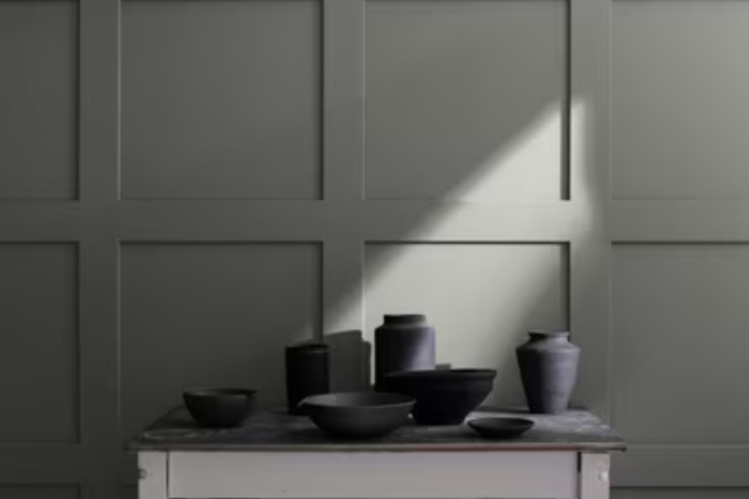
Welcome to a brief look at HC-167 Amherst Gray by Benjamin Moore, a paint color that has gained popularity for its versatility and stunning appearance. This shade belongs to Benjamin Moore’s Historical Collection, a range that reflects some of the most beloved and timeless colors. Amherst Gray stands out for its ability to add a touch of sophistication and elegance to any space. It’s a unique gray that has a deep, warm undertone, making it perfect for those looking to add a cozy yet refined feel to their interiors.
Whether you’re thinking of refreshing your living room, bedroom, or even the exterior of your home, Amherst Gray offers a balanced blend of warmth and neutrality. This color can harmonize with a wide array of decor styles, from modern to traditional, and everything in between. It’s also incredibly accommodating when pairing with other colors, making it a fantastic choice for walls, cabinetry, or as an accent.
Choosing the right paint can sometimes feel overwhelming, but Amherst Gray manages to simplify the decision-making process. It’s not just another gray; its rich undertones provide a depth that can elevate any room, making it feel more inviting and put-together. Whether you’re a seasoned decorator or about to start your first home improvement project, HC-167 Amherst Gray by Benjamin Moore could be the perfect fit for bringing your vision to life.
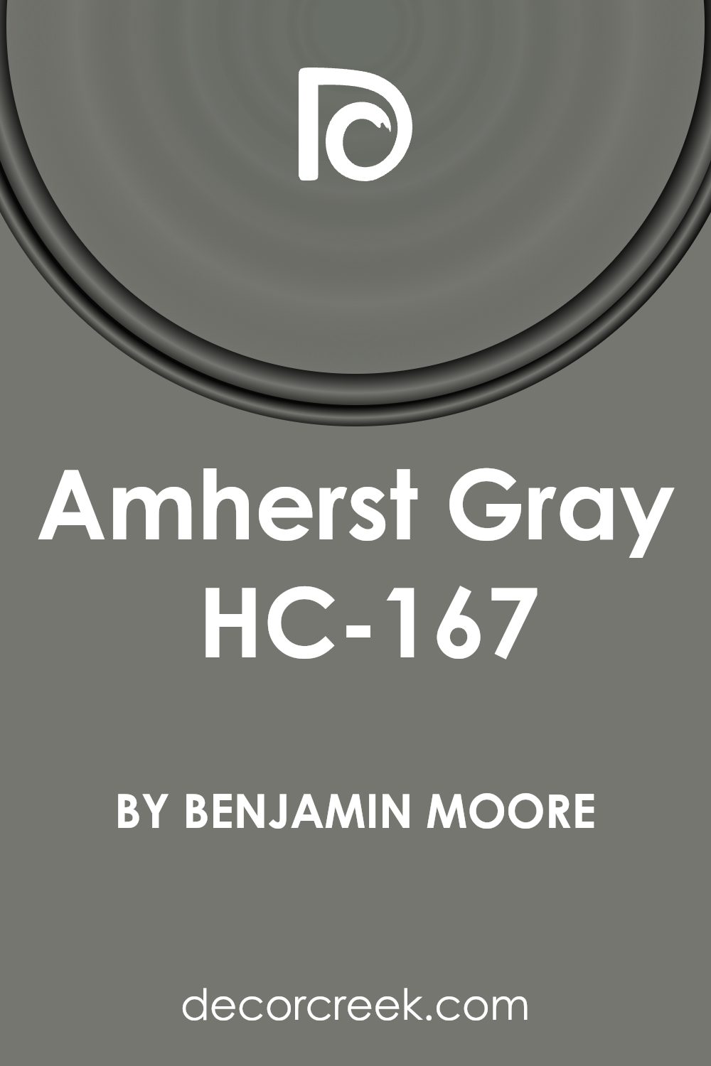
What Color Is Amherst Gray HC-167 by Benjamin Moore?
Amherst Gray is a versatile color that Benjamin Moore has crafted with a unique blend of depth and sophistication. This particular shade is more than just gray; it has a subtle hint of green that gives it a rich, earthy feel. This quality makes it perfect for those looking to inject a sense of serenity and natural elegance into their space.
When it comes to interior styles, Amherst Gray shines in a variety of settings. It works wonderfully in modern and contemporary spaces, adding a sleek, refined touch. However, its natural undertones also make it a great fit for rustic or farmhouse-style interiors, where it can complement organic materials beautifully. It serves as a stunning neutral backdrop that allows furnishings and art to stand out.
Amherst Gray pairs exceptionally well with a range of materials and textures. In rooms with wooden elements, such as hardwood floors or wooden beams, it can create a warm, inviting atmosphere. It also looks stunning against metallic finishes like brushed nickel or copper, adding a touch of elegance. For a cozy vibe, combining it with textiles like wool or linen in lighter shades can soften the space, providing a comfortable yet stylish look.
Overall, Amherst Gray is a beautifully adaptable color that brings a unique blend of sophistication and nature-inspired tranquility to any interior.
Is Amherst Gray HC-167 by Benjamin Moore Warm or Cool color?
Amherst Gray by Benjamin Moore is a shade that brings a touch of sophistication and elegance to any home. This color has a unique balance, sitting comfortably between a deep gray and a soft, welcoming charcoal. It’s versatile, making it suitable for various spaces, from living rooms to bedrooms, and even exteriors. Its richness adds depth to walls, creating an inviting atmosphere without overwhelming the space with darkness.
When used in homes, Amherst Gray has the power to transform a room into an area of calm and serenity. Its neutral tone makes it easy to pair with different colors, whether you’re adding bright accents for a lively vibe or softer hues for a more relaxed feel. Furniture and decor in wood, metal, or vibrant fabrics can stand out against this backdrop, offering endless styling options.
Moreover, in spaces with natural light, Amherst Gray changes in tone and intensity, adding a dynamic character to the room throughout the day. Its adaptability and timeless nature make it a popular choice for homeowners looking for a color that’s both stylish and practical.
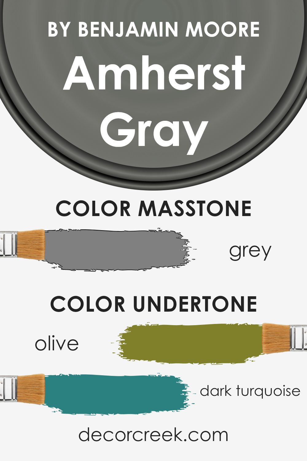
Undertones of Amherst Gray HC-167 by Benjamin Moore
Amherst Gray by Benjamin Moore is a versatile color with a complex mix of undertones that can subtly influence the look and feel of any space. These undertones range across a broad spectrum, including olive, dark turquoise, purple, and mint, among others. The presence of such a variety means that Amherst Gray can appear differently depending on the lighting and surrounding colors.
Undertones play a crucial role in perception. For instance, in a room with abundant natural light, the mint or pale pink undertones might become more pronounced, giving the space a softer, warmer feel. Conversely, in a space with limited light or during the evening, darker undertones like dark green or brown might stand out, lending the room a more grounded, cozy atmosphere.
When applied to interior walls, Amherst Gray’s adaptability makes it a favorite for many decorators. The color can complement a wide range of décor styles and preferences. In a room with wooden furniture and natural elements, its olive or dark green undertones can enhance an earthy vibe. For a cooler, serene ambiance, its light blue and light turquoise undertones might play a larger role. Moreover, the choice of accent colors and decorations can either highlight or downplay certain undertones, offering creative freedom to achieve the desired effect, be it making a small space feel larger or adding a touch of elegance to a casual room.
Overall, the underlying tones of Amherst Gray give it a chameleon-like quality, allowing it to fit beautifully into various settings and styles. Whether aiming for a cozy, warm feel or a bright, airy look, this color’s depth and versatility make it a great choice for those looking to refresh their interiors.
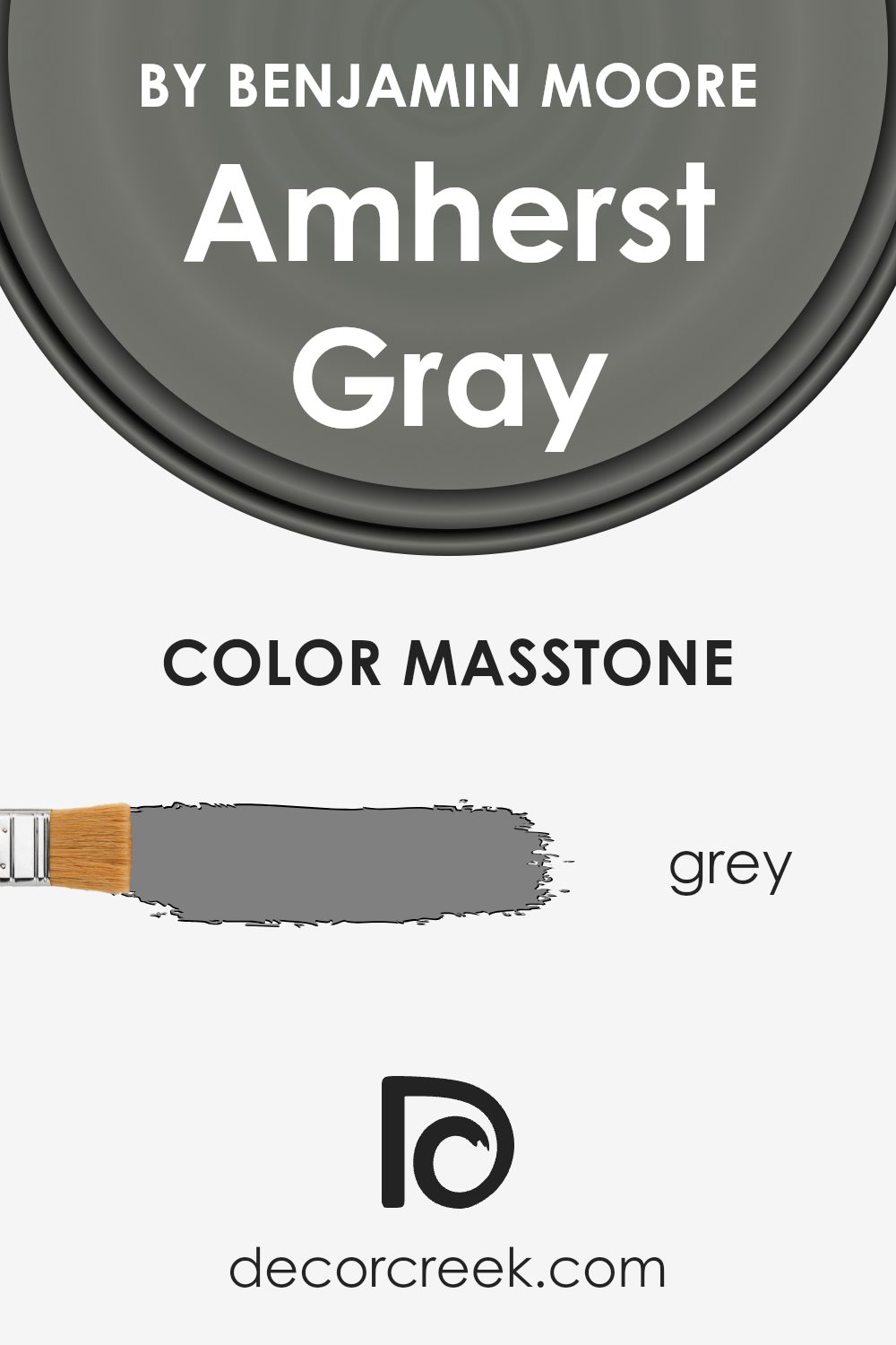
What is the Masstone of the Amherst Gray HC-167 by Benjamin Moore?
Amherst Gray HC-167 by Benjamin Moore has a base tone, often described as Grey (#808080). This specific shade plays a crucial role in how the color works within homes, offering a versatile backdrop for various interior styles. The Grey masstone means that Amherst Gray brings a balanced blend of warmth and coolness to spaces, making it exceptionally adaptable. It can smoothly integrate with both modern and traditional decors without overpowering.
This particular grey helps in creating a soothing and inviting atmosphere, vital for areas where comfort is a priority, like living rooms and bedrooms. Its neutral base allows for easy pairing with a wide range of colors, from bright accents to softer, earthy tones. This makes it a go-to choice for those looking to achieve a minimalistic yet cozy vibe in their home.
Moreover, the neutral grey masstone of Amherst Gray aids in enhancing natural light in a room, making spaces appear brighter and more spacious. Its ability to hide imperfections on walls also adds to its appeal for homeowners. Such qualities make it a smart and stylish choice for anyone looking to update their home with a fresh, but timeless look.
How Does Lighting Affect Amherst Gray HC-167 by Benjamin Moore?
Lighting plays a crucial role in how we perceive colors. The same paint can look vastly different under various types of light due to a phenomenon known as metamerism. This is where the color Amherst Gray by Benjamin Moore comes into play, showing us how versatile and complex colors can be in different lighting conditions.
- In artificial light, the outcome depends on the type of bulbs used. LED or fluorescent lighting can either cool down or warm up the color. Amherst Gray, under cool light, might lean more towards its cooler, more shadowy undertones, making it appear slightly bluer or greener. Conversely, under warm artificial light, this gray might look softer and more inviting, bringing out its warmer tones and making the space feel cozy.
- Natural light, on the other hand, changes throughout the day and affects how Amherst Gray is perceived. In a room facing north, which generally receives cooler, indirect light, Amherst Gray might appear more true to its cool gray nature, making the room feel serene yet somewhat stark. This lighting can highlight the color’s subtle complexity, giving it an elegant, understated vibe.
- In south-facing rooms, which bask in warm, abundant sunlight for most of the day, Amherst Gray can transform into a lighter, softer shade. This sunlight can reveal hidden warmth in the gray, making the room feel brighter and more welcoming.
- East-facing rooms get bright morning light, which can make Amherst Gray look warm and lively in the morning, then progressively cooler through the day. It showcases the color’s adaptability, starting the day on a bright note and cooling off as the day progresses.
- West-facing rooms experience the opposite effect, with Amherst Gray appearing cooler in the morning and warming up towards the evening. This warm, golden light can play up the gray’s warmer undertones, making the space feel cozy and inviting by dusk.
In essence, Amherst Gray’s appearance is a dance with light, showcasing its moody versatility across different times of day and various lighting conditions, proving it a sophisticated choice for those looking to add depth and character to their space.
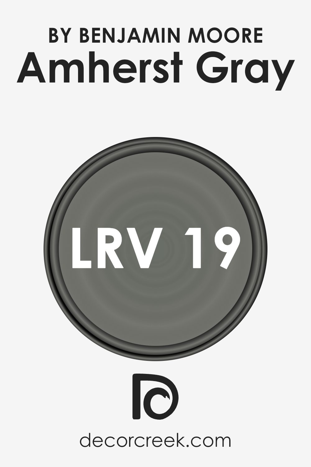
What is the LRV of Amherst Gray HC-167 by Benjamin Moore?
LRV stands for Light Reflectance Value, which is a measure used to indicate how much light a color reflects or absorbs. Think of LRV on a scale from 0 to 100, where 0 means it absorbs all light (like pure black) and 100 means it reflects all light (like pure white). This value is especially important when choosing paint colors for your space because it affects how light or dark a color looks on your walls. A higher LRV makes a room feel more open and airy because it reflects more light, while a lower LRV can make a space feel cozier or smaller due to absorbing more light.
For Amherst Gray, which has an LRV of 18.8, this means it’s on the darker side of the scale, absorbing more light than it reflects. When applied to walls, this color will appear dark and can significantly influence the ambiance of a room. It’s ideal for creating a sophisticated, intimate atmosphere in a space, but it’s also important to consider the lighting. In rooms with less natural light, Amherst Gray may appear even darker, whereas in well-lit areas, the true depth and richness of the color can come through more vividly. So, when using a color with a lower LRV like this, lighting plays a crucial role in showcasing the color’s true beauty.
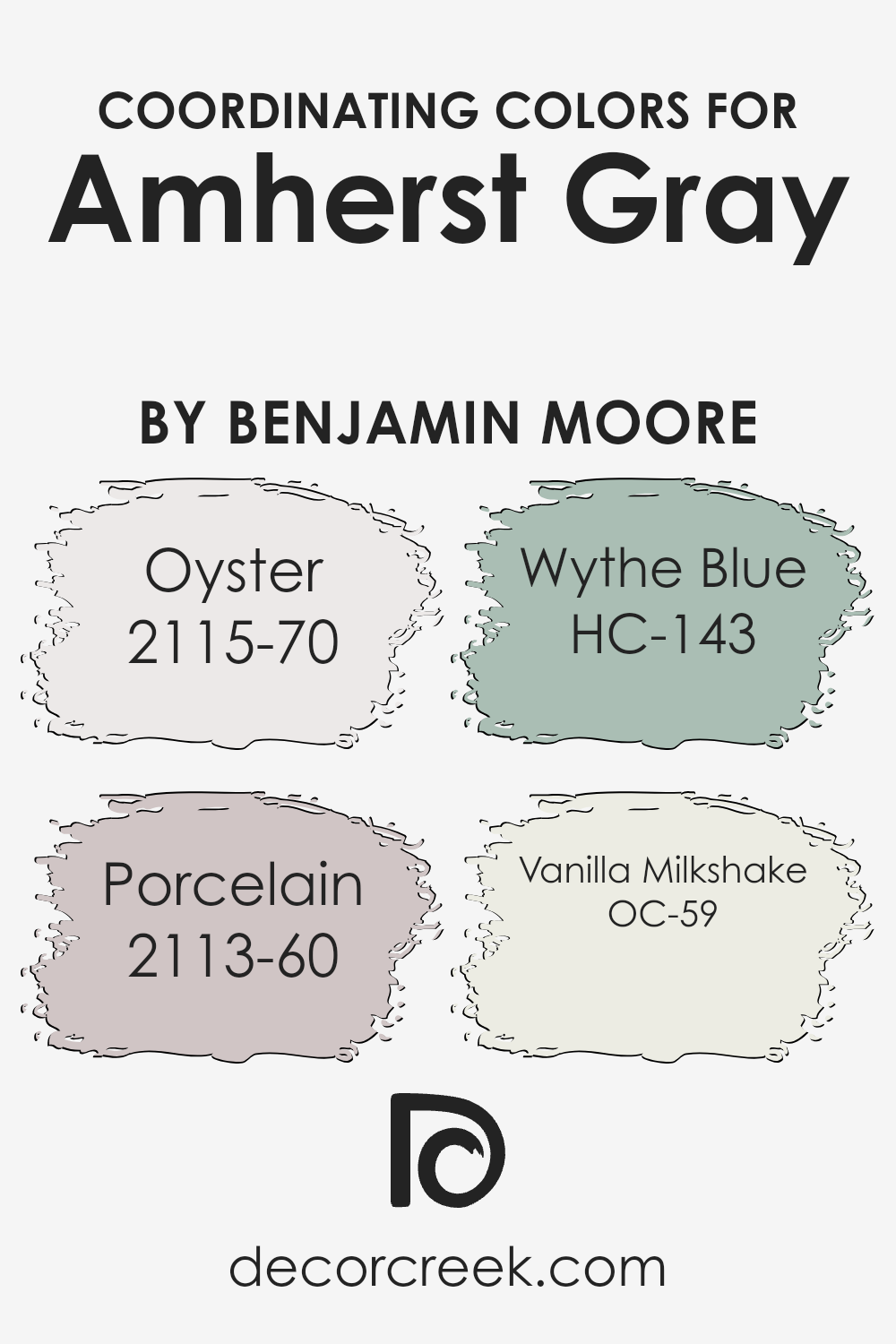
Coordinating Colors of Amherst Gray HC-167 by Benjamin Moore
Coordinating colors are essentially hues that complement each other well and are used together to create visually appealing designs. They can enhance the appearance of a room, outfit, or any design project by bringing harmony and balance. When it comes to coordinating colors for Amherst Gray, a sophisticated and versatile shade by Benjamin Moore, there are specific colors recommended to pair with it for an attractive palette.
First up is 2115-70, known as Oyster, a light and airy color with a hint of warmth that provides a subtle contrast to the deeper tones of Amherst Gray, creating a serene and inviting atmosphere. Next, we have 2113-60, Porcelain, which is a soft, almost ethereal light blue that offers a fresh, clean look when used alongside the more grounded Amherst Gray; it’s perfect for a calm and peaceful setting.
Then, there’s HC-143, Wythe Blue, a color that strikes a beautiful balance between blue and green, with a soothing quality that makes it great for adding a touch of serene elegance. Finally, OC-59, Vanilla Milkshake, is a creamy, soft white that acts as a wonderful neutral backdrop, ensuring that Amherst Gray stands out without overpowering, lending a sense of brightness and light to the space. Together, these colors harmonize beautifully, allowing for creativity and style in designing spaces that feel cohesive and thoughtfully put together.
You can see recommended paint colors below:
- 2115-70 Oyster
- 2113-60 Porcelain
- HC-143 Wythe Blue
- OC-59 Vanilla Milkshake
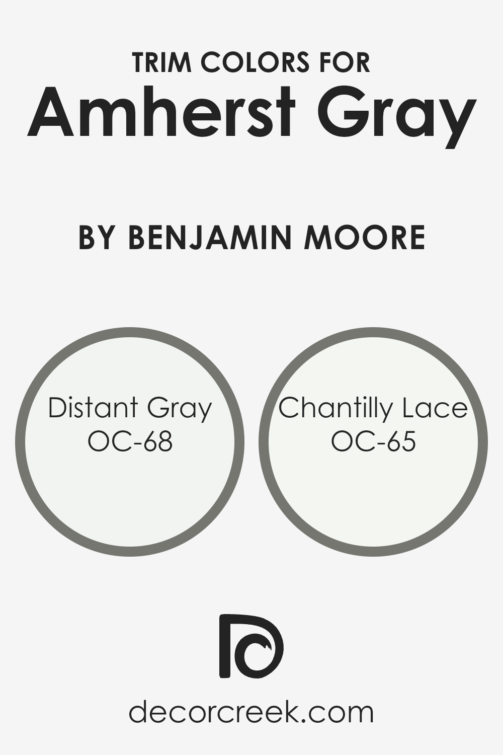
What are the Trim colors of Amherst Gray HC-167 by Benjamin Moore?
Trim colors are the hues selected for the architectural elements and details of a room or exterior, such as door frames, window trims, baseboards, and crown moldings. These colors play a crucial role in enhancing and complementing the main color scheme, like the sophisticated Amherst Gray by Benjamin Moore. By carefully choosing trim colors, you can highlight these details, creating a more defined and polished look. For Amherst Gray, selecting the right trim color is essential to either softly contrast its rich tone or to bring a crisp, clean edge to the overall aesthetic.
OC-68 Distant Gray and OC-65 Chantilly Lace by Benjamin Moore are excellent trim color choices for rooms or exteriors painted in Amherst Gray. Distant Gray is a subtle, almost ethereal color that offers a soft and airy contrast to Amherst Gray’s deeper hue, lending a gentle delineation to the space without overwhelming the senses. Chantilly Lace, on the other hand, is a bright, pure white that provides a sharp, fresh contrast, giving any Amherst Gray space a vibrant lift. Both colors are designed to enhance and refine, making them perfect complements to the stately elegance of Amherst Gray, ensuring a look that is both cohesive and stylish.
You can see recommended paint colors below:
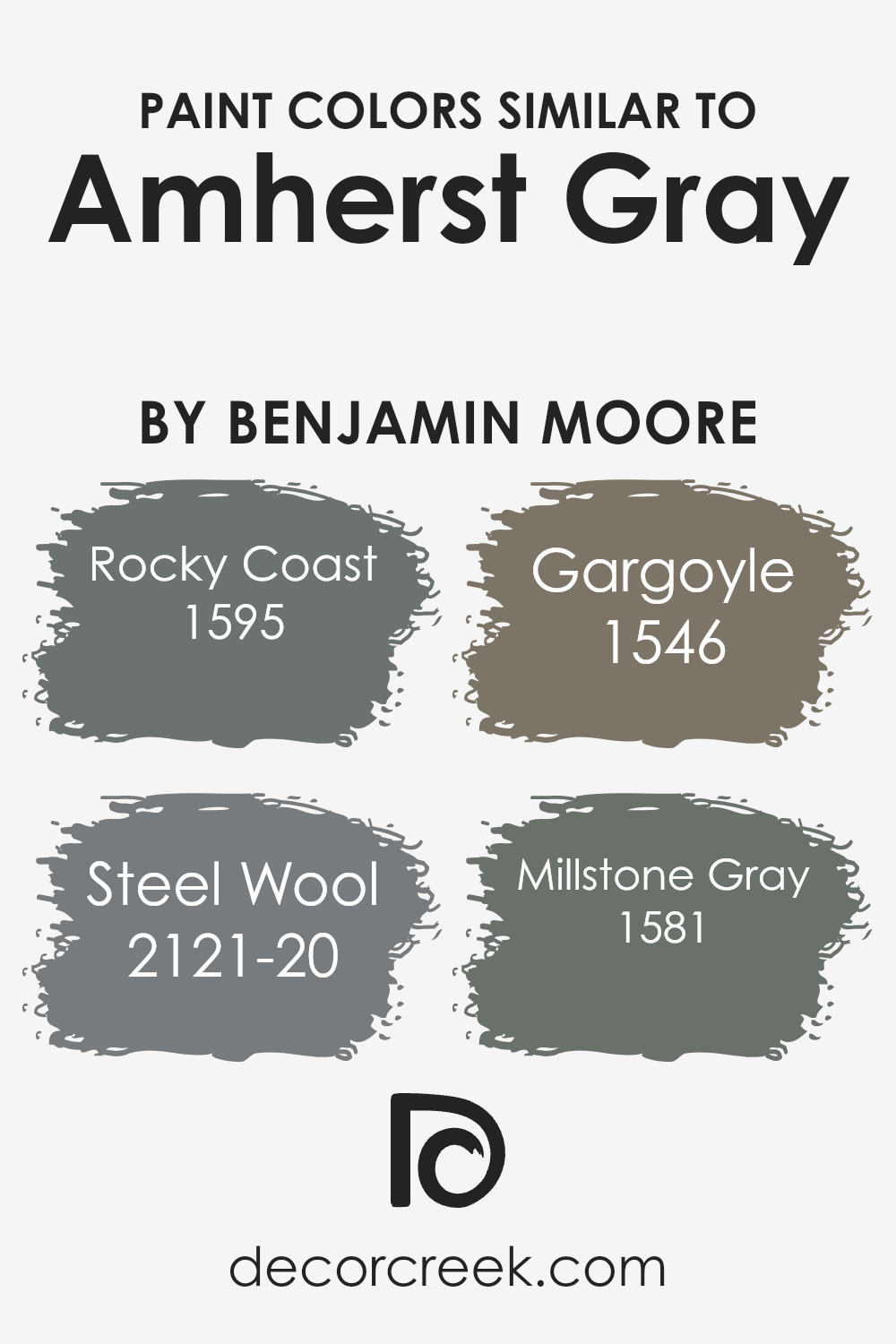
Colors Similar to Amherst Gray HC-167 by Benjamin Moore
Similar colors play a significant role in design and décor, bringing harmony and balance to a space. When used correctly, they create a seamless flow from room to room, enhancing the overall aesthetic appeal. For instance, colors similar to Amherst Gray by Benjamin Moore illustrate how varying shades can contribute to a cohesive yet visually interesting environment. These nuanced differences allow for layering and depth without a jarring contrast, making spaces feel more polished and thoughtfully put together. They work by sharing a common hue base, which ensures that, despite their individual tones, there’s an underlying consistency that ties the room or design together. This approach is particularly useful in achieving a sophisticated and unified look without resorting to monochrome schemes.
For example, Rocky Coast has a natural, earthy essence that brings a sense of calm and solidity to a space, perfect for creating a serene backdrop. Steel Wool, on the other hand, introduces a slightly cooler, more reflective quality, akin to the soft, diffused light of early morning. Gargoyle offers a deep, muted elegance that lends itself well to accentuating architectural details or furniture, adding a touch of gravitas. Lastly, Millstone Gray provides a balanced, adaptable foundation that can easily blend with a variety of textures and colors for a harmonious yet dynamic aesthetic. Each of these colors, while sharing a kinship with Amherst Gray, brings its own unique vibe, allowing for a layered and richly textured design palette.
You can see recommended paint colors below:
- 1595 Rocky Coast
- 2121-20 Steel Wool
- 1546 Gargoyle
- 1581 Millstone Gray
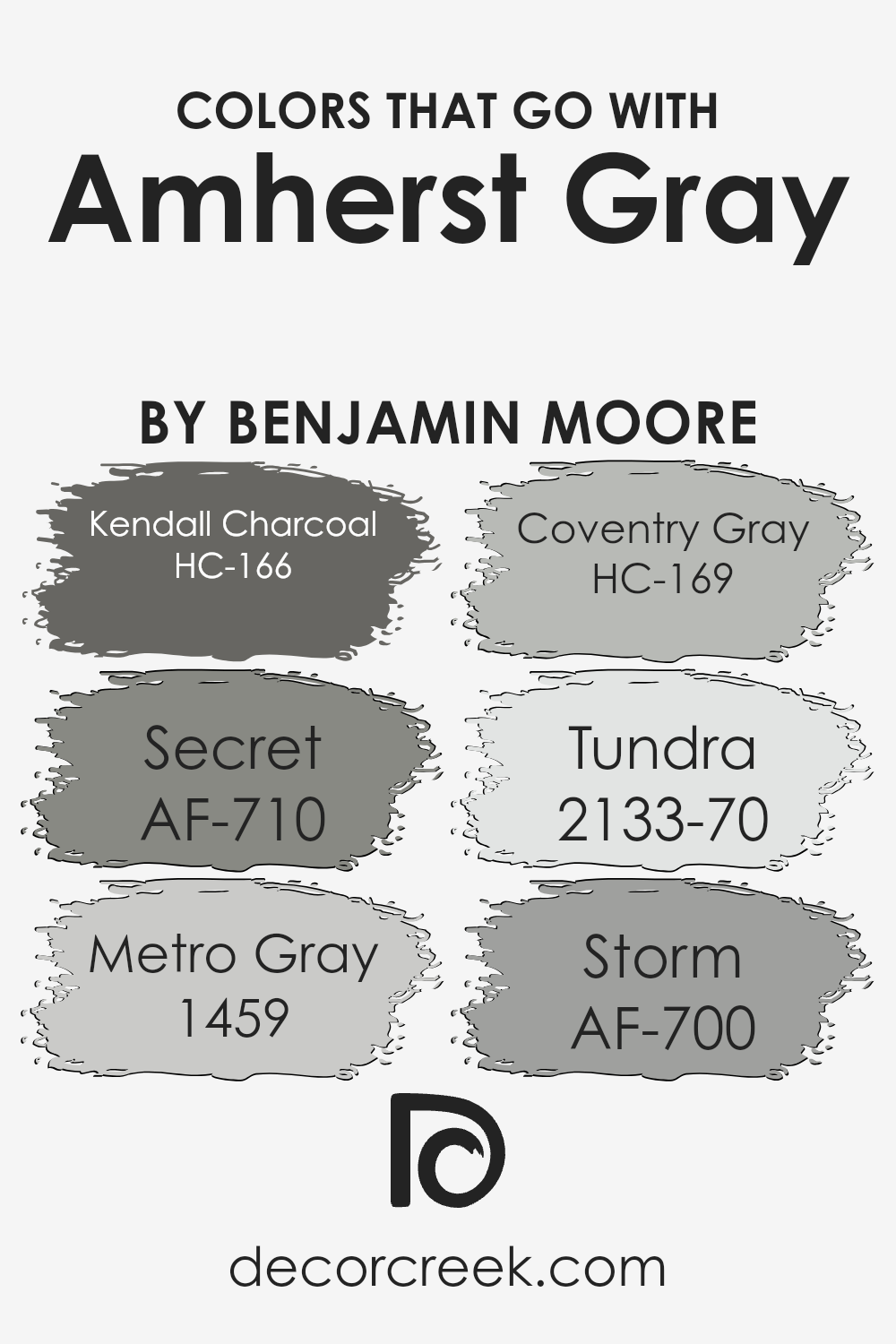
Colors that Go With Amherst Gray HC-167 by Benjamin Moore
Selecting coordinating colors for Amherst Gray HC-167 by Benjamin Moore is crucial because it ensures the design feels balanced and visually appealing. Colors that complement Amherst Gray bring out its richness and versatility, making it possible to create a variety of mood and styles in a space. When paired correctly, these colors enhance the aesthetics of a room, providing depth and contrast. They work together by either offering a striking contrast or by subtly blending in, enhancing the overall ambiance.
Kendall Charcoal HC-166 is a deeper shade that adds a sophisticated edge to spaces, working well in tandem with Amherst Gray to offer a bold, yet harmonious, contrast. Secret AF-710 is a mysterious and soft neutral that can lighten the mood without overpowering, providing a gentle complement. Metro Gray 1459 introduces a contemporary twist, its urban vibe aligning perfectly with Amherst Gray’s timeless charm. Coventry Gray HC-169, a lighter gray, adds a refreshing breeziness to the sophisticated depth of Amherst Gray, creating a serene and inviting atmosphere.
Tundra 2133-70 offers a muted backdrop that lets Amherst Gray stand out, its understated elegance supporting the main color without competing. Finally, Storm AF-700 offers a dynamic contrast with its deep, intense presence, enriching Amherst Gray with a layer of dramatic flair. These colors harmonize with Amherst Gray to create spaces that feel well-curated and thoughtfully designed, proving the importance of choosing the right complementary colors.
You can see recommended paint colors below:
- HC-166 Kendall Charcoal
- AF-710 Secret
- 1459 Metro Gray
- HC-169 Coventry Gray
- 2133-70 Tundra
- AF-700 Storm
How to Use Amherst Gray HC-167 by Benjamin Moore In Your Home?
Amherst Gray HC-167 by Benjamin Moore is a versatile and sophisticated shade of gray that can bring a touch of elegance to any home. This particular color is perfect if you’re looking to add a bit of class to your walls without making the space feel too dark or overwhelming. It’s a balanced gray that can work well in both bright rooms, where it adds depth and coziness, and in spaces that don’t get much light, where it can create a snug, inviting atmosphere.
You can use Amherst Gray in a variety of ways. It’s great for living rooms or bedrooms, giving a serene backdrop that pairs well with both vivid and muted tones. It means you can decorate with your favorite colors and accessories without worrying about clashes. In the kitchen, Amherst Gray cabinets can offer a modern and timeless look. It’s also ideal for exterior projects, like painting the siding or front door, adding a stylish and durable finish that boosts curb appeal.
By choosing Amherst Gray HC-167, you’re opting for a paint color that has the flexibility to fit almost any design vision, making your home feel cozy, stylish, and uniquely yours.
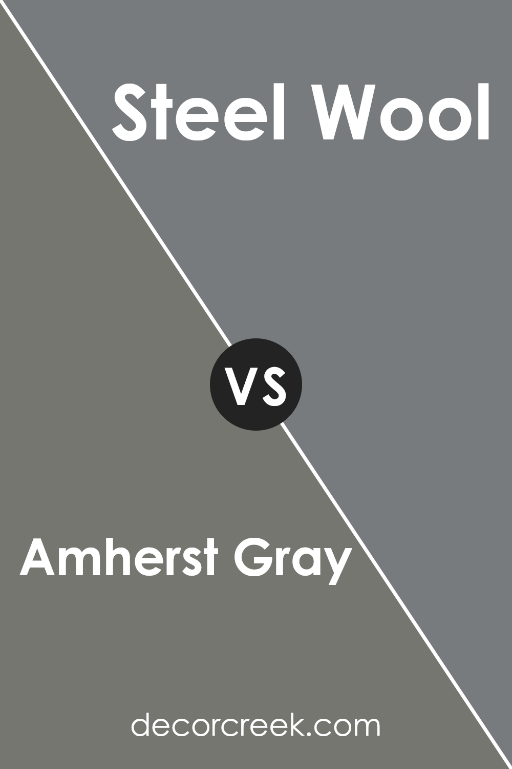
Amherst Gray HC-167 by Benjamin Moore vs Steel Wool 2121-20 by Benjamin Moore
Amherst Gray by Benjamin Moore is a deep, sophisticated shade of gray with just a hint of warmth. This makes it a versatile choice for spaces seeking a touch of elegance without feeling too cold or stark. On the other hand, Steel Wool by Benjamin Moore leans towards the cooler side of the gray spectrum, offering a sharper, more modern vibe. Steel Wool might remind you of the color of shadowed silver, giving spaces a crisp, contemporary feel.
While both colors can uplift a room’s aesthetic, Amherst Gray brings a cozy, inviting atmosphere, making it perfect for living rooms or bedrooms. Steel Wool, with its cooler undertones, is ideal for those who prefer a sleek, modern look, especially in bathrooms or kitchens. Despite their differences, both grays work well with a wide range of decor, providing a chic, versatile backdrop for any interior design style.
You can see recommended paint color below:
- 2121-20 Steel Wool
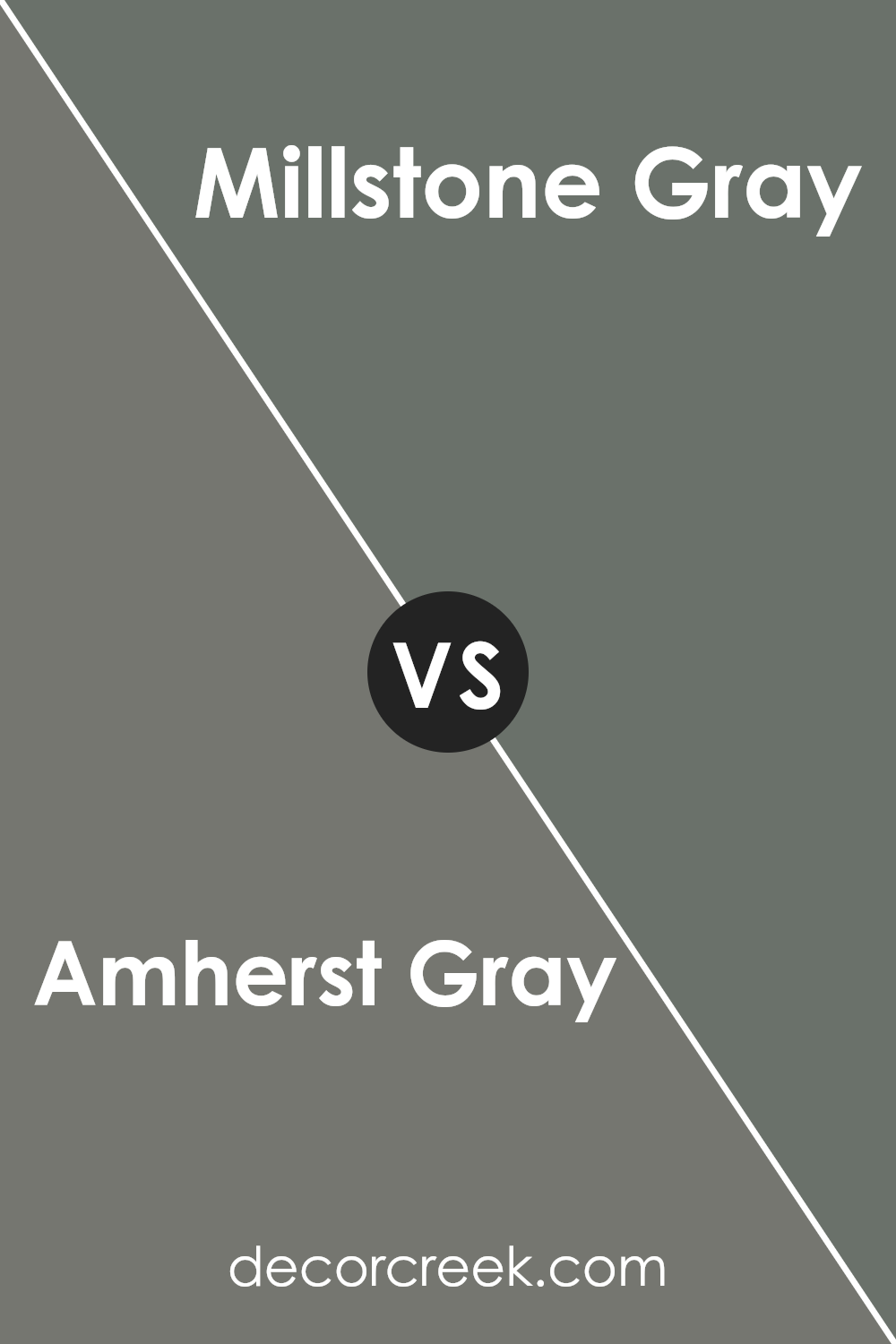
Amherst Gray HC-167 by Benjamin Moore vs Millstone Gray 1581 by Benjamin Moore
Amherst Gray and Millstone Gray are both paint colors by Benjamin Moore, each offering a unique vibe to any space. Amherst Gray is a rich, deep gray with cool undertones. It’s a color that stands out, offering a strong presence in a room, making it perfect for creating a statement wall or for exterior facades. On the other hand, Millstone Gray is lighter and carries a softer, more neutral gray tone.
It’s versatile, easily fitting into various decor styles without overpowering them. This makes it ideal for living spaces, bedrooms, or kitchens where a calm and serene atmosphere is desired. Both colors are stylish and have their own character – Amherst Gray brings depth and boldness, while Millstone Gray introduces a light, airy feeling to spaces. Choosing between them depends on the mood you want to create; a dramatic and sophisticated look with Amherst Gray, or a relaxed and inviting space with Millstone Gray.
You can see recommended paint color below:
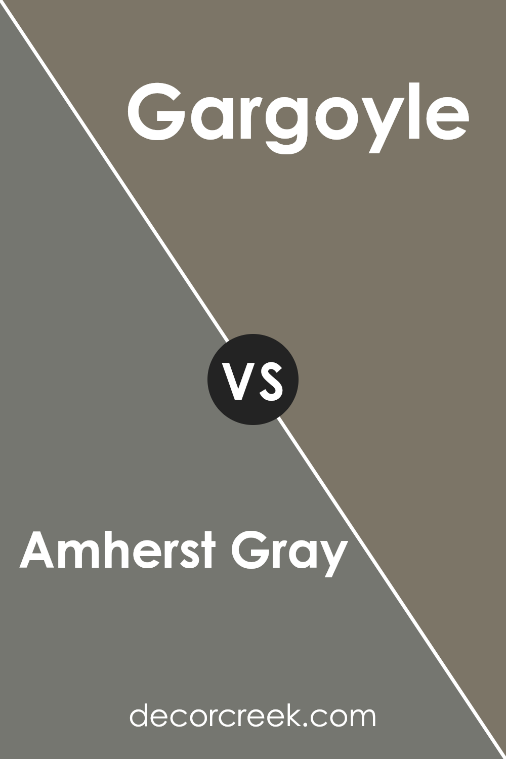
Amherst Gray HC-167 by Benjamin Moore vs Gargoyle 1546 by Benjamin Moore
Amherst Gray and Gargoyle, both by Benjamin Moore, offer unique takes on gray shades. Amherst Gray is a soft, rich gray with a hint of green, making it warm and adaptable to different lighting and spaces. This color is perfect for those seeking a cozy yet sophisticated look in their home. On the other hand, Gargoyle is a deeper, cooler shade of gray. It leans towards a more classic, timeless appearance, providing a bold statement in any room without feeling too heavy.
While Amherst Gray brightens spaces with its subtle warmth, Gargoyle stands out as a firmer, more defined color. Both colors can complement a range of décor styles, from modern to traditional, but the choice between them depends on the desired mood and atmosphere. Amherst Gray offers a lighter, welcoming feel, whereas Gargoyle gives a room an anchor with its stronger presence.
You can see recommended paint color below:
- 1546 Gargoyle
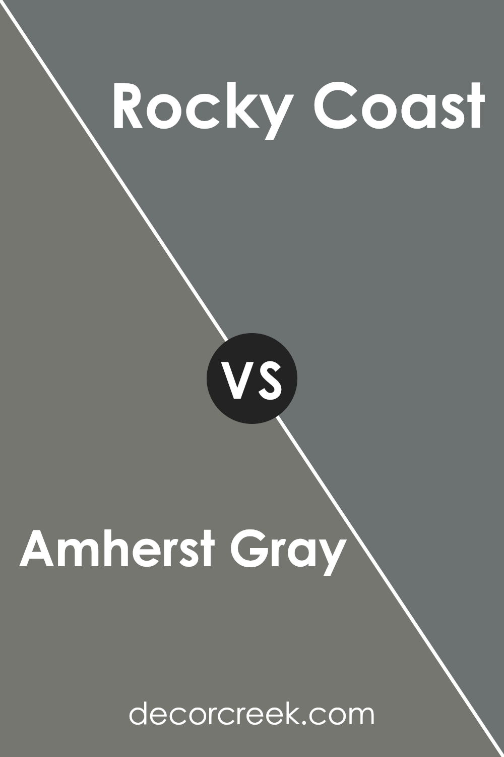
Amherst Gray HC-167 by Benjamin Moore vs Rocky Coast 1595 by Benjamin Moore
Amherst Gray and Rocky Coast are two paint colors from Benjamin Moore that have their unique appeal. Amherst Gray is a deeper, almost charcoal-like color with a solid presence that brings a sophisticated and strong vibe to a space. It’s perfect for someone looking to make a statement in an area, offering a sense of grounding and refinement without going too dark.
On the other hand, Rocky Coast has a lighter, more nuanced feel. It’s a blend that stands out for its versatility, able to complement various decor styles with ease. This color feels more open and airy compared to Amherst Gray, providing a soothing backdrop that still retains a touch of depth, thanks to its rich undertones.
Both colors are great choices, but your preference might depend on the mood you want to set in your room. Amherst Gray works well when aiming for a dramatic or cozy atmosphere, while Rocky Coast is ideal for creating a serene and welcoming space.
You can see recommended paint color below:
- 1595 Rocky Coast
Conclusion
Amherst Gray by Benjamin Moore is a versatile and sophisticated color that has gained popularity for its ability to enhance a wide range of spaces. This hue strikes a perfect balance between a deep, rich tone and a soothing neutrality, making it an ideal choice for those looking to add a touch of elegance to their interiors without overwhelming them. Its adaptability means it works well in various settings, from modern living rooms to cozy bedrooms, providing a solid foundation that complements both contemporary and traditional decor.
The appeal of Amherst Gray goes beyond just its aesthetic versatility. Homeowners and interior designers appreciate this color for its ability to create a sense of depth and texture in a space, offering a subtle yet impactful backdrop that can elevate the overall look and feel of a room. Whether used as a main wall color or as an accent to highlight architectural features, Amherst Gray brings a sense of refined sophistication that enriches the environment it inhabits. Its popularity is a testament to its timeless charm and functionality in transforming spaces into stylish and inviting areas.

Ever wished paint sampling was as easy as sticking a sticker? Guess what? Now it is! Discover Samplize's unique Peel & Stick samples.
Get paint samples

