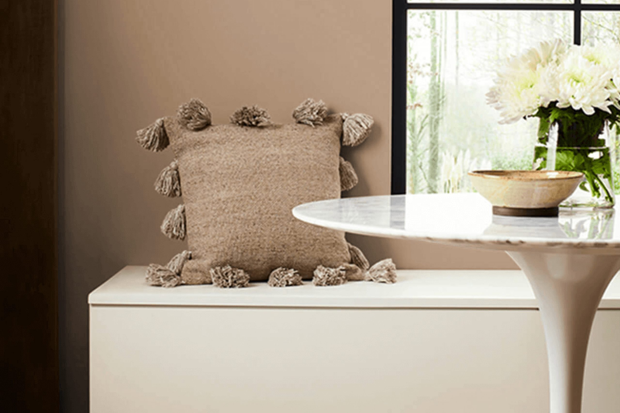
If you’re considering a warm, inviting color for your next painting project, let me introduce you to SW 2835 Craftsman Brown by Sherwin Williams. Whenever I look for a color that adds a subtle richness to any room without overwhelming the space, I often lean towards earthy tones like this one. Craftsman Brown strikes a beautiful balance between warmth and sophistication, making it a versatile choice for living rooms, dining areas, or even exteriors.
From my experience, this shade pairs wonderfully with natural materials like wood and stone, enhancing their textures and bringing a cozy, grounded feel to any environment. Whether you’re aiming to create a welcoming atmosphere in a family home or looking to add a touch of elegance to a more traditional space, SW 2835 Craftsman Brown is worth considering.
Using this paint color not only warms up your space but also lays a fantastic foundation for various decor styles, from rustic to modern.
So, if you’re planning your next DIY project or professional renovation, give Craftsman Brown a thought. It might just be the perfect hue you’re looking to paint your spaces with.
What Color Is Craftsman Brown SW 2835 by Sherwin Williams?
Craftsman Brown is a robust and warm shade of brown that brings a sense of sturdy richness to any room. This color, with its deep and earthy tones, evokes the feeling of nature and the rustic outdoors. It’s a versatile hue that pairs exceptionally well with natural materials like wood, stone, and leather, enhancing their inherent qualities. The color works best in interior styles that celebrate timeless beauty and craftsmanship, such as traditional, rustic, or arts and crafts.
In a living room or study, Craftsman Brown can create a cozy and inviting atmosphere when used on walls or accent features. It complements wooden furniture beautifully, highlighting its grain and build quality. Fabrics like wool, burlap, and linen also go well with this color, adding to the textural play that can make a space feel welcoming and well-rounded.
For those looking to design spaces with a natural flow and a grounded feel, Crafts from Brown offers a solid foundation. It’s particularly impactful in spaces where you want to promote relaxation and comfort, such as bedrooms and reading nooks.
Whether you’re pairing it with soft creams, vibrant greens, or soothing blues, this color adjusts well and brings a cohesive look to the decor.
Is Craftsman Brown SW 2835 by Sherwin Williams Warm or Cool color?
Craftsman Brown is a rich and warm color offered by Sherwin Williams. It has a deeply comforting and earthy tone that can make any room feel cozy and inviting. This color is perfect for spaces where you want to create a sense of warmth, like living rooms or bedrooms.
It pairs beautifully with natural materials such as wood, stone, and leather, enhancing the overall aesthetic of traditional and rustic home designs. The depth of Craftsman Brown can also help in making large, open spaces feel more intimate and welcoming. In smaller areas, using it on an accent wall can add a focal point without overpowering the room.
If you’re looking to create a cozy nook or a quiet reading corner, this color can set the right mood. Additionally, its versatility allows it to blend well with a variety of color schemes, including creamy whites or soft greens, making it a practical choice for many homes.
Undertones of Craftsman Brown SW 2835 by Sherwin Williams
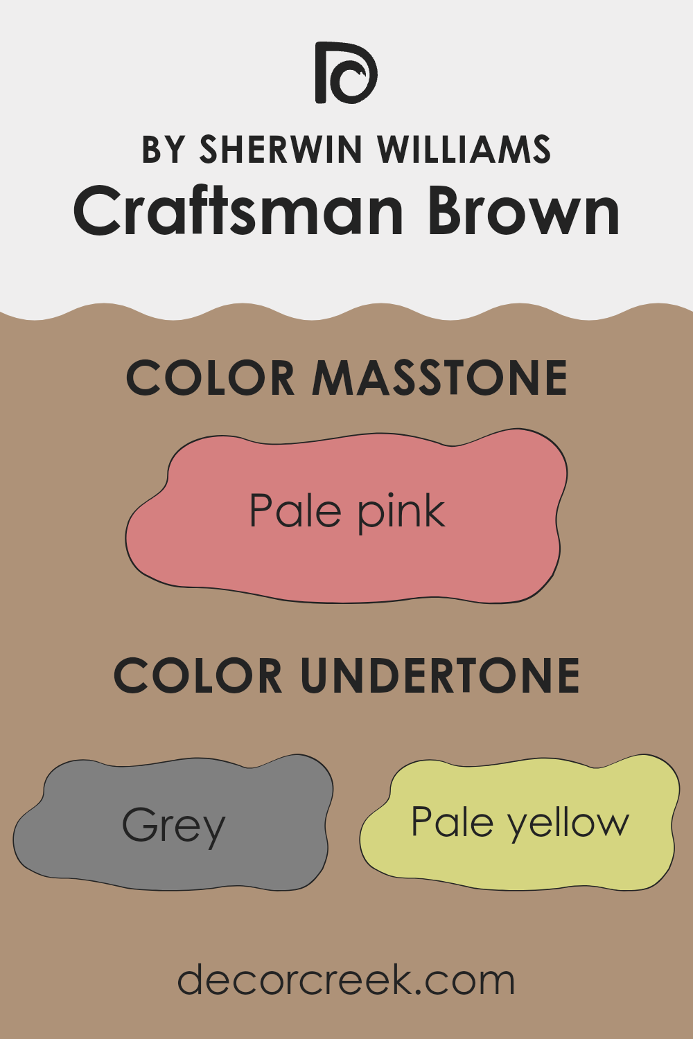
Craftsman Brown is a rich color that can create a warm and cozy atmosphere in any room. The undertones of a paint color are subtle colors that, while not always immediately noticeable, can significantly influence the overall look and feel of the color once it’s on your walls.
This particular brown has a complex mix of undertones, including grey, which can give it a muted, calming effect in spaces with a lot of natural light. Pale yellow and orange undertones add a touch of warmth, making the room feel welcoming. Similarly, mint and light green undertones bring a fresh vibrancy, which can balance darker elements in a room.
Colors like olive and light purple add a hint of sophistication, though it’s very subtle, and won’t overwhelm the primary brown tone. Lilac and violet provide a cool contrast, ideal for balancing the warmth of Craftsman Brown, especially in well-lit spaces. Using this color in an interior can greatly impact the room’s ambiance. The variety of undertones in Craftsman Brown means it can adapt to different lighting and accompanying colors.
For example, in a room with plenty of sunlight, those yellow and orange undertones might make the space feel more inviting, while the cooler lilac and violet can help keep the color grounded. This adaptability makes it a versatile choice for living rooms, bedrooms, or even dining areas, able to complement a range of decorating styles and preferences.
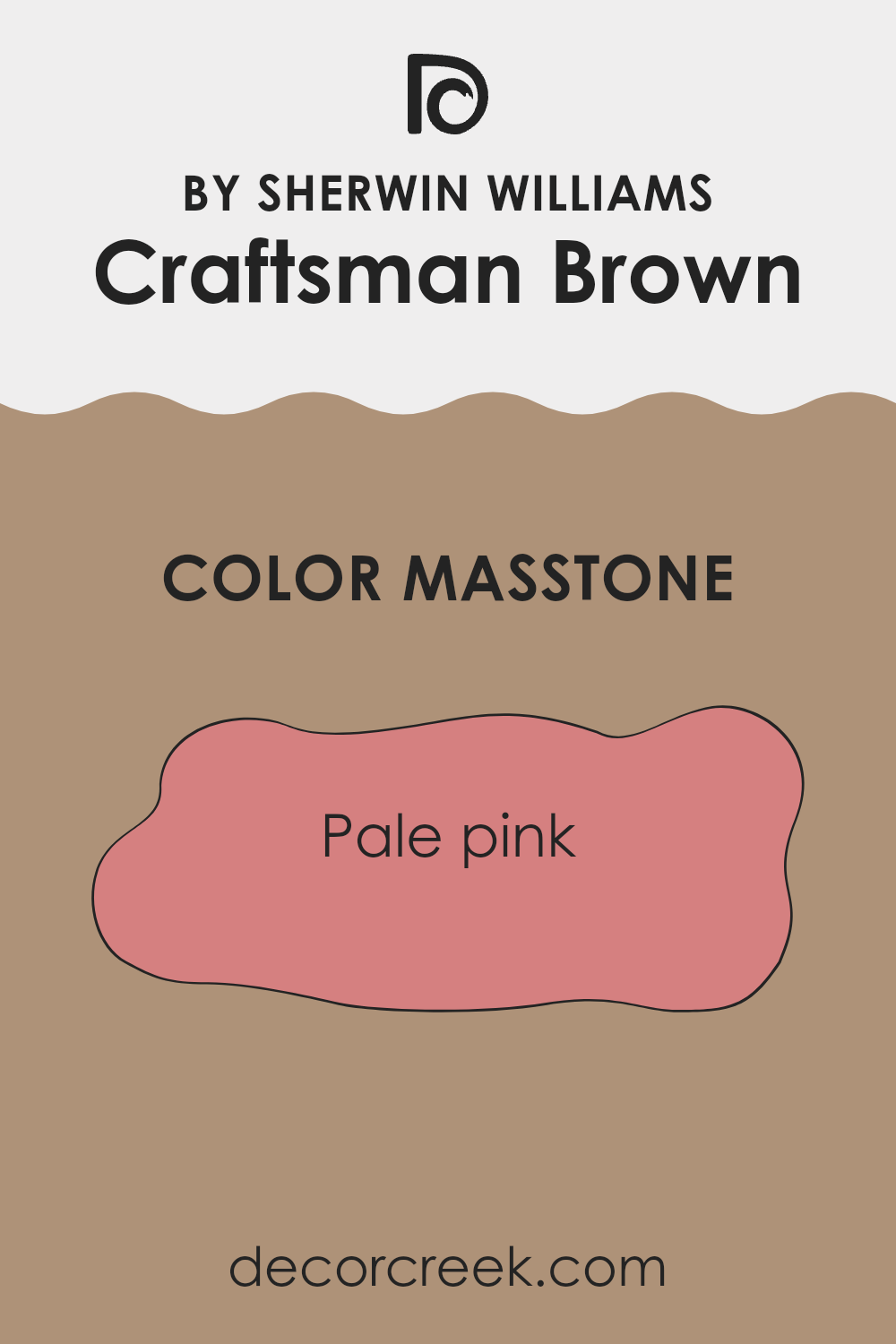
What is the Masstone of the Craftsman Brown SW 2835 by Sherwin Williams?
Craftsman BrownSW 2835 by Sherwin Williams has a masstone of pale pink, which appears as a soft, muted shade of pink. This gentle color has a calming effect, making it a great choice for home interiors where you want to create a cozy and inviting atmosphere.
This pale pink shade adds a touch of warmth to any room without being too bold or overwhelming, which makes it versatile for combining with different decor styles and colors. It works particularly well in bedrooms and living rooms where you want to promote a relaxing environment.
Additionally, due to its light and neutral nature, Craftsman BrownSW 2835 helps in making small spaces appear larger and more open, adding to its appeal for use in various home settings. Whether paired with dark woods for a traditional look or with modern furnishings for a contemporary vibe, the gentle pink hue of this color provides a beautiful backdrop.
How Does Lighting Affect Craftsman Brown SW 2835 by Sherwin Williams?
Lighting can significantly impact how we perceive colors in our everyday environments. Different types of light can make the same color appear different. For instance, Craftsman Brown, a rich brown hue, will vary in appearance based on the lighting conditions it is under, whether natural or artificial.
In artificial light, such as from bulbs or LED lights, Craftsman Brown may look warmer and cozier. This is because artificial lights often emit yellow or warm tones, which augment the brown’s inherent warmth. This makes it a great choice for living areas or dining rooms where you want a welcoming and warm atmosphere.
In contrast, natural light exposes the true character of Craftsman Brown, displaying its depth and complexity. In rooms with plenty of sunlight, such as those facing south, the color will appear lighter and more vivid throughout the day as the sun shines directly into the room. It enhances the welcoming ambience, making it an excellent choice for family rooms and kitchens.
In rooms facing north, which receive less direct sunlight, Craftsman Brown can appear darker and more subdued. This could make the room feel smaller or more enclosed, which might be ideal for creating a cozy corner or a personal study area.
East-facing rooms get plenty of light in the morning but less in the afternoon. Here, Craftsman Brown will shine brightly in the morning, looking lively and vibrant, then become calmer and softer as the day progresses. This makes it suitable for bedrooms or breakfast nooks where morning brilliance can be appreciated.
Lastly, in west-facing rooms, the color will stay relatively neutral and true to its hue during the morning and transform into a warmer glow by the evening due to the setting sun. This characteristic can enhance living spaces where you spend evening hours, as it complements the setting sun beautifully.
In summary, the appearance of Craftsman Brown can vary greatly depending on the lighting conditions, which affects its suitability for different rooms and settings.

What is the LRV of Craftsman Brown SW 2835 by Sherwin Williams?
LRV stands for Light Reflectance Value, which measures the percentage of light a paint color reflects back into a room. Think of it as a scale where higher values mean the paint is lighter and reflects more light, and lower values mean it’s darker and absorbs more light. This value is crucial when choosing paint colors because it helps predict how light or dark a color will appear once it’s on your walls.
A room’s lighting, both natural and artificial, can dramatically influence this appearance, as lighter-colored walls can make a room feel more open and airy, while darker walls tend to create a cozier, more enclosed feel.
Craftsman Brown, with an LRV of around 31, is on the darker end of the scale. This means it absorbs a lot of light rather than reflecting it, which can have a significant impact on the atmosphere of a room. In spaces with limited natural light or smaller rooms, this color could make the area feel smaller and darker. However, in a well-lit space or a larger room, using this color can add a warm and inviting quality. When using a darker color like this, it is especially important to consider lighting and room size to achieve the desired effect.

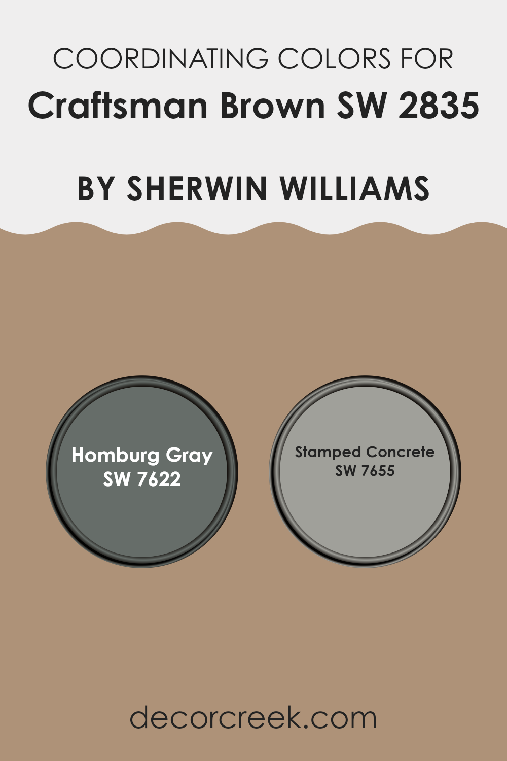
Coordinating Colors of Craftsman Brown SW 2835 by Sherwin Williams
Coordinating colors are the hues that work well together to enhance the aesthetics of a space, ensuring that the colors complement each other without clashing. By selecting a palette of coordinating colors, one can create a harmonious and visually pleasant environment.
These colors are chosen based on their positions on the color wheel, their saturation, or their brightness, among other factors. For instance, when working with a rich hue like Craftsman Brown, an ideal approach might include using colors that either contrast or blend smoothly with its deep, warm tones.
Homburg Gray SW 7622 and Stamped Concrete SW 7655 are two colors that coordinate well with the depth of Craftsman Brown. Homburg Gray is a muted, sophisticated neutral that offers a solid, grounding effect, making it a great choice for balancing the intensity of darker shades. It’s a versatile shade that can give a room a calm, collected feel. On the other hand, Stamped Concrete presents a cooler, lighter gray that provides a fresh, modern contrast to richer, darker colors.
It’s especially useful for adding a contemporary touch to spaces, helping to break up more intense color schemes without overwhelming the core aesthetics of the room. This pairing ensures a balanced and inviting atmosphere, enriching the overall appeal of the décor.
You can see recommended paint colors below:
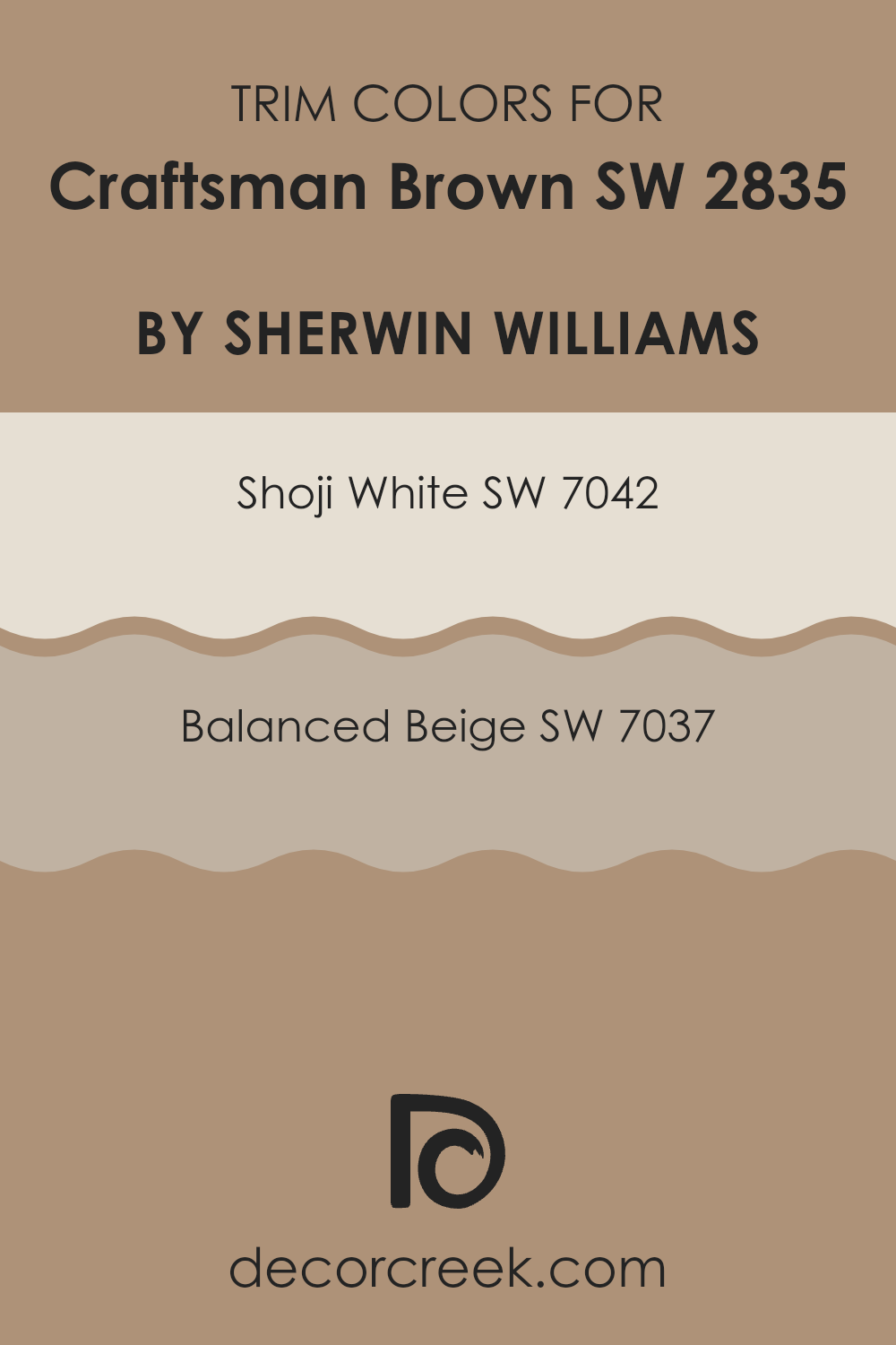
What are the Trim colors of Craftsman Brown SW 2835 by Sherwin Williams?
Trim colors are specific shades used to enhance the architectural details of a home, such as window frames, doors, and baseboards. These colors are crucial because they accentuate the primary wall color, helping to define the space visually while adding contrast and interest.
For a rich and warm hue like Craftsman Brown, choosing the right trim colors can greatly influence the overall aesthetic and mood of the room. For example, lighter trim colors create a striking contrast against a darker wall, highlighting features and adding a clean, crisp finish to the space.
Shoji White SW 7042 is a light, almost ethereal color that provides a subtle contrast when used with a darker shade such as Craftsman Brown. It is soft enough not to overpower the room but has just enough of a distinct tone to neatly outline features and make them stand out.
Balanced Beige SW 7037, on the other hand, offers a warmer option for trim, enhancing the earthy tones of Craftsman Brown without causing a stark contrast. This color has a soothing effect and works well in providing a smooth transition between the more intense hues of the walls and the brighter, lighter elements of the decor.
You can see recommended paint colors below:
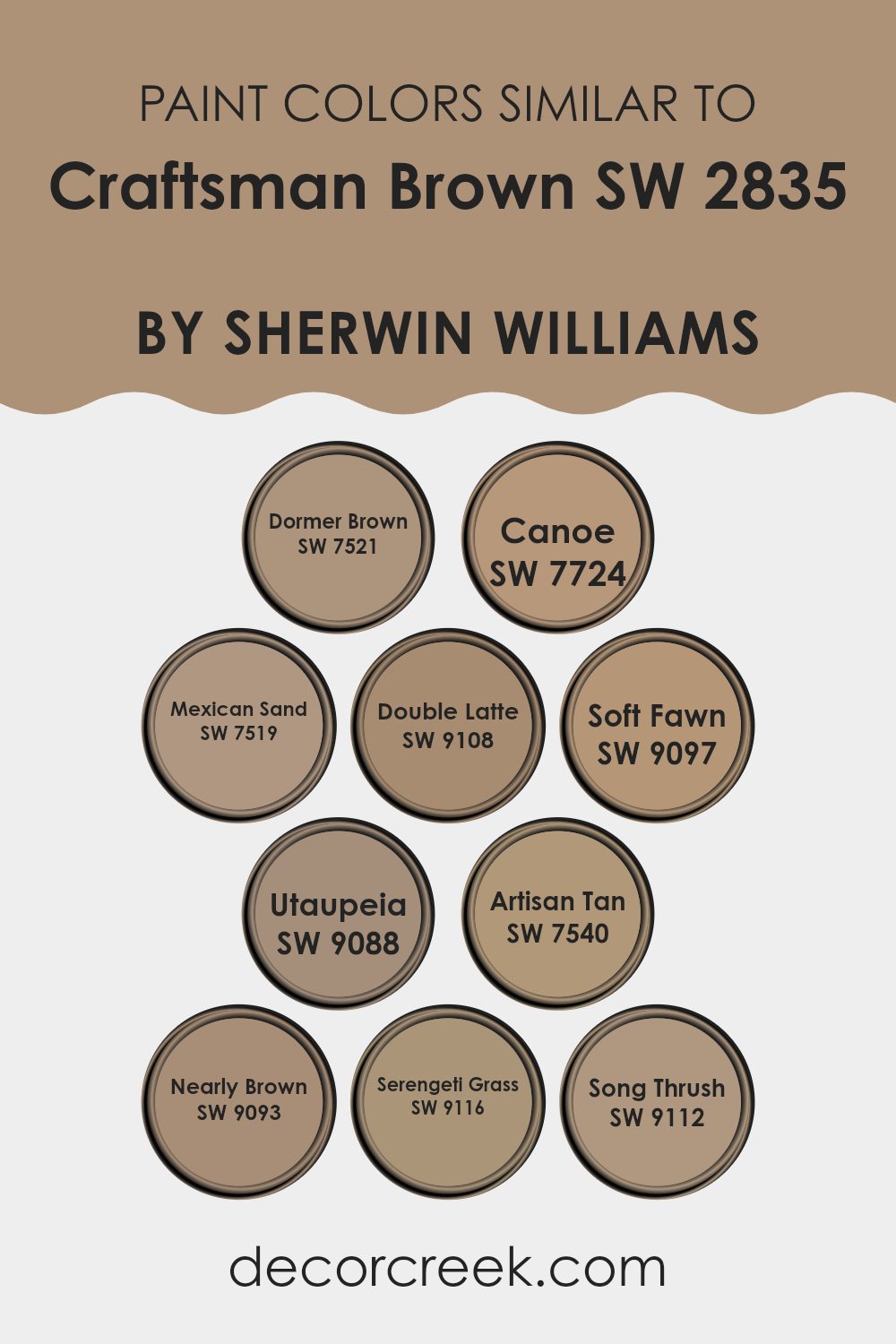
Colors Similar to Craftsman Brown SW 2835 by Sherwin Williams
Similar colors play a crucial role in design because they help in creating harmony and balance, making spaces feel cohesive and thoughtfully put together. Colors like Dormer Brown and Canoe offer subtle variations in hue that can add depth and interest without straying too far from the primary color scheme. Dormer Brown is a rich, earthy brown that brings to mind the sturdy materials of a traditional home’s woodwork. On the other hand, Canoe hints at a deeper, slightly more intense brown, reminiscent of a shadowy forest in the late evening.
Continuing with colors in the same family, Mexican Sand, Double Latte, and Soft Fawn introduce lighter, warmer tones that can soften a space while maintaining a unified look. Mexican Sand has a gently muted tone that suggests sun-warmed beaches, making it ideal for a calm, cozy nook.
Double Latte brings in a creamy, coffee-inspired hue that feels inviting and comforting. Soft Fawn, lighter still, offers a hint of warmth, perfect for brightening rooms without overwhelming them. Utaupeia, Artisan Tan, Nearly Brown, Serengeti Grass, and Song Thrush extend the palette further, providing opportunities to introduce more nuanced color variations.
Utaupeia stands out as a unique blend of gray and taupe, evoking an earthy yet modern atmosphere. Artisan Tan draws inspiration from traditional craftsmanship with a dash of sun-kissed warmth. Nearly Brown is very close to the original color but slightly softer, ideal for creating a gentle transition in spaces.
Serengeti Grass adds an unexpected twist with its greenish undertones, reminiscent of open plains, while Song Thrush is a subtle, brownish-grey tone that whispers of twilight hues. These shades collectively offer a rich tapestry of options that work beautifully together, allowing for versatile design choices that enrich and enhance the aesthetics of any space.
You can see recommended paint colors below:
- SW 7521 Dormer Brown
- SW 7724 Canoe
- SW 7519 Mexican Sand
- SW 9108 Double Latte
- SW 9097 Soft Fawn
- SW 9088 Utaupeia
- SW 7540 Artisan Tan
- SW 9093 Nearly Brown
- SW 9116 Serengeti Grass
- SW 9112 Song Thrush
How to Use Craftsman Brown SW 2835 by Sherwin Williams In Your Home?
Craftsman Brown SW 2835 by Sherwin Williams is a warm, rich brown paint color that adds a cozy and inviting feel to any room in your home. It’s particularly well-suited for living spaces, dining rooms, or any area where you want to create a comfortable and welcoming atmosphere.
This tone pairs beautifully with softer, lighter colors like creams or beige, which can help to balance its depth and intensity. If you’re looking to give your furniture a classic look, Craftsman Brown is an ideal choice for wood items such as cabinets, shelves, or tables.
It also works great on accent walls, serving as a strong backdrop that allows decor items in lighter shades to stand out. This color can act as a grounding element in your decor scheme, creating a cozy, pulled-together look that feels natural and pleasantly homey.
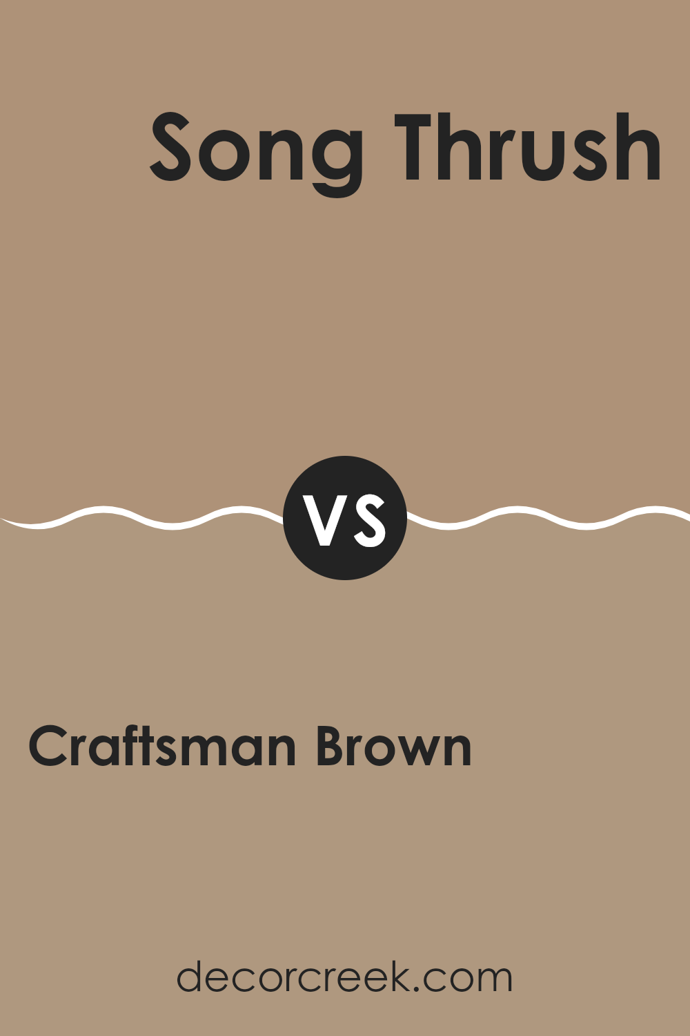
Craftsman Brown SW 2835 by Sherwin Williams vs Song Thrush SW 9112 by Sherwin Williams
Craftsman Brown and Song Thrush are both paint colors offered by Sherwin Williams, but they have distinct tones and moods. Craftsman Brown is a deep, rich brown that feels warm and cozy. It’s a solid color that provides a strong presence and can make a room feel snug and inviting.
On the other hand, Song Thrush is a lighter, softer brown with a more subtle approach. It leans towards a neutral gray-brown that works well in spaces where you want a calm and understated look.
While Craftsman Brown offers a more traditional earthy warmth, Song Thrush is more adaptable and gentle, making it easier to pair with various decor styles. Both colors have their unique appeal, depending on what atmosphere you want to achieve in your space.
You can see recommended paint color below:
- SW 9112 Song Thrush
Craftsman Brown SW 2835 by Sherwin Williams vs Mexican Sand SW 7519 by Sherwin Williams
Craftsman Brown is a rich, deep brown with a subtle warmth to it, making it perfect for lending a cozy and inviting feel to a space. It has a classic vibe that works well in traditional home designs but can also fit into more modern settings when paired with the right elements. This color offers a strong base that complements natural materials such as wood and leather.
On the other hand, Mexican Sand is a lighter, softer brown with a slightly dusty hue. This color creates a calm and welcoming atmosphere but with a more understated approach compared to Craftsman Brown. It’s versatile and neutral, easy to match with various decor styles and other colors, making it an excellent choice for walls in living areas, kitchens, or bedrooms.
While both colors share a grounding nature due to their earthy tones, Craftsman Brown serves as a more robust, statement color, whereas Mexican Sand is better for those looking for a gentle, understated backdrop.
You can see recommended paint color below:
- SW 7519 Mexican Sand
Craftsman Brown SW 2835 by Sherwin Williams vs Nearly Brown SW 9093 by Sherwin Williams
Craftsman Brown and Nearly Brown are two distinct hues by Sherwin Williams. Craftsman Brown presents a deeper, richer shade, resembling the sturdy brown seen in traditional woodworking. This color has an earthy, robust feel, making it ideal for spaces aiming for a grounded and secure atmosphere.
On the other hand, Nearly Brown leans towards a softer, lighter brown, offering a more subdued presence. It gives a gentle warmth to environments, making it perfect for areas where you want a soothing and welcoming vibe without the intensity of darker shades.
The choice between these two would depend on the desired impact: Craftsman Brown for a bold statement, and Nearly Brown for a delicate touch. Their contrasting intensities and tones allow them to suit different decor styles and personal preferences effectively.
You can see recommended paint color below:
- SW 9093 Nearly Brown
Craftsman Brown SW 2835 by Sherwin Williams vs Dormer Brown SW 7521 by Sherwin Williams
Craftsman Brown and Dormer Brown, both from Sherwin Williams, are two distinctive shades of brown that share a warm tone but differ slightly in their depth and impact on spaces. Craftsman Brown stands out with a more vibrant, richer quality. It has a deep, traditional charm that can make any room feel more inviting and cozy. Its robust hue works well in spaces that aim to convey a sense of comfort and stability.
On the other hand, Dormer Brown has a lighter, more subdued presence. It is less intense than Craftsman Brown, offering a subtle elegance that can soften a room while still providing warmth. This color is excellent for areas where you want a calm and less dramatic feel.
Both colors are versatile and can be paired with a wide range of decor styles, from modern to rustic. However, your choice between them would depend on the mood you’re aiming to create – vibrant and rich with Craftsman Brown, or gentle and understated with Dormer Brown.
You can see recommended paint color below:
- SW 7521 Dormer Brown
Craftsman Brown SW 2835 by Sherwin Williams vs Soft Fawn SW 9097 by Sherwin Williams
Craftsman Brown and Soft Fawn by Sherwin Williams are two distinct shades perfect for adding warmth to any space. Craftsman Brown is a deep, rich brown that offers a strong and earthy feel, making it ideal for areas where you want to create a cozy and inviting atmosphere, like in a living room or study.
In contrast, Soft Fawn is much lighter, with a soft beige tone that brings a gentle and soothing ambiance to a space. This color works well in rooms where you want to keep things light and airy, such as bedrooms or home offices.
While both colors lend a natural element to interiors, Craftsman Brown sets a more dramatic mood with its darker hue, whereas Soft Fawn keeps things relaxed and understated. Together, these colors could complement each other well in a home, providing both contrast and continuity in your decorating scheme.
You can see recommended paint color below:
- SW 9097 Soft Fawn
Craftsman Brown SW 2835 by Sherwin Williams vs Serengeti Grass SW 9116 by Sherwin Williams
Craftsman Brown and Serengeti Grass are two distinct paint colors from Sherwin Williams. Craftsman Brown is a deep, rich brown with warm undertones, reminiscent of classic woodwork and traditional settings. It provides a solid, earthy base that can make any room feel cozy and inviting. This color works well in spaces where you want to achieve a timeless, classic look.
On the other hand, Serengeti Grass is a lighter, more muted green with hints of brown. This color is likely to create a calm and natural atmosphere, reminiscent of open fields or a subtle safari vibe. It pairs beautifully with natural elements and materials, adding a gentle touch of the outdoors to any space.
When comparing these two, Craftsman Brown offers robustness and depth, making spaces feel grounded and secure. Serengeti Grass, however, brings in a lighter, refreshing touch that can open up a space and connect it to nature. Each color has its unique appeal and can significantly influence the mood and style of a room.
You can see recommended paint color below:
- SW 9116 Serengeti Grass
Craftsman Brown SW 2835 by Sherwin Williams vs Double Latte SW 9108 by Sherwin Williams
Craftsman Brown and Double Latte are both warm, inviting colors by Sherwin Williams, yet they offer different vibes for a space. Craftsman Brown is a deep, rich brown that provides a strong sense of warmth and coziness. This color works well in areas where you want to create a snug, welcoming atmosphere, making it ideal for living rooms or dining areas.
On the other hand, Double Latte is a lighter, creamy brown that offers a more subtle warmth. It’s less intense than Craftsman Brown and provides a softer look, which can make small spaces appear larger and more open. Double Latte is versatile, fitting nicely into various decor styles, from casual to formal.
In summary, Craftsman Brown brings a bold, cozy feel, making it great for statement spaces, while Double Latte offers a gentle warmth, suitable for creating a light, airy environment. Both colors lend a sense of warmth but in distinctly different intensities and tones.
You can see recommended paint color below:
- SW 9108 Double Latte
Craftsman Brown SW 2835 by Sherwin Williams vs Artisan Tan SW 7540 by Sherwin Williams
The main color, Craftsman Brown, is a deep, warm brown shade that brings a cozy and inviting feeling to spaces. It’s a rich color with a natural earthiness that makes it ideal for areas where you want to promote comfort, such as living rooms or dining areas.
On the other hand, Artisan Tan is lighter and has a more neutral tone. This color is very versatile and works well in various settings, providing a softer backdrop compared to the bolder Craftsman Brown. Artisan Tan gives rooms an open, airy feel, which is great for smaller spaces or places that get a lot of sunlight.
Both colors are from the same company and share an earthy quality, but Craftsman Brown is decidedly darker and warmer, making it feel more intimate. Artisan Tan, being lighter, offers a more subtle and flexible approach, suitable for creating a sense of space and calmness. Each has its unique charm, depending on the mood and size of the area you are decorating.
You can see recommended paint color below:
- SW 7540 Artisan Tan
Craftsman Brown SW 2835 by Sherwin Williams vs Utaupeia SW 9088 by Sherwin Williams
Craftsman Brown and Utaupeia by Sherwin Williams are both neutral tones, but they differ in their warmth and depth. Craftsman Brown is a deep, warm, chocolatey brown which creates a cozy and welcoming feel in any space. This color is great for creating a strong base in rooms, making them feel grounded and comfortable.
On the other hand, Utaupeia is much lighter, sitting comfortably in the taupe family. It’s a soft blend of beige and gray, giving a cleaner and more modern look. This color is versatile, working well in spaces that aim for a lighter, airier feel without becoming too cold, as some grays can.
While both colors can be used in various settings, Craftsman Brown tends to work best in areas where a strong, warm presence is desired, whereas Utaupeia is better for spaces that need a touch of neat and understated elegance. Overall, each color offers unique possibilities depending on the atmosphere you’re aiming to create.
You can see recommended paint color below:
- SW 9088 Utaupeia
Craftsman Brown SW 2835 by Sherwin Williams vs Canoe SW 7724 by Sherwin Williams
Craftsman Brown and Canoe by Sherwin Williams are two distinct colors, each with their unique charm. Craftsman Brown is a deep, rich brown that brings warmth to any space. It has a classic feel, making it perfect for cozy settings like living rooms or study areas. It pairs well with natural materials such as wood and leather, enhancing the earthy vibe of the decor.
On the other hand, Canoe is a subtle, muted green with a hint of gray. This color is versatile and works well in many areas of a home, from kitchens to bedrooms. It gives a calming effect to the environment, offering a soft backdrop that complements both modern and traditional furnishings.
While Craftsman Brown creates a snug, inviting atmosphere, Canoe suggests a peaceful, laid-back setting, making it great for places where you want to relax. Comparing the two, Craftsman Brown offers warmth and richness, whereas Canoe provides a gentle, soothing touch.
You can see recommended paint color below:
- SW 7724 Canoe
Conclusion
Craftsman Brown is a warm and cozy color that makes rooms feel like a nice, big hug. It’s perfect for creating a comfortable and welcoming space in homes, especially in places where families gather like living rooms or dining areas.
This shade of brown is not too dark and not too light, which makes it super easy to match with different types of furniture and decorations. Whether someone has a modern or a more traditional style, Craftsman Brown is a great choice because it looks good with many things.
One of the best parts about this paint is that it can hide small marks or scratches on walls since it’s a darker color. This makes it an excellent choice for busy areas in a house. Also, it works in different types of lighting, looking wonderful whether in natural light from windows or under the lights in the evening.
Overall, SW 2835 Craftsman Brown by Sherwin Williams is a great paint color choice if you want something warm, inviting, and practical for your home. It’s an easy pick that can make any room feel more like ‘home sweet home.’

Ever wished paint sampling was as easy as sticking a sticker? Guess what? Now it is! Discover Samplize's unique Peel & Stick samples.
Get paint samples

