Discover the timeless elegance and sophisticated charm of Sherwin Williams’ SW 7622 Homburg Gray, a color that adds depth and character to any space.
Amid the extensive palette of grays, Homburg Gray stands out with its unique blend of warmth and austerity, making it a versatile choice for both contemporary and traditional interiors.
This nuanced shade draws inspiration from the classic elegance of its namesake, the Homburg hat, which has symbolized refinement and style through the ages.
Homburg Gray envelops rooms in a serene ambiance, striking a perfect balance between light and dark. Its ability to adapt to various lighting conditions allows it to offer multiple facets of its personality, from a comforting retreat in daylight to a cozy enclave by night.
Whether you’re looking to create a statement wall, refresh your cabinetry, or add a touch of sophistication to your exterior, Homburg Gray provides a solid foundation for both monochromatic themes and color schemes with bolder accents.
Professionals and DIY decorators alike appreciate the quality and consistency of Sherwin Williams’ paints, and Homburg Gray is no exception.
Not only does it promise excellent coverage and durability, but it also brings a layer of warmth and complexity to spaces that crave a touch of distinction. Let’s explore how SW 7622 Homburg Gray can transform your space into a reflection of timeless elegance.

What Color Is Homburg Gray SW 7622 by Sherwin Williams?
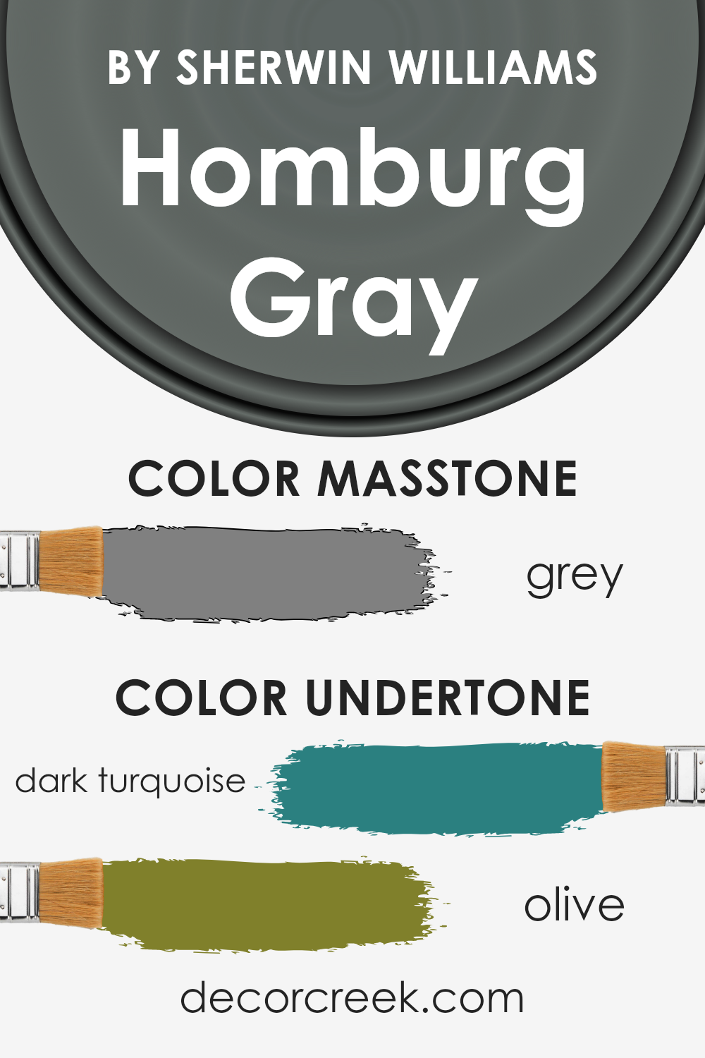
Homburg Gray, a sophisticated hue by Sherwin Williams, presents a unique blend of deep gray with subtle undertones of green, creating a rich, dynamic shade that effortlessly brings elegance into any space.
This color exudes a timeless charm, making it a perfect choice for those seeking to infuse their interiors with a sense of refined grace. Its versatility allows it to transcend mere trends, ensuring that spaces painted with Homburg Gray remain stylish and inviting for years to come.
Perfectly suited for a variety of interior styles, Homburg Gray particularly shines in spaces where a blend of classic and contemporary elements is desired.
Its depth makes it ideal for traditional settings, adding a layer of sophistication, while its nuanced hues can elevate modern and minimalistic designs by introducing warmth and complexity.
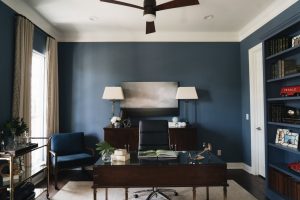
This color works exceptionally well in living rooms, bedrooms, and home offices, creating an atmosphere of calmness and serenity.
When it comes to pairing with materials and textures, Homburg Gray is remarkably adaptable. It forms an exquisite harmony with natural wood finishes, from light oaks to dark walnuts, highlighting their natural beauty.
Metallic accents in gold or brass can introduce a touch of luxury, while pairing with stone textures like marble or granite elevates the overall aesthetic.
For those who prefer a softer approach, fabrics in rich velvets or linens in neutral or jewel tones create a layered, inviting space.
Whether aiming for a look of understated elegance or a bold statement, this versatile shade serves as a stunning backdrop to a wide range of interior compositions.
Ever wished paint sampling was as easy as sticking a sticker? Guess what? Now it is! Discover Samplize's unique Peel & Stick samples.
Get paint samples

Is Homburg Gray SW 7622 by Sherwin Williams Warm or Cool color?
Homburg Gray by Sherwin Williams is a sophisticated and versatile paint color that can significantly enhance the atmosphere of a home. This unique shade is a deep, warm gray that carries subtle green undertones, offering a complex and inviting aesthetic.
Its richness provides an elegant backdrop for a variety of decor styles, from modern to traditional, making it an excellent choice for those seeking a color that combines contemporary finesse with timeless charm.
The depth of Homburg Gray allows it to absorb light and add a cozy, enveloping feel to a room, making it particularly well-suited for spaces intended for relaxation and comfort, such as living rooms or bedrooms.
However, its balanced nature means it doesn’t overwhelm spaces with natural light, instead complementing the brightness with a soft, grounding effect. This duality enables the color to adapt seamlessly to different lighting conditions, highlighting its versatility.
Incorporating Homburg Gray into a home can also serve to enhance architectural features or furniture, offering a stunning contrast to both light and dark hues.
Its ability to serve as a neutral, yet impactful, background makes it an ideal choice for displaying artwork or accent pieces, allowing them to stand out.
Overall, the use of Homburg Gray can transform a home by adding a layer of sophistication and depth, while also providing a warm and inviting environment.
Undertones of Homburg Gray SW 7622 by Sherwin Williams
Homburg Gray, a sophisticated and versatile paint color, carries intriguing undertones that add depth and complexity to its appearance.
The inherent dark turquoise and olive undertones contribute to a rich, adaptive hue that can transform spaces based on ambient lighting and surrounding colors.
These undertones affect the perception of the color significantly, influencing its interaction with both natural and artificial light.
Dark turquoise undertones inject a subtle vibrancy into the gray, adding a cool, serene ambiance to the room.
This cooler undertone can make spaces feel more open and refreshed, especially in well-lit areas where the turquoise can become more pronounced, creating a soothing environment.
On the other hand, the olive undertones bring warmth, grounding the color with an earthy depth.
In spaces with less direct light, or during different times of day when sunlight changes its intensity, these olive undertones can emerge more, lending the color a more organic and cozy feel.
This balance between cool and warm allows Homburg Gray to be remarkably adaptable, fitting a wide range of interior styles and themes.
When applied to interior walls, the dynamic interplay between these undertones enables Homburg Gray to act as both a statement and a neutral backdrop.
It harmonizes with a wide spectrum of decor elements, from bold and vibrant accents to understated, minimalist pieces.
Whether aiming for a sleek, contemporary vibe or a more traditional, comforting atmosphere, this color adjusts its character accordingly, proving to be a versatile choice for interior designers and homeowners alike.
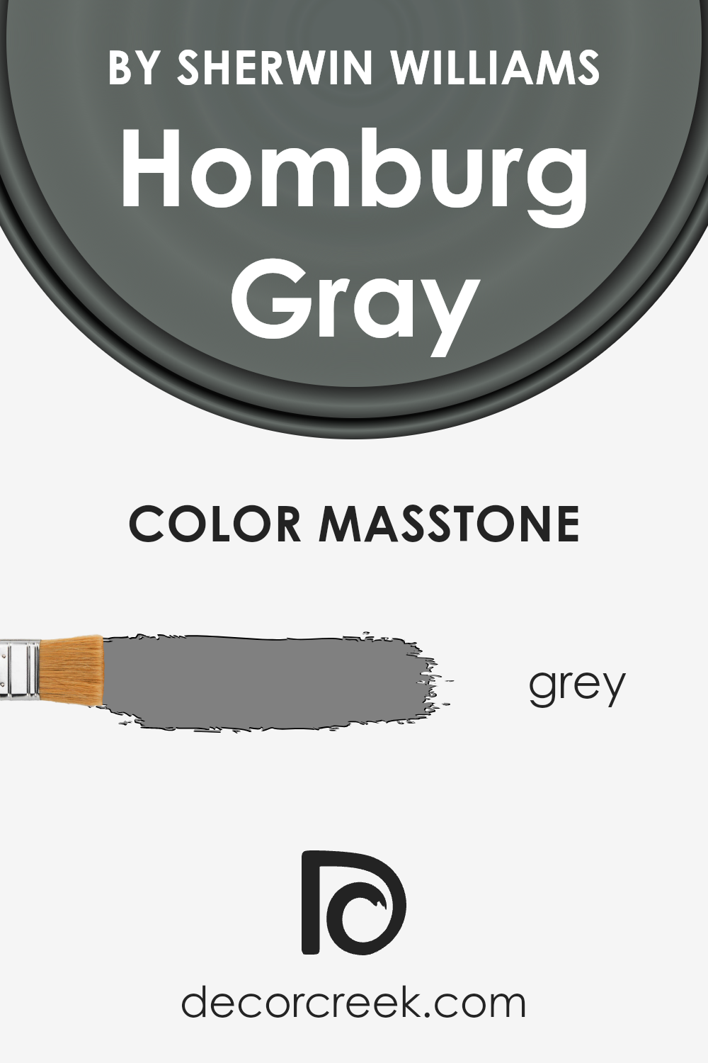
What is the Masstone of the Homburg Gray SW 7622 by Sherwin Williams?
Homburg Gray, with its masstone closely aligned to the classic grey (#808080), offers a unique blend of depth and neutrality which elegantly harmonizes with various design aesthetics in homes.
This specific shade of grey stands out by providing a robust backbone to color schemes, adeptly balancing between warm and cool tones. As a result, it creates a versatile foundation that can adapt to a wide array of decorative elements, from contemporary to traditional.
Its inherent stability makes it an ideal choice for living spaces, enhancing textures and materials without overpowering them. In bedrooms, it introduces a calming effect, encouraging relaxation.
In more communal areas such as living rooms or kitchens, Homburg Gray acts as an excellent backdrop for both vibrant and muted accents, allowing personal styles to shine without clashing.
Furthermore, its depth adds sophistication and a sense of grounding, making spaces feel more cohesive and thoughtfully curated.
This adaptability and the subtle elegance of Homburg Gray significantly affect its efficacy in transforming homes into stylish yet comfortable havens.
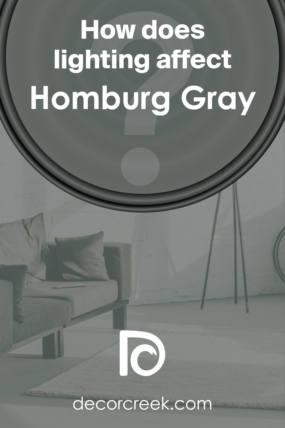
How Does Lighting Affect Homburg Gray SW 7622 by Sherwin Williams?
Lighting plays a crucial role in the perception of colors, significantly influencing their appearance and the ambiance they create in a space.
When considering a specific color, such as Homburg Gray, its interaction with light can vastly change its visual impact.
This versatile shade can fluctuate from a deep, moody hue to a softer, more serene gray depending on the light source, making it an intriguing choice for interior spaces.
In artificial light, the nuances of Homburg Gray can either be intensified or subdued. Under warm, incandescent lighting, it tends to appear warmer and more inviting, with its gray tones taking on a slightly earthy quality.
Conversely, in cooler fluorescent or LED lighting, Homburg Gray can look more stern and refined, with its blue undertones becoming more pronounced, lending a sharper, more contemporary feel to a room.
Natural light brings another dimension to Homburg Gray, showcasing its adaptability.
In north-facing rooms, which receive cooler, indirect light, this color might appear more consistent throughout the day but lean towards its cooler, more muted tones, enhancing a serene and contemplative ambiance.
South-facing rooms bask in warm, direct sunlight, which can illuminate Homburg Gray to reveal its more complex, warm undertones, making the space feel cozier and more welcoming.
East-facing rooms see the most change in Homburg Gray, with the morning light casting a bright, warm glow that softens the color, making it appear gentler and more nuanced.
As the day progresses and the direct light fades, Homburg Gray shifts back to its more natural, cooler state, maintaining a balance between warmth and sophistication.
Meanwhile, in west-facing rooms, the situation reverses; the color stays true to its cooler base during the day and warms up in the evening light, capturing a more relaxed and inviting mood as the sun sets.
In summary, Homburg Gray exhibits an exceptional ability to adapt to different lighting conditions, making it a sophisticated choice for any space.
Whether illuminated by the sun’s path or defined by artificial lighting types, this dynamic color can bring a range of atmospheres to a room, from calming and introspective to warm and inviting.
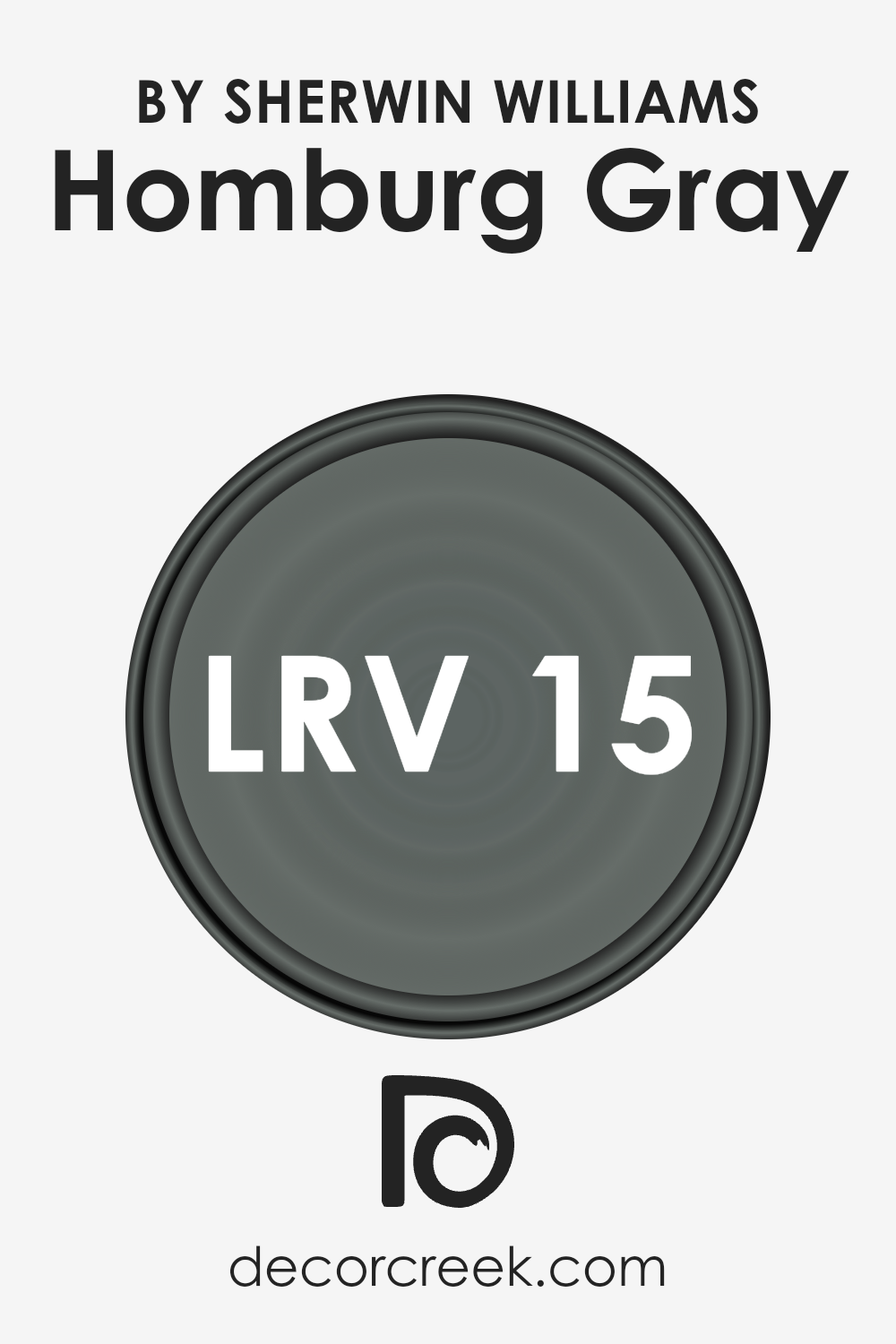
What is the LRV of Homburg Gray SW 7622 by Sherwin Williams?
Light Reflectance Value (LRV) measures the amount of visible and usable light that a color reflects or absorbs.
It is a critical concept in the world of paint and coatings, operating on a scale from 0 to 100; where 0 signifies absolute black that absorbs all light, and 100 reflects pure white, reflecting all light back into the room.
LRV is not just a number; it significantly influences how a color appears in a space, affecting the ambiance, mood, and even the perceived size of a room.
High LRV colors make spaces appear larger and more illuminated, as they reflect more light. Conversely, low LRV colors create a sense of coziness and intimacy but can make a room feel smaller and dimmer since they absorb more light.
Given its LRV of 14.691, Homburg Gray is on the lower end of the scale, meaning it absorbs much more light than it reflects.
This characteristic influences how it behaves visually on walls, contributing to a rich, deep ambiance that can significantly define a space.
This lower LRV implies that in rooms with less natural light, Homburg Gray may appear almost black, enveloping the space in a sense of sophistication yet potentially making it seem smaller.
In well-lit areas, however, the color can show its complex undertones, providing a dynamic backdrop that shifts with the lighting conditions.
The choice of this particular LRV color can therefore dramatically alter a room’s appearance and feel, making lighting considerations crucial in the design process.
LRV – what does it mean? Read This Before Finding Your Perfect Paint Color
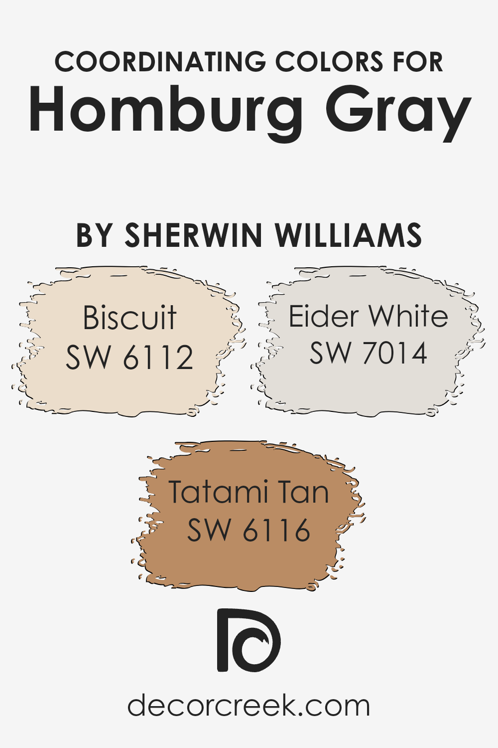
Coordinating Colors of Homburg Gray SW 7622 by Sherwin Williams
Coordinating colors are hues that harmonize with a primary color, enhancing the overall aesthetic of a space without overwhelming it.
These complementary shades work together to create a cohesive look, often by balancing warm and cool tones or by offering a variety of depths and intensities.
For Homburg Gray, a sophisticated and versatile shade by Sherwin Williams, selecting the right coordinating colors is key to achieving a polished and inviting atmosphere.
Biscuit, a warm and inviting light beige, introduces a comforting and soft ambiance that can brighten spaces while complementing the depth of Homburg Gray.
This subtle blend creates a seamless transition between more pronounced colors and softer tones, ideal for living spaces or bedrooms seeking a hint of coziness without sacrificing elegance.
Tatami Tan, on the other hand, offers a bit more depth with its rich, earthy presence. This color adds warmth and natural elements into the mix, invoking a sense of calm and stability when paired with the cooler notes of Homburg Gray.
Eider White serves as a refreshing counterbalance; its crisp, clean appearance brings a lightness and modernity that can open up a room.
Its ability to act as a transitional color enhances both the warmer tones of Biscuit and Tatami Tan and the cooler, sophisticated essence of Homburg Gray, ensuring a harmonious and balanced palette.
You can see recommended paint colors below:
- SW 6112 Biscuit
- SW 6116 Tatami Tan
- SW 7014 Eider White
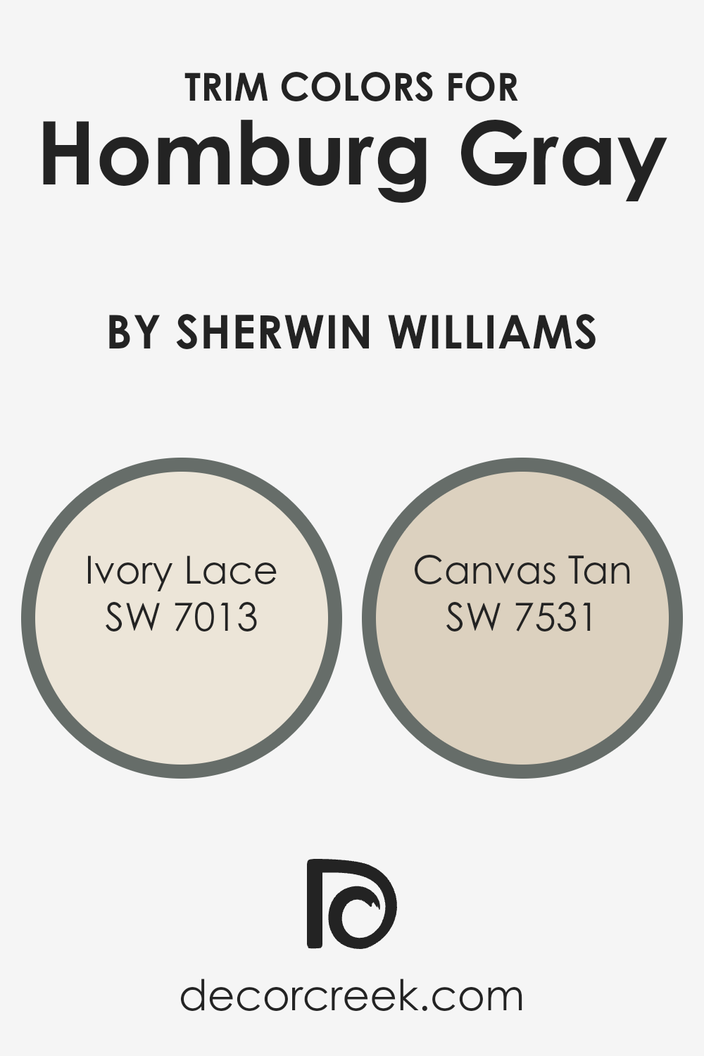
What are the Trim colors of Homburg Gray SW 7622 by Sherwin Williams?
Trim colors play a significant role in defining the aesthetic appeal and visual flow of a space, acting as a frame that enhances the wall color it borders.
For a sophisticated shade like Homburg Gray by Sherwin Williams, choosing the right trim color is crucial to either subtly complement the gray, adding to its elegance, or providing a striking contrast that highlights the wall’s rich undertones.
Ivory Lace and Canvas Tan are two exceptional choices for trim colors that can beautifully complete the look of a room adorned in Homburg Gray.
Ivory Lace is a soft, warm white with subtle creamy undertones, offering a delicate contrast that brightens the sophisticated depth of Homburg Gray, making the space feel more inviting and spacious.
Canvas Tan, on the other hand, is a neutral, mid-tone beige with a hint of warmth that echoes the natural elements of a room, providing a slightly more pronounced, yet harmonious contrast against the cooler tones of Homburg Gray.
Both trim colors ensure the walls are the focal point, while seamlessly integrating with the overall palette, creating an ambience of refined cohesion.
You can see recommended paint colors below:
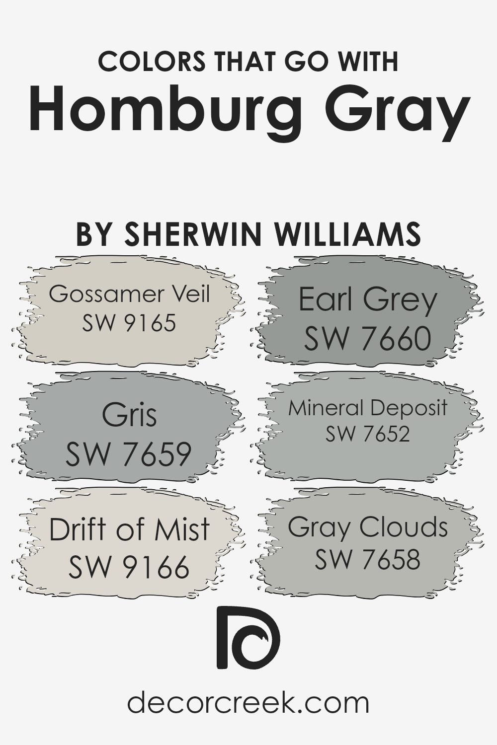
Colors that Go With Homburg Gray SW 7622 by Sherwin Williams
Choosing the right colors to complement Homburg Gray SW 7622 by Sherwin Williams is key to creating a visually appealing space. These coordinating colors, such as Gossamer Veil, Gris, Drift of Mist, Earl Grey, Mineral Deposit, and Gray Clouds, play a crucial role.
They not only enhance the beauty of Homburg Gray but also help in achieving a balanced and harmonious look in your decor. By selecting these complementing shades, you create a sophisticated palette that allows Homburg Gray to stand out while ensuring the space feels connected and thoughtfully put together.
- Gossamer Veil SW 9165 is a soft, warm neutral that provides a subtle contrast to Homburg Gray, offering a light and airy feel to any room.
- Gris SW 7659 brings a slight hint of warmth, adding depth when paired with Homburg Gray.
- Drift of Mist SW 9166 is a lighter, ethereal color creating a seamless transition between the deeper tones of Homburg Gray and the brighter aspects of a space.
- Earl Grey SW 7660, with its rich depth, echoes the sophistication of Homburg Gray, reinforcing an elegant theme.
- Mineral Deposit SW 7652 is a cooler, muted shade that complements the cooler undertones in Homburg Gray, promoting a serene atmosphere.
- Lastly, Gray Clouds SW 7658 offers a mid-tone gray that bridges the gap between the lighter and darker shades, ensuring a cohesive look throughout.
Together, these colors work in harmony with Homburg Gray to achieve a beautiful, balanced aesthetic.
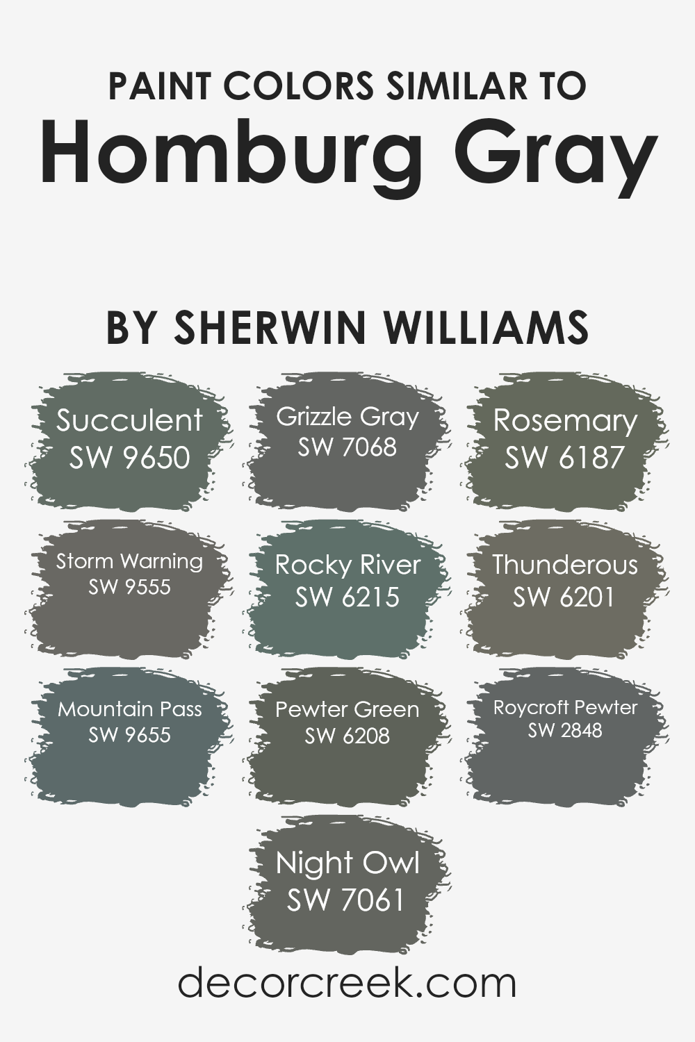
Colors Similar to Homburg Gray SW 7622 by Sherwin Williams
Selecting similar colors to Homburg Gray by Sherwin Williams is crucial for creating a cohesive and refined color palette in any interior or exterior design.
These similar colors are essential because they allow for subtle variations that can add depth and complexity to spaces without overwhelming them.
Working with shades like Succulent and Storm Warning, for example, offers a spectrum of grays that can evoke different moods and atmospheres, from serene and calming to bold and dramatic.
Similarly, Mountain Pass, Night Owl, and Grizzle Gray extend this palette into the realm of deeper, more mysterious tones, which can anchor a space and provide a striking backdrop for both modern and traditional décor.
Colors like Rocky River, Pewter Green, and Rosemary introduce an earthy, natural element to the palette, bridging the gap between cool grays and warmer, organic hues.
These colors harmonize with natural materials like wood and stone, enhancing the textures and bringing an inviting warmth to the environment.
On the other hand, Thunderous and Roycroft Pewter lean towards a more historical and timeless appeal, offering a nod to classic design elements while remaining firmly rooted in contemporary tastes.
Each of these colors, while similar to Homburg Gray, has its own unique character, allowing for a versatile range of design options that can be tailored to express individual styles and preferences while maintaining a sense of unity and flow throughout a space.
You can see recommended paint colors below:
- SW 9650 Succulent
- SW 9555 Storm Warning
- SW 9655 Mountain Pass
- SW 7061 Night Owl
- SW 7068 Grizzle Gray
- SW 6215 Rocky River
- SW 6208 Pewter Green
- SW 6187 Rosemary
- SW 6201 Thunderous
- SW 2848 Roycroft Pewter
How to Use Homburg Gray SW 7622 by Sherwin Williams In Your Home?
Homburg Gray is a versatile paint color from Sherwin Williams that brings an understated elegance to any space.
This sophisticated shade is a deep, warm gray with green undertones, making it a perfect choice for those looking to create a serene and inviting ambiance in their homes.
Unlike cooler grays, Homburg Gray’s warmth allows it to pair beautifully with a wide range of decor styles, from modern minimalist to cozy traditional.
In the home, Homburg Gray works wonders in living rooms, bedrooms, and even kitchens, offering a chic backdrop that complements both bold and muted color palettes.
For a harmonious look, consider pairing it with soft whites or creams on trim and ceilings to highlight its depth. In spaces with ample natural light, Homburg Gray reveals its rich tones, while in dimmer areas, it can add a cozy, enveloping feel.
Whether as an accent wall to draw the eye or as a base color to ground your decor, this color provides a timeless canvas that enhances the beauty of your home’s interiors.
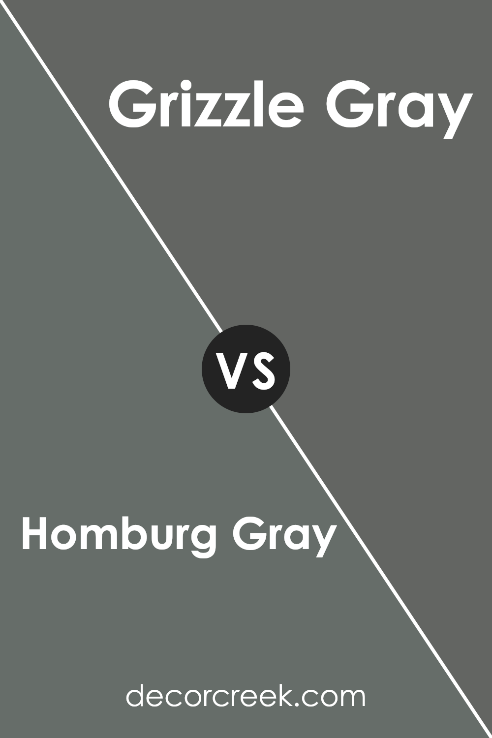
Homburg Gray SW 7622 by Sherwin Williams vs Grizzle Gray SW 7068 by Sherwin Williams
Homburg Gray and Grizzle Gray, both from Sherwin Williams, present fascinating shades of gray that cater to varying preferences in design. Homburg Gray emanates a subtle warmth with its deep, rich tone that borders on a comforting charcoal.
This color boasts an understated sophistication, making it perfect for spaces seeking a blend of modernity and coziness. On the other hand, Grizzle Gray reveals a cooler undertone, aligning more closely with slate.
It is lighter than Homburg Gray, providing a fresh, contemporary vibe that enhances the perception of space. Grizzle Gray serves well in areas that benefit from a calm and collected atmosphere, offering a serene backdrop that complements various decor styles.
Both colors, while sharing a fundamental gray base, diverge in their warmth and depth, offering distinct choices for those looking to imbue their spaces with a specific character.
You can see recommended paint color below:
Homburg Gray SW 7622 by Sherwin Williams vs Succulent SW 9650 by Sherwin Williams
Homburg Gray and Succulent stand out as distinct shades in the Sherwin Williams palette, each bringing a unique vibe. Homburg Gray is a deep, sophisticated shade with a blend of gray and subtle blue undertones, conveying a sense of calm and refinement.
It evokes a classic, timeless feel, making it perfect for elegant spaces and a neutral base in interiors. On the other hand, Succulent offers a fresh, vibrant approach with its green hue that leans towards a natural, rejuvenating essence.
This color brings an outdoor freshness inside, revitalizing any space with its lively character.
While Homburg Gray suggests a serene, composed environment ideal for creating a tranquil retreat, Succulent introduces an element of vitality and energy, ideal for spaces meant to inspire or invigorate.
Together, these colors could complement each other, with Homburg Gray providing a grounded backdrop to the lively pop of Succulent, harmoniously blending sophistication with vivacity.
You can see recommended paint color below:
Homburg Gray SW 7622 by Sherwin Williams vs Roycroft Pewter SW 2848 by Sherwin Williams
Homburg Gray and Roycroft Pewter, both by Sherwin Williams, offer distinct yet subtly nuanced palettes for interior and exterior designs. Homburg Gray is a deep, warm gray with a comforting presence that brings sophistication and a sense of calm to spaces.
Its ability to adapt to both modern and traditional settings makes it a versatile choice for decorators aiming to create a grounding atmosphere.
On the other hand, Roycroft Pewter leans towards a darker, more intense shade, encapsulating an earthy tone with hints of green undertones.
This color is perfect for creating dramatic, cozy environments, offering a rich backdrop that complements natural wood tones and metallic accents beautifully.
While both colors share a base in the gray spectrum, Homburg Gray provides a lighter, more adaptable foundation suitable for a wide range of lighting situations.
Roycroft Pewter, with its deeper and slightly warmer hues, commands attention, making it an ideal choice for feature walls or areas where a bold statement is desired.
Together, these colors represent the diverse and dynamic range of options available for creating elegant and inviting interiors.
You can see recommended paint color below:
- SW 2848 Roycroft Pewter
Homburg Gray SW 7622 by Sherwin Williams vs Storm Warning SW 9555 by Sherwin Williams
Homburg Gray and Storm Warning, both by Sherwin Williams, embody distinct shades that add depth and character to spaces. Homburg Gray is an elegant, deep gray with subtle blue undertones that evoke a sense of sophistication and tranquility.
Its richness lends itself well to creating cozy, refined areas, making it a popular choice for living rooms and bedrooms where warmth and serenity are desired.
On the other hand, Storm Warning leans towards a darker, more dramatic hue. It’s a bold color that combines gray with deeper blue elements, offering an intensity that can anchor a room or accentuate specific areas with a striking statement.
Its versatility is evident in its ability to blend with various decors, providing a modern, edgy feel to spaces.
When comparing the two, Homburg Gray offers a softer, more muted palette, ideal for those seeking a calm and soothing environment.
Storm Warning, however, is for the more adventurous, adding a layer of drama and sophistication. The choice between them depends on the desired aesthetic effect and the atmosphere one wishes to create within a space.
You can see recommended paint color below:
- SW 9555 Storm Warning
Homburg Gray SW 7622 by Sherwin Williams vs Thunderous SW 6201 by Sherwin Williams
Homburg Gray and Thunderous, both from Sherwin Williams, present a compelling study in nuanced color differences that can dramatically affect the atmosphere of a space.
Homburg Gray, with its deep, complex blend, veers towards a traditional gray with subtle undertones that can evoke a sense of sophistication and timeless elegance. It’s the kind of color that offers depth and warmth, making spaces feel grounded yet expansive.
On the other hand, Thunderous takes a slightly different approach. It is a shade that straddles the line between gray and the softest whisper of blue, giving it a cooler, more serene vibe.
This color has the power to transform spaces into tranquil havens, ideal for creating a calm and collected ambiance.
Both colors share a versatility that allows them to fit seamlessly into a variety of decorative styles, from modern minimalist to cozy traditional.
However, the warmth of Homburg Gray offers a comforting embrace, making it perfect for living areas and bedrooms. In contrast, the cool tranquility of Thunderous can refresh and calm, making it ideal for bathrooms and spaces dedicated to relaxation.
Choosing between them hinges on the desired emotional and aesthetic impact in the space.
You can see recommended paint color below:
- SW 6201 Thunderous
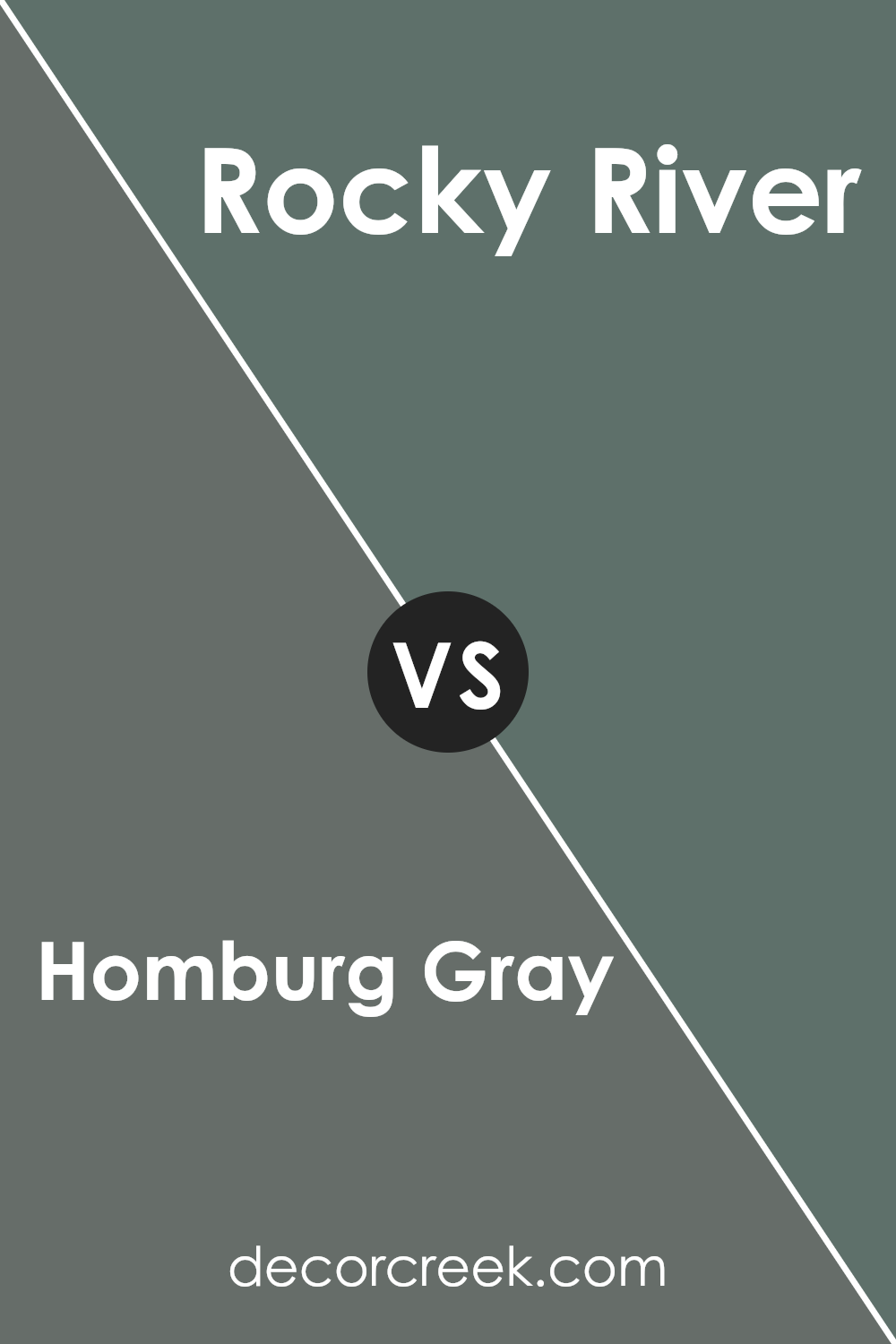
Homburg Gray SW 7622 by Sherwin Williams vs Rocky River SW 6215 by Sherwin Williams
Homburg Gray and Rocky River, both from Sherwin Williams, present a nuanced palette of sophisticated tones perfect for creating serene and elegant spaces.
Homburg Gray manifests as a deep, charcoalesque gray, imbuing spaces with a profound sense of calm and groundedness.
Its versatility lies in its ability to serve as both a bold statement or a subtle background, depending on the lighting and accompanying decor.
On the other hand, Rocky River introduces a richer, earthier tone into interiors. This color, reminiscent of the natural elegance found in a serene waterway, carries a hint of green beneath its dominant gray exterior, offering a unique blend that feels both organic and refined.
While Homburg Gray leans towards a cooler, more neutral gray, making it ideal for modern and minimalist designs, Rocky River tends towards a warmer, more inviting palette that works well in traditional or nature-inspired settings.
Both colors offer depth and complexity, but the choice between them ultimately hinges on the desired mood and the specific characteristics of the space they will inhabit.
You can see recommended paint color below:
- SW 6215 Rocky River
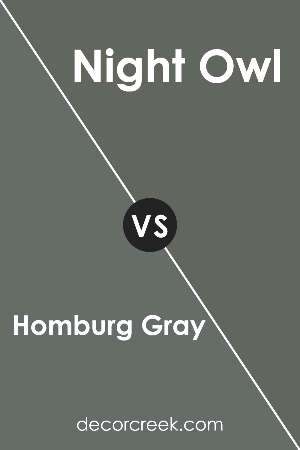
Homburg Gray SW 7622 by Sherwin Williams vs Night Owl SW 7061 by Sherwin Williams
Homburg Gray and Night Owl, both from Sherwin-Williams, are sophisticated hues that cater to distinct yet harmonious design aesthetics. Homburg Gray stands out with its deep, smoky undertones, presenting a rich blend that evokes a sense of quiet elegance.
This color is versatile, straddling the line between gray and a soft, charcoal-like presence, making it an ideal choice for spaces intended to exude a refined, yet understated opulence.
In contrast, Night Owl offers a gentler approach to the dark palette. It’s a nuanced shade that leans more towards a muted, soft gray with green undertones, casting a calm and serene ambiance.
This color is particularly apt for creating a soothing environment, promoting a sense of tranquility and peace.
While both colors share a grounding in gray, Homburg Gray leans towards a darker, more pronounced presence, ideal for statement spaces or accent walls that command attention.
Night Owl, on the other hand, is subdued and lends itself to broader application, enhancing the sense of space and light in a room. Together, they illustrate the versatility and depth of gray, each bringing its unique character to interior spaces.
You can see recommended paint color below:
- SW 7061 Night Owl
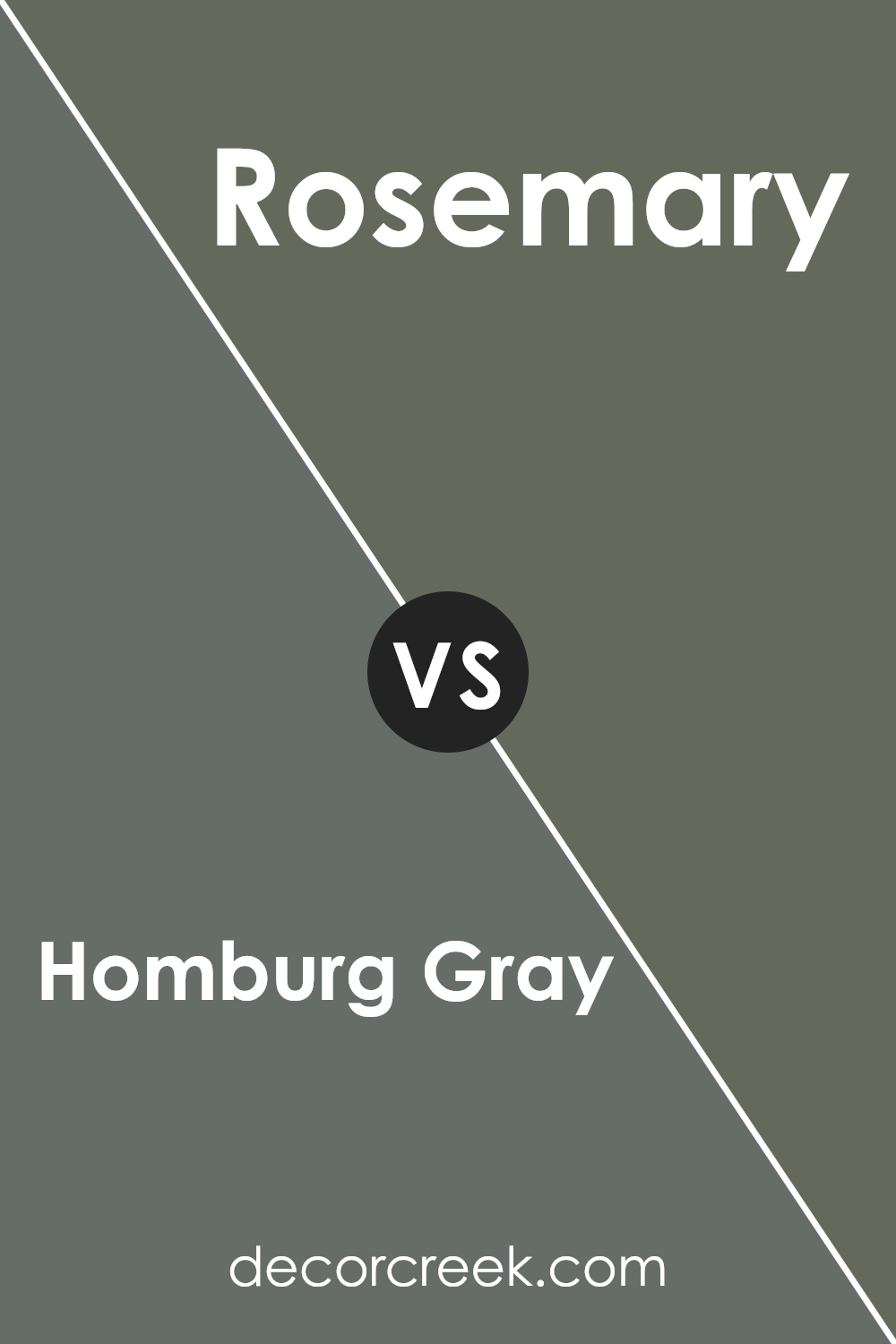
Homburg Gray SW 7622 by Sherwin Williams vs Rosemary SW 6187 by Sherwin Williams
Homburg Gray and Rosemary are two exemplary colors from Sherwin Williams, each portraying a unique aesthetic and mood. Homburg Gray is a deep, muted gray with subtle blue undertones, offering a sophisticated and timeless appeal.
It’s versatile, serving well in spaces that aim for a contemporary yet understated elegance. This color can make small rooms feel more expansive or bring a calming, collected feel to larger areas.
On the other hand, Rosemary is a rich, earthy green with undertones that can veer slightly towards olive, grounding spaces with its natural, comforting presence.
It draws inspiration from nature, making it perfect for areas where a sense of renewal and tranquility is desired. Rosemary can create an intimate ambiance in larger rooms or add depth and complexity to smaller spaces without overwhelming them.
Together, Homburg Gray and Rosemary complement each other beautifully, with the cool, refined grace of Homburg Gray balancing the warm, organic feel of Rosemary.
This combination can harmonize well in a variety of settings, from modern to rustic, proving that these colors, while distinct, are incredibly adaptive and stylish.
You can see recommended paint color below:
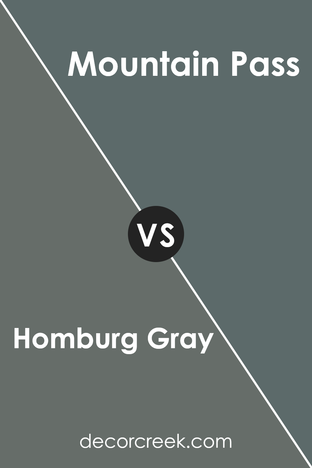
Homburg Gray SW 7622 by Sherwin Williams vs Mountain Pass SW 9655 by Sherwin Williams
Homburg Gray and Mountain Pass, both from Sherwin Williams, offer distinct atmospheres to any space. Homburg Gray presents as a deep, sophisticated gray with a slight blue undertone, giving it a serene and stately quality.
This color is versatile, easily complementing a wide range of decor styles, from modern to traditional. It’s particularly effective in creating a focused, calm environment, making it ideal for living rooms or home offices.
On the other hand, Mountain Pass introduces a darker, more enveloping tone. It veers towards a richer, nature-inspired palette, with its deep green hue hinting at dense forestry and outdoor serenity.
This color is perfect for adding depth and intrigue to a room, fostering an intimate atmosphere. It’s excellent for bedrooms or reading nooks where the goal is to create a cozy retreat.
While both colors provide a sense of tranquility, Homburg Gray leans towards a cooler, more neutral ambiance, whereas Mountain Pass offers warmth and depth, drawing inspiration from natural elements.
Each color creates a unique vibe, making the choice between them dependent on the desired mood and style of the room.
You can see recommended paint color below:
- SW 9655 Mountain Pass
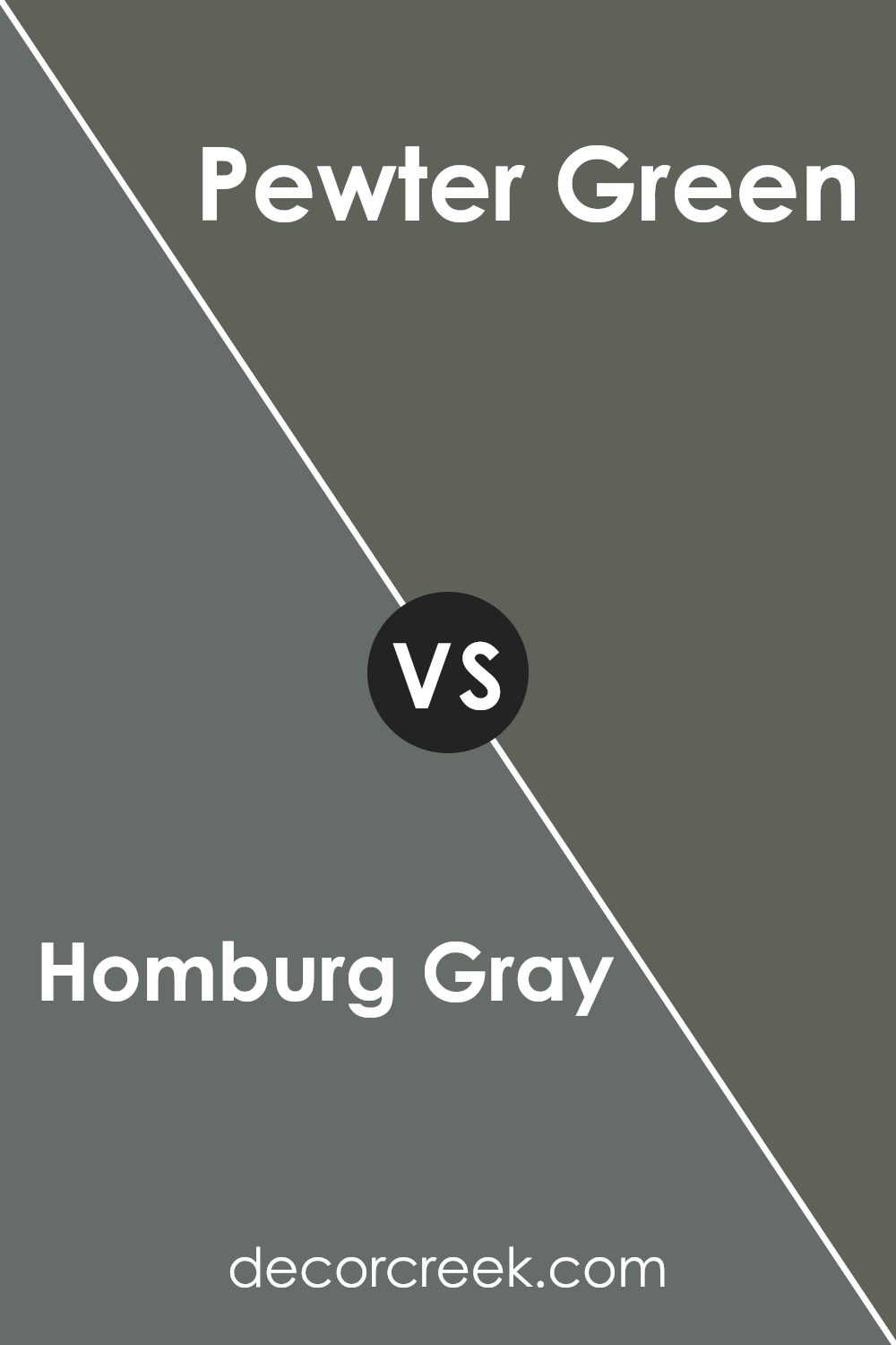
Homburg Gray SW 7622 by Sherwin Williams vs Pewter Green SW 6208 by Sherwin Williams
Homburg Gray and Pewter Green, both by Sherwin Williams, offer unique yet harmonious options for those looking to imbue their spaces with depth and sophistication.
Homburg Gray presents itself as an elegant, muted gray with subtle blue undertones, providing a serene and versatile backdrop that easily complements a variety of decor styles. Its restrained sophistication makes it perfect for creating a tranquil, refined atmosphere in any room.
On the other hand, Pewter Green stands out with its rich, deep green hue that carries gray undertones, giving it a grounding, earthy quality.
This color exudes an aura of natural elegance and brings a touch of the outdoors inside, offering a sense of calm and connection to nature. While it makes a bolder statement, it remains remarkably adaptable to various design aesthetics.
Both colors share a sophisticated versatility, but where Homburg Gray leans towards a neutral, calming gray with a hint of warmth, Pewter Green dives into a deeper narrative with its green-gray tones that recall the understated beauty of natural elements.
Whether used independently or together, these Sherwin Williams shades offer distinct pathways to achieving a space that feels both refined and welcoming.
You can see recommended paint color below:
Conclusion
In conclusion, Homburg Gray by Sherwin Williams is a versatile and sophisticated paint color that brings a touch of elegance and depth to any space it graces.
Its unique blend of gray tones strikes a perfect balance, offering neither too warm nor too cool an appearance, making it an ideal choice for a variety of design aesthetics and applications.
Whether used in a cozy living room, a serene bedroom, or a chic office space, this color provides a solid foundation that complements a wide range of decor styles, from contemporary to traditional.
Its adaptability and timeless nature ensure that it remains a popular choice among homeowners and interior designers alike.
Moreover, the resilience and quality of the paint reflect Sherwin Williams’ commitment to delivering high-standard products. Homburg Gray not only elevates the visual appeal of a room but also contributes to a comforting and inviting atmosphere.
Its ability to pair well with both bold and subdued colors allows for creative freedom in designing spaces that speak to personal tastes and preferences.
As people continue to seek out colors that offer both beauty and functionality, Homburg Gray stands out as a go-to option that promises durability and style, cementing its place in the palette of preferred choices for home improvement projects.
Ever wished paint sampling was as easy as sticking a sticker? Guess what? Now it is! Discover Samplize's unique Peel & Stick samples.
Get paint samples