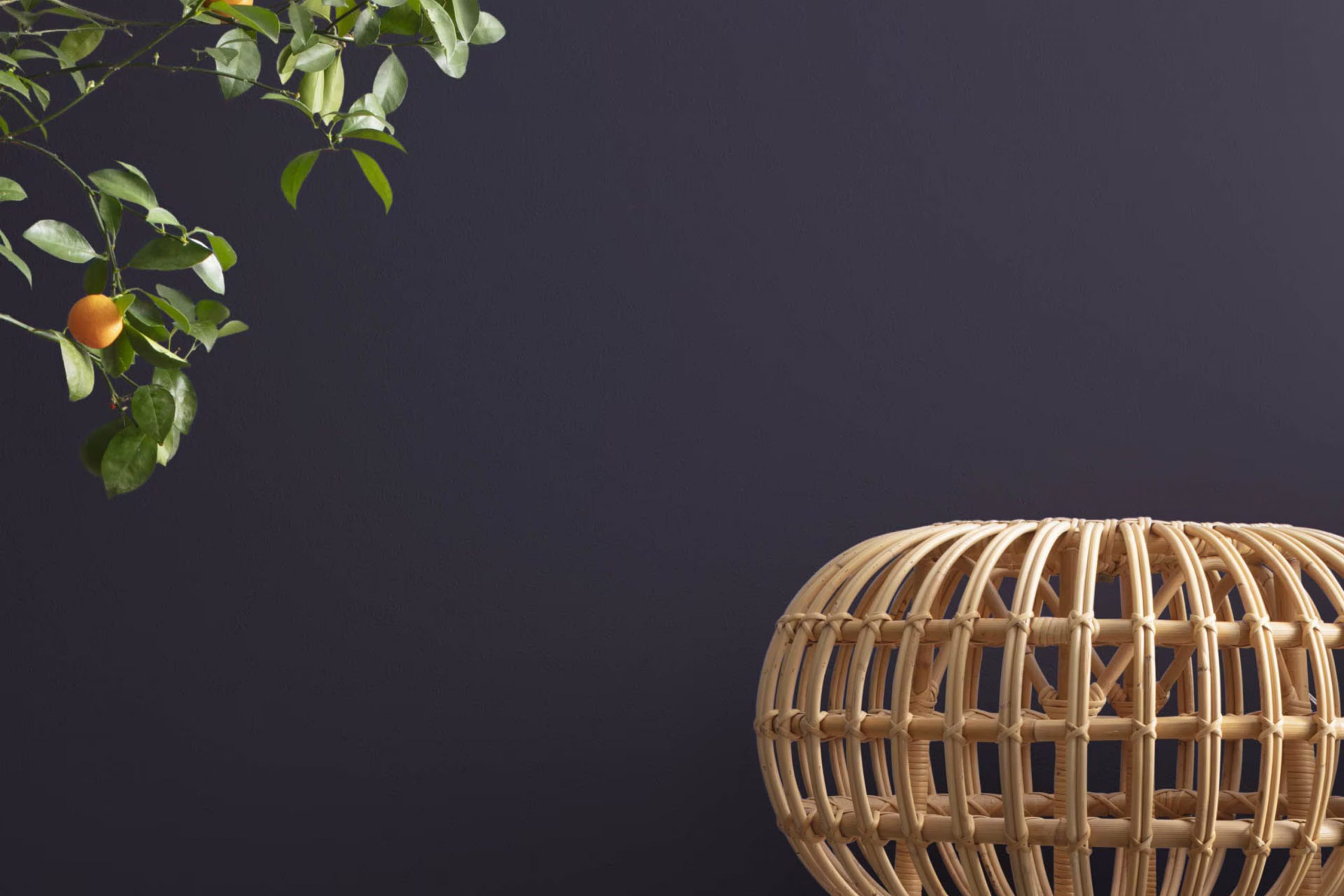
When you first see 2069-10 Deep Mulberry by Benjamin Moore, it might just take your breath away. This deep, rich hue walks a fine line between red and purple, offering a boldness that’s both warm and inviting. If you’re thinking about rejuvenating a room or giving your home a touch of refinement, this color could be the perfect choice.
Imagine it in your living room or dining area, where it can create an atmosphere of elegance and comfort. As someone who’s always looking for ways to add unique character to areas, I find Deep Mulberry intriguing because it adapts seamlessly to various lighting conditions, changing subtly to showcase different aspects of its personality.
During the day, it seems lively and vibrant, while at night, it turns into a cozy, enveloping backdrop. Whether you’re looking to paint a whole room or just an accent wall, Deep Mulberry has a wonderfully dramatic effect that doesn’t overpower.
It pairs well with soft neutrals or can be paired with contrasting colors for more dynamic interiors.
What Color Is Deep Mulberry 2069-10 by Benjamin Moore?
Deep Mulberry by Benjamin Moore is a rich, vibrant shade that resembles the juicy interior of a ripe mulberry fruit. This bold color immediately draws attention and can add a lively splash to any room. It is particularly effective when used as an accent wall or in a room where you want to make a strong style statement.
The boldness of Deep Mulberry pairs exceptionally well with neutral tones such as soft grays, warm beiges, and creamy whites. These combinations allow the intense hue to stand out without overpowering the area. When it comes to materials, this color goes beautifully with natural wood, adding warmth and natural texture to the environment.
Leather in dark tones and metallic finishes such as brass or gold also complement the richness of this shade, creating a luxurious feel.
Deep Mulberry works best in interior styles that appreciate dramatic and moody elements. It is ideal for art deco themes due to its bold, decisive personality. This color is also a great choice for modern or contemporary settings that enjoy a pop of color.
In terms of textiles, velvety fabrics and thick, woven materials can enhance the cozy yet dramatic effect of Deep Mulberry, making areas feel more inviting and lively.

Is Deep Mulberry 2069-10 by Benjamin Moore Warm or Cool color?
Deep Mulberry 2069-10 by Benjamin Moore is a rich and vibrant paint color that brings a bold, cozy warmth to any room. Its deep berry hue makes it ideal for creating a statement wall or for adding depth to a smaller area. When used in a home, this color can make large rooms feel more intimate, while its intensity can add a sense of coziness and comfort to compact areas.
The beauty of Deep Mulberry lies in its adaptability. It pairs well with a wide range of colors, from neutrals like grey and white, which help balance its richness, to more vibrant tones that complement its depth. This makes it a great choice for living rooms, bedrooms, or even dining areas.
Because of its strong presence, lighting plays a crucial role in how this color is perceived in a home. Natural light brings out the vibrancy of the shade, whereas artificial lighting can deepen its tone, making it perfect for setting a relaxed, warm mood in the evenings. Overall, Deep Mulberry is perfect for anyone looking to add a touch of cozy drama to their home.
Undertones of Deep Mulberry 2069-10 by Benjamin Moore
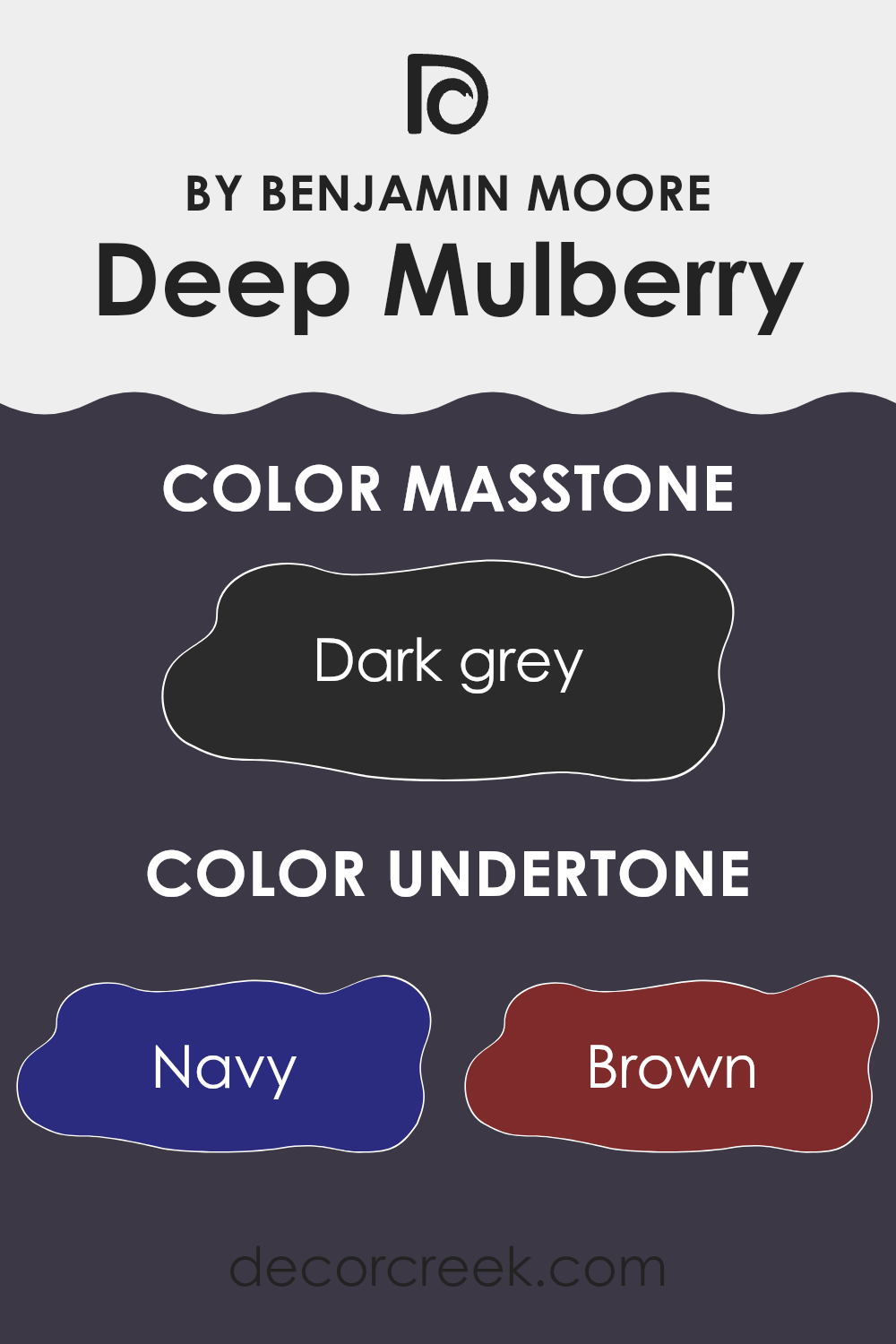
Deep Mulberry by Benjamin Moore is a rich, intriguing color that features a blend of several subtle undertones which greatly influence its appearance in different settings. These undertones include navy, brown, dark green, purple, dark turquoise, olive, and grey. The presence of these colors beneath the main hue shapes how Deep Mulberry is perceived and how it interacts with light and surrounding colors.
Undertones are essentially the ‘hidden’ colors that are mixed into the primary paint color. They can enhance the depth and complexity of the color, making it adapt under various lighting conditions. For example, in bright sunlight, the navy or purple undertones of Deep Mulberry might become more prominent, giving the color a cooler feel.
Conversely, in dimmer, indoor light, the brown or olive undertones might stand out, lending warmth to the area.
When used on interior walls, Deep Mulberry creates a dynamic effect because of its complex undertones. In a room with plenty of natural light, the walls might display a more vibrant, lively purple, whereas in artificial light, the color could appear more subdued and cozy, possibly highlighting its browner or darker green tones. This adaptability makes Deep Mulberry an adaptable choice for areas that need a touch of depth and interest without overpowering the senses.
Overall, the unique combination of undertones in Deep Mulberry can greatly affect the mood and tone of a room, making it a thoughtful choice for those looking to add a bit of color that shifts and changes, creating varied experiences throughout the day.
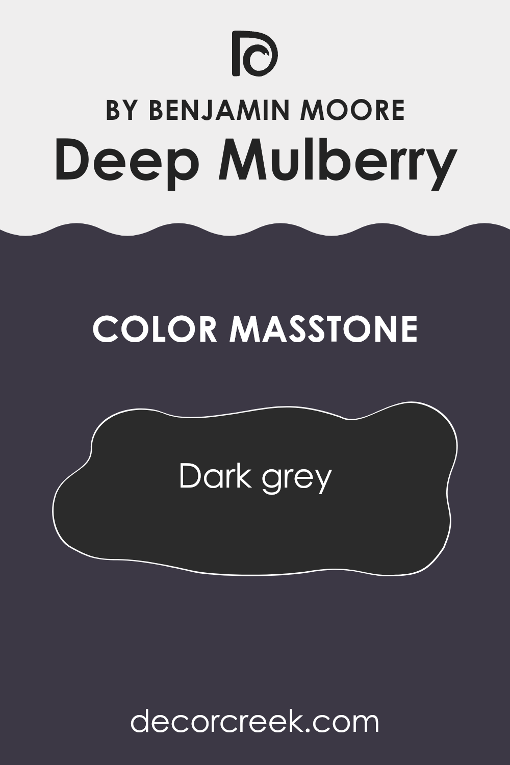
What is the Masstone of the Deep Mulberry 2069-10 by Benjamin Moore?
Deep Mulberry (2069-10) by Benjamin Moore has a masstone of dark grey. This shade influences its role in home design significantly. Since it’s a dark grey, it brings a strong, grounding effect to any area. This color can work well in rooms where you want an atmosphere of calm and focus, like home offices or libraries.
It doesn’t overpower areas but provides a stable backdrop for brighter colors or decorative items to stand out. For living areas and bedrooms, it can add depth, making rooms feel more cozy and snug.
This color is also practical as it can help hide marks or dirt, which is especially useful in areas with high traffic or with kids and pets. When used in small areas, be mindful as too much dark color might make the room feel smaller. However, pairing it with lighter colors or reflective surfaces can balance that effect.
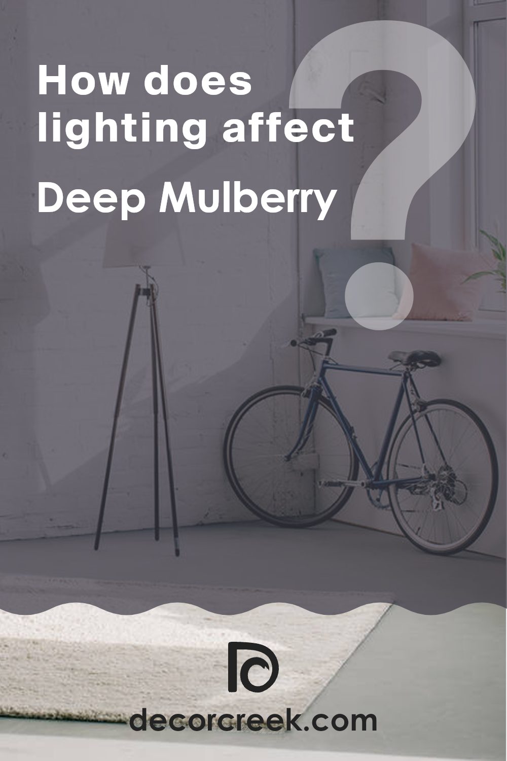
How Does Lighting Affect Deep Mulberry 2069-10 by Benjamin Moore?
Lighting plays a crucial role in how we perceive colors, significantly impacting their appearance in interior areas. The color Deep Mulberry by Benjamin Moore is a perfect example to illustrate this. Its rich, bold tone can vary dramatically under different lighting conditions.
In artificial light, Deep Mulberry tends to look warmer and more vibrant. This is because artificial light, especially bulbs with warmer tones, enhances the red and purple hues within the color, making it appear more intense and cozy. In the evening, under softer, dimmer lights, this color can create a rich, inviting atmosphere, perfect for living rooms or dining areas where you want a sense of warmth and comfort.
In natural light, the appearance of Deep Mulberry can change throughout the day. Natural light brings out the truest version of this color, but the intensity and the hue can shift based on the time of day and weather conditions. On a bright, sunny day, Deep Mulberry looks vivid and lively, while on a cloudy day, it might appear more subdued.
Room orientation also affects how Deep Mulberry is perceived:
- North-Faced Rooms: These rooms usually receive less direct sunlight, making them cooler in tone. In these environments, Deep Mulberry can look slightly darker and less vibrant, potentially needing brighter lighting fixtures to liven it up.
- South-Faced Rooms: These rooms get abundant light, which can make Deep Mulberry look lighter and more dynamic throughout the day. It’s an ideal setting for this color if you want to enhance its vibrancy and richness.
- East-Faced Rooms: Morning light can make Deep Mulberry appear bright and fresh in east-facing rooms. However, as the day progresses and natural light decreases, the color will become deeper and more subdued.
- West-Faced Rooms: In west-facing rooms, the color gets softer morning light but intense evening light. Deep Mulberry will shift from a softer tone in the morning to a dramatic and intense one by evening as it catches the sunset’s reddish hues.
Understanding these nuances helps in choosing the right paint color for each room based on its orientation and the type of light it receives.
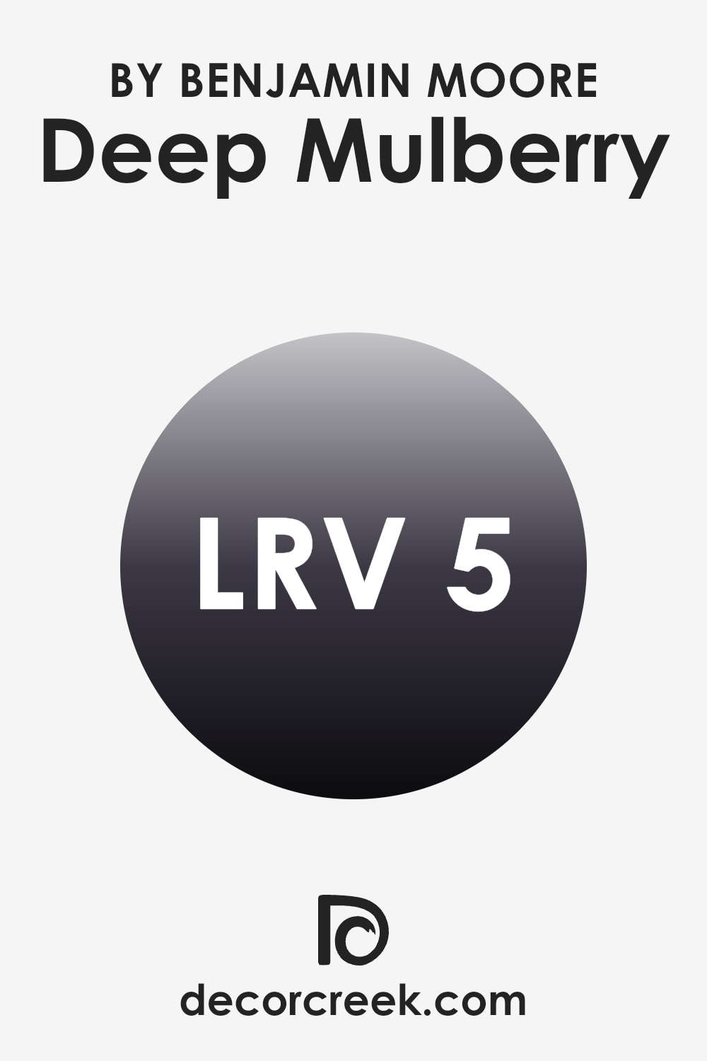
What is the LRV of Deep Mulberry 2069-10 by Benjamin Moore?
LRV stands for Light Reflectance Value, which is a measure used to determine how much light a paint color reflects back into a room. It’s expressed on a scale where a lower LRV means the color reflects less light and can make a room appear darker or smaller, while a higher LRV means the paint reflects more light, brightening up an area and making it feel larger.
The LRV is particularly important when choosing paint colors because it helps you understand how the color will behave under different lighting conditions. For example, in a room with limited natural light, a paint with a high LRV can help to make the area feel airier and more open.
In the case of Deep Mulberry with an LRV of 5.36, this color falls on the very low end of the scale, meaning it reflects very little light. This characteristic can contribute to a more intimate and cozy atmosphere in an area, but it could also make a small room feel even smaller and darker. When using such a dark color, good lighting becomes crucial to ensure the area does not feel too closed in.
This color can be effective in larger rooms or on accent walls where you want to create a dramatic or cozy corner without swamping the entire area. Additional lighting or lighter colored furnishings can also help balance the darkness of the walls and maintain a comfortable ambiance.
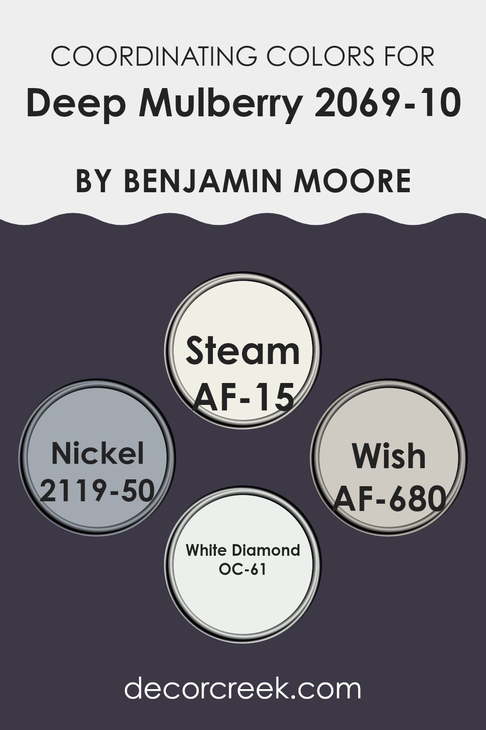
Coordinating Colors of Deep Mulberry 2069-10 by Benjamin Moore
Coordinating colors are shades that harmonize with a primary color, enhancing its beauty without overpowering it. These colors are chosen to create a balanced and cohesive look, ensuring that the primary color stands out while the surroundings support and complement it. When it comes to working with a bold color like Deep Mulberry by Benjamin Moore, selecting the right coordinating colors is key to achieving a well-rounded and aesthetically pleasing area.
Steam (AF-15) is a soft, almost ethereal white that provides a clean backdrop, making it an ideal balance to the richness of Deep Mulberry. It acts as a neutral base that allows the deeper tones to truly shine. Nickel (2119-50) is a muted gray with just enough depth to contrast subtly with darker hues, supporting the main color without competing for attention.
Wish (AF-680) offers a lighter, more understated gray that brings a sense of calm and continuity when paired with bolder shades. Finally, White Diamond (OC-61) is a crisp, clear white with a hint of brilliance that can brighten areas and provide a refreshing contrast to the intensity of Deep Mulberry. Together, these colors work harmoniously to create a pleasing environment that highlights the strengths of each hue.
You can see recommended paint colors below:
- AF-15 Steam
- 2119-50 Nickel
- AF-680 Wish
- OC-61 White Diamond
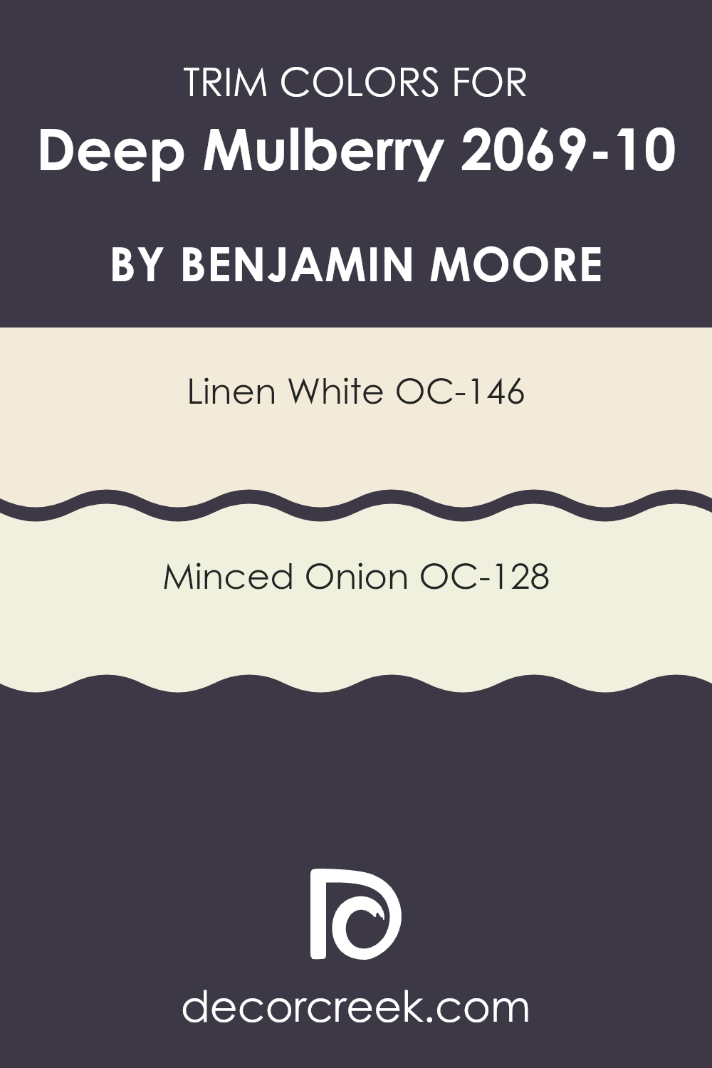
What are the Trim colors of Deep Mulberry 2069-10 by Benjamin Moore?
Trim colors are essentially the accent colors used on the interior or exterior architectural details, such as door frames, window trims, and baseboards. They play a critical role in defining and accentuating these elements, providing a contrast or complement to the primary wall color. Opting for the right trim color enhances the overall aesthetic appeal and can subtly highlight the architectural features of an area.
When paired with a bold color like Deep Mulberry, trim colors such as OC-146 – Linen White and OC-128 – Minced Onion are great choices. Linen White is a warm and creamy white that offers a gentle contrast, brightening up areas dominated by deeper hues without making them feel excessive.
Minced Onion, on the other hand, is a soft, muted beige that provides a subtle, soothing contrast to richer, darker colors, maintaining a harmonious but distinct border that enriches the overall color scheme. Both these shades act not just as simple borders but as integral components of the room’s color palette, enhancing the depth and intensity of colors like Deep Mulberry.
You can see recommended paint colors below:
- OC-146 Linen White
- OC-128 Minced Onion
Colors Similar to Deep Mulberry 2069-10 by Benjamin Moore
Choosing similar colors when decorating or designing an area can help create a cohesive and harmonious look. The colors Dark Basalt, Galaxy, Tulsa Twilight, and Plum Royale complement Deep Mulberry by providing different shades and hues that align with a deep, rich aesthetic.
When you use these similar colors together, they can enhance the overall mood of a room by subtly shifting while maintaining a consistent theme. This approach can unify an area and make it feel more connected, as each color supports and enriches the other.
Dark Basalt is a strong, almost black gray that adds depth and intrigue to any color palette, acting as a solid grounding color. Galaxy is a deep, intense blue that gives a sense of depth and mystery, perfect for creating a focal point. Tulsa Twilight is a darker, more subdued shade of purple compared to Deep Mulberry, offering a beautiful backdrop that enhances lighter elements.
Plum Royale presents a slightly more vibrant and rich purple tone, providing a lush pop of color that can liven up a design scheme. Together, these shades create a palette that is both dynamic and visually appealing, perfect for environments where a rich and cohesive look is desired.
You can see recommended paint colors below:
- 2072-10 Dark Basalt
- 2117-20 Galaxy
- 2070-10 Tulsa Twilight
- 2070-20 Plum Royale

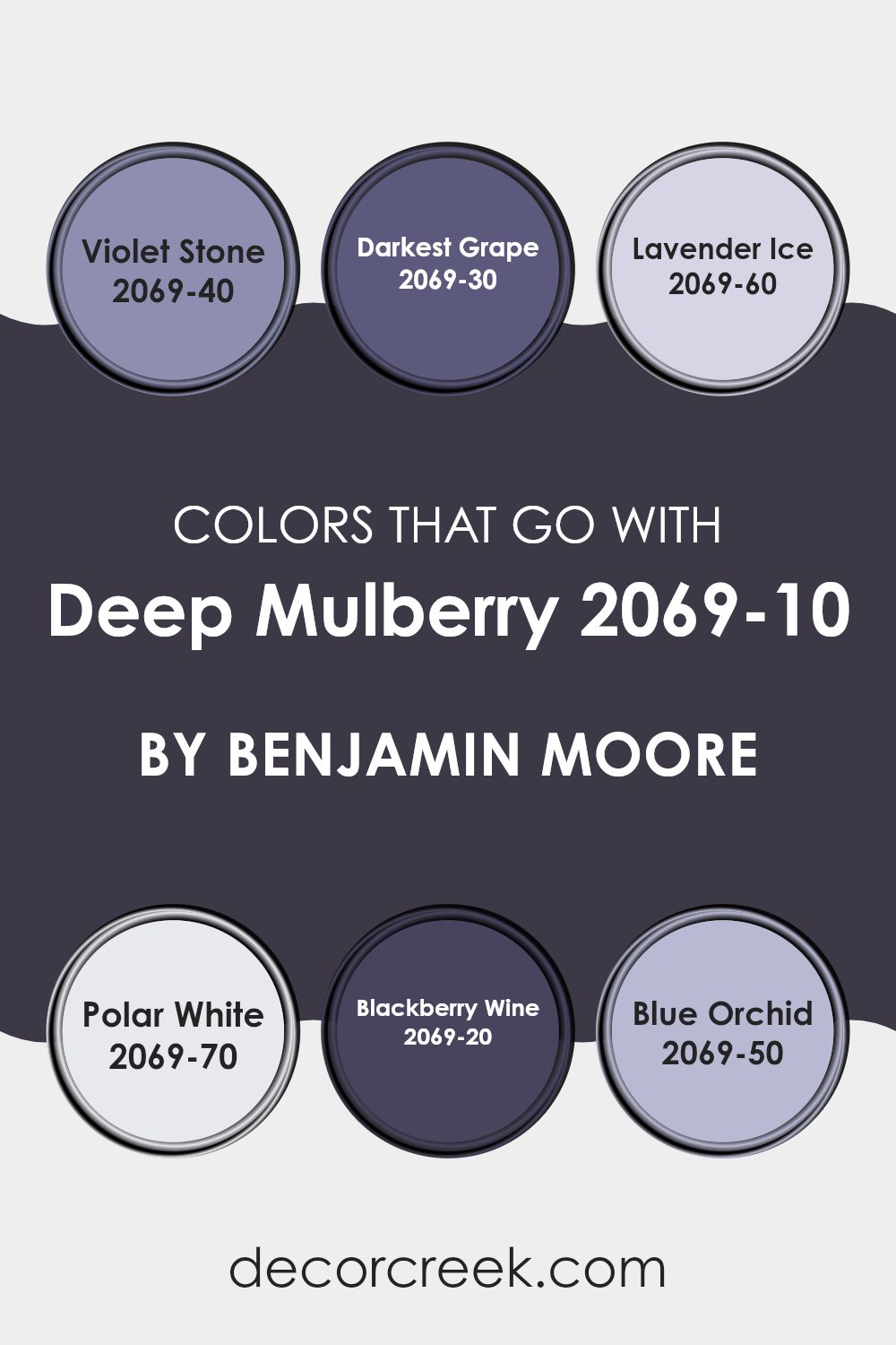
Colors that Go With Deep Mulberry 2069-10 by Benjamin Moore
Choosing the right colors to pair with Deep Mulberry 2069-10 by Benjamin Moore is crucial as it ensures the paint’s rich hue is complemented effectively, creating a pleasing aesthetic in any area. When paired strategically, these complementary shades can enhance the depth and personality of a room. The selected shades range from lighter tones to darker hues, providing various options for different design needs.
Violet Stone 2069-40 is a gentle purple that offers a subtle contrast to the intensity of Deep Mulberry, perfect for softening the overall look of an area without losing the colorful impact. Darkest Grape 2069-30, on the other hand, is a more intense shade that echoes the richness of Deep Mulberry, making it ideal for adding drama and depth to more refined areas.
Lavender Ice 2069-60 is a pale, almost pastel purple that infuses a touch of freshness and light, breaking up more concentrated colors and bringing a breath of airiness. Polar White 2069-70 is the ultimate clean and crisp background color that can help the striking tones of Deep Mulberry stand out even more while giving the room a fresh and clean appearance. Blackberry Wine 2069-20 is a dark, almost mystical color that aligns closely with the depth of Deep Mulberry, suited for creating a cozy, intimate vibe.
Lastly, Blue Orchid 2069-50 is a unique blend of blue and purple tints that offers a refreshing twist to the palette, ideal for inviting a sense of calm and creativity. Each color option proposes a unique way to style and highlights the room’s features, making the combination choices both practical and visually appealing.
You can see recommended paint colors below:
- 2069-40 Violet Stone
- 2069-30 Darkest Grape
- 2069-60 Lavender Ice
- 2069-70 Polar White
- 2069-20 Blackberry Wine
- 2069-50 Blue Orchid
How to Use Deep Mulberry 2069-10 by Benjamin Moore In Your Home?
Deep Mulberry by Benjamin Moore is a rich, dark purple hue that adds a bold statement to any area. Ideal for those looking to add a touch of drama, this color works well in a variety of home areas. In the living room, Deep Mulberry can be used on a feature wall to create a cozy and stylish focal point. Pairing it with lighter shades like soft grays or creams helps balance its intensity.
In the bedroom, applying this deep purple to all walls can create a cozy, cocoon-like feel, perfect for resting. Complement it with light colored bed linens and curtains for a nice contrast. For smaller areas like a powder room or a reading nook, painting the entire area in Deep Mulberry makes it feel more intimate and inviting.
Accessorize rooms with metallic touches such as gold or silver frames, candle holders, or lamps to make the purple stand out. This color also looks stunning when used in velvet fabrics, adding an extra layer of luxury to pillows or upholstery.
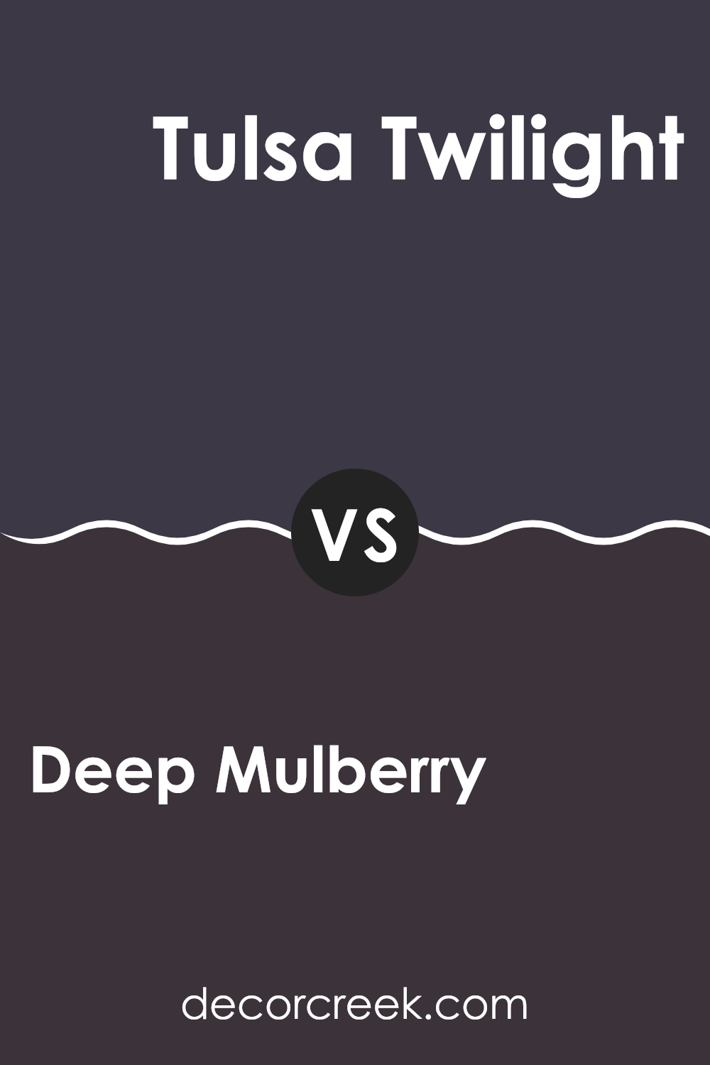
Deep Mulberry 2069-10 by Benjamin Moore vs Tulsa Twilight 2070-10 by Benjamin Moore
Deep Mulberry and Tulsa Twilight are both from Benjamin Moore and are quite close on the color spectrum. Deep Mulberry is a rich, dark purplish-red hue that brings a bold and cozy feel to any room. It has a warm undertone that makes it very inviting.
On the other hand, Tulsa Twilight is also a dark color but leans more towards a blackish-blue. This color is perfect for creating a strong, statement-making impact in an area, offering a cooler tone compared to Deep Mulberry.
Both colors are ideal for anyone looking to add depth and a dramatic flair to their interiors. They work well in areas that benefit from darker colors, like home theaters or bedrooms meant for relaxing. Pairing them with the right lighting and decor can really highlight their unique tones.
You can see recommended paint color below:
- 2070-10 Tulsa Twilight
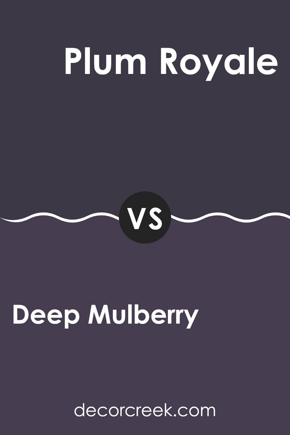
Deep Mulberry 2069-10 by Benjamin Moore vs Plum Royale 2070-20 by Benjamin Moore
Deep Mulberry and Plum Royale by Benjamin Moore are both rich, vibrant colors, but they have subtle differences in tone and depth. Deep Mulberry is a dark, berry-like color with a strong red undertone, giving it a warm and cozy feel.
It tends to add a bold and inviting look to any room, making it ideal for areas where you want to add a touch of drama. On the other hand, Plum Royale is also a deep color but leans more towards purple with noticeable blue undertones, which imparts a slightly cooler appearance.
This shade is perfect for those who prefer a moodier, more striking atmosphere. Both colors are intense and can dominate an area, so they work well as accent walls or for highlighting architectural details. They pair nicely with lighter shades and metallic decor elements to balance their depth.
You can see recommended paint color below:
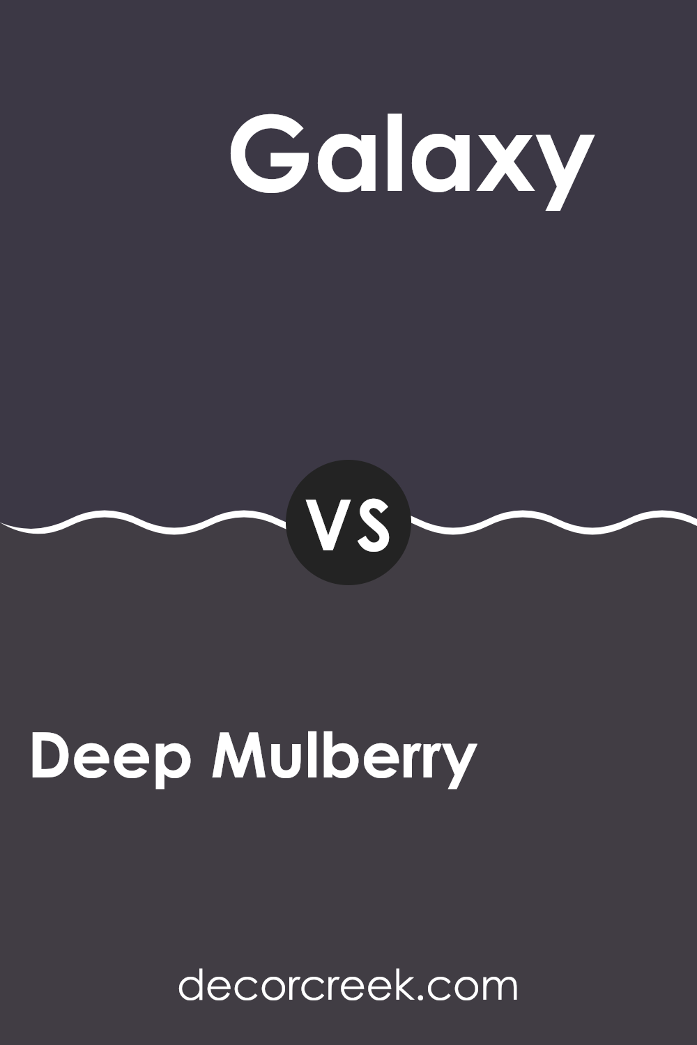
Deep Mulberry 2069-10 by Benjamin Moore vs Galaxy 2117-20 by Benjamin Moore
Deep Mulberry and Galaxy are two unique paint colors from Benjamin Moore, each offering a distinct feel. Deep Mulberry is a rich, vibrant purple shade that adds a lush and dynamic splash of color to any room. It’s bold and a bit dramatic, making it a great choice for a focal wall or to bring some intensity to an area.
On the other hand, Galaxy is a dark navy blue that leans towards refinement without using complex language. It’s more restrained than Deep Mulberry yet still has depth, providing a strong presence in an area without making it feel too strong. This color works well in areas where you want to create a sense of calmness and strength.
In use, Deep Mulberry can make small areas feel smaller because of its depth, while Galaxy, despite also being dark, often makes areas feel more expansive due to its cooler tone. Both colors are highly flexible and can be used in a variety of decor styles, whether you’re aiming for a touch of modernity or sticking with traditional.
You can see recommended paint color below:
- 2117-20 Galaxy
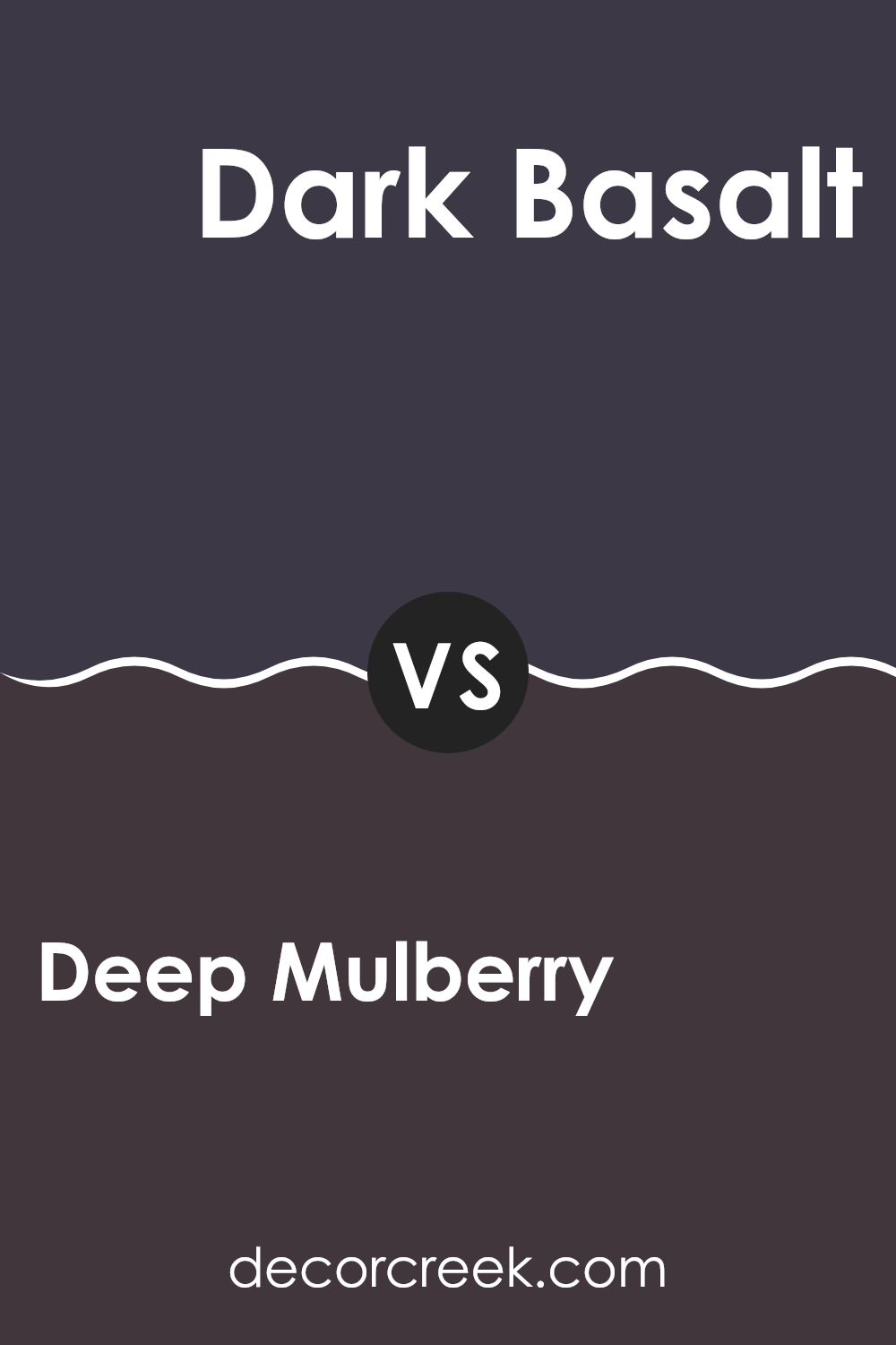
Deep Mulberry 2069-10 by Benjamin Moore vs Dark Basalt 2072-10 by Benjamin Moore
Deep Mulberry and Dark Basalt are two distinct colors from Benjamin Moore. Deep Mulberry presents as a rich, vibrant purple with a deep berry shade that adds a bold touch to any area. It’s a warm color that works beautifully to create a cozy and inviting atmosphere.
In contrast, Dark Basalt is a strong, dark gray that leans slightly towards blue. This color has a solid and grounding effect, making it a great choice for a modern and minimalistic look.
Both colors are deep and intense, making them excellent for adding character to a room. While Deep Mulberry can make areas feel more cozy and intimate due to its warmth, Dark Basalt offers a cooler, more neutral base that can match various decor styles. Whether you’re looking to warm up a room or give it a sleek, contemporary edge, these colors provide unique options. Each has its own charm, depending on the vibe you want to achieve.
You can see recommended paint color below:
- 2072-10 Dark Basalt
After reading about the paint color 2069-10 Deep Mulberry by Benjamin Moore, I’ve learned a lot about how it can make rooms look cheerful and stylish. This deep, rich purple shade adds a playful touch to any wall it covers, making it perfect for someone who loves colors that pop! Using this in a bedroom can make it feel cozy and inviting, or in a living room, it can make things feel more fun and interesting.
Even though it’s a bold color, it matches well with many other colors, from soft whites to even bright yellows. This makes it really easy to use no matter what your style is or what furniture you have. It’s especially good in areas where lots of people gather, like the living room or kitchen, because it brings a warm, happy vibe.
In all, 2069-10 Deep Mulberry is more than just a purple paint; it’s a way to add some joy and personality to your home without making things too complicated. Whether you’re redoing a whole room or just adding a splash of color somewhere, this color by Benjamin Moore is definitely worth considering!

Ever wished paint sampling was as easy as sticking a sticker? Guess what? Now it is! Discover Samplize's unique Peel & Stick samples.
Get paint samples

