Delving into the rich tapestry of interior color trends, Plum Royale 2070-20 by Benjamin Moore emerges as a captivating hue that combines depth with luxury. In the world of paint, colors like Plum Royale are more than just aesthetic choices; they are statements, setting the tone for a room’s atmosphere and design.
This article will explore the intricate facets of Plum Royale 2070-20, from its undertones to its adaptability in varied lighting conditions and coordinating colors, and its impact on interior design.
What Color Is Plum Royale 2070-20?
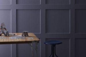
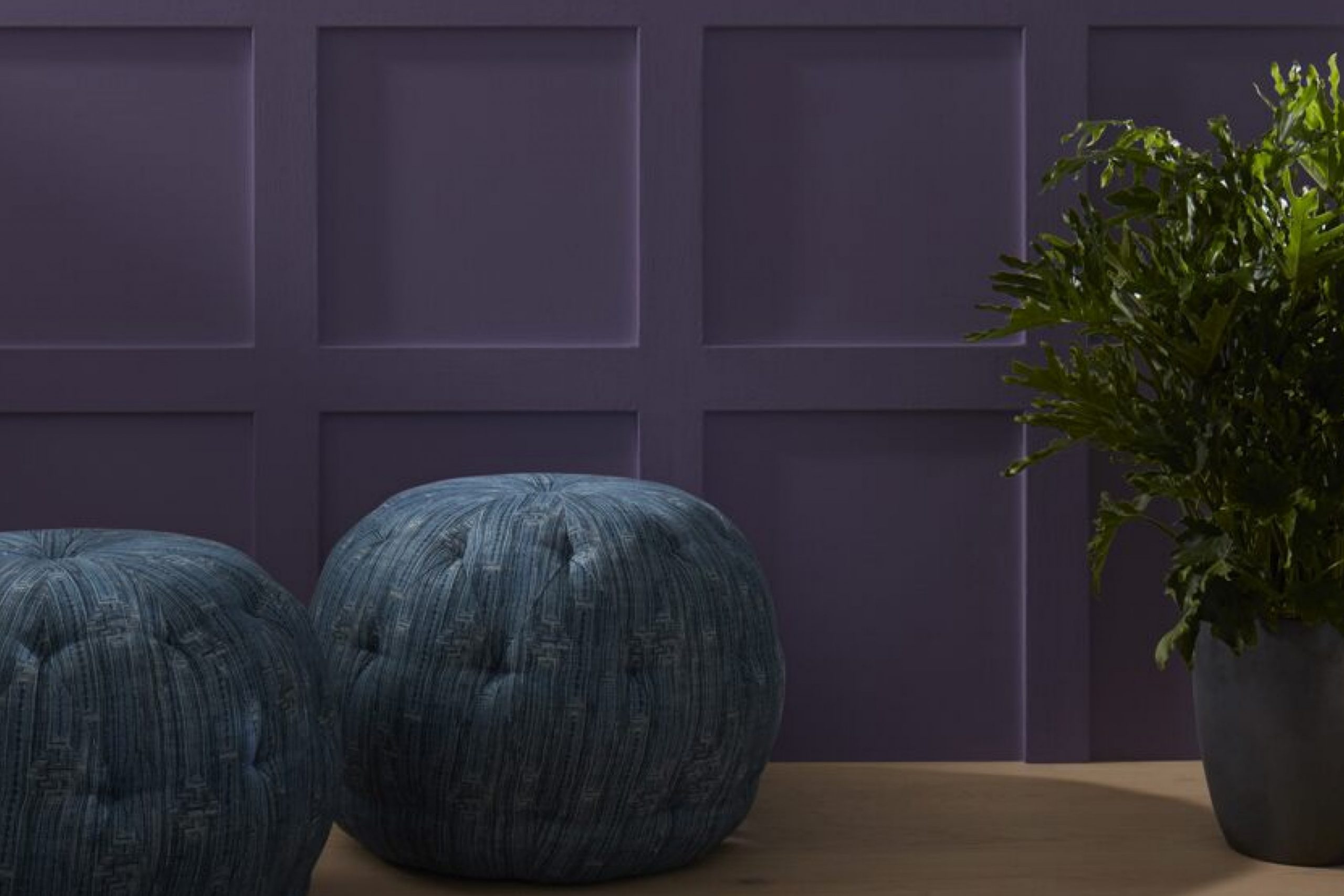
Plum Royale 2070-20 is not simply a color; it’s an experience. This Benjamin Moore hue embodies the essence of sophistication with its rich, saturated plum tones that exude both warmth and opulence. Its ability to act as a stunning backdrop or an accent feature makes it versatile across various interior styles, from modern minimalist to traditional luxe. In terms of materials, it pairs exceptionally well with polished woods, sumptuous velvets, and high-gloss metals, bringing a cohesive and refined look to any space it graces.
In styles like Art Deco or contemporary chic, Plum Royale 2070-20 thrives, offering a canvas that is as bold as it is inviting.
Ever wished paint sampling was as easy as sticking a sticker? Guess what? Now it is! Discover Samplize's unique Peel & Stick samples.
Get paint samples

Is It a Warm Or Cool Color?
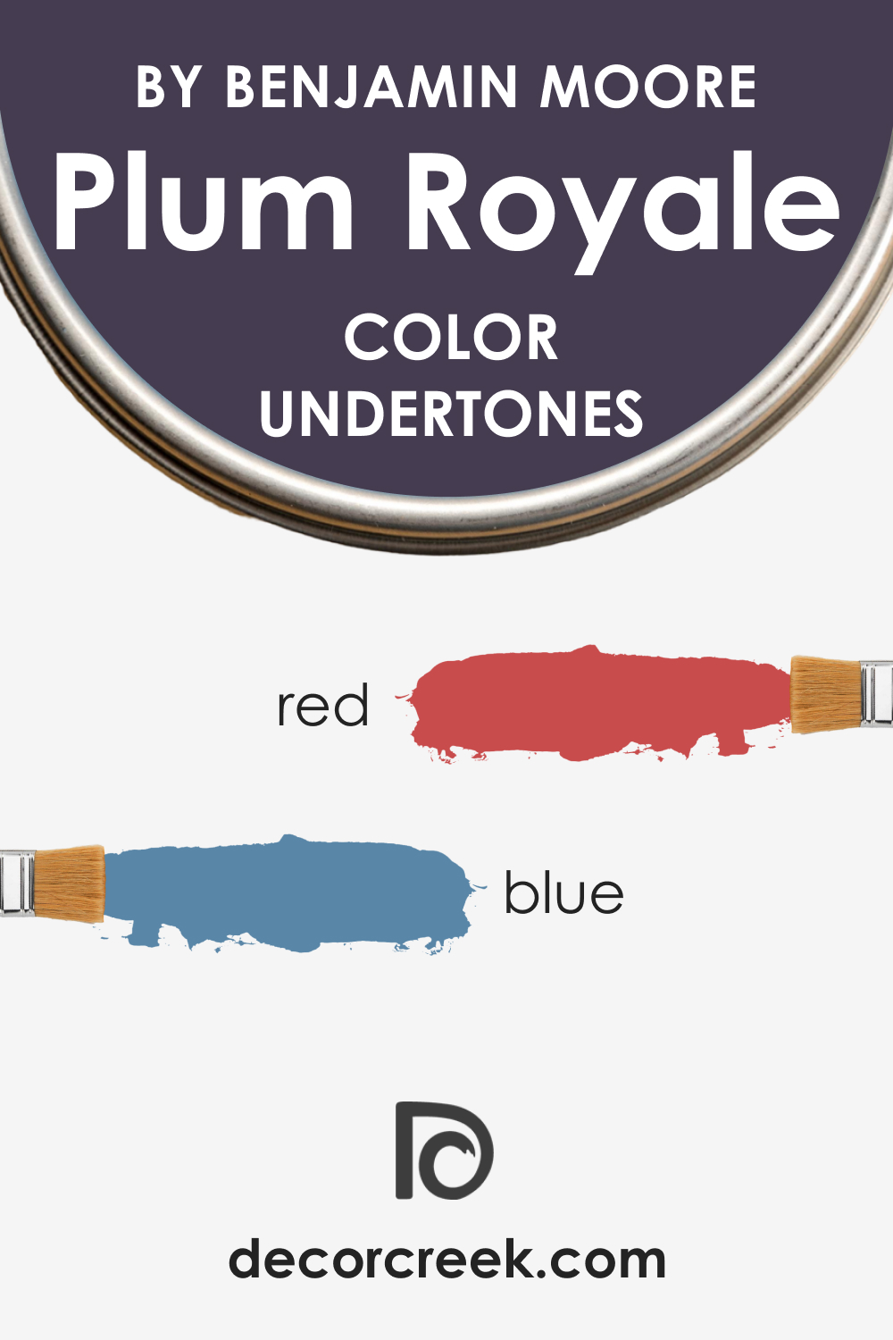
Plum Royale 2070-20 walks a delicate line between warmth and coolness. This hue leans towards the warmer side of the spectrum, given its red and purple undertones that tend to wrap the environment in a cozy embrace. In a home, it brings a sense of intimacy and comfort, making spaces feel more personal and enveloping.
The warmth of Plum Royale 2070-20 makes it particularly appealing in social spaces of the home, like the living or dining room, where its inviting palette encourages conversation and relaxation.
Undertones of Plum Royale 2070-20
Undertones are the silent whisper of colors, subtly influencing perception and mood. Plum Royale 2070-20 possesses a complex undertone that merges notes of deep red with a whisper of blue, creating a unique plum shade that can appear more lively or subdued depending on the surrounding light.
These undertones are what give Plum Royale 2070-20 its chameleon-like ability to adapt to different settings, from standing out boldly on a feature wall to acting as a unifying element across a room. On interior walls, its undertones provide a layered depth that can bring out the textures and contours of the space.
Coordinating Colors of Plum Royale 2070-20
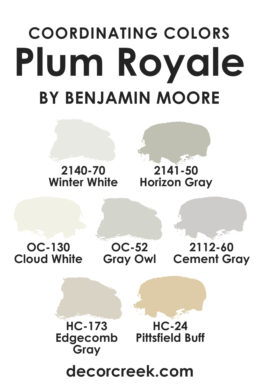
Coordinating colors are the supporting cast that complement and enhance the main hue’s character. For Plum Royale 2070-20, the companions include BM 2140-70 Winter White, a crisp and clean contrast that breathes space into the density of plum. OC-130 Cloud White offers a softer edge, diffusing the room’s boundaries gently. OC-52 Gray Owl is a balancing act, a neutral with the agility to bridge the gap between light and dark. HC-24 Pittsfield Buff is an earthy ally, grounding the plum with its organic warmth.
Adding to this palette, BM 2141-50 Horizon Gray provides a serene and stable base, while BM 2112-60 Cement Gray delivers a contemporary coolness that complements the plum’s vibrancy. Lastly, HC-173 Edgecomb Gray is a transitional color that bridges the gap between beige and gray, pairing seamlessly with the rich plum for a modern yet timeless feel.
How Does Lighting Affect Plum Royale 2070-20?
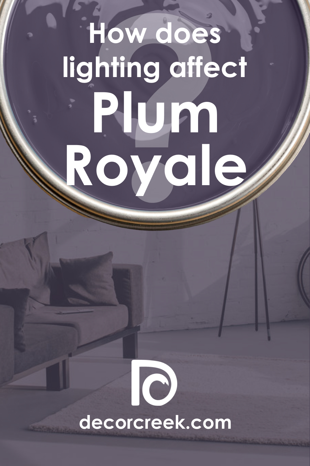
Lighting is the alchemist of color, with the power to transmute hues throughout the day. Plum Royale 2070-20 absorbs and reflects light in a way that can dramatically alter its appearance. In natural daylight, the color blooms, revealing its vibrant heart, while in the soft glow of artificial light, it can recede into a more mysterious and cozy shade. In north-facing rooms, the cooler light can enhance the plum’s blue undertones, whereas in south-facing rooms, the warm light amplifies its red components. The east light can make the color feel brighter in the morning, and in the west, the evening light can add a golden richness to the shade.
LRV of Plum Royale 2070-20
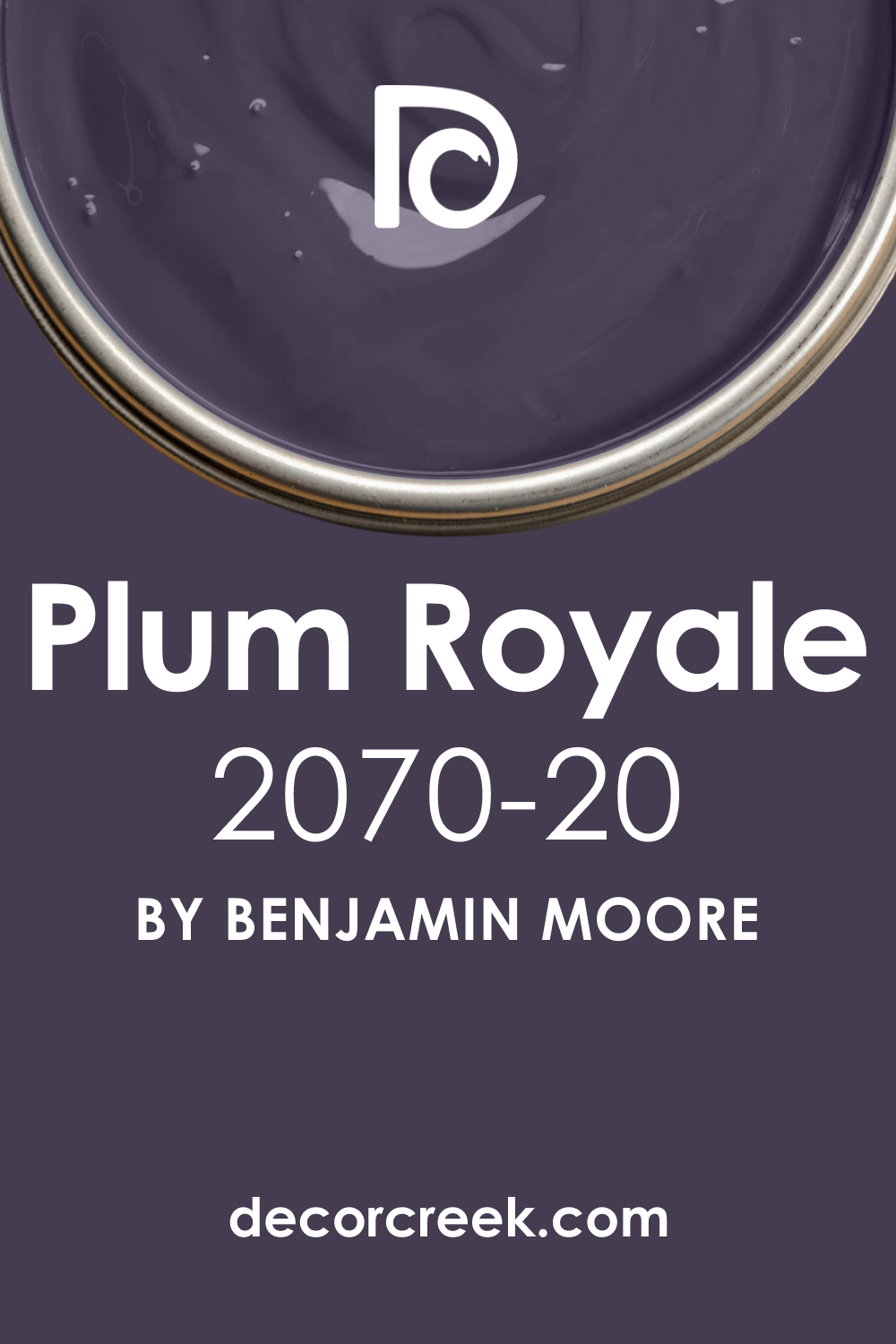
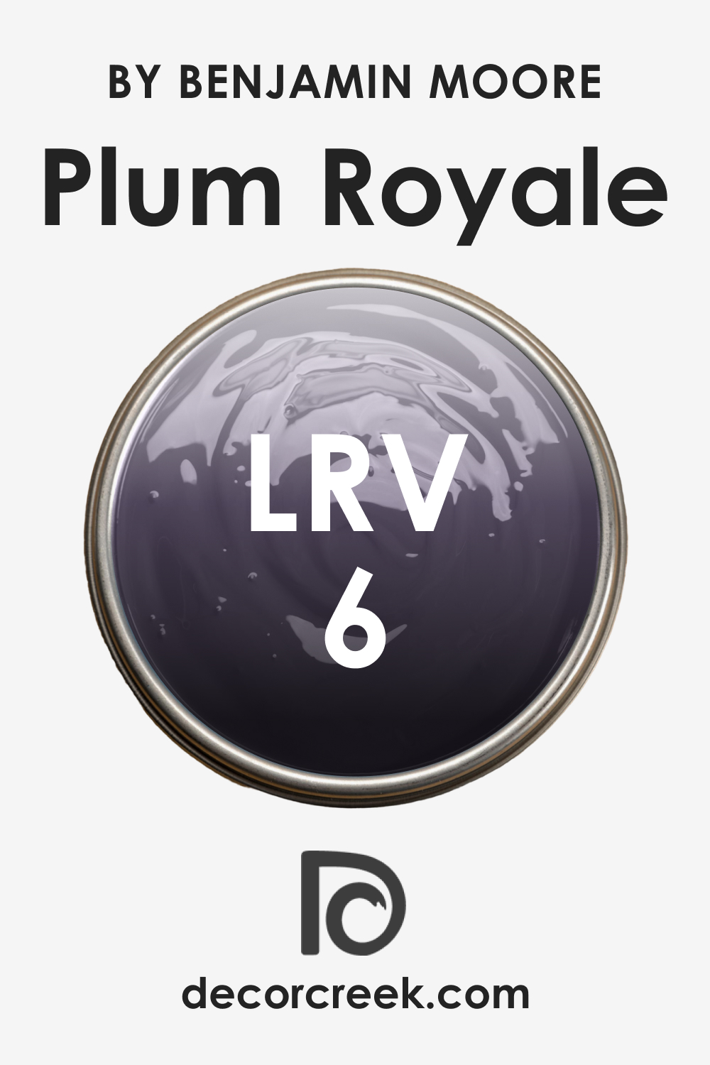
LRV, or Light Reflectance Value, measures the percentage of light a paint color reflects. With an LRV of 6, Plum Royale 2070-20 falls on the lower end of the scale, indicating it doesn’t reflect much light. This gives the color a depth that can absorb light, making it a dramatic choice for walls.
The low LRV means that in spaces without much natural light, it can appear almost black, while in well-lit areas, its plum character shines through. This interplay with light makes Plum Royale 2070-20 a dynamic choice for interiors, able to create a range of moods depending on the lighting conditions.
LRV – what does it mean? Read This Before Finding Your Perfect Paint Color
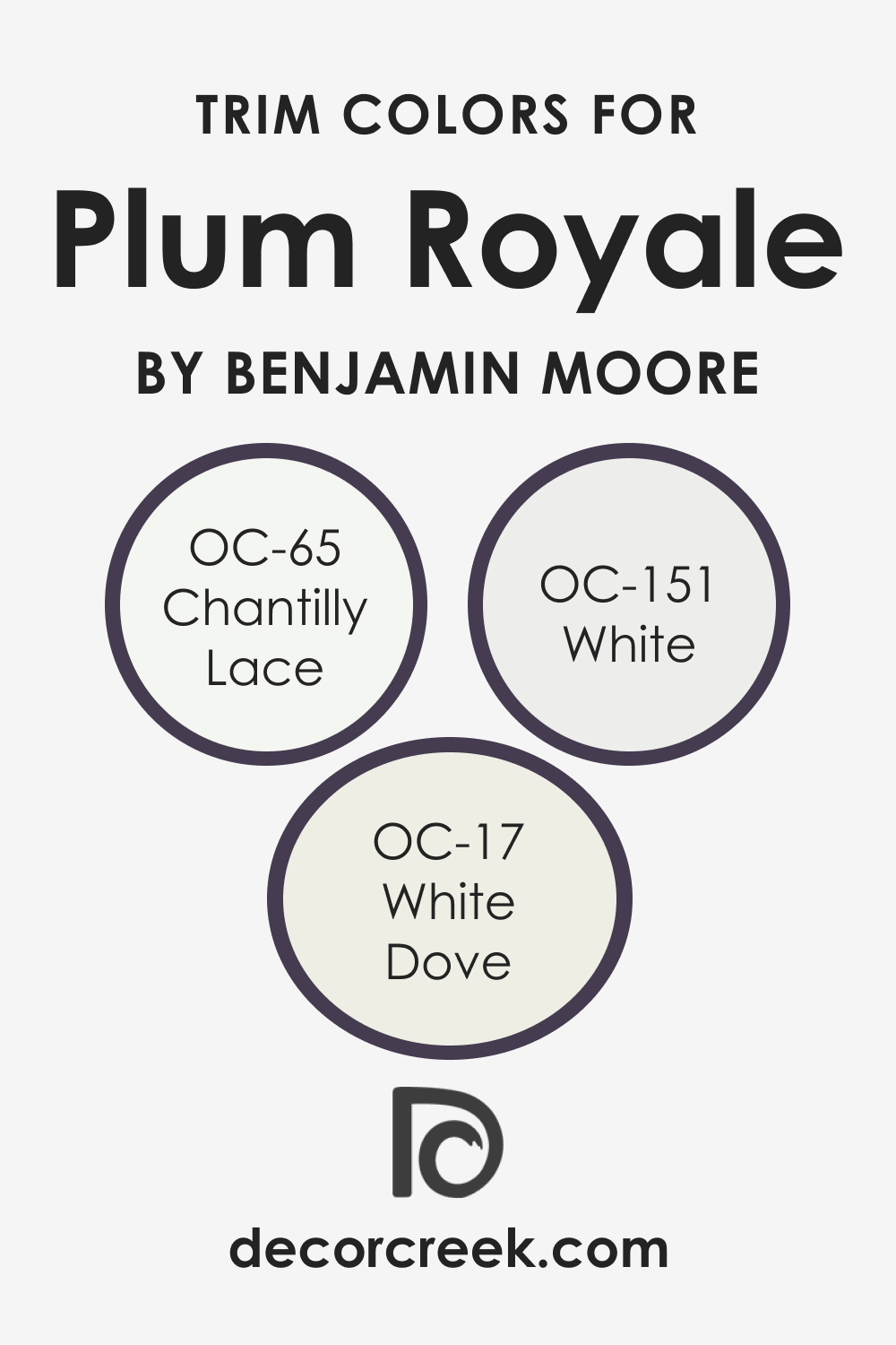
Trim Colors of Plum Royale 2070-20
Trim colors act as the frame to the artwork that is your wall color, accentuating and defining the space. With Plum Royale 2070-20, shades of white are often chosen for trims to create a striking contrast.
Colors such as OC-151 White, OC-17 White Dove, and OC-65 Chantilly Lace provide varying degrees of warmth and brightness, allowing for flexibility depending on the desired effect.
The contrast between these whites and the deep plum can sharpen the room’s features and give a crisp finish to the interior design.
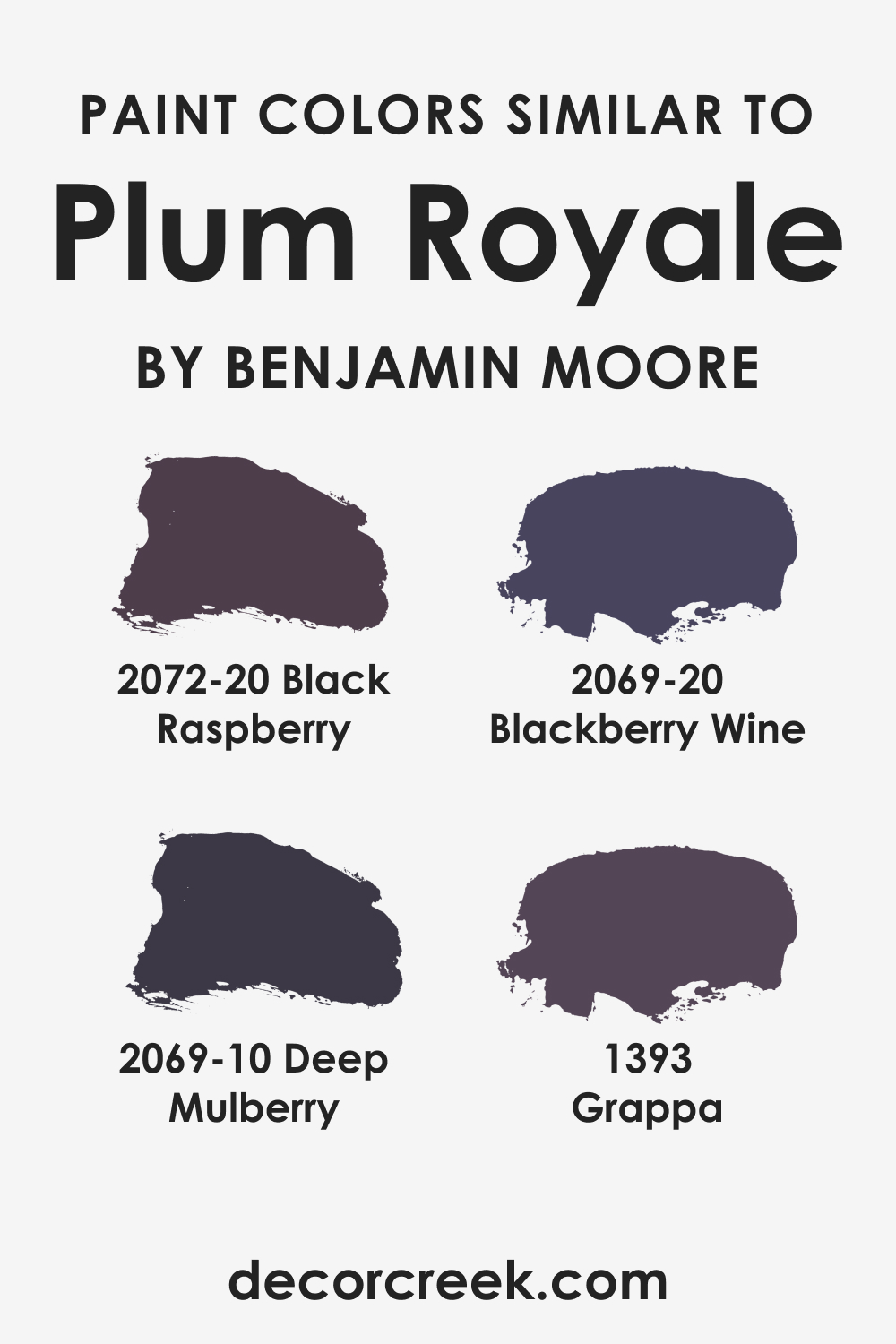
Colors Similar to Plum Royale 2070-20
Knowing colors similar to Plum Royale 2070-20 helps in creating a nuanced and layered interior design. BM 2072-20 Black Raspberry shares the same depth but with a slightly more pronounced red undertone. BM 2069-20 Blackberry Wine veers towards a more traditional berry shade, offering a touch of classic elegance.
BM 2069-10 Deep Mulberry is bolder and darker, bringing a sense of drama, while BM 1393 Grappa introduces a softer, more grayed-out purple, ideal for a muted yet rich color scheme.
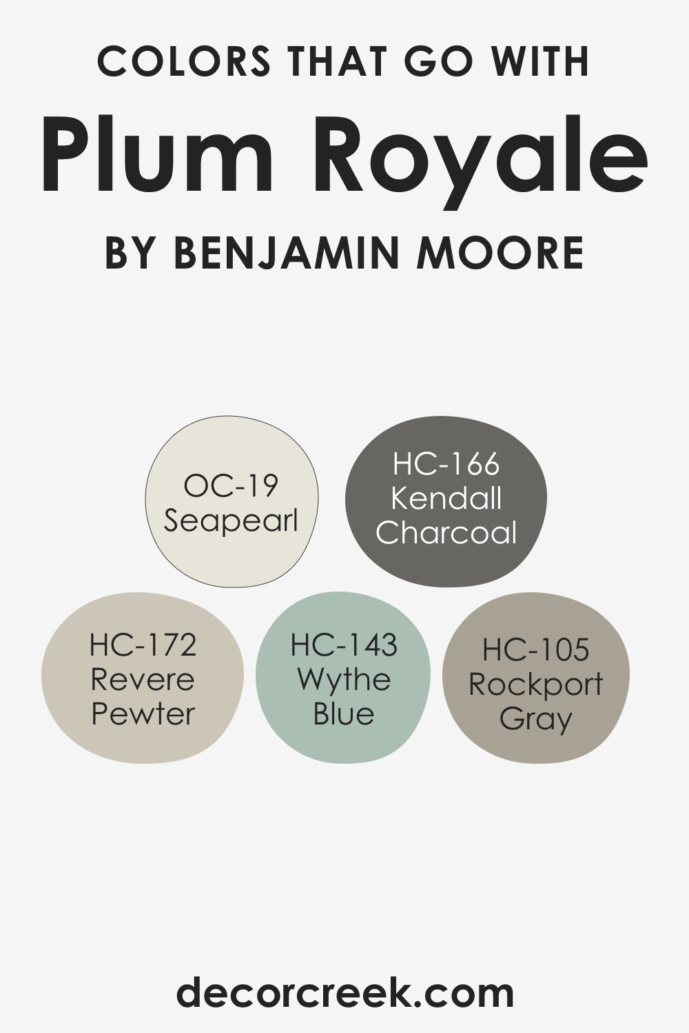
Colors That Go With Plum Royale 2070-20
The art of color pairing is crucial for creating a cohesive interior. Colors that harmonize with Plum Royale 2070-20 include HC-143 Wythe Blue, a gentle and airy hue that provides a refreshing contrast. HC-105 Rockport Gray is a robust neutral that supports the plum without overshadowing it. OC-19 Seapearl, with its warm undertones, creates a comforting blend. HC-166 Kendall Charcoal offers a solid and grounding effect, while HC-172 Revere Pewter balances the ensemble with its adaptable and harmonious nature.
Each of these colors, when used in conjunction with Plum Royale 2070-20, can craft spaces that resonate with individuality and taste, reflecting the unique personality of the inhabitants and the creative vision of the designer.
How to Use Plum Royale 2070-20 In Your Home?
Plum Royale 2070-20 is a versatile color for those looking to inject richness and depth into their home. Ideal for dining rooms and libraries, its sumptuous tone complements wood finishes and enhances the atmosphere for intimate gatherings. It fits well within interior design styles that embrace bold colors, such as bohemian, eclectic, or contemporary settings.
This color can serve as a powerful accent wall or a charismatic backdrop for art collections. In spaces for relaxation, like a reading nook, it can create a cocooning effect that enhances the feeling of being tucked away in a private retreat.
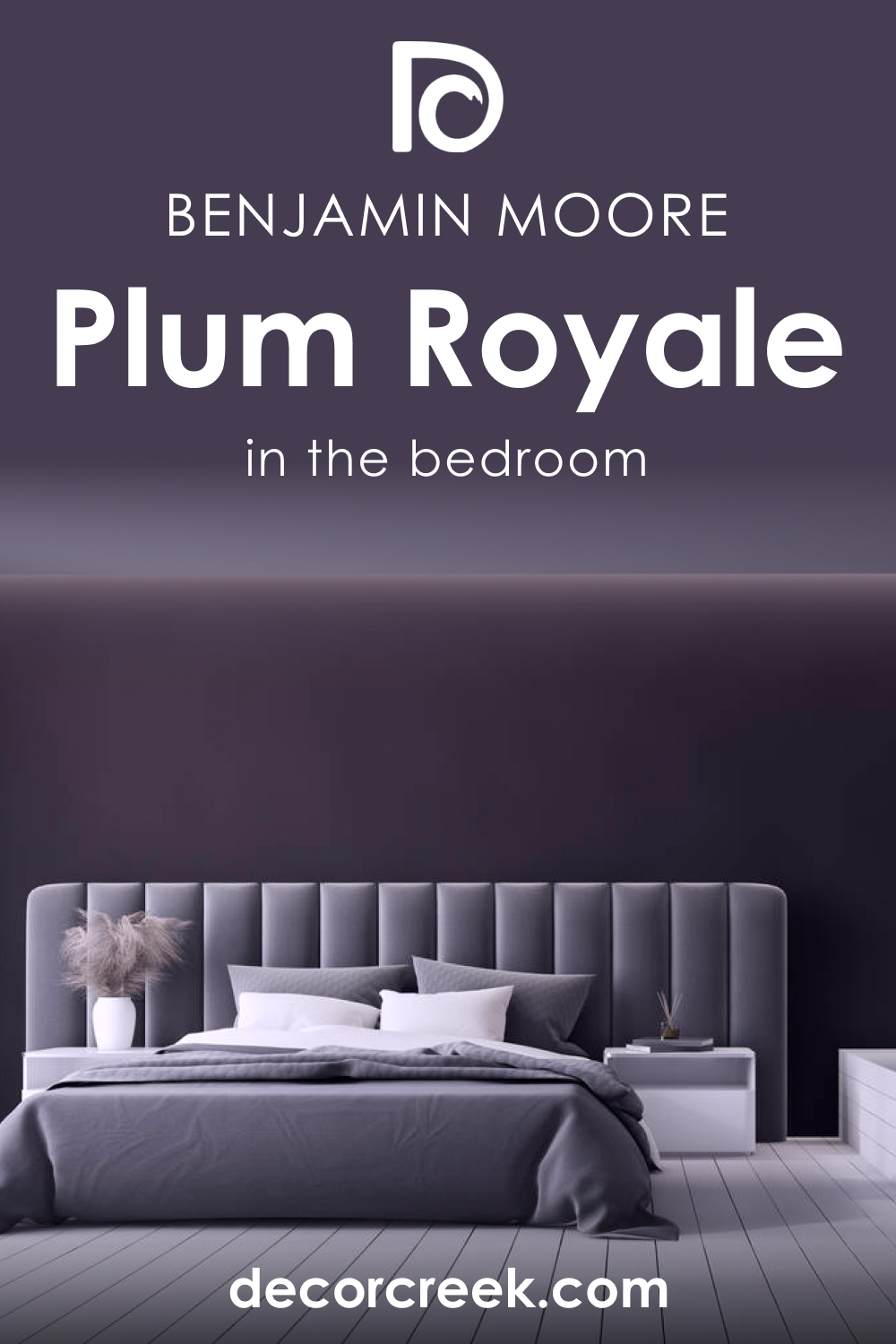
How to Use Plum Royale 2070-20 in the Bedroom?
In the bedroom, Plum Royale 2070-20 can transform the space into a serene sanctuary. Use it on a headboard wall to create a focal point that draws in warmth and comfort. Complement with light-colored bedding and drapes to maintain balance. For a luxurious touch, mix in metallic accents and soft, plush textures like velvet cushions or a faux fur throw.
This hue harmonizes with both dark and light bedroom furniture, offering flexibility in design choices. It works especially well in rooms with ample natural light or layered lighting to keep the space from feeling too dark.
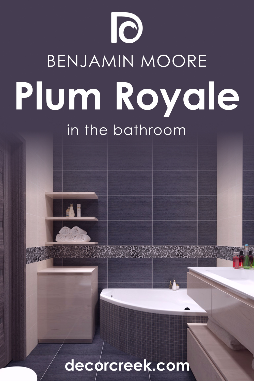
How to Use Plum Royale 2070-20 in the Bathroom?
Utilizing Plum Royale 2070-20 in the bathroom can establish an air of elegance and relaxation. For a spa-like ambience, paint one wall with this shade and pair it with marble or natural stone finishes. Chrome or brass fixtures can add a gleam that contrasts nicely with the depth of the plum. Use frosted or clear glass accessories to keep the space feeling open and light.
In a powder room, envelop the entire space in this hue for a bold statement, softened by ambient lighting to enhance the sense of luxury and retreat.
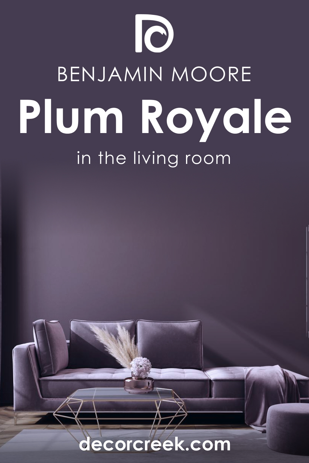
How to Use Plum Royale 2070-20 in the Living Room?
In the living room, Plum Royale 2070-20 can be used to create a striking backdrop for neutral furniture and wood accents. Apply it to walls that feature architectural details like a fireplace or built-in shelving to highlight these elements. Complement the richness of the plum with lighter textiles and a mix of natural materials to add contrast and interest.
This shade works well with a variety of flooring options, from dark hardwood to lighter carpets, allowing it to fit into many design aesthetics from modern to traditional.
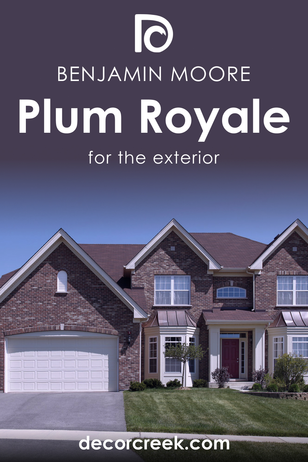
How to Use Plum Royale 2070-20 for an Exterior?
For an exterior, Plum Royale 2070-20 exudes confidence and personality. It’s perfect for front doors, shutters, or trim against a lighter-colored siding to add a pop of sophistication. When used sparingly, it can draw attention to the architectural features of a home.
Pair with stone or brick elements for a timeless look, or contrast it with lighter colors for a more contemporary edge. Always consider the surrounding landscape; this hue pairs beautifully with lush greens, providing an organic connection to nature.
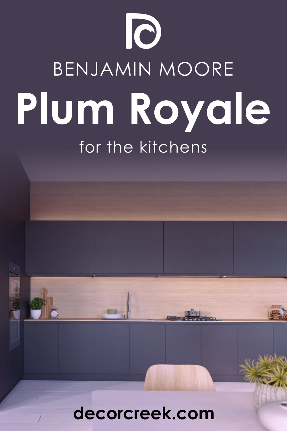
How to Use Plum Royale 2070-20 in the Kitchen?
In the kitchen, Plum Royale 2070-20 brings warmth and depth when used as an accent color. Consider painting a singular wall or an alcove to create a cozy and inviting atmosphere. It pairs beautifully with white or gray cabinets, allowing them to stand out and shine. For a cohesive look, incorporate touches of plum in kitchen accessories or seating.
This color is especially striking in well-lit spaces or where you can employ under-cabinet lighting to illuminate the richness of the hue without overpowering the room.
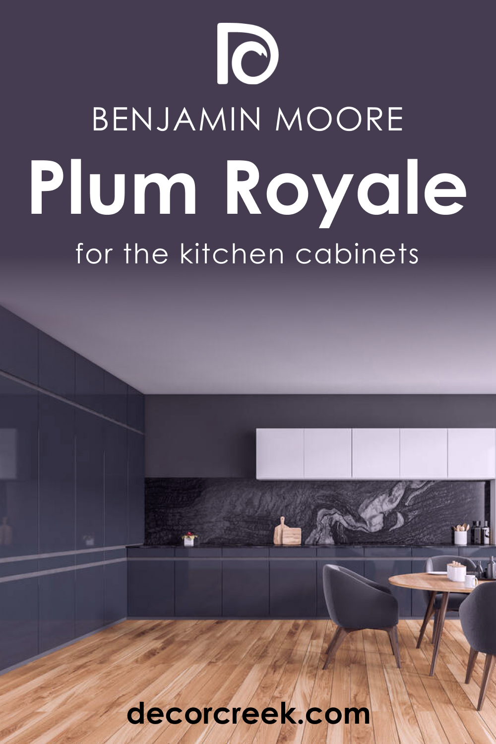
How to Use Plum Royale 2070-20 on Kitchen Cabinets
On kitchen cabinets, Plum Royale 2070-20 offers a bold and modern twist. It’s perfect for lower cabinets, paired with lighter upper cabinets or open shelving to keep the space from feeling too dark. This color works well with both matte and glossy finishes and can be the star of the kitchen when set against a neutral backsplash and countertop. Hardware in brushed gold or copper can add warmth and luxury, transforming the kitchen into a striking and contemporary space that’s sure to impress.
Comparing Plum Royale 2070-20 With Other Colors
Comparing colors like Plum Royale 2070-20 with others in its range is crucial for understanding their individual characteristics and how they might affect the atmosphere and perception of a space. Each color has a unique identity, and side-by-side comparison helps to determine which hue will achieve the desired emotional and aesthetic impact.
Contrasts in brightness, saturation, and undertones become clear, informing decisions in color schemes that can complement, coordinate, or dynamically oppose each other. This is especially important for interior design, where color can influence the perceived size of a room, its warmth, and its functionality.
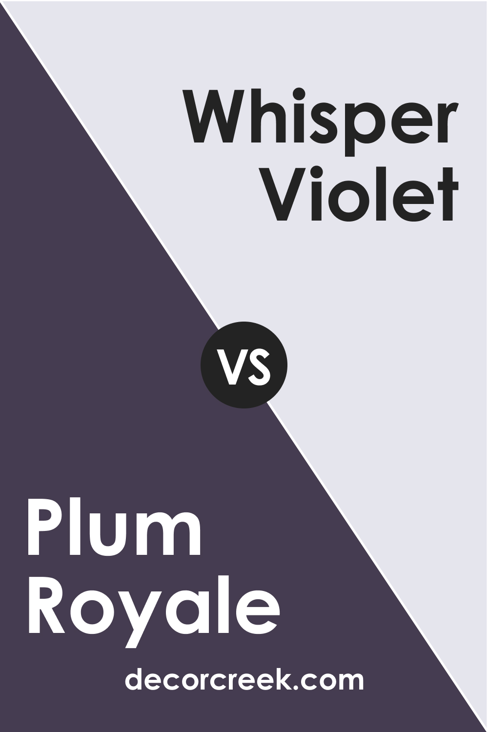
Plum Royale 2070-20 vs. BM 2070-70 Whisper Violet
When placed against Whisper Violet, Plum Royale 2070-20 stands out with its deeper, richer tone. Whisper Violet, being a lighter and more ethereal color, offers a soft, serene backdrop that could make spaces feel larger and more open, while Plum Royale 2070-20, with its intensity, brings a sense of drama and luxury.
The former could lift a space and give it a breezy feel, while the latter provides a grounding, enveloping effect.
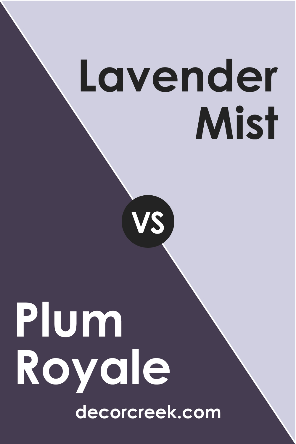
Plum Royale 2070-20 vs. BM 2070-60 Lavender Mist
Lavender Mist shares a similar purple lineage with Plum Royale but presents a much softer and muted lavender tone, which imparts a calming, spa-like quality to interiors. In contrast, Plum Royale 2070-20, with its saturated depth, creates a bold statement. Where Lavender Mist could be used to create a light and airy ambience, Plum Royale provides a sophisticated edge suitable for a more formal or intimate setting.
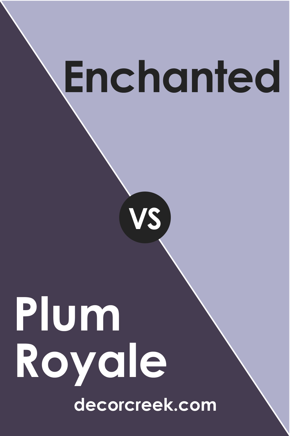
Plum Royale 2070-20 vs. BM 2070-50 Enchanted
Enchanted, a mid-toned purple, offers a happy medium between the intensity of Plum Royale and the subtlety of lighter violets. While Plum Royale suggests opulence and depth, Enchanted offers flexibility, being playful yet not overwhelming. It’s a color that can bridge the gap between tranquility and personality, whereas Plum Royale firmly decides on a strong, distinct presence.
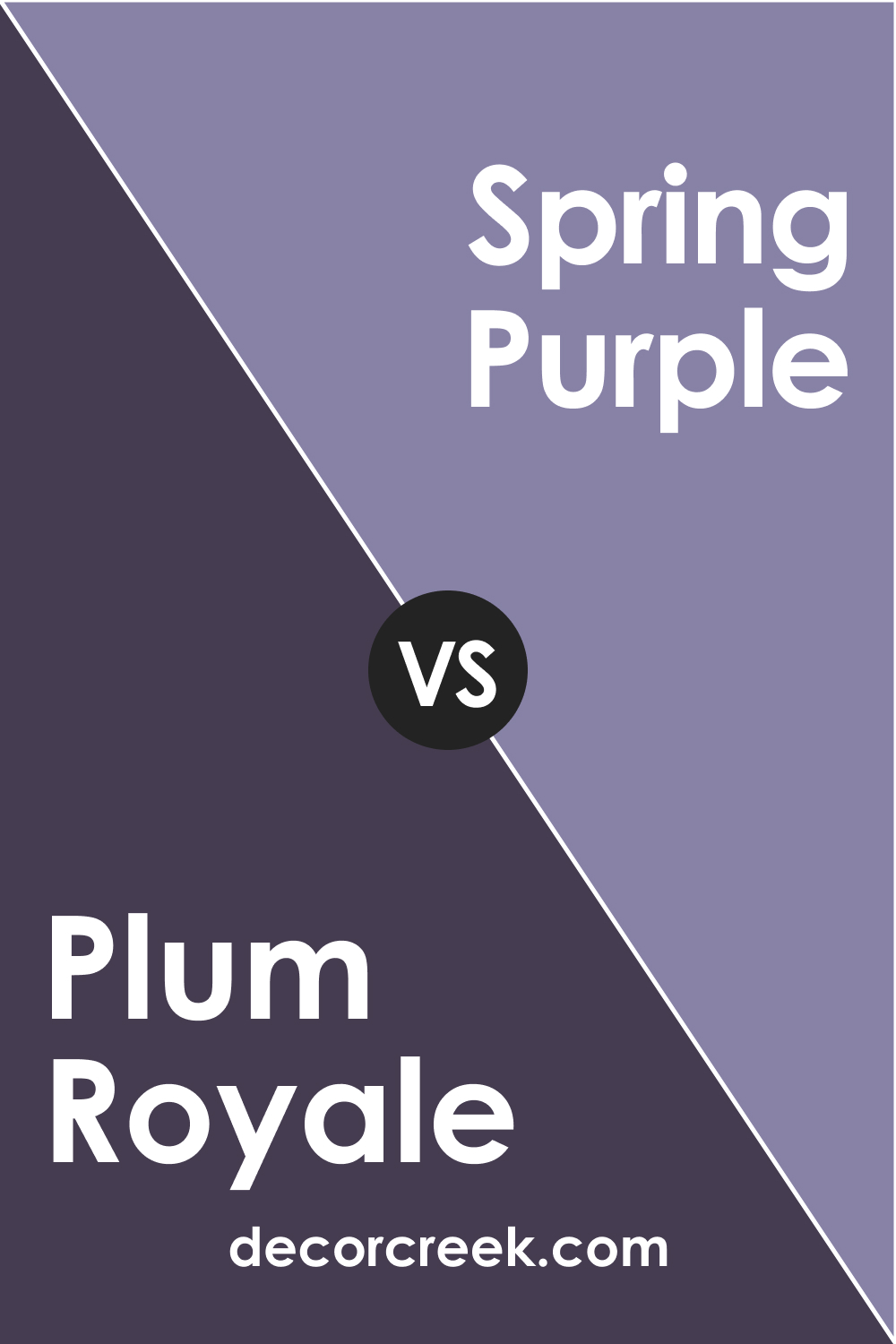
Plum Royale 2070-20 vs. BM 2070-40 Spring Purple
Spring Purple provides a more vivacious and uplifting purple compared to the deep and sumptuous tone of Plum Royale. Spring Purple can energize a space without the weighty seriousness of Plum Royale, suitable for areas that benefit from a light-hearted and fresh ambience. Plum Royale, on the other hand, is ideal for creating a focal point or defining a space with confident color.
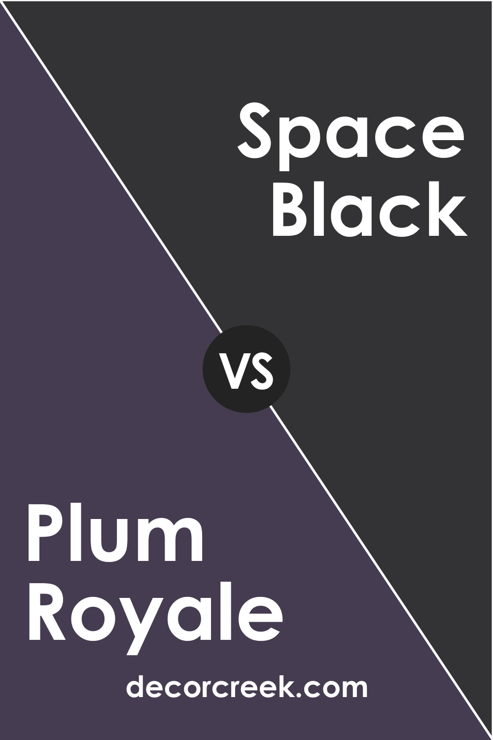
Plum Royale 2070-20 vs. BM 2119-10 Space Black
Space Black represents the extreme end of the spectrum, offering an absolute absence of color that delivers stark contrast and dramatic flair. When compared to the rich and vibrant Plum Royale, Space Black can make its purple tones appear even more saturated and lively. The two could work together for a modern, chic aesthetic, with Plum Royale breaking up the potential monotony of black.
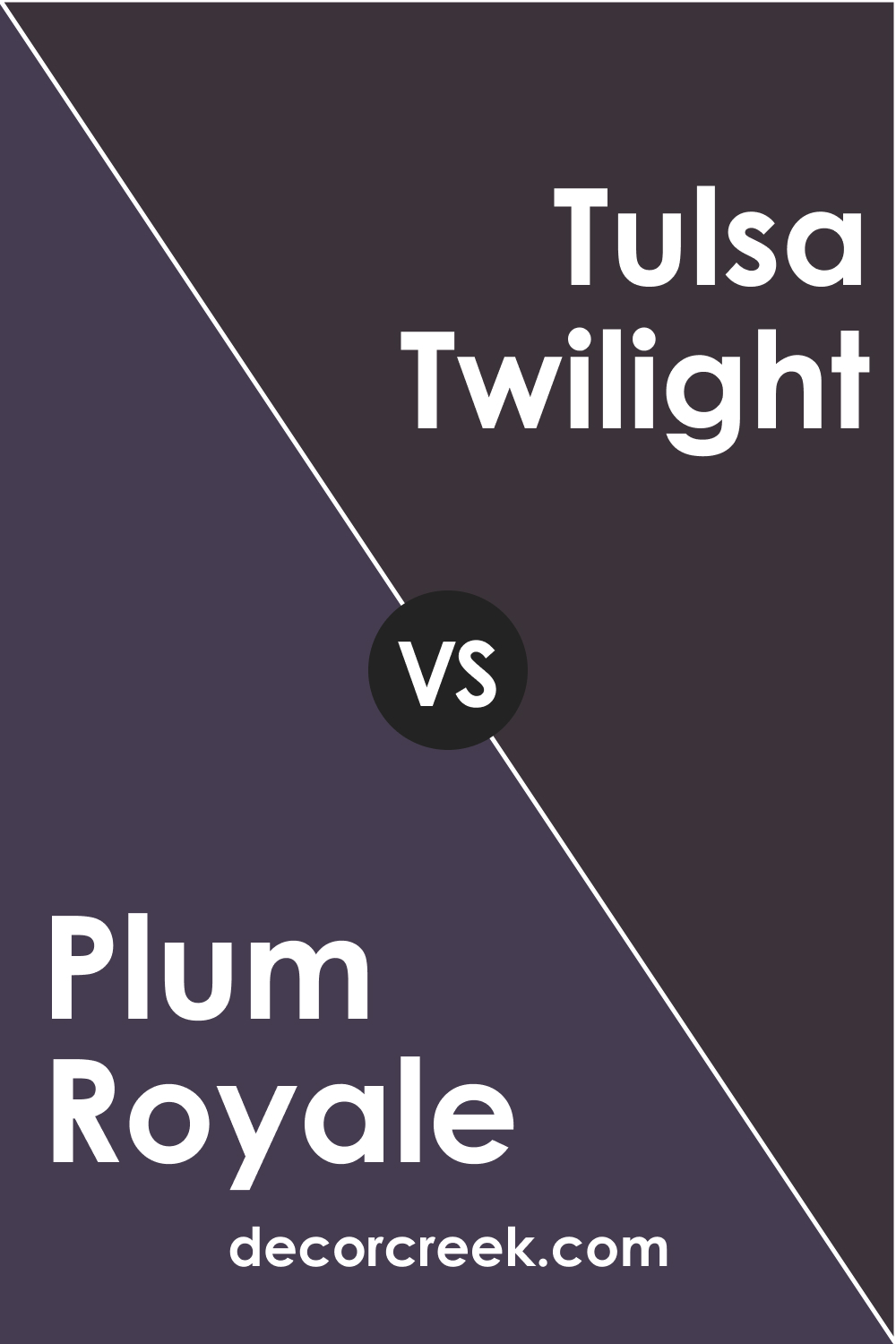
Plum Royale 2070-20 vs. BM 2070-10 Tulsa Twilight
Tulsa Twilight is another profound color but with a different hue leaning that can seem almost nocturnal. Against Plum Royale, it may appear more reserved, less saturated, and could be perceived as more conservative. Plum Royale, with its richer purple tones, exudes warmth and depth, making it the more expressive choice of the two.
Conclusion
Selecting the perfect color for a space is a nuanced art that requires careful consideration of how different hues interact with each other and the elements within a room. Plum Royale 2070-20, with its rich purple tones, offers a luxurious and dramatic option that can transform a space into one of sophistication and depth.
Through comparisons with other colors, it’s evident that Plum Royale carries a unique blend of warmth and intensity that can anchor a room, lending it a regal elegance that is both striking and inviting.
Whether coordinating with lighter violets to create a gradient effect, contrasting against stark blacks for a modern twist, or standing alone as a statement hue, Plum Royale 2070-20 has the versatility to evoke a range of moods and styles, making it an exceptional choice for those daring to make a bold color statement.