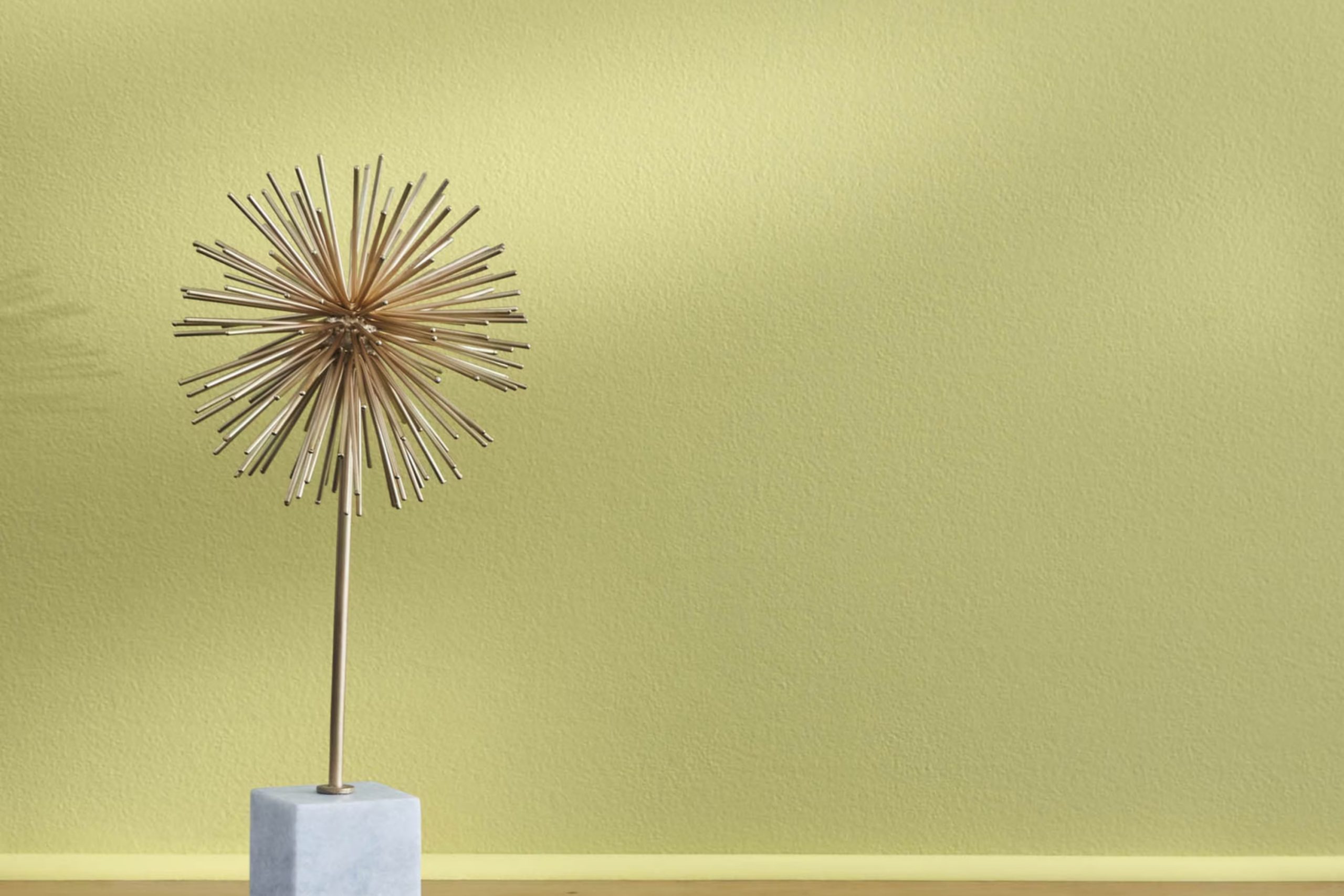
As I set out to repaint my kitchen, I stumbled upon a unique shade called 2147-40 Dill Pickle by Benjamin Moore. Initially, I was searching for something fresh but still subtle, and this color struck the perfect balance. It has a soft, welcoming green hue that immediately gives a soothing feel to the room. It isn’t too strong but has enough vibrancy to make the area look lively and inviting.
Choosing a paint color can be tricky— you want to make sure it matches your decor and lighting. Dill Pickle fits right in with my wooden cabinets and natural light, enhancing the cozy ambiance of the kitchen.
It’s surprising how a single change like this can refresh your home’s look and feel. As I began applying the first coat, I noticed how the color brought a new energy and warmth to the room.
This choice turned out to be exactly what I needed to make my kitchen feel like a new setting without undertaking a massive renovation.
What Color Is Dill Pickle 2147-40 by Benjamin Moore?
Dill Pickle by Benjamin Moore is a unique and playful green hue with a touch of earthiness, making it an adaptable choice for various interior design styles. This color evokes the freshness of nature and brings a lively yet grounded energy to any room.
It perfectly suits farmhouse and rustic-style rooms because its earthy tones complement natural elements like wood and stone. Additionally, Dill Pickle works well in eclectic and bohemian decors, where its lively personality can blend with vibrant textiles and artistic decor pieces.
This green shade pairs beautifully with natural materials such as linen, wool, and cotton, adding warmth and texture to the decor. Wood, especially in lighter tones like pine or oak, enhances the earthiness of Dill Pickle, promoting a cozy and welcoming atmosphere. For a more modern twist, incorporating metals like brushed nickel or copper can add a hint of contrast and brightness to areas dominated by this color.
Dill Pickle also harmonizes with neutral colors such as creamy whites or soft grays, which help to balance its vividness. Using these combinations allows for greater flexibility in designing a room that feels both refreshing and grounded. Whether used as an accent wall or throughout the interior, Dill Pickle can easily liven up a setting while maintaining a comforting ambiance.
Is Dill Pickle 2147-40 by Benjamin Moore Warm or Cool color?
Dill Pickle 2147-40 by Benjamin Moore is a vibrant, welcoming green shade that brings a fresh and lively touch to any room. Its natural tones make it particularly suited for rooms that benefit from a connection to the outdoors, like kitchens or sunrooms. This color pairs beautifully with natural wood finishes, adding warmth and a grounded, earthy feel.
It also complements white trim well, giving a crisp and clean look that can make smaller areas appear larger and more open. Using Dill Pickle in a home can help create a cozy, cheerful vibe that makes family and guests feel at ease. It’s perfect for those looking to add a splash of color without making a room feel too bold.
This shade works well in various lighting conditions, maintaining its lush green essence whether bathed in natural sunlight or under softer, artificial lighting. Overall, Dill Pickle by Benjamin Moore is an excellent choice for adding a touch of nature-inspired freshness to any interior.
Undertones of Dill Pickle 2147-40 by Benjamin Moore
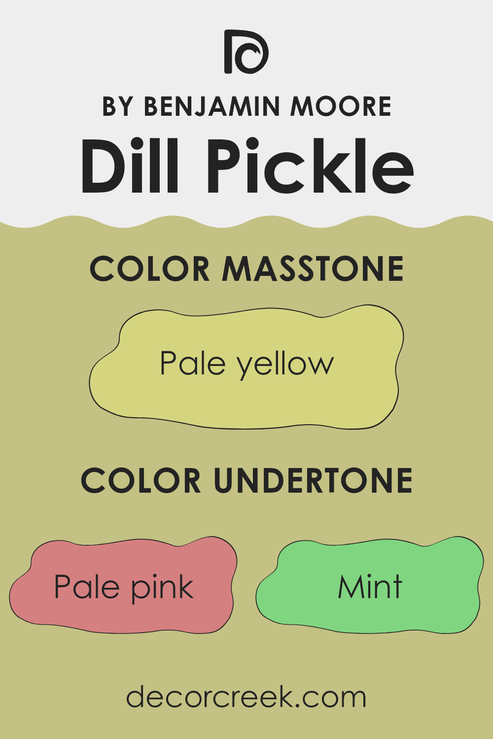
Dill Pickle by Benjamin Moore is a unique wall paint color that includes a mix of underlying hues that contribute to its overall appearance. These undertones—pale pink, mint, light gray, yellow, grey, light purple, light blue, orange, light green, lilac, and olive—modify how we perceive the color under different lighting conditions and when paired with various decor elements.
Undertones can subtly change how a color looks. For instance, in bright natural light, Dill Pickle might lean toward its lighter undertones like mint or pale pink, giving it a fresher look. In artificial or dim lighting, deeper undertones such as grey or olive might become more noticeable, making the color appear richer and warmer.
When applied to interior walls, the broad spectrum of undertones in Dill Pickle allows it to adapt beautifully to various furnishings and accent colors. The light gray or light blue could cool down a room that receives a lot of sunlight, preventing the area from looking overly bright. Meanwhile, undertones like yellow and orange can add a hint of warmth to rooms that are less lit, making them feel cozy and inviting.
Overall, Dill Pickle’s variety in undertones makes it an adaptable paint color that can enhance the aesthetic of a room through subtle shifts in its appearance, reacting dynamically with both the changing light and surrounding decor elements.
What is the Masstone of the Dill Pickle 2147-40 by Benjamin Moore?
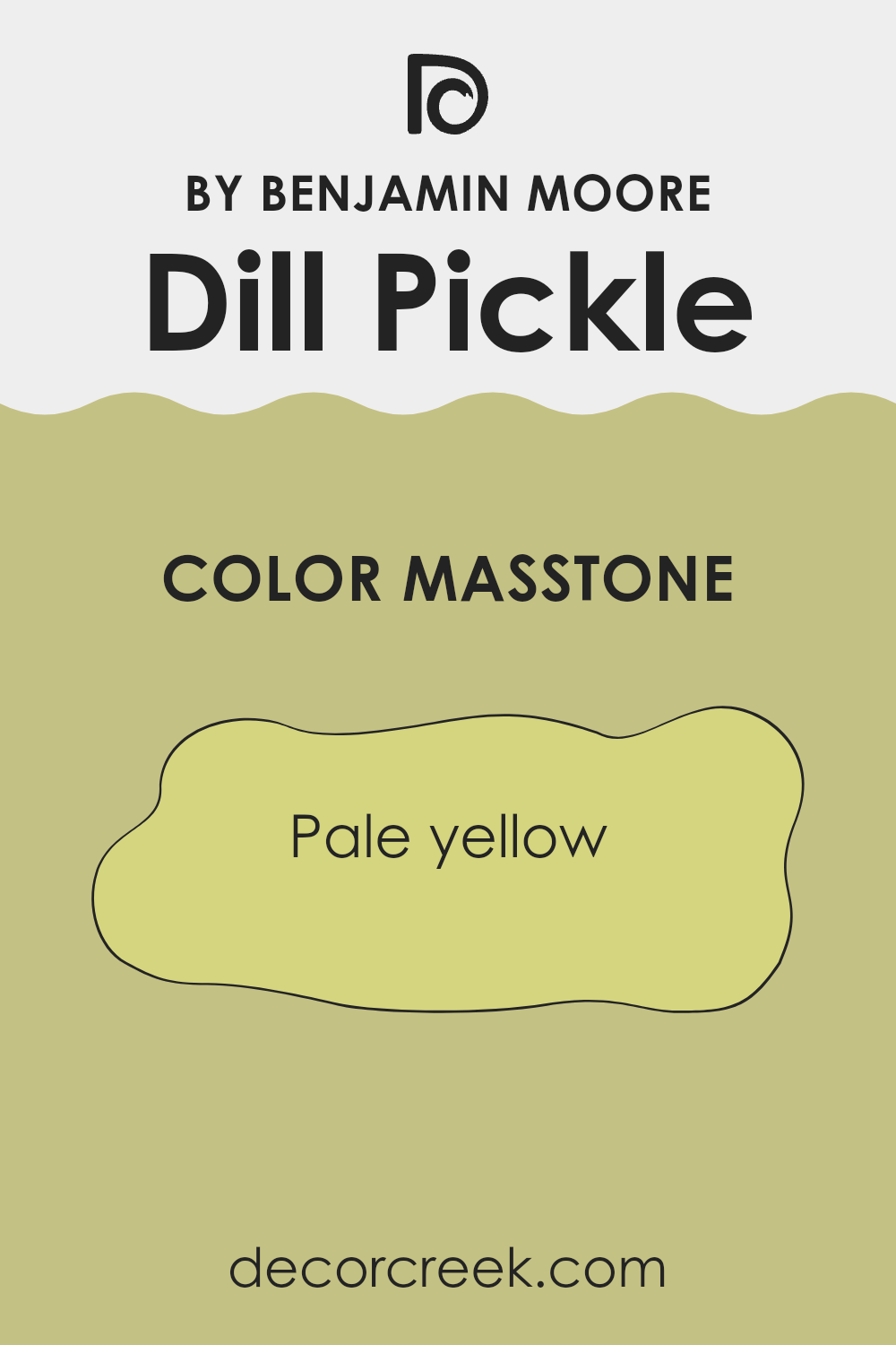
Dill Pickle 2147-40 by Benjamin Moore, with a masstone of Pale Yellow (#D5D580), is an adaptable and inviting paint color for any home. Its light yellow shade brings a bright and airy feel to rooms, making them appear more open and well-lit. Particularly effective in areas that don’t get a lot of natural sunlight, this color can make dark rooms feel cheerful and welcoming.
This shade of pale yellow also pairs well with a wide range of other colors. It complements both bold and subtle tones, allowing for various decorating styles, from casual to more formal designs. It’s a great choice for living rooms or kitchens where a touch of warmth can make a big difference.
Furthermore, this color’s softness is easy on the eyes, which makes it perfect for bedrooms where a calming atmosphere is preferred. Overall, this paint color is a practical choice that adds brightness to a home without being too strong, keeping rooms light and pleasant.
How Does Lighting Affect Dill Pickle 2147-40 by Benjamin Moore?
Lighting plays a crucial role in how colors appear in a room, dramatically impacting their perceived hue, saturation, and brightness. The color Dill Pickle by Benjamin Moore is no exception, as its appearance can vary significantly under different lighting conditions.
In artificial light, Dill Pickle tends to look warmer and more muted. Incandescent bulbs, which emit a yellowish light, can enhance the yellow tones within the color, making it appear cozier and richer. On the other hand, fluorescent lighting, with its cooler tone, might bring out more of the green in the paint, lending it a fresher, sharper feel.
Natural light has a profound effect on Dill Pickle, and its intensity and angle can change its appearance throughout the day. In rooms facing north, which receive less direct sunlight and generally have cooler, bluer light, Dill Pickle may appear slightly more muted and shadowed, with its green tones becoming more pronounced. This can make the room feel cooler and more subdued.
In south-facing rooms, which are bathed in warm, bright sunlight for most of the day, Dill Pickle can look much lighter and more vibrant. The ample sunlight highlights its lively green tones, making the room feel warm and inviting.
East-facing rooms receive morning light, which is bright and warm. In these rooms, Dill Pickle will appear bright and cheerful in the morning, with a noticeable yellow-green vibrancy that fades into a more balanced green as the day progresses.
Conversely, in west-facing rooms, the color experiences the reverse effect. It starts off softer in the earlier parts of the day under indirect light, then becomes more vivid and dynamic as it basks in the intense, warm evening light.
The way Dill Pickle reacts to different types of light and directions highlights the importance of considering lighting when choosing paint colors for any room to achieve the desired mood and effect.
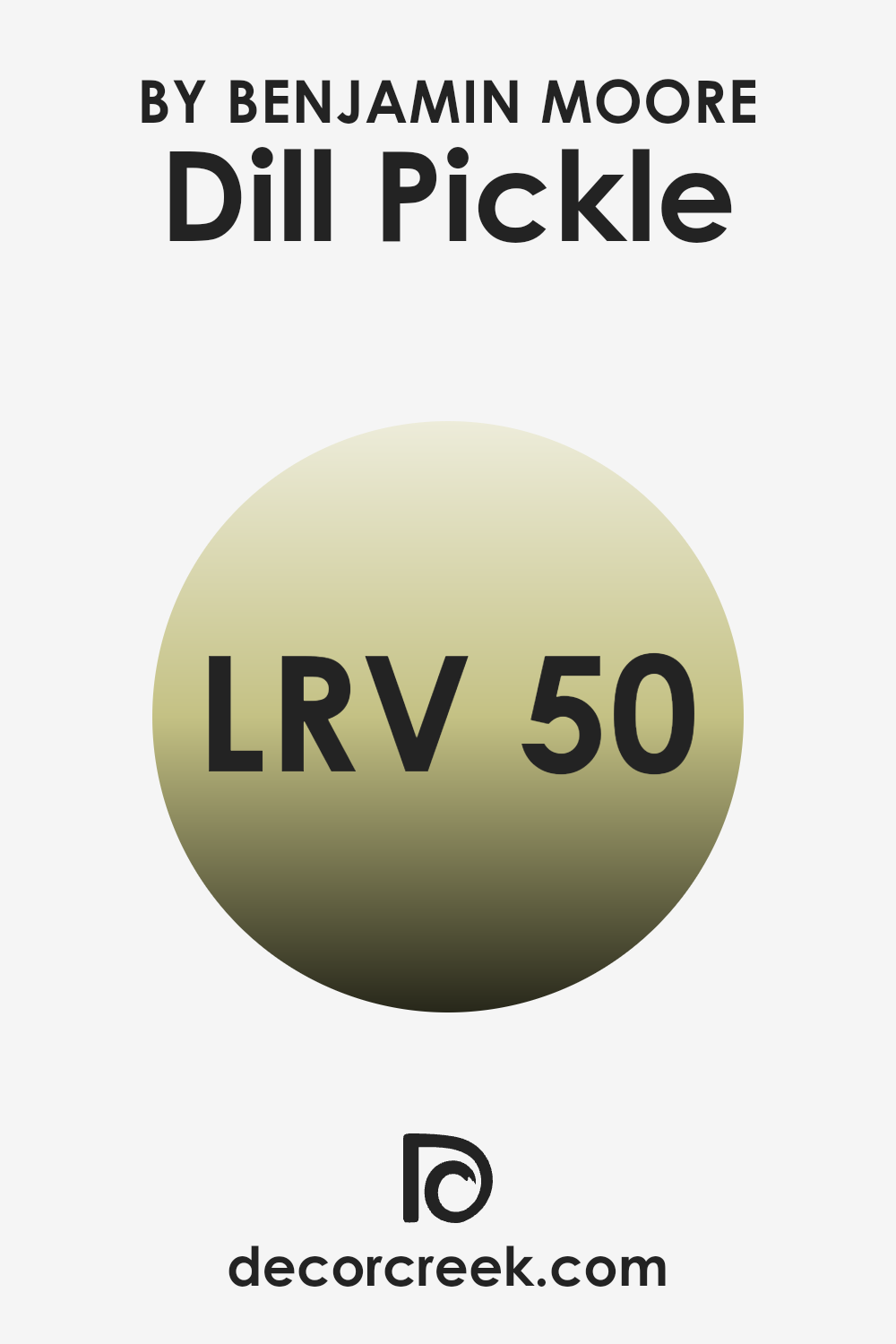
What is the LRV of Dill Pickle 2147-40 by Benjamin Moore?
LRV stands for Light Reflectance Value, a measure used to indicate how much light a paint color reflects or absorbs when applied to a surface. When a color has a high LRV, it reflects more light, making the room appear brighter and larger. Conversely, colors with a lower LRV absorb more light, which can make a room feel cozier but smaller and darker.
LRV is a practical tool used by interior designers and homeowners to choose the right shades for their interiors based on how much natural or artificial light a room receives. The LRV of Dill Pickle is 50.02, placing it right in the middle of the scale. This means it neither reflects an excessive amount of light nor absorbs too much.
In rooms with moderate to ample lighting, Dill Pickle will maintain its true color without darkening the interior or making it feel stark. This balance makes it an adaptable choice for many settings, helping maintain a room’s natural feel without overpowering it with brightness or making it feel cramped and dim.
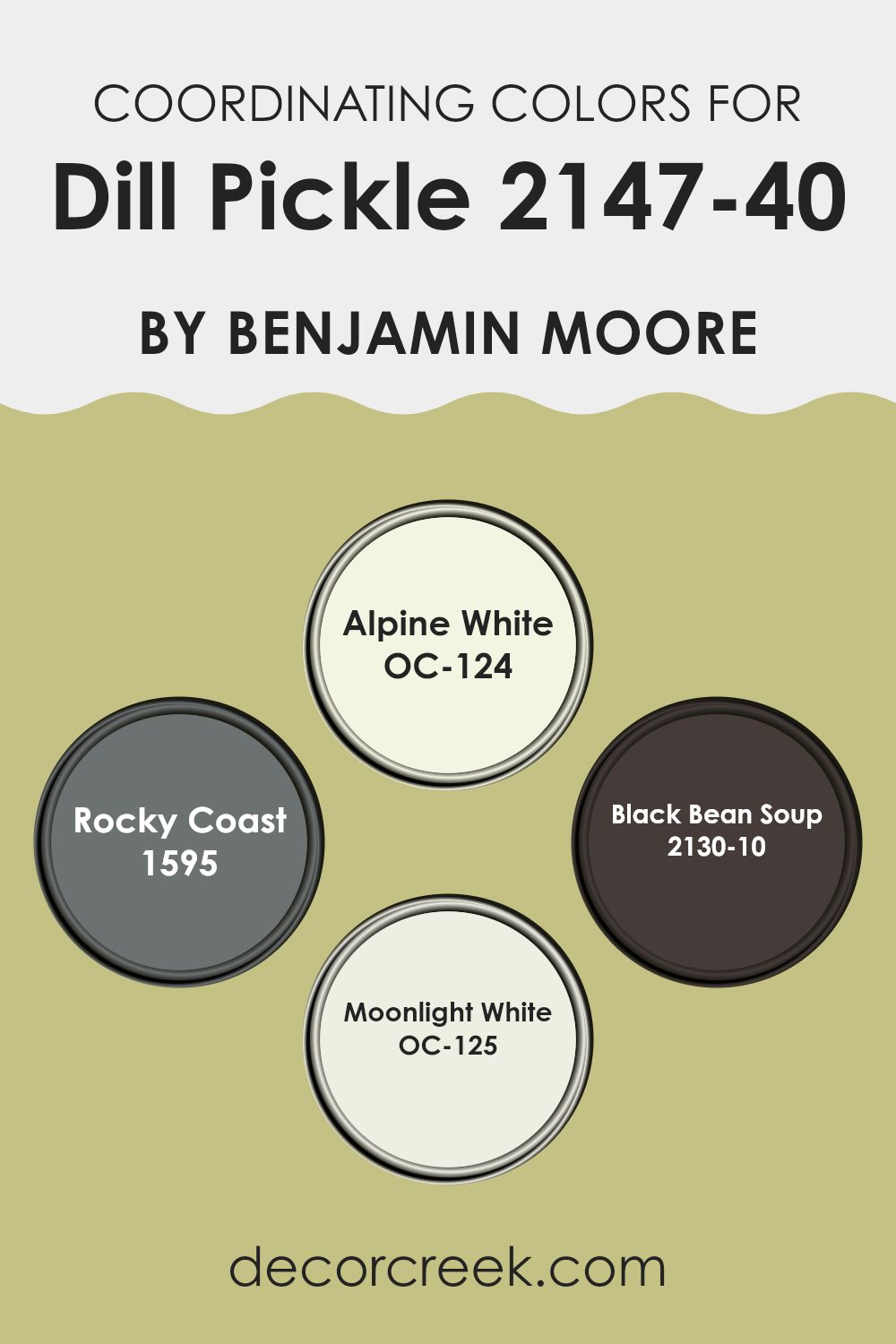
Coordinating Colors of Dill Pickle 2147-40 by Benjamin Moore
Coordinating colors are selected shades that complement a main color, enhancing the overall aesthetic of a room by creating balance and harmony. For instance, when decorating with a primary color like a pale, muted green, choosing the right coordinating colors can truly enhance the interior. The idea is to pick shades that are harmonious, either by being close on the color wheel or by providing pleasing contrasts.
Dill Pickle 2147-40 by Benjamin Moore, for example, works beautifully with softer neutrals and deep, rich tones. A coordinating color like OC-124 – Alpine White is a fresh and clean white that brings out the brightness in Dill Pickle, making the room feel airy and light. Rocky Coast 1595 is a mid-tone gray that adds a subtle contrast, grounding the lightness of Dill Pickle without making it too strong.
Another coordinating color, 2130-10 – Black Bean Soup, is a deep, dark brown that offers a bold contrast, perfect for creating a striking visual depth in a room. Lastly, OC-125 – Moonlight White provides a slightly warmer tone than Alpine White, giving a soft glow to the room which complements the natural vibe of Dill Pickle beautifully.
You can see recommended paint colors below:
- OC-124 Alpine White
- 1595 Rocky Coast
- 2130-10 Black Bean Soup
- OC-125 Moonlight White
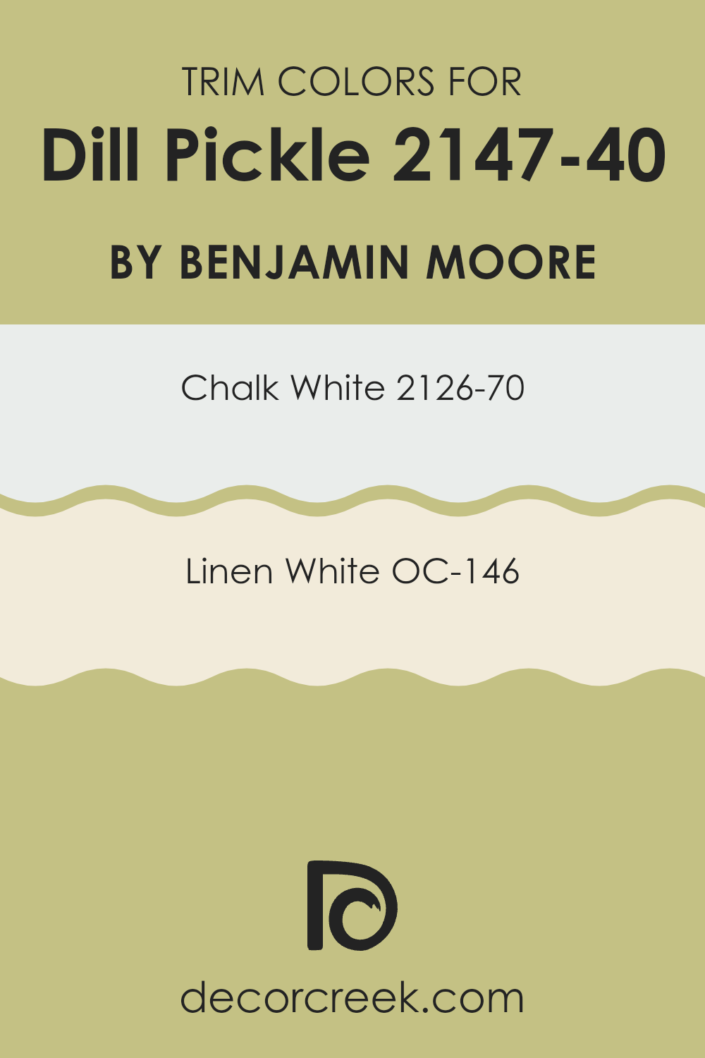
What are the Trim colors of Dill Pickle 2147-40 by Benjamin Moore?
Trim colors serve as an essential component in painting and decorating because they help to define and accentuate the architectural features of a room. Choosing the right trim color can enhance the overall aesthetics of an interior by creating a complementary contrast to the main wall color.
For example, when paired with a vibrant hue like Dill Pickle by Benjamin Moore, trim colors like Chalk White and Linen White can accentuate the lively nature of the green without making it too strong. Such a combination allows the boldness of Dill Pickle to stand out while the trim colors subtly frame and define the room, making it more inviting and neatly finished.
Chalk White 2126-70 is a clean and bright white color that brings a crisp clarity to any room. It works beautifully as a trim color because it provides a stark but fresh boundary to richer, more colorful walls.
Linen White OC-146 has a slightly warmer tone compared to Chalk White, giving it a soft and cozy feel. This color is ideal for trims as it offers a gentle transition from the vivid tones of wall colors to a more muted and calming white, which can make the interior feel harmonious and well-coordinated.
You can see recommended paint colors below:
- 2126-70 Chalk White
- OC-146 Linen White
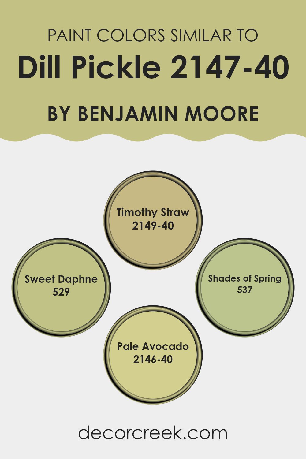
Colors Similar to Dill Pickle 2147-40 by Benjamin Moore
Choosing similar colors when designing a room is essential for creating a cohesive and harmonious atmosphere. Colors that closely relate to each other, such as shades surrounding Dill Pickle by Benjamin Moore, ensure that the room feels unified and fluid, providing a gentle visual flow that is pleasing to the eye.
For instance, using colors like Timothy Straw, Sweet Daphne, Shades of Spring, and Pale Avocado alongside Dill Pickle supports a balanced palette, with each color complementing the other without competing for attention. This method enhances the overall aesthetic of a room while maintaining a subtle and understated elegance that accommodates various decor styles and personal preferences.
Timothy Straw is a warm, mellow hue with a touch of earthiness that brings a cozy feel to any room, making it ideal for living rooms or study areas where comfort is key. On the other hand, Sweet Daphne offers a more vibrant take, with its slightly more lively green that injects a fresh and cheerful element, perfect for kitchens or playrooms.
Shades of Spring is lighter and airier, providing a soft backdrop that works well in smaller or darker rooms to give an illusion of more light and openness. Lastly, Pale Avocado has a subdued richness that works beautifully in bedrooms or bathrooms, where a calming influence is often desirable. Together, these colors work cohesively to craft visually soothing environments.
You can see recommended paint colors below:
- 2149-40 Timothy Straw
- 529 Sweet Daphne
- 537 Shades of Spring
- 2146-40 Pale Avocado
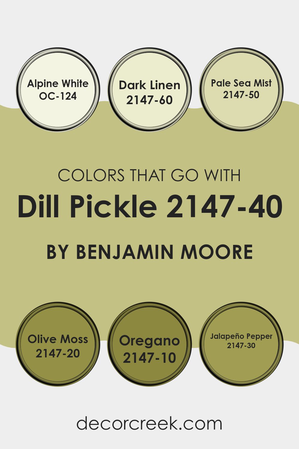
Colors that Go With Dill Pickle 2147-40 by Benjamin Moore
Choosing the right colors to pair with Dill Pickle 2147-40 by Benjamin Moore is crucial for creating a harmonious and appealing ambiance in any room. Colors that complement Dill Pickle, such as OC-124 – Alpine White or 2147-60 – Dark Linen, play a significant role in balancing the environment.
Alpine White is a crisp and clean white that brings a fresh and airy feel to the interior, making it a perfect match for the subtle green tones of Dill Pickle. On the other hand, Dark Linen is a lighter, soothing beige that adds a touch of warmth, enhancing the coziness of the room without overpowering the main color.
For those who prefer a bit more depth, shades like 2147-50 – Pale Sea Mist or 2147-20 – Olive Moss are excellent choices. Pale Sea Mist offers a gentle, muted green that echoes the earthy undertones of Dill Pickle, providing a sense of continuity and flow. Olive Moss is a darker, richer hue that contrasts nicely with Dill Pickle, adding depth and interest to the palette.
More vibrant options like 2147-10 – Oregano and 2147-30 – Jalapeño Pepper add a dynamic flair. Oregano is a deep, dark green that gives a bold touch to decor elements, ideal for accentuating details. Jalapeño Pepper stands out with its lively, bright green that injects energy and a fun vibe to go alongside the more subdued Dill Pickle, perfect for creating focal points in the design. These color relationships are key in achieving a well-rounded and visually appealing interior.
You can see recommended paint colors below:
- OC-124 Alpine White
- 2147-60 Dark Linen
- 2147-50 Pale Sea Mist
- 2147-20 Olive Moss
- 2147-10 Oregano
- 2147-30 Jalapeño Pepper
How to Use Dill Pickle 2147-40 by Benjamin Moore In Your Home?
Dill Pickle 2147-40 by Benjamin Moore is a vibrant and engaging green paint that can add a fresh look to any room in your house. This color works great in rooms that get a lot of sunlight, bringing a lively yet cozy atmosphere.
You can use it in the kitchen to complement wooden cabinets or white countertops for a natural, earthy feel. It’s also perfect for a bedroom, where the calming qualities of green can help create a relaxing environment, helping you to unwind and get a good night’s sleep.
In the living room, pairing Dill Pickle with neutral tones like grays or creams can make the interior feel warm and welcoming. For those wanting to add a bit of fun to their bathroom, this shade can be paired with bright towels or accessories. Dill Pickle is not just a paint but a way to make your home more enjoyable and lively by simply adding color to the walls.
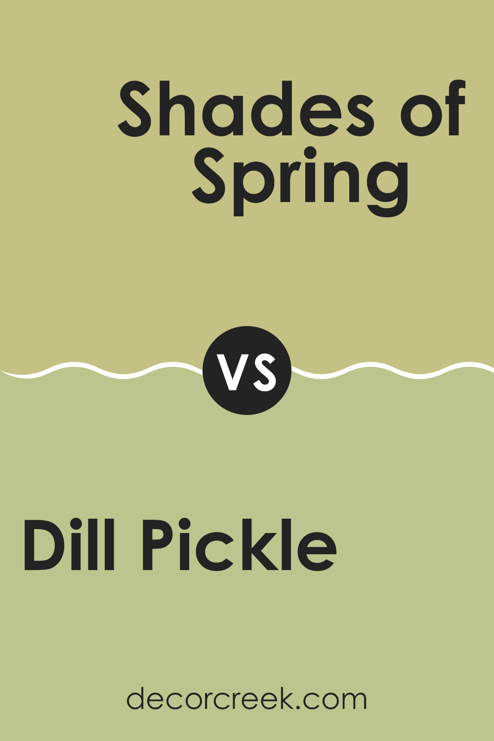
Dill Pickle 2147-40 by Benjamin Moore vs Shades of Spring 537 by Benjamin Moore
Dill Pickle by Benjamin Moore is a vibrant green that brings to mind the freshness of crisp, green vegetables. It’s a lively color that adds energy to any room, making the interior look alive and inviting.
On the other hand, Shades of Spring is a much softer green. It has a gentle touch, giving a more understated and calming appearance. While Dill Pickle stands out and attracts attention with its bold hue, Shades of Spring is more reserved, offering a pleasant and balanced backdrop.
The difference between them can be likened to the distinction between a bright, sunny day and a soft, misty morning. Each of these colors has its unique charm, making them suitable for different rooms depending on the atmosphere you want to create.
You can see recommended paint color below:
- 537 Shades of Spring
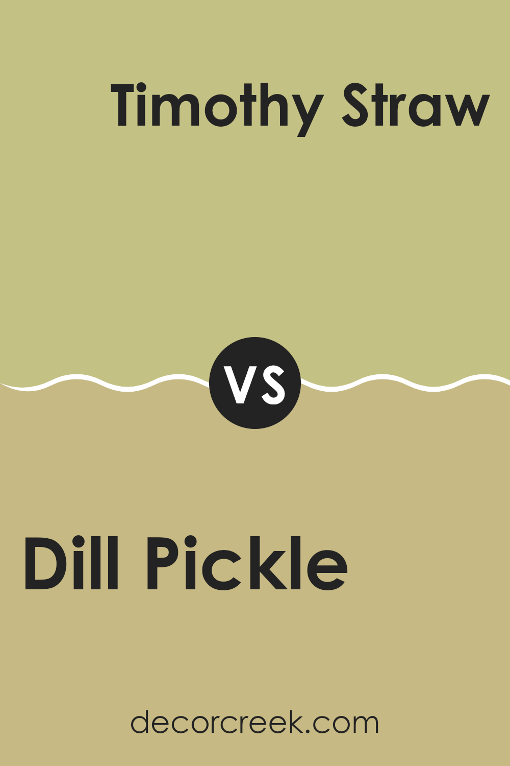
Dill Pickle 2147-40 by Benjamin Moore vs Timothy Straw 2149-40 by Benjamin Moore
Dill Pickle and Timothy Straw by Benjamin Moore are two distinct colors with unique vibes. Dill Pickle is a deep, muted green that brings to mind the color of a leafy forest. It has a calm, relaxing feel, perfect for creating a cozy and inviting atmosphere in a room.
On the other hand, Timothy Straw is a warm, golden beige that resembles the hue of dried straw or late summer wheat fields. This color provides a pleasant, bright feeling to any interior, giving it a friendly and open appearance.
While Dill Pickle works well in rooms where a touch of nature and depth is desired, Timothy Straw is excellent for areas where you want to introduce light and warmth. These colors could complement each other in an interior that seeks balance between warmth and coolness, or they can be used separately to achieve different moods depending on the room’s purpose.
You can see recommended paint color below:
- 2149-40 Timothy Straw
Dill Pickle 2147-40 by Benjamin Moore vs Pale Avocado 2146-40 by Benjamin Moore
The main color, Dill Pickle, is a warm and inviting shade of green with a definite presence of yellow, giving it a cozy, earthy feel. It’s quite rich and can bring a sense of comfort and welcoming vibes to any room. This color is perfect for rooms where you want to create a friendly and comfortable atmosphere, like living rooms or kitchens.
On the other hand, Pale Avocado is a lighter, softer green. It leans more towards a fresh, natural look, providing a subtle backdrop that can make a room feel brighter and more open. It’s ideal for smaller interiors or areas where you want to keep the mood light and airy.
Both colors offer distinct vibes — Dill Pickle brings warmth and coziness, while Pale Avocado offers a fresh and open feel. Depending on what atmosphere you want in your room, each has its charm to enhance the environment.
You can see recommended paint color below:
- 2146-40 Pale Avocado
Dill Pickle 2147-40 by Benjamin Moore vs Sweet Daphne 529 by Benjamin Moore
Both “Dill Pickle” and “Sweet Daphne” by Benjamin Moore are distinctive shades that could brighten up any room, but they each have their unique vibe. Dill Pickle is a muted, earthy green that feels calm and grounding.
It’s an adaptable color that works well in many interiors, providing a sense of freshness without being too bold. On the other hand, Sweet Daphne is a lighter, more delicate shade of green with a subtle hint of blue. This color is cheerful and uplifting, great for creating a light and airy feel in a room.
While Dill Pickle might be more suited for areas where you want a cozy or toned-down look, Sweet Daphne is perfect for rooms that benefit from a splash of brightness. Overall, they both offer lovely green hues but meet different aesthetic needs depending on the atmosphere you want to achieve.
You can see recommended paint color below:
- 529 Sweet Daphne
After reading about the 2147-40 Dill Pickle paint color by Benjamin Moore, I’ve learned quite a bit. This color is a lively green that reminds me of a sunny day in spring when the leaves are just sprouting. It’s a cheerful color that can make a room feel happy and full of life.
Since it’s like the color of nature, it can make your home feel fresh. I also found out that it’s good for both bedrooms and living rooms because it adds a pop of color without being too bright. Using Dill Pickle green in your home is a fun way to add some personality to your walls. It could mix well with soft whites or even some earthy browns and grays for a more grounded feel.
When used in a room with lots of sunlight, it can make the interior feel even more open and inviting. I think it’s perfect for anyone who wants to bring a little bit of the outdoors into their home. So, if you’re thinking of giving a room a makeover or just want to brighten up your interior, this color might be the right choice to make it look and feel cheerful and cozy.
Ever wished paint sampling was as easy as sticking a sticker? Guess what? Now it is! Discover Samplize's unique Peel & Stick samples.
Get paint samples

