Choosing the right paint color for your home can feel like a daunting task, especially with so many shades available. If you’ve been considering Benjamin Moore’s OC-68 Distant Gray, here are a few important things you should know before making your decision.
Distant Gray is not just another simple gray; it has unique qualities that can significantly affect the mood and lighting in your area. Its remarkably subtle undertones and how it interacts with different lighting scenarios can either improve your room’s natural charm or leave it feeling disconnected from your overall design vision.
I’ll help you understand how this particular shade behaves in various environments and what effects it could have in your home.
This will ensure that when you decide to go ahead with Distant Gray, you will be fully satisfied with how it changes your area.
Is Distant Gray OC-68 Right for My Home?
When I first saw Distant Gray from Benjamin Moore, I was struck by its pure, almost pristine quality. This color is so subtly bright; it’s like the lightest hint of a shadow on fresh snow. It’s perfect for creating a crisp, clean look in any room. I’ve noticed it works exceptionally well in modern and minimalist interiors, but it’s also adaptable enough for Scandinavian or even coastal styles, where simplicity and light are key elements.
In pairing materials, Distant Gray goes beautifully with natural wood, which adds warmth to its cool tones. I also love combining it with textures like linen or wool to bring some coziness into the area. For a more polished look, pairing it with marble or metallic finishes like brushed nickel or chrome can make the room feel refined yet welcoming.
Personally, I use Distant Gray in areas where I want a backdrop that’s unobtrusive yet beautifully present. It especially shines in well-lit areas, where the natural light improves its subtle nuances, making the area feel open and airy. Whether for a bedroom, bathroom, or a calm reading nook, this color has a way of making each area feel special and well-composed without competing with other elements in the room.
What are the right undertones of Distant Gray OC-68 ?
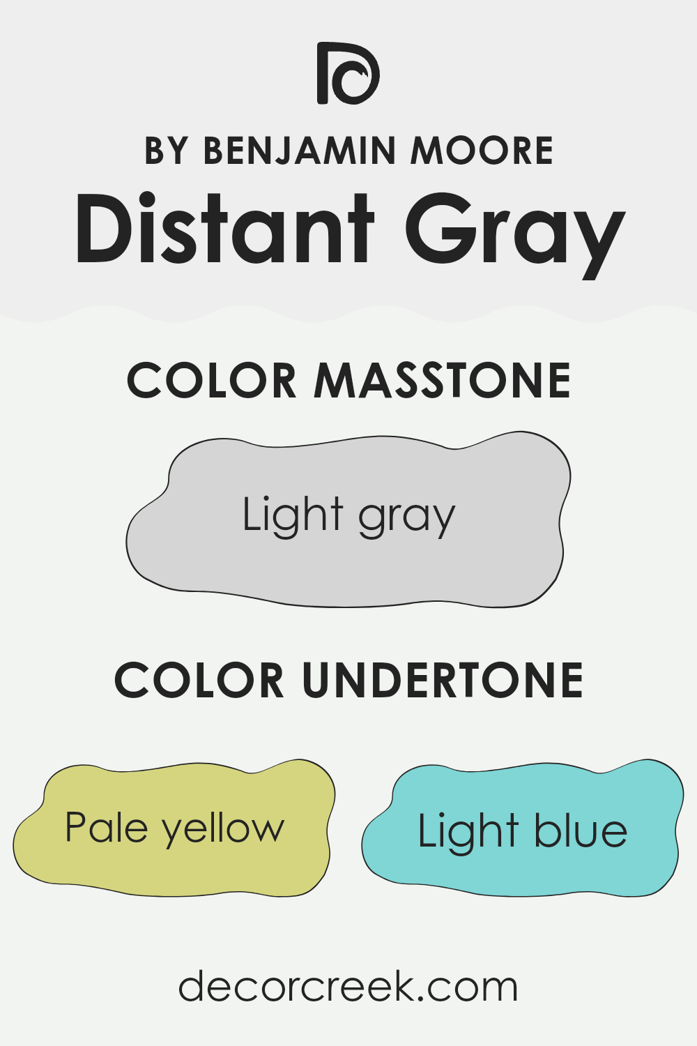
Distant Gray is a subtle paint color that might look simply gray at first glance. However, if you look closer, you’ll notice several different undertones that can change its appearance based on lighting and surrounding colors. Undertones are the hint of color beneath the main color. Although Distant Gray is primarily gray, it has undertones of pale yellow, light blue, light purple, mint, pale pink, lilac, and also gray itself.
These undertones play a significant role in how a color appears in different settings. For example, in a room with a lot of natural light, the pale yellow or light blue undertones might make the walls look slightly warmer or cooler, respectively. These changes can subtly affect the mood of the room – cooler tones often feel more relaxing, while warmer tones can make an area feel more welcoming.
When used on interior walls, Distant Gray’s mix of undertones offers a unique advantage. No matter the room’s lighting or the colors of the furniture and decor, there’s likely an undertone in Distant Gray that will complement them. This makes it a highly adaptable paint choice. In an area with wooden furniture, the pale yellow and pink undertones might highlight the wood’s warmth.
Alternatively, in a modern decor setup with metallic or blue accents, the mint and light blue undertones could harmonize beautifully. Overall, the varied undertones in Distant Gray make it a flexible paint option that can adjust to many different interior styles, subtly improving the overall aesthetic of any room.
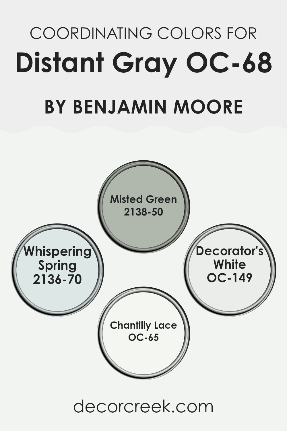
Best Coordinating Colors to use with Distant Gray OC-68 by Benjamin Moore this year.
Coordinating colors are selected hues that harmonize well with a primary color, effectively improving the overall aesthetic of an area without overpowering it. This color strategy is commonly used in interior design to create a balanced and visually appealing environment. For instance, certain shades are chosen to coordinate with a neutral base like gray, which acts as a perfect backdrop due to its adaptability. Such coordinated palettes ensure that colors complement each other, creating a cohesive and inviting look.
One of the coordinating colors chosen to pair with a light gray is Misted Green, a subtle green with a hint of blue that adds a touch of nature-inspired freshness to a room. It is gentle and works well in areas that aim for a calm and collected atmosphere.
Whispering Spring, another coordinating choice, is a soft blue that suggests the clear sky of early spring, providing a light, airy feel that improves openness and light. Moving on, Decorator’s White is a crisp white that provides a clean contrast, making it an excellent choice for trim or ceilings to frame the room with brightness. Lastly, Chantilly Lace is another white with a slightly warmer undertone, offering a creamy touch that creates a cozy, welcoming environment. Together, these colors support and enrich the primary color choice without clashing or distracting, making them ideal for achieving a harmonious design.
You can see recommended paint colors below:
- 2138-50 Misted Green
- 2136-70 Whispering Spring
- OC-149 Decorator’s White
- OC-65 Chantilly Lace
Trendy Trim Colors of Distant Gray OC-68 by Benjamin Moore to use this year.
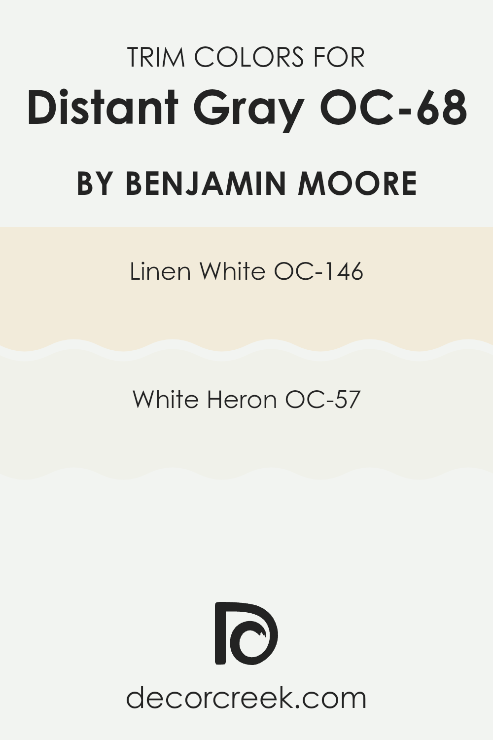
Trim colors are used to accentuate and highlight the architectural details of a room, such as moldings, door frames, and baseboards. Choosing the right trim color can improve the overall aesthetic of an area and create a pleasing visual contrast that defines and outlines distinct areas or features. When paired with a neutral tone like OC-68 Distant Gray by Benjamin Moore, using thoughtful trim colors can subtly underscore the walls and contribute to a more polished look.
Linen White OC-146 is a warm, inviting shade of white that carries a hint of creaminess, making it ideal as a trim color that can offer a soft contrast without overpowering the gentle tone of Distant Gray. It’s excellent for bringing a cozy and welcoming atmosphere to any area.
On the other hand, White Heron OC-57 presents a crisp and clean look that can brilliantly frame Distant Gray, ensuring a sharper, more defined boundary that naturally draws the eye toward the room’s design features. This color is perfect for creating a fresh and orderly appearance, smoothly complementing the main wall color.
You can see recommended paint colors below:
Evergreen Colors Similar to Distant Gray OC-68 by Benjamin Moore
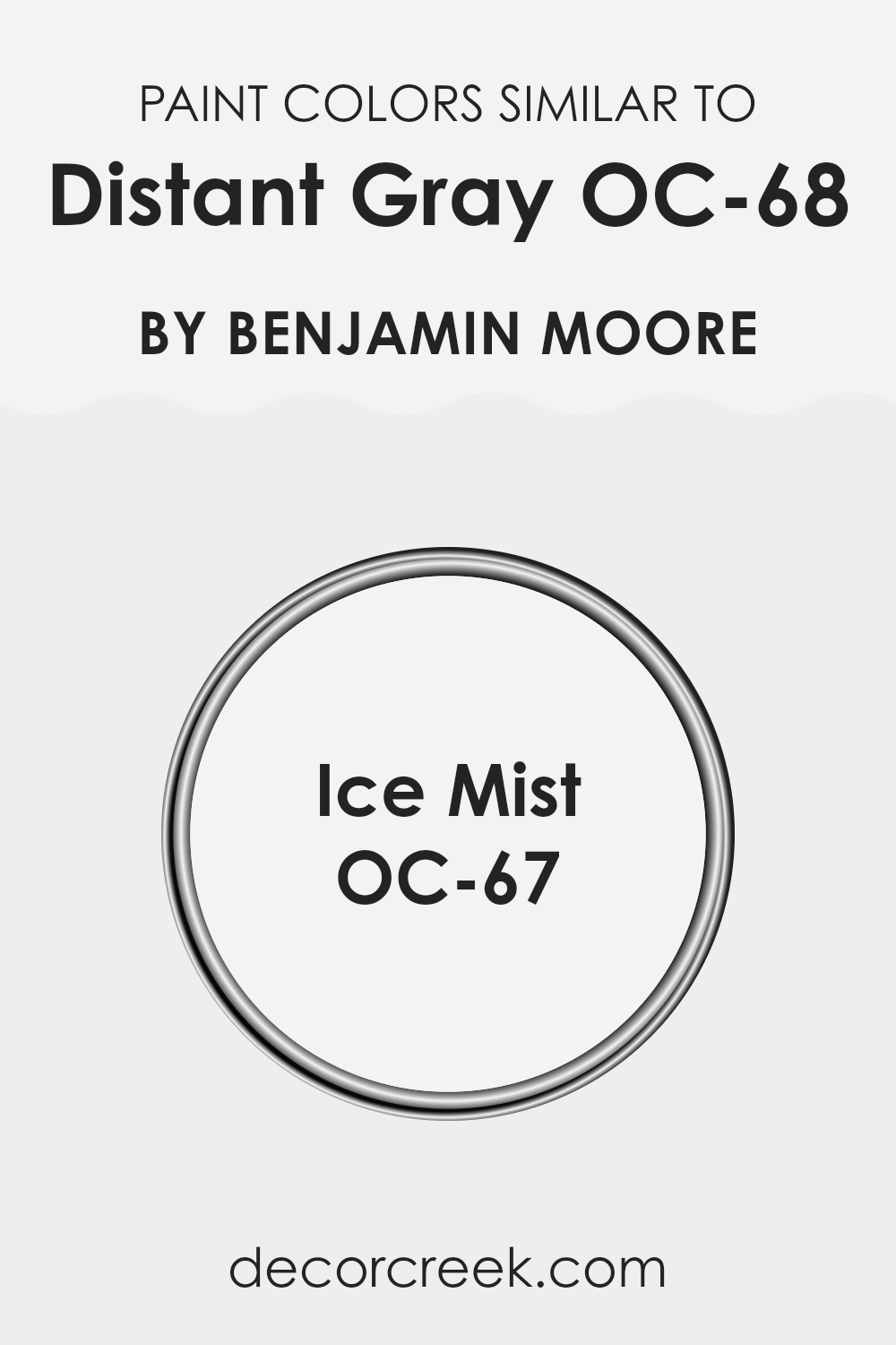
Choosing similar colors for a design scheme is essential because it creates a cohesive look that is pleasing to the eye. When using shades like Distant Gray OC-68 and its similar color Ice Mist OC-67 by Benjamin Moore, the subtle differences in hue help in crafting a harmonious area without creating a monotonous feel.
These similarities in color ensure that elements in a room complement each other, making the area appear larger and more open. When colors closely relate, they smoothly blend, easing visual transitions from one area to another, which is particularly beneficial in open floor plans or smaller rooms where you want to maximize the sense of area.
Distant Gray OC-68 by Benjamin Moore is a very light gray that almost appears white, giving a clean and understated backdrop that is adaptable for various settings. It pairs well with bold colors and soft furnishings, offering a reliable base for any decor style.
On the other hand, Ice Mist OC-67 is slightly brighter and cooler, providing a crisp, refreshing look that improves natural light in an area. This color is ideal for bathrooms and kitchens where you want a clean, fresh vibe that still feels warm and welcoming. Both these colors contribute to creating a refined and harmonious aesthetic without overpowering the senses.
You can see recommended paint color below:
- OC-67 Ice Mist
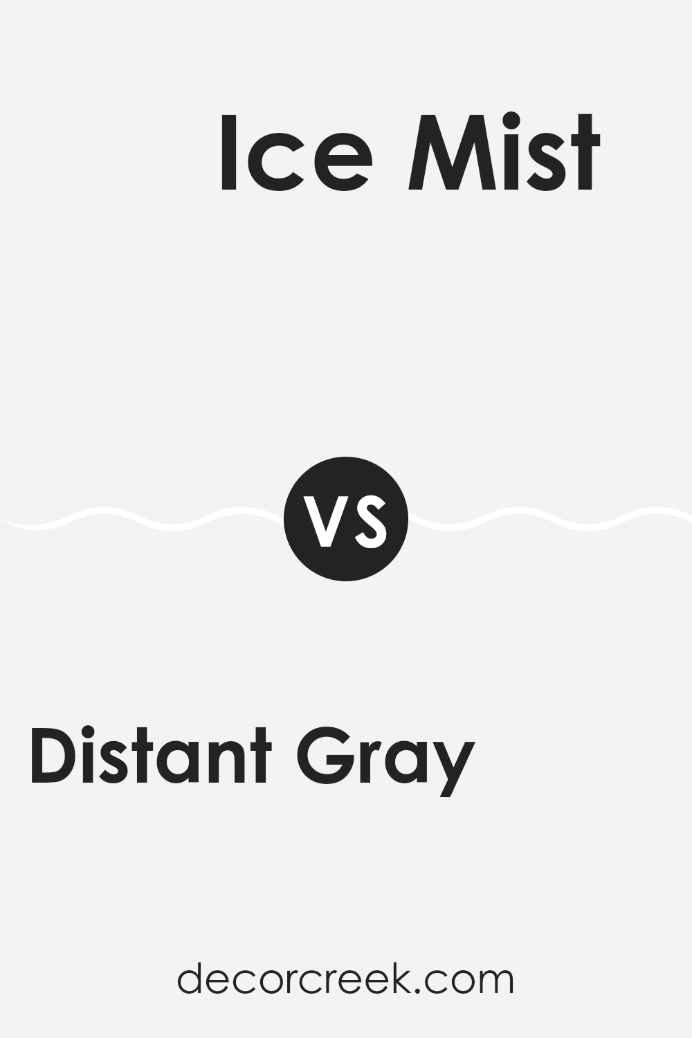
Distant Gray OC-68 by Benjamin Moore vs Ice Mist OC-67 by Benjamin Moore
Distant Gray OC-68 and Ice Mist OC-67, both by Benjamin Moore, are subtle and light colors, but they have distinct differences. Distant Gray is a soft, nearly white shade with a hint of gray, giving it a clean and neutral look. This color is excellent for creating a bright and airy feel in a room, making small areas appear larger.
On the other hand, Ice Mist OC-67 is even lighter, leaning toward a very pale, almost icy-white tone. This color reflects light beautifully, making it perfect for areas where you want to achieve a fresh, crisp atmosphere.
Both colors offer a minimalist vibe, but Distant Gray can provide a slightly warmer touch due to its gray undertones, whereas Ice Mist has a cooler effect because of its purer, brighter base. Choosing between the two would depend on whether you prefer a hint of warmth or a cooler, more reflective quality in your area.
You can see recommended paint color below:
- OC-67 Ice Mist
After reading all about OC-68 Distant Gray by Benjamin Moore, I’ve learned quite a lot about this unique paint color. It turns out, OC-68 Distant Gray is not just plain old gray. It’s a very soft, light gray that can make any room look bright and airy. It’s like a gentle morning sky on a clear day, which makes you feel calm and happy.
This paint color is great because it works well in different kinds of rooms, whether it’s a cozy bedroom, a busy kitchen, or even a bathroom. It pairs really well with lots of other colors, meaning you can use it with blues, pinks, yellows, or just about any color you like for furniture or decorations.
One of the biggest advantages of using OC-68 Distant Gray in your home is that it makes areas feel bigger and more open. This is really helpful especially if you have a smaller room. It acts almost like a magic trick, giving the illusion of more room while keeping everything looking neat and clean.
In conclusion, if you’re thinking about choosing a new paint color for your room, OC-68 Distant Gray by Benjamin Moore could be a perfect choice. It’s a friendly gray that works beautifully with other colors and will make any room in your house feel open and welcoming. Plus, it’s a color that you won’t get tired of seeing every day, which makes it a pretty smart pick!
Ever wished paint sampling was as easy as sticking a sticker? Guess what? Now it is! Discover Samplize's unique Peel & Stick samples.
Get paint samples

