As someone who enjoys updating and refreshing home areas, choosing the right paint color is crucial. Benjamin Moore’s OC-57 White Heron is a popular choice that you might be considering. Before you make a final decision, there are some important aspects to consider about this particular shade.
First, White Heron is recognized for its clean and crisp appearance, which can brighten rooms significantly. This is ideal if you’re looking to create a light and airy atmosphere in your area. However, it’s essential to review how this shade interacts with different lighting conditions, as natural and artificial light can significantly impact how the color appears on your walls.
Additionally, understanding the type of finish that complements your lifestyle and the room’s functionality can help ensure that the paint not only looks good but also lasts.
Whether you’re planning to refresh your living room, bedroom, or a more utilitarian area, gearing up with the right information about White Heron can lead to more satisfying results.
Is White Heron OC-57 Right for My Home?
White Heron OC-57 by Benjamin Moore is a soft and bright shade of white that feels crisp and inviting. When I first saw this color, I thought it had a very clean and subtle vibrancy that makes it incredibly adaptable. One of the things I really appreciate about White Heron is how it can make a small room look bigger, and a dark room appear brighter. It reflects light beautifully.
As for interior styles, I find it works seamlessly in modern and minimalistic environments, but it’s also right at home in more traditional settings. I love using it in areas where I want a fresh, clean background that lets other elements shine, whether that’s striking pieces of artwork or bold furnishings.
In terms of pairing with materials, White Heron goes well with natural wood, enhancing its warm tones. It also looks stunning against cool metals like chrome or silver. For textures, I find that it supports both smooth fabrics like silk and linens, as well as rougher materials like jute or wool. This balance makes it truly universal, whether I’m aiming for a cozy feel or a more polished look.
Choosing this shade gives me a reliable foundation that supports a variety of design decisions, making any decorating project a bit easier to tackle.
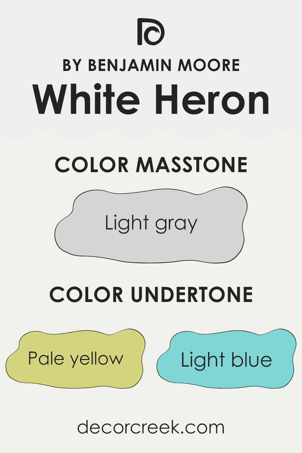
What are the right undertones of White Heron OC-57 ?
White Heron by Benjamin Moore is a subtle and adaptable paint color that often surprises people with its depth. The undertones in a paint color play a crucial role in how the color appears once applied to walls, affecting the ambiance of a room. For White Heron, these undertones include pale yellow, light blue, light purple, mint, pale pink, lilac, and grey. These varied undertones can make the paint seem different depending on the lighting and time of day.
For instance, in a room with lots of natural sunlight, the pale yellow and light blue undertones may make the walls appear slightly cooler and more refreshing. In contrast, during the evening under artificial lighting, the lilac or light purple undertones might become more noticeable, giving the walls a warmer, cozier feel. The subtle reflection of these undertones can enrich the environment, making it feel more welcoming.
In terms of interior decoration, these diverse undertones offer flexibility in color coordination with furniture and decor. The slight hints of color like mint or pale pink allow White Heron to pair well with soft textiles and natural materials, creating a unified and appealing look. When considering this paint for walls, it’s important to think about the room’s lighting and the colors of the surrounding elements to fully take advantage of its unique characteristics.
This approach helps in achieving the desired mood and style in the room.
Best Coordinating Colors to use with White Heron OC-57 by Benjamin Moore this year.
Coordinating colors are chosen to create a cohesive look when used together in interior design. They are selected based on how well they complement each other while maintaining a balance that enhances the overall aesthetic of a room.
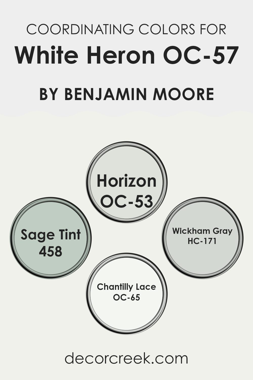
When working with a base color like White Heron by Benjamin Moore, which is a fresh and clean white, choosing the right coordinating colors is crucial to achieve a harmonious design. The colors Horizon, Sage Tint, Wickham Gray, and Chantilly Lace have been specifically selected as coordinating colors because they each offer a unique contribution while still complementing the base shade.
Horizon OC-53 is a soft, light gray with blue undertones that provides a subtle contrast to White Heron while maintaining a light and airy feel in the room. This color works well in areas that aim for a calm and relaxed atmosphere. Sage Tint 458 is a muted green with gray undertones, offering a touch of natural elegance when paired with White Heron, ideal for areas seeking a hint of color without overpowering the senses.
Wickham Gray HC-171 is another gray shade but with slightly deeper tones compared to Horizon, making it perfect for creating more definition and depth in a room. Lastly, Chantilly Lace OC-65 is a very clean, almost pure white, which brightens rooms and works wonderfully for trim, ceilings, or as a color to use on walls for those who prefer a minimalistic look.
You can see recommended paint colors below:
- OC-53 Horizon
- 458 Sage Tint
- HC-171 Wickham Gray
- OC-65 Chantilly Lace
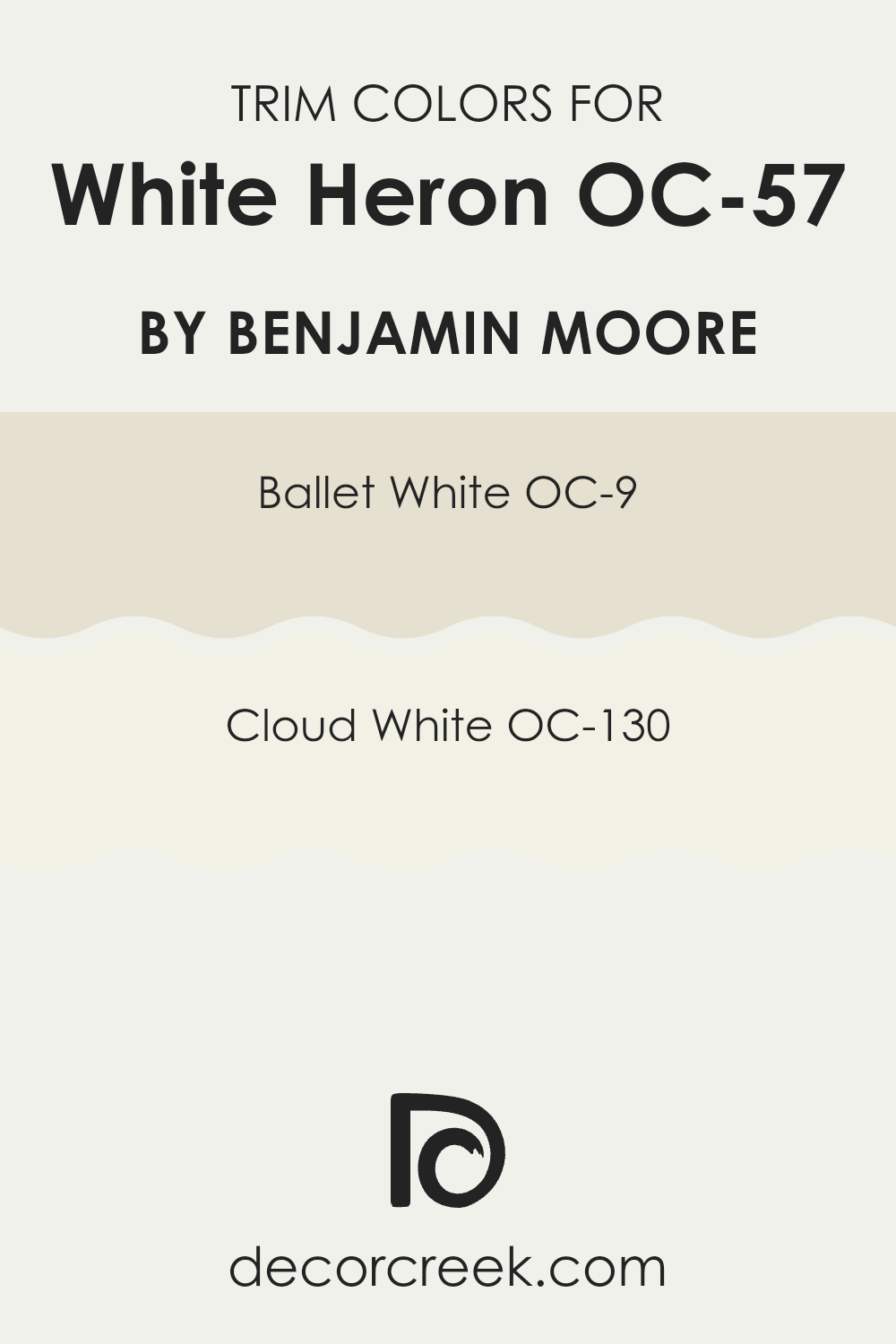
Trendy Trim Colors of White Heron OC-57 by Benjamin Moore to use this year.
Trim colors play a crucial role in interior design by framing the walls and accentuating architectural details. When paired with a neutral shade like White Heron by Benjamin Moore, choosing the right trim color can improve the overall aesthetics and bring a clean, finished look to a room.
For White Heron, a soft and welcoming hue, the use of complementary trim colors such as Ballet White OC-9 or Cloud White OC-130 ensures subtle contrast and continuity in design, keeping the ambiance light and airy yet clearly defined.
Ballet White OC-9 is a warm, gentle color that has an inviting quality, making it an excellent choice for trim as it provides a soft transition between the wall color and the trim without being too stark or overpowering. Cloud White OC-130, on the other hand, is a brighter, crisper white that offers a sharper contrast, which can help to make features like crown molding, window frames, and baseboards stand out against the muted backdrop of White Heron. Each color has its own charm and can help in creating a cohesive yet distinct environment that enhances both the room and the main wall color.
You can see recommended paint colors below:
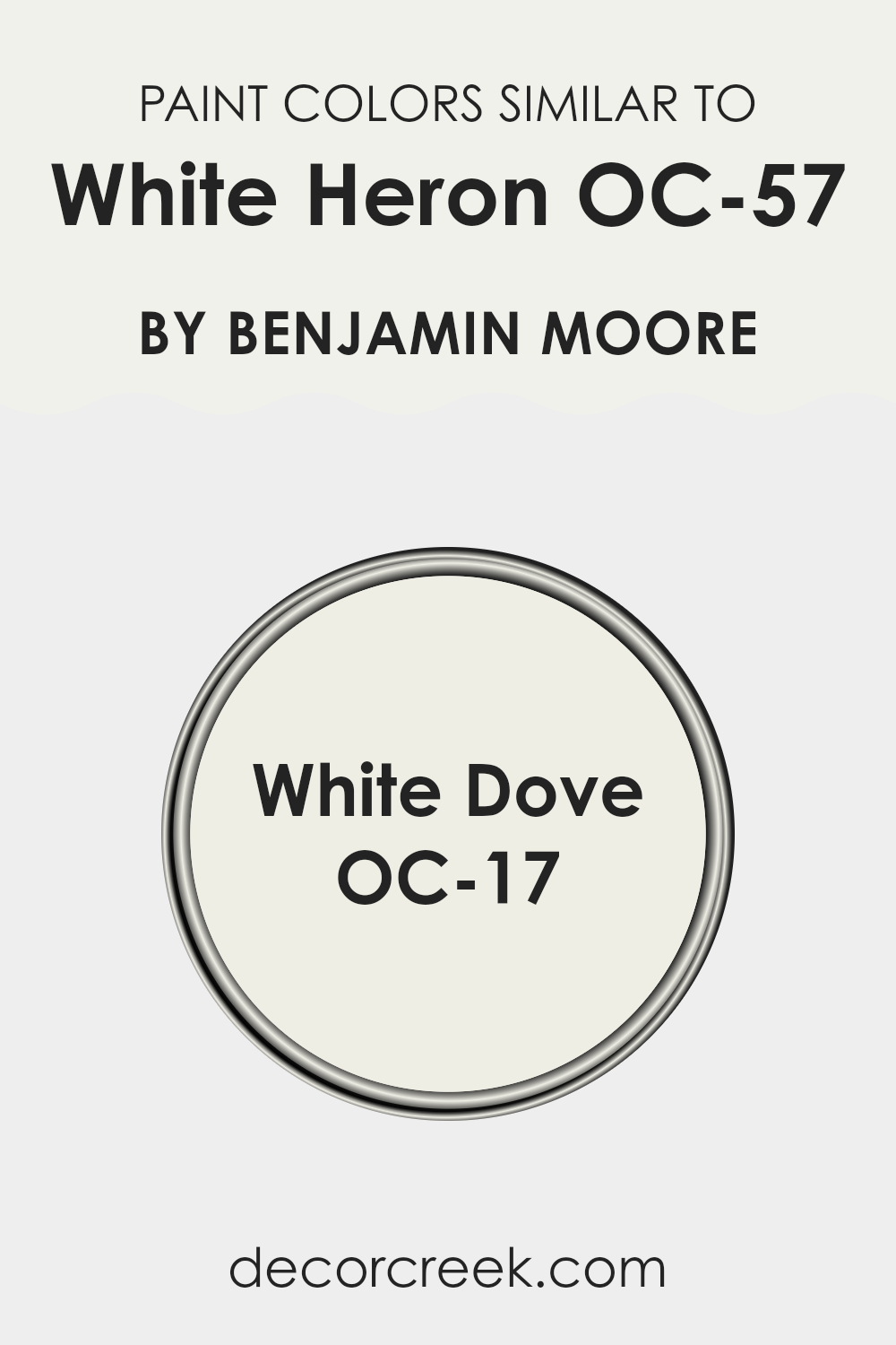
Evergreen Colors Similar to White Heron OC-57 by Benjamin Moore
When choosing paint colors for a home, selecting shades that harmonize can create a cohesive and calming environment. Similar shades to White Heron OC-57 by Benjamin Moore, such as White Dove OC-17, play a crucial role in achieving this seamless look.
These colors are close enough in hue to establish a continuous tone throughout the area, yet distinct in their subtle differences that contribute a level of interest and depth to the design. By using similar shades, the transitions between connected areas or adjacent walls become smoother, making the overall aesthetic more unified and pleasing to the eye.
White Dove OC-17 is a soft yet warm white that is perfect for those looking to add a gentle brightness to their room. Its slightly creamy undertone makes it ideal for creating a cozy atmosphere without the starkness that some brighter whites can convey.
On the other hand, White Heron OC-57 has a crisp, clean feel that reflects light beautifully, enhancing natural light sources and making areas appear more open and airy. Both these colors offer adaptability and an easy backdrop for various decor styles, effectively supporting a wide range of design preferences without overpowering the elements within the area.
You can see recommended paint color below:
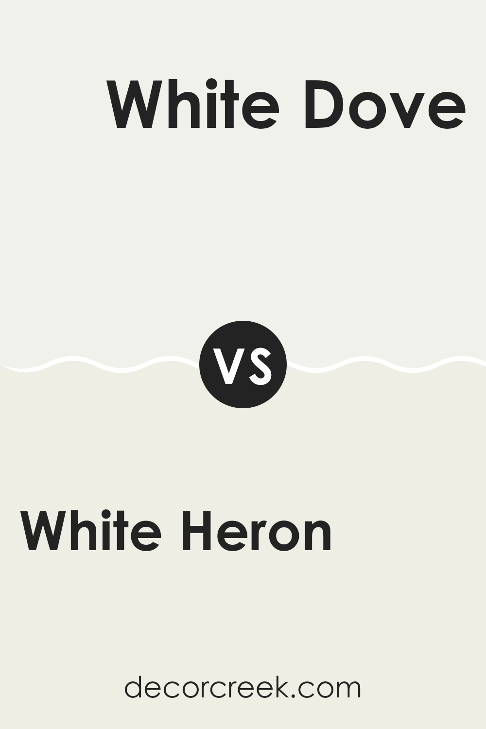
White Heron OC-57 by Benjamin Moore vs White Dove OC-17 by Benjamin Moore
The main color, White Heron, and the second color, White Dove, are both popular shades by Benjamin Moore. White Heron has a crisp, clean look with a slightly cool undertone that makes it excellent for areas that need a bright and airy feel. It reflects light beautifully, which can help make small rooms appear larger and more open.
On the other hand, White Dove has a warmer undertone, giving it a soft and inviting feel. It’s a great choice for creating a cozy atmosphere, especially in living areas or bedrooms. White Dove also pairs well with a wide range of other colors, making it adaptable for various decorating styles.
Both colors offer a fresh, clean backdrop for any room, but the choice between a cooler or warmer white would depend on your personal preference and the specific needs of the area you are decorating.
You can see recommended paint color below:
Writing the conclusion for the article, “OC-57 White Heron by Benjamin Moore,” I really learned a lot about this beautiful paint color. White Heron is not just a simple white. Its special soft and bright tone makes any room look fresh and clean. I realized it’s perfect for someone who wants to make their small rooms look bigger and their dark areas look lighter.
These features can make bedrooms feel calm and kitchens look welcoming, which is awesome. Imagine walking into a room that makes you feel relaxed right away. That’s what White Heron can do, and that’s why a lot of people might choose it when they decide to paint their home. It’s also very good at hiding marks on walls, which is helpful in families with kids or pets.
In the end, the article showed how OC-57 White Heron by Benjamin Moore isn’t just another shade of white; it’s a really great choice that can make your home look modern and tidy.
Finding out about how this paint works and what it looks like made me understand why it’s picked by so many people to brighten up their homes.
Ever wished paint sampling was as easy as sticking a sticker? Guess what? Now it is! Discover Samplize's unique Peel & Stick samples.
Get paint samples

