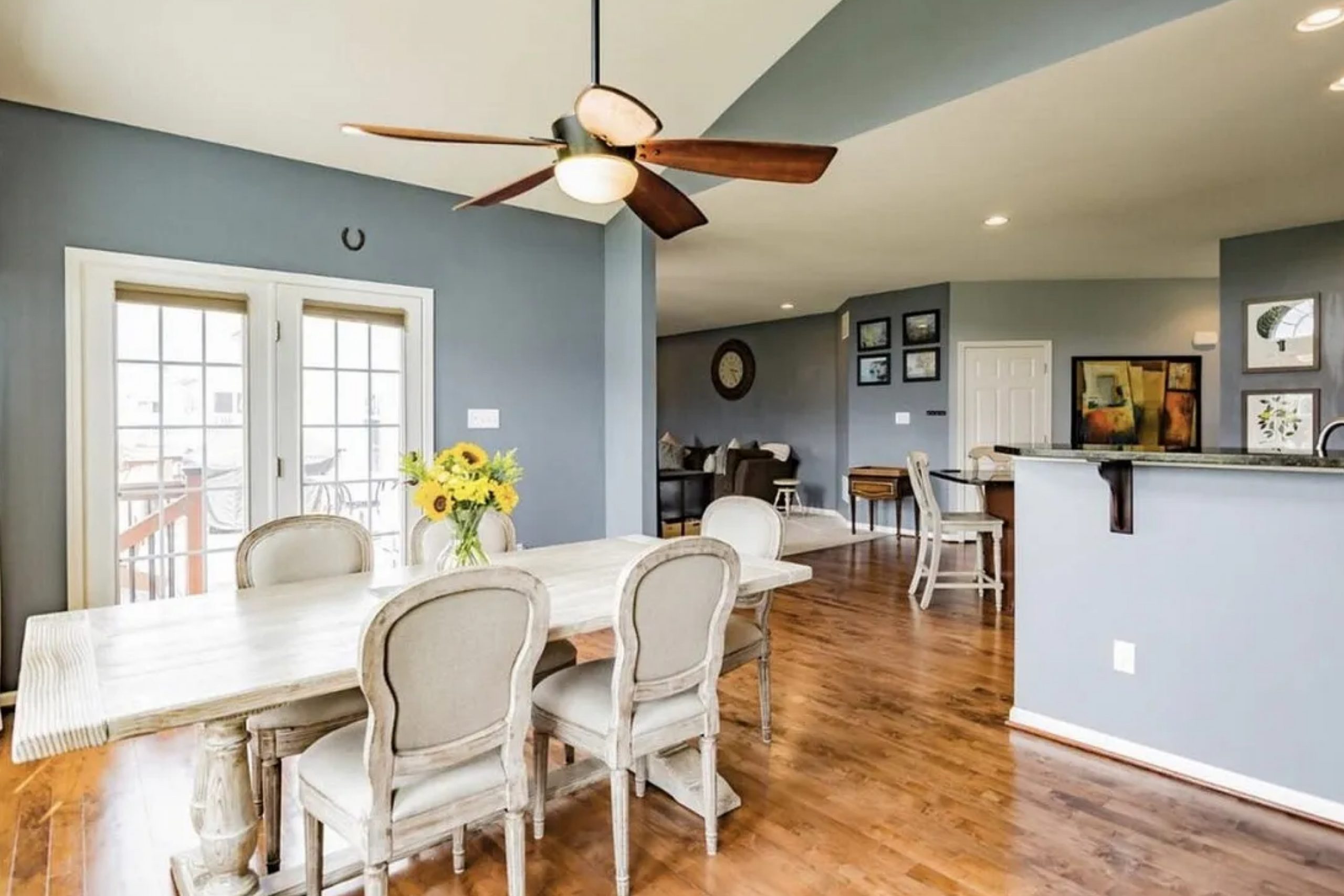
SW 2819 Downing Slate by Sherwin Williams stood out to me right away. It’s more than just a color—it brings a mood that adds depth to any room. This blue-gray shade has a touch of green that changes slightly with the light, making it both interesting and easy to use. If you like colors with a bit of personality, this one’s a great pick.
For me, SW 2819 Downing Slate creates an atmosphere that’s both cozy and sophisticated. It works beautifully in a variety of settings, from a serene bedroom haven to a bold and elegant living room.
I’ve found that it pairs well with both modern and traditional elements, making it an excellent choice for anyone looking to refresh their space without overwhelming the senses.
Choosing this color was like finding the perfect balance between boldness and subtlety. It has a way of complementing other colors, like warm woods and soft whites, while also standing strong on its own.
If you’re like me and enjoy a space that feels as inviting as it looks, SW 2819 Downing Slate might just be the perfect hue for your next project.
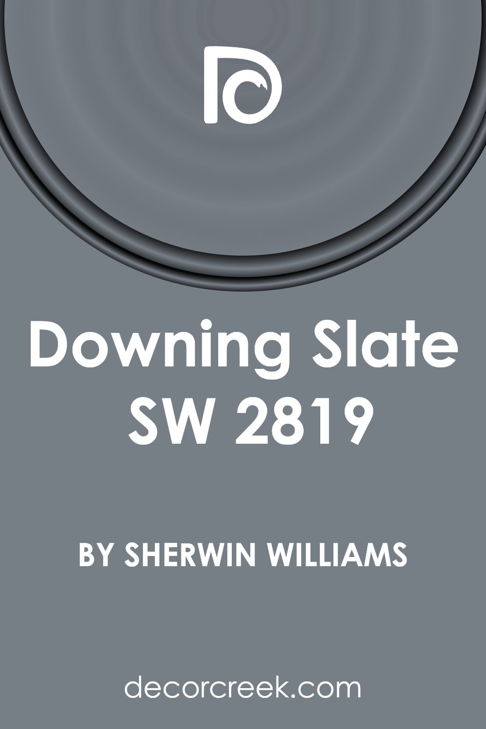
What Color Is Downing Slate SW 2819 by Sherwin Williams?
Downing Slate by Sherwin Williams is a versatile and stylish color, perfect for many interior spaces. It’s a medium to dark gray with a hint of blue, making it both classic and modern. This color works wonderfully in traditional or contemporary styles. Its cool undertones make it an excellent choice for spaces aiming to feel calm yet inviting.
In a traditional setting, Downing Slate pairs well with rich wood finishes, providing contrast without overwhelming the room’s elegance. It complements materials like mahogany or walnut beautifully.
For a more contemporary look, pair this hue with sleek metals, such as brushed nickel or stainless steel, and lighter woods like maple or ash, which can give a room a clean yet stylish appearance.
Textures like velvet or linen work well alongside Downing Slate. Velvet adds a touch of luxury, while linen gives a casual and comfortable vibe. Introducing soft fabrics in furniture or curtains can make the space feel cozy.
Furthermore, this color works perfectly in living rooms, bedrooms, or even offices, offering a backdrop that’s both distinguished and calming. Downing Slate’s adaptability means it holds its own with bold accents while remaining sophisticated when paired with neutral tones such as whites and creams.
Is Downing Slate SW 2819 by Sherwin Williams Warm or Cool color?
Downing Slate (SW 2819) by Sherwin-Williams is a muted, neutral shade often described as a blue-gray. This color works beautifully in homes because it provides a calm and relaxing backdrop without being overwhelming. It’s a versatile color that pairs well with both traditional and modern décor.
In living rooms, it can create a cozy and inviting atmosphere when combined with warm woods and soft textiles. In kitchens and bathrooms, it works nicely with white or cream accents, lending a clean and fresh look. Bedrooms painted in Downing Slate tend to feel restful, making it easier to unwind.
This shade also adapts well to different lighting conditions, appearing warmer in natural light and cooler under artificial lighting. This quality makes it a reliable choice for rooms used throughout the day. By combining it with complementing colors, homeowners can easily create a harmonious space that feels balanced and comfortable.
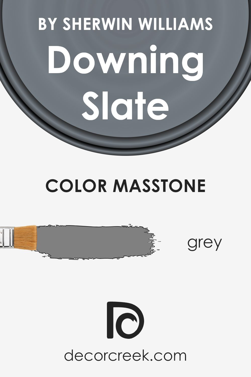
What is the Masstone of the Downing Slate SW 2819 by Sherwin Williams?
Downing Slate (SW 2819) by Sherwin Williams is a medium-toned gray with a subtle hint of warmth. The masstone of this color is a straightforward gray (#808080), which gives it a balanced and neutral feel. In homes, this quality allows Downing Slate to act as a versatile backdrop that works well in various rooms.
It pairs nicely with both warm and cool color accents, making it easy to coordinate with existing furnishings or decorative pieces.
This shade can create a cozy and inviting atmosphere without overwhelming other design elements. Its neutral nature means it can adapt to different styles, from classic to contemporary. In living rooms, it provides a calm canvas for colorful art or bold furniture.
In bedrooms, it complements soft textiles and serene lighting, helping to create a restful space. The flexibility of Downing Slate makes it a practical choice for homeowners looking for a reliable and harmonious wall color.
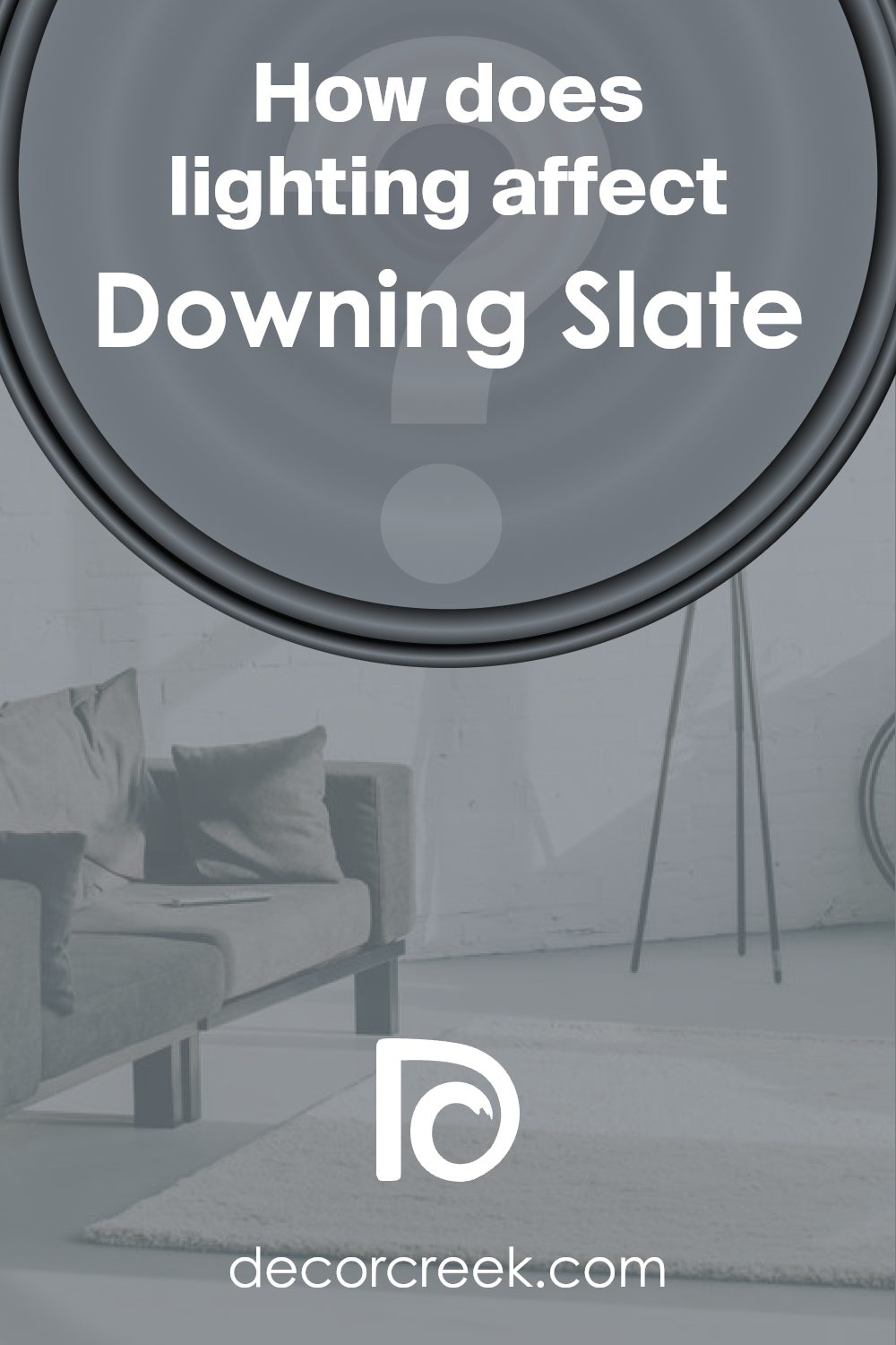
How Does Lighting Affect Downing Slate SW 2819 by Sherwin Williams?
Lighting plays a crucial role in how we perceive color. When a color such as Downing Slate by Sherwin Williams is viewed under different lighting conditions, it can appear quite different. This specific color is a deep gray with blue undertones, and it varies significantly depending on whether the light is artificial or natural.
In artificial lighting, Downing Slate may look different based on the type of bulb used. For example, under warm incandescent or traditional bulbs, it could take on a softer appearance, making the blue undertones more muted. In contrast, under cool fluorescent or LED lighting, the blue in the paint may become more pronounced, giving the room a cooler vibe.
Natural lighting changes throughout the day and also depends on the direction a room faces. In a north-facing room, where light tends to be softer and somewhat cool, Downing Slate might appear more muted and blue. This is because northern light lacks the warm tones that could otherwise warm up colors.
In south-facing rooms, which get lots of direct sunlight during the day, Downing Slate can look quite different. The abundance of warm, strong natural light can bring out more of the gray tones in the color, potentially making it feel warmer and more balanced.
East-facing rooms receive warm sunlight in the morning, making Downing Slate look brighter and slightly warmer early in the day. As the day progresses, and the light becomes cooler and shaded, the color might appear more subdued and its blue tones come forward.
West-facing rooms, on the other hand, get the brightest light in the late afternoon. Here, Downing Slate might look fairly neutral most of the day but can take on a golden warmth later as the sun sets, subtly changing how the blue and gray hues interact.
Overall, lighting heavily influences the perception of Downing Slate, from its depth to its warmth or coolness, across different room orientations and times of day.
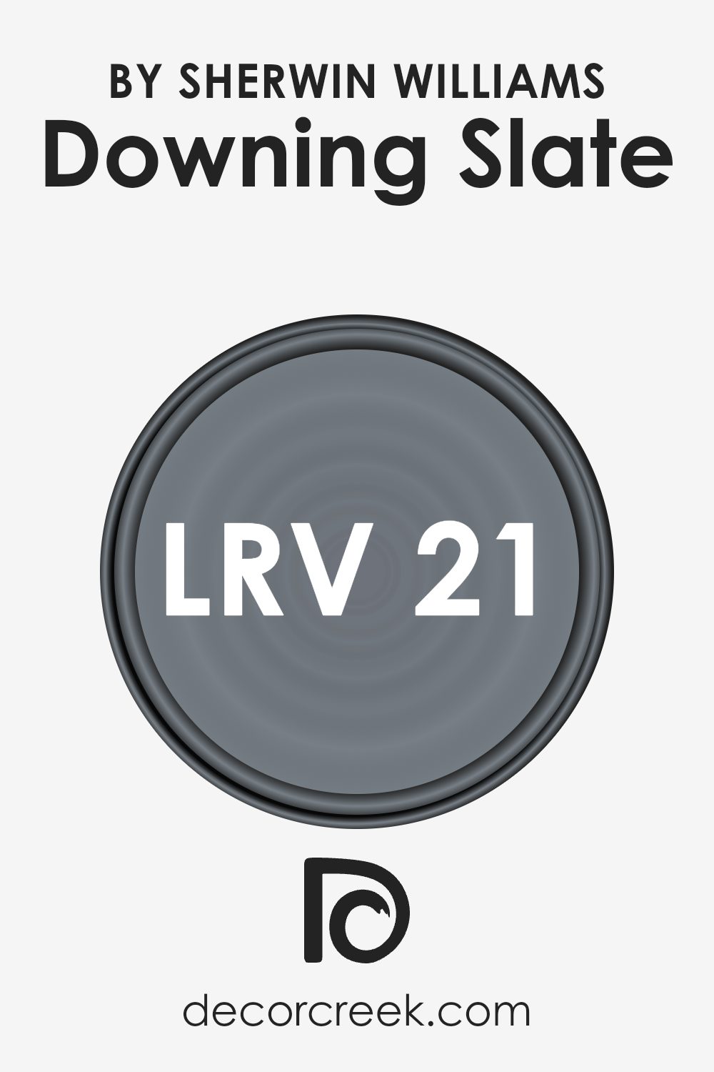
What is the LRV of Downing Slate SW 2819 by Sherwin Williams?
LRV stands for Light Reflectance Value, which is a measure that tells you how much light a color reflects. On a scale from 0 to 100, where 0 is absolute black and 100 is pure white, LRV indicates how light or dark a color will appear once it is applied to a surface.
A higher LRV means the color reflects more light and appears lighter, while a lower LRV means it absorbs more light, making it appear darker. Understanding LRV is important when choosing paint colors because it affects how a room will look depending on the amount of natural or artificial light available.
With an LRV of 20.76, Downing Slate is a fairly dark color. This means it absorbs more light than it reflects, so it can make a room feel cozy and intimate, but also potentially smaller if there isn’t enough light. When used in a space with plenty of natural or bright artificial lighting, the color can bring a depth and richness to the room.
However, in a room with little light, it might make the space feel a bit enclosed. People tend to choose colors with lower LRV for accents or on walls where they want to draw the eye, especially when trying to create a dramatic or warm atmosphere.
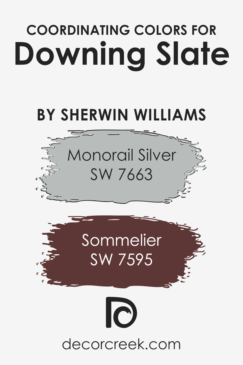
Coordinating Colors of Downing Slate SW 2819 by Sherwin Williams
Coordinating colors are shades that work well together to create a visually appealing and harmonious effect in a space. They complement each other, enhancing the overall look. When choosing colors to accompany Downing Slate by Sherwin Williams, a deep, moody blue-gray, it’s important to select shades that bring out its elegance without overpowering it. These colors should blend seamlessly, adding depth and interest.
Monorail Silver is an excellent coordinating color with Downing Slate. It’s a soft, light gray with subtle warm undertones that balance well with the coolness of Downing Slate, lending a gentle and airy feel to spaces.
Another great choice is Sommelier, a rich, wine-inspired burgundy that adds warmth and intensity.
This color complements Downing Slate by introducing a bold contrast, perfect for creating a cozy and inviting atmosphere. Together, these colors establish a stylish and unified look, ensuring each color stands out while working together harmoniously.
You can see recommended paint colors below:
- SW 7663 Monorail Silver
- SW 7595 Sommelier
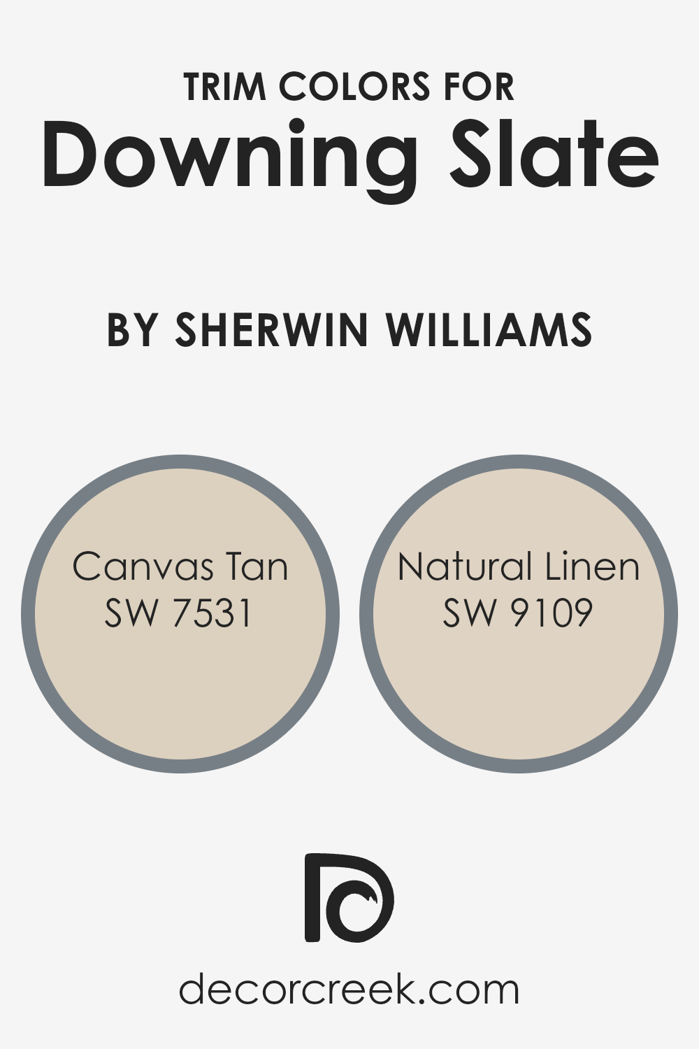
What are the Trim colors of Downing Slate SW 2819 by Sherwin Williams?
Trim colors are the colors used for the edges and borders of rooms, usually to outline doors, windows, and other border areas. They play an important role by providing a contrast or complement to the wall colors, helping to define spaces and add depth.
When paired with Downing Slate by Sherwin Williams, trim colors like Canvas Tan and Natural Linen can add warmth and softness to a room. Downing Slate is a strong, muted gray with an undertone of blue, which can give a room a stylish and contemporary feel.
The right trim color can emphasize or soften this effect, making the space feel balanced and more inviting without overwhelming the overall look.
Canvas Tan is a warm, creamy beige that brings a subtle touch of elegance to any space. It provides a gentle contrast to the cooler tones of Downing Slate, creating a welcoming and cozy environment.
Natural Linen, on the other hand, is a light, sandy hue that complements another warm choice that works well to highlight architectural features without being too bold. Both of these trim colors help anchor Downing Slate, enhancing its richness while maintaining an inviting atmosphere within the room.
Using these colors can make the room feel harmonious and well put together.
You can see recommended paint colors below:
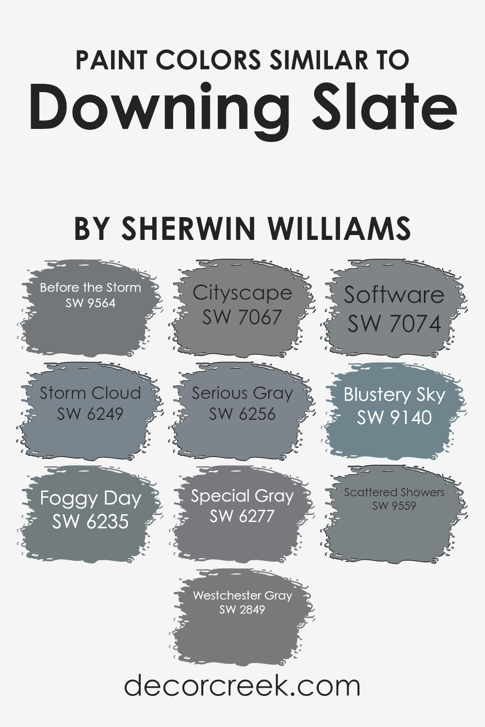
Colors Similar to Downing Slate SW 2819 by Sherwin Williams
Similar colors play a vital role in creating a cohesive and harmonious look, especially when designing spaces. The colors SW 9564 – Before the Storm and SW 6249 – Storm Cloud bring depth with their moody, blue-gray tones reminiscent of a cloudy day.
SW 6235 – Foggy Day adds a touch of softness, like a gentle mist hanging in the air. SW 2849 – Westchester Gray offers a strong and timeless gray with a hint of warmth. Continuing the theme, SW 7067 – Cityscape and SW 6256 – Serious Gray provide a more urban feel with their bold yet neutral presence.
The subtlety of SW 6277 – Special Gray can balance out a room with its understated elegance, while SW 7074 – Software introduces a darker, more dramatic gray that’s perfect for adding contrast. SW 9140 – Blustery Sky brings forth a cooler, breezy feel, evoking the open sky and wide spaces.
Lastly, SW 9559 – Scattered Showers contributes a fresh, airy vibe reminiscent of a light drizzle. These colors, similar in their muted, natural tones, work well together or individually to create a soothing, interconnected palette that enhances any space without overwhelming it.
You can see recommended paint colors below:
- SW 9564 Before the Storm
- SW 6249 Storm Cloud
- SW 6235 Foggy Day
- SW 2849 Westchester Gray
- SW 7067 Cityscape
- SW 6256 Serious Gray
- SW 6277 Special Gray
- SW 7074 Software
- SW 9140 Blustery Sky
- SW 9559 Scattered Showers
How to Use Downing Slate SW 2819 by Sherwin Williams In Your Home?
Downing Slate (SW 2819) by Sherwin Williams is a rich and versatile color that can add depth to your home. This deep shade of gray has a hint of blue, making it a great choice for creating a calm atmosphere in any room. It works well in living rooms, bedrooms, or even bathrooms, offering a modern yet cozy feel.
You can use Downing Slate on an accent wall to add a touch of drama without overwhelming the space. Pair it with light-colored furniture and decor to create a balanced look.
This color also complements natural wood tones beautifully, making it an excellent choice for spaces with wooden floors or furniture.
In the kitchen, Downing Slate can look stunning on cabinets, providing a contemporary backdrop for stainless steel appliances.
It also pairs nicely with white countertops for a clean and fresh appearance. Whether used in small doses or throughout a room, this color brings an inviting and stylish touch to any space.
Downing Slate SW 2819 by Sherwin Williams vs Serious Gray SW 6256 by Sherwin Williams
Downing Slate SW 2819 by Sherwin Williams is a deep, rich color with a mix of gray and blue tones. It’s a bold choice that can bring a dramatic mood to a room. It adds depth and can make spaces feel cozy and intimate, especially in larger rooms or on accent walls.
On the other hand, Serious Gray SW 6256 is a lighter, more muted shade of gray. It has a calm and soothing effect, making it a good choice for spaces where you want to relax, such as bedrooms or living rooms. It pairs well with many other colors due to its neutral nature.
Both colors have their unique charm and use in interior design. Downing Slate is more intense and statement-making, while Serious Gray is versatile and calming. Choosing between them depends on whether you’re looking for a bold statement or a softer, more neutral backdrop.
You can see recommended paint color below:
Downing Slate SW 2819 by Sherwin Williams vs Foggy Day SW 6235 by Sherwin Williams
Downing Slate SW 2819 by Sherwin Williams is a deep, rich blue-gray color with a classic appeal. It offers a strong, stable presence, making it a great choice for adding depth to a space. It’s ideal for traditional settings or to create a cozy atmosphere.
On the other hand, Foggy Day SW 6235 by Sherwin Williams is a softer, lighter blue-gray. It’s airy and gentle, providing a calming effect. This color works well in contemporary spaces or any area where a light, refreshing feel is desired.
When compared, Downing Slate feels more dramatic and formal, while Foggy Day is more subtle and relaxed. Downing Slate is better for creating an intimate space with a bold statement, whereas Foggy Day is better for open, inviting areas. Both colors are versatile, but their effect on a room’s mood varies significantly due to their differing intensities.
You can see recommended paint color below:
- SW 6235 Foggy Day
Downing Slate SW 2819 by Sherwin Williams vs Westchester Gray SW 2849 by Sherwin Williams
Downing Slate and Westchester Gray are both popular paint colors by Sherwin Williams. Downing Slate is a deep, rich blue-gray with subtle hints of green, which gives it a classic and timeless appearance. It tends to create a cozy and inviting atmosphere, making it perfect for spaces where you want an intimate and warm feel.
Westchester Gray, on the other hand, is a medium gray with a more neutral tone. It doesn’t lean too much toward blue or green, providing a balanced and calming backdrop. This color works well in contemporary settings, offering a clean and modern look.
While Downing Slate is more dramatic and bold, Westchester Gray is versatile and understated. Both colors can be used effectively in various interior designs, but the choice between them depends on whether you want a more traditional and moody vibe or a sleek and subtle look.
You can see recommended paint color below:
- SW 2849 Westchester Gray
Downing Slate SW 2819 by Sherwin Williams vs Blustery Sky SW 9140 by Sherwin Williams
Downing Slate SW 2819 by Sherwin Williams is a deep, rich gray with blue undertones. It often creates a cozy and warm atmosphere, making it a great choice for living rooms or bedrooms that seek a comforting feel. This color pairs well with warm wood tones and creamy whites, lending a classic yet contemporary vibe to interior spaces.
On the other hand, Blustery Sky SW 9140 is a more vibrant, medium blue, reminiscent of a clear, windy day. It brings a brighter, more cheerful energy compared to Downing Slate. Blustery Sky can add freshness to a room, making it suitable for spaces like bathrooms or kitchens where a lively touch is desired.
When used together, Downing Slate can provide a grounding effect, while Blustery Sky can add a pop of color, creating a balanced and harmonious environment. Both colors can complement each other, with Downing Slate offering depth and Blustery Sky contributing brightness.
You can see recommended paint color below:
- SW 9140 Blustery Sky
Downing Slate SW 2819 by Sherwin Williams vs Storm Cloud SW 6249 by Sherwin Williams
Downing Slate SW 2819 and Storm Cloud SW 6249, both by Sherwin Williams, are rich and versatile shades of blue-grey that add depth to any room. Downing Slate is a darker, more muted blue with green undertones, giving it a historic, classic feel. It’s perfect for creating a cozy, traditional atmosphere, especially in living rooms or libraries.
Storm Cloud, on the other hand, is a medium-dark blue-grey that’s slightly more modern and airy. It has more pronounced blue undertones, which can make spaces feel larger and more open. While both colors can serve as a neutral backdrop, Downing Slate tends to ground a room more firmly, while Storm Cloud adds a hint of freshness.
These colors pair well with lighter neutrals and natural wood tones, making them versatile choices for various design styles. Whether used for an accent wall or an entire room, both colors bring a unique charm.
You can see recommended paint color below:
- SW 6249 Storm Cloud
Downing Slate SW 2819 by Sherwin Williams vs Special Gray SW 6277 by Sherwin Williams
Downing Slate SW 2819 and Special Gray SW 6277 by Sherwin Williams are both elegant shades, but they have distinct characters. Downing Slate is a deep, muted gray with a hint of blue that gives it a warm, inviting feel. It’s perfect for creating a cozy atmosphere and works well in both traditional and modern spaces.
On the other hand, Special Gray is a cool, medium gray with more neutral undertones. It offers a clean and crisp look, making it versatile for both contemporary and minimalist designs. While Downing Slate adds warmth and coziness, Special Gray brings clarity and lightness.
Choosing between the two colors depends on the mood you want to create in your space. If you’re aiming for a warm and intimate setting, Downing Slate is a great choice. If you prefer a fresh and airy feel, Special Gray might be more suitable. Both colors offer unique qualities that can enhance your home’s aesthetic.
You can see recommended paint color below:
- SW 6277 Special Gray

Downing Slate SW 2819 by Sherwin Williams vs Cityscape SW 7067 by Sherwin Williams
Downing Slate SW 2819 and Cityscape SW 7067 are both colors by Sherwin Williams. Downing Slate is a rich, deep gray with subtle blue undertones, giving it a sophisticated and classic appearance. It often reminds people of historic homes and traditional styles. This color can create a warm and inviting atmosphere, suitable for living rooms, libraries, or dining rooms.
On the other hand, Cityscape SW 7067 is a medium to dark gray that is more neutral and has a modern vibe. It doesn’t lean strongly towards any particular undertone, making it versatile and adaptable for various spaces.
Cityscape can be a great choice for contemporary settings or as a backdrop for more vibrant accessories or artwork.
Both colors work well in different contexts but offer distinct feels. Downing Slate is cozier and more traditional, while Cityscape is sleeker and modern. Choosing between them depends on the style and mood you want for your space.
You can see recommended paint color below:
Downing Slate SW 2819 by Sherwin Williams vs Software SW 7074 by Sherwin Williams
Downing Slate SW 2819 and Software SW 7074 are both rich colors from Sherwin Williams, but they have different vibes. Downing Slate is a deep, muted blue-gray that brings a classic and timeless feel to a space. It feels calm and grounded, making it great for creating a cozy atmosphere in a room.
On the other hand, Software is a more modern, cooler gray with subtle blue undertones. It feels sleek and contemporary, adding a touch of elegance and a modern edge. Software is versatile and works well with many color schemes, fitting seamlessly into both minimalistic and bold décors.
While both colors can be used as neutrals, Downing Slate offers a warmer, more inviting presence, while Software leans towards a cooler, more polished look. Choosing between them will depend on the mood and style you want to achieve in your space.
You can see recommended paint color below:
- SW 7074 Software

Downing Slate SW 2819 by Sherwin Williams vs Before the Storm SW 9564 by Sherwin Williams
Downing Slate SW 2819 and Before the Storm SW 9564, both by Sherwin Williams, offer unique color experiences. Downing Slate is a deep, muted gray with hints of blue and green undertones. It provides a strong yet calm backdrop, often used to add depth and a sense of coziness to a room.
On the other hand, Before the Storm is a lighter, more neutral gray. It has a fresher, more airy presence, making it versatile and easy to pair with other colors. While Downing Slate can add a sophisticated touch to spaces like studies or living rooms, Before the Storm brings a lighter feel, suitable for bedrooms or kitchens where a sense of openness is desired.
Both colors can offer timeless style, but the choice between them will depend on whether you want a darker, more enveloping atmosphere or a lighter, more open feel.
You can see recommended paint color below:
Downing Slate SW 2819 by Sherwin Williams vs Scattered Showers SW 9559 by Sherwin Williams
Downing Slate SW 2819 and Scattered Showers SW 9559 are two striking colors by Sherwin Williams. Downing Slate is a deep, rich gray with undertones of blue and green, making it perfect for creating a cozy and warm atmosphere. It’s an excellent choice for accent walls or rooms where you want to add depth and sophistication without it feeling too dark or imposing.
On the other hand, Scattered Showers is a lighter, muted blue-green. It brings to mind fresh, gentle rain and can create a calming and airy feel in any space. This color works well in bathrooms, bedrooms, or any area where you want to evoke a sense of cleanliness and openness.
When used together, Downing Slate can provide a grounding background, while Scattered Showers can add an uplifting contrast. Both colors harmonize well due to their shared blue-green undertones, allowing them to complement each other beautifully in a variety of settings.
You can see recommended paint color below:
- SW 9559 Scattered Showers
Conclusion
As I wrap up my thoughts on SW 2819 Downing Slate by Sherwin Williams, I feel like I’m talking about a color that can turn any room into something really special. Imagine a color that’s a perfect mix of blue and gray. It’s not too bright, but not too dark either. It’s sort of like looking at the sky just before night-time.
I think this color can make a room feel calm and relaxing, kind of like that moment before you go to sleep when everything is peaceful. It can work well in a lot of different rooms, whether it’s your bedroom, living room, or even the kitchen.
It’s like putting on your favorite sweater—always comforting, no matter the occasion.
One of the coolest things about Downing Slate is how it looks good with other colors. You can pair it with white or light gray for a clean, neat look, or you can add some bright colors for a bit of fun. It’s like playing with your favorite toys and seeing how they look together.
In the end, SW 2819 Downing Slate is like a friendly, reliable buddy for your walls. It can make a place feel just right without being too loud or boring. It’s that simple.

Ever wished paint sampling was as easy as sticking a sticker? Guess what? Now it is! Discover Samplize's unique Peel & Stick samples.
Get paint samples

