
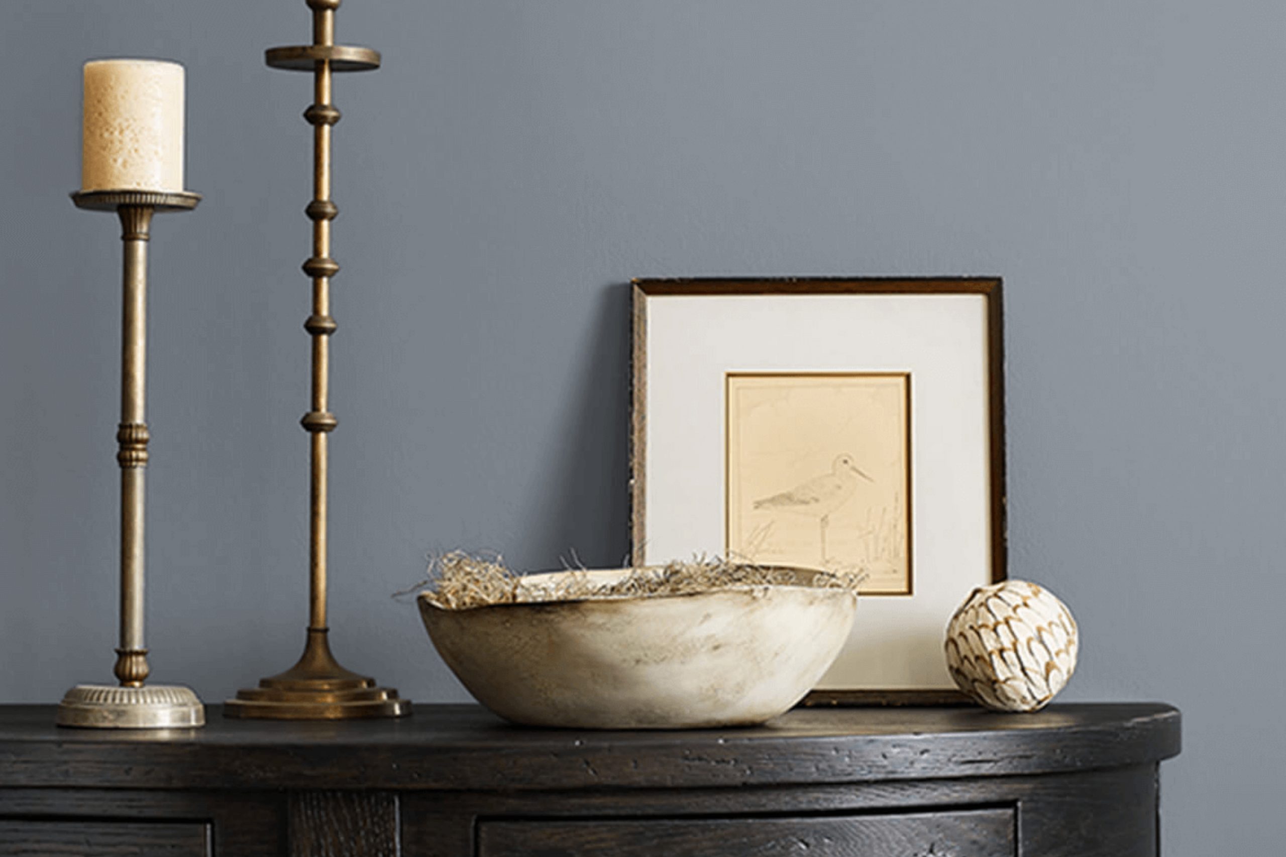
When I first came across SW 6256 Serious Gray by Sherwin Williams, I was immediately drawn to its unique character. This shade of gray is both versatile and sophisticated, making it an ideal choice for various spaces in my home. I’ve always been on the lookout for a color that brings a touch of modern elegance without being overwhelming, and Serious Gray seems to hit the mark perfectly.
What I love most about this color is its ability to create a calming and balanced atmosphere. It has a subtle depth, providing just the right amount of contrast against lighter or even darker shades. I’ve used it in my living room, where it beautifully complements both the natural light during the day and the cozy ambiance of the evening.
Choosing a color like Serious Gray means you can easily pair it with different textures and materials. I’ve noticed that it works wonderfully with wood accents, metal fixtures, and even bold pops of color in decor or furniture. It feels timeless yet contemporary, allowing me the freedom to refresh the look of my space without changing the color every few years.
This paint has truly proven itself as a staple in my home, offering a perfect backdrop for both everyday life and special occasions.
What Color Is Serious Gray SW 6256 by Sherwin Williams?
Serious Gray by Sherwin Williams, identified as SW 6256, is a versatile medium-to-dark gray. It has subtle blue undertones, giving it a cool and modern vibe suitable for various interior styles. This shade is perfect if you’re looking for a balanced gray that doesn’t lean too heavily into warm or cold territory.
In terms of interior design, Serious Gray fits well with contemporary and industrial styles. Its clean and refined look pairs nicely with modern furniture and minimalist decor. It also works well in traditional settings when combined with classic white trims and moldings.
For materials and textures, Serious Gray complements natural elements beautifully. It looks great with light to medium wood tones, providing a contrast that highlights wood’s warmth. The color also pairs well with metal and glass, enhancing the sleek and chic aspects of an industrial style. For a cozy feel, incorporate soft textiles like velvet or chunky knits in neutral colors or deep, rich hues. Accessories in silver or chrome can add a touch of modern flair.
In essence, Serious Gray by Sherwin Williams is a flexible color that brings a calm and balanced energy to interiors. It matches well with both natural and modern materials, adapting with ease to different styles.
Is Serious Gray SW 6256 by Sherwin Williams Warm or Cool color?
Serious Gray (SW 6256) by Sherwin Williams is a mid-tone gray that provides a neutral backdrop for various home design styles. Its balanced shade makes it versatile for different spaces, creating a sense of calmness and comfort. The color doesn’t lean too heavily towards blue or green, making it a true gray that pairs well with many other colors.
In living rooms, Serious Gray can create a cozy and inviting atmosphere, allowing brighter accents to stand out without overwhelming the space. In bedrooms, the color offers a restful environment, ideal for relaxation after a long day.
Bathrooms and kitchens can benefit from its understated elegance, lending a clean and modern appearance.
Lighting plays a crucial role in how Serious Gray is perceived. In rooms with abundant natural light, the gray appears lighter and more airy, while in darker spaces, it feels warmer and more intimate. Overall, Serious Gray is a reliable choice for homeowners looking for a classic yet flexible color option.
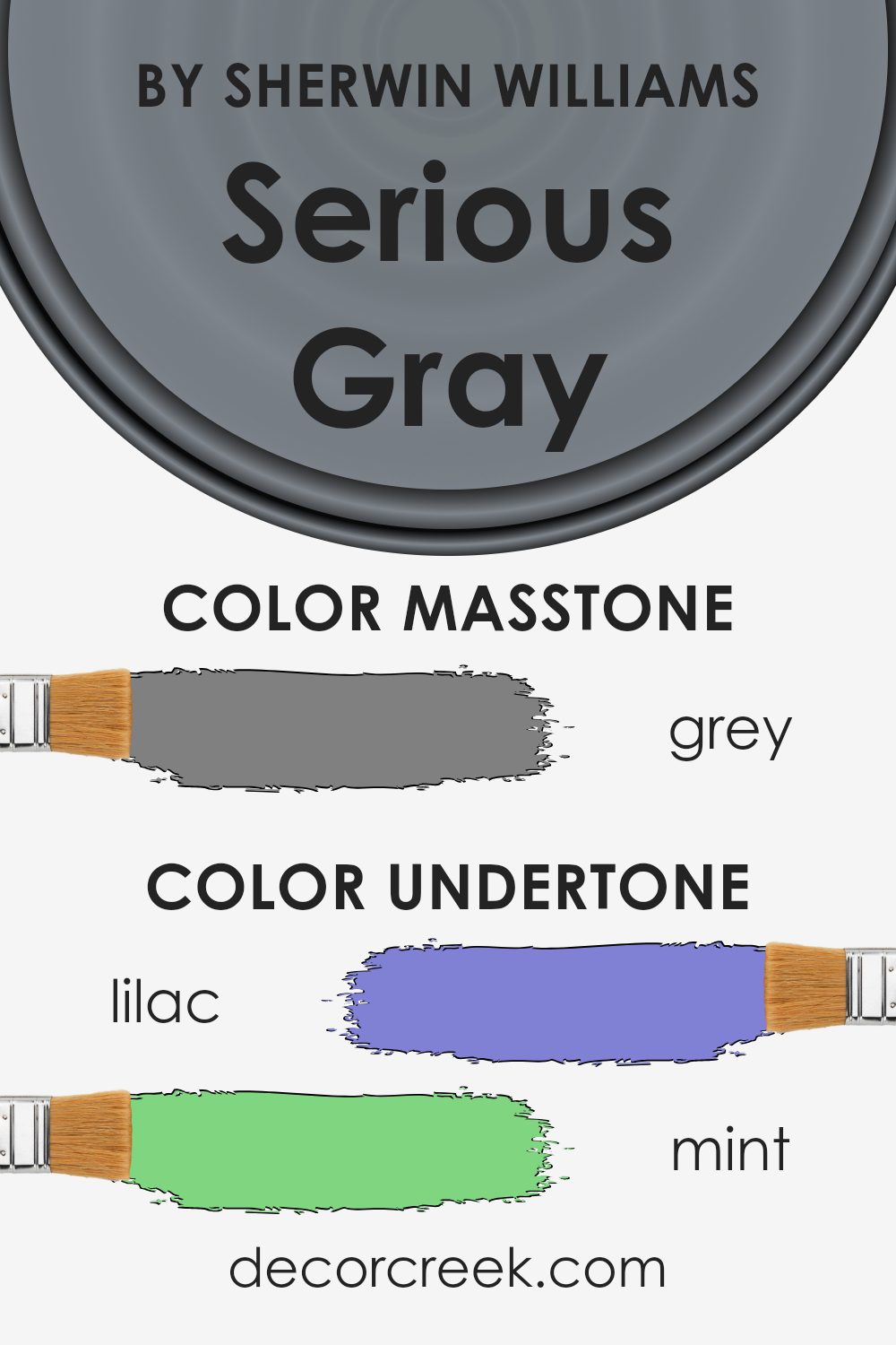
Undertones of Serious Gray SW 6256 by Sherwin Williams
Serious Gray by Sherwin Williams is a popular paint choice due to its versatile and adaptive character. The color is primarily a gray, but what makes it interesting are its undertones, which can subtly change the way the color appears depending on lighting and surrounding décor.
Undertones are the underlying hues that can influence the main color. For Serious Gray, these undertones include hints of lilac, mint, dark turquoise, pale pink, and more. For instance, in a room with plenty of natural light, the color might pick up on the light blue or mint undertones, giving it a cooler, fresher appearance.
In dimmer lighting or when paired with warm tones, the pale pink, orange, or pale yellow undertones might come through, creating a warmer, more inviting hue.
These shifts are not drastic; they are subtle and create an intriguing depth to the color. On interior walls, this means Serious Gray can adapt to different styles and furnishings, either complementing or contrasting them softly. For example, when paired with wooden furniture, it can bring out the light green or olive hues, adding a touch of earthiness.
Meanwhile, metallic or modern accents could draw attention to its cooler tones like navy or dark blue. This adaptability makes Serious Gray a flexible choice for many spaces.
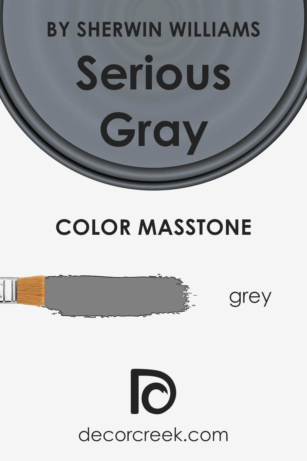
What is the Masstone of the Serious Gray SW 6256 by Sherwin Williams?
Serious Gray SW 6256 by Sherwin Williams is a balanced, neutral gray. Its masstone, a medium gray (#808080), makes it versatile and easy to incorporate into various home settings. This color works well as a backdrop in living rooms, kitchens, or bedrooms, providing a neutral tone that complements both warm and cool color schemes.
The gray hue offers a calm and steady feel, which can help create a restful environment. It pairs nicely with bold colors, allowing homeowners to add accent pieces or statement furniture without overwhelming the space.
In rooms with plenty of natural light, Serious Gray retains its soft, neutral quality, offering a consistent look throughout the day.
In darker spaces, it maintains its depth without becoming too heavy or dreary. This adaptability makes it suitable for many styles, from modern to traditional, ensuring it remains a popular and reliable choice for interior paint.
How Does Lighting Affect Serious Gray SW 6256 by Sherwin Williams?
Lighting plays a crucial role in the way we perceive colors in a room because different lighting conditions can change how a color appears to the eye. This effect can greatly influence how a paint color like Serious Gray (SW 6256) from Sherwin Williams looks in various settings throughout the day and under different lighting situations.
In natural light, Serious Gray may appear differently based on the direction the room faces. In north-facing rooms, which tend to have cooler and bluish natural light, Serious Gray could look more muted and cooler. This is because the gray tones get enhanced by the indirect and less warm light coming from the northern direction.
It can sometimes appear like a light, subdued blue-gray.
In south-facing rooms, which get more direct sunlight throughout the day, Serious Gray might look warmer and lighter. The abundance of daylight here tends to brighten up colors, making them appear more vivid or even slightly warmer than their actual tone.
East-facing rooms get warm, soft light early in the morning. Serious Gray in these spaces may seem warmer in the morning sun but can appear cooler as the daylight wanes and the room gets indirect light in the afternoon.
West-facing rooms benefit from warm, golden light in the afternoon and evening. During this time, Serious Gray could pick up a slightly warmer tone, making it appear richer and more comforting.
Under artificial light, the type of light bulb used will impact how Serious Gray appears. Incandescent or halogen lights, which emit a warmer, yellowish light, might make the gray seem warmer and more beige.
In contrast, LED or fluorescent lights, which can sometimes be cooler and more blue-toned, might cause Serious Gray to look crisper and more neutral or cool.
Overall, the interplay between lighting and paint color is essential to consider when deciding how a space will ultimately look and feel.
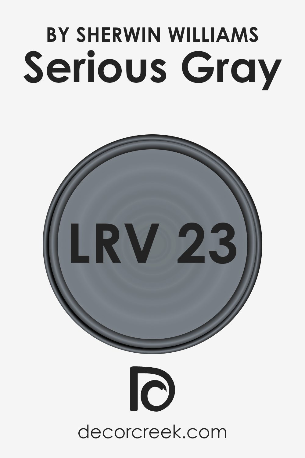
What is the LRV of Serious Gray SW 6256 by Sherwin Williams?
LRV, or Light Reflectance Value, is a measure that indicates how much light a color will reflect when applied to a surface. It is measured on a scale from 0 to 100, where 0 is absolute black, which absorbs all light, and 100 is pure white, reflecting all light. LRV is important when choosing paint colors because it affects how light or dark a color will look in a space and how it interacts with natural and artificial light.
A color with a low LRV will absorb more light, making it appear darker and potentially making a room feel cozier or smaller. Conversely, a high LRV means the color will reflect more light, making it seem brighter and possibly enlarging a room’s appearance.
With an LRV of 22.705, Serious Gray is on the darker side of the spectrum. This means it will absorb more light than it reflects, which can make a room feel more enclosed, giving it an intimate and sophisticated atmosphere. In spaces with limited natural light, Serious Gray might appear even darker, while in brightly lit rooms, it might display subtle undertones that wouldn’t be as noticeable in lower light.
Therefore, when using this color, it is important to consider the amount of light the room receives and the mood you want to create. In well-lit spaces or when balanced with lighter accents, this color can add depth and character without overwhelming the room.
Coordinating Colors of Serious Gray SW 6256 by Sherwin Williams
Coordinating colors are hues that complement each other when used together in a space, creating a pleasing visual balance. Serious Gray by Sherwin Williams is a versatile color that pairs well with a variety of shades to enhance a room’s aesthetic. For instance, SW 9165 Gossamer Veil works well as a coordinating color with Serious Gray.
It is a warm, soft gray with a hint of beige, adding a touch of coziness to the overall palette. It can lighten up the area and provide a subtle contrast against the deeper tones of Serious Gray.
Another excellent choice is SW 6252 Ice Cube, a cool, light gray that adds a fresh and airy feel to the room. Its crispness harmonizes with Serious Gray, providing a contemporary look that feels clean and inviting. Additionally, SW 9069 Veri Berri introduces a surprising twist with its vibrant berry tone.
This color injects warmth and depth into the space, balancing the more neutral grays, and adding a bit of personality. By using these colors together, you can create a well-coordinated design that feels both cohesive and dynamic, playing with subtle contrasts and complementary tones.
You can see recommended paint colors below:
- SW 9165 Gossamer Veil
- SW 6252 Ice Cube
- SW 9069 Veri Berri

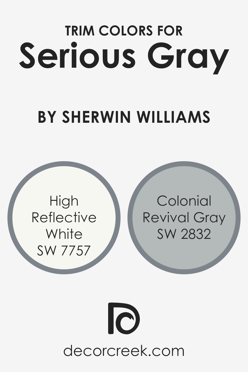
What are the Trim colors of Serious Gray SW 6256 by Sherwin Williams?
Trim colors play a crucial role in home design by highlighting architectural details and providing a finished look to any room. When using Serious Gray by Sherwin Williams, selecting the right trim color can enhance the overall appearance and style of your space.
High Reflective White, with its crisp and clean brightness, is an excellent choice for trim when paired with Serious Gray. This bright white offers a sharp contrast that accentuates the depth of the gray, making the room feel fresher and more organized by effectively highlighting the lines and angles of the space.
Colonial Revival Gray is another great trim option that can subtly complement Serious Gray while adding more depth to your color scheme. This soft gray is understated and elegant, providing a classic and unified look that adds a touch of sophistication without overpowering the main color. Using these trim colors offers a way to define spaces and add character, ensuring rooms feel welcoming and cohesive.
The contrast and harmony they bring can set the mood, balancing Serious Gray’s cool tones with either a crisp edge or a gentle transition.
You can see recommended paint colors below:
- SW 7757 High Reflective White
- SW 2832 Colonial Revival Gray
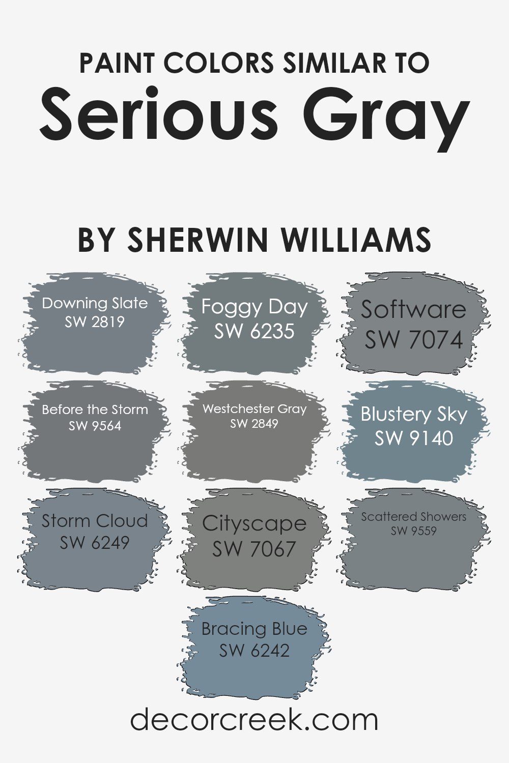
Colors Similar to Serious Gray SW 6256 by Sherwin Williams
When you think of colors that are similar to Serious Gray by Sherwin Williams, you’re drawn to tones that complement each other beautifully and create a cohesive palette. These colors bring out the best in each other, creating an atmosphere that feels connected and harmonious.
Downing Slate is a classic choice with its deep, rich tone reminiscent of stormy skies. Before the Storm, as its name suggests, carries the anticipation of an approaching rain with its muted, moody hue. Storm Cloud offers a slightly darker shade, resembling the shadows cast by thick, dense clouds.
Bracing Blue introduces a hint of coolness, like a gentle wave on a cloudy day, while Foggy Day envelops with its misty, light-hearted gray.
Westchester Gray stands out with a refined touch, perfectly balancing other hues within the spectrum. Cityscape captures the essence of urban life in a medium gray tone, ideal for modern settings. Software is a clean, crisp color, mirroring the polished look of sleek technology.
Blustery Sky brings forth a fresh and airy vibe, like a breath of fresh air after a rainy spell, while Scattered Showers creates a sense of movement and dynamism with its dynamic shade.
Together, these colors effortlessly coordinate, making spaces feel complete and thoughtfully designed.
You can see recommended paint colors below:
- SW 2819 Downing Slate
- SW 9564 Before the Storm
- SW 6249 Storm Cloud
- SW 6242 Bracing Blue
- SW 6235 Foggy Day
- SW 2849 Westchester Gray
- SW 7067 Cityscape
- SW 7074 Software
- SW 9140 Blustery Sky
- SW 9559 Scattered Showers
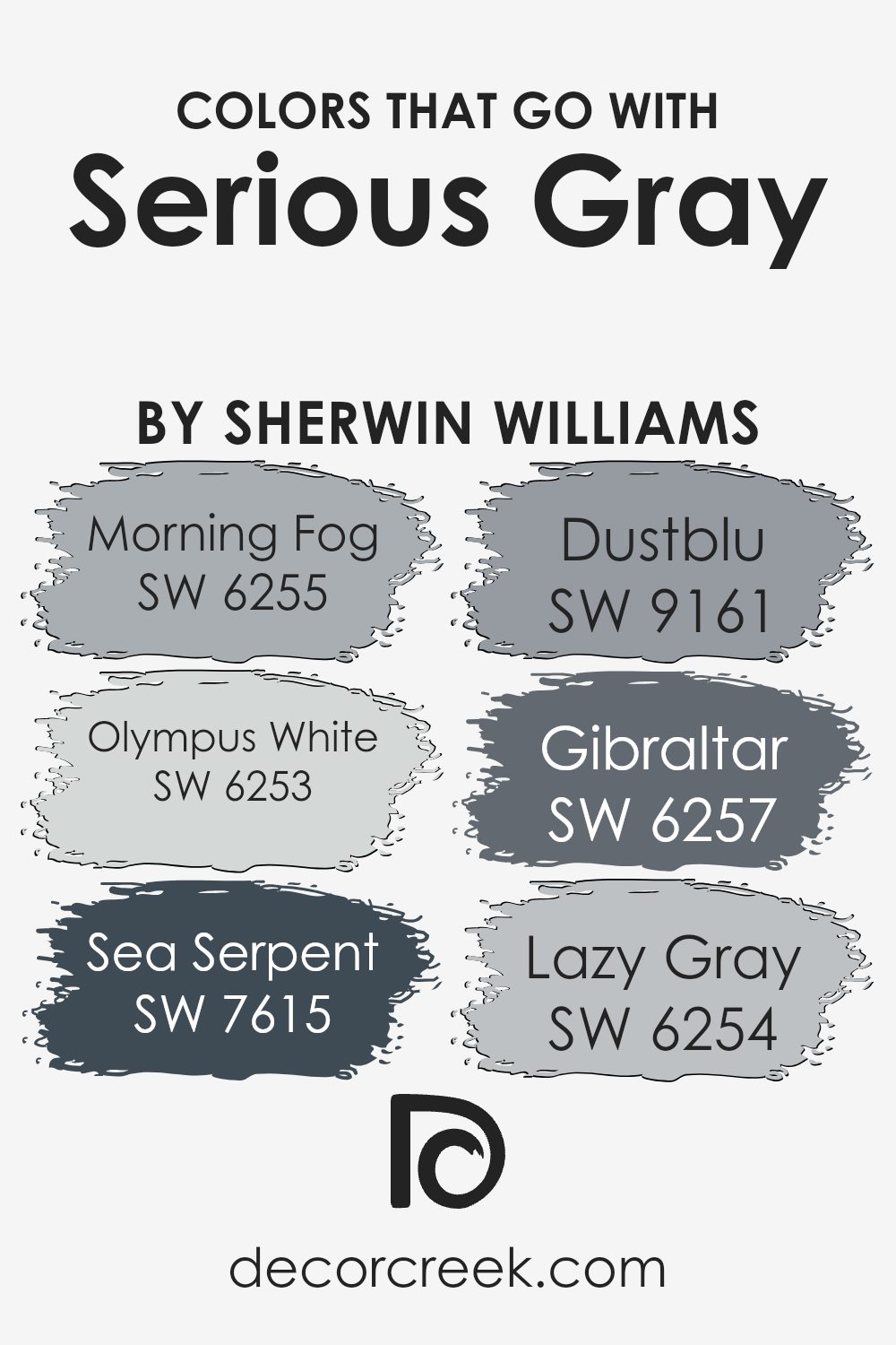
Colors that Go With Serious Gray SW 6256 by Sherwin Williams
Choosing the right colors to go with Serious Gray SW 6256 by Sherwin Williams is important because it helps create a harmonious and balanced space. Morning Fog SW 6255 is a soft, muted blue-gray that adds a gentle touch and complements the depth of Serious Gray. Olympus White SW 6253, with its subtle hint of blue and bright undertones, brings a light and airy feel, making spaces feel more open and inviting.
Sea Serpent SW 7615 is a bold deep blue that adds richness and provides a strong contrast to Serious Gray, giving a dramatic look that’s perfect for accents or feature walls.
Dustblu SW 9161 is a relaxed blue-gray that pairs well with Serious Gray, maintaining an overall calm and cohesive environment. Gibraltar SW 6257 is a solid, deep gray that adds strength and stability to the palette, enhancing the boldness of the room. Lastly, Lazy Gray SW 6254 offers a soothing light gray that brings the entire color scheme together, ensuring that the combination of colors remains balanced and pleasing to the eyes.
These colors, together with Serious Gray, work to create spaces that can feel cozy, spacious, or dynamic, depending on which tones are used and where they are placed.
You can see recommended paint colors below:
- SW 6255 Morning Fog
- SW 6253 Olympus White
- SW 7615 Sea Serpent
- SW 9161 Dustblu
- SW 6257 Gibraltar
- SW 6254 Lazy Gray
How to Use Serious Gray SW 6256 by Sherwin Williams In Your Home?
Serious Gray SW 6256 by Sherwin Williams is a versatile color choice for any home. This particular shade of gray is deep and rich, making it perfect for creating a cozy and inviting environment. One of the best uses for Serious Gray is in living rooms or bedrooms where you want a calm and relaxing atmosphere.
It’s a great backdrop for art and colorful furnishings because it allows other colors to stand out without being too overwhelming.
You can also use Serious Gray in a home office to help create a focused, productive environment. Pairing it with white or light-colored trim can make the walls pop and bring a touch of elegance to the space. For a modern look, consider using this shade on kitchen cabinets or bathroom vanities, as it pairs beautifully with stainless steel fixtures and white tiles. Serious Gray is a color that fits well in many settings due to its understated style and versatility.
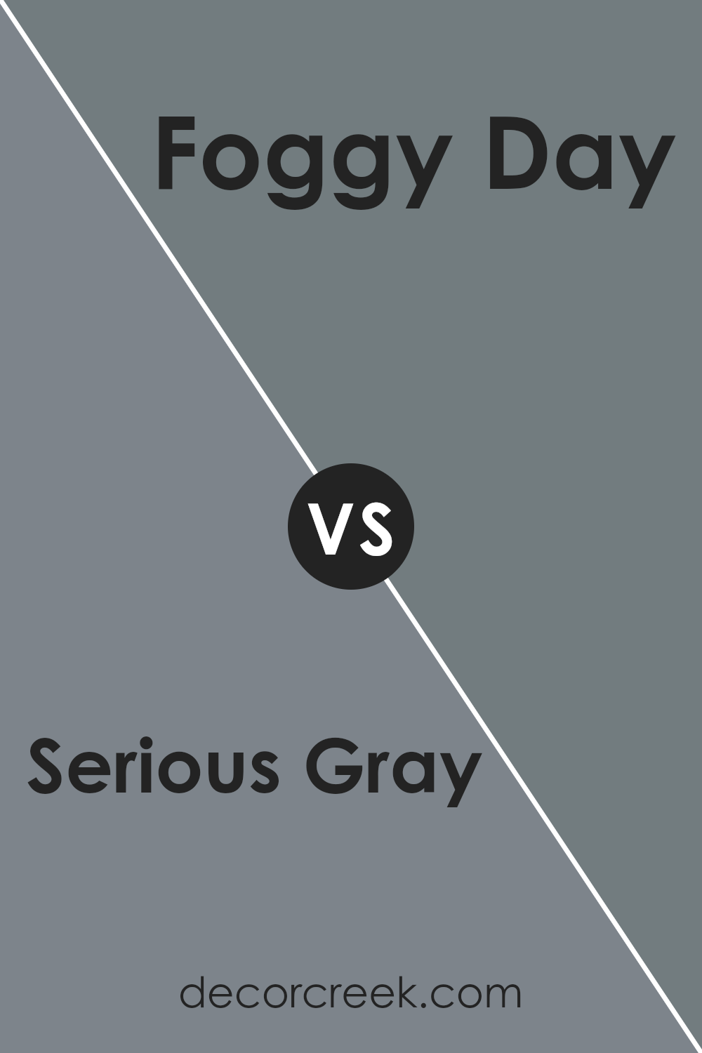
Serious Gray SW 6256 by Sherwin Williams vs Foggy Day SW 6235 by Sherwin Williams
Serious Gray SW 6256 and Foggy Day SW 6235 by Sherwin Williams are both beautiful shades of gray, but they offer different vibes. Serious Gray is a darker, more intense gray. It has a bold, muted look that carries a hint of blue, making it feel strong and solid. It’s perfect for giving a room a modern, dramatic touch.
On the other hand, Foggy Day is a lighter, softer gray with a bit more warmth. It has slight hints of blue and green that give the color a relaxing feel. Foggy Day works well for spaces where you want a soothing and airy atmosphere.
Both colors are versatile and can be paired with various decor styles, but Serious Gray adds a touch of modern sophistication, while Foggy Day brings comfort and lightness.
Together, they can create a balanced and harmonious color scheme.
You can see recommended paint color below:
- SW 6235 Foggy Day
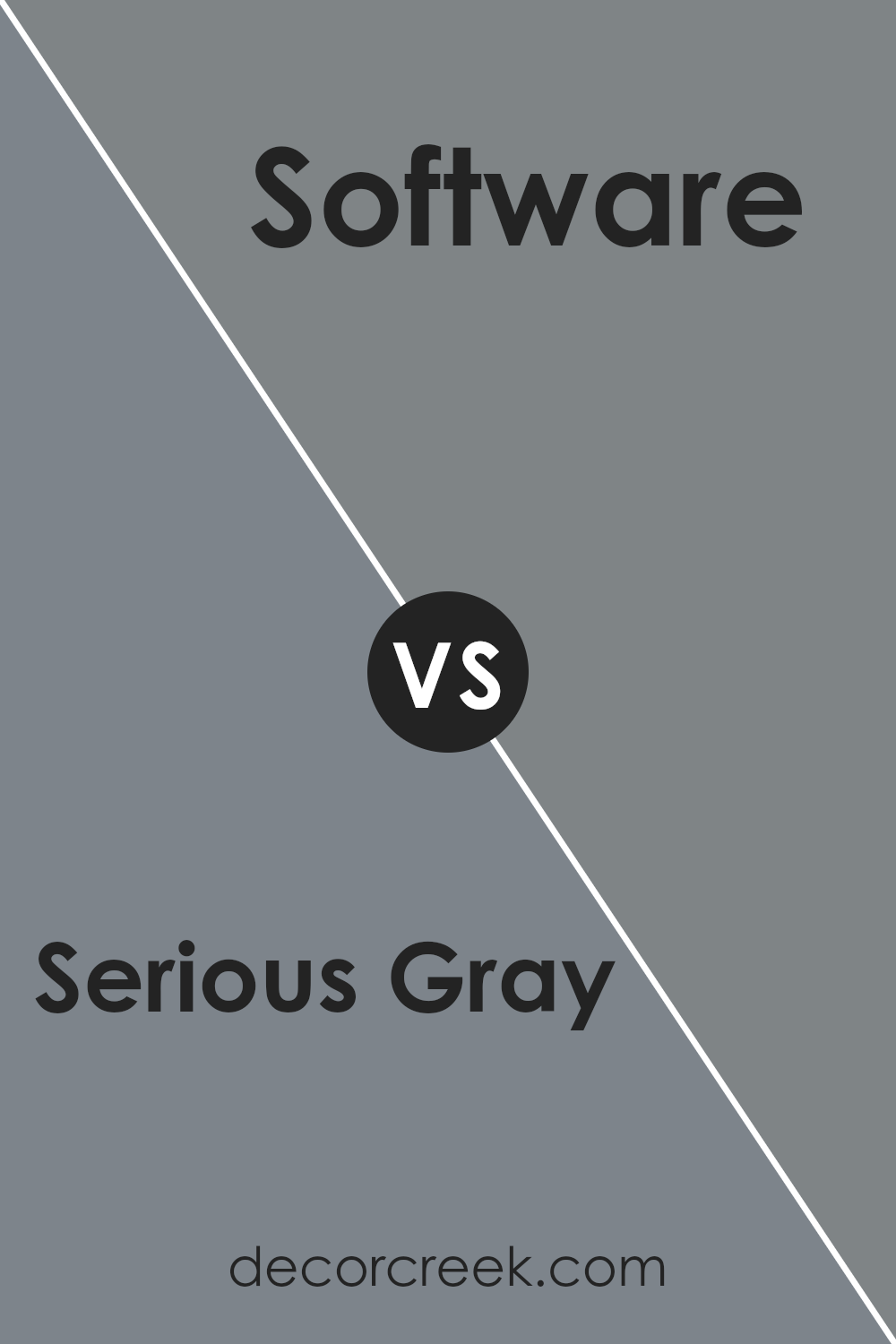
Serious Gray SW 6256 by Sherwin Williams vs Software SW 7074 by Sherwin Williams
Serious Gray SW 6256 and Software SW 7074 are two popular gray shades from Sherwin Williams. Serious Gray is a rich, medium-dark gray with a blue undertone, giving spaces a deep and muted look. It works well in cozy spaces like bedrooms and studies, adding a touch of calmness and depth. On the other hand, Software is a slightly darker gray with a subtle hint of warmth, making it feel a bit more grounded and earthy.
This color is ideal for creating a sleek and modern feel in living rooms or kitchens. When compared, Serious Gray leans more towards a cool, bluish tone, while Software offers a balance of warmth and neutrality.
Both colors can pair well with whites, blacks, and other neutrals, but Serious Gray might be more suited to spaces where you want a cool, tranquil vibe, whereas Software is perfect for a more contemporary, neutral look.
You can see recommended paint color below:
- SW 7074 Software
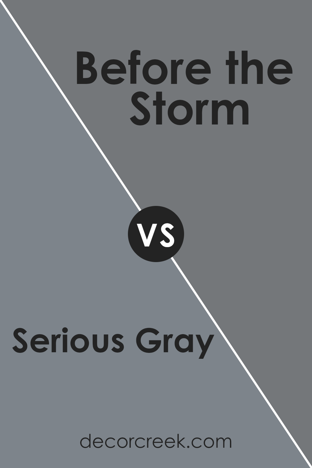
Serious Gray SW 6256 by Sherwin Williams vs Before the Storm SW 9564 by Sherwin Williams
Serious Gray SW 6256 and Before the Storm SW 9564 are both popular choices by Sherwin Williams, each bringing a distinct feel to a space. Serious Gray is a steady mid-tone gray with a blue undertone, creating a calm and modern atmosphere. Its balanced nature makes it versatile, suitable for living rooms or offices where a neutral yet engaging backdrop is desired.
On the other hand, Before the Storm SW 9564 is a slightly darker, deeper gray. Its tone leans towards the cooler side, which can give a room a more dramatic and cozy feel. It works well in bedrooms or spaces where you want a bit more moodiness and richness.
While both colors are gray, Serious Gray is lighter and slightly warmer, making it ideal for spaces needing more light and openness. Before the Storm offers depth and richness, perfect for creating an intimate and defined space. Both bring their own special touch, suitable for different styles and purposes.
You can see recommended paint color below:
Serious Gray SW 6256 by Sherwin Williams vs Blustery Sky SW 9140 by Sherwin Williams
Serious Gray SW 6256 and Blustery Sky SW 9140 by Sherwin Williams are two distinct colors. Serious Gray is a deep, muted gray with a strong presence. It’s a versatile color, suitable for creating a cozy atmosphere in living rooms or bedrooms. It pairs well with both lighter shades and bold accents, offering a neutral but impactful background.
On the other hand, Blustery Sky is a medium blue with a soft, breezy feel. It brings a touch of calmness and is reminiscent of a clear sky. This color works well in spaces where you want to evoke a light and airy mood, making it ideal for bathrooms or nurseries.
While Serious Gray emphasizes a more grounded and mature look, Blustery Sky provides a fresher, more relaxed vibe. Both colors have their unique charm, allowing them to be used effectively in different settings based on the desired ambiance.
You can see recommended paint color below:
- SW 9140 Blustery Sky
Serious Gray SW 6256 by Sherwin Williams vs Cityscape SW 7067 by Sherwin Williams
Serious Gray (SW 6256) by Sherwin Williams is a medium gray with blue undertones, giving it a calm and muted appearance. It works well in spaces where a neutral, yet slightly cool tone is desired. Serious Gray provides a balanced backdrop that can complement both warm and cool accents.
Cityscape (SW 7067), on the other hand, is a darker gray with a stronger presence. It is rich and deep, making it a bold choice for highlighting spaces or creating a dramatic atmosphere. While it can work as a neutral, its depth might overpower lighter accents, so it pairs best with stronger or contrasting colors.
Both Serious Gray and Cityscape can serve as versatile options in various settings. Serious Gray brings a softer, more understated look, while Cityscape offers a bolder, more intense feel. Depending on your design goal, each color has its strengths in enhancing room aesthetics.
You can see recommended paint color below:
Serious Gray SW 6256 by Sherwin Williams vs Scattered Showers SW 9559 by Sherwin Williams
Serious Gray SW 6256 by Sherwin Williams is a deep, slate gray color with cool undertones, providing a classic and neutral backdrop. It is a versatile shade that can complement a range of styles and settings, often used to add depth and a sense of calm to a room. The color is subtle enough to serve as a main wall color without overpowering a space.
On the other hand, Scattered Showers SW 9559 by Sherwin Williams is a lighter and somewhat warmer gray with a hint of green. This shade brings a fresh and airy feeling to spaces, making it ideal for creating a light but cozy atmosphere.
Scattered Showers is suitable for areas where you want to maintain an open and inviting tone, working well with both traditional and modern decor.
While both colors offer gray’s neutrality, Serious Gray leans towards a more subdued, darker appearance, whereas Scattered Showers provides a brighter, slightly warmer look.
You can see recommended paint color below:
- SW 9559 Scattered Showers
Serious Gray SW 6256 by Sherwin Williams vs Downing Slate SW 2819 by Sherwin Williams
Serious Gray SW 6256 and Downing Slate SW 2819 are both popular paint colors from Sherwin Williams, but they offer different vibes in a space. Serious Gray is a medium-toned gray with blue undertones. It feels modern and can add a calm and cool effect to a room. This color works well in spaces that need a neutral yet slightly cooler touch.
On the other hand, Downing Slate is a darker, more historic-looking color with deep greenish-blue tones. It has a richer, more traditional feel to it, making it ideal for spaces that aim for a classic, cozy look. This color can give depth to a room and often pairs well with traditional furnishings and decor.
While they both are grays with blue-related undertones, the depth and effect they bring to a room are quite distinct. Serious Gray is softer and more subtle, whereas Downing Slate adds a bit of drama and warmth.
You can see recommended paint color below:
- SW 2819 Downing Slate
Serious Gray SW 6256 by Sherwin Williams vs Westchester Gray SW 2849 by Sherwin Williams
Serious Gray (SW 6256) and Westchester Gray (SW 2849) are both muted gray shades from Sherwin Williams. Serious Gray is a medium gray with a blue undertone, which can give it a cool, calm appearance. It works well in modern interiors and can create a chic, understated look.
On the other hand, Westchester Gray is slightly darker and tends more towards a pure gray with minimal undertones, making it a versatile, classic choice. It is often used to add depth and can easily match various color schemes.
While both colors are versatile and stylish, Serious Gray has a subtle hint of color due to its blue undertone, whereas Westchester Gray offers more of a true gray look.
Both can be used to achieve a sophisticated look, but the choice depends on whether you prefer a cooler shade or a more neutral one.
You can see recommended paint color below:
- SW 2849 Westchester Gray
Serious Gray SW 6256 by Sherwin Williams vs Storm Cloud SW 6249 by Sherwin Williams
Serious Gray (SW 6256) and Storm Cloud (SW 6249) by Sherwin Williams are two distinct shades of gray that offer unique feels. Serious Gray is a medium-toned gray with a hint of blue, giving it a calm and stable look. It creates a neutral backdrop that can be paired with various colors and decor styles.
On the other hand, Storm Cloud is a darker, more dramatic gray, leaning heavily toward a deep, moody blue-gray tone. This color can bring a sense of depth and elegance to a space, making it feel cozy and intimate.
While both colors are cool-toned, Serious Gray’s lighter hue makes it suitable for small spaces, helping them appear more open. Storm Cloud, with its darker shade, is ideal for larger rooms or accent walls where you want to make a bold statement. Depending on the lighting and room purpose, either shade can work beautifully in a home.
You can see recommended paint color below:
- SW 6249 Storm Cloud
Serious Gray SW 6256 by Sherwin Williams vs Bracing Blue SW 6242 by Sherwin Williams
Serious Gray SW 6256 and Bracing Blue SW 6242 by Sherwin Williams are two distinct colors that offer unique vibes for your space. Serious Gray is a medium-toned gray with cool undertones. It’s versatile and pairs well with a variety of colors and styles, making it a safe choice for many different rooms. It creates a calm and neutral backdrop, which can make spaces feel more spacious and uncluttered.
On the other hand, Bracing Blue is a more vibrant choice. It’s a medium-to-dark blue with a slightly grayish tint, adding depth and character to a room. This color can bring a fresh and lively feel, making it perfect for spaces where you want a pop of color that still feels grounded.
In combination, these colors can complement each other well. Serious Gray can tone down the brightness of Bracing Blue, while Bracing Blue can add interest and energy to the gray.
You can see recommended paint color below:
Conclusion
As I wrap up my thoughts on Sherwin Williams’ SW 6256 Serious Gray, I can say it’s a color that impresses with its simple beauty. It’s a shade that manages to be both soft and strong at the same time. Serious Gray can make a room feel calm and nice without being too bold.
When I think about painting walls with this color, I see how it can work well in many different kinds of rooms. Whether it’s a bedroom, a living room, or even a kitchen, this gray adds a touch of calmness. It’s like it hugs the room with a gentle arm, making it feel cozy and welcoming.
Kids might see it like the sky on a cloudy day, which can be comforting and safe. For grown-ups, it provides a plain, but not boring, background that lets other colors and furnishings in a room stand out more.
Overall, Serious Gray is a quiet winner. It’s not flashy or bright, but that’s what makes it so special. It’s strong enough to stand on its own and soft enough to complement other colors and stuff in the house. I think it’s a great choice for anyone who wants their home to feel calm and nice.
Ever wished paint sampling was as easy as sticking a sticker? Guess what? Now it is! Discover Samplize's unique Peel & Stick samples.
Get paint samples

