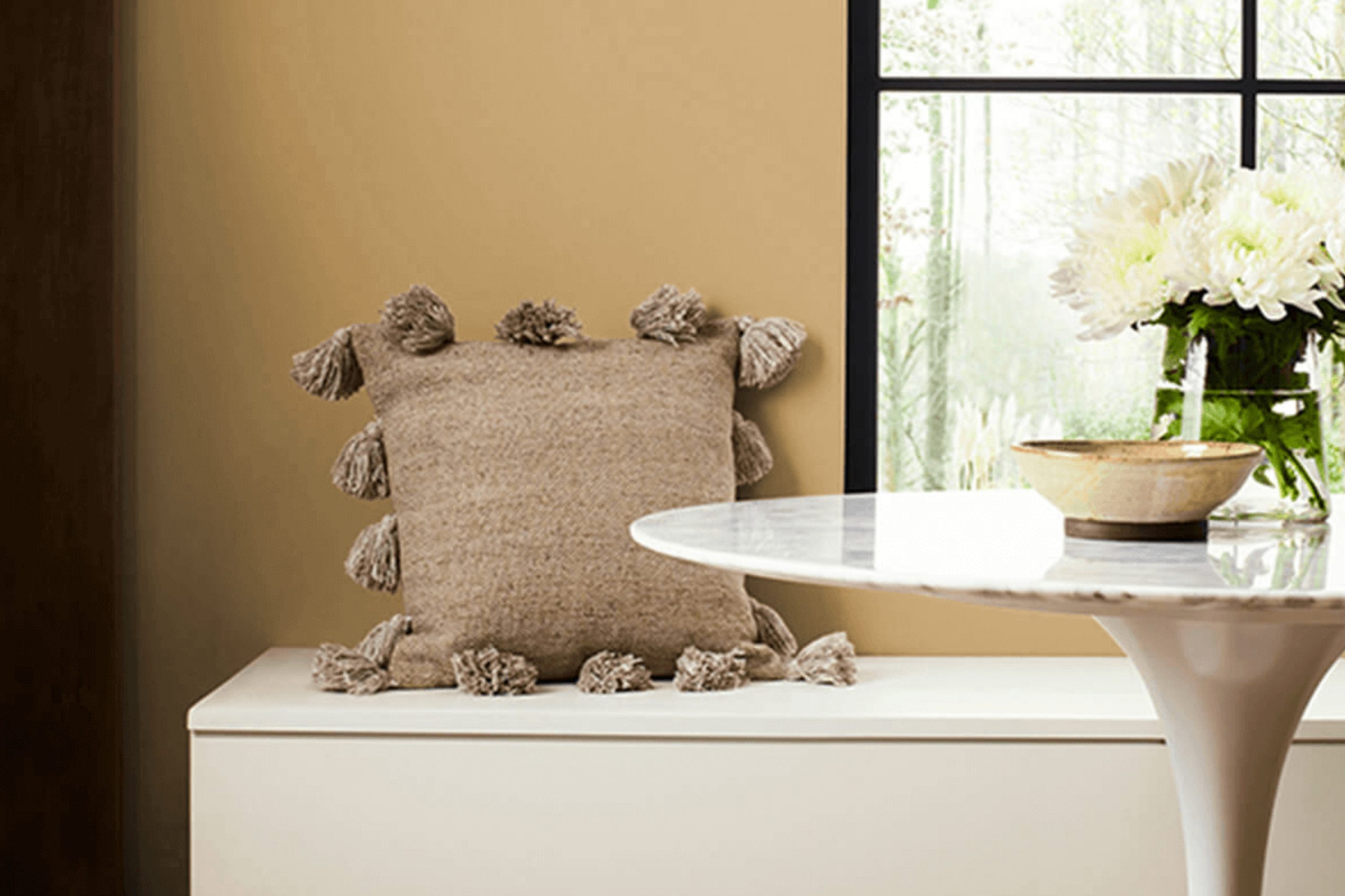
When you’re looking for color ideas to brighten up a room, it’s important to find something that not only looks good but also feels right. SW 0012 Empire Gold by Sherwin Williams is the kind of shade that can work wonders. This deep, warm yellow brings a sense of richness and luxury that few colors can match. It’s bold without being too overpowering, adding a touch of warmth and character to any area.
This color catches the eye, yet it manages to be flexible enough to pair with a variety of other shades and styles. You can create a welcoming atmosphere that feels both classic and inviting. Whether you’re considering painting an entire room or just an accent wall, Empire Gold can provide that touch of elegance and harmony you’ve been seeking.
It’s remarkable how a simple change in color can reshape your environment, offering a new outlook on the familiar walls that surround you daily.
With Empire Gold, you’re not just painting—you’re adding personality and depth to your home.
What Color Is Empire Gold SW 0012 by Sherwin Williams?
Empire Gold by Sherwin Williams is a rich, warm golden hue that brings a sense of warmth and coziness to an area. This color has a distinct, traditional, and elegant feel, making it an excellent choice for classic and enduring interior designs. It’s a color that works beautifully in traditional, transitional, or even eclectic settings, creating an inviting atmosphere.
Empire Gold pairs wonderfully with natural materials, such as wood and stone, enhancing their natural beauty. Think of wooden floors, exposed beams, or stone fireplaces. This color complements these elements by adding a touch of warmth and sophistication. Soft fabrics like linens and velvets in neutral tones work well with this color, providing a balanced and harmonious look.
When it comes to textures, Empire Gold can be matched with smooth, gleaming surfaces like brass or gold accents, giving the room a classy and refined appearance. At the same time, it partners well with rougher textures, such as jute or woven textiles, offering a comfortable and grounded feel.
Empire Gold’s flexibility makes it suitable for living rooms, dining rooms, or any area where a warm, welcoming ambiance is desired. It stands out without being overpowering, making it a perfect backdrop for various design elements.
Is Empire Gold SW 0012 by Sherwin Williams Warm or Cool color?
Empire Gold SW 0012 by Sherwin Williams is a warm, rich yellow that can make a room feel cozy and inviting. It’s a flexible color that works well in many different areas, from living rooms to kitchens. This shade adds warmth to a room, making it feel sunny and cheerful even on cloudy days.
It pairs well with a variety of other colors, including whites and browns, allowing for an easy mix with different decor styles. For those looking to make a room feel more welcoming, Empire Gold can create an uplifting atmosphere without being overpowering.
It can act as a great backdrop when paired with natural materials like wood, enhancing their warmth. This color can also emphasize natural light, making it a good choice for rooms with large windows. Whether used on all walls or as an accent, Empire Gold provides a cozy and inviting area that feels like home.
Undertones of Empire Gold SW 0012 by Sherwin Williams
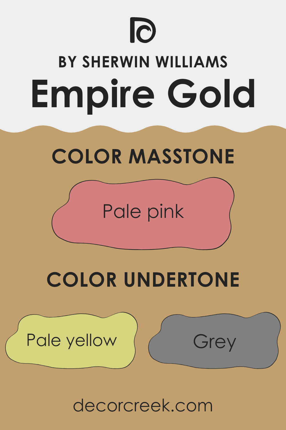
Empire Gold is a complex color with a mix of various undertones, making it flexible for interior areas. The primary base of this color is gold, but its undertones add depth and variation. Pale yellow and darker yellow undertones enhance its warmth, giving rooms a cheerful, sunny atmosphere. Pastels like mint and light green undertones soften the color, providing a refreshing and airy feel.
Grey and light grey undertones add a touch of neutrality, helping the color balance in different lighting conditions. However, they can make the color seem muted or dull in shadowed areas. Orange and light orange bring in a hint of warmth that enhances coziness.
Complex undertones, such as light purple and lilac, can give an unexpected twist, introducing a playful or creative vibe to an area. Meanwhile, pink, fuchsia, and light blue undertones add a feeling of freshness and vibrancy.
Rich undertones such as red, violet, brown, and darker purple can introduce a sense of depth and sophistication, depending on the environment. These undertones might shift the color towards a darker, more intense palette with varying layers of complexity.
Overall, the unique blend of undertones in Empire Gold helps it adapt to any interior setting by changing slightly with the light and complementing various styles and color schemes.
What is the Masstone of the Empire Gold SW 0012 by Sherwin Williams?
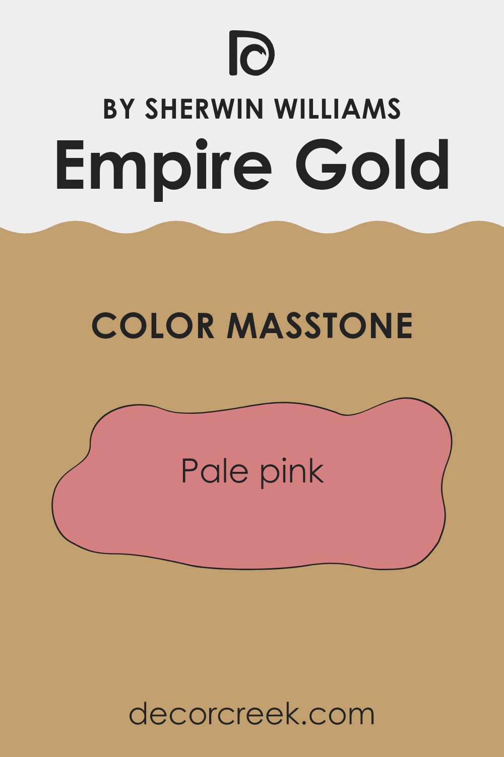
Empire Gold SW 0012 by Sherwin Williams, with its pale pink masstone, brings a soft, warm feel to home areas. This color can make a room feel welcoming and cozy without being overpowering. It subtly enhances the atmosphere by adding a gentle touch of warmth, which can make common areas feel friendly and intimate. In a bedroom, Empire Gold creates a soothing environment that encourages relaxation and comfort.
When paired with neutral furnishings, this shade can serve as a gentle backdrop, allowing other elements in the room to stand out. Its soft pink hue works well with both traditional and modern décor, offering versatility in design choices.
Additionally, Empire Gold can work beautifully in nurseries or children’s rooms, bringing a sense of calm with its understated elegance. With its inviting softness, Empire Gold is an excellent choice for those looking for a color that provides warmth and subtle beauty.
How Does Lighting Affect Empire Gold SW 0012 by Sherwin Williams?
Lighting can significantly affect how we perceive colors in a room. The same color might look different under various lighting conditions, making it important to consider the light when choosing paint colors like Empire Gold by Sherwin Williams.
Under artificial light, colors can change based on the type of bulb used. Incandescent bulbs tend to cast a warmer, yellowish light, which can enhance the warm tones in Empire Gold, making it appear cozier and more inviting. Fluorescent lighting, on the other hand, can add a cooler, bluish tint, potentially dulling the warmth of the gold and making it look a little more muted.
Natural light also plays a major role in how colors are perceived. The direction a room faces can change how colors look throughout the day. In north-facing rooms, light tends to be cooler and more consistent. Empire Gold might seem slightly cooler or less vibrant in this type of area, offering a more subdued appearance.
In south-facing rooms, there is ample natural light throughout the day, often warmer and more intense. Here, Empire Gold can look vibrant and full, with the sunlight highlighting its golden tones nicely.
East-facing rooms receive warm, bright light in the morning and cooler light later in the day. Empire Gold might seem fresh and lively in the morning, becoming softer and more muted as the day goes on.
West-facing rooms get cooler light in the morning and warm, rich light in the afternoon and evening. In these rooms, Empire Gold may appear more mellow early in the day, gaining depth and richness as the sun sets.
Overall, it’s always a good idea to test paint colors in your specific lighting before committing, as they can shift dramatically based on the light in the room.
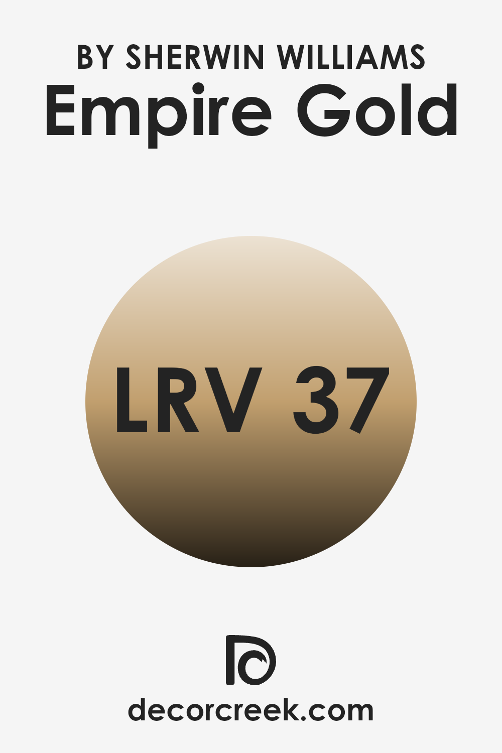
What is the LRV of Empire Gold SW 0012 by Sherwin Williams?
LRV, or Light Reflectance Value, is a measure of how much light a color reflects compared to pure white or absorbs when spread across a surface. It’s measured on a scale from 0 to 100, where 0 is completely black, reflecting no light, and 100 is pure white, reflecting all light. The higher the LRV, the more light a color will reflect.
Understanding LRV is important when choosing paint colors because it affects how the colors will look in different lighting conditions and room sizes. Colors with high LRV values can make a room feel brighter and more open, while colors with lower LRV values can create a more intimate and cozy atmosphere.
For Empire Gold with an LRV of 37.174, the value indicates that it reflects a moderate amount of light. This means that Empire Gold will not make a room feel overly bright. Instead, it will provide a warm, somewhat subdued backdrop. With this LRV, the color will absorb more light than it reflects, giving the walls a comforting and enveloping feel.
In rooms with ample natural light, Empire Gold can add a sense of richness without overpowering the area. In a dimmer room, this color might appear even warmer and more intense, emphasizing its gold tones.
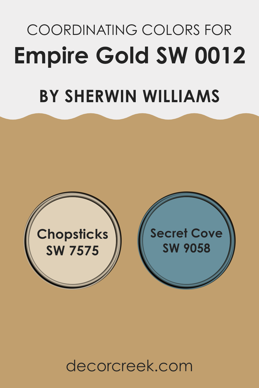
Coordinating Colors of Empire Gold SW 0012 by Sherwin Williams
Coordinating colors are hues that complement each other and work well together in an area, creating a balanced and harmonious look. When you choose a main color for a room, like Empire Gold from Sherwin Williams, finding coordinating colors involves picking shades that enhance its richness and depth without overpowering it. Empire Gold is a warm, golden shade that brings a feeling of warmth and vitality to a room. To coordinate with it, colors such as Chopsticks and Secret Cove from Sherwin Williams can be ideal choices.
Chopsticks, with its earthy, neutral tones, brings a grounded and natural feel to the palette, enhancing the inviting warmth of Empire Gold. Its muted brownish appearance provides a nice counterpoint, making it perfect for creating comfort and cohesion in a room.
Secret Cove, on the other hand, adds a touch of cool sophistication with its deep blue-green tint. This color can introduce a refreshing contrast, balancing the brightness of Empire Gold while maintaining a soothing atmosphere. Together, these colors make a dynamic trio that brings depth and character to any room without clashing, ensuring a pleasing visual experience.
You can see recommended paint colors below:
- SW 7575 Chopsticks
- SW 9058 Secret Cove
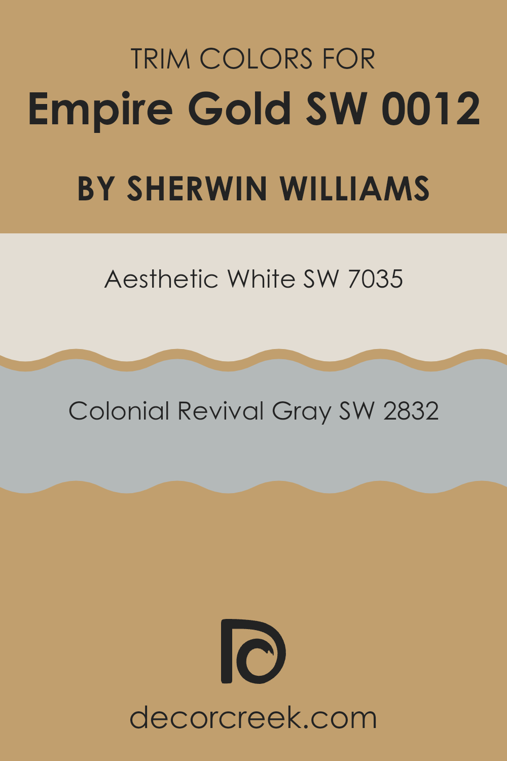
What are the Trim colors of Empire Gold SW 0012 by Sherwin Williams?
Trim colors are the shades chosen to paint the edges or borders of a room or building. They are important because they help define areas and accentuate the main color of the walls. When paired with Empire Gold by Sherwin Williams, trim colors can create a beautiful contrast that enhances the overall look.
Empire Gold is a warm and inviting color, so selecting the right trim can either soften its boldness or make it pop. The trim colors like SW 7035 – Aesthetic White and SW 2832 – Colonial Revival Gray are excellent choices for adding a touch of elegance and balance to a room featuring Empire Gold.
SW 7035, known as Aesthetic White, is a soft off-white that provides a clean and warm backdrop without overpowering an area. It pairs nicely with Empire Gold by adding a light, airy feel that highlights the room’s cozy atmosphere. SW 2832, called Colonial Revival Gray, is a medium gray that adds depth and sophistication without dominating other elements.
Its subtle hue complements Empire Gold by providing a mild contrast, making the golden tones stand out beautifully. Using these trim colors can give a room a stylish and cohesive look, allowing each element to contribute to an inviting environment.
You can see recommended paint colors below:
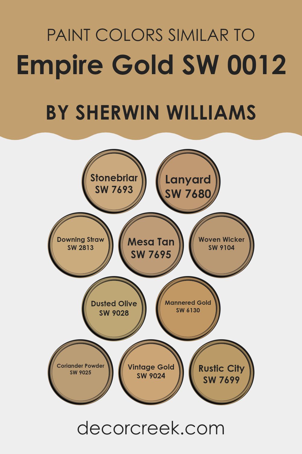
Colors Similar to Empire Gold SW 0012 by Sherwin Williams
Similar colors to Empire Gold by Sherwin Williams are important because they allow for a harmonious and cohesive design palette. When used together, these colors can create a warm and inviting atmosphere, as they complement each other without clashing. SW 7693 Stonebriar, with its warm beige tone, provides a soft and flexible option that pairs nicely with more vibrant shades. SW 7680 Lanyard brings a rich, earthy feel, adding depth to any area.
Downing Straw SW 2813 offers a pale yellow tint that mimics the softness of straw, perfect for brightening a room. SW 7695 Mesa Tan leans towards a warm, reddish-brown hue, ideal for adding warmth. Woven Wicker SW 9104 presents a cozy, neutral base with a light brown complexion, making it adaptable for any theme.
Dusted Olive SW 9028 injects a touch of nature with its subdued green undertones, fostering an organic feel. Mannered Gold SW 6130 showcases a deeper golden hue, providing a touch of elegance. SW 9025 Coriander Powder brings a subtle mustard tint, adding interest without overpowering.
Vintage Gold SW 9024 resonates with a classic and muted gold ambiance, while SW 7699 Rustic City rounds out the palette with its rich, earthy and reddish tint. These similar colors build a cohesive and friendly color scheme around Empire Gold.
You can see recommended paint colors below:
- SW 7693 Stonebriar
- SW 7680 Lanyard
- SW 2813 Downing Straw
- SW 7695 Mesa Tan
- SW 9104 Woven Wicker
- SW 9028 Dusted Olive
- SW 6130 Mannered Gold
- SW 9025 Coriander Powder
- SW 9024 Vintage Gold
- SW 7699 Rustic City
How to Use Empire Gold SW 0012 by Sherwin Williams In Your Home?
Empire Gold SW 0012 by Sherwin Williams is a warm, inviting color that can add a cozy feel to any room in your home. This golden hue works well in living rooms, dining areas, or even bedrooms, bringing a touch of warmth and comfort.
In a living room, it can create a welcoming atmosphere, making the room feel more inviting for family gatherings or time spent relaxing. In the dining room, it can enhance the ambiance, making meals feel more inviting.
Pair it with neutral tones like beige or soft gray for a balanced look, or add white accents for a fresh contrast. Empire Gold is also great for an accent wall, providing a pop of color without overpowering the room. Its flexibility means it can be used in both small and large areas, making it a great choice for anyone looking to add warmth to their home.
Empire Gold SW 0012 by Sherwin Williams vs Lanyard SW 7680 by Sherwin Williams
Empire Gold SW 0012 is a warm, golden hue that brings a cheerful and inviting feel to your area. It’s rich and vibrant, similar to the color of autumn leaves or a sunny morning. This color can make a room feel lively and warm, perfect for areas where you want to create a cozy and welcoming atmosphere.
Lanyard SW 7680, on the other hand, is a neutral, earthy color that provides a calm and grounded look. It resembles a soft taupe or light brown and works well as a background shade. It’s more subdued than Empire Gold, making it a good choice if you prefer a more understated and relaxed vibe in your room.
When comparing these colors, Empire Gold is brighter and more energizing, while Lanyard is subtle and soothing. Each color can set a different mood, and your choice will depend on whether you want a lively or calming environment.
You can see recommended paint color below:
- SW 7680 Lanyard
Empire Gold SW 0012 by Sherwin Williams vs Downing Straw SW 2813 by Sherwin Williams
Empire Gold (SW 0012) and Downing Straw (SW 2813) are both warm, inviting colors from Sherwin Williams, but they each bring their own unique feel. Empire Gold is a rich, deep golden hue. It’s a bold color that adds warmth and a sense of coziness to any room. It works well in areas where you want a touch of elegance without being too dark or overpowering.
On the other hand, Downing Straw is a lighter, softer yellow with a hint of beige. It feels sunnier and more laid-back than Empire Gold. This color is great for creating a bright and friendly atmosphere, making it ideal for kitchens or living rooms where you want a light and welcoming vibe.
Both colors can create a sense of warmth, but Empire Gold is more dramatic and Downing Straw is softer and more subtle. Depending on the ambiance you want, each can enhance your area differently.
You can see recommended paint color below:
- SW 2813 Downing Straw
Empire Gold SW 0012 by Sherwin Williams vs Woven Wicker SW 9104 by Sherwin Williams
Empire Gold SW 0012 by Sherwin Williams is a warm, rich golden hue that brings a sense of warmth and comfort to an area. It has a strong character and can make a room feel cozy and inviting.
Woven Wicker SW 9104 by Sherwin Williams, on the other hand, is a soft, neutral brown that offers a more subtle and adaptable background. It is less intense than Empire Gold and can act as a calming backdrop or complement to bolder colors.
When comparing the two, Empire Gold stands out for its boldness, adding energy and depth to a room. Woven Wicker is more restrained, providing a soothing, natural feel that works well with various décor styles.
Together, Empire Gold can be used as an accent to add pops of color, while Woven Wicker can ground a room with its earthy tones. Their combination balances warmth and neutrality, creating a harmonious look.
You can see recommended paint color below:
Empire Gold SW 0012 by Sherwin Williams vs Vintage Gold SW 9024 by Sherwin Williams
Empire Gold SW 0012 and Vintage Gold SW 9024 are both rich, warm shades from Sherwin Williams, but they have distinct characteristics. Empire Gold SW 0012 is a strong, deep yellow with a mustard tone, making it bold and lively. It’s perfect for areas that need a burst of energy and can brighten a room significantly.
In contrast, Vintage Gold SW 9024 is more subdued and muted, with a darker, earthier tone. It has a softer, aged appearance, reminiscent of antique finishes. This makes it suitable for creating a cozy, classic atmosphere.
While Empire Gold can be more assertive, Vintage Gold is likely to blend more subtly into its surroundings. Depending on your taste, Empire Gold can add excitement, whereas Vintage Gold offers a more understated, comforting feel. Both colors can add warmth, but the former is brighter, while the latter is more mellow.
You can see recommended paint color below:
- SW 9024 Vintage Gold
Empire Gold SW 0012 by Sherwin Williams vs Mannered Gold SW 6130 by Sherwin Williams
Empire Gold SW 0012 and Mannered Gold SW 6130 by Sherwin Williams are both warm golden shades, but they have distinct characteristics. Empire Gold is a deeper, more intense golden hue. It brings a rich, bold touch to a room, adding a sense of warmth and inviting atmosphere. It works well in areas where you want a cozy and luxurious feel.
On the other hand, Mannered Gold is a bit softer and more muted compared to Empire Gold. This color offers a subtle elegance, making it a great choice for creating a relaxed and comfortable environment. It’s slightly more subdued, which can make it flexible for different settings, blending nicely with various decor styles and color schemes.
Both colors can add warmth and style to a room, but your choice depends on whether you prefer the bold richness of Empire Gold or the softer, more understated tone of Mannered Gold.
You can see recommended paint color below:
- SW 6130 Mannered Gold
Empire Gold SW 0012 by Sherwin Williams vs Mesa Tan SW 7695 by Sherwin Williams
Empire Gold SW 0012 by Sherwin Williams is a warm, rich yellow with a hint of earthiness. It radiates a cozy feel, creating a lively yet welcoming atmosphere. Its deep golden tone can make areas feel sunnier and more inviting. In contrast, Mesa Tan SW 7695 is a muted, earthy beige with brown undertones.
It’s a neutral color that gives off a calm and grounded vibe, making it flexible for many settings. When comparing the two, Empire Gold is bright and energizing, contrasting with Mesa Tan’s more subdued and stable presence.
Empire Gold can serve as an accent or focal point, drawing attention and adding warmth, while Mesa Tan functions well as a background or base color, providing a soft backdrop that complements a range of other colors. Together, they balance each other, with Empire Gold adding vibrancy and Mesa Tan offering calmness in their combination.
You can see recommended paint color below:
- SW 7695 Mesa Tan
Empire Gold SW 0012 by Sherwin Williams vs Rustic City SW 7699 by Sherwin Williams
Empire Gold SW 0012 and Rustic City SW 7699 by Sherwin Williams are two distinct colors. Empire Gold is a warm, inviting yellow with a touch of earthiness. It feels sunny and cheerful, adding a cozy and vibrant energy to any room. This color can brighten up an area, providing a welcoming and positive atmosphere.
Rustic City, on the other hand, is a deeper, more muted shade. It leans towards a brownish-red, evoking a sense of groundedness and warmth. While Empire Gold is bright and cheerful, Rustic City offers a more subdued and rustic vibe, making areas feel comfortable and intimate.
When comparing both, Empire Gold is ideal for creating lively, energetic areas, while Rustic City brings a sense of warmth and depth, perfect for creating a cozy environment. Both colors work well in enhancing a room’s character, yet they offer different moods and energies.
You can see recommended paint color below:
- SW 7699 Rustic City
Empire Gold SW 0012 by Sherwin Williams vs Coriander Powder SW 9025 by Sherwin Williams
Empire Gold SW 0012 and Coriander Powder SW 9025 are two distinctive colors from Sherwin Williams. Empire Gold is a rich, warm yellow with a hint of orange that adds a cozy and inviting feel to an area. It is bold without being too overpowering, making it suitable for living areas or accent walls where a touch of vibrancy is desired.
On the other hand, Coriander Powder is a softer, muted beige with subtle green undertones. It provides a more understated look, offering a sense of calm and neutrality. This shade is flexible and works well as a backdrop in various areas, complementing both modern and classic designs.
While Empire Gold energizes an area, Coriander Powder creates a gentle, relaxed atmosphere. Together, they can serve as a dynamic duo, with the boldness of Empire Gold being balanced by the subtlety of Coriander Powder.
You can see recommended paint color below:
- SW 9025 Coriander Powder
Empire Gold SW 0012 by Sherwin Williams vs Dusted Olive SW 9028 by Sherwin Williams
Empire Gold (SW 0012) by Sherwin Williams is a warm and rich yellow-gold color that brings energy and brightness to any area. It’s vibrant and can make a room feel sunny and cheerful. It’s a great choice for spots that need a bit of liveliness and warmth.
On the other hand, Dusted Olive (SW 9028) is a muted green with gray undertones. This color is more subdued and can bring a sense of calmness and comfort. It works well in settings where a more relaxed atmosphere is desired.
While Empire Gold can make a bold statement, drawing attention and creating a lively environment, Dusted Olive is more about subtlety and ease, offering a soft, gentle feel. These two colors can complement each other well, with Empire Gold bringing in brightness and Dusted Olive adding a soothing balance, making them suitable for different moods within a home.
You can see recommended paint color below:
- SW 9028 Dusted Olive
Empire Gold SW 0012 by Sherwin Williams vs Stonebriar SW 7693 by Sherwin Williams
Empire Gold SW 0012 and Stonebriar SW 7693 by Sherwin Williams are both warm, inviting colors, but they have distinct characteristics. Empire Gold is a rich, yellow-gold color that radiates warmth and energy.
It can make an area feel cozy and welcoming, and it pairs well with natural materials like wood. On the other hand, Stonebriar is a more subdued, beige tone with subtle undertones of gray. It is a flexible color that creates a calming and neutral backdrop, allowing other colors or decor to stand out.
While Empire Gold brings a sense of vibrancy to a room, Stonebriar offers a more understated and classic aesthetic. Together, they can be combined effectively to create a balanced and harmonious look, with Empire Gold serving as an accent against the more neutral and relaxing base of Stonebriar.
You can see recommended paint color below:
- SW 7693 Stonebriar
After talking about SW 0012 Empire Gold by Sherwin Williams, I feel like I’ve learned a lot about how special this paint color is. Empire Gold is a warm, golden-yellow shade that makes rooms feel cheerful and bright. It’s like bringing a little bit of sunshine inside your home. When I imagine a room painted with this color, I think of a cozy and happy place where people can gather and feel comfortable.
This color can work in lots of different parts of the house. You could use it in the living room to make it feel welcoming or in the kitchen to add some warmth and energy. Even a hallway could look nicer with this splash of gold. What’s really nice about Empire Gold is that it matches well with other colors. If you have blue or green in your decorations, Empire Gold creates a nice balance.
I also learned that when decorating with Empire Gold, you can add different textures, like soft pillows or curtains, to make the room even more interesting. It’s like dressing up a room to look its best. In the end, Empire Gold is a joyful color that brings life and happiness to wherever it is used.
It reminds me of how a sunny day can brighten our mood and make everything seem a little better.
Ever wished paint sampling was as easy as sticking a sticker? Guess what? Now it is! Discover Samplize's unique Peel & Stick samples.
Get paint samples

