When I think of colors that create a sense of warmth and comfort, Sherwin Williams’ SW 7575 Chopsticks certainly comes to mind. This rich, earthy hue evokes a feeling of coziness, turning any space into an inviting retreat.
It’s the sort of color that makes you want to curl up with a good book or enjoy a relaxing evening with friends and family. Chopsticks strikes a perfect balance between sophistication and approachability, making it incredibly versatile for a variety of spaces, from living rooms and kitchens to bedrooms and dens.
What I appreciate about this color is its ability to complement both modern and traditional decor. It’s a shade that works harmoniously with natural elements, such as wood and stone, enhancing their beauty without overpowering them.
The name itself, Chopsticks, brings to mind a connection to simple pleasures and shared experiences, reminiscent of cozy dinners and meaningful conversations around the table.
With Chopsticks, any room can immediately feel more grounded and welcoming, offering a perfect backdrop for cherished memories.
Whether you’re looking to refresh your living space or set the tone for your personal sanctuary, SW 7575 Chopsticks is a choice that never fails to create a warm and inviting atmosphere.

What Color Is Chopsticks SW 7575 by Sherwin Williams?
Chopsticks (SW 7575) by Sherwin Williams is a warm, earthy neutral that brings a sense of coziness to any room. Its rich, brown hue is reminiscent of the natural tones found in wood and earth, making it a versatile choice for different interior styles.
This color works especially well in rustic and farmhouse interiors, where its warmth complements the natural materials often used in these styles. In a rustic setting, Chopsticks can be paired with wooden beams, stone accents, and soft textiles to create a welcoming atmosphere. It is also fitting for a more modern setting, owing to its simplicity and depth, which can add a touch of nature to sleek lines and open spaces.
When considering materials, Chopsticks pairs beautifully with reclaimed wood, leather, and metal elements. The color’s warmth enhances the rich textures of leather and helps to soften the coolness of metals, such as iron or steel. Textiles like wool, cotton, or linen in muted tones or contrasting colors can add layers to the room without clashing.
Chopsticks is an excellent choice for those looking to add a cozy, grounded feel to their home. Whether used on walls, furniture, or accent pieces, its welcoming nature is sure to enrich any living space.
Is Chopsticks SW 7575 by Sherwin Williams Warm or Cool color?
Chopsticks SW 7575 by Sherwin Williams is a warm, earthy tan color, perfect for creating a welcoming atmosphere in homes. This neutral shade has a subtle undertone that complements a range of other colors, making it versatile for different rooms and styles.
When used on walls, Chopsticks provides a cozy backdrop that enhances both modern and traditional decor. It pairs well with natural materials like wood and stone, making it ideal for living rooms and kitchens.
In bedrooms, Chopsticks can create an inviting space that feels comfortable and snug, especially when combined with soft textiles like cotton and wool. Its warm nature makes it a great choice for open spaces, gently connecting different areas of the home.
This color also works well with plants and natural elements, bringing a touch of the outdoors inside. Overall, Chopsticks SW 7575 is an adaptable color that adds warmth and depth to any space without being overpowering.
Undertones of Chopsticks SW 7575 by Sherwin Williams
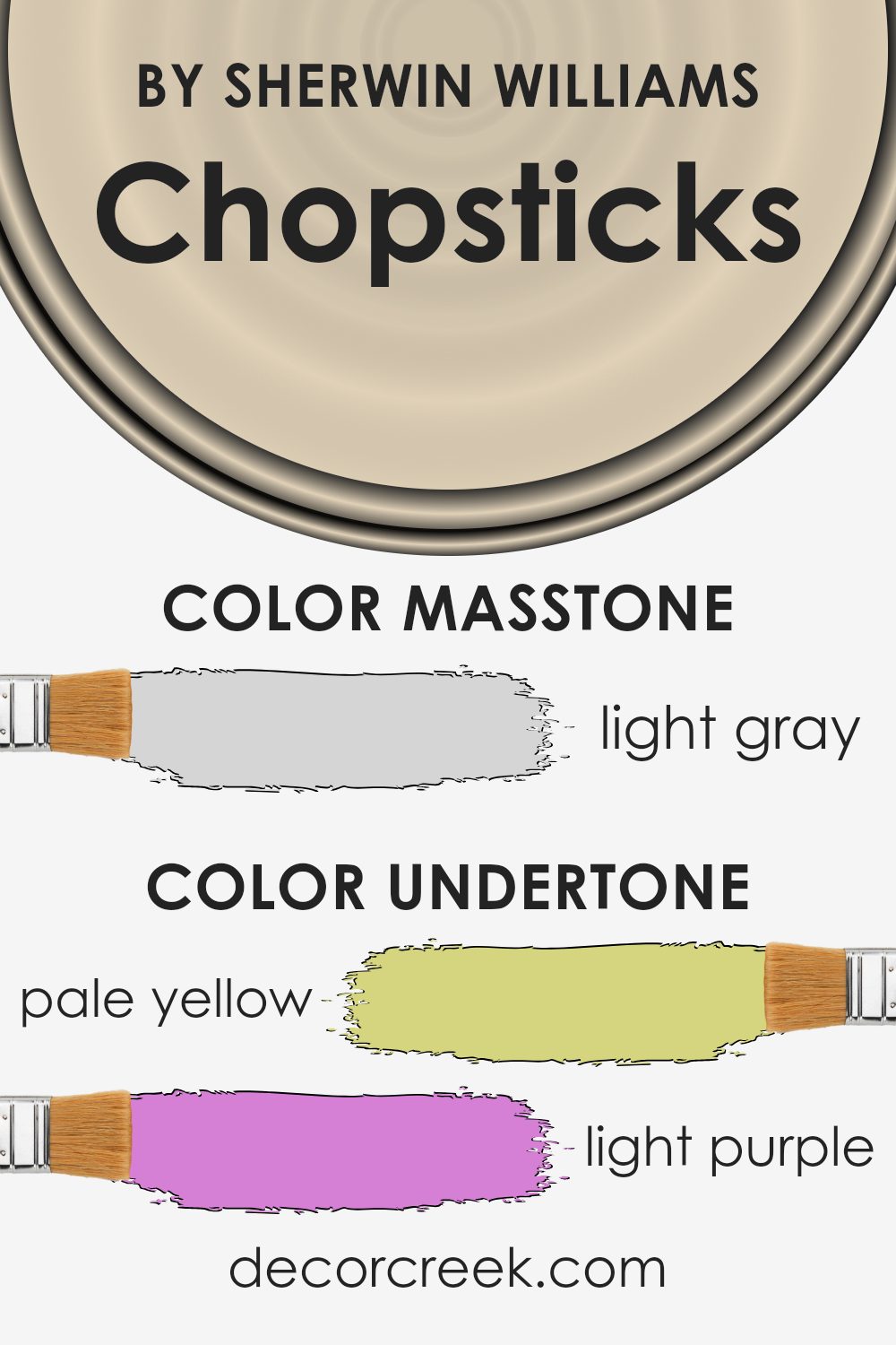
Chopsticks by Sherwin Williams is a unique color with several undertones that impact how we perceive it. The main color can shift slightly depending on these underlying hues, creating different effects in a space.
This color has pale yellow undertones, which can make it feel warm and inviting. The light blue element adds a hint of coolness, balancing the warmth with a fresh touch. Pale pink adds a soft, romantic vibe, while the mint introduces a feeling of crispness. The light purple and lilac lend a subtle, mysterious quality, adding depth. Grey provides a neutral base, ensuring the color doesn’t lean too heavily towards one feature.
When used on interior walls, these undertones play a significant role. In a room with plenty of natural light, the pale yellow might stand out more, giving the space a warm glow. In contrast, artificial lighting could highlight the light purple or grey, providing a cooler, subdued appearance.
These shifts make Chopsticks a versatile choice for different moods and settings. It can adapt to various environments, making it suitable for both lively and calm spaces, depending on the lighting and surrounding decor.
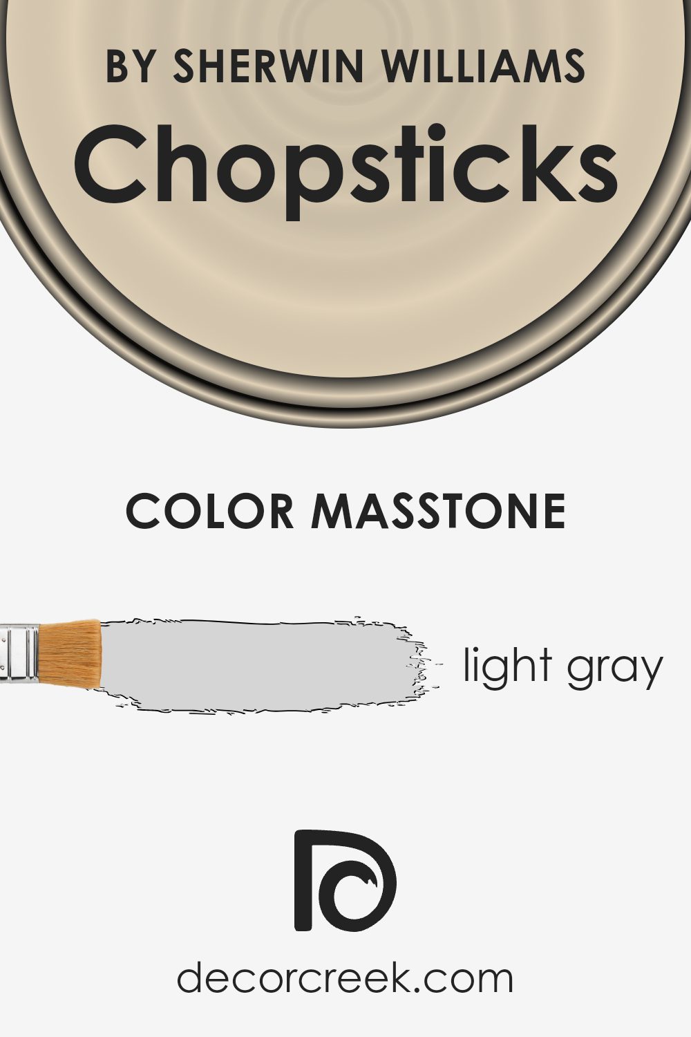
What is the Masstone of the Chopsticks SW 7575 by Sherwin Williams?
Chopsticks SW 7575 by Sherwin Williams is a light gray color with a masstone of #D5D5D5. This subtle shade of gray can have a big impact on how a room looks and feels. The lightness of the color allows it to reflect more natural light, which can make a space feel bigger and more open. It’s a versatile and neutral tone that pairs well with many other colors and styles in a home.
This color works well in living rooms and bedrooms, where a calm environment is desired. It can serve as a backdrop that complements both bold and soft-colored accents, making it easy to change decor without the need to repaint.
Additionally, Chopsticks can be an excellent choice for kitchens and bathrooms, adding a clean and modern appearance. Its simple and understated nature makes it a timeless option that can suit many different tastes and preferences.
How Does Lighting Affect Chopsticks SW 7575 by Sherwin Williams?
Lighting plays a crucial role in how we perceive colors. Different light sources can alter the way a paint color looks. Chopsticks SW 7575 by Sherwin Williams is a warm, earthy hue that shifts in appearance under various lighting conditions.
In artificial light, Chopsticks may look different depending on the type of bulb used. Under incandescent lighting, which has a warmer tone, the color may appear warmer and more inviting. Fluorescent lighting, which has a cooler tone, can make the color look more muted or washed out. LED lights can vary in color temperature, so they might enhance or dull the hue depending on whether they’re warm or cool.
In natural light, the effect on Chopsticks is even more pronounced. The direction and intensity of sunlight throughout the day and year can dramatically change its appearance.
In north-facing rooms, which tend to receive cooler and more consistent light, the color might appear less vibrant and more subdued. The cool light can bring out the earthy tones of Chopsticks, making it look softer and more muted.
In south-facing rooms, which receive the most intense and warm light throughout the day, Chopsticks can look brighter and more intense. The warm natural light enhances the rich undertones, giving the room a cozy feel.
In east-facing rooms, the strong morning light can make the color look more lively and vibrant in the early hours. As the day progresses and the light cools down, the color might become more subtle.
West-facing rooms have warmer light in the afternoon and evening. The color may seem richer and more golden as the sun sets, providing a warm glow that accentuates the paint’s warmth.
Overall, the direction and type of light significantly impact how Chopsticks is perceived, making it essential to consider these factors when choosing paint for a space.

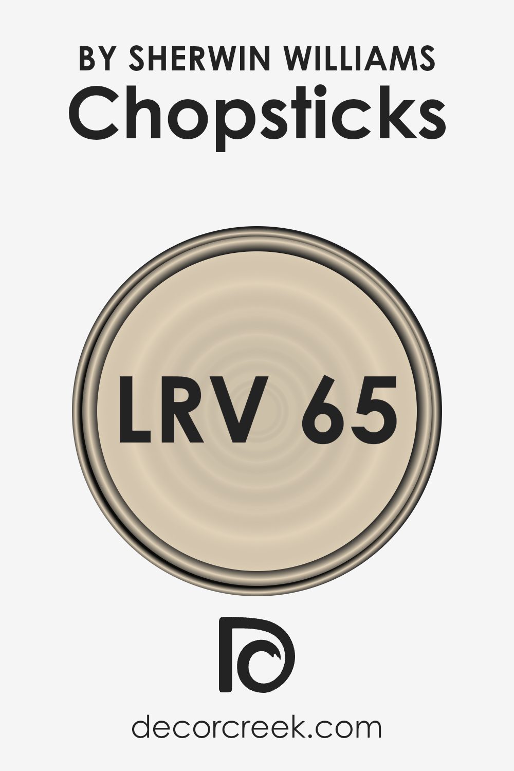
What is the LRV of Chopsticks SW 7575 by Sherwin Williams?
Light Reflectance Value, or LRV, is a measure of how much light a color reflects. It is recorded on a scale from 0 to 100, where 0 represents absolute black (no light reflected) and 100 represents pure white (full light reflection). Essentially, the LRV tells us how bright or dark a color will appear when applied to a surface.
Colors with higher LRV values reflect more light and can make rooms feel more open and spacious. They can brighten up darker areas because they bounce more light around. Conversely, colors with lower LRV values absorb more light, making a space feel cozier and sometimes smaller.
Regarding Chopsticks by Sherwin Williams, which has an LRV of 64.821, this value indicates that it leans toward the lighter side of the color spectrum. With such moderate light reflectance, Chopsticks reflects a fair amount of light, making it a good choice to brighten a room without being overwhelmingly bright.
This subtlety allows the color to warm up a space gently, providing a welcoming and comfortable atmosphere. It can work well in rooms that need a touch of light but still benefit from some warmth and depth, making it versatile for different styles and settings.
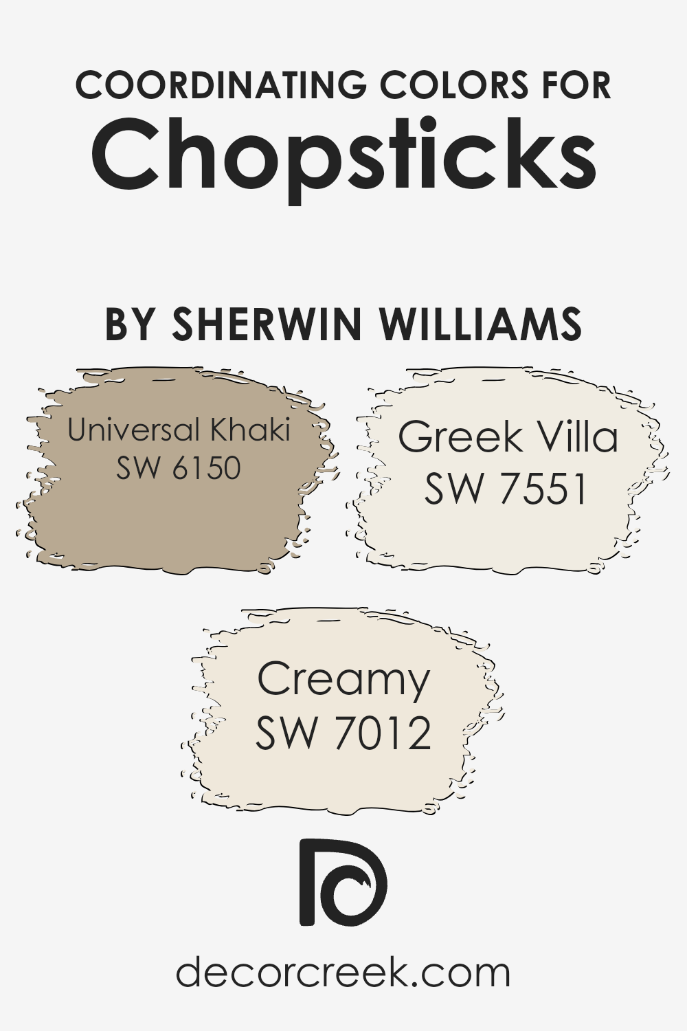
Coordinating Colors of Chopsticks SW 7575 by Sherwin Williams
Coordinating colors are shades that work well together to create a harmonious look in a space. They are chosen to complement a main color, in this case, Chopsticks by Sherwin Williams. To achieve a balanced and appealing design, it’s important to select colors that enhance the primary shade without clashing. One of the coordinating colors is SW 6150 Universal Khaki, a warm, earthy tone that provides a grounded backdrop. It brings a sense of comfort and coziness, making it an excellent choice to pair with the rich warmth of Chopsticks.
Another complementary color is SW 7012 Creamy, a soft, off-white that adds brightness and a touch of elegance. This hue helps to lighten the space and introduces a gentle contrast to the darker Chopsticks.
Additionally, SW 7551 Greek Villa serves as a crisp, clean white with a hint of warmth, perfectly offsetting other colors while adding an airy feel to the room. By using these tones together, you can easily achieve a cohesive and inviting atmosphere that enhances the overall aesthetic of your space. Each color brings its own unique quality to the palette, ensuring a balanced and pleasant visual experience.
You can see recommended paint colors below:
- SW 6150 Universal Khaki
- SW 7012 Creamy
- SW 7551 Greek Villa
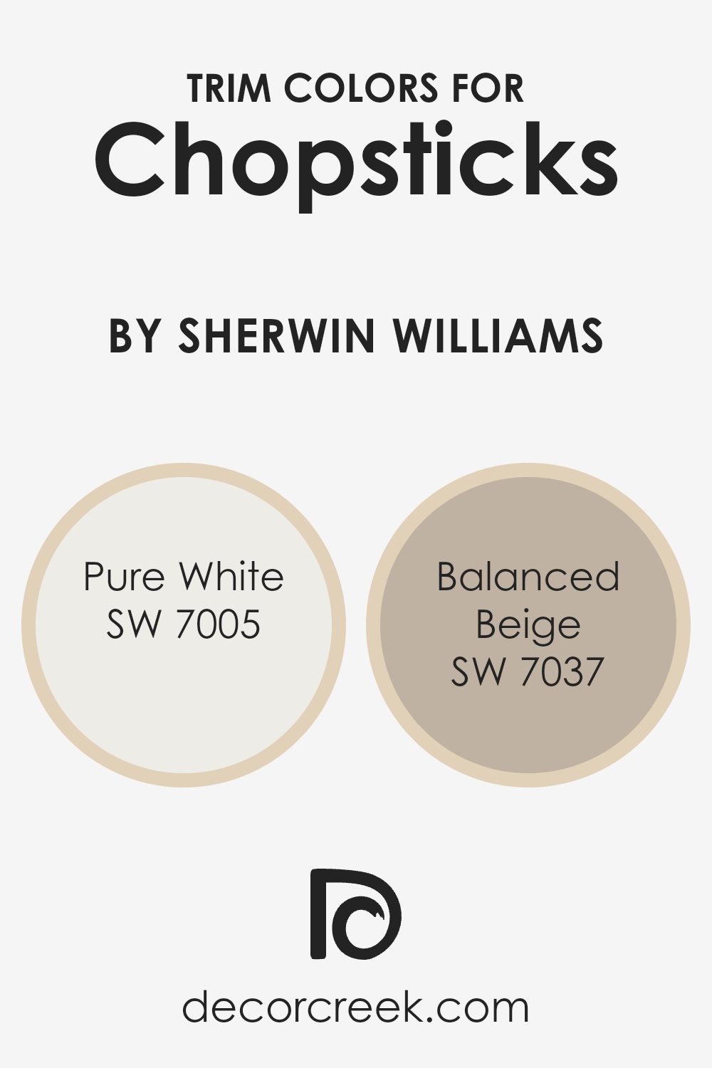
What are the Trim colors of Chopsticks SW 7575 by Sherwin Williams?
Trim colors refer to the paint colors used on the smaller parts of a room or house, like moldings, door frames, and baseboards, which help define spaces and add detail to a design. They are important because they create contrast and highlight the main color, giving a room a finished and well-designed look. For Chopsticks 7575 by Sherwin Williams, trim colors like SW 7005 Pure White and SW 7037 Balanced Beige can help enhance the main color.
Pure White is a clean and bright shade that brings a crisp, fresh feel and can make other colors stand out more. Balanced Beige adds a warm, neutral background that complements various colors and styles without overwhelming them.
Using SW 7005 Pure White as a trim color offers a classic and timeless look. It helps in creating a clear distinction against the wall colors and adds a bright touch to the overall appearance. This color enhances the architecture of a room, making moldings and doors appear crisp and defined. On the other hand, SW 7037 Balanced Beige provides a subtle contrast.
Its warm tone adds depth without being too bold, making it a versatile choice that brings out the warmth in Chopsticks. Together, these trim colors can enhance the beauty of a space, giving it a polished and harmonious look.
You can see recommended paint colors below:
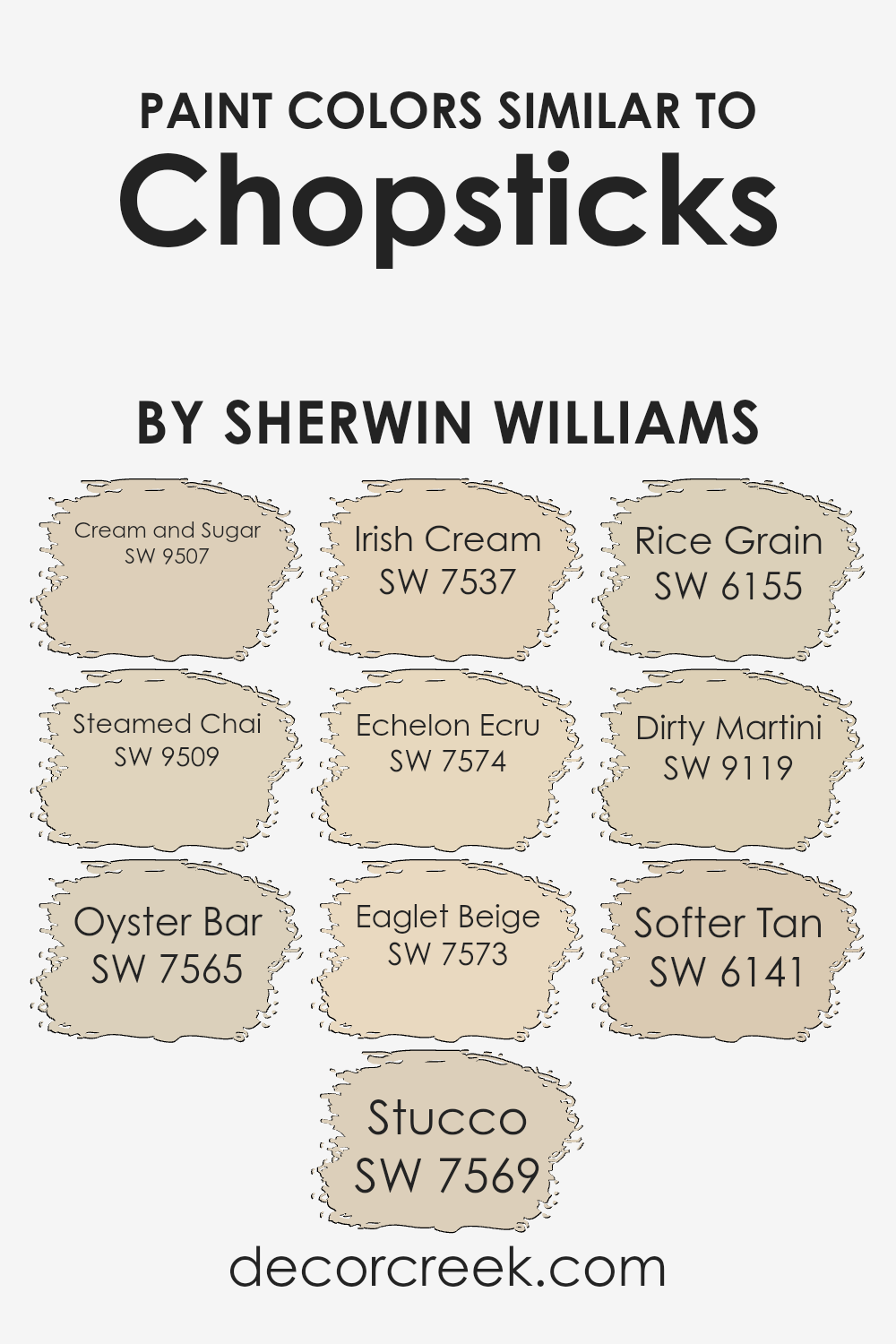
Colors Similar to Chopsticks SW 7575 by Sherwin Williams
Using colors similar to Chopsticks by Sherwin Williams can create a warm and inviting atmosphere in any room. These colors work well together because they share similar undertones and qualities, creating a harmonious space. SW 9507 Cream and Sugar is a soft and subtle off-white that adds a gentle touch to any setting. SW 9509 Steamed Chai offers a warm, cozy beige with hints of spice, perfect for adding depth. SW 7565 Oyster Bar, a pale, neutral color, is ideal for a crisp yet homely appearance, providing a refined backdrop for other colors.
SW 7569 Stucco is a muted beige with an earthy undertone that brings in warmth and comfort. SW 7537 Irish Cream is a rich, creamy color that feels welcoming and cozy. SW 7574 Echelon Ecru provides a tan hue with a hint of gold, adding warmth without overpowering. SW 7573 Eaglet Beige is a soft, neutral beige that serves as a versatile base for many interior styles.
SW 6155 Rice Grain is a light greige that balances greys and beiges for a modern touch. SW 9119 Dirty Martini adds a unique twist with its subtle green undertone, offering a fresh perspective. Finally, SW 6141 Softer Tan is a warm, light tan that creates a natural, soothing environment. Together, these colors create a cohesive look that is both stylish and comfortable.
You can see recommended paint colors below:
- SW 9507 Cream and Sugar
- SW 9509 Steamed Chai
- SW 7565 Oyster Bar
- SW 7569 Stucco
- SW 7537 Irish Cream
- SW 7574 Echelon Ecru
- SW 7573 Eaglet Beige
- SW 6155 Rice Grain
- SW 9119 Dirty Martini
- SW 6141 Softer Tan
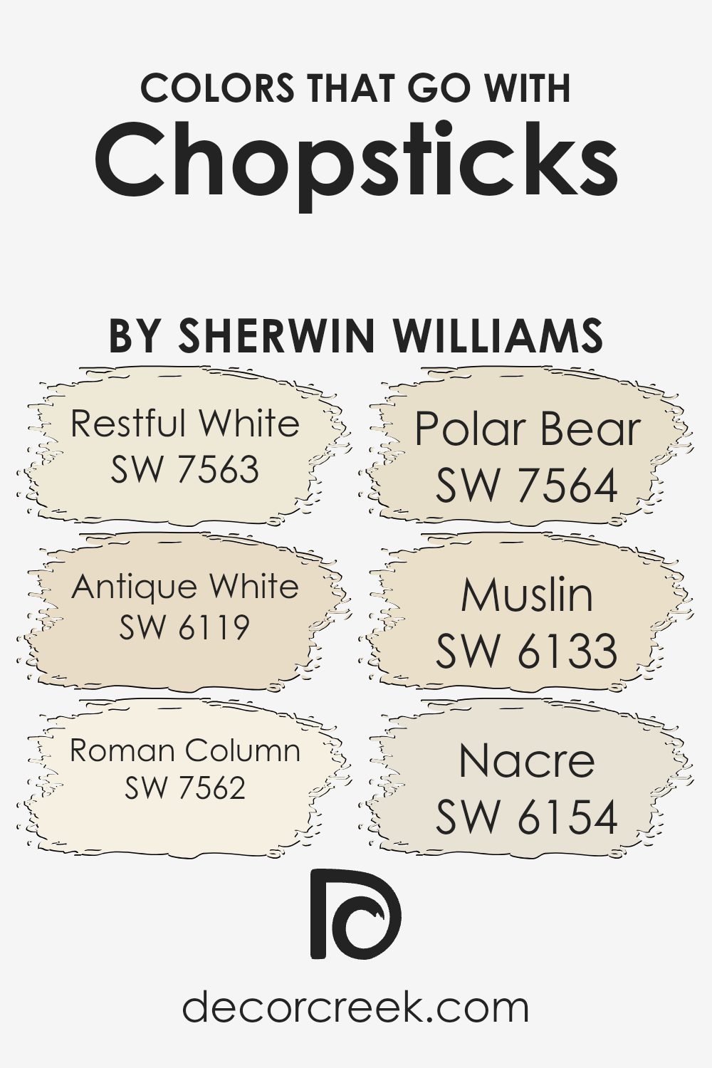
Colors that Go With Chopsticks SW 7575 by Sherwin Williams
Colors that go with Chopsticks SW 7575 by Sherwin Williams are important because they help to create a balanced and harmonious atmosphere in any space. These colors, when used together, can make a room feel more cohesive and welcoming. For instance, SW 7563 – Restful White is a soft and gentle shade that brightens the space without being too stark. Meanwhile, SW 6119 – Antique White adds warmth with its creamy undertones, making it a great choice for creating a cozy environment.
SW 7562 – Roman Column offers a light, airy feel that complements Chopsticks beautifully, as it doesn’t overpower the main shade. SW 7564 – Polar Bear is another option that introduces a crispness, lending a fresh look to any room. For a hint of earthiness, SW 6133 – Muslin brings a subtle beige tone that pairs well with other neutrals.
Lastly, SW 6154 – Nacre adds a touch of elegance with its pearlescent finish, which can enhance the overall look without being too bold. Together, these colors work with Chopsticks to create a soothing and inviting space, making it easy to design a room that feels just right.
You can see recommended paint colors below:
- SW 7563 Restful White
- SW 6119 Antique White
- SW 7562 Roman Column
- SW 7564 Polar Bear
- SW 6133 Muslin
- SW 6154 Nacre
How to Use Chopsticks SW 7575 by Sherwin Williams In Your Home?
Chopsticks SW 7575 by Sherwin Williams is a warm, inviting paint color that can bring comfort to a home. This rich, earthy tone works well in various spaces, creating a welcoming atmosphere. For living rooms, Chopsticks can be used on the walls to add warmth and make the space feel cozy.
Pairing it with neutral furniture and natural materials, like wood or stone, enhances its earthy feel. In the kitchen, Chopsticks can be used for cabinetry or an accent wall, complementing stainless steel appliances and bright countertops.
In bedrooms, this shade can help create a relaxing and restful environment, especially when combined with soft textiles like cotton or linen. Additionally, Chopsticks SW 7575 is a great choice for exterior use, bringing a natural look to front doors or trims when matched with lighter-colored siding. Overall, it’s a versatile paint color that can enhance the coziness of any room.
Chopsticks SW 7575 by Sherwin Williams vs Rice Grain SW 6155 by Sherwin Williams
Chopsticks SW 7575 by Sherwin Williams is a warm, beige color with a touch of yellow. It offers a cozy and inviting feel, making it a great choice for living areas or rooms where you want a comforting atmosphere. It pairs nicely with wooden furniture and natural elements, enhancing their warmth.
Rice Grain SW 6155, also by Sherwin Williams, is a lighter beige with subtle green undertones. This color has a soft and airy appearance, making it ideal for spaces where you want a sense of openness and light. It can work well in kitchens or bathrooms, adding a gentle brightness without being overwhelming.
When comparing the two, Chopsticks is richer and more grounded, providing a more substantial presence in a room. On the other hand, Rice Grain offers a softer, more neutral backdrop. Both colors complement earthy tones but offer different moods: Chopsticks brings warmth and comfort, while Rice Grain offers lightness and versatility.
You can see recommended paint color below:
- SW 6155 Rice Grain
Chopsticks SW 7575 by Sherwin Williams vs Steamed Chai SW 9509 by Sherwin Williams
Chopsticks SW 7575 by Sherwin Williams is a warm, earthy brown that adds a cozy feel to a room. It brings a sense of comfort and can work well in spaces where you want a grounding, natural effect.
Steamed Chai SW 9509, on the other hand, is a lighter, creamy beige. It’s soft and inviting, making a space feel open and airy. While Chopsticks offers depth and richness, Steamed Chai provides a lighter, more neutral backdrop that can brighten a space. When used together, Chopsticks can serve as an accent or feature wall, with Steamed Chai used on surrounding walls to balance the room.
Both colors work well in a variety of settings, but the choice between them depends on whether you want a dark, cozy atmosphere or a light, fresh feel. They complement each other nicely, creating harmony in design.
You can see recommended paint color below:
Chopsticks SW 7575 by Sherwin Williams vs Eaglet Beige SW 7573 by Sherwin Williams
Chopsticks SW 7575 and Eaglet Beige SW 7573 are two colors by Sherwin Williams that offer different moods and uses for spaces. Chopsticks is a warm and rich brown with reddish undertones, bringing a cozy and inviting feel to a room. It’s perfect for spaces where you want to create a sense of warmth, like a living room or study.
On the other hand, Eaglet Beige is a lighter, neutral beige with soft undertones. It provides a more subtle and airy appearance, making it great for creating an open and relaxed atmosphere in any room, from bedrooms to hallways. While Chopsticks adds depth and richness, Eaglet Beige offers simplicity and fresh elegance.
Depending on the ambiance you want, you can choose Chopsticks for a warm, earthy setting or Eaglet Beige for a light, neutral backdrop. Choose based on the mood and lighting you want in your space.
You can see recommended paint color below:
- SW 7573 Eaglet Beige
Chopsticks SW 7575 by Sherwin Williams vs Softer Tan SW 6141 by Sherwin Williams
Chopsticks SW 7575 by Sherwin Williams is a warm, medium brown color that gives a cozy and grounded feeling. It’s like the earthy tone you find in natural wood, making spaces feel inviting and calm. On the other hand, Softer Tan SW 6141 is a lighter, beige-like color. This shade feels airy and bright, providing a sense of openness to a room.
When you compare the two, Chopsticks is much darker and richer, while Softer Tan offers a softer and more neutral appearance. Chopsticks works well in spaces where you want to add warmth and depth, making it suitable for accent walls or cozy corners.
Softer Tan, with its lighter hue, is perfect for creating a light and spacious feel, often used in living areas or bedrooms to keep them open and fresh. Both colors belong to a neutral palette but serve slightly different purposes.
You can see recommended paint color below:
Chopsticks SW 7575 by Sherwin Williams vs Stucco SW 7569 by Sherwin Williams
Chopsticks SW 7575 by Sherwin Williams is a warm, earthy color. It has a comforting, cozy feel, making spaces feel inviting and grounded. This shade resembles the warmth of natural wood, bringing a bit of nature indoors. It’s a versatile choice, complementing both modern and traditional decor styles.
On the other hand, Stucco SW 7569 is lighter and softer. It has a gentle, understated quality, often resembling the muted tones of natural plaster or clay. This color can create a light and airy environment, perfect for making smaller spaces feel larger and more open.
While Chopsticks adds depth and richness, Stucco offers a fresh, clean backdrop. Both colors are easy to live with and lend themselves to earthy, calm interiors. However, Chopsticks might be better suited for a cozy den or a relaxing study, whereas Stucco works well in kitchens, bathrooms, or areas where a bright, open feel is desired.
You can see recommended paint color below:
- SW 7569 Stucco
Chopsticks SW 7575 by Sherwin Williams vs Echelon Ecru SW 7574 by Sherwin Williams
Chopsticks by Sherwin Williams (SW 7575) and Echelon Ecru (SW 7574) are two colors that are similar yet distinct. Chopsticks is a warm, medium-toned beige with a hint of brown, giving it a cozy, inviting feel. It provides a comfortable backdrop that works well in living areas or anywhere you want a warm touch.
Echelon Ecru, on the other hand, is slightly lighter and has a softer, more muted appearance. It leans more towards a creamy beige, offering a gentle contrast while maintaining the same warm undertones. This color is well-suited for spaces where you want a relaxed atmosphere without being too bold.
Both colors are versatile neutrals, allowing them to complement a range of furnishings and decors. While Chopsticks adds a bit more depth and richness, Echelon Ecru brings a subtle, airy quality. Together, they can create a harmonious balance in any environment.
You can see recommended paint color below:
Chopsticks SW 7575 by Sherwin Williams vs Irish Cream SW 7537 by Sherwin Williams
Chopsticks SW 7575 and Irish Cream SW 7537 by Sherwin Williams are both warm, inviting shades but have distinct differences. Chopsticks is a deeper, richer color with hints of brown, giving it a cozy, earthy feel. It’s a color that can make a room feel grounded and warm, making it ideal for spaces where you want to feel snug and relaxed.
On the other hand, Irish Cream is lighter, with a beige hue that adds a soft, gentle warmth to any room. It’s versatile and neutral, working well to create a bright, airy atmosphere without overwhelming the space. While Chopsticks adds a touch of depth and warmth, Irish Cream keeps things light and fresh.
These two colors can complement each other beautifully in a home, with Chopsticks providing depth and Irish Cream offering a gentle contrast, making them a great pairing for a balanced and welcoming environment.
You can see recommended paint color below:
- SW 7537 Irish Cream
Chopsticks SW 7575 by Sherwin Williams vs Dirty Martini SW 9119 by Sherwin Williams
Chopsticks SW 7575 and Dirty Martini SW 9119 from Sherwin Williams offer unique, distinct vibes. Chopsticks is a warm, inviting color with a beige undertone, making it versatile for many settings. It can bring a sense of comfort and coziness to a room, working well with other neutral tones or as a backdrop for bolder accents.
On the other hand, Dirty Martini is a muted green with a slightly brownish tint. This shade adds a touch of nature and earthiness to a space without being too obvious. It pairs nicely with other earth tones or soft neutrals, creating a relaxed, natural feel.
While Chopsticks leans towards a classic neutral, Dirty Martini introduces a bit more color, ideal for those who want subtle character without overwhelming strength. Both shades can complement wood finishes, but the choice depends on whether you prefer a warm neutral or a soft green to anchor your room’s design.
You can see recommended paint color below:
- SW 9119 Dirty Martini
Chopsticks SW 7575 by Sherwin Williams vs Oyster Bar SW 7565 by Sherwin Williams
Chopsticks SW 7575 and Oyster Bar SW 7565 by Sherwin Williams are two distinct paint colors. Chopsticks is a warm, earthy brown with a hint of orange, offering a cozy and inviting feel. It’s a great choice for spaces where you want a comforting, grounded atmosphere.
On the other hand, Oyster Bar is a soft, neutral beige with subtle gray undertones. It provides a calm, versatile backdrop that can complement a variety of design styles. While Chopsticks brings warmth and richness to a room, Oyster Bar offers a lighter, more airy feel. When used together, Chopsticks could add depth as an accent, while Oyster Bar serves as a soothing base.
Both colors are versatile, but their different undertones and intensities mean they can create contrasting moods depending on how they’re used in a space. This makes them useful for different design needs.
You can see recommended paint color below:
- SW 7565 Oyster Bar
Chopsticks SW 7575 by Sherwin Williams vs Cream and Sugar SW 9507 by Sherwin Williams
Chopsticks SW 7575 is a rich, warm brown color available from Sherwin Williams. It brings a comforting and earthy feel to any space, making it a great choice for creating a cozy atmosphere. It pairs beautifully with both lighter and darker colors, due to its natural and neutral undertones.
On the other hand, Cream and Sugar SW 9507 is a light, soft beige. This color offers a gentle and airy quality that can brighten up a room. It’s subtle yet versatile, providing a great backdrop that complements a wide range of design styles and colors.
When comparing the two, Chopsticks is much darker and more intense, while Cream and Sugar is light and uplifting. Together, they can create a balanced look by using Chopsticks for accent areas or furniture, while Cream and Sugar serves as the primary wall color. This combination offers depth without being overwhelming.
You can see recommended paint color below:
Conclusion
After learning about SW 7575 Chopsticks by Sherwin Williams, I am truly impressed by its warm and inviting nature. This paint color reminds me of a cozy hug from a friend. It’s a beautiful shade that combines the richness of earthy tones with the comfort of a familiar place. When I think about how this color looks in a room, I imagine a place that feels welcoming and friendly. It’s like being in a room filled with soft blankets and friendly smiles.
Chopsticks is a color that works well with many different things. Whether it’s in a living room with bright pillows or a kitchen with shiny utensils, it fits right in and makes everything look wonderful. This color is also very calming, bringing a sense of warmth and peace to any area it covers.
I find that using Chopsticks can make everyday places feel special. It brings a gentle glow to our surroundings, making us feel happy and at ease. Overall, SW 7575 Chopsticks is more than just a paint color; it’s a way to help rooms feel nice and comforting.
This curiosity into Chopsticks has taught me how colors can change the way we feel at home, making everything seem a little brighter and more joyful.
Ever wished paint sampling was as easy as sticking a sticker? Guess what? Now it is! Discover Samplize's unique Peel & Stick samples.
Get paint samples

