If you’re thinking about giving your room a fresh look with a new paint color, you might want to consider SW 7006 Extra White by Sherwin Williams. Before you grab a paintbrush and start the update, let me share some insights about this particular shade of white.
First off, you should know that despite its name, Extra White isn’t a stark or cold white. It has a slightly warm undertone that makes it adaptable enough to work in various lighting situations. Whether your room gets a lot of natural light or relies more on artificial lighting, this color maintains its crispness without turning too sterile.
Choosing the right white paint can be trickier than it seems, thanks to the subtle nuances each shade brings to a room. Extra White is great if you’re aiming for a clean, consistent look throughout your home. It pairs beautifully with bold colors and works equally well as a standalone color for a minimalistic aesthetic.
As you get ready to update your home, keep in mind that the finish of the paint can also affect the overall outcome. A matte finish could soften the atmosphere, while a gloss finish might brighten up a smaller room. Think about the mood and functionality of each room you’re planning to paint with Extra White.
Hopefully, these tips help you understand whether SW 7006 Extra White is the right choice for your renovation project!
Is Extra White SW 7006 Right for My Home?
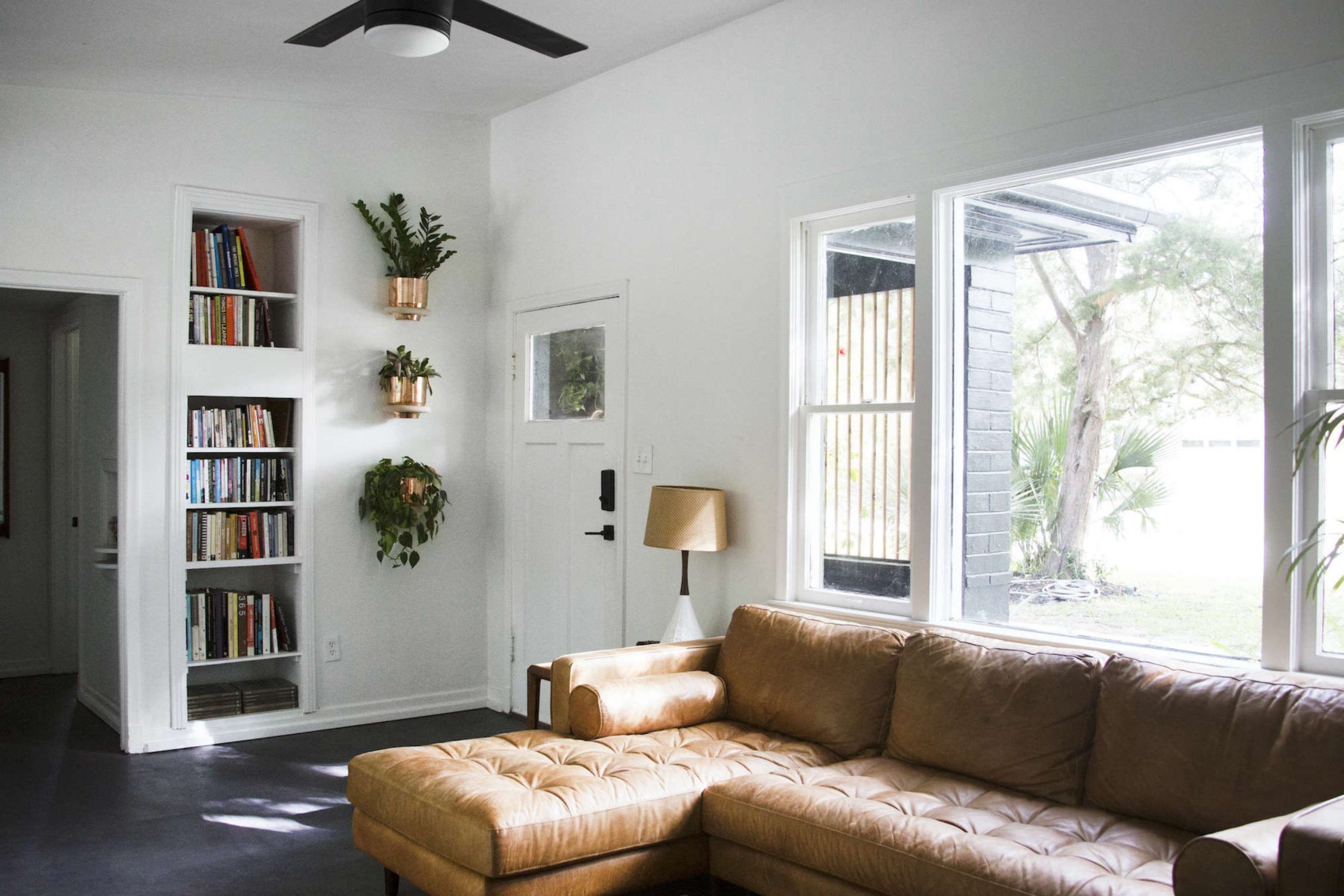
I recently had the chance to use the color Extra White by Sherwin Williams in a design project, and I must say, it’s a remarkably clean and crisp shade of white. This paint is perfect for creating a bright, airy atmosphere in any room. Its pure white tone makes it an excellent base for various interior styles, particularly modern, minimalist, and Scandinavian decor. I have found that it works exceptionally well in rooms that aim for a fresh and contemporary look.
What I love most about using this color is how adaptable it is when it comes to pairing it with different materials and textures. It goes beautifully with smooth, matte surfaces like unpolished wood, which helps in adding warmth to the coolness of the white.
I also enjoy matching it with metallic accents, like brushed nickel or chrome, which help give a room a more modern edge. Even textiles work well with Extra White; think soft, plush fabrics or even coarse linens, which add an inviting layer to the design.
In terms of matching with other colors, it serves as a perfect backdrop for both bold and muted palettes. It allows the colors to stand out without competing with them. Whether I’m decorating a room with vibrant artwork or soothing earth tones, Extra White is my go-to for making the colors truly stand out.
decorcreek.com
What are the right undertones of Extra White SW 7006 ?
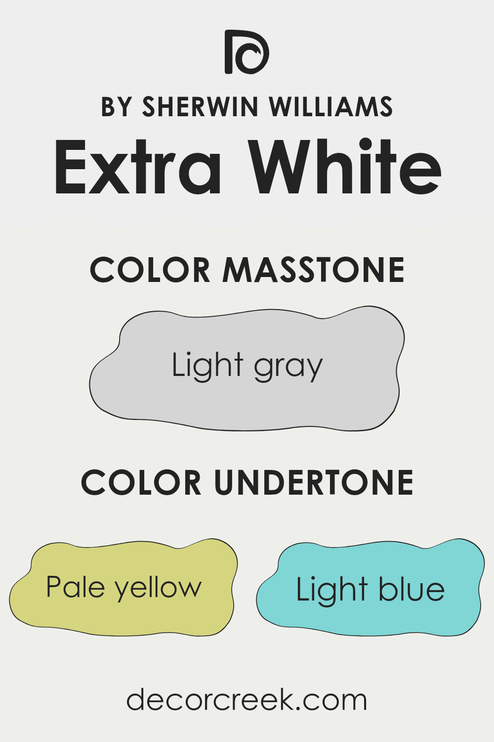
Extra White SW 7006 by Sherwin Williams is a popular paint choice for those seeking a clean, bright white. However, the way we perceive its “whiteness” can be significantly influenced by its undertones. Undertones are subtle colors that are used in the mixture to create the main color. For Extra White, these undertones include shades like pale yellow, light blue, light purple, mint, pale pink, lilac, and gray.
In different lighting conditions, these undertones can become more apparent, affecting how the color is seen. For example, in a room with a lot of natural light, the light blue or lilac undertones could give the walls a slightly cooler appearance. In artificial light, the pale yellow or pale pink might make the room feel warmer.
When using Extra White on interior walls, it’s crucial to consider the room’s lighting and how it might highlight these undertones. Pale yellow and pale pink can make a room feel cozier, while light blue and lilac can provide a more refreshing look. Mint and gray can help balance out brightness, providing a subtle depth that prevents the color from feeling too stark.
Thus, understanding the impact of these undertones will help in achieving the desired effect in your room, ensuring that the white chosen performs as expected in both its atmosphere and interaction with other elements of the room’s decor.
decorcreek.com
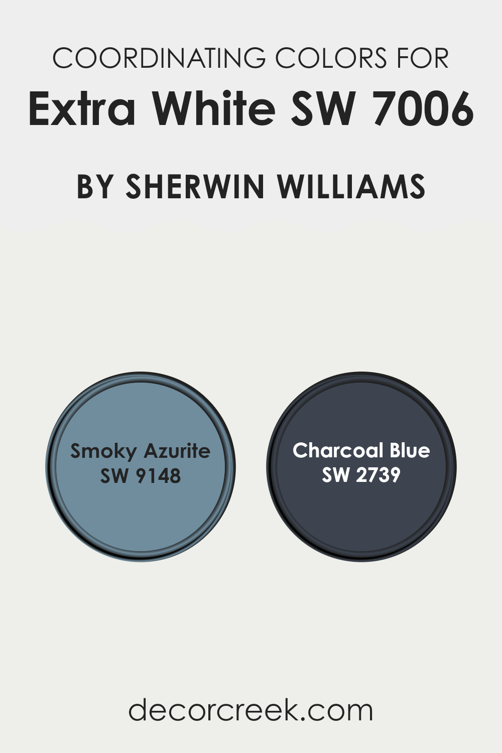
Best Coordinating Colors to use with Extra White SW 7006 by Sherwin Williams this year.
Coordinating colors work by complementing or providing a visual balance to a primary color within a room. For example, if someone chooses a neutral base like a light color for their walls, adding coordinating colors can enhance the aesthetic appeal without being too intense. These coordinating colors should have a cohesive feel, ensuring that the room remains visually appealing and harmonious.
One of the colors that coordinates well with lighter shades is Smoky Azurite SW 9148 by Sherwin Williams. This is a deep, subtly vibrant blue that can add depth and interest to a room, particularly when it is used on accent walls, furniture, or even in decorative elements.
Another effective coordinating color is Charcoal Blue SW 2739, also by Sherwin Williams. This shade is a darker, richer blue that provides a striking contrast to lighter wall colors, making it ideal for creating focal points in a room, such as painted cabinets or doors. Both colors help in setting a dynamic yet balanced atmosphere in rooms that utilize lighter shades as a base.
You can see recommended paint colors below:
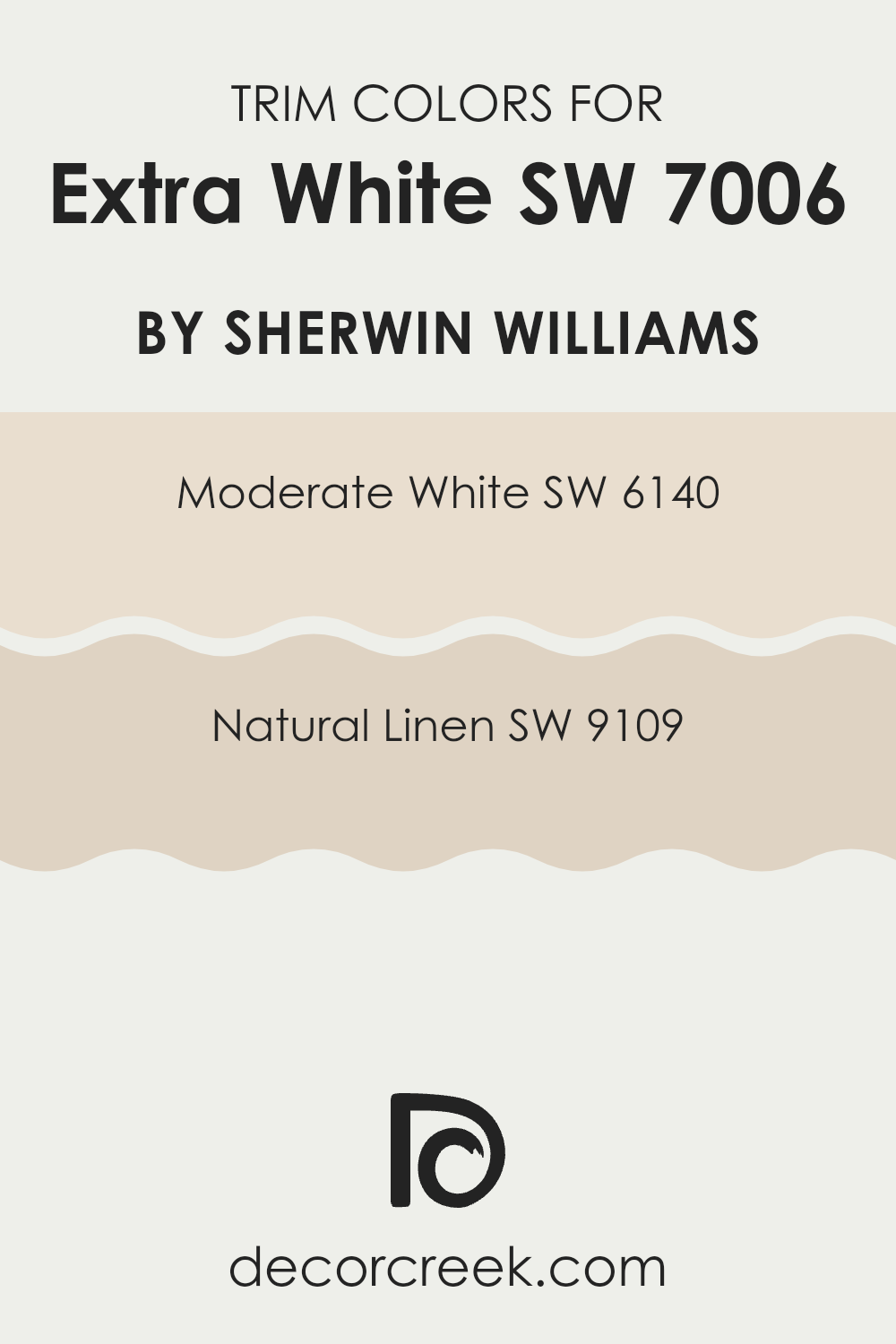
Trendy Trim Colors of Extra White SW 7006 by Sherwin Williams to use this year.
Trim colors are specific shades used to accentuate or contrast with the main color on walls, often seen on baseboards, moldings, door frames, and other architectural features around the home. When used around a neutral color like Extra White, trim colors like Moderate White and Natural Linen can subtly enhance the aesthetic appeal without being too intense. Choosing the right trim color helps frame the room, creating a clean and polished look that complements the overall decor.
Moderate White, a soft and gentle white with warm undertones, offers a subtle contrast that helps define the crisp lines of Extra White without creating stark differences. This makes it ideal for a refined yet understated look.
Natural Linen, on the other hand, brings a slight creamy tone that adds depth and warmth to the surroundings, enriching the environment in a subtle but definite way. This color works beautifully to provide a soft, welcoming atmosphere, particularly in rooms emphasizing comfort and light.
You can see recommended paint colors below:
- SW 6140 Moderate White
- SW 9109 Natural Linen
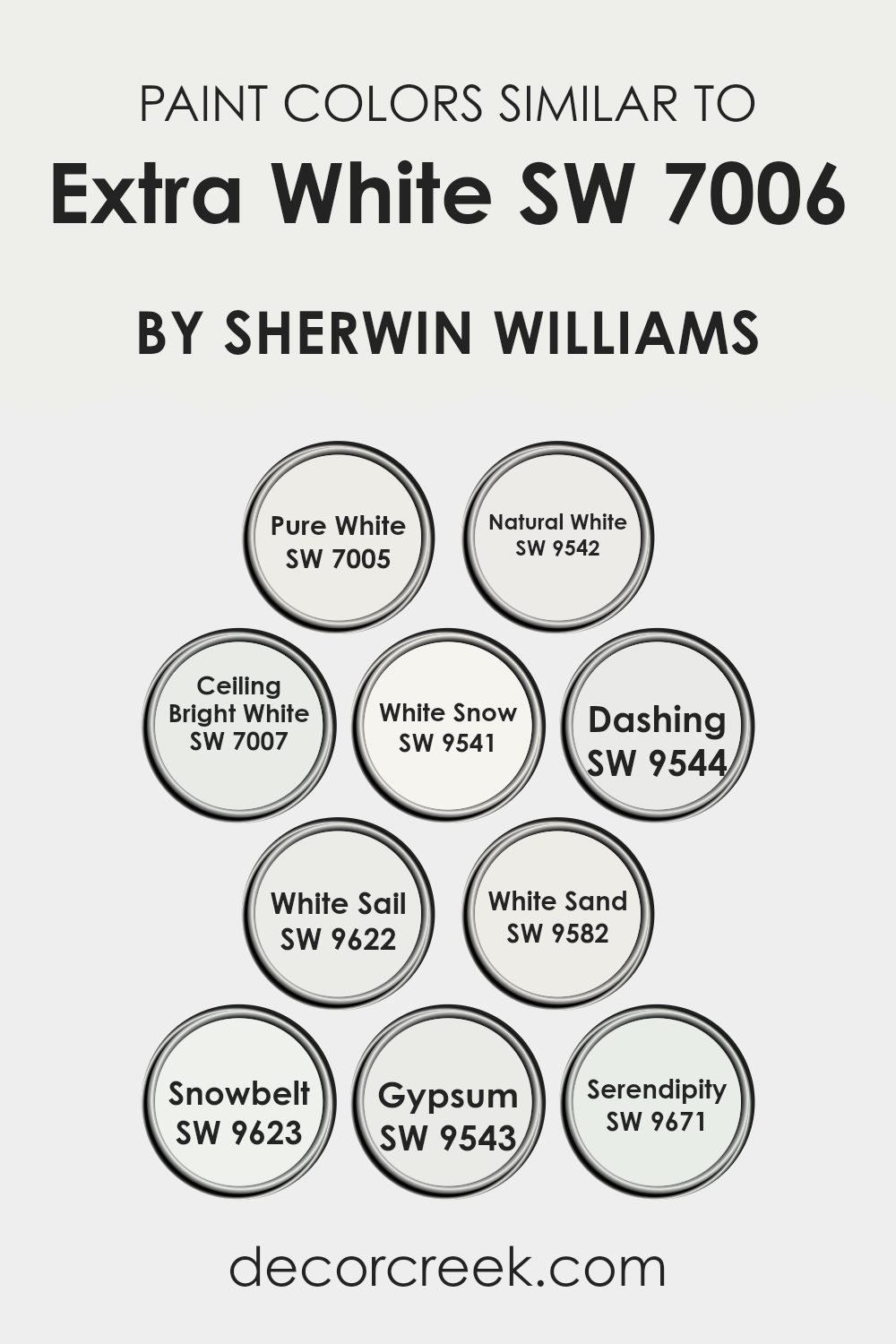
Evergreen Colors Similar to Extra White SW 7006 by Sherwin Williams
Similar colors play a crucial role in creating a visually cohesive look within any room, allowing for a seamless blend of style and comfort. These slight variations of a shade offer the ability to adjust the nuances of the decor to better meet specific moods, lighting conditions, or personal tastes without deviating too far from the intended base hue.
For example, Pure White (SW 7005) is a clean, vibrant counterpart to Extra White, reflecting ample natural light, which can make smaller rooms feel larger and more inviting. Conversely, Natural White (SW 9542) has a subtle warmth that softens rooms that need a cozy, welcoming feel.
Other shades like Ceiling Bright White (SW 7007) serve to refresh ceilings with a luminous effect, giving a sense of added openness. While White Snow (SW 9541) provides a sleek, almost pristine finish, ideal for trim or baseboards, achieving a refined finish. Colors like Dashing (SW 9544) introduce a slight gray tint, perfect for those wanting a hint of contrast.
White Sail (SW 9622) and White Sand (SW 9582) evoke the feel of a calm, sandy beach, blending fluidly with natural elements like wood or stone. For those looking for a cool-toned white, Snowbelt (SW 9623) offers just that, excellent for modern settings.
Gypsum (SW 9543) carries an almost undetectable pinkish cast that warms the walls delicately, whereas Serendipity (SW 9671) is a unique off-white with minimal gray undertones, adaptable for use in almost any room. Together, these colors provide an array of possibilities that allow decorators to refine their rooms subtly yet significantly.
You can see recommended paint colors below:
- SW 7005 Pure White
- SW 9542 Natural White
- SW 7007 Ceiling Bright White
- SW 9541 White Snow
- SW 9544 Dashing
- SW 9622 White Sail
- SW 9582 White Sand
- SW 9623 Snowbelt
- SW 9543 Gypsum
- SW 9671 Serendipity
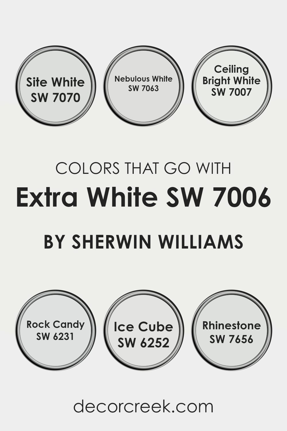
Colors that Go With Extra White SW 7006 by Sherwin Williams
Choosing the right colors to complement Extra White SW 7006 by Sherwin Williams is essential for creating harmonious and appealing rooms. Extra White itself is a very clean and crisp white, making it an adaptable backdrop for a variety of color palettes.
When paired with suitable colors like SW 7070 – Site White, SW 7063 – Nebulous White, or SW 7007 – Ceiling Bright White, it helps in achieving a subtle and balanced look. These shades are close in the spectrum to Extra White, which allows for a gentle, seamless transition between the walls and trim, producing a cohesive aesthetic.
On the cooler side, colors like SW 6231 – Rock Candy and SW 6252 – Ice Cube introduce a slightly more pronounced contrast while still maintaining a soft, harmonious vibe. Rock Candy is a pale gray that offers a hint of depth and refinement without being too intense and without taking away from the light, airy feel of Extra White.
Ice Cube, another soft gray with a hint of blue, brings a fresh feel to rooms, making them feel more open and airy. Lastly, SW 7656 – Rhinestone is another excellent complement, being a very light gray that nearly mirrors the undertones of Extra White, ensuring that the overall design feels aligned and thoughtful. Combining these shades with Extra White can help achieve a stylish, cohesive look throughout your home.
You can see recommended paint colors below:
- SW 7070 Site White
- SW 7063 Nebulous White
- SW 7007 Ceiling Bright White
- SW 6231 Rock Candy
- SW 6252 Ice Cube
- SW 7656 Rhinestone
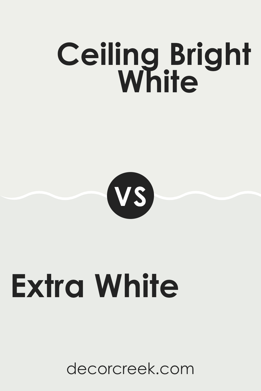
Extra White SW 7006 by Sherwin Williams vs Ceiling Bright White SW 7007 by Sherwin Williams
Extra White and Ceiling Bright White are two distinct shades, despite their similar names. Extra White is a pure, clean white without any strong undertones. It’s adaptable and works well in various settings, brightening rooms effectively.
On the other hand, Ceiling Bright White is slightly warmer, with a subtle, almost imperceptible warmth that makes it more relaxed than Extra White. This characteristic allows it to complement various color schemes gently without being too dominant.
If you’re aiming to achieve a crisp, sharp look, Extra White is a great choice. If you prefer a softer atmosphere that still retains a sense of freshness, Ceiling Bright White might be the better option. Both colors are commonly used for creating a feeling of more openness and light in a room.
You can see recommended paint color below:
- SW 7007 Ceiling Bright White
Extra White SW 7006 by Sherwin Williams vs White Snow SW 9541 by Sherwin Williams
Extra White and White Snow are both popular shades from Sherwin Williams, each offering its own unique take on white. Extra White is a crisp, clean shade that has very little undertone, making it a true bright white.
This makes it great for rooms where you want to create a sharp, fresh look. On the other hand, White Snow has a slightly warmer tone, giving it a softer appearance compared to Extra White.
Although still very much a white, White Snow’s subtle warmth helps create a cozier feel, making it ideal for living rooms where a gentler atmosphere is desired. Both colors are adaptable and can be used in various design styles, from modern to traditional, but the choice between them depends on the specific mood or brightness you want to achieve in your room.
You can see recommended paint color below:
- SW 9541 White Snow
Extra White SW 7006 by Sherwin Williams vs Dashing SW 9544 by Sherwin Williams
Extra White and Dashing by Sherwin Williams have distinct personalities that cater to different visual tastes and design needs. Extra White is a bright, clean white that provides a crisp background, perfect for creating a sharp, clear look in any room. It efficiently reflects light, making rooms appear larger and brighter, which is ideal for small rooms or darker areas needing a lift.
On the other hand, Dashing is a much darker color, a deep green that adds a bold touch to rooms. This hue can be used to create a striking feature wall or to bring a sense of nature and depth into a room.
The dark, rich tones of Dashing can give a room a cozy, enveloping feel, contrasting nicely with the airy feel that Extra White promotes. Both colors have their unique appeal, with Extra White favoring minimalism and brightness, while Dashing leans toward a dramatic, nature-inspired vibe.
You can see recommended paint color below:
- SW 9544 Dashing
Extra White SW 7006 by Sherwin Williams vs Snowbelt SW 9623 by Sherwin Williams
Extra White and Snowbelt are two appealing shades by Sherwin Williams, each offering a unique vibe for your room. Extra White is a very clean and pure white. It’s highly adaptable and great as a go-to option for brightening rooms or creating a neutral backdrop that lets other decor elements stand out. This color functions well in any area of a home or office, reflecting natural light beautifully and making rooms appear larger.
On the other hand, Snowbelt has a slightly cooler tone, leaning toward a gentle grayish-white. This subtle difference gives it a crisper feel, suitable for those wanting a modern and fresh look. Snowbelt can be particularly effective in rooms where you want a hint of character without moving too far away from a traditional white.
Choosing between the two depends on the kind of atmosphere you want to create; Extra White brings a straightforward clarity, while Snowbelt offers a hint of contemporary flair with its cooler undertones. Both colors provide a clean canvas, but Snowbelt might be the go-to if you are looking for something with a slight edge.
You can see recommended paint color below:
- SW 9623 Snowbelt
Extra White SW 7006 by Sherwin Williams vs Pure White SW 7005 by Sherwin Williams
Extra White and Pure White by Sherwin Williams are both popular white paint colors, but they have some subtle differences. Extra White is a very clean and bright white. It doesn’t have much in the way of undertones, making it a great choice if you’re looking for a pure, crisp white. It reflects light beautifully, so it’s a good pick for rooms that you want to brighten up.
On the other hand, Pure White is also a bright white but with a slightly softer tone. It has a touch of gray in its base, which gives it a slightly warmer and more inviting feel compared to Extra White. This makes Pure White an adaptable choice, working well in many different types of rooms and complementing various decor styles without feeling too stark.
In summary, if you’re going for a sharp, vivid white, Extra White is the way to go. If you prefer something a little gentler and less stark, then Pure White would be a better choice. Both are great options depending on the mood and style you want to achieve in your room.
You can see recommended paint color below:
Extra White SW 7006 by Sherwin Williams vs White Sand SW 9582 by Sherwin Williams
Extra White and White Sand by Sherwin Williams are two distinct shades, both offering unique characteristics for rooms. Extra White is a true, crisp white, providing a clean and clear look without any undertones that might alter its purity. This makes it an excellent choice for a bright, minimalist appearance. It reflects light well, making rooms appear larger and more open.
On the other hand, White Sand has a slightly warmer tone, with a touch of beige that gives it a cozy, welcoming vibe. This color is perfect for those who prefer a softer, less stark white environment. It’s a great option for living areas and bedrooms where a gentler atmosphere is desired.
These two colors serve different purposes depending on the mood and style you want to achieve. While Extra White is sharp and vivid, White Sand offers a subtle warmth, making each suitable for various decorating styles and rooms.
You can see recommended paint color below:
- SW 9582 White Sand
Extra White SW 7006 by Sherwin Williams vs Serendipity SW 9671 by Sherwin Williams
The color Extra White is a clean and bright white paint that offers a refreshing feel to any room. It’s highly adaptable and can act as a crisp backdrop for various decor styles—perfect for making other colors stand out or giving a room a fresh, airy appearance.
On the other hand, Serendipity is a playful and gentle pink tone that adds a soft, cheerful vibe to a room. It has enough warmth to create a cozy atmosphere yet remains light enough to maintain a bright and inviting room. This color is excellent for adding a touch of personality without being too intense.
Both colors are unique in their ways; Extra White provides a pure foundation while Serendipity offers a dash of warmth and charm. Combining them can create a balanced and pleasing aesthetic, with Extra White highlighting the subtle depth of Serendipity.
You can see recommended paint color below:
- SW 9671 Serendipity
Extra White SW 7006 by Sherwin Williams vs Gypsum SW 9543 by Sherwin Williams
Extra White and Gypsum are both paints from Sherwin Williams, but they exhibit subtle differences in tone and vibe. Extra White is a clean, bright white that’s almost pure, making it a great choice for those seeking a crisp, clear look. It shines best in rooms that aim for a sharp, minimalist aesthetic.
On the other hand, Gypsum has a warmer tone, leaning slightly toward a soft gray, which adds a cozy, gentle feel to rooms. This makes it ideal for living areas or bedrooms where you prefer a hint of color to create a more inviting atmosphere.
While both colors help make a room look larger and are adaptable in terms of decor matching, Extra White suits modern and sleek designs, whereas Gypsum is excellent for a more understated, comfortable setting.
You can see recommended paint color below:
- SW 9543 Gypsum
Extra White SW 7006 by Sherwin Williams vs White Sail SW 9622 by Sherwin Williams
Extra White and White Sail, both by Sherwin Williams, offer subtle differences that could affect the atmosphere of a room. Extra White is a bright, pure white that works well in a variety of rooms, providing a clean and crisp backdrop. It reflects light efficiently, making it an excellent choice for areas that you want to feel more open and airy.
On the other hand, White Sail has a slightly warmer tone. This warmth gives it a softer appearance, which can make rooms feel more inviting and comfortable compared to the starkness of Extra White. White Sail is ideal for rooms where a gentler atmosphere is desired, such as bedrooms or living areas.
Choosing between these two depends on the mood you want to create and how the lighting in your room interacts with these shades. Extra White suits a modern look with its sharp freshness, while White Sail is better for a cozy, welcoming feel.
You can see recommended paint color below:
- SW 9622 White Sail
Extra White SW 7006 by Sherwin Williams vs Natural White SW 9542 by Sherwin Williams
Extra White and Natural White are both popular white paints by Sherwin Williams, but they have subtle differences. Extra White is a bright and clean white that gives off a crisp, clear look. It doesn’t have any warm or cool undertones, making it an excellent choice for a modern room that needs a sharp, straightforward white.
In contrast, Natural White is a bit softer and has a slight warmth to it, thanks to its beige undertones. This makes it ideal for rooms where you want a cozy, inviting atmosphere without the starkness that can sometimes come with a pure white. Natural White works well in rooms that get a lot of sunlight, as the light enhances its warm qualities.
Choosing between them depends on the mood and feel you want for your room. For a more striking, clean look, go with Extra White. If you’re after a gentler, warmer atmosphere, Natural White would be the better option.
You can see recommended paint color below:
- SW 9542 Natural White
As I wrap up my thoughts on SW 7006 Extra White by Sherwin Williams, I’m pretty impressed with how this paint can change a room. It’s like a magic white that can make any place look bright and fresh. Whether you want to paint your bedroom, living room, or even the kitchen, this white is perfect because it doesn’t turn into some weird color when the light changes—it stays true white all day long.
One thing I really like is how clean it makes everything look. It’s like starting with a blank canvas where you can add any colors you want with decorations or furniture, and they will all stand out nicely because of the white background. It’s super easy to match with other colors, so you won’t get stuck trying to figure out what goes with what.
Using SW 7006 Extra White means you don’t have to worry about the paint making rooms feel cold or too bright. It actually gives just the right amount of brightness that makes a place feel cozy and welcoming. So, if you’re thinking about giving a room a fresh look or just like the idea of having a bright white that works well with everything, then SW 7006 Extra White could be just what you need. It’s not just paint; it’s a way to make your home look neat and nice all the time.
decorcreek.com
Ever wished paint sampling was as easy as sticking a sticker? Guess what? Now it is! Discover Samplize's unique Peel & Stick samples.
Get paint samples

