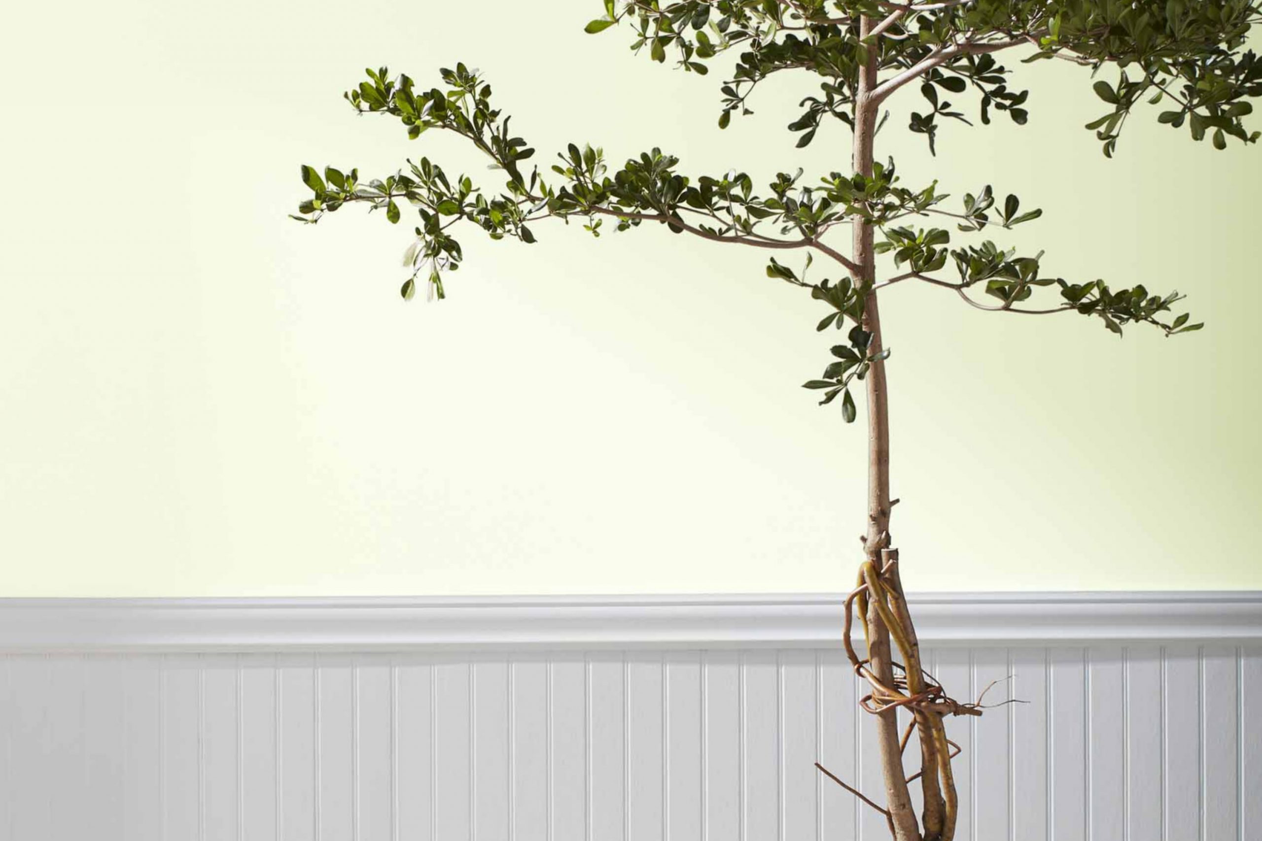
Thinking about a fresh spin on your space? Consider the vibrant charm of 2029-70 Frosty Lime by Benjamin Moore. As someone who appreciates the impact of subtle yet striking color choices in interiors, I found Frosty Lime to be a delightful surprise. This unique hue carries a youthful energy that brightens any room without overwhelming it.
Frosty Lime is not just another green; it’s a lively, zesty shade that can instantly lift the mood of your home. Whether you’re thinking about refreshing a tired-looking kitchen or adding a playful splash to your bathroom, Frosty Lime offers a cheerful yet sophisticated vibe.
Its versatility makes it easy to pair with a range of decor styles and palettes, ensuring it complements your existing furnishings. Imagine walking into a room that feels alive with freshness—this is the effect Frosty Lime can achieve. The color is especially useful for those areas of your home that could use a little extra light or cheer.
So, if you’re ready to give your home a mini-makeover, Frosty Lime could be the perfect choice to brighten your interiors while keeping them effortlessly chic.
What Color Is Frosty Lime 2029-70 by Benjamin Moore?
Frosty Lime by Benjamin Moore is a vibrant and refreshing shade of green that brings to mind the zest and freshness of a lime. This color has a lively and youthful appeal, making it perfect for adding a pop of brightness to any room. The paint has a smooth finish, which looks great under various lighting conditions, enhancing its versatility and appeal.
This shade works wonderfully in modern and playful interior styles, such as contemporary, minimalist, or Scandinavian designs where its clean and crisp nature can be fully appreciated. Frosty Lime pairs exceptionally well with natural materials like light woods, which help ground its brightness and add warmth to the space.
Textures such as linen, cotton, and jute also complement this color well, providing a balanced look that’s both eye-catching and cozy. Incorporating Frosty Lime in a space, such as an accent wall or through decorative accessories like cushions, throws, or vases, creates a lively focal point. It also works well in kitchens and bathrooms, where it promotes a sense of cleanliness and freshness. When used tastefully, Frosty Lime can energize a room without overwhelming it, setting a friendly and inviting atmosphere.
Is Frosty Lime 2029-70 by Benjamin Moore Warm or Cool color?
Frosty Lime 2029-70 by Benjamin Moore is a vibrant, refreshing shade of green that brings a lively touch to any space in a home. This color has a crisp, clean look that can make rooms feel more open and brighter, working particularly well in small spaces or areas with limited natural light. It’s a great choice for kitchens or bathrooms where you want a splash of energy and cheer.
Additionally, Frosty Lime can be paired with neutral tones like white, gray, or beige to create a balanced look, or it can be matched with bolder colors for a more dynamic and fun atmosphere.
It’s a versatile color that adapts well to different decorating styles, whether you’re going for a modern or a more traditional feel. Using Frosty Lime on walls, as an accent, or in decorative elements can instantly lift the mood of your home, making it feel more welcoming and lively.
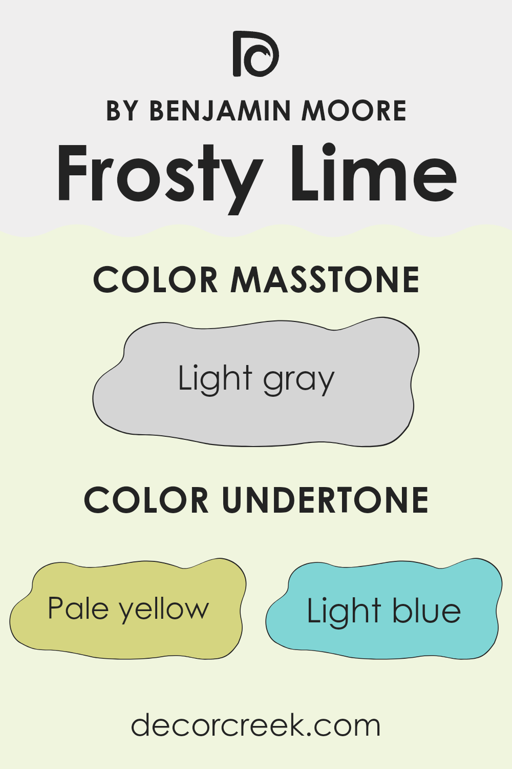
Undertones of Frosty Lime 2029-70 by Benjamin Moore
Frosty Lime is a unique color that brings a vibrant but subtle touch to any space. It has a blend of interesting undertones that can subtly influence the feeling and aesthetics of a room. The undertones include pale yellow, light blue, light purple, mint, pale pink, lilac, and grey. Each undertone can play a significant role in how we perceive the color overall.
Undertones are like hidden colors that are not immediately obvious but can be seen in certain lights or when placed next to other colors. They can make a color look cooler or warmer depending on their hue. For instance, the pale yellow and mint undertones in Frosty Lime add a slight warmth, making it feel lively and energetic, while the light blue and lilac give it a cooler, more refreshing vibe.
When used on interior walls, the effect of Frosty Lime’s undertones can vary greatly depending on lighting and surrounding colors. In a room with plenty of natural light, the paler undertones like yellow and mint might make the space feel bright and airy. Meanwhile, in artificial light, the cooler undertones like blue and purple might stand out, giving the room a calmer, more relaxed feel.
The grey undertone can help to ground the brighter aspects, ensuring that the color maintains a sort of neutral balance, making it versatile enough to pair with various decor styles and colors. Overall, Frosty Lime’s diverse undertones offer flexibility and a dynamic range of expressions, depending on where and how it’s used.
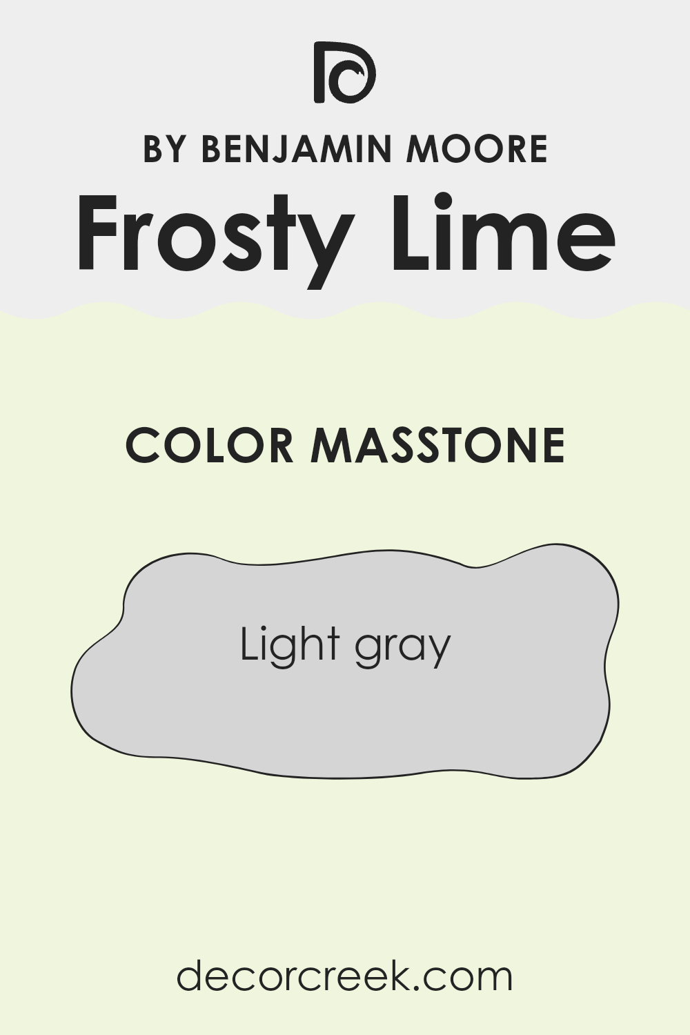
What is the Masstone of the Frosty Lime 2029-70 by Benjamin Moore?
Frosty Lime 2029-70 by Benjamin Moore has a masstone of light gray, or #D5D5D5. This particular shade of gray is quite neutral and versatile, making it an excellent choice for various spaces in a home.
Its light tone helps to make rooms appear more spacious and open, which can be especially beneficial in smaller spaces that might feel cramped. Since it’s a subtle color, it doesn’t overwhelm a room but instead provides a calm backdrop that can work well with many different decor items and furniture styles.
Whether you’re looking to create a modern look or complement traditional furnishings, this color can fit in smoothly. Additionally, this shade of gray can help to reflect and amplify natural light, brightening up a room effortlessly. For homeowners looking for a flexible color that can maintain a fresh look over time, Frosty Lime 2029-70 is a reliable choice.
How Does Lighting Affect Frosty Lime 2029-70 by Benjamin Moore?
Lighting plays a crucial role in how colors appear in different environments. Different light sources can dramatically change the perception of a color’s hue, brightness, and saturation. Natural sunlight provides the fullest spectrum of light, making colors appear more vibrant. Artificial light, depending on the type (like LED, fluorescent, or incandescent), can alter how a color looks by casting various tones.
The color Frosty Lime by Benjamin Moore is a vivid, lively shade of green. Under artificial light, the color may vary. Fluorescent lights typically bring out cooler tones in colors, which could make Frosty Lime look slightly more blue-green. Incandescent lighting, which emits warmer tones, might make it appear softer and less intense.
In natural light, the appearance of Frosty Lime can change throughout the day. Morning light in an east-facing room is cooler, thus the color will look fresher and brighter. As the light becomes warmer towards the evening, the color warms up as well. In south-facing rooms, where sunlight is abundant for most of the day, Frosty Lime will consistently appear vivid and lively, enhancing its dynamic nature.
Conversely, in a north-facing room, Frosty Lime may appear slightly muted since north-facing rooms receive less direct sunlight, often resulting in a cooler, shadowed light. Without the influence of direct sunlight, Frosty Lime will maintain a more consistent look throughout the day but may lack some of the vibrancy seen in rooms with more sunlight.
Rooms facing west will experience the changing light dramatically, with Frosty Lime appearing muted in the morning, and potentially getting quite intense or glowing in the late afternoon when the sun sets and casts warmer light.
Thus, the orientation of the room and the type of lighting both play pivotal roles in how Frosty Lime is perceived, potentially altering its look and feel within the space.

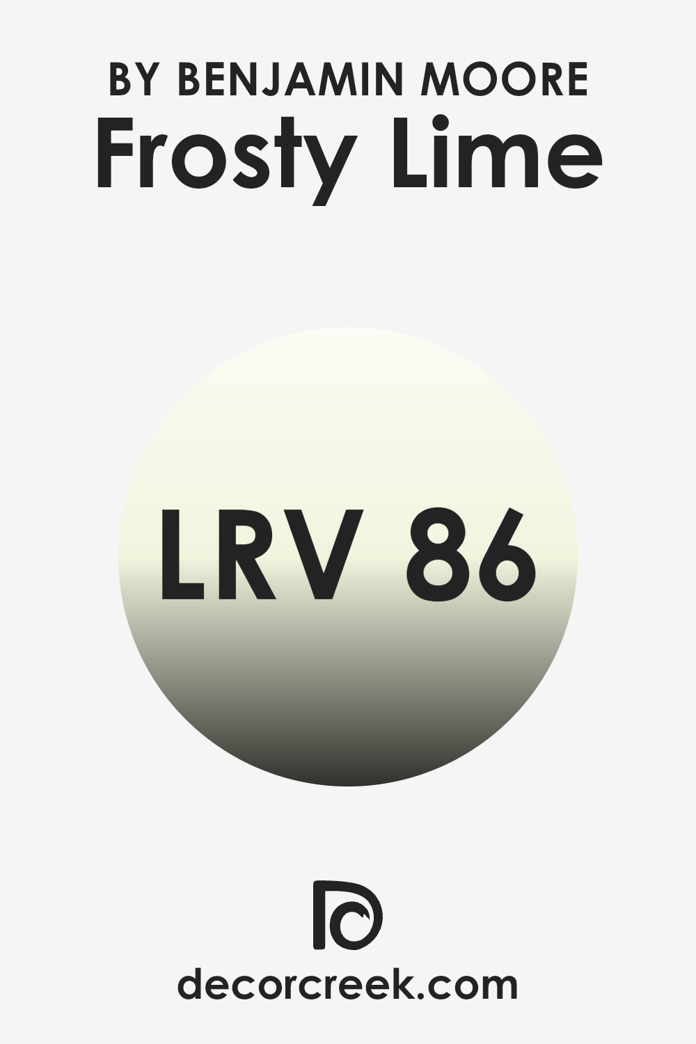
What is the LRV of Frosty Lime 2029-70 by Benjamin Moore?
LRV stands for Light Reflectance Value, which is a measurement that indicates how much light a paint color reflects back into a room versus how much it absorbs. Measured on a scale from zero to a hundred, a higher number means the color reflects more light.
This is important because it affects how light or dark a color appears when applied to the walls of a room. Light colors, with high LRVs, make spaces appear brighter and can make small rooms feel larger, while dark colors with low LRVs can make a room feel cozier but smaller.
Frosty Lime, with an LRV of 85.88, is a light color that will reflect most of the light that hits it. This means it’s an excellent choice for making a room feel airy and spacious. In rooms that are already well-lit, using a color like Frosty Lime can enhance the brightness, making the space look lively and fresh. In dimmer rooms, it can help maximize the available light to make the space feel less cramped.
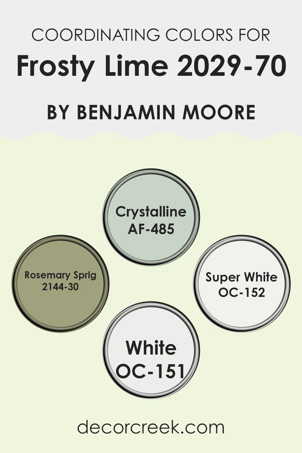
Coordinating Colors of Frosty Lime 2029-70 by Benjamin Moore
Coordinating colors are chosen to work well together in a space, enhancing the overall aesthetic without overwhelming the senses. For Frosty Lime by Benjamin Moore, colors such as Crystalline, Rosemary Sprig, Super White, and White are excellent coordinating choices. These hues complement Frosty Lime’s vibrant green, ensuring a balanced and harmonious color scheme in any room. They are selected based on their ability to support the main color, allowing it to shine while also providing a cohesive look.
Crystalline is a soft, muted green that adds a touch of calmness without being too dull. It pairs beautifully with Frosty Lime for a gentle, nature-inspired vibe. Rosemary Sprig, on the other hand, is a deeper, richer green that provides a wonderful contrast, adding depth and interest to the space.
Super White is a crisp, clean white that brings out the brightness in Frosty Lime, making the room appear more spacious and airy. Lastly, White is a pure, clear hue that blends smoothly with the vibrant tones of Frosty Lime, ensuring the space feels light and fresh. Together, these colors create a refreshing and pleasant atmosphere in any room.
You can see recommended paint colors below:
- AF-485 Crystalline
- 2144-30 Rosemary Sprig
- OC-152 Super White
- OC-151 White
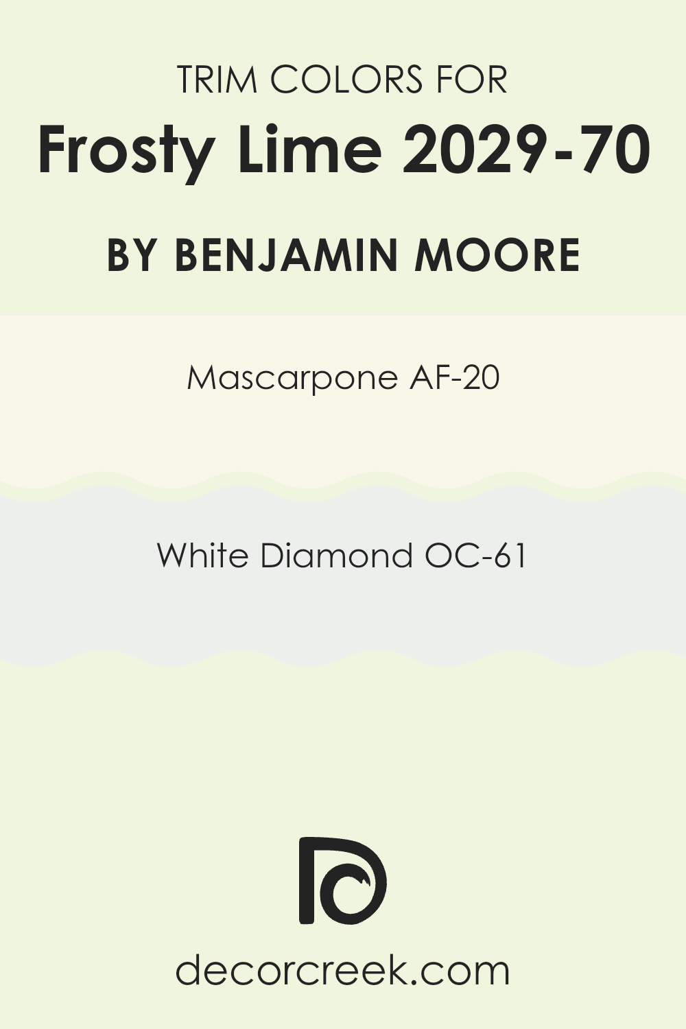
What are the Trim colors of Frosty Lime 2029-70 by Benjamin Moore?
Trim colors are the hues chosen to accentuate or frame the primary color of a wall, helping to define the structural elements like doors, window frames, and baseboards. By selecting the right trim color, you can enhance the overall aesthetic of a room and create a pleasing contrast that highlights architectural details.
For Frosty Lime by Benjamin Moore, trim colors like AF-20 – Mascarpone and OC-61 – White Diamond are ideal because they offer a subtle yet noticeable juxtaposition against the vibrant green, emphasizing brightness and making the space feel more defined.
AF-20 – Mascarpone is a creamy, soft white that resembles the gentle tones found in Mascarpone cheese. It’s a warm white that adds a mild, inviting contrast to sharper colors like Frosty Lime, providing a smooth transition between the lively wall color and the trim. On the other hand, OC-61 – White Diamond is a crisp, clear white with a slight sparkle, reminiscent of a diamond’s clarity. This trim color brings a fresh, clean edge to the surroundings, enhancing Frosty Lime’s vividness without overpowering it, perfect for creating a refreshing and well-balanced environment.
You can see recommended paint colors below:
- AF-20 Mascarpone
- OC-61 White Diamond
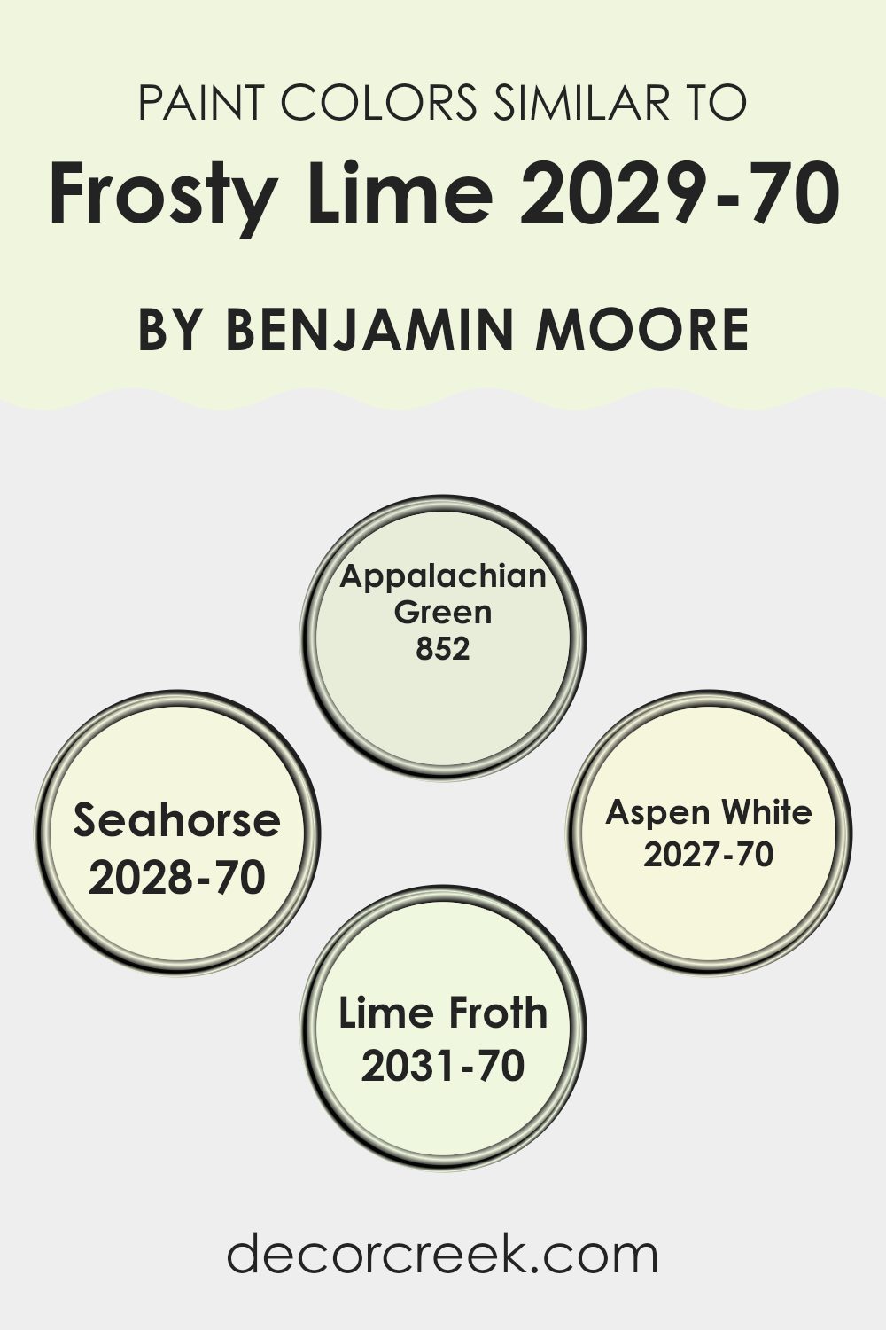
Colors Similar to Frosty Lime 2029-70 by Benjamin Moore
Choosing similar colors for a decorating scheme is crucial because it creates a sense of harmony and balance in a space. When colors are closely related on the color wheel, they naturally complement each other, making a room feel more cohesive. For instance, when working with a light, playful color like a frosty lime, incorporating shades like Appalachian Green offers a subtle contrast while staying within a harmonious palette. This similarity among hues helps in maintaining a fluid visual flow, which is pleasing to the eye and can make spaces feel larger and more open.
For example, Appalachian Green is a muted green shade that blends seamlessly with lighter greens, providing a soft backdrop that enhances brighter accents without overpowering them. Seahorse, on the other hand, is a pale, airy green with a hint of yellow, reflecting light beautifully and giving a fresh and uplifting feel to any room.
Aspen White is not just plain white; it has a slight undertone of green, which makes it perfect for pairing with greens and yellows for a crisp, clean look. Lastly, Lime Froth is a very light green with a touch of warmth, excellent for adding subtle texture and depth to a predominantly light-colored room. By using these similar colors, you can achieve a cohesive and inviting atmosphere that feels intentional and thoughtfully designed.
You can see recommended paint colors below:
- 852 Appalachian Green
- 2028-70 Seahorse
- 2027-70 Aspen White
- 2031-70 Lime Froth
Colors that Go With Frosty Lime 2029-70 by Benjamin Moore
Choosing the right colors to complement Frosty Lime 2029-70 by Benjamin Moore can greatly enhance the visual impact and mood of any space. Each coordinating shade brings its unique vibe while ensuring the overall look remains harmonious and pleasing to the eye. These companion colors, such as Stem Green, Pale Vista, and others, are carefully selected to work well with Frosty Lime, ensuring a cohesive and polished look in any room.
Stem Green is a vibrant color that adds a lively energy to spaces when paired with Frosty Lime. It’s perfect for areas where you want a touch of nature’s freshness. Pale Vista, on the other hand, is much softer, offering a subtle hint of color that’s not overwhelming, ideal for creating a calm and inviting atmosphere.
Rosemary Green is darker, adding depth and contrast, which can help to define spaces and bring forward elements in a room. Baby Fern is a gentle hue, very light and airy, great for smaller rooms or spaces that get a lot of sunlight.
Basil Green offers a rich, earthy tone that feels grounded and comforting, perfect for areas where warmth is desired. Lastly, Potpourri Green has a subtle muted quality, making it excellent for spaces that aim for a soft and gentle aesthetic. Together, these colors complement Frosty Lime by providing balance, contrast, and a touch of nature’s charm, making them invaluable for designing beautiful interiors.
You can see recommended paint colors below:
- 2029-40 Stem Green
- 2029-60 Pale Vista
- 2029-30 Rosemary Green
- 2029-20 Baby Fern
- 2029-10 Basil Green
- 2029-50 Potpourri Green

How to Use Frosty Lime 2029-70 by Benjamin Moore In Your Home?
Frosty Lime 2029-70 by Benjamin Moore is a vibrant, fresh shade of green that brings energy and brightness to any space. This color is perfect for those looking to add a lively touch to their home. It works well in areas that benefit from a splash of cheerfulness, such as kitchens or playrooms.
In a kitchen, Frosty Lime can be used on walls or cabinets to create a fun, inviting atmosphere where family and friends want to gather. Additionally, this shade can help brighten a small, dim space like a hallway or bathroom, making it feel more open and airy.
For a subtle touch, consider using it for accents like window trims or a single accent wall, paired with neutral tones such as whites or light grays. This helps maintain balance and prevents the color from overwhelming the room. Accessories like cushions, vases, or artwork in Frosty Lime can also add a fresh pop of color without the commitment of paint.
Frosty Lime 2029-70 by Benjamin Moore vs Aspen White 2027-70 by Benjamin Moore
Frosty Lime and Aspen White by Benjamin Moore are two distinct paint colors that could add unique characters to any room. Frosty Lime is a vibrant, fresh green that resonates with energy and liveliness. This brighter hue can make spaces feel lively and is ideal for adding a touch of liveliness to a kitchen or playroom.
In contrast, Aspen White is a clean and crisp white shade which provides a pure, untouched look. It serves as a superb base color, helping other colors stand out and can help make small rooms appear larger and more open.
While Frosty Lime adds a punch of color, Aspen White is perfect for creating a calm, minimalistic backdrop. They are suitable in different settings depending on whether one seeks a dynamic burst of color or a subtle enhancement of other design elements.
You can see recommended paint color below:
- 2027-70 Aspen White
Frosty Lime 2029-70 by Benjamin Moore vs Seahorse 2028-70 by Benjamin Moore
Comparing the two colors, Frosty Lime and Seahorse, both from Benjamin Moore, we see a vibrant and cheerful theme. Frosty Lime is a bright, zesty green with a fresh vibe that mimics the lively color of lime zest. It’s perfect for spaces where you want to add a punch of energy and liveliness, great for kitchens or playrooms.
On the other hand, Seahorse is a more subdued shade. It’s a soft yellow with hints of green, giving it a muted yet cheerful appearance. This color is more understated than Frosty Lime and works well in areas where a calming yet cheerful atmosphere is desired, like living rooms or bathrooms.
While both colors are light and airy, Frosty Lime stands out with its vivacious tone, whereas Seahorse offers a gentle touch of warmth and softness. Choosing between them depends on the mood and feel you want to bring into a space. Both colors are versatile but serve different aesthetic needs.
You can see recommended paint color below:
- 2028-70 Seahorse
Frosty Lime 2029-70 by Benjamin Moore vs Appalachian Green 852 by Benjamin Moore
Frosty Lime and Appalachian Green are two distinct shades by Benjamin Moore. Frosty Lime is a vibrant, light green that has a vivid and energetic feel, perfect for adding a splash of brightness to a space. It can make small spaces appear larger and more open because of its fresh, almost citrus-like look.
On the other hand, Appalachian Green is a deeper, muted green with a more subtle and grounding presence. This color has an earthy tone that can bring a sense of calm and coziness to a room. It works well in areas where you want to create a natural, soothing environment, like bedrooms or living areas.
Together, these colors could complement each other in a space that aims for balance, with Frosty Lime bringing in light and cheer, while Appalachian Green adds depth and warmth. Both greens can harmonize well with natural materials and light woods, offering a refreshing yet cozy atmosphere.
You can see recommended paint color below:
- 852 Appalachian Green
Frosty Lime 2029-70 by Benjamin Moore vs Lime Froth 2031-70 by Benjamin Moore
Frosty Lime and Lime Froth by Benjamin Moore are both vibrant, fresh colors that can make any space feel livelier. Frosty Lime is a bit brighter with a noticeable zest that mimics the lively color of lime peel. This makes it a great choice for adding a pop of eye-catching color to a room that needs a bit of energy.
On the other hand, Lime Froth has a softer, more muted tone. While still fresh, it leans more towards a gentle, creamy version of lime. This color works well in areas where you want a hint of color without overwhelming the space. It’s perfect for creating a subtle, refreshing vibe.
Both colors are great for adding freshness to your space, but Frosty Lime packs more punch, while Lime Froth provides a softer touch. Depending on what feeling you want in your room, either shade could be the perfect pick.
You can see recommended paint color below:
- 2031-70 Lime Froth
If you’re thinking about giving your room a new look, Frosty Lime could be a great choice. It’s the kind of color that brings a sense of brightness and energy, so it could make your room feel more lively. Whether you paint a small part of your room with it or go big and paint the whole room, it can really make a difference.
This color isn’t just cool to look at, but it also has a cheerful vibe which can make everyone feel more upbeat when they enter the room. Imagine having a room that makes you feel happier just by walking into it — that’s the power of Frosty Lime.
In conclusion, I think Frosty Lime by Benjamin Moore is a fantastic color for anyone who wants to add some zest and cheerfulness to their space. It’s fun, lively, and can definitely make any room more enjoyable. So, if you’re looking to brighten up your space, Frosty Lime might just be the perfect pick!
Ever wished paint sampling was as easy as sticking a sticker? Guess what? Now it is! Discover Samplize's unique Peel & Stick samples.
Get paint samples

