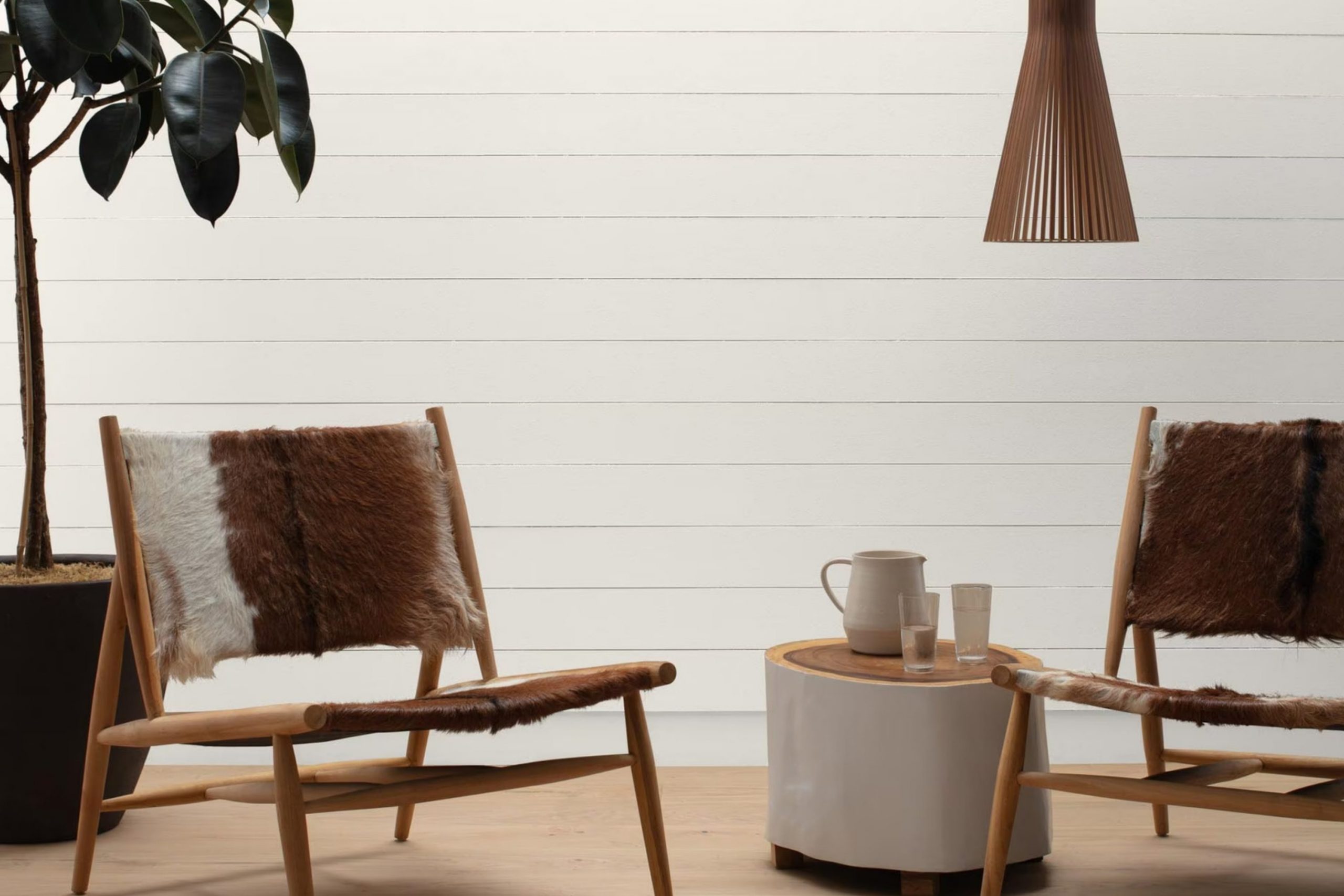
If you’re on the hunt for a paint color that truly feels like home, let me tell you about AF-10 Gardenia by Benjamin Moore. This shade has been a game changer in my quest for the perfect wall color. Gardenia isn’t just plain white — it’s a soft, creamy shade that brings warmth to a room without feeling too strong.
Whether you’re looking to refresh your living room, bedroom, or even your kitchen, this color brings a gentle brightness that makes every room feel welcoming. Painting the walls with Gardenia made my home feel calm and relaxing — like a quiet little escape. It pairs beautifully with all kinds of styles — from modern minimalist to rustic farmhouse — which makes it easy to use in many homes
I found that it particularly shines in natural light, creating a subtle glow that changes throughout the day, adding character and depth to my room.
If you’re feeling unsure about committing to a new paint color, AF-10 Gardenia could very well be the reassurance you need—it’s hard to go wrong with such a forgiving shade!
What Color Is Gardenia AF-10 by Benjamin Moore?
Gardenia AF-10 by Benjamin Moore is a soft, warm white that brings a gentle brightness to any room. Its creamy undertone makes it especially ideal for creating a cozy and inviting atmosphere. This color tends to reflect light beautifully, giving rooms an airy feel without being too stark.
Gardenia AF-10 works best in interior styles that aim for a relaxed and homey feel. It’s perfect for farmhouse, shabby chic, and traditional designs where its warm undertones can complement natural materials. In a modern or minimalist setting, this color helps soften the sharp lines and cold surfaces often associated with these styles, making rooms feel more welcoming.
When it comes to mixing materials and textures, Gardenia AF-10 works beautifully with just about anything It pairs well with natural wood, from pale pine to rich walnut, enhancing the depth and beauty of the grain. It also looks great with soft linens and textured fabrics, adding a layer of coziness to the decor. In addition, this color compleates well with metals such as gold and copper, which add a touch of warmth and luster that harmonize with its creamy undertone.
Whether you’re looking to create a soothing bedroom or a cheerful living room, Gardenia AF-10 offers a lovely canvas that supports a range of materials and textures.
Is Gardenia AF-10 by Benjamin Moore Warm or Cool color?
Gardenia AF-10 by Benjamin Moore is a warm, soft white paint that brings a cozy and inviting atmosphere to any room. This color is part of Benjamin Moore’s Affinity Collection, which is designed to make it easier for homeowners to create harmonious color schemes in their interiors.
Gardenia AF-10 works particularly well in homes because it has a very neutral tone that pairs easily with other colors. This flexibility means it can be used in various rooms, whether it’s a bright and airy living room or a calm and relaxing bedroom.
The color’s soothing quality doesn’t overpower the interior, making it a great choice for walls, trims, and ceilings. It can also help make a small room look bigger and brighter. Easy to apply and maintain, this paint is a practical option for both new decorators and experienced designers looking to create a warm, welcoming home environment.
Undertones of Gardenia AF-10 by Benjamin Moore
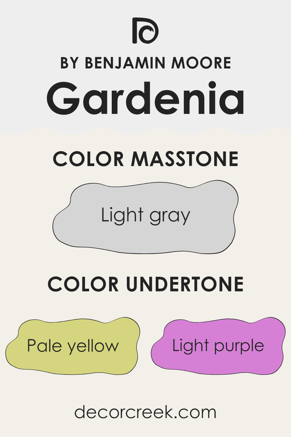
The color Gardenia by Benjamin Moore is a beautiful and adaptable shade that can take on different atmospheres depending on its undertones. These subtle tones include pale yellow, light purple, light blue, pale pink, mint, lilac, and grey. Undertones are the colors that linger beneath the surface of the paint and can greatly influence the overall look of the color, especially in various lighting conditions.
When Gardenia is painted on interior walls, its undertones play a crucial role in the room’s ambiance. For example, pale yellow undertones add a warm glow, making the interior feel more welcoming. Light purple or lilac undertones introduce a hint of coolness, which might give the room a gentle, calm feel.
Similarly, light blue and mint can evoke feelings of freshness and purity, perfect for creating a clean and inviting environment.
Pale pink undertones soften the look of the walls with a subtle warmth, making interiors like bedrooms and living rooms feel cozy. Grey undertones give the color a nice neutral balance, which makes it easier to mix with different styles and furniture pieces.
Each undertone can change the perception of the paint color under different lighting conditions. For instance, in a room with lots of natural light, the lighter undertones might become more pronounced, while artificial lighting can enhance the deeper undertones. Understanding these effects can help in selecting the right decor and accessories to complement the wall color, ultimately affecting the overall feel of the room.
What is the Masstone of the Gardenia AF-10 by Benjamin Moore?
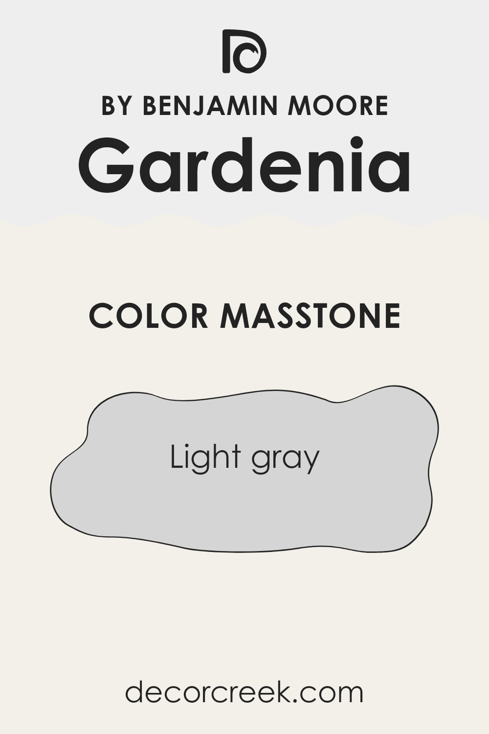
Gardenia AF-10 by Benjamin Moore is a light gray color, with a hex code of #D5D5D5. This shade of gray offers a clean and subtle look, making it ideal for use in various rooms of a home. When used on walls, this color provides a calm backdrop, which complements a wide range of decor styles, from modern to traditional.
It’s light enough to make small interiors appear larger and brighter, while still adding a touch of character. This light gray is also great for pairing with bolder colors, as it doesn’t clash and can help to soften more intense hues.
Furnishings and accent pieces in vivid colors stand out nicely against a light gray background. It’s also forgiving when it comes to maintenance, as light marks or blemishes are less visible on this gentle shade compared to darker colors. Overall, Gardenia AF-10 is an easy-to-love shade that fits well in all kinds of interiors, adding a fresh and clean feel to any home.
How Does Lighting Affect Gardenia AF-10 by Benjamin Moore?
Lighting plays a crucial role in how colors appear in any interior. Different types of light can make the same paint color look quite different. When we talk about a color like Gardenia AF-10 from Benjamin Moore, understanding how it reacts under various lighting conditions is important for predicting how it will look in your home.
In artificial light, the color of Gardenia AF-10 can vary depending on the type of bulbs used. Warm lights, such as those from incandescent bulbs, typically enhance the yellow and warm undertones, making the color appear softer and cozier. On the other hand, fluorescent lighting is cooler and can make the same paint look brighter and slightly more blue-toned.
Natural light also plays a huge role in how this color is perceived. The direction your room faces can have a big impact:
1. North-facing rooms: These rooms get less direct sunlight, which tends to be cooler and bluish. Here, Gardenia AF-10 might look more muted and slightly grayish, giving a calm and gentle feel.
2. South-facing rooms: These rooms enjoy abundant light for most of the day, which is generally warmer. In such rooms, Gardenia AF-10 will look warmer and brighter, bringing out the creamy characteristics of the color.
3. East-facing rooms: Light in these rooms is brightest in the morning and tends to be warmer. Morning light can make Gardenia AF-10 look very gentle and inviting. As the day progresses and the light diminishes, the color can turn cooler and more subdued.
4. West-facing rooms: Evening light, which is warmer, fills these rooms, especially in the late afternoon and evening. Here, the color could appear vibrant and warm in the afternoon but might take on a softer glow by sunset.
Understanding how light affects the appearance of colors like Gardenia AF-10 helps in making informed decisions about paint colors for your home, ensuring that the colors match your expectations and the mood you want to create in each room.
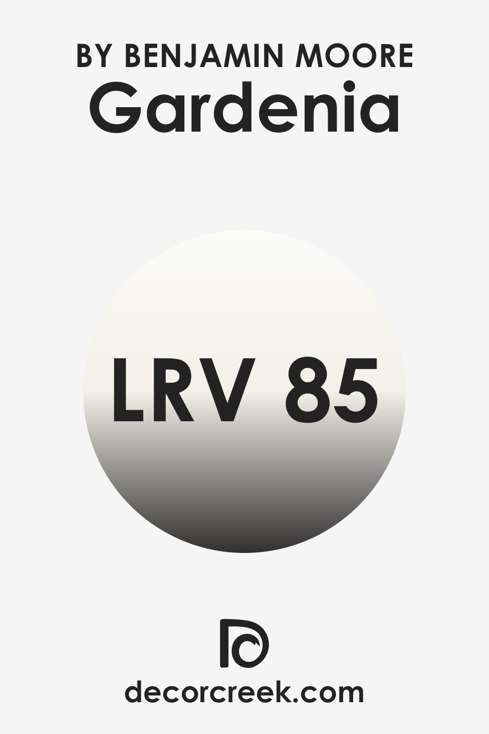
What is the LRV of Gardenia AF-10 by Benjamin Moore?
LRV stands for Light Reflectance Value, which is a measure on a scale that tells us how much light a paint color reflects back into a room, compared to how much it absorbs. A higher LRV means the color reflects more light, making the room appear brighter.
This value is especially useful when deciding on paint colors because it helps predict how light or dark a color will look once it’s on your walls. The size and brightness of your room, along with how much natural or artificial light it receives, can significantly influence your perception of the color. With an LRV of 85.03, the color Gardenia is very light, reflecting most of the light that hits it.
This makes it a good choice for making smaller or darker spots feel more open and airy. Because it reflects a lot of light, it can help brighten rooms that don’t get much natural sunlight, counteracting the shadows and dimness. However, in very bright rooms, this high LRV can sometimes make the color feel a bit too sharp or reveal wall imperfections more easily because of how much light it reflects.
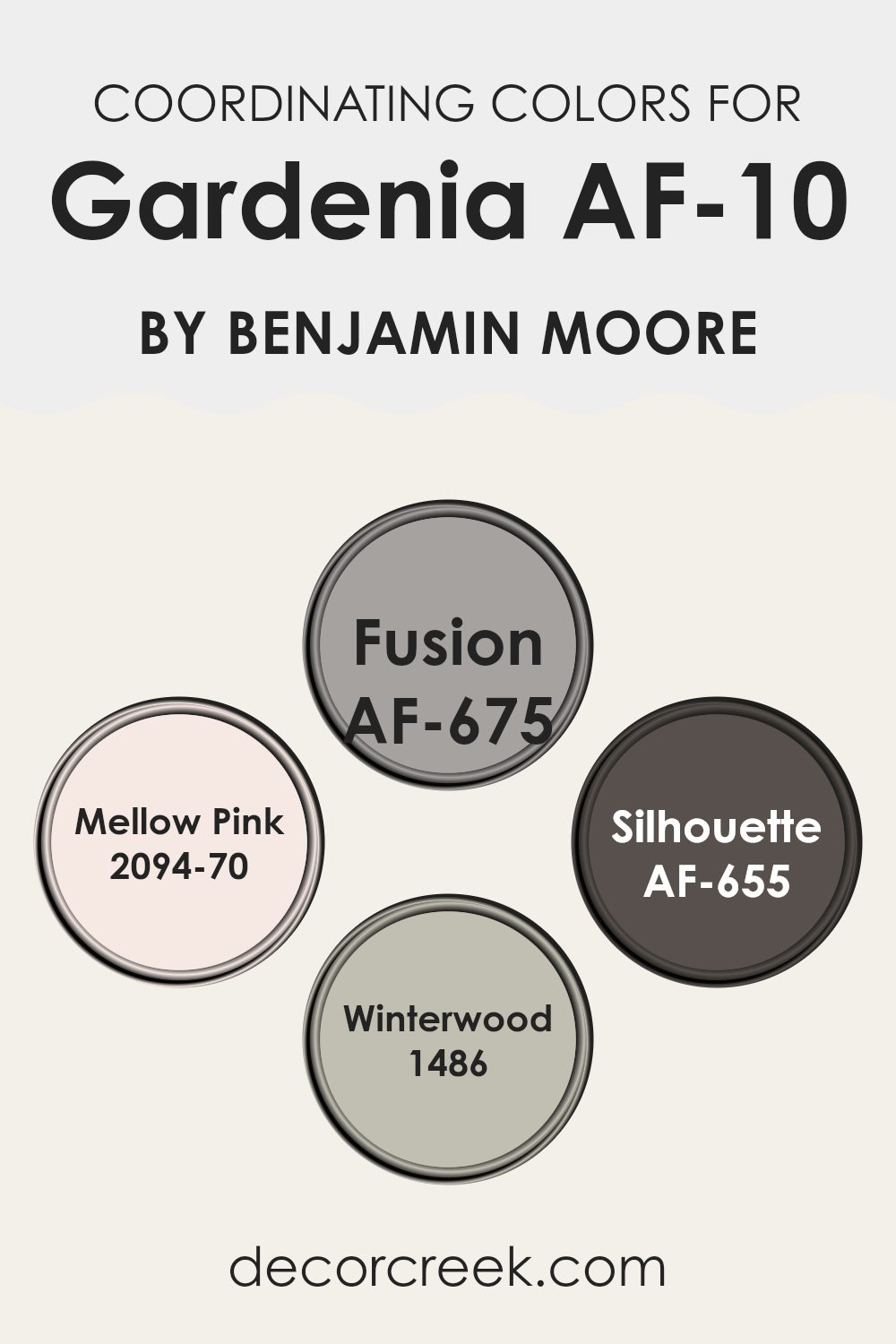
Coordinating Colors of Gardenia AF-10 by Benjamin Moore
Coordinating colors are selected shades that harmonize well when used together, creating a visually appealing scheme. These colors complement each other, either by being similar in tone or by providing a pleasing contrast. For instance, after choosing a main color like Gardenia AF-10 by Benjamin Moore, you would select additional shades that enhance and support the primary hue, ensuring that each room feels balanced and well-designed.
Among the coordinating colors for Gardenia AF-10, Fusion AF-675 is a profound gray that offers a strong foundation for any spot, adding depth and interest. Mellow Pink 2094-70 is a soft, gentle pink that adds a touch of warmth to interiors, ideal for creating a welcoming, cozy atmosphere.
Silhouette AF-655 is another darker shade, almost charcoal, that pairs exceptionally well with lighter tones, providing a striking contrast. Lastly, Winterwood 1486 is a soft, muted green with gray undertones that helps balance stronger colors and brings a gentle touch to both modern and traditional rooms.
Together, these colors create diverse possibilities for designing a cohesive and appealing look throughout your home.
You can see recommended paint colors below:
- AF-675 Fusion
- 2094-70 Mellow Pink
- AF-655 Silhouette
- 1486 Winterwood
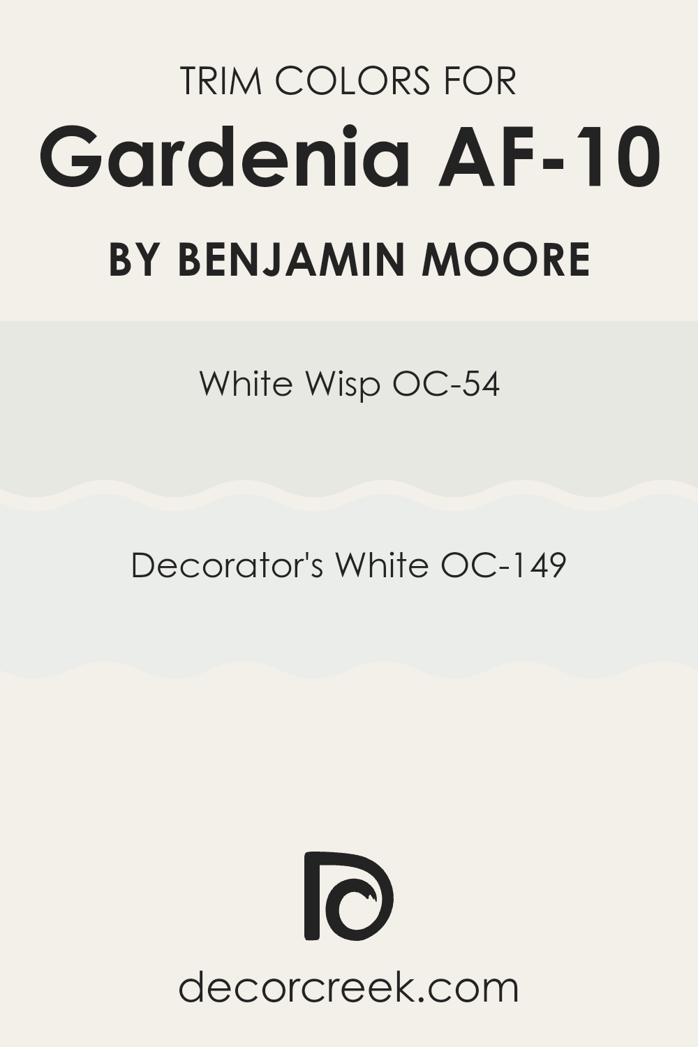
What are the Trim colors of Gardenia AF-10 by Benjamin Moore?
Trim colors, like OC-54 – White Wisp and OC-149 – Decorator’s White, play a crucial role in enhancing the visual appeal of a spot by providing a contrasting or complementary frame around doors, windows, and baseboards. These colors also help in defining the architectural details of a room, making features stand out more prominently against broader wall colors such as Gardenia AF-10 by Benjamin Moore.
Choosing the right trim color can make the walls appear more refined and can effectively break up large surfaces, adding interest and layers to a room’s design. OC-54 – White Wisp is a very light gray that offers a subtle contrast, giving a clean and fresh look that supports a range of wall colors without overpowering them.
It’s especially effective in rooms that aim for a light and airy feel. OC-149 – Decorator’s White, on the other hand, is a crisp, clear white that provides a sharper contrast, making it ideal for use in a variety of color schemes. This color brightens up trims, making details pop and giving the room a well-defined, polished look.
You can see recommended paint colors below:
Colors Similar to Gardenia AF-10 by Benjamin Moore
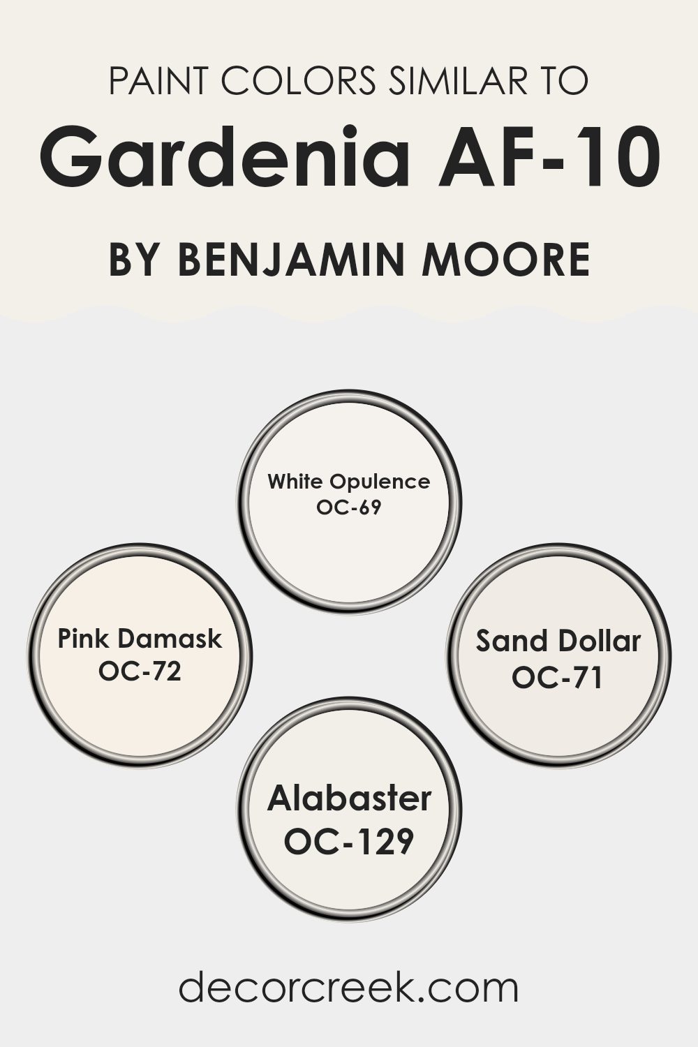
Choosing similar colors in home decor can create a harmonious and visually appealing environment. Colors that closely relate to each other, like those similar to Gardenia AF-10 by Benjamin Moore, promote a sense of continuity and flow throughout a spots. Using shades like White Opulence, Pink Damask, Sand Dollar, and Alabaster allows for subtle variations in a room without the risk of clashing.
This approach can make decorating easier as these colors naturally complement each other and can often be used interchangeably across different rooms and elements, such as walls, trims, and accents. White Opulence has a clean and refreshing feel, making it a great choice for creating a bright and airy atmosphere. It reflects light beautifully, which can help smaller spots appear larger.
Pink Damask offers a gentle hint of color, providing warmth and a soft, welcoming vibe. On the other hand, Sand Dollar has an earthy, beige tone that works well in rooms where a calming, neutral backdrop is desired. Alabaster, being a warm but almost pure white, serves as an excellent base or accent color, enhancing other hues and tying varied design elements together seamlessly. Implementing these colors can give any interior a coherent look while allowing for flexibility in decor choices and style transitions.
You can see recommended paint colors below:
- OC-69 White Opulence
- OC-72 Pink Damask
- OC-71 Sand Dollar
- OC-129 Alabaster
Colors that Go With Gardenia AF-10 by Benjamin Moore
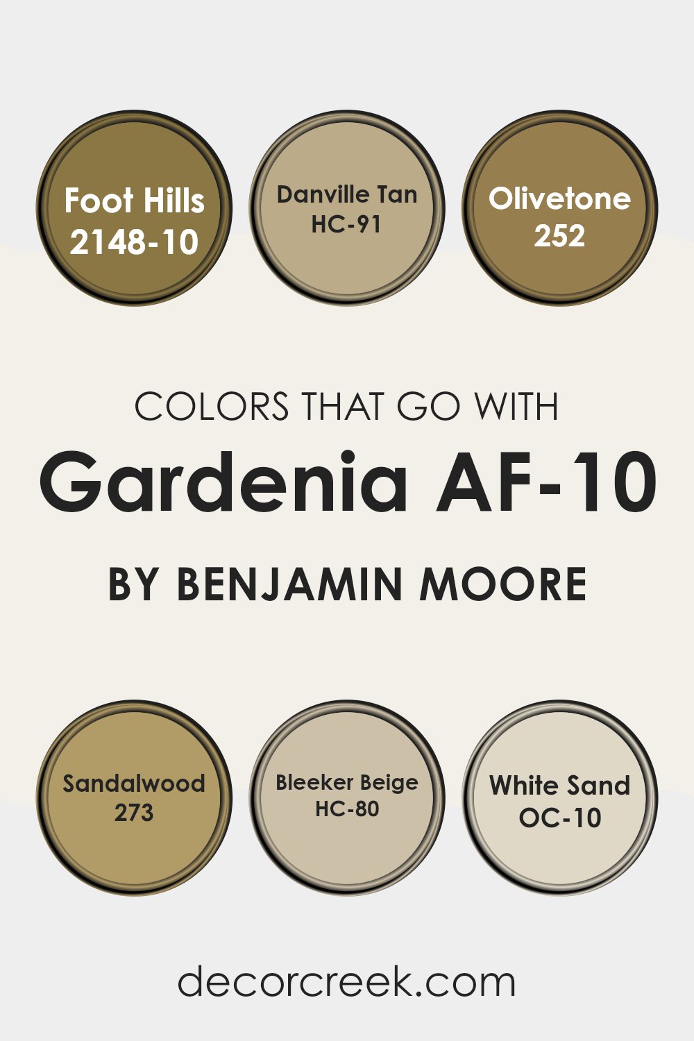
When decorating a interior, choosing the right colors to complement a central shade like Gardenia AF-10 by Benjamin Moore is crucial. Gardenia AF-10 is a warm, creamy white that acts as a perfect backdrop for a variety of coordinating colors. Colors that harmonize well with Gardenia AF-10, such as Foot Hills, Danville Tan, Olivetone, Sandalwood, Bleeker Beige, and White Sand, offer a palette that can enhance the atmosphere of any room by adding depth and warmth.
Foot Hills is a deep, earthy taupe that brings a grounding effect to the airy Gardenia AF-10. It works well in areas where you want a bit more depth without making the room feel heavy or closed in. Danville Tan offers a friendlier, lighter tan hue, offering an inviting and warm feel, which is ideal for living rooms and kitchens.
Olivetone stands out with its rich, olive green shade that introduces a natural, lively element that pairs beautifully with the neutrality of Gardenia AF-10. Moving to a slightly different spectrum, Sandalwood presents a muted, sandy beige that works well in parts of the home aiming for a subtle and calm look.
Bleeker Beige is similar but with a hint of gray, offering flexibility and sophistication in coordination. Lastly, White Sand, a light, sandy off-white, serves to brighten rooms while maintaining a warm ambiance, thus creating a cohesive flow when used with Gardenia AF-10. Together, these colors create a balanced and inviting palette that works well with different design styles and personal tastes.
You can see recommended paint colors below:
- 2148-10 Foot Hills
- HC-91 Danville Tan
- 252 Olivetone
- 273 Sandalwood
- HC-80 Bleeker Beige
- OC-10 White Sand
How to Use Gardenia AF-10 by Benjamin Moore In Your Home?
Gardenia AF-10 by Benjamin Moore is a warm, creamy white color that’s perfect for creating a cozy and welcoming atmosphere in your home. It has a soft touch that works well in any room, whether it’s your living room, kitchen, or bedroom. If you’re looking to freshen up your section, this color is a great choice because it pairs beautifully with various décor styles and adds a clean, finished look to the walls.
You can use Gardenia AF-10 to paint your entire living room or bedroom to make the section feel bigger and brighter.
It’s also ideal for smaller areas like bathrooms and hallways, where it can help reflect light and give the illusion of more corner. Additionally, this shade works wonderfully as a background for displaying artwork or family photos, as it doesn’t compete with colors and helps highlight other elements in the room.
Combining it with darker furniture or flooring can create a lovely contrast, or you can pair it with lighter, natural wood tones for a harmonious look.
Whatever your choice, Gardenia AF-10 offers a fresh canvas that allows your personal style to shine.
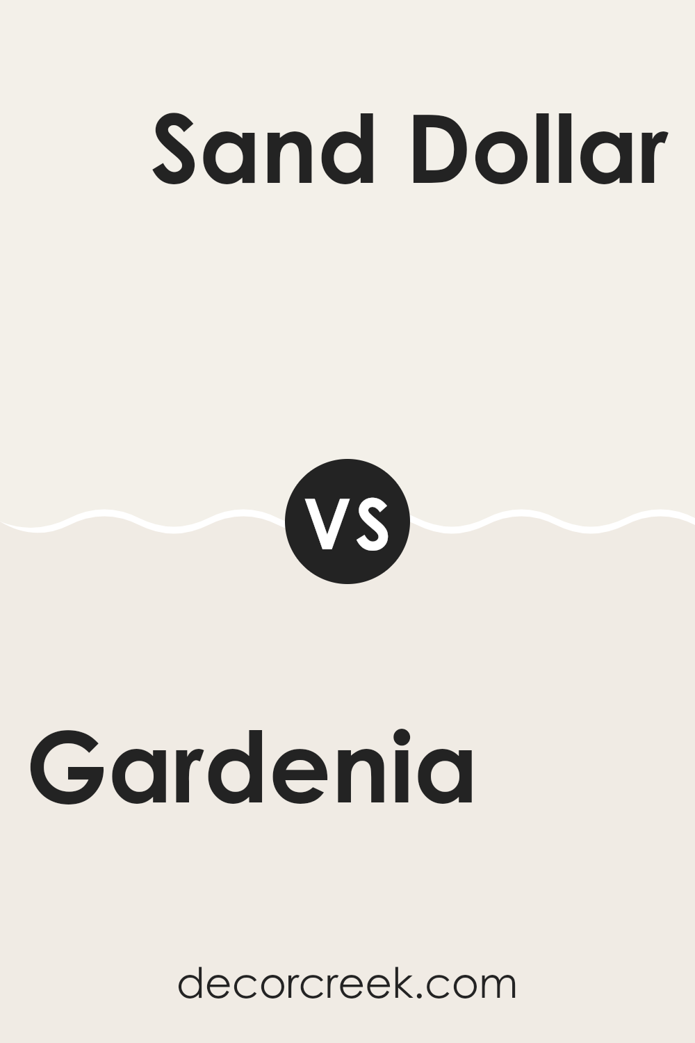
Gardenia AF-10 by Benjamin Moore vs Sand Dollar OC-71 by Benjamin Moore
Gardenia AF-10 and Sand Dollar OC-71 are both colors by Benjamin Moore that give a soft, welcoming vibe to any room. Gardenia is a warm white with a creamy undertone, perfect for making parts of the home feel cozy and inviting without being too stark.
On the other hand, Sand Dollar has a slightly greyish tint, making it a good choice if you prefer a neutral backdrop with a hint of color. This color can help small areas feel more open and works well in both bright and low light.
Both colors pair well with other shades and are ideal for anyone looking to create a gentle, calming atmosphere in their home. While Gardenia adds a subtle warmth, Sand Dollar offers a touch of coolness, providing a gentle contrast that can suit various decorating styles.
You can see recommended paint color below:
- OC-71 Sand Dollar
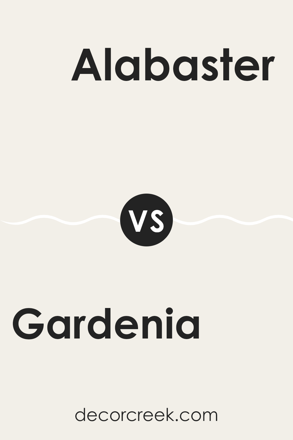
Gardenia AF-10 by Benjamin Moore vs Alabaster OC-129 by Benjamin Moore
Gardenia AF-10 and Alabaster OC-129, both by Benjamin Moore, are quite similar but have subtle differences. Gardenia AF-10 is a gentle off-white with a warm undertone, making the corner where it’s used feel cozy and inviting. It pairs well in areas with natural light which enhances its warm feel, perfect for living rooms or bedrooms looking for a touch of warmth.
On the other hand, Alabaster OC-129 is also an off-white, but it leans closer to a neutral white without strong yellow or pink undertones. This color works well in different parts of the home and gives each room a clean, fresh look. It works especially well in areas that aim for a modern, crisp appearance like kitchens or bathrooms.
Both colors are great choices for creating a light and airy feel in a room, but your choice might depend on whether you prefer a cozier (Gardenia) or a more straightforward, clean look (Alabaster).
You can see recommended paint color below:
- OC-129 Alabaster
Gardenia AF-10 by Benjamin Moore vs Pink Damask OC-72 by Benjamin Moore
Gardenia AF-10 and Pink Damask OC-72, both by Benjamin Moore, have distinct vibes that can really change the look of a room. Gardenia AF-10 is a soft white with a subtle hint of warmth. This color is great for creating a clean and welcoming atmosphere in a corner , making rooms appear brighter and more open. It’s an excellent choice if you want a classic look that’s not too stark but still feels fresh.
On the other hand, Pink Damask OC-72 offers a gentle touch of pink, bringing a warmer, more inviting feel than Gardenia. It’s not too bright or bold, but it brings just enough color to give a corner some warmth and character. This shade works well for adding a soft, romantic touch to bedrooms or creating a cozy, inviting atmosphere in living areas.
In summary, while both colors are appealing, Gardenia leans towards a traditional white with a fresh appeal, and Pink Damask adds a hint of pink for warmth and charm.
You can see recommended paint color below:
- OC-72 Pink Damask
Gardenia AF-10 by Benjamin Moore vs White Opulence OC-69 by Benjamin Moore
Gardenia AF-10 and White Opulence OC-69, both by Benjamin Moore, are shades of white that offer subtly different vibes for a room. Gardenia AF-10 is a warmer white, which gives parts of the homea cozy and welcoming feel. It’s particularly good in rooms that could use a soft glow, making them more inviting. This color pairs well with earthy tones and wood finishes, enhancing the overall homely atmosphere.
On the other hand, White Opulence OC-69 leans towards a cooler spectrum. This shade is fresher and brighter, making it ideal for parts of the home that aim to have a clean and crisp appearance. It works well in modern settings or rooms that get a lot of natural light, as it helps make the corner appear more airy and open.
Choosing between these colors depends on the mood and style you want for your room. Gardenia AF-10 is great for a relaxed and warm setting, while White Opulence OC-69 is better for a sharper, more vibrant look.
You can see recommended paint color below:
- OC-69 White Opulence
In wrapping up my thoughts on AF-10 Gardenia by Benjamin Moore, I find this paint color truly lovely for any room needing a touch of coziness and warmth. After testing it out, I can tell you that Gardenia isn’t just any white. It has a creamy feel that makes your room feel welcoming and bright without being too sharp or bold. This is ideal when you want to freshen up your room but keep things soft and gentle.
It works so well in many different rooms, whether you’re painting your living room, kitchen, or bedroom. I especially loved how it looked in the living room with natural light coming in. It gave off a calm and happy vibe, which made everything look more beautiful. Plus, cleaning the walls was easy, as marks and dirt didn’t show up much because of the paint’s nice finish.
Overall, AF-10 Gardenia by Benjamin Moore is a great choice if you’re looking for paint that’s easy to get along with and makes your home feel warm and inviting. Whether you’re sprucing up a single room or painting the whole house, Gardenia adds just the right touch of coziness. I highly recommend giving it a try if you’re thinking about adding a fresh look to your living parts of the home without going too dramatic. It’s a color that everyone in the family will surely appreciate and enjoy.
Ever wished paint sampling was as easy as sticking a sticker? Guess what? Now it is! Discover Samplize's unique Peel & Stick samples.
Get paint samples

