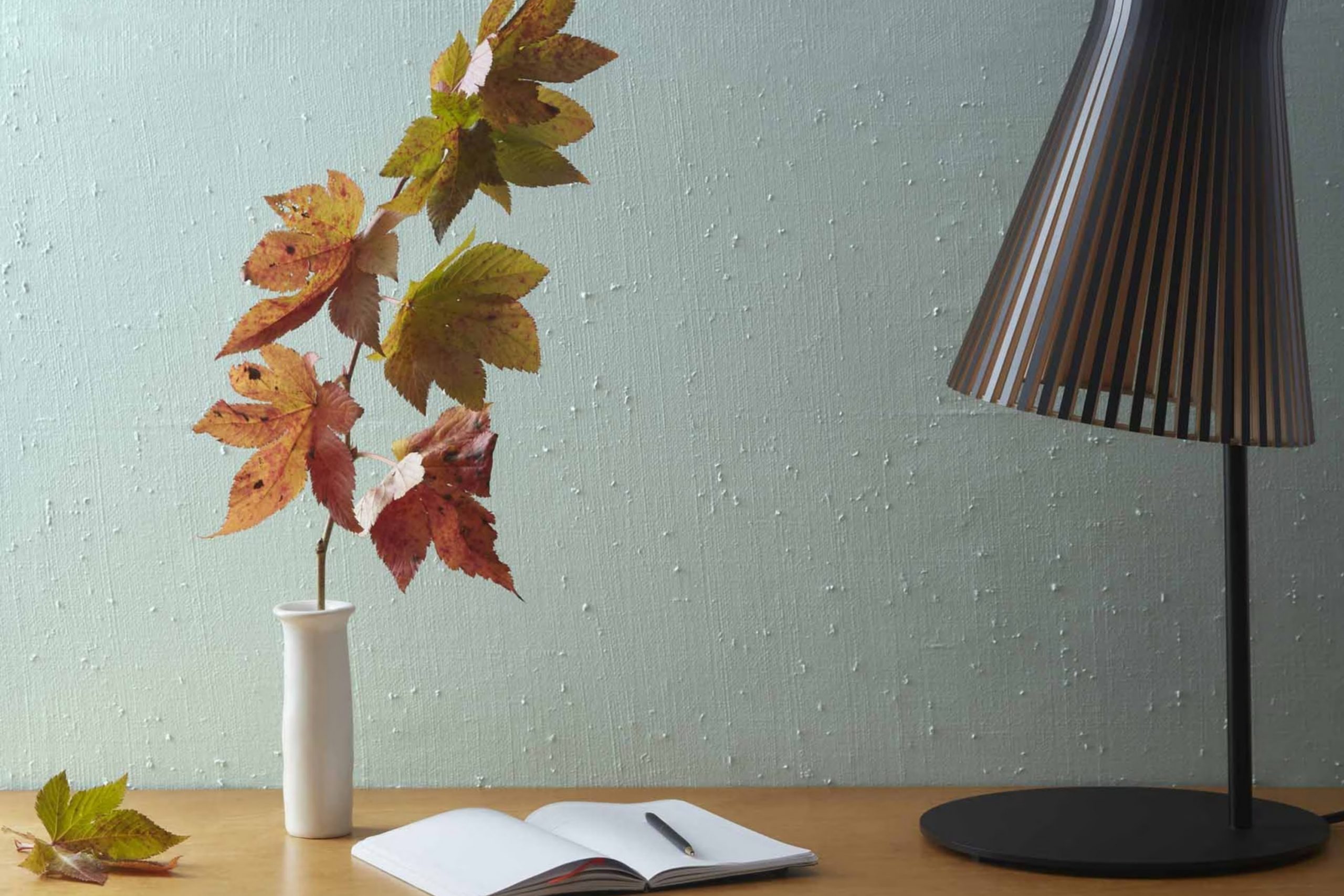
I recently tried out a paint color named 2123-40 Gossamer Blue by Benjamin Moore, and I must say it’s a refreshing choice. Perfect for those looking to brighten up a room without going for something too bold, its soft blue hue brings a light and airy feel to any area.Whether you’re painting a bedroom to create a calming atmosphere or adding a touch of peace to your living room, Gossamer Blue manages to do just that.
This shade has a subtle charm that works beautifully with white trim and can also harmonize well with various wood finishes, making it adaptable for different home styles. If you’re considering a new color for your next home renovation or simply want to refresh a room, I’d recommend giving Gossamer Blue a look.
It might just be the soothing tone you need to give your room a fresh, new feel.
What Color Is Gossamer Blue 2123-40 by Benjamin Moore?
Gossamer Blue by Benjamin Moore is a light and airy color that brings a fresh vibe to any room. With its subtle hints of gray, this blue shade has a calming effect, making it ideal for creating a relaxing atmosphere. The color is adaptable enough to fit various interior styles, particularly shining in modern, coastal, and Scandinavian decor due to its clean and minimalistic appeal.
In contemporary settings, Gossamer Blue works beautifully as a main wall color, providing a cool backdrop that complements sleek furniture and metallic accents like stainless steel or chrome. For a beachy, coastal look, pair it with sandy tones, white, and soft textiles to mimic the colors of the shore and sky. In Scandinavian interiors, it pairs well with light woods, such as beech or ash, and simple, functional furniture to enhance the open, airy feel of the area.
Texturally, Gossamer Blue goes well with a variety of materials. It looks stunning with natural wood, which adds warmth to the cool blue. Linen and cotton fabrics in neutral colors also work well, offering a tactile contrast that feels cozy and inviting. Additionally, incorporating elements like jute or wool in rugs or throws can introduce an earthy, grounded feel to balance the airiness of the blue. This adaptable color is a great choice for anyone looking to refresh their living area with a light, clean look.
Is Gossamer Blue 2123-40 by Benjamin Moore Warm or Cool color?
Gossamer Blue 2123-40 by Benjamin Moore is a refreshing light blue shade that can make rooms feel airy and bright. This color has a calm, soft look that is perfect for creating a relaxing atmosphere in homes. It is adaptable and works well in various areas such as bedrooms, bathrooms, and living areas.
When used on walls, Gossamer Blue can make an area seem larger and more open, while also providing a gentle backdrop that complements various decor styles and colors. It pairs nicely with whites, grays, and even some pastel colors, giving homeowners the flexibility to mix and match their furnishings.
This shade is also beneficial in rooms that receive a lot of natural light, where it reflects the light beautifully, further enhancing the sense of area. Conversely, in dimly lit rooms, it can help brighten the area subtly without being overpowering. Gossamer Blue is a good choice for anyone looking to refresh their home with a gentle and pleasing aesthetic.
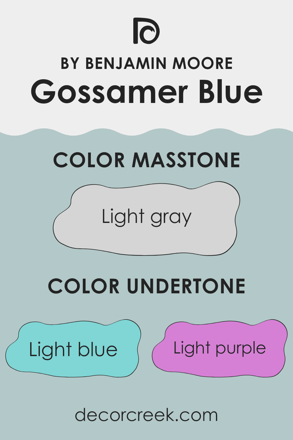
Undertones of Gossamer Blue 2123-40 by Benjamin Moore
Gossamer Blue is a unique paint color that incorporates a mix of subtle undertones which can alter its appearance based on the lighting and surrounding elements. Undertones are the colors that lurk beneath the surface of the primary color, impacting how it looks in different conditions. For Gossamer Blue, these undertones include light blue, light purple, pale yellow, lilac, mint, pale pink, and grey.
These undertones play a critical role in how we perceive the color. For example, light blue and mint undertones might make the color appear cooler and more refreshing, which is great for creating a calming environment.
On the other hand, pale yellow and pale pink can warm up the area, making it feel more welcoming. Lilac and light purple add a subtle hint of elegance, while the grey undertone can help the color blend well with modern decor and furnishings.
When applied to interior walls, the undertones of Gossamer Blue can significantly influence the mood and aesthetic of a room. In an area with lots of natural light, the lighter undertones like blue and mint might become more pronounced, giving the room a fresh and airy feel. In artificial or dim lighting, the grey and lilac undertones might stand out, lending a more muted and cozy vibe.
Additionally, the choice of furnishings and decor can either amplify or soften these undertones, making Gossamer Blue a flexible choice for various interior styles. Its ability to interact with both light and surrounding colors makes it an intriguing choice for those looking to enhance their living area.
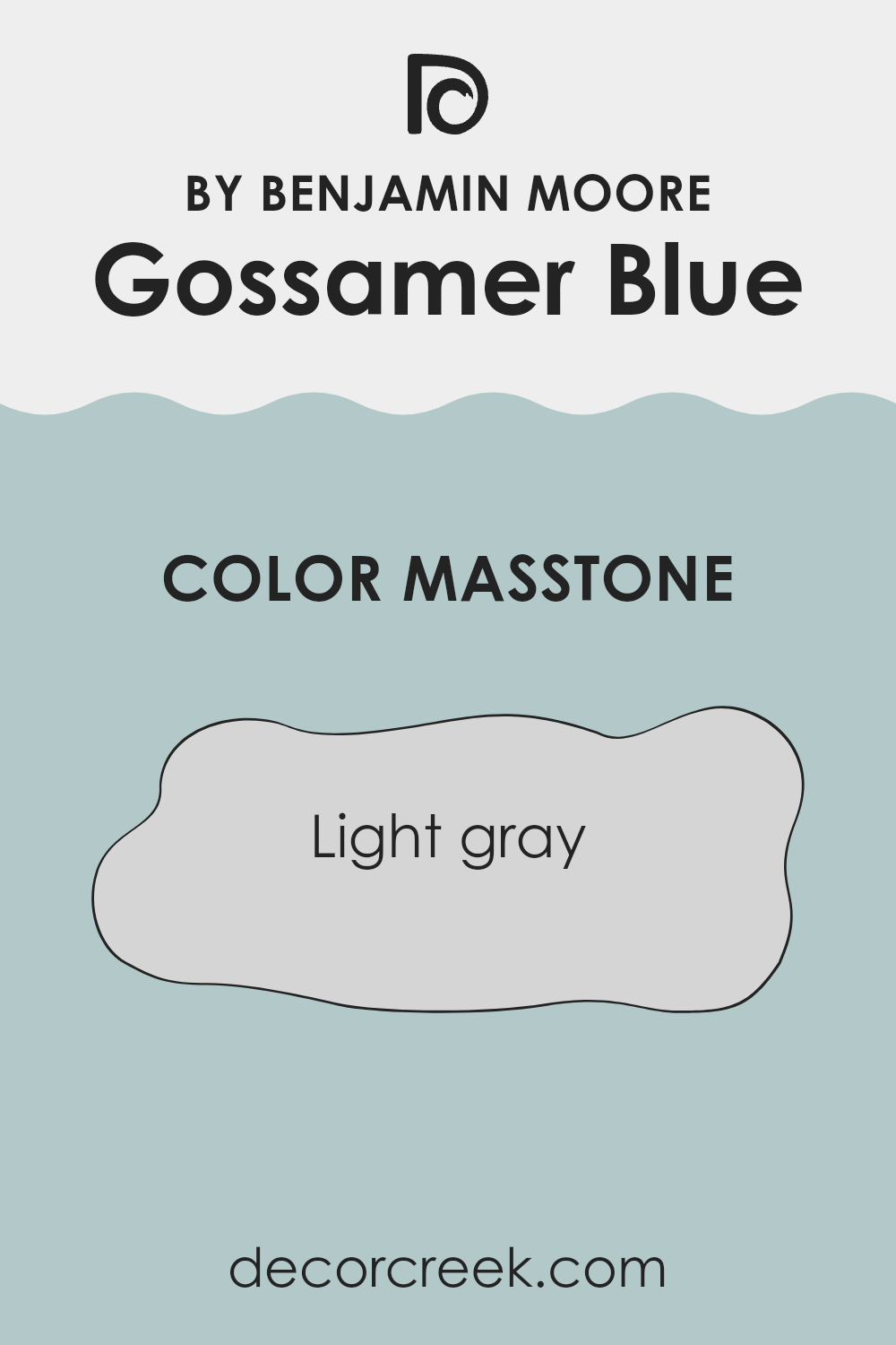
What is the Masstone of the Gossamer Blue 2123-40 by Benjamin Moore?
Gossamer Blue 2123-40 by Benjamin Moore is a light gray color with the masstone #D5D5D5. This shade is very adaptable and works well in many different areas in a home. Because it is a neutral color, it doesn’t overpower a room or clash with other colors.
This makes it an excellent choice for main living areas, bedrooms, or even bathrooms. It can help make smaller areas appear bigger and brighter, as light colors tend to make rooms feel more open and airy.
This color also has a clean and fresh look, which can help to create a calm and relaxing atmosphere in a home. It’s easy to match with different styles of decor and furniture, allowing for a wide range of design choices. Whether you want a modern look or something more traditional, this shade of gray can fit your needs.
How Does Lighting Affect Gossamer Blue 2123-40 by Benjamin Moore?
Lighting plays a crucial role in how colors are perceived in any room. The way light interacts with colors can significantly change their appearance, affecting the mood and feel of a home. Different lighting conditions—whether artificial or natural—can make the same color look different at various times of the day or in different settings.
Gossamer Blue is a calming, soft blue shade by Benjamin Moore that reacts distinctively under various lighting conditions. In artificial light, such as from bulbs or LED lights, this blue tends to appear slightly brighter and more vibrant. The artificial light often highlights the blue’s pure and gentle qualities, making it a great choice for creating a lively and cheerful atmosphere.
In natural light, the appearance of Gossamer Blue can vary significantly depending on the direction of the windows and the time of day. In a north-facing room, which receives less direct sunlight, Gossamer Blue may look more muted and subtle. This cooler light tends to bring out the blue’s softer side, making it ideal for a calming environment.
South-facing rooms, benefiting from abundant direct sunlight, will make Gossamer Blue appear much brighter and more dynamic. The strong light intensifies the blue, making it feel fresh and airy. This is perfect for areas used actively during the day, like living rooms or kitchens.
In east-facing rooms, where the morning light is warmer, Gossamer Blue will have a gently cheerful glow in the mornings, shifting to a cooler tone as the day progresses. In west-facing rooms, the color will stay relatively neutral during the morning and become warmly lit in the evening. This dynamic change can add an interesting effect, making the room feel different depending on the time of day.
Overall, Gossamer Blue’s reaction to different lighting conditions makes it a flexible choice, adapting beautifully to both artificial and natural light sources.
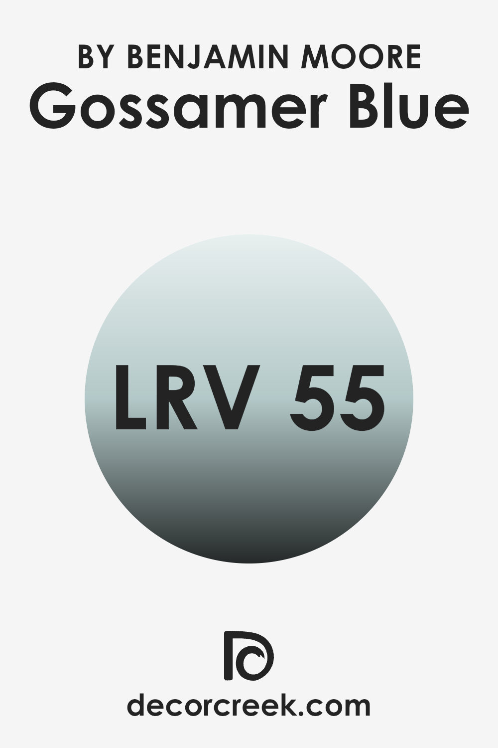
What is the LRV of Gossamer Blue 2123-40 by Benjamin Moore?
LRV stands for Light Reflectance Value, which measures the percentage of light that a paint color reflects back into a room. Think of it as a scale that helps you understand how light or dark a color will look once it’s on your walls. Higher values mean the paint will reflect more light, making the room feel brighter.
On the other hand, lower values mean the paint absorbs more light, which can make a room feel cozier but smaller. Understanding LRV helps in choosing the right paint color for your room based on how much natural or artificial light that room gets during the day.
The LRV for Gossamer Blue is 55.04, placing it in the mid-range category on the scale. This means it’s neither too dark nor too light, making it a flexible option that can be used in many types of rooms. In areas with less natural light, it will help to make the room feel moderately illuminated without being too strong.
For well-lit rooms, this LRV ensures that the color remains visible and vibrant, even with the abundance of light. Overall, this LRV suggests that Gossamer Blue is a practical choice that can enhance a wide variety of rooms without making them feel too tight or overly bright.
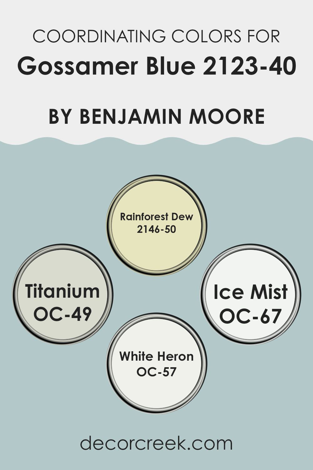
Coordinating Colors of Gossamer Blue 2123-40 by Benjamin Moore
Coordinating colors are chosen to work harmoniously with a main color, enhancing the overall aesthetic of a room without overpowering it. For instance, the color Gossamer Blue by Benjamin Moore can be paired with several coordinating colors to create a balanced and appealing palette in any setting. Such coordinating colors might include various hues that complement or contrast with the main color in a way that achieves a desired mood or style.
Rainforest Dew is a light, refreshing green that adds a natural touch when used alongside blues like Gossamer Blue. It’s ideal for bringing a subtle hint of the outdoors indoors. Titanium is a very light gray that offers a clean, neutral backdrop, allowing bolder colors like Gossamer Blue to stand out without being too strong.
Ice Mist is another option, presenting an almost white, very pale blue that reflects light and creates a sense of openness, enhancing the airy quality of a room. Lastly, White Heron stands out as a pristine white that provides a crisp contrast, highlighting the soft tone of Gossamer Blue, perfect for trim or ceiling color to complete a fresh, cohesive look.
You can see recommended paint colors below:
- 2146-50 Rainforest Dew
- OC-49 Titanium
- OC-67 Ice Mist
- OC-57 White Heron
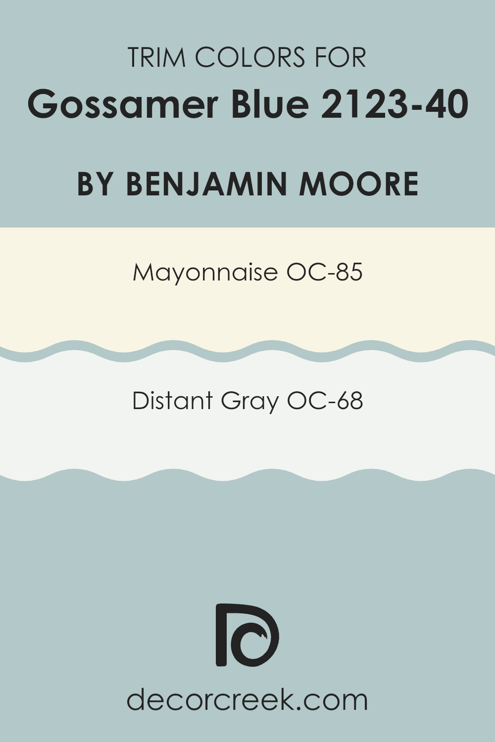
What are the Trim colors of Gossamer Blue 2123-40 by Benjamin Moore?
Trim colors, such as OC-85 – Mayonnaise and OC-68 – Distant Gray by Benjamin Moore, play a critical role in enhancing the visual appeal of a room, especially when paired with a primary color like Gossamer Blue.
These trim shades act as defining borders around doors, windows, and baseboards, helping highlight these features and provide a clean, polished finish. By carefully selecting complementary trim colors, homeowners can ensure that each element within the room stands out while still maintaining a cohesive and attractive environment.
Mayonnaise OC-85 is a warm, creamy white that brings soft brightness to the room, making it an excellent choice for trim that gently contrasts with the cool tone of Gossamer Blue. This shade is flexible and ensures that the transition between walls and woodwork feels smooth. On the other hand, Distant Gray OC-68 offers a light, fresh gray that creates a slightly bolder frame around architectural details without competing with the main color. This shade is ideal for those who want a subtle yet distinct separation between walls and trim.
You can see recommended paint colors below:
- OC-85 Mayonnaise
- OC-68 Distant Gray
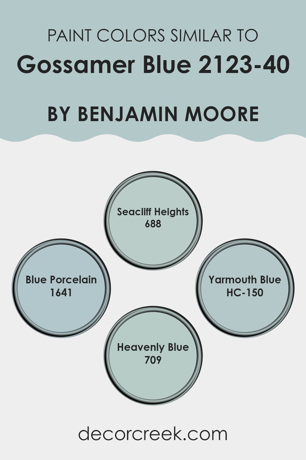
Colors Similar to Gossamer Blue 2123-40 by Benjamin Moore
Choosing similar colors to a base shade, like Benjamin Moore’s Gossamer Blue, offers a harmonious look that is pleasing to the eye. By selecting shades that share the same undertones or are closely lined up on the color wheel, designers can create rooms that feel cohesive and visually balanced.
This continuity can make an area feel more expansive and seamlessly integrated. For instance, variations of Gossamer Blue can add depth and interest while maintaining a unified color palette, providing the environment with a more connected and fluid appearance.
For example, Benjamin Moore’s Seacliff Heights has a gentle blue hue that conjures images of a foggy coastal morning. It softly reflects light, bringing a delicate glow to the room. Blue Porcelain by Benjamin Moore is another shade with a hint of blue that mimics the color found in antique ceramics, lending a subtle historical touch to interiors.
Yarmouth Blue offers a muted version of the sky on a pale, early spring day, adding a fresh and airy feel. Lastly, Heavenly Blue is slightly more vibrant, reminiscent of a mid-morning sky, providing a cheerful and uplifting tone. These close relatives to Gossamer Blue allow for layering of hues, offering flexibility in design while keeping the area tied together under one aesthetic theme.
You can see recommended paint colors below:
- 688 Seacliff Heights
- 1641 Blue Porcelain
- HC-150 Yarmouth Blue
- 709 Heavenly Blue
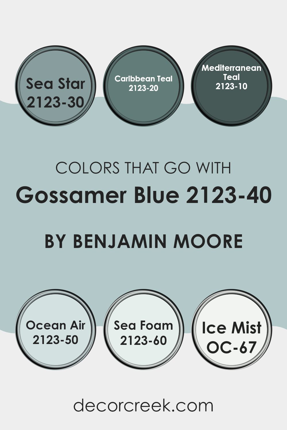
Colors that Go With Gossamer Blue 2123-40 by Benjamin Moore
Choosing complementary colors for Gossamer Blue 2123-40 by Benjamin Moore is important as they enhance the overall aesthetic of an area, making it feel coordinated and harmonious. When colors like Sea Star, Caribbean Teal, Mediterranean Teal, Ocean Air, Sea Foam, and Ice Mist are used alongside Gossamer Blue, they create a balance and add depth to the decor. These colors, ranging from deep to light tones, work together to create a fluid and visually appealing palette that can either calm or invigorate a room depending on how they’re used.
Sea Star 2123-30 is a deep, almost mystical blue that adds a bold contrast to the lighter Gossamer Blue, making it stand out more. Caribbean Teal 2123-20, with its vibrant splash, brings a sense of energy and life to areas that feature Gossamer Blue. Mediterranean Teal 2123-10, the darkest of the group, offers a rich backdrop that allows lighter hues to pop beautifully.
Ocean Air 2123-50 is much lighter, providing a soft, airy feel that enhances the area’s lightness when paired with Gossamer Blue. Sea Foam 2123-60, with its hint of green, offers a gentle connection to nature and complements the calming effect of Gossamer Blue. Lastly, Ice Mist OC-67, with its very subtle and almost white appearance, provides a crisp, clean look that makes the blue tones truly stand out, ensuring the room feels well-lit and open.
You can see recommended paint colors below:
- 2123-30 Sea Star
- 2123-20 Caribbean Teal
- 2123-10 Mediterranean Teal
- 2123-50 Ocean Air
- 2123-60 Sea Foam
- OC-67 Ice Mist
How to Use Gossamer Blue 2123-40 by Benjamin Moore In Your Home?
Gossamer Blue 2123-40 by Benjamin Moore is a vibrant shade of sky blue that adds a fresh and airy feel to any room. Ideal for creating a relaxed atmosphere, this color works beautifully in areas like bedrooms and bathrooms where you want a calming effect.
You can also use it in a home office to help keep the environment light and cheerful, making it easier to stay focused and productive. When paired with neutral colors like white or gray, Gossamer Blue stands out and gives your area a clean, crisp look.
It is also highly adaptable, so you can use it in a variety of decor styles, from modern to coastal. Apply it on all walls for an immersive effect, or just on an accent wall to highlight a particular area of your home. For those who like DIY projects, this color can also breathe new life into old furniture, giving it a cool, modern twist.
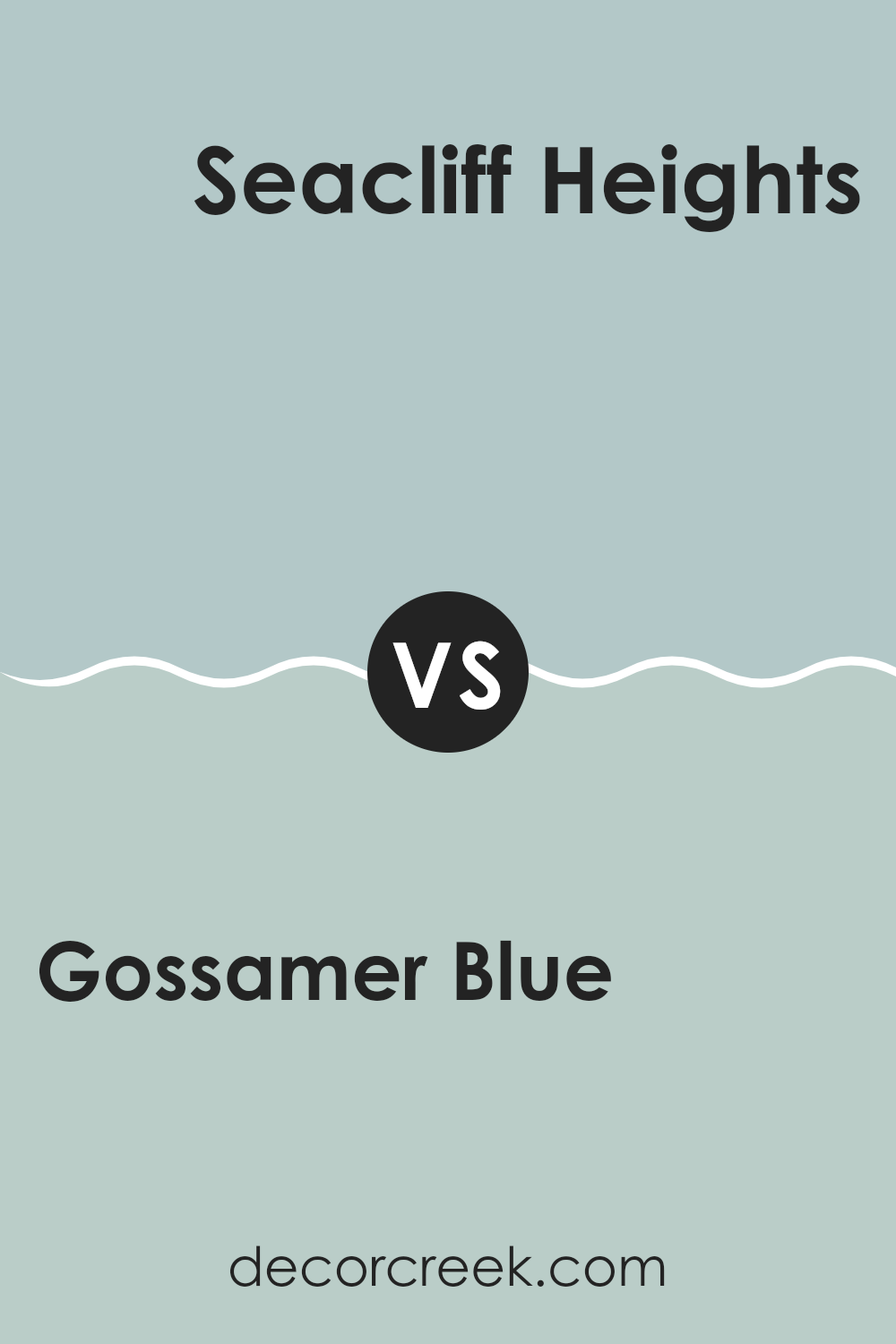
Gossamer Blue 2123-40 by Benjamin Moore vs Seacliff Heights 688 by Benjamin Moore
Gossamer Blue, a premium paint option from Benjamin Moore, offers a subtle and fresh feel. It’s a lighter, airier shade, perfect for creating a calm and relaxing atmosphere in any room. Its cool undertones make it excellent for pairing with soft whites or elegant grays to achieve a breezy and contemporary look.
On the other hand, Seacliff Heights by Benjamin Moore is a deeper and slightly more saturated color. It tends to bring a touch of depth to areas while still maintaining a relaxed vibe. This color works well in living rooms or bedrooms where a cozy yet refined look is desired.
It pairs beautifully with darker woods and neutral accessories to add a grounded yet airy feel to the interior. While both colors promote a calm environment, Gossamer Blue leans more towards a light, ethereal feel, whereas Seacliff Heights adds a bit of richness and warmth to the area.
You can see recommended paint color below:
- 688 Seacliff Heights
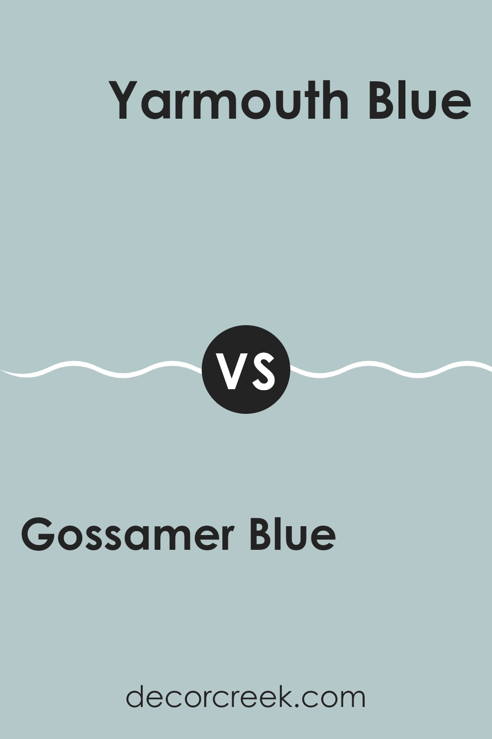
Gossamer Blue 2123-40 by Benjamin Moore vs Yarmouth Blue HC-150 by Benjamin Moore
Gossamer Blue and Yarmouth Blue by Benjamin Moore are both calming blue shades, but they have distinct tones that set them apart. Gossamer Blue is a soft, light blue with an airy feel, making it a great choice for creating a relaxed and welcoming atmosphere. It works well in areas meant for resting or casual gatherings, reflecting a gentle vibe.
Yarmouth Blue, on the other hand, is deeper and leans slightly toward a greenish-blue hue. This color provides a more grounded feel compared to Gossamer Blue. Yarmouth Blue is suitable for areas where you might want a bit more color depth, but still prefer to keep the overall sense of calm.
Choosing between these two depends on the mood you’re aiming for and how much natural light the area receives. Gossamer Blue brightens up a dim room nicely, while Yarmouth Blue can add a touch of depth without making the room feel too heavy. Both are adaptable but serve slightly different aesthetic purposes.
You can see recommended paint color below:
- HC-150 Yarmouth Blue
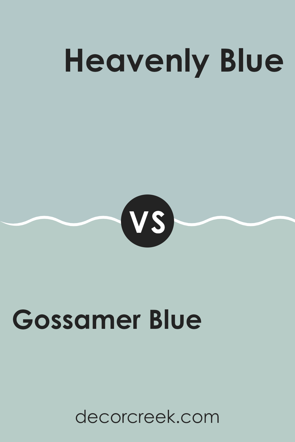
Gossamer Blue 2123-40 by Benjamin Moore vs Heavenly Blue 709 by Benjamin Moore
Gossamer Blue and Heavenly Blue by Benjamin Moore are both hues within the blue color family, yet they have distinct tones. Gossamer Blue leans towards a soft, light blue that might remind one of a clear, sunny sky early in the morning. It’s a calming color but with a freshness that makes it adaptable for areas you want to keep airy and light.
On the other hand, Heavenly Blue is slightly deeper, resembling the richer tone of the sky later in the morning. This color has a more noticeable presence while still maintaining a gentle and pleasant vibe. It could be especially good for adding a bit of color to a room without overpowering it.
Overall, while both paints share a blue base, Gossamer Blue is subtler and lighter, making it great for smaller or less light-filled areas to give them an open feel. Heavenly Blue, being a tad deeper, works well where you want a touch of vibrancy without going too bold. Both can create a peaceful atmosphere, but they do so with slightly different shades and effects.
You can see recommended paint color below:
- 709 Heavenly Blue
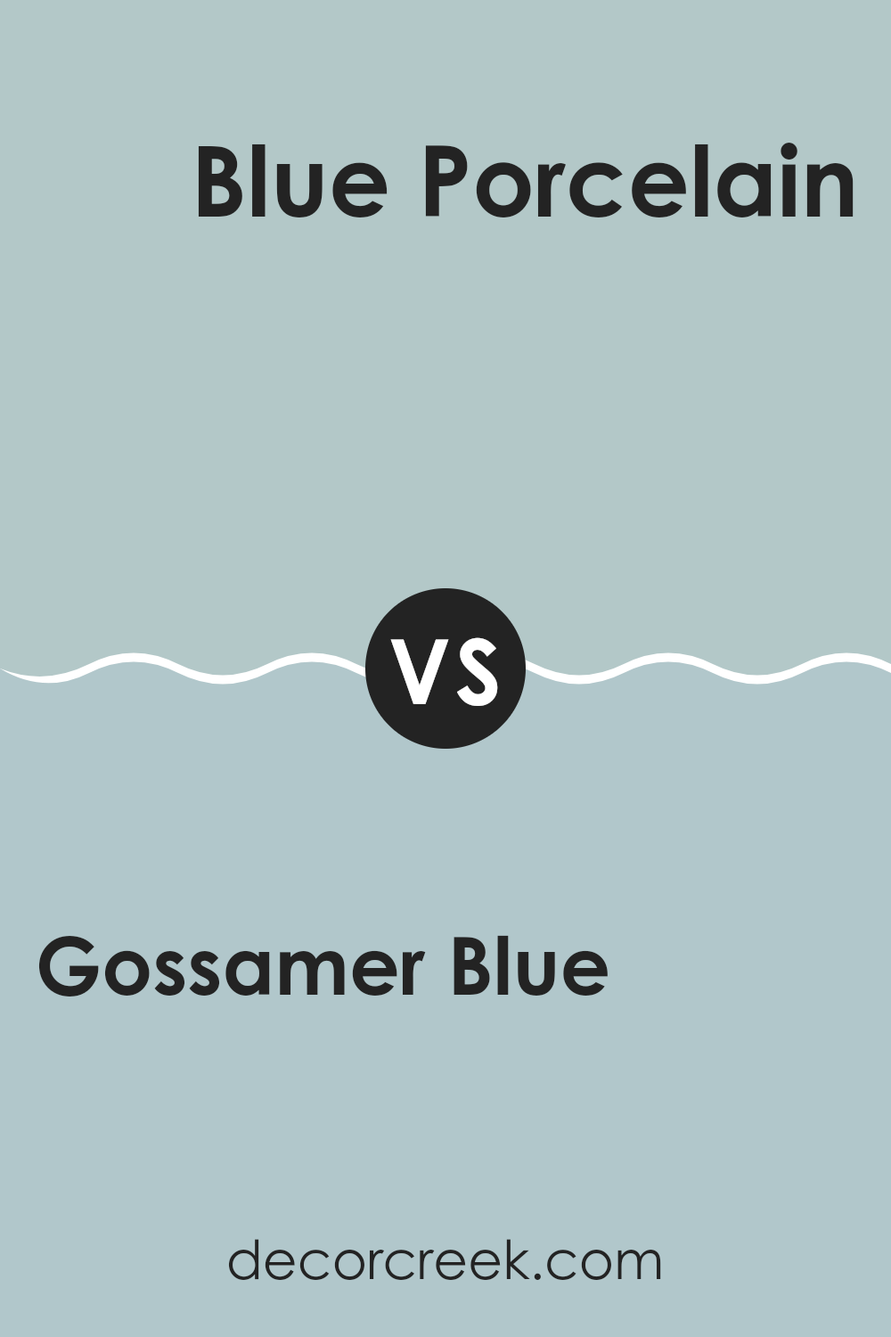
Gossamer Blue 2123-40 by Benjamin Moore vs Blue Porcelain 1641 by Benjamin Moore
Gossamer Blue and Blue Porcelain by Benjamin Moore are both beautiful shades of blue, but they have some distinct differences. Gossamer Blue is a soft, light blue that almost feels airy.
It’s the kind of color that makes a room feel open and expansive, providing a subtle and gentle backdrop that’s easy to match with a variety of decor styles. On the other hand, Blue Porcelain is a deeper, more intense blue.
It has a richer tone that is more prominent and can add a strong touch of character to an area. This shade could be ideal for creating a striking feature wall or for adding depth to an otherwise neutral palette. Both colors offer their unique atmosphere; Gossamer Blue is lighter and more understated, while Blue Porcelain stands out more and makes a bolder statement.
You can see recommended paint color below:
- 1641 Blue Porcelain
After reading about the paint color 2123-40 Gossamer Blue by Benjamin Moore, I’ve learned quite a bit about how special this color is. It’s a soft, gentle blue that has the magic touch to make any room feel calm and happy. This shade of blue is perfect for anyone looking to brighten up their bedroom or even give their bathroom a fresh, clean look. It sounds like it’s not too strong or too pale, but just right to add something special without taking over the whole room.
I’ve also noticed that people really like how this color can match with lots of other colors and decorations. It works well whether you have a modern style at home or something more traditional. That means it’s a pretty safe pick if you’re trying to decide on a new color for a room and want to make sure it’ll look good with whatever you already have.
So, if you’re thinking about giving a fresh look to a part of your home, 2123-40 Gossamer Blue could be a great pick. It’s calm, it’s friendly, and it fits in with many different styles.
It seems like a color that could make any area a bit more special.
Ever wished paint sampling was as easy as sticking a sticker? Guess what? Now it is! Discover Samplize's unique Peel & Stick samples.
Get paint samples

