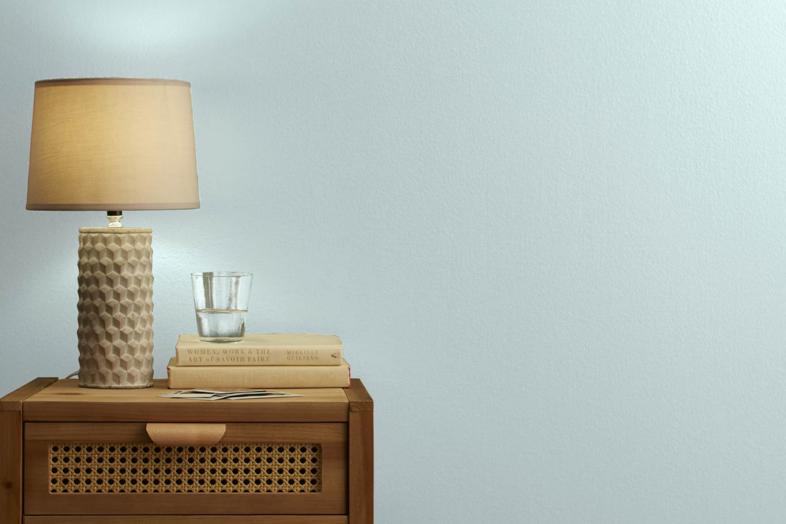
When you first come across 2136-60 Harbour Haze by Benjamin Moore, you’ll quickly notice how unique this color is. Think of it as a subtle blend of gray and blue, with a hint of lavender that softens and warms up any room effortlessly. It’s perfect for those looking to add a gentle touch of color to their interiors without overpowering the existing decor.
You might have seen many paints in your time, but Harbour Haze has a soothing effect that sets it apart. It’s like bringing a gentle sea breeze into your home. If you’re someone who enjoys a calm and peaceful environment, this color could be just what you need.
As you consider the options for your next room refresh, keep in mind how this adaptable shade can work wonders in different lighting conditions, offering a quiet backdrop or a dynamic highlight depending on the natural light available.
Whether you’re planning to update a bedroom, a living room, or even a small nook, Harbour Haze offers a soft palette that pairs beautifully with a wide range of colors and décor styles. It finds a balance between being present and fading into the background, making it a practical choice for a peaceful and inviting atmosphere.
What Color Is Harbour Haze 2136-60 by Benjamin Moore?
Harbour Haze 2136-60 by Benjamin Moore is a gentle blue-gray shade that brings a fresh and airy feel to any room. Its light and subtle qualities make it an adaptable choice, fitting well into a range of decorating styles. Whether aiming for a minimalist, modern look or a cozy, traditional room, this color creates a welcoming atmosphere.
In minimalist interiors, Harbour Haze offers a clean and crisp background that highlights modern furniture and contemporary art without overpowering the senses. For a more traditional setting, this color pairs beautifully with rich wood textures, adding a light contrast to dark wooden furniture and flooring, enhancing the warmth and natural beauty of the room.
This color also works wonderfully in coastal-style interiors, where it reflects the light and breezy character of the seaside. Paired with natural materials like linen, cotton, and light woods, it creates a relaxed, beachy mood. Textures such as woven rugs or bamboo shades complement this hue perfectly, reinforcing a connection to nature and the outdoors.
Overall, Harbour Haze is a flexible color that pairs well with a variety of materials and textures, fitting seamlessly into many design styles while maintaining a sense of calm and openness in the room.
Is Harbour Haze 2136-60 by Benjamin Moore Warm or Cool color?
Harbour Haze by Benjamin Moore is a gentle gray color with subtle blue undertones. It’s perfect for creating a calm and welcoming atmosphere in any room. This color is adaptable because it fits well with various decor styles, from modern to traditional.
When used in homes, Harbour Haze works especially well in rooms with a lot of natural light, as the sunlight brings out its unique undertones. In smaller or darker rooms, it helps open up the room, making it seem larger and more airy.
This shade pairs well with brighter colors, like blues and yellows, as well as more understated colors like soft whites and earth tones. This makes it easy to use in any room, whether you want it as a main wall color or an accent. Overall, Harbour Haze offers a fresh and clean look, making any home feel more inviting.
Undertones of Harbour Haze 2136-60 by Benjamin Moore
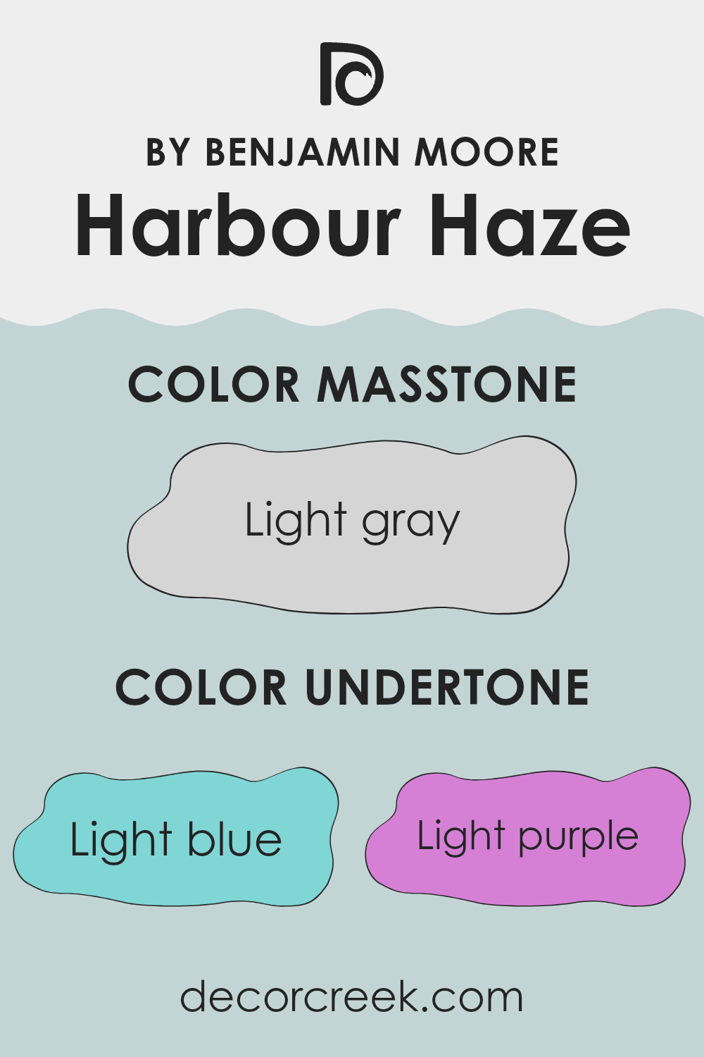
Harbour Haze is a unique paint color with a blend of subtle undertones that significantly influence its appearance in different settings. This shade features hints of light blue, light purple, pale yellow, lilac, mint, pale pink, and grey. Each of these undertones can subtly shift the main color’s look depending on factors such as lighting and surrounding colors.
Undertones play a crucial role in how we perceive color. They can either enhance or soften certain aspects of the main hue, making the color appear cooler or warmer. For instance, light blue and mint undertones in Harbour Haze can make it seem cooler and fresher, while pale yellow or pale pink might warm it up, adding a soft, gentle touch.
When used on interior walls, the effect of Harbour Haze’s undertones is quite noticeable. In rooms with plenty of natural light, the blue and mint undertones might stand out more, giving the walls a fresher feel. Conversely, in artificial lighting, the warmer undertones of pale pink and yellow might become more visible, creating a cozy atmosphere.
These subtle shifts help achieve the desired mood in a room without changing the main color. Additionally, the presence of grey undertones helps to balance the brightness, ensuring the color stays muted and calming, which makes it highly adaptable for different rooms and styles.
What is the Masstone of the Harbour Haze 2136-60 by Benjamin Moore?
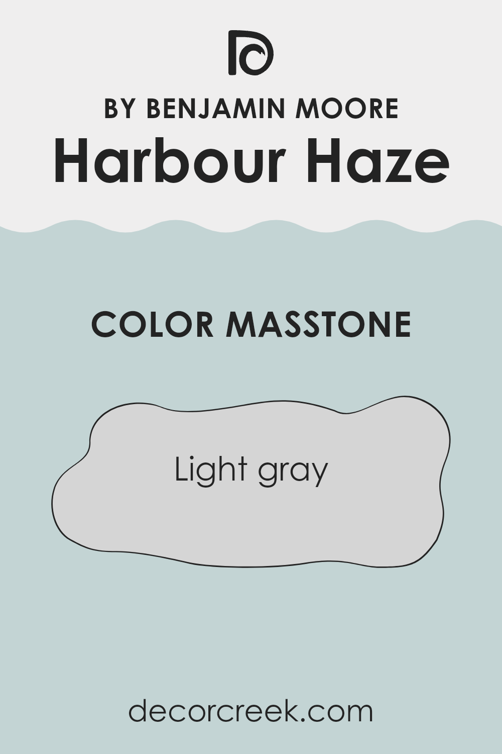
Harbour Haze 2136-60 by Benjamin Moore is a light gray color that makes any room feel fresh and open. This color has the ability to make small rooms appear larger and brighter because of its light, airy quality. Homeowners appreciate this shade because it pairs well with almost any decor, from modern to traditional.
In homes where natural light is limited, using this shade can help mimic the effect of brighter, more open rooms. Additionally, it’s gentle on the eyes, providing a calm backdrop that doesn’t overpower architectural features or furnishings. Light gray like Harbour Haze 2136-60 is highly adaptable.
It works well in various rooms, including kitchens, living areas, and bedrooms. It’s effective as a main wall color or as an accent to complement bolder shades. This flexibility makes it a go-to choice for those looking to refresh their home without making drastic changes.
How Does Lighting Affect Harbour Haze 2136-60 by Benjamin Moore?
Lighting can dramatically influence how colors appear in a room, affecting everything from mood to perceived openness. The color, such as Harbour Haze by Benjamin Moore, is an adaptable shade that responds uniquely to different lighting conditions.
In artificial light, Harbour Haze tends to look warmer. This happens because most artificial lighting, like incandescent bulbs, casts a yellow hue, adding a cozy and gentle feel to the color. LED or fluorescent lights, which have cooler tones, might make Harbour Haze appear slightly more gray than blue.
In natural light, the true character of Harbour Haze comes through more clearly. Sunlight enhances its subtle blue tones, making the color appear fresh and airy. This makes it an excellent choice for rooms meant to feel open and relaxed.
The direction a room faces also affects how Harbour Haze appears:
- North-facing rooms: These get less direct sunlight, which can make colors look cooler. Harbour Haze in a north-facing room might seem more muted and grayish, maintaining a calm and soothing look.
- South-facing rooms: With abundant sunlight, south-facing rooms highlight the blue in Harbour Haze, making it vibrant and bright. It’s ideal for creating a lively and refreshing atmosphere.
- East-facing rooms: Morning light makes Harbour Haze look very soft and pleasant. As the day progresses, the color may lose some of its brightness but will still keep a gentle, clean appearance.
- West-facing rooms: Afternoon and evening light, which tends to be warm, will make Harbour Haze appear richer and slightly more colorful. Expect this shade to bring a cozy and comforting feeling as the day ends.
Understanding how different types of light affect colors like Harbour Haze helps you choose the perfect room and setting for its use, ensuring you achieve the desired mood and balance in your home décor.
decorcreek.com
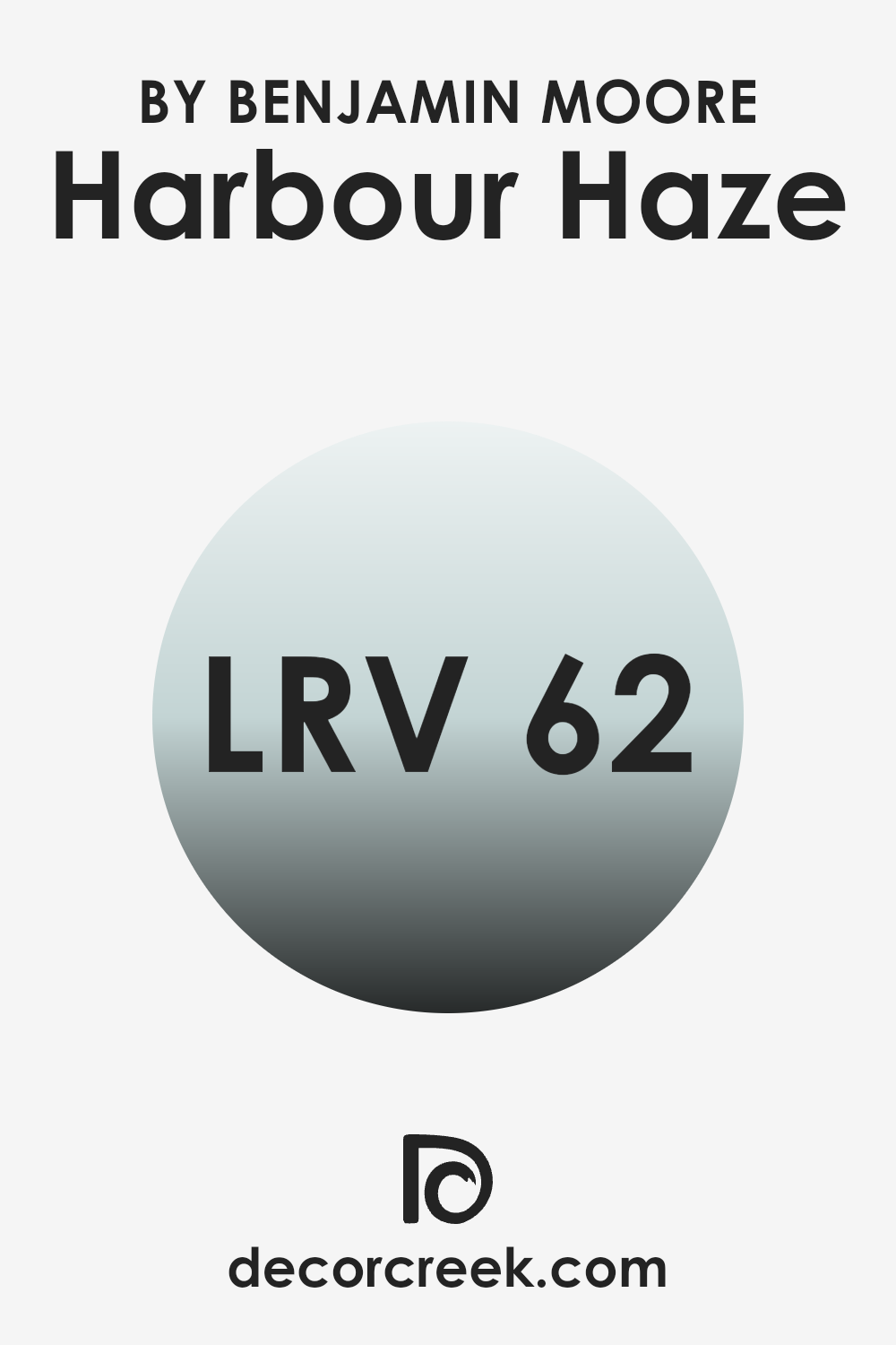
What is the LRV of Harbour Haze 2136-60 by Benjamin Moore?
LRV stands for Light Reflectance Value, and it represents the amount of light a paint color reflects back into a room compared to the light it absorbs. In simpler terms, it measures how light or dark a color will appear when applied to your walls. High LRV values indicate that the color reflects more light and therefore looks lighter, making a room feel more open and expansive.
On the other hand, colors with lower LRV values absorb more light and can make a room feel cozier but smaller. The LRV for Harbour Haze is 62.47, which means it’s on the lighter side of the scale. This color will reflect a good amount of light, helping rooms appear brighter and larger than they might with darker shades.
It’s a practical choice for smaller rooms or areas with fewer windows, as it can help to brighten the room without the need for extra lighting. This particular shade of gray provides a fresh and airy feel, making it an excellent backdrop for a range of decor styles and personal preferences.
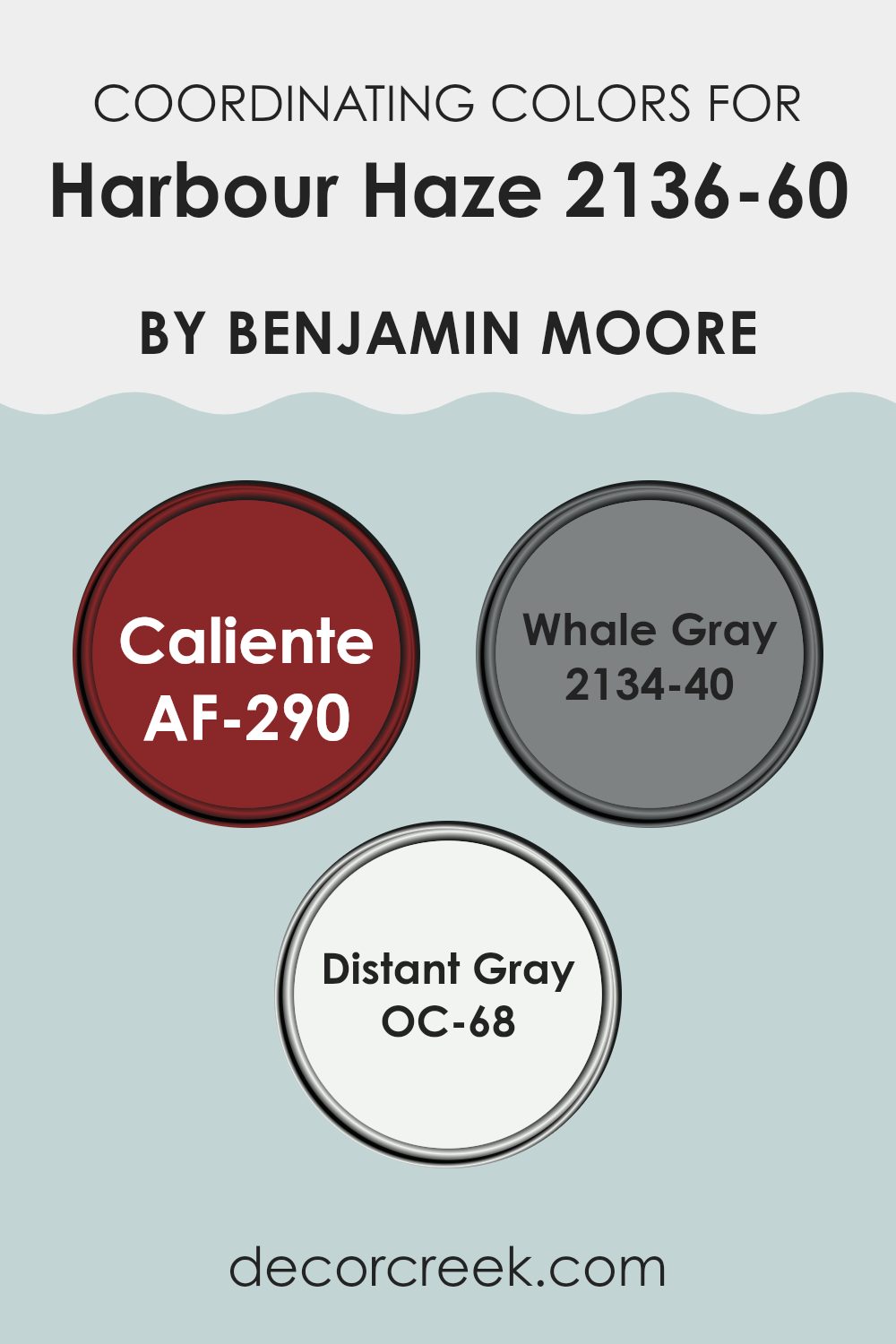
Coordinating Colors of Harbour Haze 2136-60 by Benjamin Moore
Coordinating colors are those that complement and balance each other when used together in decorating. These colors are chosen to create harmony in a room, ensuring that none of them overpower the other and that the overall appearance is cohesive.
When using paints like Benjamin Moore’s Harbour Haze, finding the right coordinating colors can enhance the aesthetic and set the desired mood in a room. Coordinating colors can be from the same color palette or contrasting shades that work well together.
For instance, AF-290 Caliente by Benjamin Moore is a vibrant, bold red that adds energy and warmth to a room. It works well with Harbour Haze as it provides a striking contrast that can liven up any room, making it feel inviting and dynamic.
On the cooler side, 2134-40 Whale Gray is a deep, soothing gray that offers a grounding effect, perfect for creating a balanced look when paired with the lighter hues of Harbour Haze. It’s ideal for adding depth and polish without overpowering the room.
Lastly, OC-68 Distant Gray is a very light, almost white gray that offers a crisp, clean look. This color complements Harbour Haze by providing a subtle contrast, enhancing the room without demanding attention, perfect for creating a light and airy atmosphere. Together, these colors support one another to achieve a cohesive and harmonious look.
You can see recommended paint colors below:
- AF-290 Caliente
- 2134-40 Whale Gray
- OC-68 Distant Gray
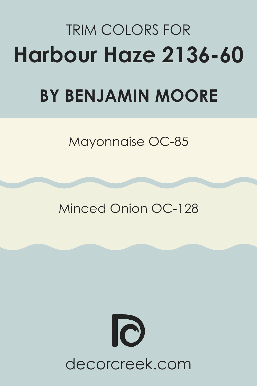
What are the Trim colors of Harbour Haze 2136-60 by Benjamin Moore?
Trim colors are the accent colors used on the architectural elements such as door frames, moldings, and baseboards of a room or exterior of a building. In the context of using Harbour Haze by Benjamin Moore for the main wall color, selecting the right trim colors is crucial for creating a harmonious and pleasing visual effect.
Trim colors like OC-85 – Mayonnaise and OC-128 – Minced Onion complement Harbour Haze by offering a subtle contrast that helps define and highlight the architectural details of the room, giving it an attractive and well-finished look.
Mayonnaise OC-85 is a warm, creamy white that can bring a gentle brightness to the edges where it is applied, softening the overall aesthetic without overpowering the delicate tone of Harbour Haze. On the other hand, Minced Onion OC-128 is a muted, neutral shade with a hint of warmth, perfect for adding slight depth and complexity to the trim, effectively outlining features and fostering an inviting feel. Both colors support the primary hue without creating harsh contrasts, enhancing the room’s appeal gently and effectively.
You can see recommended paint colors below:
- OC-85 Mayonnaise
- OC-128 Minced Onion
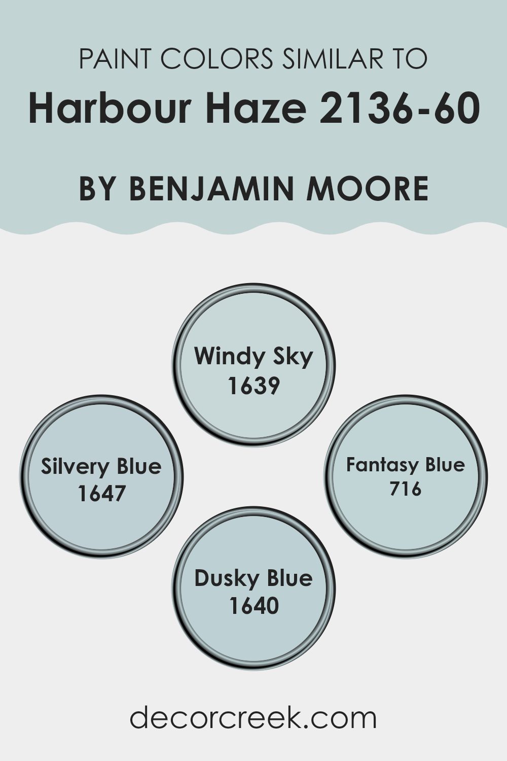
Colors Similar to Harbour Haze 2136-60 by Benjamin Moore
Selecting similar colors when designing a room is crucial because they create a harmonious aesthetic and encourage a seamless flow throughout the area. Similar colors, like those close to Harbour Haze by Benjamin Moore, share common undertones but vary slightly in shade, offering subtle contrasts that can enhance the depth and dimension of a room. These variations allow designers to craft rooms that feel coherent and smoothly linked, without the sharp transitions that come with pairing highly contrasting colors.
For instance, Windy Sky is a gentle gray-blue that evokes the calmness of an overcast seaside morning, making it perfect for creating a peaceful atmosphere. Another color, Silvery Blue, has a hint of metallic shimmer that subtly reflects light, adding a layer of visual interest to a room without overpowering the senses.
Fantasy Blue provides a slightly more pronounced blue hue, reminiscent of a dreamy sky, adding a touch of whimsy to rooms. Lastly, Dusky Blue offers a deeper, more muted tone, ideal for adding a bit of mystery and depth to an interior. These hues work well together because they share a cool-toned foundation yet each presents a unique vibe, enabling designers to create a cohesive yet varied aesthetic within a room.
You can see recommended paint colors below:
- 1639 Windy Sky
- 1647 Silvery Blue
- 716 Fantasy Blue
- 1640 Dusky Blue
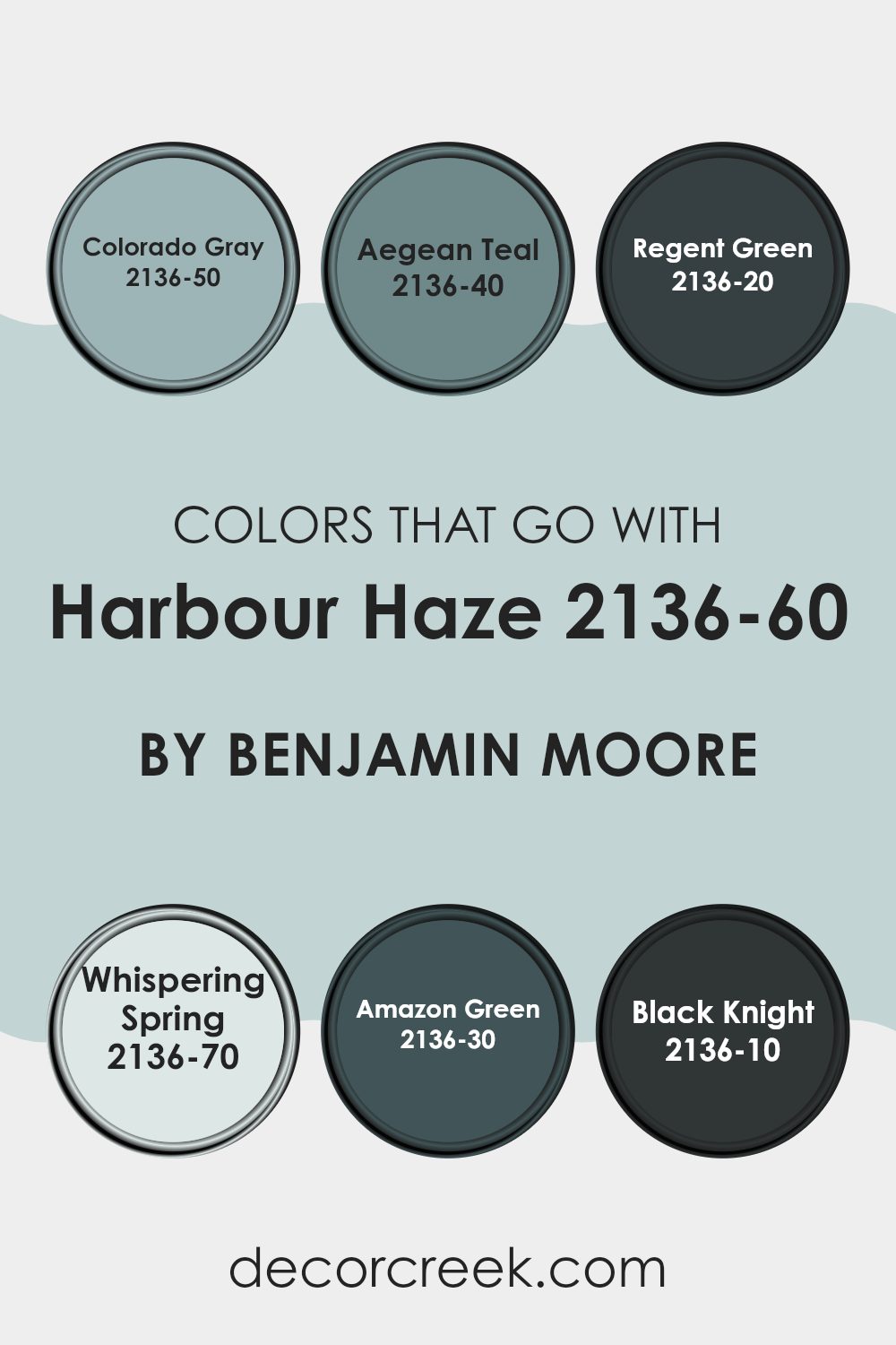
Colors that Go With Harbour Haze 2136-60 by Benjamin Moore
Choosing the right colors to pair with Harbour Haze 2136-60 by Benjamin Moore is crucial in creating a harmonious and inviting atmosphere in any room. Harbour Haze is a soft, neutral gray that serves as a flexible backdrop, making it easy to pair with a range of colors to create different moods and styles. When selected thoughtfully, these complementary shades enhance the beauty and adaptability of Harbour Haze, allowing it to blend seamlessly into various design schemes.
Colorado Gray 2136-50 is a deeper, moodier gray that provides a striking contrast to the lighter Harbour Haze, making any room feel more grounded and cozy. Next, Aegean Teal 2136-40 presents a unique mix of blue and green, offering a touch of color that is both refreshing and calming—perfect for adding a sense of refinement without overpowering the senses.
Regent Green 2136-20, a rich and deep green, brings a sense of luxury and depth, ideal for creating striking focal points in a room. On the lighter side, Whispering Spring 2136-70 is a delicate, airy blue that introduces a breath of freshness, enhancing the light and open feel of Harbour Haze. Amazon Green 2136-30 is a vibrant, lush green that injects vitality and energy into the room, complementing the neutrality of Harbour Haze beautifully.
Lastly, Black Knight 2136-10 offers a bold, dramatic black that can be used selectively to add sophistication or to anchor lighter hues like Harbour Haze, preventing the design from feeling too light. Each of these colors, when combined with Harbour Haze, creates a balanced and visually engaging palette that makes any home feel both stylish and comfortable.
You can see recommended paint colors below:
- 2136-50 Colorado Gray
- 2136-40 Aegean Teal
- 2136-20 Regent Green
- 2136-70 Whispering Spring
- 2136-30 Amazon Green
- 2136-10 Black Knight
How to Use Harbour Haze 2136-60 by Benjamin Moore In Your Home?
Harbour Haze 2136-60 by Benjamin Moore is a gentle and inviting blue paint color that brings a breezy, coastal feel to any room. Its soft tone makes it perfect for creating a relaxing atmosphere in your home. You can use this adaptable shade in various rooms.
For instance, painting your living room walls with Harbour Haze can create a calm setting for your family and guests. It’s also an excellent choice for bedrooms, where its soothing qualities help promote restful sleep. Additionally, this color works well in bathrooms, offering a light and airy feel that enhances the sense of cleanliness and freshness.
If you’re not ready to commit to painting entire walls, consider using Harbour Haze for accent pieces like a bookshelf or cabinets to add a subtle touch of color without overpowering the room. Pairing it with whites or neutral tones can keep your decor looking fresh and modern.
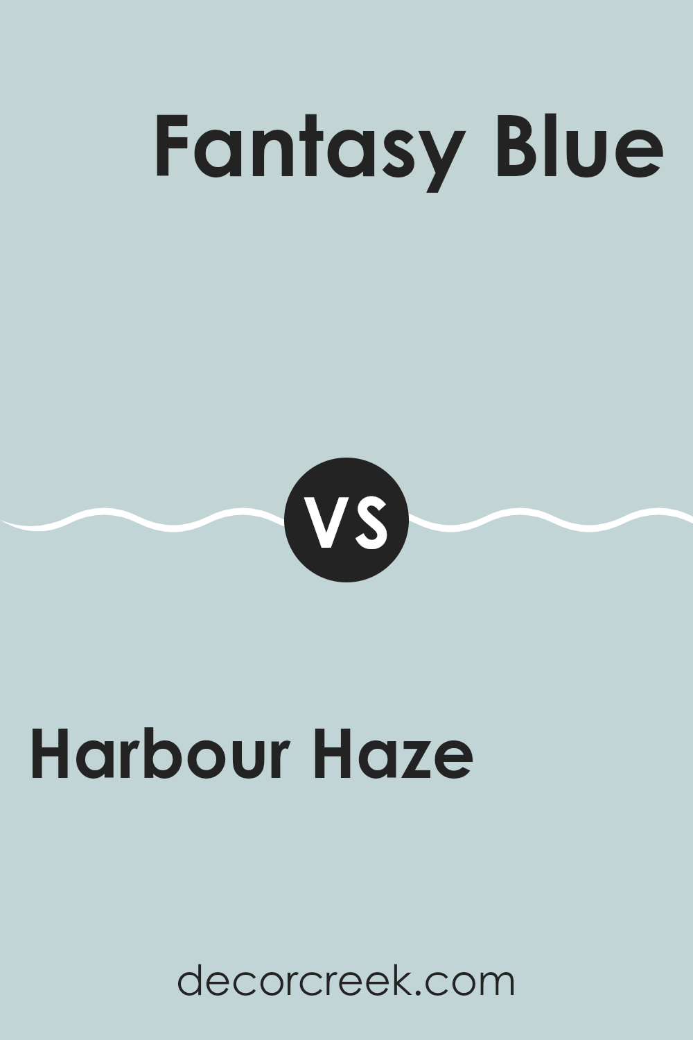
Harbour Haze 2136-60 by Benjamin Moore vs Fantasy Blue 716 by Benjamin Moore
Harbour Haze is a soft, light gray with a hint of blue that gives it a gentle, welcoming vibe. It’s subtle enough to work in any room, lending a clean and airy feel to rooms that need a touch of brightness without overpowering them.
On the other hand, Fantasy Blue is a more vivid, sky-like blue. It’s brighter and more noticeable compared to Harbour Haze, bringing a cheerful and fresh look wherever it’s used. While Harbour Haze might blend into the background, Fantasy Blue stands out more, making it a great choice for a focal point in a room.
Both colors reflect light well and can make a room feel larger, but they serve different moods and intentions within interior design. While Harbour Haze is more neutral and adaptable, Fantasy Blue adds a splash of energy and playfulness to a room.
You can see recommended paint color below:
- 716 Fantasy Blue
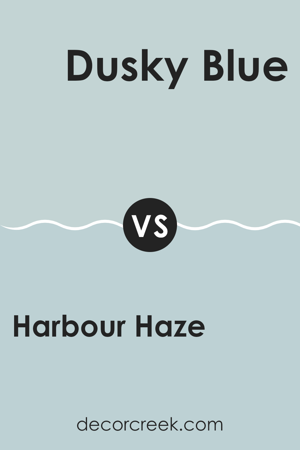
Harbour Haze 2136-60 by Benjamin Moore vs Dusky Blue 1640 by Benjamin Moore
Harbour Haze and Dusky Blue by Benjamin Moore are both calming colors, but they bring different moods to a room. Harbour Haze is a soft, light gray with a subtle hint of blue. It’s very gentle and makes rooms feel open and airy, perfect for creating a relaxed atmosphere. It works beautifully in rooms that receive plenty of natural light.
On the other hand, Dusky Blue is a deeper, more pronounced blue. It has a muted quality that adds a sense of warmth and comfort to rooms. Unlike the lighter Harbour Haze, Dusky Blue can make a room feel more enclosed but in a cozy, inviting way. It’s ideal for a room where you want to feel grounded and relaxed.
Both colors are beautiful and can work well depending on the mood you want to create—light and open or snug and comforting. Mixing and matching these shades in décor pieces can also bring a balanced and appealing visual effect to your home.
You can see recommended paint color below:
- 1640 Dusky Blue
Harbour Haze 2136-60 by Benjamin Moore vs Windy Sky 1639 by Benjamin Moore
The two colors, Harbour Haze and Windy Sky by Benjamin Moore, share a calming feel but have distinct undertones and brightness levels. Harbour Haze is a lighter shade that resembles a pale, soft gray with hints of blue. It has a fresh, airy quality that makes rooms feel open and relaxed. It’s perfect if you’re aiming for a gentle, soothing backdrop in a room.
On the other hand, Windy Sky is a deeper shade that leans more toward a true blue, though it still maintains a muted, subtle character. This color adds a bit more depth and character to rooms compared to Harbour Haze, offering a touch of richness without overpowering the senses. It’s ideal for creating a cozy, comforting environment.
Both colors work beautifully in rooms designed for a calm and peaceful atmosphere. They differ mainly in their depth and the strength of their blue tones, giving you flexibility depending on the mood you want to create in your room.
You can see recommended paint color below:
- 1639 Windy Sky
Harbour Haze 2136-60 by Benjamin Moore vs Silvery Blue 1647 by Benjamin Moore
Harbour Haze and Silvery Blue, both from Benjamin Moore, offer unique shades for different tastes in interior design. Harbour Haze is a gentle light gray with a touch of blue, creating a subtle, soothing atmosphere. It’s reminiscent of a misty morning sky and perfect for those who want a clean, airy feel in their room.
On the other hand, Silvery Blue is a more defined blue that leans toward a classic, soft appearance. This color has a calming effect similar to Harbour Haze but is slightly deeper and richer, reflecting the tone of early dawn. It’s ideal for rooms where you want a touch of color while maintaining a peaceful mood.
While both colors promote a relaxed setting, Harbour Haze is more neutral, blending easily with a variety of decor styles. Silvery Blue, with its more noticeable blue tone, serves as a gentle yet distinct backdrop, potentially becoming a focal point in a room. The choice between the two depends on whether you prefer the subtle neutrality of gray-blue or a soothing, more pronounced blue presence to shape your room’s atmosphere.
You can see recommended paint color below:
- 1647 Silvery Blue
In wrapping up my thoughts on Benjamin Moore’s 2136-60 Harbour Haze, I must say, it’s a lovely color for any room. This shade is a gentle gray that looks great both during the day and at night. In daylight, it’s bright and soft, making a room feel open and cheerful. At night, it becomes a cozy backdrop that helps you unwind.
Using Harbour Haze was a wonderful choice for my bedroom. It added a calm atmosphere, perfect for relaxing or reading my favorite books. I also tried it in the kitchen, and it made the room look clean and welcoming. My friends noticed it right away and loved it!
What’s especially nice about Harbour Haze is how easily it pairs with different decorations and furniture styles, whether modern or classic. It’s great for someone like me who enjoys changing things up without needing to repaint every time.
So, if you’re looking for a new color for your home, consider Harbour Haze. It’s a friendly, peaceful shade that makes any room look fresh and inviting. Plus, it’s fascinating to see how it shifts with the light and always makes the room feel perfectly balanced.
Ever wished paint sampling was as easy as sticking a sticker? Guess what? Now it is! Discover Samplize's unique Peel & Stick samples.
Get paint samples

