Welcome to our article on SW 6866 Heartthrob by Sherwin Williams, a color that’s more than just a shade—it’s an emotion. In the vast palette of Sherwin Williams, Heartthrob stands out as a bold, lively red that brings energy and warmth to any space. It’s a color that can easily transform the mood of a room, making it feel vibrant and full of life.
Whether you’re thinking about adding a pop of color to your living room or want to create a statement wall in your bedroom, Heartthrob offers a dynamic and passionate hue that’s hard to overlook.
In this article, we’ll explore how Heartthrob can be used in different parts of the home, from accent walls to full room makeovers. We’ll also provide tips on color combinations and decor items that work well with this striking shade. Plus, for those concerned about the practical aspects of bringing such a bold color into their homes, we’ll offer advice on paint finishes and lighting to make sure Heartthrob looks its best in any light.
Whether you’re a seasoned interior designer or a homeowner searching for inspiration, Heartthrob by Sherwin Williams offers a unique opportunity to create a space that’s both warm and inviting, yet incredibly stylish. Let’s explore how this breathtaking color can change the feel of your home and reflect your personal style.
What Color Is Heartthrob SW 6866 by Sherwin Williams?
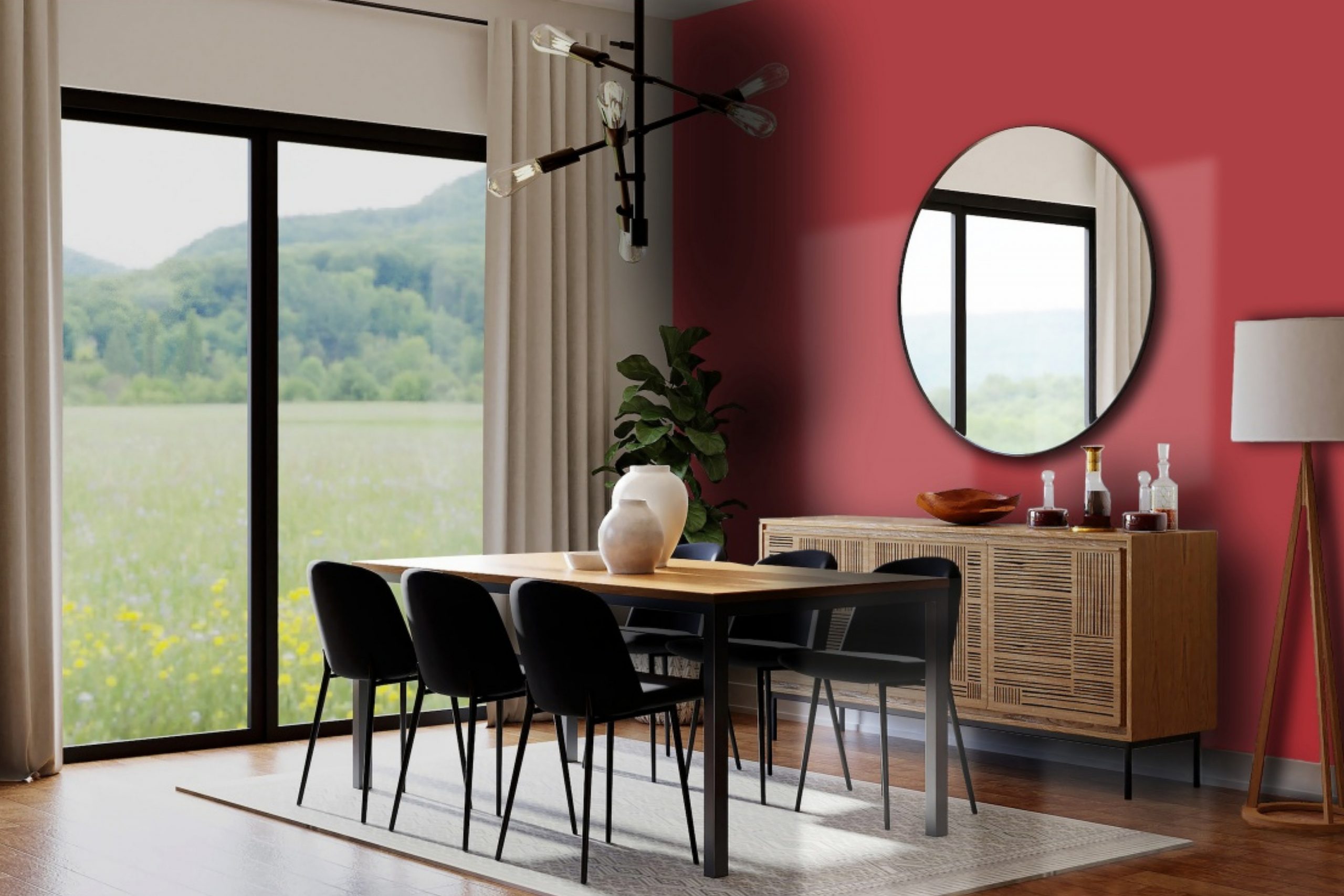
Heartthrob by Sherwin Williams is a vibrant, bold red color that truly stands out. This shade of red is warm and inviting, making it a perfect choice for adding a splash of energy and personality to any space. It’s the kind of color that can create a stunning feature wall in a living room or add a cozy, intimate vibe to a dining area. Heartthrob has a certain charm that can transform a dull room into a lively, dynamic space.
When it comes to interior styles, this lively red works wonders with modern and eclectic decor. It’s a color that pairs beautifully with minimalist furnishings, allowing the red to really pop against a more subdued backdrop. In terms of materials, Heartthrob looks stunning when combined with natural wood, as the warmth of the wood complements the depth of the red. Think of light oak flooring or walnut furniture pieces that balance the intensity of the red with their natural, earthy tones.
Metallic accents in gold or brass can also enhance the richness of Heartthrob, adding a luxurious touch to the overall decor. For textures, consider soft, plush fabrics like velvet to add a layer of sophistication and comfort to the bold backdrop created by Heartthrob. Whether it’s a velvet-upholstered armchair or rich, heavy drapes, combining such textures with this Sherwin Williams red can achieve a cozy yet stylish interior.

Is Heartthrob SW 6866 by Sherwin Williams Warm or Cool color?
Heartthrob by Sherwin Williams is a rich, vibrant shade of red that brings a bold and energetic touch to any home. This color has a unique way of creating a strong visual impact; it can transform a plain room into a lively and engaging space. When used on an accent wall or in decorative elements, Heartthrob adds a warm and invigorating atmosphere, making any room feel more welcoming and dynamic. In homes, this color works especially well in living rooms or dining areas, where it encourages conversation and togetherness.
Although it’s a powerful color, it’s also surprisingly versatile. Paired with neutral tones like white, gray, or black, Heartthrob can stand out without overwhelming a space. This balance is key to integrating such a bold color tastefully within a home’s interior. However, it’s important to use it thoughtfully, as too much can make a space feel smaller or overly intense.
Overall, Heartthrob offers a fantastic way to inject personality and vibrancy into your home, turning ordinary rooms into striking statements.
Undertones of Heartthrob SW 6866 by Sherwin Williams
Heartthrob by Sherwin Williams is a bold and vibrant color that brings a lot of personality to any room. When we look at this color, it’s not just a simple shade; there are subtle colors mixed in that affect how we see it. These are called undertones. For Heartthrob, the undertones are red, purple, pink, olive, orange, grey, pale pink, dark grey, navy, dark green, and dark turquoise. These undertones can make the color change slightly under different lighting or when paired with other colors.
For example, the red undertone makes the color warm and inviting, perfect for a cozy living room. The purple and pink undertones add a soft, playful vibe, making it a great choice for a child’s bedroom or a creative space. The presence of dark grey and navy can give it a more sophisticated look, ideal for a study or dining room.
In interior walls, these undertones can really affect the mood of a room. Natural light can highlight the pink and orange undertones, making the space feel bright and cheerful. In artificial light, the darker undertones like dark green and dark turquoise might stand out, giving the room a more grounded and calming atmosphere.
Overall, the undertones in Heartthrob can make it very versatile. By understanding these nuances, you can choose decor and accents that either complement or contrast with these undertones, depending on the effect you’re going for. This way, Heartthrob can fit a wide range of tastes and settings, making it a fantastic choice for adding a pop of color to your home.
What is the Masstone of the Heartthrob SW 6866 by Sherwin Williams?
Heartthrob SW 6866 by Sherwin Williams features a masstone of brown, represented by the code #802B2B. This masstone gives the color a rich, warm foundation that is incredibly versatile for home decor. Being a deep, almost chocolate-infused red, it brings a cozy and comforting atmosphere to any space. This particular shade of brown works wonders in creating a welcoming environment, whether it’s painted on a statement wall or used in accent pieces throughout a room.
When applied in homes, this color has a unique way of making spaces feel more intimate and grounded. It pairs beautifully with natural wood finishes, metals, and creamy whites, offering a perfect balance for those looking to create a space that feels both sophisticated and snug. The warmth of the color can enhance the lighting in a room, making it feel brighter or more subdued depending on the time of day.
This adaptability makes it an excellent choice for living rooms, bedrooms, and even dining areas, where the goal is to foster a sense of togetherness and comfort.
How Does Lighting Affect Heartthrob SW 6866 by Sherwin Williams?
Lighting plays a crucial role in how we perceive colors in our environment, impacting their intensity, shade, and overall vibe. When considering a specific color, like a vibrant red hue from Sherwin Williams, the influence of light can significantly alter its appearance in a room.
In artificial light, the warmth or coolness of the bulbs can affect how this rich red is viewed. Warm lighting tends to enhance the red’s depth, making it appear more cozy and inviting. On the other hand, cool-toned lights can make the red seem a bit sharper, potentially adding a more modern or edgy feel to the space.
Natural light brings its own dynamic changes to colors. Under the sun’s rays, this red can reveal all its complexity, shifting in brightness and saturation throughout the day. In a north-facing room, which typically receives cooler, softer light, the red might appear more muted, leaning towards a subtler, more sophisticated look. This setting won’t do much to brighten the color but will certainly highlight its deeper tones.
In a south-facing room, bathed in warm, bright light for most of the day, the red will likely look its most vibrant and energized. The ample sunlight can make the color pop, giving the room a lively and cheerful ambiance. It’s in these rooms that the color can truly shine, showing off its richness to the fullest.
Rooms facing east catch the morning sun, which can make the red feel warm and welcoming in the morning, gradually transitioning to a cooler tone as the day progresses. This direction allows the color to display a nice range of its personality, from a bright and energetic start to a more subdued and calm ending.
West-facing rooms get the evening sun, which means the red will spend much of the day under a cooler tone before warming up in the afternoon and evening. This lighting can make the color feel quite dynamic, as it shifts from somewhat reserved to a more striking presence as the day ends.
In conclusion, the perception of this vibrant red hue hugely depends on the interplay between the color and the lighting conditions in the room, ranging from cozy and sophisticated in lower light to bold and dynamic in brighter settings.

What is the LRV of Heartthrob SW 6866 by Sherwin Williams?
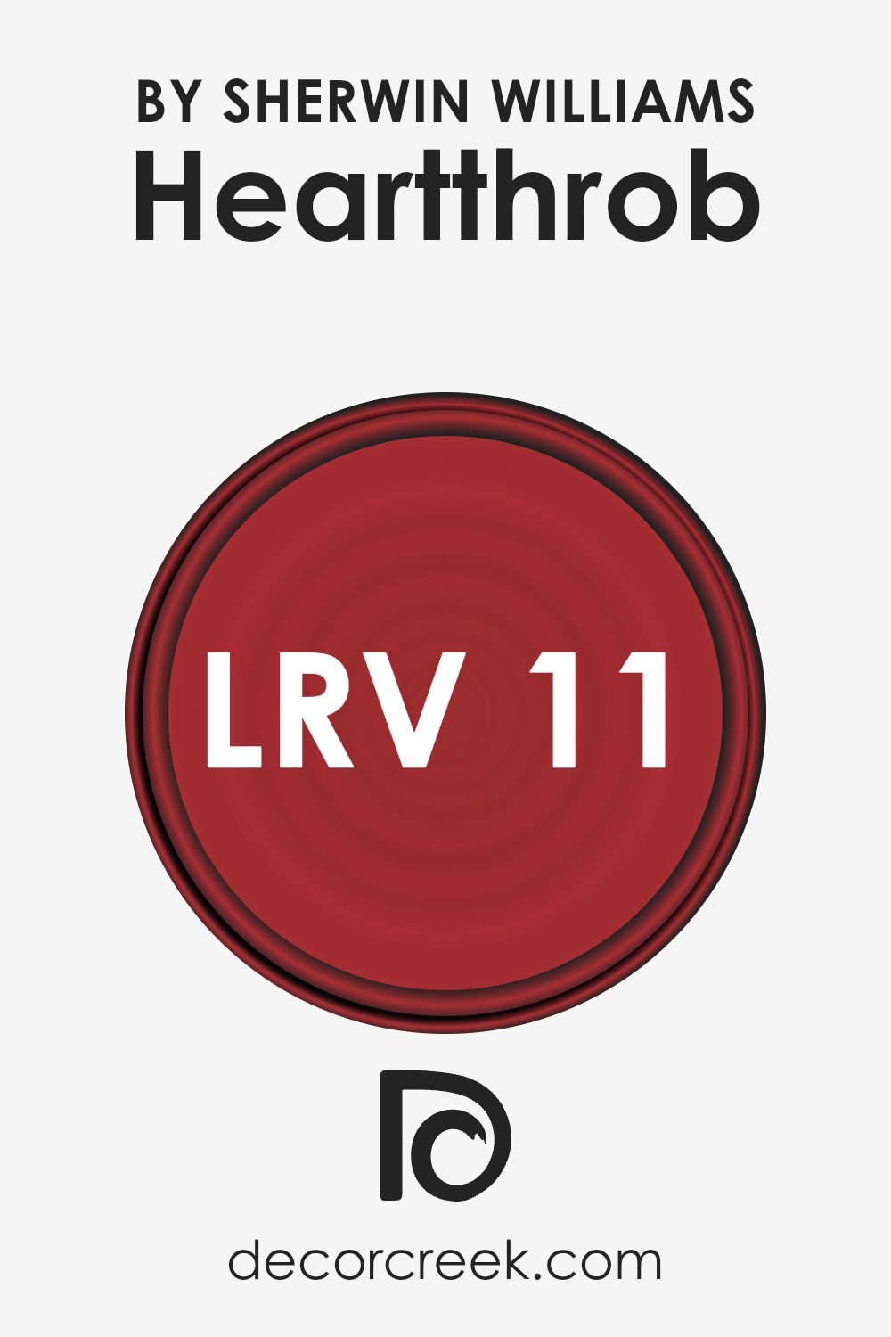
With an LRV of 10.552, Heartthrob (SW 6866) by Sherwin Williams is on the lower end of the scale, meaning it’s a dark color that absorbs more light than it reflects. In practical terms, this means that when used on walls, Heartthrob will give the room a rich, deep ambiance but may also make the space feel smaller or more enclosed.
It’s an ideal choice for creating dramatic or statement spaces but can make well-lit rooms feel darker. Therefore, it’s essential to consider the lighting in your room when choosing to use this color, as it prominently affects the mood and perceived size of your interior spaces.
Coordinating Colors of Heartthrob SW 6866 by Sherwin Williams
Coordinating colors play a crucial role in design by creating a visually harmonious space. When we talk about coordinating colors, we’re referring to a palette of shades that work well together to enhance the overall aesthetic appeal of an area. This concept is essential in interior design, fashion, and art, helping to create a balanced look that is pleasing to the eye.
For example, when using a vibrant shade like a deep red, finding the right coordinating colors ensures that the space feels cohesive and thoughtfully designed rather than overwhelming or disjointed.
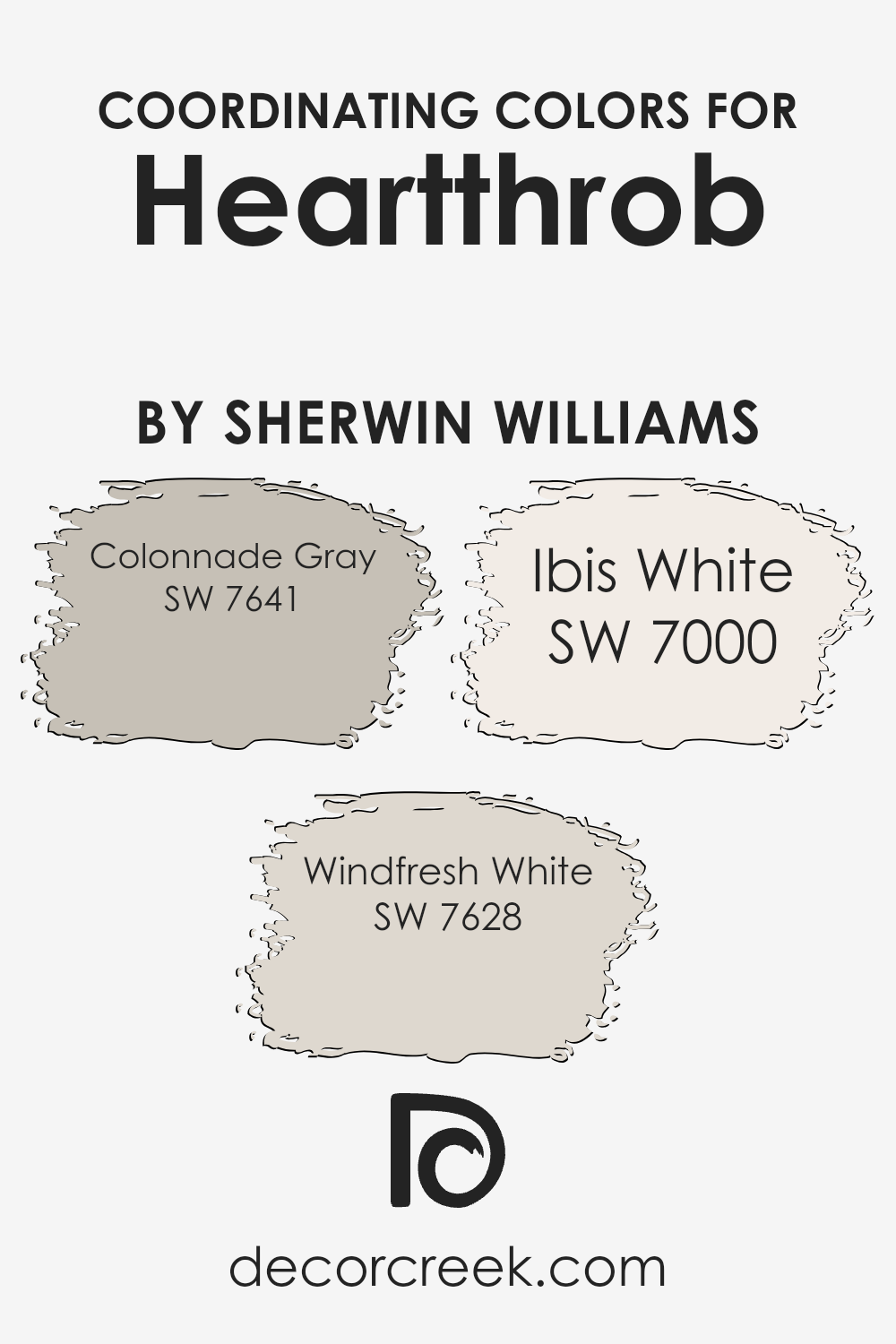
Consider the rich shade of Sherwin Williams’ Heartthrob as a starting point. To complement this bold color, coordinating colors such as Colonnade Gray, Windfresh White, and Ibis White can be used. Colonnade Gray is a versatile neutral with warm undertones that provide a soft contrast to the intensity of Heartthrob, making spaces feel grounded and calm.
Windfresh White offers a clean, crisp background that allows the red to truly stand out, giving rooms a fresh and airy feel. Lastly, Ibis White has a slightly warmer tone compared to Windfresh White, creating a subtle, inviting ambiance that pairs beautifully with both Heartthrob and Colonnade Gray.
Together, these colors work in harmony to create designs that are both balanced and dynamic, allowing each color to shine without overpowering the others.
You can see recommended paint colors below:
- SW 7641 Colonnade Gray
- SW 7628 Windfresh White
- SW 7000 Ibis White
What are the Trim colors of Heartthrob SW 6866 by Sherwin Williams?
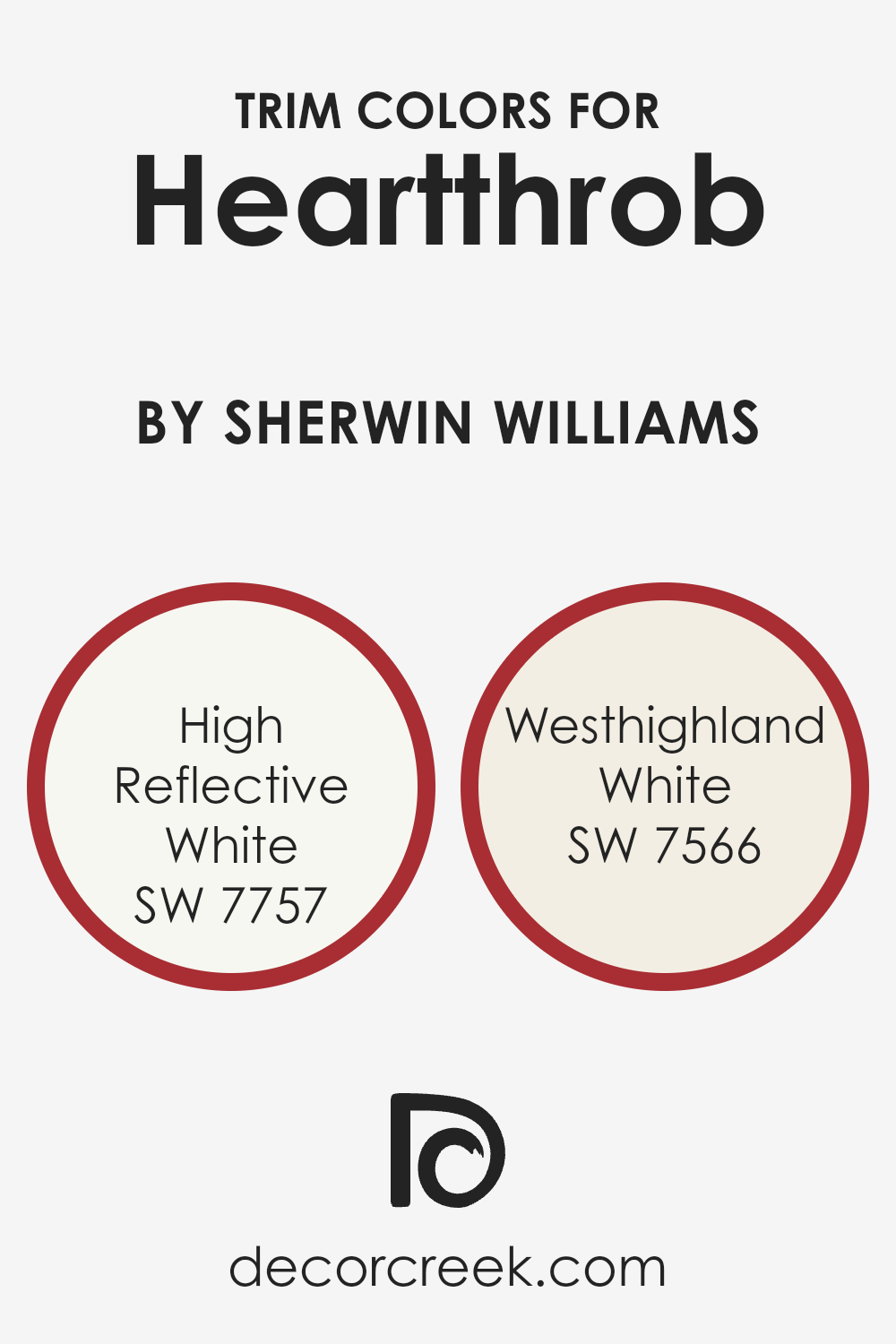
Trim colors are essentially the accents chosen to highlight or frame different elements within your home, such as door frames, window sills, and baseboards. They play a crucial role in enhancing the aesthetic appeal of your walls and overall interior design by creating a contrasting or complementary backdrop. For a bold color like Heartthrob by Sherwin Williams, choosing the right trim color can soften its intensity or further highlight its vibrancy, depending on the desired effect. It’s about finding the balance that works for your space and taste.
The two trim colors, High Reflective White (SW 7757) and Westhighland White (SW 7566) by Sherwin Williams, offer different but equally effective options for pairing with Heartthrob. High Reflective White is a very bright white with a crisp, clean finish that can make the boldness of Heartthrob pop, providing a sharp contrast that is both modern and striking.
On the other hand, Westhighland White has a warmer, creamier tone, offering a softer transition from the rich, deep red of Heartthrob. This creates a more subtle distinction between the wall and trim, for those who prefer a smoother blend between colors.
You can see recommended paint colors below:
- SW 7757 High Reflective White
- SW 7566 Westhighland White
Colors Similar to Heartthrob SW 6866 by Sherwin Williams
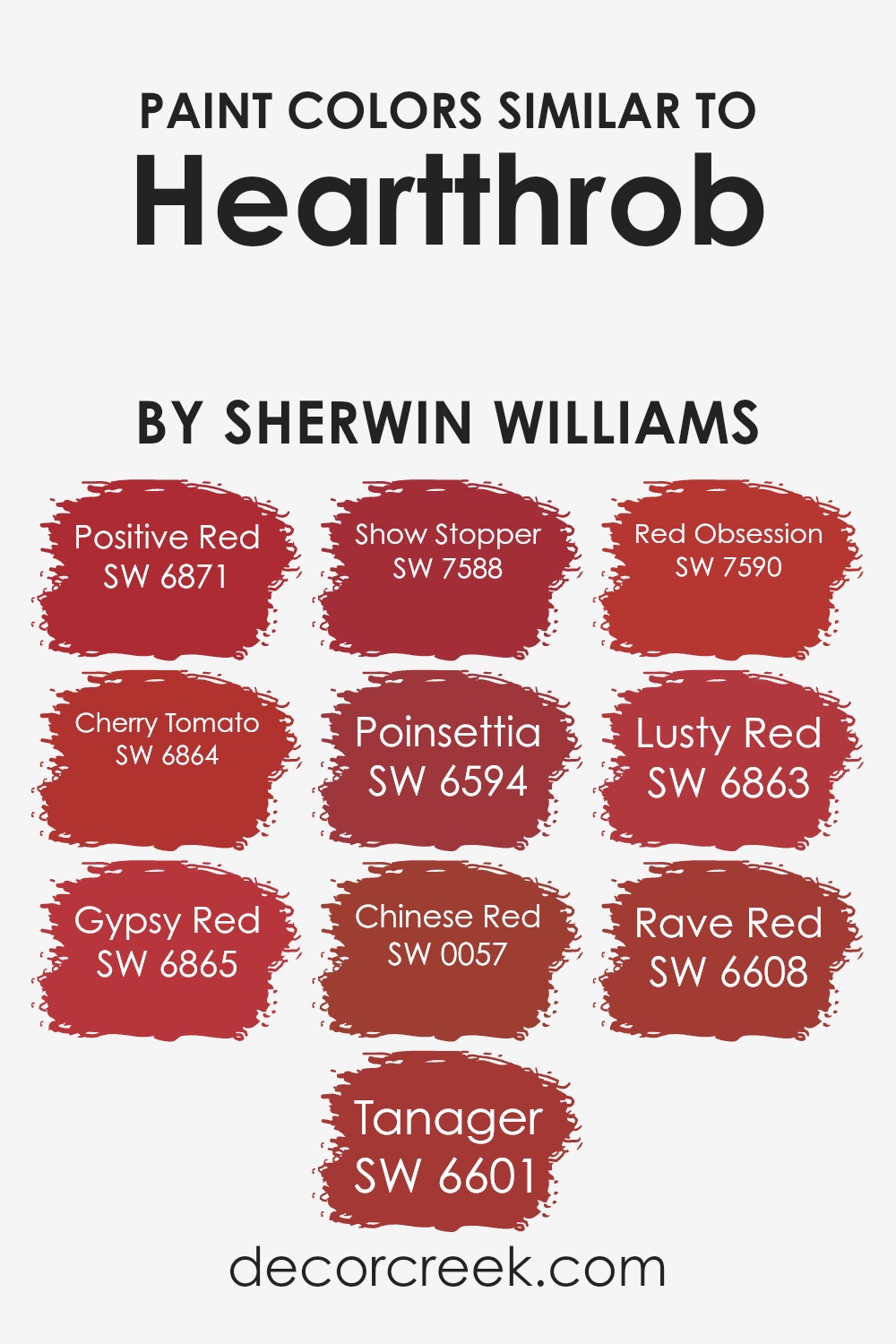
Similar colors play an important role in creating aesthetic harmony and bringing together different elements of design seamlessly. When colors closely match, like the variations similar to Heartthrob by Sherwin Williams, they offer a cohesive look that can make spaces feel more thoughtfully designed and visually appealing. These shades of red carry warmth and energy, making them perfect for adding vibrancy to a room. Their similarity means they can be mixed and matched in various combinations without clashing, allowing for a dynamic yet unified color scheme.
Positive Red is a bright and bold choice, exuding confidence and cheerfulness, while Cherry Tomato adds a slightly more playful tone, with its vibrant and inviting hue. Gypsy Red offers a deeper, more subdued red, perfect for creating a sense of sophistication. Tanager is another shade that leans towards a rich depth, offering an earthy, grounded feel.
Show Stopper is strikingly bold, making a strong statement wherever it’s used. Poinsettia has a classic charm, with its traditional red that’s reminiscent of holiday joy. Chinese Red stands out with its slightly orange undertone, providing a unique twist on a classic red. Red Obsession is deep and intense, offering a dramatic flair.
Lusty Red brings an exotic touch, with its slightly purplish cast for a mysterious vibe. Finally, Rave Red is a bright and energetic color, perfect for spaces that aim to stimulate and invigorate. Together, these colors provide a versatile palette for creating spaces that range from lively and bold to cozy and inviting, all while maintaining a sense of unity and harmony through their shared red tones.
You can see recommended paint colors below:
- SW 6871 Positive Red
- SW 6864 Cherry Tomato
- SW 6865 Gypsy Red
- SW 6601 Tanager
- SW 7588 Show Stopper
- SW 6594 Poinsettia
- SW 0057 Chinese Red
- SW 7590 Red Obsession
- SW 6863 Lusty Red
- SW 6608 Rave Red
Colors that Go With Heartthrob SW 6866 by Sherwin Williams
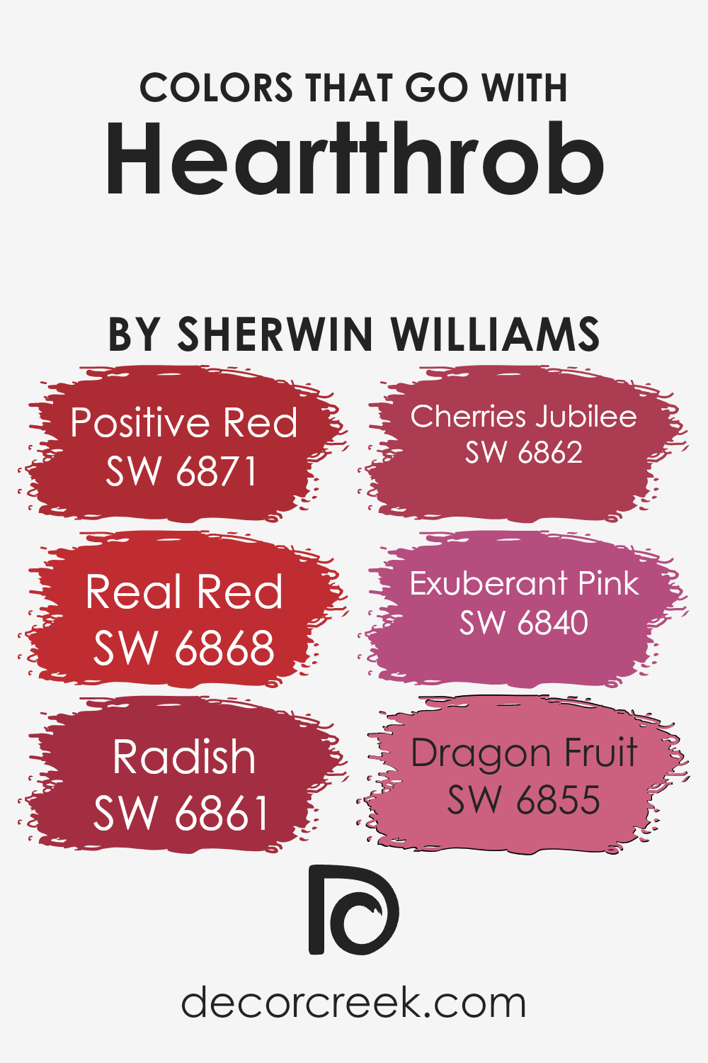
Colors that pair with Heartthrob SW 6866 by Sherwin Williams play a significant role in creating harmonious and appealing spaces. These colors, which include Positive Red SW 6871, Real Red SW 6868, Radish SW 6861, Cherries Jubilee SW 6862, Exuberant Pink SW 6840, and Dragon Fruit SW 6855, work together to enhance the visual dynamics of a room.
Such combinations can transform a simple area into a vibrant and energetic space or add a touch of warmth to a cozy corner, demonstrating the power of color coordination.
Positive Red SW 6871 offers a bright and lively hue that injects a sense of energy and enthusiasm into interiors, making it perfect for accent walls or decorative elements. Real Red SW 6868, on the other hand, is a more grounded shade of red that brings depth and sophistication, ideal for spaces requiring a touch of elegance.
Radish SW 6861 introduces a slightly quirky and unique flavor to décor, offering an unexpected twist that can stimulate creativity. Cherries Jubilee SW 6862 provides a sumptuous and rich tone, akin to the luxuriousness of ripe cherries, adding a layer of decadence to any setting. Exuberant Pink SW 6840 radiates with a youthful and playful spirit, perfect for injecting joy and fun into spaces.
Lastly, Dragon Fruit SW 6855 is a bold and exotic option that stands out, offering a strong statement color that can be the focal point in any room. Together, these colors complement Heartthrob SW 6866 by creating lively, dynamic, and cohesive color schemes that enhance the overall aesthetic of an environment.
You can see recommended paint colors below:
- SW 6871 Positive Red
- SW 6868 Real Red
- SW 6861 Radish
- SW 6862 Cherries Jubilee
- SW 6840 Exuberant Pink
- SW 6855 Dragon Fruit
How to Use Heartthrob SW 6866 by Sherwin Williams In Your Home?
Heartthrob by Sherwin Williams is a vibrant, striking shade of red that can bring warmth and energy into any space in your home. This paint color is perfect for those looking to add a bold statement to their interiors. Whether you’re wanting to paint an accent wall in your living room to create a focal point, or looking to energize your dining area for lively dinners, Heartthrob has the power to transform the mood of a room. It’s also an excellent choice for a bedroom headboard wall, injecting passion and drama into your personal space.
In smaller doses, Heartthrob can be used on furniture or decor items to introduce a pop of color without overwhelming the space. Pair it with neutral tones like white, gray, or beige to balance its intensity, or match it with deep blues or greens for a rich, layered look. Remember, a little goes a long way with this powerful color, so consider your room’s natural light and size when planning your use of Heartthrob.
Heartthrob SW 6866 by Sherwin Williams vs Rave Red SW 6608 by Sherwin Williams
Heartthrob and Rave Red, both by Sherwin Williams, are vibrant colors that catch the eye. While both hues belong to the red family, they have subtle differences. Heartthrob leans towards a deep, rich red with a hint of cherry. This color is bold and makes a statement, perfect for spaces or accents where you want a strong pop of color. On the other hand, Rave Red is slightly warmer.
It carries an energy that’s hard to miss, ideal for creating a lively and welcoming atmosphere. Though similar, Heartthrob gives off a more refined vibe, whereas Rave Red feels more spirited and dynamic. Choosing between them depends on the mood you’re aiming to create. Whether it’s the sophisticated depth of Heartthrob or the cheerful brightness of Rave Red, both colors offer unique charms to spruce up any space.
You can see recommended paint color below:
- SW 6608 Rave Red
Heartthrob SW 6866 by Sherwin Williams vs Chinese Red SW 0057 by Sherwin Williams
Heartthrob and Chinese Red by Sherwin Williams are two vibrant colors that both pack a punch in the red family, yet they have their distinct personalities. Heartthrob is a bold, deep red that seems to pull you in with its richness. It has a certain warmth that makes spaces feel more intimate and cozy, perfect for creating a statement wall or accent pieces that stand out.
On the other hand, Chinese Red is a brighter, more traditional red. It’s a classic shade that brings to mind festive occasions and lively spaces. This color is great for adding a pop of energy and excitement to any room. While both colors are beautiful and bold, Heartthrob leans towards a deeper, more muted tone, making it ideal for elegant, sophisticated spaces. Chinese Red, with its brighter and more eye-catching hue, tends to make spaces feel more dynamic and vibrant.
You can see recommended paint color below:
- SW 0057 Chinese Red
Heartthrob SW 6866 by Sherwin Williams vs Poinsettia SW 6594 by Sherwin Williams
Heartthrob and Poinsettia, both by Sherwin Williams, are vibrant, rich colors, adding personality to any space. Heartthrob is a deep, bold red with a slight hint of pink, making it stand out more and giving a sense of drama and passion. In contrast, Poinsettia leans towards a classic red, reminiscent of the traditional holiday flower it’s named after.
This color feels warmer and more inviting, with a timeless appeal that fits beautifully in spaces meant for gathering and warmth. While both shades are red, Heartthrob has an intensity that draws the eye and makes a strong statement, perfect for accent walls or decor pieces. Poinsettia, on the other hand, offers a more grounded feel, easier to blend with a variety of decor styles, from festive to cozy.
Choosing between them depends on the mood you want to create – Heartthrob for bold, dramatic flair and Poinsettia for warm, welcoming vibes.
You can see recommended paint color below:
- SW 6594 Poinsettia
Heartthrob SW 6866 by Sherwin Williams vs Lusty Red SW 6863 by Sherwin Williams
Heartthrob and Lusty Red are both vibrant colors from Sherwin Williams, but they stand out in their own unique ways. Heartthrob carries a deep, rich tone, almost like a dark cherry. It has a bold presence that can make a strong statement in a room, perfect for creating an accent wall or energizing a small space. On the other hand, Lusty Red is brighter and more vivid.
It leans towards a classic red that can instantly brighten up a space. This color is great for areas where you want to add a pop of energy and passion without overwhelming the senses. While both colors share a vibrant red base, Heartthrob offers depth and intensity, making spaces cozy and dramatic. Lusty Red, however, provides a cheerful and lively vibe, ideal for spaces meant for activity and gatherings.
Choosing between them comes down to the mood you want to set: Heartthrob for deep, dramatic flair, and Lusty Red for bright, energetic spaces.
You can see recommended paint color below:
- SW 6863 Lusty Red
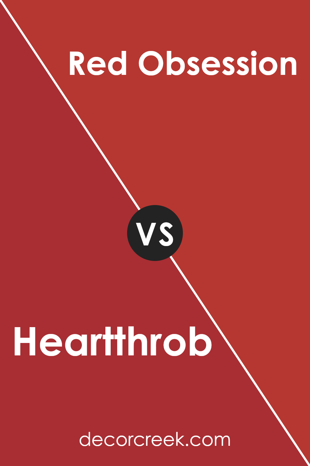
Heartthrob SW 6866 by Sherwin Williams vs Red Obsession SW 7590 by Sherwin Williams
Heartthrob and Red Obsession are two striking colors by Sherwin Williams, both boasting their unique shades of red. Heartthrob is a vivid, bold red that packs a punch. It’s the kind of color that can make a statement in any space, bringing an energetic and lively vibe. On the other hand, Red Obsession offers a slightly deeper, more muted tone.
It’s a sophisticated hue that lends a touch of elegance and depth to rooms, without overwhelming them. While Heartthrob stands out for its brightness and ability to draw attention, Red Obsession brings a sense of warmth and refinement. Choosing between them depends on the mood you want to set: Heartthrob for an upbeat and dynamic atmosphere, and Red Obsession for a classy, grounded ambiance.
Both are beautiful in their own right, tailored to different tastes and spaces.
You can see recommended paint color below:
- SW 7590 Red Obsession
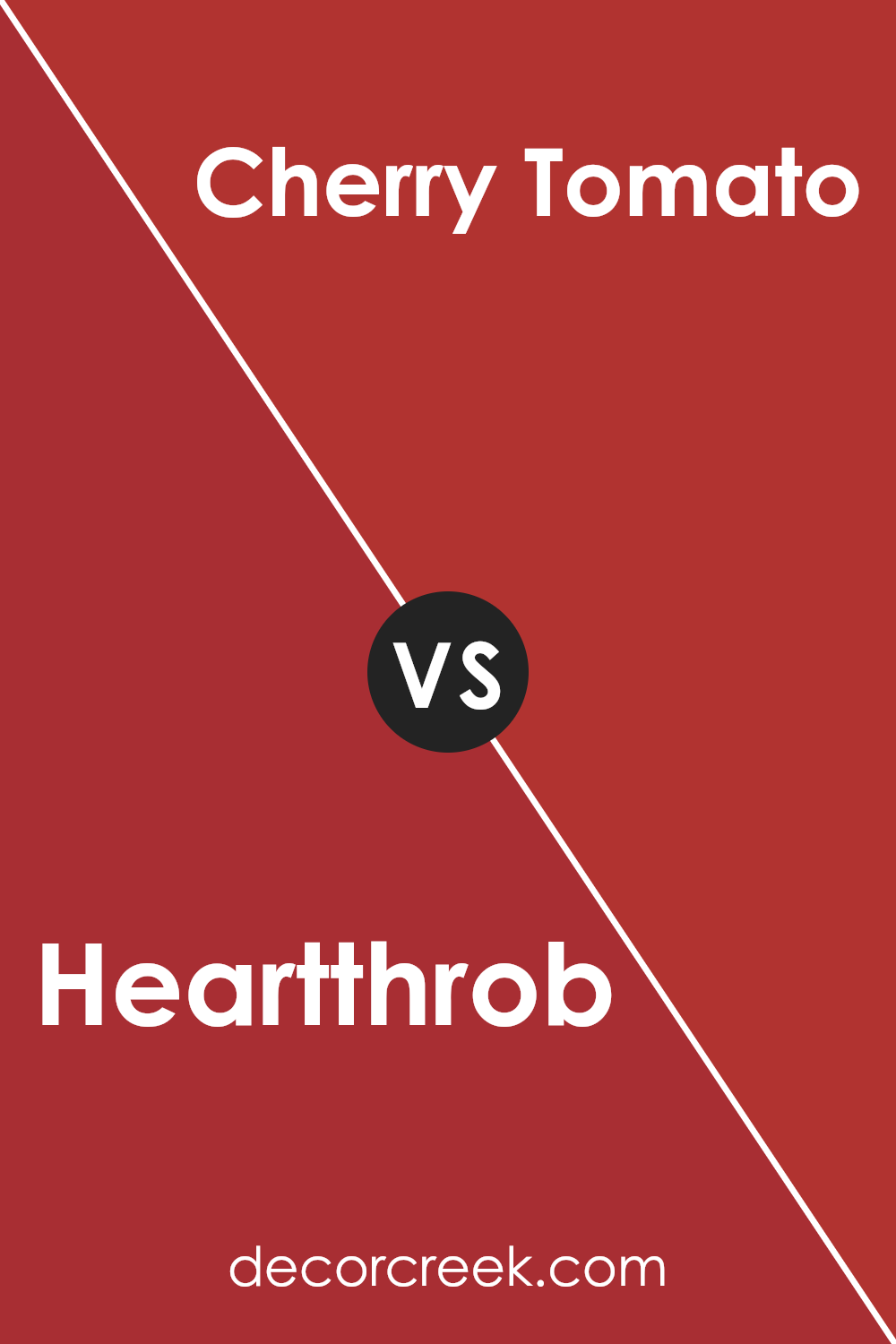
Heartthrob SW 6866 by Sherwin Williams vs Cherry Tomato SW 6864 by Sherwin Williams
Heartthrob and Cherry Tomato are two vibrant shades that offer distinct vibes for any space. Heartthrob, as its name suggests, is a deep, passionate red that feels rich and full of emotion. It’s a color that can make a strong statement on a wall, creating a cozy and dramatic atmosphere.
On the other hand, Cherry Tomato is a brighter, more energetic red. It’s a lively color that brings a sense of cheerfulness and dynamism to a room. While both shades are beautiful, they serve different moods and settings. Heartthrob is perfect for creating a sophisticated and intimate space, ideal for living rooms or bedrooms. Cherry Tomato, with its vivid and spirited hue, works great in kitchens, dining areas, or any space that benefits from a pop of brightness and enthusiasm.
In essence, choosing between them depends on the mood you’re aiming to set—Heartthrob for depth and warmth, Cherry Tomato for vibrancy and energy.
You can see recommended paint color below:
- SW 6864 Cherry Tomato
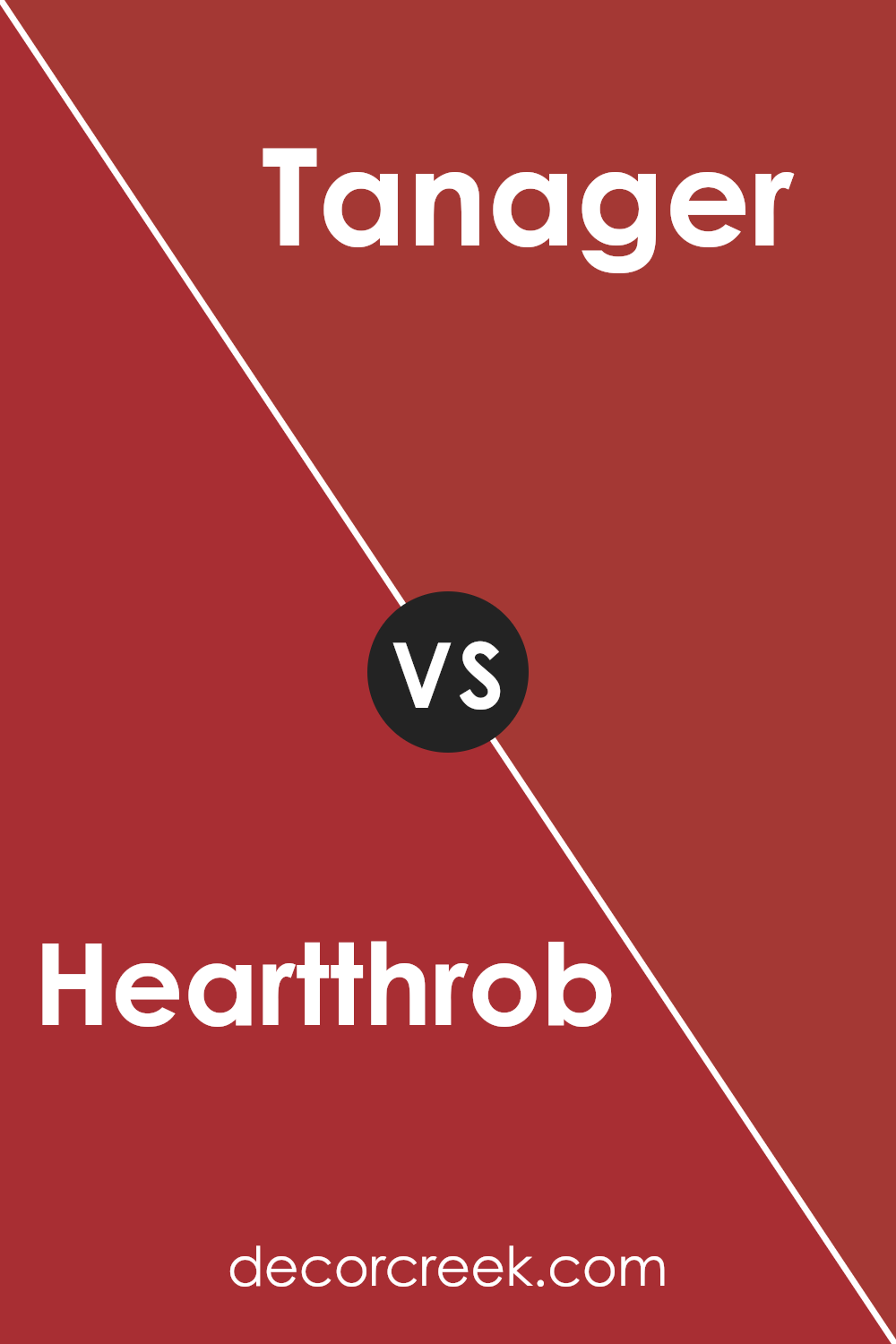
Heartthrob SW 6866 by Sherwin Williams vs Tanager SW 6601 by Sherwin Williams
Heartthrob and Tanager are two vivid colors from Sherwin Williams, each with its own unique vibe. Heartthrob is a deep, rich red that feels bold and striking. It’s the kind of color that makes a statement, whether it’s on a wall or an accent piece, drawing all eyes to it. Its intensity is perfect for spaces or items you want to highlight, bringing warmth and energy.
On the other hand, Tanager is a vibrant, cheerful orange. It’s lighter and has a more playful touch compared to Heartthrob. Tanager can brighten up any space, giving it a fresh, lively look. It’s great for areas where you want to add a pop of color without overwhelming the senses. This color encourages a welcoming, friendly atmosphere.
Although both colors are strong and vivid, Heartthrob leans towards a more dramatic and passionate vibe, while Tanager offers a sense of joy and enthusiasm. Each brings its own flair to the table, making them suitable for different purposes depending on the mood you want to create.
You can see recommended paint color below:
- SW 6601 Tanager
Heartthrob SW 6866 by Sherwin Williams vs Show Stopper SW 7588 by Sherwin Williams
Heartthrob and Show Stopper, both from Sherwin Williams, bring their unique personalities to the palette. Heartthrob is a vibrant, deep red, full of energy and passion. It’s the kind of color that grabs attention in any room, making a bold statement wherever it’s applied. On the other hand, Show Stopper also stands out, but it leans more towards a classic, rich burgundy. While it’s still eye-catching, it has a slightly more refined and sophisticated vibe compared to Heartthrob’s lively punch.
In contrast, Heartthrob is the go-to when you want a space to feel more dynamic and filled with life. It’s perfect for places where activity and enthusiasm are key. Show Stopper, however, is ideal for creating an aura of elegance and depth, making rooms feel cozy yet distinguished. Though both colors are on the bold spectrum, Heartthrob shouts from the rooftops, whereas Show Stopper makes a strong, but quieter, statement.
Choosing between them depends on the mood you want to set: exhilarating and spirited with Heartthrob or classy and stately with Show Stopper.
You can see recommended paint color below:
- SW 7588 Show Stopper

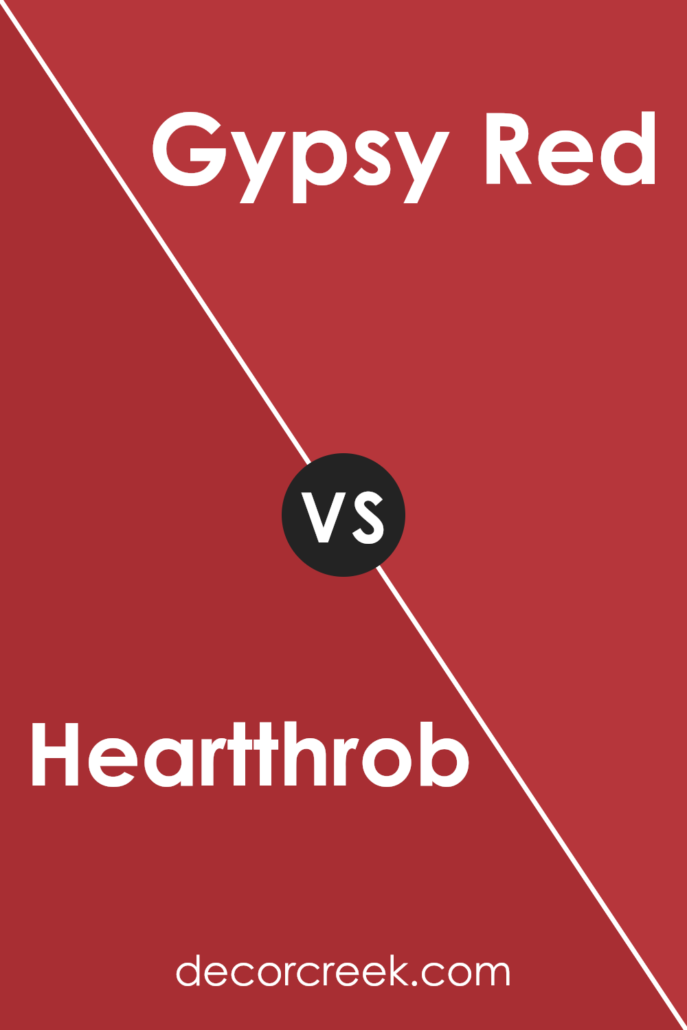
Heartthrob SW 6866 by Sherwin Williams vs Gypsy Red SW 6865 by Sherwin Williams
Heartthrob and Gypsy Red by Sherwin Williams are two vibrant colors that have their unique shades but also share some similarities. Heartthrob stands out with a bold, vivid red that grabs attention instantly. It’s the kind of color that makes a statement, perfect for someone looking to add a dramatic flair to their space.
On the other hand, Gypsy Red offers a slightly more subdued tone. While it’s still in the red family, it comes with a dash of earthiness that gives it a more grounded and warm feel. This makes Gypsy Red ideal for creating cozy and welcoming spaces. Both colors are fantastic choices for anyone looking to inject personality into their interiors.
However, your choice between them might come down to the atmosphere you’re aiming to achieve: Heartthrob for a dynamic and eye-catching vibe, or Gypsy Red for a comforting and inviting ambiance.
You can see recommended paint color below:
- SW 6865 Gypsy Red
Heartthrob SW 6866 by Sherwin Williams vs Positive Red SW 6871 by Sherwin Williams
Heartthrob and Positive Red by Sherwin Williams are both vibrant and eye-catching colors, but they have their unique tones. Heartthrob is a deep, rich red that has a hint of maroon, giving it a cozy yet bold feel. It’s a color that stands out and makes a statement in any space, perfect for someone wanting to add warmth and depth to their décor.
On the other hand, Positive Red is a true, bright red. It’s more energizing and vibrant, with a more straightforward approach to bringing life and excitement into a room. This color can easily brighten up a space and make it look lively and inviting. While both colors share the warmth and boldness of red, Heartthrob leans towards a darker, more sophisticated shade, whereas Positive Red is cheerier and more straightforward with its vividity.
Either choice offers a striking way to incorporate red into your environment, but the mood and atmosphere they create will differ significantly.
You can see recommended paint color below:
- SW 6871 Positive Red
Conclusion
In summary, Heartthrob by Sherwin Williams is a vibrant and bold color that can bring a lively and energetic atmosphere to any space. This hue has the power to make a statement in a room, adding a sense of vitality and passion. Its rich depth makes it an excellent choice for those looking to inject personality and warmth into their home décor.
Whether applied to an accent wall, used for furniture pieces, or incorporated into decorative elements, this color is sure to add a dynamic and inviting touch.
Moreover, Heartthrob’s versatility enables it to complement a wide range of styles and palettes, making it an attractive option for various design projects. Its ability to stand out, yet harmonize with other colors, offers endless possibilities for creating a cozy, yet striking aesthetic. Whether aiming for a modern, eclectic, or traditional look, incorporating this color can help achieve a desired mood and ambience.
Overall, Heartthrob is a fantastic choice for those looking to add a pop of color and energy to their living spaces.

Ever wished paint sampling was as easy as sticking a sticker? Guess what? Now it is! Discover Samplize's unique Peel & Stick samples.
Get paint samples

