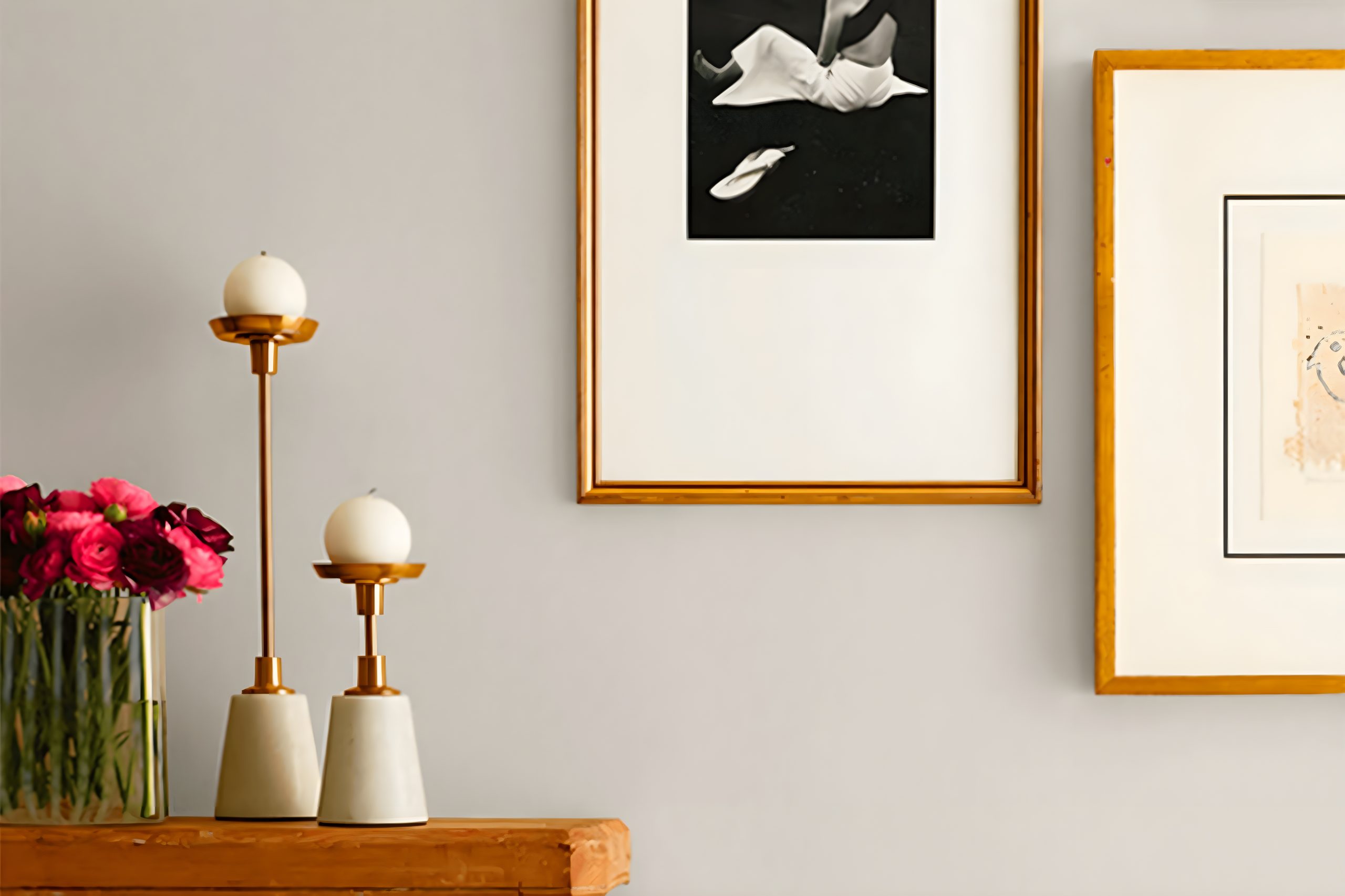
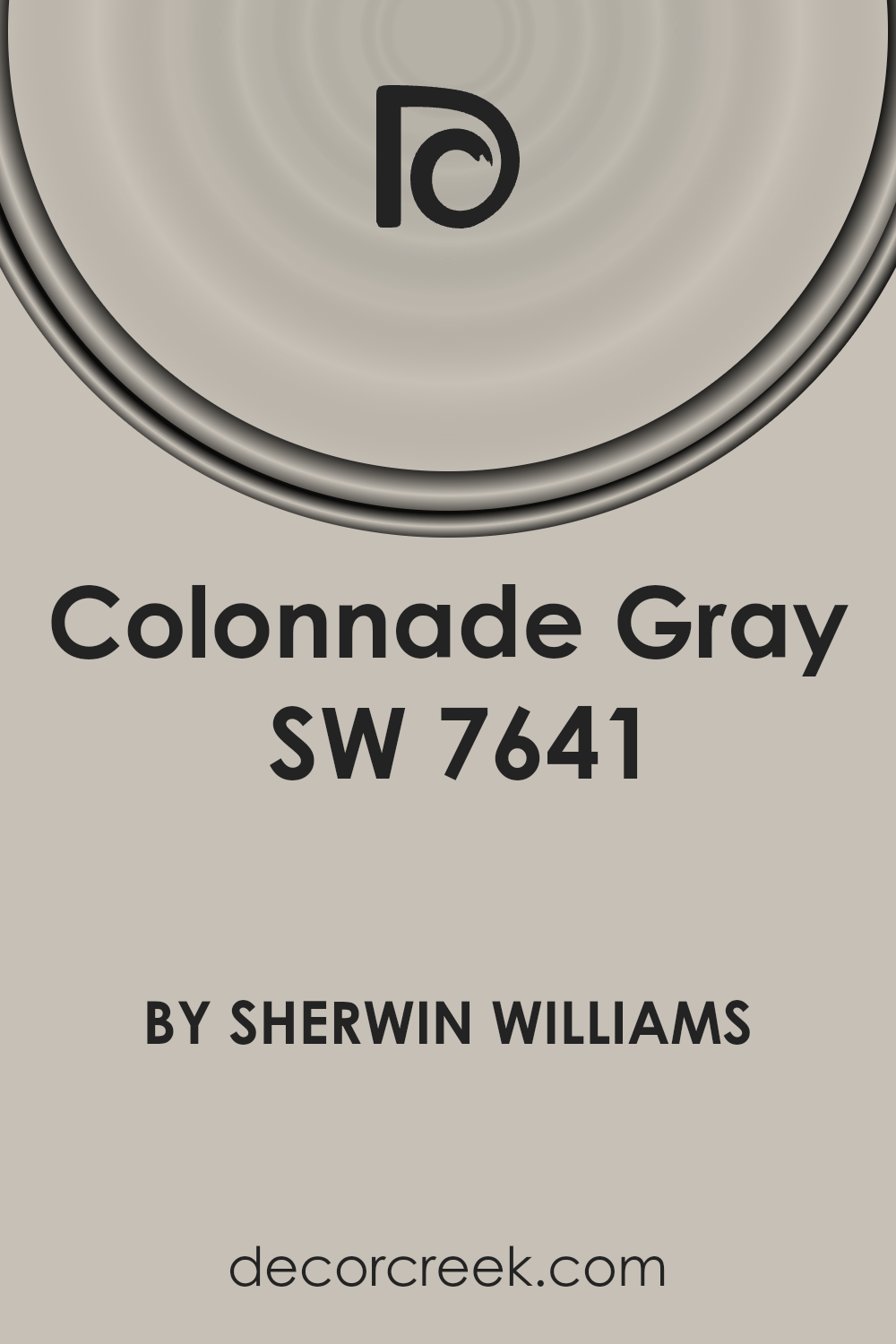
Introducing SW 7641 Colonnade Gray by Sherwin Williams, a versatile and elegant paint color that brings a sense of sophistication to any space.
This particular shade of gray stands out for its warm undertones, making it a perfect choice for homeowners looking to create a cozy yet refined atmosphere.
Whether you’re aiming to refresh your living room, bedroom, or even the exterior of your home, Colonnade Gray offers a neutral base that pairs beautifully with a wide range of decor styles, from modern to traditional.
One of the standout features of SW 7641 Colonnade Gray is its ability to adapt to different lighting conditions, shifting subtly to showcase its depth and complexity.
This makes it an excellent option for spaces that receive varying amounts of natural light throughout the day.
Not only does it complement other colors well, but it also serves as a stunning backdrop for artwork, furniture, and accent pieces, allowing you to highlight your favorite home accessories.
In this guide, we’ll explore how SW 7641 Colonnade Gray can be utilized in various settings and with different color palettes, offering inspiration for your next home improvement project.
Whether you’re planning a major renovation or simply want to update a room with a fresh coat of paint, Colonnade Gray provides a timeless appeal that’s sure to enhance the look and feel of your home.
What Color Is Colonnade Gray SW 7641 by Sherwin Williams?
Colonnade Gray by Sherwin Williams is a versatile and sophisticated shade that effortlessly blends cool and warm tones, making it a perfect choice for various interior styles.
This shade of gray has a unique ability to adapt to different lighting conditions, appearing cooler in spaces flooded with natural light and warmer in rooms with softer, artificial lighting.
Its balanced nature allows it to stand out as a modern neutral, ideal for anyone looking to add a touch of elegance to their space without overwhelming it with color.
This color works exceptionally well in minimalistic, contemporary, and transitional interiors, due to its subtle complexity and understated beauty.
It creates a serene and inviting atmosphere that can make rooms feel more spacious and open. Colonnade Gray pairs wonderfully with a wide range of materials and textures.
It looks stunning against sleek white marble, adding a touch of luxury to kitchens and bathrooms. In living rooms or bedrooms, combining it with warm wood tones enhances its coziness, making the space feel grounded and welcoming.
Soft fabrics like wool or linen in light creams or deeper charcoals complement Colonnade Gray, adding depth and interest through contrast.
Metallic finishes, such as brushed nickel or antique brass, also harmonize beautifully with this color, offering a mix of modernity and timeless charm.
Whether used as a primary backdrop or as an accent feature, Colonnade Gray brings a sense of refined sophistication to any interior space.
Ever wished paint sampling was as easy as sticking a sticker? Guess what? Now it is! Discover Samplize's unique Peel & Stick samples.
Get paint samples

Is Colonnade Gray SW 7641 by Sherwin Williams Warm or Cool color?
Colonnade Gray by Sherwin Williams is a versatile paint color that has the power to transform any space in a house, giving it a fresh and elegant look.
This particular shade of gray strikes the perfect balance between warm and cool tones, making it easy to pair with a wide range of contrasting or complementary colors.
It’s especially effective in rooms that get a mix of natural and artificial light, showcasing its adaptability by subtly changing its tone from a soft, inviting warmth to a more refined, understated coolness as the day progresses.
When applied to walls, Colonnade Gray can make small rooms feel more spacious and give large rooms a cozy, more intimate feel.
This color works wonders in creating a neutral backdrop for both bold and muted furnishing choices, enabling homeowners to switch up their decor without the need to repaint.
Its inherent sophistication enhances architectural details and can be a unifying element that ties different rooms and styles together.
In essence, this color offers a timeless aesthetic that can appease various tastes and preferences, making any home feel more inviting and homely.
Undertones of Colonnade Gray SW 7641 by Sherwin Williams
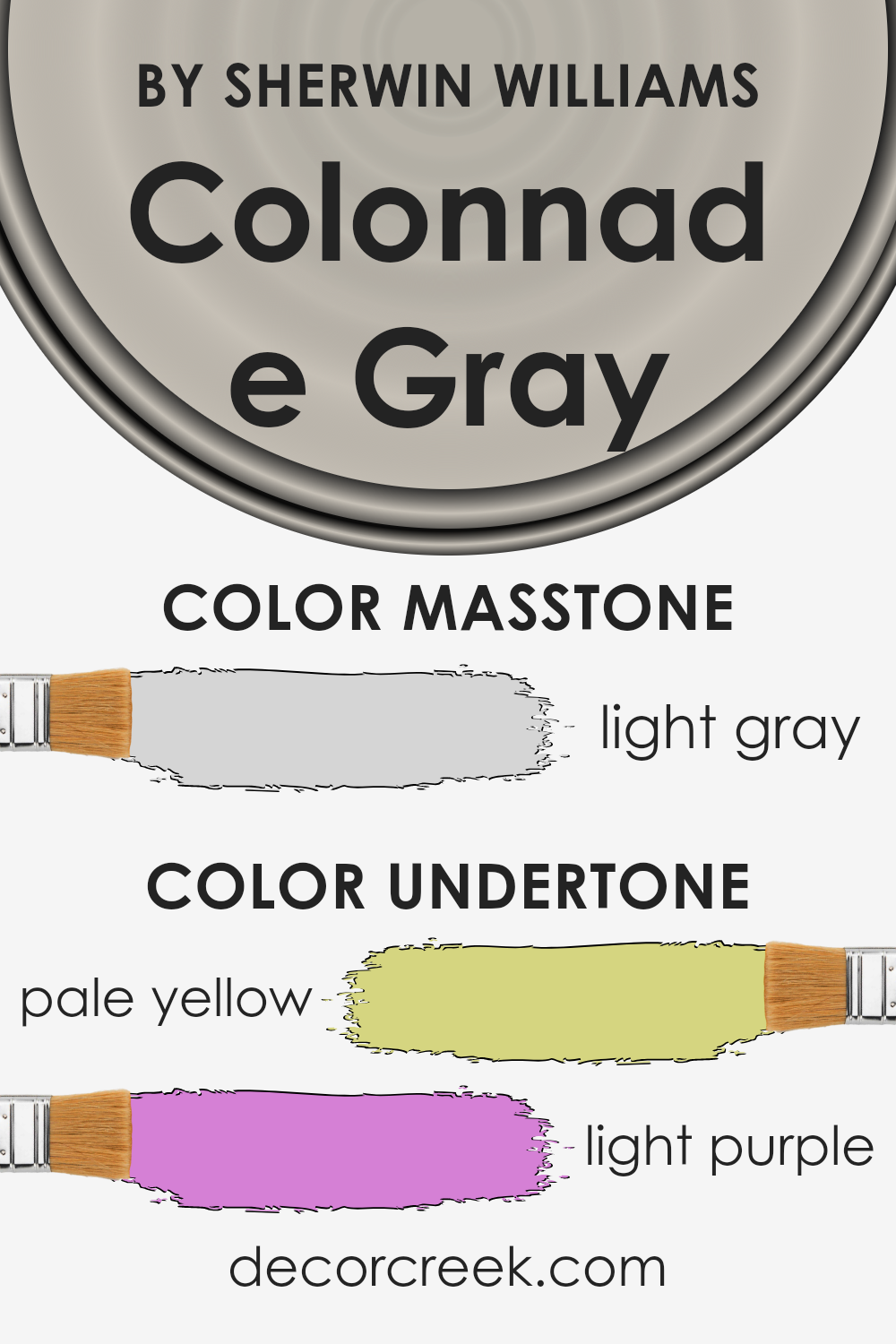
Colonnade Gray by Sherwin Williams is a unique color that looks simple at first glance, but when you look closer, you’ll notice it has subtle undertones that really make it stand out.
These undertones are pale yellow and light purple. Now, you might wonder, why do undertones matter? Well, they can significantly change how we perceive the main color.
Undertones work like a quiet background melody in a song. They can alter the mood and feel of a color without you even realizing it.
In the case of Colonnade Gray, the pale yellow undertone adds a touch of warmth, making the gray feel cozier and more inviting than a typical, cooler gray.
On the other hand, the light purple undertone introduces a hint of sophistication and depth, giving the color a more nuanced appearance that can seem almost chameleon-like in different lights.
When you paint interior walls with this color, these undertones play with the light in the room, affecting the color’s appearance throughout the day.
In natural sunlight, the pale yellow might make the room feel brighter and more cheerful. Meanwhile, under artificial lighting, the light purple could come forward, adding a touch of elegance and mystery to the space.
This means that Colonnade Gray isn’t just a simple gray paint.
Its undertones add layers of complexity, making it a versatile choice that can adapt to different styles and lighting conditions, ultimately influencing the atmosphere of any room.
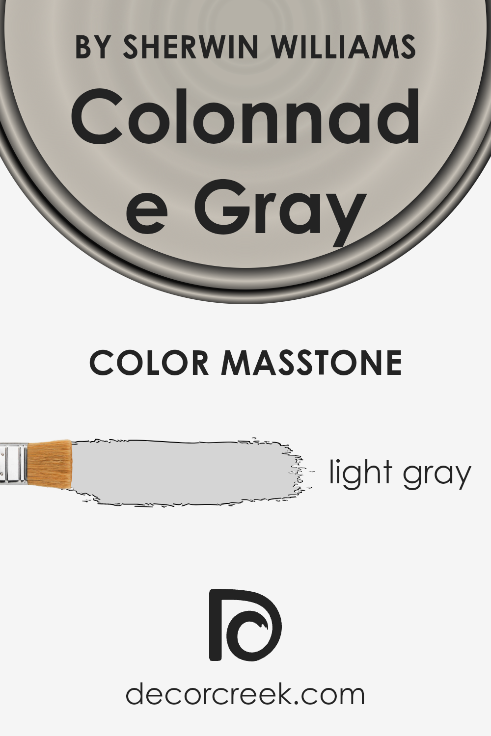
What is the Masstone of the Colonnade Gray SW 7641 by Sherwin Williams?
Colonnade Gray SW 7641 by Sherwin Williams has a masstone, or base color, of light gray, closely resembling the shade #D5D5D5. This means it’s a soft, soothing gray that brings a calm and elegant feel to any room.
In homes, this color works wonders by creating a neutral backdrop that’s both timeless and versatile.
Since it’s a light shade, it has the power to make small spaces appear bigger and brighter, always a plus! It’s like a visual breath of fresh air, making it easy to mix and match with different furniture and decor styles, whether you’re going for a modern, minimalist, or even a cozy, rustic vibe.
This color effortlessly balances warmth and coolness, ensuring it fits comfortably in most lighting conditions, whether the space receives lots of sunlight or is more on the shaded side.
Overall, it’s a fantastic choice for anyone looking to add a touch of understated sophistication to their home.
How Does Lighting Affect Colonnade Gray SW 7641 by Sherwin Williams?
Lighting plays a crucial role in how we perceive colors. The type of light and its direction can significantly change the look of a paint color on our walls.
Let’s explore Colonnade Gray by Sherwin Williams, a popular paint color, and see how different lighting conditions can affect its appearance.
In artificial light, such as that from light bulbs, Colonnade Gray can exhibit various tones depending on the kind of bulb used.
LED or fluorescent lights, which offer a cooler light, can make Colonnade Gray appear more subtle and closer to a true gray.
Incandescent bulbs, which emit a warmer light, can bring out the warmer, cozier undertones of the color, making it feel softer and more inviting.
Natural light, on the other hand, changes throughout the day and can significantly impact how Colonnade Gray looks.
In north-faced rooms, which receive less direct sunlight, this color may lean towards a cooler, more shadowy tone, highlighting its gray aspects more prominently.
This can give a serene and calming effect but might feel a bit cooler and more austere.
South-faced rooms bask in abundant sunlight, which can warm up Colonnade Gray, making it appear softer and slightly lighter. The warmth of the light enhances the welcoming and snug vibes of the room, perfect for creating a bright and airy space.
In east-faced rooms, the morning light can make Colonnade Gray look very different throughout the day. It starts with a warm, golden glow in the morning, making the color appear more lively and warm.
As the day progresses and the direct sunlight moves away, it transitions back to its true gray, maintaining a balanced and neutral vibe throughout the day.
West-faced rooms get the intense evening light, which can cast a warm glow on the walls. During this time, Colonnade Gray may seem warmer and more inviting, perfect for relaxing in the late afternoon or evening.
As the light fades, the color can return to a cooler and more balanced gray shade.
In summary, lighting plays a significant role in the perception of Colonnade Gray, with different types of light and directions bringing out its many facets, from warm and cozy to cool and sophisticated.

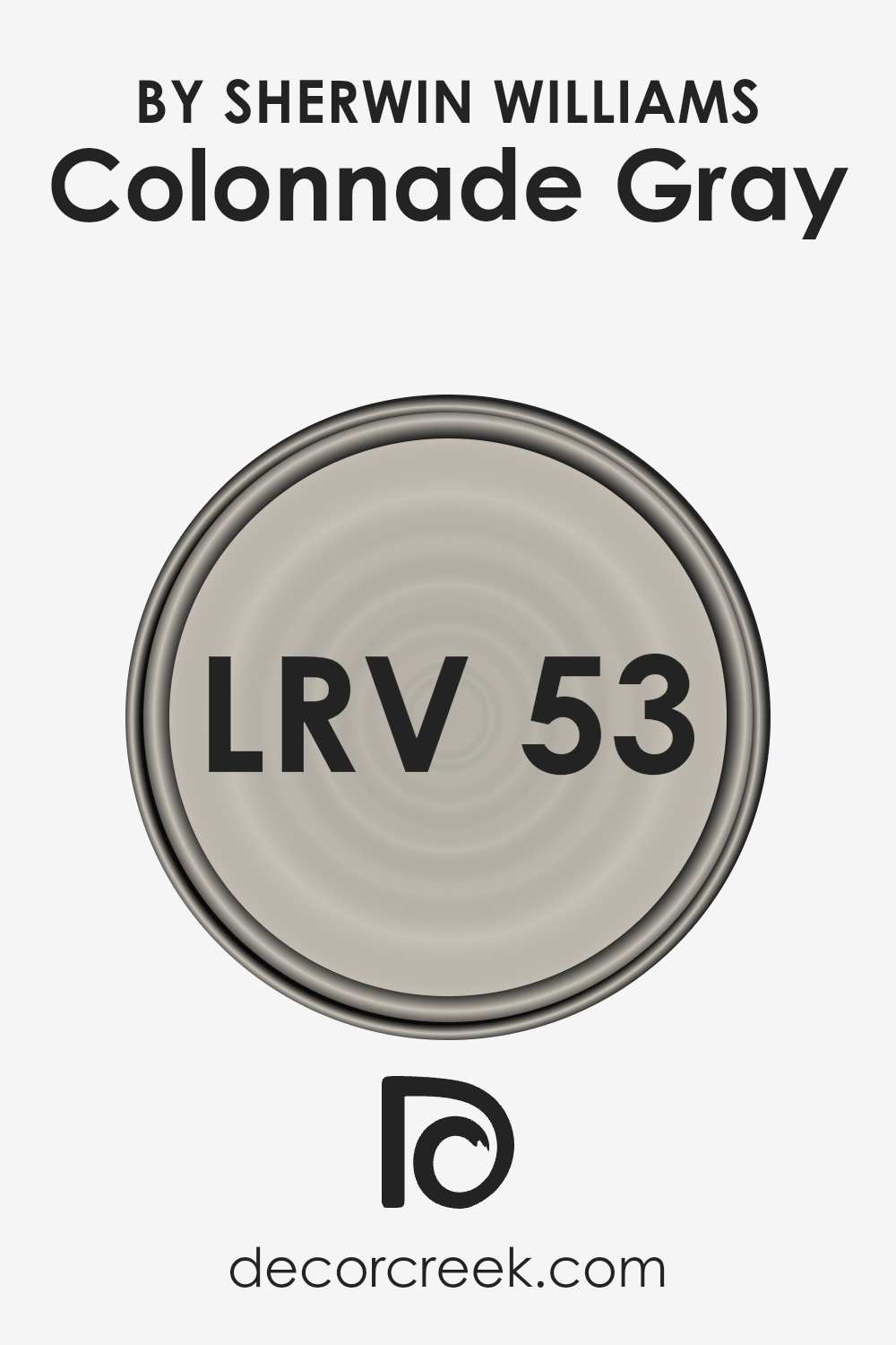
What is the LRV of Colonnade Gray SW 7641 by Sherwin Williams?
LRV stands for Light Reflectance Value, a measure that indicates how much light a paint color reflects or absorbs when applied to a surface. This value ranges from 0, which is pure black and absorbs all light, to 100, which is pure white and reflects all light.
LRV is a crucial aspect to consider when choosing paint colors for your rooms because it can significantly affect the appearance and mood of a space.
A higher LRV means the color will reflect more light, making a room feel brighter and larger. Conversely, a lower LRV implies that a color will absorb more light, creating a cozier or more enclosed feeling in a room.
Colonnade Gray, with an LRV of 53.042, sits in the middle of the LRV scale, which means it strikes a balance between reflecting and absorbing light.
This particular level of LRV suggests that Colonnade Gray is a versatile color that can work well in a variety of spaces and lighting conditions.
In brightly lit rooms, it may appear lighter and more airy, whereas in rooms with less natural light, it will show a bit more of its depth, providing a warm and inviting atmosphere without making the space feel too closed in.
This makes Colonnade Gray a great choice if you’re looking for a neutral color that adapts well to different settings and lighting conditions.
LRV – what does it mean? Read This Before Finding Your Perfect Paint Color
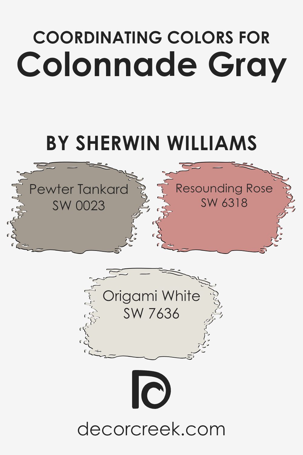
Coordinating Colors of Colonnade Gray SW 7641 by Sherwin Williams
Coordinating colors work together to create a cohesive palette for interior or exterior design, enhancing the atmosphere of a space without overwhelming it.
When dealing with a versatile base like Colonnade Gray by Sherwin Williams, choosing the right coordinating colors is crucial for achieving a balanced and aesthetically pleasing environment.
This selection process involves picking colors that complement or contrast with the base color in a way that creates harmony and interest.
Pewter Tankard SW 0023 is a deep, muted shade that pairs beautifully with Colonnade Gray, adding a robust and refined touch to the color scheme.
It’s ideal for creating a sense of depth in a room or emphasizing architectural details. Origami White SW 7636, on the other hand, offers a crisp and clean contrast to the soft warmth of Colonnade Gray, bringing a fresh and airy feel to the space.
It works exceptionally well for trim, ceilings, or as an accent wall to brighten the area. Resounding Rose SW 6318 introduces a subtle hint of color, adding warmth and a gentle touch of personality to the palette.
This soft pink hue blends seamlessly with Colonnade Gray and its coordinating colors, creating a soothing and inviting atmosphere.
Together, these colors work in harmony to enhance the beauty and character of any space, offering a range of possibilities for designers and homeowners alike.
You can see recommended paint colors below:
- SW 0023 Pewter Tankard
- SW 7636 Origami White
- SW 6318 Resounding Rose
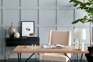
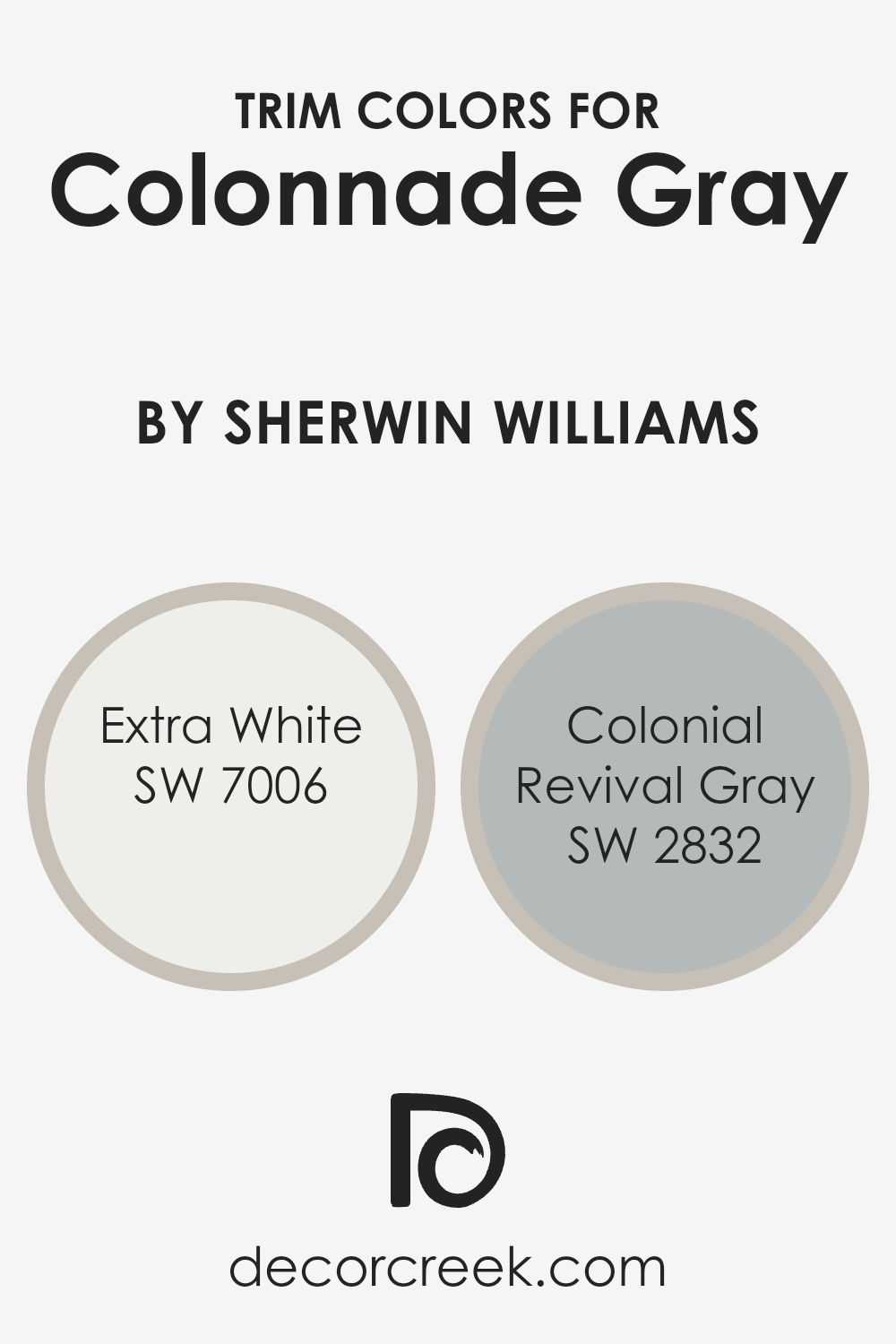
What are the Trim colors of Colonnade Gray SW 7641 by Sherwin Williams?
Trim colors are essentially the accents you choose to complement the main color of a room or exterior, acting like the frame around a picture.
For a versatile shade like Colonnade Gray by Sherwin Williams, selecting the right trim color can enhance its aesthetic appeal and make design features stand out.
When paired with Colonnade Gray, a trim in SW 7006 – Extra White or SW 2832 – Colonial Revival Gray can create a harmonious balance, adding depth and definition to the space.
Trim colors are crucial because they encapsulate and highlight the architectural details of a space, giving it a finished, polished look.
SW 7006 – Extra White is a crisp, clean white that offers a stark contrast to Colonnade Gray, making it pop and giving a fresh, vibrant edge to any room. It’s perfect for creating a bold, modern look that still feels inviting.
On the other hand, SW 2832 – Colonial Revival Gray is a slightly deeper, warmer gray that complements Colonnade Gray by providing a subtle contrast.
This pairing is ideal for those who prefer a more subdued, cohesive color scheme that elegantly ties the room together, enhancing the overall ambiance without overwhelming the senses.
You can see recommended paint colors below:
- SW 7006 Extra White
- SW 2832 Colonial Revival Gray
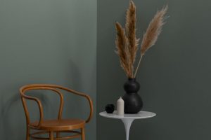
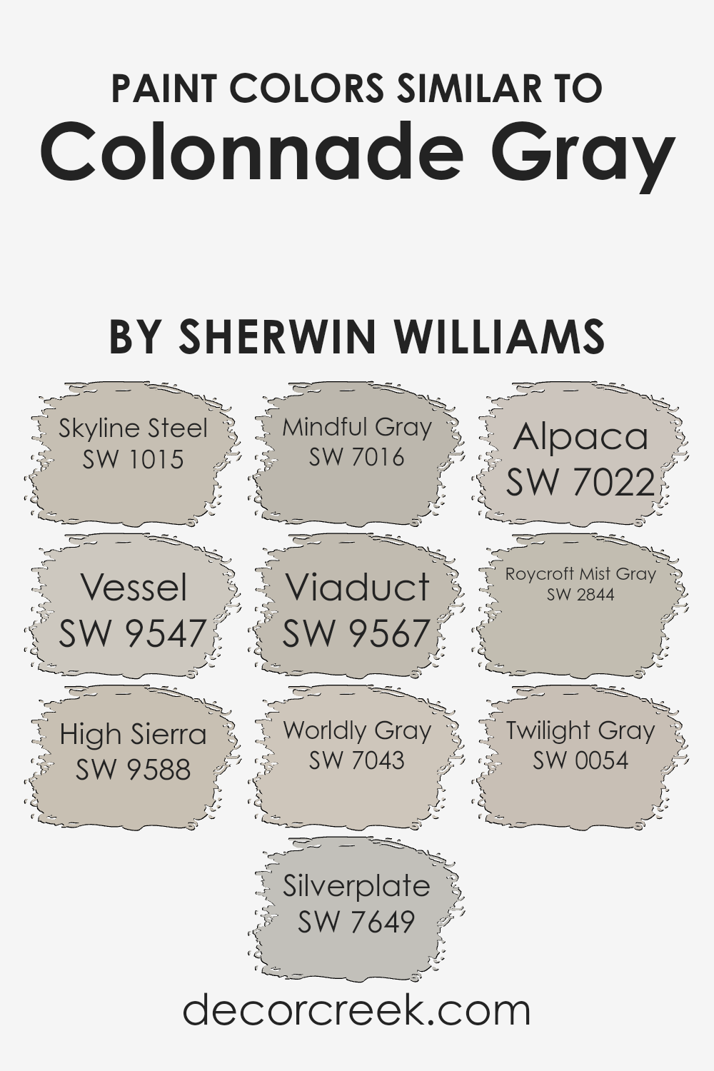
Colors Similar to Colonnade Gray SW 7641 by Sherwin Williams
Choosing similar colors, like those akin to Sherwin Williams’ Colonnade Gray, plays a crucial role in creating a harmonious and visually pleasing space.
These colors work together seamlessly, offering a sophisticated palette that can enhance the flow and continuity throughout a home or any given space.
Colors such as Skyline Steel present a soft, airy quality that mimics the tranquil expanse of the sky, making spaces feel more open and serene. Vessel introduces a subtle depth, reminiscent of a gently shadowed sea, that adds complexity and richness.
High Sierra offers a muted, earthy feel, grounding the scheme with its solid, comforting presence. Silverplate brings a sleek, contemporary edge with its cool undertones, akin to modern steel structures, providing a crisp, clean look.
Mindful Gray adds a warm, inviting layer, its balanced tone bridging the gap between austerity and warmth, perfect for creating cozy yet refined spaces.
Viaduct, with its unique blend of gray and subtle blue hints, recalls the enduring beauty of ancient stone bridges, infusing spaces with a sense of stability and timelessness.
Worldly Gray, soft and nuanced, hints at the varied palette of the natural world, offering versatility and adaptability to different lighting and decor.
Alpaca provides a gentle whisper of color, soft enough to soothe, yet distinctive enough to make a subtle statement.
Roycroft Mist Gray harks back to the earthy tones found in early 20th-century architecture, bringing a touch of heritage and depth. Lastly, Twilight Gray captures the fleeting beauty of the sky at dusk, offering a tranquil, reflective hue that speaks to quiet elegance.
These colors collectively elevate the aesthetic of any interior, allowing for a range of expressions that feel connected and coherent.
You can see recommended paint colors below:
- SW 1015 Skyline Steel
- SW 9547 Vessel
- SW 9588 High Sierra
- SW 7649 Silverplate
- SW 7016 Mindful Gray
- SW 9567 Viaduct
- SW 7043 Worldly Gray
- SW 7022 Alpaca
- SW 2844 Roycroft Mist Gray
- SW 0054 Twilight Gray
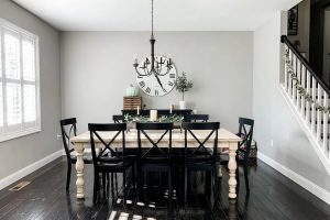
How to Use Colonnade Gray SW 7641 by Sherwin Williams In Your Home?
Colonnade Gray by Sherwin Williams is a versatile and beautiful gray paint color that adds a touch of elegance to any room in your home.
Its balanced tone means it fits well with both warm and cool decor, making it easy for you to use in your living room, kitchen, or even bedroom.
One of the best things about Colonnade Gray is its ability to make spaces feel more open and airy, yet cozy and inviting at the same time.
For those looking to refresh their living area, applying Colonnade Gray on the walls can instantly uplift the space, giving it a modern and sophisticated look.
If your kitchen feels a bit outdated, this color can give it a clean and crisp feel without feeling too sterile. In the bedroom, it offers a calm and serene backdrop, perfect for relaxing after a long day.
Pairing Colonnade Gray with white trim or cabinets can create a beautiful contrast, making the gray stand out even more.
Additionally, it works well with a wide range of colors, from soft pastels to bold accents, allowing you to personalize your space with decorative items and textiles.
Whether you want to update a single room or your entire home, Colonnade Gray offers a simple yet effective way to achieve a fresh new look.
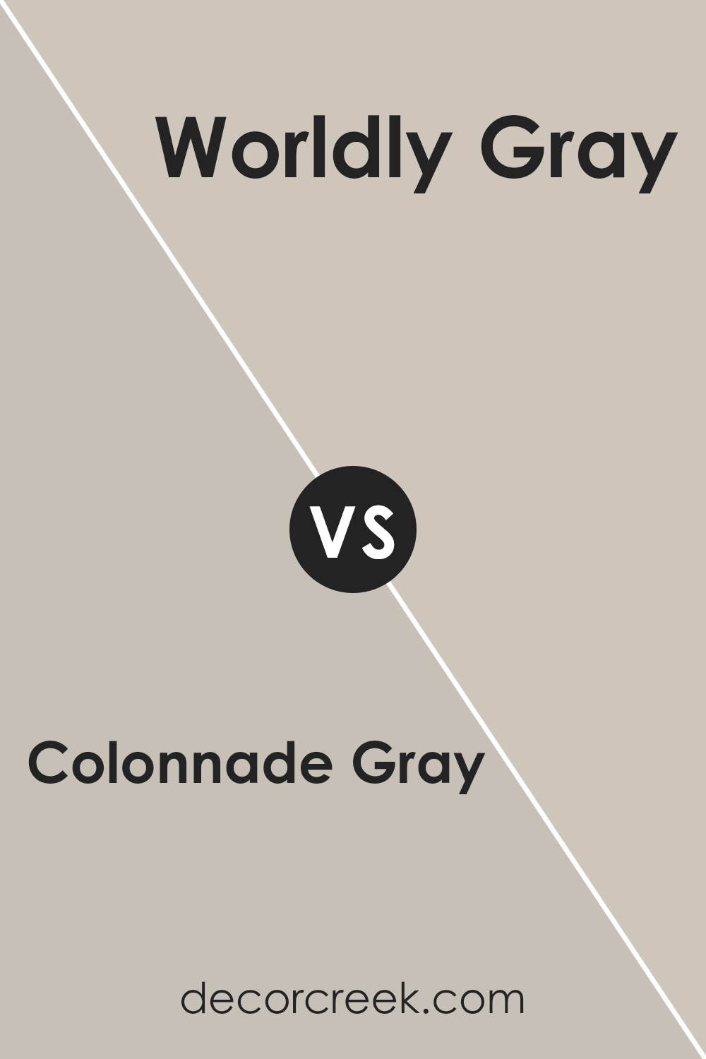
Colonnade Gray SW 7641 by Sherwin Williams vs Worldly Gray SW 7043 by Sherwin Williams
Colonnade Gray and Worldly Gray by Sherwin Williams are both popular choices for those looking to add a touch of elegance and neutrality to their spaces.
Colonnade Gray is a light warm gray with subtle beige undertones, giving it a soft and welcoming feel. It can brighten up rooms while keeping a cozy vibe, perfect for living rooms and bedrooms.
On the other hand, Worldly Gray stands out for its slight green undertone, making it a bit cooler compared to Colonnade Gray.
Despite this, it remains warm enough to create a calming and inviting atmosphere, suitable for various areas including offices and dining rooms.
Both colors offer versatility in decor, easily pairing with a wide range of furniture and finishes.
While Colonnade Gray leans towards a warmer, beige-like appearance making spaces feel homely, Worldly Gray offers a cooler, more muted backdrop that can make rooms appear more spacious and serene.
You can see recommended paint color below:
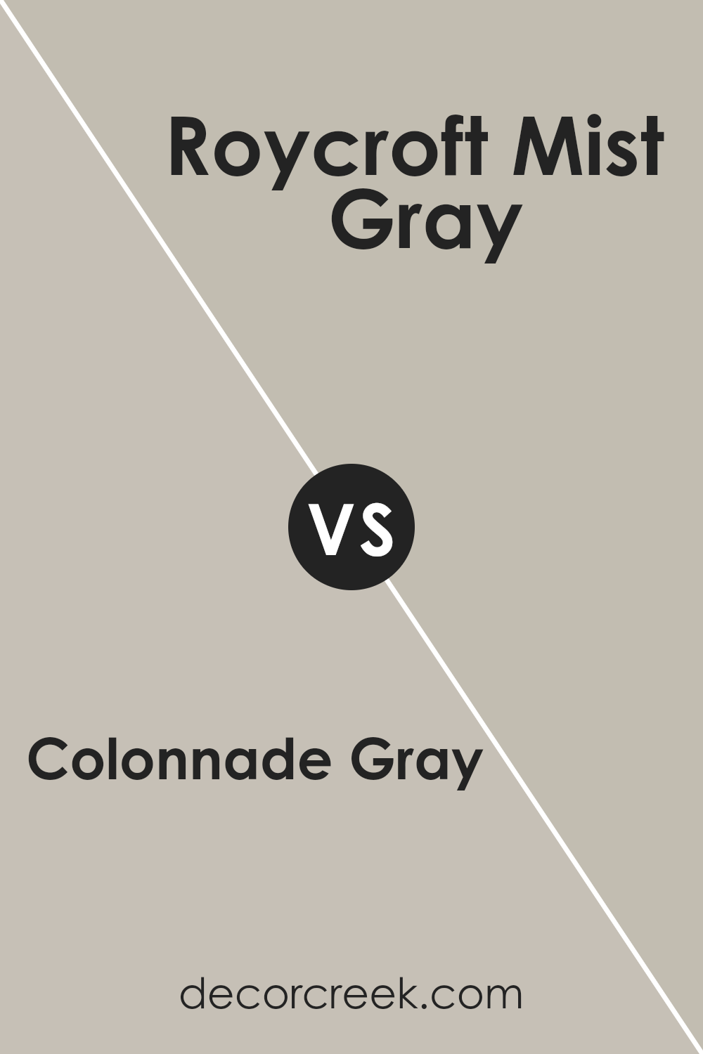
Colonnade Gray SW 7641 by Sherwin Williams vs Roycroft Mist Gray SW 2844 by Sherwin Williams
Colonnade Gray and Roycroft Mist Gray are two Sherwin Williams paints with unique tones. Colonnade Gray is a neutral, light gray shade that carries a subtle warmth, making it versatile for any room.
Its understated elegance offers a fresh, modern feel, perfect for creating a calm and inviting atmosphere. On the other hand, Roycroft Mist Gray is a deeper, more historical color.
This shade leans towards a slightly earthy, warmer tone, giving spaces a cozier, more comforting aura compared to the crisper feel of Colonnade Gray.
While both colors are beautifully understated, Colonnade Gray is better for those seeking a lighter, airier feel, whereas Roycroft Mist Gray suits spaces that aim for a more grounded, sophisticated vibe.
Each color brings its special character to interiors, making the choice between them dependant on the desired mood and aesthetic of the space.
You can see recommended paint color below:
- SW 2844 Roycroft Mist Gray
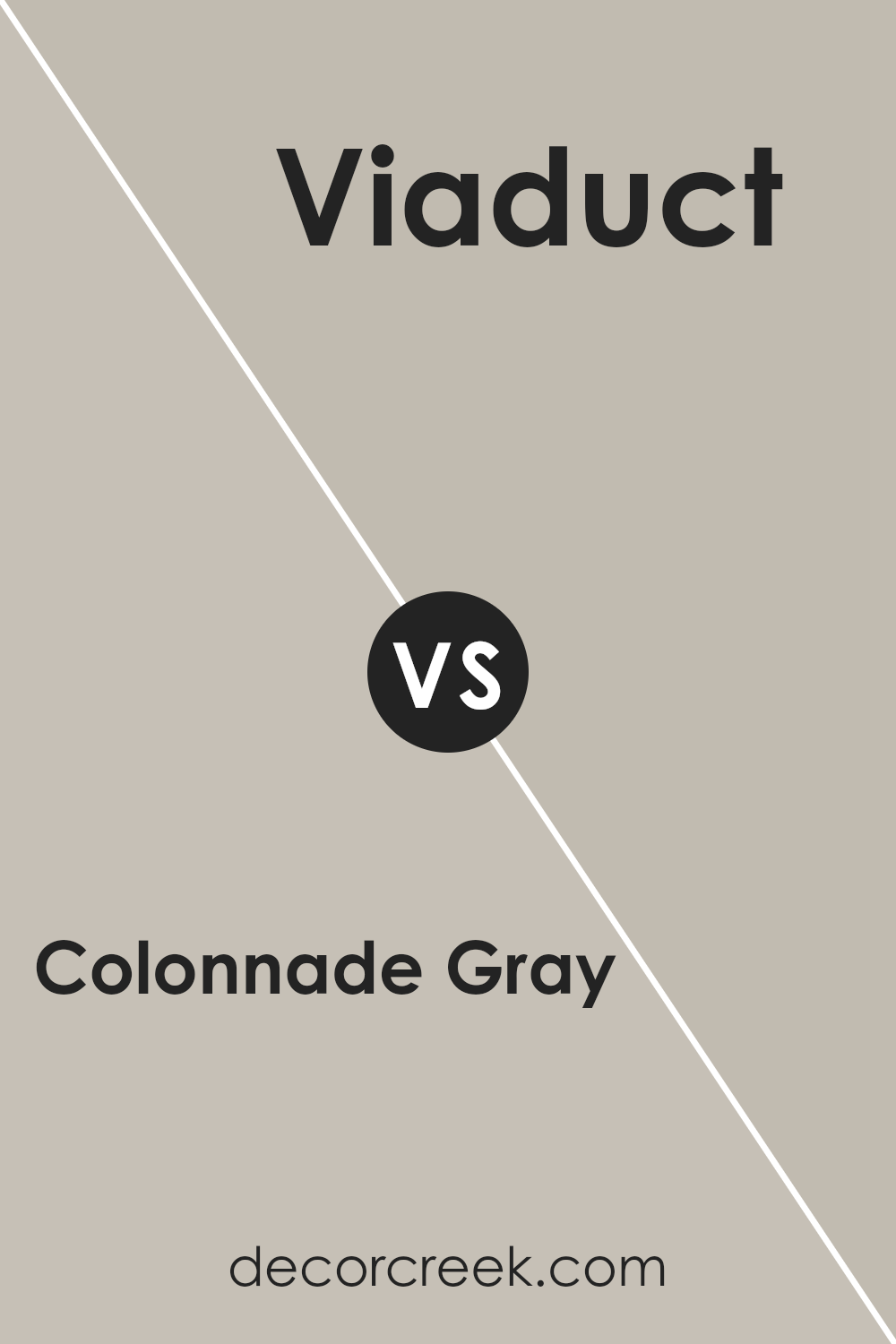
Colonnade Gray SW 7641 by Sherwin Williams vs Viaduct SW 9567 by Sherwin Williams
Colonnade Gray and Viaduct, both by Sherwin Williams, offer unique shades for anyone looking to freshen up a space. Colonnade Gray has a warm, welcoming vibe, perfect for creating a cozy atmosphere in any room.
It’s light enough to make spaces feel airy yet has enough depth to add character. On the other hand, Viaduct brings a bolder, more dramatic feel.
It’s darker, making it ideal for accent walls or spaces where you want a touch of sophistication. While Colonnade Gray is versatile, fitting well in many settings like living rooms or kitchens, Viaduct demands attention, making it a great choice for statement areas.
Despite their differences, both colors carry the high quality and durability Sherwin Williams is known for. Whether looking for a light, inviting feel with Colonnade Gray or a deeper, more striking ambiance with Viaduct, each color offers a unique way to transform your space.
You can see recommended paint color below:
- SW 9567 Viaduct
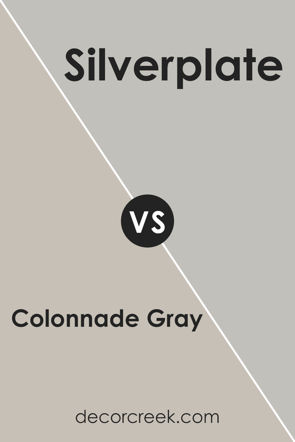
Colonnade Gray SW 7641 by Sherwin Williams vs Silverplate SW 7649 by Sherwin Williams
Colonnade Gray and Silverplate, both from Sherwin Williams, are two versatile colors that bring their unique charm to spaces.
Starting with Colonnade Gray, it’s a warm, inviting gray that has a hint of beige, making it a perfect neutral.
It gives rooms a cozy and welcoming feel, striking a balance between a traditional gray and the warmth of greige.
On the other hand, Silverplate steps into the cooler side of grays.
It’s a pure, clean gray that leans more towards a modern and minimalistic look. This color brings an airy and more spacious feel to interiors, offering a sleek backdrop for various decor styles.
While Colonnade Gray adds warmth and a subtle sense of comfort to walls, Silverplate offers a crisp, clean aesthetic that can make spaces feel more open and refreshed.
Depending on the ambiance you’re going for, either of these colors can transform a room in its unique way. If you prefer a cozy, inviting space, Colonnade Gray is your go-to. For a modern, bright room, Silverplate will do the trick.
You can see recommended paint color below:
- SW 7649 Silverplate
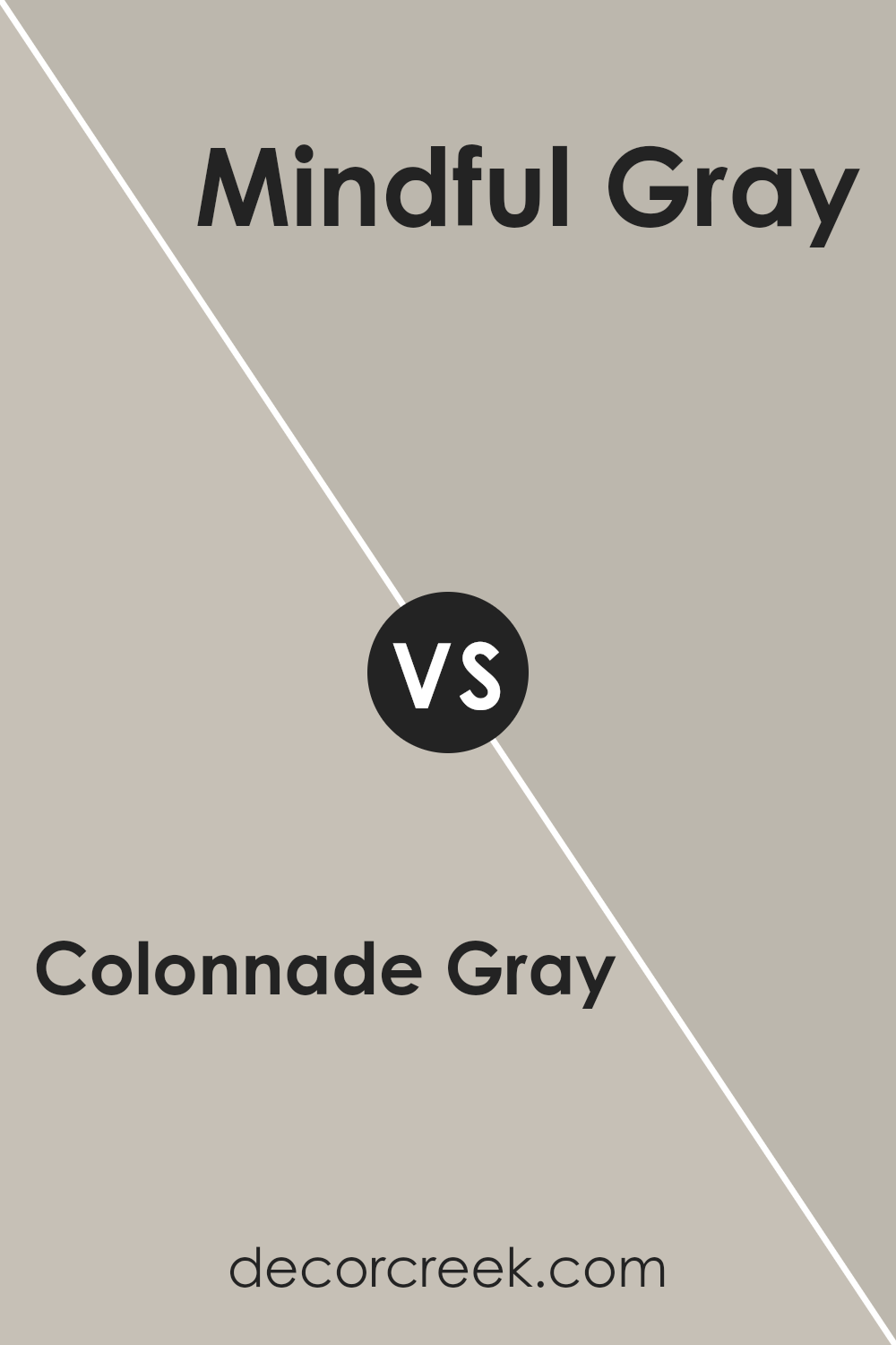
Colonnade Gray SW 7641 by Sherwin Williams vs Mindful Gray SW 7016 by Sherwin Williams
Colonnade Gray and Mindful Gray, both by Sherwin Williams, are popular choices for those looking to give their space a modern, yet timeless appearance.
While at first glance they may seem quite similar, there are differences worth noting. Colonnade Gray is a lighter shade, offering a subtle, warm undertone that brings a cozy feel to any room.
It’s perfect for creating a bright and airy atmosphere, making spaces appear larger and more welcoming.
On the other hand, Mindful Gray sits a bit deeper on the color spectrum. It carries a slightly bolder tone, with a mix of warm and cool undertones, giving it a unique flexibility to complement various decor styles.
It works well in spaces that aim for a bit more depth and sophistication without overwhelming the senses.
When choosing between the two, consider the amount of natural light your room receives and the mood you wish to create.
Colonnade Gray excels in spaces flooded with light, while Mindful Gray is a great choice for adding rich layers to a room. Both colors are quite versatile, but your preference for lighter or slightly deeper tones will guide your decision.
You can see recommended paint color below:
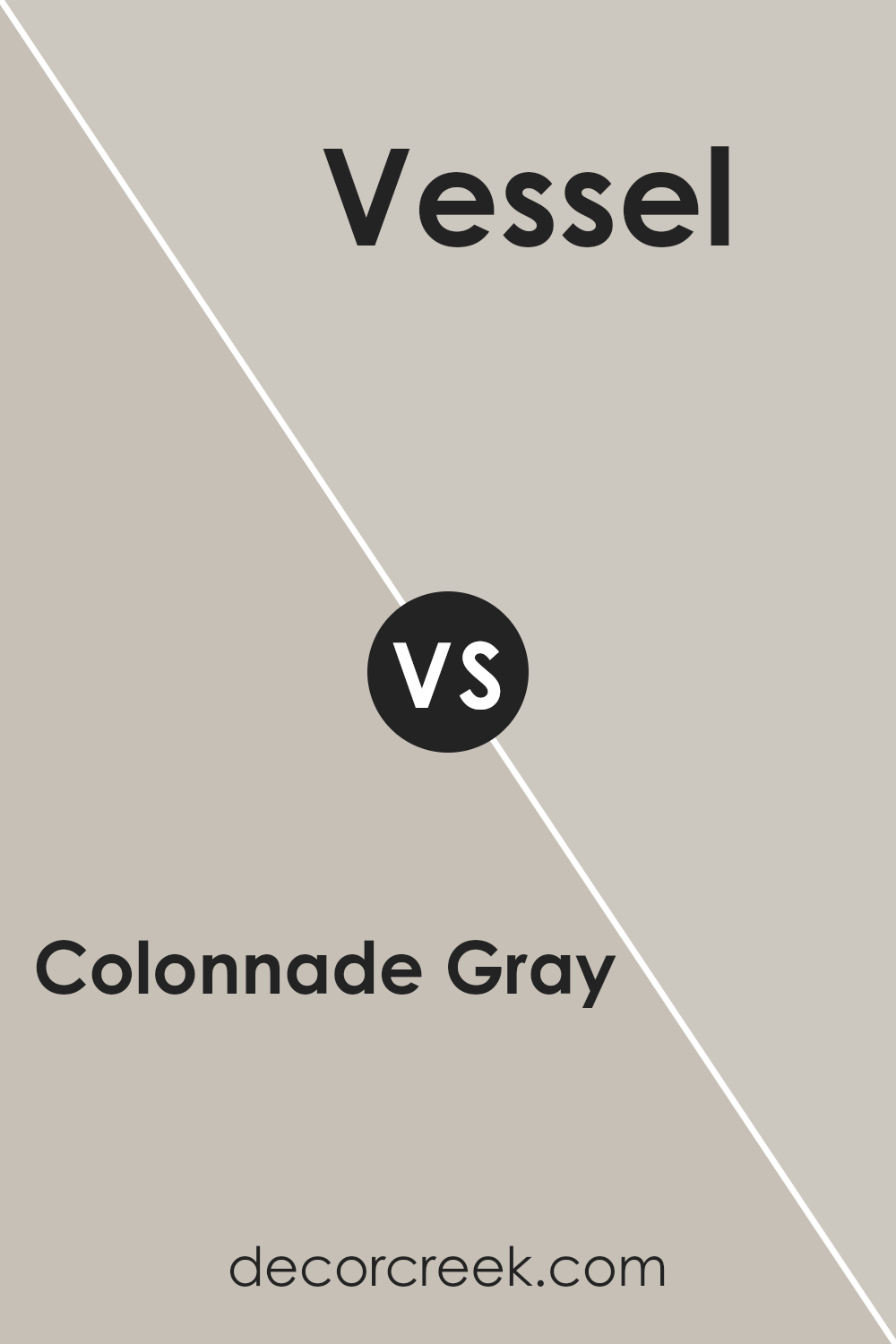
Colonnade Gray SW 7641 by Sherwin Williams vs Vessel SW 9547 by Sherwin Williams
Colonnade Gray and Vessel by Sherwin Williams are two distinct colors that offer unique vibes to any space. Colonnade Gray is a soft, light gray with a warm undertone, making it a versatile choice for rooms, adding a subtle elegance without overpowering.
It’s like a cozy blanket on a chilly day, gentle and inviting. On the other hand, Vessel is a deeper, more pronounced color. It’s a gray with a hint of green, giving it an earthy, grounded feel.
This color can add a touch of nature and depth to a room, making it feel more anchored and serene. While Colonnade Gray lightens up a space with its airy presence, Vessel brings a stronger personality, introducing a sense of calm and solidity.
They both have their own charm, with Colonnade Gray being the go-to for a light and breezy feel, and Vessel creating a more enveloping and cozy atmosphere.
You can see recommended paint color below:
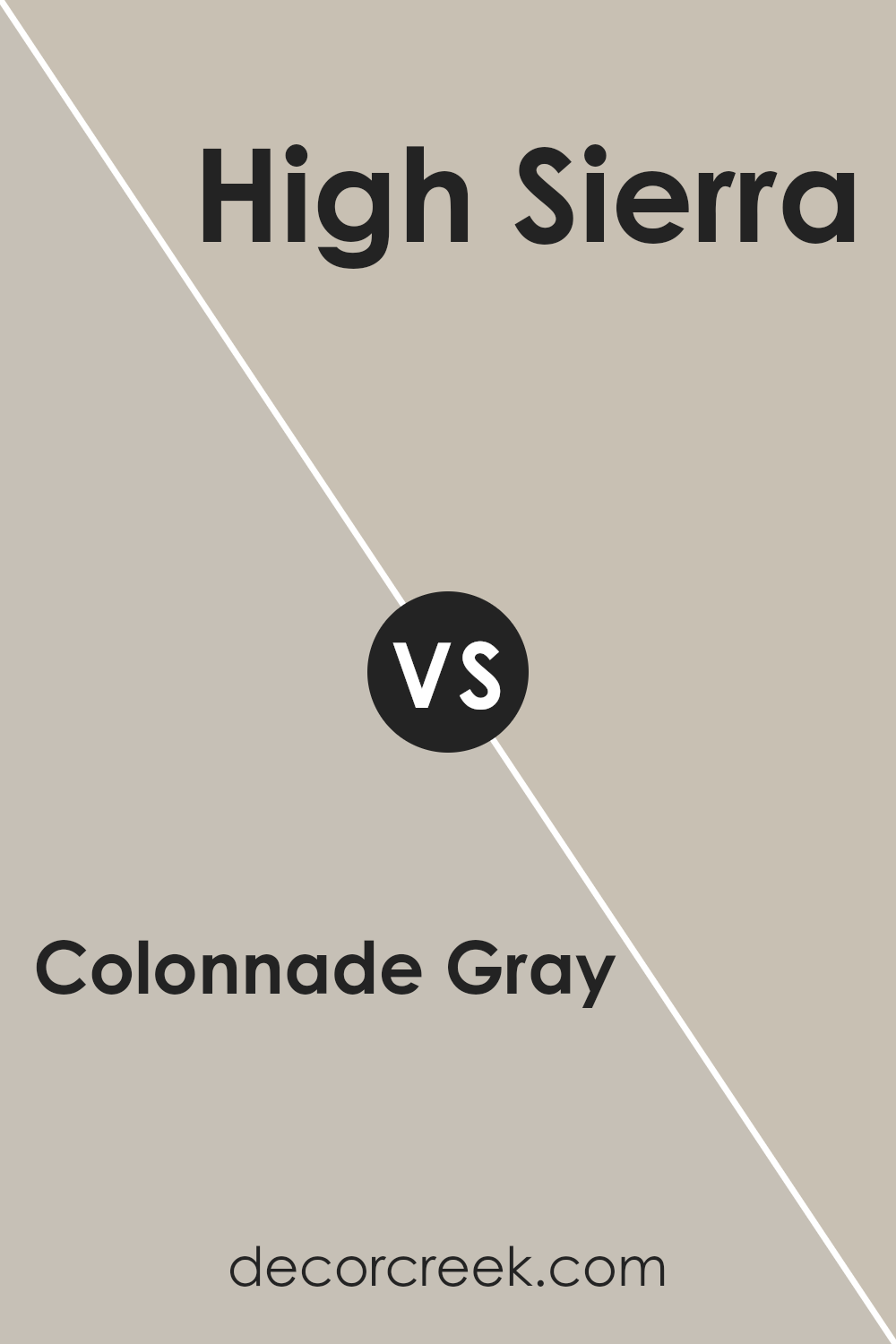
Colonnade Gray SW 7641 by Sherwin Williams vs High Sierra SW 9588 by Sherwin Williams
Comparing Colonnade Gray and High Sierra, both by Sherwin Williams, reveals some key differences. Colonnade Gray is a versatile, light gray that has a warm undertone, making it perfect for creating a cozy yet sophisticated vibe in any room.
It’s the kind of color that easily adapts to different lighting conditions, appearing more muted in bright light and deeper in low light.
On the other hand, High Sierra takes on a more distinct presence. It’s a deeper shade, offering a richer and earthier tone. This color brings a sense of calm and grounding to a space, reminiscent of the serene beauty of mountain landscapes.
High Sierra provides a stronger statement and can add depth and warmth to a room, making it ideal for accent walls or spaces where you want a more inviting atmosphere.
Both colors offer unique qualities: Colonnade Gray for its flexible elegance and High Sierra for its rich, comforting depth. Choosing between them depends on the desired mood and atmosphere for your space.
You can see recommended paint color below:
- SW 9588 High Sierra
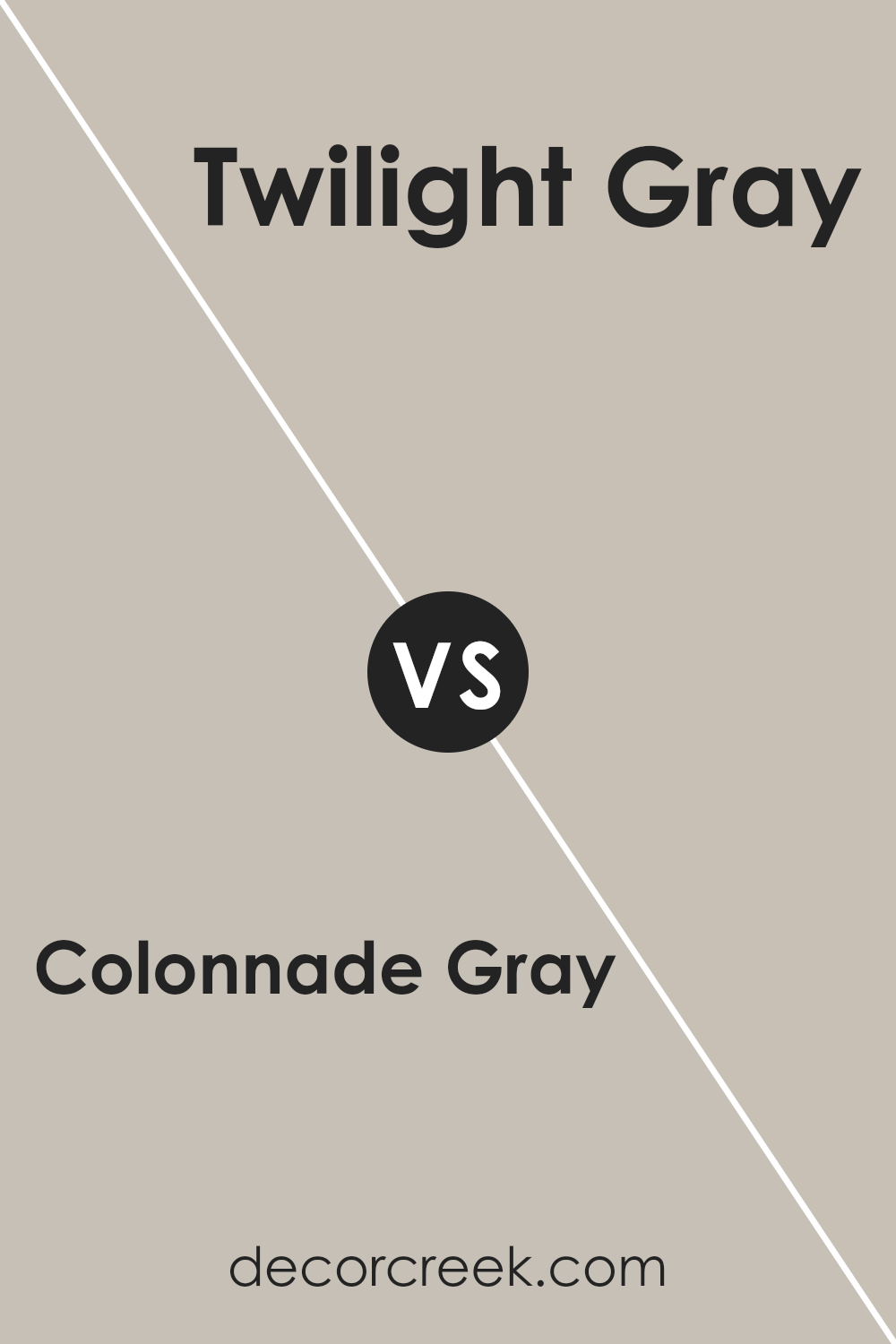
Colonnade Gray SW 7641 by Sherwin Williams vs Twilight Gray SW 0054 by Sherwin Williams
Colonnade Gray and Twilight Gray are two popular paint colors by Sherwin Williams. Colonnade Gray is a light gray shade with warm undertones, making it a versatile choice for various spaces.
It brings a subtle, cozy warmth to rooms, perfect for creating a welcoming atmosphere. This color works well in areas with a lot of natural light or spaces you want to feel more open and airy.
On the other hand, Twilight Gray is a darker, more muted gray. It has a richness to it that adds a sophisticated touch to any room. This shade can make a bold statement and is ideal for accent walls or spaces where you want to add a bit of drama.
While it’s still in the gray family, its deeper tone sets it apart from Colonnade Gray, offering a more intimate and focused feel.
Both colors have their unique appeal, with Colonnade Gray being great for a light and breezy feel, and Twilight Gray ideal for adding depth and elegance.
Choosing between them depends on the mood and style you want to achieve in your space.
You can see recommended paint color below:
- SW 0054 Twilight Gray
Colonnade Gray SW 7641 by Sherwin Williams vs Skyline Steel SW 1015 by Sherwin Williams
Colonnade Gray by Sherwin Williams is a versatile gray that has warm undertones, giving it a cozy feel that’s perfect for any room. It’s a kind of gray that can bring a sense of calmness and elegance, easily blending with various decor styles.
Its warmth makes it inviting, perfect for living spaces, bedrooms, or even kitchens.
On the other hand, Skyline Steel is a different shade also by Sherwin Williams. This color is lighter than Colonnade Gray and carries a more neutral tone.
It has the ability to brighten up a space while still maintaining a subtle, sophisticated vibe. Because of its lighter and more neutral nature, it’s excellent for creating a feeling of added space and light in smaller or less brightly lit rooms.
In a nutshell, Colonnade Gray brings warmth and a cozy atmosphere to interiors with its inviting undertones, while Skyline Steel offers a lighter, more neutral option that can make a room feel more spacious and bright.
Both colors are great choices depending on the mood and feel you’re aiming for in your space.
You can see recommended paint color below:
- SW 1015 Skyline Steel
Colonnade Gray SW 7641 by Sherwin Williams vs Alpaca SW 7022 by Sherwin Williams
Colonnade Gray and Alpaca by Sherwin Williams are two popular paint colors that share some similarities but also have their own unique differences.
Both colors belong to the neutral palette, making them versatile for various spaces. Colonnade Gray has a cooler tone, often likened to a light-medium gray with a hint of warmth, making it flexible for rooms that need a bit of coziness without feeling too dark.
On the other hand, Alpaca is warmer, with a softer, more beige-gray tone. This color brings a gentle warmth to spaces, perfect for creating a welcoming atmosphere.
While Colonnade Gray can give a modern, sophisticated look to a room, Alpaca lends itself to a more relaxed, comfortable vibe. Choosing between them depends on the mood you want to set for your space.
Do you lean towards a cooler, more modern aesthetic or a warmer, cozier feel?
You can see recommended paint color below:
Colonnade Gray SW 7641 vs Revere Pewter HC-172
Colonnade Gray is a warm gray that reads slightly cooler and lighter, giving a cleaner, crisper look. Revere Pewter is warmer and deeper, adding more presence and stronger contrast with white trim.
Choose Colonnade Gray for a lighter, clean feel; choose Revere Pewter for a warmer, more grounded look.
Colonnade Gray by Sherwin Williams emerges as a versatile and stylish choice for anyone looking to refresh their space. Its unique blend of gray tones offers a balance of warmth and sophistication, making it an excellent selection for various rooms and lighting conditions.
This paint color effortlessly complements a wide range of decor styles, from modern to traditional, allowing for seamless integration into any home.
Its popularity among homeowners and designers alike speaks to its ability to bring a sense of calm and elegance to a space without overwhelming it.
Whether you’re looking to create a serene bedroom retreat or a lively living area, Colonnade Gray provides a solid foundation that can be easily accented with different colors and textures.
Its adaptability and timeless appeal make it a smart choice for those seeking to enhance their home’s ambiance and value.
Ever wished paint sampling was as easy as sticking a sticker? Guess what? Now it is! Discover Samplize's unique Peel & Stick samples.
Get paint samples