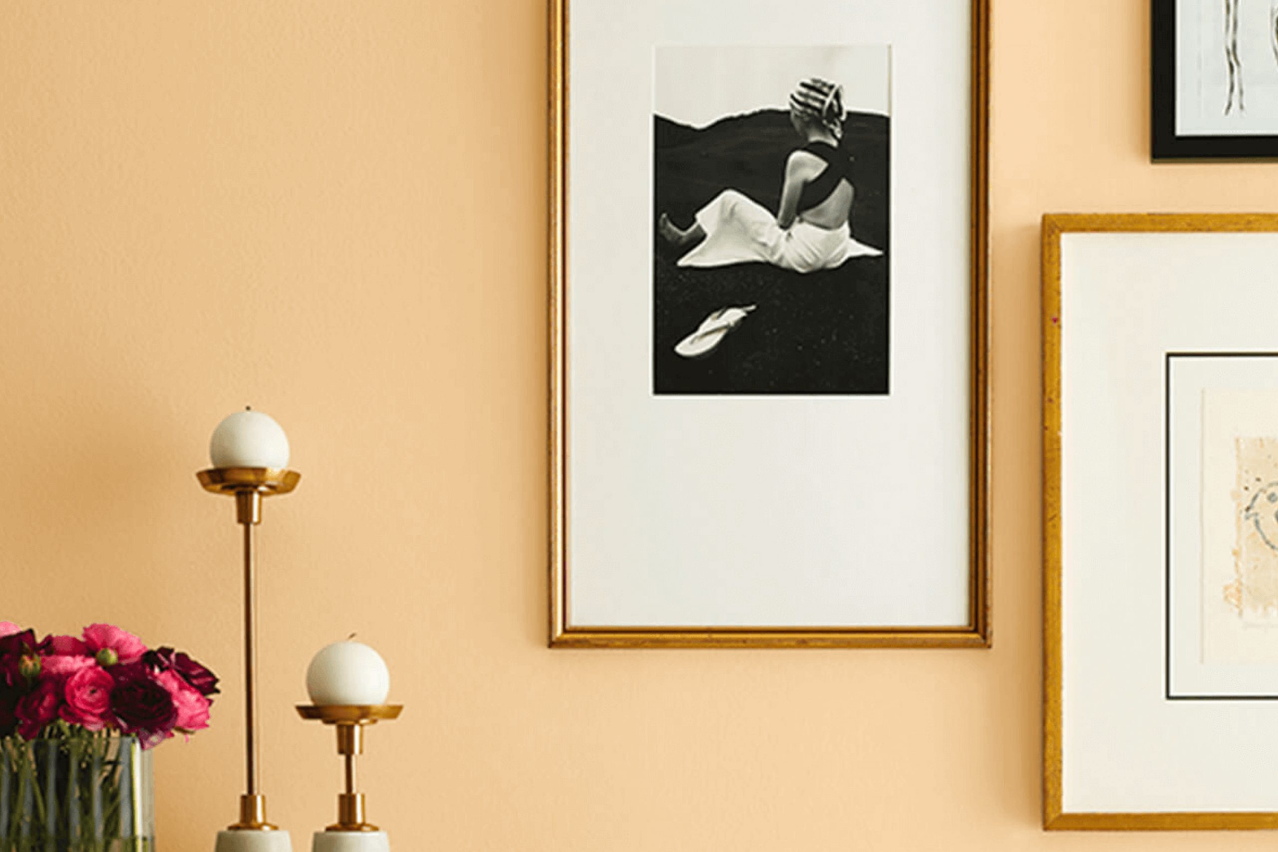
Choosing the right paint color for your home can feel like a big decision. Recently, I came across SW 6380 Humble Gold by Sherwin Williams, a color that pleasantly surprised me with its warm and inviting hue. This shade of gold strikes a perfect balance, making any room feel cozy yet full of life. It’s not too overwhelming but has enough vibrancy to brighten up a space effectively.
Humble Gold pairs well with a variety of decor styles and plays nicely with both natural light and artificial lighting, which enhances its versatility. Whether you’re looking to refresh your living room, bedroom, or even your kitchen, this color can add that subtle touch of elegance you might be looking for.
It works especially well in spaces where you want to add a bit of cheer without overpowering the room with boldness. In my experience, this particular shade from Sherwin Williams offers a chic and seamless way to update your living environment.
It brings with it a sense of warmth that encourages relaxation and comfort. If you’re looking for a color that uplifts your mood and complements most interiors, Humble Gold could be the paint you need to consider.
What Color Is Humble Gold SW 6380 by Sherwin Williams?
Humble Gold by Sherwin Williams is a warm, inviting shade of yellow with a subtle richness that makes any space feel cozy and welcoming. This golden hue strikes a lovely balance between brightness and softness, making it an ideal choice for adding a touch of cheerfulness without overwhelming a room.
Humble Gold works beautifully in a variety of interior styles. Its timeless warmth makes it perfect for classic and traditional settings, where it brings a sense of age-old elegance. It’s also superb in country and rustic interiors, complementing natural wood elements and rough textures that typify these styles.
Even in a modern or minimalist space, this color adds a bright focal point, enhancing the overall aesthetic without detracting from the sleek lines. When pairing materials and textures with this vibrant color, natural elements like raw wood or rattan can create a grounded, earthy vibe. Soft textures such as velvet or wool in neutral tones help balance the brightness of the gold, ensuring the room remains soothing to the eyes.
For a more dynamic contrast, metals like bronze or copper can accentuate the warmth of the paint, while bolder textiles in navy or deep green will set off its richness beautifully.
Is Humble Gold SW 6380 by Sherwin Williams Warm or Cool color?
Humble Gold by Sherwin Williams is a warm, inviting hue that can make any room feel cozy and welcoming. This gold-toned paint color is perfect for adding a touch of warmth to spaces that may feel cold or lack natural light, such as north-facing rooms. It pairs well with a wide range of accent colors, from deep blues to soft grays, making it versatile for different home styles and preferences.
When used in a living room or dining area, Humble Gold creates a friendly, casual atmosphere that encourages guests to relax and enjoy their surroundings. In a bedroom, this color helps to establish a comfortable, peaceful environment, which is ideal for resting.
Additionally, in small spaces like a foyer or a hallway, applying this color can add a sense of brightness and open up the area without being overwhelming. Overall, Humble Gold is a great choice for anyone looking to create a homey, cheerful vibe in their house.
Undertones of Humble Gold SW 6380 by Sherwin Williams
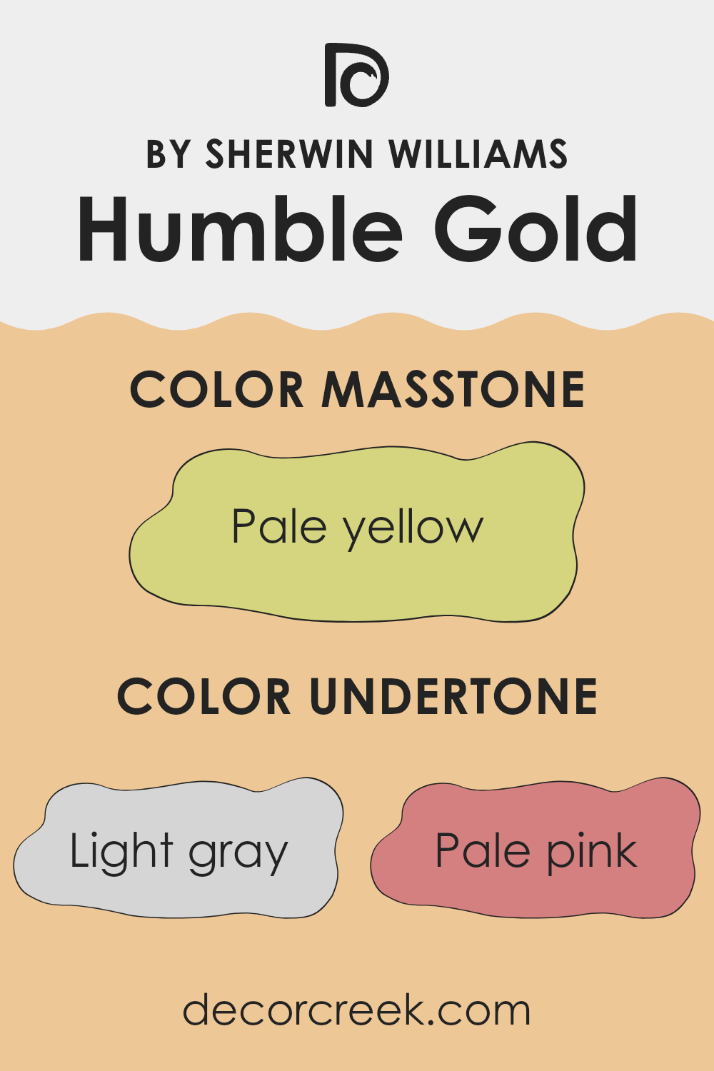
Humble Gold is a unique color with a variety of undertones that subtly influence its appearance in different settings. The primary shade is a warm, inviting gold, but depending on the lighting and surrounding colors, you might notice hints of other shades. For instance, light gray, pale pink, and light purple undertones bring a softness to the color, making it more versatile and easier to incorporate into various decor styles.
Yellow and orange undertones add a cheerful, sunny vibe, making a room feel bright and welcoming. These undertones are particularly attractive in living areas or any space where you want to add a dash of warmth and energy.
On the other hand, undertones of mint, light blue, and lilac can cool down the warmth of the gold, offering a subtle balance and making the color more adaptable to different themes and accessories. These cooler undertones are especially useful in spaces that get a lot of sunlight, preventing the room from feeling too warm.
Additionally, shades like grey, light green, and olive give Humble Gold a more grounded, earthy feel, which can help in creating a cozy, comforting atmosphere. This makes it an excellent choice for bedrooms or study areas where a calming effect is desirable.
Overall, the diverse undertones of Humble Gold allow it to interact dynamically with both light and furnishings, affecting the mood and style of any room. Whether you’re looking for a pop of color or a subtle complement to your existing decor, this color can adapt beautifully, enhancing the space in a natural, appealing way.
What is the Masstone of the Humble Gold SW 6380 by Sherwin Williams?
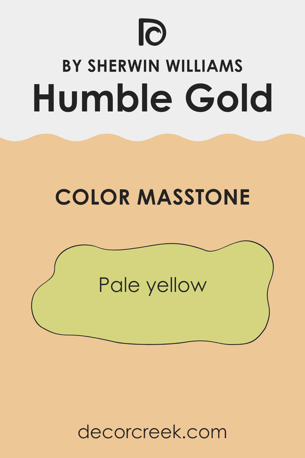
Humble GoldSW 6380 by Sherwin Williams has a masstone, or main color tone, of pale yellow. This shade is soft and gentle, making it a great choice for home interiors. In a house, this color adds a warm, welcoming feeling without being too bright or overwhelming. It works particularly well in living rooms and kitchens where a cozy atmosphere is often desired.
Pale yellow pairs easily with many other colors. It goes well with whites and grays for a clean, modern look, or it can be paired with blues and greens for a more earthy, natural vibe. This flexibility makes it a useful hue for those who like to change their decor seasonally or enjoy a versatile backdrop that can adapt to various accessories and furniture styles.
Another benefit of using a light yellow like Humble GoldSW 6380 is that it can help brighten up spaces that do not get a lot of natural sunlight, making small or dark rooms appear larger and more airy.
How Does Lighting Affect Humble Gold SW 6380 by Sherwin Williams?
Lighting plays a crucial role in how we perceive colors. Different light sources can drastically change the appearance of a color. For instance, natural sunlight provides the truest representation of colors, while artificial light can alter how they appear depending on the type of light bulb used.
Now, consider a specific paint color like Humble GoldSW 6380 by Sherwin Williams. In natural light, this warm, muted gold shade shows its true beauty, reflecting a bright and cozy atmosphere that feels inviting. As sunlight shifts throughout the day, this color can look vibrant and lively under the midday sun or softer and more subdued in the early morning or late afternoon.
In rooms with artificial lighting, the type of bulb matters. Incandescent bulbs, which emit a warm glow, enhance the warm tones of Humble Gold, making the room feel warmer and more welcoming. Fluorescent lighting, on the other hand, could bring out a slightly harsher yellow tone in the color.
The orientation of a room also influences how this color appears. In north-facing rooms, which often get cooler, indirect light, Humble Gold might appear slightly muted and less vibrant. It won’t catch the full strength of the sun, which can mean the color may look more subdued and less warm.
In south-facing rooms, the color can look exceptionally vibrant and warm throughout the day because of the abundance of direct sunlight. This exposure maximizes the richness of Humble Gold, making the space feel energetic and cozy.
East-facing rooms receive morning sunlight, making Humble Gold look bright and cheerful in the morning, then cooler and more muted as the day progresses. Conversely, in west-facing rooms, the color will start off cooler in the morning but become warmly lit and inviting by the afternoon as it catches the evening light.
Understanding these effects can help in deciding the best room to use this color, based on the light exposure and the ambiance one wishes to achieve.
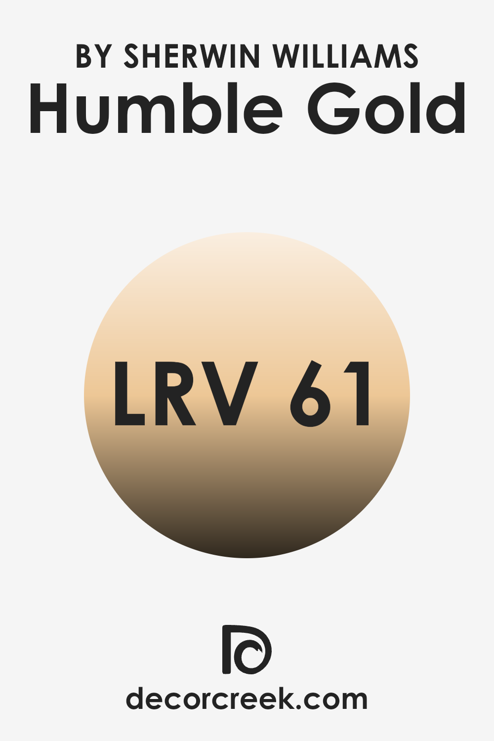
What is the LRV of Humble Gold SW 6380 by Sherwin Williams?
Light Reflectance Value (LRV) measures the amount of light a paint color reflects back into a room versus how much it absorbs. On a scale usually extending from a low end, which means the color absorbs more light, to a high end where it reflects more, LRV helps in choosing the right paint color based on how bright or dark you want the space to appear.
A color with a high LRV will make a room feel brighter and more open, as it reflects more light. On the other hand, colors with lower LRVs tend to make a room look more enclosed and cozy by absorbing more light.
The LRV of Humble Gold, which is 61.31, indicates that it is a moderately light color. This means it has a good balance of reflecting light without being too bright, thus providing a warm and welcoming feel when used on walls. This particular shade of yellow has a cheerful and soft brightness to it, which can help in making a space feel lively yet not overwhelmingly bright. It is an ideal choice for rooms that need a touch of warmth but also want to maintain a light and airy feel.
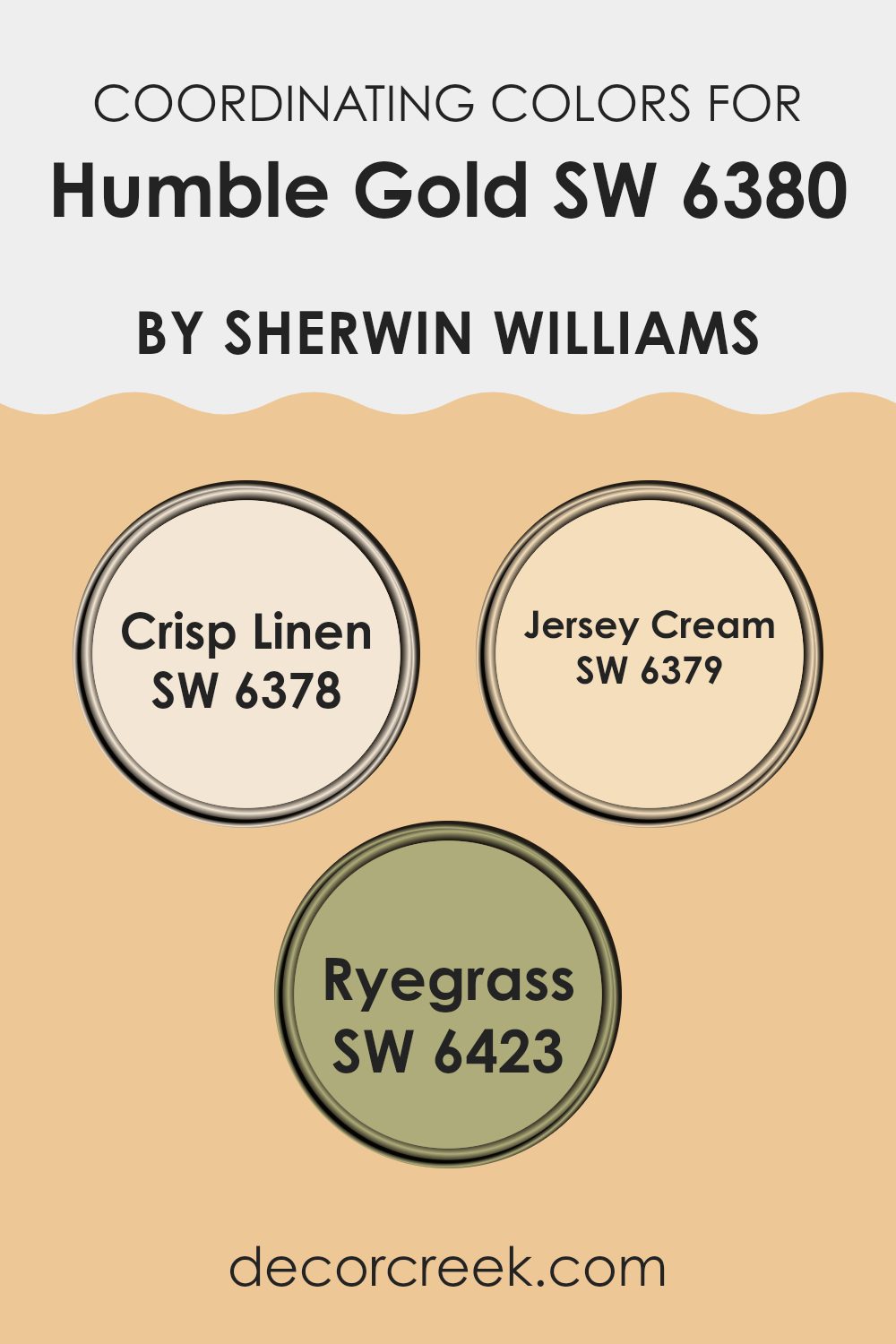
Coordinating Colors of Humble Gold SW 6380 by Sherwin Williams
Coordinating colors are chosen to complement a main color, enhancing the overall aesthetic of a space by providing balance and harmony. When selecting coordinating colors, it’s important to consider their relationship on the color wheel as well as their saturation and brightness. This helps in achieving a cohesive look that flows naturally from one area to another.
For the warm golden hue of a popular paint color, three coordinating colors have been carefully selected: Crisp Linen, Jersey Cream, and Ryegrass. These colors work together to create a welcoming and balanced environment, ensuring that none of the colors overpower the others.
Crisp Linen is a soft, muted shade that offers a subtle contrast, making it a great background color that allows bolder colors to stand out. With its understated elegance, it provides a calm and gentle canvas that complements deeper tones perfectly. Jersey Cream is a warm, creamy color that adds a hint of richness and depth. It works seamlessly with warmer hues, enhancing the cozy feeling of a room without overwhelming it with too much intensity.
Ryegrass introduces a refreshing splash of green, adding a natural, earthy element to the palette. This color is perfect for those looking to add a touch of nature-inspired vibrancy, grounding the space in comfort and freshness. Together, these coordinating colors offer a harmonious palette that supports the warmth and subtle sophistication of the main gold tone.
You can see recommended paint colors below:
- SW 6378 Crisp Linen
- SW 6379 Jersey Cream
- SW 6423 Ryegrass
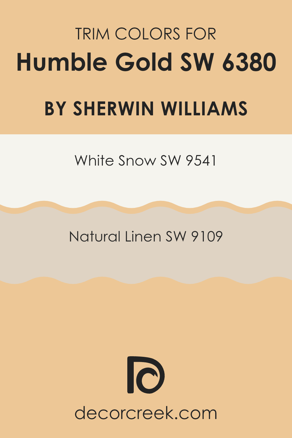
What are the Trim colors of Humble Gold SW 6380 by Sherwin Williams?
Trim colors are essentially the accent colors used on the architectural elements of a room, such as baseboards, moldings, door and window frames, to enhance the main color painted on the walls. Choosing the right trim color is crucial because it defines and highlights the architectural features of a room, creating clear visual boundaries that make wall colors stand out more vividly.
For a warm, inviting shade like Humble Gold by Sherwin Williams, selecting the right trim colors can significantly affect the overall ambiance and cohesion of the space. White Snow SW 9541 is a crisp, clean shade of white that provides a strong contrast against richer, darker colors like Humble Gold.
This sharp differentiation makes the wall color pop and delivers a fresh, neat look to the space. On the other hand, Natural Linen SW 9109 offers a softer contrast. It’s a gentle, warm beige that echoes some of the warmth of Humble Gold, lending a smooth and harmonious transition between the wall and trim, creating a more subtle and cohesive appearance. Both trim colors, depending on preference, help enhance the beauty of the wall shade while fitting seamlessly into the overall design aesthetic.
You can see recommended paint colors below:
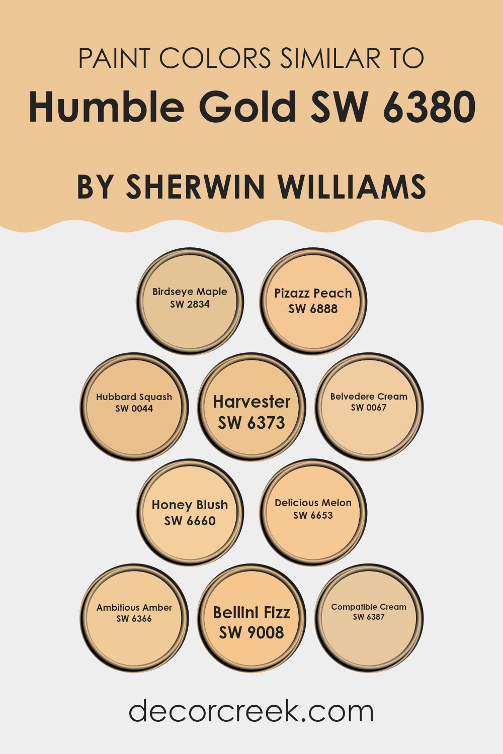
Colors Similar to Humble Gold SW 6380 by Sherwin Williams
Choosing similar colors is essential when you’re aiming for a cohesive and harmonious look in your design. Using colors like Humble Gold by Sherwin Williams and its similar shades ensures that the various elements in your space blend seamlessly. These colors share common undertones that allow them to complement each other without overpowering the space. In addition to aesthetic harmony, similar colors can also enhance the perceived size of a space, making smaller rooms feel larger and more open.
For instance, Birdseye Maple SW 2834 offers a gentle, muted hue that functions well as a soft backdrop in spaces where subtlety is key. Pizazz Peach SW 6888, on the other hand, brings a light, peachy tone that adds a touch of warmth to the environment. Hubbard Squash SW 0044 is a rich, creamy color, perfect for creating a cozy and inviting atmosphere.
Harvester SW 6373 has a cheerful yellow hue that brightens any room instantly, while Belvedere Cream SW 0067 is slightly deeper, providing a gentle warmth. Honey Blush SW 6660 is an ideal option for those looking for a hint of softness in their color scheme without going too bold. Delicious Melon SW 6653 adds a playful pop of color, perfect for vibrant, dynamic spaces.
Ambitious Amber SW 6366 is a bold, inviting shade that works well to inject personality into a room. Bellini Fizz SW 9008 is lighthearted and airy, making it a good choice for spaces that want to maintain a light and breezy vibe. Finally, Compatible Cream SW 6387 is a neutral, versatile shade that pairs pleasantly with a wide range of décor, ensuring flexibility in styling and re-styling.
You can see recommended paint colors below:
- SW 2834 Birdseye Maple
- SW 6888 Pizazz Peach
- SW 0044 Hubbard Squash
- SW 6373 Harvester
- SW 0067 Belvedere Cream
- SW 6660 Honey Blush
- SW 6653 Delicious Melon
- SW 6366 Ambitious Amber
- SW 9008 Bellini Fizz
- SW 6387 Compatible Cream
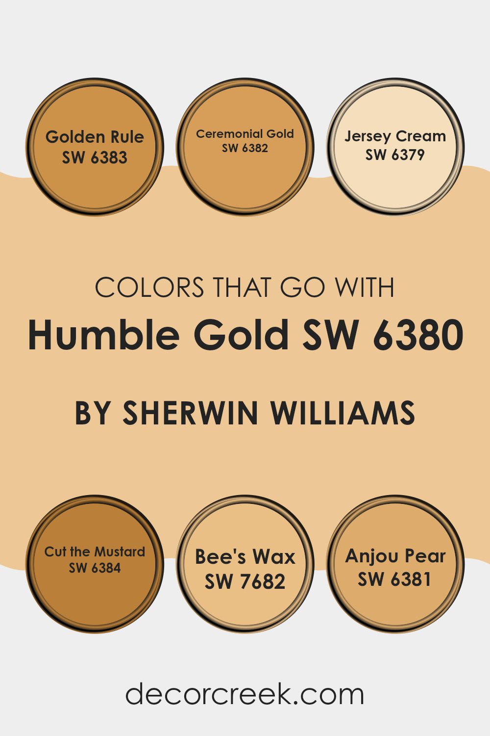
Colors that Go With Humble Gold SW 6380 by Sherwin Williams
Selecting compatible colors for Humble Gold SW 6380 by Sherwin Williams plays a crucial role in creating a cohesive and appealing design palette. These complementary shades help in balancing the vibrant yet warm tone of Humble Gold, ensuring that the space feels harmonious and inviting. Colors such as Golden Rule SW 6383 and Ceremonial Gold SW 6382 offer a subtle variation in hue that enriches the depth of the decor.
Golden Rule has a muted yellow tone that exudes a cozy, sunlit charm, making it ideal for a space that aims for a soft, warm glow. Ceremonial Gold, on the other hand, has a deeper, more pronounced golden hue perfect for adding a dash of regality and warmth to any room.
Further, Jersey Cream SW 6379 adds a light and creamy touch that can brighten spaces without overwhelming the golden tones of Humble Gold. It’s light enough to offer a soothing contrast, yet retains a warmth that complements the overall palette.
Cut the Mustard SW 6384 is a bold, darker yellow that grounds the palette, providing a strong foundational color that adds drama and intensity. Bee’s Wax SW 7682 introduces a smooth, neutral backdrop that allows Humble Gold to shine, making it a great choice for larger areas or furniture pieces.
Lastly, Anjou Pear SW 6381 offers a splash of greenery-inspired freshness, which works beautifully to introduce a natural and lively aspect to the environment. All these colors collectively create a balanced and warm atmosphere when paired with Humble Gold.
You can see recommended paint colors below:
- SW 6383 Golden Rule
- SW 6382 Ceremonial Gold
- SW 6379 Jersey Cream
- SW 6384 Cut the Mustard
- SW 7682 Bee’s Wax
- SW 6381 Anjou Pear
How to Use Humble Gold SW 6380 by Sherwin Williams In Your Home?
Humble Gold by Sherwin Williams is a warm and rich yellow paint color that brings a cozy, sunny vibe to any room. This shade is perfect if you want to add a touch of brightness without overwhelming your space. It works well in living rooms or dining areas where you gather with friends and family, giving a welcoming and cheerful feel.
For those looking to refresh their kitchen, Humble Gold can make the space feel more inviting and lively. Pair it with white cabinets or dark countertops to create a balanced look. In bedrooms, using this color on one accent wall can keep the room light and airy while adding a pop of color that’s not too intense.
Humble Gold also pairs nicely with natural elements like wooden furniture or green houseplants, enhancing its warm undertones. Because it’s not too bold, it’s easy to match with various decors, helping you give your home a fresh, friendly look without too much effort.
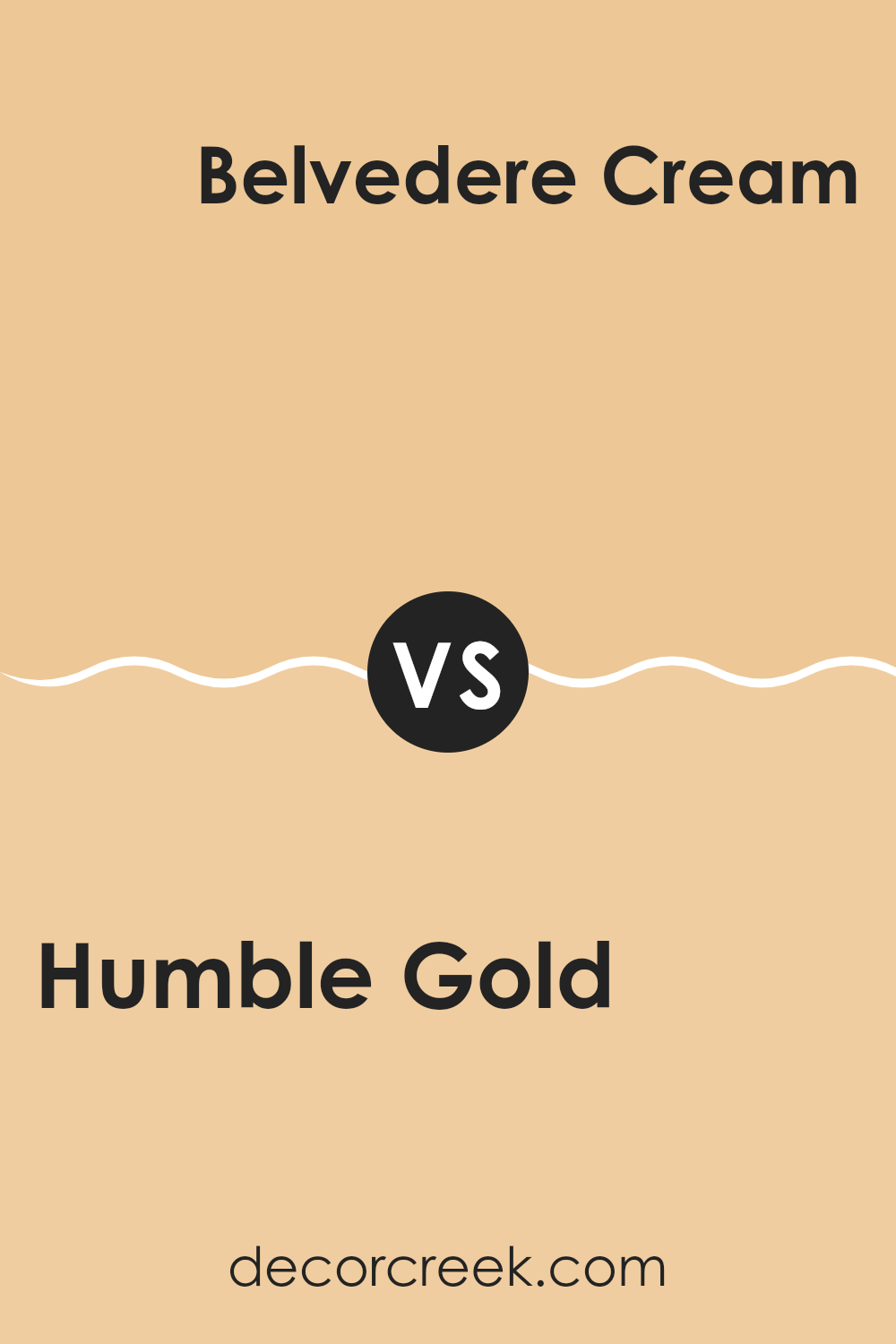
Humble Gold SW 6380 by Sherwin Williams vs Belvedere Cream SW 0067 by Sherwin Williams
Humble Gold is a warm, soft shade of yellow with a slight mustard tone, giving it a cozy and inviting feel, making any space seem more welcoming and lived-in. It pairs well with natural elements like wooden furniture and lush green plants.
In contrast, Belvedere Cream is a softer, more neutral shade that leans towards a classic cream with subtle yellow undertones. It provides a clean and calming backdrop that is highly versatile, blending seamlessly with other colors and decor styles.
While Humble Gold adds a touch of warmth and character, Belvedere Cream is perfect for creating a muted, elegant look without overpowering other design elements. Both colors offer unique benefits and can beautifully transform a room depending on the desired atmosphere and complementing decor.
You can see recommended paint color below:
- SW 0067 Belvedere Cream
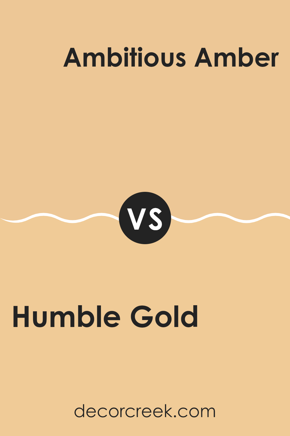
Humble Gold SW 6380 by Sherwin Williams vs Ambitious Amber SW 6366 by Sherwin Williams
Humble Gold and Ambitious Amber are two warm, inviting colors offered by Sherwin Williams. Humble Gold is a muted, soft golden yellow with an earthy tone that adds a cozy, gentle feel to any space. It’s a versatile color that blends well with natural elements and can be used in living rooms or bedrooms to create a calm, welcoming atmosphere.
On the other hand, Ambitious Amber is a richer, deeper hue compared to Humble Gold. This color is a bold amber that leans towards an orangey-brown, giving it a more vibrant feel. Ambitious Amber works well in spaces where you want to make a statement or bring some warmth, such as in dining rooms or entryways.
Both colors share a warmth that is ideal for creating inviting spaces, but Humble Gold offers a softer approach while Ambitious Amber goes for a striking impact. Depending on the vibe you’re aiming for, each color has its unique appeal that can be used effectively in home décor.
You can see recommended paint color below:
- SW 6366 Ambitious Amber
Humble Gold SW 6380 by Sherwin Williams vs Delicious Melon SW 6653 by Sherwin Williams
Humble Gold and Delicious Melon are two distinct colors from Sherwin Williams that offer unique vibes to any space. Humble Gold is a rich, muted yellow with a touch of brown, giving it a warm and cozy feel. It’s perfect for creating a welcoming atmosphere in living rooms or dining areas.
On the other hand, Delicious Melon is a bright, vibrant orange that adds a cheerful and lively touch. This color works great in kitchens, playrooms, or any space that benefits from a pop of energy and fun.
Both colors are versatile and can be used in various decorating styles, but they serve different moods and settings. Humble Gold is more subdued and is excellent for a more relaxed, understated look. Delicious Melon, with its energetic hue, is ideal for spaces that aim to be more dynamic and engaging. Depending on what you want to achieve in a room, either could be a fitting choice, whether you’re looking to calm things down or spice them up.
You can see recommended paint color below:
- SW 6653 Delicious Melon
Humble Gold SW 6380 by Sherwin Williams vs Harvester SW 6373 by Sherwin Williams
Humble Gold and Harvester are two distinct shades offered by Sherwin Williams. Humble Gold is a warm, muted yellow with an understated, cozy feel, perfect for creating a welcoming space. It pairs nicely in rooms where a gentle touch of warmth is desired without overwhelming the senses.
On the other hand, Harvester presents a brighter, more vibrant yellow. This color brings a cheerful and energetic vibe to any space, making it great for areas like kitchens or playrooms where you want to inspire activity and joy.
While both colors share a base in the yellow family, Humble Gold leans towards a softer, more subdued ambiance, whereas Harvester offers a punchier, more lively atmosphere. Choosing between them depends on the desired mood and function of the room.
You can see recommended paint color below:
- SW 6373 Harvester
Humble Gold SW 6380 by Sherwin Williams vs Pizazz Peach SW 6888 by Sherwin Williams
Humble Gold and Pizazz Peach are two distinctive colors from Sherwin Williams. Humble Gold is a warm, muted shade of gold with a touch of brown, making it a cozy and welcoming color. It can set a calm, inviting mood in a room and pairs well with a variety of decor styles.
On the other hand, Pizazz Peach is a bright, vibrant peach tone that adds a cheerful pop of color to any space. It’s much more energetic and lively compared to the subdued nature of Humble Gold.
Pizazz Peach works great for adding a sense of fun and freshness, especially in kitchens or playrooms. In summary, Humble Gold offers a soft, understated warmth, whereas Pizazz Peach brings a bold and lively burst, making each suitable for different atmospheres and preferences.
You can see recommended paint color below:
- SW 6888 Pizazz Peach
Humble Gold SW 6380 by Sherwin Williams vs Birdseye Maple SW 2834 by Sherwin Williams
The main color, Humble Gold, is a warm, rich yellow with a subtle earthy vibe. It brings a cozy and welcoming feel to any space, making it perfect for living areas or bedrooms where you want to create a comfortable atmosphere.
In comparison, Birdseye Maple is a pale, creamy yellow. It’s lighter and gives a more delicate touch to spaces, ideal for smaller rooms or areas where you want to enhance natural light.
While Humble Gold has a more pronounced golden tone that can make a room feel more enclosed and intimate, Birdseye Maple opens up a space with its lighter and brighter quality. The two colors could work well together in different parts of a home, using Humble Gold for a striking accent and Birdseye Maple for a gentle background, or vice versa, depending on personal preference and the desired effect in the room.
You can see recommended paint color below:
- SW 2834 Birdseye Maple
Humble Gold SW 6380 by Sherwin Williams vs Hubbard Squash SW 0044 by Sherwin Williams
Humble Gold and Hubbard Squash are two distinctive colors from Sherwin Williams that have their own unique qualities. Humble Gold has a warm, muted yellow tone that suggests a touch of coziness and comfort.
It’s subtle enough to work as a backdrop for various design schemes while still adding a bit of cheer. On the other hand, Hubbard Squash sports a richer, deeper orange-yellow hue. This color is bolder and can make a strong statement in a room. It’s perfect for creating a focal point or adding a vibrant splash to a space.
Comparatively, Humble Gold provides a more understated warmth, making it easier to blend with other colors, whereas Hubbard Squash stands out and works well with contrasting colors to really pop. Both colors can add warmth to any space but in different intensities and moods.
You can see recommended paint color below:
- SW 0044 Hubbard Squash
Humble Gold SW 6380 by Sherwin Williams vs Honey Blush SW 6660 by Sherwin Williams
Humble Gold and Honey Blush are two distinct shades offered by Sherwin Williams. Humble Gold is a rich, deep yellow with a subtle earthy tone that gives off a warm, inviting vibe. It’s perfect for creating a cozy atmosphere in spaces like living rooms or bedrooms.
On the other hand, Honey Blush has a brighter, more vibrant quality. It’s a cheerful color that closely resembles the natural hue of honey. This color works well in areas where you want to add a lively and energetic feel, such as kitchens or dining areas.
While both colors share a yellow base, Humble Gold leans towards a muted, golden shade that can often feel more grounded and calming. Honey Blush, with its vividness, can instantly brighten a space and make it feel more dynamic. Both colors can enrich a home in their unique ways, depending on the mood and tone you want to set for each room.
You can see recommended paint color below:
- SW 6660 Honey Blush
Humble Gold SW 6380 by Sherwin Williams vs Compatible Cream SW 6387 by Sherwin Williams
The main color, Humble Gold, is a warm, rich golden hue with a soft, welcoming feel. It’s the kind of color that adds a cozy, cheerful vibe to any room, making spaces feel more inviting and comfortable. It works well in living areas or bedrooms where you want to create a relaxed, homey mood.
In contrast, Compatible Cream is a lighter, gentler color. It’s a soft, creamy shade that provides a neutral backdrop, perfect for pairing with bolder colors or as a standalone for a calm, subtle effect. This color is versatile and suits various decorating styles, from contemporary to traditional.
Both Humble Gold and Compatible Cream have their unique appeal and can be used together effectively. Humble Gold offers depth and warmth, while Compatible Cream brings a smooth, light contrast, enhancing spaces with a fresh, airy feel. They can be paired to balance out each other, with Humble Gold as an accent and Compatible Cream covering larger areas.
You can see recommended paint color below:
- SW 6387 Compatible Cream
Humble Gold SW 6380 by Sherwin Williams vs Bellini Fizz SW 9008 by Sherwin Williams
Humble Gold and Bellini Fizz are both unique colors by Sherwin Williams, but they have distinctly different tones and moods. Humble Gold is a warm, muted yellow with a cozy and welcoming feel. It offers a soft, golden hue that works beautifully in spaces where you want to add a sense of comfort without overwhelming brightness.
This color pairs well with dark woods and rich textures, making it ideal for living rooms or cozy study areas. On the other hand, Bellini Fizz is a lighter and more playful color.
It has a peachy-pink tone that brings a fresh and cheerful energy to any space. Perfect for adding a subtle splash of color, Bellini Fizz is great for bathrooms, kitchens, or even as an accent wall in a nursery. It’s less grounded than Humble Gold and provides a more airy and light-hearted vibe. This makes it versatile for spaces that aim to feel open and inviting.Together, these colors offer choices between a grounded, subtle warmth and a bright, cheerful lightness.
You can see recommended paint color below:
- SW 9008 Bellini Fizz
I can imagine using Humble Gold in a living room or a kitchen where you want to create a friendly and relaxed environment. What’s great about this color is how it goes well with different types of furniture and decorations, whether they are light or dark. It sounds perfect for someone who wants to add a bit of warmth to their home without making it feel too busy or colorful.
Overall, Humble Gold by Sherwin Williams seems like a fantastic choice for anyone looking to freshen up their home with a new paint color that is warm and easy to get along with. Whether you’re painting an entire room or just an accent wall, this color could be just the right pick. It’s sure to make any room feel more cozy and inviting.
Ever wished paint sampling was as easy as sticking a sticker? Guess what? Now it is! Discover Samplize's unique Peel & Stick samples.
Get paint samples

