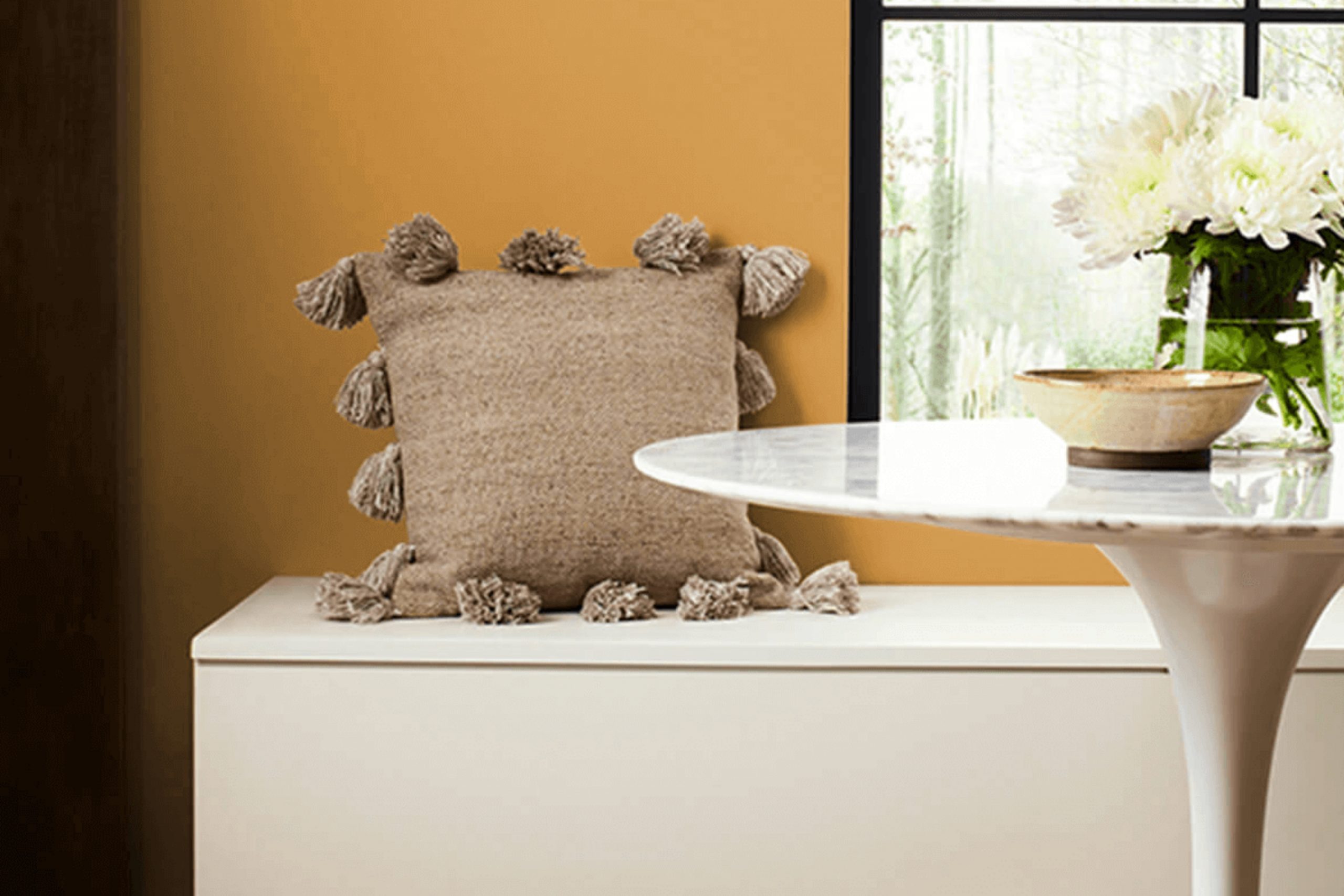
When looking for a paint color that adds a rich, warm touch to any room, I find SW 6383 Golden Rule by Sherwin Williams particularly appealing. It’s a shade that can breathe life into a space while still maintaining a classic feel. The color embodies a deep, golden yellow that resembles sunlight bathing a room in comfort and warmth. It’s friendly yet bold, making it versatile for both living areas and spaces like kitchens or home offices.
When applied, Golden Rule has the ability to make large rooms feel cozy and small spaces appear brighter. Whether you’re thinking of accent walls or a complete makeover, this color establishes an inviting ambiance. I’ve noticed that it pairs beautifully with dark woods and traditional furnishings, bringing a cohesive look to diverse design elements.
The versatility of Golden Rule doesn’t end at aesthetics; it’s also practical. The richness of the color helps in hiding imperfections on walls and brings a long-lasting depth when paired with the right finish.
If you’re considering a change that makes both a visual and practical impact, SW 6383 Golden Rule is definitely a go-to option.
What Color Is Golden Rule SW 6383 by Sherwin Williams?
Golden Rule by Sherwin Williams is a vibrant and warm hue that radiates coziness and hospitality. This color, a rich blend of deep yellow with a hint of orange, brings a cheerful energy to any space. It’s perfect for creating a welcoming atmosphere in rooms that are meant for relaxation and gatherings.
The inviting nature of Golden Rule makes it ideal for living rooms and kitchens, where it can create a sunny, social vibe. It also works well in dining areas, adding a splash of warmth that enhances both mealtimes and special gatherings. Due to its bright and heartening qualities, this color is especially effective in styles like boho chic, rustic, or any setting that favors earthy, vibrant tones.
Golden Rule pairs beautifully with natural materials such as wood, adding an organic touch to the overall aesthetic. When it comes to textures, it complements rough, tactile surfaces like burlap or linen, enhancing the visual and tactile richness of a room. This color also looks stunning when matched with brushed metals such as copper or gold, which highlight its warm undertones and create an inviting, cohesive look.
Whether aiming for a homey rustic feel or a cheerful modern design, Golden Rule provides a versatile foundation that can breathe life into various decorating ambitions.
Is Golden Rule SW 6383 by Sherwin Williams Warm or Cool color?
Golden Rule SW 6383 by Sherwin Williams is a rich and warm shade of yellow that can bring a cozy and inviting atmosphere to any home. This particular color is perfect for creating a cheerful and welcoming environment in spaces like living rooms, kitchens, or dining areas. The brightness of Golden Rule helps to make smaller or darker rooms appear more open and airy. This can be especially helpful in homes with limited natural light.
When used on walls, this shade compleates well with a wide range of colors, allowing for versatile design options. It pairs beautifully with whites, greys, and even darker shades like navy, bringing a balanced look to a room.
Additionally, this color can serve as a striking background for decor elements such as artwork, shelves, and furniture, highlighting them without overpowering. Overall, Golden Rule is a great choice for anyone looking to add a touch of warmth and cheerfulness to their living space. Its ability to make spaces feel more lively and inviting makes it a popular choice for many homeowners.
Undertones of Golden Rule SW 6383 by Sherwin Williams
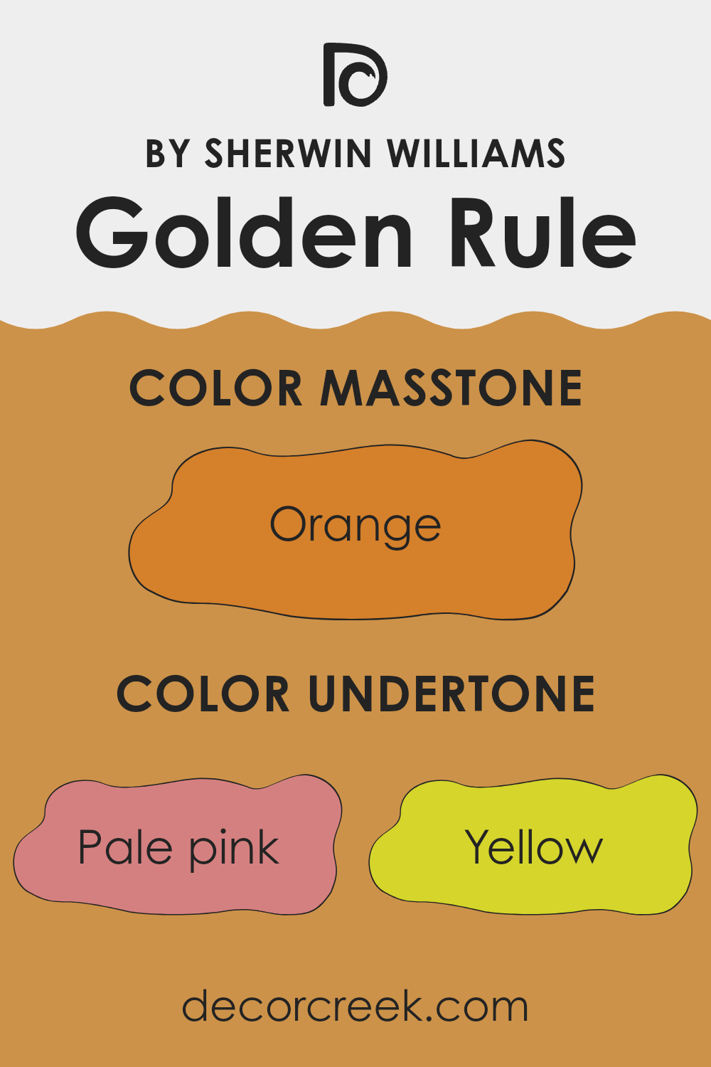
Golden Rule is a unique and vibrant paint color from Sherwin-Williams, known for its warm and inviting hue. The undertones of a paint color are subtle colors that can influence the main color when viewed under different lighting conditions or when paired with other colors. For Golden Rule, these undertones include a variety of shades like pale pink, yellow, olive, pale yellow, grey, light green, red, mint, pink, brown, and purple.
Undertones are crucial because they can change how we perceive the main color. For example, pale pink and red undertones in Golden Rule add a soft warmth, making the space feel cozy. Yellow and pale yellow undertones bring brightness, giving a room a sunnier outlook. Olive and brown undertones lend an earthy richness, which can make a space feel grounded and balanced.
When used on interior walls, Golden Rule’s combination of undertones allows it to adapt to different styles and lighting conditions, making it versatile. In natural light, the yellow and light green undertones might become more pronounced, energizing the room. In artificial light, the pink and red undertones could dominate, creating a welcoming, warm feel.
Choosing this paint color for an interior means considering these dynamic undertones, as they significantly impact the ambiance and mood of the room. Whether creating a cheerful space or a cozy retreat, Golden Rule with its rich undertones offers plenty of decorating possibilities.
What is the Masstone of the Golden Rule SW 6383 by Sherwin Williams?
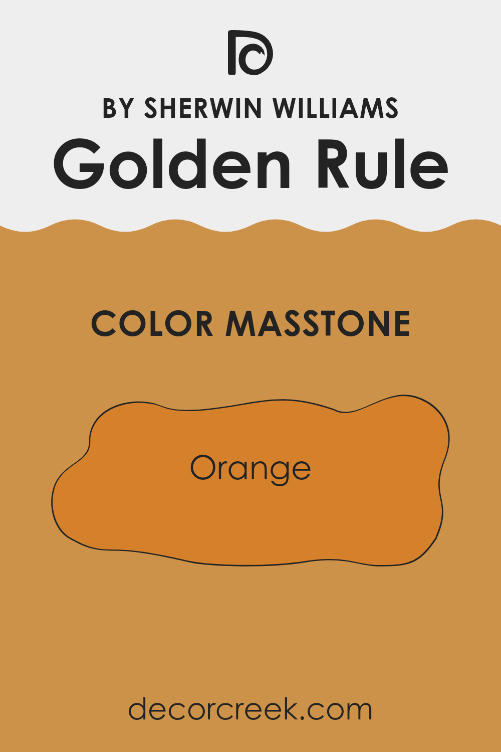
Golden Rule SW 6383 is a dynamic shade of orange by Sherwin Williams. The masstone of this color, Orange (#D5802B), brings a bold and warm vibe to any space. In homes, this vibrant hue adds a touch of energy and cheerfulness. It’s perfect for spaces like kitchens and living rooms where you want a lively, welcoming atmosphere.
Using this orange in smaller amounts, like on an accent wall or in home decor items, can liven up a room without overwhelming it. When mixed with neutral colors such as white, grey, or beige, Golden Rule creates a balanced look, making the space feel cozy yet lively. It’s also great for sparking creativity, making it a good choice for a home office or a creative corner.
Due to its brightness, it’s best to use this color thoughtfully to prevent it from overpowering other elements in the room. Light or natural lighting can also influence how this color appears and feels in a space, so consider the room’s lighting when decorating with Golden Rule.
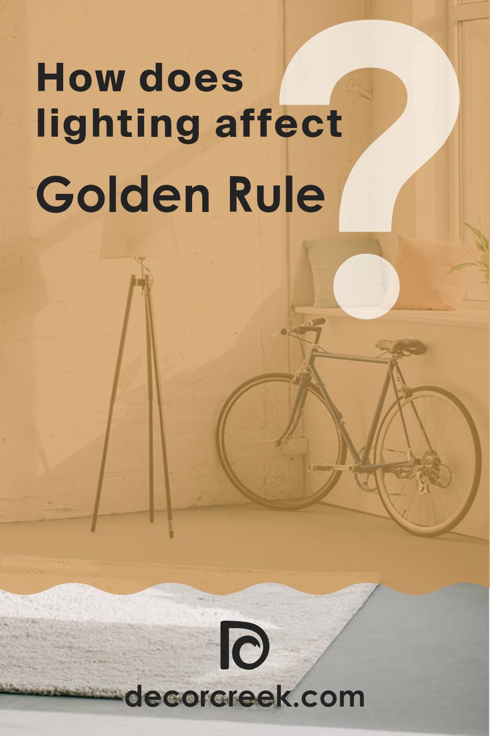
How Does Lighting Affect Golden Rule SW 6383 by Sherwin Williams?
Lighting plays a critical role in how colors are perceived in any space. Essentially, different lighting conditions can dramatically change the appearance of a paint color on your walls. This is especially true for a color like Golden Rule, a warm, inviting shade of yellow.
In terms of artificial light, the kind of bulb used makes a difference. Warm white bulbs enhance the coziness of Golden Rule, making it appear richer and more amber. In contrast, cool white bulbs might make it look brighter and slightly washed out. The intensity and direction of artificial light also influence how this color manifests. Spot lighting can create a vivid glow on specific wall sections, while ambient lighting provides a soft, even coat across an entire room.
Under natural light, Golden Rule also shifts in appearance throughout the day. Morning light in an east-facing room brings out the brightness of this yellow, making it vibrant and lively. As the sun moves, south-facing rooms capture the most light, especially in the midday, allowing Golden Rule to shine in its full golden splendor, creating a cheerful atmosphere.
However, in north-facing rooms, where sunlight is cooler and more diffuse, Golden Rule may look more muted and subtle. It won’t have that bright, sunny effect but will still warm up the space gently. In west-facing rooms, the evening light can cast a beautiful glow on Golden Rule, making the walls come alive with a warm, soft radiance during sunset.
Room orientation and lighting conditions are essential to consider when choosing colors for your space because they determine the color’s true impact. Golden Rule, with its warm hues, generally adds warmth and light but can appear differently based on where and how it’s used.
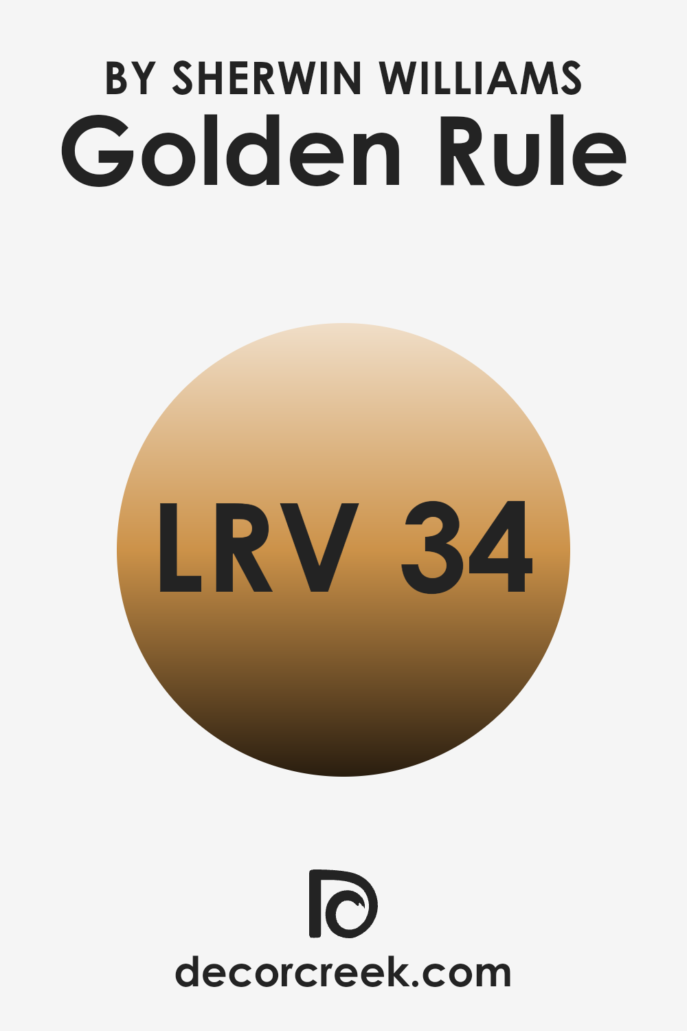
What is the LRV of Golden Rule SW 6383 by Sherwin Williams?
LRV stands for Light Reflectance Value, which is a measurement used to determine the percentage of light a paint color reflects. This scale helps people decide how light or dark a color will look when applied to walls in various environments.
A higher LRV means the color reflects more light, making it appear lighter, and is thus more suitable for small or dark rooms as it makes the space feel airier and more open. Conversely, a lower LRV means the color absorbs more light, making it look darker, which can be used to create a cozier or more enclosed feel in a space.
The color Golden Rule SW 6383 has an LRV of 33.757, placing it on the darker side of the scale. This means it will absorb more light than it reflects, giving it a richer and deeper appearance on the walls. As such, it might not be the best choice for a small, poorly lit room as it could make the space appear even smaller and darker. However, in a well-lit area or a larger room, this warm hue can add a sense of warmth and depth, making the environment feel inviting and comfortable. When using a color with this LRV, lighting should be carefully considered to enhance the space effectively.
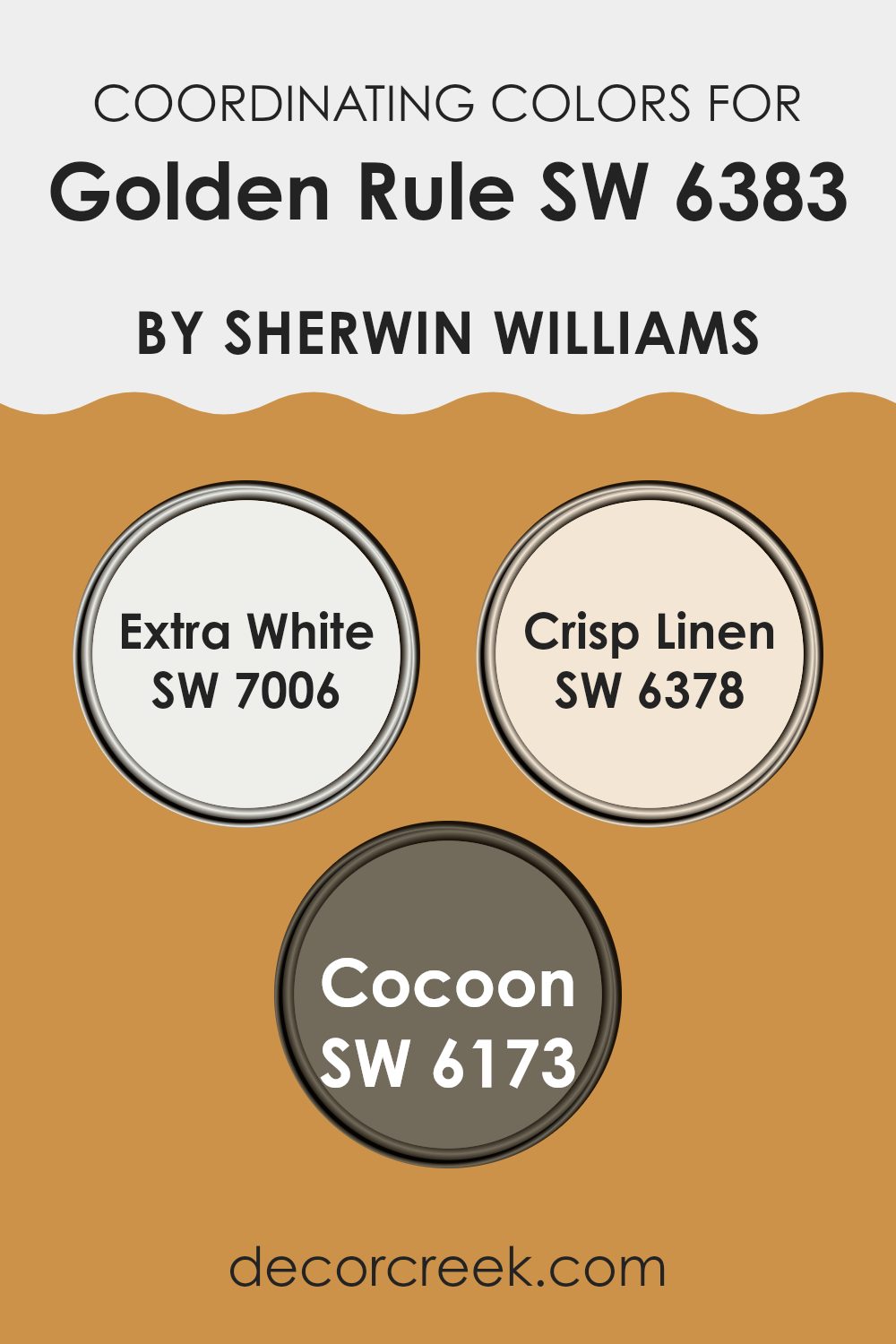
Coordinating Colors of Golden Rule SW 6383 by Sherwin Williams
Coordinating colors are shades that harmonize well with a primary color, enhancing the overall aesthetic of a space without overwhelming the main hue. In the case of Golden Rule, a rich, inviting shade by Sherwin Williams, selecting the right coordinating colors is essential to achieve a balanced and appealing look. The chosen coordinating colors can influence the mood and style of the room, making it important to select those that complement the primary color effectively.
One coordinating color, Extra White (SW 7006), is a clean and crisp shade that provides a stark contrast to the warmth of Golden Rule. It works well to bring out the richness of the primary color and adds a fresh brightness to spaces, making it excellent for trim and ceilings for a polished look.
Crisp Linen (SW 6378) offers a soft, subtle warmth, acting as a gentle bridge between the robust Golden Rule and more neutral or light accents. This shade is perfect for adjoining walls or larger areas where a softer touch is needed. Lastly, Cocoon (SW 6173) is a deeper, muted color that complements the vibrancy of Golden Rule by adding depth and warmth, ideal for creating cozy corners or accent walls in a room. Together, these coordinating colors work synergistically to create a cohesive and inviting environment.
You can see recommended paint colors below:
- SW 7006 Extra White
- SW 6378 Crisp Linen
- SW 6173 Cocoon
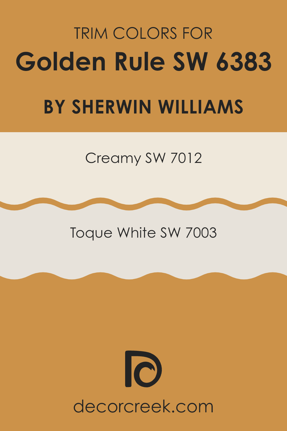
What are the Trim colors of Golden Rule SW 6383 by Sherwin Williams?
Trim colors are vital in home decor for accentuating the architectural details and creating distinct visual outlines that enhance both the interior and exterior of a building. When used correctly, like with the striking Golden Rule by Sherwin Williams, trim colors can frame and complement the main hues, emphasizing a polished finish.
Selecting the right trim color, such as Sherwin Williams’ Creamy or Toque White, plays a crucial role in highlighting the robust tones of Golden Rule, ensuring that design elements are crisply defined and that the overall look feels harmoniously put together.
Creamy SW 7012 by Sherwin Williams is a light, soft buttery color that adds a warm and gentle contrast when paired as a trim color with bolder hues like Golden Rule. It helps in softening transitions between colors, making the space feel cozy and inviting. On the other hand, Toque White SW 7003 is a neutral, slightly off-white tone that offers a clean and subtle differentiation, making it a fantastic choice for trim as it helps in creating a fresh and neatly tailored appearance. Both colors support the main shade in achieving a seamless yet noticeable aesthetic throughout a room or on an exterior.
You can see recommended paint colors below:
Colors Similar to Golden Rule SW 6383 by Sherwin Williams
When decorating your space, choosing similar colors can create a comforting and harmonious atmosphere. These colors blend seamlessly, offering a visually appealing and cohesive look that elevates the aesthetic of any room. For instance, the palette of colors similar to Golden Rule by Sherwin Williams includes shades like Honeycomb and Tassel. Honeycomb is a warm, amber hue that exudes a cozy, inviting vibe, while Tassel has a slightly deeper yellow-gold tone that reflects a cheerful and sunny ambiance.
Further examples include Ceremonial Gold, a rich golden color with a touch of majesty, and Saffron Thread, which adds a dash of vibrant yellow that is bright and eye-catching. Curry is another option, presenting a deep mustard-like shade that brings warmth to the surroundings, while Bakelite Gold offers a muted, antique gold appearance that pairs well in vintage-inspired settings.
Colors like Gold Coast and Trinket are also in this family; Gold Coast features a deep, sunlit hue resembling a sunset, and Trinket, a lighter, playful gold, is perfect for adding a subtle sparkle. Rounding out the selection, Bosc Pear and Butternut provide unique takes on the golden theme, with Bosc Pear leaning towards a dusty gold with greenish undertones and Butternut showing off a soft, peachy-gold that is soothing to the eye. These colors work well together or individually to create a space that feels connected and beautifully arrayed.
You can see recommended paint colors below:
- SW 6375 Honeycomb
- SW 6369 Tassel
- SW 6382 Ceremonial Gold
- SW 6663 Saffron Thread
- SW 6671 Curry
- SW 6368 Bakelite Gold
- SW 6376 Gold Coast
- SW 6685 Trinket
- SW 6390 Bosc Pear
- SW 6389 Butternut

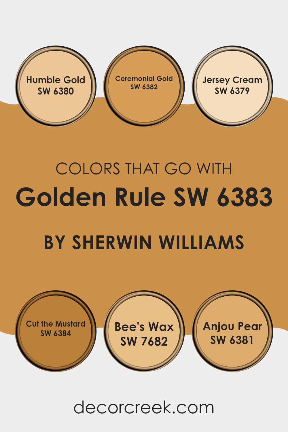
Colors that Go With Golden Rule SW 6383 by Sherwin Williams
Choosing the right colors to complement Golden Rule SW 6383 by Sherwin Williams is crucial because it helps create a harmonious and pleasing atmosphere in any space. Golden Rule is a warm, inviting shade that can easily be paired with other colors to enhance the aesthetic appeal of a room. When paired with compatible colors like Humble Gold, Ceremonial Gold, Jersey Cream, Cut the Mustard, Bee’s Wax, and Anjou Pear, it creates a cohesive look that can make spaces feel more welcoming and cohesive.
Humble Gold SW 6380 is a subtle, mellow gold that carries a hint of earthiness, making it perfect for adding a touch of warmth without overwhelming a space. Ceremonial Gold SW 6382 has a deeper, more pronounced golden tone that suggests richness and warmth, ideal for accent walls or decorations.
Jersey Cream SW 6379 offers a lighter, creamy hue that brightens spaces and works well in areas that receive a lot of natural light. Cut the Mustard SW 6384 is a bolder, darker yellow that adds a bit of drama and personality to an otherwise neutral palette. Bee’s Wax SW 7682 brings a soft, muted yellow, offering a gentle contrast that is soothing to the eye.
Lastly, Anjou Pear SW 6381 displays a unique blend of yellow-green, providing a refreshing twist that complements the earthy tones of Golden Rule. Using these colors together not only enhances the visual impact of a room but also allows for a flexible decorating style that can suit various tastes and preferences.
You can see recommended paint colors below:
- SW 6380 Humble Gold
- SW 6382 Ceremonial Gold
- SW 6379 Jersey Cream
- SW 6384 Cut the Mustard
- SW 7682 Bee’s Wax
- SW 6381 Anjou Pear
How to Use Golden Rule SW 6383 by Sherwin Williams In Your Home?
Golden Rule SW 6383 by Sherwin Williams is a warm and inviting shade of yellow that can add a cheerful touch to any home. This color is vibrant enough to make a statement yet soft enough to be soothing, making it a great choice for creating a welcoming atmosphere.
You can use it in various ways around your home. For instance, painting an accent wall in a living room or kitchen with Golden Rule can brighten the space and make it feel more cozy. It’s also an excellent choice for dining rooms or entryways where you want to create a friendly vibe.
If you’re not ready to commit to painting entire walls, consider using it for smaller projects like painting a piece of furniture or a door. This color pairs well with neutral shades like white or gray, which helps balance its brightness while maintaining a fresh look.
Golden Rule SW 6383 by Sherwin Williams vs Bosc Pear SW 6390 by Sherwin Williams
Golden Rule and Bosc Pear are both warm, inviting shades produced by Sherwin Williams that can add a cozy feel to any room. Golden Rule is a vibrant, rich yellow with a sunny disposition. This shade is bright and cheerful, creating a welcoming atmosphere in spaces that need a lively boost.
On the other hand, Bosc Pear is a deeper, muted yellow with hints of green, resembling the skin of its namesake fruit. It’s a calmer color, offering a more subdued and earthy feel compared to the energetic vibe of Golden Rule.
Both colors work well in lighting that highlights their unique tones, with Golden Rule best for invigorating spaces and Bosc Pear suited for areas where a more relaxed ambiance is desired. Combining these colors can provide a balanced look with both warmth and depth.
You can see recommended paint color below:
- SW 6390 Bosc Pear
Golden Rule SW 6383 by Sherwin Williams vs Tassel SW 6369 by Sherwin Williams
Golden Rule and Tassel, both by Sherwin Williams, present unique hues that can significantly impact a room’s vibe. Golden Rule offers a deeply rich mustard yellow that brings a warm and cozy feel to any space. It pairs well with dark wood and can give a room an autumnal atmosphere.
On the other hand, Tassel is a lighter, more subdued tan color. It’s versatile and works well in spaces that aim for a soft, neutral look, offering a calm backdrop that complements bolder accents without overpowering them.
While Golden Rule adds a pop of warmth to stimulate a space, Tassel provides a quiet and subtle foundation, making it ideal for relaxing areas. These colors could work beautifully together, with Golden Rule accenting a room decked out in the more laid-back Tassel to create balance and interest.
You can see recommended paint color below:
- SW 6369 Tassel
Golden Rule SW 6383 by Sherwin Williams vs Curry SW 6671 by Sherwin Williams
Golden Rule and Curry are both warm, inviting colors from Sherwin Williams, but they have distinct tones that set them apart. Golden Rule is a rich, deep yellow that brings a cozy and comforting feel to any space, making it perfect for creating a welcoming atmosphere in living rooms or dining areas. It resembles the color of autumn leaves and has a nostalgic charm.
On the other hand, Curry is a brighter, more vibrant shade. It has an energetic vibe that can instantly brighten up a room. This color is excellent for spaces where you want to add a splash of cheerfulness, like a kitchen or a playroom. It’s like the color of sunshine, making it ideal for those who want a lively and refreshing look.
Overall, while both colors add warmth, Golden Rule offers a more subdued, classic feel, whereas Curry brings a lively, cheerful presence. These differences make each color suitable for different settings and moods.
You can see recommended paint color below:
- SW 6671 Curry
Golden Rule SW 6383 by Sherwin Williams vs Butternut SW 6389 by Sherwin Williams
Golden Rule and Butternut, both by Sherwin Williams, are warm hues that bring a cozy vibe to any space. Golden Rule is a rich, deep yellow with a hint of mustard, making it bold and vibrant. It’s perfect for spaces where you want to add a cheerful and lively touch.
In contrast, Butternut leans more towards a light, creamy orange. This color is softer and more subdued, offering a gentler and welcoming atmosphere. Butternut is ideal if you’re aiming for a calm and comforting environment without using a typical neutral.
Together, these colors can create a beautiful balance in a room, with Golden Rule adding energy and Butternut providing a soothing backdrop. They work well in a variety of settings, from modern kitchens to cozy living rooms.
You can see recommended paint color below:
- SW 6389 Butternut
Golden Rule SW 6383 by Sherwin Williams vs Bakelite Gold SW 6368 by Sherwin Williams
Golden Rule and Bakelite Gold are two distinct shades offered by Sherwin Williams. Golden Rule has a deep, rich yellow hue with a touch of orange, giving it a warm and cozy feel that’s inviting in any space. It closely resembles the color of traditional gold, making it perfect for elegant, yet understated accents in a home.
On the other hand, Bakelite Gold has a slightly deeper and more muted tone compared to Golden Rule. It leans more towards a mustard yellow, providing a subtle vintage feel. This color is ideal if you’re looking for something that adds both warmth and a hint of earthiness to a room.
Both colors are great for adding a splash of warmth to a space, but your choice might depend on the specific mood or style you’re aiming for. Golden Rule works well in vibrant, sunny areas, while Bakelite Gold is better suited for spaces where a more subdued, cozy atmosphere is desired.
You can see recommended paint color below:
- SW 6368 Bakelite Gold
Golden Rule SW 6383 by Sherwin Williams vs Saffron Thread SW 6663 by Sherwin Williams
Golden Rule and Saffron Thread are two vibrant shades from Sherwin Williams. Golden Rule is a rich, deep yellow with a hint of orange, giving it a warm and cozy feel. It’s perfect for creating a welcoming atmosphere in any space.
On the other hand, Saffron Thread is a brighter and more intense color. It leans more towards a vivid yellow with strong orange tones, making it more striking and energetic compared to Golden Rule. While Golden Rule creates a subtle and inviting vibe, Saffron Thread stands out and grabs attention, ideal for accent walls or areas where you want to make a statement.
Both colors bring warmth and cheer, but Golden Rule offers a more muted warmth, whereas Saffron Thread provides a bold pop of color. Depending on the mood you want to set in a room, you might choose the subdued elegance of Golden Rule or the lively brightness of Saffron Thread.
You can see recommended paint color below:
- SW 6663 Saffron Thread
Golden Rule SW 6383 by Sherwin Williams vs Ceremonial Gold SW 6382 by Sherwin Williams
Golden Rule and Ceremonial Gold by Sherwin Williams are both warm and inviting colors but have subtle differences. Golden Rule is a vibrant, rich gold with a radiant and sunny tone. It’s perfect for spaces where you want to add a cheerful and bright atmosphere. This color works well in rooms that need a boost of energy or where activities and interactions occur frequently, like living rooms or kitchens.
On the other hand, Ceremonial Gold is slightly darker and has a more muted, understated gold tone. It’s ideal for areas where you prefer a warm ambiance without the brightness of a more vivid gold. This color suits spaces that are meant for relaxing or where you want a touch of warmth without overwhelming brightness, such as bedrooms or dining areas.
Both colors can warm up a room, but Golden Rule stands out more with its sunny disposition, while Ceremonial Gold offers a subtle elegance.
You can see recommended paint color below:
- SW 6382 Ceremonial Gold
Golden Rule SW 6383 by Sherwin Williams vs Trinket SW 6685 by Sherwin Williams
Golden Rule and Trinket are two distinct colors by Sherwin Williams that offer unique vibes for any space. Golden Rule is a warm, rich yellow with a sunny and inviting feel. This color is ideal for creating a cozy and cheerful atmosphere in areas like living rooms or kitchens. Its golden tones can make a space feel more welcoming and bright.
On the other hand, Trinket is a vibrant, intense shade of yellow that leans slightly towards orange. It’s bolder and can add a splash of energy to a room. Due to its vivid nature, Trinket works well in spaces that benefit from a pop of color, such as an accent wall or a playful kids’ room.
Both colors are great for adding warmth to a room, but Golden Rule provides a more muted, traditional warmth, while Trinket offers a more lively and energetic feel. Depending on what mood you want to set, each color has its own charm and utility.
You can see recommended paint color below:
- SW 6685 Trinket
Golden Rule SW 6383 by Sherwin Williams vs Honeycomb SW 6375 by Sherwin Williams
Golden Rule and Honeycomb, both by Sherwin Williams, offer warm and inviting hues, but they vary subtly in their tones. Golden Rule is a rich golden-yellow color that brings a vibrant, bright feel to any space. It stands out as a bold shade that can energize a room and is ideal for making a statement.
On the other hand, Honeycomb is lighter and less intense. It still retains a cheerful warmth but with a softer, more muted approach. This color is perfect for creating a cozy, welcoming atmosphere in areas like living rooms or kitchens.
When deciding between the two, consider the mood you want to set. Golden Rule’s boldness is great for areas that benefit from a splash of energy, whereas Honeycomb’s subdued shade works well where a gentler touch of warmth is needed. Both colors are versatile and can blend nicely with natural materials or other earthy tones.
You can see recommended paint color below:
- SW 6375 Honeycomb

Golden Rule SW 6383 by Sherwin Williams vs Gold Coast SW 6376 by Sherwin Williams
Golden Rule by Sherwin Williams is a warm, vibrant hue that closely resembles the classic look of a shiny gold coin. It has a bright and inviting feel to it, perfect for adding a cheerful splash of color to any space. This shade tends to bring a lively and energetic atmosphere to a room, which makes it great for areas where you want to make a bold statement or uplift the mood.
On the other hand, Gold Coast by Sherwin Williams is slightly darker and richer than Golden Rule. It leans more towards a deeper mustard color, making it a good choice for those looking for something a bit more subdued yet still retaining a golden warmth.
This color can work well in spaces where you want warmth without the brightness of a more vibrant gold, offering a more grounded and cozy feel. Both colors share a golden base, but their intensity and depth differ, making them suitable for various preferences and room settings.
You can see recommended paint color below:
- SW 6376 Gold Coast
Conclusion
As I wrap up my thoughts on this paint, I’m struck by just how cozy and cheerful it makes a room feel. It’s like the color of golden sunshine, and it has a unique way of making spaces feel happy and welcoming.
In my experiments and observations, Golden Rule works amazingly well in living rooms and kitchens where you want to create a friendly atmosphere. It pairs beautifully with soft whites or even dark blues for a striking contrast. What’s more, this color keeps proving how it can brighten up a small, dim area or add a touch of warmth to a modern, simple design.
For anyone thinking of giving their home a fresh coat of paint, Golden Rule is a color you might want to consider. It’s not just another yellow; it’s a shade that carries a feeling of warmth, happiness, and a little bit of the golden hour every hour of the day. Whether used on a feature wall or throughout a room, it’s sure to make your home feel more alive and welcoming.
So if you’re looking to add some cheer and warmth to your home, I would highly recommend SW 6383 Golden Rule. It’s a color that’s both lively and cozy, perfect for making any room a little brighter and a lot more enjoyable.
Ever wished paint sampling was as easy as sticking a sticker? Guess what? Now it is! Discover Samplize's unique Peel & Stick samples.
Get paint samples

