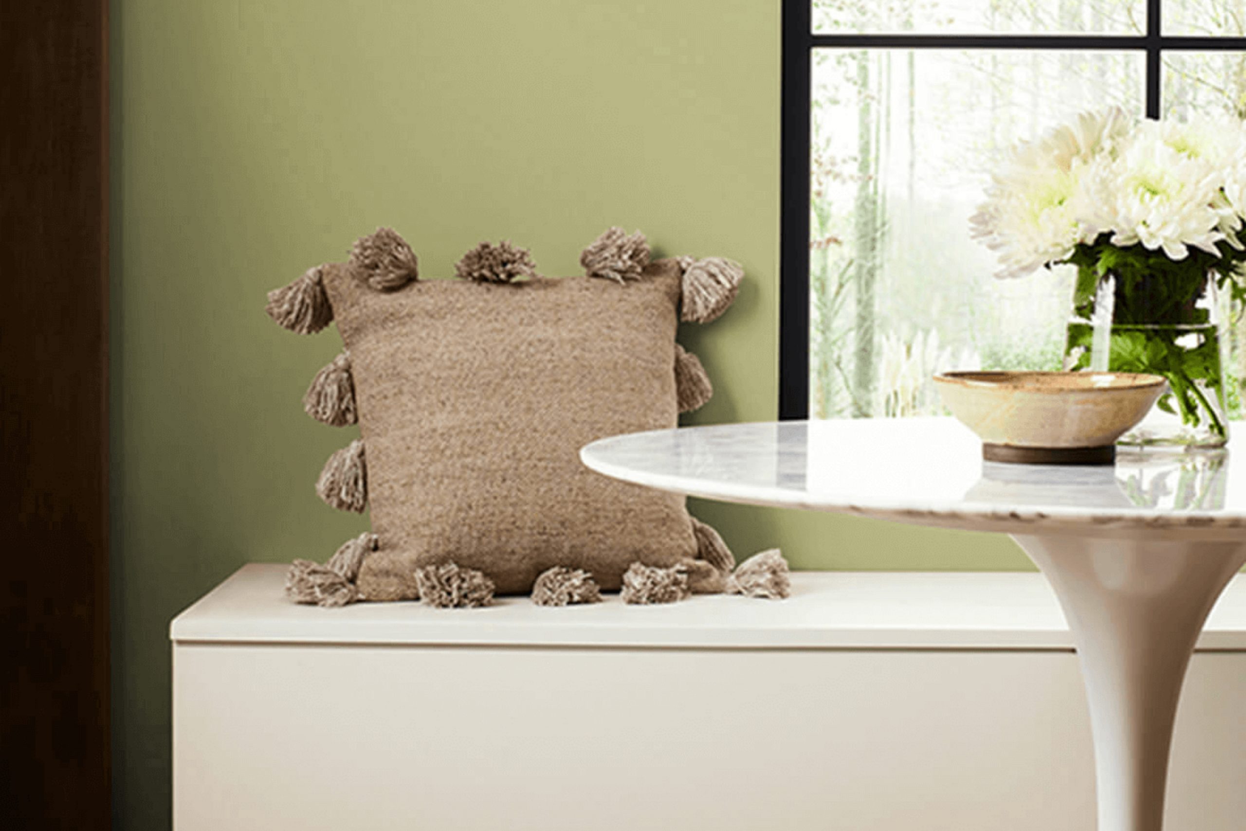
As you explore the world of colors, consider the hue SW 6423 Ryegrass by Sherwin Williams, which might just redefine your space. This shade offers a fresh breath of green that brings a soothing allure, without overpowering the senses. It’s versatile enough to be used in various settings, from creating a serene background in a living room to adding vitality to a kitchen. The color Ryegrass has an organic, earthy vibe that connects your interiors with the natural world outside.
In your journey to refresh your home, Ryegrass serves as a gentle nudge towards a more grounded and calm environment. As someone who enjoys updating their living space, you’ll appreciate how this color complements both modern and traditional decor.
Furthermore, its subtle brightness can be a game changer in spaces that lack natural sunlight, making small rooms feel larger and more inviting.
So, if you’re considering a new look for your walls, Ryegrass is a choice that could seamlessly blend with your existing furnishings while also setting a tranquil, fresh mood for your home.
What Color Is Ryegrass SW 6423 by Sherwin Williams?
Ryegrass by Sherwin Williams is a vibrant and refreshing green hue that carries a hint of earthy tones which makes it a versatile choice for decorating a home. This particular shade of green brings a sense of freshness and energy to any room, acting as a lively backdrop that can anchor a variety of decor styles.
This color works wonderfully in styles that lean towards the natural and organic, such as rustic, farmhouse, and even modern country. It also fits well in spaces that aim for a lively, yet cozy atmosphere such as bohemian or eclectic interiors. Ryegrass can be especially striking when used in a kitchen or dining area, providing a stimulating visual appeal that enhances the room’s dynamics.
When it comes to materials, Ryegrass pairs beautifully with natural wood, from light pine to rich walnut, enhancing the warmth of the wood tones. It also goes well with textures like linen, burlap, and cotton, promoting an airy, open feel. Metals like copper or brass can be introduced for a touch of glamour, but even matte finishes like wrought iron would work well to provide a grounding effect, offsetting the brightness of the color.
In essence, Ryegrass is a flexible color choice that accommodates multiple decorating materials, helping to create a welcoming and lively space.
Is Ryegrass SW 6423 by Sherwin Williams Warm or Cool color?
Ryegrass by Sherwin Williams is a vibrant, earthy green hue that provides a fresh and natural feel when used in home interiors. This color is ideal for those looking to bring a touch of nature inside their home. It pairs beautifully with natural elements like wooden furniture or floors and works well in rooms that receive a good amount of natural light, enhancing a lively yet cozy atmosphere.
When used in smaller spaces, Ryegrass can make the area feel more intimate and snug, especially when complemented with softer lighting. In larger rooms, this shade can help define sections, like a reading nook or a focal wall, without overwhelming the space.
It’s also versatile enough to be used in various rooms, from kitchens to bedrooms, adding a splash of energy and freshness. Ryegrass is especially useful in homes where a connection to nature and a lively yet warm ambiance are desired.
Undertones of Ryegrass SW 6423 by Sherwin Williams
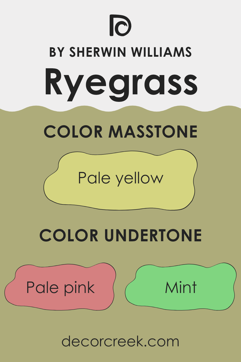
RyegrassSW 6423 is a unique color with a range of interesting undertones that can greatly influence its appearance depending on lighting and surrounding colors. Undertones are subtle hues that can be seen when a color is exposed to different lighting conditions or placed next to other colors. They play a crucial role in how we perceive the main color because they can bring out certain qualities and feelings.
The undertones in RyegrassSW 6423 include pale pink, mint, grey, yellow, orange, light green, olive, light gray, light purple, light blue, and lilac. These undertones make the color quite versatile. For example, the light pink and mint undertones can make a room feel fresher and more alive, while grey or olive undertones could give a more grounded, earthy feel.
When using this paint color on interior walls, the effect of these undertones can be quite noticeable. In a room with a lot of natural light, the lighter undertones like light blue and light purple might make the walls seem more vibrant. In less natural light, the darker undertones like olive or grey might become more dominant, giving the walls a more subdued look.
Thus, choosing decor and furnishing that complement these undertones can either enhance or neutralize their effects, depending on the desired atmosphere in the room. Light colored decor could emphasize the cooler mint or light blue tones, making the room feel more airy and open. In contrast, darker furniture could highlight the warmer orange or olive undertones, creating a cozy, welcoming environment.
Understanding and considering these undertones can help achieve the desired effect and mood in your space with RyegrassSW 6423.
What is the Masstone of the Ryegrass SW 6423 by Sherwin Williams?
RyegrassSW 6423 by Sherwin Williams has a masstone of Pale Yellow (#D5D580), which offers a soft and cheerful presence in any home. This light yellow shade brings a subtle warmth that can make spaces feel more inviting and cozy.
Its gentle tone works well in rooms that need a touch of brightness without overpowering other design elements. For instance, in a living room or a kitchen, this color can complement natural light, making the space appear larger and more open. Bedrooms can also benefit from this color’s softness, contributing to a relaxed and comfortable atmosphere.
Additionally, its versatility means it pairs nicely with various decor styles, from modern to rustic, and coordinates easily with other colors. This soft yellow works exceptionally well with white trim or furniture, enhancing its light, airy feel. By using this color, homeowners can achieve a pleasant and welcoming environment in their spaces.

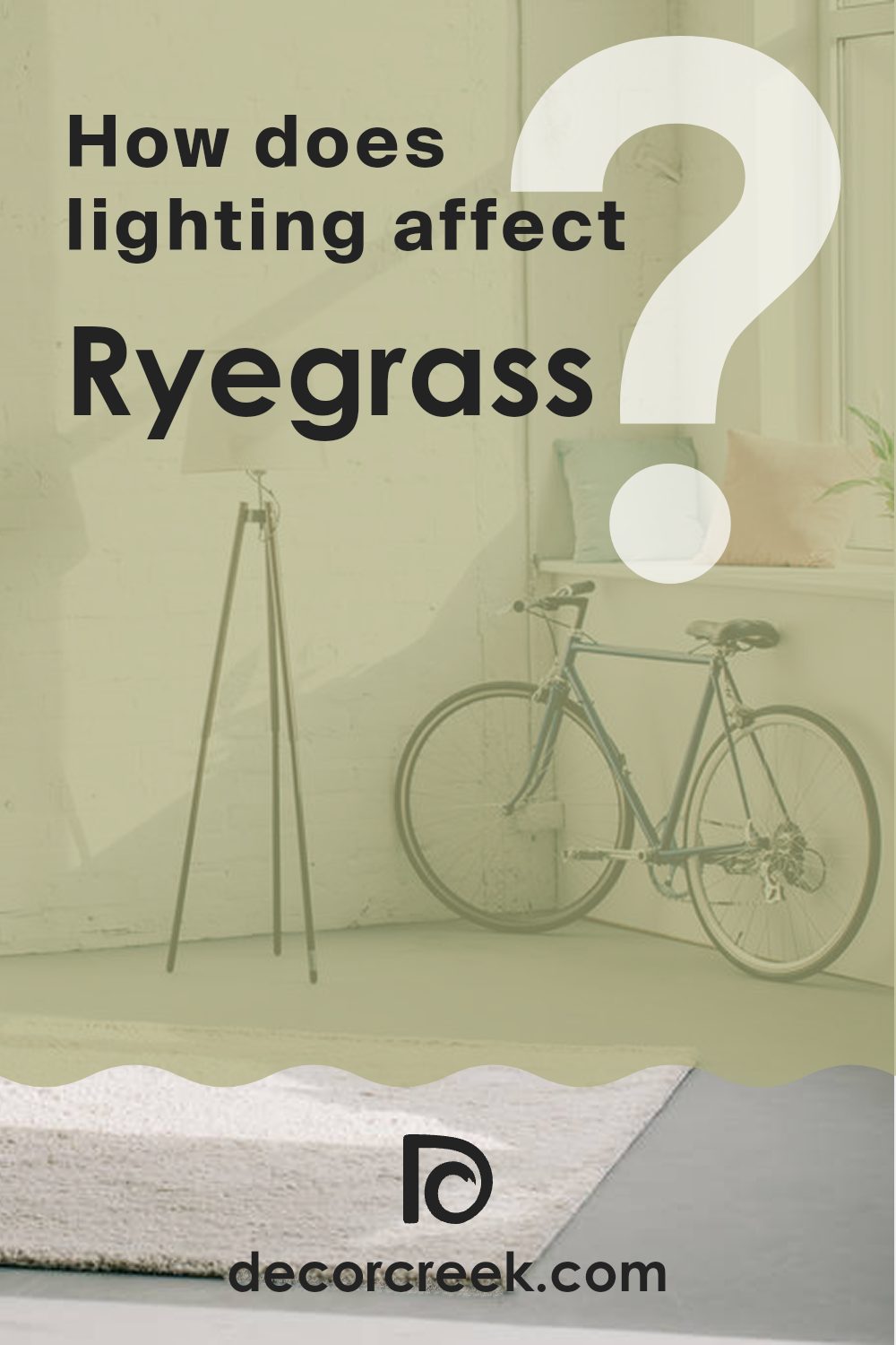
How Does Lighting Affect Ryegrass SW 6423 by Sherwin Williams?
Lighting plays a crucial role in how colors are perceived in different environments. The impact of light on color can shift dramatically whether viewed under natural or artificial lighting conditions. For instance, Ryegrass, a warm green shade by Sherwin Williams, can look quite different depending on the light it is under.
In natural light, Ryegrass tends to reveal its true color. Sunlight brings out the brightness and vibrancy of this warm green, making it appear lively and fresh. Conversely, under artificial lighting, such as LED or fluorescent lights, Ryegrass might look slightly different. For instance, under the yellow glow of incandescent bulbs, it might appear warmer and more muted, losing a bit of its freshness and taking on a cozier, more subdued look.
The orientation of a room also significantly affects how Ryegrass will appear. In north-facing rooms, which receive less direct sunlight and often have a cooler light, Ryegrass might appear more subdued and slightly darker. The cooler, bluish light can make it seem less vibrant than it truly is.
South-facing rooms get a lot of direct sunlight, which can bring out the vibrancy and warmth of Ryegrass, making it look very energetic and rich. It’s in these rooms that Ryegrass would really shine, appearing lively throughout the day as the natural light changes.
East-facing rooms get strong light in the morning when the sun rises. Here, Ryegrass would look bright and cheerful in the morning but might appear softer and quieter in the afternoon as the natural light dwindles.
In west-facing rooms, the situation reverses; the color will start off softer during the morning and become vivid and bright in the afternoon and evening as the sun sets. This changing light can make Ryegrass appear dynamic and versatile, matching the mood as the day progresses.
Overall, the lighting, whether natural or artificial, and the orientation of the room, can indeed affect how Ryegrass and other colors are perceived and should be considered when deciding where to use specific colors.
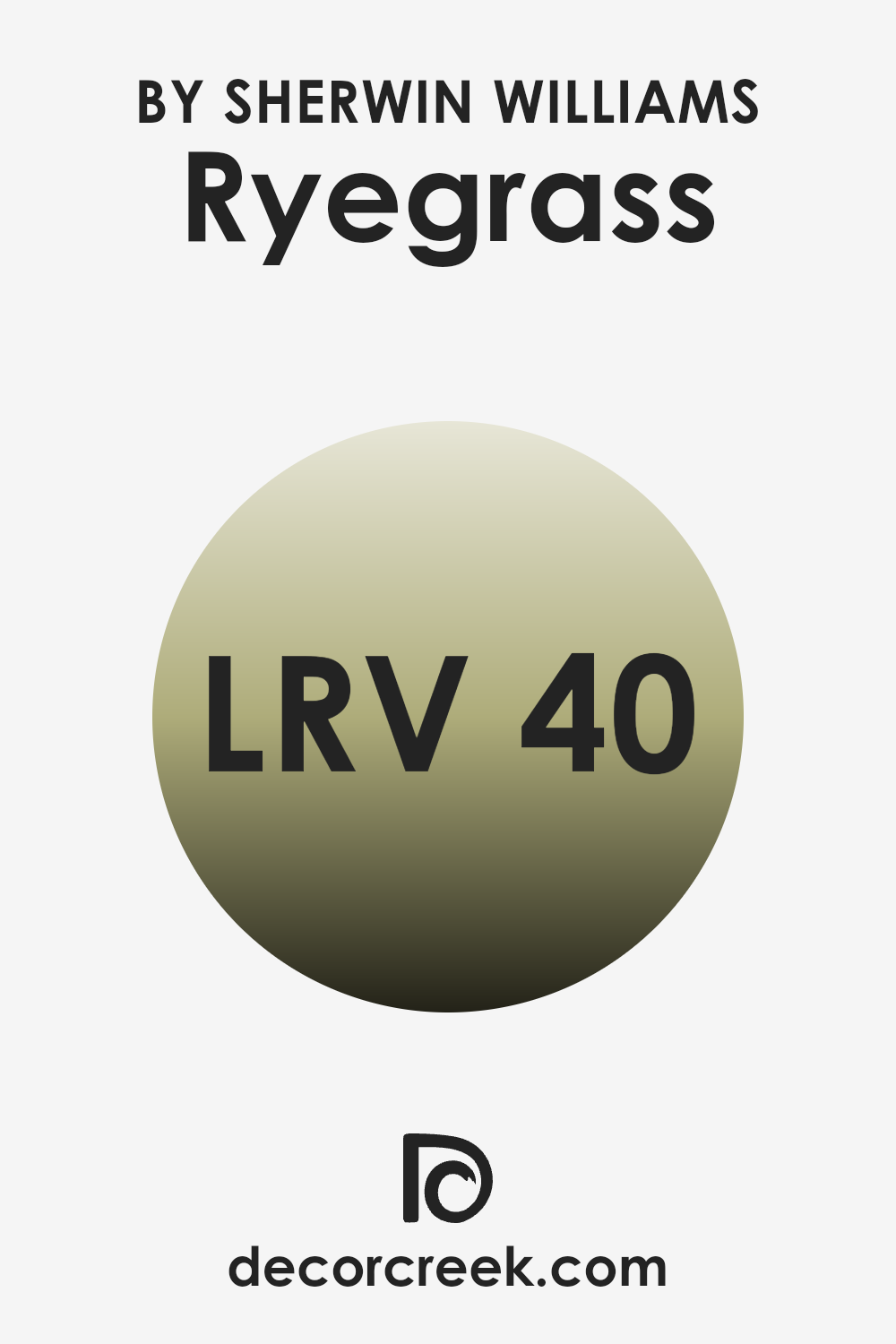
What is the LRV of Ryegrass SW 6423 by Sherwin Williams?
LRV stands for Light Reflectance Value, a measure that indicates how much light a color reflects or absorbs when painted on a surface. LRV scales from zero to one hundred, where zero is completely black, absorbing all light, and one hundred is pure white, reflecting all light.
This value is particularly useful when choosing paint colors as it helps predict how light or dark a color will appear in a specific environment. Colors with higher LRVs are typically used to make spaces appear larger and brighter, as they reflect more light around the room.
In the case of Ryegrass, which has an LRV of 40.062, this color falls in the mid-range of the scale. It means this shade will reflect some light but also absorb a fair amount too. The effect of a mid-range LRV like this is a balanced look that neither dominates a space by brightness nor feels too heavy or dull. This makes Ryegrass a versatile choice for many spaces, capable of offering a rich depth of color while maintaining some light reflection to prevent the room from feeling too closed in or dark.
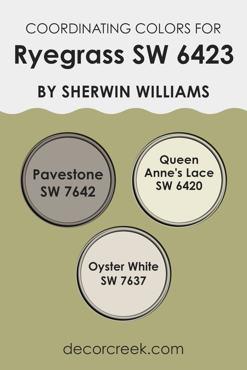
Coordinating Colors of Ryegrass SW 6423 by Sherwin Williams
Coordinating colors are those that harmoniously complement each other when used together in decor, creating a balanced and aesthetically pleasing environment. These colors are chosen based on their position on the color wheel and their ability to enhance the main hue without overpowering it.
When you have a primary color like Ryegrass by Sherwin Williams, finding the right coordinating colors can really enhance the look and feel of the space. In this case, Pavestone, Queen Anne’s Lace, and Oyster White serve as coordinating colors. They each play a role in bringing out the unique qualities of Ryegrass while maintaining their own charm.
Pavestone is a medium gray shade that adds depth and contrast, providing a sturdy foundation for Ryegrass to stand out. Its neutral tone means it can blend well with both light and dark hues, making it versatile in various design schemes. On the other hand, Queen Anne’s Lace is a soft, warm white that brings a gentle brightness to spaces, helping to lift and lighten the environment.
It creates a subtle contrast with Ryegrass, ensuring that the green remains fresh and lively. Lastly, Oyster White is slightly creamier than Queen Anne’s Lace, offering a hint of warmth. This color is perfect for creating a cozy and inviting atmosphere, pairing beautifully with Ryegrass to produce a harmonious and homely feel.
You can see recommended paint colors below:
- SW 7642 Pavestone
- SW 6420 Queen Anne’s Lace
- SW 7637 Oyster White
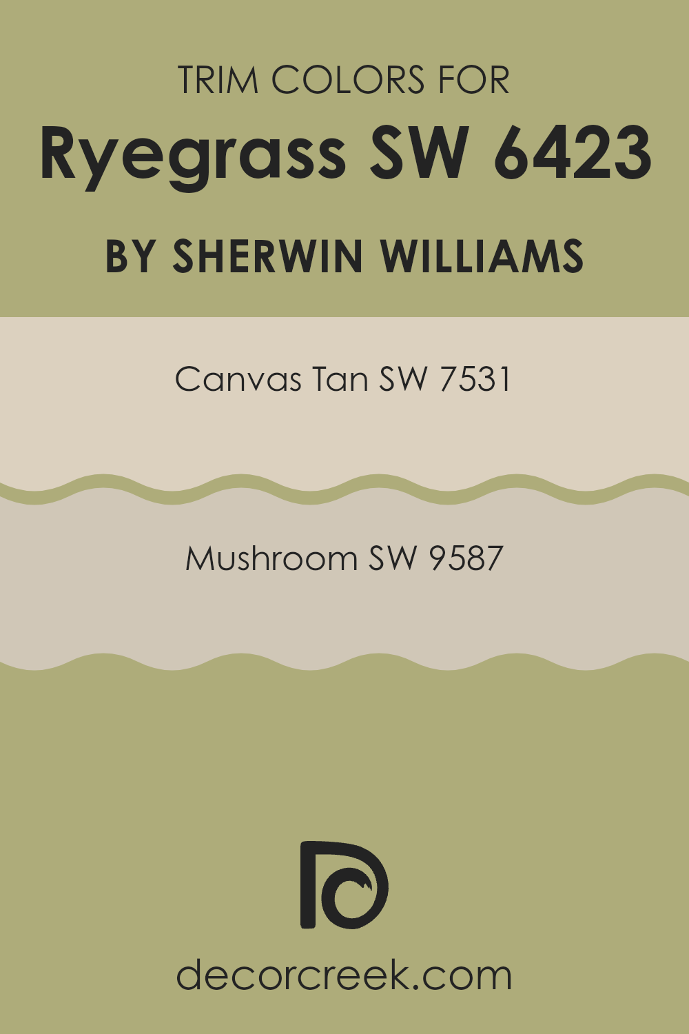
What are the Trim colors of Ryegrass SW 6423 by Sherwin Williams?
Trim colors are specific shades used to accent or outline architectural features and elements like doors, windows, and baseboards in a room. These colors play a crucial role in defining the spaces and adding contrast, which can enhance the overall aesthetic and make the primary colors stand out.
For instance, Ryegrass by Sherwin Williams, a vibrant and lush color, can be beautifully complemented by well-chosen trim colors that highlight its richness without overpowering the space.
Using SW 7531 – Canvas Tan as a trim color offers a subtle, neutral backdrop that doesn’t compete with the main color but instead supports it, providing a smooth transition between the wall and trim. On the other hand, SW 9587 – Mushroom offers a slightly darker, warmer option that can add depth and warmth to the surroundings, making it ideal for creating a cozy, inviting atmosphere. Both colors help in achieving a balanced look that enhances the visual impact of the main hue in the room.
You can see recommended paint colors below:
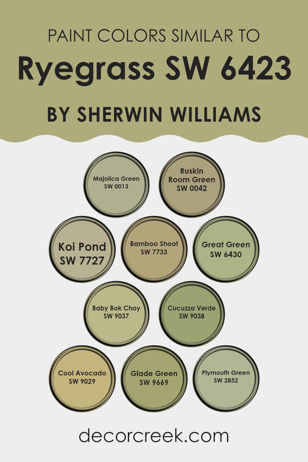
Colors Similar to Ryegrass SW 6423 by Sherwin Williams
Similar colors, like variations of a base green shade from Sherwin Williams, play an essential role in creating a cohesive and harmonious look in any space. When colors are similar, they naturally coordinate with each other, making it easier to design a room that feels balanced and aesthetically pleasing. These shades can be skillfully used to create depth and continuity in a design scheme, enhancing the overall ambiance without overpowering with contrast.
For example, Majolica Green is a deep, rich green that exudes warmth, while Ruskin Room Green offers a more muted and earthy tone, great for grounding a space. Koi Pond is slightly brighter, adding a dash of freshness akin to new spring leaves.
Bamboo Shoot provides a light, creamy green that brightens interiors softly. Moving on, Great Green is bold and vivid, perfect for making a statement. Baby Bok Choy is a gentle, pale green that works well in spaces that call for a touch of subtle color. Cucuzza Verde steps it up with a bit more intensity while still remaining soft, and Cool Avocado is a fun, vibrant option that brings energy to any room. Glade Green has a dusty hue ideal for creating a cozy, muted environment. Lastly, Plymouth Green is reminiscent of historic charm and acts as a beautiful backdrop in more traditional settings.
You can see recommended paint colors below:
- SW 0013 Majolica Green
- SW 0042 Ruskin Room Green
- SW 7727 Koi Pond
- SW 7733 Bamboo Shoot
- SW 6430 Great Green
- SW 9037 Baby Bok Choy
- SW 9038 Cucuzza Verde
- SW 9029 Cool Avocado
- SW 9669 Glade Green
- SW 2852 Plymouth Green
Colors that Go With Ryegrass SW 6423 by Sherwin Williams
When selecting colors that complement Ryegrass SW 6423 by Sherwin Williams, it’s key to consider how different shades can enhance or balance the primary hue. Colors like Shagreen SW 6422, a soft gray-green, subtly harmonize with Ryegrass, providing a muted backdrop that allows the richer tones of Ryegrass to stand out. Celery SW 6421, a light, fresh green, adds a crisp and airy feel when paired with Ryegrass, lightening the overall mood and contributing to a relaxed color scheme.
On the warmer side, Baby Bok Choy SW 9037 offers a slightly yellowish-green tone that brings a natural, earthy vibe when used alongside Ryegrass, making spaces feel more grounded and connected to the outdoors.
For deeper contrasts, Basque Green SW 6426, a dark and intense green, creates a striking effect next to Ryegrass, ideal for accentuating elements in a room. Relentless Olive SW 6425 and Tansy Green SW 6424, both rich and deep greens, work well to provide depth and a sense of lushness, enhancing the robust character of Ryegrass. These pairings not only look appealing but also foster a cohesive and inviting environment where each color supports and highlights the qualities of the others.
You can see recommended paint colors below:
- SW 6422 Shagreen
- SW 6421 Celery
- SW 9037 Baby Bok Choy
- SW 6426 Basque Green
- SW 6425 Relentless Olive
- SW 6424 Tansy Green

How to Use Ryegrass SW 6423 by Sherwin Williams In Your Home?
Ryegrass SW 6423 by Sherwin Williams is a unique, lively green paint color that brings freshness to any space. Its vibrant tone makes it a great choice for adding vitality and a touch of nature to your home. You can use Ryegrass in various areas, such as a focal wall in your living room to inject some energy, or in a bathroom to create a refreshing backdrop. It’s also a wonderful color for kitchen cabinets if you’re looking for something different from the usual whites or grays.
For bedrooms, pairing Ryegrass with softer hues, like light creams or clean whites, can balance its boldness, making the room feel cozy yet full of life. This shade works well in homes with lots of natural light, highlighting its dynamic yet warm qualities.
Additionally, incorporating Ryegrass in smaller elements, such as a door or a piece of furniture, can liven up the space without overwhelming it. This versatile color can help you make your home feel more lively and connected to the outdoors.
Ryegrass SW 6423 by Sherwin Williams vs Baby Bok Choy SW 9037 by Sherwin Williams
Ryegrass and Baby Bok Choy are two distinct colors by Sherwin Williams. Ryegrass is a vibrant shade of green that brings a fresh and lively feel to any room. It’s a color that can remind you of spring grass or the lush leaves in a forest, providing a natural and energetic vibe.
In contrast, Baby Bok Choy is a much softer and milder green. This color has a soothing effect, making it perfect for spaces where you want to relax, like bedrooms or bathrooms. It’s subtle, not too bright, and fits well with neutral tones, adding a gentle hint of color.
While Ryegrass stands out and adds a dash of brightness, Baby Bok Choy offers a backdrop that’s calm and understated. Both colors offer different moods and can be chosen based on the atmosphere you wish to achieve in a space.
You can see recommended paint color below:
- SW 9037 Baby Bok Choy
Ryegrass SW 6423 by Sherwin Williams vs Great Green SW 6430 by Sherwin Williams
Ryegrass and Great Green, both by Sherwin Williams, are distinct shades of green, each setting a different tone. Ryegrass is a lighter, softer green with a fresh vibe that might remind you of spring grass.
It’s bright enough to make small spaces feel bigger and can cheer up a room without overwhelming it. On the other hand, Great Green is a deeper, richer green, closer to the hues of a dense forest. This color is bolder and more pronounced, making it a great choice for creating a strong, noticeable presence in a space.
It can work well in larger areas or as an accent wall, where its intensity won’t dominate the surrounding decor. Both colors offer a natural feel but serve different design needs based on how light or dark you want to go.
You can see recommended paint color below:
- SW 6430 Great Green
Ryegrass SW 6423 by Sherwin Williams vs Bamboo Shoot SW 7733 by Sherwin Williams
Ryegrass by Sherwin Williams is a fresh, vibrant green with a strong presence that brings energy to any space. This color has a boldness that makes it suitable for areas where you want to add a splash of nature-inspired vibrancy.
On the other hand, Bamboo Shoot is also a nature-inspired hue but leans towards a muted, earthy green. This color is more subdued and offers a softer look, great for creating a calming atmosphere in spaces meant for relaxation or focus.
While Ryegrass stands out more and can dominate a room, Bamboo Shoot blends subtly into a space, complementing other natural tones. Both colors can be used in various settings, but Ryegrass may be the choice for those looking to make a more striking impression, whereas Bamboo Shoot works well for those aiming for a gentle, understated vibe.
You can see recommended paint color below:
- SW 7733 Bamboo Shoot
Ryegrass SW 6423 by Sherwin Williams vs Plymouth Green SW 2852 by Sherwin Williams
Ryegrass and Plymouth Green are two distinct paint colors offered by Sherwin Williams, each bringing a unique vibe to any space. Ryegrass leans towards a vibrant, fresh green that can brighten up rooms with an energetic feel.
It’s particularly great for spaces that aim to have a cheerful and inviting atmosphere. On the other hand, Plymouth Green has a deeper, more muted green tone that suggests a more traditional and classic look. This color is well-suited for areas where a calm and understated elegance is desired.
When comparing the two, Ryegrass gives off a more youthful and lively energy, while Plymouth Green offers a grounded, timeless appeal, making it ideal for those looking for a more subtle green. Both colors have their place depending on the mood and style you want to achieve in your decorating.
You can see recommended paint color below:
- SW 2852 Plymouth Green
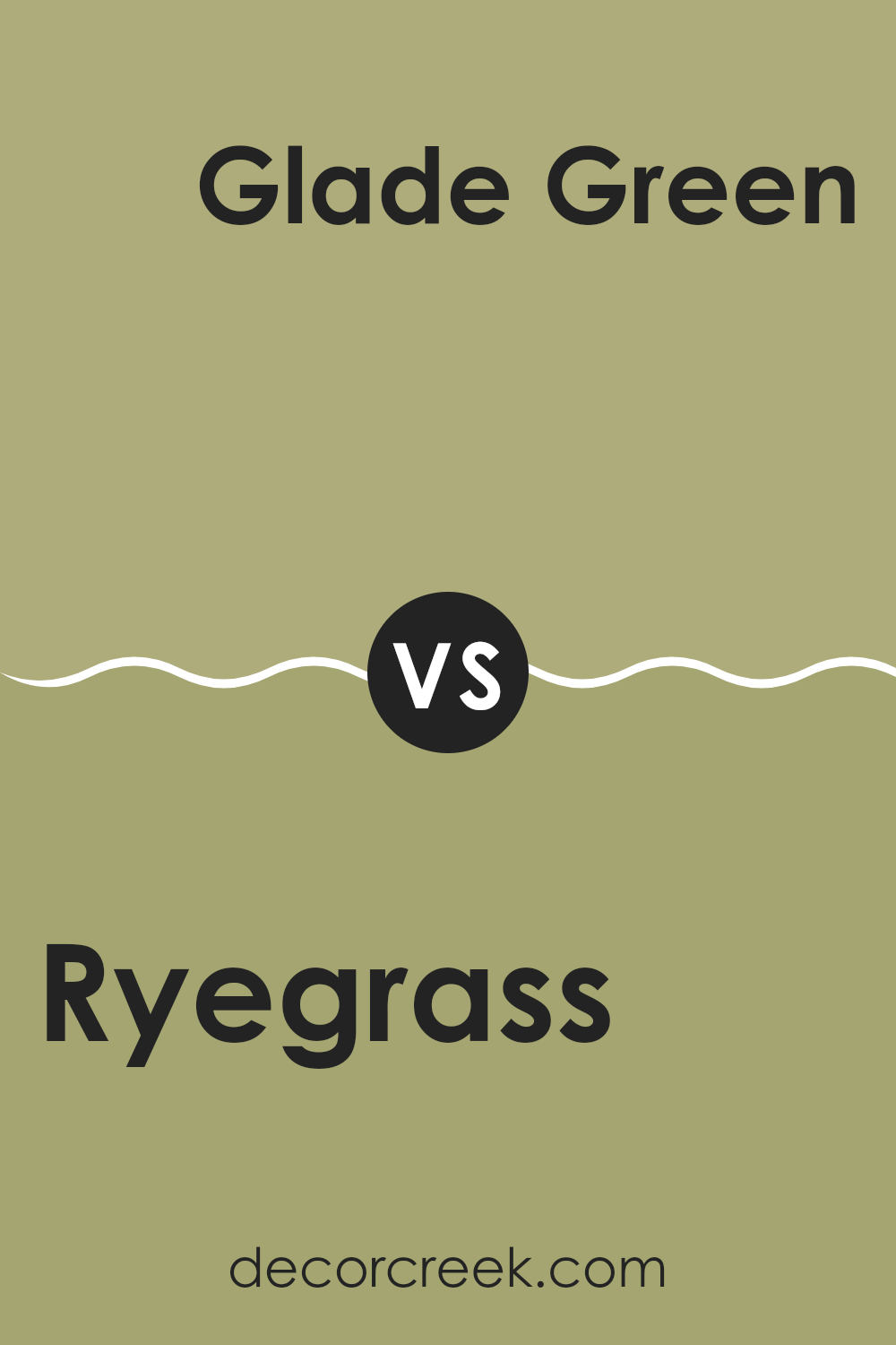
Ryegrass SW 6423 by Sherwin Williams vs Glade Green SW 9669 by Sherwin Williams
Ryegrass is a vibrant shade of green that leans toward a fresh, spring-like tone. It is bright and brings a sense of energy and liveliness to a space, making it ideal for areas where you might want to add a crisp, refreshing look. This color tends to reflect a lot of light, helping to make spaces appear larger and more open.
On the other hand, Glade Green is a deeper and more muted green. It has a subdued nature, providing a calming backdrop that is less intense than Ryegrass. This darker green complements wood tones and neutral colors well, making it a good choice for settings that aim for a natural, earthy vibe.
Both colors offer distinct feelings: Ryegrass injects vibrancy and freshness, while Glade Green offers a more relaxed and calming green environment. Depending on the mood or atmosphere you want to create, each color has its unique appeal and can significantly affect the aesthetics of a room.
You can see recommended paint color below:
- SW 9669 Glade Green
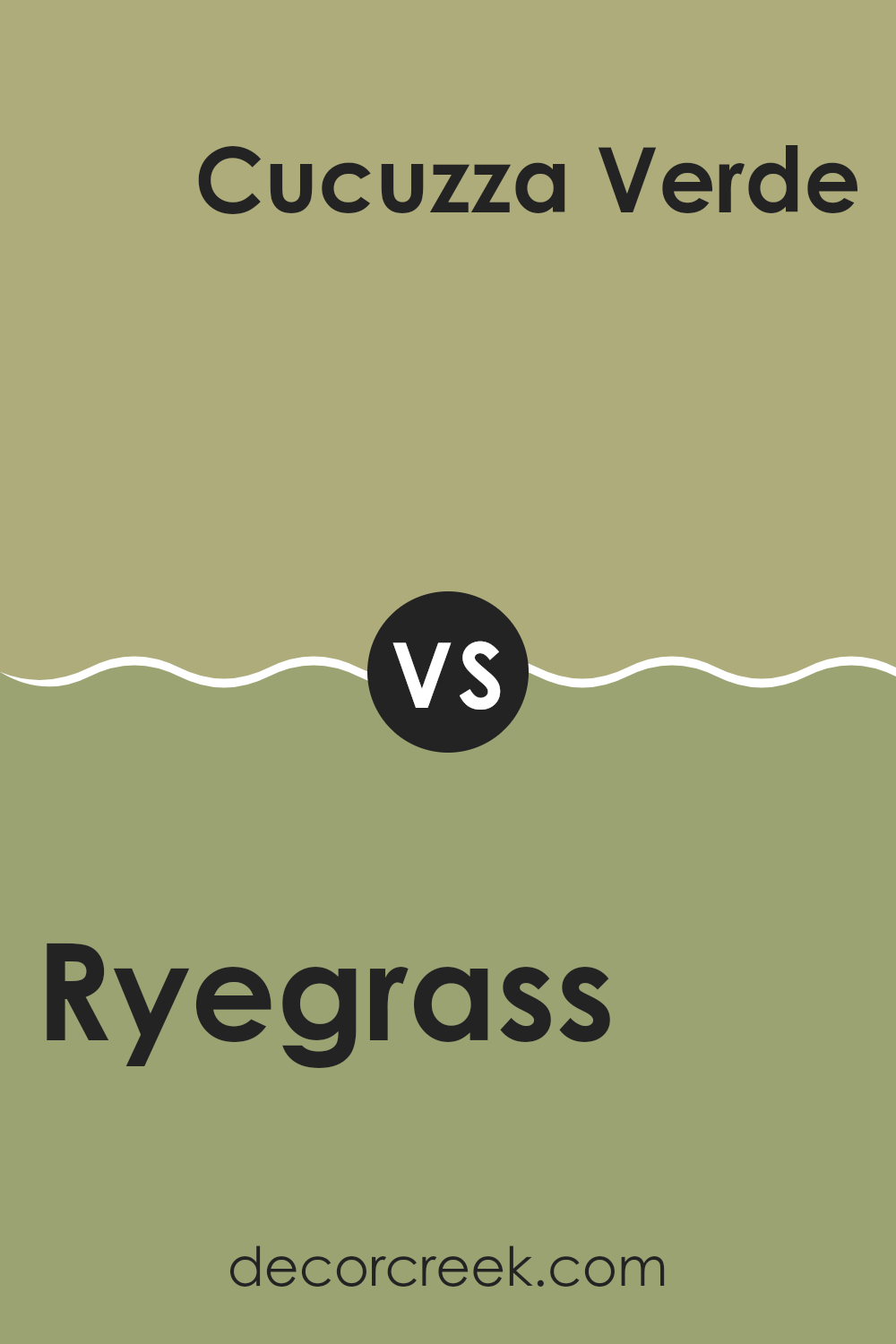
Ryegrass SW 6423 by Sherwin Williams vs Cucuzza Verde SW 9038 by Sherwin Williams
Ryegrass and Cucuzza Verde, both from Sherwin Williams, offer unique green hues, each creating a different mood in a space. Ryegrass is a deeper, more traditional green that brings warmth to a room. It evokes the lush, dense feel of a thriving, healthy lawn, making it ideal for spaces where you want a cozy but grounded atmosphere.
On the other hand, Cucuzza Verde is a lighter, more muted green with a grayish tinge. This color is more subdued and neutral, providing a contemporary look that works well in modern living areas and kitchens. It tends to open up a space, giving it a fresh, airy feel.
Both colors are versatile and can enhance the aesthetics of a room, though Ryegrass tends to draw in more classic comfort, while Cucuzza Verde leans towards a modern, minimalist vibe. Depending on the mood you want to create, either color can significantly impact your decor.
You can see recommended paint color below:
- SW 9038 Cucuzza Verde
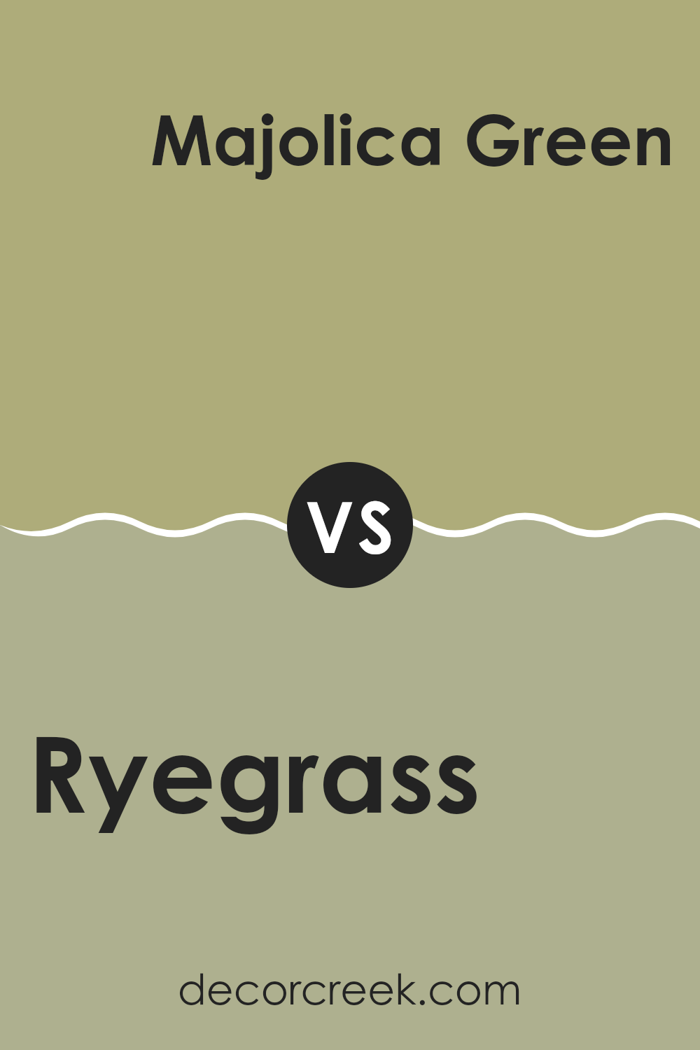
Ryegrass SW 6423 by Sherwin Williams vs Majolica Green SW 0013 by Sherwin Williams
**Ryegrass** and **Majolica Green** are two distinct shades from Sherwin Williams. Ryegrass is a lively, vibrant green that brings a fresh and energetic feel to a space. It’s a brighter tone that adds a pop of color without being overwhelming, making it great for spaces like kitchens or playrooms.
On the other hand, Majolica Green has a deeper, more subdued hue. It leans towards a richer, darker green, which gives it a more grounded and calming presence. This color is well-suited for areas where a more relaxed atmosphere is desired, such as bedrooms or offices.
Comparing the two, Ryegrass is more stimulating and vivacious, making it ideal for areas needing a lively touch. Majolica Green offers a more muted and restful vibe, perfect for creating a peaceful retreat in a home. Choosing between them depends on the mood you want to set in your room and the other colors in your design scheme.
You can see recommended paint color below:
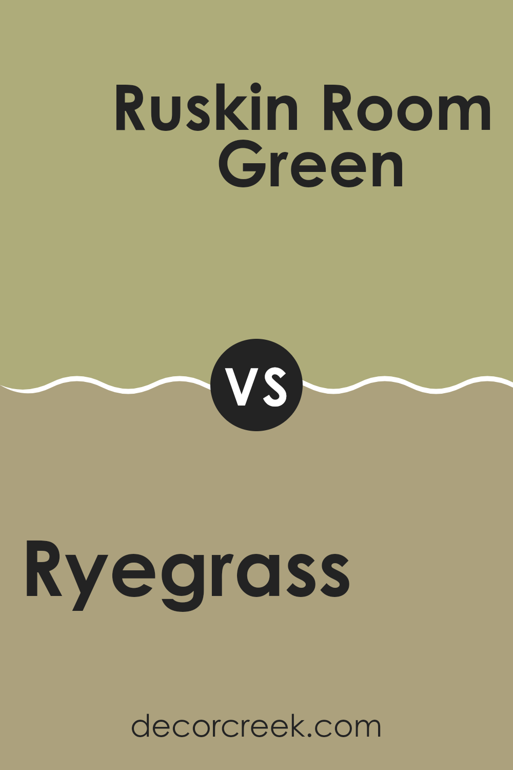
Ryegrass SW 6423 by Sherwin Williams vs Ruskin Room Green SW 0042 by Sherwin Williams
The two colors, Ryegrass and Ruskin Room Green, both from Sherwin Williams, offer distinct green tones that could suit different decorating needs. Ryegrass is a lively, bright green that carries a fresh and energetic vibe. It’s the kind of color that can make a room feel more alive and is perfect for spaces where you want a cheerful and refreshing atmosphere.
On the other hand, Ruskin Room Green is a much deeper, muted green. It has a more reserved feel compared to Ryegrass and lends a sense of solidity and grounding to a space. This color is ideal for areas where a more relaxing and calm environment is desired, such as libraries or bedrooms.
Overall, if you’re looking for a green that’s vibrant and stands out, Ryegrass is your go-to. If you prefer a greener tone that’s richer and more subdued, Ruskin Room Green might be what you need. Both colors offer beautiful greens but fulfill different aesthetic roles depending on your space and mood preferences.
You can see recommended paint color below:
- SW 0042 Ruskin Room Green
Ryegrass SW 6423 by Sherwin Williams vs Cool Avocado SW 9029 by Sherwin Williams
Ryegrass and Cool Avocado are both green hues from Sherwin Williams, but they offer distinct vibes due to their different tones. Ryegrass is a vibrant, lively green that brings a burst of energy to any space. This color has a freshness that can make a room feel more dynamic and invigorating.
On the other hand, Cool Avocado is a deeper, muted green. This hue provides a more subtle and grounding feel, perfect for creating a relaxing and cozy atmosphere. It’s less intense than Ryegrass and works well in areas where you want to promote calm and focus.
In terms of styling, Ryegrass stands out more and could be a great choice for accent walls or in spaces that benefit from a pop of color. Cool Avocado, due to its understated quality, is easier to blend into a wider range of decor styles, making it ideal for larger areas or as a base color. Both colors reflect the natural world, but each offers a unique approach to bringing the beauty of green into your home.
You can see recommended paint color below:
- SW 9029 Cool Avocado
Ryegrass SW 6423 by Sherwin Williams vs Koi Pond SW 7727 by Sherwin Williams
Ryegrass is a light green color that tends to remind you of fresh spring foliage. It has a bright and cheerful vibe, making spaces feel lively and welcoming. This color is great for areas where you might want a touch of nature’s freshness without overwhelming the senses.
On the other hand, Koi Pond is a deeper, more saturated green that resembles the lushness of wet moss or the depths of a shaded forest. This color offers a more grounded, calming aesthetic that is well-suited for creating cozy or more contemplative spaces.
Together, these two colors can work well in a home, with Ryegrass effectively brightening spaces and Koi Pond adding depth and stability. Whether used in different rooms or as accent and primary colors in a single space, they complement each other by offering different aspects of the natural world.
You can see recommended paint color below:
- SW 7727 Koi Pond
After looking at SW 6423 Ryegrass by Sherwin Williams, I think it’s a really cool paint color! It’s a soft green that reminds me of the grass in spring. I feel that it’s perfect for anyone who wants to bring a little bit of nature into their home. This color isn’t too bright or too dark. It’s just right for making a room feel fresh and lively.
If you’re thinking about making your bedroom or living room look happier and more inviting, Ryegrass might be the perfect choice. It goes really well with lots of other colors, so it’s easy to use when you’re decorating. You can pair it with soft yellows, gentle blues, or even some grays and whites for a calm and cozy vibe.
All in all, Ryegrass is a fantastic pick if you want a color that feels cheerful and soothing at the same time. It can help make your room look beautiful without trying too hard. Whether you’re painting a wall or just adding little touches here and there, I think you’ll really like what it does for your place.
Ever wished paint sampling was as easy as sticking a sticker? Guess what? Now it is! Discover Samplize's unique Peel & Stick samples.
Get paint samples

