When you first encounter 2122-50 Iceberg by Benjamin Moore, you might find it refreshingly subtle. The shade, a gentle, pale blue, captures the essence of a calm, peaceful environment. It’s easy to see how this color could make any room feel more open and airy. Applying Iceberg on your walls could be a smart choice if you’re aiming to create a peaceful retreat in your home, a place where the stresses of the day melt away the moment you step inside.
This hue is not just another blue; it holds a quiet charm, maintaining a lightness that could gently enhance the natural lighting of an area without overpowering it. This quality makes it an adaptable option, whether for a bustling kitchen, a calm bedroom, or a cozy living room.
Furthermore, Iceberg by Benjamin Moore is flexible when it comes to matching with decor. It plays nicely with both bold and muted accent colors, making it an excellent base for various decorating styles.
If you’re thinking of refreshing your area with a new splash of color, consider how Iceberg might breathe new life into your surroundings.
What Color Is Iceberg 2122-50 by Benjamin Moore?
The color Iceberg by Benjamin Moore is a light, refreshing blue with a subtle gray undertone that gives it a clean and airy feel. This shade is part of Benjamin Moore’s classic color collection and offers a crisp, calming presence that is adaptable and broadly appealing. The color is light enough to make small rooms feel larger and offers a restful quality ideal for areas meant for relaxation.
Iceberg works particularly well in minimalist or contemporary interiors, complementing clean lines and uncluttered rooms. It also pairs beautifully with Scandinavian decor, where its light tones echo the natural, cozy elements of Nordic design. In a coastal style home, Iceberg can contribute to a breezy, beachy aesthetic, especially when combined with soft whites and sandy beiges.
In terms of materials and textures, Iceberg pairs wonderfully with natural wood, adding warmth to its cool tones. It also looks stunning when contrasted with metallic accents like brushed nickel or chrome, which enhance its modern vibe.
For a softer approach, linen or cotton textiles in neutral shades can balance its coolness, creating an area that feels both fresh and inviting. Overall, Iceberg by Benjamin Moore is a flexible color choice that can refresh a variety of rooms with its clean, airy vibe.
Is Iceberg 2122-50 by Benjamin Moore Warm or Cool color?
Benjamin Moore’s Iceberg is a light blue shade that brings a fresh and airy feel to any room. This color is very adaptable, making it a great choice for different areas in your home. When used in a living room or bedroom, Iceberg creates a calming atmosphere, perfect for relaxing. In bathrooms, it reflects light beautifully, making the area appear larger and more open.
Kitchens also benefit from this color, as it gives a clean and crisp look to the room. One of the best things about Iceberg is its ability to pair well with many other colors. It looks great with whites and grays for a subtle, cohesive look, or can be paired with brighter colors like yellow or green for a more vibrant and cheerful vibe.
It’s a flexible color that can easily be incorporated into various decor styles, whether you’re going for a modern, minimalistic look or a more traditional style. Iceberg could be the perfect color to freshen up your home without overpowering it.
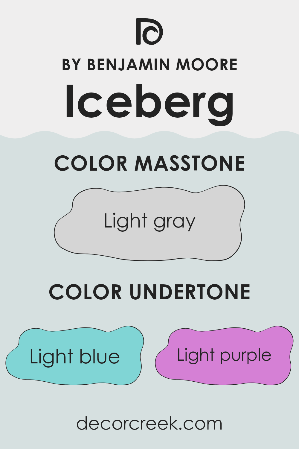
Undertones of Iceberg 2122-50 by Benjamin Moore
Iceberg is a unique and appealing color that has a variety of undertones, making it adaptable to many interior decor styles. The presence of light blue, light purple, pale yellow, lilac, mint, pale pink, and grey undertones impact how this color is perceived and how it influences the mood of a room.
Understanding undertones is crucial as they can subtly influence the overall look and feel of the paint once applied. For instance, light blue and mint undertones give a fresh feel, making the room appear more airy and open. This can be particularly appealing in areas like bathrooms or small kitchens where a sense of openness is desirable.
Light purple and lilac bring a gentle, almost whimsical quality to the room, ideal for creating a soothing backdrop in bedrooms or quiet sitting areas. Pale yellow undertones add a hint of cheerfulness, subtly brightening up areas without being overpowering.
The inclusion of pale pink adds a soft, warm touch, which can make large, stark rooms feel more intimate and welcoming. Grey undertones help balance out the brightness of the other colors, ensuring that the paint remains neutral and adaptable, making it easier to match with a wide range of decor styles and colors.
When used on interior walls, these undertones can significantly affect the ambiance of a room. The mixture of cool and warm tones ensures that Iceberg is a complex, dynamic shade capable of both calming and enlivening an environment, depending on its surrounding elements and lighting conditions. This complexity makes it a great choice for anyone looking to add depth and interest to their walls without committing to a bold color choice.
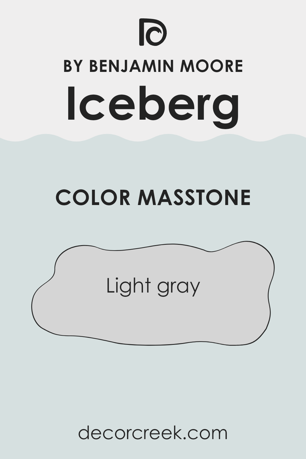
What is the Masstone of the Iceberg 2122-50 by Benjamin Moore?
Iceberg 2122-50 by Benjamin Moore is a light gray color with a masstone code of #D5D5D5. This subtle and neutral shade is highly adaptable, making it perfect for any area in your home. In living areas or bedrooms, this light gray shade creates an inviting and calm environment, soothing the senses without overpowering with color.
Its neutrality means it pairs seamlessly with other colors – be it bright accents like blues and yellows or more muted tones such as creams and browns, thus offering flexibility in decor choices. This color is also practical as it doesn’t easily show small marks or fingerprints, making it ideal for bustling households.
When used in smaller areas, the lightness of Iceberg 2122-50 helps make rooms appear larger and more airy, maximizing any natural light. This makes it a preferred choice for rooms like bathrooms or compact kitchens, where size and brightness are often limited.
How Does Lighting Affect Iceberg 2122-50 by Benjamin Moore?
Lighting plays a crucial role in how we perceive colors. The color or shade we see can significantly change under different lighting conditions due to the light’s temperature and intensity.
Take, for example, the color Iceberg (2122-50) from Benjamin Moore. This paint, a light, cool blue with a hint of gray, responds distinctively to various types of light.
In artificial light, the characteristics of Iceberg might alter depending on the type of bulb used. Under warm artificial lighting, such as incandescent bulbs, this color could appear softer and slightly muted, leaning more into its gray tones. Meanwhile, under cooler, fluorescent light, the blue tones might become more vivid, giving the room a fresher feel.
On the other hand, in natural light, Iceberg changes with the time of day and weather conditions. Under bright, clear daylight, the color looks vibrant and fairly true to its swatch, highlighting its crisp blue tone. On cloudy days, it might appear more subdued and lean into its gray aspects.
The orientation of the room also affects how Iceberg looks:
- North-facing areas receive less direct sunlight, which often makes colors appear cooler. Here, Iceberg might seem more shadowy and subdued, emphasizing its gray characteristics.
- South-facing areas, blessed with plentiful daylight, will showcase Iceberg in its truest form—a bright, refreshing blue throughout most of the day.
- East-facing areas get morning light, which is cooler and bluer in tone. In these rooms, Iceberg will appear brighter and truer to its color in the morning, becoming softer as the day progresses.
- West-facing areas experience the evening light, which tends to be warmer. Iceberg will take on a softer, gentler hue in the afternoons and evenings, with a muted presence highlighted during sunset.
Understanding these nuances can help in choosing the right color for a room based on its exposure and the type of light it most often receives.
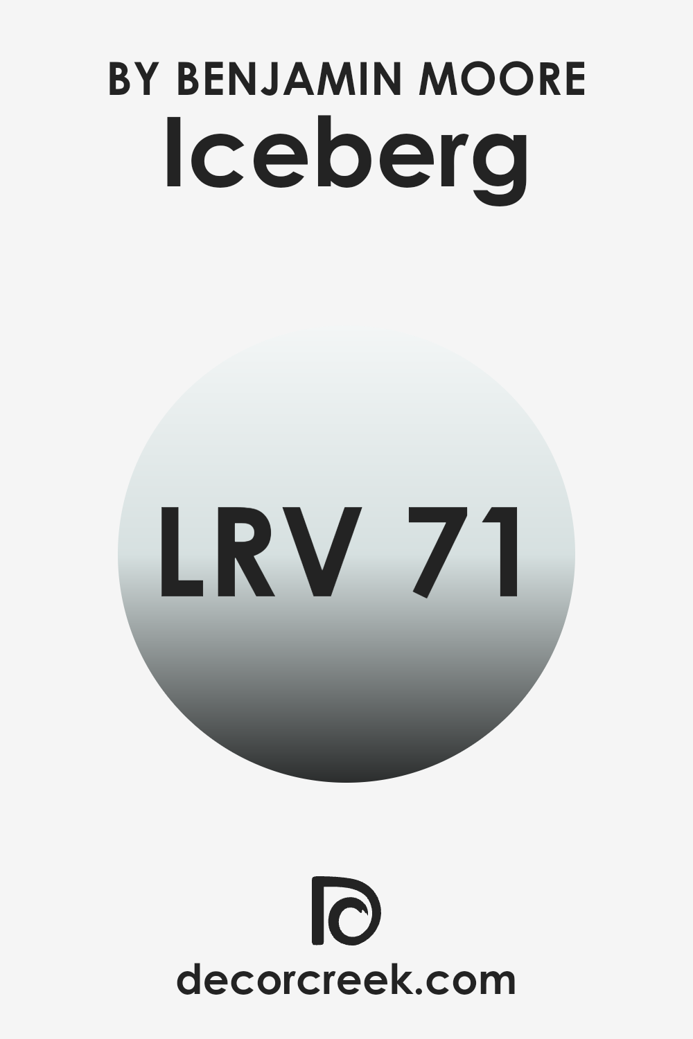
What is the LRV of Iceberg 2122-50 by Benjamin Moore?
LRV stands for Light Reflectance Value, which measures the percentage of light a paint color reflects compared to the amount it absorbs. In simple terms, it is a scale that tells us how light or dark a color will appear once it’s on your wall. Higher LRV colors, those closer to 100, are lighter and can make a room feel more open and airy because they reflect more light back into the area.
On the other hand, colors with lower LRV values absorb more light, making them appear darker and can make a room feel smaller or cozier. In the case of the color Iceberg, with an LRV of 71.1, it is fairly light, meaning it will reflect quite a bit of light and help to brighten up a room.
This lightness can also affect the apparent size of an area, making smaller rooms appear larger and more inviting. The reflective quality can particularly enhance areas with less natural light, bouncing artificial light around to illuminate the room effectively. Thus, choosing a color like Iceberg can be a great decision for enhancing natural light and making interiors feel fresh and airy.
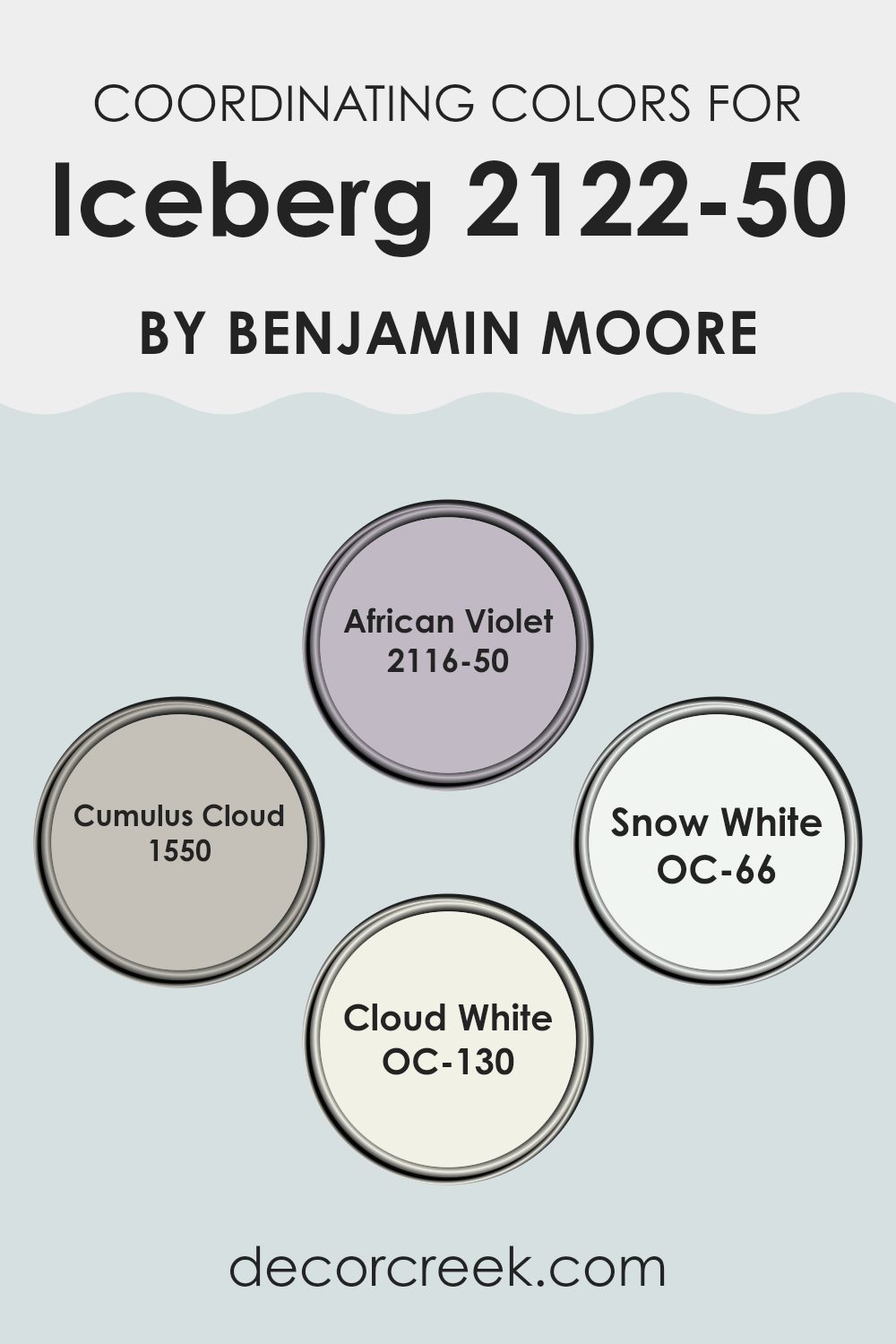
Coordinating Colors of Iceberg 2122-50 by Benjamin Moore
Coordinating colors are selected hues that work well together to create a harmonious and appealing visual look in an area. These colors complement each other, balancing out tones and enhancing the overall aesthetic of a room. When choosing coordinating colors, the goal is to pick shades that balance the room’s vibe without overpowering the main color. For Iceberg (2122-50), a cool and muted blue, a thoughtful selection of coordinating colors can create a cohesive and inviting atmosphere.
The chosen coordinating colors for Iceberg (2122-50) by Benjamin Moore include African Violet (2116-50), Cumulus Cloud (1550), Snow White (OC-66), and Cloud White (OC-130). African Violet (2116-50) is a deep, muted purple that provides a striking contrast to Iceberg’s lighter tones, adding depth and interest to the color scheme.
Cumulus Cloud (1550) is a mid-tone gray that offers a neutral backdrop, allowing Iceberg to stand out without overpowering the senses. Snow White (OC-66) is a crisp, clean white that brings light and freshness into the mix, making the area feel more open and airy. Lastly, Cloud White (OC-130) is a soft white with a subtle warmth, perfect for creating a smooth transition between the cooler Iceberg and the other hues in the palette. Together, these colors create a balanced and visually appealing environment.
You can see recommended paint colors below:
- 2116-50 African Violet
- 1550 Cumulus Cloud
- OC-66 Snow White
- OC-130 Cloud White
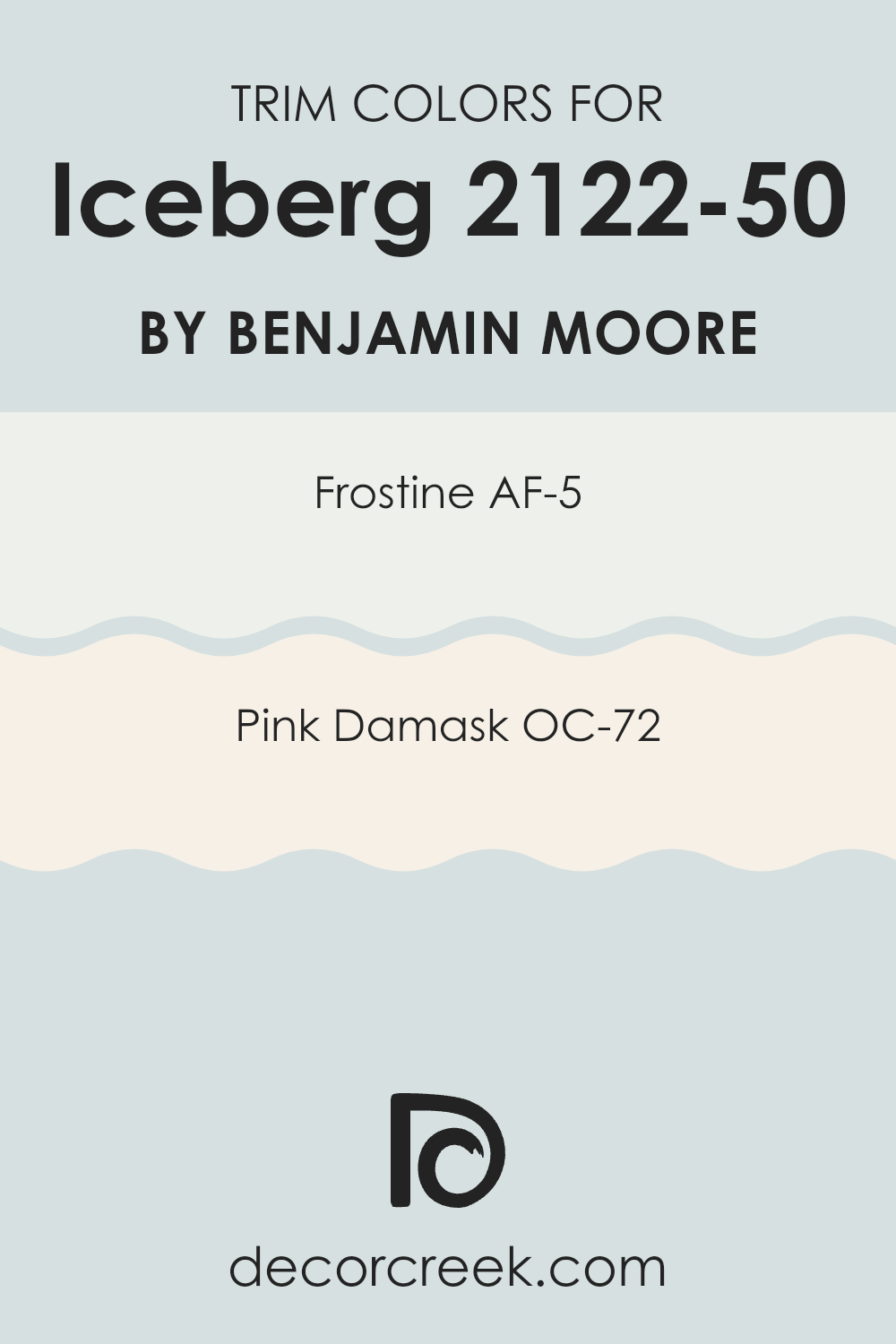
What are the Trim colors of Iceberg 2122-50 by Benjamin Moore?
Trim colors are specifically chosen accents used to highlight or define the edges around windows, doors, and baseboards, offering an aesthetic contrast or complement to the main colors on walls. When using a shade like Iceberg by Benjamin Moore, selecting the right trim colors can make a significant impact.
Colors like AF-5 – Frostine and OC-72 – Pink Damask are perfectly suited for this purpose, as they subtly yet effectively accent the softness of Iceberg, creating a balanced and inviting appearance in any area. AF-5 – Frostine is a gentle, airy white that brings a fresh and clean look to a room. It contrasts nicely with the cooler tones of Iceberg, providing a crisp outline that enhances architectural features without overpowering the area.
OC-72 – Pink Damask offers a light pink hue that adds a warm, soft touch to the surroundings. This color complements Iceberg by adding a hint of warmth to the overall cool palette, ensuring that the environment feels cozy and welcoming. Both colors help in creating a harmonious area that feels well-coordinated and thoughtfully designed.
You can see recommended paint colors below:
- AF-5 Frostine
- OC-72 Pink Damask
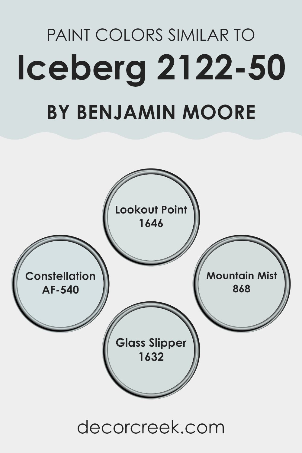
Colors Similar to Iceberg 2122-50 by Benjamin Moore
Choosing similar colors in a design can greatly enhance the overall aesthetics while maintaining a coherent look. Colors close to each other on the color spectrum help create a subtle and harmonious visual gradation, avoiding any harsh contrasts and conveying a unified theme.
Similar colors like Iceberg, Lookout Point, Constellation, Mountain Mist, and Glass Slipper all come from a cool-toned family, tending towards soft blues and subtle grays, making them perfect for creating a peaceful and pleasant atmosphere. Lookout Point is a muted blue with a breezy feel that blends well in light-filled rooms, adding a fresh touch without overpowering the senses.
Similarly, Constellation offers a soft gray with a hint of blue, which works well as a subtle background shade that supports other colors. Mountain Mist presents itself as a gentle gray that pairs beautifully with natural materials and light wood, fostering a friendly area.
Lastly, Glass Slipper is a very light, airy blue, almost transparent, which is great for achieving a minimalistic yet inviting environment. Using these colors together helps in presenting a fluid visual story, governed by calmness and gentle contrasts, perfect for interiors meant for relaxation and thought.
You can see recommended paint colors below:
- 1646 Lookout Point
- AF-540 Constellation
- 868 Mountain Mist
- 1632 Glass Slipper
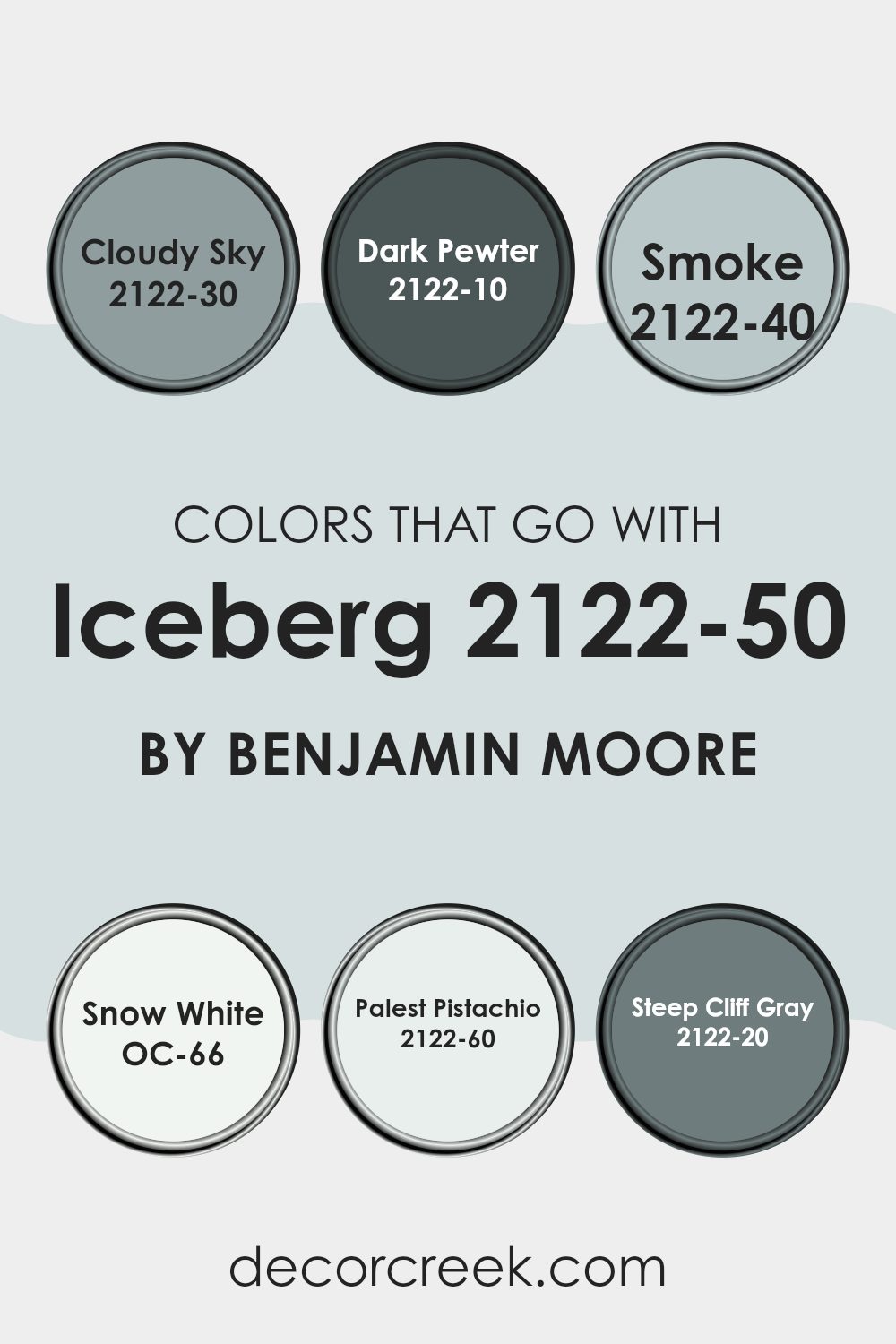
Colors that Go With Iceberg 2122-50 by Benjamin Moore
Choosing complementary colors for Iceberg 2122-50 by Benjamin Moore is crucial for achieving a harmonious look in any area. Iceberg, a subtle, soft blue tone, pairs well with a range of colors to create a balanced and inviting atmosphere. For instance, Cloudy Sky 2122-30, a deeper shade of blue-gray, provides a lovely contrast to Iceberg, allowing it to stand out more prominently.
In comparison, Dark Pewter 2122-10, a strong charcoal color, adds depth and can be used for accent features or furniture, bringing a grounded feel to the lighter Iceberg. Moreover, pairing Iceberg with Smoke 2122-40, a muted blue-gray, creates a seamless transition between colors in a room, ideal for a cohesive interior. Snow White OC-66, a clean and crisp white, refreshes the palette and enhances the airy feel when used alongside Iceberg.
For a touch of warmth, Palest Pistachio 2122-60 introduces a gentle green hue, providing a subtle but refreshing pop of color that pairs beautifully without overpowering. Lastly, Steep Cliff Gray 2122-20, a rich, deep gray, can serve as a solid base for the lighter tones, ensuring the overall aesthetic remains balanced and visually appealing. Each of these colors works collectively to support the calmness and lightness of Iceberg, making them essential choices for designing a comforting and aesthetically pleasing interior.
You can see recommended paint colors below:
- 2122-30 Cloudy Sky
- 2122-10 Dark Pewter
- 2122-40 Smoke
- OC-66 Snow White
- 2122-60 Palest Pistachio
- 2122-20 Steep Cliff Gray
How to Use Iceberg 2122-50 by Benjamin Moore In Your Home?
Iceberg 2122-50 by Benjamin Moore is a soft, light blue paint color that can bring a fresh and airy feel to any area in your home. This color works exceptionally well in rooms that get a lot of natural light, making them feel more open and breathable. It’s perfect for bedrooms, offering a calm, gentle backdrop that can help you relax and sleep better.
In the living room, Iceberg can pair nicely with darker blues or greys to create a balanced look. It’s also an excellent choice for bathrooms, where it can help create a clean and refreshing environment. For those looking to add a subtle touch of color without overpowering a room, Iceberg works well on an accent wall, especially behind shelves or in alcoves.
Moreover, its adaptability extends to furniture and cabinets; repainting older pieces with Iceberg can instantly refresh the look of any area. Overall, using this color in your home can help create a light, bright, and cheerful atmosphere.
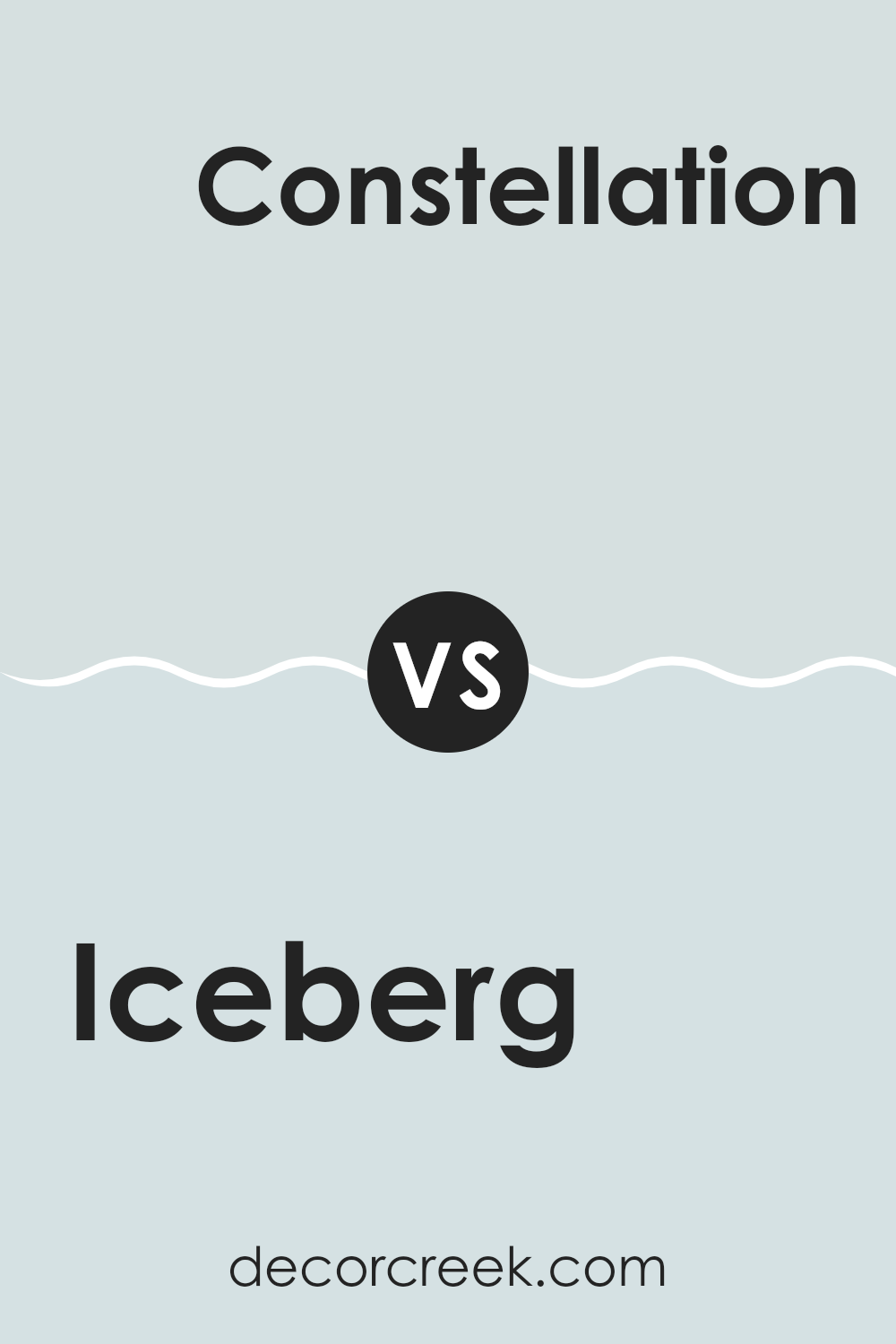
Iceberg 2122-50 by Benjamin Moore vs Constellation AF-540 by Benjamin Moore
“Iceberg” and “Constellation” by Benjamin Moore are two shades that share a cool and calm hue, but each brings its own unique vibe to an interior. “Iceberg” is a light, almost airy blue, giving a room a fresh and open feeling, perfect for creating a bright and welcoming area.
On the other hand, “Constellation” is a slightly greyer blue, giving it a more muted appearance. This color can make a room feel more grounded without losing that light, calming feel of blue. Both colors are adaptable, working well in various rooms, from bedrooms to living rooms.
While “Iceberg” can add a touch of brightness, making a small room appear larger, “Constellation” is excellent for those seeking a subtle, cozy atmosphere. Choosing between the two depends on your room’s lighting and the ambiance you want to achieve.
You can see recommended paint color below:
- AF-540 Constellation
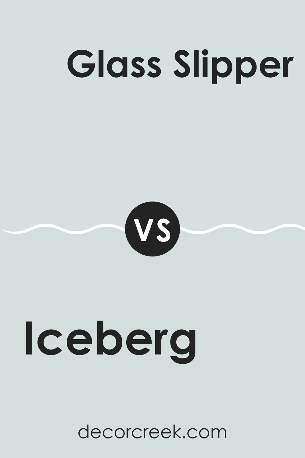
Iceberg 2122-50 by Benjamin Moore vs Glass Slipper 1632 by Benjamin Moore
The main color, Iceberg, and the second color, Glass Slipper, are both soft and light blues from Benjamin Moore, but they have subtle differences. Iceberg has a crisp, clean feel that might remind you of a bright, clear winter’s day, making interiors feel fresh and airy.
In contrast, Glass Slipper leans slightly towards a grayish tone, giving it a softer and more muted appearance. This quality makes Glass Slipper an excellent choice for creating a gentle and calming atmosphere in a room. Both colors are adaptable and can work well in various lighting situations and room sizes.
While Iceberg provides a more vibrant touch, potentially brightening up a darker room, Glass Slipper offers a subtler presence, potentially lending itself better to areas that aim for a soft, understated look. Overall, choosing between them would depend on the specific vibe you’re looking to achieve in your interior.
You can see recommended paint color below:
Iceberg 2122-50 by Benjamin Moore vs Lookout Point 1646 by Benjamin Moore
Iceberg 2122-50 and Lookout Point 1646, both by Benjamin Moore, are unique colors that add a fresh feel to any area. Iceberg is a light, pastel blue with a crisp, clean vibe, perfect for creating a bright and airy atmosphere. It reflects light beautifully, making it an excellent choice for smaller rooms or any area where you want to enhance natural light.
On the other hand, Lookout Point 1646 is a slightly deeper shade of blue with hints of gray, giving it a cooler, more muted appearance. This color is great for adding a calm but intriguing touch to a room. It works well in areas where you want a bit more color depth without overpowering the senses.
When used together, these two colors complement each other nicely, allowing for a balanced and harmonious look. Iceberg can serve as a refreshing base, while Lookout Point provides subtle contrasts, perfect for accents and features. This combination is ideal for those looking to create a refreshing but grounded atmosphere in their home.
You can see recommended paint color below:
- 1646 Lookout Point
Iceberg 2122-50 by Benjamin Moore vs Mountain Mist 868 by Benjamin Moore
The color Iceberg by Benjamin Moore is a soft, pale blue that feels light and airy. It brings to mind the clear sky on a sunny morning. This shade is great for creating a refreshing and clean look in any area. On the other hand, Mountain Mist by Benjamin Moore is a gray color with cool undertones.
It has a subtle hint of blue, making it a calm and gentle color that pairs well with a variety of décor styles. While Iceberg adds a brighter touch of blue, Mountain Mist is more muted and neutral, providing a soothing backdrop that doesn’t demand attention but nicely complements other colors in an interior.
Both colors can make a room feel open and relaxed but in different ways—Iceberg with a lively vibe of blue, and Mountain Mist with a more understated, grounding effect.
You can see recommended paint color below:
- 868 Mountain Mist
After reading about the 2122-50 Iceberg paint color by Benjamin Moore, I’ve really learned a lot about how this shade makes a room feel cool and fresh, kind of like a light blue sky on a clear day. The color Iceberg is really light and airy, which makes it perfect for any area that you want to feel bright and welcoming.
Whether you’re thinking about changing the color in your bedroom, living room, or even the bathroom, Iceberg seems like an amazing choice. It’s soft enough that it won’t make the room too stark but still adds a neat pop of color without being too loud. This makes it great for places where you relax and want to feel calm.
Also, it seems like Iceberg could mix well with many other colors or decorations you might already have at home. It doesn’t demand much but gently complements other styles you have, making it easy to use if you’re not keen on changing everything at once.
Overall, I think Benjamin Moore’s Iceberg is a pretty color that could help make any interior look fresher and brighter without too much effort. I would definitely consider using this paint if I wanted to refresh my room without making everything look too different. It’s just the right touch of light blue that brings a fresh, peaceful feeling.
Ever wished paint sampling was as easy as sticking a sticker? Guess what? Now it is! Discover Samplize's unique Peel & Stick samples.
Get paint samples

