I was searching for a color that could add a subtle, elegant flair to my workspace when I stumbled upon Benjamin Moore’s 2122-40 Smoke. This gray shade has a hint of blue that conveys a calm and calming atmosphere, perfect for rooms where you need a touch of calm yet encourage productivity.
The color’s flexibility impressed me as it beautifully complements a variety of decor styles and furniture hues. Whether paired with bright whites for a fresh, airy feel or dark wood tones for more of a grounded, classic look, Smoke’s adaptability makes room change straightforward and thrilling.
This color might just be the solution if, like me, you’re looking to refresh your room without committing to anything overly bold or demanding.
It’s subtle, yet it significantly alters the environment it envelops.
What Color Is Smoke 2122-40 by Benjamin Moore?
Smoke 2122-40 by Benjamin Moore is a subtle and soft gray shade with a hint of blue, bringing a calm and soothing presence to any room it graces. This color fits perfectly within the modern color palette and offers a refreshing neutrality, making it ideal for various living areas.
Smoke 2122-40 works exceptionally well in interior styles such as Scandinavian, minimalist, and coastal due to its light and airy quality. Its adaptability also makes it a great choice for contemporary and traditional settings. This particular shade thrives in rooms that aim for a relaxed, fresh atmosphere, enhancing the room’s aesthetic without being too intense.
When pairing this color with materials and textures, Smoke 2122-40 complements natural wood tones, from light beech to rich walnut, bridging the gap between modern taste and organic feel. It looks stunning against white trim or furniture, providing a clean, crisp look. Textiles like linen or cotton in white, beige, or soft pastel tones work beautifully to maintain the light and breezy vibe.
Additionally, incorporating elements like brushed nickel or stainless steel can give a more polished look, while adding glass or mirrored surfaces can help reflect light and make the room appear larger.
Is Smoke 2122-40 by Benjamin Moore Warm or Cool color?
Smoke 2122-40 by Benjamin Moore is a deep, grayish-blue shade that offers a calm and cozy atmosphere, perfect for various rooms in homes. This color works well in bedrooms and living rooms, setting a relaxed mood, making it easier to unwind after a long day.
The unique tone of Smoke can make smaller rooms appear more open, as its depth adds an element of airiness, despite its darker hue. Additionally, it pairs beautifully with white trim and modern furniture, enhancing the overall aesthetic of a room without being too intense.
It’s also remarkably adaptable, fitting flawlessly with both contemporary and rustic designs. Whether the goal is to create a statement wall or to paint an entire room, Smoke provides a stable and grounding effect that can balance brighter accents and features, making it a go-to choice for those looking to update their home without drastic changes.
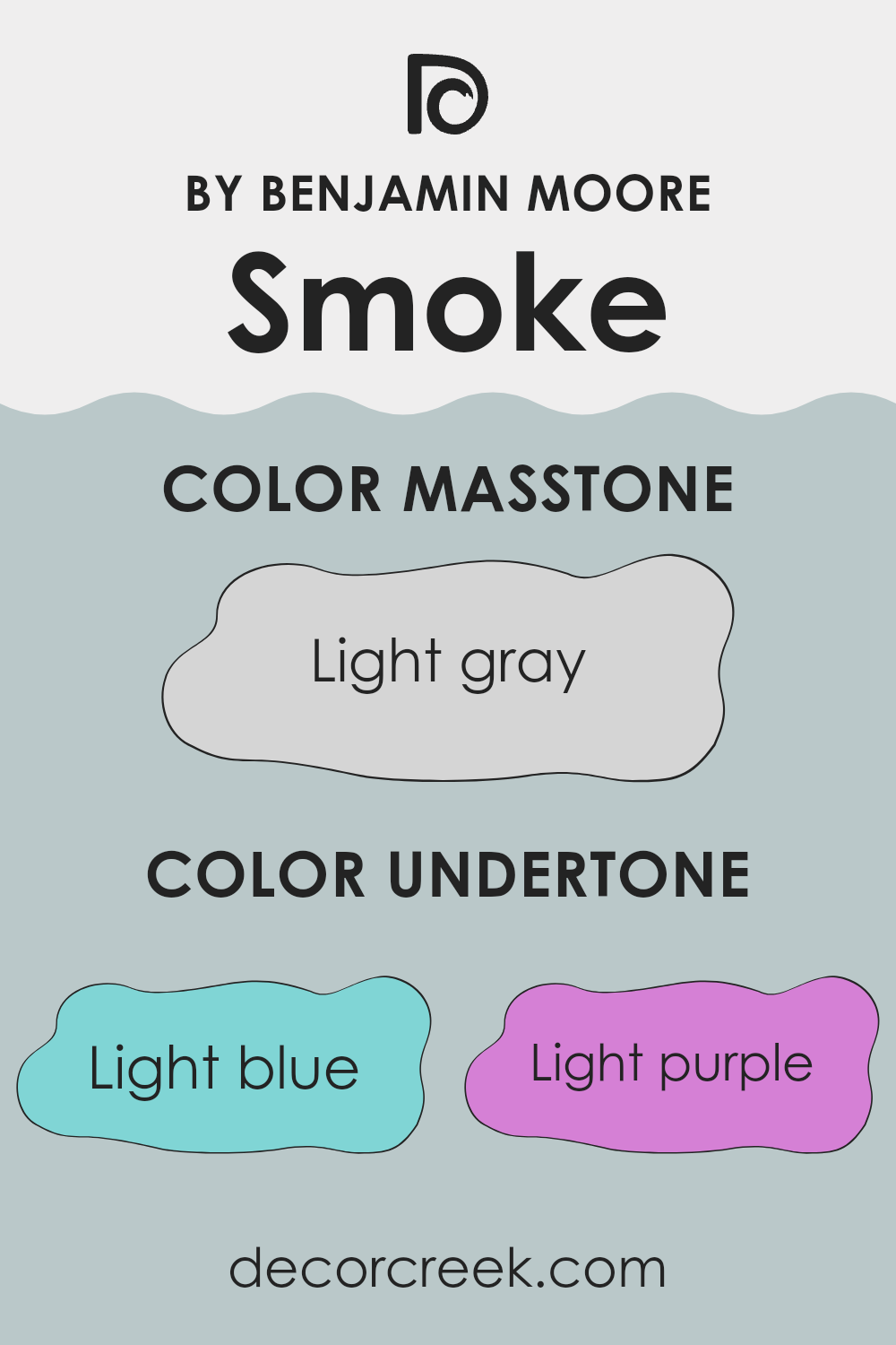
Undertones of Smoke 2122-40 by Benjamin Moore
Smoke 2122-40 by Benjamin Moore is an adaptable color with unique undertones that affect how it appears in different lights and settings. This paint color has undertones of light blue, light purple, pale yellow, lilac, mint, pale pink, and grey, which work together to give it a complex and mutable appearance, making it suitable for various interior walls.
Undertones are subtle colors that lie beneath the surface of the primary color. They can influence the primary color’s warmth, coolness, and depth, affecting how we perceive the color in various lighting conditions. For example, in natural light, the light blue and lilac undertones of Smoke 2122-40 may make it appear cooler and softer, making it a pleasing choice for creating a calm and inviting atmosphere in a room.
When applied to interior walls, the mingling of Smoke 2122-40’s undertones can play beautifully with furnishings and decor. The pale yellow and mint undertones can subtly brighten up a room, making it feel more open and airy, while the pale pink and grey can add a gentle depth, ensuring the walls offer warmth and comfort. This complexity allows Smoke 2122-40 to adjust to various styles and palettes, pairing nicely with both light and dark furnishings, enhancing the overall aesthetic of any room.
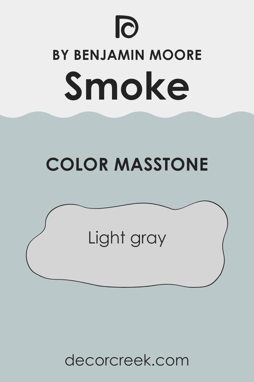
What is the Masstone of the Smoke 2122-40 by Benjamin Moore?
Smoke 2122-40 by Benjamin Moore has a masstone of light gray, identifiable by its color code #D5D5D5. This neutral, soft gray shade is highly adaptable and proves to be a practical choice for home interiors.
It sets a calm, inviting atmosphere in any room without being too stark or cold, which sometimes happens with darker gray tones. Light gray walls can make small rooms appear larger and more open, as they reflect light better than darker hues. This color works well in various settings, blending seamlessly with different decor styles and color schemes.
Whether paired with bold, vibrant colors to create a dynamic contrast or teamed with other neutrals for a more subtle look, Smoke 2122-40 maintains its balance and doesn’t overpower the room. Its light gray shade provides a clean backdrop that allows furnishings and artwork to stand out, making it suitable for living rooms, bedrooms, and home offices.
How Does Lighting Affect Smoke 2122-40 by Benjamin Moore?
Lighting plays a crucial role in how we perceive colors, and understanding this can make a big difference in decorating rooms. Different types of light can make the same paint color look completely different.
Taking Smoke 2122-40 by Benjamin Moore as an example, this shade will look different under various lighting conditions. In natural light, this color tends to show its true characteristics. For instance, in a room with plenty of sunlight, Smoke 2122-40 will appear slightly lighter and more dynamic. This is particularly prominent on sunny days.
In contrast, under artificial lighting, such as LED or incandescent bulbs, Smoke 2122-40 can look a bit different. Warmer lights, like incandescent bulbs, might bring out a slight warmth in the color, making it appear less gray and more beige. Cooler lights, like some LEDs, might highlight its gray tones, making it look more muted.
The direction a room faces can also influence how Smoke 2122-40 appears:
- North-Facing Rooms: These rooms get less direct sunlight and tend to have cooler light. Here, Smoke 2122-40 might look a tad more shadowy and pronounced in its gray aspects, giving a more steady and calming feel without much variation throughout the day.
- South-Facing Rooms: In contrast, south-facing rooms are bathed in ample sunlight for most of the day, which can make Smoke 2122-40 look lighter and reveal any underlying warm tones. The color can feel more alive and welcoming in these rooms.
- East-Facing Rooms: These rooms enjoy bright light in the morning, which then fades as the day progresses. Smoke 2122-40 might look bright and airy in the morning, then gradually transition to its true gray shade by sunset.
- West-Facing Rooms: With more intense afternoon and evening light, this color could start off subdued in the morning and then grow richer as the day goes on.
In summary, the way Smoke 2122-40 looks dramatically depends on the lighting and the direction of the room. This interplay between color and light can greatly affect the atmosphere and mood in any given room.
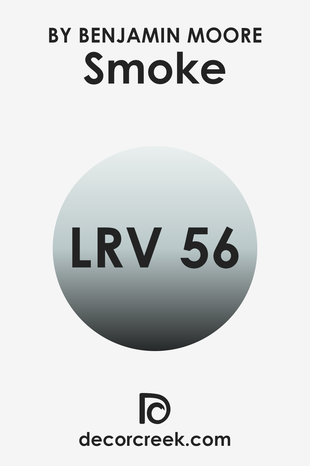
What is the LRV of Smoke 2122-40 by Benjamin Moore?
LRV stands for Light Reflectance Value, which is a measure of the amount of visible and usable light that a color reflects or absorbs when painted on a wall. Specifically, it’s gauged on a scale where higher values mean the color reflects more light and appears lighter, whereas lower values mean the color absorbs more light and appears darker.
This value is crucial because it helps determine how light or dark the color will look in a specific environment, impacting the ambiance of a room. Light colors can make a room feel more open and airy, while dark colors can make it feel more enclosed.
Regarding the color Smoke 2122-40 by Benjamin Moore, with an LRV of 56.39, it sits near the middle of the scale, reflecting a moderate amount of light. This characteristic means it won’t overpower a room by appearing too bright, nor will it make a room feel smaller or cramped by being overly dark.
It is adaptable enough to be used in various rooms, either enhancing the inherent brightness of well-lit areas or adding a subtle hint of depth and warmth to less-lit rooms without dramatically darkening them. This kind of LRV makes it a good choice for someone looking to achieve a balanced look in their home.
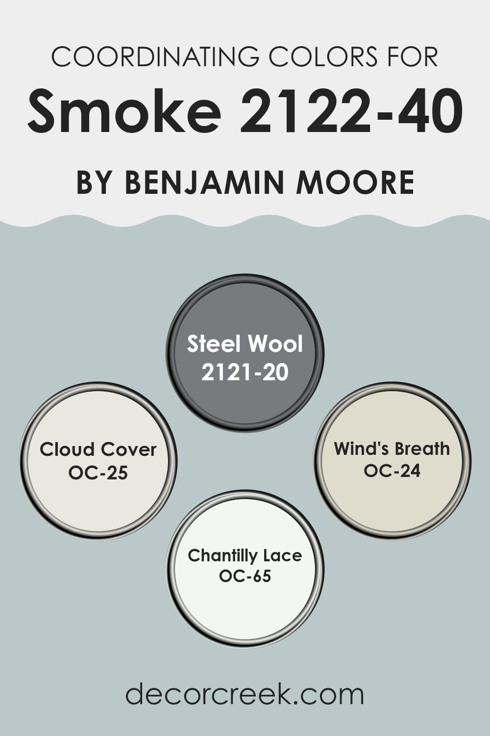
Coordinating Colors of Smoke 2122-40 by Benjamin Moore
Coordinating colors are selected to create a harmonious color scheme that complements a primary color, in this case, the shade Smoke by Benjamin Moore. These coordinating colors work by either enhancing or balancing the main color’s tone and mood, depending on whether they are of a similar shade or a contrasting one. When used together effectively, coordinating colors can bring a sense of visual cohesion and balance to any room.
Steel Wool is a deep, robust gray that offers a strong contrast to Smoke, making it ideal for adding depth and definition to a room. Cloud Cover, on the other hand, is a soft white with slight gray undertones, providing a gentle blend that can light up any room while maintaining a smooth transition from Smoke.
Another lighter option is Wind’s Breath, a subtle off-white with a touch of beige, perfect for creating a soft, neutral backdrop that doesn’t overpower Smoke. Lastly, Chantilly Lace stands out as a pure, clean white. It is excellent for trim and accents, as it brings a crisp freshness that can make the walls pop without clashing with the overarching gray theme.
You can see recommended paint colors below:
- 2121-20 Steel Wool
- OC-25 Cloud Cover
- OC-24 Wind’s Breath
- OC-65 Chantilly Lace
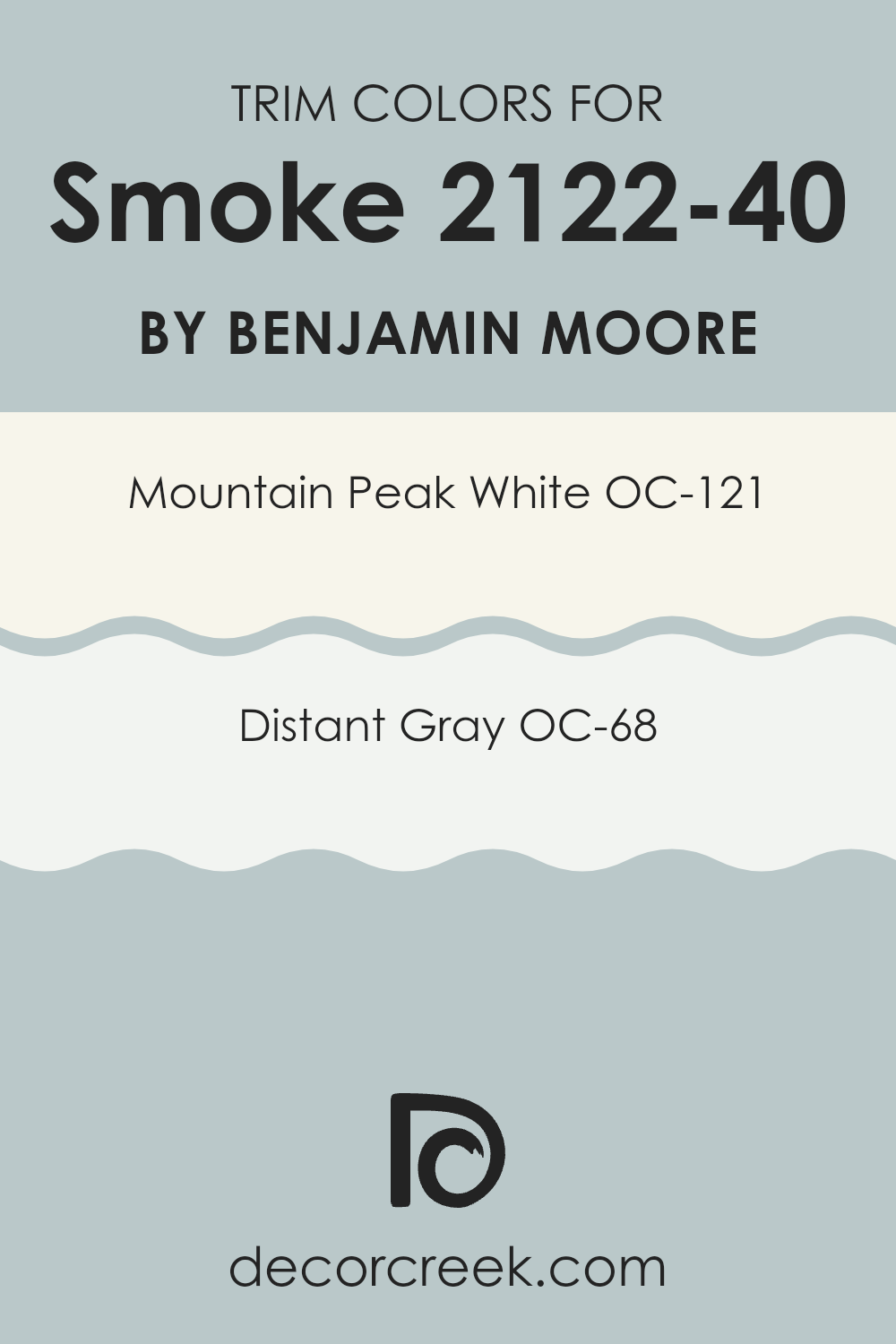
What are the Trim colors of Smoke 2122-40 by Benjamin Moore?
Trim colors are specifically chosen to complement the main hues on walls and other large surface areas, enhancing the overall appearance of the room. Benjamin Moore’s Smoke 2122-40, a muted gray with a hint of blue, can significantly benefit from carefully selected trim colors like OC-121 – Mountain Peak White and OC-68 – Distant Gray.
These colors help define and accentuate architectural details such as door frames, moldings, and baseboards, providing a clean and finished look. The right trim colors can also help make the wall colors stand out, adding depth and dimension to the room without overpowering the main color theme.
Mountain Peak White (OC-121) is a very light and airy shade that offers a subtle contrast against deeper tones like Smoke 2122-40. It helps in creating a bright and open feel, making it an excellent choice for enhancing natural light and giving rooms a fresher look.
On the other hand, Distant Gray (OC-68) is a very soft, almost imperceptible gray that blends seamlessly when used as a trim, supporting the primary color without causing abrupt transitions. It is ideal for achieving a harmonious and cohesive look in rooms where a more understated elegance is desired.
You can see recommended paint colors below:
- OC-121 Mountain Peak White
- OC-68 Distant Gray
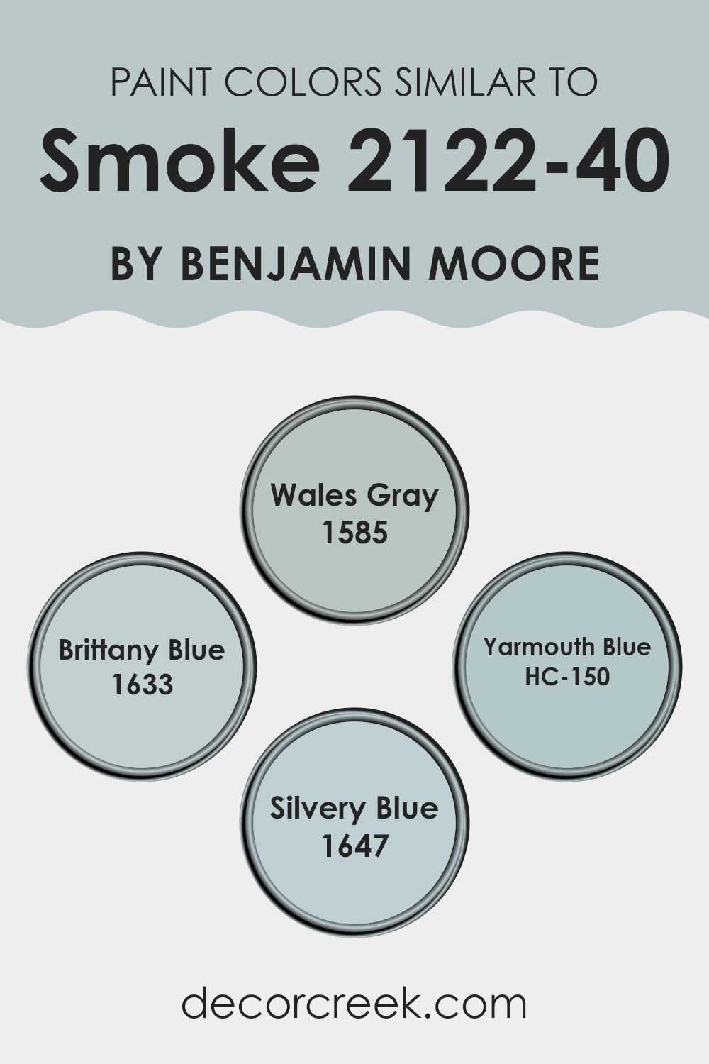
Colors Similar to Smoke 2122-40 by Benjamin Moore
Using similar colors in a design can create a harmonious and visually appealing room. Similar colors, like varying shades of blue, work well together because they have a common hue base, which provides a seamless look while maintaining enough contrast to define different elements in a room.
This soothing palette can make a room feel cohesively decorated and aesthetically balanced. It’s especially effective in achieving a unified appearance without the stark contrasts that more diverse color schemes might introduce.
For instance, 1585 – Wales Gray by Benjamin Moore is not just gray but has subtle blue undertones that lend a calm, cooling effect, perfect for a peaceful living area or bedroom. The slightly brighter 1633 – Brittany Blue offers a fresh, airy feel that mimics the clear sky, ideal for creating an inviting atmosphere.
On the other hand, HC-150 – Yarmouth Blue features a bit more depth, making it suitable for highlighting important areas or furniture pieces. Finally, 1647 – Silvery Blue has a gentle, light reflective quality that can help to open up a room, reflecting natural light and making rooms appear larger. Together, these colors complement each other and are adaptable enough to suit various decorating styles, from casual to formal.
You can see recommended paint colors below:
- 1585 Wales Gray
- 1633 Brittany Blue
- HC-150 Yarmouth Blue
- 1647 Silvery Blue
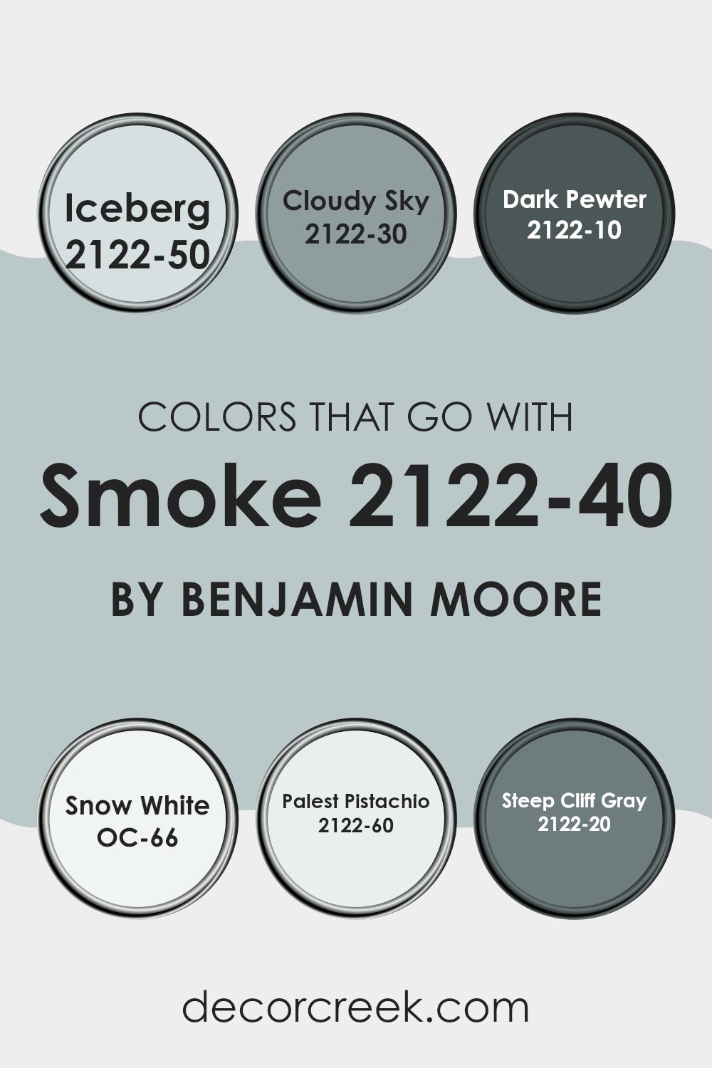
Colors that Go With Smoke 2122-40 by Benjamin Moore
Choosing the right complementary colors for Smoke 2122-40 by Benjamin Moore is crucial because it helps create a balanced and harmonious atmosphere in your living room. When you select colors like Iceberg, Cloudy Sky, Dark Pewter, Snow White, Palest Pistachio, and Steep Cliff Gray, you’re able to enhance the aesthetic of your room while also ensuring that everything flows seamlessly. These shades work together to provide a cohesive look that can make any room feel more inviting and comfortable.
For instance, pairing Smoke with Iceberg, a light and airy blue, gives a room a fresh and clean feel, perfect for creating a cool, calm environment. Cloudy Sky, a deeper blue, adds a bit more drama and depth, making it ideal for accent walls or furniture pieces. Dark Pewter is a bold, near-black shade that provides a striking contrast, perfect for highlighting architectural features or furniture.
Snow White is a pure, crisp white that brightens up any room and offers a stark contrast to Smoke, allowing it to stand out. Palest Pistachio is a soft, subtle green that injects a hint of natural color into your decor, complementing the cool tones of Smoke. Lastly, Steep Cliff Gray is a strong gray that works well with Smoke to create a dynamic and visually interesting room, especially in modern settings. Together, these colors support the base hue of Smoke, allowing for a multitude of design possibilities that can fit any taste or style.
You can see recommended paint colors below:
- 2122-50 Iceberg
- 2122-30 Cloudy Sky
- 2122-10 Dark Pewter
- OC-66 Snow White
- 2122-60 Palest Pistachio
- 2122-20 Steep Cliff Gray
How to Use Smoke 2122-40 by Benjamin Moore In Your Home?
Smoke 2122-40 by Benjamin Moore is a beautiful, soft gray paint that can bring a soothing and peaceful feel to any room in your home. It’s an adaptable color that works well in many areas, including living rooms, bedrooms, and kitchens. Due to its subtle tone, it pairs nicely with many decor styles, from modern to traditional.
One way you can use Smoke 2122-40 is by painting your living room walls with it. This neutral color provides a calm backdrop, allowing your furniture and artwork to stand out. It’s great for rooms where you want a calm feel without making the room feel too dark.
In the bedroom, Smoke 2122-40 can help create a relaxing room that’s perfect for unwinding at the end of the day. Combine it with soft bedding and maybe a few bold accent pillows to add a personal touch.
Lastly, in the kitchen, this color can help keep the room clean-looking and bright. Pair it with white cabinets for a fresh and airy look. Smoke 2122-40 is a great choice if you’re looking to refresh your home with a new paint color that has a gentle and inviting hue.
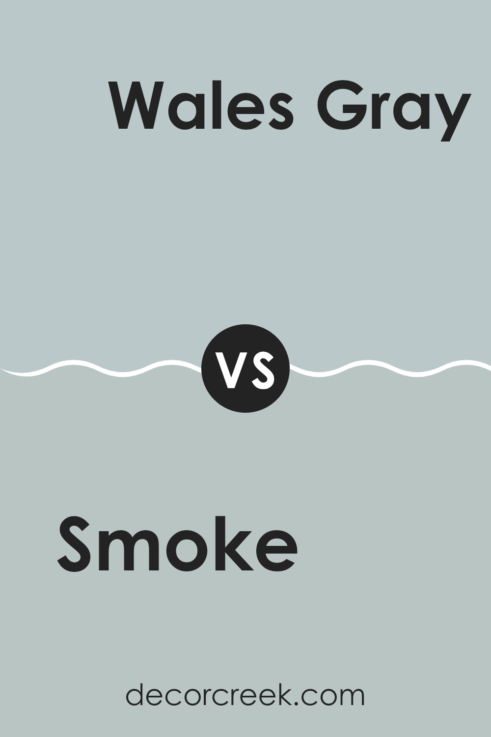
Smoke 2122-40 by Benjamin Moore vs Wales Gray 1585 by Benjamin Moore
Smoke 2122-40 and Wales Gray 1585, both by Benjamin Moore, present distinct shades that can greatly influence the mood of a room. Smoke has a deep, charcoal-like tone that imparts a strong presence, making it ideal for creating a striking accent in rooms. It tends to absorb light, adding a cozy feel to any area.
On the other hand, Wales Gray is lighter and leans slightly towards blue, giving it a fresher, more open vibe. It reflects more light, which can make small rooms appear larger and more inviting.
When choosing between the two, consider the room’s purpose and size. Smoke works well in larger, well-lit areas where its depth can be appreciated without being too intense, while Wales Gray is perfect for smaller rooms or rooms aiming for a gentle, airy feel. Each color offers a unique aesthetic that can beautifully complement varied interior designs without overlapping in use.
You can see recommended paint color below:
- 1585 Wales Gray
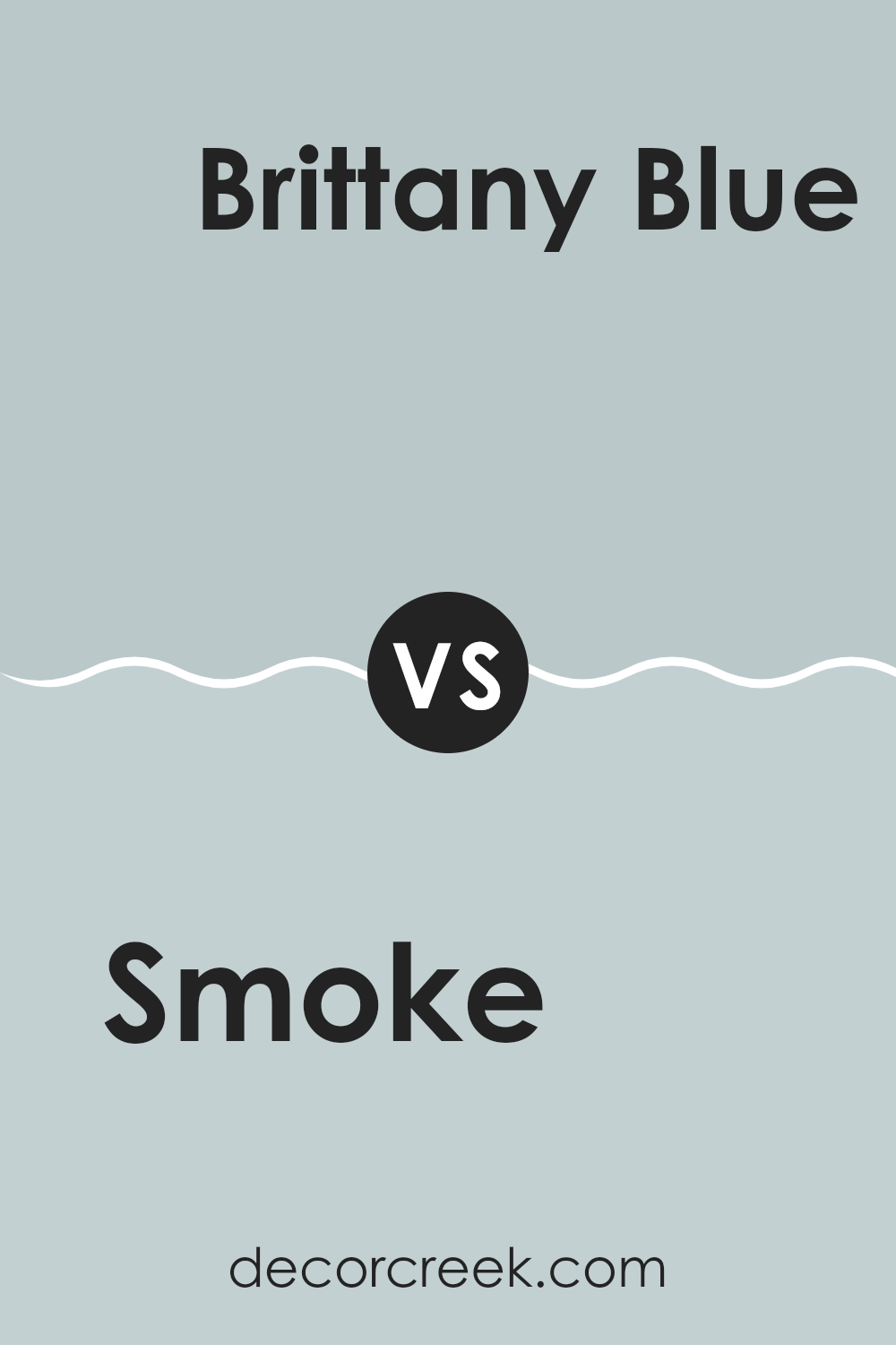
Smoke 2122-40 by Benjamin Moore vs Brittany Blue 1633 by Benjamin Moore
Smoke 2122-40 and Brittany Blue 1633 by Benjamin Moore are two distinct shades that each offer a unique vibe. Smoke is a deep, grayish tone that looks very refined and can really make a statement in a room without being too intense.
It’s perfect for a modern look or to add a subtle backdrop in any room. On the other hand, Brittany Blue has a much lighter, more gentle feel. This color is a soft blue with a touch of gray, giving it a calm and pleasant presence that’s ideal for creating a relaxed environment in places like bedrooms or bathrooms.
When comparing the two, Smoke is bolder and more pronounced, whereas Brittany Blue offers a lighter, airier touch. Both colors bring their own special qualities to a room, making them adaptable for different decorating styles.
You can see recommended paint color below:
- 1633 Brittany Blue
Smoke 2122-40 by Benjamin Moore vs Yarmouth Blue HC-150 by Benjamin Moore
The main color, Smoke by Benjamin Moore, is a subtle, soft gray with hints of blue, giving it a gentle and calming presence in any room, ideal for creating a peaceful ambiance. It has a cool undertone, making it great for a modern look in living rooms or bedrooms.
On the other hand, Yarmouth Blue is also from Benjamin Moore and leans more prominently towards a true blue, although it maintains a muted softness that prevents it from being too intense. This color is brighter compared to Smoke and brings a refreshing feel to the room. Yarmouth Blue works beautifully in bathrooms or kitchens where you want a splash of color that remains soft and inviting.
Both colors share a muted subtlety but differ in their balance of gray and blue, with Smoke showing more gray and Yarmouth Blue showcasing more of the blue spectrum. Each brings its own unique feel to a room, offering softness and calm but in two distinctly different shades.
You can see recommended paint color below:
- HC-150 Yarmouth Blue
Smoke 2122-40 by Benjamin Moore vs Silvery Blue 1647 by Benjamin Moore
Smoke 2122-40 by Benjamin Moore is a subtle gray tone that evokes a soft, cloudy day. It’s calm and understated, making it a great choice for any room where you want a gentle, neutral backdrop. It pairs well with various decor styles and adds a soothing touch without taking over visually.
On the other hand, Silvery Blue 1647 by Benjamin Moore is a gentle blue that has a hint of silver, giving it a slightly luminous quality. This color is light and airy, perfect for creating a refreshing and inviting atmosphere in rooms like bedrooms or bathrooms. It’s also a good choice to brighten up areas without being too intense with strong color.
Both colors are light and mild but offer distinct vibes — Smoke 2122-40 is more grounded and earthy, while Silvery Blue 1647 leans towards a breezier, uplifting feel. Each works well to create a peaceful room, though their impacts differ slightly based on their undertones and the mood you want to set.
You can see recommended paint color below:
- 1647 Silvery Blue
After reading about the color “2122-40 Smoke” by Benjamin Moore, I really think it’s a wonderful choice for painting almost any room. This color is a sort of soft blue with a hint of gray, which gives it a calming feel. It seems perfect for someone who wants their room to be a peaceful place, like a cozy reading nook or a relaxing bedroom.
What’s cool about “Smoke” is that it isn’t too bright but it still adds a nice touch of color to a room. It works well with lots of other colors too. Whether you have furniture that is dark brown, light pink, or even bolder colors, “Smoke” can fit right in without causing any clash. This makes it really handy when you want to redecorate without buying all new pieces to match the walls.
Also, Benjamin Moore is known for making paint that lasts a long time and stays looking good. So, choosing “Smoke” might mean you don’t have to repaint as often, which is great if you’d rather spend your time and money on other fun projects.
So, I’d say if you’re looking for a new color for your room and you want something that’s calm, pretty, and easy to match with other things, “2122-40 Smoke” could be a perfect pick. It seems to make any room feel just a bit nicer, which is pretty awesome when you think about it.

Ever wished paint sampling was as easy as sticking a sticker? Guess what? Now it is! Discover Samplize's unique Peel & Stick samples.
Get paint samples

