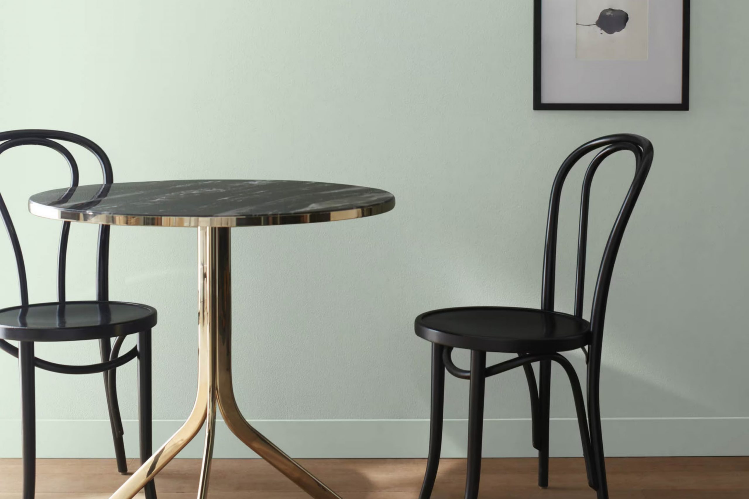
Have you ever walked into a room and felt an immediate sense of calm wash over you? That’s the effect 457 Icy Morn by Benjamin Moore had on me. I want to share my experience with this unique shade of paint, which might just be the perfect addition to your home if you’re looking for a subtle yet impactful change.
Icy Morn is not just another pale blue. It has a refreshing quality that brightens any setting without feeling too cold or sterile. It strikes a delicate balance, providing a backdrop that’s both invigorating and soothing. In my living room, this color brought a new level of freshness, reminding me of a crisp, peaceful winter morning that energizes you as soon as you open your eyes.
Using Icy Morn extended beyond just aesthetics; it subtly altered the feel of my living area, making it seem larger and more open while still cozy. It gave a new life to my old furniture and decor, proving that a single change can make a whole room feel brand new.
Whether you’re considering a full renovation or just a quick makeover, Icy Morn offers a breath of fresh air to any project. Let me tell you more about how this color can work its magic in your home too.
What Color Is Icy Morn 457 by Benjamin Moore?
“Icy Morn” by Benjamin Moore is a light and breezy blue hue with hints of green, which brings a fresh and airy feel to any setting. This subtle, soft color has a calming effect, making it perfect for creating a relaxed atmosphere in your home. Its delicate tone works well with natural light, enhancing rooms to appear more open and inviting.
This adaptable shade pairs beautifully with minimalistic and modern interior styles, as well as coastal and Scandinavian designs where simplicity and lightness are key. Its cool tones are a great match for clean whites and soft grays, helping to maintain a light, cohesive look throughout a room.
For materials, “Icy Morn” goes particularly well with light woods such as oak and birch that emphasize its natural character. Adding textures like linen or cotton in furnishings will complement the soft feel of the color, while metals such as brushed nickel or soft matte silver can add a subtle contrast without overpowering its gentle nature.
Overall, “Icy Morn” is ideal for those looking to create a refreshing, open setting with a hint of modernity and elegance. It helps to keep the environment calm and welcoming, working harmoniously with a range of materials and other colors to support a variety of decor styles.
Is Icy Morn 457 by Benjamin Moore Warm or Cool color?
Icy Morn 457 by Benjamin Moore is a soft, light blue-gray shade that brings a fresh and airy feel to any room. This color is quite adaptable, making it a popular choice for many homes. It works well in small areas because the light color can make rooms look bigger and more open.
Icy Morn is also gentle enough to use in rooms where you relax, like bedrooms or living rooms, because it doesn’t overpower the setting. This color pairs well with both dark and light furniture and can balance brighter colors, creating a nice contrast.
It is especially good for people who want a modern look without going too bold, as it maintains a subtle presence. In well-lit areas, it can look almost white with a hint of blue, helping to reflect light and brighten the room. Overall, Icy Morn 457 is a great option for anyone looking to refresh their home with a clean and fresh look.
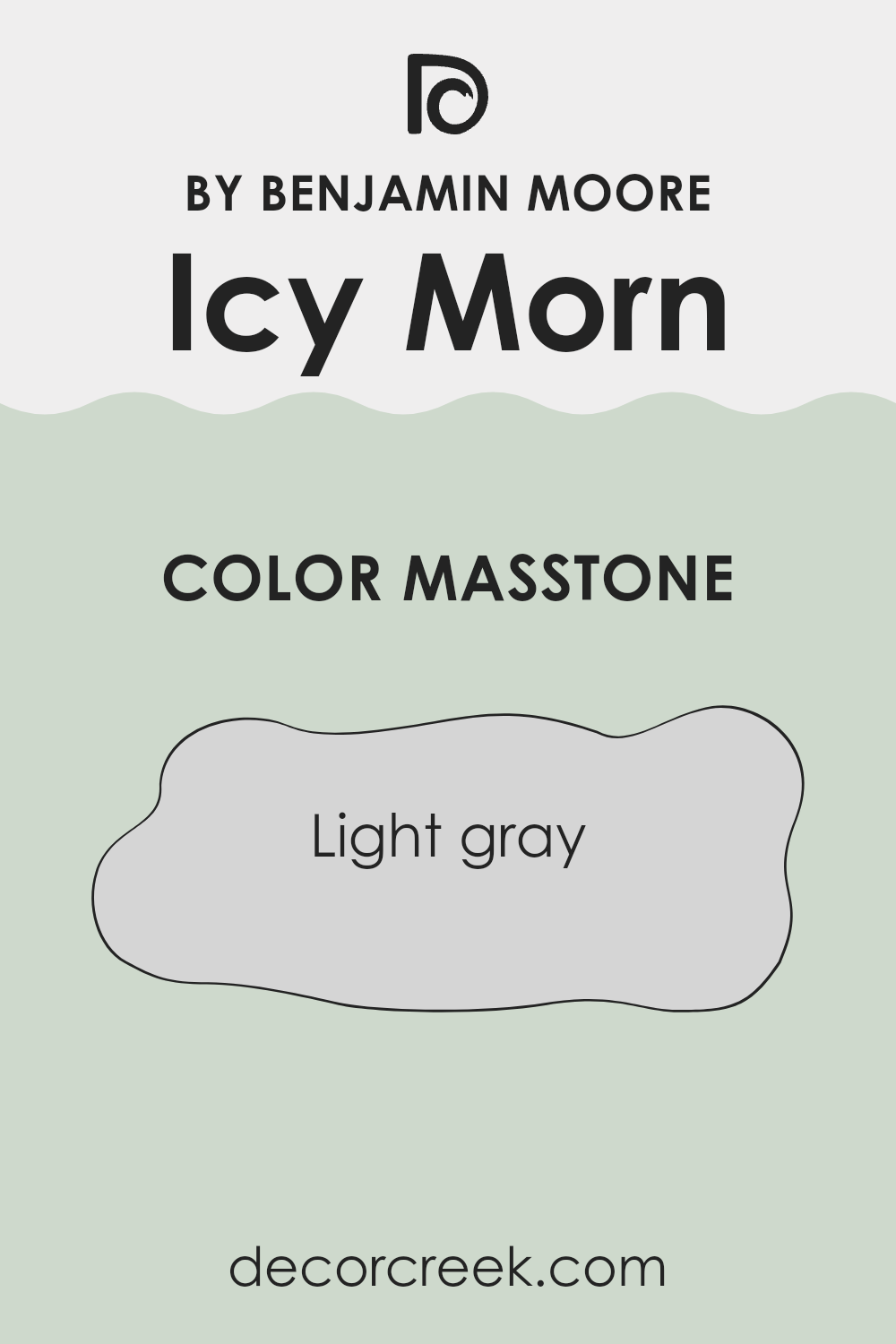
What is the Masstone of the Icy Morn 457 by Benjamin Moore?
Icy Morn 457 by Benjamin Moore, with a masstone of Light Gray (#D5D5D5), is a flexible color suitable for creating a calm and soothing atmosphere in homes. This light gray shade has a subtle brightness that makes rooms feel more open and airy. It’s excellent for smaller areas or spots with limited natural light, as it helps make the room appear larger and more welcoming.
This color is also very adaptable, pairing well with various decor styles and colors, from bold and vibrant hues to more muted tones. It can act as a neutral backdrop for colorful art and furniture or a standalone color for a minimalist look.
The neutrality of Light Gray ensures it works well in most house areas, including living rooms, bedrooms, and kitchens, providing a clean and enduring look without overpowering the senses. Furthermore, its simplicity in tone means it often requires less frequent updating, contributing to a low-maintenance home environment.
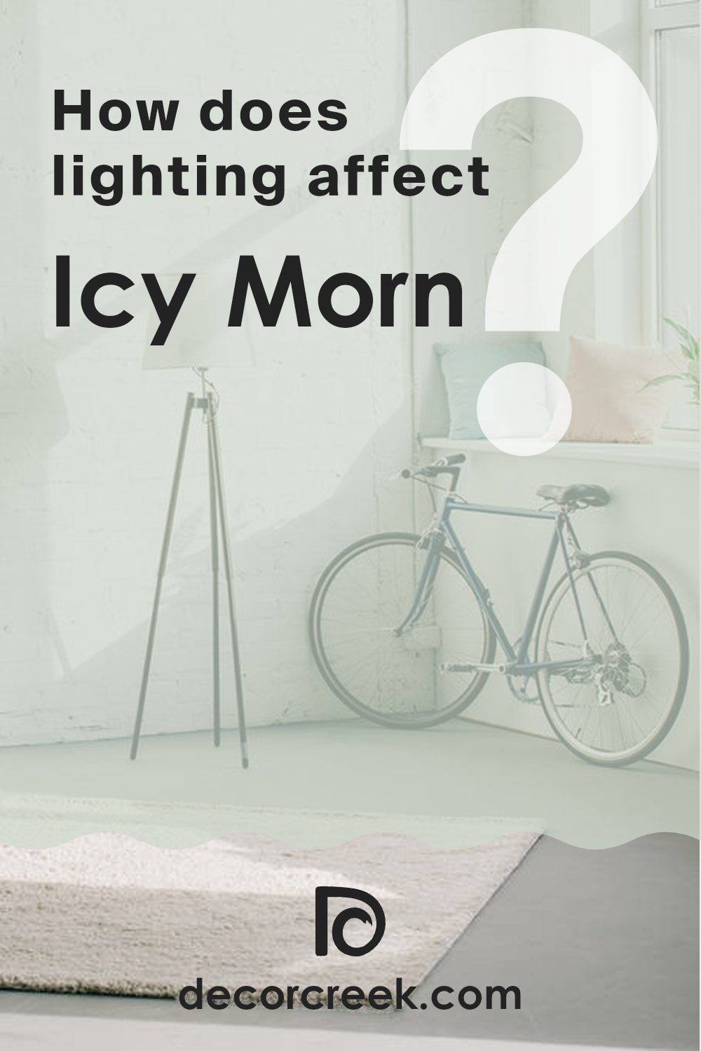
How Does Lighting Affect Icy Morn 457 by Benjamin Moore?
Lighting plays a crucial role in how colors appear in any setting, significantly shaping their perception and mood. A paint color like Icy Morn by Benjamin Moore, known for its cool and gentle blue tones, can show varied effects under different lighting conditions.
Artificial Light: Under artificial lighting, Icy Morn can shift in appearance depending on the type of bulb used. Incandescent bulbs, which emit a warm, yellowish glow, can soften the blue, making it appear slightly greener or muddier. Conversely, LED or fluorescent bulbs, especially those mimicking daylight, will maintain the color’s true blue shade, keeping it crisp and bright.
Natural Light: In natural light, this color mirrors the day’s brightness and weather conditions. On sunny days, Icy Morn looks vibrant and cool, enhancing its blue tones, while on cloudy days, it may appear more muted and subtle.
Each room’s orientation relative to the sun also affects how Icy Morn is perceived:
- North-Facing Rooms: Receive less direct sunlight, making Icy Morn appear cooler and slightly darker, with its gray undertones more visible. This works well for creating a calm and collected atmosphere.
- South-Facing Rooms: With abundant light, Icy Morn brightens, enhancing its lively blue hues and making the room feel airy and inviting.
- East-Facing Rooms: Morning light makes Icy Morn look bright and pleasant, but as the day progresses, it shifts to cooler tones, creating subtle mood changes throughout the day.
- West-Facing Rooms: Evening light gives Icy Morn a warmer, golden glow, softening its blue and adding a cozy, welcoming touch.
By understanding how lighting interacts with Icy Morn, you can plan its use more effectively, ensuring that each room feels balanced and appealing at all times of the day.
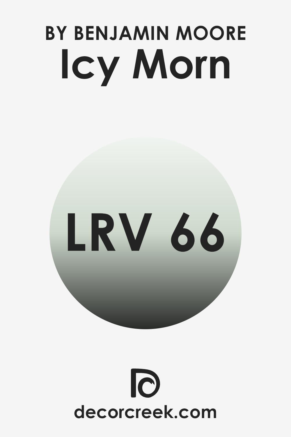
What is the LRV of Icy Morn 457 by Benjamin Moore?
LRV stands for Light Reflectance Value, and it’s a measurement used to show how much light a paint color reflects. The scale runs from zero, which absorbs all light and appears completely black, to the highest value, which reflects all light and appears pure white.
The higher the number, the more light the color reflects. This is important because it helps in selecting the right paint color for a room, depending on how bright or muted you want it to look. Lighter rooms often feel more open and can appear larger.
For Icy Morn, with an LRV of 65.84, the color is fairly light and reflects a good amount of light back into the room. This makes it a great option for brightening smaller areas and giving them a more airy appearance, while still maintaining enough depth to add interest and character. It’s a solid choice if you want to refresh a room that has natural or artificial lighting, as it won’t absorb too much light.
Plus, its balanced LRV ensures the color remains consistent throughout the day, offering a stable and appealing backdrop in any setting.
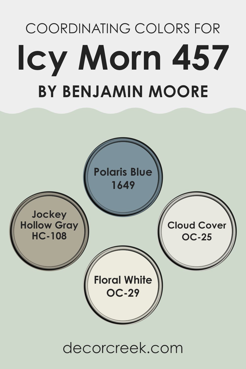
Coordinating Colors of Icy Morn 457 by Benjamin Moore
Coordinating colors are shades that complement one another and create a visually pleasing harmony when used together in interior design or painting. These colors are chosen for their ability to support and enhance the character of the main color without overpowering it.
They can either contrast to bring vibrancy or stay closer in tone for a more subtle effect, depending on the mood or atmosphere you want to achieve. In home decor, when a shade like Icy Morn by Benjamin Moore is used as the primary color, selecting the right coordinating hues is essential to creating a balanced and welcoming setting.
For Icy Morn, a soft and airy blue, Polaris Blue serves as a deeper counterpoint, adding depth and intensity that works beautifully for accent walls or statement pieces. Jockey Hollow Gray introduces a muted, earthy contrast, grounding the palette and adding refinement without overshadowing the lighter tones.
Cloud Cover is a fresh, neutral white that brightens a room and makes it feel more expansive, making it perfect for trim or ceilings. Finally, Floral White brings a gentle warmth to the mix, offering a cozy touch that softens the coolness of Icy Morn. Together, these shades provide flexible options for achieving a cohesive and inviting design.
You can see recommended paint colors below:
- 1649 Polaris Blue
- HC-108 Jockey Hollow Gray
- OC-25 Cloud Cover
- OC-29 Floral White
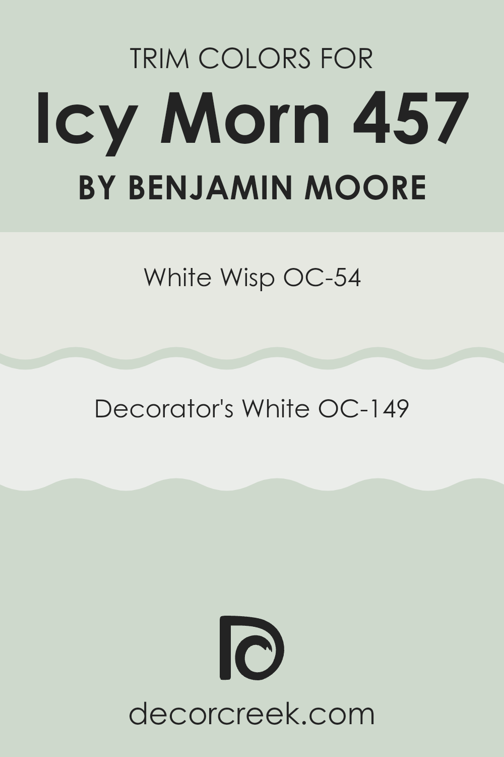
What are the Trim colors of Icy Morn 457 by Benjamin Moore?
Trim colors are finishes used on architectural details such as door frames, window casings, and baseboards, creating either a subtle blend or a striking contrast with the main wall color. The right trim choice, like OC-54 White Wisp or OC-149 Decorator’s White by Benjamin Moore, can enhance the aesthetics of a room by highlighting structural elements and adding a polished, intentional look.
When paired with a base shade like Icy Morn, these trim colors ensure a cohesive and refined visual flow. White Wisp OC-54 carries a soft hint of gray that tempers its brightness, allowing it to flow seamlessly with cooler hues like Icy Morn. This creates a smooth and delicate transition, avoiding stark edges.
Decorator’s White OC-149, in contrast, is a pure, crisp white with just a trace of warmth, offering a clean and striking frame against gentler wall colors. It provides a fresh, sharp boundary that accentuates the walls while giving the architectural details a crisp prominence. Both options complement Icy Morn beautifully, ensuring the room feels thoughtfully designed and balanced.
You can see recommended paint colors below:
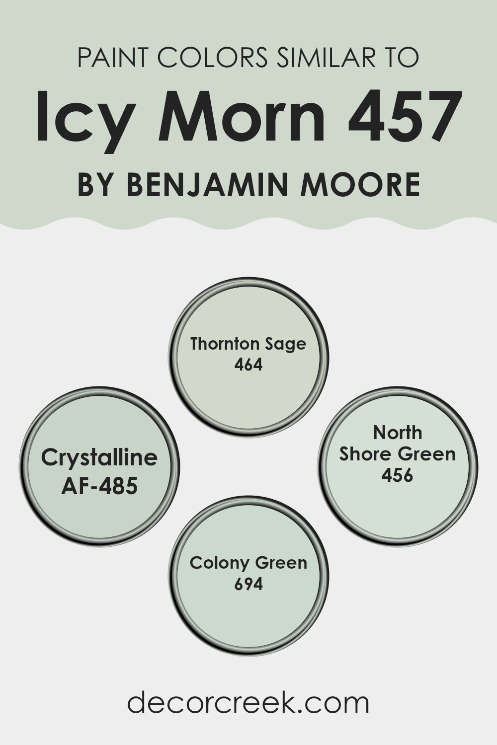
Colors Similar to Icy Morn 457 by Benjamin Moore
Similar colors play a crucial role in creating a harmonious and visually appealing color scheme. By using shades that are closely related, such as those similar to Icy Morn by Benjamin Moore, you create a sense of unity and flow within a room. These subtle variations can help highlight different features without creating an intense contrast. For instance, using shades like Thornton Sage, Crystalline, North Shore Green, and Colony Green alongside Icy Morn can produce a cohesive atmosphere that feels connected and cohesive.
Each of these colors complements Icy Morn in a unique way. Thornton Sage is a muted, earthy green that brings a natural feel to the environment, making it perfect for areas that aim for a calming effect. Crystalline is a clearer, slightly more vibrant green that can brighten a room while still maintaining a soft overall look.
North Shore Green offers a deeper green tone that pairs well with lighter shades to add depth, perfect for accent walls or furniture pieces. Lastly, Colony Green stands out as a pale, dusty green, which works beautifully in rooms that aim for a subtle hint of color without creating an intense effect. These colors, all sharing a green undertone, work seamlessly with each other, offering a flexible palette for decorating any room.
You can see recommended paint colors below:
- 464 Thornton Sage
- AF-485 Crystalline
- 456 North Shore Green
- 694 Colony Green
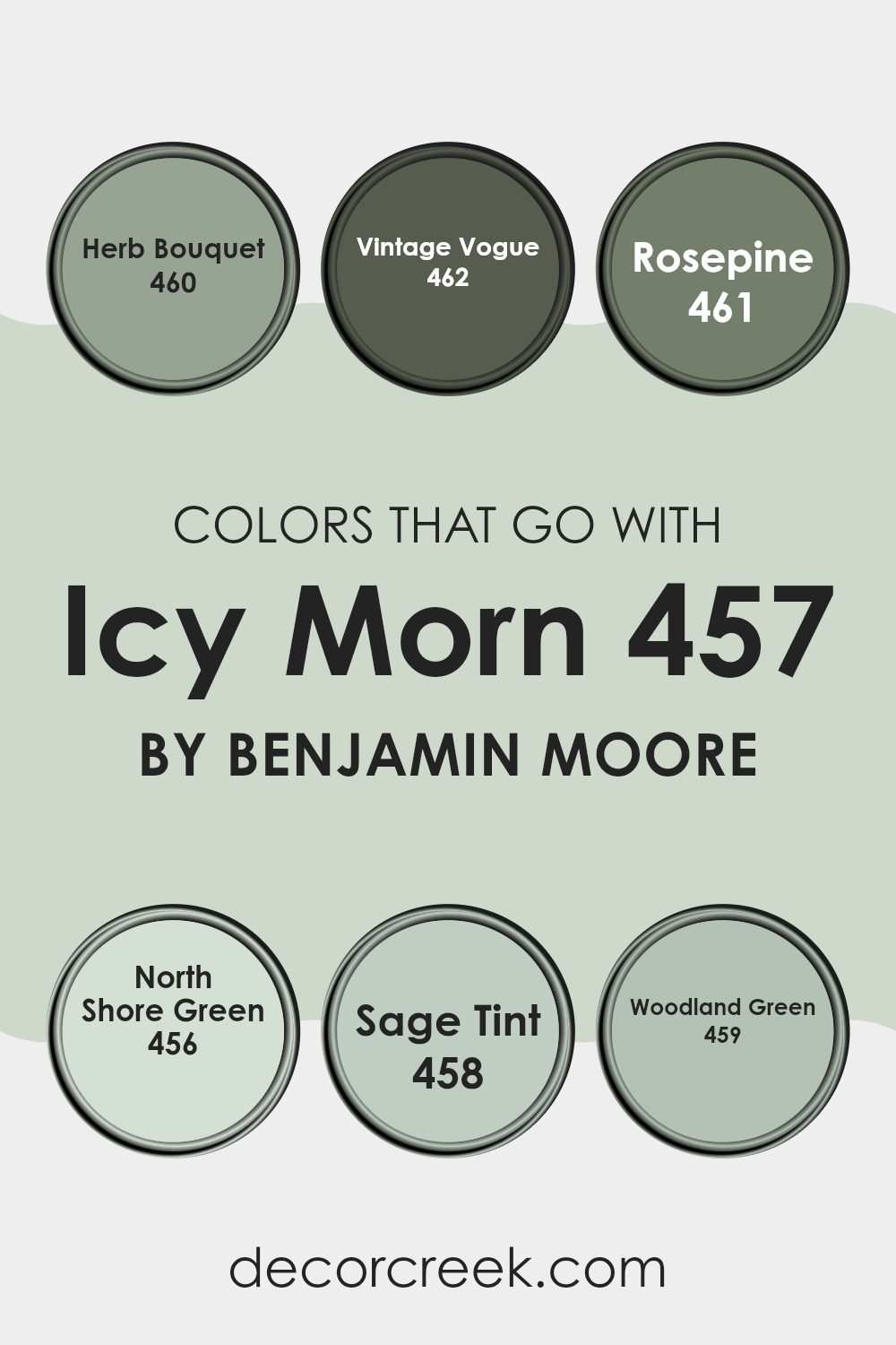
Colors that Go With Icy Morn 457 by Benjamin Moore
Choosing the right colors to complement Icy Morn 457 by Benjamin Moore is essential for creating a harmonious and visually appealing room. When paired with coordinating shades like 460 – Herb Bouquet, 462 – Vintage Vogue, and others from the same palette, Icy Morn 457 can really shine, helping to achieve a balanced and inviting atmosphere. These colors work together by enhancing each other’s beauty without overpowering, perfect for designing a cohesive look throughout your home.
Herb Bouquet 460 is a gentle, quietly appealing green that can brighten up areas subtly without creating an intense effect. Vintage Vogue 462 offers a richer, deeper tone that adds a touch of elegance and strength to the mix, grounding lighter shades like Icy Morn.
461 introduces a soft, muted hue that blends green and rose, providing a unique background that allows furnishings and decor to stand out. North Shore Green 456 has a vibrancy that captures attention and brings energy to a room, making it ideal for an accent wall. Sage Tint 458 is a lighter, almost ethereal green that works beautifully in calming rooms meant for relaxation.
Lastly, Woodland Green 459 provides a dark, forest-like ambiance that pairs magnificently with the cool freshness of Icy Morn, perfect for creating depth and focus in larger or overly bright rooms. Together, these colors create a cohesive palette that enhances the overall aesthetic, making any room look well-thought-out and welcoming.
You can see recommended paint colors below:
- 460 Herb Bouquet
- 462 Vintage Vogue
- 461 Rosepine
- 456 North Shore Green
- 458 Sage Tint
- 459 Woodland Green
How to Use Icy Morn 457 by Benjamin Moore In Your Home?
Icy Morn 457 by Benjamin Moore is a soft, light blue paint color that brings a fresh and airy feel to any room. It’s perfect for creating a calm and relaxing atmosphere in your home. This color works great in rooms like bedrooms and bathrooms where you want to promote rest and relaxation.
Because it’s a subtle shade, it pairs well with a variety of decor styles and other colors. For example, you could use it as a base color for walls and match it with white trim for a clean, crisp look. Alternatively, combining it with darker blues or grays can add some contrast and make your room more interesting.
Icy Morn is also ideal for small areas or spots with limited natural light, as its light-reflective qualities can make rooms appear larger and more open. Whether you’re looking to refresh a single room or repaint your entire home, Icy Morn offers a flexible and refreshing choice.
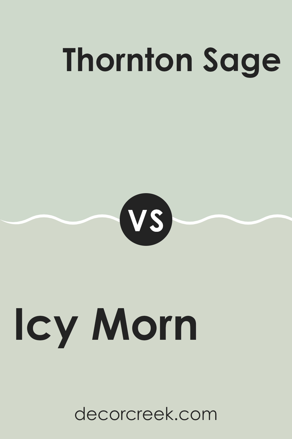
Icy Morn 457 by Benjamin Moore vs Thornton Sage 464 by Benjamin Moore
Icy Morn is a cool, light gray with a hint of blue, giving it a crisp and fresh feel. This color is perfect for those looking to brighten up a room while maintaining a calm and neutral atmosphere. It reflects light well, making it a great choice for smaller areas or spots with limited natural light.
On the other hand, Thornton Sage is a deeper, muted green with subtle gray undertones. It offers a natural, earthy vibe to any room, providing a sense of warmth and comfort. This color is ideal for creating a cozy and inviting atmosphere, and works especially well in places where you want to promote relaxation, such as bedrooms or living rooms.
Both colors are quite adaptable but serve different moods and aesthetics. Icy Morn is more about creating a light, airy feel, while Thornton Sage tends to ground a room with its richer, warmer tones.
You can see recommended paint color below:
- 464 Thornton Sage
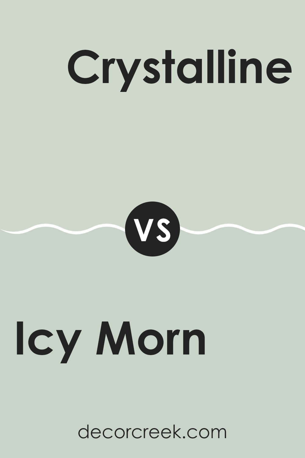
Icy Morn 457 by Benjamin Moore vs Crystalline AF-485 by Benjamin Moore
Icy Morn and Crystalline are two beautiful colors from Benjamin Moore that each bring their own unique feel to a room. Icy Morn is a pale, muted blue that has a subtle coolness, reflecting a calm and gentle environment. It’s perfect for creating a peaceful vibe, making it ideal for bedrooms or bathrooms where relaxation is key.
On the other hand, Crystalline is a bit more vibrant. It has a hint of green, making it a fresh and airy color, more energetic than Icy Morn. This color would work well in areas that receive a lot of natural light, or rooms where you want to add a sense of freshness and vitality.
While both colors are cool-toned and can brighten a room, their differences in hue and depth can shape the mood and character of a home significantly. Icy Morn lends a softer, more understated look, whereas Crystalline offers a more lively and refreshing touch.
You can see recommended paint color below:
- AF-485 Crystalline
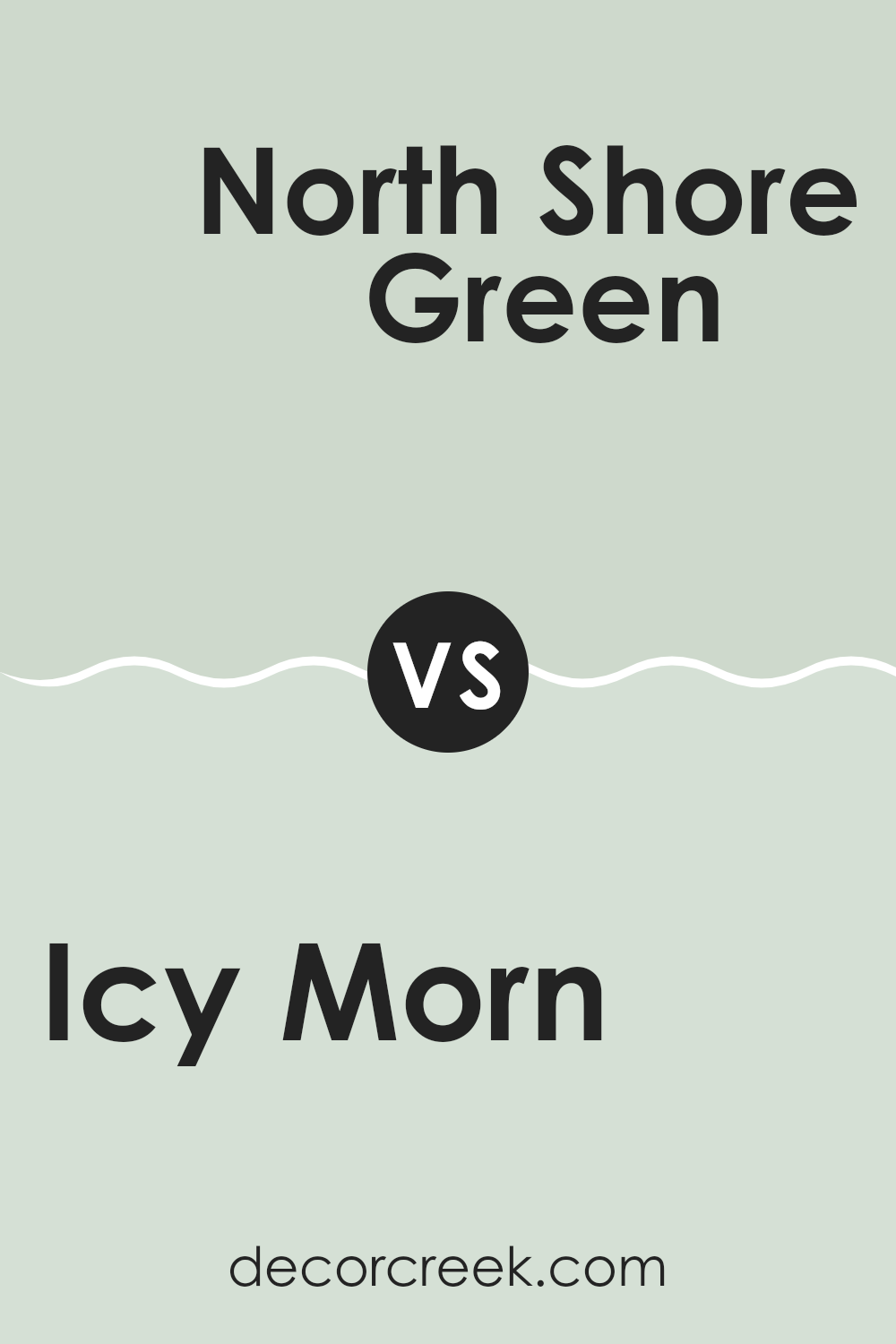
Icy Morn 457 by Benjamin Moore vs North Shore Green 456 by Benjamin Moore
Icy Morn and North Shore Green, both by Benjamin Moore, present a refreshing and calming palette. Icy Morn is a muted, light blue with a subtle hint of green. It has an airy and gentle feel, making it great for creating a light and breezy atmosphere in rooms. This color reflects light well, adding a sense of openness to smaller areas.
On the other hand, North Shore Green is a deeper, more pronounced green with an aquatic feel. While it’s still in the realm of calming colors, it offers a stronger presence due to its deeper tone. It works well in rooms where you want to introduce a touch of nature and depth without it feeling too much.
Together, these colors can complement each other beautifully, with Icy Morn bringing a soft backdrop and North Shore Green offering a charming contrast. The blend of these two colors can bring a peaceful yet lively feel to any room.
You can see recommended paint color below:
- 456 North Shore Green
Icy Morn 457 by Benjamin Moore vs Colony Green 694 by Benjamin Moore
Both Icy Morn and Colony Green are colors by Benjamin Moore, each offering a unique mood for decorating a room. Icy Morn is a soft, pale blue with a hint of gray. It’s a cool and soothing color that resembles a calm, misty morning sky. This shade is great for rooms where you want a clean and calming atmosphere, like bathrooms or bedrooms.
On the other hand, Colony Green is a richer, deeper green that has a sense of freshness and nature. It brings the feeling of lush gardens or a dense forest into your home, making it ideal for rooms where you want to add vibrancy and life, such as living areas or kitchens.
While both colors create peaceful environments, Icy Morn tends to make a room feel more open due to its lighter tone, whereas Colony Green adds depth and character with its darker hue. Depending on your room’s purpose and the effect you want, you can choose the one that fits your needs the best.
You can see recommended paint color below:
- 694 Colony Green
Concluding my thoughts on 457 Icy Morn by Benjamin Moore, I’d say it’s a pretty impressive paint color. This shade of blue can make any room in your house feel calm and cool, almost like a gentle morning sky. It’s perfect for bedrooms where you want to relax or even for a bathroom to give it a splash of cheer. With its light and gentle touch, it can also make small rooms look a bit bigger, which is always a good trick.
Using this paint could be a good idea if you’re looking to freshen up a place without making things too bright or bold. It gives just the right amount of color and has a kind feeling about it. It’s not just me who thinks this is a great color; lots of others seem to enjoy it because it works in various spots in the home.
If you or someone you know is thinking about painting a room or a piece of furniture, suggesting 457 Icy Morn could be a smart choice.
It’s simple, light, and has a kind of gentle energy that makes any room feel more welcoming.
Ever wished paint sampling was as easy as sticking a sticker? Guess what? Now it is! Discover Samplize's unique Peel & Stick samples.
Get paint samples

