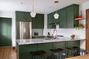
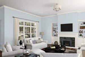
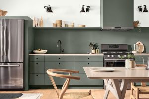
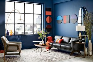
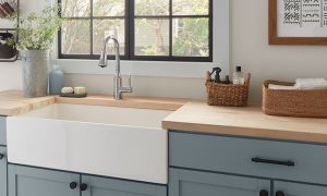
It’s hard to call green a go-for paint color when it comes to choosing paints for our home renovation projects! Even if we use greens, we choose lighter and more versatile shades to incorporate into our homes with less effort.
However, more profound and richer shades of green are also worth mentioning! One of them is called Vintage Vogue, and it’s one of the green colors by Benjamin Moore.
Today we will tell you more about this paint color, including its LRV and undertones. You will learn how it works in different spaces and what colors should be used with it to create the most beautiful palette in your home!
What Kind of Color Is BM Vintage Vogue 462?
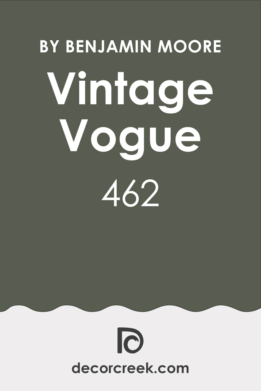
BM Vintage Vogue paint color is hardly the shade of green that everyone will like! All because of its depth and rather dark appearance. As Encycolorpedia says, BM Vintage Vogue reads as an ultra-dark, slightly smoky shade of green.
And in certain lighting conditions, this color tends to look nearly as dark as black! Thanks to this feature, this green can be successfully used instead of other dark colors, such as black or brown, if your color scheme requires that.
Naturally, such a profound color demands caution when you use it! On the other hand, BM Vintage Vogue can give your living space a unique and elegant vibe, turning any room into a reserved yet beautiful masterpiece with style.
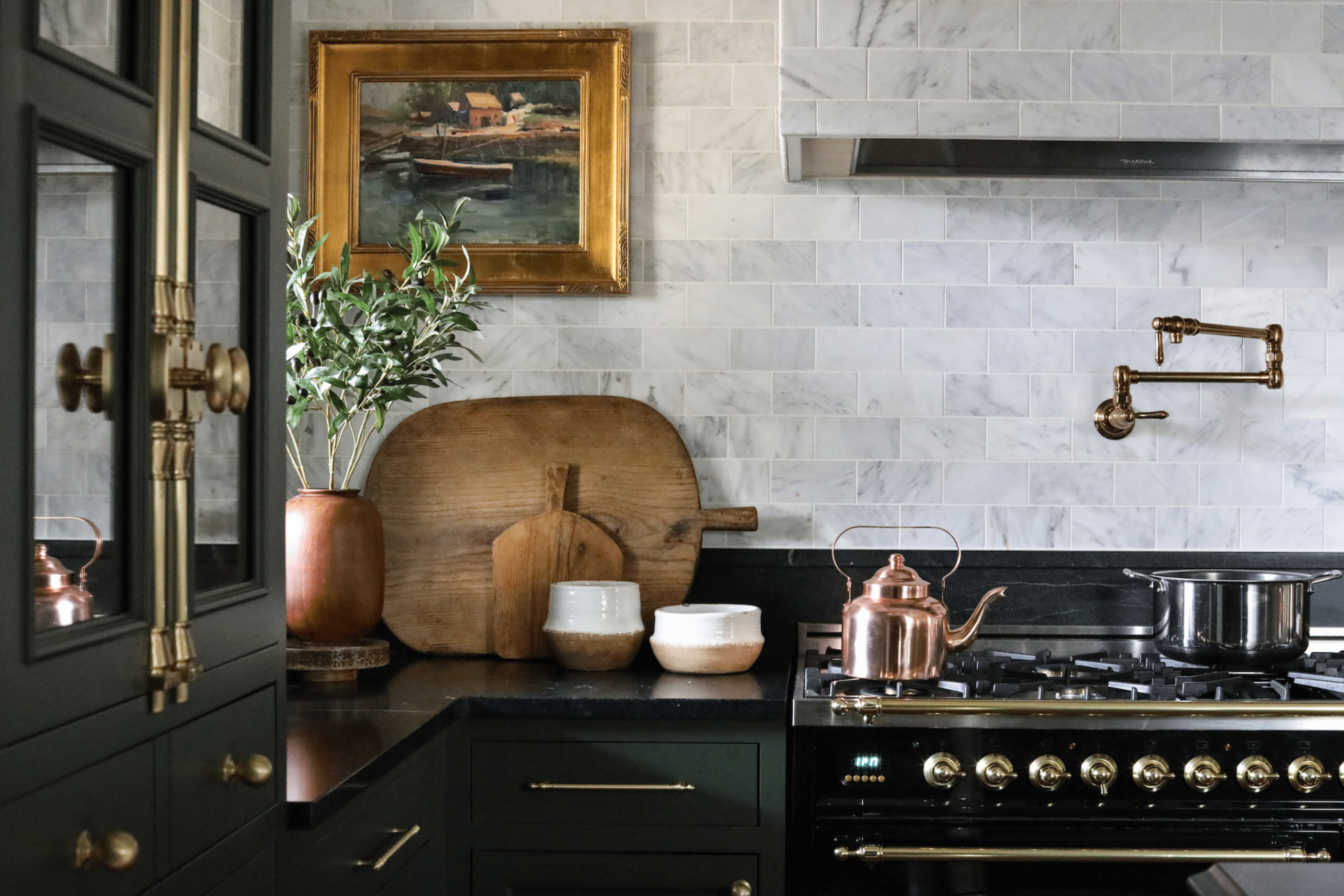
This green pairs exceptionally well with wooden textures and golden elements, as well as with whites and natural fabrics. This is why it can complement many interior styles, from classic to modern ones.
Ever wished paint sampling was as easy as sticking a sticker? Guess what? Now it is! Discover Samplize's unique Peel & Stick samples.
Get paint samples
What Undertones Does Vintage Vogue 462 Paint Color Have?
Undertones matter a lot when it comes to using paint colors in your home! Depending on the color’s undertones, you might see the paint reading differently in different rooms and in different light!
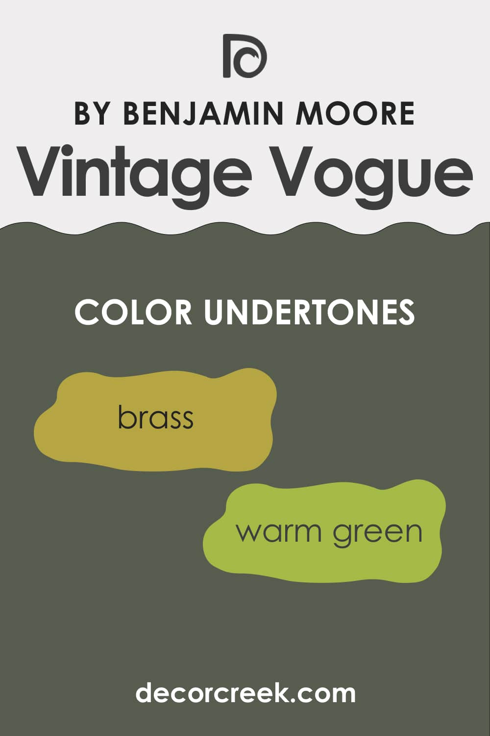
As for BM Vintage Vogue, this profound aristocratic green has pleasantly warm undertones that pair perfectly with metals (such as brass) and also go well with a variety of different wood tones, which makes this bold green so versatile.
What LRV Vintage Vogue 462 Has?
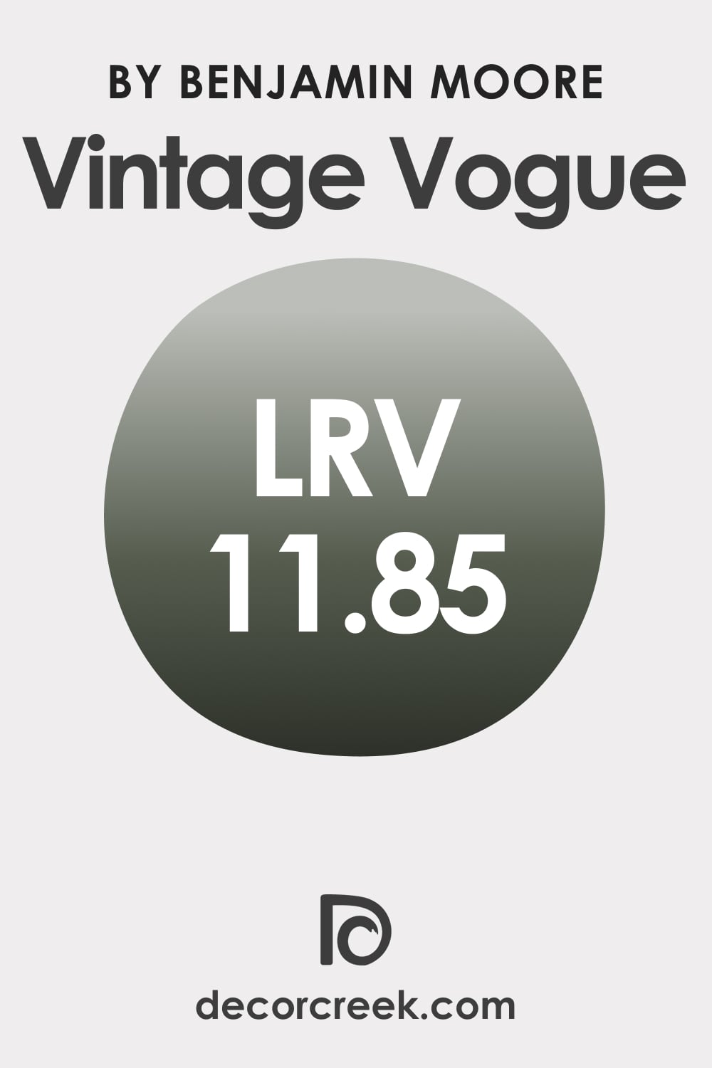
The LRV of this lush and rich paint color is 11.85, which means BM Vintage Vogue is rather dark. However, if you look at it, you will notice that this color doesn’t read pitch-dark at all! In fact, on the walls, it reads deep enough to also act as a neutral!
Thanks to such a low LRV, this shade of green can help you make a statement in any room you use it. However, you should keep in mind that this color will read somewhat differently depending on the lighting conditions!
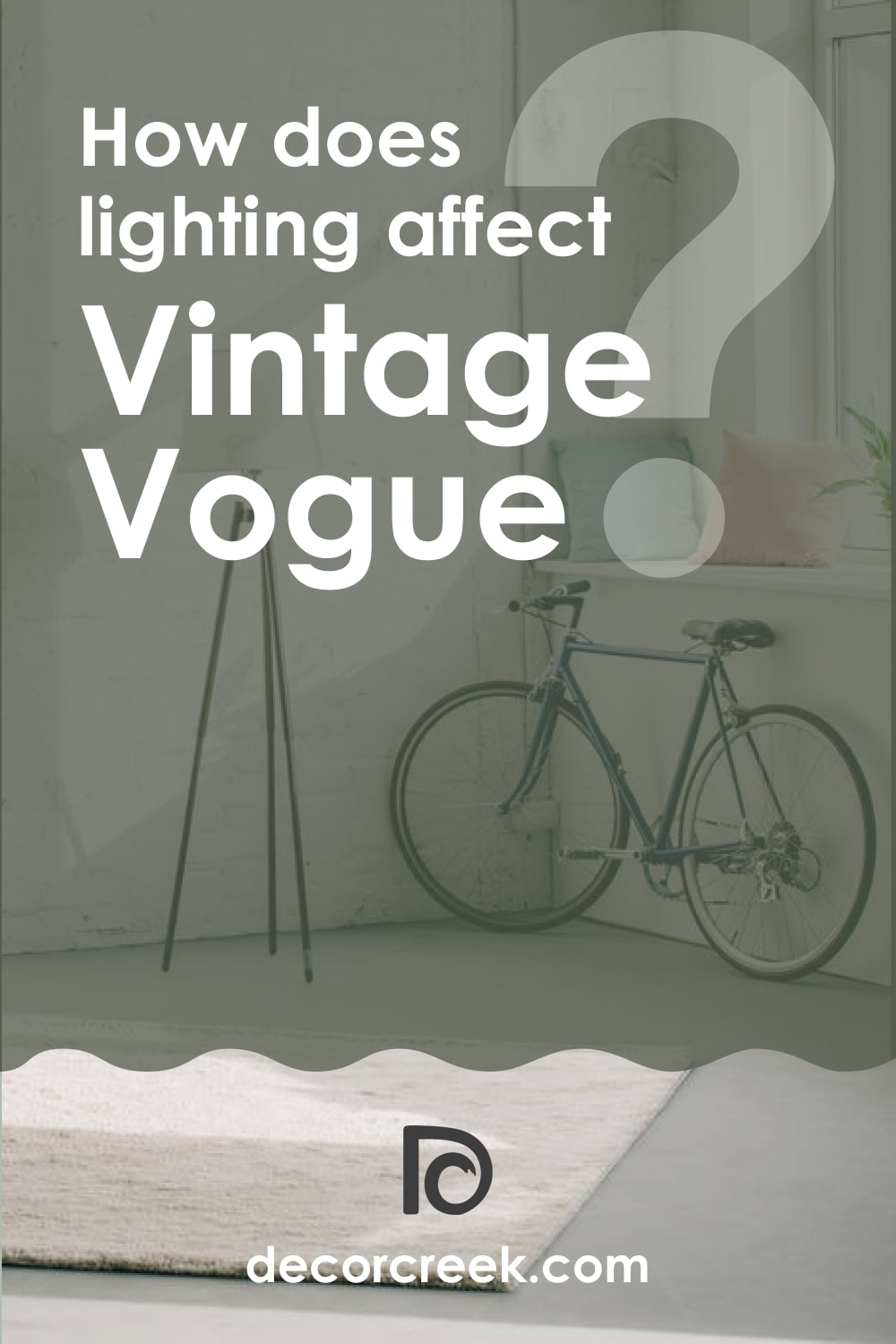
For example, in a room with plenty of bright natural light, BM Vintage Vogue will read a profound and rich green. But in a room with dim light, as well as in a space with poor or no lighting, expect BM Vintage Vogue to look much darker and more cool-toned.
LRV – what does it mean? Read This Before Finding Your Perfect Paint Color
Vintage Vogue 462 Coordinating Colors
If you use the correct coordinating colors in your home, you can be sure that the space will look appealing and welcoming. However, it’s often challenging for homeowners to pick the right coordinating colors, especially if they deal with such a dark color as BM Vintage Vogue!
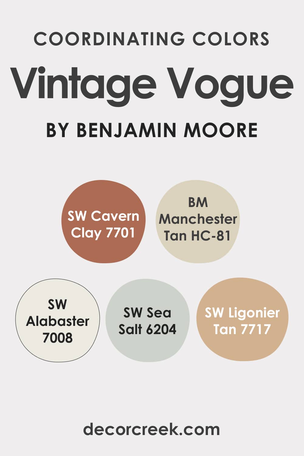
This is why we have prepared a helpful hint for you! Below, you can find the most suitable colors to coordinate with this bold and sophisticated green:
- SW Cavern Clay
- SW Manchester Tan
- SW Alabaster
- SW Sea Salt
- SW Ligonier Tan
Colors that go with Vintage Vogue 462
Deeper and darker colors seem to be easy to pair with other colors. People believe you just need to use contrasting paints and lighter colors that will stand out in front of the darker paint used on the walls.
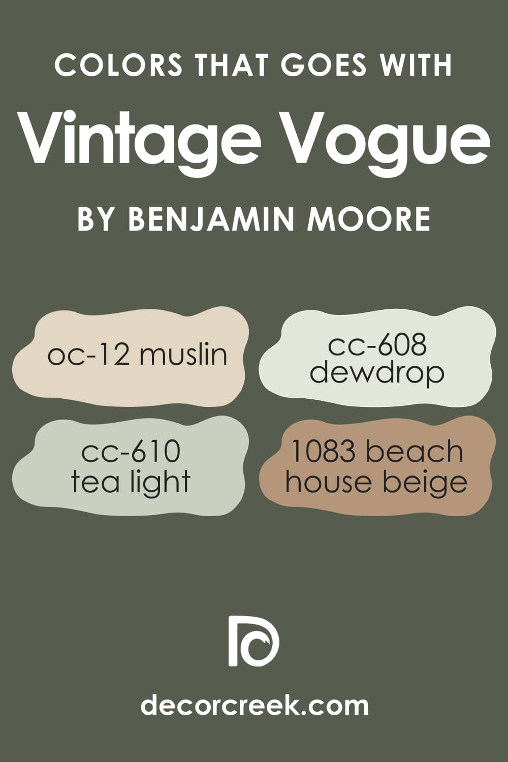
However, if you don’t want to make your home look like a chessboard with only dark and bright colors with nothing in between, you’d better have various colors at hand! For BM Vintage Vogue, you might want to consider the following ones:
- OC-12 Muslin
- 1083 Beach House Beige
- CC-608 Dewdrop
- CC-610 Tea Light
What’s the Best Trim Color to Use With BM Vintage Vogue?
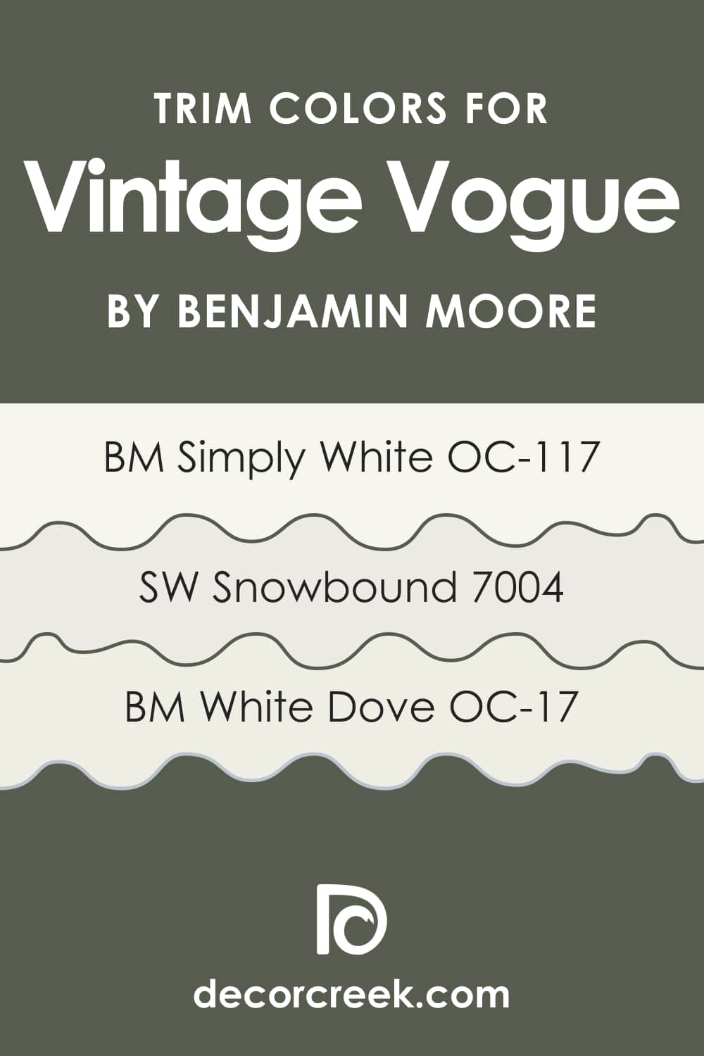
White is traditionally the optimal trim color due to its versatile nature and ability to work with any color on the wall. You should only ensure you use the right shade of white.
For BM Vintage Vogue as a wall color, we would suggest you the following whites to use on your trim. With them, you will create a proper and balanced contrast:
Paint Colors Similar to BM Vintage Vogue
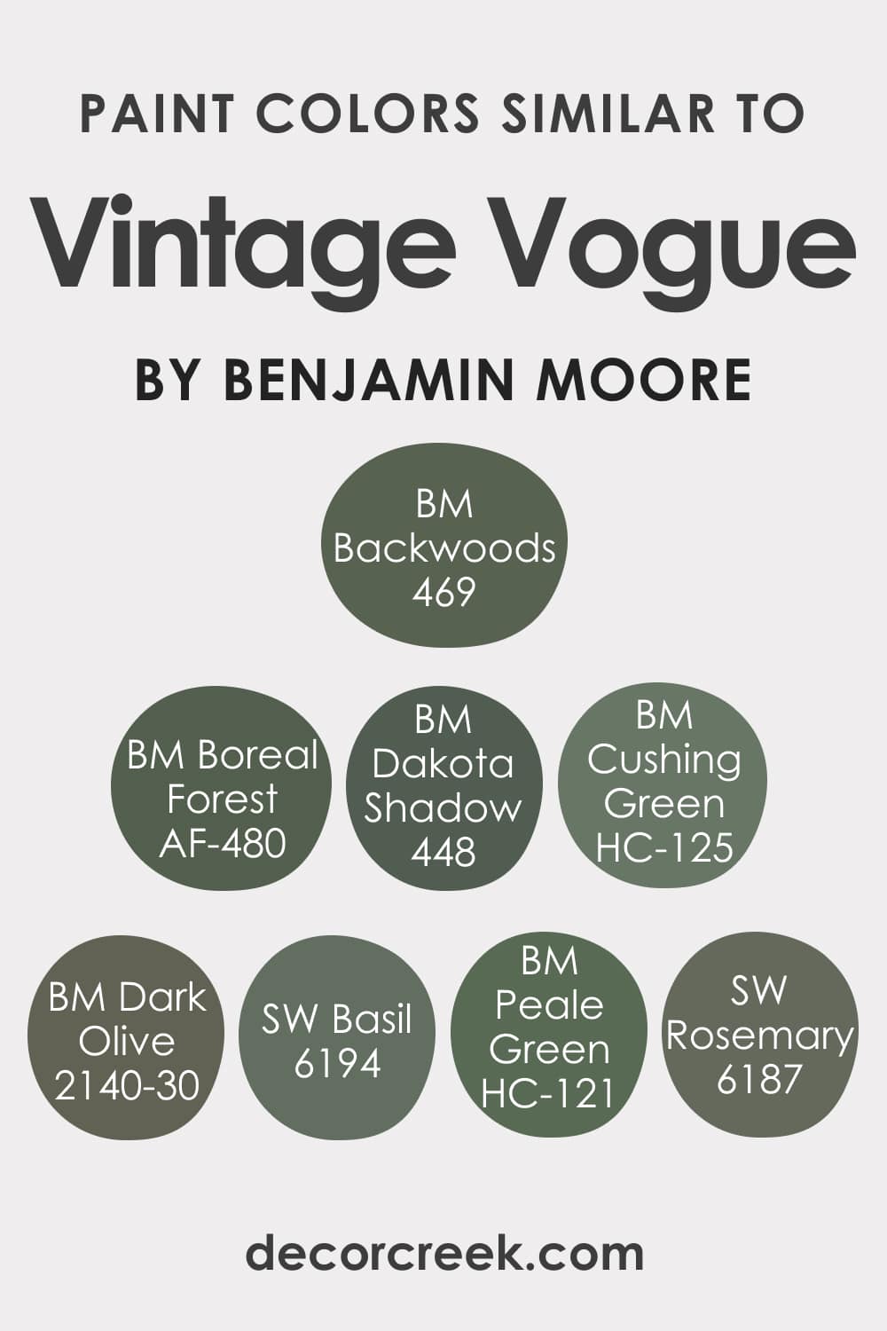
Do you think it’s easy to pick the colors that would read the same as such a dark and rich green as BM Vintage Vogue? Well, this is a bit of a challenging task in fact! This green has a well-balanced tone and warmth, which makes it pretty hard to choose the color that would read the same.
Below, we have selected several shades of green that read almost the same as the Vintage Vogue paint by Benjamin Moore.
- BM Boreal Forest
- BM Backwoods
- BM Dakota Shadow
- BM Dark Olive
- Sherwin-Williams Rosemary
- Benjamin Moore Cushing Green
- Sherwin-Williams Basil
- Benjamin Moore Peale Green
Of course, each alternative green is slightly different due to the distinct LRVs and undertones. But except for this nuance, you can use any of the suggested substitutes should you need to replace the Vintage Vogue paint with another green.
Complimentary Colors for Vintage Vogue 462 Paint Color by Benjamin Moore
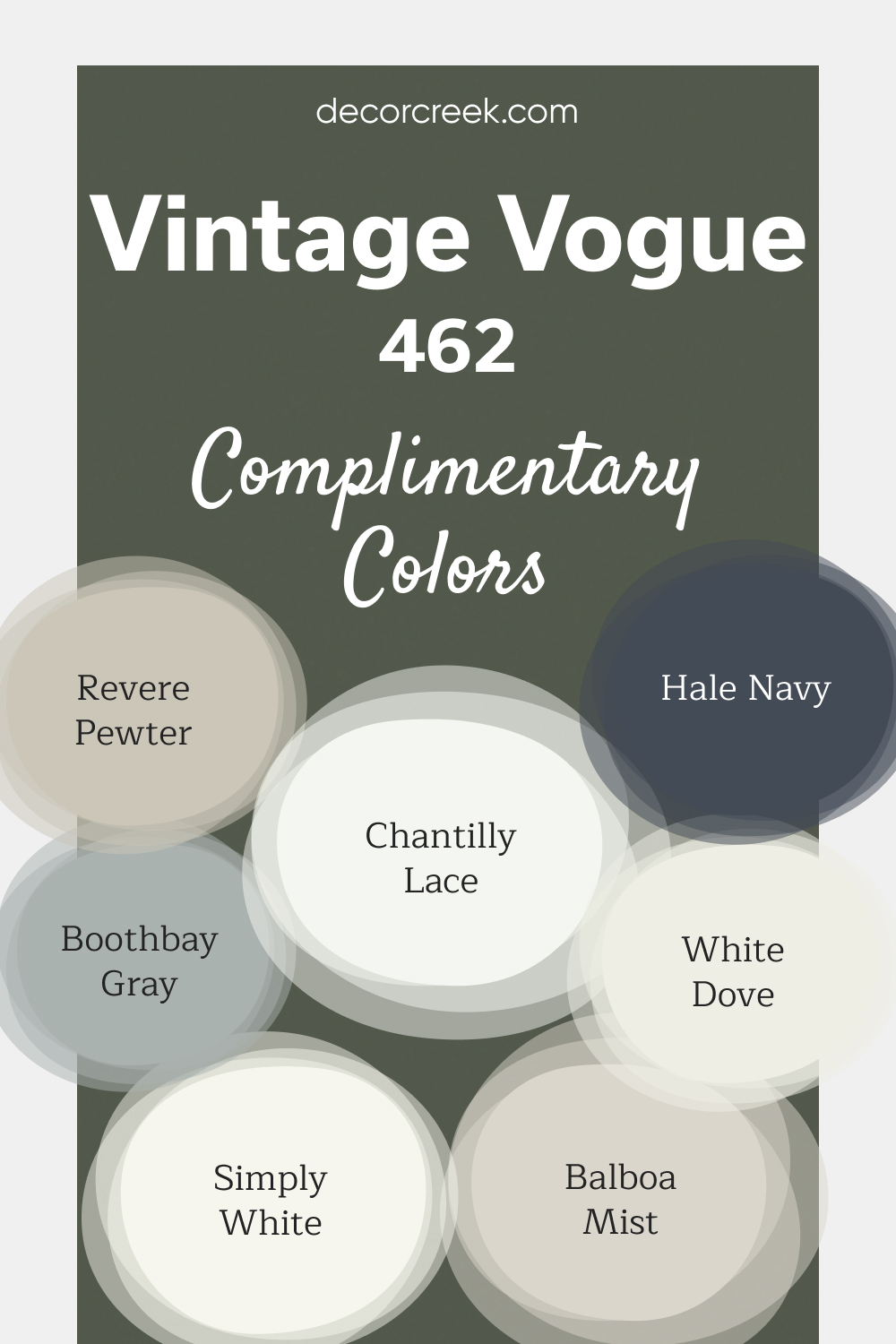
Vintage Vogue by Benjamin Moore is a bold, elegant green that adds depth and richness to any space. It pairs beautifully with lighter shades like Simply White, Chantilly Lace, and White Dove, offering a fresh and clean contrast for trim, cabinetry, or accents.
These bright whites help balance the boldness of Vintage Vogue while maintaining an inviting feel. For a more neutral look, Balboa Mist and Revere Pewter provide soft, calming tones that complement Vintage Vogue’s rich hue.
If you’re looking for a striking contrast, Hale Navy and Boothbay Gray are perfect choices.
Together, these colors create a balanced and sophisticated palette that works for both modern and traditional designs.
Vintage Vogue 462 by Benjamin Moore Color Palette
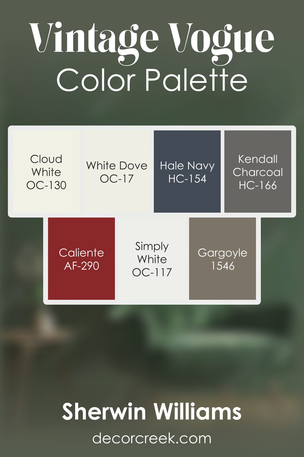
Vintage Vogue carries a deep, earthy green tone that feels grounded and expressive, and this palette enhances its richness with warm neutrals, soft whites, and powerful accents. Cloud White, Simply White, and White Dove brighten the palette with gentle light, creating contrast that helps the darker green feel approachable and warm.
Gargoyle adds an earthy foundation that strengthens Vintage Vogue’s natural character, while Kendall Charcoal provides a clean, structured edge that supports the deep tones without overpowering them.
Hale Navy brings a cool, steady accent that adds variety and shape to the palette, pairing beautifully with the green base.
Caliente introduces a warm burst of red that adds personality and vibrancy, giving the palette a lively spark.
Together, these shades create a grounded yet expressive palette that feels rich, confident, and thoughtfully balanced. It works beautifully in offices, dining rooms, and living spaces where warmth and depth are desired.
The palette pairs well with wood finishes, natural textures, and warm lighting, creating an atmosphere that feels inviting and full of character.
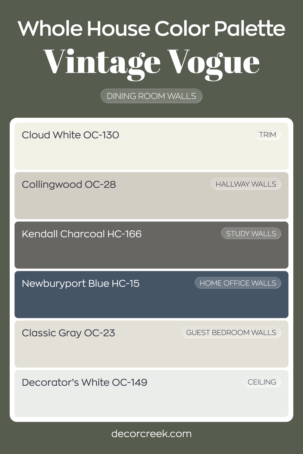
Whole House Paint Color Palette Grounded In Vintage Vogue 462
Vintage Vogue 462 brings deep green drama to the dining room walls. Cloud White trim and Decorator’s White on the ceiling keep the darker shade polished and defined. The contrast feels intentional and refined.
Collingwood in the hallway and Classic Gray in the guest bedroom lighten the transition between rooms.
Kendall Charcoal in the study reinforces the darker mood, while Newburyport Blue in the house office adds layered depth. These tones work together with richness and strength.
The palette blends deep greens, charcoals, and cool blues with light neutrals. The result is a bold yet cohesive whole-house design.
Comparing Vintage Vogue 462 With Other Colors
As you can already see, green is a complex color that has plenty of shades, and each shade is unique. To help you see this distinction better, we suggest you read how BM Vintage Vogue differs from other greens.
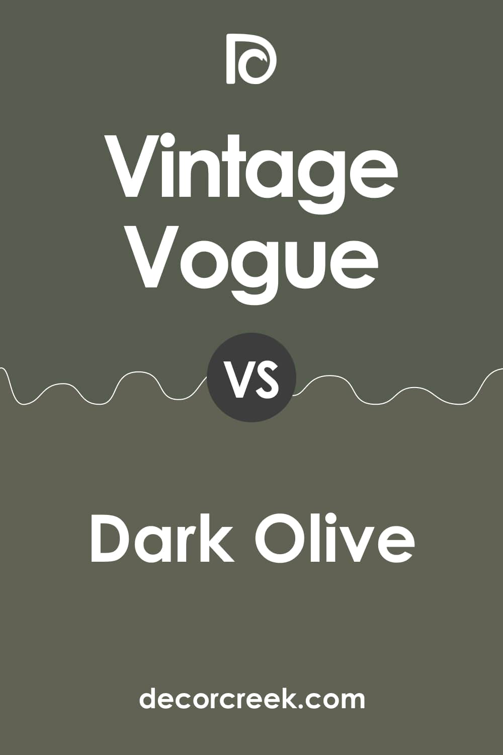
Vintage Vogue vs Dark Olive
BM Dark Olive has rich, muddy undertones, whilst BM Vintage Vogue reads clearly green with a darker nature. The Dark Olive seems to be warmer and a bit lighter than its deeper counterpart.
However, the colors have very close LRVs (11 for BM Vintage Vogue and 13 for BM Dark Olive), which makes them equally dark.
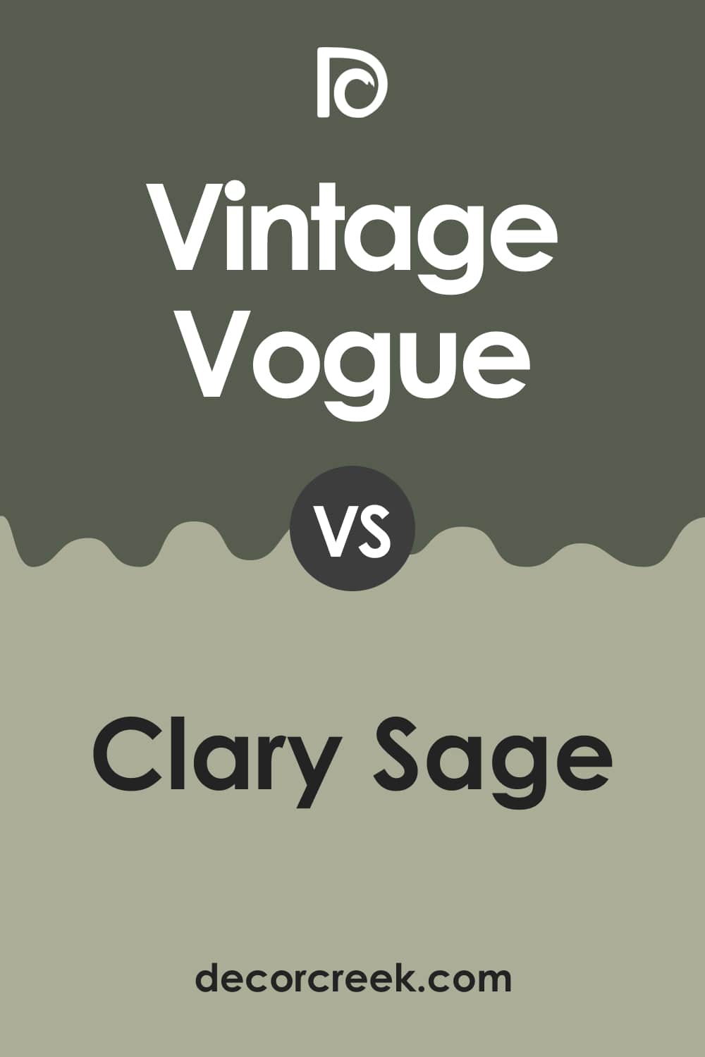
Vintage Vogue vs Clary Sage
SW Clary Sage has yellow undertones, which makes it different from the Vintage Vogue color with its profound green hue. Also, these colors have distinct LRVs (41 for SW Clary Sage and 11 for BM Vintage Vogue).
As a result, the Clary Sage green reads much lighter, and we would even say paler than its significantly darker and deeper counterpart.
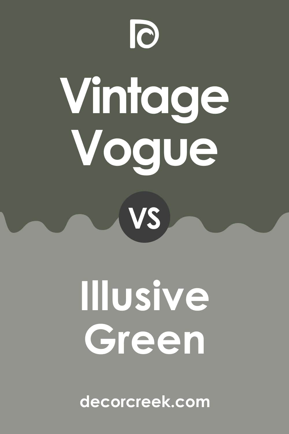
Vintage Vogue vs Illusive Green
SW Illusive Green is a neutral yet pretty dark color with cyan and gray undertones. Its LRV is 29. Compared to BM Vintage Vogue, it reads noticeably grayer and somewhat lighter due to its distinct light-reflecting ability.
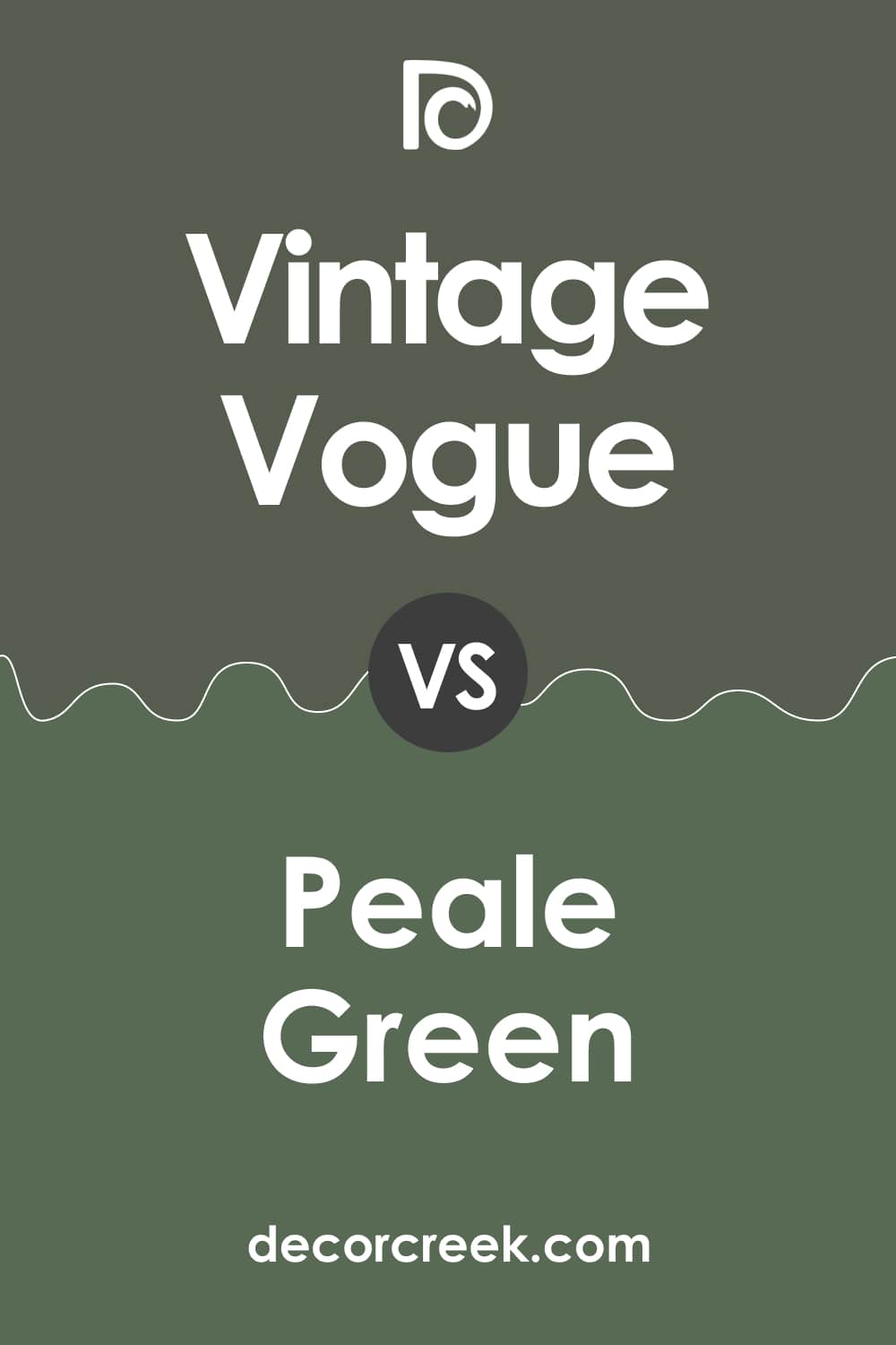
Vintage Vogue vs Peale Green
BM Peale Green is an earthy and forest green with the least grey/brown undertones. Its LRV is 12. Compared to BM Vintage Vogue, it looks greener and more saturated with less darkness.
This lighter appearance helps you to see this color as a lighter one, although its light reflectance ability is almost the same as that of the Vintage Vogue color.
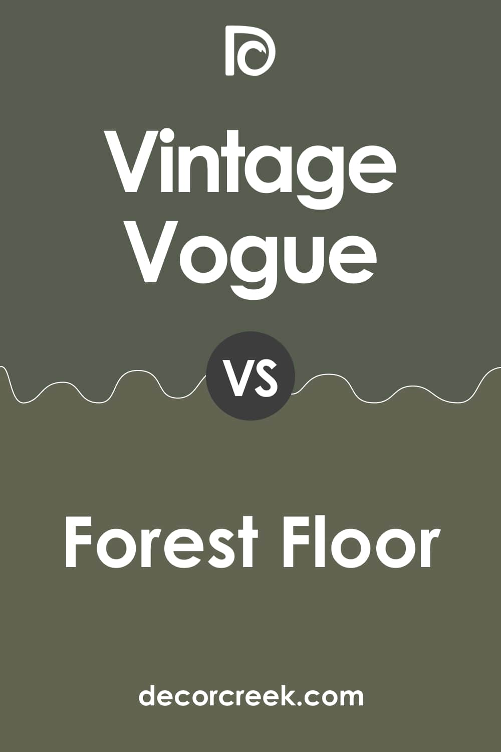
Vintage Vogue vs Forest Floor
BM Forest Floor is olive-green, muted and dark, with an LRV of 12. However, it reads a bit lighter than BM Vintage Vogue due to distinct undertones. In fact, compared to BM Vintage Vogue, its counterpart looks slightly yellowish because of the olive hue.
Where Vintage Vogue 462 Color Can Be Used In Your Home?
To help you understand how BM Vintage Vogue may work in different spaces of your home, we have prepared a brief description below. Each section contains a quick overview of the way this green reads in different rooms. As a result, you will approximately imagine what to expect from this rich and bold color.
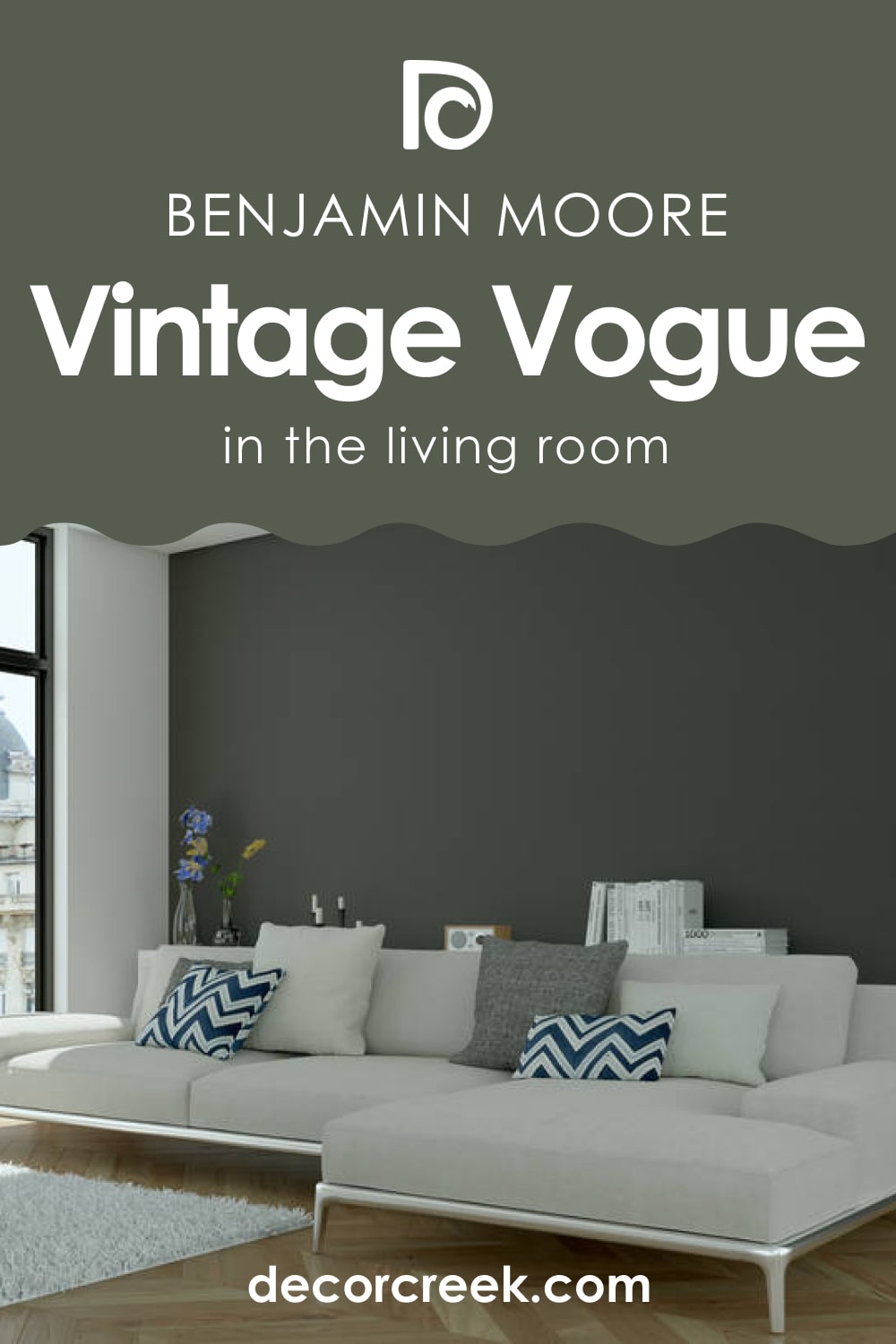
Vintage Vogue 462 in the Living Room
This green can make your living room look elegant and aristocratic, giving it charm and an exquisite note…but only if the room is spacious and has plenty of natural light! In a small and poorly-lit space, BM Vintage Vogue is likely to play a bad guy and make the room seem smaller than it is!
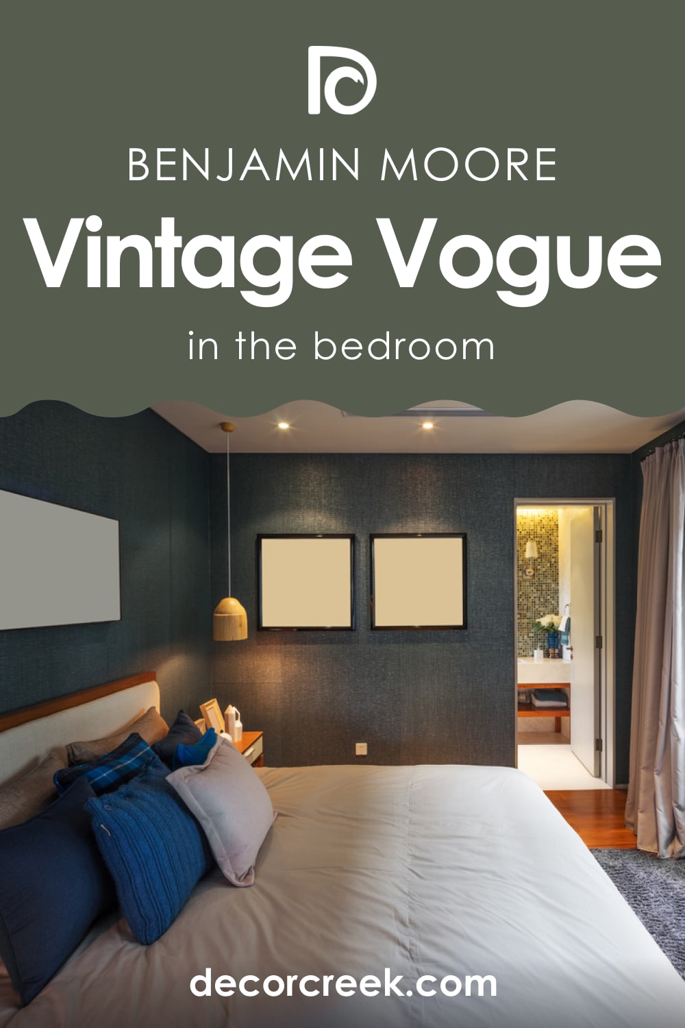
Vintage Vogue 462 a Bedroom
If you enjoy profound and rich colors in your bedroom that don’t look dark, this shade of green, muted and bold, is exactly what you need! If the size of your bedroom allows, paint all the walls with this color. Otherwise, you can sprinkle it on the accent wall only.
Since BM Vintage Vogue works great with browns and beiges, as well as with natural fabrics, it will fit bedrooms with wooden floors and furniture with beige-brown upholstery.
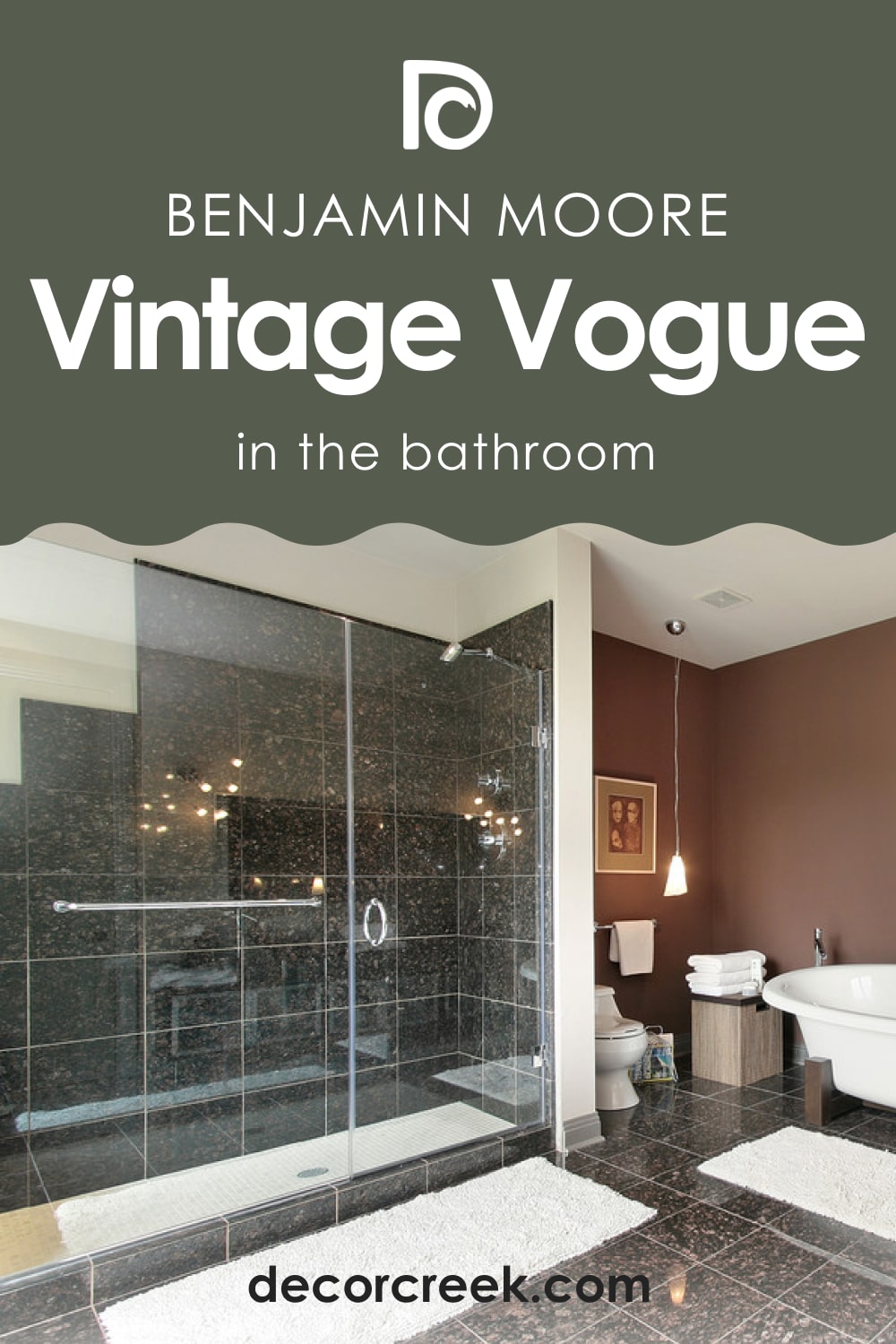
Vintage Vogue 462 in the Bathroom
It’s not the best color to paint the entire bathroom due to its depth, but as an accent wall color, BM Vintage Vogue will surely grab your attention! As an option, you can use it only on your vanity sink and/or drawers, leaving the walls white.
Vintage Vogue 462 for the Kitchen
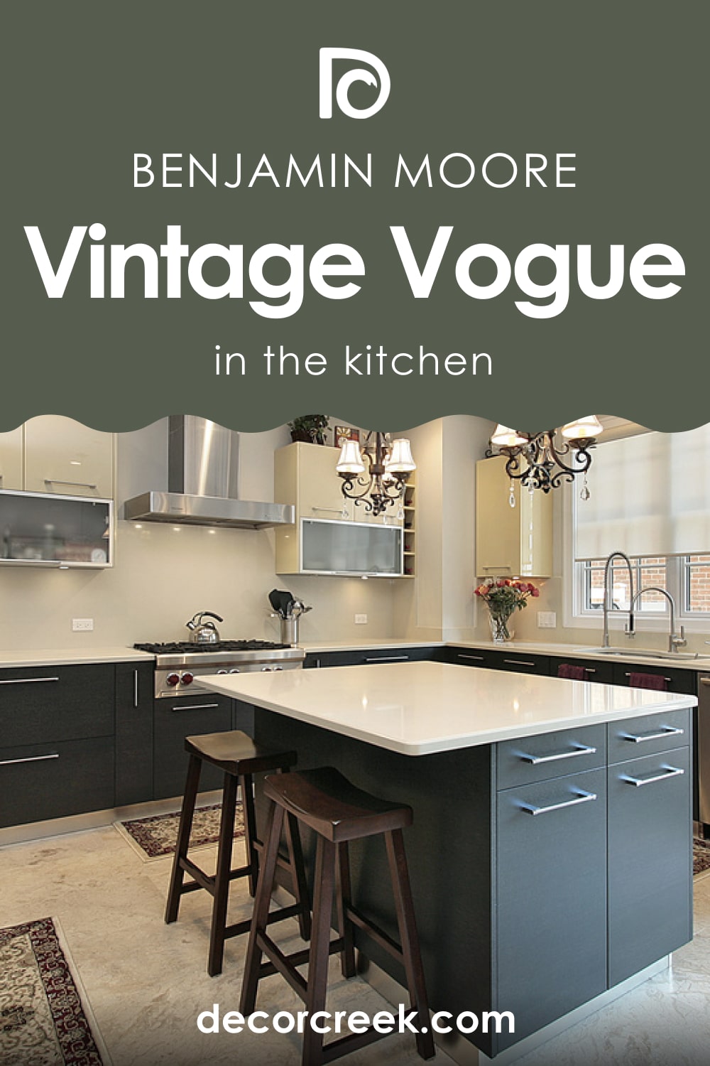
In your kitchen, this shade of green will work equally well on cabinets and walls. Where you use it depends only on the lighting in the kitchen and its size. For smaller kitchens, we would recommend painting only cabinets with this dark green shade.
Paired with brass hardware and bright white tile, this green will read less profound, adding a color accent to the space.
Vintage Vogue 462 for the Exterior Use
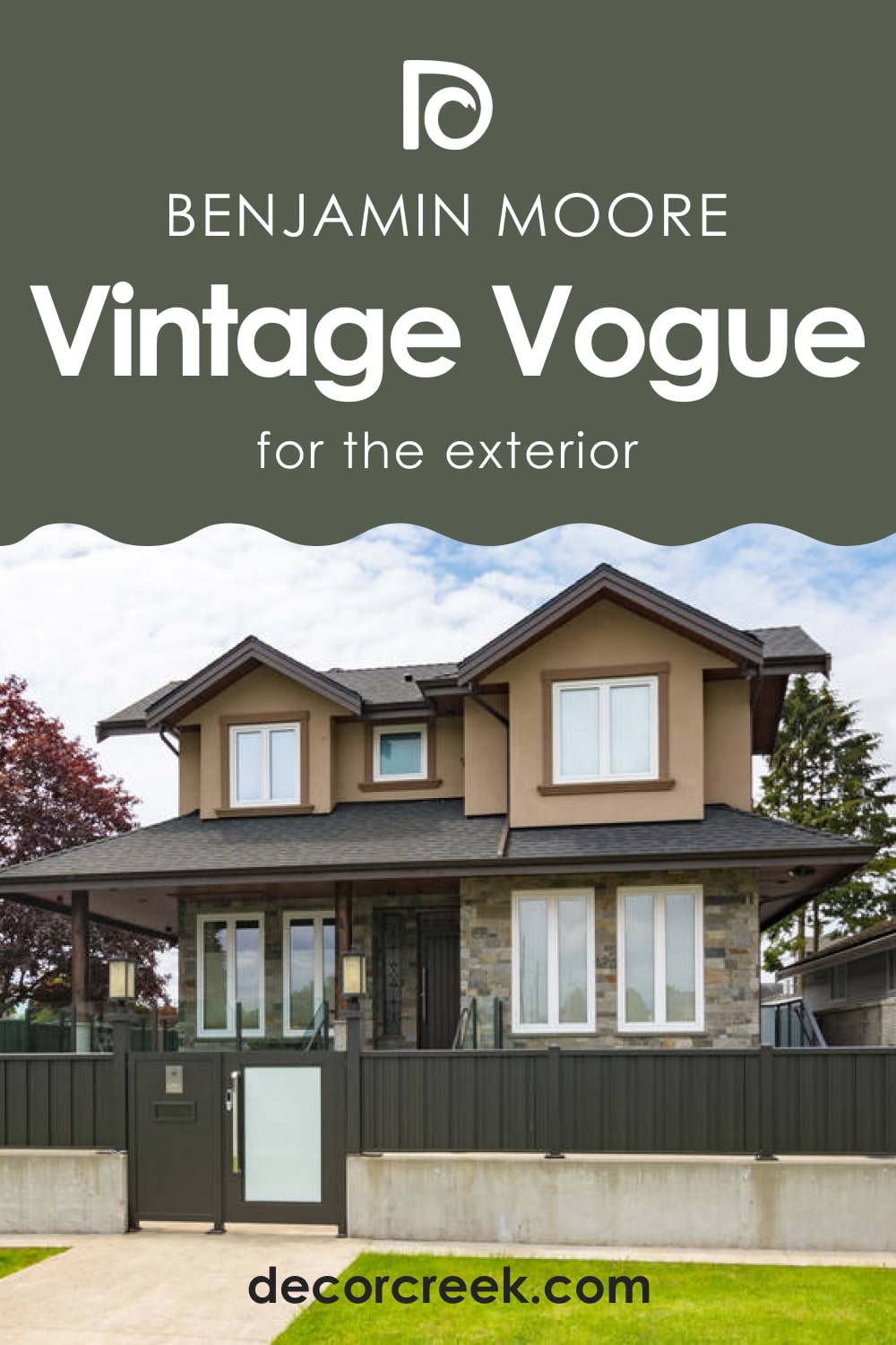
This shade of green works remarkably well on exterior walls no matter the lighting conditions. In warmer daylight, it may read slightly warmer too, but it won’t lose its soft green hue anyway. In cooler lighting conditions (e.g., on a cloudy day), you should expect this green to read somewhat deeper.
Now you know what kind of color BM Vintage Vogue is. You learned its undertones, LRV, and trim colors. You also know what colors to use to coordinate it correctly and in what rooms this bold and rich green will work best of all.

Ever wished paint sampling was as easy as sticking a sticker? Guess what? Now it is! Discover Samplize's unique Peel & Stick samples.
Get paint samples
Frequently Asked Questions
⭐What color collection does BM Vintage Vogue belong to?
This green paint color is part of the Benjamin Moore Classics color collection.
⭐How does BM Vintage Vogue read in rooms with very little light?
In very poorly lit spaces, this paint may read very dark, sometimes nearly black!
⭐Does BM Vintage Vogue read gray?
In certain lighting conditions, this green may read slightly grayish.


