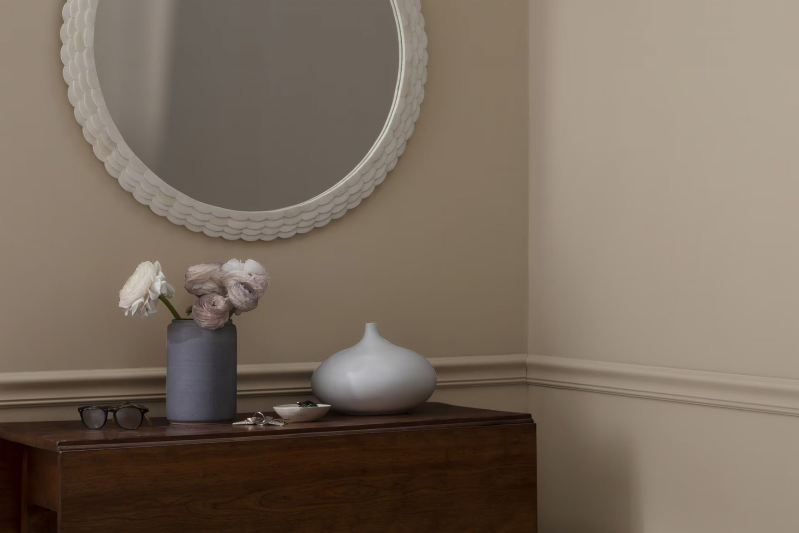
When you see the color 985 Indian River by Benjamin Moore firsthand, it might just shift your perception of neutrals. Introducing a shade that’s both subtle and rich, Indian River blends effortlessly into various rooms while maintaining a unique presence that sets it apart from your usual beige or taupe.
Whether you’re looking to refresh your living room walls or give a piece of furniture a new life, this color provides a flexible backdrop that complements both modern and traditional styles.
In my own experience, Indian River offers a welcoming warmth that enhances natural light, making it ideal for rooms that could use a cozy yet refined touch. Its sandy undertones create a sense of calm and comfort, which is perfect for creating a relaxed atmosphere in your home.
Moreover, pairing it with contrasting colors like deep blues or vibrant greens highlights its earthy qualities without feeling too strong.
If you’re keen on upgrading your interior while keeping things chic and understated, 985 Indian River might just be the shade you’ve been looking for.
What Color Is Indian River 985 by Benjamin Moore?
Indian River by Benjamin Moore is a warm, medium taupe shade that strikes a balance between beige and gray. It exudes a cozy and inviting vibe, making it particularly suitable for rooms meant for relaxation and warmth. The color has a unique flexibility, allowing it to blend into both contemporary and traditional decors seamlessly.
In terms of interior styles, Indian River works exceptionally well in rustic and Scandinavian themes due to its earthy undertones. It also makes an excellent choice for modern farmhouse interiors or any setup that leans toward subtle, nature-inspired elements.
When it comes to pairing with materials, Indian River goes well with natural wood. This combination brings out the richness of the wood while enriching the depth of the taupe. Textures such as linen or cotton in soft neutrals continue the theme of comfort, while a hint of matte black or brushed metal in light fixtures or hardware can add a modern touch without overpowering the warmth of the color.
Furthermore, Indian River pairs nicely with soft, plush textures like wool or fleece in throw blankets and cushions, enhancing the comforting feel of a room. This hue can help create a cohesive look that feels grounded and soothing in any home setting.
Is Indian River 985 by Benjamin Moore Warm or Cool color?
Indian River 985 by Benjamin Moore is a flexible and warm taupe that brings a cozy and welcoming feel to any room. This shade is subtle enough to serve as a neutral backdrop but has enough depth to make a statement on its own. It pairs well with a wide range of colors, from soft whites to bold hues, making it a great choice for living rooms, bedrooms, and even kitchens.
The soft warmth of Indian River helps it blend smoothly with natural materials like wood and leather, enhancing their natural beauty. In rooms with plenty of natural light, this color can look slightly lighter, adding a bright and airy feel. Meanwhile, in rooms with less light, it provides a snug and intimate atmosphere.
Because of its neutral yet rich tone, Indian River is also excellent for highlighting art and other decor elements, making them stand out beautifully against the walls. This color adjusts easily to various decorating styles, from modern to rustic, adding a touch of elegance without being too dramatic.
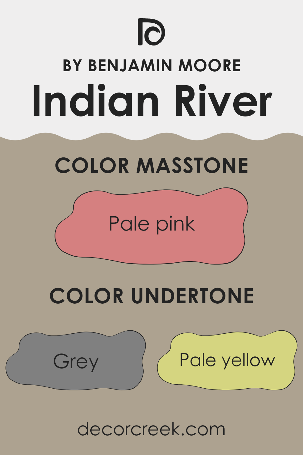
Undertones of Indian River 985 by Benjamin Moore
Indian River 985 by Benjamin Moore is a unique color that brings in a subtle complexity aided by its multiple undertones. Undertones are the hidden hues that influence the overall perception of the primary color, affecting how it appears in different lighting conditions and when coordinated with other colors. Essentially, undertones can make a color appear cooler or warmer, depending on their nature.
Indian River 985 has undertones that range widely from gray to various shades like pale yellow, mint, and light purple, to more vivid tones such as orange and red. Each undertone plays a role in adjusting the color’s warmth and depth. For instance, gray and light gray can soften the intensity, giving a muted, gentle look, which is excellent for a calming environment without making the room feel cold.
Meanwhile, undertones like pale yellow and mint add a touch of freshness, subtly brightening rooms without feeling too bright. These make the color flexible, fitting into many different interior styles and themes.
When used on interior walls, the flexibility of Indian River 985 allows it to adapt to various lighting scenarios beautifully. During daylight, lighter undertones might become more noticeable, making the room feel airy. In artificial light, deeper undertones like orange or brown can enrich the atmosphere, creating a warm and inviting room.
Overall, the range of undertones in Indian River 985 allows it to pair well with a wide variety of decor, offering adaptability and a balanced ambiance in home interiors. This adjustability is valuable in achieving a cohesive look throughout your home.
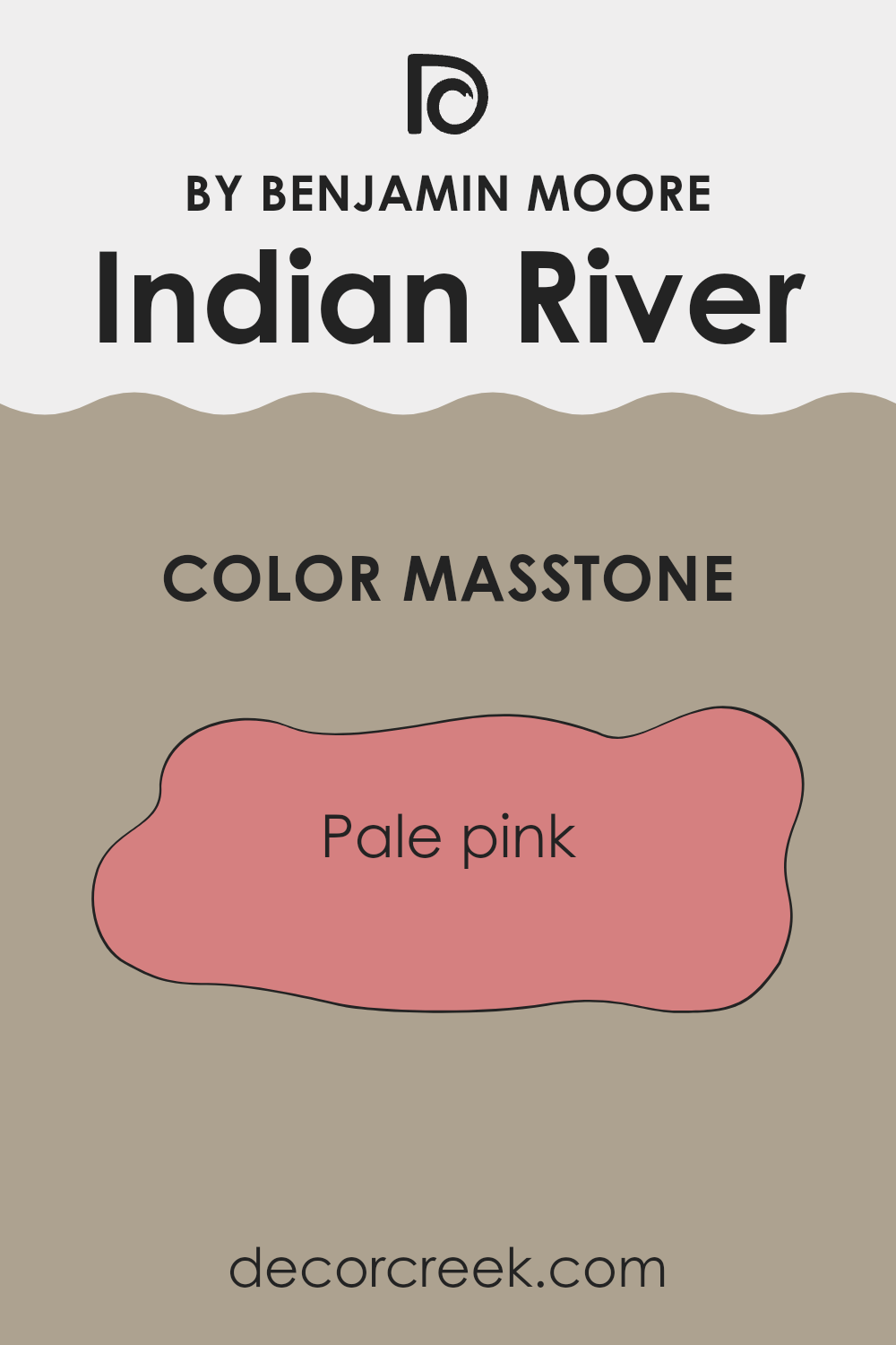
What is the Masstone of the Indian River 985 by Benjamin Moore?
Indian River 985 by Benjamin Moore has a masstone of pale pink, identified by the color code #D58080. This gentle pink shade offers a subtly warm feeling that can make any room feel welcoming and cozy.
When used in homes, this color can significantly lighten up a room by adding a touch of soft, cheerful warmth without being too vibrant or strong. Since it’s not a bold pink, it’s very flexible and can be used in various settings, including living rooms, bedrooms, and even kitchens.
It pairs well with other neutral shades such as grays, whites, and beiges, allowing for a smooth integration into existing decor. Additionally, this pale pink works well in rooms with natural light, enhancing a fresh and airy feel. It’s an excellent choice for those looking to add a subtle hint of color to their home without committing to something overly vivid.
How Does Lighting Affect Indian River 985 by Benjamin Moore?
Lighting significantly affects how we perceive colors. The type of light and the direction it comes from can change how a color looks in a room. Take the color Indian River 985 by Benjamin Moore, for example. This is a warm neutral tone that appears differently under varying lighting conditions.
In artificial light, such as LED or incandescent bulbs, Indian River 985 tends to look warmer and more inviting. The yellow or warm white bulbs enhance the cozy feel of this color, making it perfect for living rooms and bedrooms where relaxation matters most.
Under natural light, the appearance of Indian River 985 shifts throughout the day. Natural light reveals the truest form of any paint color, but the intensity and angle of the sunlight can alter its appearance.In north-facing rooms, where light is cooler and more consistent, Indian River 985 might appear slightly more grayed and subdued. These rooms don’t get a lot of direct sunlight, so the color can look soft and gentle.
South-facing rooms, however, receive plenty of direct sunlight, making Indian River 985 look warmer and brighter. It tends to bring out the beige and tan undertones of the color, making the room feel warm and sunny even without artificial lighting.
In east-facing rooms, the color gets bright morning light, which makes Indian River 985 feel crisp and lively in the mornings but cooler later in the day. This quality makes it ideal for kitchens and breakfast areas that are used primarily in the morning.West-facing rooms experience the opposite effect.
The color starts off cooler in the morning and gains warmth and depth in the afternoon and evening as the sun sets. This gradual change can be a beautiful feature in rooms used mostly at night, like dining areas. Understanding how Indian River 985 responds to different lighting conditions can help you decide where to use it effectively in your home to enhance its look and comfort.
decorcreek.com
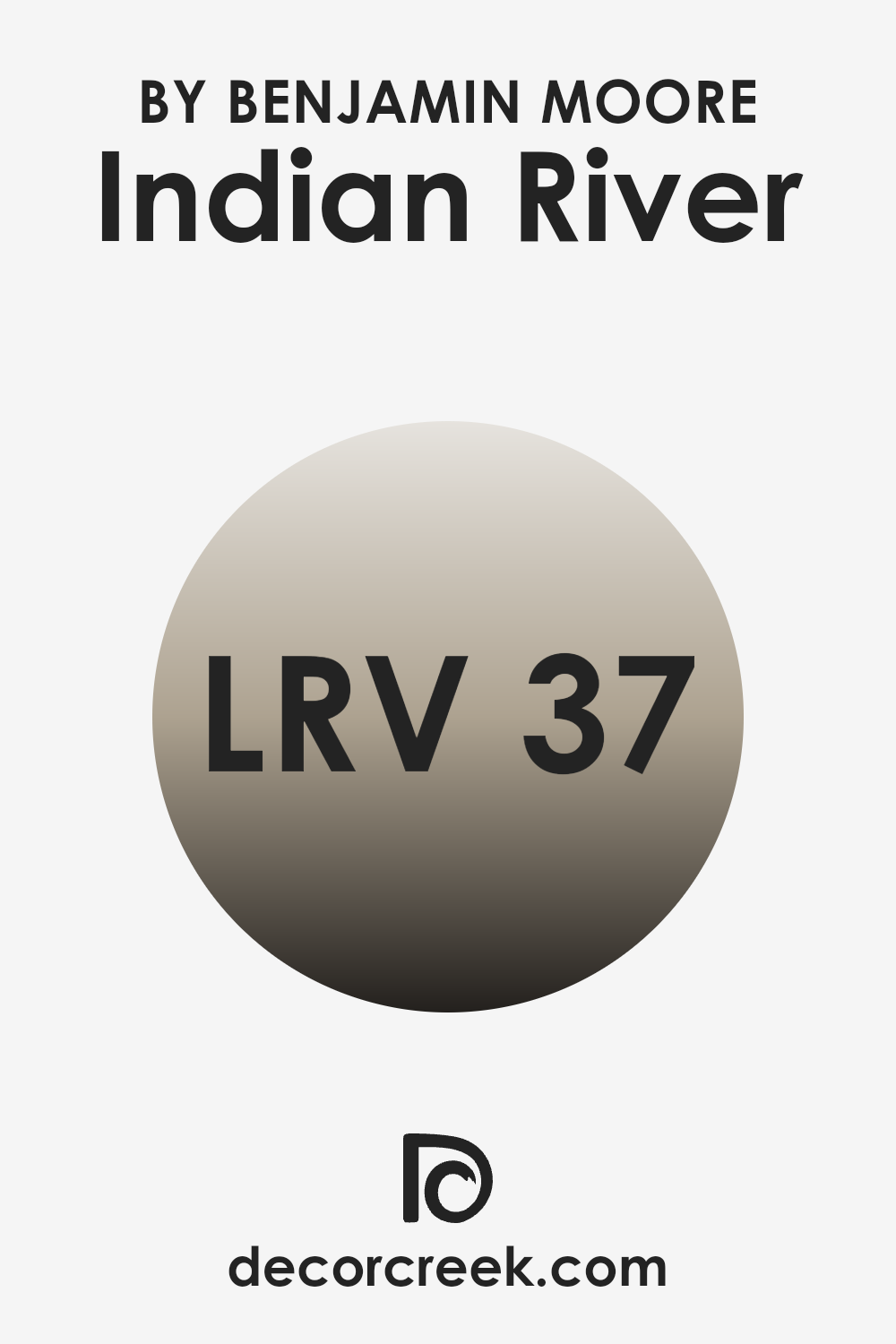
What is the LRV of Indian River 985 by Benjamin Moore?
LRV stands for Light Reflectance Value, which measures the percentage of light a paint color reflects back into a room as opposed to absorbing it. Think of it like this: if a color has a high LRV, it will reflect more light, making a room feel brighter and more open. On the other hand, a color with a low LRV will absorb more light, which can make a room feel cozier but smaller and darker.
It is an important factor to consider when choosing paint because it affects both the mood and the perception of size in a room. For instance, the LRV of Indian River, which sits at 36.66, indicates that it’s a medium-dark shade. It will absorb more light than it reflects, meaning it’s better suited for well-lit rooms or larger areas where you want to create a snug, inviting feel.
This particular value suggests that the color can make a room feel warm and comforting without making it seem too tight, as long as there is enough lighting to balance the depth of the shade. Remember, a room’s lighting will strongly influence how this color appears once it’s up on the walls.
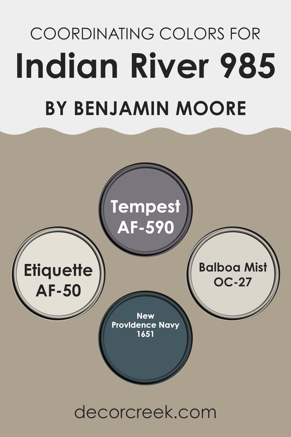
Coordinating Colors of Indian River 985 by Benjamin Moore
When coordinating colors, the goal is to select hues that complement each other, enhancing the overall aesthetic of a room without feeling too strong. This can involve using shades that either contrast or harmonize, depending on the desired effect. By choosing coordinating colors like those from Benjamin Moore, you can create a seamless look that brings out the best in each color.
One of the coordinating colors, AF-590 – Tempest, is a deep, moody gray that adds a touch of drama and grounding to any room. It pairs beautifully with lighter colors, offering balance to softer tones. AF-50 – Etiquette is a subtle, almost airy white with a gentle touch of gray.
This soft shade works well to create a quiet backdrop or to tone down the depth of darker colors. OC-27 – Balboa Mist is another calm and gentle color, providing a neutral base that complements both bright and muted tones effectively.
Lastly, 1651 – New Providence Navy is a classic navy blue that brings a traditional yet bold energy to the palette, perfect for accents or standout elements. These colors together provide a harmonious mix that can enhance any decorating style, from modern minimalism to cozy traditional design.
You can see recommended paint colors below:
- AF-590 Tempest
- AF-50 Etiquette
- OC-27 Balboa Mist
- 1651 New Providence Navy
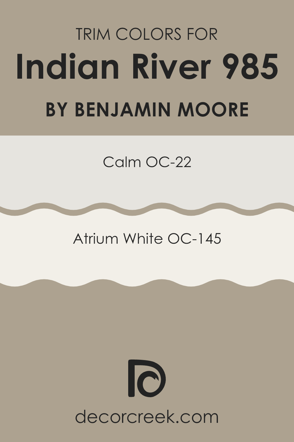
What are the Trim colors of Indian River 985 by Benjamin Moore?
Trim colors, such as OC-22 – Calm and OC-145 – Atrium White by Benjamin Moore, are hues used to accentuate the detailing in homes like doorways, moldings, window trim, and baseboards. Essentially, these colors help to define and accent the architectural features of rooms, enhancing the aesthetic appearance and complementing the primary wall color.
The use of subtle and compatible trim colors can refine the overall look of a room, giving it a finished and coherent appearance. For example, pairing a neutral or softly contrasting trim color with the main color can pull a room together, making it look clean and well-designed.
OC-22 – Calm is a gentle gray shade that provides a soft contrast to stronger main colors, offering a subtle delineation that is neither jarring nor too strong. It’s the kind of color that quietly supports the primary palette, adding depth to the walls without stealing the show.
On the other hand, OC-145 – Atrium White is a crisp white that works beautifully to provide a sharp, clean line against deeper wall colors. This color is excellent for brightening rooms and highlighting the architectural elements in any area without complicating the color scheme.
The use of subtle and compatible trim colors can refine the overall look of a room, giving it a finished and coherent appearance. For example, pairing a neutral or softly contrasting trim color with the main color can pull a room together, making it look clean and well-designed.
OC-22 – Calm is a gentle gray shade that provides a soft contrast to stronger main colors, offering a subtle delineation that is neither jarring nor overpowering. It’s the kind of color that quietly supports the primary palette, adding depth to the walls without stealing the show.
On the other hand, OC-145 – Atrium White, is a crisp white that works beautifully to provide a sharp, clean line against deeper wall colors. This color is excellent for brightening rooms and highlighting the architectural elements in any room without complicating the color scheme.
You can see recommended paint colors below:
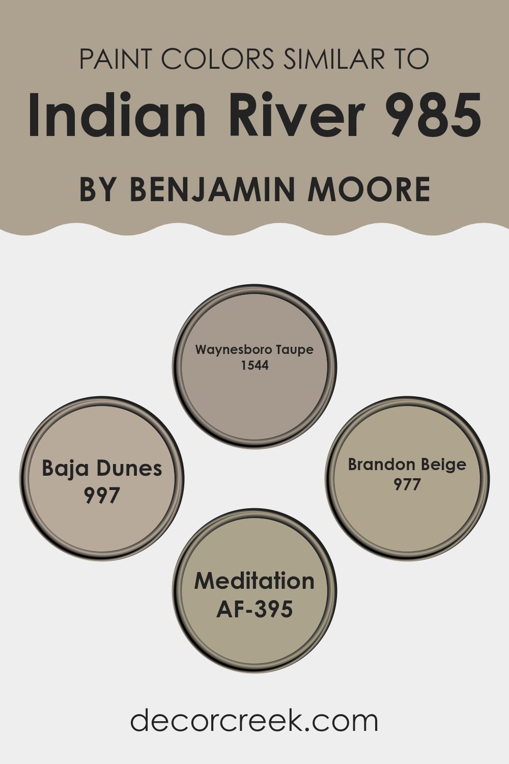
Colors Similar to Indian River 985 by Benjamin Moore
Using similar colors in interior design is crucial because they create a cohesive and soothing aesthetic, allowing for a seamless transition between rooms. Colors like 1544 – Waynesboro Taupe and 997 – Baja Dunes, for example, work beautifully alongside each other due to their subtlety and gentle contrast.
Waynesboro Taupe is a warm, grayish-taupe that offers a neutral backdrop perfect for living areas. Baja Dunes is slightly lighter, with a hint of warmth that enhances the room, making it feel open and inviting. They both share muted tones that ensure decorations and furnishings can stand out without feeling too strong.
Other similar shades, 977 – Brandon Beige and AF-395 – Meditation, also play important roles in this family of hues. Brandon Beige is a rich, deeper beige that provides a lovely earthiness, suitable for rooms that need a bit more color without going too dark. Meditation, a color with a touch of gray, adds elegance and pairs well with more vibrant decorations by grounding them with its subtle presence.
These colors are generally adaptable, fitting a variety of design styles from modern to rustic, and help to create rooms that feel cohesive and intentional. Working with such complementary shades ensures a harmonious visual flow in homes, easing transitions between different living areas.
You can see recommended paint colors below:
- 1544 Waynesboro Taupe
- 997 Baja Dunes
- 977 Brandon Beige
- AF-395 Meditation
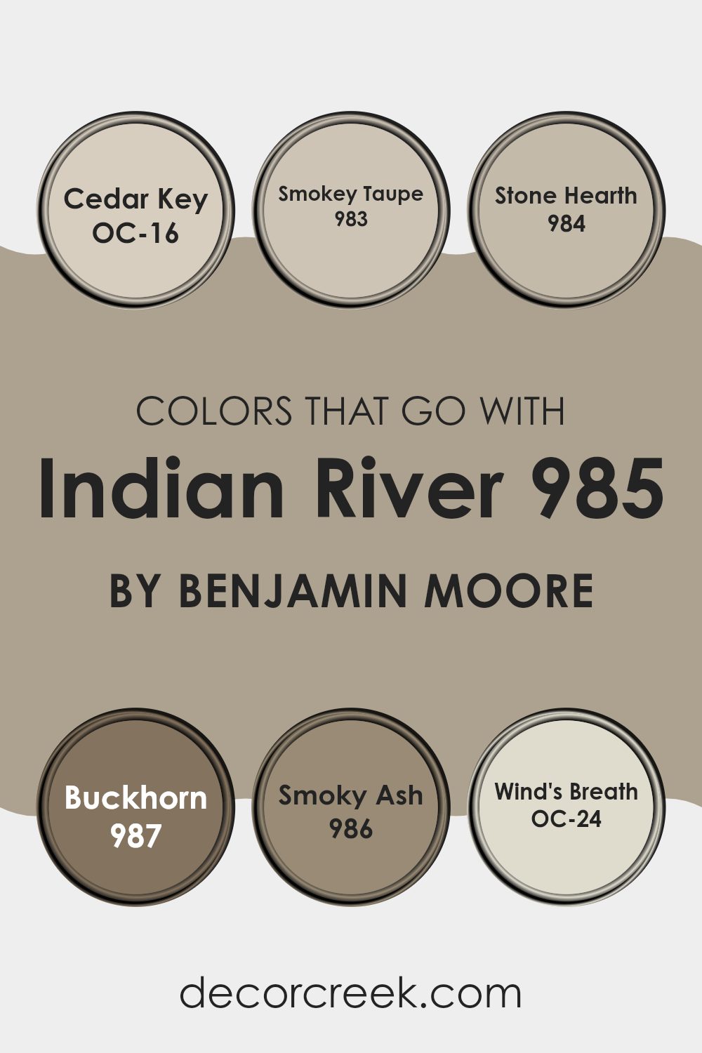
Colors that Go With Indian River 985 by Benjamin Moore
Selecting the right colors to pair with Indian River 985 by Benjamin Moore is key to achieving a harmonious and appealing look in any room. Colors like OC-16 Cedar Key, 983 Smokey Taupe, 984 Stone Hearth, 987 Buckhorn, 986 Smoky Ash, and OC-24 Wind’s Breath not only complement Indian River 985 but enhance the overall aesthetic, creating a coherent and inviting atmosphere.
These accompanying shades work because they share similar undertones that balance beautifully with Indian River 985’s warm and rich hue, allowing for a smooth visual transition across a room. OC-16 Cedar Key offers a neutral beige tone that brings a light and airy feel, making it perfect for open rooms and providing a soft contrast.
Smokey Taupe 983, on the other hand, provides a slightly bolder taupe shade that adds depth and pairs well with the earthiness of Indian River 985. Stone Hearth 984 has a friendly gray-brown that fits well in areas seeking a touch of warmth without feeling too heavy. Buckhorn 987 has a deeper, rich brown tone that grounds rooms with its strong presence.
Smoky Ash 986 brings in a striking dark gray-brown that can add drama and draw focus within a design. Lastly, Wind’s Breath OC-24 is a very light beige that works beautifully to brighten rooms without creating sharp contrasts, making it ideal for a gentle complement and overall balance in the color scheme. By pairing these colors with Indian River 985, you ensure a room that feels cohesive and inviting, with both depth and harmony.
You can see recommended paint colors below:
- OC-16 Cedar Key
- 983 Smokey Taupe
- 984 Stone Hearth
- 987 Buckhorn
- 986 Smoky Ash
- OC-24 Wind’s Breath
How to Use Indian River 985 by Benjamin Moore In Your Home?
Indian River 985 by Benjamin Moore is a flexible paint color perfect for adding a touch of warmth to any room in your home. This shade is a rich blend of taupe, often admired for its ability to provide both a cozy and inviting atmosphere. Ideal for living rooms and bedrooms, it pairs beautifully with soft whites and strong darks, allowing you to create a balanced look.
You can also use it in a kitchen or dining room to offer a subtle hint of elegance without feeling too bold. In smaller rooms like bathrooms or hallways, Indian River can make the area feel more open and lighter if used on one focus wall and balanced with brighter tones on others.
If you want to add character to your home office, consider using it on bookshelves or cabinets for a grounded, subtle look that’s easy on the eyes. Indian River is also durable and hides marks well, making it practical for busy areas of your home.
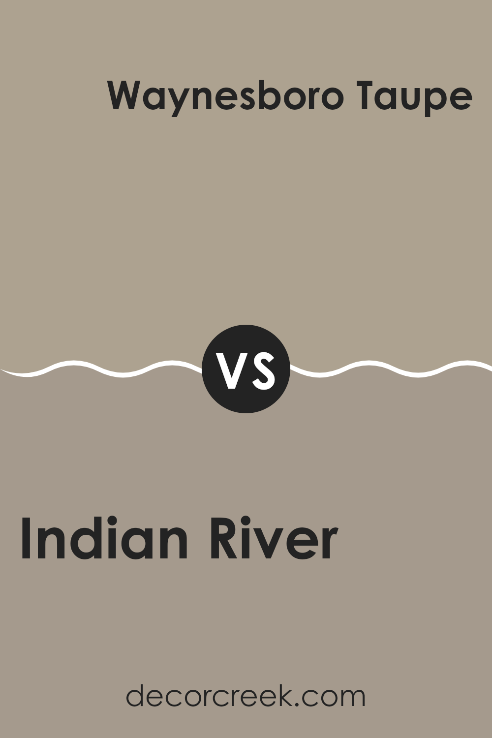
Indian River 985 by Benjamin Moore vs Waynesboro Taupe 1544 by Benjamin Moore
Indian River by Benjamin Moore is a deep, warm beige that carries subtle hints of gray. It’s a rich color that provides a cozy and inviting atmosphere to any room. This shade is flexible and works well in rooms that aim for a grounded, welcoming feel.
In comparison, Waynesboro Taupe by Benjamin Moore is a lighter taupe that leans more toward a classic gray. It’s a neutral shade that offers a cleaner, more open feeling, making it suitable for smaller rooms to help them appear more spacious. The color is perfect for those who want a modern touch without feeling too bold.
Both colors are excellent choices for creating a neutral yet distinct backdrop in a home. Indian River, with its deeper and warmer tones, is ideal for a more intimate setting, while Waynesboro Taupe, being lighter and grayish, is great for brighter, airy rooms. The choice between the two would largely depend on the desired mood and size of the room.
You can see recommended paint color below:
- 1544 Waynesboro Taupe
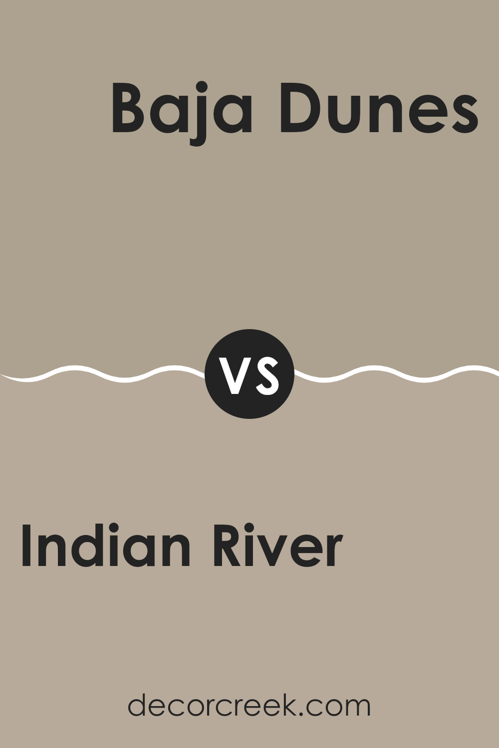
Indian River 985 by Benjamin Moore vs Baja Dunes 997 by Benjamin Moore
Indian River is a warm, mid-tone beige with subtle gray undertones. It provides a cozy and inviting atmosphere to any room, making it perfect for living areas or bedrooms. The color is flexible, blending well with various decors and helping to create a relaxed and comfortable environment.
On the other hand, Baja Dunes is slightly lighter than Indian River and carries more of a creamy tone, with a touch of warmth. This color is excellent for rooms where you want to enhance natural light, such as kitchens or smaller areas. It offers a clean and gentle feeling, conducive to calm and relaxed settings.
Both Indian River and Baja Dunes are neutral colors, but Indian River leans toward a richer depth with its gray undertones, while Baja Dunes brings a softer, creamier look. Depending on the mood you want to create and the amount of natural light available, each color has its own strength in enhancing room design.
You can see recommended paint color below:
- 997 Baja Dunes
Indian River 985 by Benjamin Moore vs Brandon Beige 977 by Benjamin Moore
Indian River and Brandon Beige, both by Benjamin Moore, are distinct hues yet subtly related through their warm undertones. Indian River presents as a deeper, muted shade, leaning toward gray with brown influences, making it feel cozy and grounding.
It works well in rooms where a sense of solidity and subtle richness is desired. On the other hand, Brandon Beige is lighter and offers a fresher feel, being a true beige that combines nicely with a broader range of colors. It tends to brighten rooms while maintaining warmth, making it ideal for areas that benefit from a light, inviting atmosphere.
Both colors pair well with natural materials and can create a unified look, but Indian River is better for a bold statement, while Brandon Beige stands out for its flexibility. Choosing between them depends on the desired effect and the specific qualities of the room they are meant to enhance.
You can see recommended paint color below:
- 977 Brandon Beige
Indian River 985 by Benjamin Moore vs Meditation AF-395 by Benjamin Moore
Indian River by Benjamin Moore is a warm, beige color that creates a cozy and inviting atmosphere. It has a slight grayish undertone, making it an excellent choice for those looking to bring a touch of subtlety to their room without it feeling too stark or cold. This color can work well in various rooms, particularly in living areas and bedrooms where a softer, more neutral backdrop is desired.
On the other hand, Meditation by Benjamin Moore is a bit deeper and leans toward a taupe shade. This color is also warm but offers a richer, more pronounced look compared to Indian River. Meditation can be ideal for rooms that you want to feel more grounded and defined. Its depth adds character and can be a perfect option for accent walls or for areas that benefit from a stronger color presence.
Both colors are neutral and flexible, but while Indian River goes lighter and softer, Meditation provides a bit more impact and depth. This makes each suitable for different preferences or room functions based on how much warmth and dimension you want to bring into the room.
You can see recommended paint color below:
- AF-395 Meditation
As I finish writing about the 985 Indian River color by Benjamin Moore, I feel like I’ve learned a lot about how paint can change the mood of a room. Indian River is a warm, brownish-gray shade that’s cozy and welcoming. It’s a lot like the color of hot cocoa or the bark of a tree. This is a color that can make a big room feel a bit smaller and more comforting.
I realized that this color works well in places where you go to relax, like living rooms or bedrooms. It gives off a cozy vibe that makes you want to curl up with a book or take a nap. Even better, it’s subtle enough that it won’t clash with your furniture or decorations. It’s like a friendly backdrop that lets your favorite things stand out without taking away attention.
In my article, I suggested that 985 Indian River is useful in different kinds of homes because it doesn’t demand attention but still adds a lovely touch. Using this color could make your home feel warmer and more inviting. Whether you paint all the walls or just one to make it stand out, Indian River provides a sweet, comforting feeling, which I think is really nice.
So if you’re thinking about giving your room a new look, this could be a great color to try!
decorcreek.com
Ever wished paint sampling was as easy as sticking a sticker? Guess what? Now it is! Discover Samplize's unique Peel & Stick samples.
Get paint samples

