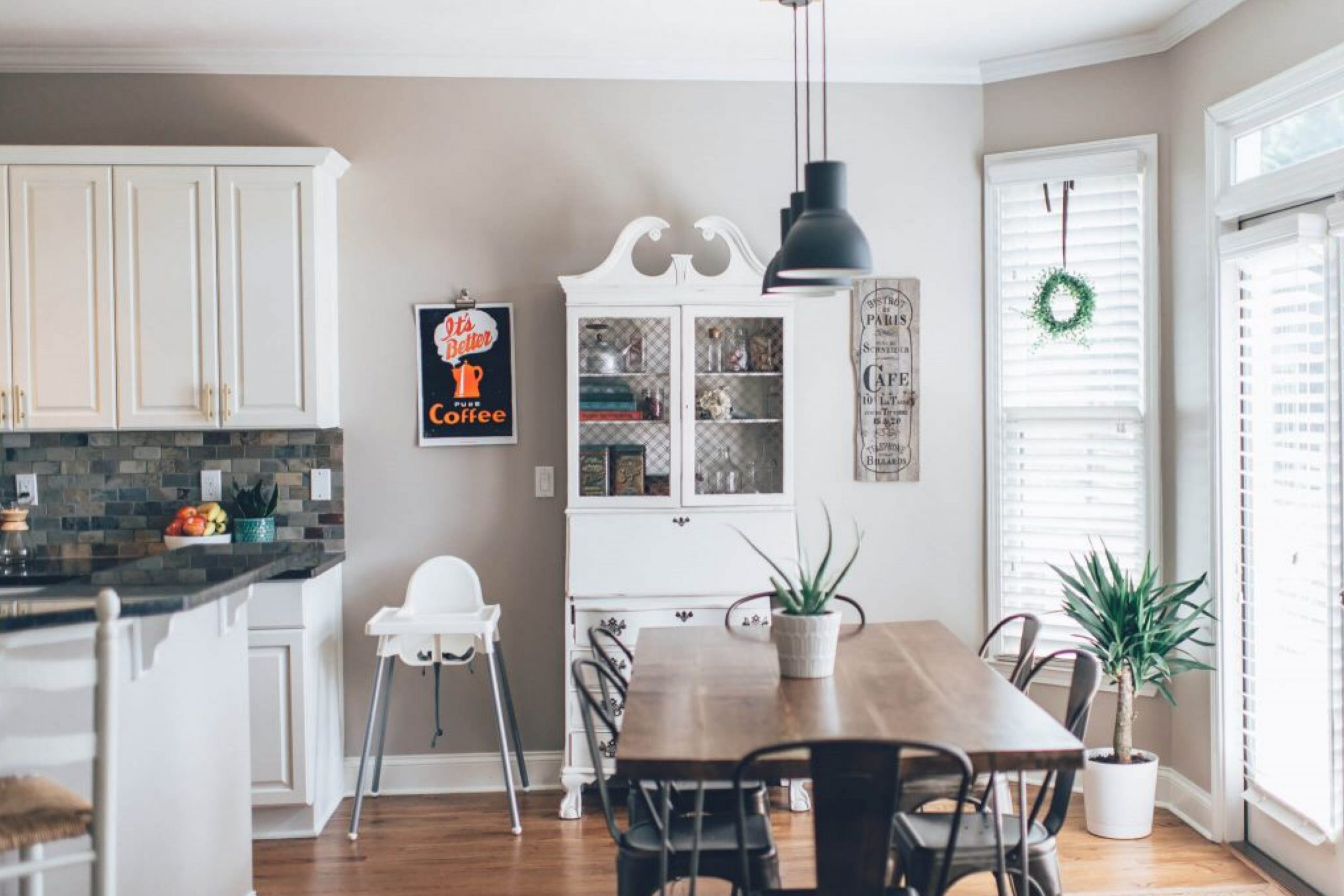
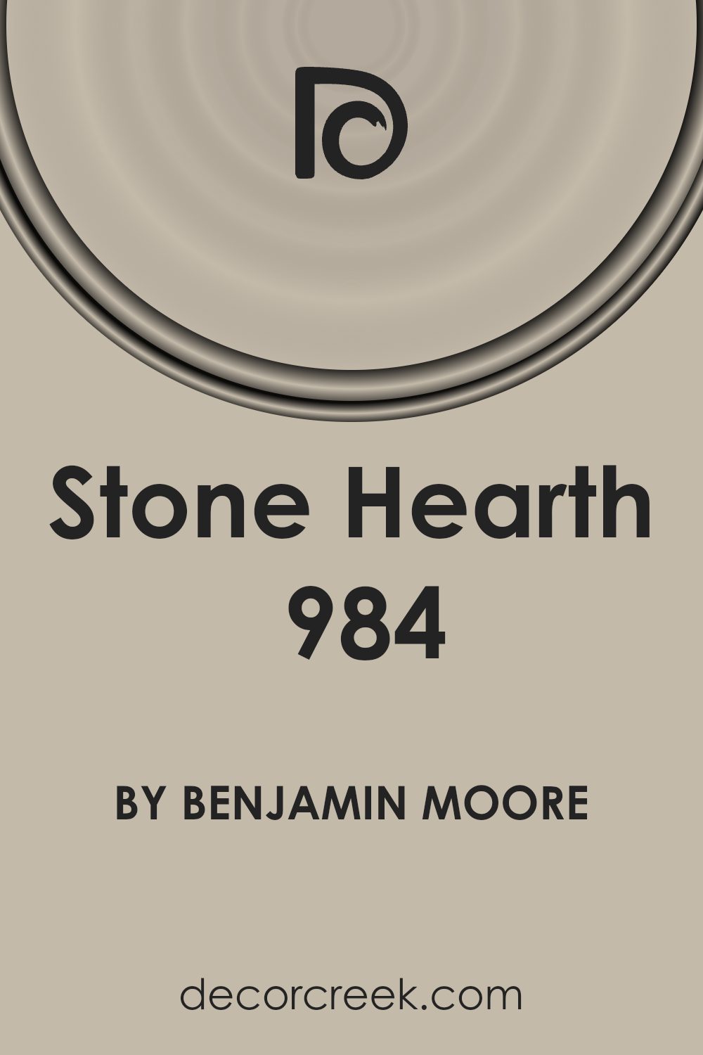
If you’re on the lookout for a paint color that brings a cozy and warm feel to your space, 984 Stone Hearth by Benjamin Moore should be on your radar. This particular shade is a beautiful blend of taupe and gray, offering a perfect balance that works well in various types of rooms and with different decor styles. Whether you’re thinking about refreshing your living room, bedroom, or even your kitchen, Stone Hearth offers a subtle elegance that can make any space feel more inviting and comfortable.
This color is especially great for those who prefer neutral tones but still want a hint of warmth in their surroundings. It’s not just any ordinary gray; its unique blend with taupe gives it a rich depth, making it a versatile option for pairing with both light and dark furnishings and accessories.
From a design perspective, Stone Hearth can serve as a fantastic backdrop for artwork, as well as both modern and traditional pieces, allowing them to stand out without overshadowing them.
Getting your space to look and feel just right can be a bit challenging, but choosing the right paint color is a significant first step. With 984 Stone Hearth by Benjamin Moore, you’re off to a good start, setting a solid foundation for the rest of your design decisions.
Whether you’re updating a single room or planning a more extensive renovation, this color might just be the warm, inviting hue you’re looking for.
What Color Is Stone Hearth 984 by Benjamin Moore?
Stone Hearth by Benjamin Moore is a warm, inviting neutral that strikes a fine balance between a taupe and a beige. This versatile color has a comforting presence, making it an excellent choice for creating a cozy and welcoming space. Its earthy tones give it a soft, natural look, which works beautifully in living rooms, bedrooms, and even kitchens, adding a touch of sophistication without overwhelming the senses.
This color shines in a variety of interior styles, from rustic charm to modern minimalism, and even traditional settings. It’s particularly effective in spaces where a calm and restful ambiance is desired, due to its ability to blend seamlessly with a wide range of color palettes. Whether your room is filled with natural light or relies on artificial sources, Stone Hearth maintains its depth and warmth, creating a snug and inviting atmosphere.
When it comes to pairing materials and textures, Stone Hearth is highly adaptable. It complements natural wood beautifully, from light oak to darker walnut, enhancing the organic feel of a space. It also pairs well with soft fabrics like cotton and linen in neutral shades, adding layers of texture without creating visual clutter.
For a bit of contrast, metallic accents in gold or brushed nickel can add a touch of elegance to a room. Stone surfaces, whether polished granite or honed marble, also harmonize with Stone Hearth, ensuring a cohesive and stylish look.
Is Stone Hearth 984 by Benjamin Moore Warm or Cool color?
Stone Hearth 984 by Benjamin Moore is a versatile color that adds a cozy warmth to any room in a home. This shade belongs to a family of neutral colors, making it a perfect choice for those looking to create a soothing and inviting space. Its subtle warmth works well with a variety of decor styles, from modern to rustic, and can complement both dark and light furniture and accessories.
Using Stone Hearth 984 on walls can help to make a room feel more grounded and secure. Its earthy tones bring a sense of calmness, making it an excellent choice for bedrooms and living areas where relaxation is key. In well-lit spaces, this color glows softly, enhancing the feeling of comfort, while in rooms with less natural light, it maintains its depth, adding to the atmosphere without overpowering.
For homeowners looking to update their space without making drastic changes, painting with Stone Hearth 984 can achieve a subtle yet significant impact. It works beautifully as a main wall color but can also serve as an accent to add depth and dimension to a room, blending seamlessly with other colors and textures in the home.
Undertones of Stone Hearth 984 by Benjamin Moore
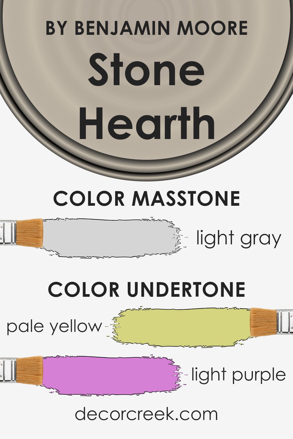
Stone Hearth by Benjamin Moore is a versatile color with a complex mix of undertones that can subtly shift its appearance under different lighting conditions. These undertones include pale yellow, light purple, pale pink, light blue, mint, grey, and lilac. Understanding these undertones can really help you figure out how this color will look in your space.
Undertones play a significant role in how we perceive color. They can influence the color’s warmth, coolness, and depth. For example, pale yellow and mint undertones can make Stone Hearth appear warmer and more inviting, especially in natural light. Conversely, grey and light purple undertones can give it a cooler, more muted feel, which might be more apparent under artificial lighting.
This complexity makes Stone Hearth a particularly adaptive choice for interiors, capable of creating different moods and styles depending on the room and lighting.
On interior walls, Stone Hearth brings a rich depth that ties together a room’s decor. In rooms with plenty of natural light, the warmer undertones like pale yellow and mint might become more pronounced, making the space feel cozy and welcoming. In spaces with less natural light, the cooler undertones like grey and light purple might stand out, lending a sophisticated and serene atmosphere.
The presence of these undertones means Stone Hearth can complement a wide range of furnishings and decor styles, from modern and minimalistic to rich and traditional, making it a favorite for interior designers and homeowners alike.
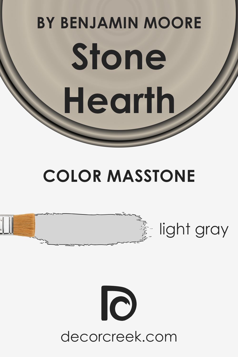
What is the Masstone of the Stone Hearth 984 by Benjamin Moore?
Stone Hearth 984 by Benjamin Moore is a color that carries a masstone, basically the main color you see, of Light Gray (#D5D5D5). This soft, neutral gray has a calming and subtle effect, making it an excellent choice for those looking to create a peaceful and inviting space in their home. Its light gray tone works wonders in rooms of all sizes and styles, reflecting natural light beautifully and making spaces appear larger and more open.
Because of its versatility, it pairs well with a wide range of colors – from bold and bright tones for a vibrant contrast to softer, pastel hues for a more cohesive and gentle aesthetic. In living rooms, bedrooms, or even kitchens, Stone Hearth 984 adds a touch of sophistication and modernity, without overwhelming the space. Its ability to act as a backdrop for furniture and art makes it a go-to for homeowners aiming for a chic and understated look.
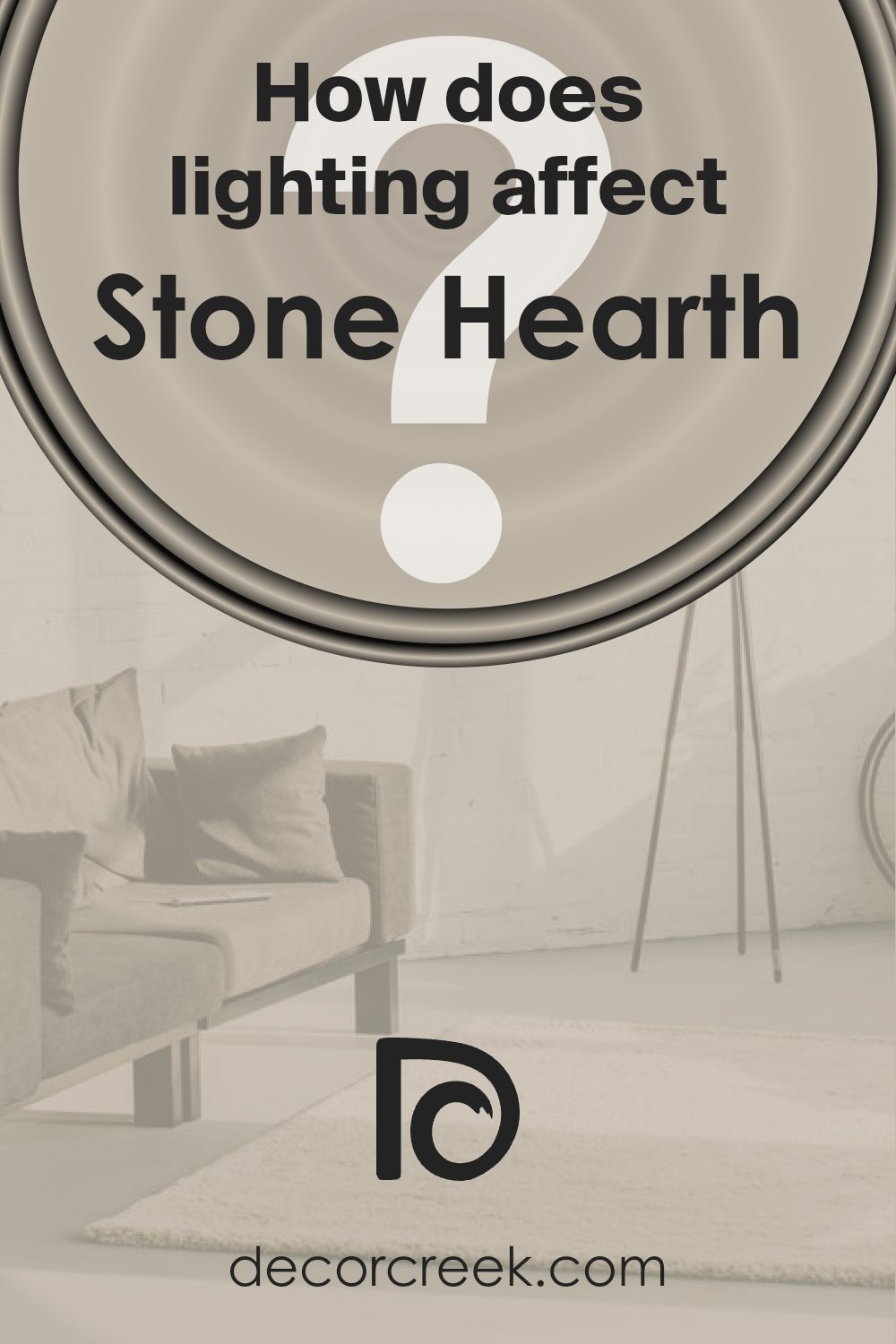
How Does Lighting Affect Stone Hearth 984 by Benjamin Moore?
Lighting plays a crucial role in how we perceive colors. A paint color can appear differently under various light sources due to how light interacts with surfaces and reflects back to our eyes. For instance, the color Stone Hearth by Benjamin Moore can show a range of shades depending on the lighting condition.
In artificial light, the impact varies based on the type of bulbs used. Warm lights can enrich the warmth in Stone Hearth, making it appear cozier and more welcoming. It’s the kind of ambiance you might want for a living room or dining area. Cooler LED lights, on the other hand, can bring out subtle gray tones in the color, giving it a more modern and crisp look.
Natural light brings its dynamics. In a room facing north, which receives less direct sunlight and tends to have cooler light, Stone Hearth may appear more muted and slightly cooler, emphasizing its gray undertones. This makes it suitable for creating a serene, calm space.
In south-facing rooms, which are bathed in warm sunlight for most of the day, Stone Hearth can look warmer and more vibrant. Here, its underlying warmth is highlighted, making the space feel inviting and bright.
East-facing rooms receive bright morning light, making Stone Hearth look soft and warm early in the day. As the day progresses and the light diminishes, the color may seem more subdued and cooler, offering a tranquil retreat.
West-facing rooms experience the opposite, starting with a cooler, more muted version of Stone Hearth during the morning. As the sun sets, the color can warm up significantly, offering a rich, warm backdrop in the afternoon and evening.
Understanding how light affects color can help in selecting the right paint for a room, ensuring you get the desired mood and ambiance throughout the day.
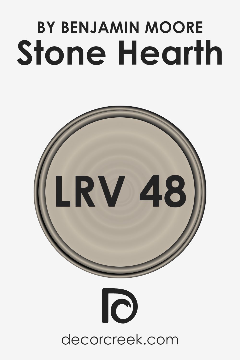
What is the LRV of Stone Hearth 984 by Benjamin Moore?
LRV stands for Light Reflectance Value, which is a measure of how much light a color reflects or absorbs. Think of it as a scale from 0 to 100, where 0 means the color absorbs all light (appearing very dark) and 100 means it reflects all light (appearing very bright).
This value is super helpful when choosing paint colors because it gives you an idea of how light or dark a color will look on your walls. If you pick a color with a high LRV, your room might feel brighter and more open. On the other hand, a color with a low LRV could make the room feel cozier but potentially smaller or darker.
The LRV of Stone Hearth is 48.45, sitting pretty much in the middle of the LRV scale. This means it neither reflects all the light nor does it absorb it all. Instead, it strikes a balance, making it a versatile color choice for spaces.
In rooms with plenty of natural light, this color can feel warmer and more inviting, while in spaces with less light, it could appear slightly darker but still maintain a sense of warmth. Its LRV suggests it’s a great option for those looking for a color that doesn’t drastically darken a room nor overpower it with brightness, providing a beautiful depth and sophistication to the walls.
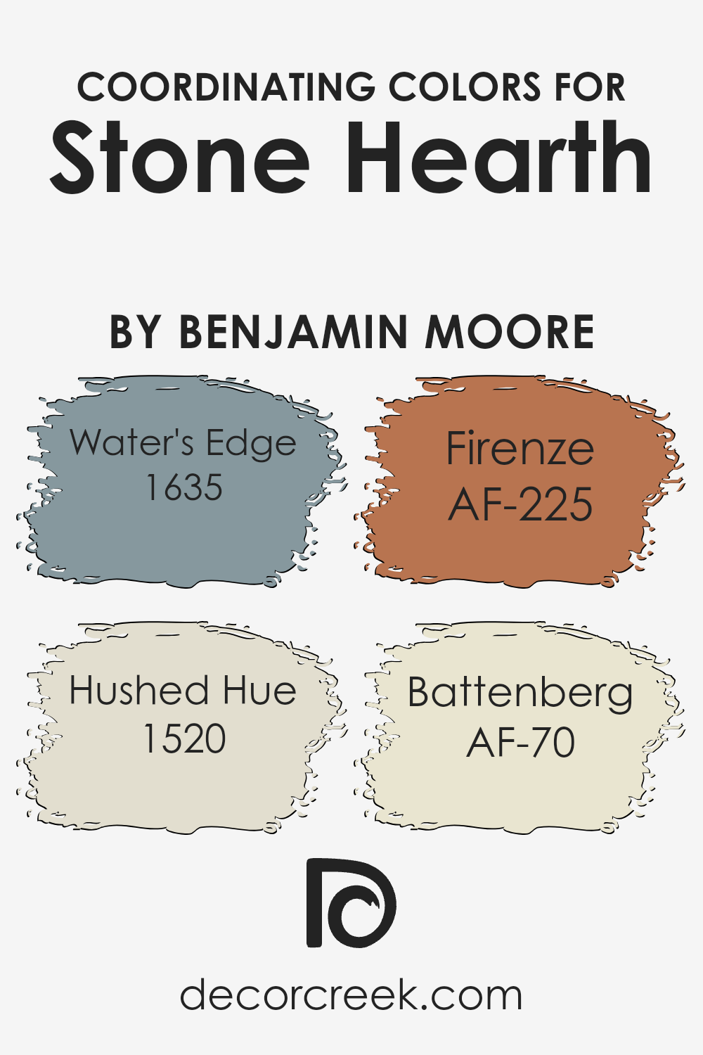
Coordinating Colors of Stone Hearth 984 by Benjamin Moore
Coordinating colors are shades that harmonize well with a primary color, enhancing the overall aesthetic of a space. With Stone Hearth 984 by Benjamin Moore as the primary color, selecting coordinating colors becomes an engaging process of mixing and matching shades to create a balanced and visually pleasing palette.
This selection involves choosing colors that not only complement Stone Hearth but also bring out its unique undertones, ensuring the space feels cohesive and thoughtfully designed.
Water’s Edge 1635, for instance, is a serene blue that mimics the calmness of a tranquil sea, providing a cool contrast to Stone Hearth’s warm tones. It’s perfect for creating a soothing ambiance. Hushed Hue 1520, on the other hand, is a soft, muted pink that adds a gentle touch of warmth, making spaces feel welcoming and cozy.
AF-225 Firenze is a rich, earthy amber that infuses depth and sophistication into the environment, ideal for adding an element of elegance.
Lastly, AF-70 Battenberg is a light, creamy hue that offers a subtle contrast, ensuring the space remains bright and airy. Together, these colors work in harmony to enhance the beauty of Stone Hearth, each bringing its own character to the mix while supporting a cohesive design theme.
You can see recommended paint colors below:
- 1635 Water’s Edge
- 1520 Hushed Hue
- AF-225 Firenze
- AF-70 Battenberg
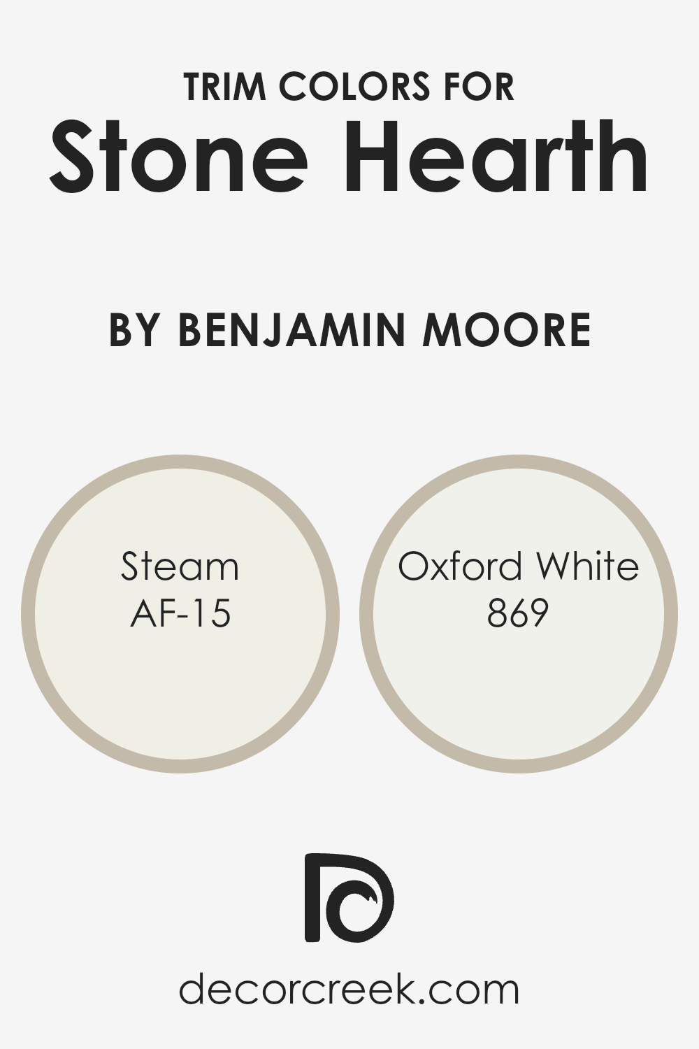
What are the Trim colors of Stone Hearth 984 by Benjamin Moore?
Trim colors in the world of painting and decorating refer to the hues chosen for the architectural details and accents of a room, like door frames, skirtings, moldings, and window trims. These colors play a crucial role in defining and complementing the main color palette of a space, ensuring that the walls and the architectural details stand out in harmony.
For a sophisticated and balanced look, choosing the right trim colors is essential. For example, when using a warm and inviting shade like Stone Hearth by Benjamin Moore, it’s important to pick trim colors that enhance its beauty without overwhelming it.
AF-15, known as Steam, is a soft, almost ethereal white with a subtle hint of warmth. This color is exceptionally versatile, making it a perfect choice for trim as it softly outlines the space, providing a gentle contrast that enhances the depth of the walls without creating a stark division.
On the other hand, 869, or Oxford White, is a crisp, clean white with a slightly more pronounced brightness. It offers a sharper contrast to Stone Hearth, bringing a fresh and refined edge to the room. Both colors, with their distinct qualities, ensure that the trim not only defines the architectural elements of the space but also complements the overall aesthetic, adding layers and interest to the design.
You can see recommended paint colors below:
- AF-15 Steam
- 869 Oxford White
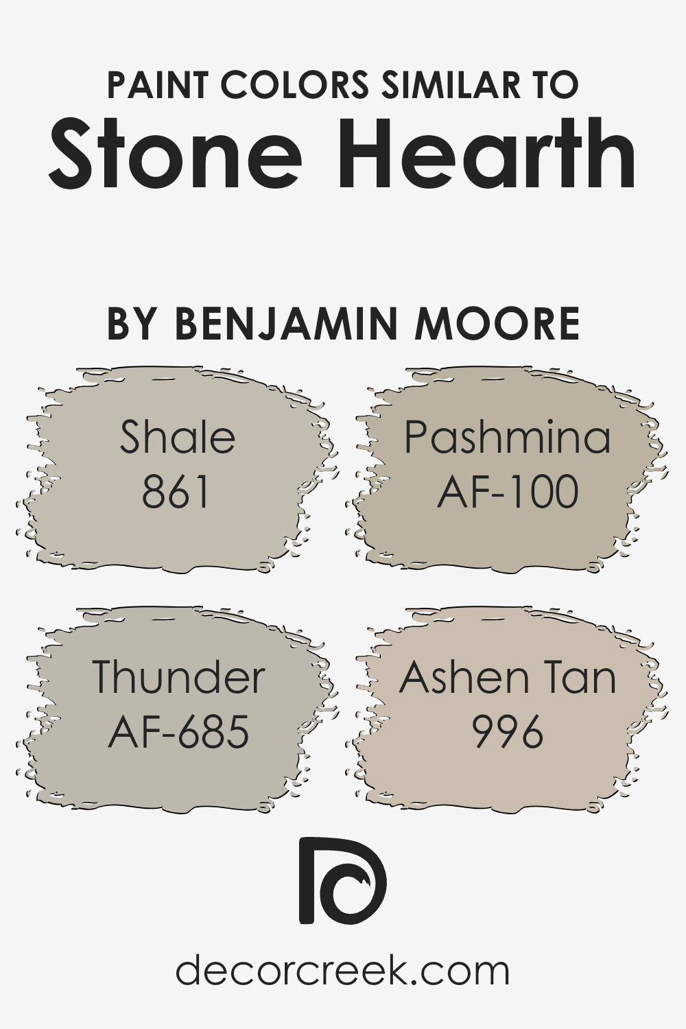
Colors Similar to Stone Hearth 984 by Benjamin Moore
Similar colors play a significant role in creating a cohesive and harmonious look in any space. When you pick shades like 861 – Shale, AF-685 – Thunder, AF-100 – Pashmina, and 996 – Ashen Tan, which share a close relationship with Stone Hearth by Benjamin Moore, you ensure a fluid transition of hues that complement each other beautifully.
These colors work together by blending subtly, avoiding stark contrasts that can make a space feel disjointed. Instead, they add depth and complexity, giving the room a seamless aesthetic. This strategy is particularly useful in open-plan areas where you want to define different zones without using contrasting colors.
Shale is a soft, muted gray with a touch of warmth that evokes a sense of calmness, making it perfect for a relaxing bedroom or a serene living area. Thunder, on the other hand, offers a stronger, yet equally warm gray, lending itself to a more dramatic and sophisticated look, ideal for creating a focal point or accent walls.
Pashmina is a deeper, richer hue that straddles the line between gray and beige, offering versatility and warmth to spaces that crave a cozy yet refined touch. Finally, Ashen Tan brings a lighter, more neutral option, providing a soft backdrop for rooms that aim for a subtle, airy feel. Together, these colors create a palette that is both diverse and unified, allowing for creative freedom while maintaining a coherent visual flow.
You can see recommended paint colors below:
- 861 Shale
- AF-685 Thunder
- AF-100 Pashmina
- 996 Ashen Tan
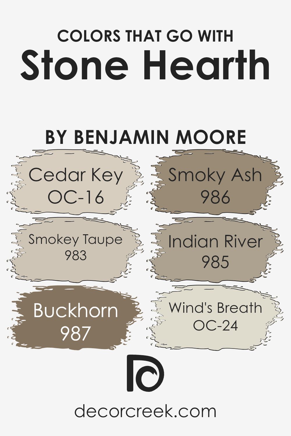
Colors that Go With Stone Hearth 984 by Benjamin Moore
Choosing the right colors to complement Stone Hearth 984 by Benjamin Moore is crucial because it can influence the overall mood and aesthetics of a space. Colors that harmonize with Stone Hearth create a cohesive and visually appealing environment, enhancing the room’s design without overpowering the soothing essence of this central shade. Stone Hearth is a versatile hue that acts as a perfect backdrop, allowing accessory colors to shine, whether creating a serene, inviting space or a bold statement room.
Cedar Key OC-16 offers a delicate balance, adding a soft, almost ethereal quality to rooms, making spaces feel airy and more open. Smokey Taupe 983, on the other hand, brings a subtle depth, enriching the environment with its warm undertones, perfect for a cozy, grounded feel.
Buckhorn 987 introduces an earthy richness, adding character and a sense of welcoming warmth, ideal for creating spaces that feel lived in and loved. Smoky Ash 986 is a darker, moodier companion that lends an air of sophistication and drama, great for accentuating features or creating focal points.
Indian River 985, with its muted, dusky charm, adds elegance to the mix, offering a slightly more refined and understated approach to design. Wind’s Breath OC-24 is the lightest touch, providing a breath of fresh air to the palette, enhancing the sense of space and light in a room, making it feel more expansive and serene. Each of these companion colors plays a crucial role in designing a harmonious space that reflects personal style while maintaining a balanced and cohesive look with Stone Hearth 984.
You can see recommended paint colors below:
- OC-16 Cedar Key
- 983 Smokey Taupe
- 987 Buckhorn
- 986 Smoky Ash
- 985 Indian River
- OC-24 Wind’s Breath
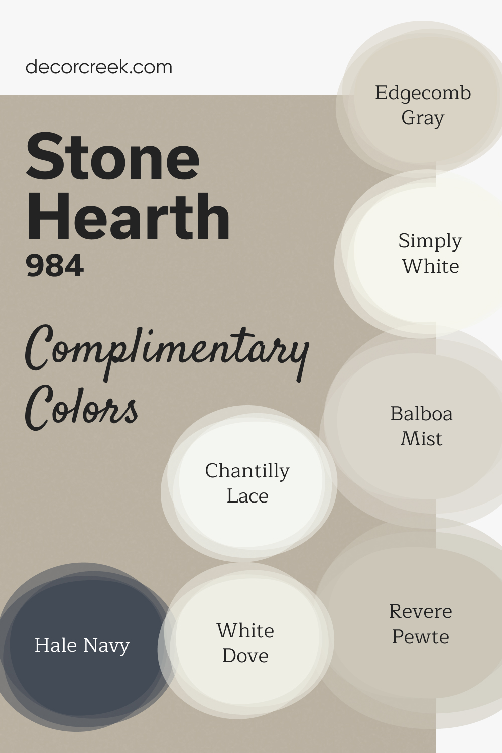
Complimentary Colors for Stone Hearth 984 Paint Color by Benjamin Moore
Stone Hearth by Benjamin Moore is a cozy, warm neutral that works beautifully in any room. Pair it with Chantilly Lace or Simply White for crisp, bright accents that keep the space feeling light and open. Revere Pewter and Edgecomb Gray provide soft, balanced tones that blend seamlessly with Stone Hearth for a harmonious look.
For added depth and richness, Hale Navy offers a bold contrast, while Balboa Mist and White Dove introduce subtle, calming shades.
This versatile color palette is perfect for creating a comfortable, timeless atmosphere, whether you prefer a modern or classic style.
How to Use Stone Hearth 984 by Benjamin Moore In Your Home?
Stone Hearth 984 by Benjamin Moore is a warm, versatile paint color that brings a cozy feeling to any home. This shade is part of the Benjamin Moore Classics® collection, known for timeless colors that fit in a wide range of decorating styles. Stone Hearth is a kind of taupe, blending gray and brown to create a neutral backdrop that works well in various rooms.
You can use Stone Hearth in your living room or bedroom to create a soothing atmosphere that feels welcoming and calm. It pairs beautifully with white trims, giving a clean and sophisticated look. For those looking to update their kitchen or bathroom, Stone Hearth offers a subtle warmth that complements wood cabinets and stone tiles, making these spaces feel inviting.
Beyond walls, this versatile color can also be used on cabinets or furniture, lending a modern yet timeless feel to pieces that need a fresh look. Whether you want to paint an entire room or just add an accent wall, Stone Hearth 984 offers flexibility, making it easy to incorporate into your home design project.
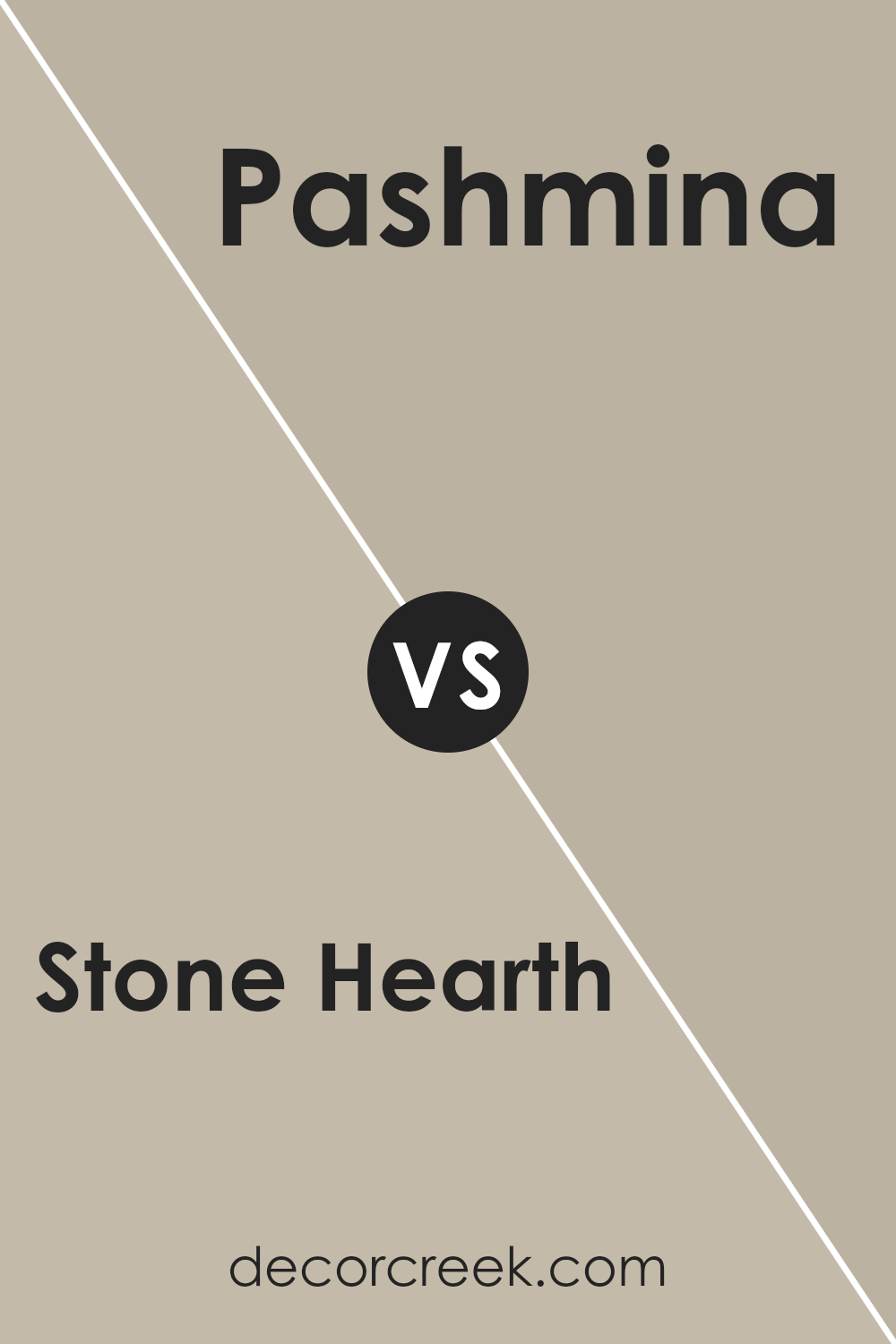
Stone Hearth 984 by Benjamin Moore vs Pashmina AF-100 by Benjamin Moore
When comparing Stone Hearth and Pashmina by Benjamin Moore, picture two elegant, cozy shades that bring warmth to any room. Stone Hearth has a slightly cooler tone, like the soft gray of river rocks smoothed over time. It’s versatile, fitting well in spaces where you want a hint of sophistication without overwhelming the room with darkness.
On the other hand, Pashmina sits a bit warmer on the color spectrum. Think of it as the color of a well-worn, comfortable leather jacket. It carries an earthy richness, making spaces feel inviting and snug. This color works great in areas where you want to add a bit of coziness and warmth, drawing in anyone who enters.
Both colors share an understated elegance, capable of transforming a space into a serene retreat. However, Stone Hearth leans towards a muted, cooler gray, while Pashmina offers a warmer, deeper hug, perfect for creating a welcoming ambiance. Together, they offer choices for those looking to achieve a balanced, refined look with their décor.
You can see recommended paint color below:
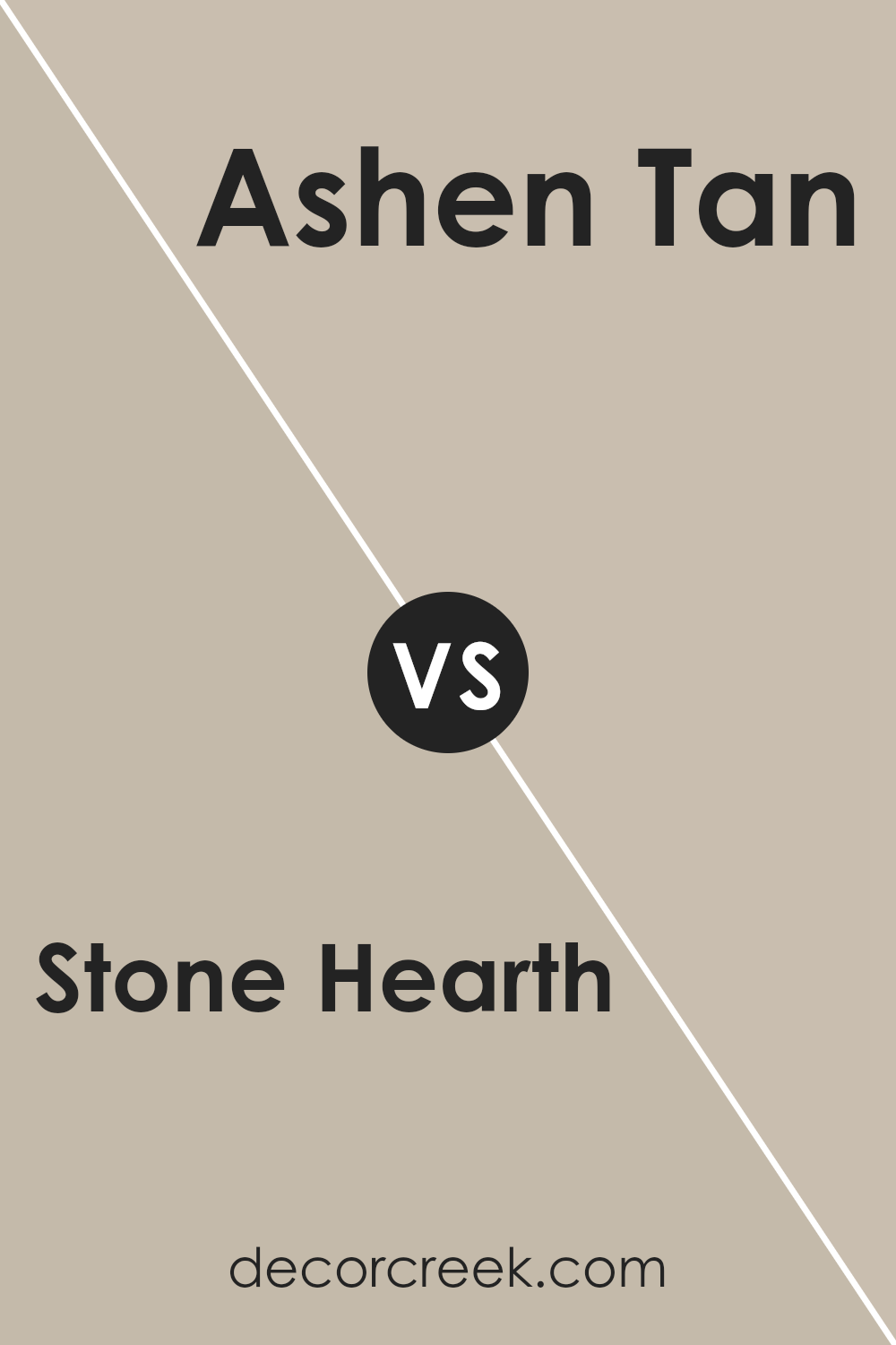
Stone Hearth 984 by Benjamin Moore vs Ashen Tan 996 by Benjamin Moore
Stone Hearth and Ashen Tan are two colors by Benjamin Moore that offer a subtle yet distinct difference in tone for your walls. The main color, Stone Hearth, is a soft, warm beige with a hint of taupe, creating a cozy atmosphere in any room. It’s a color that brings natural elements indoors, lending to a feeling of comfort and stability.
On the other hand, Ashen Tan leans towards a lighter, more neutral beige, without as much of the taupe undertone that Stone Hearth has. This color brightens up spaces while maintaining an earthy, grounded vibe. Both colors are versatile, but while Stone Hearth adds warmth and depth, Ashen Tan offers a cleaner, more open feel.
Choosing between them depends on the amount of light your room gets and whether you prefer a cozier or airier ambiance. Either way, they bring a touch of nature and relaxation to your home.
You can see recommended paint color below:
- 996 Ashen Tan
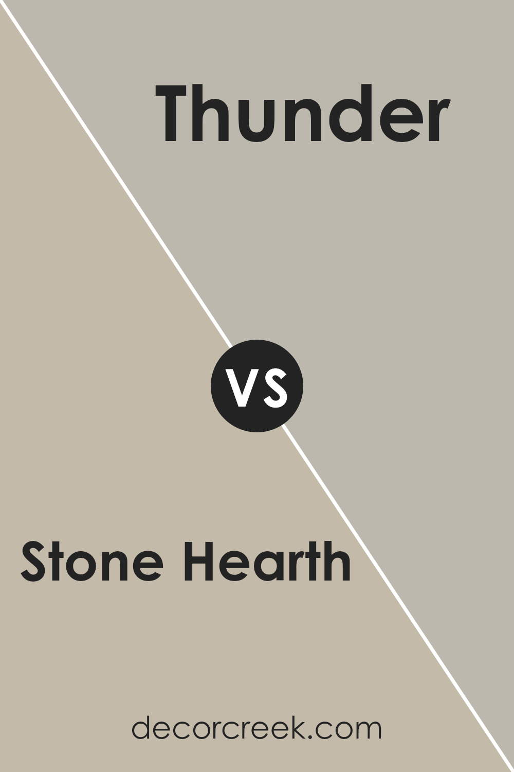
Stone Hearth 984 by Benjamin Moore vs Thunder AF-685 by Benjamin Moore
Stone Hearth and Thunder are two unique shades by Benjamin Moore that offer distinct vibes to any space. Stone Hearth is a warm, welcoming beige that has a comforting and soft presence. Perfect for creating a cozy and inviting atmosphere, it’s like a gentle hug for your walls. On the other hand, Thunder brings a cooler, more balanced gray to the table. It’s a shade that provides a modern and sophisticated touch, making it ideal for spaces that aim for a chic and elegant look.
While Stone Hearth leans towards a warmer palette, making rooms feel snug and serene, Thunder offers a more neutral backdrop, giving a sleek and contemporary feel. This makes Stone Hearth a top pick for those seeking a traditional, earthy ambiance and Thunder a go-to for lovers of minimalist, refined aesthetics. Both shades carry the quality and durability Benjamin Moore is known for, but their impacts on room atmosphere and mood are distinctly different.
You can see recommended paint color below:
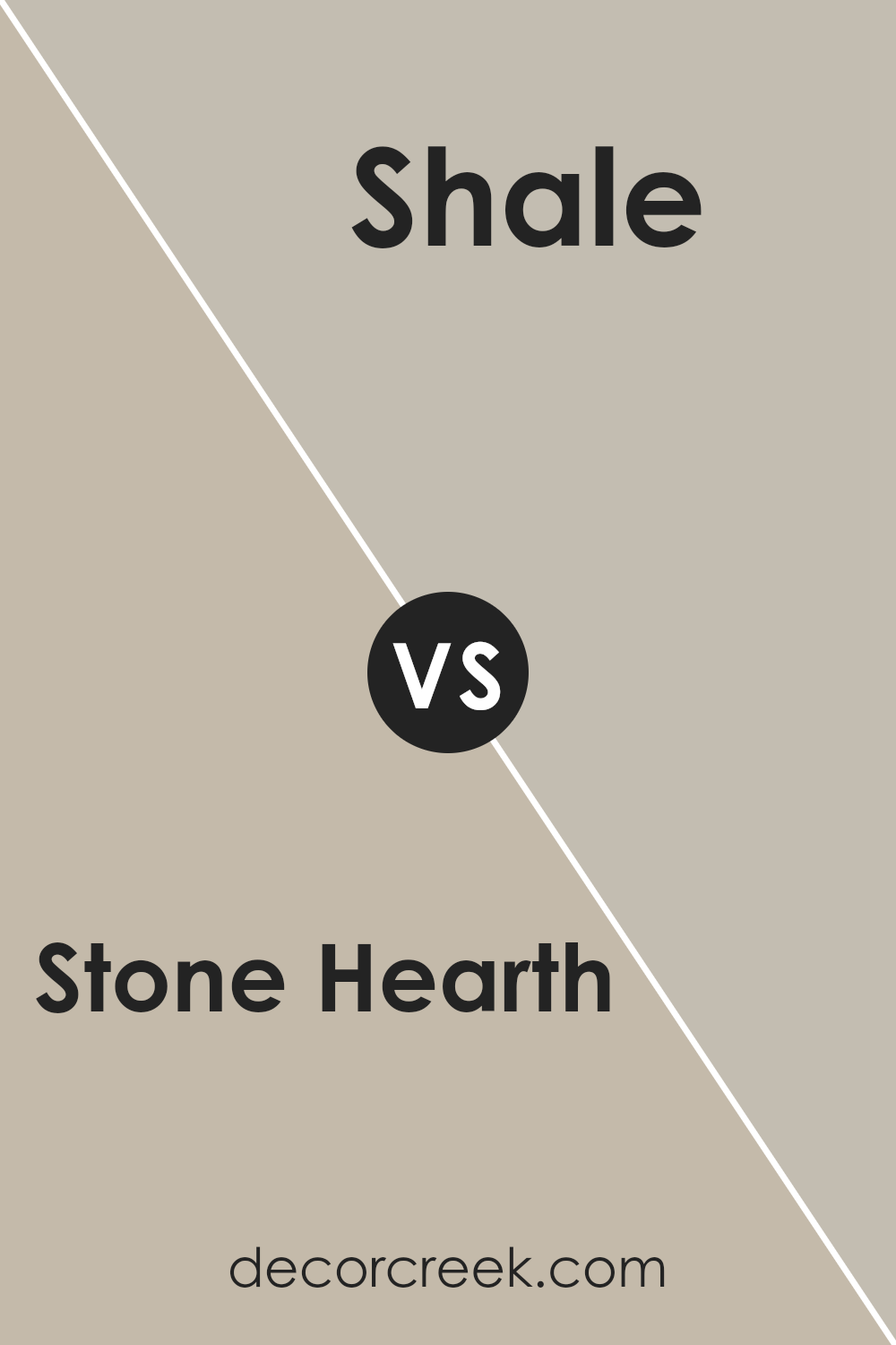
Stone Hearth 984 by Benjamin Moore vs Shale 861 by Benjamin Moore
Stone Hearth and Shale, both by Benjamin Moore, are unique colors that could beautifully complement a range of spaces. Stone Hearth has a warm, welcoming vibe to it. It’s like a cozy, soft blanket, offering a subtle mix of beige and gray. This color feels like a gentle hug for any room, creating a soothing backdrop that’s both inviting and comforting.
On the other side, Shale steps in with a cooler demeanor. Imagine a sleek, smooth stone found in a clear stream. It carries more gray than Stone Hearth, leaning towards a slightly more formal and sophisticated appearance. Shale is the kind of color that gives a space an elegant touch without being too bold or overwhelming.
While both colors share a certain neutrality, making them versatile for various settings, Stone Hearth brings warmth and coziness, perfect for a living room or bedroom. Shale, with its cool and calm gray tones, could be a great choice for modern kitchens or bathrooms. Each has its unique charm, depending on the atmosphere you’re aiming to create.
You can see recommended paint color below:
- 861 Shale
Conclusion
Stone Hearth, a color by Benjamin Moore, is acknowledged for its versatility and warmth, making it a popular choice for those looking to add a cozy and inviting feel to their spaces. Its unique blend creates a perfect backdrop that complements a variety of decor styles, from modern to traditional. This flexibility means it can seamlessly integrate into almost any room, enhancing the overall aesthetic without overwhelming the senses.
Furthermore, the subtle elegance of Stone Hearth makes it an ideal option for creating a tranquil and serene environment. Its earthy tones provide a soothing effect, making it particularly suitable for areas where relaxation is key, such as bedrooms and living rooms. This color’s ability to adapt while maintaining a sense of calm and comfort is what sets it apart, enabling homeowners to create spaces that feel both refined and welcoming.
Ever wished paint sampling was as easy as sticking a sticker? Guess what? Now it is! Discover Samplize's unique Peel & Stick samples.
Get paint samples

