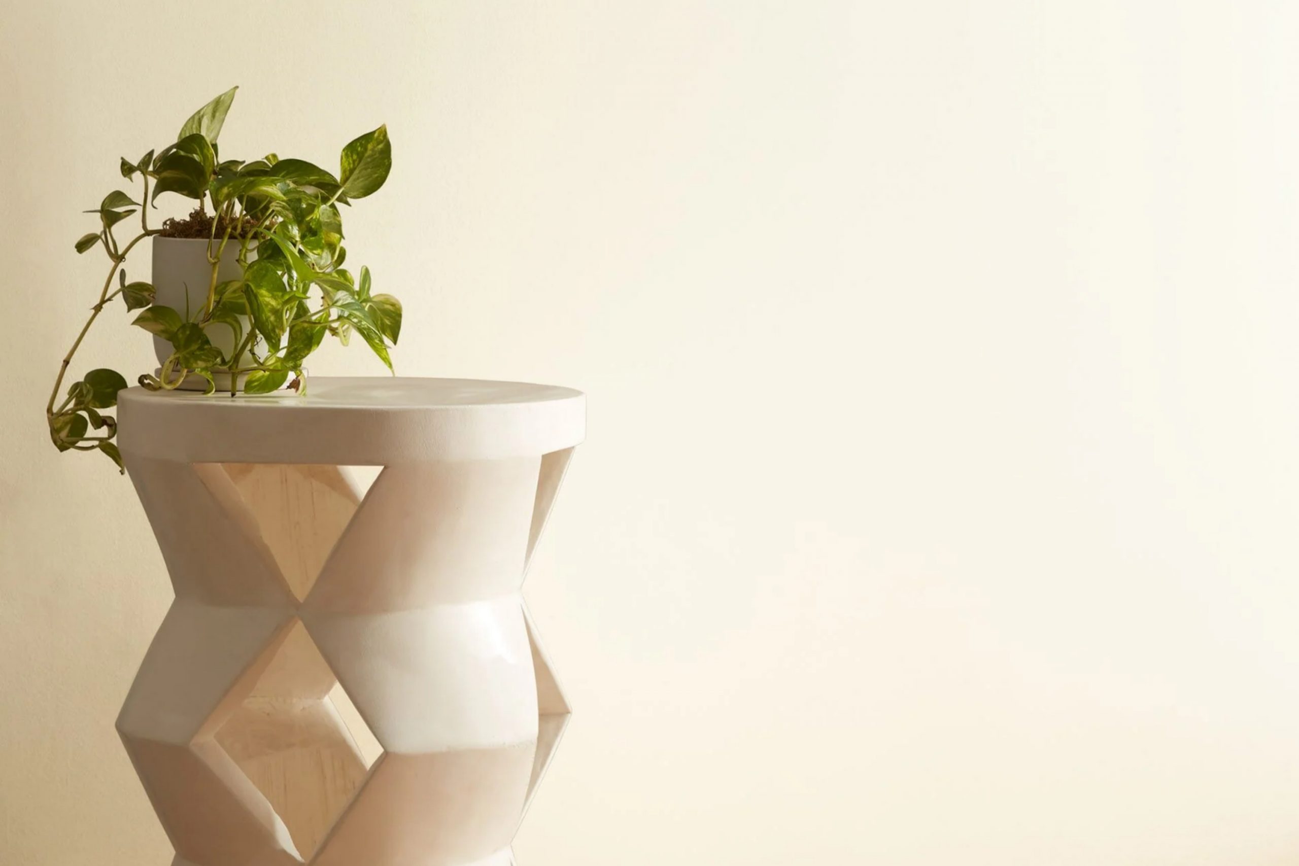
If you’re considering a fresh color for your walls, let me share a personal favorite, 925 Ivory White by Benjamin Moore. I recently chose this color for my living room refresh and couldn’t be happier with the results. It offers a clean, soothing presence that works wonderfully in spaces that crave a touch of softness without the starkness of pure white.
One of the best aspects of Ivory White is its versatility. It pairs beautifully with a wide array of décor styles, from modern minimalist pieces to more rustic, woodsy elements. This hue has an uncanny ability to pull a space together, making everything look intentional and cohesive.
Additionally, I’ve noticed that the color behaves differently depending on the natural light available, presenting a slightly creamy tone during the day and a warm, inviting glow by evening lighting. This chameleon-like quality keeps the space feeling dynamic yet tranquil as the day progresses.
Overall, opting for 925 Ivory White could be a great choice if you are looking for a color that brings a gentle brightness to a room while maintaining a warm, inviting atmosphere. It’s a shade that truly transforms a space into a serene and welcoming place to unwind.
What Color Is Ivory White 925 by Benjamin Moore?
Ivory White (925) by Benjamin Moore is a smooth, off-white color that brings a gentle warmth to any room. The slight creamy hint makes it more inviting than a stark white, offering a soft backdrop for various design styles. This shade pairs wonderfully with a broad range of interior looks, from traditional to modern and even coastal themes. Its subtle warmth works especially well in living areas and bedrooms where a calm and welcoming atmosphere is desired.
This versatile color coordinates easily with a spectrum of materials and textures. It looks particularly appealing with natural wood, enhancing its rich tones. Ivory White also complements materials like linen or cotton, creating a cozy, airy feel.
Metal accents in brushed nickel or soft brass are particularly striking against this off-white shade, providing a touch of contrast without overwhelming the space.
Ivory White is also practical in that it helps to brighten spaces without being too reflective, making it an excellent choice for areas that do not receive a lot of natural light.
Whether you’re aiming for a rustic charm with textured fabrics and distressed wood or a cleaner, more streamlined look with smooth surfaces and simple lines, this color offers a dependable base that supports an array of personal styles and preferences.
Is Ivory White 925 by Benjamin Moore Warm or Cool color?
Ivory White 925 by Benjamin Moore is a popular paint color choice for many homeowners due to its warm and inviting tone. This shade of white adds a soft, creamy feel to walls without being too stark or bright. It’s especially ideal for creating a cozy atmosphere in living areas and bedrooms where comfort is key.
The warm undertones of Ivory White can help make a room feel more welcoming and can complement various decor styles from traditional to modern. This flexibility makes it a great option for those looking to refresh their space without committing to a bold color change. Ivory White is also forgiving when it comes to lighting, looking equally pleasant in rooms with natural or artificial light.
By adding tasteful simplicity to a room, it allows other elements like furniture, artwork, and textiles to stand out. Using Ivory White can subtly enhance the overall feel of a home, making spaces seem larger and more open while maintaining a homely vibe. Its versatility in pairing with other colors and materials makes it a timeless choice for any interior.
Undertones of Ivory White 925 by Benjamin Moore
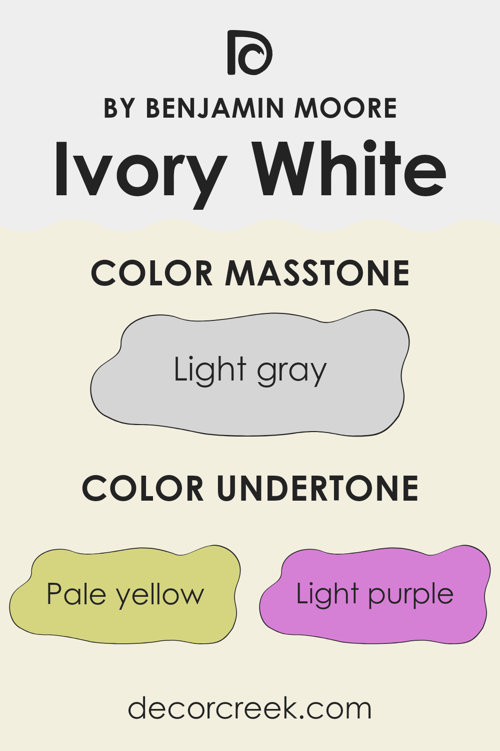
Ivory White 925 by Benjamin Moore is a popular paint color known for its versatility and warmth. This color has multiple undertones which include pale yellow, light purple, light blue, pale pink, mint, lilac, and grey. Understanding these undertones is key to using the color effectively in interior design.
Undertones are subtle hues that influence the main color shade, affecting how it appears under different lighting conditions. For Ivory White 925, the presence of pale yellow can make the color appear warmer and more inviting, which is ideal for living spaces where a cozy atmosphere is desired. Meanwhile, the hint of light purple adds a touch of calmness, softening the overall feel of the room.
The light blue undertone can invoke a sense of freshness and openness, making it a great choice for bathrooms and kitchens, while the pale pink can add a subtle hint of cheerfulness to any space. The mint and lilac undertones introduce a slight coolness, which can balance out rooms with plenty of natural light and prevent them from feeling overly warm. Lastly, the grey undertone helps ground the color, ensuring it doesn’t lean too far toward overly sweet or bright, and providing a neutral backdrop that complements various decor styles and elements.
When applying Ivory White 925 on interior walls, these undertones interact with the room’s natural and artificial lighting, furnishings, and decor elements, creating an inviting and adaptable backdrop. This color’s ability to blend seamlessly with many different styles and accessories makes it a favorite among homeowners and designers seeking a reliable yet flexible wall color.
What is the Masstone of the Ivory White 925 by Benjamin Moore?
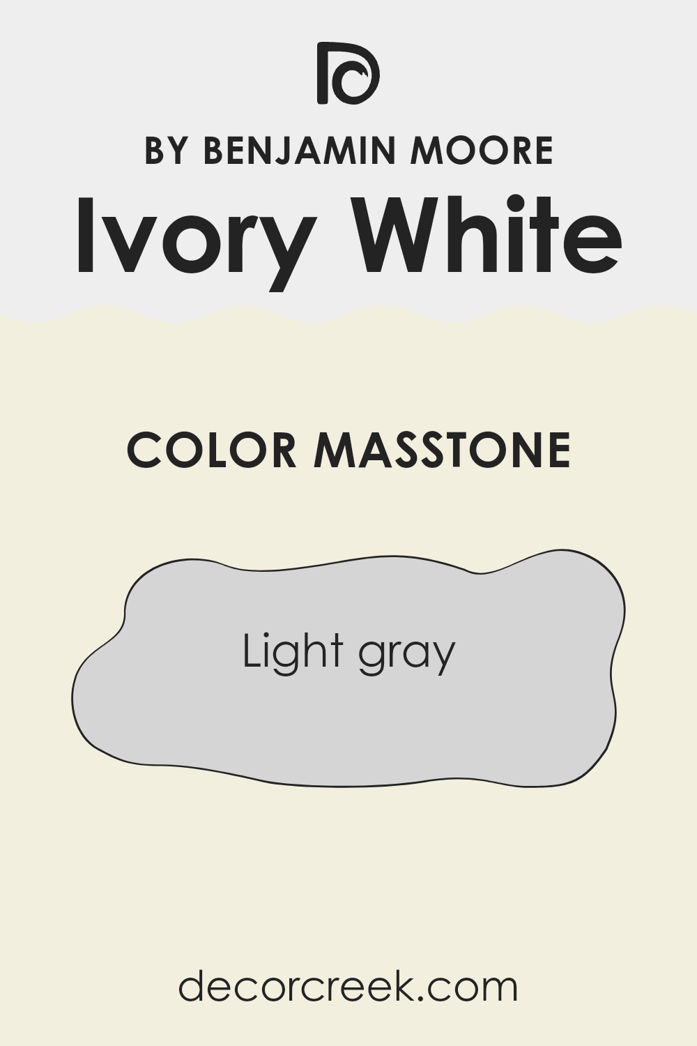
Ivory White 925 by Benjamin Moore has a masstone of Light Gray, labeled as #D5D5D5. This subtle and neutral shade is highly versatile, which makes it a popular choice for homeowners. Its light gray tone provides a clean and fresh look, making spaces appear brighter and more open.
This color can easily blend with different decor styles and furniture colors, allowing for a seamless integration into any room. It’s an excellent option for walls in living areas, bedrooms, and kitchens because it doesn’t overpower the space with color but still adds a touch of warmth.
The neutrality of Ivory White 925 means it can also be used to refresh smaller spaces like bathrooms and hallways, giving them a more spacious feel. Additionally, this color works well as a background for hanging art or displaying other decorative elements, as it doesn’t clash and lets other colors pop against it.
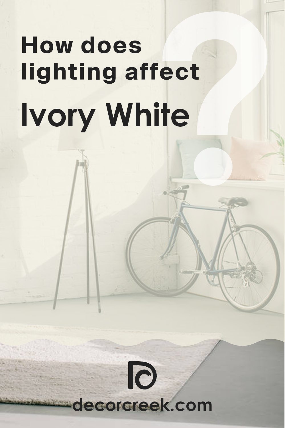
How Does Lighting Affect Ivory White 925 by Benjamin Moore?
Lighting plays a crucial role in how we perceive colors. This fact is especially important in interior design, where the color of paint can significantly alter the mood and feel of a space. Ivory White by Benjamin Moore is a versatile shade that can look quite different depending on the type of light it is exposed to.
In artificial light, Ivory White tends to have a warm and welcoming feel. Most artificial lights, like incandescent and LED bulbs, can bring out the yellow and beige undertones in the paint, making a room feel cozy and inviting. This effect is perfect for living spaces and bedrooms where a softer, more comforting atmosphere is desired.
In natural light, the color can vary depending on the direction of the light. Rooms that face north typically receive less direct sunlight, which can make Ivory White appear slightly cooler and more muted. This might give the room a calm and laid-back appearance. In contrast, south-facing rooms get a lot of sunlight throughout the day, which can make Ivory White look brighter and more vibrant, enhancing its warm undertones and making the space feel lively and energetic.
For east-facing rooms, the morning light can make Ivory White look very soft and warm, creating a perfect setting for starting the day. As the light changes, the color cools down, maintaining a neutral and balanced look.
West-facing rooms, on the other hand, get afternoon and evening light which can make the paint color look warmer and richer towards the end of the day, providing a comforting environment during relaxation hours.
Overall, Ivory White by Benjamin Moore is a flexible color that can adapt to different lighting conditions, offering various atmospheres throughout the day and across different room orientations.
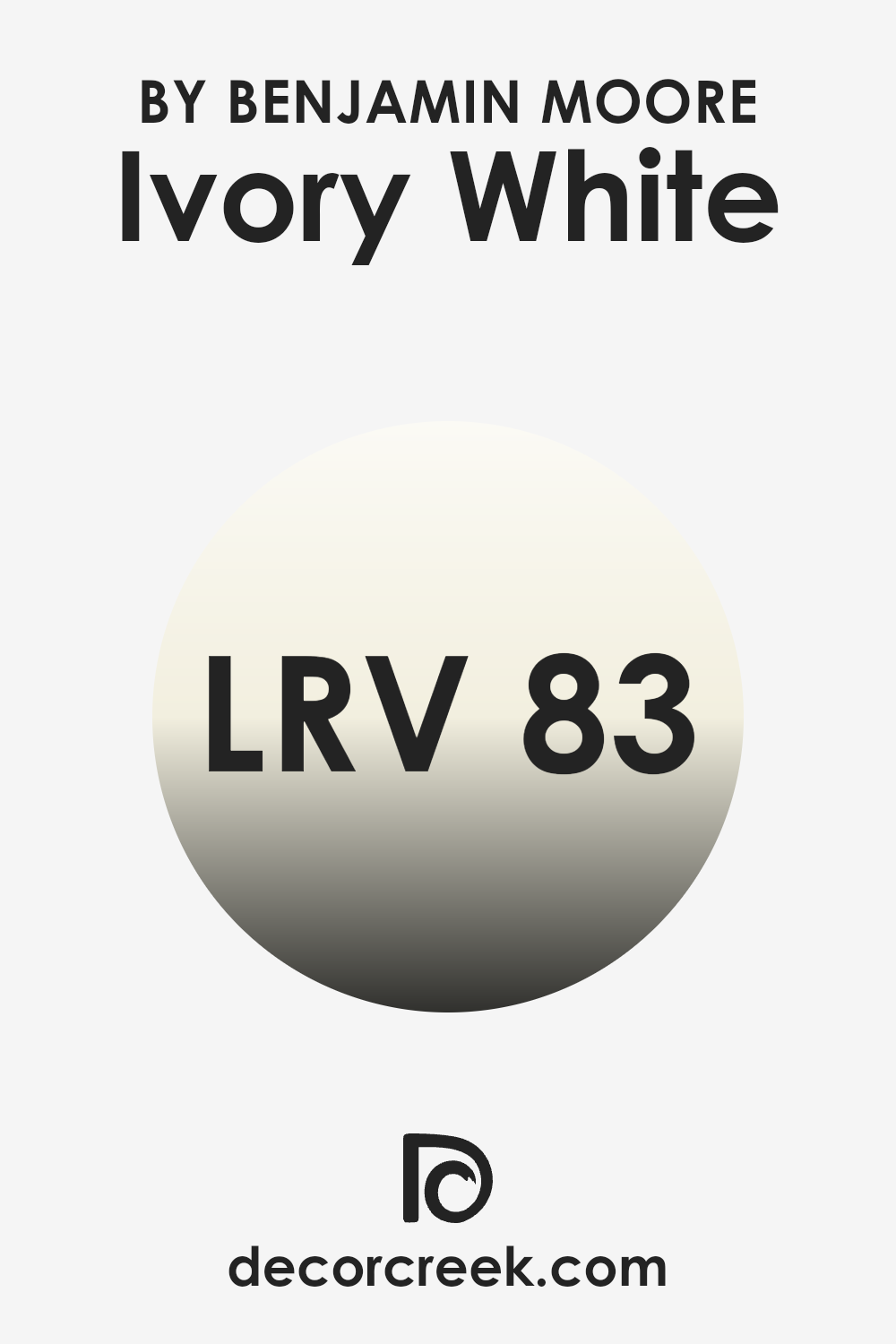
What is the LRV of Ivory White 925 by Benjamin Moore?
LRV stands for Light Reflectance Value, a measure used to indicate how much light a paint color reflects or absorbs when applied to a wall. LRV values range from a low of zero, which reflects no light and absorbs all light (like a true black), to high values near the top of the scale, which reflect nearly all light (like a pure white).
Colors with higher LRV make rooms feel brighter since they reflect more light into the space. This is particularly useful to know when choosing paint colors for darker rooms that you wish to brighten up or for spaces where a light, airy feeling is desired.
For the specific color of Benjamin Moore’s Ivory White, which has an LRV of 83.32, this means the color is very light and reflects a lot of light. In practical terms, when applied to interior walls, Ivory White can make a space appear larger and more open by brightening it up.
This light shade is excellent for smaller rooms or areas with limited natural light, as it helps maximize the light available and creates a fresh, clean look.
The high LRV also means that colors and decorations used in the room will stand out more clearly against the light background, offering a subtle backdrop rather than competing with other elements in the space.
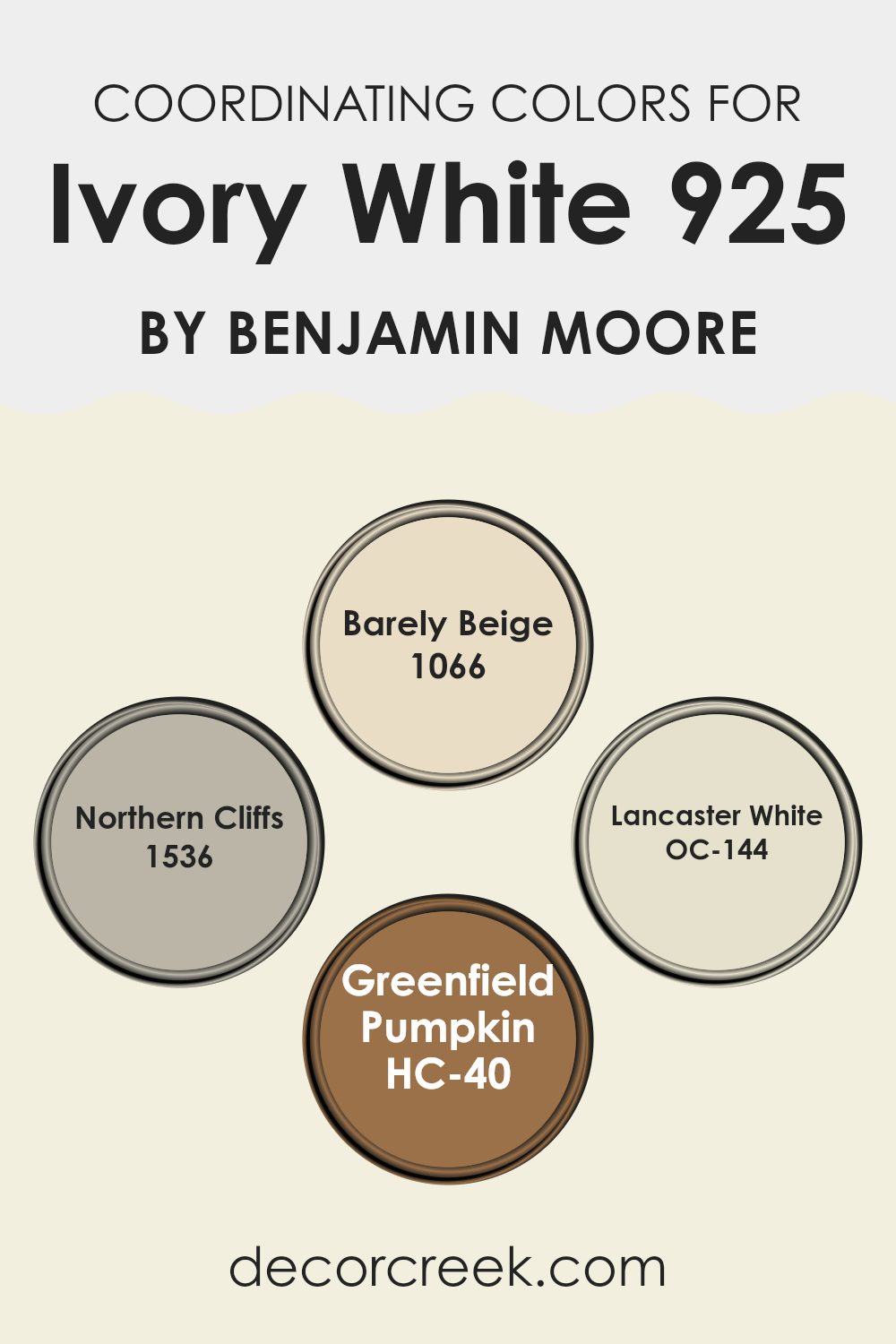
Coordinating Colors of Ivory White 925 by Benjamin Moore
Coordinating colors are shades that complement each other well, either by being in harmony or by offering a balanced contrast. Choosing coordinating colors involves selecting hues that create a visually appealing palette, enhancing the effect of each individual color. For instance, when working with a neutral base like ivory white, selecting the right coordinating colors can subtly enrich the ambiance of a room.
Among the coordinating colors for ivory white, Barely Beige 1066 is a soft and muted shade that provides a warm backdrop, making spaces feel cozy without overwhelming with color. Next, Northern Cliffs 1536 offers a deeper, gray-infused tone that adds depth and definition, ideal for accent walls or furniture pieces to stand out more prominently.
Lancaster White OC-144 is almost as light as the base ivory but has a hint of warmth to prevent a space from seeming too stark, offering a fresh and clean look. Finally, Greenfield Pumpkin HC-40 brings in a lively splash of color with its rich, pumpkin-like hue, perfect for adding a pop of vibrancy to a room that predominantly features lighter, neutral tones. Together, these colors work seamlessly to create a balanced and pleasant environment.
You can see recommended paint colors below:
- 1066 Barely Beige
- 1536 Northern Cliffs
- OC-144 Lancaster White
- HC-40 Greenfield Pumpkin
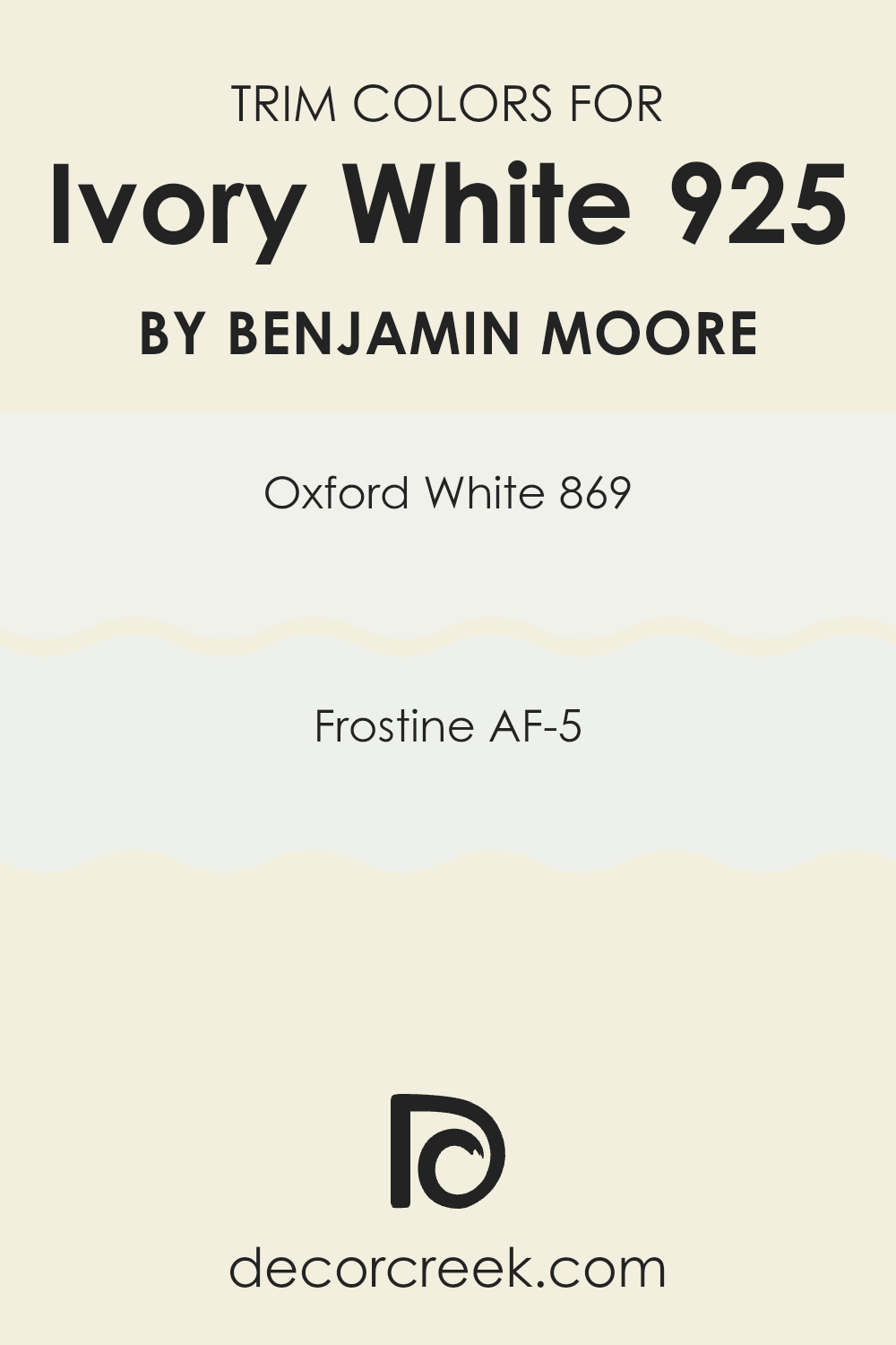
What are the Trim colors of Ivory White 925 by Benjamin Moore?
Trim colors are specific shades used predominantly for painting the architectural details such as door frames, window frames, baseboards, and crown moldings. When paired effectively, trim colors can complement the main wall color and enhance the overall aesthetic of a room. For a wall painted with Ivory White by Benjamin Moore, trim colors like Oxford White and Frostine offer subtle contrasts that can gently define the spatial contours without overwhelming the soft tone of Ivory White.
Oxford White 869 is a clean and fresh shade of white that maintains a sense of crispness around the edges of a room. It creates a gentle distinction against Ivory White, making it a good choice for a refined look.
Frostine AF-5, on the other hand, is slightly cooler and has a hint of gray, providing a muted but striking contrast which is ideal for enhancing architectural details without causing a stark visual break with the softer Ivory White backdrop. Both colors support the primary wall shade by lending an understated depth to the space, making the room appear more polished and thoughtfully designed.
You can see recommended paint colors below:
- 869 Oxford White
- AF-5 Frostine
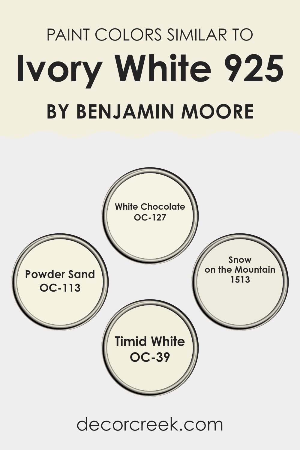
Colors Similar to Ivory White 925 by Benjamin Moore
Choosing similar colors to Ivory White by Benjamin Moore can pave the way to a cohesive visual experience in any interior space. Colors like White Chocolate, Powder Sand, Snow on the Mountain, and Timid White harmonize seamlessly with the soft, creamy tone of Ivory White.
This similarity aids in creating a fluid decor theme, where transitions between walls, trims, and accents are smooth and visually RESTFUL.
Such a palette reduces jarring contrasts, allowing the eyes to move effortlessly around the room, thus enhancing the overall aesthetic appeal without stark interruptions.
White Chocolate offers a rich, creamy tone, introducing a slightly warmer hue that compliments Ivory White’s base, adding depth while still retaining a light and airy feel. Powder Sand has a slightly more BEACHY vibe, adding subtle warmth to spaces and pairing pleasantly with darker wood tones or textiles.
Snow on the Mountain carries with it a hint of gray, giving it a cool, understated presence that can add dimension while maintaining the inherent brightness of a predominantly white color scheme. Lastly, Timid White boasts a hint of soft beige, creating an inviting atmosphere and working particularly well in sunlit areas, reflecting light while adding a touch of coziness.
These colors, while closely allied, each offer their unique character, enriching any space with varied but harmonious visual layers.
You can see recommended paint colors below:
- OC-127 White Chocolate
- OC-113 Powder Sand
- 1513 Snow on the Mountain
- OC-39 Timid White
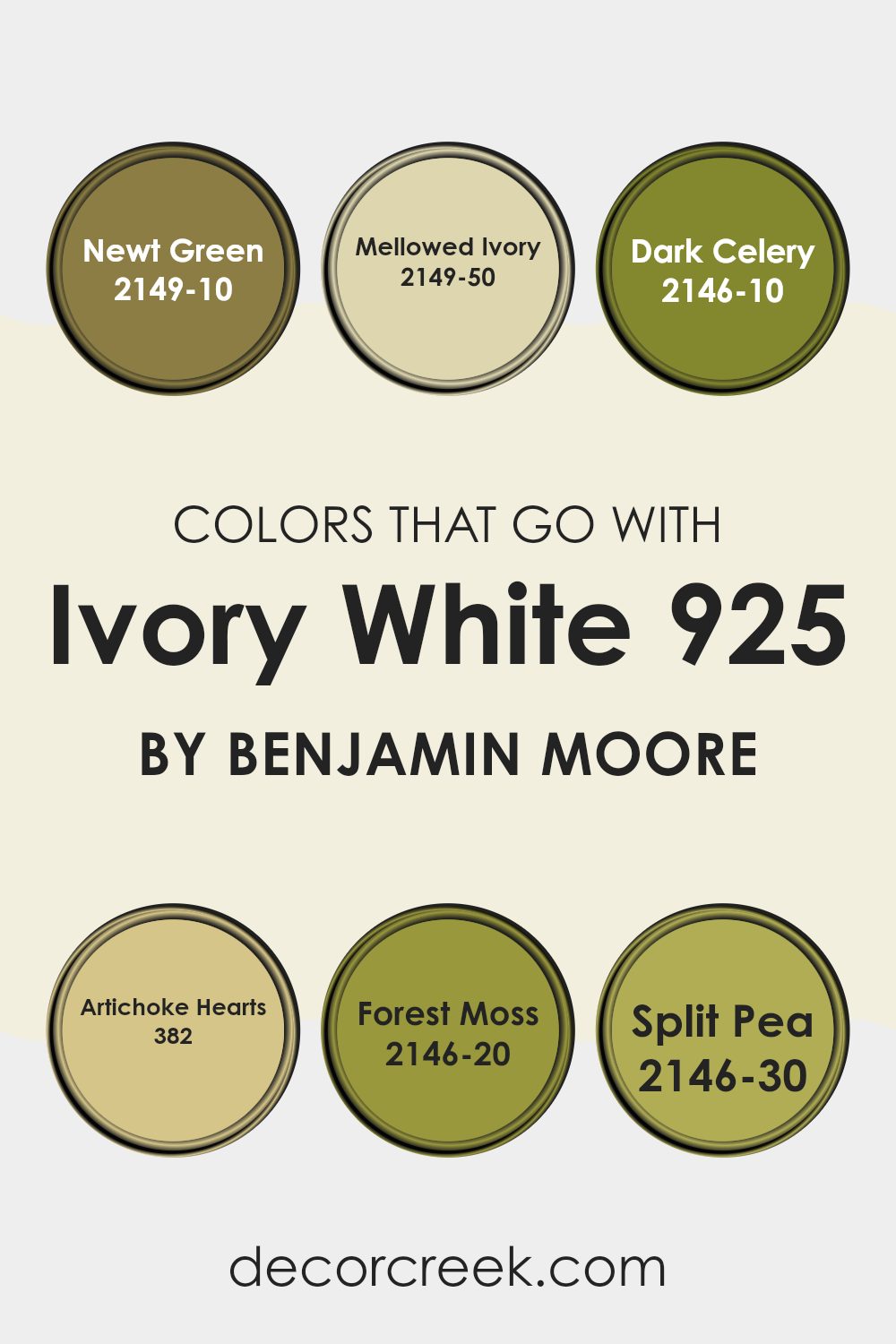
Colors that Go With Ivory White 925 by Benjamin Moore
Choosing colors that harmonize well with Ivory White 925 by Benjamin Moore can significantly impact the ambiance of a room by creating a cohesive and appealing aesthetic. Ivory White itself is a versatile and warm shade, which makes it an ideal background for a diverse range of colors. When paired with compatible hues, it helps to create a space that is inviting and visually balanced.
Newt Green, a deep and vibrant green, adds a bold pop of color that contrasts beautifully against the softness of Ivory White. This combination can bring a lively and dynamic element to the decor. Mellowed Ivory, a subtle and slightly more muted tone, works naturally with Ivory White, offering a gentle enhancement that enriches the space without overwhelming it.
Dark Celery, with its rich, earthy tone, introduces a rustic feel that adds depth and character when used alongside Ivory White. Artichoke Hearts, a subdued yet rich green, complements Ivory White in a way that’s harmonious and grounding, ideal for creating a cozy atmosphere.
Forest Moss, a deep and dense green, provides a dramatic and lush feel, imbuing any room with a sense of lushness when teamed with the crispness of Ivory White.
Split Pea, a vibrant and cheerful green, offers an energetic burst that brings freshness and zest to the mild backdrop of Ivory White, perfect for spaces intended to feel more lively and inviting.
You can see recommended paint colors below:
- 2149-10 Newt Green
- 2149-50 Mellowed Ivory
- 2146-10 Dark Celery
- 382 Artichoke Hearts
- 2146-20 Forest Moss
- 2146-30 Split Pea
How to Use Ivory White 925 by Benjamin Moore In Your Home?
Ivory White 925 by Benjamin Moore is a soft white paint color that can be used in various ways throughout your home. It’s known for its gentle tone, which works well with different decorating styles. For instance, in a living room or bedroom, Ivory White can set a calm and welcoming atmosphere. This color is especially great for spaces that don’t get a lot of natural light, as it helps make rooms appear brighter and more open.
In kitchens, Ivory White pairs beautifully with cabinets and woodwork, offering a clean and fresh look. It’s also a fantastic choice for trim and doors, providing a subtle contrast against bolder wall colors without being too stark. You can use it in bathrooms as well, where it helps create a clean and fresh vibe.
For those looking to add a touch of warmth to their walls without overwhelming the space, Ivory White is an excellent choice. It works harmoniously with many decor elements, from modern to rustic, making it a versatile option for any home.
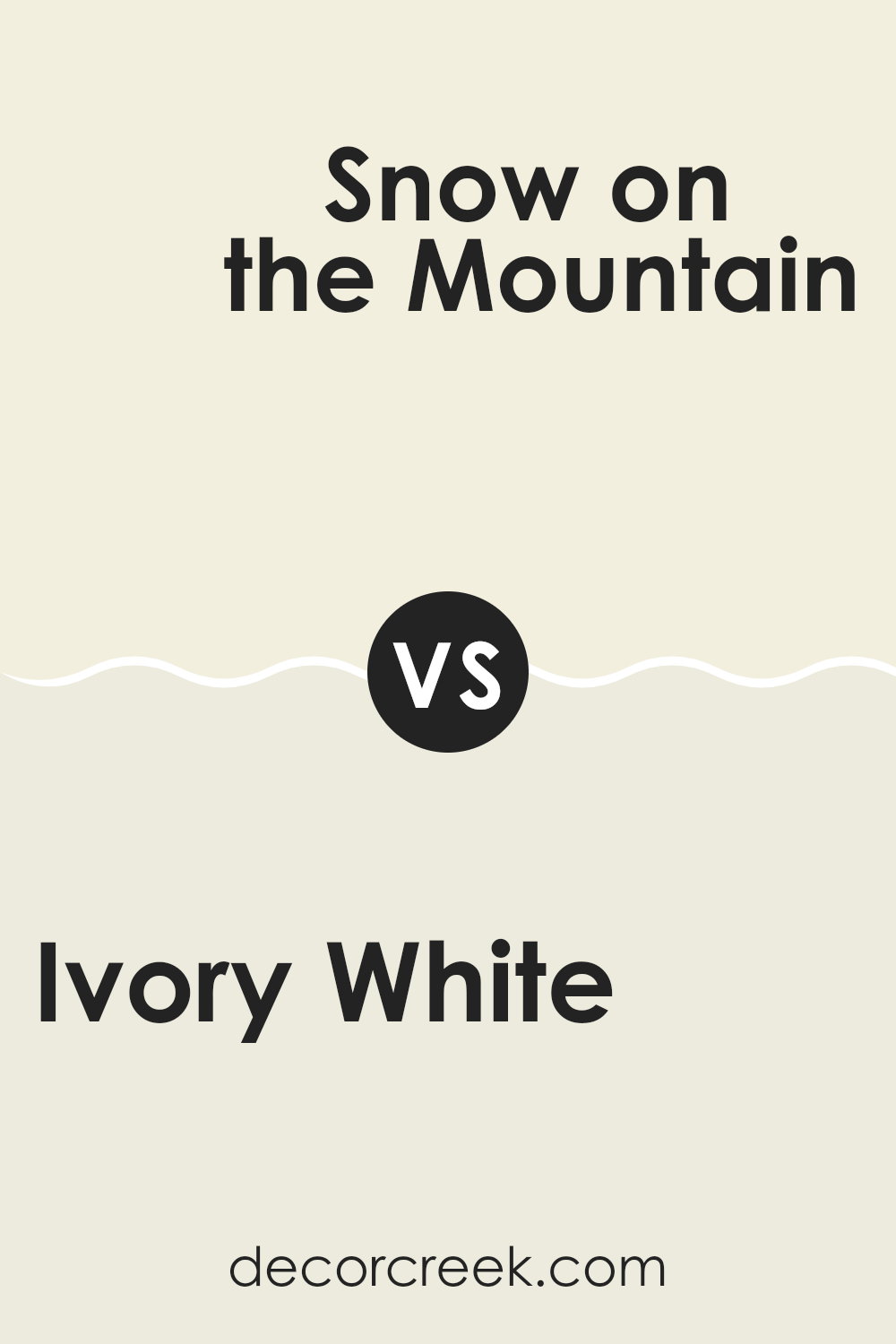
Ivory White 925 by Benjamin Moore vs Snow on the Mountain 1513 by Benjamin Moore
The main color, Ivory White, and the second color, Snow on the Mountain, both by Benjamin Moore, present subtle differences that make each unique. Ivory White has a warm undertone, softly enriching the space with a cozy feel that leans a bit toward beige. This makes it quite versatile for rooms where you want a soft, welcoming atmosphere such as living rooms or bedrooms.
On the other hand, Snow on the Mountain appears slightly cooler compared to Ivory White. It has hints of grey, which gives it a fresher, crisper look. This color is excellent for spaces that aim for a bright, airy feel like kitchens and bathrooms or even small spaces that you want to appear larger.
Both colors are light and neutral, making them easy to pair with various decor styles and other colors. Depending on the mood you want to set or the specific characteristics of the space, one might suit better than the other.
You can see recommended paint color below:
- 1513 Snow on the Mountain
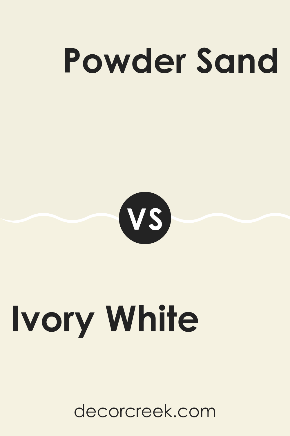
Ivory White 925 by Benjamin Moore vs Powder Sand OC-113 by Benjamin Moore
Ivory White 925 and Powder Sand OC-113 are two subtle paint colors by Benjamin Moore. Ivory White 925 is a warm white with a slightly creamy tone, making it a cozy choice for spaces where you want a touch of warmth without it feeling too stark. It pairs well with various decor styles and adds a soft, welcoming vibe to rooms.
On the other hand, Powder Sand OC-113 is a bit cooler than Ivory White, leaning towards a very light beige with hints of gray. This color reflects light beautifully, making small spaces seem larger and more open. It’s an excellent choice for someone looking for a neutral with a bit more depth than a plain white.
Both colors are versatile and can be used in various spaces, from living rooms to bedrooms, providing a clean, fresh backdrop. However, the choice between them depends on the mood you’re aiming for—warmer and cozier with Ivory White or cooler and slightly more modern with Powder Sand.
You can see recommended paint color below:
- OC-113 Powder Sand
Ivory White 925 by Benjamin Moore vs Timid White OC-39 by Benjamin Moore
Ivory White 925 and Timid White OC-39 by Benjamin Moore are two subtle shades of white that each offer a distinctive vibe to any space. Ivory White has a warmer undertone, which makes it feel cozy and welcoming, ideal for living rooms or bedrooms where you want a soft, inviting atmosphere. This color pairs well with earthy tones and natural materials like wood or linen.
On the other hand, Timid White leans slightly towards a cooler tone, which gives it a fresh and clean appearance. This makes it great for kitchens, bathrooms, or any area that benefits from a crisp, clear look. Its cooler undertone can help make small spaces seem bigger because it reflects light well.
Both colors are versatile but serve slightly different purposes based on their undertones. Whether you choose Ivory White for its warmth or Timid White for its clarity, both will provide a subtle, refined backdrop to your decor.
You can see recommended paint color below:
- OC-39 Timid White
Ivory White 925 by Benjamin Moore vs White Chocolate OC-127 by Benjamin Moore
Comparing Ivory White 925 and White Chocolate OC-127 from Benjamin Moore, both colors are variations of white but have distinct tones that set them apart. Ivory White leans towards a creamy, slightly warm hue that can add a gentle cozy feel to a space. It’s soft and subtle, making it a great choice for rooms where you want a touch of warmth without overpowering with color.
On the other hand, White Chocolate has a richer, deeper tone, resembling the color of white chocolate as its name suggests. It exudes a hint of beige or light taupe, providing a slightly more pronounced presence than Ivory White. This color is ideal if you’re looking for a white that still brings a bit of depth and warmth to a room, but with a hint more richness than the paler Ivory White.
Both are versatile and can work beautifully in various settings, depending on the mood or atmosphere you’re aiming to achieve in your space.
You can see recommended paint color below:
- OC-127 White Chocolate
It’s not too strong, it blends in well with all kinds of decorations and furniture colors. If someone is thinking about repainting their room or even their whole house, Ivory White could be a great choice.
It’s like a friendly smile for your walls — it makes everything look good without trying too hard.
Whether you’re fixing up a small corner or a big living room, this color could be just the right touch to make your home look neat and tidy.
Ever wished paint sampling was as easy as sticking a sticker? Guess what? Now it is! Discover Samplize's unique Peel & Stick samples.
Get paint samples

