If you’re thinking about giving your room a fresh coat of paint, you might find this color very appealing.
Oxford White is known for its clean and pure appearance, making it a favorite for anyone looking to brighten up their space.
It’s not just plain white; it has a subtle richness that avoids feeling too stark or cold, which can be a common issue with some whites.
This shade works wonderfully in a variety of settings, whether you’re painting a sunny kitchen or a quiet bedroom.
It reflects light beautifully, creating a lively and inviting atmosphere. Moreover, Oxford White pairs well with nearly any decor style, from modern to traditional, making it incredibly versatile for your decorating needs.
Whether you have a lot of colorful art or more understated furnishings, this color creates a lovely backdrop that complements different textures and shades in your furnishings and accessories. If you’re considering a new look for your home, Oxford White might be just what you need.
What Color Is Oxford White 869 by Benjamin Moore?
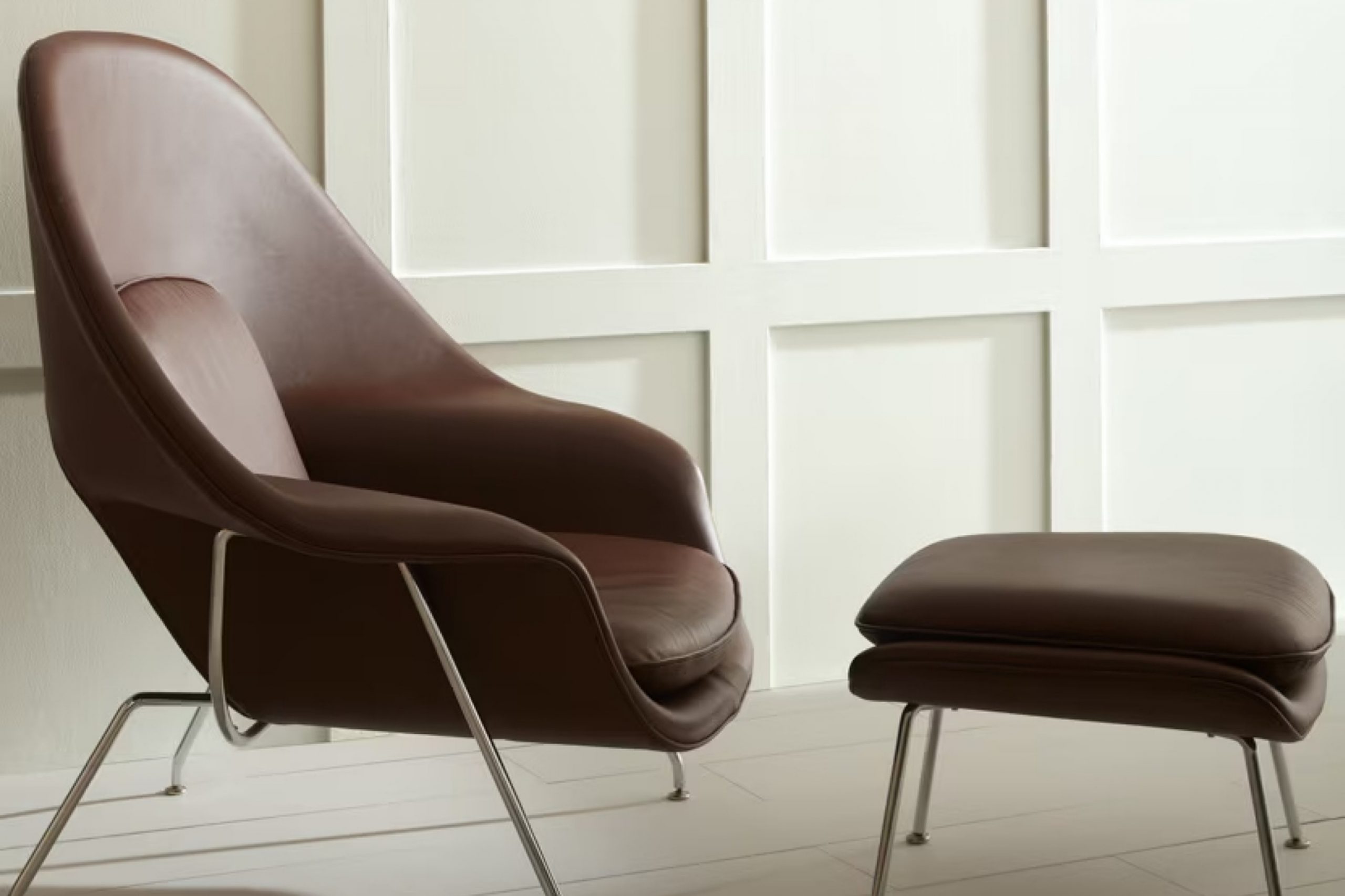
Oxford White by Benjamin Moore is a crisp and clean white that brings a fresh and bright vibe to any room. With its subtle warmth, it avoids the clinical feel that some whites can have, making it an excellent choice for creating a welcoming atmosphere. This particular shade of white is versatile, suited to both modern and traditional interior styles.
In contemporary spaces, Oxford White pairs wonderfully with sleek materials like glass and polished metal, enhancing a minimalist aesthetic without making the space feel cold.
It can also successfully soften industrial designs when used alongside exposed brick or raw concrete, providing a nice balance that feels lived-in and cozy.
For those who prefer a more classic or rustic look, this white works beautifully with natural wood, from dark walnut to lighter oaks, adding a breath of freshness to rich textures.
It’s equally lovely with softer textures such as linen or cotton, making it a fantastic backdrop for a cozy farmhouse or cottage-style interior.
This paint color is particularly effective in spaces that aim for a bright and airy feel, such as kitchens and bathrooms, as well as in small rooms that you want to appear more spacious. It reflects light beautifully, helping to make any room feel larger and more open.
Is Oxford White 869 by Benjamin Moore Warm or Cool color?
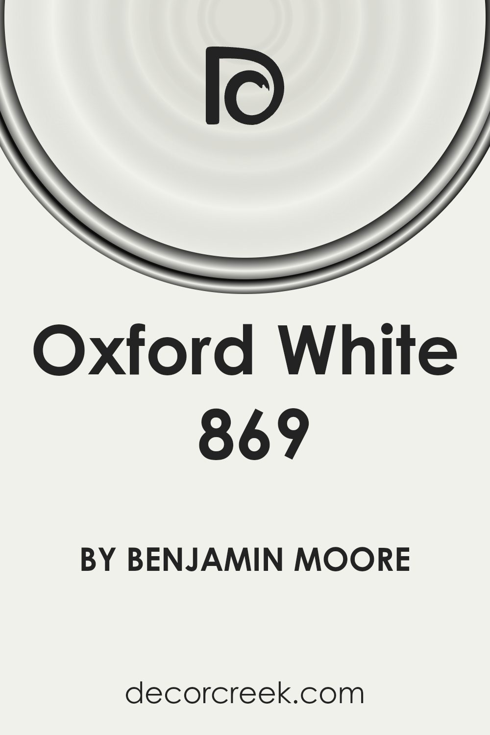
Oxford White 869 by Benjamin Moore is a popular paint color known for its clean and simple look. This shade of white has a slightly warm tone, making it inviting and ideal for use in various rooms in your home. One of the main advantages of using Oxford White is its flexibility; it can be paired with just about any decor style, from modern to traditional. Whether you’re painting your living room, bedroom, or kitchen, this color provides a fresh and clean backdrop that makes your furniture and art pop.
Additionally, Oxford White is great for small spaces. It reflects light well, helping to make rooms look larger and more open. It’s also a good choice for hallways or other areas that may not get a lot of natural light.
Easy to apply and maintain, this paint represents a straightforward way to refresh your space without overwhelming it, ensuring your home feels welcoming and bright.
Undertones of Oxford White 869 by Benjamin Moore
Oxford White by Benjamin Moore is a popular paint color known for its versatility and clean appearance. However, the way we perceive this seemingly simple white can vary greatly due to its undertones. Undertones are subtle hues that influence the main color, affecting how it looks in different lighting and alongside other colors.
Oxford White has a complex mix of undertones including pale yellow, light blue, light purple, mint, pale pink, lilac, and grey. These undertones can make the white appear warmer or cooler depending on the surrounding colors and light sources.
For instance, the pale yellow and pale pink undertones can give the paint a warmer feel, making a room feel cozy and inviting. On the other hand, light blue, mint, and lilac undertones can impart a cooler touch, making a space feel more open and airy.
The presence of grey undertone adds a neutral balance, ensuring that the color maintains a certain crispness without becoming too stark or cold. This makes Oxford White a great choice for interior walls as it can complement a wide range of decor styles and color schemes.
When used on interior walls, the varied undertones of Oxford White can subtly influence the mood and feel of a room. The specific lighting, whether natural or artificial, as well as furnishings, can accentuate different undertones, thus subtly altering the visual impact and ambiance of the space.
What is the Masstone of the Oxford White 869 by Benjamin Moore?
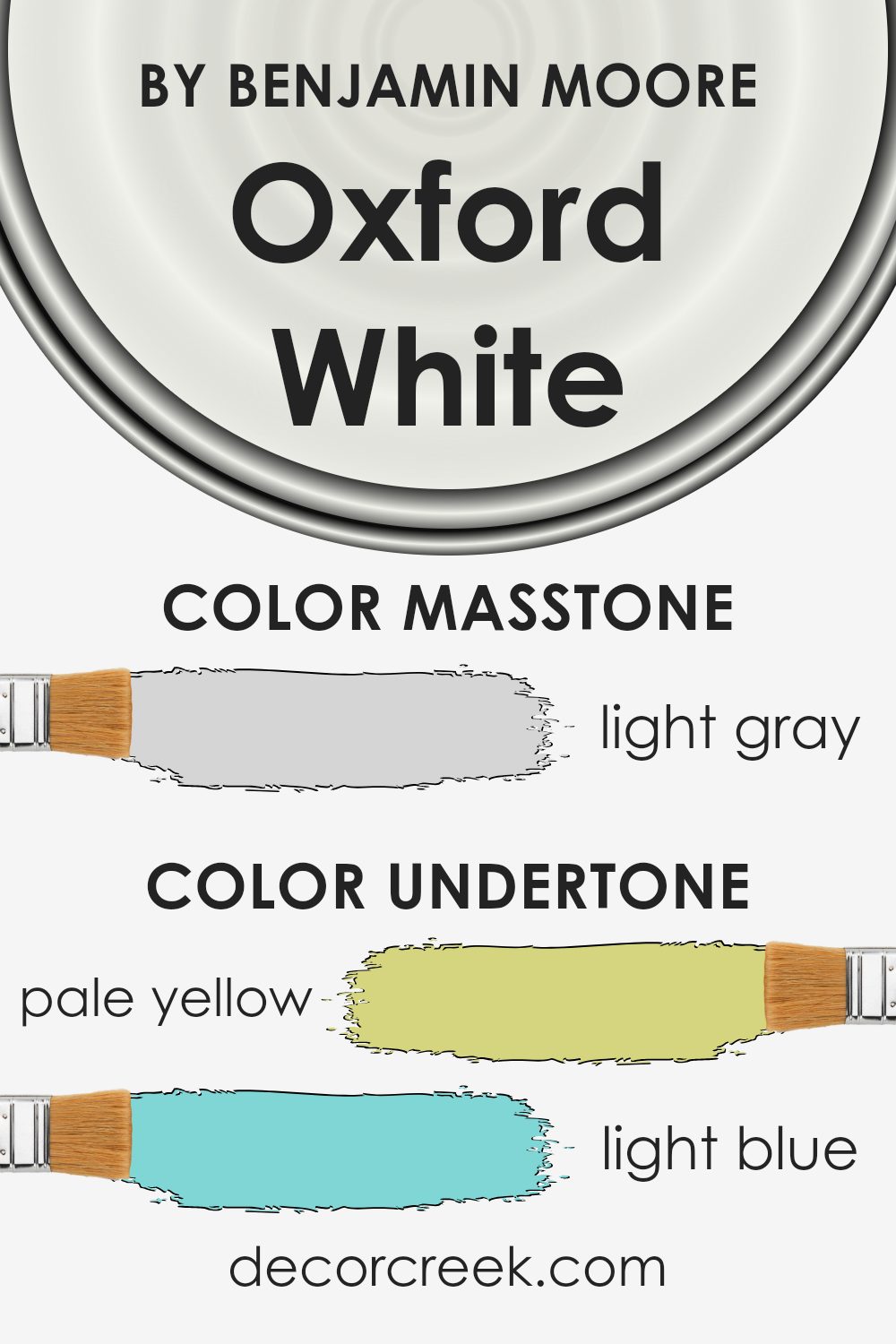
Oxford White 869 by Benjamin Moore, a light gray shade, creates a subtle backdrop in homes. Its hue is clean and fresh, often making rooms feel airy and spacious. Even in small spaces, this color prevents the feeling of being boxed in, reflecting light to make areas appear larger.
Since it’s a neutral tone, it blends well with various décor styles and color schemes, from bold and colorful art pieces to classic wood furniture.
Homeowners favor using this color because it offers a minimalistic feel without being too stark, making it easier to add personal accents that truly make a home feel unique.
The cool undertones of this light gray can also help balance out rooms that receive a lot of sunlight, maintaining a cool atmosphere throughout the day. Overall, its flexibility and understated elegance make it a go-to choice for creating a welcoming, stylish home environment.
How Does Lighting Affect Oxford White 869 by Benjamin Moore?
Lighting plays a crucial role in how colors are perceived in any given space. The impact of lighting on colors like Oxford White by Benjamin Moore can significantly influence the atmosphere and feel of a room.
Natural Light
Oxford White reacts differently under various natural lighting conditions:
- North-Faced Rooms: These rooms get less direct sunlight, which can make colors appear slightly cooler. Oxford White in this setting may lean toward a cooler, crisp white rather than its typically warm undertone.
- South-Faced Rooms: Abundant in sunlight, south-facing rooms bathe colors in warm, bright light for most of the day. Here, Oxford White will look very bright and can bring out any subtle warm undertones in the paint.
- East-Faced Rooms: Morning light in these rooms provides a bright and warm appearance at the beginning of the day, making Oxford White look very vibrant and fresh in the mornings and more neutral towards the evening.
- West-Faced Rooms: The evening sun in these rooms offers a similar effect to morning light, but with the potential for dramatic shadows and highlights as the sun sets. Oxford White will tend to feel warmer and more welcoming in the afternoon and evening.
Artificial Light:
Different types of artificial light affect how Oxford White appears:
- Incandescent Lighting:This lighting adds a yellowish hue, enhancing the warmer undertones of Oxford White, making spaces feel cozier.
- Fluorescent Lighting: Often emitting a flat, cool light, fluorescent bulbs can drain warmth from colors, making Oxford White appear more stark and pure.
- LED Lighting: Depending on the color temperature of the LED (measured in Kelvin), it can simulate either daylight (making it appear true to color) or a warmer tone (bringing out subtle warm notes in the paint).
Understanding how Oxford White reacts under different light conditions helps in making informed decisions about using this color in various rooms, ensuring that it always enhances the beauty and functionality of the space it adorns.
Whether used in a bedroom, living room, or kitchen, considering the light exposure will help in achieving the desired ambiance and aesthetic effect.
What is the LRV of Oxford White 869 by Benjamin Moore?
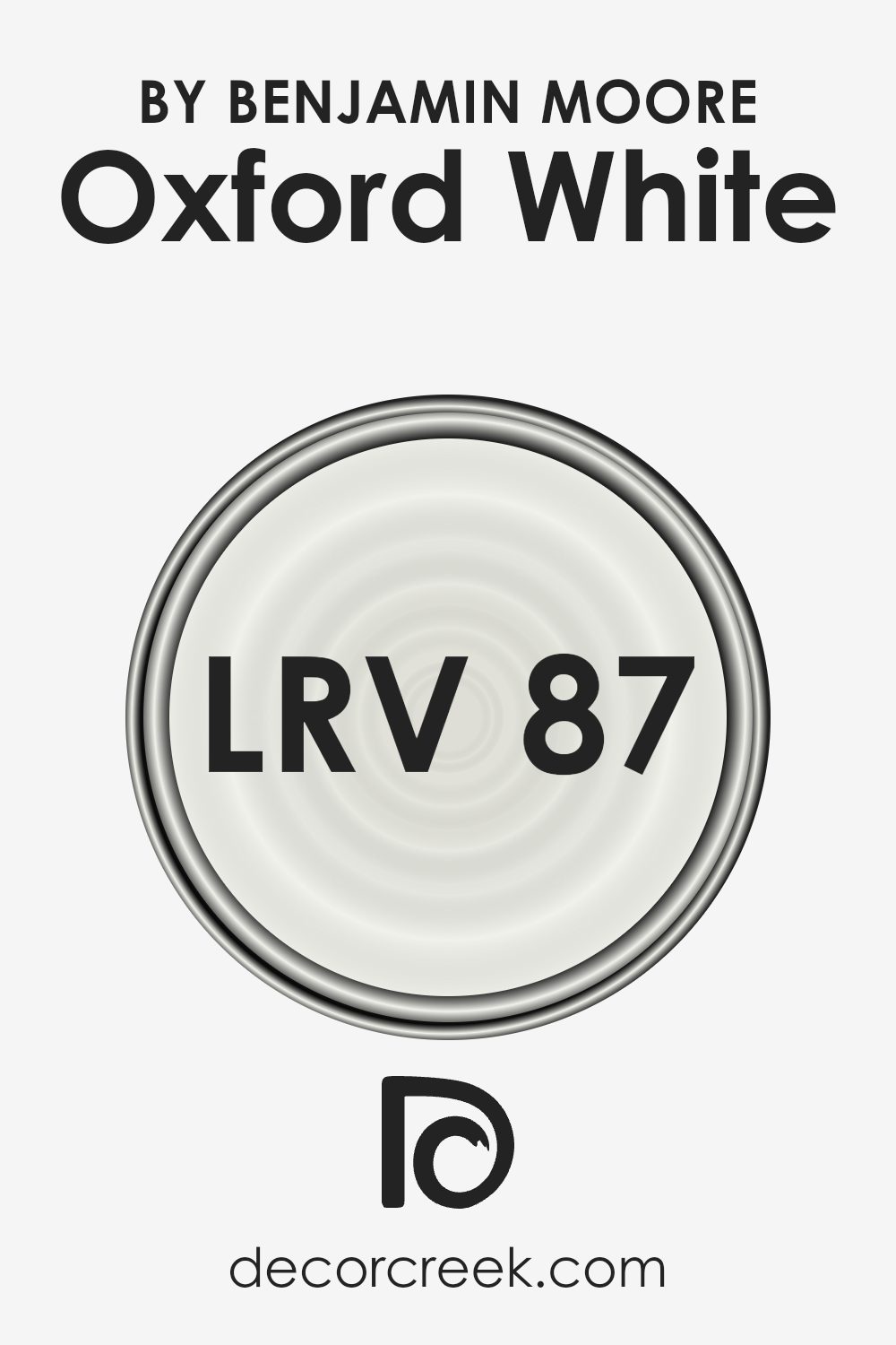
LRV stands for Light Reflectance Value, which is a measure of how much light a paint color reflects compared to how much it absorbs. When a color has a high LRV, it means it reflects a lot of light and looks lighter. Conversely, colors with low LRVs absorb more light and appear darker.
This value is important because it can significantly affect how a color looks in a space depending on the lighting conditions. For example, a room with lots of natural light will make high LRV colors look very bright, while the same color might look muted in a room with less light.
The LRV for Oxford White is 86.69, which means it’s pretty high, causing it to reflect a lot of light and appear quite bright. This bright characteristic makes it a good choice for making smaller rooms feel larger and more open. Since Oxford White reflects so much light, it can help to brighten up spaces that are naturally dark or have limited light sources.
However, in very brightly lit areas, this color might feel too bright and could potentially cause a bit of glare. Choosing the right lighting is crucial to ensure the space looks comfortable and visually appealing with this shade.
Coordinating Colors of Oxford White 869 by Benjamin Moore
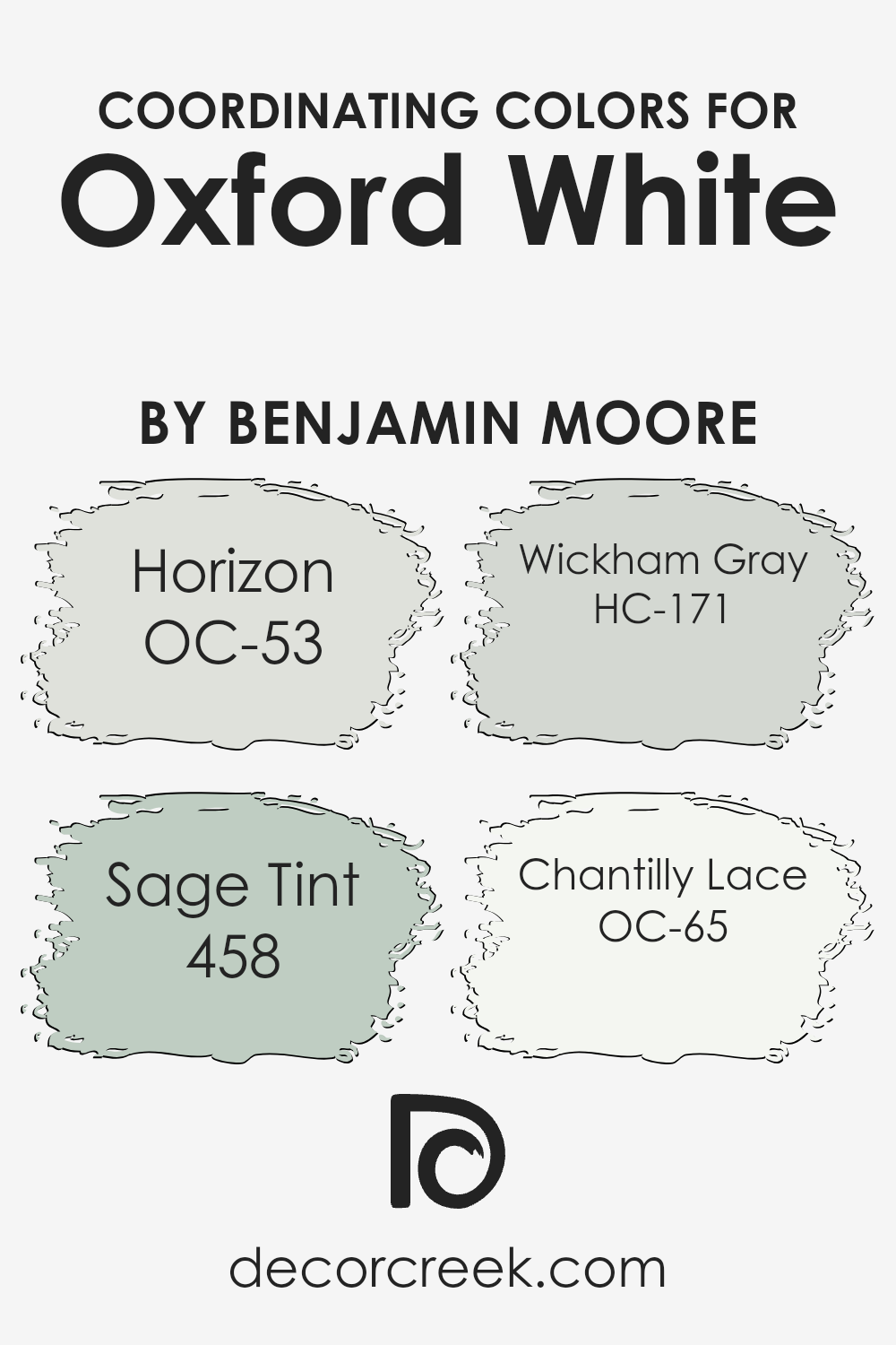
Coordinating colors are used to create a harmonious and balanced look in any space by selecting hues that complement each other while offering contrast or variation. When paired with a versatile base color like Oxford White by Benjamin Moore, which is a clean and bright white, coordinating colors are chosen to enhance the overall aesthetic without overwhelming the base shade.
These coordinating hues can bring out the best features of the base color, making every accent stand out and contribute to the cohesive feel of the design.
For instance, OC-53 – Horizon is a soft, grayish-blue that adds a subtle touch of color, lending a calm and refreshing feel when used alongside Oxford White.
On the other hand, 458 – Sage Tint is a gentle green with a hint of gray, providing a natural and earthy element that complements the purity of white.
HC-171 – Wickham Gray is another option, offering a stronger gray tone that generates a striking yet balanced contrast with a crisp white.
Lastly, OC-65 – Chantilly Lace is a very clean and almost pure white, almost similar to Oxford White but with a slightly different undertone that can help in creating a layered white-on-white look which adds depth and interest to the space without diverging from a light and airy palette.
By choosing such coordinating colors, you can achieve a designed space that feels cohesive and thoughtfully curated.
You can see recommended paint colors below:
- OC-53 Horizon
- 458 Sage Tint (CHECK A SAMPLE)
- HC-171 Wickham Gray
- OC-65 Chantilly Lace
What are the Trim colors of Oxford White 869 by Benjamin Moore?
Trim colors, like accents in a room, are chosen to complement the main color on walls or exteriors, highlighting architectural features and creating a neat finish. For a home or space painted with Benjamin Moore’s Oxford White, trim colors selected can significantly influence the overall look, accentuating the clean, fresh vibe of the white.
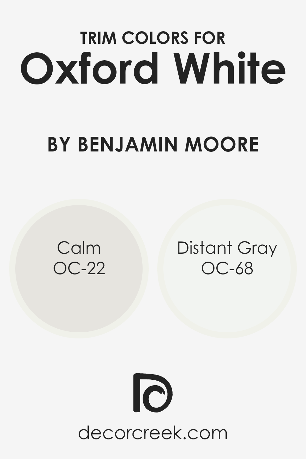
Using OC-22 Calm and OC-68 Distant Gray as trim colors provides subtle contrasts that add depth and definition without overwhelming the primary color.
OC-22 Calm is a soft, muted beige that offers a gentle contrast to Oxford White, giving a warm and inviting finish to the edges and corners of a room. OC-68 Distant Gray, on the other hand, is a light gray with cool undertones, providing a slightly sharper boundary that enhances visual interest and sophistication.
Both these colors support the base white with a discreet yet effective enhancement, making them excellent choices for a refined and polished look in any space.
You can see recommended paint colors below:
- OC-22 Calm
- OC-68 Distant Gray
Colors Similar to Oxford White 869 by Benjamin Moore
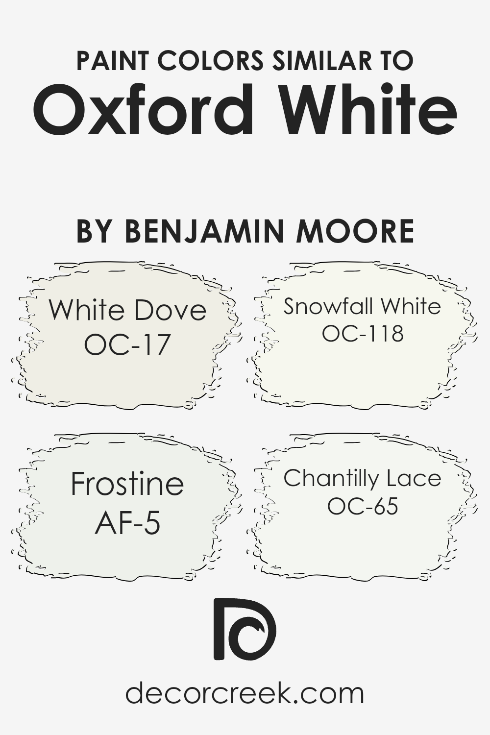
Choosing similar colors, like the varying shades of white offered by Benjamin Moore, plays a key role in creating a harmonious and coherent color palette that enhances the aesthetic appeal of any space. Paint shades such as White Dove, Frostine, Snowfall White, and Chantilly Lace are all closely related to Oxford White 869, making them perfect for achieving a subtle yet impactful design look.
These nuances allow for a gentle transition between spaces or decorative elements, making it easier to maintain a unified theme without stark contrasts that can disrupt the visual flow of an area.
White Dove has a soft and warm undertone, making it ideal for a cozy and inviting ambiance, while Frostine leans more toward a cooler tone, providing a fresh and crisp appearance analogous to a brisk winter morning. Snowfall White offers a clean, almost undetectable cool hue that acts as a seamless backdrop for bolder colors or furnishings.
Meanwhile, Chantilly Lace is renowned for its almost pure white quality that reflects light beautifully, amplifying the brightness of a room while still blending effortlessly with other whites.
These variations of white enable the use of subtle differences that can distinguish surfaces and elements softly, without creating jarring transitions.
You can see recommended paint colors below:
- OC-17 White Dove (CHECK A SAMPLE)
- AF-5 Frostine (CHECK A SAMPLE)
- OC-118 Snowfall White
- OC-65 Chantilly Lace
Colors that Go With Oxford White 869 by Benjamin Moore
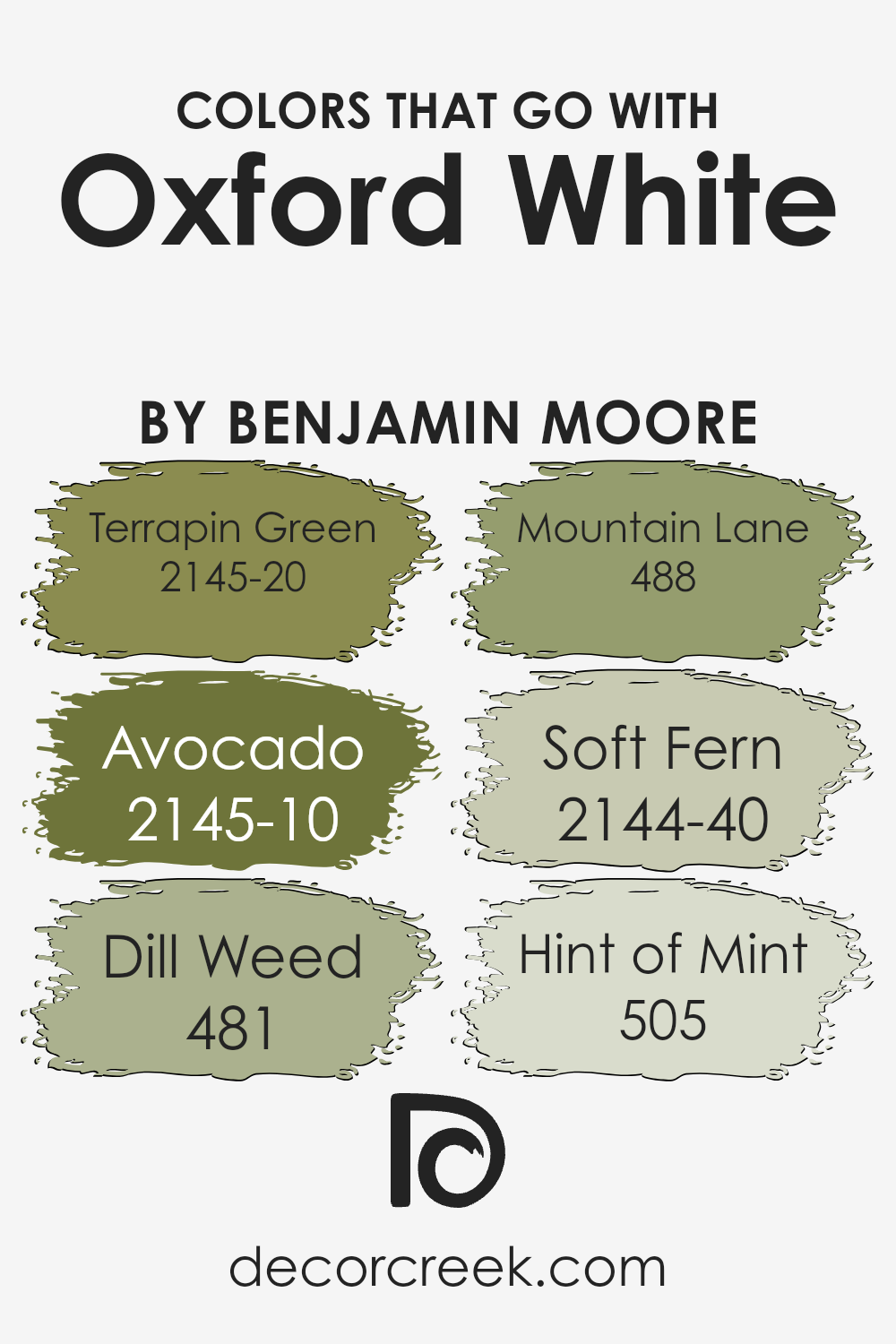
Choosing the right colors to complement Oxford White 869 by Benjamin Moore is crucial because it can impact the overall look and feel of your space. Oxford White is a clean and versatile shade that serves as an excellent base for other colors. When paired with colors like Terrapin Green or Avocado, it creates a balanced and inviting atmosphere.
These coordinating colors can help enhance the aesthetic appeal of any room, making it appear more welcoming and coherent.
Terrapin Green is a deep, earthy tone that brings a cozy, grounded feeling to a room, perfect for creating a relaxed environment. Avocado, on the other hand, is a richer, darker green with a luscious depth that adds a touch of warmth to spaces. Moving on to Dill Weed, this is a lighter green which injects a fresh, energetic vibe into interiors, great for spaces that need a touch of liveliness.
Mountain Lane offers a more muted green, providing a subtle hint of nature that is soothing and understated. Soft Fern is another gentle hue, this time with a delicate touch that is soft on the eyes, making it ideal for quiet, peaceful areas.
Lastly, Hint of Mint is a pale, refreshing green that lightens up spaces and offers a crisp, clean finish to a room alongside Oxford White. Together, these colors work harmoniously to create a pleasing and coherent palette that enhances the beauty of your home.
You can see recommended paint colors below:
- 2145-20 Terrapin Green (CHECK A SAMPLE)
- 2145-10 Avocado (CHECK A SAMPLE)
- 481 Dill Weed (CHECK A SAMPLE)
- 488 Mountain Lane (CHECK A SAMPLE)
- 2144-40 Soft Fern (CHECK A SAMPLE)
- 505 Hint of Mint (CHECK A SAMPLE)
How to Use Oxford White 869 by Benjamin Moore In Your Home?
Oxford White 869 by Benjamin Moore is a popular paint color known for its pure and clean look. It’s a versatile shade of white that can brighten up any room, making spaces appear larger and more inviting.
Whether you’re repainting your living room, bedroom, or kitchen, Oxford White can provide a fresh, crisp backdrop that works well with various decor styles and colors.
This color is especially great for anyone looking to refresh their home with a minimalistic and clean aesthetic. It pairs beautifully with bold colors, allowing them to stand out, but also complements softer hues for a more subtle look. If you’re updating your kitchen, Oxford White can make your cabinets look new and neat.
In living spaces, it can help artwork and furniture pop against the clean, white background.
You can also use Oxford White on trim and moldings to create a seamless look that connects each room in your home. This adaptable white can be the perfect choice for creating a refreshing, bright interior that feels welcoming.
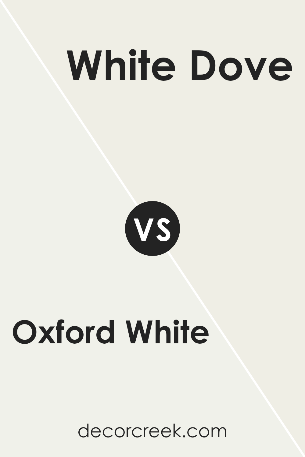
Oxford White 869 by Benjamin Moore vs White Dove OC-17 by Benjamin Moore
Oxford White and White Dove by Benjamin Moore are both popular white paint colors, but they have subtle differences that can affect the feel of a space. Oxford White has a clean and bright quality that makes it a strong choice for a modern look. It tends to reflect light well, making it excellent for spaces that you want to feel lively and open.
On the other hand, White Dove has a softer, warmer tone that gives it a more welcoming feel.
This warmth makes White Dove ideal for living areas and bedrooms where a cozy atmosphere is desired. It pairs beautifully with various textures and colors, adding a gentle contrast without overpowering other elements.
In summary, if you’re looking for a sharp, vivid white, Oxford White is the way to go. If you prefer a softer, warmer white, White Dove is a great choice. Both will brighten up a room but in slightly different ways.
You can see recommended paint color below:
Oxford White 869 by Benjamin Moore vs Snowfall White OC-118 by Benjamin Moore
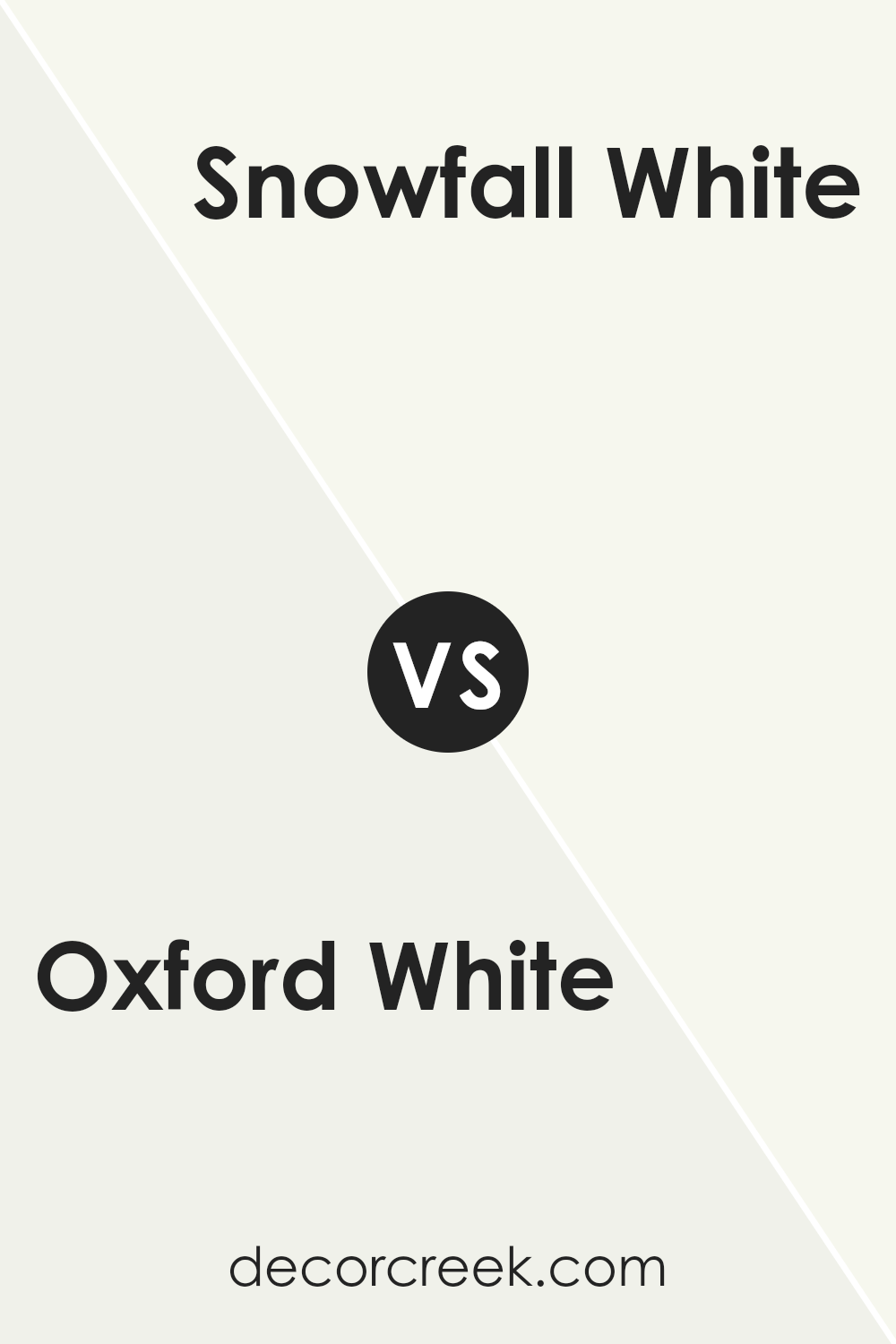
Oxford White and Snowfall White are both white paint colors by Benjamin Moore, but they have subtle differences. Oxford White has a clean and pure look, making it an excellent choice for a simple and fresh feel in a space. It reflects light nicely, which helps to make rooms look more spacious and open.
On the other hand, Snowfall White has a slightly warmer tone. This warmth adds a cozy and inviting feel to rooms, making it a great option for spaces where you want a bit of a softer ambiance. Both colors are versatile and can easily match with various decor styles, but your choice might depend on the mood you want to set.
Oxford White is ideal if you prefer a sharp, vivid setting, while Snowfall White is better for a softer, more comforting atmosphere.
You can see recommended paint color below:
- OC-118 Snowfall White
Oxford White 869 by Benjamin Moore vs Chantilly Lace OC-65 by Benjamin Moore
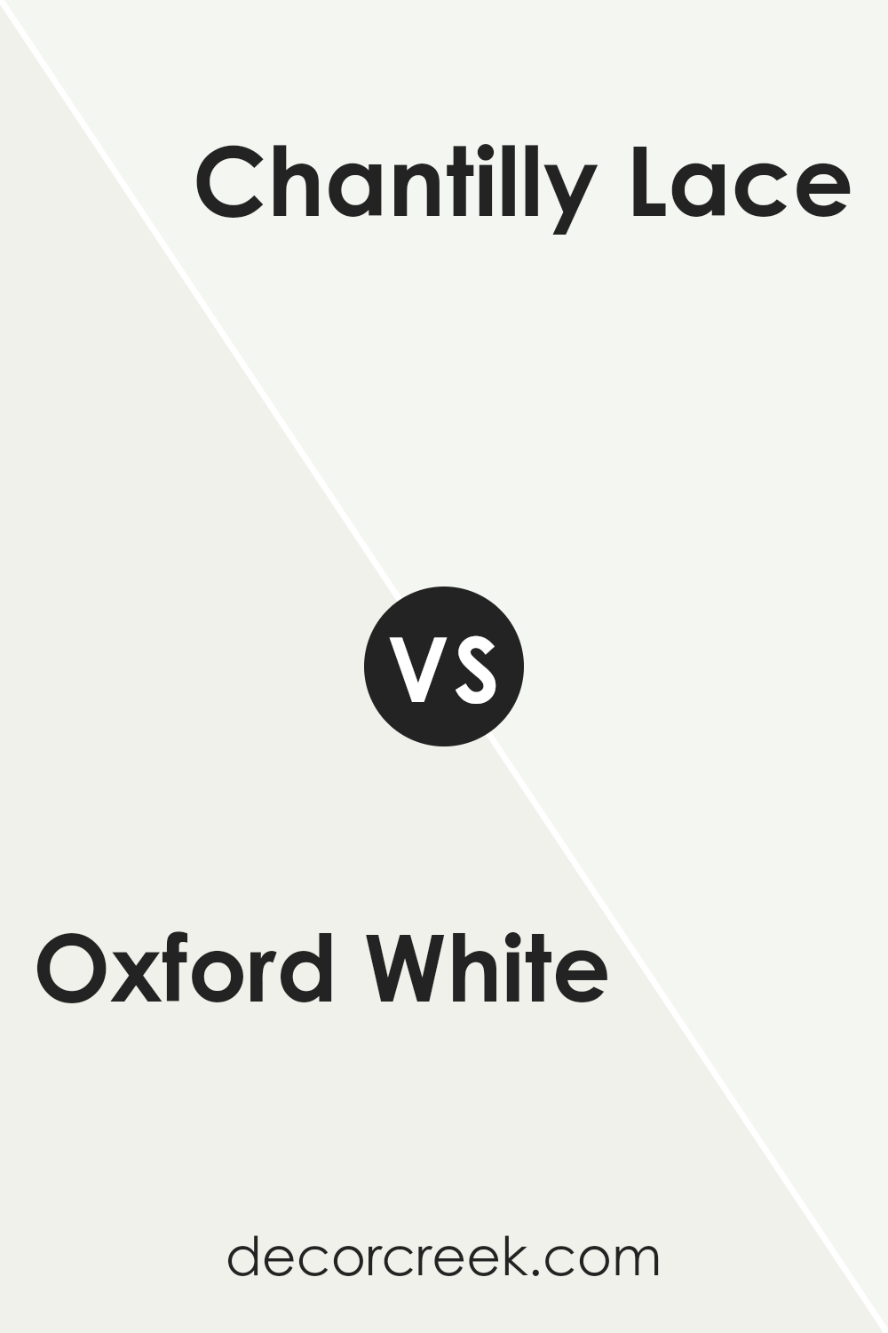
Oxford White and Chantilly Lace by Benjamin Moore are both popular white paint colors, each bringing its unique vibe to spaces. Oxford White has a warm undertone, making it feel cozy and welcoming. It complements natural light beautifully, enhancing spaces with a soft, creamy glow. This makes it a great choice for living rooms or bedrooms where you want a comforting ambiance.
On the other hand, Chantilly Lace is a crisper white, known for its clean and bright appearance. It has cooler undertones compared to Oxford White, giving it a more modern feel. This clarity makes Chantilly Lace fantastic for kitchens and bathrooms, where a sharp, fresh look is often desired.
Overall, the choice between the two depends on the mood you’re trying to create. Oxford White brings warmth and softness, while Chantilly Lace offers a crisp, fresh setting. Both are versatile, working well in various lighting conditions and pairing nicely with different decor styles.
You can see recommended paint color below:
Oxford White 869 by Benjamin Moore vs Frostine AF-5 by Benjamin Moore
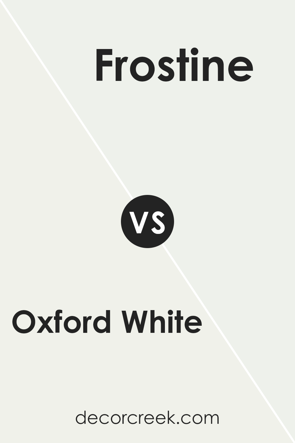
Oxford White and Frostine are both paints from Benjamin Moore, known for their subtlety and elegance. Oxford White is a really bright white that has a hint of warmth, making it a popular choice for creating a fresh, clean look in any space. It reflects light beautifully, which can make rooms appear larger and more open.
On the other hand, Frostine is also a white shade but with a slightly cooler tone. This color is great for those who prefer a hint of crispness in their decor, as it provides a slight contrast to warmer colors, giving a balanced feel to a room.
When comparing these two, Oxford White offers a welcoming, warm atmosphere due to its creamy undertones, while Frostine feels a bit more airy and minimalistic due to its cooler undertones. Both colors are versatile and can easily fit into various design styles, from modern to traditional. The choice between the two would depend on the mood and tone you want to set for your space.
You can see recommended paint color below:
- AF-5 Frostine (CHECK A SAMPLE)
Conclusion
Having spent a good amount of time talking about 869 Oxford White by Benjamin Moore, I’ve realized just how special this paint color is. It’s not just plain white; it’s like a fresh start on a canvas, ready for any story you want to tell.
This shade has an amazing way of making rooms look bright and open, turning even small rooms into places where you feel free to breathe and move around.
When you paint your walls with 869 Oxford White, it’s like putting up a magic mirror that reflects light all around and makes everything look better and more inviting. It’s perfect for anyone who likes to change their room decorations often because it pretty much goes well with every other color and style you might choose later.
From everything I’ve learned, 869 Oxford White is more than just a paint; it’s a smart choice for making your home feel clean, fresh, and cozy all at once. Whether you are fixing up a room or just wanting a change, this color is like a good friend that makes everything else look great.
It’s simple, but it really does the job beautifully. So, this is why I think it’s one of the best choices you could make if you’re thinking about a new color for your walls.
Ever wished paint sampling was as easy as sticking a sticker? Guess what? Now it is! Discover Samplize's unique Peel & Stick samples.
Get paint samples


