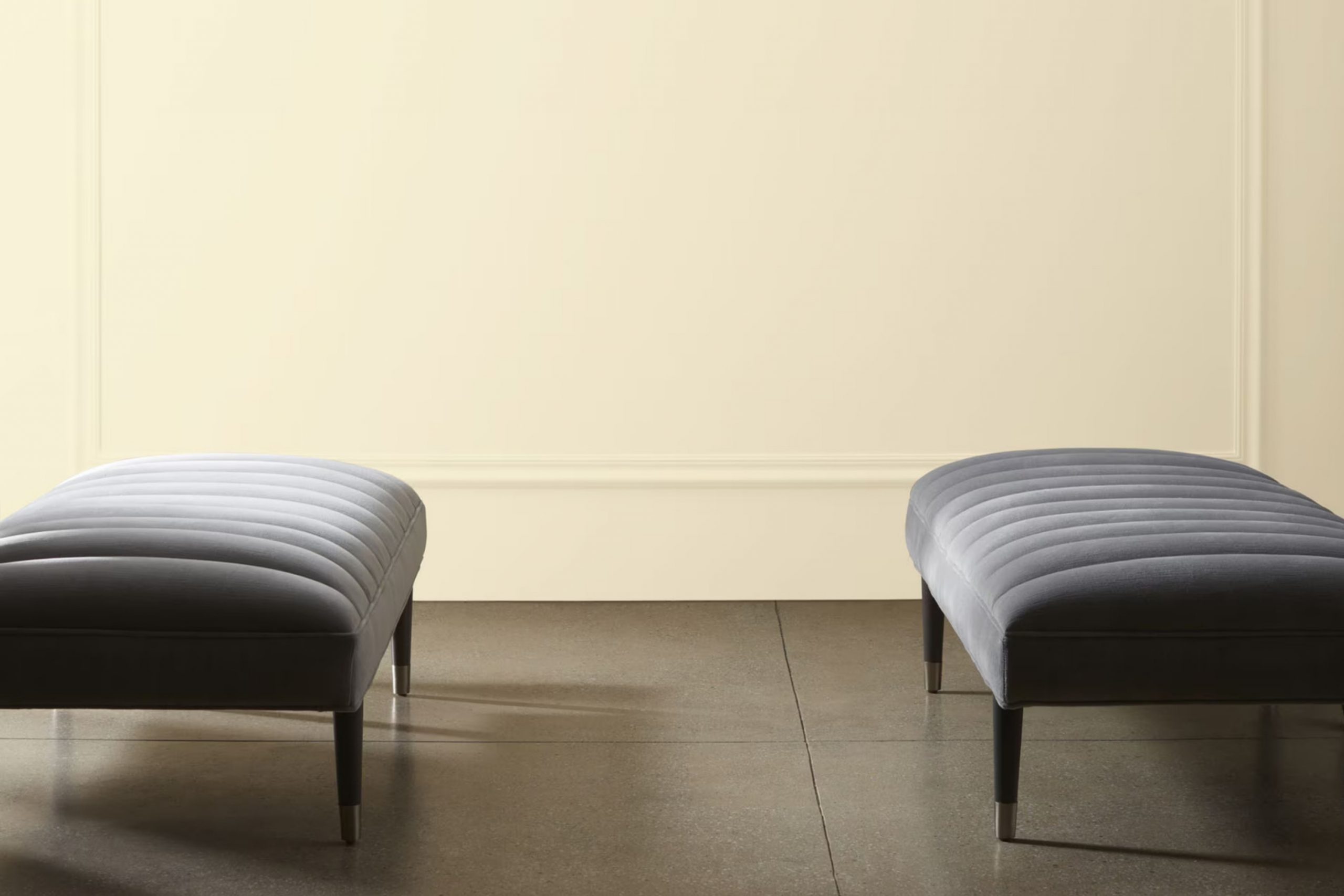
When I paint my living room, I choose a color that speaks to both elegance and comfort. CSP-965 Knitted Cape by Benjamin Moore immediately comes to mind. This shade is more than just a color; it’s like wrapping your home in a cozy sweater on a chilly day.
As you brush it onto the walls, the hue envelops the room in warmth, making it feel inviting and peaceful. The gentle blend of neutral tones has the power to soothe your senses. Whether you’re reading a book by the window or sharing laughs over dinner, this color serves as the perfect backdrop.
It creates an atmosphere that is both refined and relaxed, making any room feel like a personal retreat. Ideal for living rooms, bedrooms, or workspaces, CSP-965 Knitted Cape effortlessly adapts to various settings and styles. In its presence, I feel a sense of balance and calm, as if the color itself has the ability to smooth out the rough edges of a hectic day.
It’s this unique ability to complement any mood or decor that makes it a favorite choice.
What Color Is Knitted Cape CSP-965 by Benjamin Moore?
Knitted Cape CSP-965 by Benjamin Moore is a warm, earthy hue that brings a sense of comfort and coziness to any room. This color is reminiscent of a soft, woven blanket, blending gentle brown tones with subtle hints of gray. It creates an inviting atmosphere that’s perfect for a living room or bedroom.
This shade fits well in various interior styles. In a rustic or farmhouse setting, Knitted Cape complements wooden furniture and natural fibers, enhancing the overall warmth and earthy feel. It also works beautifully in a contemporary or modern setting, where it can soften the sleek lines and hard surfaces, providing a subtle contrast.
Pair this color with natural materials like wood, leather, and stone for a cohesive look. Textures such as woven baskets, linen throws, and chunky knit cushions can enhance the cozy vibe it offers. Light-colored woods or dark metals can also provide a striking contrast, adding depth to the design. Combining Knitted Cape with soft creams or whites will keep the room light, while deeper browns or charcoals can add richness.
Whether used on walls, furniture, or accents, Knitted Cape CSP-965 brings a touch of coziness to any interior.
Is Knitted Cape CSP-965 by Benjamin Moore Warm or Cool color?
Knitted Cape CSP-965 by Benjamin Moore is a warm, earthy shade that brings a cozy and inviting feel to homes. It’s a neutral color that blends beige and brown, making it flexible for various interior styles. This color can make large areas feel more intimate and bring warmth to rooms with minimal natural light.
In living rooms, Knitted Cape CSP-965 creates a welcoming atmosphere, perfect for gatherings and relaxation. In the bedroom, it provides a calming backdrop that encourages rest and comfort. The color works well with both modern and traditional decor, complementing natural wood tones and other soft, muted colors like soft blues and forest greens.
In kitchens and dining areas, it adds a touch of earthy elegance that can enhance the appeal of cabinetry and dining furniture. Overall, Knitted Cape CSP-965 by Benjamin Moore is a practical and charming choice for adding warmth and style to any room in your home.
Undertones of Knitted Cape CSP-965 by Benjamin Moore
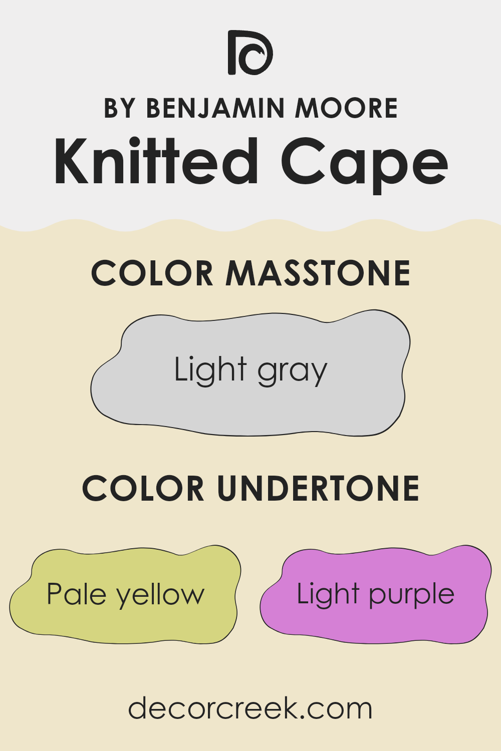
Knitted Cape CSP-965 by Benjamin Moore is a multifaceted color with a unique blend of undertones. Its color makeup includes shades of pale yellow, light purple, light blue, pale pink, mint, lilac, and gray. These undertones can significantly influence how we perceive it and how it appears on walls.
When a color has multiple undertones, it can shift in appearance based on lighting and surrounding colors. For example, in natural light, Knitted Cape might showcase more of its yellow and blue tones, giving a brighter and fresher feel. Under warm artificial light, the pink and mint undertones could come to the fore, offering a cozier and softer ambiance.
On interior walls, these undertones make Knitted Cape a flexible choice. It can complement a wide range of design elements, from warm woods to cool metals. The gray undertone provides a neutral base, which helps balance the brighter or cooler notes. This makes it adaptable to various styles and settings. Whether you’re aiming for a cheerful vibe with the yellow and mint hints or a calm one with the lilac and gray, the color can accommodate different moods. Understanding the undertones helps in selecting matching decor and achieving the desired atmosphere in a room.
What is the Masstone of the Knitted Cape CSP-965 by Benjamin Moore?
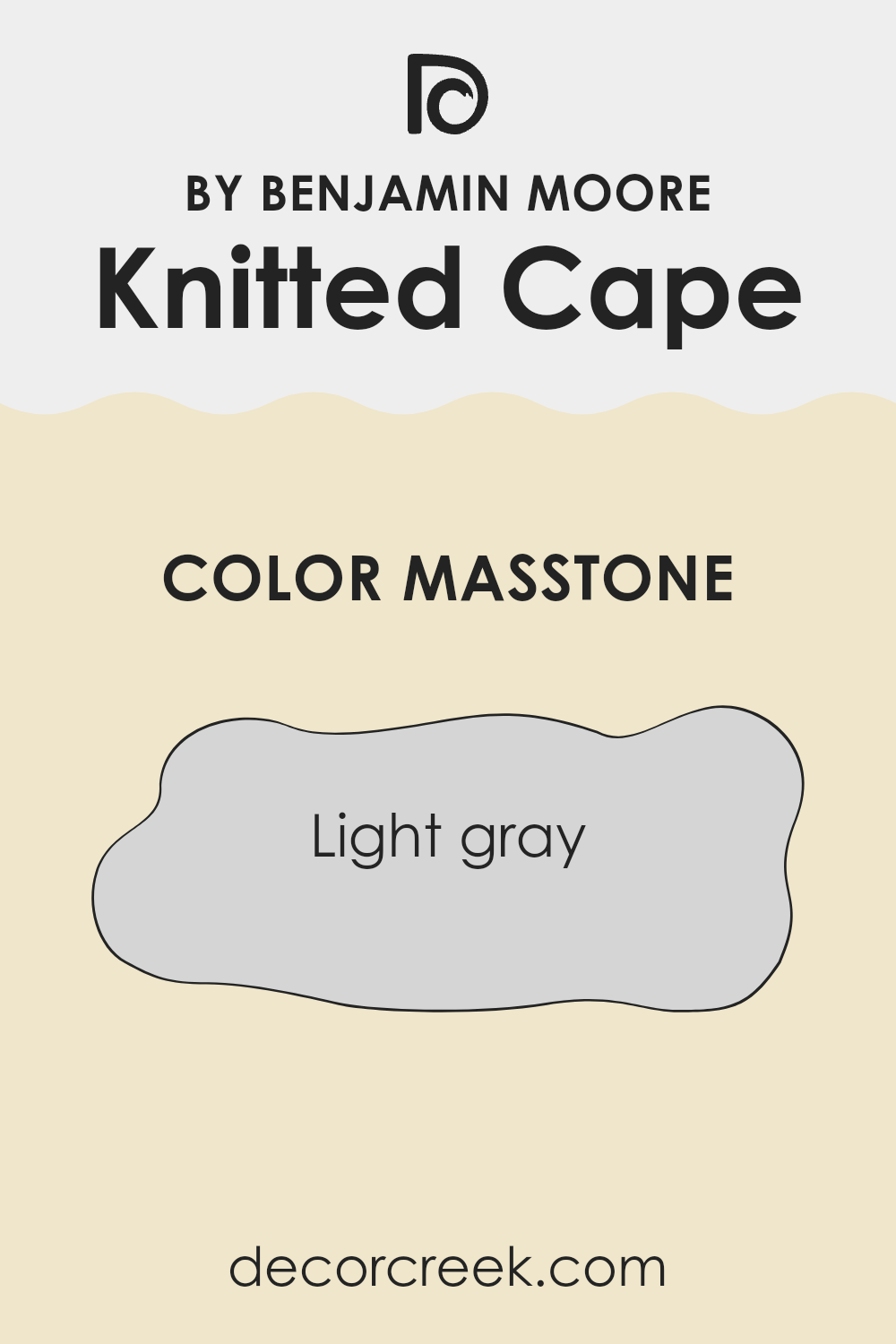
Knitted Cape CSP-965 by Benjamin Moore is a light gray color with the masstone of #D5D5D5. This shade is flexible and neutral, making it a great choice for many homes. Its soft gray tone can create a calm and relaxed atmosphere in any room. This color works well as a backdrop, allowing other colors and decor elements to stand out.
Because it is a light gray, Knitted Cape CSP-965 reflects light in a gentle way, helping rooms feel brighter and more open. This makes it especially useful for small areas or rooms with limited natural light.
It pairs well with both warm and cool colors, making it adaptable to various color schemes. Whether used in living rooms, bedrooms, or kitchens, Knitted Cape CSP-965 brings a gentle touch of sophistication without being overpowering. Its understated nature ensures that it will harmonize with a wide range of design styles.
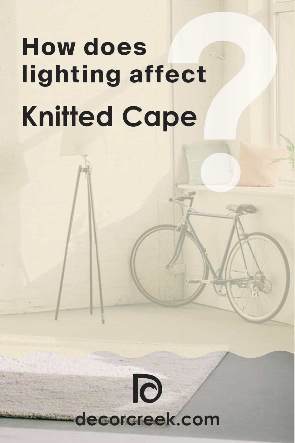
How Does Lighting Affect Knitted Cape CSP-965 by Benjamin Moore?
Lighting plays a crucial role in how we perceive colors. Different light sources can make the same color appear differently. For instance, a color that looks vibrant and warm in natural daylight might appear dull or cooler under artificial lighting.
“Knitted Cape” (CSP-965) by Benjamin Moore is a flexible earthy brown-gray shade. How it appears in a room can change dramatically depending on the type of light and the room’s orientation.
- Artificial Light: When you look at “Knitted Cape” under artificial lights, its hue can shift based on the bulb type. Incandescent bulbs, which have a warm, yellowish light, can enhance the brown tones in the color, making it appear warmer and richer. In contrast, fluorescent lighting, which tends to be cooler, might bring out the gray undertones, giving the color a more muted and subtle appearance.
- Natural Light: In natural light, the color remains truer to its paint swatch but can still change based on the room’s orientation.
– North-Facing Rooms: These rooms get less direct sunlight and typically have cooler light. “Knitted Cape” might appear a bit darker and more gray in these areas.
– South-Facing Rooms: They are bathed in warm, bright light for much of the day. Here, “Knitted Cape” will look brighter and more inviting, with its warmer tones being more pronounced.
– East-Facing Rooms: Morning light is warm and soft. In the mornings, the color will appear quite warm and glowing, while in the afternoon, as the light fades, it may look more subdued.
– West-Facing Rooms: These rooms enjoy warmer tones later in the day as the sun sets. In the morning or midday, the color might look more neutral, but later, its warmer elements will emerge as the setting sunlight hits.
Understanding these lighting dynamics can help you decide where and how to use “Knitted Cape” in your room.
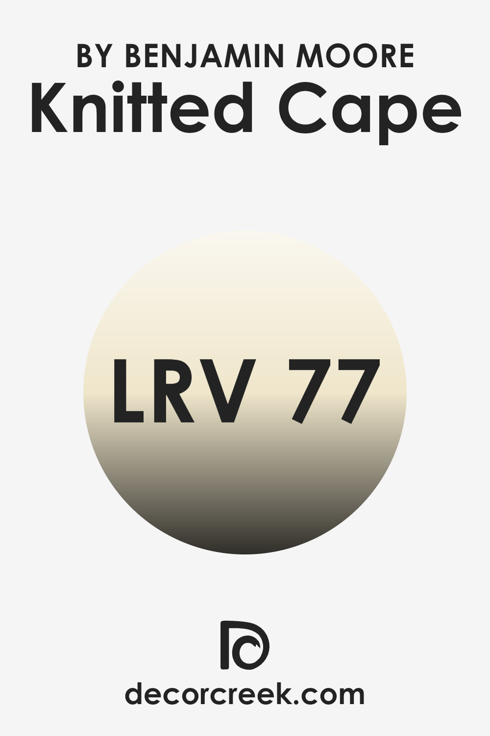
What is the LRV of Knitted Cape CSP-965 by Benjamin Moore?
LRV stands for Light Reflectance Value, which is a measure of how much light a paint color reflects. It is a scale from 0 to 100, where 0 means the color absorbs all light and appears very dark, while 100 means the color reflects all light and is very bright, like pure white. When you paint a room, the LRV helps determine how light or dark the room will feel.
A higher LRV value means the color reflects more light, making a room feel brighter and more open. In contrast, a lower LRV value absorbs more light and can make a room feel cozier or smaller.
For Knitted Cape, which has an LRV of 77.17, this means it reflects a significant amount of light. This paint color is quite reflective and can make a room feel bright and airy. In rooms with limited natural light, it can help maximize the available light, making the room feel more inviting and open. This LRV value indicates that Knitted Cape is a good choice for areas where you want a light and fresh atmosphere without it being stark or too reflective.
It’s well-suited for areas where you desire a warm, inviting brightness.
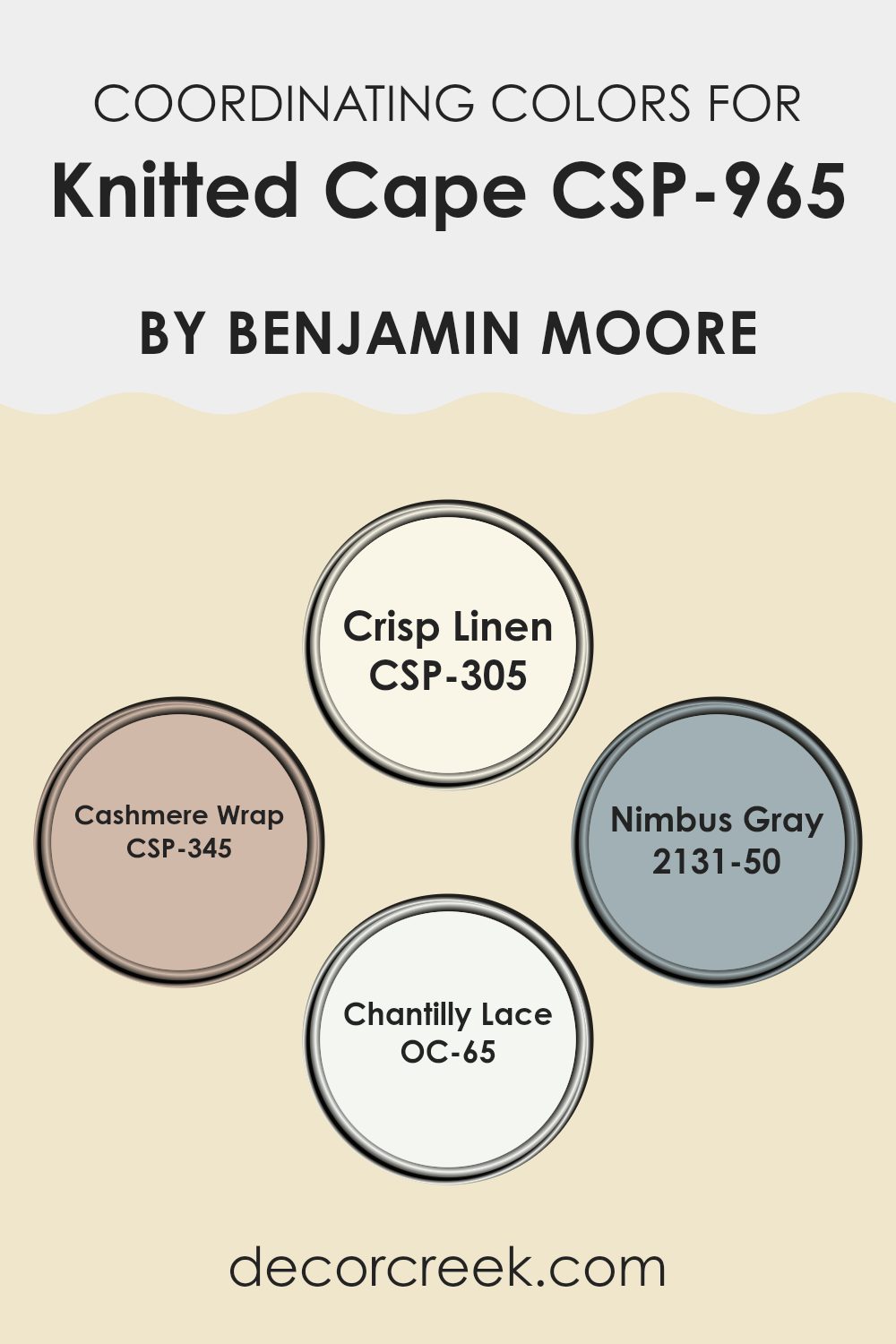
Coordinating Colors of Knitted Cape CSP-965 by Benjamin Moore
Coordinating colors are hues that naturally complement each other when used together in a room. They help create a harmonious look, making a room feel balanced and visually pleasing. When picking colors to go with Knitted Cape, a deep, warm hue from Benjamin Moore, it’s essential to choose shades that enhance rather than overshadow it. CSP-305 Crisp Linen is a soft, creamy white that brings a sense of warmth and coziness. It’s an ideal backdrop that subtly balances the richness of Knitted Cape without competing for attention.
CSP-345 Cashmere Wrap adds a gentle, muted tone with a hint of peach, which beautifully softens and complements the richness of Knitted Cape. 2131-50 Nimbus Gray introduces a cool, calming touch with its soft gray-blue undertones, providing a modern edge that’s perfect for a balanced color palette.
Lastly, OC-65 Chantilly Lace is a classic, bright white known for its purity and freshness. It’s a perfect accent that can add crisp contrast and clarity when paired with the deeper tones. Together, these coordinating colors create a pleasing ensemble, each enhancing the appeal of the others without overshadowing the main feature.
You can see recommended paint colors below:
- CSP-305 Crisp Linen
- CSP-345 Cashmere Wrap
- 2131-50 Nimbus Gray
- OC-65 Chantilly Lace
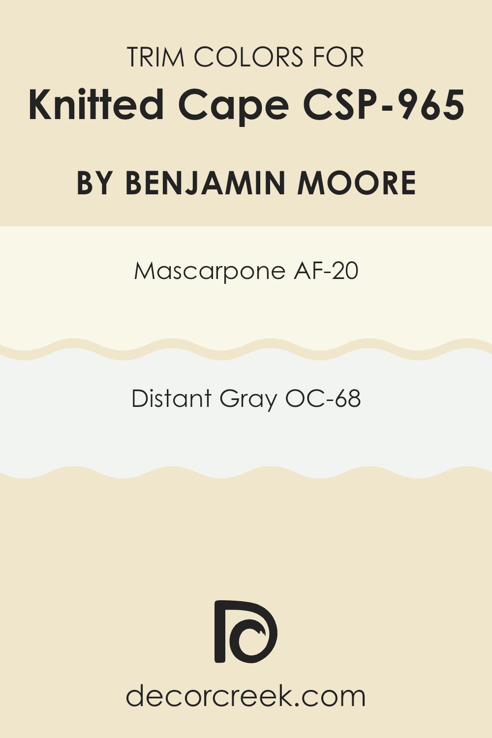
What are the Trim colors of Knitted Cape CSP-965 by Benjamin Moore?
Trim colors are the finishing touches that can greatly enhance the overall look of any room. They are used to highlight borders, edges, and frames, creating a contrast that defines the architecture and draws attention to specific features.
In the case of Knitted Cape by Benjamin Moore, trim colors play a crucial role in complementing the main hue, providing harmonious balance or a striking contrast. The use of AF-20 Mascarpone and OC-68 Distant Gray as trim colors can significantly uplift the appearance of Knitted Cape, making the room feel more complete and visually appealing.
AF-20 Mascarpone is a warm, creamy white that adds a touch of softness and comfort. It gently brightens areas without being overpowering, blending seamlessly with Knitted Cape while adding warmth. On the other hand, OC-68 Distant Gray is a cool, light gray that introduces a subtle hint of contrast. Its understated elegance brings a refreshing clarity to the overall color scheme. Both colors, when used as trim for Knitted Cape, ensure a balanced and polished finish, enhancing the beauty of the room effortlessly.
You can see recommended paint colors below:
- AF-20 Mascarpone
- OC-68 Distant Gray
Colors Similar to Knitted Cape CSP-965 by Benjamin Moore
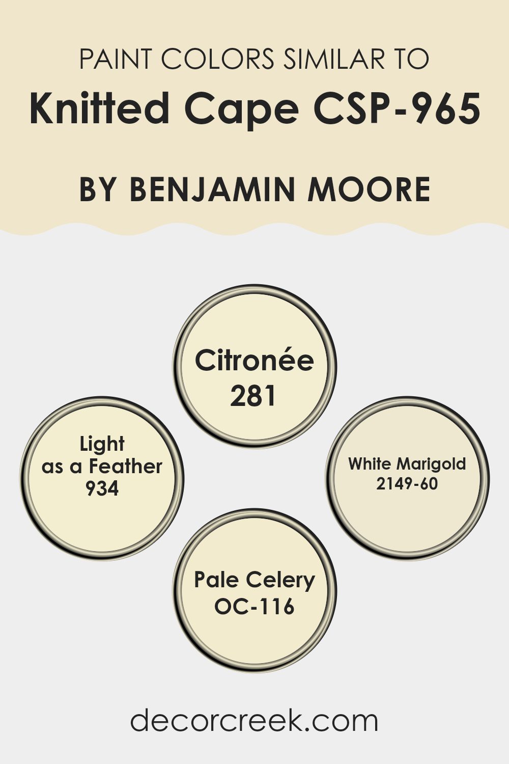
Similar colors play an essential role in creating a harmonious and visually appealing room. They provide a sense of unity and balance without being monotonous, making a room feel more cohesive. When we look at the color palette of Knitted Cape, understanding the nuances of similar shades can help us create a unified design. For instance, the color Citronée, a soft and soothing pastel yellow, adds warmth and light without overpowering. Its gentle presence is perfect for pairing with other light shades.
Similarly, Light as a Feather offers a subtle elegance with its understated presence, lending an airy and fresh feel. When paired with White Marigold, a delicate off-white with a hint of warmth, the room gains a subtle vibrancy and warmth that doesn’t overshadow.
Pale Celery, with its soft green hue, complements the yellow undertones, creating a refreshing balance that is neither too bold nor too muted. Together, these colors create an environment that feels light and inviting, bringing together both comfort and style. These shades harmonize effortlessly, allowing each to shine while supporting the overall aesthetic of the room, making it welcoming and beautifully coordinated.
You can see recommended paint colors below:
- 281 Citronée
- 934 Light as a Feather
- 2149-60 White Marigold
- OC-116 Pale Celery
Colors that Go With Knitted Cape CSP-965 by Benjamin Moore
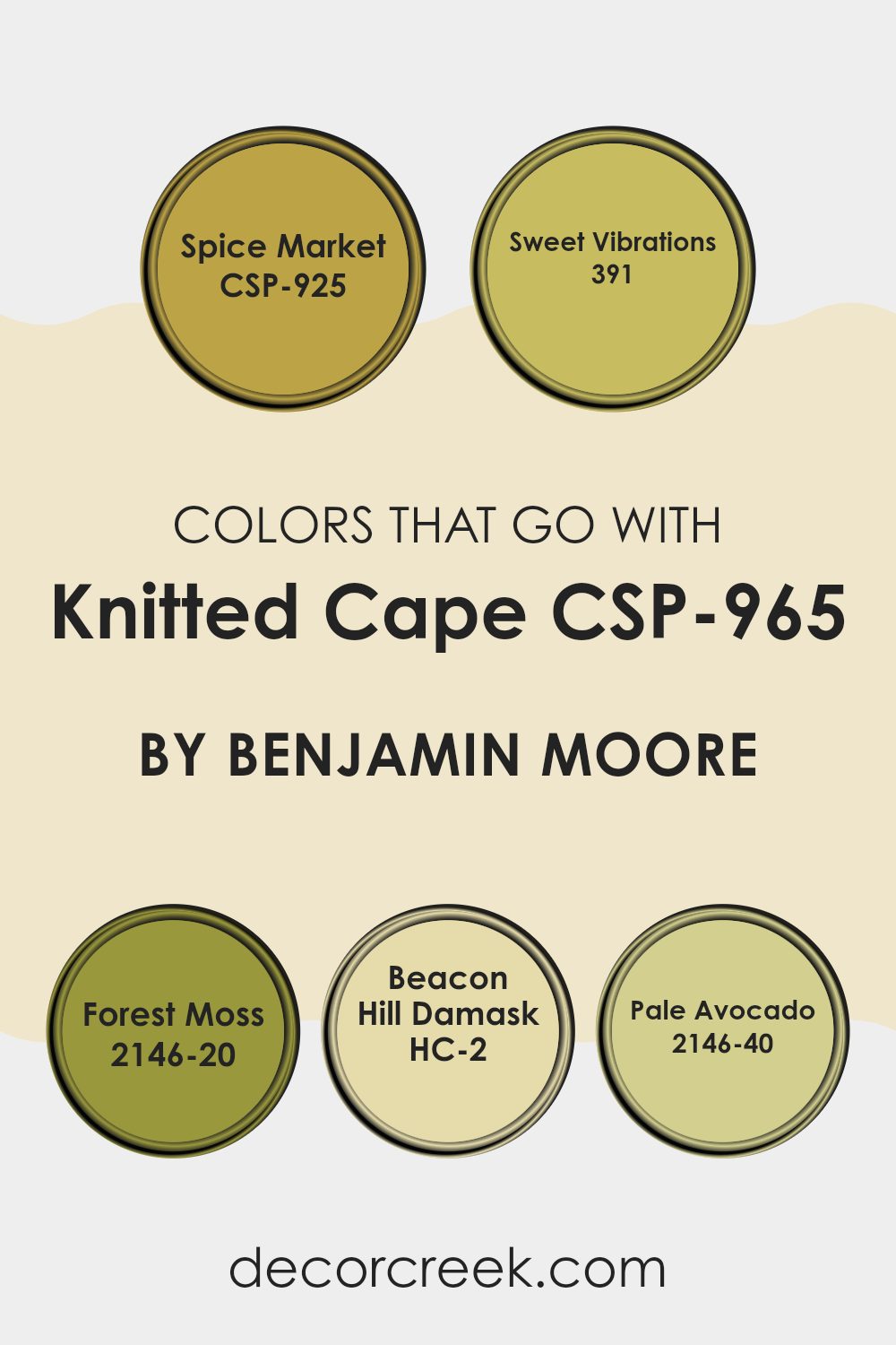
Choosing the right colors to pair with Knitted Cape CSP-965 by Benjamin Moore is crucial as they enhance the overall look and feel of a room, ensuring that everything feels harmonious. Each color brings its own unique vibe, complementing Knitted Cape in different ways.
Take CSP-925, Spice Market, for example. This warm, spicy hue adds a cozy and inviting atmosphere, creating a sense of warmth when paired with the soft, neutral tone of Knitted Cape. Similarly, 391, Sweet Vibrations, introduces a lively and cheerful note, brightening the room and uplifting the muted beige of Knitted Cape.
2146-20, Forest Moss, provides a deep, earthy touch that brings in a bit of nature’s richness, grounding the airy quality of Knitted Cape with its lush, green undertones. Beacon Hill Damask, or HC-2, adds a classic and lasting elegance with its subtle yellow undertones, enhancing the soft beige with a hint of refinement without being too intense.
Lastly, 2146-40, Pale Avocado, offers a fresh, light green that immediately evokes a feeling of spring and renewal, adding a gentle pop of color that harmonizes beautifully with Knitted Cape. Together, these colors create a balanced and visually pleasing palette, making any room feel unified and well-thought-out.
You can see recommended paint colors below:
- CSP-925 Spice Market
- 391 Sweet Vibrations
- 2146-20 Forest Moss
- HC-2 Beacon Hill Damask
- 2146-40 Pale Avocado
How to Use Knitted Cape CSP-965 by Benjamin Moore In Your Home?
Knitted Cape CSP-965 by Benjamin Moore is a warm, neutral color that’s perfect for creating a cozy atmosphere in any room. This shade of paint is flexible and can fit well into different home settings. One way to use it is in the living room to set a relaxed mood.
Pair it with soft cream or beige furnishings to enhance its warmth. In the bedroom, Knitted Cape CSP-965 can create a calming environment when combined with light-colored linens or contrasting dark woods.
For a kitchen with charm, consider using it on cabinetry or walls, matched with brushed metal fixtures for a modern touch. This color is also suitable for hallways or entrance areas, as it welcomes guests with a gentle vibe. Overall, Knitted Cape CSP-965 provides a flexible backdrop that can be seamlessly integrated with various decor styles, offering a touch of comfort and elegance to your home.
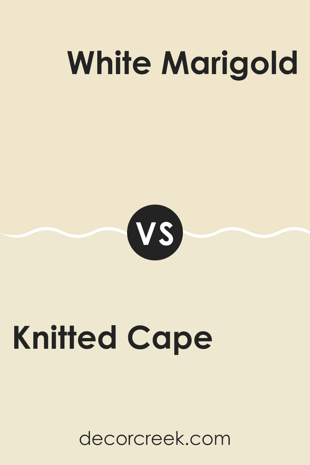
Knitted Cape CSP-965 by Benjamin Moore vs White Marigold 2149-60 by Benjamin Moore
Knitted Cape CSP-965 by Benjamin Moore is a warm and cozy color. It has a rich, earthy tone that feels inviting and comfortable, like a soft knitted sweater you might wear on a chilly day. It can create a sense of warmth and coziness in a room, making it feel homely and welcoming.
On the other hand, White Marigold 2149-60 by Benjamin Moore is a much lighter color. It’s a soft, creamy shade with a hint of yellow, reminiscent of delicate marigold flowers. This color feels light and airy, bringing a gentle brightness to a room. It’s perfect for making a room feel open and spacious without being overly stark or cold.
While Knitted Cape provides depth and warmth, White Marigold offers lightness and a subtle cheerfulness. Together, they contrast nicely, balancing warmth with brightness in a harmonious way. Both colors can bring out the best in a room, depending on the mood you’re aiming for.
You can see recommended paint color below:
- 2149-60 White Marigold
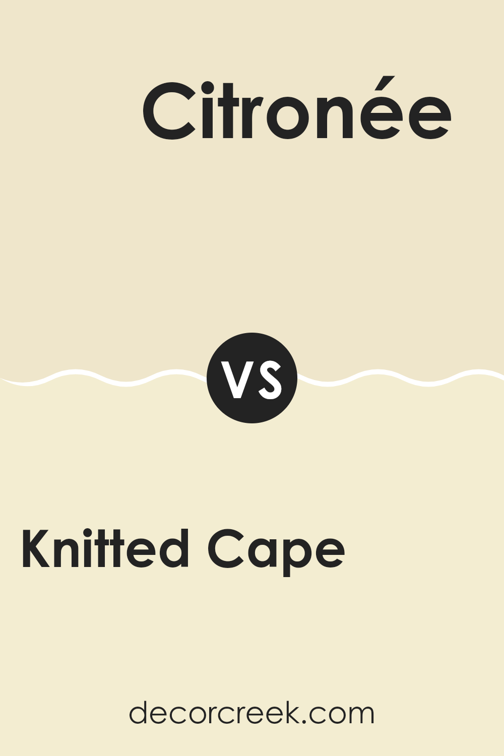
Knitted Cape CSP-965 by Benjamin Moore vs Citronée 281 by Benjamin Moore
Knitted Cape CSP-965 by Benjamin Moore is a soft, neutral color that has a calming and warm presence. It fits well in areas where you want a relaxed and cozy atmosphere. On the other hand, Citronée 281 is a vibrant, energetic yellow that stands out and adds a cheerful touch to a room.
While Knitted Cape is more muted and works as a neutral backdrop, Citronée can act as an accent color that draws attention. When you put these two colors together, they balance each other out. Knitted Cape can help tone down the brightness of Citronée, while Citronée injects some life into the more subdued Knitted Cape.
They can work well as part of a larger color scheme where you want both comfort and a pop of energy. Using Knitted Cape for larger areas and Citronée for smaller accents can create a nice visual contrast in any room.
You can see recommended paint color below:
- 281 Citronée
Knitted Cape CSP-965 by Benjamin Moore vs Pale Celery OC-116 by Benjamin Moore
Knitted Cape (CSP-965) by Benjamin Moore is a warm, earthy tone with rich brown and gray undertones, creating a cozy and grounded feel. It is reminiscent of natural materials like wood or stone, making it a flexible choice for any room that aims for a welcoming and comfortable atmosphere.
On the other hand, Pale Celery (OC-116) by Benjamin Moore is a light, fresh green with a soft and gentle presence. It evokes a sense of calmness and freshness, similar to new leaves budding in spring. This color is perfect for areas that want a light, airy feel and a hint of nature without being too bold.
While Knitted Cape provides warmth and depth, Pale Celery offers a refreshing and light touch. Together, they complement each other well, with Knitted Cape grounding a room and Pale Celery providing a breath of fresh air. They’re ideal for creating a balanced and inviting environment.
You can see recommended paint color below:
- OC-116 Pale Celery
Knitted Cape CSP-965 by Benjamin Moore vs Light as a Feather 934 by Benjamin Moore
“Knitted Cape” (CSP-965) by Benjamin Moore is a warm, earthy tone that carries a sense of coziness and comfort. It resembles a muted, creamy brown, offering a grounded and inviting atmosphere, making it ideal for living rooms or bedrooms where you want to cultivate a welcoming feeling.
On the other hand, “Light as a Feather” (934) by Benjamin Moore is a lighter, cooler shade. It leans towards a soft gray with hints of blue, providing an airy and refreshing vibe. This color is great for areas where you want to maximize natural light and create an open, spacious look, such as kitchens or bathrooms.
Comparing the two, “Knitted Cape” evokes warmth and depth, making a room feel intimate and snug, while “Light as a Feather” gives off a breezy and open ambiance, making rooms feel more expansive and bright. Both colors serve different moods and can beautifully complement each other in a home.
You can see recommended paint color below:
- 934 Light as a Feather
After reading about CSP-965 Knitted Cape by Benjamin Moore, I feel like I understand why this color is so special. Imagine a warm, comfy blanket wrapping around you on a chilly day. That’s what this color reminds me of. It’s a soft and welcoming shade that makes any room feel cozy and inviting.
When I picture CSP-965 Knitted Cape, I think of it as the color of a gentle hug or the soft yarn of a cherished sweater. It’s a color that makes rooms feel comfortable like home should. It’s not too bright and not too dark. Just right, like when Goldilocks found the perfect porridge.
This shade can work well in many rooms. It can make a living room feel restful or a bedroom feel calming. It’s a great choice if you want a place to relax when you’re tired from a long day.
Choosing colors like this can change how a room feels without having to change a lot of things. CSP-965 Knitted Cape by Benjamin Moore is a fantastic choice if you’re looking for a friendly, welcoming color to make your home feel even more like your own special place.
Ever wished paint sampling was as easy as sticking a sticker? Guess what? Now it is! Discover Samplize's unique Peel & Stick samples.
Get paint samples

