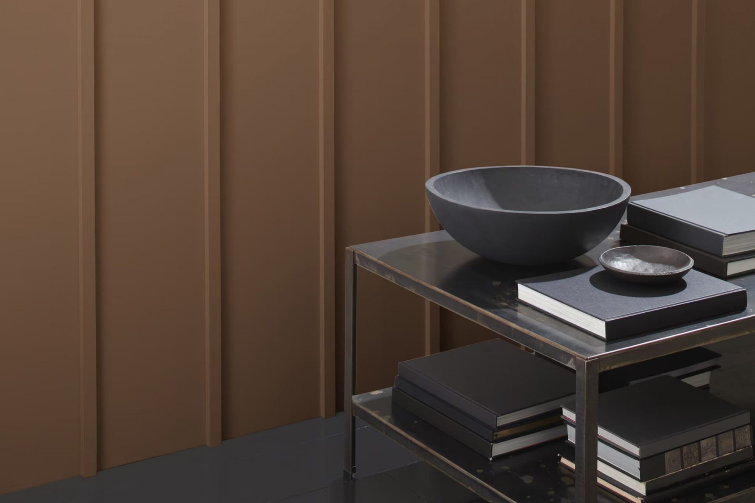
When you choose a color for your home, it’s like picking a backdrop for all your memories. AF-165 Kona by Benjamin Moore isn’t just any paint option; it’s a choice that brings warmth to every wall it covers. Picture the deep, rich tones of coffee in the comforting room of your living room or cozying up a study with its inviting hues.
Whether you are updating a room or giving a new look to your entire home, Kona offers a sense of assurance and style that makes every corner feel more like yours. Its unique color stands out in the Benjamin Moore collection, providing a perfect blend of sophistication and comfort that suits any decor.
As you decide on integrating Kona into your life, you’ll find its charm lies not just in its aesthetic appeal but also in how it refreshes mundane areas into mesmerizing havens.
This color goes beyond mere decoration; it sets a mood, enhances ambience, and expresses a part of who you are, right there on your walls.
What Color Is Kona AF-165 by Benjamin Moore?
Kona AF-165 by Benjamin Moore is a deeply saturated brown that carries a warm, cozy undertone reminiscent of rich coffee. This robust shade can work wonders in areas meant to feel welcoming and snug, such as living rooms or cozy nooks.
Kona’s versatility allows it to pair well with a variety of interior styles, particularly rustic, modern, and traditional decors. Its earthy tone complements natural materials like wood, leather, and linen, enhancing the textures’ inherent warmth.
In a rustic setting, think of pairing Kona with reclaimed wood furniture or woolen throws to reinforce a cabin-like feel. In modern rooms, this color works beautifully alongside sleek furnishings and can act as a grounding element when combined with metals and glass.
Kona is also great for creating a dramatic backdrop. It can be applied on accent walls or for cabinetry, providing a beautiful contrast to lighter or neutral tones in a room. When paired with creamy whites or soft grays, it makes the room feel cozy yet balanced. For a harmonious look, blend it with natural elements like stone or terracotta, which will highlight the room’s features without overpowering the senses.
Overall, Kona AF-165 is a flexible color choice that adds depth and warmth to any room, making it a favorite for those looking to create a welcoming atmosphere in their home.
Is Kona AF-165 by Benjamin Moore Warm or Cool color?
The Kona AF-165 paint by Benjamin Moore is a rich, deep brown that adds a cozy and warm feel to any room. This color is great for areas where you want to promote a sense of comfort and welcome, such as living rooms or dining areas.
Due to its depth, Kona AF-165 works especially well in larger rooms or rooms with plenty of natural light, as it can make small rooms feel smaller if not balanced with lighter colors or adequate lighting. Additionally, its earthy tone pairs well with a range of other colors, from creamy whites to vibrant teals, allowing flexibility in design choices.
Furniture and decor in natural wood tones particularly stand out against this backdrop, creating a grounded, homely vibe. Whether you’re looking to create a focal wall or paint an entire room, Kona AF-165 can add a touch of warmth to your home, making it feel more inviting and cozy.
Undertones of Kona AF-165 by Benjamin Moore
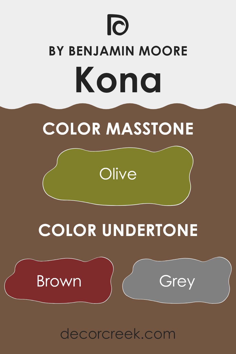
Kona AF-165 by Benjamin Moore is a unique color that may appear simple at first glance but actually holds a complex range of undertones that significantly influence how it looks in different settings. This color includes subtle hints of browns, greys, purples, and various other shades, which contribute to its versatility and appeal.
Undertones are the colors lurking beneath the surface of the paint that subtly influence the overall hue. They can make a color appear warmer or cooler depending on the lighting and surrounding elements, affecting the mood and style of a room. For Kona AF-165, its broad spectrum of undertones enables it to coordinate well with a diverse range of decor and lighting situations.
For instance, in a room with plenty of natural light, its grey and purple undertones might be more pronounced, giving the walls a cooler, more neutral appearance. Conversely, in artificial light, the brown and red undertones might stand out more, providing a warmer and more inviting feel.
On interior walls, Kona AF-165’s undertones can make the room feel more layered and interesting. It doesn’t just show as a flat color but interacts with the room’s light and furnishings. This interaction can either enhance or subdue its impact depending on what you pair it with. For example, pairing it with dark wood furniture can bring out its darker green or navy undertones, while bright and airy fabrics might highlight its lighter undertones such as pale pink or mint.
In conclusion, the complex undertones of Kona AF-165 make it a flexible choice for interior walls, adapting uniquely to various settings and decors and affecting the room’s atmosphere and design aesthetics.
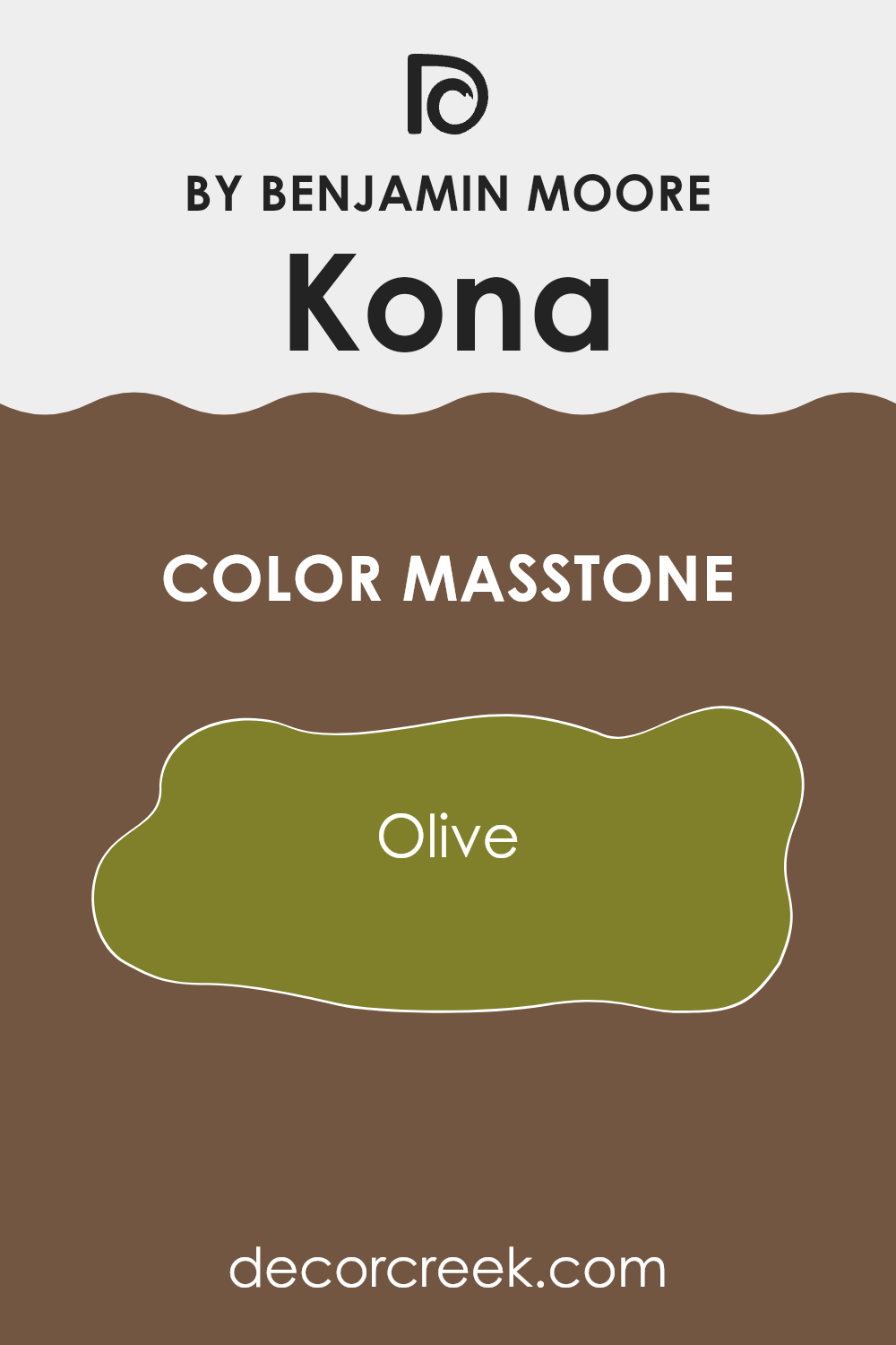
What is the Masstone of the Kona AF-165 by Benjamin Moore?
KonaAF-165 by Benjamin Moore has a masstone of Olive, a unique shade that is a blend of a dark yellow and green. This color can create a calm and welcoming atmosphere in any home. Its richness means it works well in natural light and can also make areas feel cozier in areas with less light.
It pairs nicely with natural materials like wood, adding warmth to rooms like living rooms or bedrooms. This shade is flexible; it can act as a bold statement on an accent wall or as a subtle backdrop when used on all walls.
For homes with a rustic or earthy style, this olive tone offers a sturdy, nature-inspired look. It can also contrast beautifully with modern decor, adding depth to a contemporary look with its deep, rich hue. Olive lends itself well to homes, providing a grounding and organic feel that is both stylish and comforting.
How Does Lighting Affect Kona AF-165 by Benjamin Moore?
Lighting plays a crucial role in how we perceive colors in our surroundings. The type of light, whether natural from the sun or artificial from light bulbs, can influence how a color looks on our walls, furniture, and decor. For instance, a paint color like Kona, which is a rich, deep brown with warm undertones, can appear differently under various lighting conditions.
When exposed to artificial light, such as LED or incandescent bulbs, Kona may take on a warmer tone. Incandescent lighting, with its yellowish cast, can enhance the warm undertones of Kona, making it appear cozier and more inviting. In contrast, LED lights, depending on their color temperature, can either make Kona look more true to its color in daylight or slightly more muted.
Natural light changes throughout the day and impacts how colors look in a room. In north-facing rooms, which receive less direct sunlight, Kona will appear as a true deep brown since the cooler, indirect light from the north can emphasize its richness without altering its base tone much. This can make the room feel more intimate.
In south-facing rooms, which are flooded with ample, direct sunlight for most of the day, Kona can look lighter and show more of its warm undertones. The color becomes vibrant and lively due to the bright, warm light, which might be great for living rooms.
East-facing rooms receive the morning sunlight, which is warm and bright. Here, Kona will have a cheerful and inviting presence in the morning, gradually transitioning to a truer, deeper shade as the day progresses because the light becomes cooler.
Finally, in west-facing rooms, the afternoon and evening light, which tends to be warmer, will make Kona look exceptionally warm and rich. This can create a cozy atmosphere towards the end of the day, making it a great choice for dining rooms or rooms used mainly in the afternoon and evening.
In summary, Kona adapts uniquely to different lighting, offering varying experiences in each room based on the direction it faces and the type of light it receives.
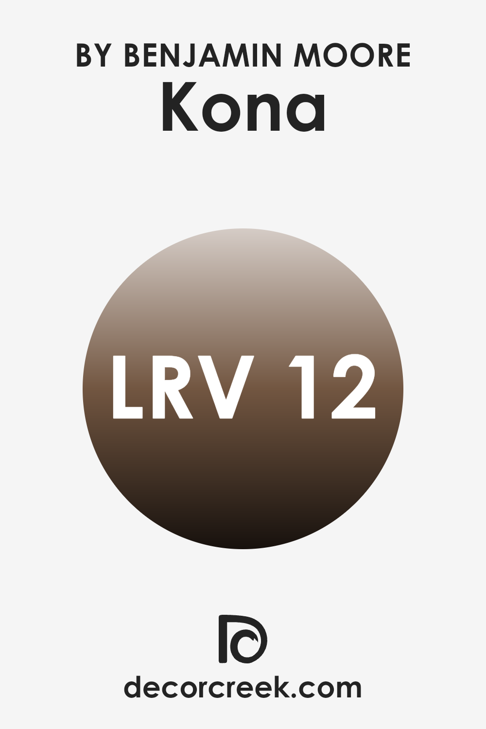
What is the LRV of Kona AF-165 by Benjamin Moore?
LRV stands for Light Reflectance Value, which measures the percentage of light a paint color reflects back into a room. This value helps in determining how light or dark a color will appear on your walls. The scale for LRV runs from zero, which is the darkest, reflecting no light, to the highest point on the scale, which reflects all light hitting it.
Colors with a higher LRV make a room feel more open and airy because they reflect more light. In contrast, colors with a lower LRV can make a room feel smaller but are excellent for creating a cozy and inviting atmosphere. With an LRV of 12.29, Kona is quite dark. It absorbs a significant amount of light, which can make a room feel more enclosed.
When used on walls, this color can bring a sense of warmth and intimacy to a room, making it ideal for areas where a calming and secluded feel is desired, such as bedrooms or reading areas. However, it is essential to balance this dark shade with adequate lighting and lighter accents to ensure the room doesn’t feel too confined. Additionally, if your room is naturally dark or small, using a color with such a low LRV could make it appear even smaller and darker.
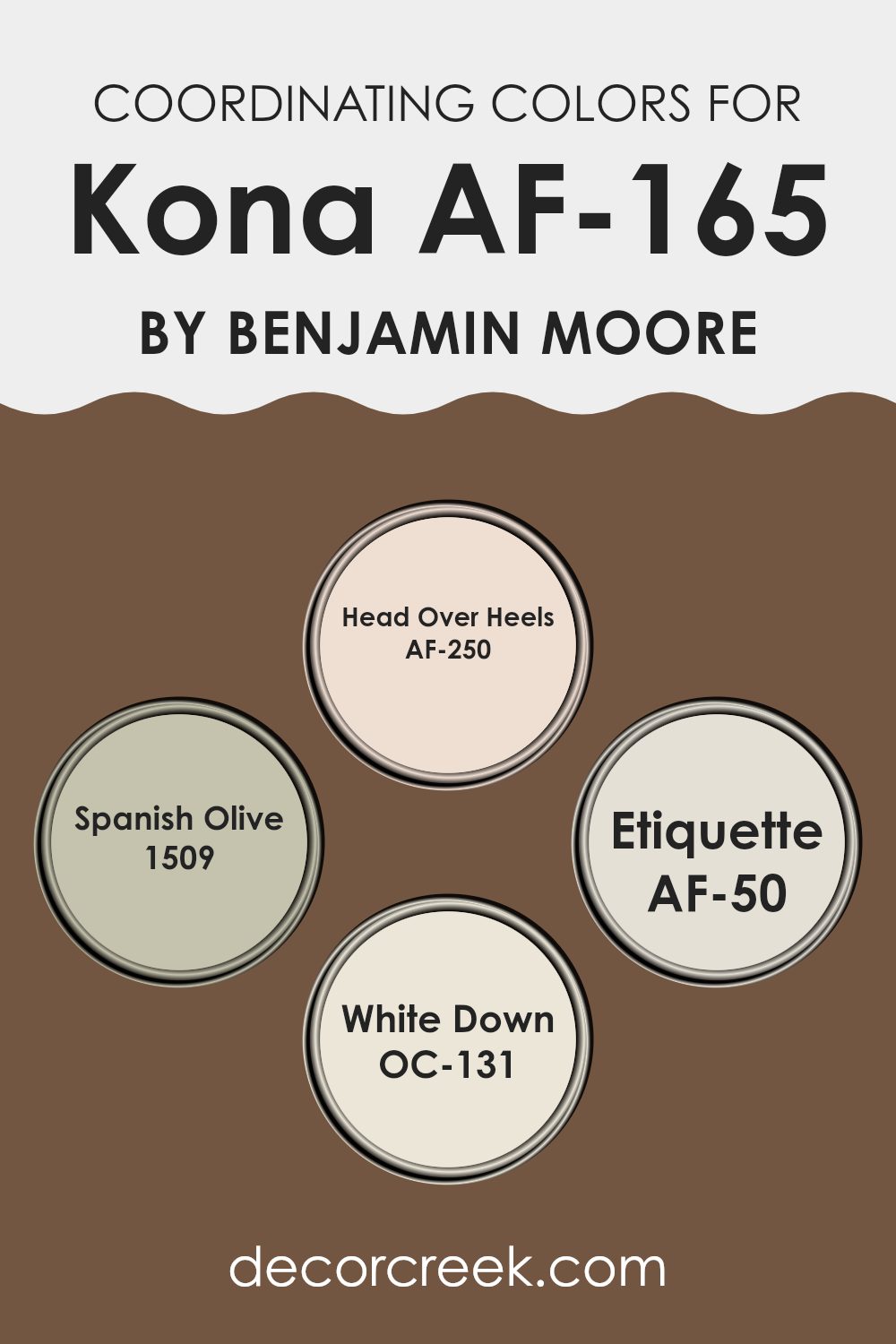
Coordinating Colors of Kona AF-165 by Benjamin Moore
Coordinating colors are hues that complement each other well and create a harmonious look when used together. These colors are often found alongside each other on color palettes provided by paint brands, making it easier for decorators to design rooms that flow elegantly.
Each coordinating color balances features of the main color (such as Kona AF-165 by Benjamin Moore) to enhance room aesthetics and evoke a particular mood or style. Understanding which colors coordinate can help one achieve a cohesive interior room that brings out the best of each hue.
Kona’s coordinating color, Head Over Heels AF-250, is a soft, blush-toned pink that adds a gentle touch of warmth to areas, making it perfect for creating a cozy yet light atmosphere. Spanish Olive 1509 is a muted, earthy green, ideal for bringing a subdued, natural vibe to a room that complements more intensely colored or neutral furnishings. Etiquette AF-50 offers a clean, mid-tone gray that works wonderfully to balance out richer colors with its understated elegance.
Finally, White Down OC-131 is a off-white with a hint of warmth; it’s excellent for creating a bright and airy feeling in any room, providing relief from more saturated colors and tying different room elements together seamlessly. Together, these colors offer a variety of decorating possibilities to achieve a visually appealing environment.
You can see recommended paint colors below:
- AF-250 Head Over Heels
- 1509 Spanish Olive
- AF-50 Etiquette
- OC-131 White Down
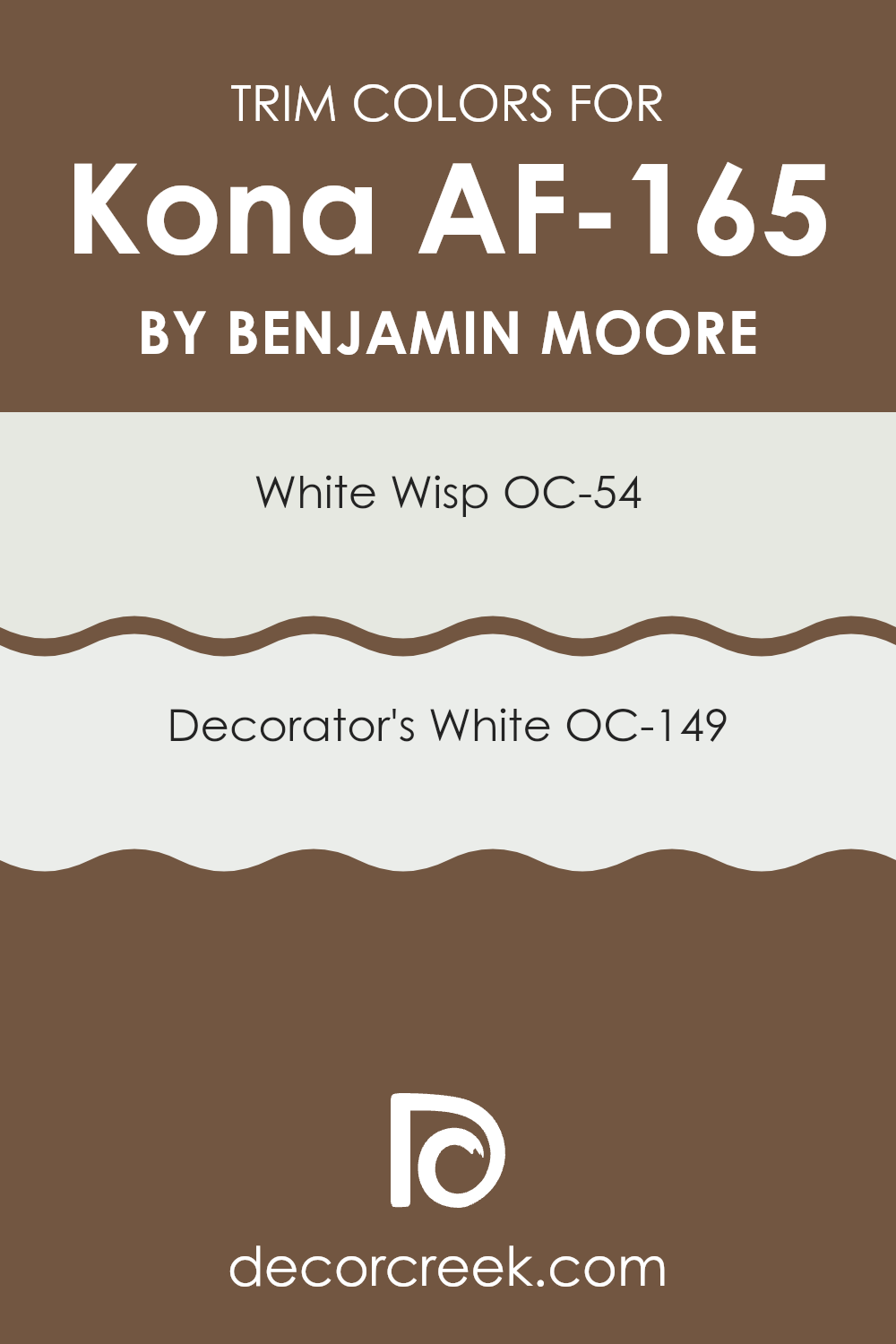
What are the Trim colors of Kona AF-165 by Benjamin Moore?
Trim colors are special shades used on the finishing edges or accents of walls, doors, windows, and other architectural features in a room, creating contrast and adding detail to the interior design. Trim colors like OC-54 – White Wisp and OC-149 – Decorator’s White from Benjamin Moore are especially significant when paired with a main color such as Kona AF-165 because they help to frame the room and can make the dominant color stand out more effectively.
These colors ensure that features like crown moldings, baseboards, and door frames don’t just blend into the background, but rather highlight the overall design scheme. White Wisp OC-54 is a gentle white with a hint of soft gray, giving it a clean and fresh appearance that merges well with Kona AF-165, providing a subtle contrast without overpowering the senses.
On the other hand, Decorator’s White OC-149 offers a crisper edge, due to its slight undertone of cool gray, making it an excellent choice for sharper, cleaner lines that clearly define the areas between different areas and elements in a room. Both these trim colors work in harmony to enhance the visual interest and feel of the room by framing and complementing the bolder hues like Kona.
You can see recommended paint colors below:
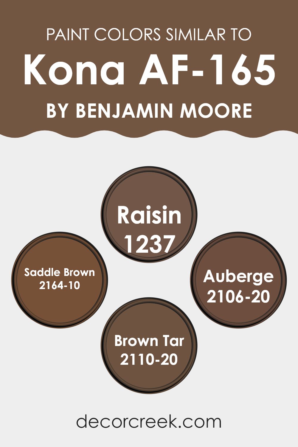
Colors Similar to Kona AF-165 by Benjamin Moore
Choosing a palette of similar colors can have a valueble imapct on interior design. Focused color schemes create a cohesive atmosphere in a room, making it feel complete and united. For example, matching colors such as Raisin, Saddle Brown, Auberge, and Brown Tar effectively accentuate the visibility and character of Kona AF-165 by Benjamin Moore, serving either as complementary tones in a room or as stand-alone shades that echo the deep, soulful essence of Kona.
Raisin is a dark, berry-inspired shade that injects a hint of warmth and depth into areas. It pairs seamlessly with the dark chocolate allure of Kona, offering a subtler contrast that’s both warm and inviting. Similarly, Saddle Brown draws from a rich, leathery palette, introducing a robust and earthy feel that complements heftier tones like Kona wonderfully.
Auberge leans into a deep burgundy, adding a touch of elegance without overpowering the senses. It’s a perfect match for intimate settings where a strong but nuanced color is needed. Brown Tar, on the other hand, provides a dense, almost black shade that anchors lighter accents and brings a dramatic flair to balance the richness of colors like Kona. Together, these colors create a harmonious visual flow and add layers to a room, making it feel grounded and thoughtfully connected.
You can see recommended paint colors below:
- 1237 Raisin
- 2164-10 Saddle Brown
- 2106-20 Auberge
- 2110-20 Brown Tar
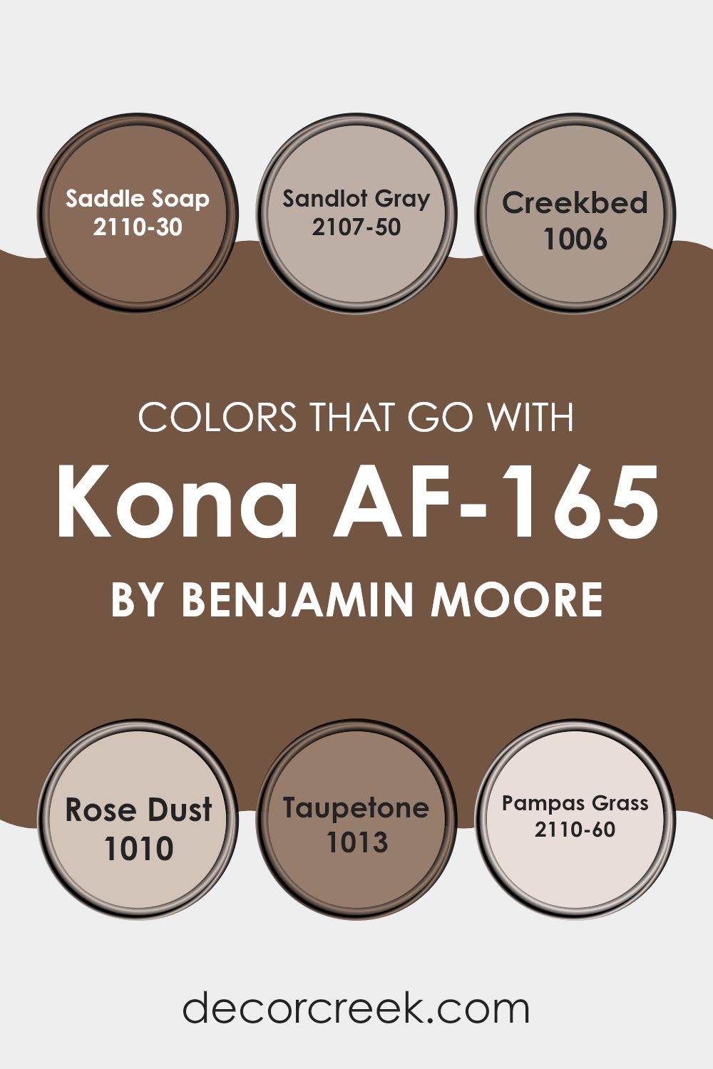
Colors that Go With Kona AF-165 by Benjamin Moore
Choosing colors that complement Kona AF-165, a flexible paint shade by Benjamin Moore, is crucial in creating a cohesive and appealing color scheme for any room. Kona AF-165, with its deep and rich tones, pairs beautifully with a variety of colors, enhancing the overall aesthetic and mood of a room.
For instance, Saddle Soap, a warm and earthy brown, brings a cozy and welcoming feel to the room when used alongside KonaAF-165, making it perfect for living areas or bedrooms where comfort is key. Meanwhile, Sandlot Gray offers a lighter, softer gray shade that contrasts subtly with KonaAF-165, providing a refined look without overpowering the senses.
Adding colors like Creekbed, a mellow taupe, introduces a gentle neutral that works harmoniously to balance the intensity of KonaAF-165, making it ideal for relaxing environments such as studies or dens. Rose Dust, a soft pink with a touch of warmth, injects a subtle vibrancy and freshness when paired with KonaAF-165, ideal for areas that benefit from a pop of color. Taupetone, another pleasing taupe, leans towards a slightly richer hue, which crafts a seamless transition between the boldness of KonaAF-165 and other elements in the room.
Lastly, Pampas Grass, a pale, sandy hue, offers a light contrast that highlights the deeper notes of KonaAF-165, perfect for creating a visually interesting room that maintains a grounded feel. Combining these colors with KonaAF-165 can pull a room together, making it feel thoughtfully designed and visually cohesive.
You can see recommended paint colors below:
- 2110-30 Saddle Soap
- 2107-50 Sandlot Gray
- 1006 Creekbed
- 1010 Rose Dust
- 1013 Taupetone
- 2110-60 Pampas Grass
How to Use Kona AF-165 by Benjamin Moore In Your Home?
The Kona AF-165 by Benjamin Moore is a rich and warm brown paint color that brings a cozy feeling to any room. This flexible shade fits well in many parts of the home like the living room, bedroom, or dining area.
Its deep tone pairs nicely with lighter colors such as creams or soft yellows, creating a balanced look. You can use it on a feature wall to add depth and interest to your room, or paint all the walls in a smaller room like a bathroom to make it feel more welcoming and cozy.
Furniture and decorations in natural wood or rustic styles go perfectly with Kona AF-165, enhancing the homey vibe. Additionally, if you have a lot of natural light in your home, this color can look especially warm and inviting, making your room feel pleasant and relaxed. Whether you’re repainting a single room or looking to add some character throughout your home, Kona AF-165 is a great choice.
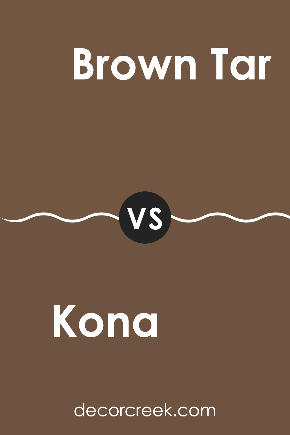
Kona AF-165 by Benjamin Moore vs Brown Tar 2110-20 by Benjamin Moore
Kona AF-165 and Brown Tar 2110-20, both by Benjamin Moore, showcase unique aspects of brown hues, each offering its distinct vibe. Kona AF-165 exudes a deep, rich brown tone that brings a warm and cozy feel to any room. This color works well in areas where you want a touch of elegance without being too bold. It’s perfect for living rooms and dining areas where you aim for a welcoming atmosphere.
On the other hand, Brown Tar 2110-20 is a much darker shade that tends to lean towards a more intense, almost black-brown color. This makes it ideal for creating dramatic accents in interior rooms or used in smaller doses to add depth. It fits well in modern settings or as an accent wall, providing a strong backdrop to lighter or vibrant colors.
Both colors share a base of brown, but their intensity and impact are quite different, offering diverse options depending on the room’s desired mood and style.
You can see recommended paint color below:
- 2110-20 Brown Tar
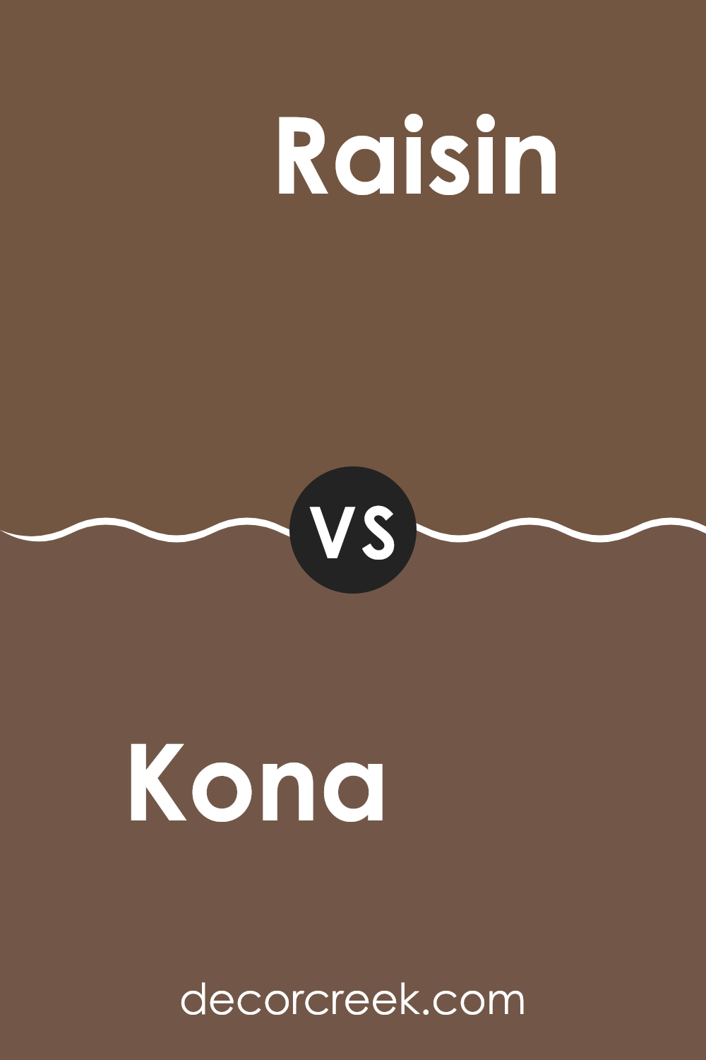
Kona AF-165 by Benjamin Moore vs Raisin 1237 by Benjamin Moore
The Kona AF-165 by Benjamin Moore is a deep, rich brown with a hint of gray, giving it a cozy and earthy feel. This color is ideal for creating warm, inviting rooms, and works well in living rooms or bedrooms.
On the other hand, Raisin 1237 by Benjamin Moore has a darker, more intense tone, verging toward a deep purple-brown. It offers a bolder look that can make a strong statement, perfect for accent walls or decor pieces that need to stand out.
Comparatively, Kona is softer and more neutral, which makes it more flexible for various decorating styles, while Raisin, with its deeper berry undertones, suits rooms that can handle a bit of drama. Both colors provide unique approaches to incorporating dark tones into your room, depending on the ambiance you want to achieve.
You can see recommended paint color below:
- 1237 Raisin
Kona AF-165 by Benjamin Moore vs Auberge 2106-20 by Benjamin Moore
Comparing the two colors from Benjamin Moore, Kona AF-165 and Auberge 2106-20, gives a clear insight into their different tones and atmospheres. Kona AF-165 is a deep, rich brown that offers a warm and cozy feel. It’s ideal for creating a welcoming and comfortable room, reminiscent of dark chocolate or well-polished wood.
On the other hand, Auberge 2106-20 has a bolder, darker approach, leaning more towards a deep burgundy. This color adds a dramatic flair to any room, providing a strong presence that can make wall decor or furniture stand out. It’s perfect for those looking to make a statement with their color choice.
While both colors are dark, they evoke different moods; Kona is more about warmth and homeliness, whereas Auberge leans toward elegance and drama. Depending on what you’re going for in a room—coziness or a striking feel—either of these colors could be the perfect choice.
You can see recommended paint color below:
- 2106-20 Auberge
Kona AF-165 by Benjamin Moore vs Saddle Brown 2164-10 by Benjamin Moore
The main color, Kona, is a deep, rich brown with a hint of warmth. It has an inviting quality without being overly bright, making it suitable for areas where you want to create a cozy and comfortable ambiance. This color feels natural and earthy, which provides a solid, grounding effect in a room.
On the other hand, Saddle Brown is a much darker shade. It’s closer to a traditional dark brown with strong, bold undertones. This color is ideal for creating a striking contrast in decor, especially when used on accent walls or for furniture. It tends to absorb more light, making it suitable for larger, well-lit rooms to prevent the area from feeling too closed in.
While both colors share a brown base, Kona leans towards a warmer, lighter tone, offering a gentle welcome. In contrast, Saddle Brown serves as a dramatic backdrop, perfect for making other elements in the room stand out. Together, these colors could work well for anyone looking to combine soft warmth with dramatic depth in their color scheme.
You can see recommended paint color below:
- 2164-10 Saddle Brown
After reading about AF-165 Kona by Benjamin Moore, I’ve learned a lot about this unique paint color. Kona is a deep and rich brown shade that looks like dark chocolate. It feels cozy and warm, making any room feel welcoming. This color works really well in places where you want to relax, like a bedroom or a living room.
Benjamin Moore has made sure that the color Kona not only looks good but also lasts a long time without fading. It’s amazing how a simple paint like Kona can change the whole feel of a room and make it nicer to spend time in.
Moreover, this paint is easy to apply, which is great news for anyone wanting to paint their room themselves without needing a professional’s help. Kona mixes well with other colors too, so you can get creative with how you decorate the rest of the room.
Overall, choosing AF-165 Kona is a solid decision if you’re looking for a paint that’s warm, cozy, and has a classic vibe. Whether you’re updating your bedroom or giving your living room a new look, Kona is a great choice that will make your room look and feel very comfortable.
Ever wished paint sampling was as easy as sticking a sticker? Guess what? Now it is! Discover Samplize's unique Peel & Stick samples.
Get paint samples

