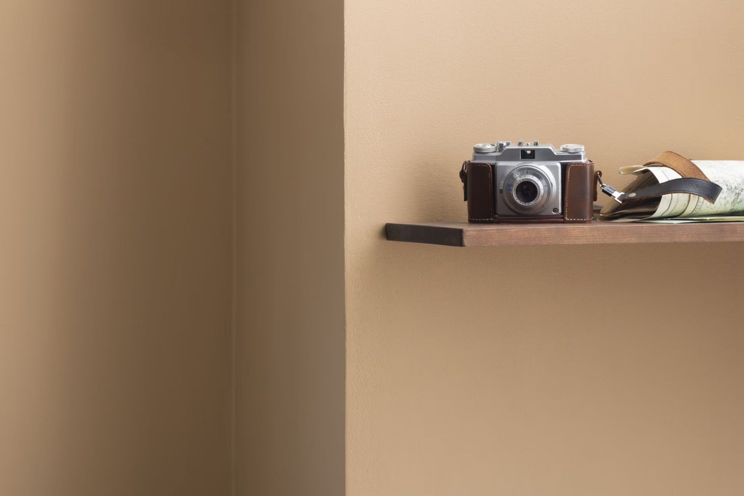
As a personal fan of creating cozy, inviting areas, I came across AF-200 Lingerie by Benjamin Moore. I must say, selecting the right paint color can be a game-changer for your home décor. AF-200 Lingerie is not just a shade; it subtly balances warmth with neutral elegance, making it a flexible choice for any room.
Whether you’re freshening up your living room or looking for the perfect backdrop for your bedroom, this color provides a gentle, refined canvas that enhances the room without overpowering it.
Plus, it pairs beautifully with a variety of textures and furniture styles, from modern minimalist to shabby chic. If your goal is to create a room that feels welcoming and stylish, AF-200 Lingerie could be the ideal match.
Give it a chance, and you might just find it as surprisingly adaptable and appealing as I did.
What Color Is Lingerie AF-200 by Benjamin Moore?
Lingerie AF-200 by Benjamin Moore is a soft, warm white with subtle, creamy undertones. It offers a gentle hint of color, making it more inviting than stark whites, while still maintaining a clean, airy feel. This shade is part of the Affinity Color collection, known for colors that harmonize perfectly with each other, ensuring a cohesive look throughout any room.
This flexible white works exceptionally well in a variety of interior styles. It’s particularly suited to modern and minimalist designs, where its lightness can help to create a sense of openness. It’s also equally at home in more traditional settings, providing a fresh, polished backdrop that allows other elements such as furniture and artwork to stand out.
When it comes to materials, Lingerie AF-200 pairs beautifully with natural wood, from light maple to rich walnut, highlighting the depth and texture of the grain. It also matches well with metallic finishes like brushed nickel or copper, adding a slight contrast to the warmth of the white.
Textured fabrics, such as linen or velvet, in neutral tones or soft pastels, complement the creamy qualities of Lingerie AF-200, contributing to a cozy, inviting environment. Overall, this color is a superb choice for anyone looking to add a subtle nuance to their room without overpowering it with color.
Is Lingerie AF-200 by Benjamin Moore Warm or Cool color?
Lingerie AF-200 by Benjamin Moore is a soft, warm beige color that brings a cozy and calming atmosphere to any room. This neutral shade is flexible, making it easy to combine with a wide range of other colors, from bold and bright to subtle and soft.
It works well in bedrooms, living rooms, and bathrooms, providing a gentle backdrop that complements both modern and traditional decor. The color’s warm undertones can help to make a room feel more inviting and comfortable, which is great for creating a relaxing environment in your home.
It’s particularly effective in rooms with natural light, as the sunlight enhances the warm qualities of the color, making the room feel airy and light. Whether you’re looking to paint an entire room or just an accent wall, Lingerie AF-200 offers a beautiful and adaptable option that can help to harmonize the elements of your decor.
Undertones of Lingerie AF-200 by Benjamin Moore
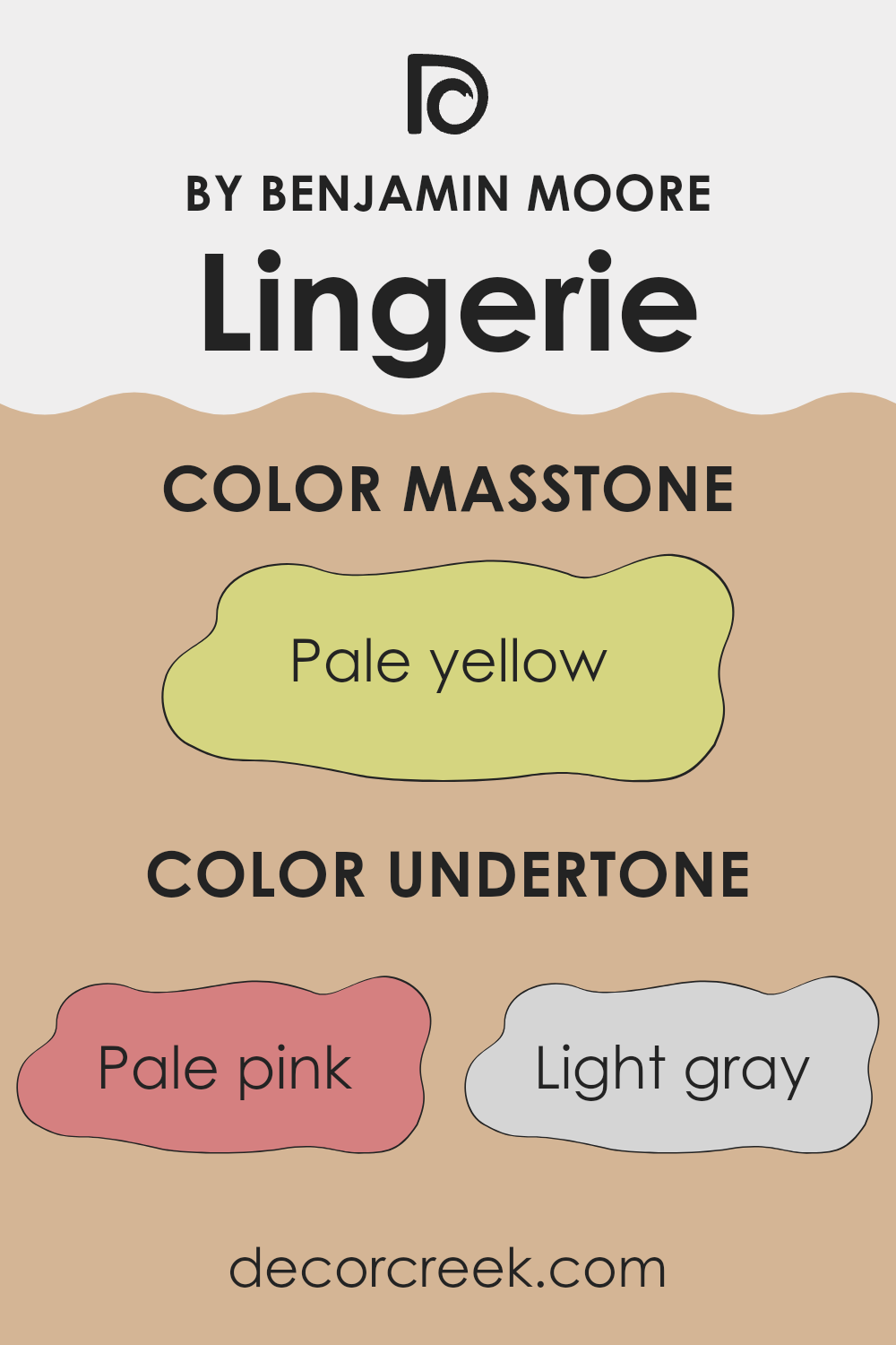
Lingerie AF-200 by Benjamin Moore is a color that can subtly change in appearance based on its undertones. Undertones are the underlying colors that emerge under different lighting conditions or when placed next to other colors. The undertones for this particular shade include pale pink, light gray, light purple, mint, grey, light blue, yellow, lilac, orange, light green, and olive. Each of these colors subtly influences the main hue, affecting how it looks in various environments.
In interior settings, the presence of these undertones means that Lingerie AF-200 can look different depending on the room’s lighting and surrounding colors. For example, in a room with a lot of natural light, the pale pink or light purple undertones might make the walls seem softer and more inviting.
In artificial light, the grey or light gray might become more dominant, giving the room a cooler feel. This adaptability makes Lingerie AF-200 a flexible choice for walls because it can harmonize with a wide range of decor styles and color schemes. If the room has elements like wooden furniture or natural fibers, the olive or light green undertones can enhance these organic features.
In a minimalist room with modern furnishings, the light gray or grey undertones could complement metallic fixtures and modern design elements, creating a cohesive look. Overall, the varied undertones in Lingerie AF-200 make it an excellent option for those looking to achieve a nuanced yet harmonious color palette in their home.
What is the Masstone of the Lingerie AF-200 by Benjamin Moore?
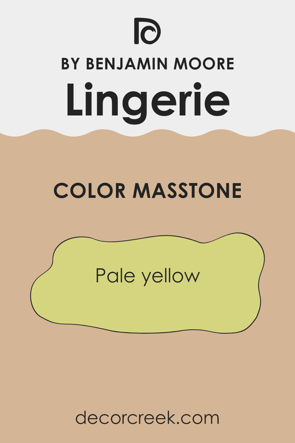
Lingerie AF-200 by Benjamin Moore is a soft, pale yellow paint color that brightens up any room with a subtle, cheerful glow. The light yellow hue has a natural warmth which can make rooms feel cozy and inviting, especially in areas that don’t get a lot of sunlight. This particular shade is flexible enough to work well in various parts of the home, from kitchens and bathrooms to living rooms and bedrooms.
The understated quality of Lingerie AF-200 means it pairs nicely with a wide range of decor styles and complements different color schemes without overpowering them. It can act as a neutral backdrop for bolder colors or work harmoniously with soft pastels for a gentle, relaxing atmosphere.
In practical terms, this yellow is gentle enough not to show small imperfections on walls as much as darker or more vibrant colors might. This makes it a good choice for large wall areas. It’s a color that provides a fresh, clean look, improving the overall feel of a home.
How Does Lighting Affect Lingerie AF-200 by Benjamin Moore?
Lighting plays a crucial role in how colors appear in any environment. This is because light affects our perception of color. Depending on whether a color is viewed under natural or artificial light, it can look dramatically different. In the case of a light color such as the one by Benjamin Moore, its appearance can vary significantly under different lighting conditions.
Artificial light, depending on whether it is warm or cool, can alter how this color is perceived. Warmer lights, like those with a yellow tint, can make the color appear softer and creamier. Cooler lights, on the other hand, might make it look more crisp and bright, enhancing its pale qualities.
Natural light brings its own set of effects. The angle of the sun and the time of day can change how a color looks. In north-facing rooms, which often get less direct sunlight, the color might appear slightly cooler and grayer, giving a muted look. South-facing rooms receive more intense daylight, so here, this color will appear brighter and more vibrant, bringing out its subtle warm tones.
East-facing rooms enjoy the morning light, which is typically gentle and warm. This warm morning light can make the color look very soft and welcoming. As the day progresses, the light becomes cooler, which might affect how the color looks, making it appear slightly duller.
Conversely, west-facing rooms get the best of the afternoon and evening light, which can be quite warm and golden. This kind of light can make the color glow, enhancing its warmth in a pleasant way. In summary, the perception of colors like this specific light one from Benjamin Moore can differ based on the lighting they are under, showing multiple shades and moods throughout the day and in different settings. Understanding this can help in choosing the right paint color based on the room’s orientation and the type of artificial light used within the room.

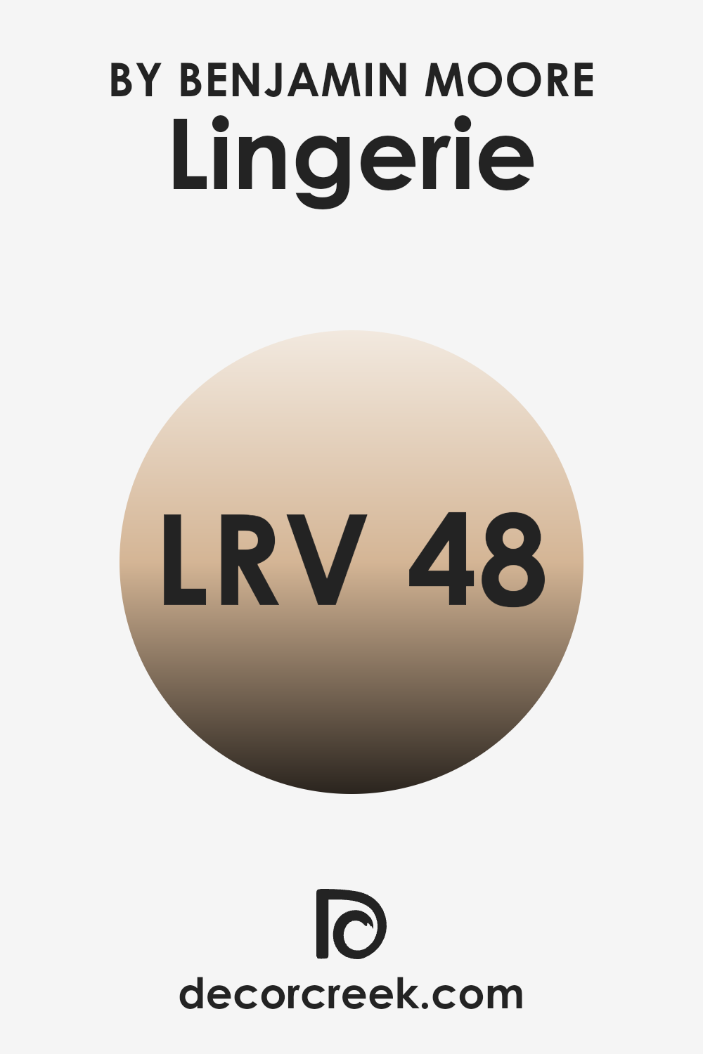
What is the LRV of Lingerie AF-200 by Benjamin Moore?
LRV stands for Light Reflectance Value, which is a measure used to indicate how much light a paint color reflects back into a room as opposed to absorbing it. This value is particularly useful when deciding on paint colors, as it helps to understand how light or dark a color will look once applied to the walls.
An LRV can range from a very low number, indicating a dark color that absorbs more light, to a high number, showing that the color is lighter and reflects more light. The LRV of 48.32 for the mentioned color means that it reflects almost half of the light that hits it. This level suggests that it is a mid-tone color – not too dark, but not particularly light either.
In practical terms, this makes it a flexible choice for rooms, accommodating both areas that receive a lot of natural sunlight and those that might rely more heavily on artificial lighting. Being a mid-range LRV, it should maintain its true color under different lighting conditions without leaning too heavily towards feeling stark or overly shadowy.
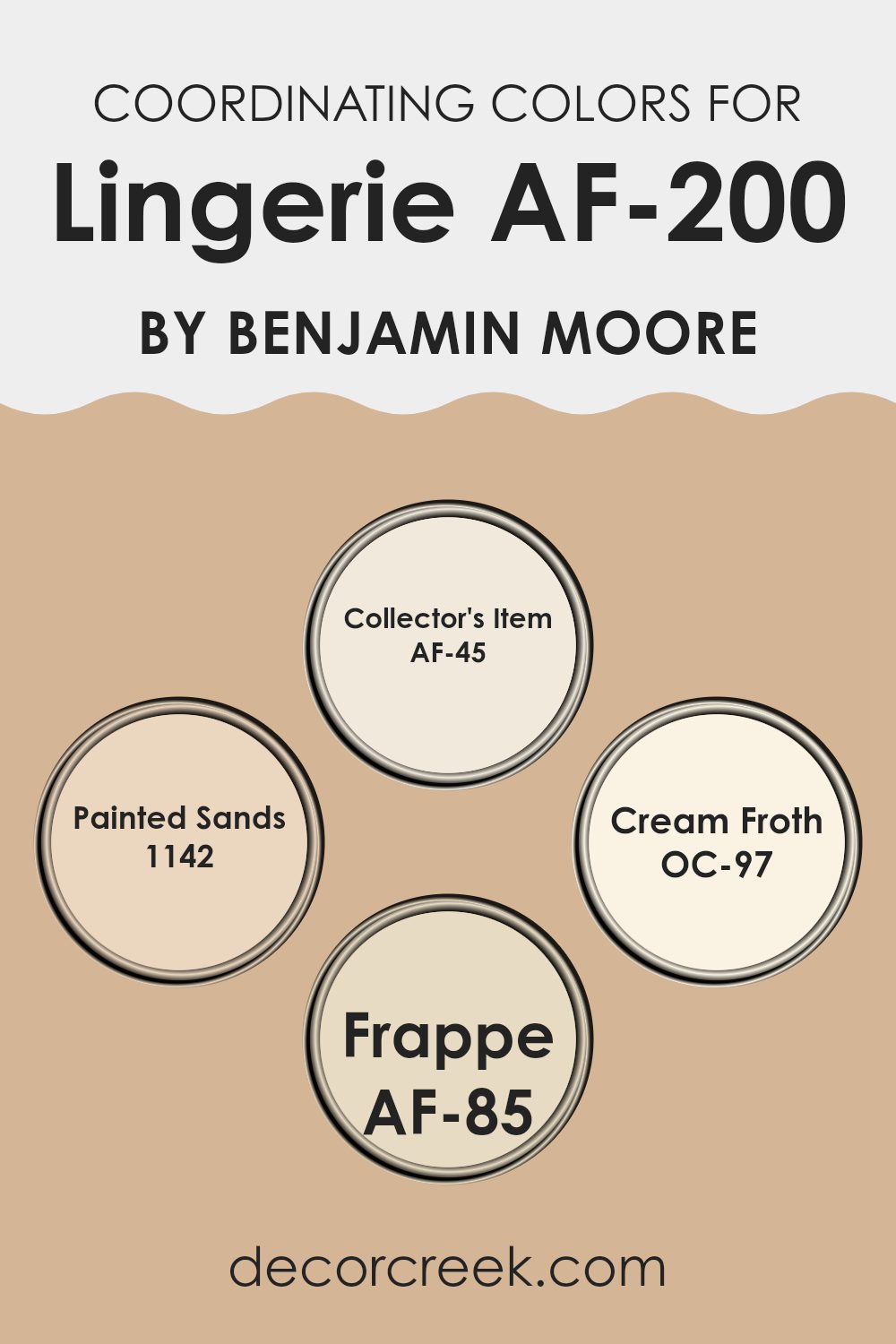
Coordinating Colors of Lingerie AF-200 by Benjamin Moore
Coordinating colors are selected to work harmoniously together in a room, enhancing the overall aesthetic appeal without overpowering any single element. Essentially, this concept involves choosing shades that complement the primary color used in a room to create a balanced and visually appealing environment. These colors can contrast with, balance, or accentuate the main hue, depending on what’s desired in the design.
For a color like Lingerie by Benjamin Moore, coordinating colors could include shades like Collector’s Item, Painted Sands, Cream Froth, and Frappe. Collector’s Item is a subtle off-white that offers a clean and airy feel to complement richer tones or serve as a gentle contrast to darker colors.
Painted Sands, with its warm and gentle brown tone, provides a sturdy earthy quality that pairs well with both light and bold colors, adding depth and warmth to areas. The softness of Cream Froth, as a light creamy color, acts as a smooth backdrop, allowing other colors to stand out without clashing. Lastly, Frappe is a mellow caramel hue that brings a cozy, welcoming touch which is great for areas that need a sense of comfort and understated elegance. Overall, such a palette creates an engaging and pleasant room tailored to bring balance and beauty.
You can see recommended paint colors below:
- AF-45 Collector’s Item
- 1142 Painted Sands
- OC-97 Cream Froth
- AF-85 Frappe
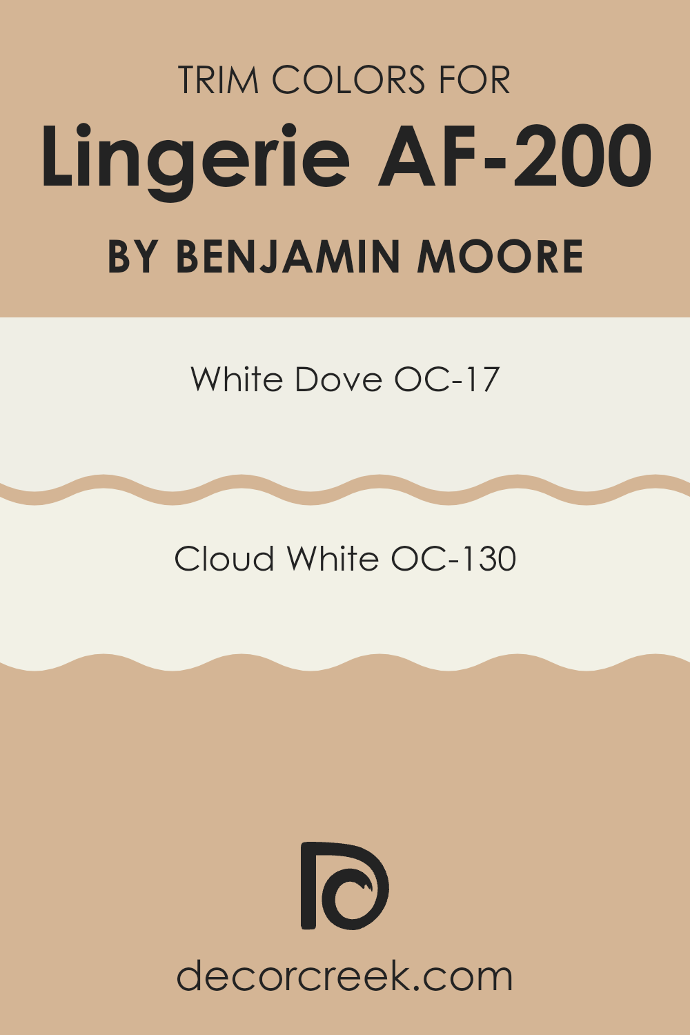
What are the Trim colors of Lingerie AF-200 by Benjamin Moore?
Trim colors are selected shades that are used to highlight the architectural features of a room, such as baseboards, molding, door and window frames, enhancing the overall aesthetic appeal. In the case of using trim colors like White Dove and Cloud White from Benjamin Moore, these lighter tones create a clean, seamless transition between walls and their accentuated elements.
These colors are particularly effective in lingerie environments where a gentle and unobtrusive ambience is preferred, ensuring the focus remains on the products while also providing a polished look to the room.
White Dove (OC-17) is a warm white color that offers a very soft and calm appearance, making it a perfect choice for a subtle contrast with bolder wall colors. It is known for its versatility, working well alongside many different hues. On the other hand, Cloud White (OC-130) has a slightly cooler tone, lending a fresh crispness that helps to brighten and open up a room. Both colors are neutral, ensuring they do not clash with the surrounding décor, but rather enhance the cleanliness and crispness of the lingerie showroom’s environment.
You can see recommended paint colors below:
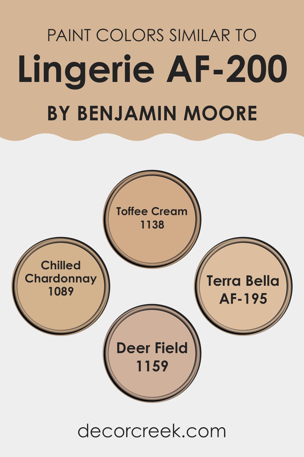
Colors Similar to Lingerie AF-200 by Benjamin Moore
When decorating a room, choosing similar colors is a crucial step in creating a cohesive and harmonious look. Similar colors, such as the range inspired by Lingerie AF-200 by Benjamin Moore, work together because they share common hues, making the transition between them smooth and pleasing to the eye.
These colors blend together naturally, avoiding harsh contrasts that might visually disrupt a room. By using shades that complement each other, you can achieve a balanced and unified aesthetic that enhances the overall ambiance of any room.
For example, Toffee Cream is a warm and inviting beige that offers a soft backdrop suitable for living rooms and bedrooms alike. It pairs well with furniture in both dark and light tones, providing a flexible base for various decor styles.
Another similar color is Chilled Chardonnay, which brings a subtle hint of yellow, reminiscent of a refreshing glass of white wine. This color is bright enough to add a slight cheer yet muted enough to maintain a calm atmosphere.
Terra Bella is a deeper hue that suggests the richness of earthy clay, ideal for adding a touch of warmth to a room. It works beautifully in areas that benefit from a cozy and welcoming vibe. Lastly, Deer Field is a gentle brown with a hint of green, perfect for those looking to introduce a natural element into their interiors. It particularly enhances rooms that have a lot of wooden elements or greenery. Together, these hues support each other to create an inviting palette that is easy on the eyes and suitable for a variety of areas.
You can see recommended paint colors below:
- 1138 Toffee Cream
- 1089 Chilled Chardonnay
- AF-195 Terra Bella
- 1159 Deer Field
Colors that Go With Lingerie AF-200 by Benjamin Moore
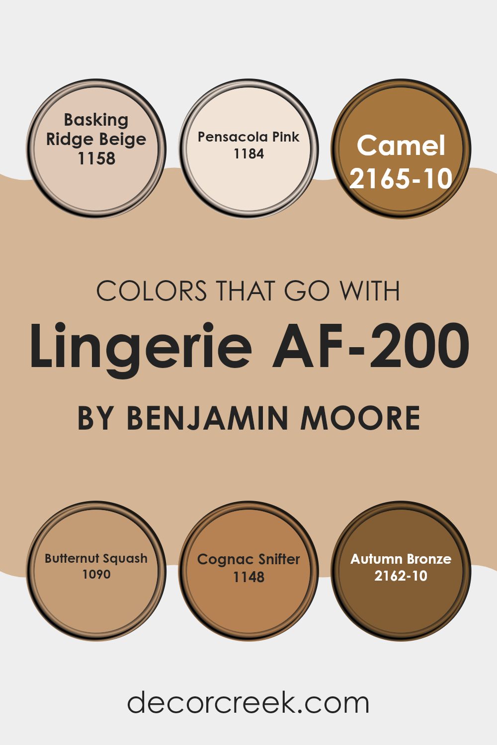
When choosing colors to pair with Lingerie AF-200 by Benjamin Moore, it’s crucial to consider how they complement the base hue to create a harmonious room. The selected colors, such as Basking Ridge Beige, Pensacola Pink, Camel, Butternut Squash, Cognac Snifter, and Autumn Bronze, each play a significant role in enhancing the overall aesthetic. These complementary colors ensure the room maintains a balanced and inviting atmosphere, allowing Lingerie AF-200 to shine as a backdrop or stand out as a focus point, depending on the design intent.
Basking Ridge Beige is a warm, soothing beige that effortlessly coordinates with softer hues, adding a gentle strength to any room. Pensacola Pink offers a subtle touch of warmth, bringing with it a soft, welcoming feel. Camel is a deeper, richer shade that adds a touch of earthiness and grounding.
Butternut Squash brings a cheerful splash of color, vibrant and lively, perfect for adding some energy to a room. Cognac Snifter is a rich, deep tone that exudes a sense of coziness and comfort, ideal for creating a focal point. Lastly, Autumn Bronze is a robust color that conveys a rustic yet refined air, perfect for adding depth and character. Together, these colors create a palette that supports a variety of decorating styles, ensuring that any room feels complete and well-coordinated.
You can see recommended paint colors below:
- 1158 Basking Ridge Beige
- 1184 Pensacola Pink
- 2165-10 Camel
- 1090 Butternut Squash
- 1148 Cognac Snifter
- 2162-10 Autumn Bronze
How to Use Lingerie AF-200 by Benjamin Moore In Your Home?
Lingerie AF-200 by Benjamin Moore is a subtle, soft paint color that can add a gentle and inviting touch to any room in your home. Its light, airy feel makes it perfect for creating a relaxed atmosphere, ideal for bedrooms and bathrooms where comfort is key. The color works well on walls and can also be used for trim or furniture to create a cohesive look.
This color pairs beautifully with bolder shades, serving as a neutral backdrop that lets other colors stand out. For example, in a living room, using Lingerie AF-200 on the walls while adding darker furniture or bright cushions can make the room feel open and welcoming.
Since it has such a neutral tone, it is very flexible and can fit with many different styles and preferences. Whether you are updating a single room or repainting your entire house, Lingerie AF-200 is a reliable choice that can help make your room feel refreshed and inviting without being too overpowering.
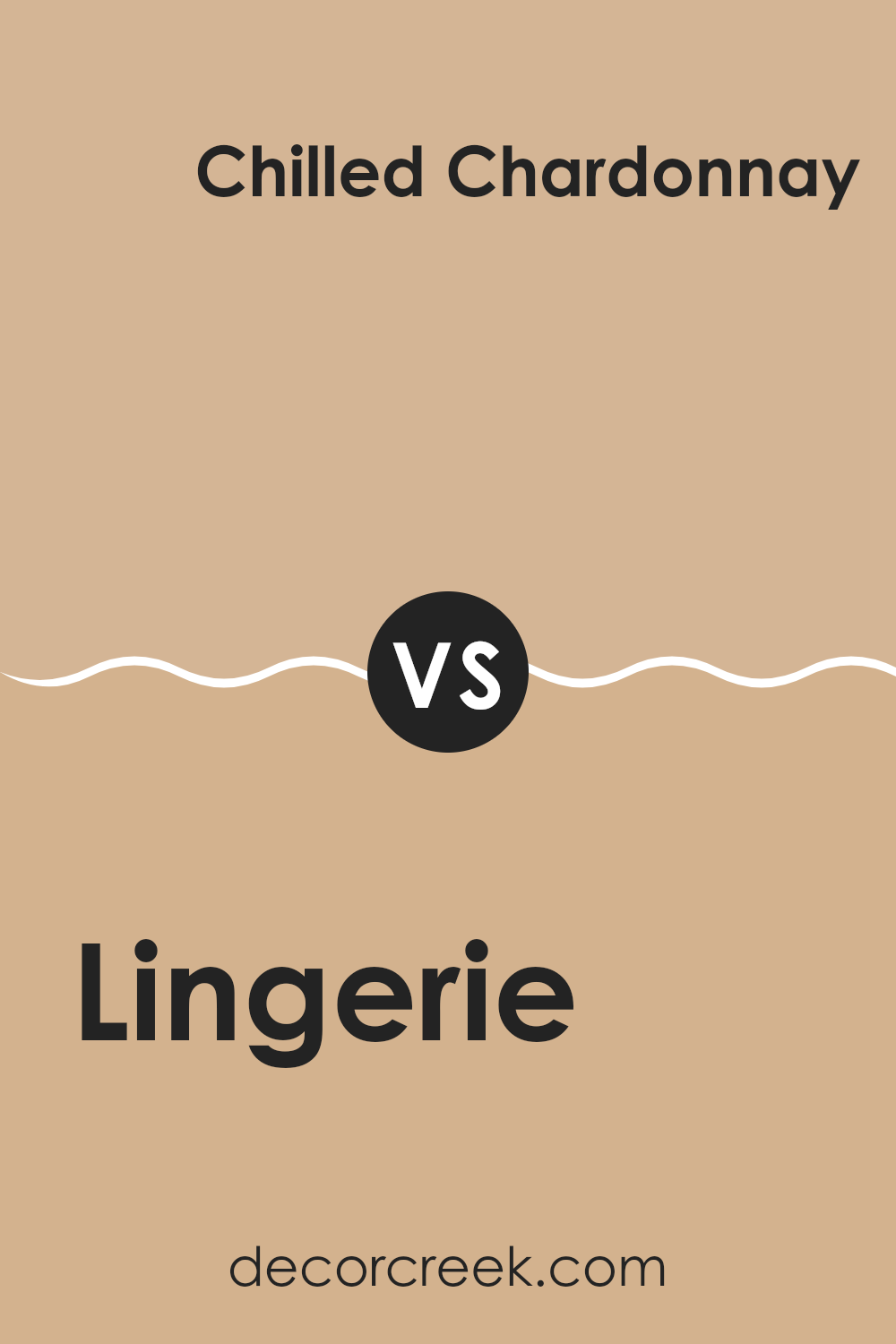
Lingerie AF-200 by Benjamin Moore vs Chilled Chardonnay 1089 by Benjamin Moore
Lingerie AF-200 and Chilled Chardonnay 1089, both by Benjamin Moore, offer distinct vibes for interior rooms. Lingerie AF-200 is a soft, pale pink that brings a gentle, soothing feel to a room.
It’s subtle enough to serve as a backdrop in various settings, giving a warm and cozy touch without overpowering the senses. On the other hand, Chilled Chardonnay 1089 is a light, creamy yellow. It adds brightness and a welcoming, cheerful energy, making rooms feel more open and lively.
While Lingerie AF-200 leans towards a calm, nurturing atmosphere, Chilled Chardonnay 1089 injects a dash of sunshine, potentially lightening up darker areas or making small rooms appear larger. Choosing between them depends on the mood you want: calming with Lingerie or energizing with Chilled Chardonnay.
You can see recommended paint color below:
- 1089 Chilled Chardonnay
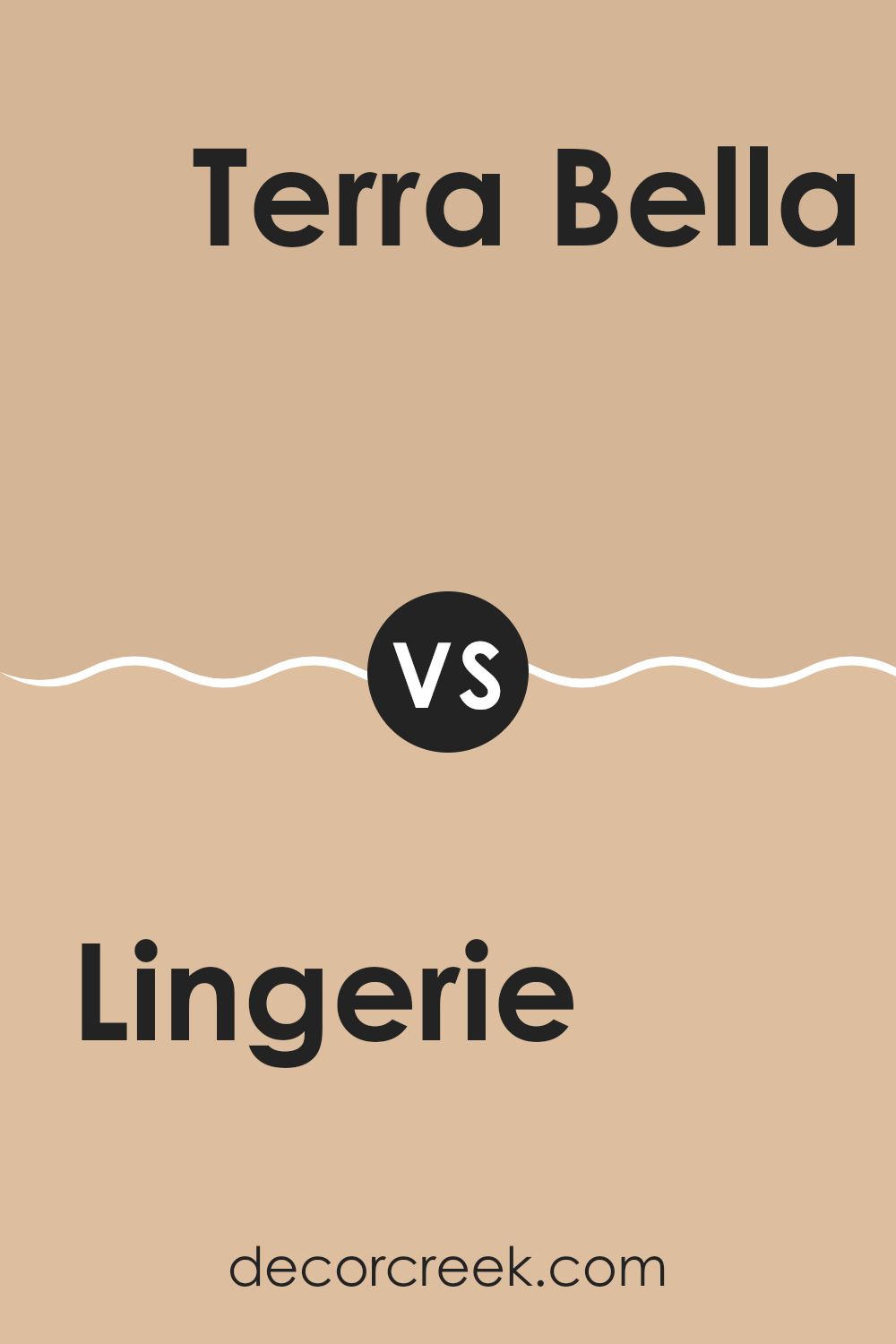
Lingerie AF-200 by Benjamin Moore vs Terra Bella AF-195 by Benjamin Moore
The main color, Lingerie, is a soft, muted beige that provides a light and clean backdrop. It’s quite neutral, making it flexible for many rooms, whether it’s a living room or a bedroom. This shade brings a calm, airy feel to any room, promoting a relaxed environment.
In contrast, Terra Bella is a richer, deeper taupe. It has a warm undertone, creating a cozy and inviting atmosphere. This color is ideal for those looking to add a bit of warmth to their room without overpowering it with darker tones.
Both colors come from the same color family but portray different moods and effects. Lingerie is best suited for those preferring a lighter, more laid-back vibe, while Terra Bella works well for adding a touch of warmth and depth. These colors can work beautifully together in different parts of a home to create a flow that’s both harmonious and visually interesting.
You can see recommended paint color below:
- AF-195 Terra Bella
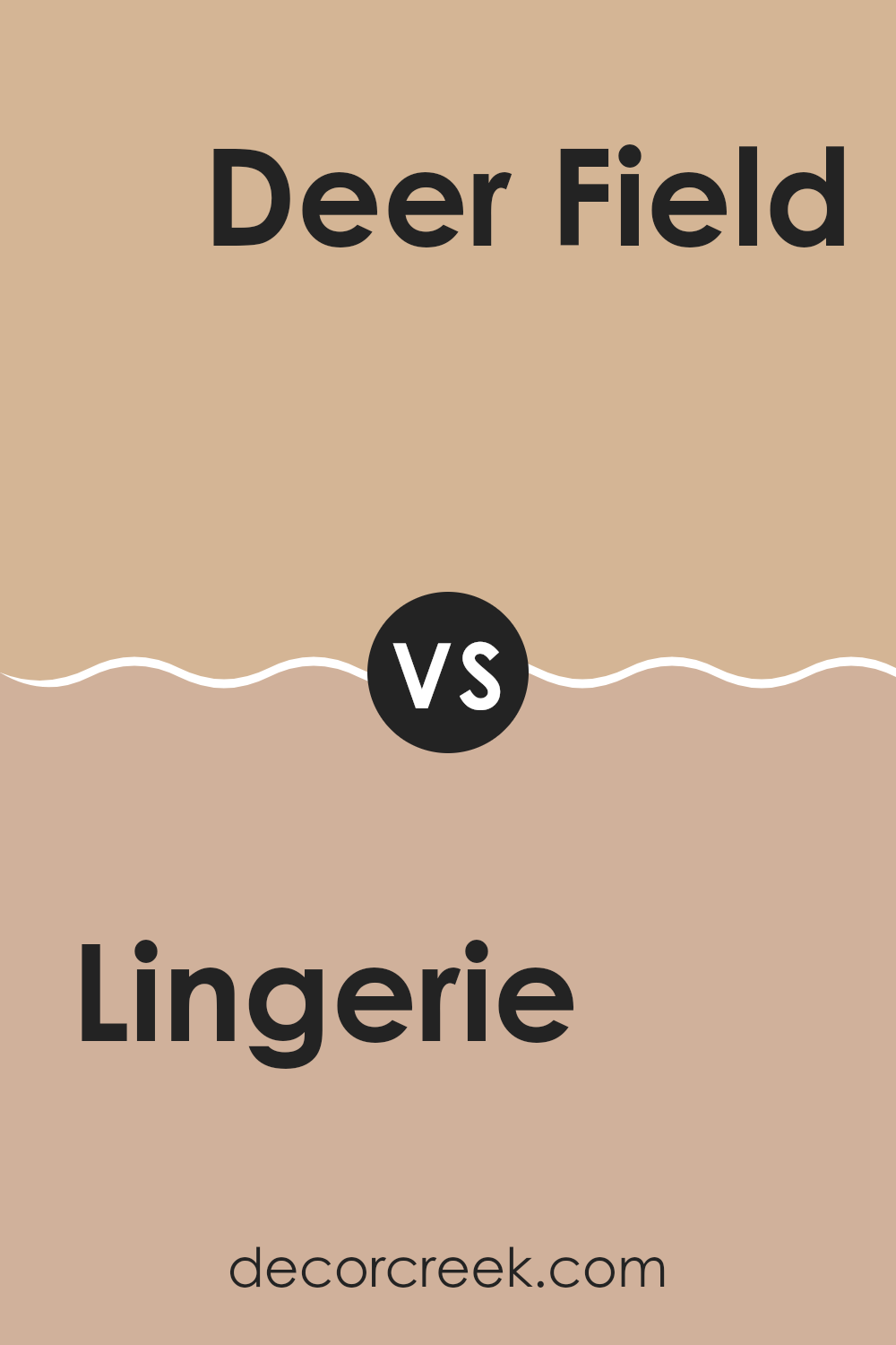
Lingerie AF-200 by Benjamin Moore vs Deer Field 1159 by Benjamin Moore
Lingerie AF-200 is a soft, warm peach color with a subtle beige undertone. It creates a cozy, inviting atmosphere in any room, reflecting light beautifully to make anreas appear larger and more open. On the other hand, Deer Field 1159 is a deeper, richer beige with hints of yellow and brown. This color gives a stronger, warmer feel to areas, making them feel snug and comfortable.
When comparing the two, Lingerie AF-200 is lighter and tends to blend well with other colors, making it ideal for a neutral backdrop that allows furniture and decor to stand out. It’s perfect for living areas and bedrooms where a gentle, calming feel is desired.
Deer Field 1159, with its earthier tones, suits areas where a more filled, cozy ambiance is preferred, such as dens or dining rooms. While both colors offer warmth, Deer Field 1159 provides a bolder statement with its richer hue.
You can see recommended paint color below:
- 1159 Deer Field
Lingerie AF-200 by Benjamin Moore vs Toffee Cream 1138 by Benjamin Moore
The main color, Lingerie, is a soft and gentle neutral that leans towards a very light taupe. It provides a calming and subtle backdrop, suitable for creating a relaxed atmosphere in any room. This color is flexible and pairs well with both bold and muted tones, allowing for various decorating styles.
On the other hand, Toffee Cream has a warmer, richer hue. It’s a medium brown with a welcoming, creamy feel, reminiscent of a delicious caramel toffee. This color is excellent for areas where a cozy, inviting ambiance is desired. It works well in living areas and dining rooms, bringing warmth and a sense of comfort.
Comparing the two, Lingerie is lighter and more understated, making it a good choice for smaller rooms or rooms that get less natural light, as it can help make them appear larger and brighter. Toffee Cream, with its deeper, warmer tones, is ideal for creating a cozy, snug environment. Both colors offer a lovely base for various decorating schemes, depending on the mood and function of the room.
You can see recommended paint color below:
- 1138 Toffee Cream
I’ve just finished reading about AF-200 Lingerie by Benjamin Moore, and I have to say, it’s quite interesting how a simple color can do so much for a room! This paint isn’t just any paint; it’s part of the Affinity collection which really helps in making different colors work well together. What’s special about AF-200 Lingerie is its unique soft, off-white shade that seems to make any room feel warmer and more welcoming.
From what I read, applying this color can really change the look of a place without making everything too bright or too dull. It’s like the perfect middle ground. It also goes well with so many other colors. That means, if you have a blue sofa or a green carpet, this color on the walls will still look great!
People who have used AF-200 Lingerie seem to be really pleased with how it turns out. They say it makes their rooms look clean and fresh. Plus, it’s good for all kinds of places, whether it’s a bedroom, a living room, or even a kitchen.
So, after reading all about it, I think AF-200 Lingerie by Benjamin Moore is a smart choice if you’re looking to paint a room. It’s simple, looks nice, and it fits in almost anywhere, which is probably why so many people recommend it.
Ever wished paint sampling was as easy as sticking a sticker? Guess what? Now it is! Discover Samplize's unique Peel & Stick samples.
Get paint samples

