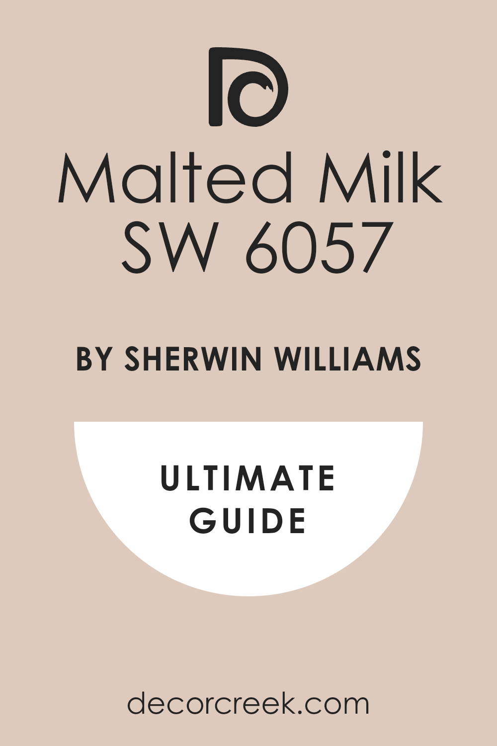
When you’re looking for a paint color that brings warmth and coziness to your space, SW 6057 Malted Milk by Sherwin Williams might just be your perfect match. This color is a creamy, soft beige that feels like a gentle hug for your walls.
It’s versatile enough to fit into almost any room in your home, whether you want to freshen up your living room, bedroom, or kitchen.
Using Malted Milk in your home can make your space feel inviting and serene. It pairs wonderfully with a wide range of decor styles, from rustic farmhouse to modern minimalism.
You’ll find that it works well with both natural light and artificial lighting, adapting its warmth to enhance your space beautifully throughout the day.
If you’re worried about it clashing with your current furnishings, don’t be. This color’s neutral tone makes it incredibly easy to integrate with existing colors and materials in your home.
Whether you have dark wood furniture, vibrant fabrics, or soft pastels, Malted Milk can tie them all together harmoniously.
So, if you’re thinking about giving your home a fresh, new look, consider SW 6057 Malted Milk. It’s a choice that you’ll find both lovely and practical, making your decorating process a little smoother and your living spaces more welcoming.
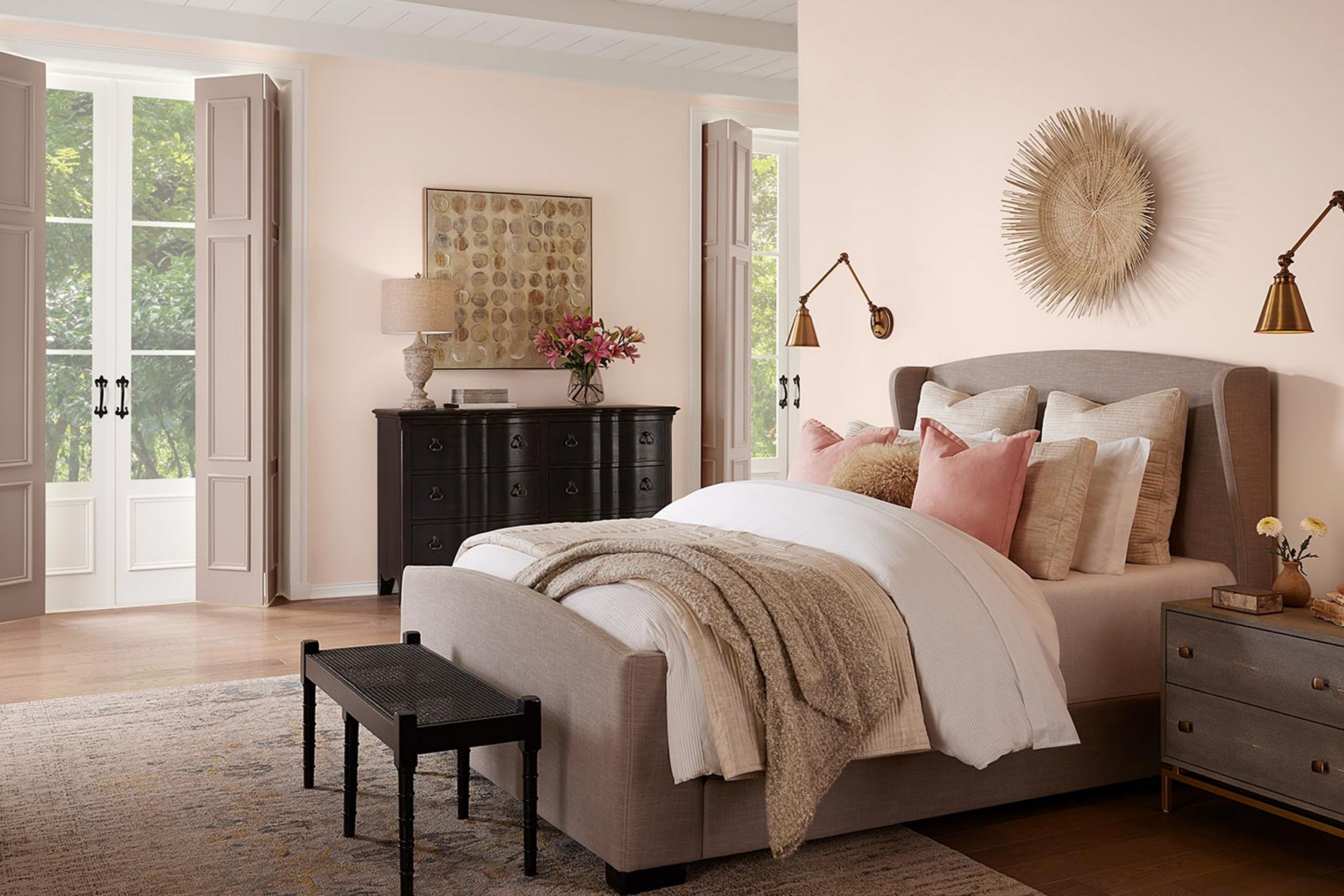
What Color Is Malted Milk SW 6057 by Sherwin Williams?
Malted Milk is a comforting, warm beige hue that brings a sense of coziness and understated elegance to any room. This versatile color has the ability to create an inviting atmosphere without overwhelming a space, making it an ideal choice for those who prefer a subtle and classic look.
It works well in interior styles such as modern farmhouse, rustic, and traditional because it offers a neutral backdrop that complements various design elements and colors.
Malted Milk pairs beautifully with natural materials like wood, leather, and linen, adding depth and texture to its surroundings. The warm undertones of this color match well with rich wooden furniture, enhancing the cozy feel of the room.
It also looks great against exposed brick or stone, bringing out the rustic elements in a space.
Additionally, Malted Milk can be paired with softer textures to create a balanced, soft look. Fabrics such as cotton, suede, and wool in light colors like whites, creams, and soft pastels help to keep spaces feeling light and airy.
For those wanting to add a bit of contrast, darker accents in greens, blues, or even blacks can add a striking touch to a room without overpowering the soothing nature of Malted Milk.
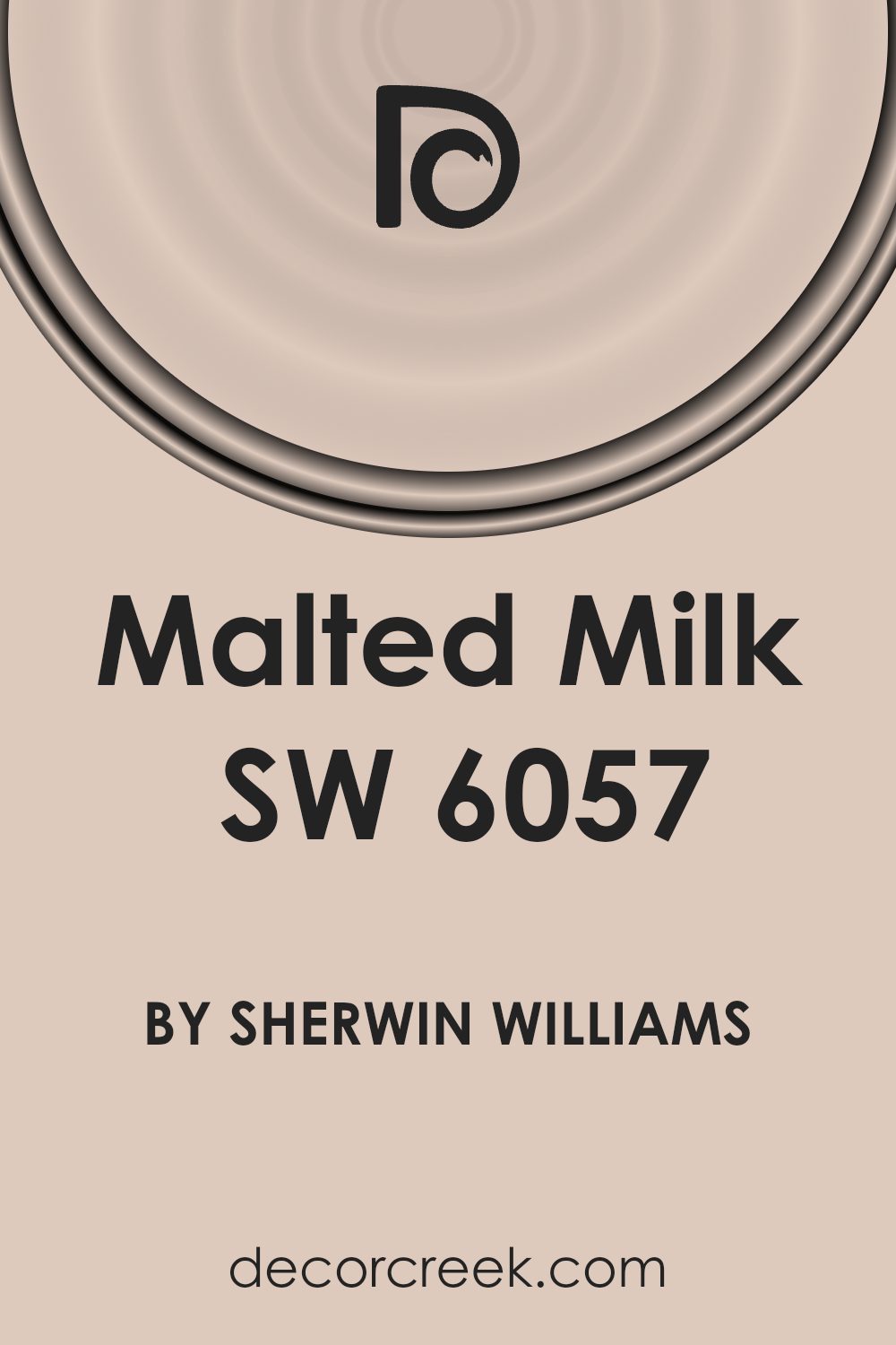
Is Malted Milk SW 6057 by Sherwin Williams Warm or Cool color?
Malted Milk SW 6057 by Sherwin Williams is a gentle, soothing shade that adds a warm and welcoming touch to any room. This color has a creamy beige tone that reflects light beautifully, making spaces seem larger and more open.
It’s especially useful in rooms that may not get a lot of natural sunlight. Because it’s a neutral color, Malted Milk pairs well with a wide variety of decor styles and colors, from bold and bright to soft and subtle, allowing for flexibility in decorating.
This makes it ideal for living areas, bedrooms, and even kitchens where a soft backdrop is beneficial for adding layers of design with furniture and accessories. Additionally, its calming nature makes it a great choice for creating a relaxed atmosphere conducive to unwinding after a long day.
Overall, Malted Milk is a versatile and appealing choice that works wonderfully in a range of home environments.
Undertones of Malted Milk SW 6057 by Sherwin Williams
Malted Milk is a unique paint color that subtly incorporates various undertones, affecting its appearance under different lighting conditions. Undertones are the hidden hues that influence the main color we see.
For instance, pale yellow gives a warm glow, light purple adds a soft complexity, and pale pink brings a hint of warmth. Light blue introduces a cool freshness, while mint offers a touch of earthiness. Lilac brings a mild floral vibe, and grey adds a neutral balance.
The presence of these undertones means that Malted Milk evolves throughout the day. In natural daylight, you might notice more of its pale yellow or light blue undertones, making the walls look slightly brighter or cooler. Under artificial lighting, the pale pink or lilac might become more noticeable, creating a cozy, welcoming feel.
When used on interior walls, the complexity of these undertones allows Malted Milk to adapt to various decor styles and color schemes. It can appear more muted in rooms with less light, or vibrant in well-lit spaces, making it a versatile choice for many homes.
Overall, the undertones of Malted Milk influence the mood and feel of a room, making it appear dynamic and adaptable to both personal taste and changing light.
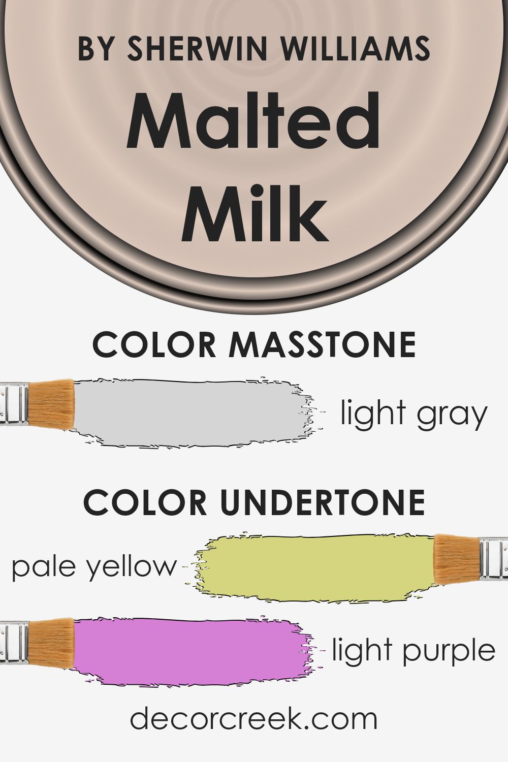
What is the Masstone of the Malted Milk SW 6057 by Sherwin Williams?
Malted Milk SW 6057 by Sherwin Williams has a masstone of light gray, identified by the color code #D5D5D5. This subtle and neutral shade is versatile, making it a great choice for various rooms in a home. Light gray offers a fresh and clean look, which can make smaller spaces appear bigger and more open.
Since it doesn’t dominate the space, you can easily pair it with different decor styles and colors. Whether you’re pairing it with bright colors for a playful look or with other neutrals for a more understated style, this color provides a solid foundation.
It’s especially effective in living areas and bedrooms where a calm and peaceful atmosphere is often desired. Furthermore, light gray is practical as it hides minor imperfections well and requires less maintenance compared to darker shades. This color can help create a pleasant and inviting environment in any home.
How Does Lighting Affect Malted Milk SW 6057 by Sherwin Williams?
Lighting plays a crucial role in how we perceive colors in our environment. Different types of light can dramatically alter the appearance of a color due to their varying intensities and hues.
For example, Malted Milk by Sherwin Williams is a warm, gentle color that can shift in appearance depending on the light source. In natural sunlight, Malted Milk has a soft, creamy look that feels inviting and cozy.
The natural light enhances the warm undertones of the color, making it appear lighter and more open.
Under artificial lighting, such as LED or fluorescent lights, Malted Milk may look slightly different.
Warmer artificial lights can enhance its creamy tones, making the room feel warmer and more welcoming. Cooler artificial lights, however, might make the color appear a bit more muted, reducing the warmth and making it look more neutral.
The orientation of rooms relative to the sun’s path also affects how Malted Milk looks throughout the day:
– North-Faced Rooms: These rooms get less direct sunlight, which can make colors appear cooler and shadowed. Malted Milk in a north-facing room might seem more subdued and less vibrant, leaning more towards a neutral beige throughout the day.
– South-Faced Rooms: These receive more direct sunlight, bringing out the warmth and richness of Malted Milk. In these rooms, the color will appear brighter and more lively, especially during the day when the sun is at its brightest.
– East-Faced Rooms: These rooms enjoy bright light in the morning when the sun rises. Malted Milk will look warm and welcoming in the morning but might lose some of its vibrancy as natural light fades and becomes indirect in the afternoon.
– West-Faced Rooms: Here, the color will appear more neutral during the morning but will warm up in the afternoon and evening as the sun sets. This can make the room feel cozy and snug, especially towards the end of the day.
Therefore, when choosing paint like Malted Milk, consider both the room’s lighting and orientation to fully appreciate how it will look at different times of the day.

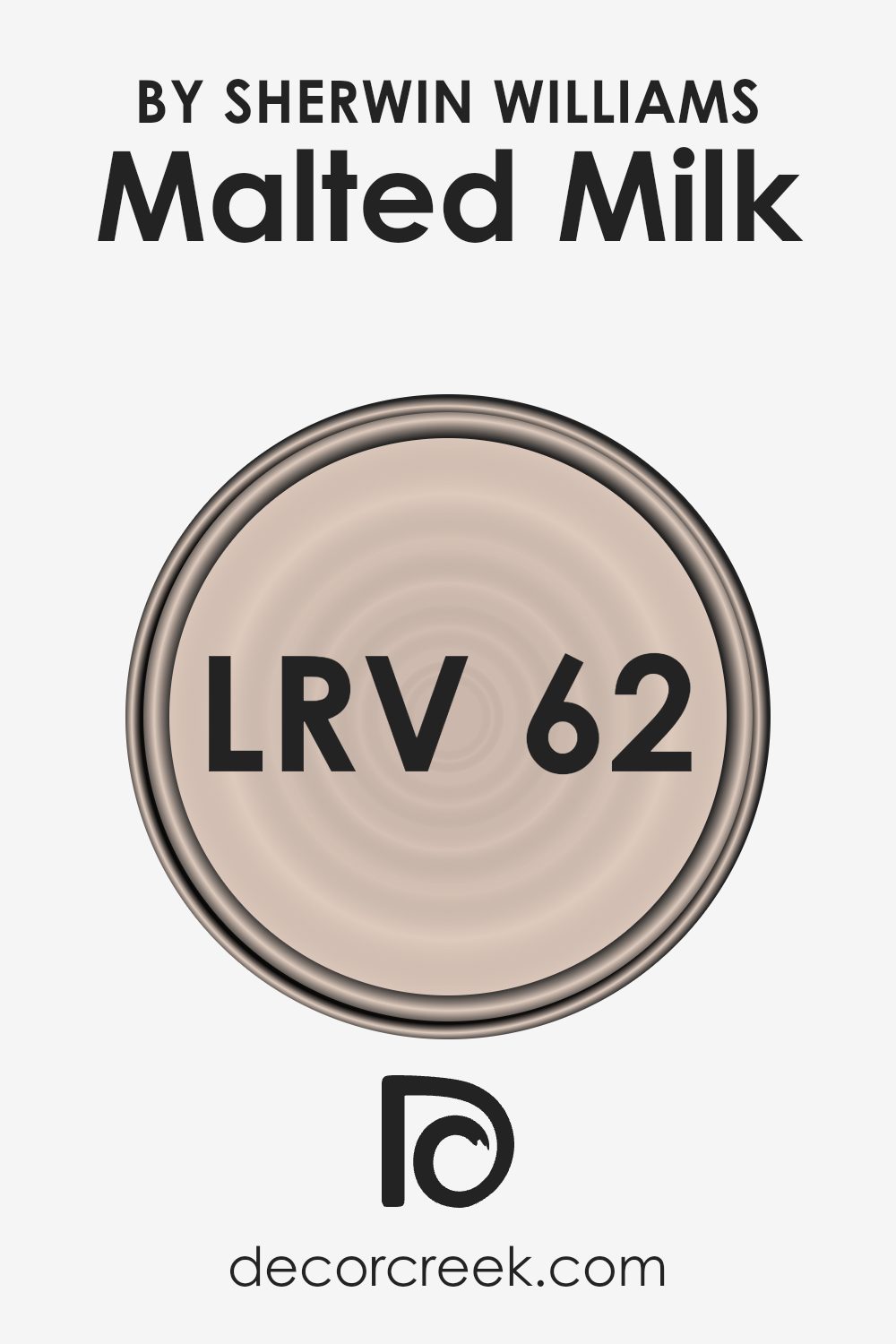
What is the LRV of Malted Milk SW 6057 by Sherwin Williams?
LRV stands for Light Reflectance Value, which is a measurement used to determine how much light a paint color reflects. Essentially, it tells you how light or dark a color will appear once it’s on your walls.
The LRV scale runs from 1 to 99, where 1 is the darkest, absorbing most light, and 99 is the brightest, reflecting most of the light. High LRV colors can make a room feel more open and airy as they reflect more light around the space. Conversely, colors with a low LRV absorb more light, which can make a room look cozier but smaller.
The specific color in question, with an LRV of around 61, is on the lighter side of the scale. This means it is fairly reflective and is likely to make a room feel luminous and more spacious. The color’s ability to reflect over half of the light that hits it makes it a good choice for spaces that you want to brighten up.
However, it’s still far enough away from the highest end of the scale to retain some warmth, adding a subtle depth to the walls without overwhelming the space with brightness.
This makes it versatile for various lighting conditions and room sizes, as it provides a nice balance between being too bright or too dark.
Coordinating Colors of Malted Milk SW 6057 by Sherwin Williams
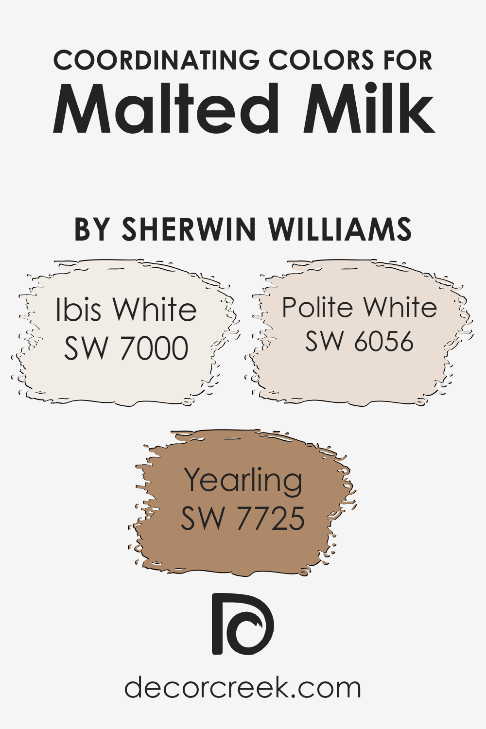
Coordinating colors are selected to enhance the aesthetic appeal and balance of a central color by creating a harmonious palette. For example, when decorating with a soft, creamy hue like Malted Milk, choosing coordinating colors like Ibis White, Yearling, and Polite White can enhance the overall look of a room.
These colors work together by either providing subtle contrasts or by reinforcing a monochromatic scheme, which helps in achieving a cohesive and inviting atmosphere.
Ibis White is a clean and bright white that brings a fresh and airy quality to the space. It’s perfect for trim or ceilings to provide a crisp finish that complements the warmth of Malted Milk.
Yearling is a deeper, muted shade of green-brown that adds depth and interest, acting as an excellent choice for accent walls or furniture to ground the lighter tones of Malted Milk and Ibis White.
Lastly, Polite White offers a slightly warmer tone than Ibis White, which makes it ideal for creating a soft, cozy feeling in a room without stark contrasts, enhancing the soothing essence of the whole color scheme.
You can see recommended paint colors below:
- SW 7000 Ibis White (CHECK A SAMPLE)
- SW 7725 Yearling (CHECK A SAMPLE)
- SW 6056 Polite White (CHECK A SAMPLE)
What are the Trim colors of Malted Milk SW 6057 by Sherwin Williams?
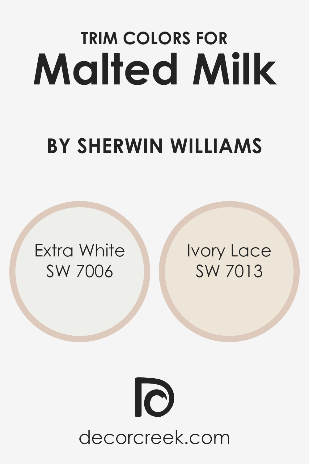
Trim colors are specific shades used to accentuate and complement the main color on walls, which in this case is Malted Milk by Sherwin Williams. Choosing the right trim color can enhance the overall aesthetic of a room, creating a beautiful contrast that defines spaces distinctively.
Trim colors can highlight architectural details, frame features like doors and windows, and give a finished look to the edges and corners of a room.
For a harmonious pairing with Malted Milk, Sherwin Williams offers shades like Extra White and Ivory Lace. Extra White is a clean, bright white that brings a crisp clarity to the edges, making it perfect for a fresh and clear look.
Ivory Lace, on the other hand, offers a softer and slightly warmer alternative, providing a gentle contrast that is both inviting and cozy. Both colors support the warm undertones of Malted Milk, ensuring a coherent and appealing visual flow throughout the space.
You can see recommended paint colors below:
Colors Similar to Malted Milk SW 6057 by Sherwin Williams
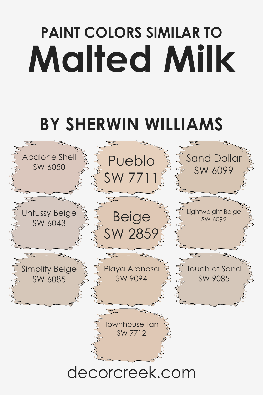
Choosing similar colors, like those related to Malted Milk by Sherwin Williams, is essential for creating a harmonious and cohesive look in your space. Colors that are alike can be used to enhance each other, providing a subtle but effective variation that adds depth and interest without the stark contrast that comes from using complementary colors.
This technique allows for a smooth visual flow and makes the room feel more put together.
For instance, Abalone Shell is a gentle hue, reminiscent of the inner layer of a seashell, offering a calm, neutral backdrop. Unfussy Beige, as the name suggests, is an uncomplicated beige that works seamlessly in any space for a clean and orderly appearance.
Simplify Beige, slightly deeper than the previous shades, adds a warm, inviting quality to environments. Townhouse Tan has a richer, more pronounced earthiness that provides a sturdy foundation for room aesthetics.
Stepping into a slightly darker spectrum, Pueblo is a robust color that recalls the clay houses, giving any space a grounded feel. Beige is a classic, a straight-forward color that pairs easily with other hues for a balanced look.
Playa Arenosa suggests the softness of sandy beaches, perfect for a light, airy room. Sand Dollar is another beach-inspired shade, lighter and more ethereal, ideal for creating a breezy feel.
Lightweight Beige is almost imperceptible and works well where you want the color to blend smoothly without drawing much attention. Lastly, Touch of Sand is a subtle color, a whisper of beige that adds just a hint of warmth to the walls, echoing the softness of sandy shores.
Using colors like these together can help achieve a professional yet comfortable atmosphere in your home, where every element seems thoughtfully considered and effortlessly aligned.
You can see recommended paint colors below:
- SW 6050 Abalone Shell (CHECK A SAMPLE)
- SW 6043 Unfussy Beige (CHECK A SAMPLE)
- SW 6085 Simplify Beige (CHECK A SAMPLE)
- SW 7712 Townhouse Tan (CHECK A SAMPLE)
- SW 7711 Pueblo (CHECK A SAMPLE)
- SW 2859 Beige
- SW 9094 Playa Arenosa (CHECK A SAMPLE)
- SW 6099 Sand Dollar (CHECK A SAMPLE)
- SW 6092 Lightweight Beige (CHECK A SAMPLE)
- SW 9085 Touch of Sand (CHECK A SAMPLE)
Colors that Go With Malted Milk SW 6057 by Sherwin Williams
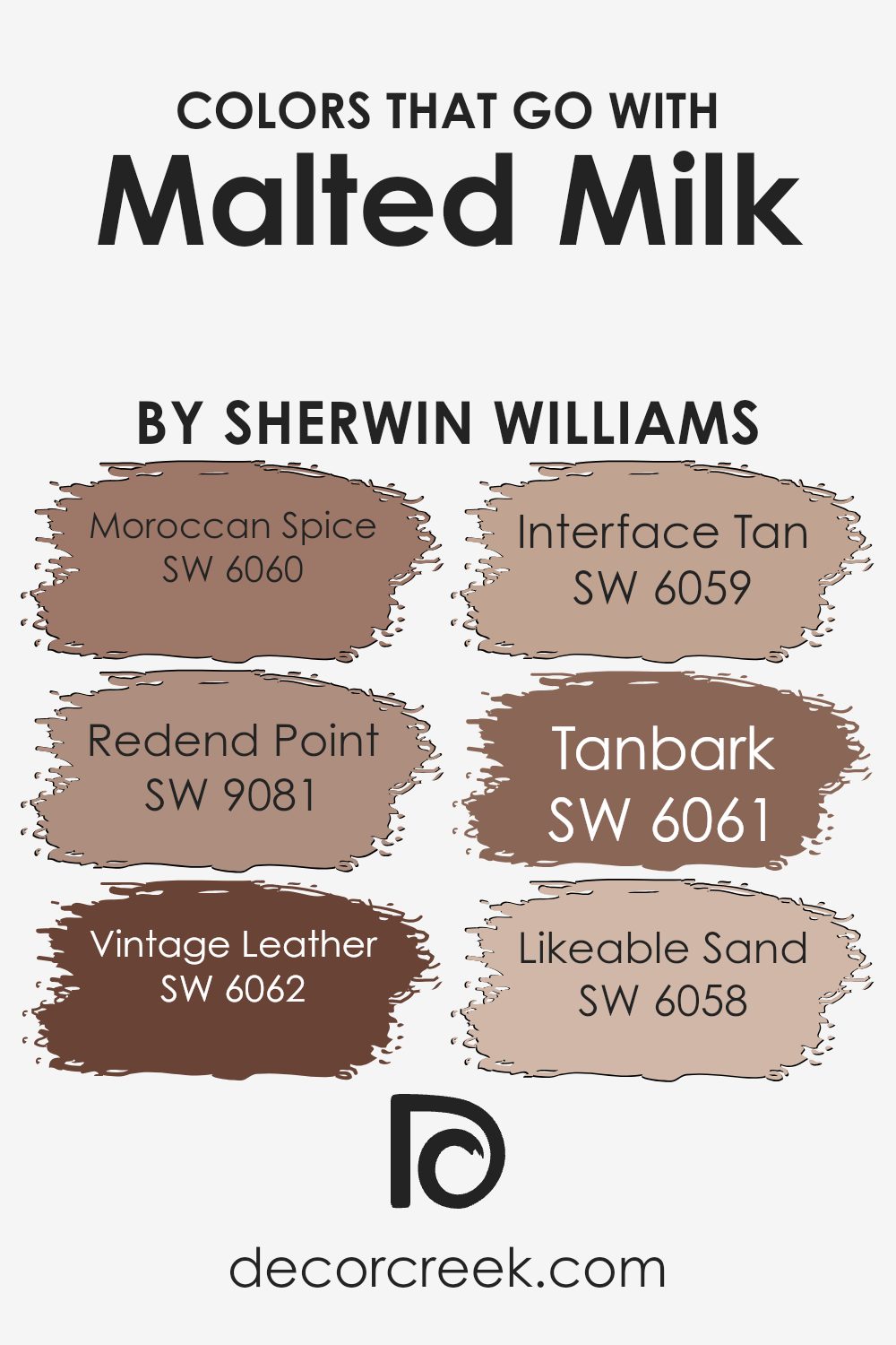
Choosing the right colors that complement Malted Milk SW 6057 by Sherwin Williams is essential for creating a cohesive and appealing look in any space. The shades that pair well with Malted Milk help to enhance its warm and inviting nature without overpowering the room.
For example, Moroccan Spice SW 6060 provides a vibrant contrast with its rich, spicy tone, lending energy and warmth when used alongside the subdued backdrop of Malted Milk.
On the other hand, Redend Point SW 9081 offers a dusty rose hue that softly blends with Malted Milk, providing a gentle and pleasing aesthetic that feels cozy and less intense.
Vintage Leather SW 6062 adds a deep, earthy brown that anchors the lighter Malted Milk, providing depth and character to an area.
Interface Tan SW 6059, a lighter, sandy color, complements Malted Milk by adding a seamless, smooth transition in spaces that desire a natural flow.
Tanbark SW 6061, slightly darker than Malted Milk, enriches the environment with a solid yet not overwhelming presence, while Likeable Sand SW 6058 supplies a touch of softness and brightness, ensuring the room remains light and airy.
These colors work together to build a diverse palette that supports various design styles while maintaining harmony and a pleasant atmosphere.
You can see recommended paint colors below:
- SW 6060 Moroccan Spice (CHECK A SAMPLE)
- SW 9081 Redend Point (CHECK A SAMPLE)
- SW 6062 Vintage Leather (CHECK A SAMPLE)
- SW 6059 Interface Tan (CHECK A SAMPLE)
- SW 6061 Tanbark (CHECK A SAMPLE)
- SW 6058 Likeable Sand (CHECK A SAMPLE)
How to Use Malted Milk SW 6057 by Sherwin Williams In Your Home?
Malted Milk SW 6057 by Sherwin Williams is a warm, creamy beige paint color that adds a cozy feel to any room. This versatile shade works well in various areas of a home, such as living rooms, bedrooms, and kitchens.
Because of its neutral tone, Malted Milk pairs beautifully with a wide range of other colors, from bright and bold to soft and subtle, making it a great base for any decorating style.
For those looking to refresh their living space, painting the walls with Malted Milk can instantly make the room feel welcoming and comfortable. It’s also an excellent choice for creating a light, airy feeling in smaller or darker spaces.
In the bedroom, Malted Milk creates a calm backdrop, perfect for relaxing after a long day.
Pair it with crisp white trim and natural wood accents for a fresh, clean look. Whether you’re updating a single room or repainting your entire house, Malted Milk is a reliable choice that works well in a variety of settings and styles.
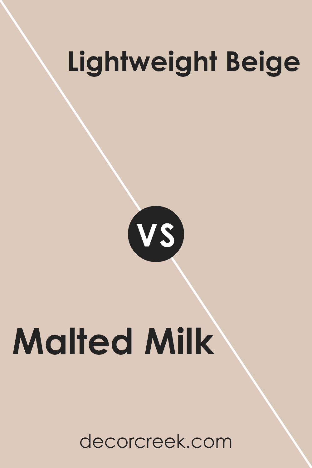
Malted Milk SW 6057 by Sherwin Williams vs Lightweight Beige SW 6092 by Sherwin Williams
The main color, Malted Milk, is a soft, soothing beige with a hint of warmth that makes it versatile enough to use in almost any room. It creates a cozy and inviting atmosphere, pairing well with various decor styles from rustic to modern.
On the other hand, Lightweight Beige is slightly lighter with cooler undertones, making it ideal for spaces where you want to open up the area and make it feel more spacious.
This color works especially well in smaller rooms or areas with limited natural light. Both colors are quite neutral, but the warmth of Malted Milk offers a more homey vibe, while the crispness of Lightweight Beige gives a fresher look.
You can see recommended paint color below:
- SW 6092 Lightweight Beige (CHECK A SAMPLE)
Malted Milk SW 6057 by Sherwin Williams vs Touch of Sand SW 9085 by Sherwin Williams
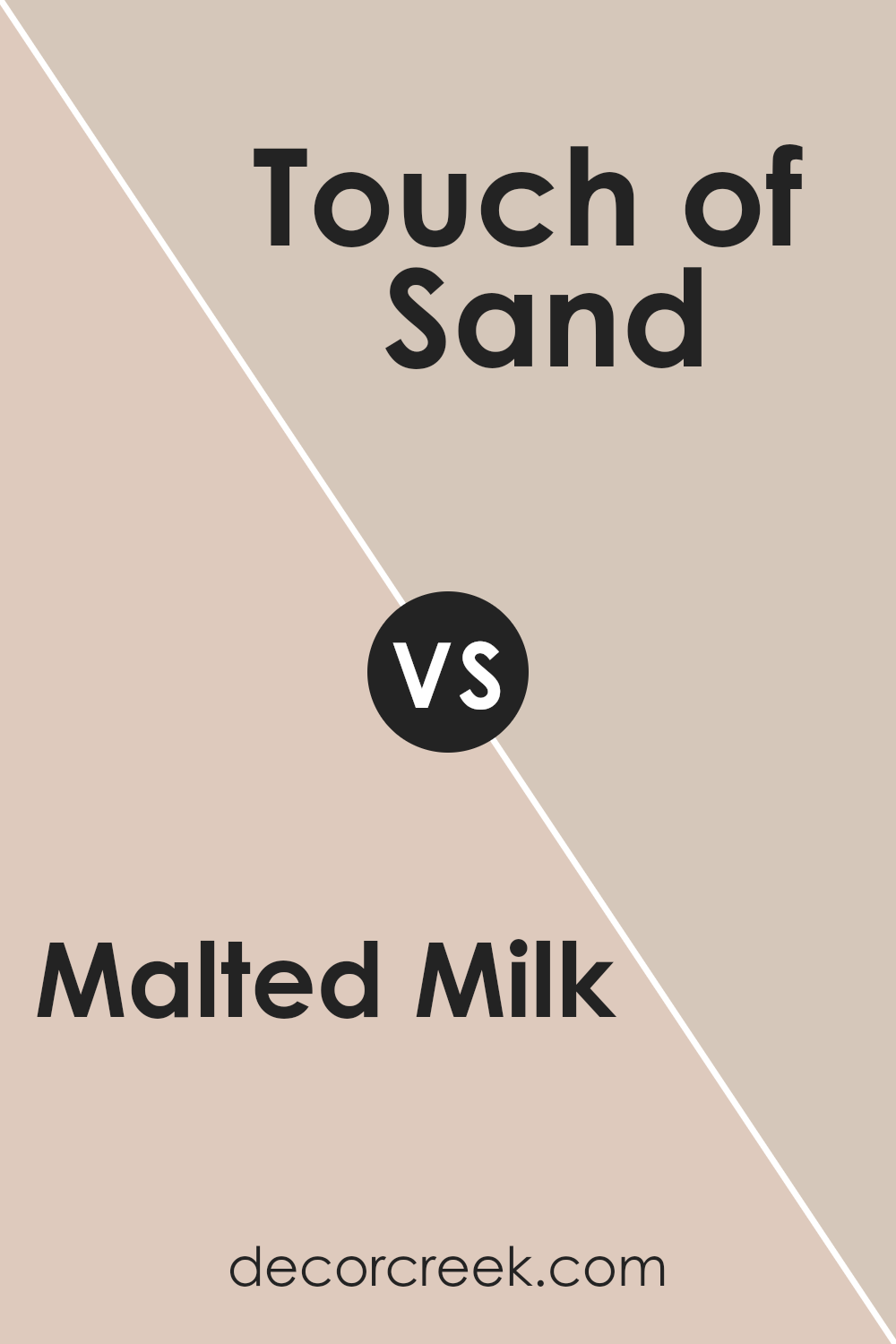
Malted Milk and Touch of Sand are two neutral shades from Sherwin Williams, both offering a warm and welcoming vibe to any space. Malted Milk is a lighter, soft beige that feels cozy and is versatile enough to work well in almost any room.
It reflects more light, making spaces appear larger and more open. Touch of Sand, on the other hand, is slightly darker and carries a hint of gray. This color provides a sturdy, grounding effect, perfect for creating a peaceful yet stylish atmosphere.
It’s ideal for areas where you want a touch of warmth without the brightness of a lighter color. Both shades are similar in their subtlety and warmth but differ in depth and undertones, Malted Milk leaning more towards a creamy feel, while Touch of Sand offers a dustier look. These differences make them useful for various decorating styles and preferences.
You can see recommended paint color below:
Malted Milk SW 6057 by Sherwin Williams vs Simplify Beige SW 6085 by Sherwin Williams
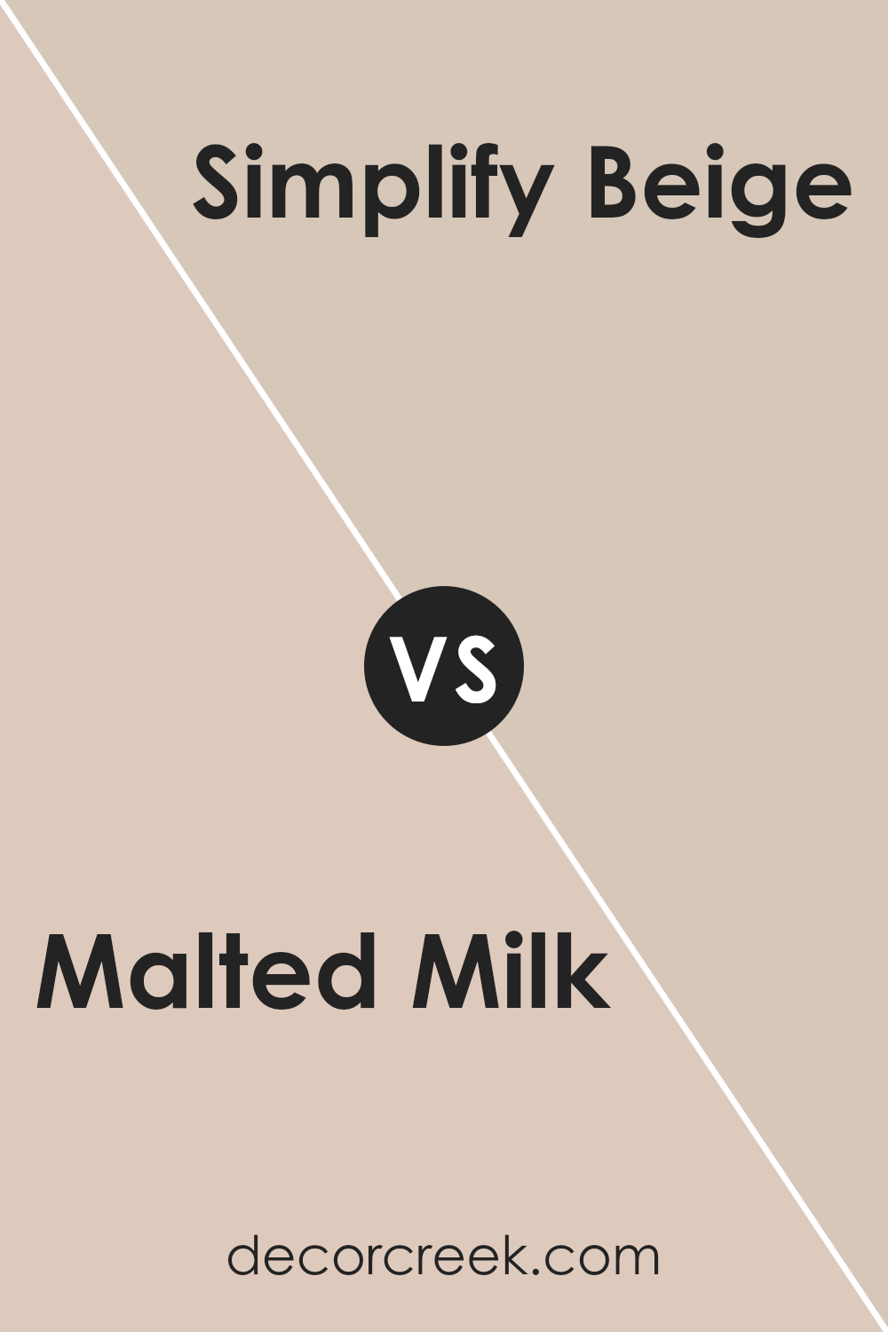
Malted Milk is a soft, light beige with a warm base, making it cozy and welcoming in any space. It pairs well with brighter colors, providing a subtle backdrop that allows other hues to stand out. In contrast, Simplify Beige is a shade darker with a hint of gray, giving it a more muted, neutral appearance.
This color is excellent for creating a calm, understated look, making spaces seem more cohesive and put together. Both colors are versatile and can work well in various settings like living rooms, bedrooms, or offices.
However, Malted Milk reflects more light, brightening rooms more significantly than Simplify Beige, which offers a grounding effect. This makes Malted Milk a better choice for small or dim spaces, while Simplify Beige is ideal for larger areas or spaces with plenty of natural light.
You can see recommended paint color below:
- SW 6085 Simplify Beige (CHECK A SAMPLE)
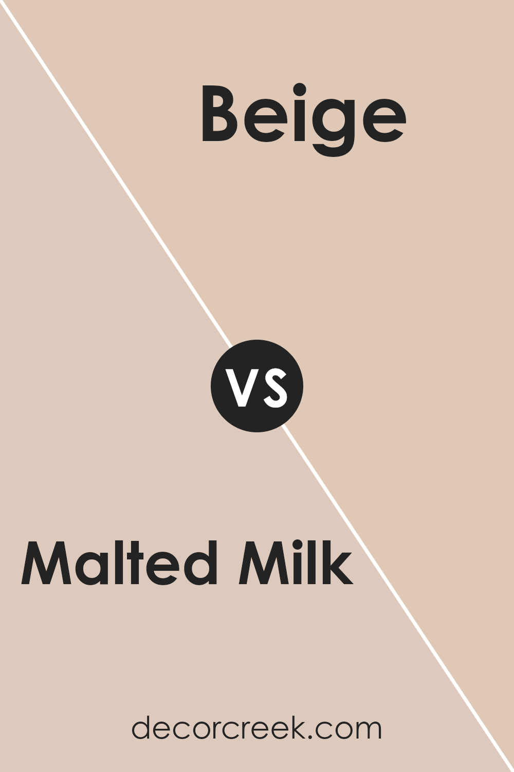
Malted Milk SW 6057 by Sherwin Williams vs Beige SW 2859 by Sherwin Williams
Malted Milk by Sherwin Williams is a soft, creamy beige that has a warm, inviting undertone. It works well in spaces where you want a cozy and neutral backdrop. This color tends to blend seamlessly into any room, providing a gentle, soothing presence without being too stark or cold.
Beige by Sherwin Williams, on the other hand, is a darker shade compared to Malted Milk. It presents as a true beige with a slightly more pronounced brown undertone. This makes it ideal for areas where you might want to add a bit more warmth and depth.
Beige offers a more robust color presence, making it suitable for larger spaces or as an accent wall to create a point of interest.
Overall, both colors are versatile and can be used in various home settings, but Malted Milk is lighter and subtler, while Beige offers a bit more strength and warmth.
Depending on the feel you want in a room, you can choose either to achieve a gentle comfort or a more defined warmth.
You can see recommended paint color below:
- SW 2859 Beige
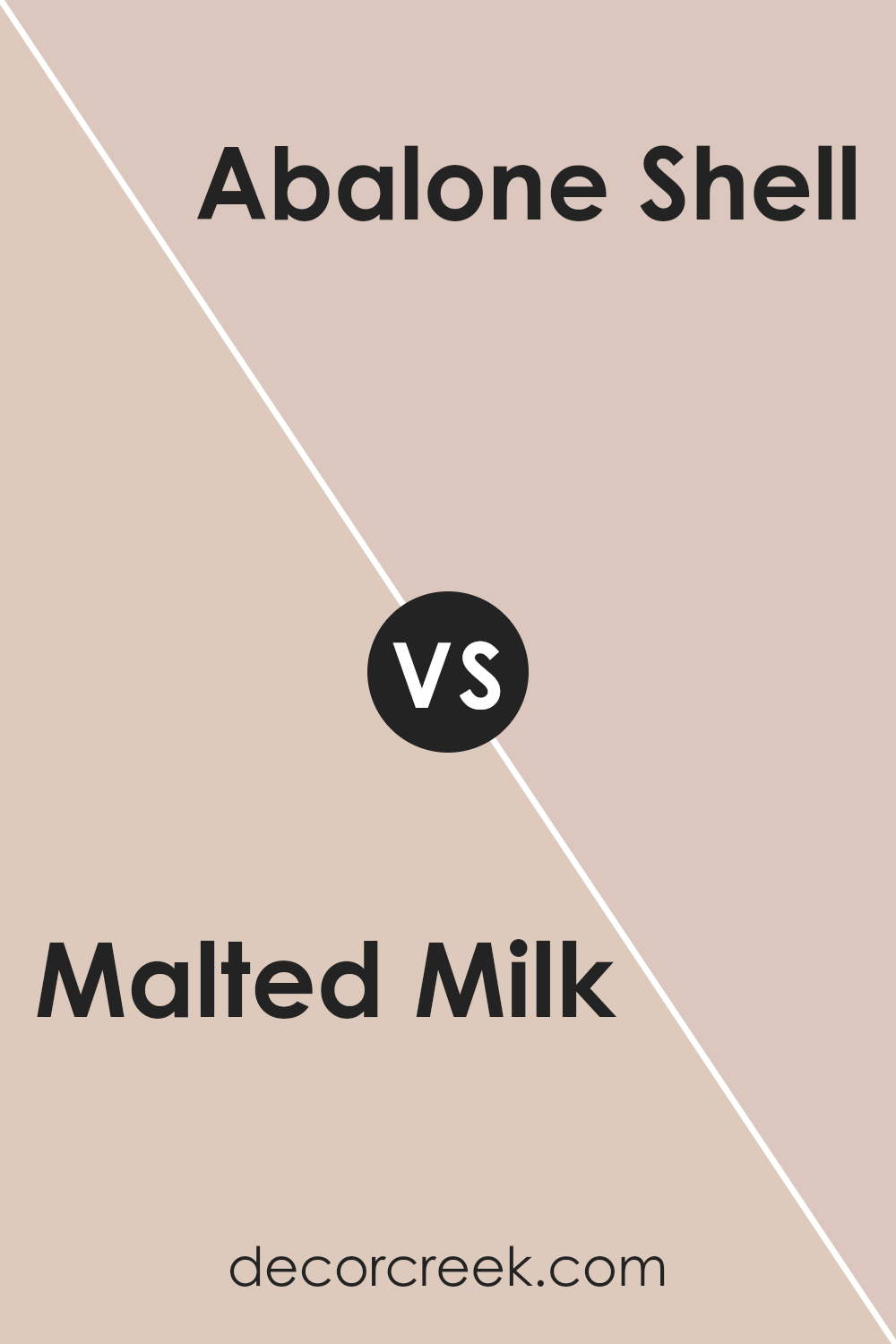
Malted Milk SW 6057 by Sherwin Williams vs Abalone Shell SW 6050 by Sherwin Williams
Malted Milk and Abalone Shell, both from Sherwin Williams, offer subtle yet distinct tones for interior spaces. Malted Milk is a warm, soft beige with a comforting and inviting feel, making it perfect for cozy living areas or bedrooms. It pairs well with various decor styles and adds a gentle, soothing touch to the walls.
On the other hand, Abalone Shell has a slightly cooler tone, leaning towards a light gray with a hint of beige. This color is excellent for creating a clean, fresh look in a room. It’s ideal for spaces you want to feel airy and bright, like bathrooms or kitchens.
While both colors share a base neutrality, Malted Milk brings warmth and coziness, whereas Abalone Shell offers a crisper, more refreshing vibe. They could even complement each other in different areas of a home to create a balanced color flow.
You can see recommended paint color below:
- SW 6050 Abalone Shell (CHECK A SAMPLE)
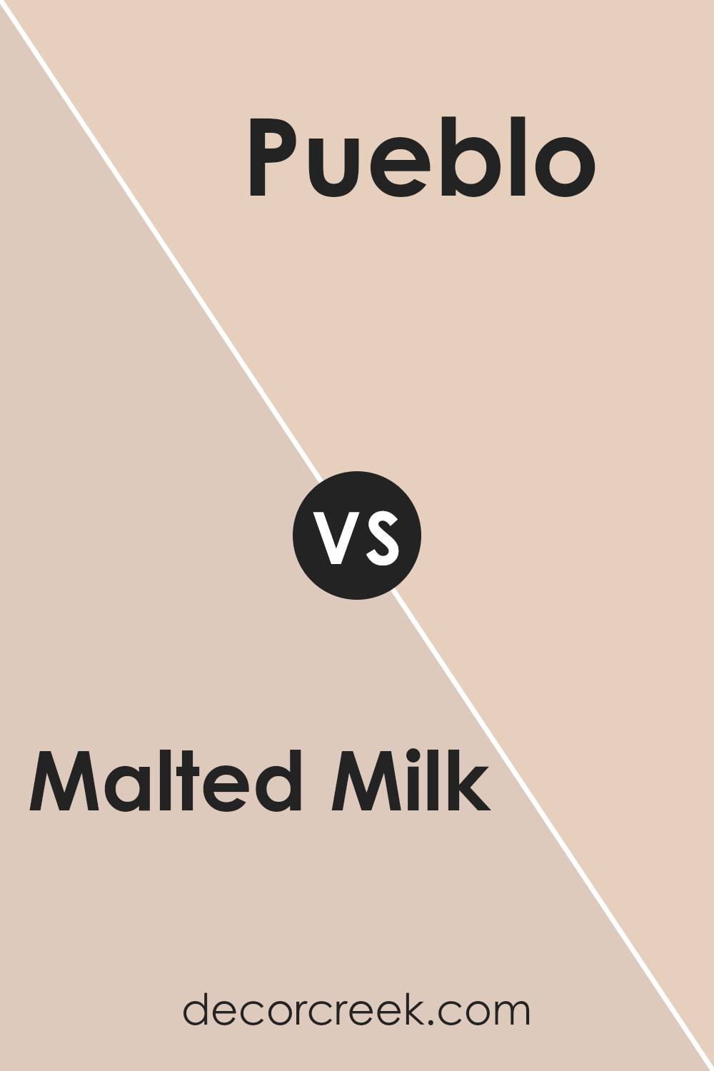
Malted Milk SW 6057 by Sherwin Williams vs Pueblo SW 7711 by Sherwin Williams
Malted Milk is a gentle, soft beige tone that provides a calm and welcoming feel to any space it adorns. It’s a versatile color that pairs well with a variety of decor styles, from rustic to modern. The muted quality of this beige makes it an excellent choice for spaces where you want a subtle background that doesn’t overpower the room’s other features.
On the other hand, Pueblo is a more defined, warmer beige with a hint of peach that gives it a cozier quality. This color is great for creating a homey, inviting atmosphere in spaces like living rooms and dining areas.
The warmth of Pueblo makes it ideal for pairing with rich colors and textures, providing a more enveloping feel than the softer Malted Milk.
Both colors offer their unique charm and can be used effectively to create different moods and styles in a home. Whether you choose the subtler Malted Milk or the richer Pueblo depends on the kind of ambiance you want to achieve in your space.
You can see recommended paint color below:
- SW 7711 Pueblo (CHECK A SAMPLE)
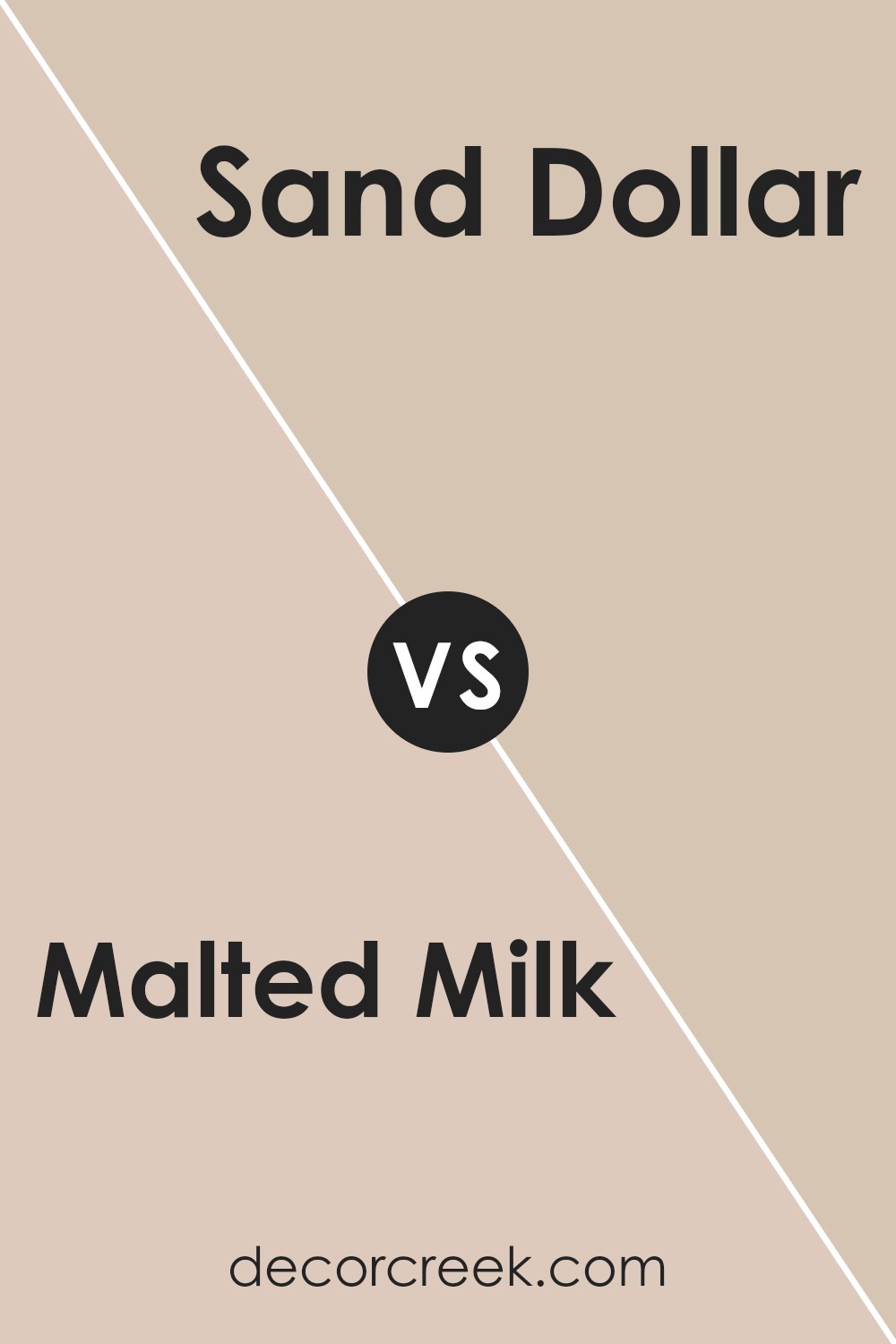
Malted Milk SW 6057 by Sherwin Williams vs Sand Dollar SW 6099 by Sherwin Williams
Malted Milk and Sand Dollar, both by Sherwin Williams, are subtle and warm shades that can add a cozy feel to any room. Malted Milk is a slightly richer hue that brings a comforting warmth with its deeper beige tones, making it ideal for spaces where you want a bit of snugness but with a light feel.
It can work well in living rooms or bedrooms where you want to keep things soft yet inviting.
On the other hand, Sand Dollar is a lighter color that leans more towards a neutral, sandy beige. It is excellent for areas where you want to maximize the sense of space and light, such as in smaller rooms or spaces with limited natural light. This color works well in kitchens or bathrooms where a clean and airy atmosphere is desired.
Both colors offer a gentle, neutral backdrop, but Malted Milk offers a bit more depth and warmth, while Sand Dollar brings an airy and open feel to spaces.
These colors can easily complement each other in different rooms of a house to maintain a coherent but varied palette.
You can see recommended paint color below:
- SW 6099 Sand Dollar (CHECK A SAMPLE)
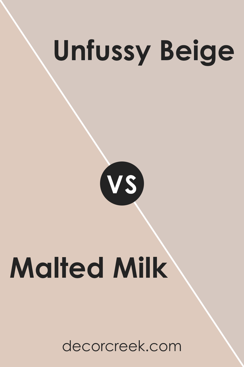
Malted Milk SW 6057 by Sherwin Williams vs Unfussy Beige SW 6043 by Sherwin Williams
Malted Milk and Unfussy Beige are two neutral colors by Sherwin Williams that provide a warm and inviting atmosphere to any room, but they have distinct tones that set them apart. Malted Milk has a creamy, soft hue that leans slightly towards a pale taupe.
This color is ideal for those who want a hint of warmth in their spaces without it being overpowering. It pairs well with darker woods and can brighten up a small space effectively.
On the other hand, Unfussy Beige carries a bit more depth with a subtle gray undertone. This makes it a great choice for a more grounded, earthy feel in a room. Unfussy Beige works well in areas with a lot of natural light, as the light brings out the complex undertones, making the space feel cozy yet open.
Both colors are versatile and can be used in various settings, from living rooms to bedrooms, providing a neutral backdrop that allows other elements in the room to stand out.
Whether you choose the lighter Malted Milk or the deeper Unfussy Beige, both will help create a welcoming and comfortable space.
You can see recommended paint color below:
- SW 6043 Unfussy Beige (CHECK A SAMPLE)
Malted Milk SW 6057 by Sherwin Williams vs Townhouse Tan SW 7712 by Sherwin Williams
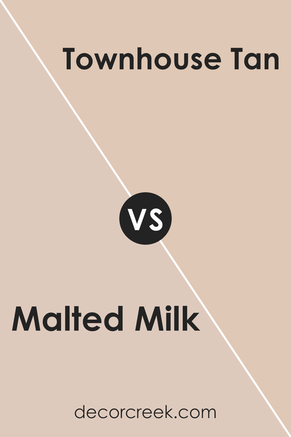
Malted Milk and Townhouse Tan are two neutral paint colors by Sherwin Williams, but they bring different vibes to a space. Malted Milk is a soft, creamy beige, lighter and with a hint of warmth that makes a room feel cozy and inviting. It’s perfect for creating a gentle and airy atmosphere in any area of your home, from living rooms to bedrooms.
On the other hand, Townhouse Tan is a darker, more muted beige.
This color adds a bit of a richer, more grounded feeling to spaces, making it great for areas where you want to add some depth without overpowering with darker colors like brown or gray.
It works well in places with lots of natural light or larger rooms, as it can make the space feel more put together and cozy.
Both colors are versatile and can be matched with a variety of decor styles and furnishings, but your choice between them might depend on the mood you want to set and how much natural light your room receives.
You can see recommended paint color below:
- SW 7712 Townhouse Tan (CHECK A SAMPLE)
Malted Milk SW 6057 by Sherwin Williams vs Playa Arenosa SW 9094 by Sherwin Williams
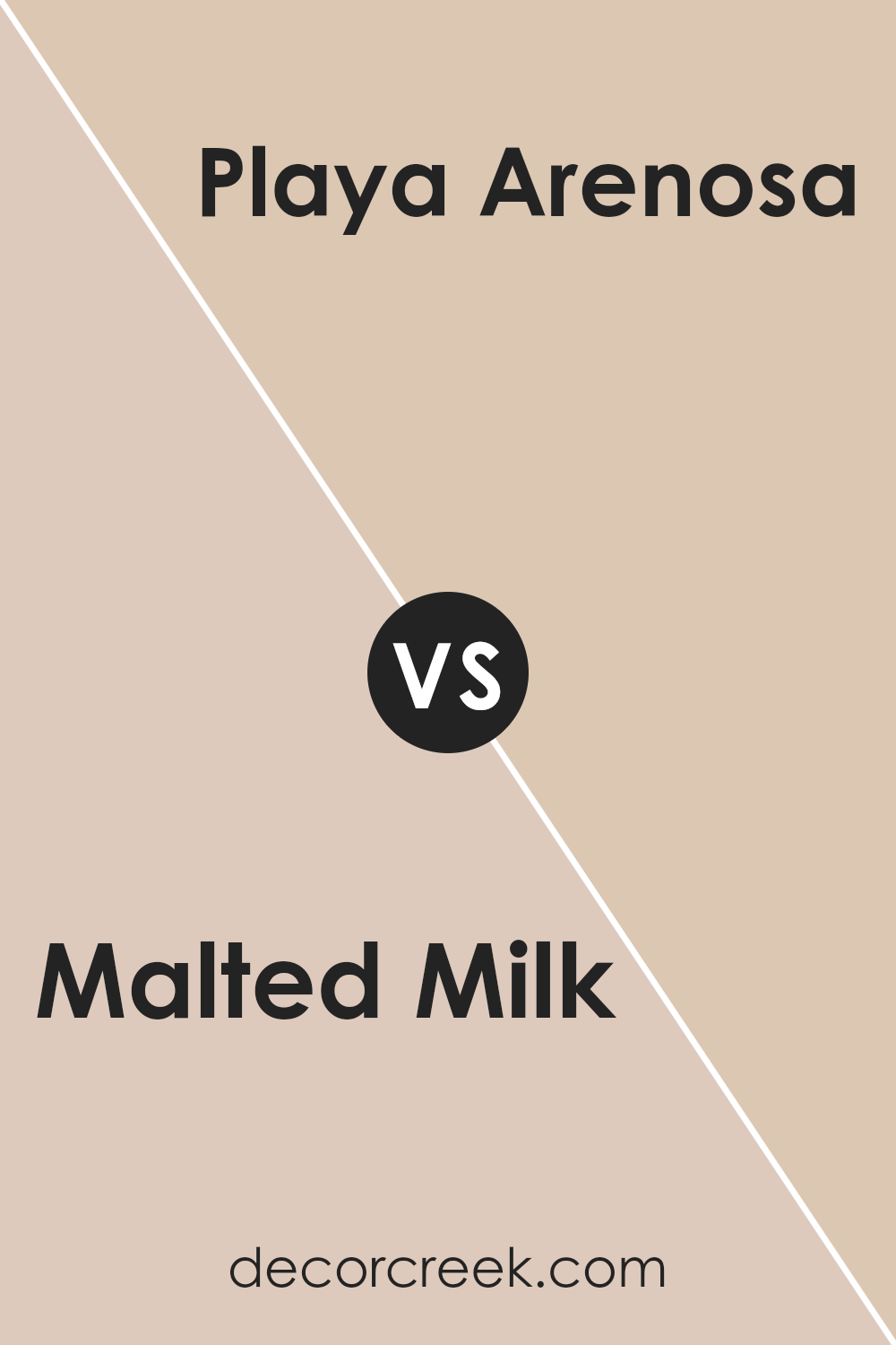
Malted Milk and Playa Arenosa are both colors from Sherwin Williams that create a calm and comforting atmosphere in any room. Malted Milk is a soft beige with a warm undertone that gives it a cozy, inviting feel. It’s a neutral shade that pairs well with brighter colors or serves as a stand-alone color for a subtle, understated look.
On the other hand, Playa Arenosa is a bit darker and has hints of gray, making it a cooler tone compared to Malted Milk. This color resembles the shade of sandy beaches, offering a natural, earthy vibe to spaces.
It’s perfect for those looking to add a touch of nature and a slightly more muted element to their décor.
Both colors work well in a variety of decorating styles and can help create a relaxed, welcoming environment. Whether you choose the warmer tones of Malted Milk or the cooler, earthy notes of Playa Arenosa, each offers its unique charm to interiors.
You can see recommended paint color below:
- SW 9094 Playa Arenosa (CHECK A SAMPLE)
Conclusion
In conclusion, SW 6057 Malted Milk by Sherwin Williams is a lovely, soft beige paint color that seems perfect when one wants their room to feel warm and cozy. It suits any room in your home, from a kitchen to a bedroom, because it creates a welcoming atmosphere.
The color works well with many other colors, whether you love bright colors like blues and greens or prefer softer shades like whites and grays. It’s particularly useful for places where you want to relax and feel comfortable.
Malted Milk is easy to apply, covers well, and has a durable finish, which means it lasts a long time and keeps looking good. Practical and pretty, this color helps make rooms look brighter and more open without being too bold or flashy.
Anyone looking for a paint that helps make their living spaces nicer and comfortable would be happy choosing Malted Milk.
Ever wished paint sampling was as easy as sticking a sticker? Guess what? Now it is! Discover Samplize's unique Peel & Stick samples.
Get paint samples


