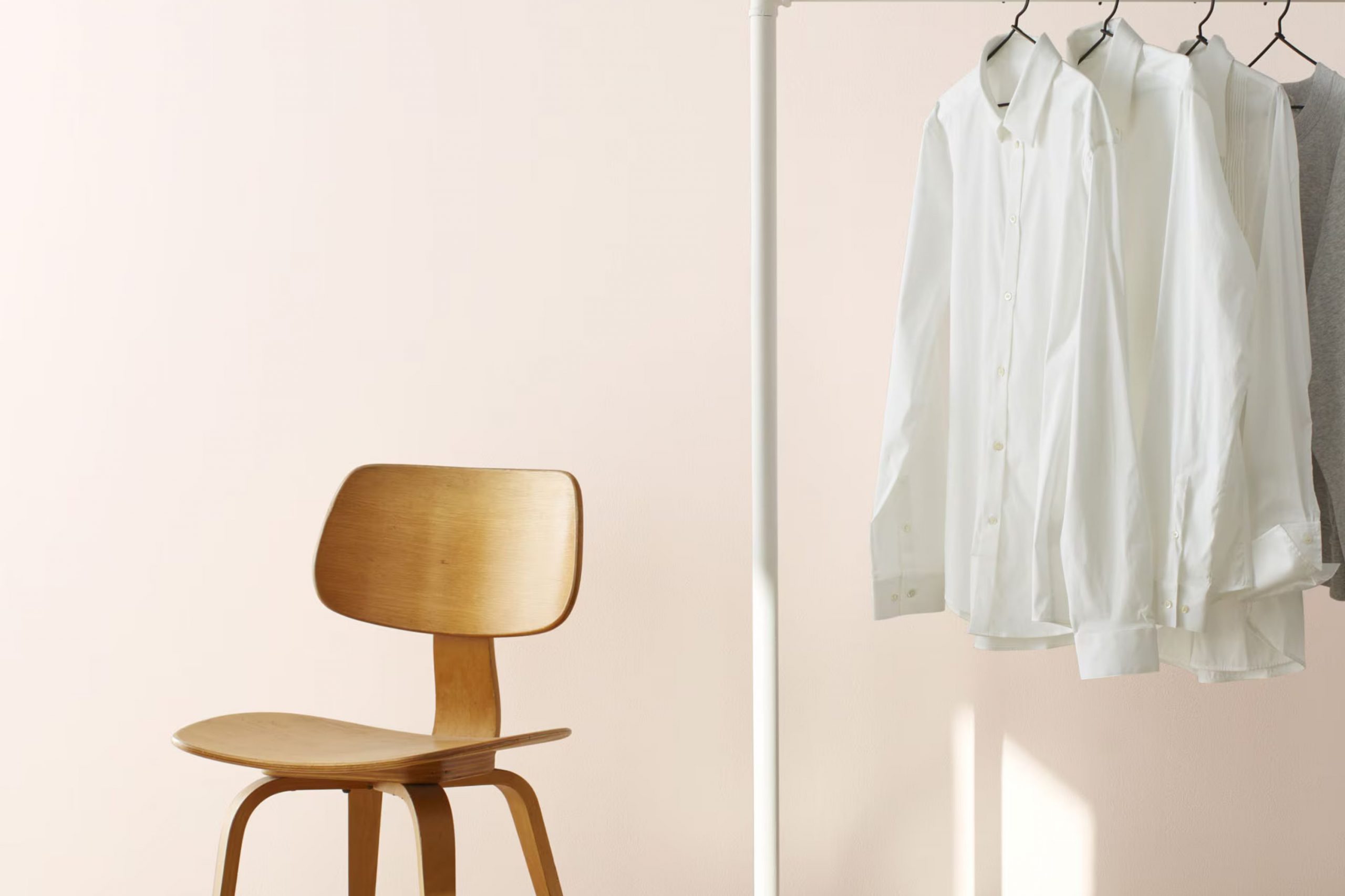
I recently stumbled upon a fascinating paint color named “2095-70 Melted Ice Cream” by Benjamin Moore. As I researched more about it, the uniqueness of this shade caught my attention. It’s not just any ordinary beige or cream; it has a subtle richness to it that evokes the creamy, dreamy essence of melted ice cream on a sunny day.
What makes “2095-70 Melted Ice Cream” particularly intriguing is its adaptability. Whether I’m thinking about refreshing the living room, brightening a kitchen, or adding a soft, soothing touch to a bedroom, this color offers a gentle backdrop that seamlessly complements various decor styles from modern to classic. Moreover, it pairs beautifully with brighter colors and natural elements, enhancing the overall aesthetic without overpowering the senses.
This color choice might inspire you to redecorate an area or finish a project with a touch that brings both warmth and lightness.
Painting with “2095-70 Melted Ice Cream” is like adding a layer of subtle elegance to any room, making the area feel welcoming and lived-in.
What Color Is Melted Ice Cream 2095-70 by Benjamin Moore?
“Melted Ice Cream” by Benjamin Moore is a gentle and creamy color that brings a soft touch to any area. This shade is a light, almost pastel, yellow that radiates warmth and a comforting, homey vibe. Due to its subdued brightness, it works as a perfect backdrop in rooms that need a little lift without overpowering the senses.
This color fits seamlessly into a variety of interior styles, particularly in country, coastal, or Scandinavian themes where a sense of light and airiness is key. It has a fresh feel that complements these relaxed, natural styles well. In rooms that capitalize on plenty of natural light, “Melted Ice Cream” enhances the brightness, making areas feel larger and more open.
When it comes to matching materials and textures, this paint color pairs beautifully with natural wood, from pale birch to rich walnut, adding to its earthy aesthetic. It also looks wonderful with soft, tactile fabrics like wool or cotton in neutral colors, which help to round out the gentle appeal of the hue. Incorporating elements such as wicker or rattan can also accentuate a laid-back, cozy atmosphere, making it ideal for living areas and bedrooms where comfort is key.
Is Melted Ice Cream 2095-70 by Benjamin Moore Warm or Cool color?
Melted Ice Cream 2095-70 by Benjamin Moore is a soft, creamy white color that brings a light and airy feel to any room. This color is adaptable, making it easy to match with various styles and décors. Its subtle warmth adds a cozy yet fresh touch, ideal for living areas and bedrooms where a calm atmosphere is desired.
This shade works especially well in areas with lots of natural light, as it reflects brightness, making rooms look more open and inviting. Because of its neutral tone, it pairs beautifully with bolder colors, acting as a balancing element.
For homeowners looking to create a welcoming environment without being too bold, this color is an excellent choice. It’s particularly useful in smaller areas, where it can help to make the room appear larger and more comfortable. Whether used as a main wall color or for accents like trim and doors, Melted Ice Cream 2095-70 helps enhance the beauty of a home effortlessly.
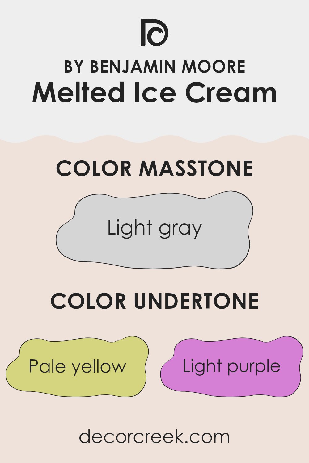
Undertones of Melted Ice Cream 2095-70 by Benjamin Moore
Melted Ice Cream 2095-70 by Benjamin Moore is more complex than it may first appear, thanks to its variety of undertones. This paint color includes hints of pale yellow, light purple, light blue, pale pink, mint, lilac, and grey. Each undertone contributes to the overall appearance of the color, affecting how it looks under different lighting conditions and when paired with various furnishings and decor.
Undertones can significantly influence our perception of color. For example, a color with a yellow undertone might look warmer and more inviting, while a blue undertone could give a cooler, calming effect. When used on interior walls, the undertones in Melted Ice Cream can make an area feel differently based on the other colors in the room and the natural light.
In the case of Melted Ice Cream, the pale yellow and pink undertones can make a room feel warm and cozy, especially in sunlight. The light purple and lilac undertones add a subtle depth, preventing the color from feeling flat. Light blue and mint give a fresh, airy vibe, ideal for creating a relaxed atmosphere. Lastly, the grey undertone helps balance out the brightness, ensuring the color isn’t too overpowering, making it adaptable for various areas and styles.
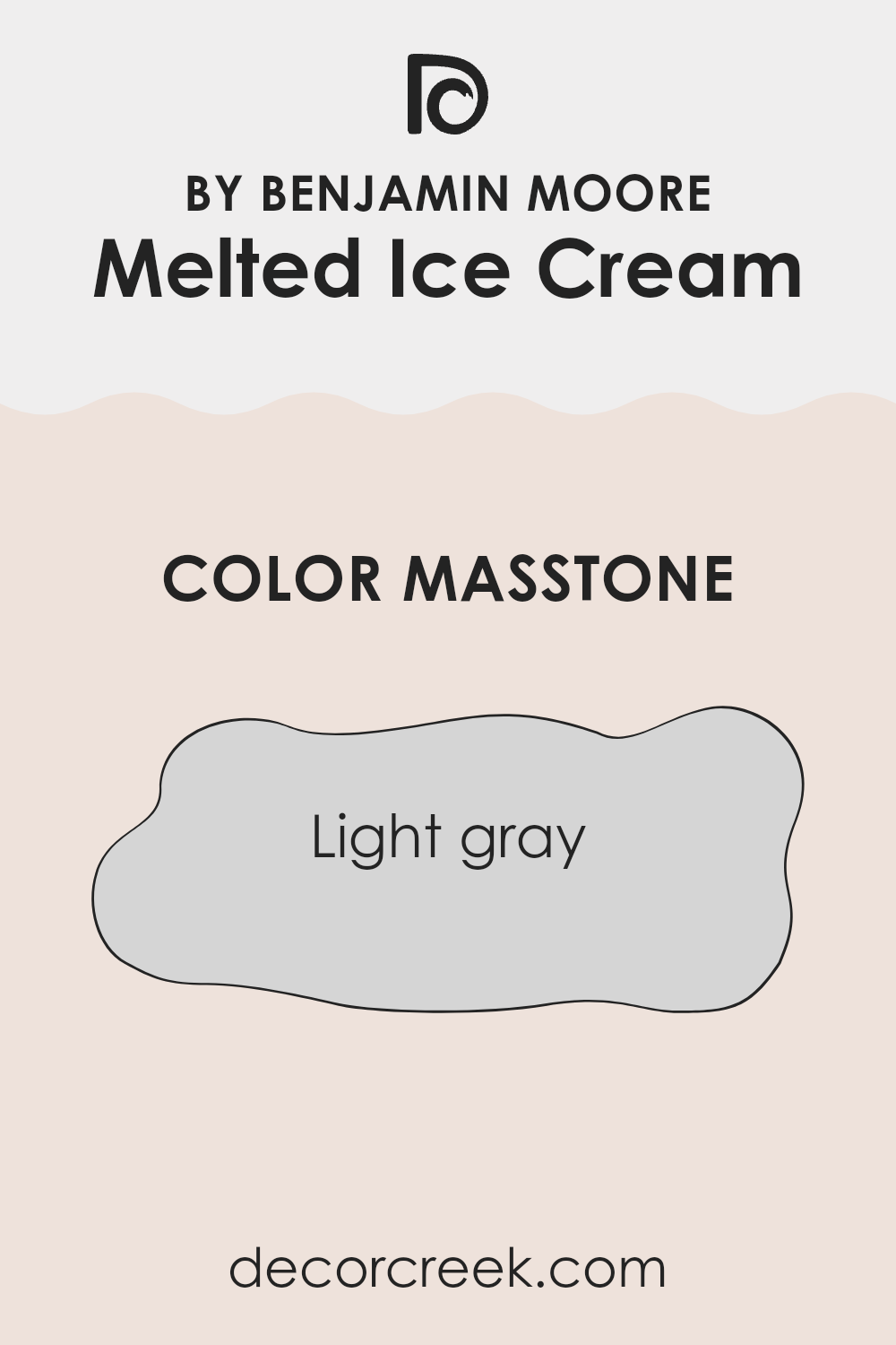
What is the Masstone of the Melted Ice Cream 2095-70 by Benjamin Moore?
Melted Ice Cream 2095-70 by Benjamin Moore shows up as a light gray with the code #D5D5D5. As a masstone, its neutral and soft gray shade makes it adaptable for use in any type of home. This color works well in both small and large areas, as it helps to reflect light, giving a room a brighter, more open feel.
Because it is so gentle on the eyes, it pairs well with almost any decor, from modern to classical, offering a calm backdrop that allows furniture and artwork to shine.
It’s especially useful in bedrooms or living areas where you want a peaceful atmosphere without the area feeling too cold or stark. This light gray also works well for painting walls or trim and is effective in hiding minor wall imperfections. This makes 2095-70 a practical choice for everyday living while still maintaining a fresh and tidy appearance in your home.
How Does Lighting Affect Melted Ice Cream 2095-70 by Benjamin Moore?
Lighting plays a crucial role in how we perceive colors. The type of light and its direction can significantly impact the appearance of a paint color on your walls. For example, the color Melted Ice Cream by Benjamin Moore is a gentle, soft hue that can change based on the lighting conditions.
In artificial light, the effects on Melted Ice Cream can vary depending on the type of bulb used. Warm-toned bulbs can make this color appear cozier and richer, enhancing its creamy undertones. In contrast, cooler-toned bulbs may bring out a crisper, brighter side of the color, making it seem more vibrant.
In natural light, Melted Ice Cream also changes throughout the day as the sunlight shifts. In north-facing rooms, which receive less direct sunlight, this color can appear a bit more subdued and cooler, giving off a calm and gentle feel. Without the influence of strong, direct light, it maintains a more consistent look throughout the day.
In south-facing rooms, where light is warmer and more abundant, Melted Ice Cream will look warmer and more inviting. The natural brightness can make it seem almost luminous, really highlighting its creamy base.
East-facing rooms have light that is stronger in the morning. Here, Melted Ice Cream will start the day with a bright and cheerful appearance, then transition to softer tones as the natural light fades.
West-facing rooms experience the reverse, with softer morning light that strengthens in the afternoon. This color will be milder in the morning but will warm up and become more vibrant in the afternoon to early evening.
Overall, the way Melted Ice Cream adjusts to different lighting underscores the importance of considering both your room’s orientation and the type of light when choosing paint colors. This ensures you achieve the desired effect in each area at any time of day.
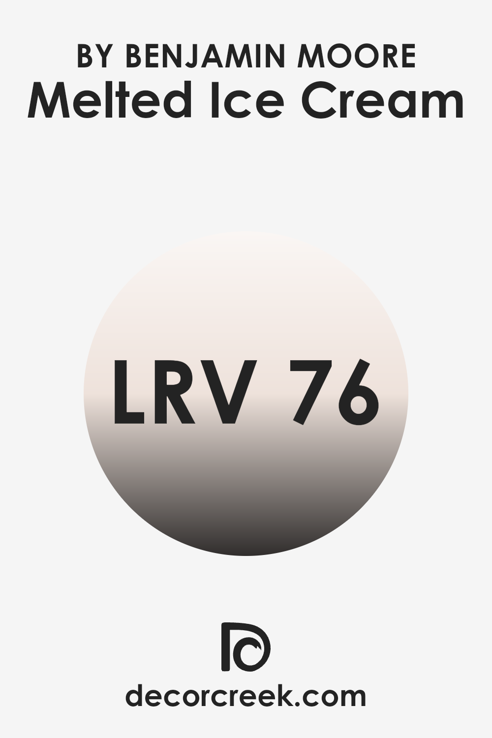
What is the LRV of Melted Ice Cream 2095-70 by Benjamin Moore?
LRV stands for Light Reflectance Value, which is a measurement used to determine how much light a color reflects or absorbs. Measured on a scale from 1 to 99, LRV helps in deciding how light or dark a color might appear once applied to walls.
Colors with higher LRVs, such as white and other light shades, will reflect more light, making areas appear brighter and larger. Conversely, colors with lower LRVs absorb more light, which can make rooms look cozier but smaller and darker.
Given its LRV of 76.38, “Melted Ice Cream” by Benjamin Moore is a color with a high capacity to reflect light. This property makes it an excellent choice for painting areas in the home where a bright and open feel is desired. Rooms with less natural light or smaller areas can greatly benefit from this paint color, as it will help in making the room feel airier and more expansive.
Applying this light color on walls will enhance the brightness of the area, utilizing whatever natural or artificial light is available more efficiently.
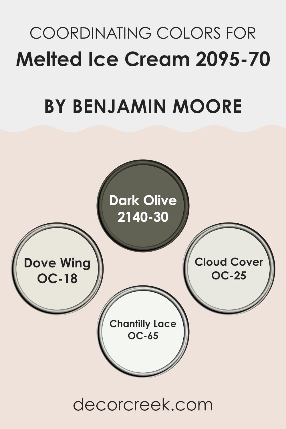
Coordinating Colors of Melted Ice Cream 2095-70 by Benjamin Moore
Coordinating colors are shades that harmonize well when used together in decorating or design, creating a visually pleasing scheme. When choosing coordinating colors, it’s essential to consider how different hues complement each other to achieve a balanced and cohesive look. For Melted Ice Cream 2095-70 by Benjamin Moore, a soft and gentle color, selecting the right coordinating colors can enhance its warmth and subtlety without overpowering its delicate nature.
One coordinating color is Dark Olive 2140-30, a deep, earthy green that provides a strong contrast to the lightness of Melted Ice Cream, adding depth and a touch of nature’s calmness to any area. Another beautiful coordinate is Dove Wing OC-18, which is a soft, off-white with a hint of gray. It pairs effortlessly with lighter hues for a relaxed and airy atmosphere.
Cloud Cover OC-25 is slightly deeper compared to Dove Wing, offering a middle ground with its warm, gray undertones that work well to maintain balance in a color scheme. Finally, Chantilly Lace OC-65 is a bright, crisp white that can act as a clean counterpoint, bringing out the vibrant and creamy aspects of Melted Ice Cream, making the area feel fresh and inviting. Each of these hues supports the main color in its own unique way, contributing to a harmonious interior palette.
You can see recommended paint colors below:
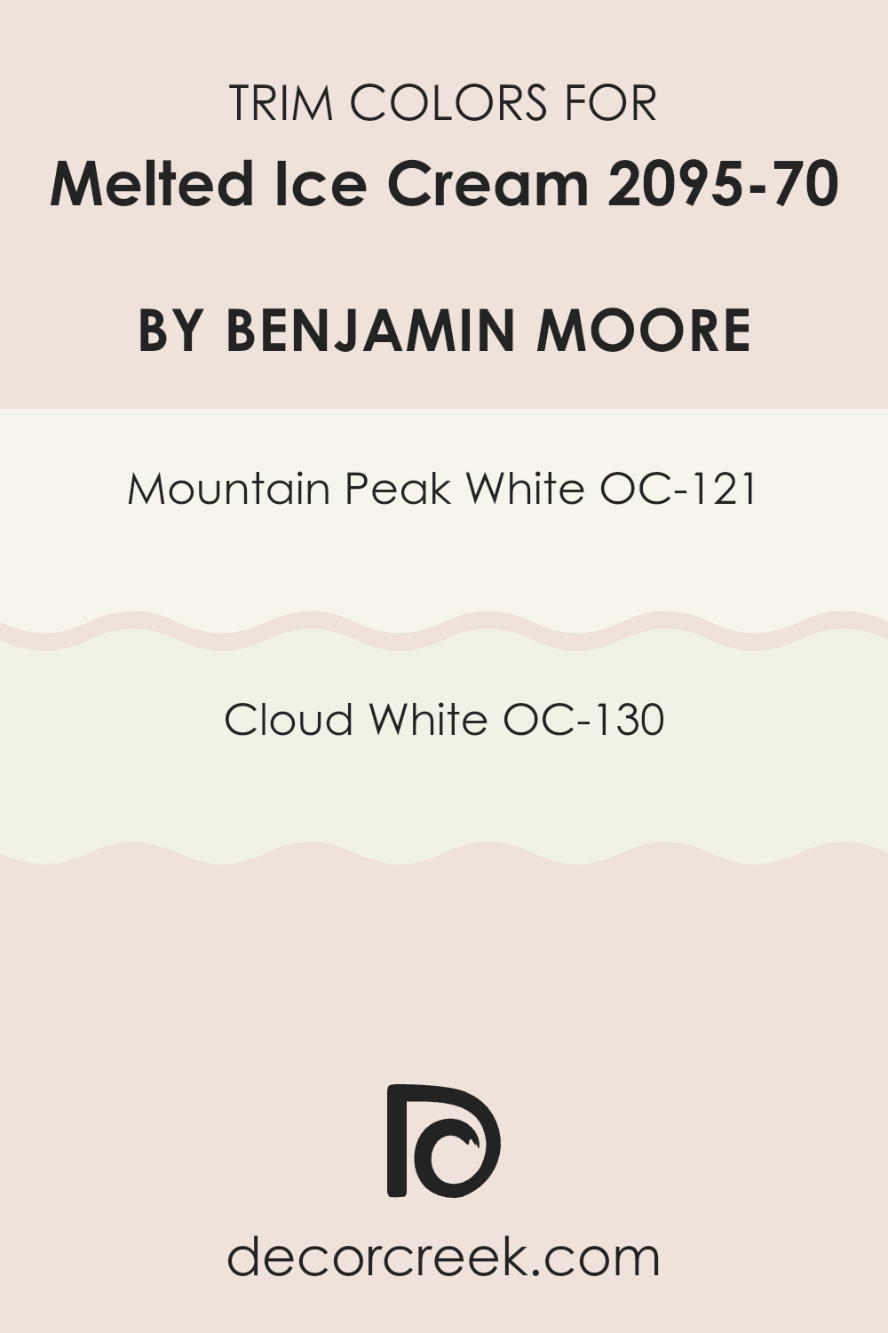
What are the Trim colors of Melted Ice Cream 2095-70 by Benjamin Moore?
Trim colors are chosen to highlight the unique architectural features of a room, such as door frames, window sills, and baseboards, creating a visual framework that complements the primary wall colors. When considering the soft and subdued shade of Melted Ice Cream by Benjamin Moore, selecting the right trim colors can add a defined finish to the overall design.
OC-121 Mountain Peak White and OC-130 Cloud White are excellent choices, as they offer a subtle contrast that enhances the delicate nature of Melted Ice Cream without overpowering it.
Mountain Peak White is a gentle off-white that brings a warm and inviting brightness to trim, providing a subtle differentiation that makes wall colors pop while maintaining a cohesive look. On the other hand, Cloud White delivers a slightly crisper feel that beautifully frames rooms, adding clarity and a clean, fresh finish that complements lighter hues like Melted Ice Cream, making them more vibrant and appealing. These trim colors are crucial in achieving a polished and harmonious appearance in any area they adorn.
You can see recommended paint colors below:
- OC-121 Mountain Peak White
- OC-130 Cloud White
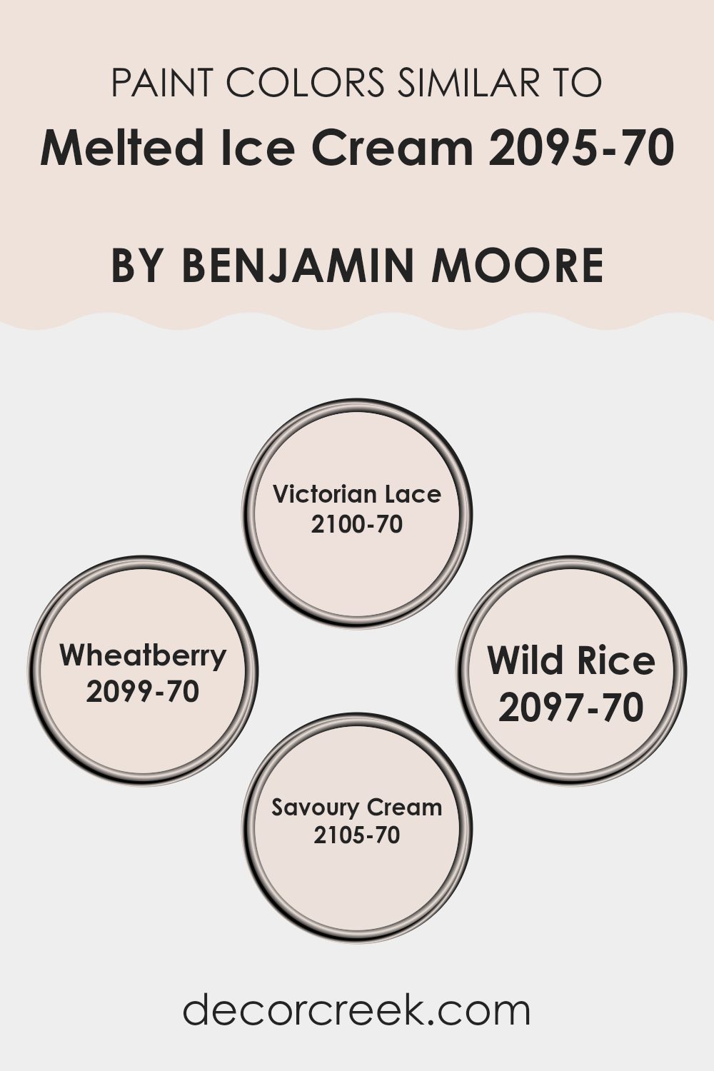
Colors Similar to Melted Ice Cream 2095-70 by Benjamin Moore
Using similar colors in design and decorating projects creates a harmonious and visually appealing environment. Colors like Victorian Lace, Wheatberry, Wild Rice, and Savoury Cream closely align with the subtle tones of Melted Ice Cream, creating a palette that is cohesive yet subtly diverse. This coordination of colors ensures a smooth visual flow from one area to another, enhancing the aesthetic continuity without overpowering the senses. When used together, these hues complement each other, allowing designers and homeowners to achieve a balanced and inviting atmosphere.
Victorian Lace is a delicate off-white that exudes a gentle warmth, making it perfect for creating a calm and welcoming feel in any room. Wheatberry brings a slightly deeper tone, reminiscent of soft, sunlit wheat fields, adding a touch of nature-inspired warmth. Wild Rice shifts towards a muted beige, offering a deeper contrast while still maintaining the lightness of the palette.
Lastly, Savoury Cream finishes the set with a hint of richer creaminess, providing a subtle depth that works well to ground the lighter shades in the collection. Together, these colors complete a spectrum of harmonious shades that effortlessly complement each other, enhancing any area with their gentle charm.
You can see recommended paint colors below:
- 2100-70 Victorian Lace
- 2099-70 Wheatberry
- 2097-70 Wild Rice
- 2105-70 Savoury Cream
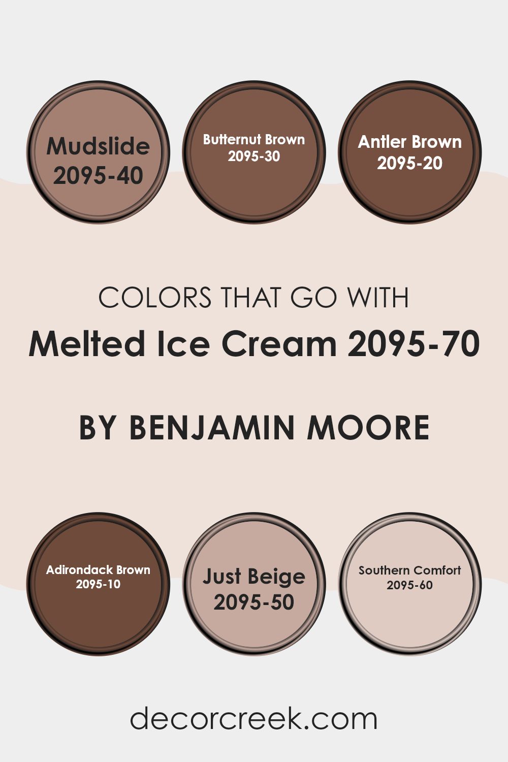
Colors that Go With Melted Ice Cream 2095-70 by Benjamin Moore
When decorating an area, choosing the right colors to complement a base tone like Melted Ice Cream 2095-70 by Benjamin Moore is crucial. These compatible colors, all from Benjamin Moore, each bring their own unique feel to the room while maintaining harmony with the soft, adaptable nature of Melted Ice Cream.
Using these complementary shades allows for creating a layered, inviting atmosphere where each color supports and enhances the others.
Mudslide 2095-40 boasts a hearty, warm brown tone reminiscent of wet earth that adds depth and grounding to decor schemes. Following it, Butternut Brown 2095-30 offers a lighter, nutty shade that’s perfect for adding a touch of warmth without overpowering areas. Antler Brown 2095-20 provides a rich, deep brown which works well in areas that benefit from a dark, strong color to create focus or accentuate key furnishings.
For even more intensity, Adirondack Brown 2095-10 steps in as a bold, almost black-brown, ideal for making dramatic statements or emphasizing architectural details. On the lighter side, Just Beige 2095-50 clears the palette with a clean, neutral beige, excellent for broad surfaces and providing a calm backdrop.
Lastly, Southern Comfort 2095-60 is a creamy, soft hue, less intense yet highly flexible for creating smooth transitions between stronger colors.
Together, these colors harmonize beautifully with Melted Ice Cream, creating environments that are cohesive and visually appealing.
You can see recommended paint colors below:
- 2095-40 Mudslide
- 2095-30 Butternut Brown
- 2095-20 Antler Brown
- 2095-10 Adirondack Brown
- 2095-50 Just Beige
- 2095-60 Southern Comfort
How to Use Melted Ice Cream 2095-70 by Benjamin Moore In Your Home?
Melted Ice Cream 2095-70 by Benjamin Moore is a warm, creamy color that instantly makes any room feel welcoming and cozy. This subtle shade can work wonders in brightening up areas that lack natural light, such as a north-facing room. Its softness allows it to blend easily with a variety of decor styles and colors, making it an adaptable choice for any area in your home.
For those looking to refresh their living room or bedroom, applying Melted Ice Cream on the walls can create a gentle backdrop that complements both bright accents and darker furniture beautifully. It’s also an excellent color for a nursery or child’s room, providing a soothing yet cheerful atmosphere.
In smaller areas like a bathroom or hallway, this color can make the room appear larger and more open. Pair it with crisp white trim for a clean, refined look. Whether you’re repainting entirely or just looking to update an accent wall, Melted Ice Cream offers a lovely, subtle enhancement to your home.
Melted Ice Cream 2095-70 by Benjamin Moore vs Wheatberry 2099-70 by Benjamin Moore
Melted Ice Cream and Wheatberry by Benjamin Moore are both light and airy colors, but they have distinct tones that set them apart. Melted Ice Cream is a very soft, creamy white that often gives a gentle, subtle look to a room, evoking a sense of calm and simplicity. It’s an adaptable shade that works well in areas where you want a clean and open feel.
On the other hand, Wheatberry leans more towards a delicate beige with a hint of warmth. This color can add a touch of coziness to areas, making it ideal for spots where you want a bit of warmth without overpowering the room with strong colors. It pairs well with other warm tones and natural materials like wood or wool.
Both colors are quite light, which makes them fantastic options for making small areas appear larger and brighter. Depending on your decor, either can be an excellent choice for creating a fresh, inviting environment.
You can see recommended paint color below:
- 2099-70 Wheatberry
Melted Ice Cream 2095-70 by Benjamin Moore vs Savoury Cream 2105-70 by Benjamin Moore
Melted Ice Cream and Savoury Cream, both by Benjamin Moore, exhibit very subtle differences in tones that affect their visual appearance. Melted Ice Cream presents a soft, muted off-white that might remind one of the light, creamy color found in its namesake. This shade works well in areas meant to feel cozy and gently lit, giving a clean, understated background.
On the other hand, Savoury Cream leans towards a slightly warmer tone. This color has an inviting warmth to it, making areas feel welcoming and cozy. It’s an excellent choice for those who prefer their white to have a hint of softness without going entirely into beige or yellow territories.
Both colors are adaptable and neutral, perfect for use across various rooms and lighting situations. While Melted Ice Cream feels slightly brighter and cooler, Savoury Cream brings a hint warmer ambiance. Choose between them based on the desired warmth and the specific lighting of your area.
You can see recommended paint color below:
- 2105-70 Savoury Cream
Melted Ice Cream 2095-70 by Benjamin Moore vs Victorian Lace 2100-70 by Benjamin Moore
Melted Ice Cream and Victorian Lace by Benjamin Moore are both pale, soft colors that can brighten up an area subtly. Melted Ice Cream is a warm off-white with a hint of yellow, giving it a creamy, cozy feel. It reminds you of a comforting, sweet dessert, making it great for creating a welcoming atmosphere in living areas or kitchens.
On the other hand, Victorian Lace is cooler and has a slight pink undertone. This makes it feel more delicate and slightly more refined than Melted Ice Cream. It’s a color that would look lovely in a bedroom or an area where you want a gentle, calm feeling.
Both colors are quite neutral and adaptable, but the choice between them depends on the mood you want to set in your area. Melted Ice Cream works well where you want warmth and a sunlit look, while Victorian Lace is better for a subtle, soft charm.
You can see recommended paint color below:
- 2100-70 Victorian Lace
Melted Ice Cream 2095-70 by Benjamin Moore vs Wild Rice 2097-70 by Benjamin Moore
Melted Ice Cream and Wild Rice by Benjamin Moore are both light and subtle colors, but they offer different vibes for room decor. Melted Ice Cream is a soft, creamy white with a warm undertone, making it perfect for creating a cozy and inviting atmosphere in your home. It reflects light well, helping to make small areas appear bigger and more open.
On the other hand, Wild Rice is slightly darker and has a hint of beige, giving it a richer and warmer appearance compared to Melted Ice Cream. This color is excellent for areas where you want to add a touch of warmth without overpowering the room with too deep or bold of a hue.
Both colors are adaptable and can work beautifully in various settings, from living rooms to bedrooms. However, your choice might depend on the amount of natural light your room receives or whether you prefer a crisper look (Melted Ice Cream) or something with a bit more depth (Wild Rice).
You can see recommended paint color below:
- 2097-70 Wild Rice
In conclusion, the color 2095-70 Melted Ice Cream by Benjamin Moore is just lovely. It’s soft and gentle, like a warm hug or a fluffy cloud in the sky. If you’re thinking about giving your room a makeover, this color could be a great choice because it makes everything look cozy and calming. It’s especially wonderful for places where you relax, like your bedroom or a reading nook, because its light pink tone can help you feel peaceful and happy.
The color is also like magic because it can blend in nicely with other colors. Whether you have furniture in dark colors or bright ones like yellows or greens, Melted Ice Cream can go along well with them, making decorating your room fun and easy.
So, if you want a color that’s soft, inviting, and can mix well with others, 2095-70 Melted Ice Cream might be just what you’re looking for. It’s perfect for anyone wanting to add a touch of sweetness to their daily surroundings.
decorcreek.com
Ever wished paint sampling was as easy as sticking a sticker? Guess what? Now it is! Discover Samplize's unique Peel & Stick samples.
Get paint samples

