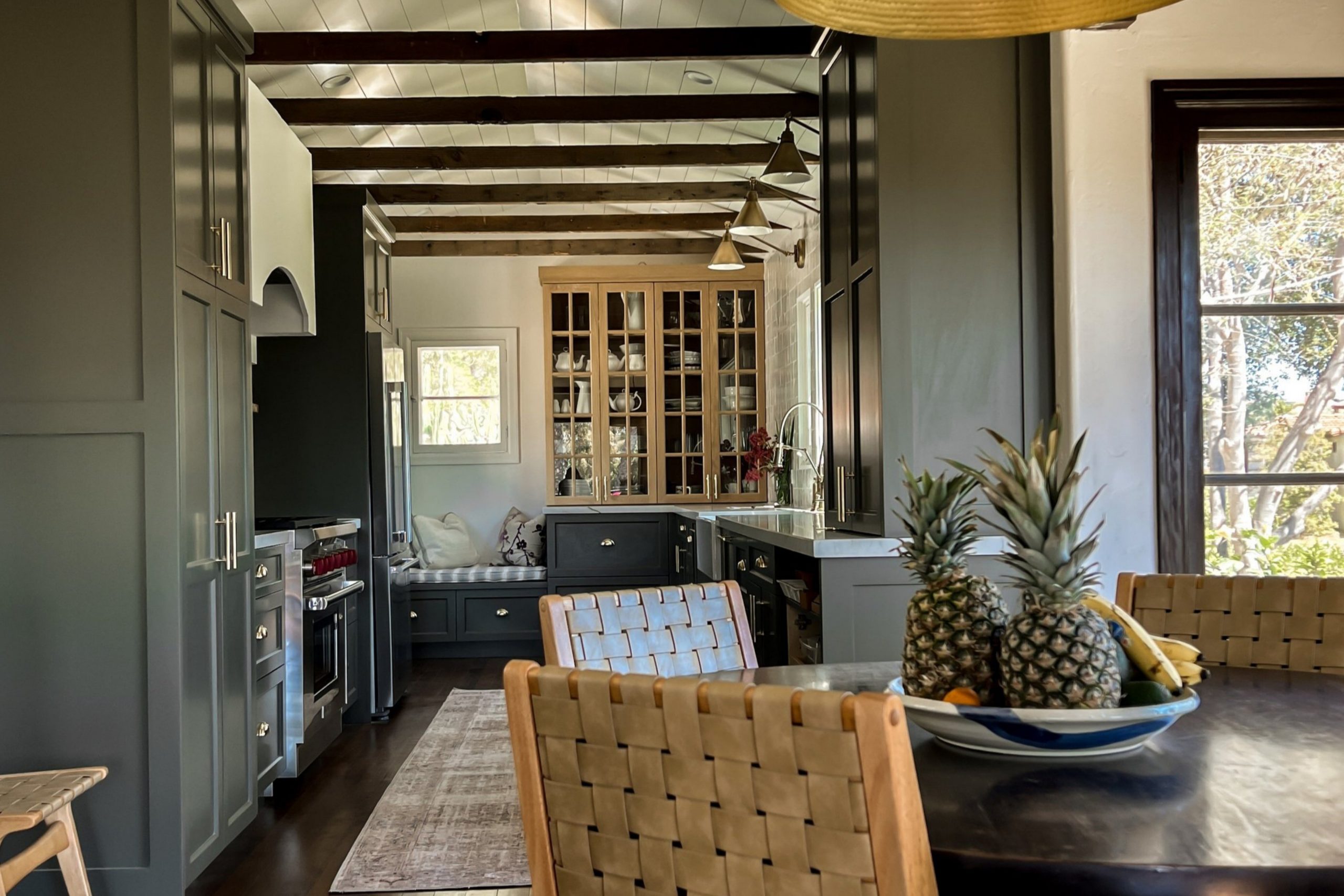
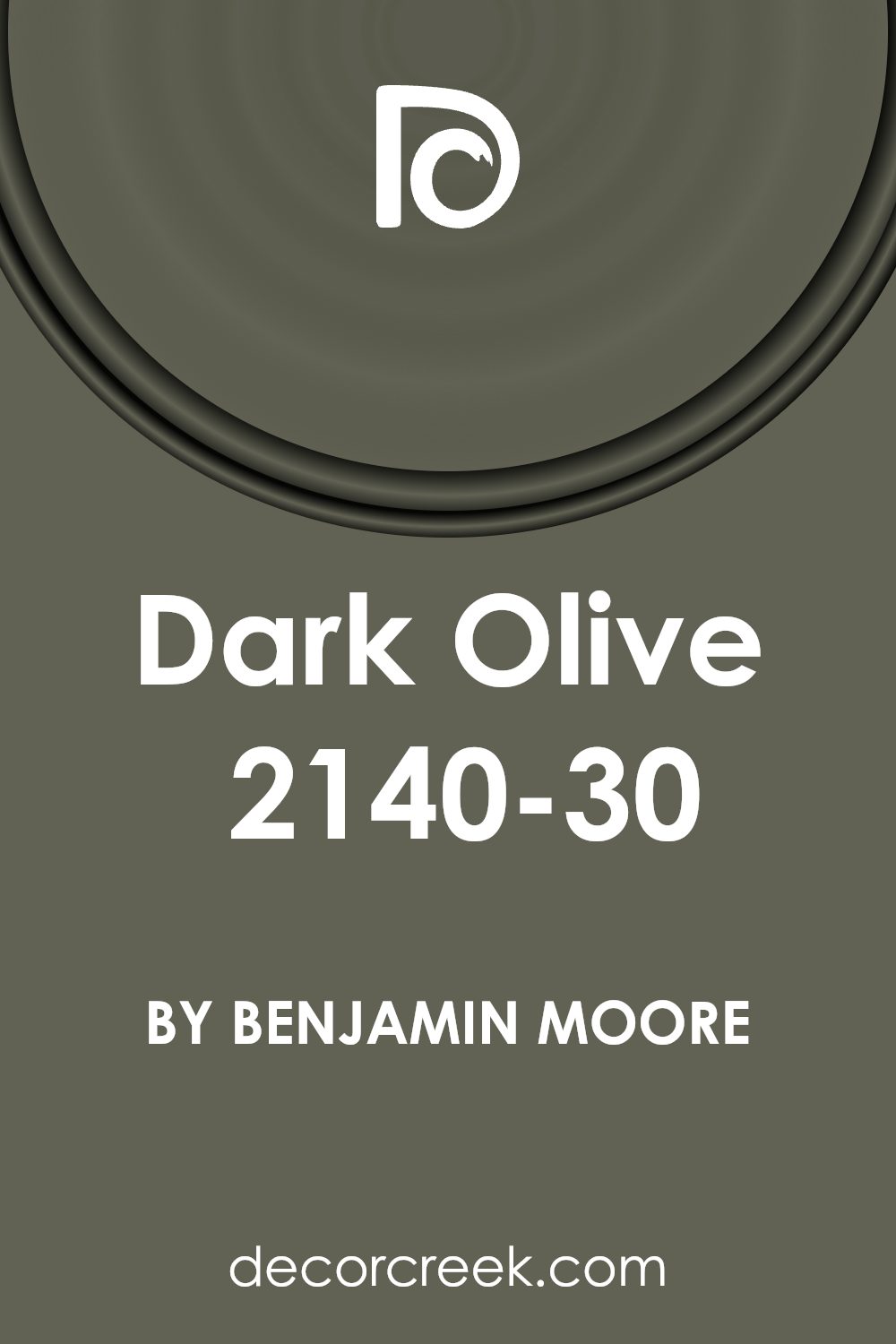
The 2140-30 Dark Olive by Benjamin Moore is a paint color that brings a unique and sophisticated touch to any space. This deep, rich shade of green acts as a beautiful backdrop, blending seamlessly with various decor styles from modern to traditional. Ideal for anyone who desires to add a dose of nature’s tranquility and elegance into their interior, Dark Olive offers a versatile option for walls, trim, or accent pieces.
Whether it’s to cozy up a living room or add character to a bedroom, this color can effortlessly elevate the look of your home. Beyond its aesthetic appeal, Dark Olive stands as a testament to Benjamin Moore’s commitment to quality, ensuring durability and consistency in every stroke.
This overview aims to shed light on how Dark Olive can inspire your next home improvement project, offering a glimpse into its potential to create welcoming and stylish environments.
What Color Is Dark Olive 2140-30 by Benjamin Moore?
Dark Olive 2140-30 by Benjamin Moore is a rich, deep shade that combines the lushness of green with the subdued, warm undertones of brown. This particular color brings a sense of sophistication and earthiness to any space, making it a versatile choice for various design styles. Its depth allows it to stand out as a statement wall or to add character when used for trim, doors, and even furniture pieces.
When thinking about interior styles, Dark Olive pairs beautifully with rustic, farmhouse, and even modern designs. Its natural vibe works well in spaces that aim for a cozy, welcoming feel, and it’s especially striking against natural wood tones, from light oak to darker walnut. The color also complements materials with texture, such as leather, wool, and linen, adding layers of depth and interest to the room’s overall aesthetics.
Beyond natural materials, Dark Olive can be paired with metals like brass or copper for a touch of elegance, or with concrete and stone textures for a more industrial look. Its versatility extends to colors as well; it looks stunning with soft, creamy whites, providing contrast, or alongside warmer hues for a more cohesive, earth-toned palette.
Overall, Dark Olive is a beautifully complex color that can help create a space that feels both grounded and sophisticated, making it a great choice for those looking to introduce a touch of nature and richness into their interiors.
Is Dark Olive 2140-30 by Benjamin Moore Warm or Cool color?
Dark Olive 2140-30 by Benjamin Moore is a unique color that brings a sophisticated and cozy vibe to any home. This deep, rich green has a hint of earthiness, making it perfect for creating a calming and inviting atmosphere in a room. When used in homes, Dark Olive adds depth and character, providing a backdrop that pairs well with a wide range of decor styles, from modern to traditional. This color can make large spaces feel more intimate and cozy, while also giving small rooms a touch of elegance without overwhelming them.
One of the great things about Dark Olive is its versatility. It works beautifully as an accent wall to add a splash of color or can be used on cabinetry or furniture for a chic, updated look. It also complements natural materials like wood, stone, and metals, enhancing the warmth and texture of a space.
When paired with lighter colors or natural light, Dark Olive can create a stunning contrast, making the room appear vibrant and lively. Whether you’re looking to update a single room or your entire home, Dark Olive offers a beautiful and timeless option that can make your space feel more inviting and stylish.
Undertones of Dark Olive 2140-30 by Benjamin Moore
Dark Olive 2140-30 by Benjamin Moore is a rich, complex color that brings warmth and depth to any space. Its unique undertones play a big role in how we perceive this color, making it versatile and adaptable to various settings and lighting conditions.
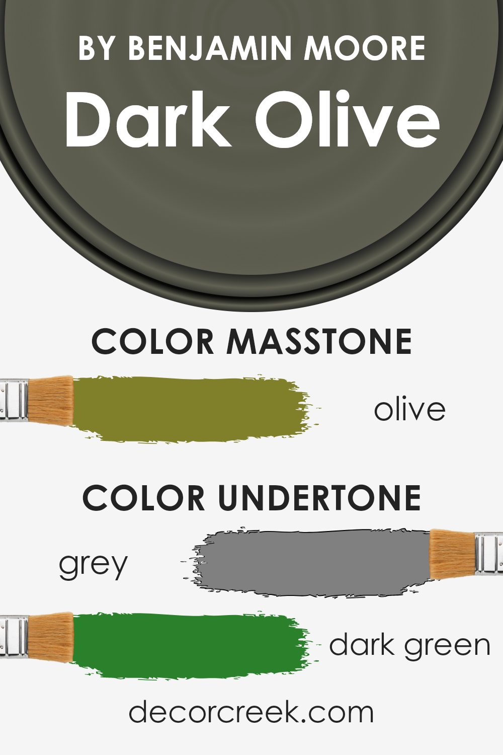
When you look at Dark Olive, you might first notice its primary hue of deep, earthy green. However, as light changes or when paired with different colors and materials, you’ll start to see the richness brought out by its various undertones. Grey (#808080) adds a muted, sophisticated feel, making the color less intense and more soothing. The dark green (#2B802B) keeps the color rooted in nature, offering a sense of tranquility and calmness.
Brown (#802B2B) and dark grey (#2B2B2B) give Dark Olive a grounded, earthy base, making it perfect for spaces meant to feel cozy and inviting. Touches of dark turquoise (#2B8080) and purple (#802B80) introduce a hint of the mystical and the luxurious, adding layers and intrigue. Navy (#2B2B80) deepens the complexity, suggesting a regal, refined backdrop that remains subtly inspiring.
In lighter tones, such as light green (#80D52B) and mint (#80D580), there’s a refreshing vibe that can make a room feel more lively and vibrant, without overwhelming with brightness. Orange (#D5802B) and yellow tones (#D5D52B, #D5D580) bring warmth, making the space feel more welcoming and cheerful.
When applied to interior walls, all these undertones contribute to a dynamic yet harmonious look. They ensure that Dark Olive doesn’t just act as a simple backdrop but rather as an integral part of the room’s overall charm and character. The color’s ability to change subtly with the day’s light or its surroundings means it can fit a variety of themes and styles, from modern and sophisticated to rustic and cozy.
Understanding and appreciating these undertones can greatly influence design choices, helping create spaces that feel complete, balanced, and full of life.
What is the Masstone of the Dark Olive 2140-30 by Benjamin Moore?
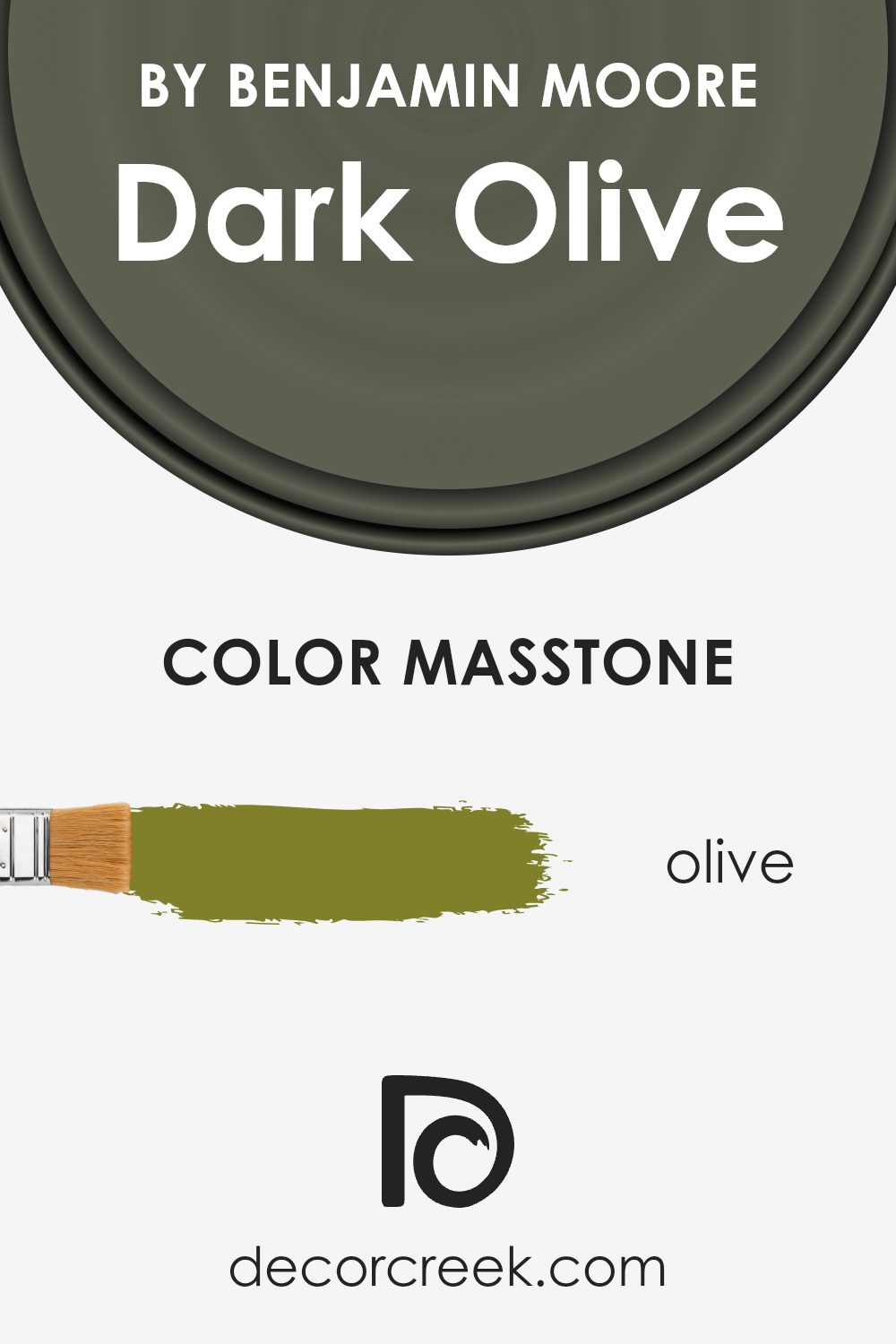
Dark Olive 2140-30 by Benjamin Moore, with its masstone Olive (#80802B), brings a grounded and natural vibe into homes. This color is like the heart of a lush forest; it adds a touch of the outdoors inside. Its deep, rich green with hints of brown makes rooms feel cozy and welcoming. Imagine it in a study or living room – it turns these spaces into calming retreats where you can relax or focus. Because of its earthy tones, Dark Olive fits well with various decor styles, from rustic to modern, adding depth and warmth.
This color works great as an accent wall or for cabinets, complementing natural wood tones and neutral colors. It can also balance brighter colors, preventing them from overwhelming a space. In well-lit areas, Dark Olive shines, revealing subtle undertones that add character. In darker rooms, it provides a sophisticated, cozy feel. Adding Dark Olive to your home means bringing in a touch of nature and tranquility.
How Does Lighting Affect Dark Olive 2140-30 by Benjamin Moore?
Lighting plays a crucial role in how we perceive colors. The same color can appear different under various lighting conditions due to how light interacts with the surface it’s on and how our eyes perceive this interaction. The paint color Dark Olive by Benjamin Moore is a great example to explore the effects of lighting on colors.
In artificial light, such as LED or incandescent bulbs, Dark Olive might appear warmer or have a deeper, richer tone. This is because artificial lights, depending on their color temperature, can add yellow or reddish hues, making Dark Olive seem cozier in the evening or in rooms that rely on artificial lighting.
In natural light, the color can look significantly different. Natural light offers a full spectrum of colors, which can highlight different undertones in the paint. On a bright, sunny day, Dark Olive might look brighter and more vibrant, while on an overcast day, it may appear muted and softer.
The direction your room faces also affects how Dark Olive looks. In north-faced rooms, which often get cooler, indirect light, this color might look more sober and subdued, enhancing its more serious and stately qualities. South-faced rooms enjoy warmer, direct light for most of the day, which can make Dark Olive look livelier and more welcoming.
East-faced rooms get bright light in the morning, which could make Dark Olive look fresh and vibrant, but as the day progresses and the direct light moves away, the color could shift to appear cooler and more reserved. In contrast, west-faced rooms may start with a more muted version of the color; as the sun sets, the warmer light can make Dark Olive glow with warmth, highlighting its depth and complexity.
These nuances underscore the importance of considering lighting — both natural and artificial — when choosing colors for your space. Testing the color in different lights and at different times of the day will give you the best preview of how it will truly look in your environment.
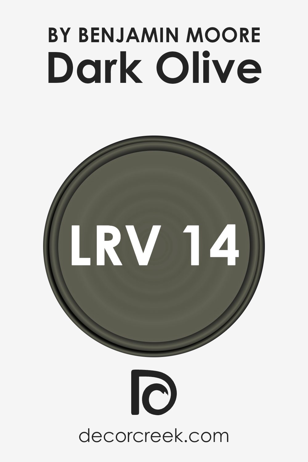
What is the LRV of Dark Olive 2140-30 by Benjamin Moore?
The LRV for the color Dark Olive by Benjamin Moore is 13.52, which means it’s on the darker end of the scale. This means it won’t reflect much light, absorbing more instead, which can significantly impact how this color makes a room feel.
It’s a rich, deep color that can add a lot of character and warmth to a space, but it’s important to consider lighting when using it. In rooms with plenty of natural or well-planned artificial light, Dark Olive can create a sophisticated and intimate atmosphere. However, in spaces lacking in light, it might make the room feel smaller and darker.
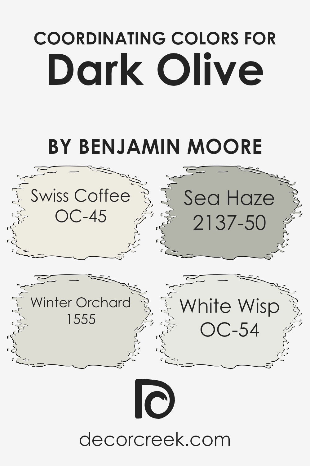
Coordinating Colors of Dark Olive 2140-30 by Benjamin Moore
Coordinating colors are shades that go well together, creating a balanced and harmonious look. When you have a specific color like Dark Olive by Benjamin Moore, finding coordinating colors means selecting other shades that complement it without clashing. This concept works by choosing colors that share a similar tone, contrast in a pleasing way, or belong to a color scheme that naturally looks good together. For Dark Olive, a deep, earthy green, the coordinating colors are chosen to either contrast it in a subtle manner or enhance its natural richness.
Swiss Coffee, OC-45, is a warm, inviting off-white that brings a soft brightness, making it a perfect counterbalance to the depth of Dark Olive. Its creamy tone provides a neutral background that allows darker colors to pop. Winter Orchard, 1555, has a gentle, grayish-green hue that echoes the natural elements in Dark Olive, promoting a serene and cohesive look.
Moving on, Sea Haze, 2137-50, offers a cool, muted green that bridges the gap between the light and dark shades, adding a touch of sophistication. Lastly, White Wisp, OC-54, presents a cool white with a hint of blue undertone, introducing a crisp, clean element that refreshes and uplifts the whole color palette. Together, these coordinating colors create a balanced and appealing palette that can enhance a variety of spaces.
- OC-45 Swiss Coffee
- 1555 Winter Orchard
- 2137-50 Sea Haze
- OC-54 White Wisp
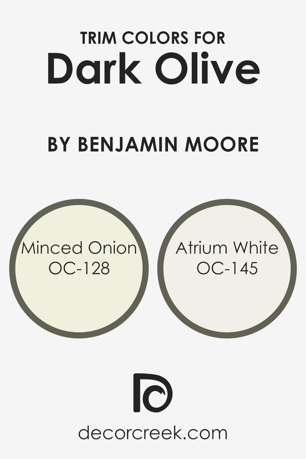
What are the Trim colors of Dark Olive 2140-30 by Benjamin Moore?
Trim colors are essentially the colors used for painting the trimwork in a room, which includes elements like baseboards, moldings, window and door frames. The choice of trim color is crucial because it frames the architectural details of a room and complements the wall colors, adding depth and character to the space. For a rich, sophisticated color like Dark Olive by Benjamin Moore, selecting the right trim colors can enhance its beauty and elegance. Trim colors act as a visual guide, drawing the eye to the room’s features and ensuring that the wall color stands out.
Two wonderful choices for trim colors with Dark Olive could be Minced Onion (OC-128) and Atrium White (OC-145) by Benjamin Moore.
Minced Onion is a soft, warm gray that brings a subtle contrast against the deep tones of Dark Olive, softening the room’s overall feel without overwhelming it. This hue is light and versatile, ensuring that the darker wall color becomes the focal point while the trim neatly outlines the room’s dimensions. On the other hand, Atrium White is a pristine, pure white with just a hint of warmth. It offers a more striking contrast to Dark Olive, creating a crisp and clean look that can make the dark walls pop and the architectural details more pronounced. Using either of these colors as trim with Dark Olive can achieve a balanced and polished aesthetic in any space.
You can see recommended paint colors below:
- OC-128 Minced Onion
- OC-145 Atrium White
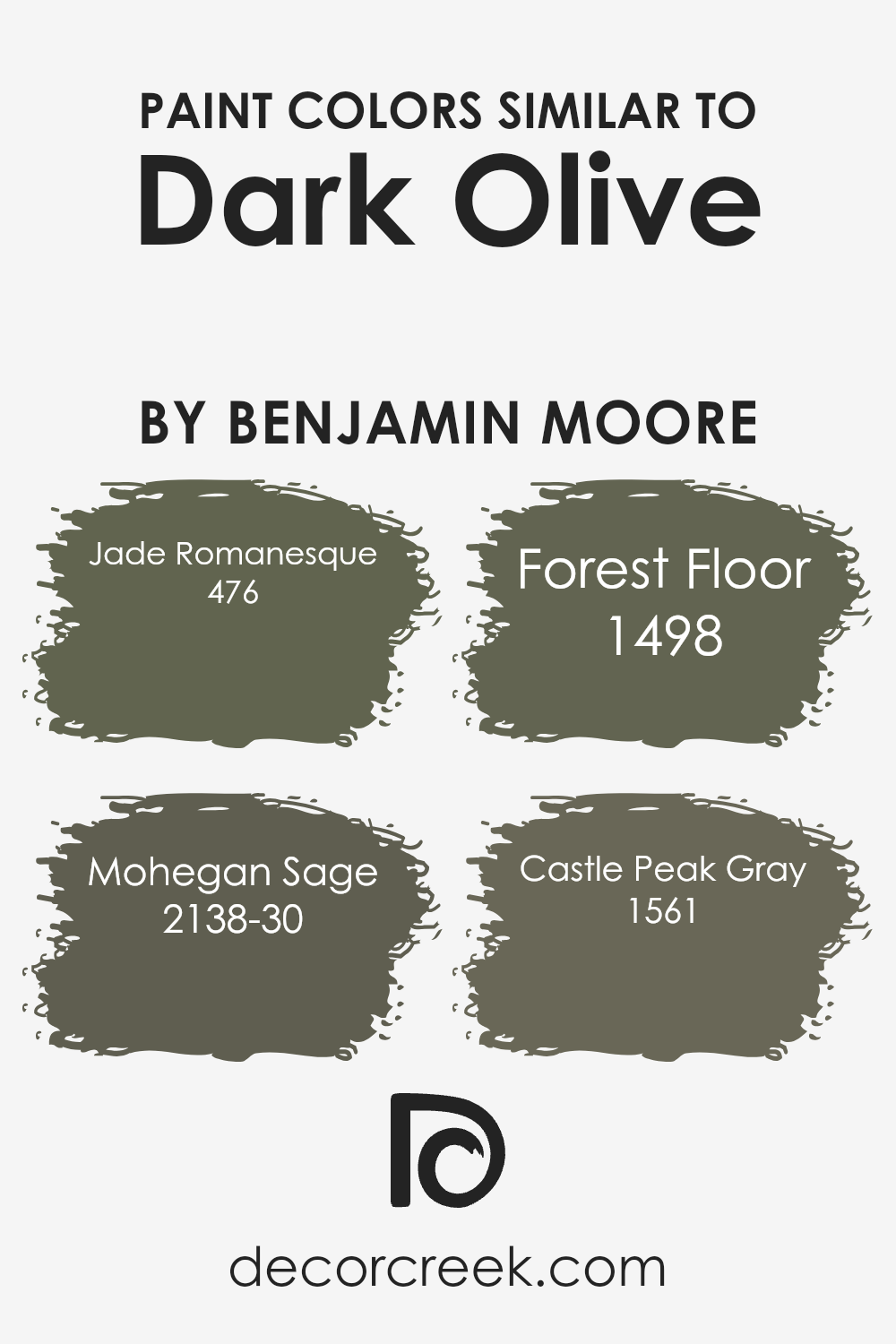
Colors Similar to Dark Olive 2140-30 by Benjamin Moore
Similar colors play a vital role in design and decor, creating harmony and a seamless aesthetic transition from one space to another. When we look at colors close to Dark Olive by Benjamin Moore, such as Jade Romanesque, Mohegan Sage, Forest Floor, and Castle Peak Gray, we see a palette that works together to evoke a sense of tranquility and natural beauty. These colors have subtle differences yet share a common undertone that makes them work beautifully together, allowing for a cohesive look in any space.
Jade Romanesque adds a touch of sophistication with its deep, rich tones that hint at the mystery of ancient artifacts, making it perfect for accent walls or statement pieces. Mohegan Sage, on the other hand, brings a soft, earthy vibe that’s reminiscent of a serene forest at dawn, ideal for creating a calming atmosphere.
Forest Floor grounds the palette with its dense, earthy essence, suggesting the fertile soil of a well-trodden path in the woods, great for adding depth and warmth. Lastly, Castle Peak Gray offers a modern twist with its cool, stony hues, providing a versatile backdrop that supports the other colors, making it an excellent choice for contemporary spaces. Together, these similar colors enrich the visual experience by layering texture and depth, enhancing the overall aesthetic without overwhelming the senses.
You can see recommended paint colors below:
- 476 Jade Romanesque
- 2138-30 Mohegan Sage
- 1498 Forest Floor
- 1561 Castle Peak Gray
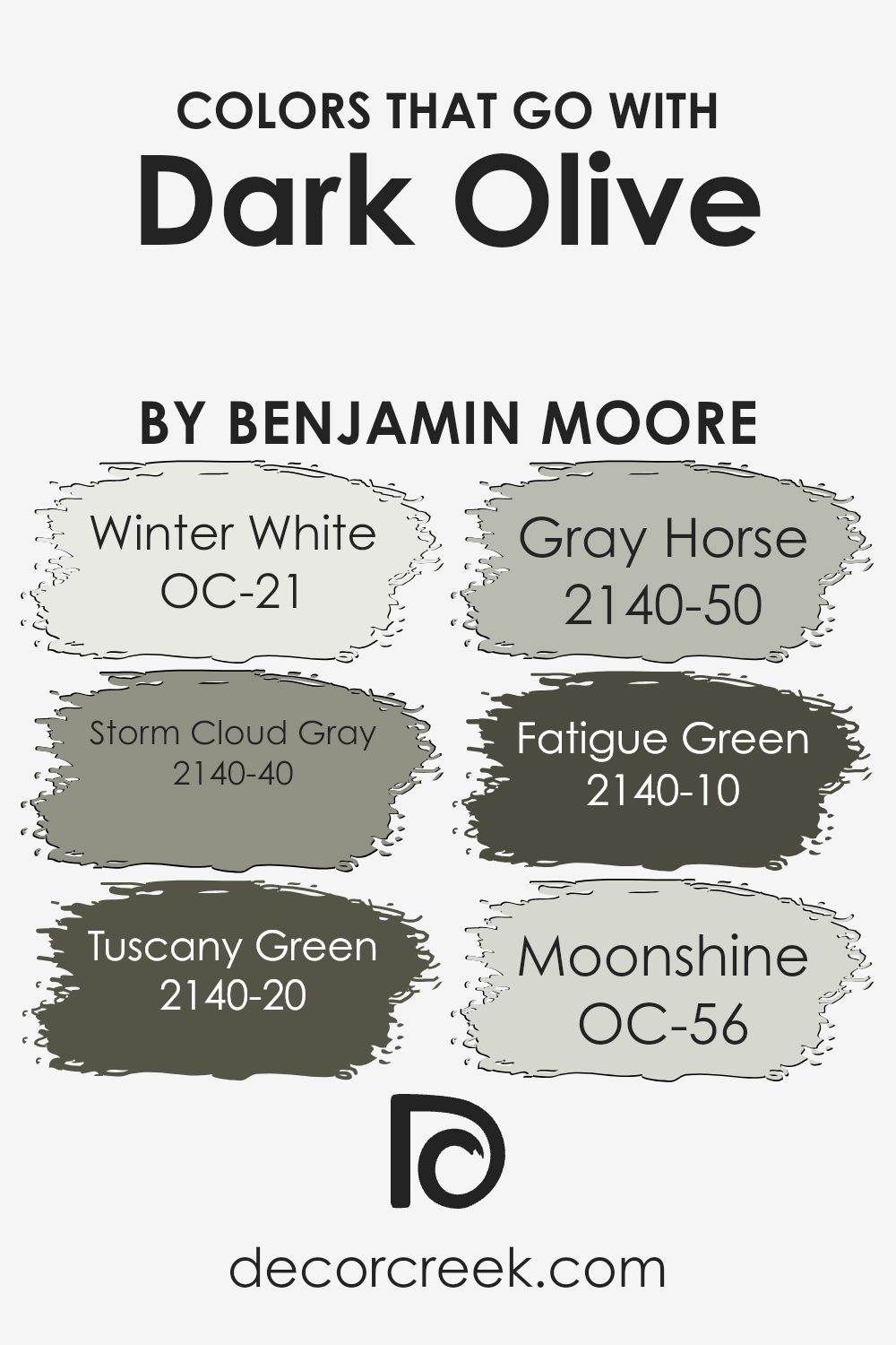
Colors that Go With Dark Olive 2140-30 by Benjamin Moore
Selecting the right colors to accompany Dark Olive 2140-30 by Benjamin Moore is key for creating a harmonious and appealing space. These colors, including OC-21 Winter White, 2140-40 Storm Cloud Gray, 2140-20 Tuscany Green, 2140-50 Gray Horse, 2140-10 Fatigue Green, and OC-56 Moonshine, play crucial roles in enhancing the visual appeal of Dark Olive. They help balance its deep, rich tones with lighter or contrasting shades for a truly balanced look.
Winter White OC-21 is a soft, airy white that brings a sense of brightness and openness, making it a perfect counterbalance to the denseness of Dark Olive. It reflects light, adding a fresh, crisp finish to the room. Storm Cloud Gray 2140-40, a deep, moody gray, adds a touch of sophistication and depth when paired with Dark Olive, creating a serene and inviting atmosphere.
Tuscany Green 2140-20, with its earthy, vibrant hue, complements Dark Olive by enhancing its natural, lush qualities, making any space feel more connected to nature. Gray Horse 2140-50, a mid-tone gray with green undertones, works seamlessly with Dark Olive to create a subdued yet intriguing aesthetic. Fatigue Green 2140-10 offers a military-like vibe that’s bold yet pairs wonderfully with Dark Olive for a cohesive, nature-inspired look. Lastly, Moonshine OC-56, a pale, soft gray with blue undertones, introduces a subtle contrast to Dark Olive, brightening the space delicately without overwhelming it.
Together, these colors form a palette that enriches the depth and complexity of Dark Olive, ensuring a sophisticated and welcoming environment.
You can see recommended paint colors below:
- OC-21 Winter White
- 2140-40 Storm Cloud Gray
- 2140-20 Tuscany Green
- 2140-50 Gray Horse
- 2140-10 Fatigue Green
- OC-56 Moonshine
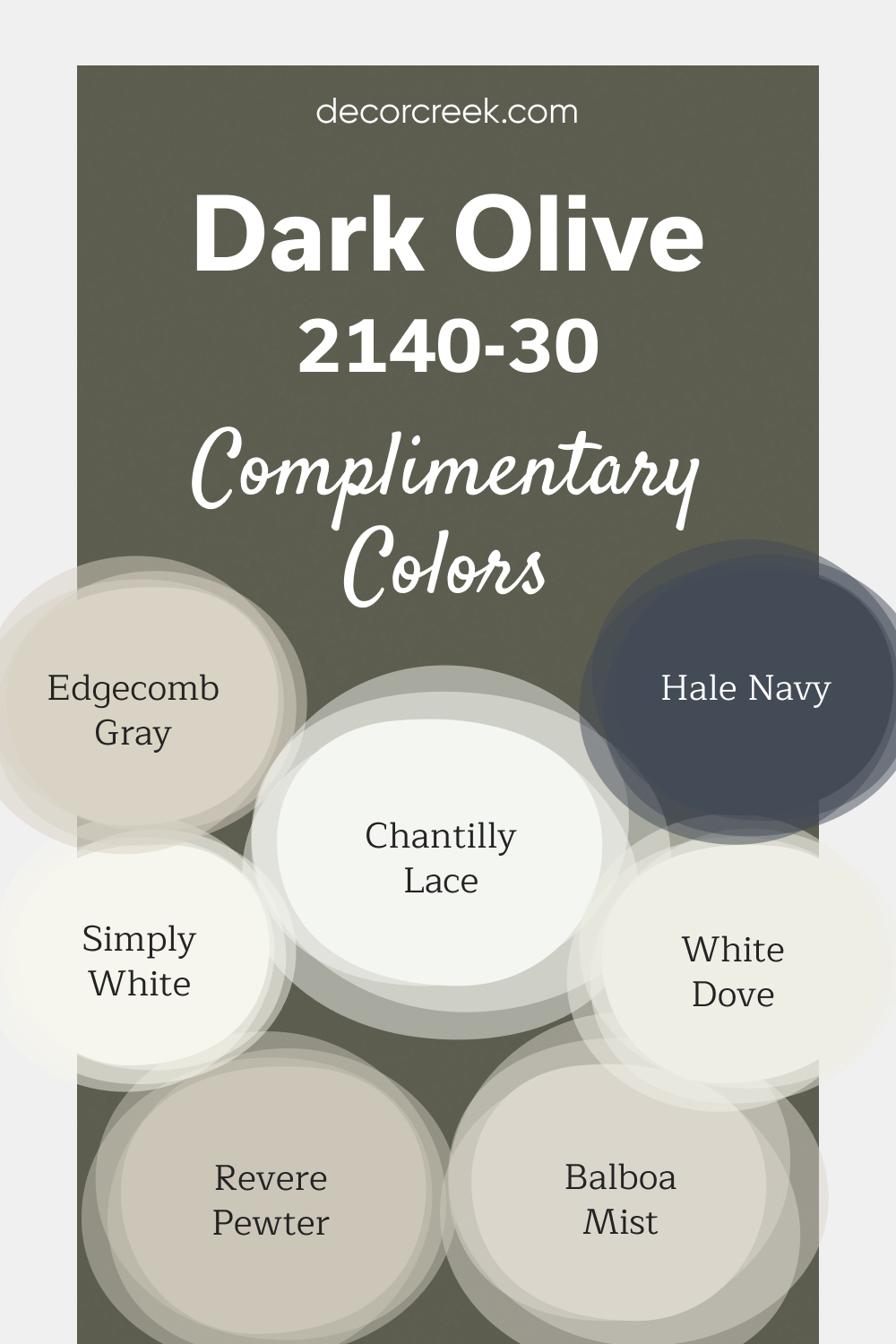
Complimentary Colors for Dark Olive 2140-30 Paint Color by Benjamin Moore
Dark Olive by Benjamin Moore is a rich, earthy green that brings a sense of depth and character to any space. It pairs wonderfully with clean whites like White Dove, Chantilly Lace, and Simply White, offering a fresh contrast that highlights the strength of the color.
These lighter shades enhance the room’s brightness while allowing Dark Olive to stand out. For a softer look, Edgecomb Gray, Revere Pewter, and Balboa Mist add neutral tones that balance the boldness of Dark Olive.
If you’re looking for a striking accent, Hale Navy offers a deep, dramatic contrast that complements the green perfectly. This combination of colors creates a well-rounded, timeless design that works in various settings.
How to Use Dark Olive 2140-30 by Benjamin Moore In Your Home?
Dark Olive 2140-30 by Benjamin Moore is a rich, deep green paint that gives a cozy and sophisticated vibe to any room. This color works well in spaces where you want to add a touch of nature’s serenity without overwhelming the area with bright colors. You can use it in your living room or bedroom to create a calm and relaxing atmosphere. It pairs beautifully with natural materials like wood, leather, or wool, enhancing the room’s warmth and comfort.
For those who like a bit of drama, Dark Olive can also serve as an excellent accent color. Imagine one wall in your dining area or behind your bed in this lush green, providing a stunning backdrop to furniture and accessories. If you’re not ready for a big change, consider using it on smaller elements like a bookcase, a door, or even window frames for a subtle yet impactful addition.
Moreover, Dark Olive can be complemented with softer hues such as creams, beiges, or soft pinks to balance its depth, making your space feel inviting and well-designed. With its versatile nature, this color helps you create a space that feels both unique and cozy, perfect for anyone looking to add a touch of elegance and nature to their home.
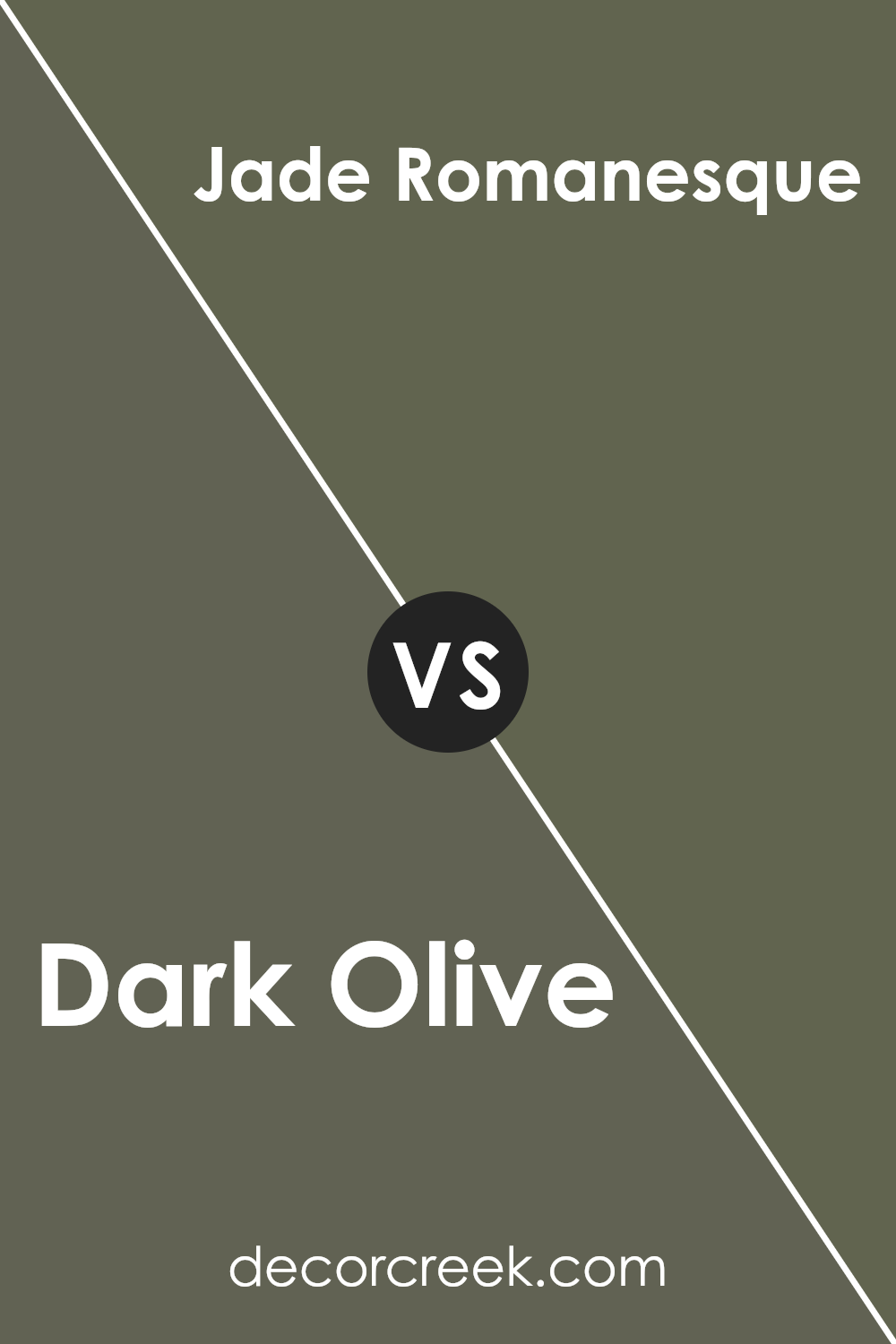
Dark Olive 2140-30 by Benjamin Moore vs Jade Romanesque 476 by Benjamin Moore
When comparing Dark Olive by Benjamin Moore and Jade Romanesque by Benjamin Moore, you’ll notice some distinct differences. Dark Olive is a rich, deep green with a touch of brown, giving it an earthy feel. This color brings a sense of warmth and natural elegance to spaces, making rooms feel cozy yet sophisticated.
On the other hand, Jade Romanesque is a lighter, brighter shade of green with a hint of blue. This color offers a fresher, more vibrant look, adding a pop of color that’s both soothing and lively. While Dark Olive leans towards a traditional and refined look, perfect for creating a grounded atmosphere, Jade Romanesque has a more youthful and energetic vibe, ideal for brightening up a space.
Both colors add a beautiful touch to interiors, but your choice depends on the mood and style you’re aiming for.
You can see recommended paint color below:
- 476 Jade Romanesque
Dark Olive 2140-30 by Benjamin Moore vs Forest Floor 1498 by Benjamin Moore
The main color, Dark Olive 2140-30 by Benjamin Moore, is a rich, deep shade that combines the earthy tones of green and brown. It’s a color that suggests stability and depth, providing a strong foundation for any room it’s used in. On the other hand, Forest Floor 1498, also by Benjamin Moore, is a bit lighter and leans more towards a natural green hue.
This color can bring a sense of calm and serenity, somewhat like being in the middle of a tranquil forest. While both colors are inspired by nature, Dark Olive presents a more intense and moodier vibe, perfect for creating a cozy and sophisticated space. Forest Floor, with its softer green, offers a refreshing and inviting atmosphere, ideal for spaces where relaxation and lightness are preferred.
Together, these colors could complement each other well, offering a balance between the soothing qualities of green and the grounding presence of darker tones.
You can see recommended paint color below:
- 1498 Forest Floor
Dark Olive 2140-30 by Benjamin Moore vs Castle Peak Gray 1561 by Benjamin Moore
The main color, Dark Olive, is a deep, rich shade that combines the earthy vibe of green with a touch of sophistication, almost like the dense foliage in a shadowy forest. It’s a color that can make spaces feel cozy and grounded, adding a sense of calm and serenity to any room. Imagine it as a backdrop in a study or cozy nook, where it pairs well with natural wood and soft lighting for a truly inviting atmosphere.
On the other hand, Castle Peak Gray is a lighter, more neutral color. It carries the versatility of gray but with a warm undertone that keeps it from feeling too cold or industrial. This hue is like a gentle morning mist over a mountain, offering a subtle blend of warmth and coolness. It’s perfect for creating a serene, airy space, offering a canvas that pairs well with brighter colors for a pop or other neutrals for a minimalist look.
Both colors bring their own unique charm and character to spaces, from the depth and richness of Dark Olive to the soft, adaptable nature of Castle Peak Gray, making them suitable for various styles and settings.
You can see recommended paint color below:
- 1561 Castle Peak Gray
Dark Olive 2140-30 by Benjamin Moore vs Mohegan Sage 2138-30 by Benjamin Moore
When you look at Dark Olive 2140-30 by Benjamin Moore, you’re seeing a deep, rich green that has a lot of earthiness to it. It’s a green that feels like it’s rooted in nature, providing a strong and comforting presence in any space. This color brings a cozy warmth, perfect for creating a feeling of stability and groundedness in your home.
On the other side, Mohegan Sage 2138-30 by Benjamin Moore takes a lighter approach. It’s also a green, but this one leans towards a softer, more muted sage. It’s like comparing the dense foliage of a forest (Dark Olive) to the lighter, airy feel of garden herbs (Mohegan Sage). Mohegan Sage offers a more relaxed and soothing vibe, making spaces feel open and serene. It’s the kind of color that can brighten up a room while still keeping things pretty calm and laid-back.
While both colors share a green base, Dark Olive brings depth and intensity, and Mohegan Sage offers a lighter, fresher look. Depending on what atmosphere you want in your space, each color has its unique charm and application.
You can see recommended paint color below:
- 2138-30 Mohegan Sage
Conclusion
In conclusion, the color Dark Olive 2140-30 from Benjamin Moore stands out as an exceptional choice for those looking to add a touch of sophistication and nature-inspired beauty to their space. Its rich, deep green hue offers a grounding presence, making it ideal for creating a serene and inviting atmosphere in any room. Whether applied in a cozy study, a restful bedroom, or as an accent in a living area, this color brings a balanced blend of elegance and warmth, enhancing the overall aesthetic of a home.
Furthermore, its versatility allows it to pair well with a variety of decor styles and color palettes, from rustic woods to modern metals. The unique charm of Dark Olive 2140-30 ensures it can effortlessly elevate the look and feel of a space without overwhelming it. This makes it a favored option for interior designers and homeowners alike who are aiming to achieve a refined yet welcoming environment.
Ever wished paint sampling was as easy as sticking a sticker? Guess what? Now it is! Discover Samplize's unique Peel & Stick samples.
Get paint samples

