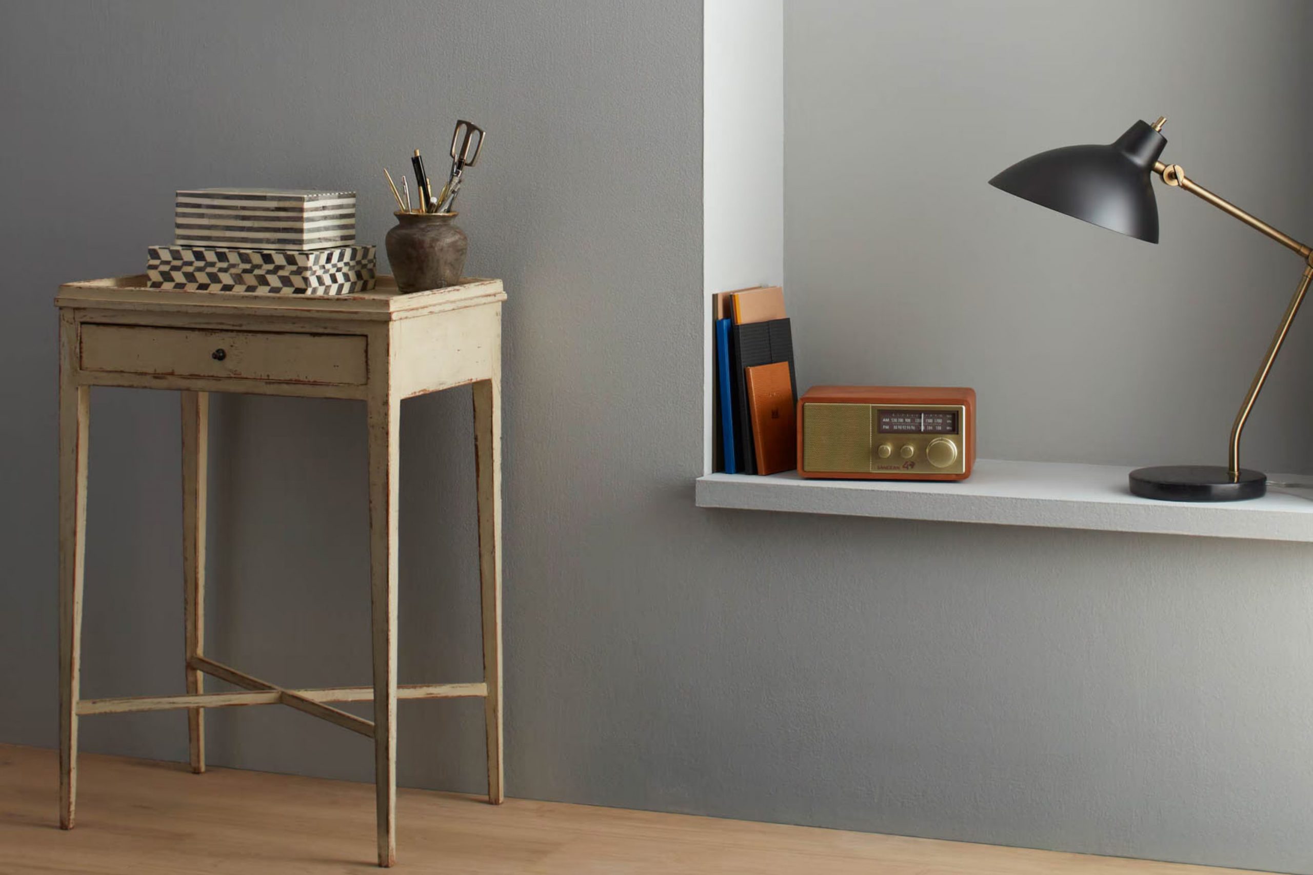
I recently came across AF-690 Metropolitan, a paint color from Benjamin Moore, and I was intrigued by its unique charm. It’s a shade that doesn’t demand attention but instead brings a subtle refined feel to any room.
Described as understated yet confident, Metropolitan sits perfectly in the middle of cool gray and warm beige, making it incredibly flexible. Whether you plan to refresh your bedroom, living room, or even your office room, this color provides a calming backdrop that complements various decor styles and personal tastes.
I’ve seen firsthand how Metropolitan can refresh an ordinary room into a calm and stylish interior. It acts as a neutral base that allows furniture and artwork to really stand out, yet it’s strong enough to hold its own as a primary focus in a minimalistic design.
The color’s adaptability makes it easy for you to pair it with bold colors or keep it calm with tones of white and soft pastels.
What Color Is Metropolitan AF-690 by Benjamin Moore?
The color Metropolitan AF-690 by Benjamin Moore is a stylish gray that strikes a balance between cool and warm tones. This neutral shade is incredibly flexible, making it suitable for any room in a home or professional interior. The subtle richness of this gray allows it to blend naturally with a variety of decor styles, particularly modern and minimalist interior designs. It also works well in industrial and Scandinavian-themed interiors, where simplicity and functionality are key.
When it comes to pairing materials, Metropolitan AF-690 complements natural wood beautifully, particularly lighter woods like oak and birch that help create a warm and inviting atmosphere. It also looks striking against metal accents, such as steel or brass, which can lend a slight edgy feel to the room.
For textures, this color pairs well with soft textiles, like wool or linen, to add a sense of comfort. Plush velvets or smooth leathers also work well with this shade, providing a contrast in textures that can make any room more interesting. Overall, its understated elegance allows it to fit naturally with various decor elements, making Metropolitan AF-690 a dependable choice for creating a stylish and cohesive interior.
decorcreek.com
Is Metropolitan AF-690 by Benjamin Moore Warm or Cool color?
Metropolitan AF-690 by Benjamin Moore is a popular paint color choice for many homeowners due to its neutral and flexible gray shade. This color is light enough to make small rooms appear larger and has just enough depth to add character without overpowering a room. It pairs well with a wide range of decor styles, from modern to traditional, making it a go-to for many interior designers.
When used on walls, Metropolitan AF-690 provides a subtle backdrop that allows other elements in the room, such as furniture and artwork, to stand out. It’s particularly effective in rooms that get a lot of natural light, as the color can appear to change subtly throughout the day, adding a dynamic element to the room. In darker rooms, it helps maintain a feeling of openness.
This color also works well in different parts of the home, from living rooms and kitchens to bedrooms and bathrooms, offering a cohesive look when used throughout. Its neutral tone makes it easy to match with different colors and textures, providing flexibility in changing up decor without needing to repaint.
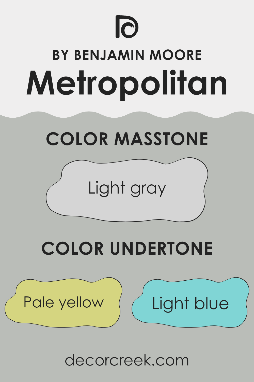
Undertones of Metropolitan AF-690 by Benjamin Moore
Metropolitan AF-690 by Benjamin Moore is a flexible gray paint that has subtle hints of other colors blended into its base. The undertones in this paint include pale yellow, light blue, light purple, mint, pale pink, lilac, and grey. Undertones are secondary colors that influence the primary color shade and can affect the overall perception of the color when applied, especially under different lighting conditions.
These undertones play a significant role in how we view the color on interior walls. For instance, the pale yellow undertone brings a touch of warmth, making the room feel more inviting. The light blue and mint undertones introduce a sense of freshness and can make a room feel airy. Lilac and light purple can subtly influence the feeling of creativity and calm in a room.
When applied to interior walls, the pale pink undertone brings a softness to the environment, while the gray helps maintain a neutral and balanced base, allowing flexibility in decor selections. Because of these undertones, Metropolitan AF-690 can look slightly different in various rooms and lighting scenarios, from sunlit kitchens to artificially lit hallways.
These slight color shifts mean the paint color can appear more dynamic and adaptable, naturally fitting with various furniture styles and home decor. Overall, the multiple undertones help improve the character of the rooms by offering subtle complexity that enriches the atmosphere.
decorcreek.com
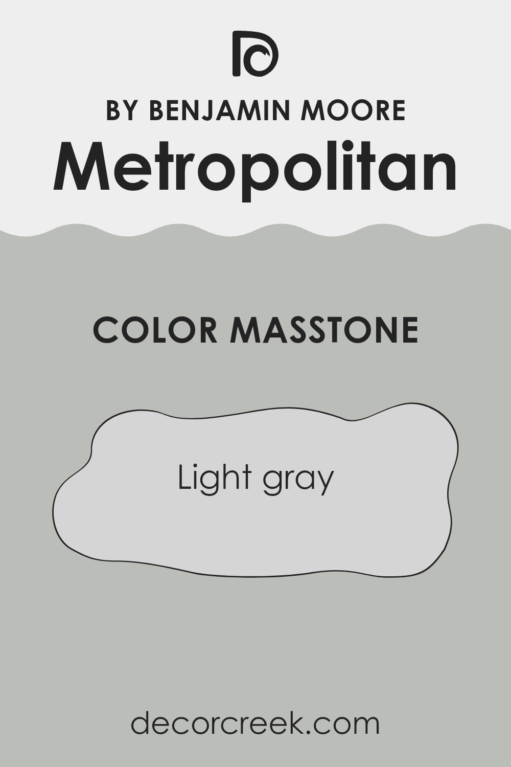
What is the Masstone of the Metropolitan AF-690 by Benjamin Moore?
Benjamin Moore’s Metropolitan AF-690 has a primary color that is light gray, specifically shade #D5D5D5. This neutral hue is very flexible and works well in various parts of a home. Because it is not too dark or too bright, it helps create a balanced look in rooms. This light gray shade can make small rooms appear larger and more open, while also bringing a clean and calm feel to any area.
In living rooms or bedrooms, it pairs well with both lively and subtle colors for furniture and decor, allowing for a range of design styles from modern to classic.
In kitchens or bathrooms, this light gray provides a fresh, clean backdrop for fixtures and accessories. It’s also practical because light colors can hide small imperfections on walls better than darker shades, making maintenance easier. Overall, Metropolitan AF-690 is a great choice for creating a welcoming and adaptable home environment.
decorcreek.com
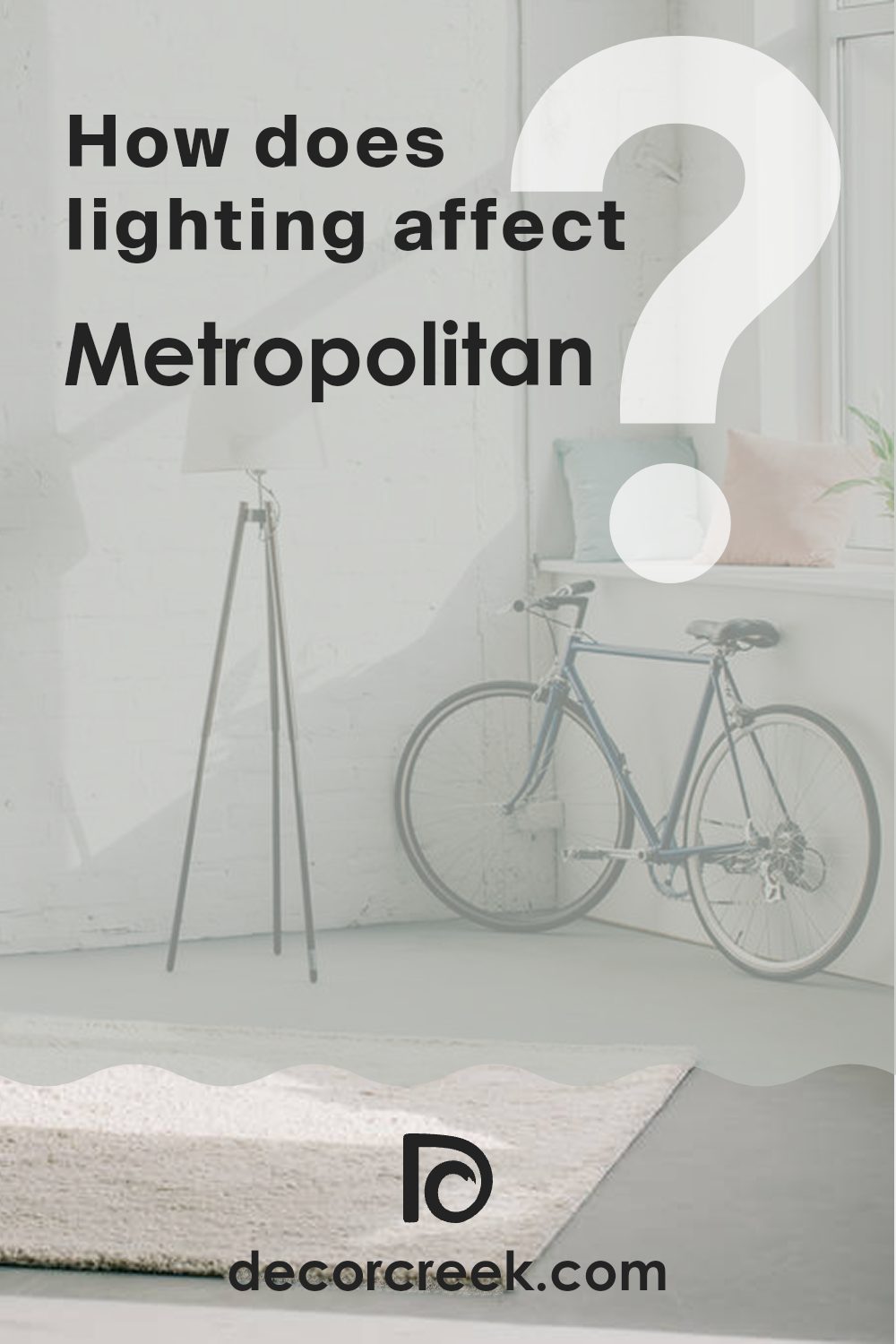
How Does Lighting Affect Metropolitan AF-690 by Benjamin Moore?
Lighting plays a vital role in how we perceive colors in different environments. Light sources can greatly influence how a color looks, altering our perception of its hue, brightness, and saturation.
The color we’ll discuss here, MetropolitanAF-690, is a shade by Benjamin Moore. This color has a balanced, neutral tone that can shift subtly according to the lighting in which it is viewed.
In natural light, MetropolitanAF-690 appears true to its form—a soft, smoky gray that looks clean and crisp. Natural light, especially from the sun, brings out the truest version of this color. In artificial light, such as LED or fluorescent lights, MetropolitanAF-690 can take on slightly different tones. Under warm artificial lighting, it might seem a bit cozier and softer, taking on a slight beige or warmer gray tint. On the other hand, in cooler artificial light, the color may look sharper and slightly bluish.
The orientation of a room and its windows also affects how MetropolitanAF-690 is perceived:
- North-facing rooms: These rooms receive less direct sunlight, which can make colors appear cooler. In a north-facing room, MetropolitanAF-690 might seem slightly more shadowed and cooler, leaning toward a more steely gray.
- South-facing rooms: These rooms get abundant sunlight throughout the day, which can make colors appear brighter and more lively. In south-facing rooms, MetropolitanAF-690 will look lighter and more consistent throughout the day.
- East-facing rooms: With morning light, this color will start the day looking soft and warm in an east-facing room. As the light fades, the color will get cooler, reflecting a truer gray as the natural light decreases.
- West-facing rooms: Evening light in west-facing rooms can make MetropolitanAF-690 glow warmly in the late afternoon. It will experience the reverse effect of an east-facing room, starting cooler in the morning and growing warmer toward the evening.
Understanding lighting and room orientation can help in making informed decisions about paint colors for your home, making sure that you achieve the desired effect in each room based on its exposure and the type of light it receives.
decorcreek.com
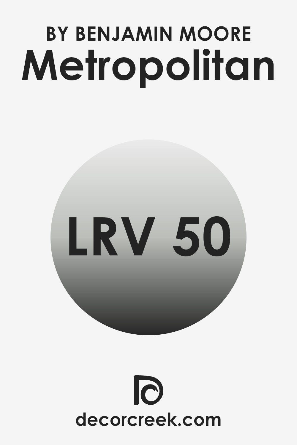
What is the LRV of Metropolitan AF-690 by Benjamin Moore?
LRV stands for Light Reflectance Value, which measures how much light a color reflects back into a room versus how much it absorbs. LRV is given on a scale where a higher value means the paint color reflects more light, making a room feel brighter.
On the other hand, a lower LRV indicates the color absorbs more light, which can make a room feel cozier but potentially smaller and darker. Generally, light colors have higher LRVs because they make the most of the natural light available in a room.
Benjamin Moore’s Metropolitan AF-690 has an LRV of 49.96, placing it nearly at the midway point on the reflectance scale. This means the color does an almost equal job of reflecting and absorbing light. It’s flexible because it neither darkens a room significantly nor makes it noticeably lighter. Depending on the room’s natural light, this shade can offer a balanced, neutral backdrop that works well in a variety of settings and complements different decor and furniture styles.
decorcreek.com
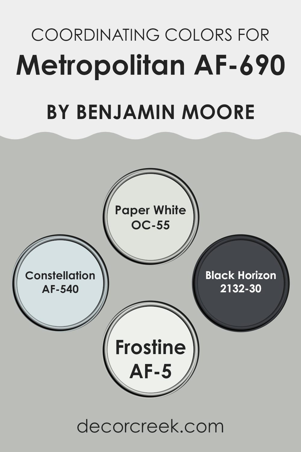
Coordinating Colors of Metropolitan AF-690 by Benjamin Moore
Coordinating colors are selected to complement a primary color, creating a cohesive and pleasing color scheme in interior design. When these colors are used together, they create a balanced and harmonious look, improving the aesthetics of a room without overpowering it with too many conflicting tones. Coordinating colors can vary in shades and hues, but they all serve the purpose of supporting the main color in improving the overall design.
For the color Metropolitan AF-690 by Benjamin Moore, several coordinating colors can be used to create a beautifully balanced palette. OC-55, known as Paper White, is a soft and neutral white that provides a fresh and clean background, making it great for trim and ceilings where a subtle contrast is desired.
AF-540, named Constellation, is a light blue with a gentle and airy feel, perfect for bringing a hint of color into a room while maintaining a light and open atmosphere. 2132-30, Black Horizon, is a deep and bold black that can be used strategically to add depth and focus in a room, making it ideal for accent pieces or feature walls.
Lastly, AF-5, called Frostine, is another light neutral with a chilly undertone that complements Metropolitan nicely, creating a peaceful mood in interiors that aim for a relaxed feel. Together, these coordinating colors work naturally with Metropolitan AF-690 to create stylish, cohesive looks in various settings.
You can see recommended paint colors below:
- OC-55 Paper White
- AF-540 Constellation
- 2132-30 Black Horizon
- AF-5 Frostine
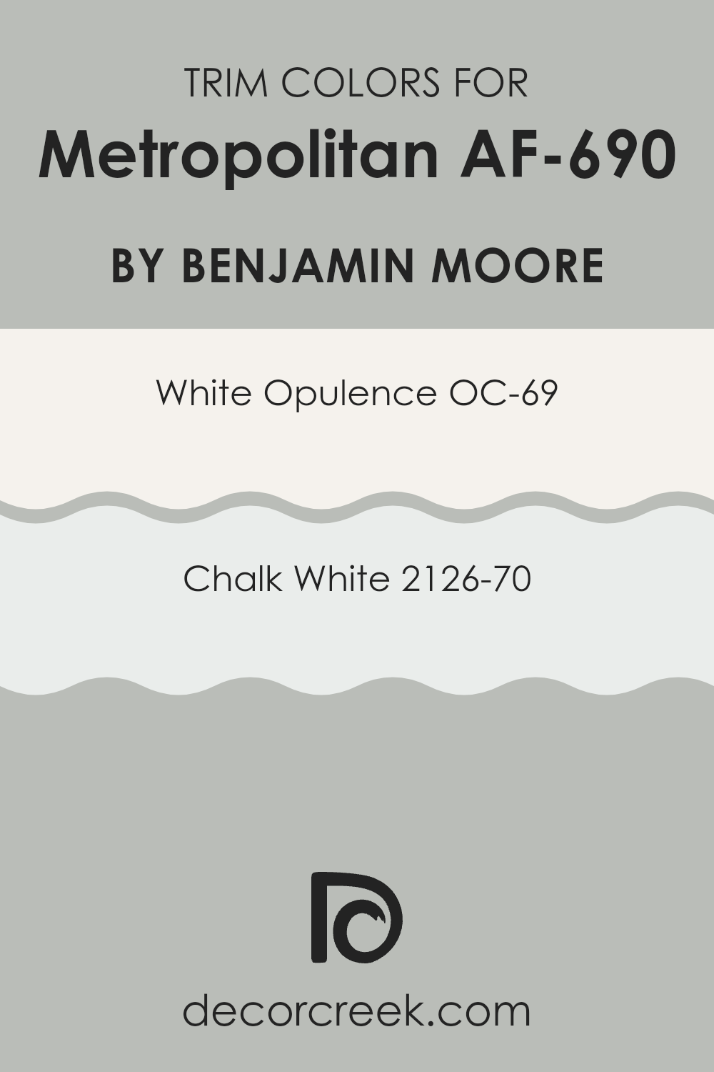
What are the Trim colors of Metropolitan AF-690 by Benjamin Moore?
Trim colors are essential in interior design as they help define and accentuate the architectural features of a room. Specifically, when paired with a neutral shade like Metropolitan AF-690 by Benjamin Moore, trim colors such as OC-69 – White Opulence and 2126-70 – Chalk White can improve the overall aesthetic by creating crisp, clean lines that highlight doors, windows, and other elements.
These contrasting colors not only frame the room effectively but also add a subtle touch of brightness, making the room appear more polished and neatly finished. White Opulence (OC-69) is a clean and bright white that brings a fresh feeling to any room, making it a perfect complement to the cooler tones of Metropolitan AF-690.
Its ability to reflect light increases the openness of a room, giving a lighter, airy quality that works well in various settings. Chalk White (2126-70), on the other hand, offers a slightly warmer tone, providing a soft and gentle contrast that is ideal for more cozy and inviting interiors. Together, these colors provide options that can adapt to different lighting and stylistic preferences, ensuring a harmonious and appealing look.
You can see recommended paint colors below:
- OC-69 White Opulence
- 2126-70 Chalk White
Colors Similar to Metropolitan AF-690 by Benjamin Moore
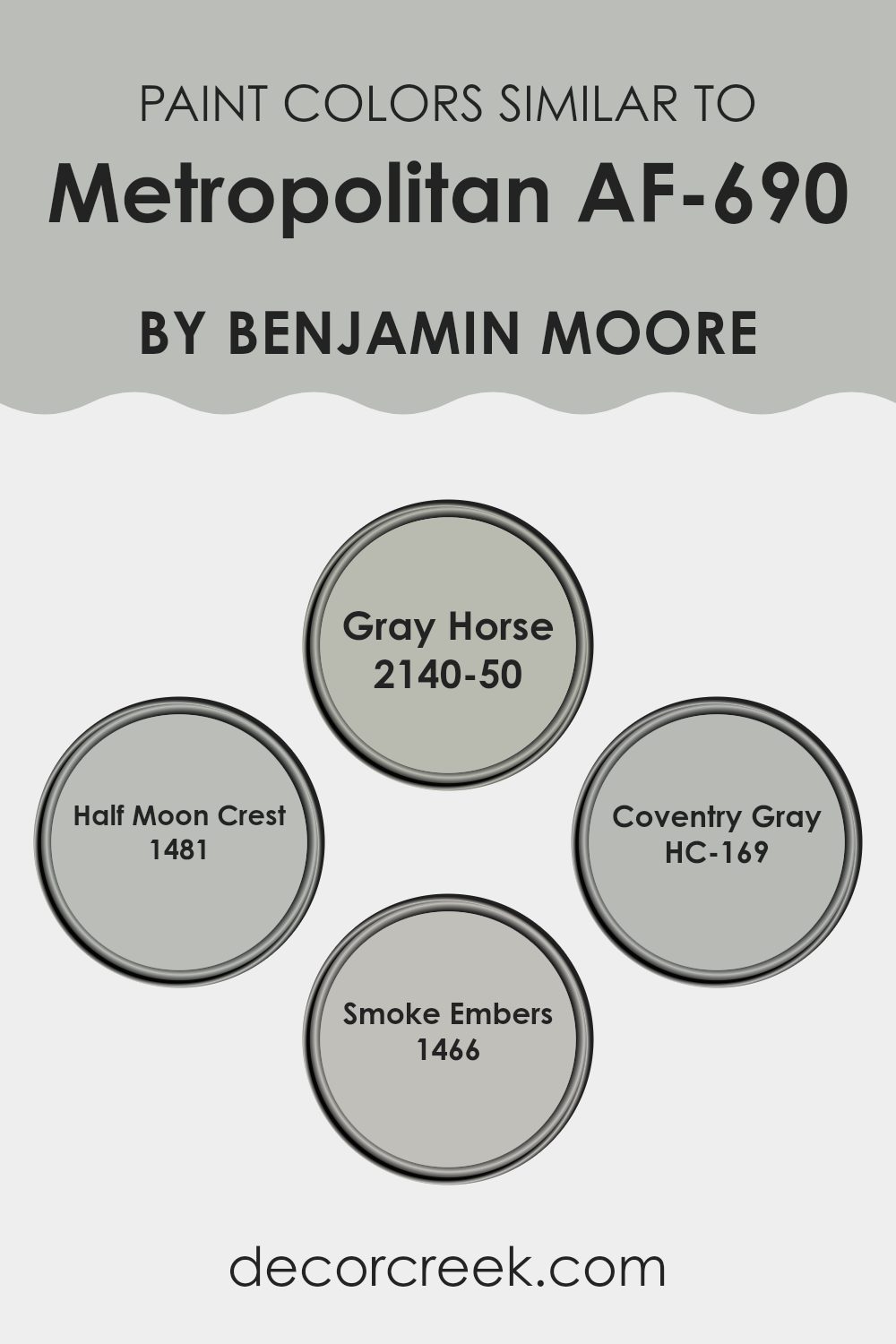
Selecting similar colors in interior design is essential for creating a harmonious and cohesive room. Colors that are close to each other on the color wheel provide a subtle contrast and can make a room feel more balanced and inviting. For example, when decorating with a base color like Metropolitan AF-690 by Benjamin Moore, choosing shades like Gray Horse, Half Moon Crest, Coventry Gray, and Smoke Embers can improve the aesthetic without overpowering the senses.
Gray Horse is a calming mid-tone gray that brings a sense of calm to any room, perfect for interiors where you want to relax. Half Moon Crest is a slightly lighter gray that reflects more light, making it ideal for smaller or darker rooms to give an illusion of more room.
Coventry Gray offers a classic touch with its slightly richer hue, providing depth and character to a design scheme. Lastly, Smoke Embers is a muted, almost smoky gray that works well in areas where a soft, understated refined feel is desired. Using these shades together maintains aesthetic consistency while allowing each room to have its unique feel.
You can see recommended paint colors below:
- 2140-50 Gray Horse
- 1481 Half Moon Crest
- HC-169 Coventry Gray
- 1466 Smoke Embers
Colors that Go With Metropolitan AF-690 by Benjamin Moore
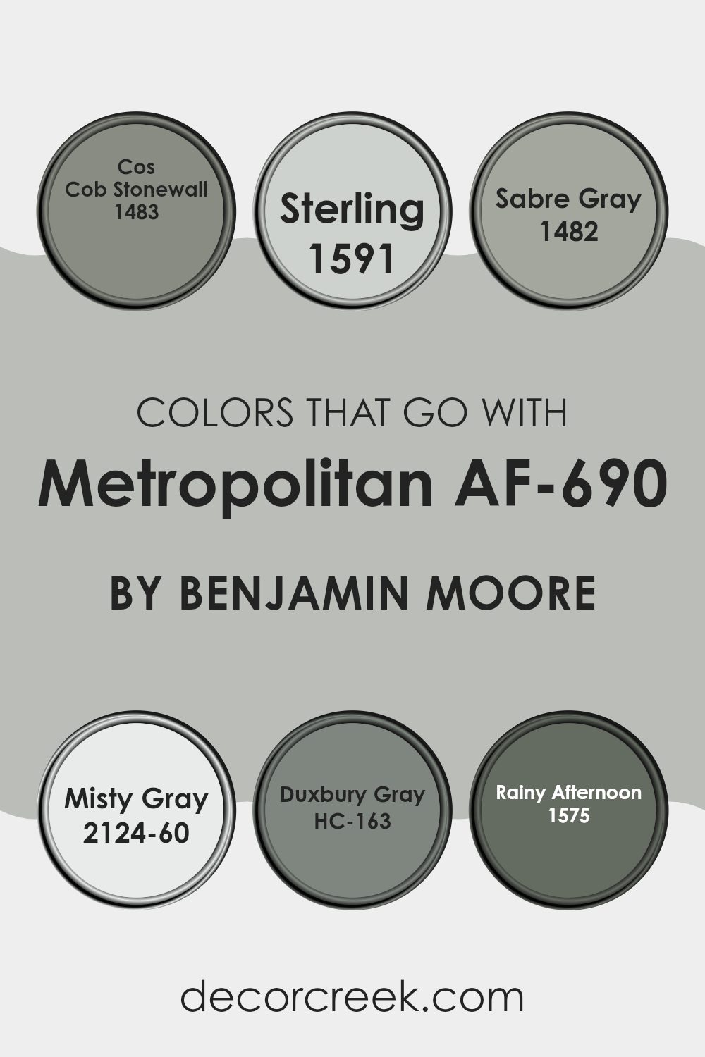
Choosing the right colors to complement Metropolitan AF-690 by Benjamin Moore is important because it ensures the overall look is cohesive and pleasing to the eye. Metropolitan AF-690 is a soft, neutral gray that serves as an excellent foundation for any room.
When paired with harmonizing colors like 1483 – Cos Cob Stonewall, a deeper, earthy gray, it helps create a subtle contrast that improves the depth and dimension of the room. Similarly, 1591 – Sterling, a light silver gray, adds a touch of brightness and can make a room feel more open and airy.
Further improving the palette, 1482 – Sabre Gray offers a mid-tone gray with a hint of blue, providing a cooling effect suitable for a calming atmosphere in interiors such as bedrooms or offices. 2124-60 – Misty Gray, on the other hand, is a very light gray that almost blends with white, perfect for creating a soft backdrop that makes the darker grays stand out.
For a bolder contrast, HC-163 – Duxbury Gray brings a strong, slate-like gray that can make furniture or decor items in lighter grays stand out. Lastly, 1575 – Rainy Afternoon is a deep, stormy gray with a hint of green, ideal for adding a mysterious or dramatic touch to an interior design scheme. These colors work together to provide a variety of choices that allow for flexibility in design while maintaining a harmonious look that’s easy on the eyes.
You can see recommended paint colors below:
- 1483 Cos Cob Stonewall
- 1591 Sterling
- 1482 Sabre Gray
- 2124-60 Misty Gray
- HC-163 Duxbury Gray
- 1575 Rainy Afternoon
How to Use Metropolitan AF-690 by Benjamin Moore In Your Home?
Metropolitan AF-690 by Benjamin Moore is a popular gray paint color that brings a clean and modern look to any room. Its flexibility makes it easy to work with various decoration styles, whether you’re aiming for a stylish living room or a cozy bedroom.
Applying Metropolitan on walls will give your room a fresh and updated look. It’s muted enough to act as a backdrop for art and bright-colored furniture or to create a calming environment when paired with soft lighting and minimalist decor. This color also matches well with white trim for a crisp, refined appearance.
Many homeowners choose Metropolitan for its ability to make small rooms seem larger and brighter as it reflects light beautifully without being too stark. It’s also a great choice for painting kitchen cabinets for a sleek, modern feel. Plus, it’s easy to find coordinating fabrics and accessories since its neutral tone complements various colors and textures.
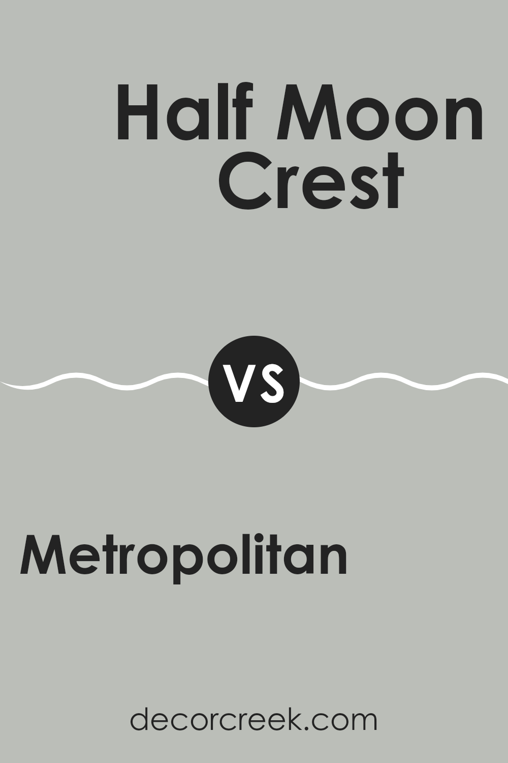
Metropolitan AF-690 by Benjamin Moore vs Half Moon Crest 1481 by Benjamin Moore
Metropolitan AF-690 and Half Moon Crest 1481 are two paint colors offered by Benjamin Moore. Metropolitan AF-690 is a subtle, gray shade with a neutral, calming quality, making it flexible for any room.
It reflects a feeling of calm and composure and pairs well with various decor styles and textures. On the other hand, Half Moon Crest 1481 is slightly darker and leans toward a cooler tone. This color gives a fresh, modern feel to a room and can make white trims or furniture stand out nicely.
Both colors are excellent choices for creating a peaceful environment in your home. They work well both individually or combined as part of a color scheme across different rooms, providing a smooth flow without harsh contrasts.
You can see recommended paint color below:
- 1481 Half Moon Crest
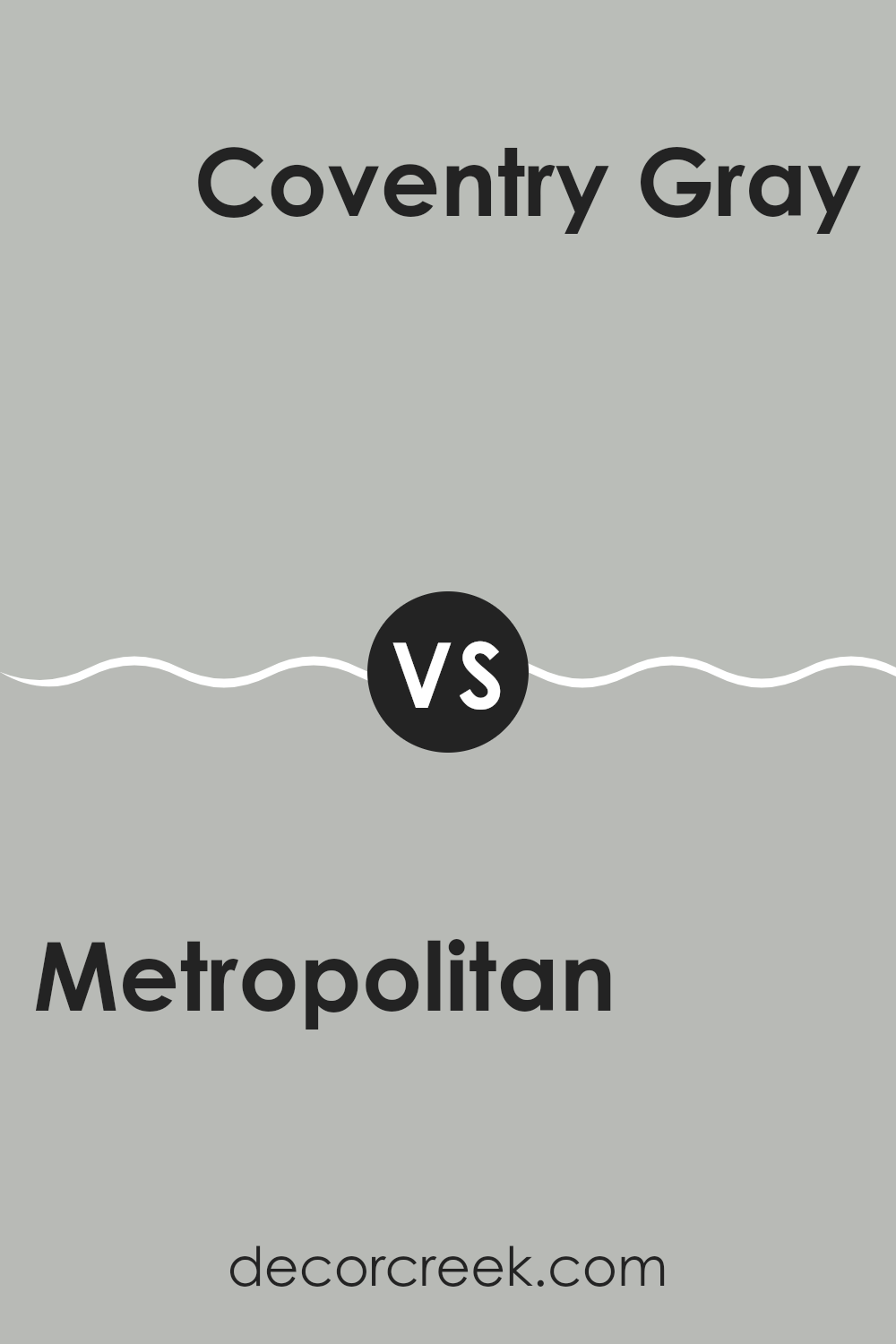
Metropolitan AF-690 by Benjamin Moore vs Coventry Gray HC-169 by Benjamin Moore
Metropolitan and Coventry Gray are both colors by Benjamin Moore, but they have distinct tones and moods. Metropolitan is a subtle gray with cool undertones. It has a soft, neutral look that makes it flexible for various interiors, giving a room a clean and modern feel without being too stark.
On the other hand, Coventry Gray is a bit deeper and has a noticeable blue undertone, making it more noticeable than Metropolitan. This color can add a bit more drama or character to a room while still keeping things relatively neutral. Coventry Gray works well in areas where you want a touch of refined style without going too dark.
So, if you’re looking for a color that’s light and blends naturally with different decor styles, Metropolitan is a great choice. If you prefer something with a little more presence that can still work beautifully with other colors, Coventry Gray is an excellent option. Both colors offer a fresh, clean look but bring their unique feel to interiors.
You can see recommended paint color below:
Metropolitan AF-690 by Benjamin Moore vs Gray Horse 2140-50 by Benjamin Moore
The main color, Metropolitan, is a neutral gray that provides a calm and balanced look. It’s flexible and works well in various interiors, making rooms appear elegant without being too bold.
On the other hand, Gray Horse has a hint of green, giving it a subtle earthy feeling. This color is slightly more dynamic due to its undertone, offering a unique twist on the typical gray. When used in a room, Gray Horse brings a fresh and natural feel, which can make a room feel more inviting.
While both colors are grays, Metropolitan leans toward a cooler, more understated gray, making it ideal for a modern look. Gray Horse, with its green undertone, is excellent for interiors where you want a touch of nature and a bit more personality.
You can see recommended paint color below:
- 2140-50 Gray Horse
Metropolitan AF-690 by Benjamin Moore vs Smoke Embers 1466 by Benjamin Moore
Metropolitan and Smoke Embers by Benjamin Moore are two shades that offer distinct atmospheres for any room. Metropolitan is a soft, subtle gray with a touch of warmth, making it flexible for interiors that need a neutral backdrop that still feels cozy. It’s perfect for living areas or bedrooms where you want a gentle hint of color without overpowering the senses.
On the other hand, Smoke Embers is a cooler gray with a slight hint of blue undertones. This color offers a more modern feel, ideal for a contemporary room or an office setting where a cooler, crisper environment is desired. It stands out a bit more than Metropolitan, providing a sharper contrast to bright or warm tones in a room’s decor.
Both colors work well in various lighting conditions, though Metropolitan’s warmer tones might create a more welcoming glow in low-light areas, while Smoke Embers could provide a clean, fresh look that increases natural light. Each color suits different aesthetic preferences and uses, from cozy and inviting to sleek and modern.
You can see recommended paint color below:
After reading all about AF-690 Metropolitan by Benjamin Moore, I’ve learned a lot about this special paint color. First, it’s really important to show that Metropolitan isn’t just any grey—it’s a calm, soft grey that can make any room feel just right. It’s like the comfy grey sweater that you love to wear because it makes you feel good and goes with everything.
What’s great about Metropolitan is that it fits well in lots of different places. Whether you want your bedroom to be a cozy place to read, your kitchen to look clean and welcoming, or your living room to be a nice spot for chatting with family, this color works. It’s like a good friend that gets along with everyone and every room.
People who choose Metropolitan are usually looking for something that isn’t too bright or too dark. It’s perfect for those who want their home to feel peaceful and neat without using really strong colors. The beauty of Metropolitan is how it brings a gentle touch to walls without taking over the whole room’s feel. It sort of creates the background and lets the other colors or decorations you have stand out.
So, would I recommend AF-690 Metropolitan by Benjamin Moore? Absolutely! It’s a friendly, easygoing color that makes any room look good and feel comfy. It’s perfect if you want your home to have a light, calm atmosphere. Plus, it matches with nearly everything. What’s not to love about that?
decorcreek.com
Ever wished paint sampling was as easy as sticking a sticker? Guess what? Now it is! Discover Samplize's unique Peel & Stick samples.
Get paint samples

