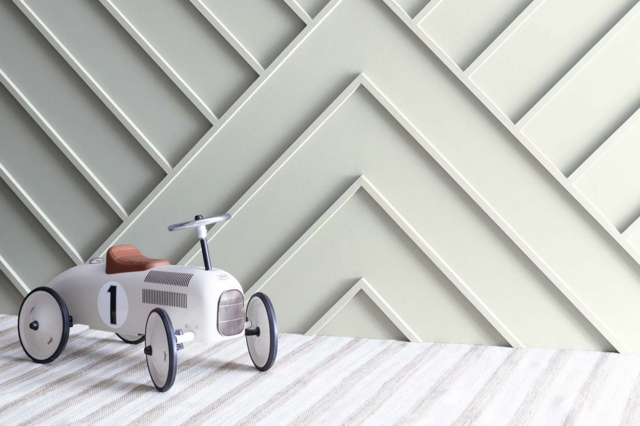
When you start planning a room makeover, choosing the right paint color is crucial for setting the mood. I recently worked on refreshing my study, a small area that desperately needed some light. That’s when I stumbled upon OC-56 Moonshine by Benjamin Moore. Painting the walls with this color completely changed the atmosphere of the room.
OC-56 Moonshine is a soft, muted gray with just a hint of blue undertones. This shade is gentle and neutral, making it highly adaptable for any room. It’s particularly effective in areas where you want to promote a calm and focused environment, like a home office or a cozy reading nook. The subtle blue undertone adds a fresh and airy feel, lifting the room without making it feel intense with color.
Using OC-56 Moonshine also helped the room appear more open and inviting, a clear change from its previous darker color that made the room feel cramped. By opting for a light reflective shade like Moonshine, the entire area feels rejuvenated.
Overall, my choice of Benjamin Moore’s OC-56 Moonshine brought a new energy into my study, proving that a simple can of paint can make a big difference.
What Color Is Moonshine OC-56 by Benjamin Moore?
Moonshine is a subtle, light gray color with soft blue undertones that can bring a clean and inviting feel to any room. This hue from Benjamin Moore is well-suited for creating a bright and airy atmosphere, making rooms seem more open and calming without feeling cold. It works particularly well in contemporary and minimalist interior styles, but it’s equally at home in country or Scandinavian-inspired settings.
This shade pairs nicely with a range of materials and textures. In a room featuring wood elements, such as oak or walnut, Moonshine offers a gentle contrast that highlights the natural beauty of the wood without overpowering it.
It also complements metallic finishes like brushed nickel or stainless steel, adding a smooth and refined look to modern appliances or decor. For a soft and cozy vibe, you can match it with textiles like linen or cotton in whites or neutrals, creating an effortless, pulled-together area.
It’s an adaptable paint color that adjusts well to various rooms, whether you’re aiming to brighten a small bathroom or create a soothing bedroom retreat. As a backdrop, it supports bold colors or works charmingly with other muted tones for a more harmonious palette. Moonshine is a classic choice that brings freshness to interiors.
Is Moonshine OC-56 by Benjamin Moore Warm or Cool color?
Moonshine by Benjamin Moore is a gentle gray paint color that brings a fresh and clean look to any room. It has a subtle cool tone that looks soft under natural light. This makes it an excellent choice for areas like kitchens and bathrooms, where a neutral backdrop can help the room feel larger and more open.
In living rooms, Moonshine provides a calm background that works well with various decor styles, from modern to traditional. This adaptability means you can pair it easily with brighter colors or keep things muted for a more cohesive look.
Because of its neutral tone, Moonshine can also help balance out rooms with lots of natural light or tone down areas with less light, pausing the glare in sunny rooms and preventing darker ones from feeling too closed off. Overall, it is a practical and stylish option for those looking to refresh their home’s appearance without making the room feel too intense with color.
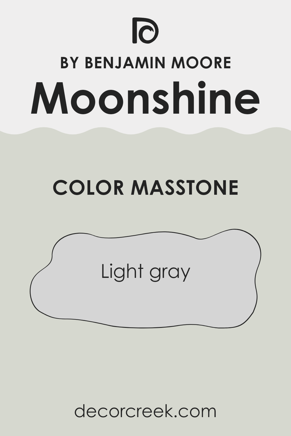
What is the Masstone of the Moonshine OC-56 by Benjamin Moore?
Moonshine OC-56 by Benjamin Moore, with a masstone of light gray, offers a subtle and adaptable backdrop in home settings. This shade of gray presents a clean, fresh look without being too stark, making it an excellent choice for those looking to achieve a modern yet inviting atmosphere.
Its lightness helps it blend seamlessly with a variety of décor styles and colors, from bright and bold to soft and subtle. This particular gray has the benefit of making small rooms appear larger and more open, as it reflects more light compared to darker hues. It also has the advantage of hiding minor wall imperfections better than pure white.
In living rooms, bedrooms, or any part of the house, Moonshine OC-56 works well because it acts as a neutral foundation, allowing personal touches and colors to stand out. Additionally, this color maintains its charm under different lighting conditions, providing consistency in style regardless of the time of day.
How Does Lighting Affect Moonshine OC-56 by Benjamin Moore?
Lighting plays a crucial role in how we perceive colors, altering their appearance depending on the type of light and its intensity. Different light sources can change how a color looks in a room. For example, the paint color Moonshine, a pale gray with subtle blue undertones, can appear very different under various lighting conditions.
In natural light, the true color of Moonshine is most accurately displayed. In a south-facing room, where sunlight is abundant throughout the day, Moonshine will look brighter and more vibrant, allowing its subtle blue undertones to shine through. This can make the room feel airy and light.
However, in a north-facing room, Moonshine might appear a bit cooler and more muted. North-facing areas receive less direct sunlight, which can make colors appear slightly darker and grayer. This might make Moonshine take on a more shadowy, subdued look.
For east-facing rooms, the color will be exposed to the warm, bright light of the morning sun but will receive less light as the day progresses. In the morning, Moonshine will appear lighter and slightly warmer, potentially highlighting more of its gray qualities. As the day moves on, it might take on a cooler tone.
In west-facing rooms, the situation is the reverse of east-facing rooms. Moonshine may look more muted during the first part of the day when the light is dimmer, but it will be bathed in a warmer, more vivid light by the afternoon. This warm light in the late day can make Moonshine look softer and warmer.
In artificial light, the appearance of Moonshine can vary greatly depending on the type of bulbs used. Warm white bulbs can enhance its cozy, soft qualities, making it feel more inviting. On the other hand, cool white bulbs might strengthen its blue undertones, giving it a crisper, more refreshing look.
Understanding these effects can help you choose the right paint for your area based on the light conditions to achieve your desired ambiance.
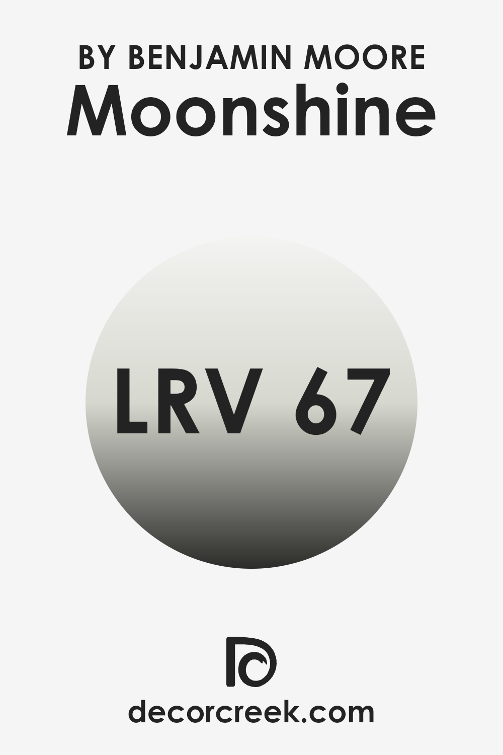
What is the LRV of Moonshine OC-56 by Benjamin Moore?
LRV stands for Light Reflectance Value, which is a measure of the amount of visible and usable light that a color reflects from or absorbs into a painted surface. Essentially, it tells you how light or dark a color will look once it’s applied on the walls.
A higher LRV means the color reflects more light, making it appear lighter and brighter, while a lower LRV means it absorbs more light, appearing darker. This is particularly helpful in choosing paint colors as it can drastically affect the mood and feel of a room.
With an LRV of 66.53, Moonshine OC-56 by Benjamin Moore is on the lighter side, reflecting a significant amount of light. This characteristic makes it a good choice for areas that need to feel more open and airy.
In rooms with less natural light, this color can help make the area brighter and more welcoming. Its light-reflective properties mean it won’t make a room feel intense but will gently enhance the surrounding light sources. This makes it adaptable for use in many different types of rooms, helping small ones appear larger and making bigger ones feel connected and balanced.
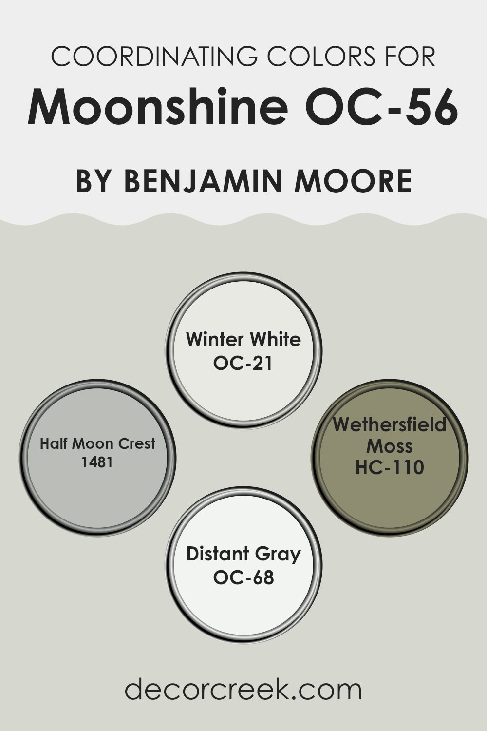
Coordinating Colors of Moonshine OC-56 by Benjamin Moore
Coordinating colors are selected to complement a primary paint color in order to create a harmonious color scheme across various areas, like rooms in a home. These coordinating shades enhance the aesthetics of the main color by amplifying its visual appeal and creating a balanced atmosphere in the room.
For instance, when pairing with a subtle primary hue such as Moonshine OC-56 by Benjamin Moore, which is a soft, light gray, a cohesive palette can be carefully crafted with colors that either contrast with or continue the cool and calm feel.
One example of a coordinating color is Winter White OC-21, a very light shade that almost leans towards pure white with just a hint of softness. This color works beautifully to bring out the crispness in Moonshine OC-56, making rooms feel fresh and airy.
Half Moon Crest 1481 is a deeper gray that provides a stunning contrast to Moonshine, adding depth and interest to interiors without making the lighter tones feel intense. Wethersfield Moss HC-110, a muted olive green, introduces an element of nature-inspired color that complements the coolness of Moonshine.
Finally, Distant Gray OC-68 offers an almost imperceptible contrast, being an ultra-light gray that maintains the monochromatic theme while slightly differentiating wall sections or features within a room. Each of these shades supports the primary color in enhancing the overall feel and cohesion of living areas.
You can see recommended paint colors below:
- OC-21 Winter White
- 1481 Half Moon Crest
- HC-110 Wethersfield Moss
- OC-68 Distant Gray
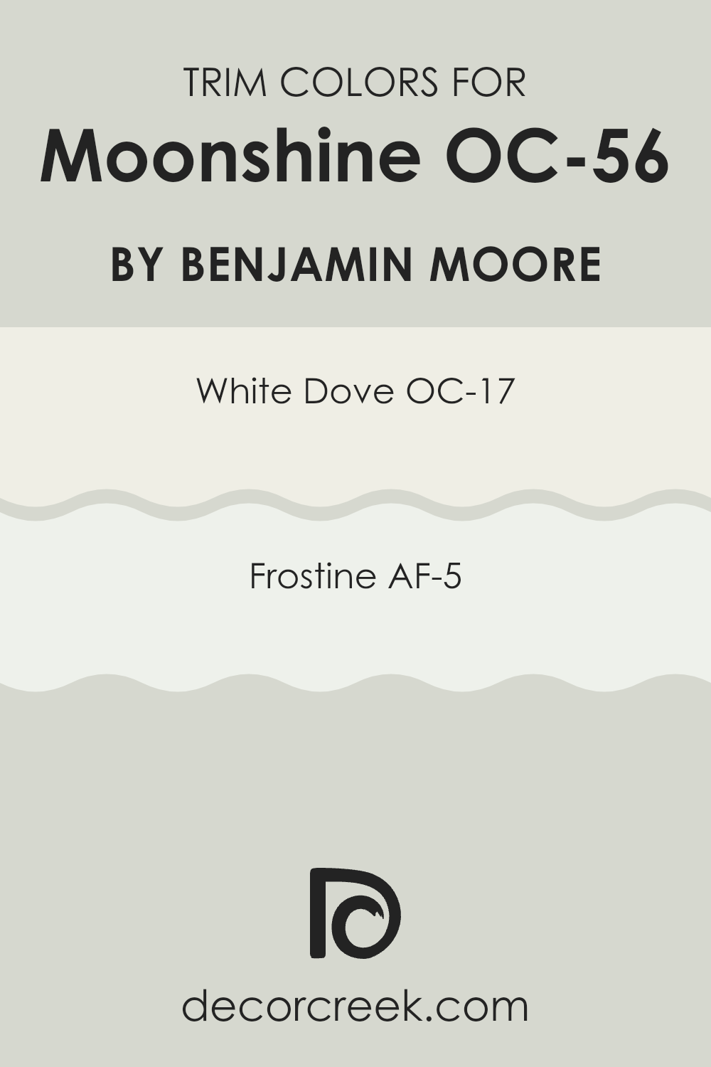
What are the Trim colors of Moonshine OC-56 by Benjamin Moore?
Trim colors are the hues used for painting the architectural details and accents of a room or house, like door frames, moldings, baseboards, and window trims. Choosing the right trim color can significantly enhance the overall appearance of an area by outlining and defining the structural features, providing a clean finish, and complementing the main wall colors.
One excellent choice for trim is OC-17 White Dove by Benjamin Moore, a warm, welcoming white that offers a soft backdrop to more muted wall colors like Moonshine OC-56. It’s gentle and light, which makes it very adaptable for use in many different rooms, adding a subtle touch without becoming intense.
Another great option is AF-5 Frostine, also by Benjamin Moore, which is a slightly cooler white and provides a crisp contrast, particularly good for bringing a fresher look when paired with cooler tones, helping to enhance the room’s overall aesthetic without creating too stark of a contrast. Both colors are adaptable and help in achieving a neat and polished look, enhancing the area’s visual flow.
You can see recommended paint colors below:
- OC-17 White Dove
- AF-5 Frostine
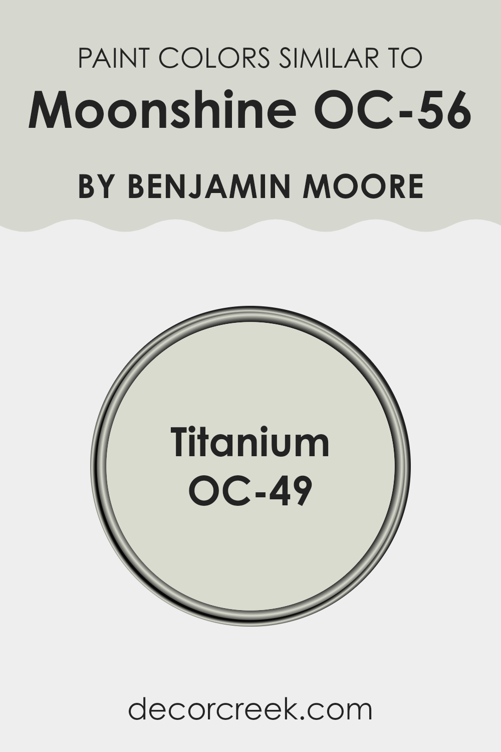
Colors Similar to Moonshine OC-56 by Benjamin Moore
Choosing similar colors for your interior design scheme is essential for creating a harmonious and cohesive look within your room. When colors closely resemble each other, as Moonshine OC-56 by Benjamin Moore does with OC-49 Titanium, they help to establish a subtle and smooth visual flow from one area to another. This smooth continuity can make smaller rooms appear larger and provide a restful visual experience. By keeping the tones in the same family, you ensure that the design feels well-thought-out and professionally curated.
Moonshine OC-56 by Benjamin Moore is a gentle, muted gray that carries a hint of blue, making it an adaptable backdrop for both bright and soft color accents. This color evokes a sense of calm and works beautifully in rooms that aim for a relaxed atmosphere.
On the other hand, OC-49 Titanium, which is very similar to Moonshine, is slightly warmer with understated beige undertones that offer a soft, inviting feel. It pairs well with a variety of decor styles, enhancing the sense of warmth in any environment. Both colors support a seamless aesthetic flow in a design scheme, promoting a unified yet distinct look throughout the home.
You can see recommended paint color below:
- OC-49 Titanium
How to Use Moonshine OC-56 by Benjamin Moore In Your Home?
Moonshine OC-56 by Benjamin Moore is a soft, subtle gray paint that complements a wide range of home decor styles. Its understated tone makes it a great choice for creating a calm and welcoming atmosphere in any room. If you’re thinking about refreshing your living area, Moonshine OC-56 could be the perfect shade for you.
You can use it in several ways around your home. For example, painting your living room or bedroom walls with Moonshine OC-56 can give the room a fresh, modern look while still keeping things simple and neat. It pairs beautifully with white trim for a clean, crisp appearance.
Additionally, this color works well in bathrooms and kitchens, providing a light, airy feel. It’s also an excellent choice for smaller rooms, as the light color can help make an area appear larger and more open. With its adaptability, Moonshine OC-56 is ideal for anyone looking to give their home a quick and easy refresh.
Moonshine OC-56 by Benjamin Moore vs Titanium OC-49 by Benjamin Moore
Moonshine and Titanium by Benjamin Moore are both neutral colors, but they have some distinct differences. Moonshine is a light gray with soft blue undertones, giving it a clean and fresh look. It’s great for making small rooms appear bigger and creating a calm atmosphere.
On the other hand, Titanium is a deeper gray with slightly green undertones. This color is excellent for areas where you want a bit more warmth and depth. While Moonshine reflects more light and can brighten up an area, Titanium provides a cozier feel, which can be perfect for living rooms or bedrooms.
Both colors are adaptable and easy to match with a variety of decor styles, but the choice between them depends on the mood you want to set and the natural light in your room.
You can see recommended paint color below:
- OC-49 Titanium
In wrapping up my thoughts about OC-56 Moonshine by Benjamin Moore, I have to say I’m really impressed. This color is so light and pretty, almost like the soft light you see on a cloudy day. It has the power to make rooms feel calm and welcoming. Whether you put it in your bedroom or your living room, it brings a fresh and clean look every time you walk in.
This paint is not just for walls, though. I think it would look great on cabinets or furniture to give your home a consistent and unified look. Thinking about how it changes with different lighting throughout the day was also interesting. It can look a bit more grey or a bit more blue, so it’s fun to see how it adapts.
I tried it out in a few rooms and it works well with a lot of different colors and decorations. It’s a good choice if you like changing things up now and then because it’s a backdrop that fits with many styles and accessories.
So, if you’re looking for a new paint color that’s calm and pretty but also cool and light, OC-56 Moonshine is definitely worth considering. It makes rooms look clean, fresh and it’s easy on the eyes. Plus, it’s simple yet effective. Try it out, you might be surprised at how much you like it!
Ever wished paint sampling was as easy as sticking a sticker? Guess what? Now it is! Discover Samplize's unique Peel & Stick samples.
Get paint samples

