As you consider giving your space a fresh look with a new paint color, SW 6971 Morning Glory by Sherwin Williams is an option you might want to think about. This shade is a gentle blend of blue with a soft gray undertone, creating a subtle and soothing atmosphere wherever it’s applied.
Whether you’re looking to freshen up your living room, bedroom, or even an office space, Morning Glory brings a light and airy feel that can effortlessly modernize and uplift any area.
Choosing the right paint color can often feel overwhelming due to the plethora of choices available, but Morning Glory has a versatile hue that works well in many different lighting situations and complements various decor styles.
So, as you plan your next painting project, consider how this beautiful shade can enhance your home’s aesthetic and create a more welcoming environment.
What Color Is Morning Glory SW 6971 by Sherwin Williams?
Morning Glory SW 6971 by Sherwin Williams is a bright and cheerful blue that brings a fresh and lively feel to any space. This vibrant hue combines the calmness of blue with a touch of energizing brightness, making it perfect for creating a welcoming atmosphere in your home.
Morning Glory pairs wonderfully with various interior styles, especially coastal and country homes where its natural brightness plays well with light textiles and rustic furnishings. In a modern or contemporary setting, this color can add a pop of vibrancy that is both fun and stylish.
As for materials, Morning Glory works beautifully with natural wood tones, from light beech to rich walnut, highlighting their natural grains and warm undertones. Textiles like linen, cotton, and wool in neutral shades such as white, beige, or soft gray complement this blue nicely, allowing it to stand out without overpowering the space. Additionally, metallic finishes like brushed nickel or polished chrome can add a crisp, clean touch to the surroundings.
Using Morning Glory in your interior not only brightens the room but also creates an environment that feels open and airy. It’s a color that assists in pulling diverse elements together to create a cohesive and pleasant space.
Is Morning Glory SW 6971 by Sherwin Williams Warm or Cool color?
Morning Glory by Sherwin Williams is a fresh and vibrant color that can really brighten up a space. This particular shade of blue has a lively, yet soft quality that makes it a great choice for many rooms in a home. When used in a living room or kitchen, Morning Glory brings a clean and airy feel, enhancing the room’s natural light. This makes the space look bigger and more inviting.
In smaller or darker spaces, such as bathrooms or hallways, applying Morning Glory on the walls can instantly make the area feel more open and less cramped. This color also pairs well with a wide range of decor styles and colors, adding versatility to its appeal.
Whether combined with neutral tones like whites and grays for a calm atmosphere or contrasting bright colors for a more dynamic look, Morning Glory can fit seamlessly into your home design, providing a cheerful backdrop to everyday life.
Undertones of Morning Glory SW 6971 by Sherwin Williams
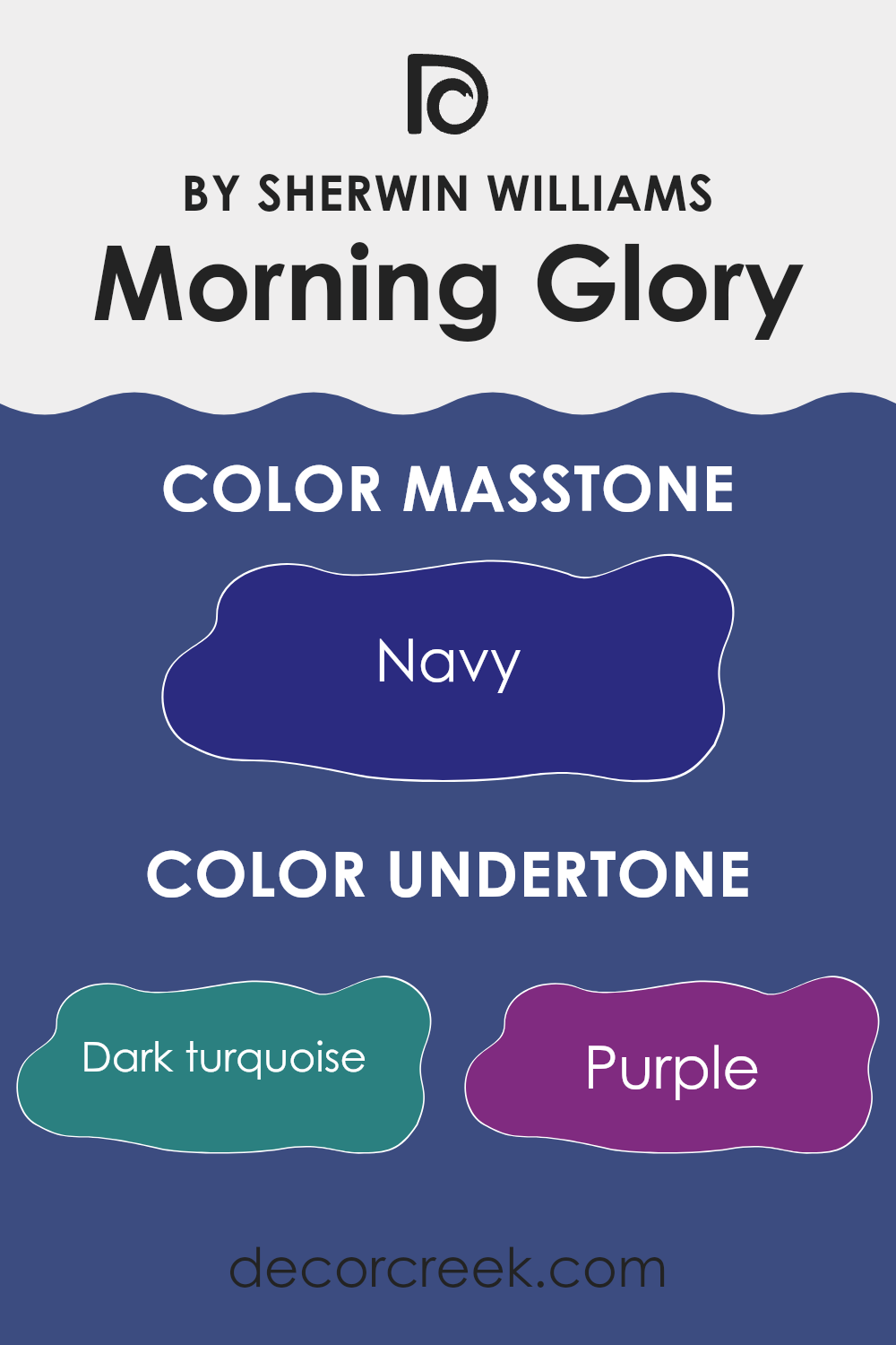
Morning Glory SW 6971 by Sherwin Williams is an intriguing paint color that has a complex mix of undertones. These undertones include shades like dark turquoise, purple, grey, dark blue, dark grey, blue, dark green, violet, brown, lilac, and olive. The presence of these undertones can significantly influence the overall look of the color depending on the lighting and surrounding colors.
Undertones are subtle colors that lurk beneath the surface of the primary color. They can change the way a color appears, sometimes making it look cooler or warmer. For instance, in bright light, such as from the sun during the day, Morning Glory might lean more towards its blue or turquoise undertones, giving it a fresher look.
In dimmer, artificial light, the darker undertones like purple and dark grey might become more pronounced, giving the color a deeper feel.
When applied to interior walls, the effect of these undertones becomes particularly important. The multiple undertones in Morning Glory can make the walls look lively and dynamic, as the color may appear slightly different from one wall to another depending on the lighting conditions. This can make a room feel more interesting and layered.
Moreover, because Morning Glory has both cool (like blue and dark turquoise) and warm undertones (like brown and olive), it’s versatile and can work well with various decor styles and palettes. It can help in achieving a balanced look in a room, making the space neither too stark nor too overwhelming.
Overall, this color, with its rich blend of undertones, offers a unique flexibility that allows it to adapt to different settings and moods.
What is the Masstone of the Morning Glory SW 6971 by Sherwin Williams?
Morning Glory by Sherwin Williams has a strong navy base, officially recognized with the color code #2B2B80. This rich, deep blue shade brings a sense of calm and steadiness to any space. When used in homes, it often creates a grounding effect, making rooms feel more secure and cozy.
This navy hue works exceptionally well in living areas and bedrooms where a peaceful atmosphere is desired. Since it’s a darker color, it’s excellent at hiding imperfections on walls and can make large, open spaces feel more intimate and inviting.
However, because it absorbs a lot of light, it’s best used in rooms with ample natural or artificial lighting to prevent them from feeling too dark. Pairing this navy tone with lighter colors like whites or soft grays can balance its intensity, adding a stylish contrast that keeps rooms lively and visually interesting.

How Does Lighting Affect Morning Glory SW 6971 by Sherwin Williams?
Lighting plays a crucial role in how we perceive colors. When you choose a paint like Morning Glory SW 6971, understanding how different types of light affect it can make a big difference in achieving the desired look in your room.
In artificial light, colors can appear differently depending on the type of bulbs used. Warm light bulbs can make Morning Glory, a versatile bluish-green, look more vibrant and slightly greener. Fluorescent lighting, which usually casts a cooler tone, might bring out more of the blue in this color, giving the room a fresher feel.
In natural light, the appearance of Morning Glory will change throughout the day based on the sun’s position and intensity. Natural light tends to show the truest color, so you can see Morning Glory in its fullest brightness and vividness during daylight, particularly when it’s sunny.
The orientation of the room also affects how this color appears:
– North-facing rooms: These rooms get less direct sunlight, which can cause cooler and softer blue tones in Morning Glory to become more prominent, thus the room might feel slightly cooler.
– South-facing rooms: With abundant sunshine, the color can appear much brighter and more vibrant, emphasizing its greenish tones.
– East-facing rooms: Morning Glory will look different in the morning when it’s hit by the warm sunrise tones, potentially making the room feel fresh and lively. As the day progresses and the natural light dims, the color will return to a calmer blue.
– West-facing rooms: Here, the color will experience the opposite effect of east-facing rooms. The soft morning light will show a gentle tone of the color, and as the sun sets in vibrant hues, the walls might glow warmly in the late afternoon.
Understanding how light interacts with color can help you decide on the perfect placement and complementary decor to pair with Morning Glory in your home.

What is the LRV of Morning Glory SW 6971 by Sherwin Williams?
LRV stands for Light Reflectance Value, which is a measure of how much light a paint color reflects back into a room. Essentially, it indicates how light or dark a color will appear once it’s on your walls. LRV can range highly; lower values mean the color absorbs more light, making it appear darker, while higher values mean it reflects more light, making it appear lighter.
This number is crucial when choosing paint because it helps determine how a color will actually look in your specific environment, especially under different lighting conditions. The LRV for the color Morning Glory by Sherwin Williams is 7.653, which is relatively low.
This means it’s a darker shade that doesn’t reflect much light. When used on walls, colors with an LRV like this tend to create a more muted and cozier atmosphere. They can make large rooms feel a bit smaller and more intimate, but in smaller spaces, they might feel a bit overwhelming or cramped if not balanced with adequate lighting or lighter-colored decor.
This darker LRV also affects the perception of the room’s temperature, as darker shades can make spaces feel warmer.

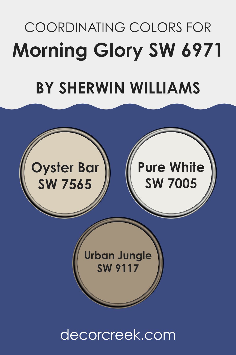
Coordinating Colors of Morning Glory SW 6971 by Sherwin Williams
Coordinating colors are selected shades that harmonize beautifully with a primary color to enhance the overall aesthetic of a space. When you pick a vibrant primary color like a deep blue, the coordinating colors are usually more subdued or complementary to ensure balance and visual appeal in your decor. Choosing the right coordinating shades involves looking at color undertones, brightness, and saturation to create a seamless look.
For example, Oyster Bar SW 7565 serves as a subtle neutral with its light, sandy taupe tone, making it perfect for softening the intensity of a bolder primary color and providing a soothing background.
Pure White SW 7005 is an essential clean and crisp white that offers a stark contrast, which can help other colors pop and stand out more prominently. Lastly, Urban Jungle SW 9117 provides a muted, earthy green that can introduce a natural, calming element into the space, balancing out the strength of a vibrant primary color with its gentle and understated character.
You can see recommended paint colors below:
- SW 7565 Oyster Bar
- SW 7005 Pure White
- SW 9117 Urban Jungle
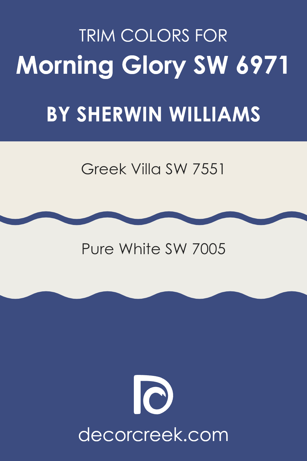
What are the Trim colors of Morning Glory SW 6971 by Sherwin Williams?
Trim colors are used to accentuate architectural details and create a visual separation between different elements of a room or building. For Morning Glory by Sherwin Williams, a vivid blue paint, choosing the right trim color is crucial as it helps to highlight the beauty of the wall color while contributing to a cohesive look.
Trim colors like SW 7551 – Greek Villa and SW 7005 – Pure White are popular choices. These lighter shades work wonderfully by providing a crisp border that can make the bold blue stand out more strikingly and give the space a clean, finished appearance.
Greek Villa (SW 7551) is a warm, slightly off-white tone that offers a gentle contrast against the more vibrant hues like Morning Glory. This color isn’t stark or cold, which makes it a good option for creating a soft yet distinct boundary on trims and moldings. Alternatively, Pure White (SW 7005) is a true, bright white that provides a stark, contrasting line against deeper colors, ensuring that the blue pops more dramatically and the architectural features are clearly defined. Both choices lend a fresh and orderly vibe to any room, enhancing the overall aesthetic while allowing the main color, Morning Glory, to shine prominently.
You can see recommended paint colors below:
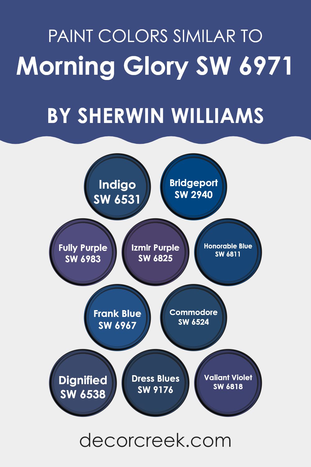
Colors Similar to Morning Glory SW 6971 by Sherwin Williams
Similar colors play a vital role in creating a harmonious and pleasing aesthetic in any space. Choosing shades like those similar to Morning Glory by Sherwin Williams can produce a seamless visual flow that ties different elements and spaces together. For instance, Indigo is a deep blue that adds a sense of depth and is perfect when used in accents or as a feature wall, while Bridgeport offers a slightly muted hue that works well in calm, understated rooms.
Fully Purple has a rich vibrancy that can give a playful boost to an interior, contrasting with the more subdued tones of Izmir Purple, which carries a gentle royalty appropriate for a tranquil bedroom or reading nook.
Honorable Blue and Frank Blue both give off a trustworthy vibe, offering clear but nuanced options for office spaces or studies. Commodore introduces a stronger, more assertive presence, anchoring spaces with its deep tone. Similarly, Dignified’s bold character can act as a fantastic backdrop for art pieces or to draw attention in a dining area.
Completing this palette, Dress Blues offers a classic navy that’s perfect for creating a timeless look, and Valiant Violet brings an energetic pulse to invigorating living areas or creative spaces. Using these similar colors allows for creating a cohesive look throughout the home, ensuring that each room flows into the next without harsh contrasts.
You can see recommended paint colors below:
- SW 6531 Indigo
- SW 2940 Bridgeport
- SW 6983 Fully Purple
- SW 6825 Izmir Purple
- SW 6811 Honorable Blue
- SW 6967 Frank Blue
- SW 6524 Commodore
- SW 6538 Dignified
- SW 9176 Dress Blues
- SW 6818 Valiant Violet
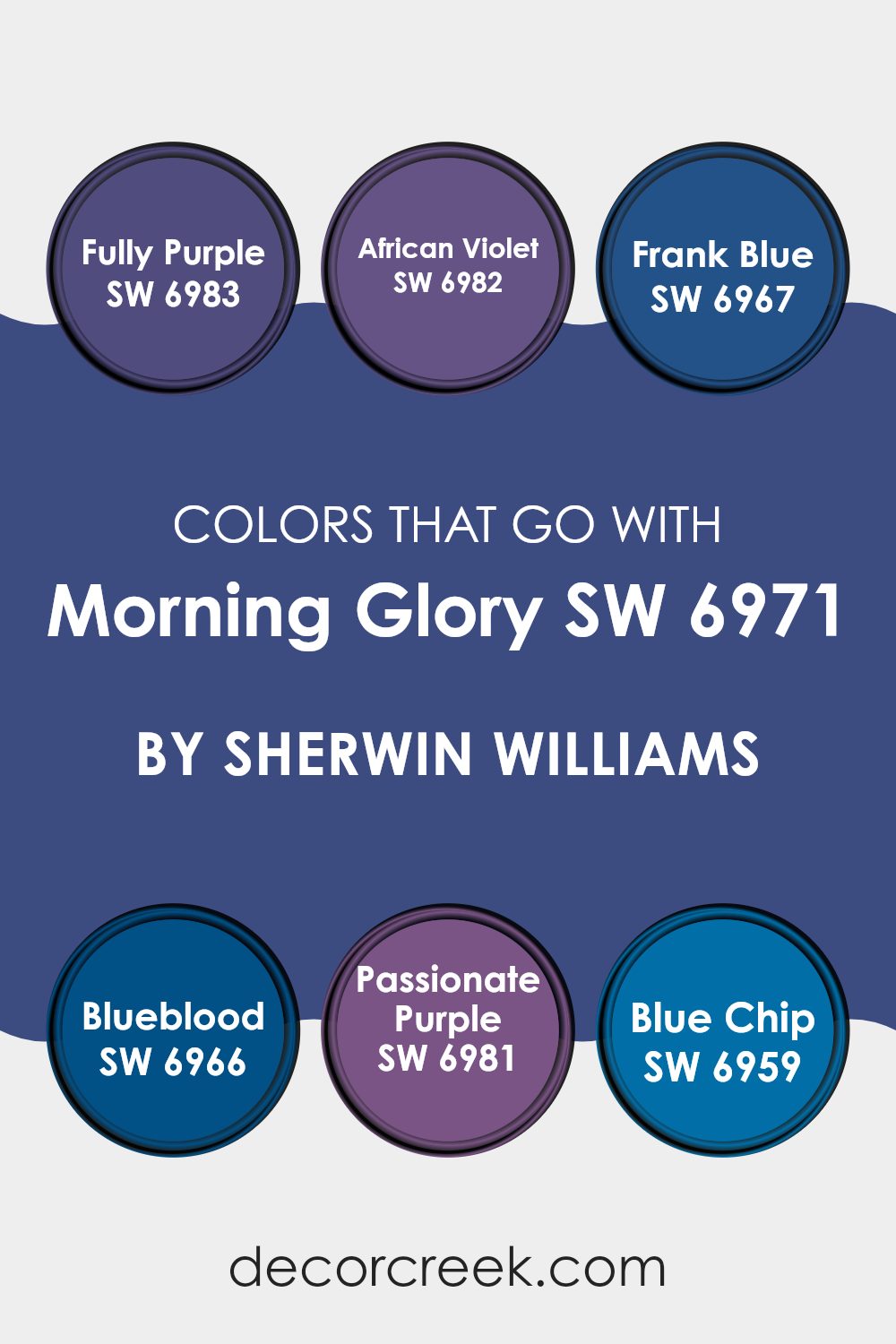
Colors that Go With Morning Glory SW 6971 by Sherwin Williams
Choosing the right colors to complement Morning Glory SW 6971 by Sherwin Williams can significantly impact the atmosphere and aesthetic of a space. Morning Glory is a vibrant and lively shade, reminiscent of a clear, blue sky on a sunny morning. When paired wisely, these companion colors can create a balanced and harmonious environment, enhancing the beauty of each hue while providing a dynamic visual experience.
Fully Purple SW 6983 is a rich and deep purple that exudes a strong presence, making it perfect for accent walls or decor that needs to stand out. It contrasts beautifully with Morning Glory, offering a regal feel to any room.
African Violet SW 6982 offers a slightly lighter purple tone, providing a subtle yet playful contrast that helps in softening the surroundings when used alongside the brighter blues. Frank Blue SW 6967 is a robust shade that leans towards the maritime, perfect for adding a sense of depth and focus in spaces that complement nautical themes.
Blueblood SW 6966, is a darker blue that can lend a sense of mystery and drama when paired with Morning Glory, ideal for a more dramatic and moody atmosphere. Passionate Purple SW 6981 brings a burst of energy with its vivid and intense purple, injecting liveliness and a touch of fun into a space.
Blue Chip SW 6959, the darkest of these shades, works well for adding a powerful punch or for creating an elegant backdrop against the lighter Morning Glory. Each color offers a unique way to style a room, depending on the desired mood, from playful and energetic to refined and dramatic.
You can see recommended paint colors below:
- SW 6983 Fully Purple
- SW 6982 African Violet
- SW 6967 Frank Blue
- SW 6966 Blueblood
- SW 6981 Passionate Purple
- SW 6959 Blue Chip
How to Use Morning Glory SW 6971 by Sherwin Williams In Your Home?
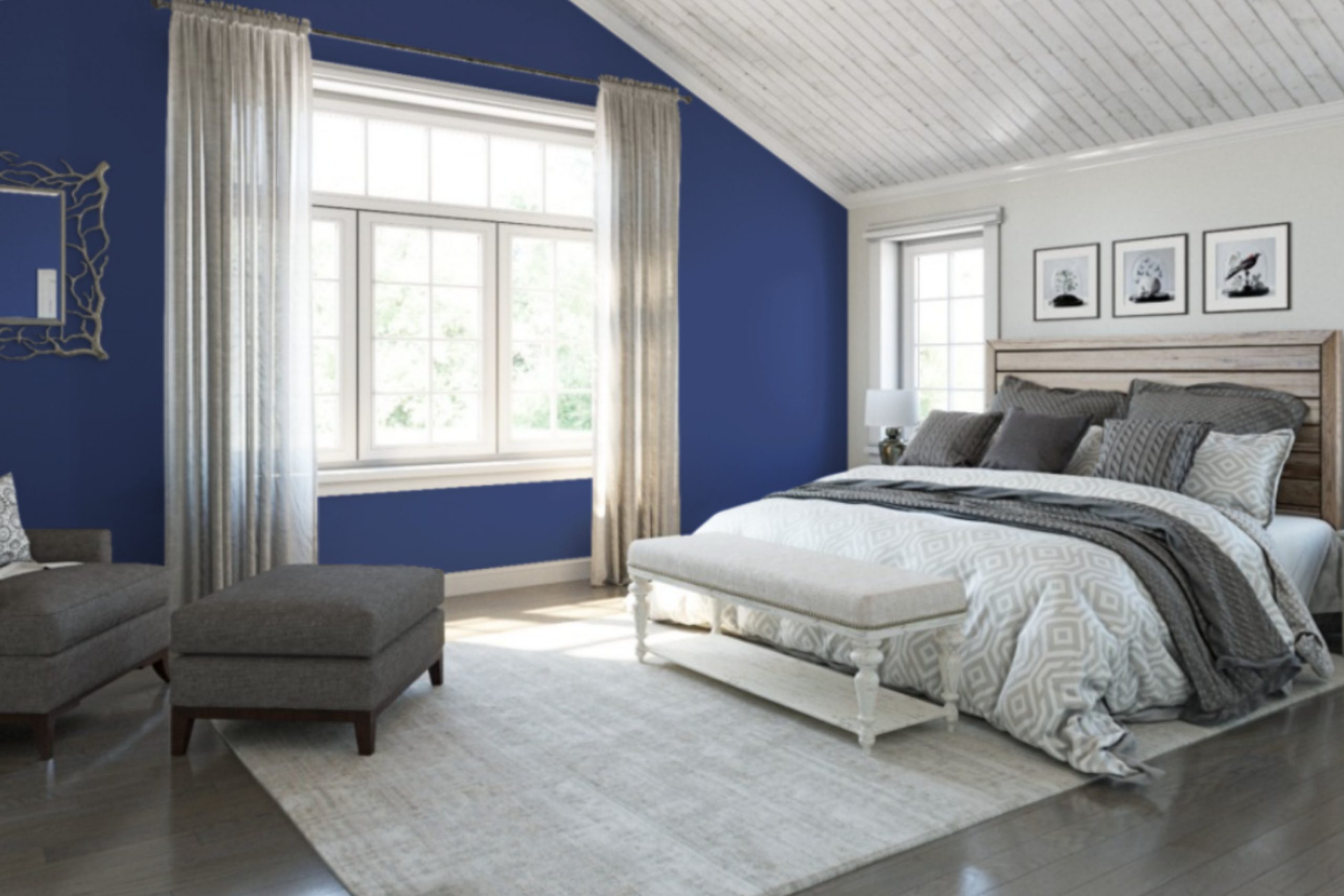
Morning Glory SW 6971 by Sherwin Williams is a beautiful light blue paint color that adds a fresh and bright touch to any room. Ideal for creating a calming atmosphere, this color is perfect for bedrooms and bathrooms where you want a soothing feel. Light blue is often associated with the sky and water, making it a great choice for spaces where you want to encourage relaxation and calm thoughts.
Using Morning Glory SW 6971 in your home is simple. It pairs wonderfully with white trim for a clean and crisp look. In a bedroom, consider painting the walls with this light blue and adding white bedding and curtains for a refreshing vibe. In a bathroom, this color can create a spa-like environment, especially when used with soft lighting and natural elements like wood or stone.
Additionally, Morning Glory SW 6971 works well in living spaces or kitchens, complementing both modern and traditional decors. Match it with light wood furniture or metallic accents for a balanced and inviting ambiance. This versatile shade is an excellent choice if you’re looking to brighten up your living space with a gentle touch of color.
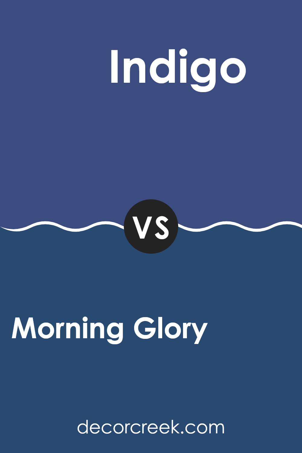
Morning Glory SW 6971 by Sherwin Williams vs Indigo SW 6531 by Sherwin Williams
Morning Glory SW 6971 and Indigo SW 6531 are two distinct colors offered by Sherwin Williams. Morning Glory is a vibrant, cheerful shade of blue that has a light and airy feel. It’s perfect for creating a refreshing and welcoming atmosphere in a room, much like a clear blue sky on a sunny morning.
On the other hand, Indigo SW 6531 is a deeper and darker blue. It has a more classic and timeless appeal, resembling the deep shades of twilight. Indigo is well-suited for adding a sense of depth and dignity to a space.
While both colors share a blue base, Morning Glory injects more brightness into its environment, whereas Indigo provides a more grounded and subdued tone. Choosing between them depends on the mood and atmosphere you want to set in your space.
You can see recommended paint color below:
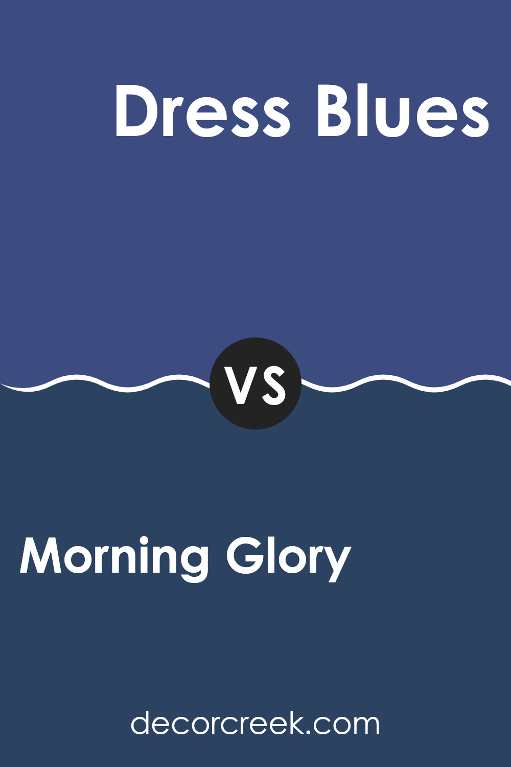
Morning Glory SW 6971 by Sherwin Williams vs Dress Blues SW 9176 by Sherwin Williams
Morning Glory and Dress Blues, both by Sherwin Williams, offer unique vibes to any space. Morning Glory is a bright, refreshing blue that brings a lively feel, resembling a clear sky on a sunny day. It’s perfect for making a room feel open and airy.
On the other hand, Dress Blues is a much darker blue, which makes it appear more like the deep, mysterious tones of a navy uniform. This color tends to lend a strength and grounded nature to spaces, providing a bold backdrop ideal for highlighted areas or furniture pieces.
Though both blues, they cater to very different moods and settings. Morning Glory adds a cheerful burst of color, ideal for kitchens or bedrooms looking for a pop of freshness. Dress Blues works well in an office or dining area where a touch of formal elegance is desired. Together, these colors could even complement each other in a single area—offering contrast and variety.
You can see recommended paint color below:
- SW 9176 Dress Blues
Morning Glory SW 6971 by Sherwin Williams vs Commodore SW 6524 by Sherwin Williams
Morning Glory and Commodore are both striking colors offered by Sherwin Williams, each bringing its own distinct vibe to spaces. Morning Glory is a vibrant, bright blue that feels cheerful and energetic. This shade is perfect for adding a splash of liveliness to any room, and can really make spaces feel open and airy.
On the other hand, Commodore is a much darker blue, almost heading towards navy. It provides a bold and strong presence, giving a room a more grounded and concentrated feel. This color works well in areas where you want to promote focus and authority, making it a great choice for office spaces or accent walls in a bedroom.
Together, these colors could create a dynamic contrast if used in the same area. Morning Glory could lighten up a space while Commodore could be used to add depth and seriousness, balancing out the brightness with its intensity. Their combined use could provide a balanced but lively atmosphere.
You can see recommended paint color below:
- SW 6524 Commodore

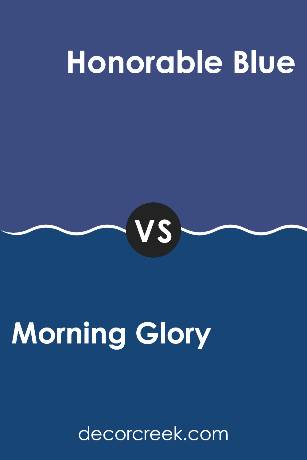
Morning Glory SW 6971 by Sherwin Williams vs Honorable Blue SW 6811 by Sherwin Williams
Morning Glory and Honorable Blue, both from Sherwin Williams, offer distinct blue tones for different decorating styles. Morning Glory is a vibrant, energetic blue that brings a fresh and lively feel to any space. It’s the kind of color that can instantly brighten up a room and make it feel more welcoming and cheerful.
On the other hand, Honorable Blue presents a deeper, more reserved shade. This color leans towards a navy blue, which can add a sense of steadiness and depth to a space. It’s perfect for those who prefer a more toned-down look but still want a hint of color.
While Morning Glory is ideal for spaces like kitchens, children’s rooms, or anywhere you want a playful, refreshing vibe, Honorable Blue works well in areas where a more mature, calm atmosphere is desired, such as bedrooms or offices. Both colors are versatile and can be coordinated with a variety of decor styles and palettes.
You can see recommended paint color below:
- SW 6811 Honorable Blue
Morning Glory SW 6971 by Sherwin Williams vs Dignified SW 6538 by Sherwin Williams
Morning Glory and Dignified, both from Sherwin Williams, present a striking contrast in tones. Morning Glory leans towards a vibrant, fresh light blue that feels open and airy, reminiscent of a clear, sunny morning sky.
This color is great in spaces where you want to bring in a sense of brightness and enthusiasm. On the other hand, Dignified strikes a richer note with its deep teal hue that adds a sense of depth and richness to any room.
This color has a boldness to it, suitable for creating a more grounded and defined space. The lighter Morning Glory can make small rooms appear bigger, whereas Dignified, darker and more intense, often works well in larger or well-lit areas to create a more cozy and impactful experience. Together, they offer diverse options depending on the mood and feel you want to achieve in a room.
You can see recommended paint color below:
- SW 6538 Dignified

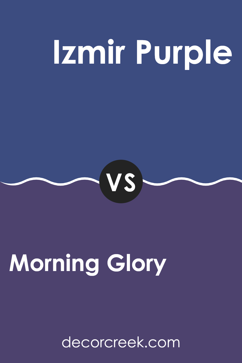
Morning Glory SW 6971 by Sherwin Williams vs Izmir Purple SW 6825 by Sherwin Williams
Morning Glory by Sherwin Williams is a lively and bright blue hue, fresh and vibrant, reminiscent of a clear sky on a sunny morning. It adds a splash of cheerful energy to any space, making it lively and welcoming.
In contrast, Izmir Purple is a deep, bold purple that brings its own unique flair. This color has a regal quality, often associated with luxury and creativity. It provides a striking pop of color that can make a room feel more dynamic and full of life.
When comparing them, Morning Glory is lighter and tends to brighten spaces significantly, making it great for areas where you want to enhance the perception of space and light. Izmir Purple, on the other hand, offers a sense of depth and drama, perfect for creating a focal point or adding a touch of elegance. Both colors could work beautifully either together or separately, depending on the mood you want to create in your home.
You can see recommended paint color below:
- SW 6825 Izmir Purple
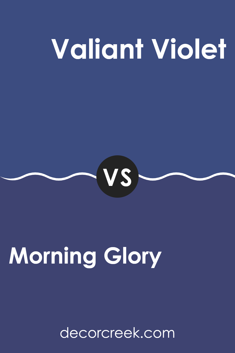
Morning Glory SW 6971 by Sherwin Williams vs Valiant Violet SW 6818 by Sherwin Williams
Morning Glory and Valiant Violet are both unique shades from Sherwin Williams, but they offer distinct vibes. Morning Glory is a lively, bright blue that might remind you of a clear sky on a sunny day. It’s quite vivid and can add a refreshing splash of color to a room.
On the other hand, Valiant Violet is a deeper, richer purple that carries a sense of boldness and creativity. It’s a bit more dramatic and could be great for making a statement in a space.
While Morning Glory brings a cheerful and airy feel, Valiant Violet provides a more grounded and strong presence. Choosing between them depends on what mood you want to set in your space—light and open or deep and striking.
You can see recommended paint color below:
- SW 6818 Valiant Violet
Morning Glory SW 6971 by Sherwin Williams vs Bridgeport SW 2940 by Sherwin Williams
Sure, let’s take a look at Morning Glory and Bridgeport, both from Sherwin Williams. Morning Glory is a vibrant, bright blue that really stands out. It’s the kind of color that makes a statement and can cheer up any space.
It resembles the blue you see in the sky just after dawn, fresh and lively. On the other hand, Bridgeport is a lot softer. This color is a muted green with gray undertones, giving it a more understated and calm feel.
While both colors can work beautifully in different settings, Morning Glory tends to draw more attention, making it great for a focal point in a room. Meanwhile, Bridgeport is better for creating a subtle backdrop—it blends nicely without overpowering. Depending on the mood you want to set in your space, you could go bold with Morning Glory or keep things low-key with Bridgeport.
You can see recommended paint color below:
- SW 2940 Bridgeport
Morning Glory SW 6971 by Sherwin Williams vs Frank Blue SW 6967 by Sherwin Williams
Morning Glory and Frank Blue are both vibrant colors by Sherwin Williams, yet they offer distinct visual experiences. Morning Glory is a lively and bright blue, almost reminiscent of a clear sky on a sunny morning. This color has a fresh and cheerful vibe that can easily light up a room. It tends to add a sense of airiness and can make small spaces appear larger.
On the other hand, Frank Blue is a deeper and more intense shade. This color is richer and leans towards a more traditional navy, making it perfect for creating a grounding atmosphere in a space. Frank Blue suits areas where a touch of formality or a strong visual anchor is desired, such as dining rooms or offices.
When comparing the two, Morning Glory provides a more energizing feel, making it ideal for kitchens or bathrooms, while Frank Blue offers a more reserved strength, suitable for more subdued or formal areas.
You can see recommended paint color below:
- SW 6967 Frank Blue
Morning Glory SW 6971 by Sherwin Williams vs Fully Purple SW 6983 by Sherwin Williams
Morning Glory and Fully Purple, both by Sherwin Williams, present a vibrant contrast in their hues and feel. Morning Glory is a bright, energetic blue that’s reminiscent of a clear sky on a sunny day. It’s fresh and uplifting, often used to add a cheerful pop of color in spaces that need a light, airy feel.
On the other hand, Fully Purple is a deep, bold purple with a hint of mystery and richness. This color is ideal for adding depth and a touch of drama to any room, working well in creative or intimate settings.
While Morning Glory brings a sense of energy and openness, Fully Purple offers a sense of depth and luxuriousness. Whether you’re looking to brighten a space or give it a regal or cozy touch, choosing between these two colors depends largely on the mood and atmosphere you want to achieve in your room.
You can see recommended paint color below:
- SW 6983 Fully Purple
In wrapping up my thoughts on SW 6971 Morning Glory by Sherwin Williams, I must say I’m really impressed with how it makes any room feel fresh and cheerful. This paint color is like a breath of fresh air in your home, reminding you of a clear blue sky on a sunny day. It has a way of making a space look clean and bright without being too bold, which I find perfect for bedrooms or living rooms where you just want to relax and feel at ease.
Using Morning Glory, you won’t have to worry about it going out of style because it has such a classic and pleasant appeal. It pairs well with many other colors, whether you’re adding dark furniture or bright cushions. This makes it a great choice if you like changing things around in your room without having to repaint every time.
Overall, if you’re thinking about giving your room a new look that feels lively and welcoming, SW 6971 Morning Glory might just be the right pick. It brings a cheerful vibe that’s hard to beat, making it a win in my book for anyone looking to brighten up their home.
Ever wished paint sampling was as easy as sticking a sticker? Guess what? Now it is! Discover Samplize's unique Peel & Stick samples.
Get paint samples

