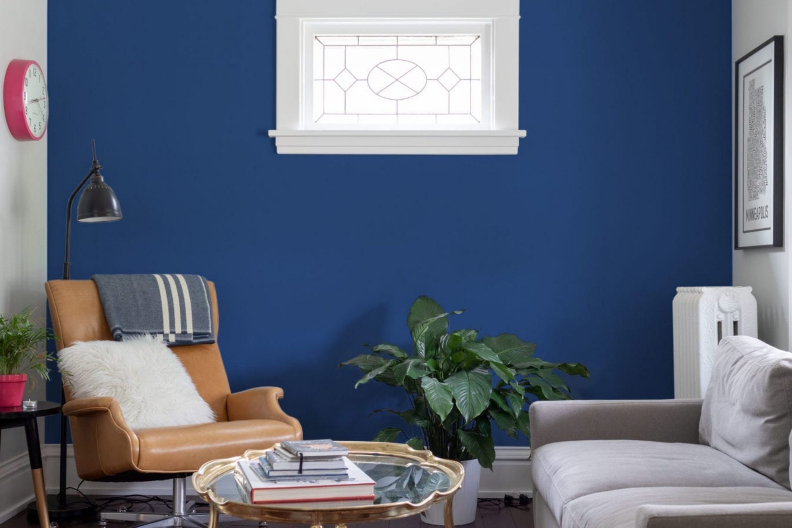
SW 6531 Indigo by Sherwin Williams is a remarkable color that instantly catches the eye. It’s a shade of blue that feels both deep and inviting, much like the evening sky on a clear night. When I first considered using this color, I found it both challenging and exciting. Indigo carries an elegance that is hard to ignore, with its rich tones and subtle undertones.
This color has a way of elevating any room, giving it a sophisticated yet comfortable atmosphere. It’s neither too dark nor too light, striking the perfect balance to create a calming environment. I noticed that it pairs well with both neutral and bold colors, allowing for endless possibilities in design choices.
In a world filled with many colors, Indigo stands out as a classic choice that never feels overwhelming. It’s perfect for those who wish to make a statement while maintaining a sense of peace. Whether it’s used for an accent wall or an entire room, Indigo has the power to transform spaces into places where you feel at ease, yet inspired.
By choosing SW 6531 Indigo, you invite a sense of depth and warmth into your home, offering a backdrop that complements various styles seamlessly.
What Color Is Indigo SW 6531 by Sherwin Williams?
Indigo SW 6531 by Sherwin Williams is a rich, deep blue with a touch of purple, reminiscent of a twilight sky. It’s bold yet versatile, making it a popular choice for those who want to create a cozy and intimate atmosphere in their home. This color works especially well in modern, eclectic, and traditional styles.
In a modern interior, indigo can add a pop of color while maintaining a sleek and stylish look. In an eclectic space, it can serve as a striking backdrop for a mix of patterns and colors. In traditional settings, it brings a classic and timeless feel.
Indigo pairs beautifully with materials like natural wood, soft velvet, and crisp white linen. The depth of this color can highlight the texture of wood grains or the soft pile of velvet, adding layers of interest to a room. It also goes well with metallics like gold or brass, bringing a touch of warmth and glamour.
Accents in light gray or cream can balance indigo’s intensity, while pops of emerald green or mustard can add a playful contrast. Whether used on walls, furniture, or accessories, Indigo SW 6531 creates a welcoming and stylish environment that feels both unique and inviting.
Is Indigo SW 6531 by Sherwin Williams Warm or Cool color?
Indigo SW 6531 by Sherwin Williams is a bold and rich color that brings a sense of depth and warmth to any home. It is a deep blue with hints of purple, making it a striking choice for walls, furniture, or accents.
In living rooms, it can create a cozy and inviting atmosphere, especially when paired with lighter colors like whites or grays to balance its intensity. In bedrooms, Indigo can add a calming feel that helps create a peaceful resting space. This color works well with natural light, enhancing its richness throughout the day.
Indigo can also act as a statement color in a dining room or as an accent wall in a home office, providing a touch of elegance and confidence. Additionally, Indigo can be combined with metallic finishes for a more modern look. Overall, this color has a versatile appeal that suits various styles and moods in home design.
Undertones of Indigo SW 6531 by Sherwin Williams
Indigo SW 6531 by Sherwin Williams is a rich, deep color with a complex mix of undertones. These undertones include hints of dark turquoise, dark grey, dark green, purple, grey, dark blue, blue, brown, olive, violet, and lilac. Each undertone subtly influences how we perceive the main color. Undertones are important because they can affect how a color looks under different lighting conditions and in combination with other colors.
For Indigo SW 6531, the blend of cool undertones like dark blue and violet gives the color a strong, stable presence, making it look more blue in certain light. The hints of grey and dark grey play an important role by giving the color a muted and sophisticated look that can make it easy to pair with other neutral tones. Warm undertones, like brown and olive, add depth and richness, making the color feel cozy and inviting.
When used on interior walls, these undertones can make the space feel both bold and comforting. The room’s lighting can bring out different undertones, so the walls might appear more vibrant during the day when natural light highlights the blue and violet hints. At night, under warm indoor lighting, the color can look softer and more muted, emphasizing the brown and olive undertones. Overall, this makes Indigo SW 6531 a versatile option for various interior design styles.

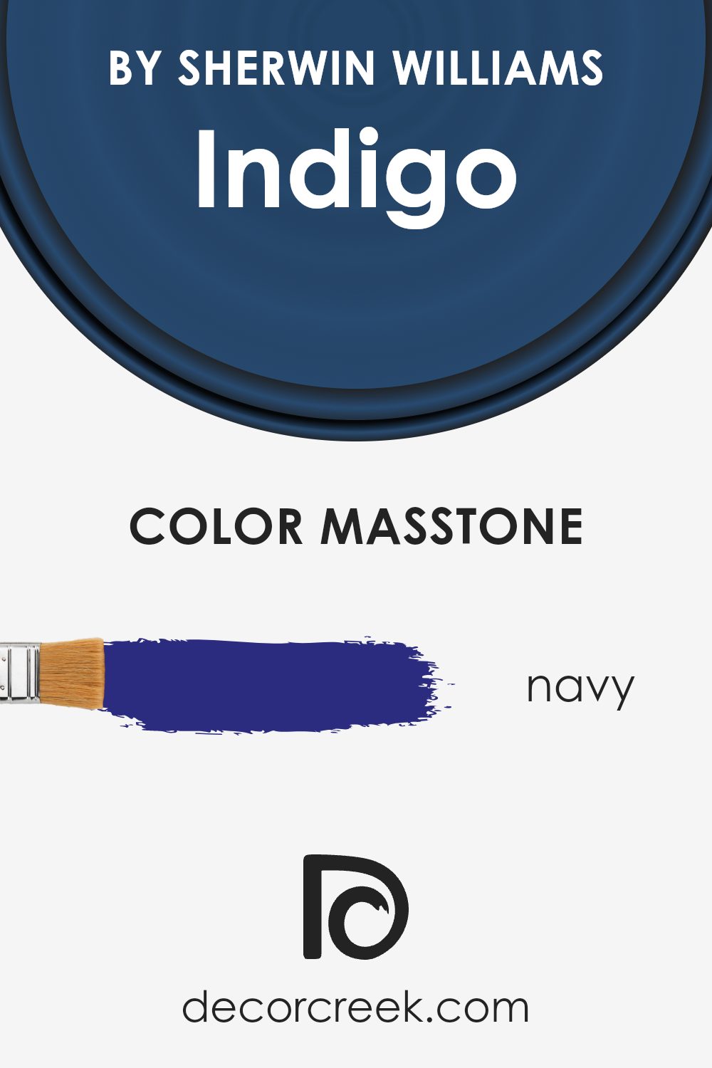
What is the Masstone of the Indigo SW 6531 by Sherwin Williams?
IndigoSW 6531 from Sherwin Williams has a rich navy masstone, meaning its main color is a deep, reliable navy (#2B2B80). This strong, dark color can change how a room feels. It’s perfect for adding a sense of coziness and sophistication to any space.
When you use this bold navy in your home, it can make large spaces feel more intimate and comfortable. It’s a great choice for dining rooms or studies, where you want a calm atmosphere. The deep blue can make white or light-colored furniture stand out, creating a nice balance and allowing other colors to pop. IndigoSW 6531 can also work well for feature walls, providing a striking background that is still versatile.
In bedrooms, this color can promote a peaceful, restful environment. Overall, this navy tone is an excellent choice for those wanting a classic yet bold statement piece in their home decor.
How Does Lighting Affect Indigo SW 6531 by Sherwin Williams?
Lighting plays a crucial role in how we see and perceive colors. The color Indigo SW 6531 by Sherwin Williams, like any other, can appear differently under various lighting conditions.
In natural light, the direction the light comes from significantly impacts how this color appears. In north-facing rooms, natural light is cooler and more subdued. Indigo SW 6531 in these rooms may appear more muted and cooler, sometimes taking on a slightly grayish undertone. This is because the natural light is consistent but doesn’t bring out the warmth in colors.
In south-facing rooms, the color receives warm, intense light throughout the day. Here, Indigo SW 6531 may appear richer and more vibrant. The warm light enhances the blue undertones, making the color appear more saturated. This setup makes the room feel bright and lively.
East-facing rooms receive warm light in the morning and cooler light later in the day. In the mornings, Indigo SW 6531 might appear brighter and more energized, as the morning sun can give it a warmer glow. In the afternoon, as the light cools down, the color might look a bit more subdued and calm.
West-facing rooms have the opposite effect, with their brightest and warmest light appearing in the late afternoon and evening. In these rooms, Indigo SW 6531 will seem warmer and more inviting later in the day, while appearing more neutral or muted in the earlier hours.
Under artificial lighting, the color’s appearance can vary based on the type of bulbs used. Warm white bulbs can enhance the depth and warmth of Indigo SW 6531, giving it a cozy feel. Cool white or daylight bulbs might make it appear crisp and more vivid. Thus, choosing the right lighting can significantly influence how Indigo SW 6531 is perceived in any space.

What is the LRV of Indigo SW 6531 by Sherwin Williams?
Light Reflectance Value, or LRV, is a measurement used to indicate how much light a color will reflect. It ranges from 0, which is absolute black and reflects no light, to 100, which is pure white and reflects all light. This value helps people understand how bright or dark a color will appear on walls.
Colors with low LRV will absorb more light, making them look darker, while colors with high LRV will reflect more light and appear brighter. This is important when choosing paint for spaces, as it affects how light or dark a room feels.
For the color Indigo SW 6531 by Sherwin Williams, the LRV is 6.479. This is a low LRV, meaning that this color will absorb most of the light in a room, resulting in a rich, deep, and dark appearance on the walls. Rooms painted with this shade will look more cozy and intimate, as the color won’t reflect much light.
This makes Indigo a good choice for larger spaces where you want to create a warm and inviting atmosphere, but it might make smaller, less lit rooms feel even smaller. Always consider how much natural and artificial light a room gets to ensure the color works well in your space.

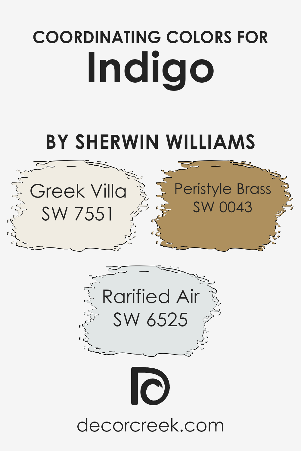
Coordinating Colors of Indigo SW 6531 by Sherwin Williams
Coordinating colors are shades that complement or enhance a primary color without clashing. In the case of Indigo (SW 6531) by Sherwin Williams, its coordinating colors create a harmonious palette that can unify a space. For instance, Greek Villa (SW 7551) is a warm, soft white that serves as a perfect backdrop to the deep and rich tone of Indigo, adding a touch of warmth and airiness to the room. Meanwhile, Rarified Air (SW 6525) is a light, breezy blue that introduces a hint of peacefulness, balancing Indigo’s intensity with its softer hue.
Peristyle Brass (SW 0043) brings a contrasting yet complementary element with its muted gold tone, offering an understated warmth that pairs beautifully with Indigo’s depth. Together, these colors create a balanced and inviting atmosphere.
The combination of Greek Villa’s fresh neutrality, Rarified Air’s gentle touch, and Peristyle Brass’s warm glow alongside Indigo, offers endless possibilities for creating a well-coordinated and visually appealing environment. Whether used in a living room, bedroom, or even a bathroom, this palette can deliver comfort and style, making any space feel more cohesive and thoughtfully designed.
You can see recommended paint colors below:
- SW 7551 Greek Villa
- SW 6525 Rarified Air
- SW 0043 Peristyle Brass
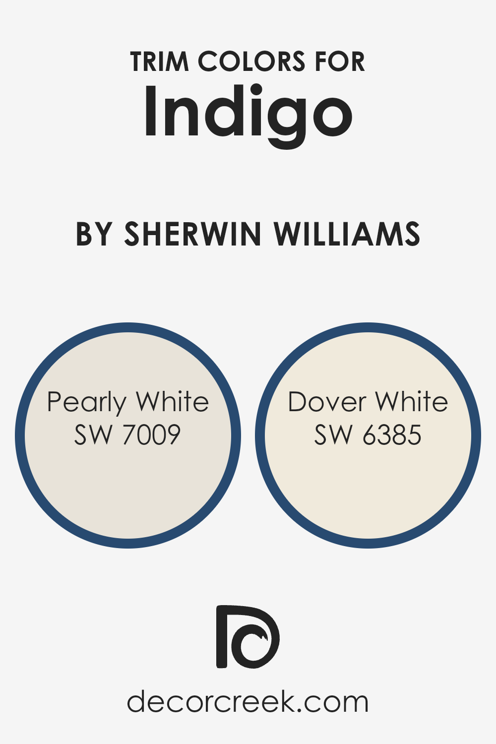
What are the Trim colors of Indigo SW 6531 by Sherwin Williams?
Trim colors are the shades used for the finishing or edges of walls, ceilings, doors, and windows. These colors play a crucial role in enhancing the main wall colors, providing a balanced contrast that highlights the architecture of a space. For instance, when using Indigo SW 6531 by Sherwin Williams, choosing the right trim colors can greatly affect the overall ambiance of a room.
Trim colors like SW 7009 – Pearly White offer a subtle, soft white with just enough warmth to complement the deep, rich blue of Indigo. It creates a clean and fresh boundary while maintaining an inviting feel. Trim colors make sure the main wall color like Indigo SW 6531 stands out beautifully, adding depth and a defined structure to rooms.
Similarly, SW 6385 – Dover White is another excellent choice as a trim color. It’s a warm white with a slight hint of creaminess, giving a cozy and welcoming look. This color is perfect for softening the transitions between Indigo SW 6531 and other elements in a room, such as woodwork or furniture. Trim colors are not just about boundaries but they enrich and bring out the beauty of the main colors, making spaces feel complete and well-designed.
They create harmony within the room through careful color coordination and contribute significantly to the visual appeal of the entire setup. Using Pearly White and Dover White with Indigo can ensure a pleasant and cohesive look that balances boldness with subtlety.
You can see recommended paint colors below:
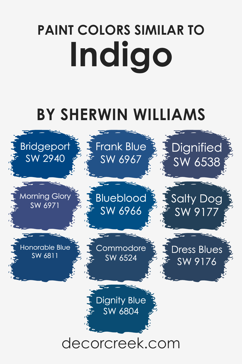
Colors Similar to Indigo SW 6531 by Sherwin Williams
Choosing colors similar to Indigo by Sherwin Williams is a great way to create a cohesive and harmonious space. Similar colors, like SW 2940 Bridgeport and SW 6971 Morning Glory, are important because they provide subtle variations that work well together.
These shades each have their own unique qualities but still maintain a related feel, making them perfect for adding depth and interest to a room without clashing. For example, SW 6811 Honorable Blue offers a rich, deep tone, while SW 6804 Dignity Blue has a slightly warmer hue. These colors can seamlessly blend with Indigo and each other, creating a balanced and unified look.
Continuing with this palette, SW 6967 Frank Blue and SW 6966 Blueblood offer deep and regal vibes, lending an air of confidence to any room. SW 6524 Commodore is a strong, yet calming blue that complements the bolder shades, like SW 6538 Dignified, which adds a touch of refinement.
Meanwhile, SW 9177 Salty Dog and SW 9176 Dress Blues are darker shades that bring sophistication and grounding to the palette, perfect for accent walls or furnishings. Together, these colors can create a harmonious and inviting atmosphere, adding layers of personality to any space.
You can see recommended paint colors below:
- SW 2940 Bridgeport
- SW 6971 Morning Glory
- SW 6811 Honorable Blue
- SW 6804 Dignity Blue
- SW 6967 Frank Blue
- SW 6966 Blueblood
- SW 6524 Commodore
- SW 6538 Dignified
- SW 9177 Salty Dog
- SW 9176 Dress Blues
Colors that Go With Indigo SW 6531 by Sherwin Williams
Colors that complement Indigo SW 6531 by Sherwin Williams play a crucial role in creating harmonious and visually pleasing spaces. Choosing the right colors can either make the indigo stand out as a statement piece or allow it to blend seamlessly within a color scheme. Scanda SW 6529, with its clean and fresh undertones, pairs perfectly with indigo for a vibrant yet calming effect.
Bluesy Note SW 9064 introduces a deeper, moodier tone to the palette, enhancing the rich qualities of indigo. Cosmos SW 6528, with its touch of purple, brings a subtle sophistication to the mix, adding depth without overpowering the indigo.
In addition, Blissful Blue SW 6527 provides a lighter, softer option, evoking a sense of comfort and relaxation next to the strong, confident indigo. Icelandic SW 6526, with its icy lightness, offers a refined contrast, keeping the overall look refreshing and airy.
Finally, Revel Blue SW 6530 presents a more muted blue tone, creating a balanced and grounded feel when used with indigo. Together, these colors create a versatile palette that can adapt to different moods and settings, emphasizing the beauty and versatility of Indigo SW 6531.
You can see recommended paint colors below:
- SW 6529 Scanda
- SW 9064 Bluesy Note
- SW 6528 Cosmos
- SW 6527 Blissful Blue
- SW 6526 Icelandic
- SW 6530 Revel Blue

How to Use Indigo SW 6531 by Sherwin Williams In Your Home?
Indigo SW 6531 by Sherwin Williams is a rich and deep color that can bring warmth and coziness to a home. It works well in different spaces, whether you’re updating a living room, bedroom, or bathroom.
You can use it to paint an accent wall to add depth and interest without overwhelming the room. It pairs nicely with neutral tones like white or beige, creating a nice balance. In the living room, this color can complement wooden furniture and add a touch of elegance when used with gold or brass accents.
In the bedroom, it can create a soothing atmosphere, especially when combined with soft textiles and warm lighting.
If you’re feeling bold, painting kitchen cabinets in Indigo can make the space feel modern and chic.
Adding some plants or natural elements can enhance the vibe, making Indigo SW 6531 a versatile choice for different styles and moods.
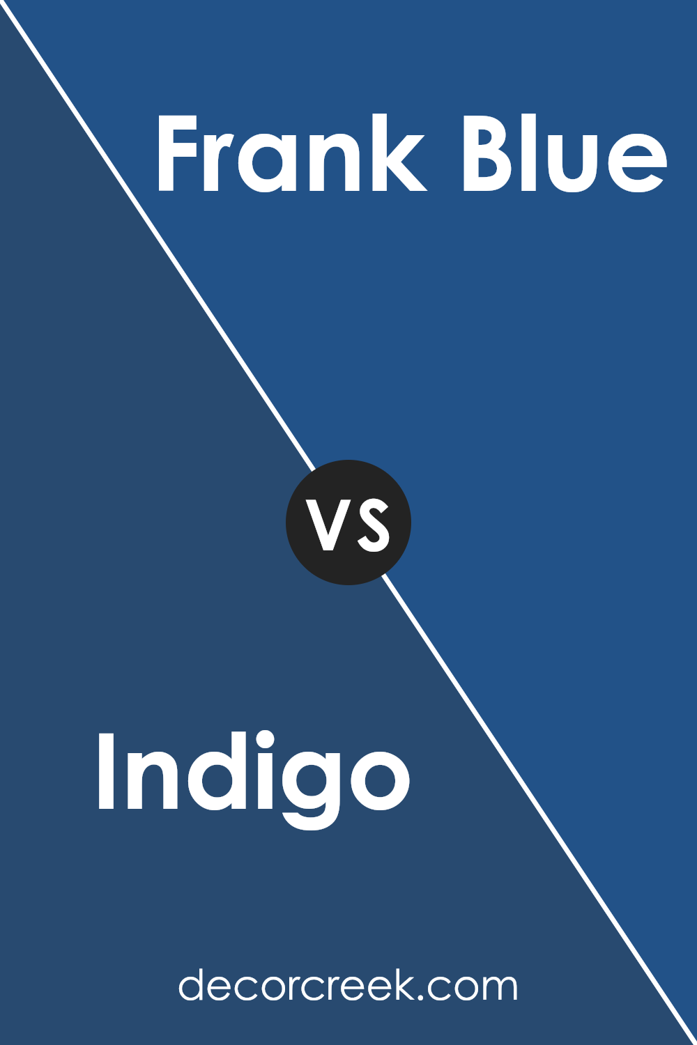
Indigo SW 6531 by Sherwin Williams vs Frank Blue SW 6967 by Sherwin Williams
Indigo SW 6531 by Sherwin Williams is a deep, rich shade of blue with a hint of purple, which gives it a classic and elegant feel. It’s often seen as a color that conveys a sense of calm and depth, making it a popular choice for creating a cozy atmosphere in a room.
On the other hand, Frank Blue SW 6967 is a brighter, more vibrant blue that stands out with its lively and refreshing vibe. It brings energy and brightness to spaces, making it ideal for areas where you want to add a cheerful and uplifting mood. While Indigo is more muted and sophisticated, Frank Blue is bold and spirited.
This makes Indigo suitable for more traditional settings, whereas Frank Blue can serve as a fun accent in modern or casual spaces. Both colors can complement each other, offering a balance of depth and liveliness.
You can see recommended paint color below:
- SW 6967 Frank Blue
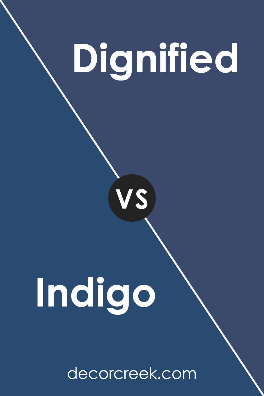
Indigo SW 6531 by Sherwin Williams vs Dignified SW 6538 by Sherwin Williams
Indigo SW 6531 and Dignified SW 6538 by Sherwin Williams are both rich blue shades that bring distinct personalities to a space. Indigo SW 6531 is a deep, dark blue with some purple undertones, giving it a more vibrant and bold appearance. It feels rich and adds depth to a room, making it a strong choice for creating a modern or dramatic look.
On the other hand, Dignified SW 6538 is a slightly softer blue with more muted undertones. It feels more subdued and calming compared to the brighter Indigo. This makes Dignified a fantastic option for spaces where you want a touch of color without it being too overpowering.
While both colors can work well in various settings, Indigo is ideal for accent walls or bold statements, while Dignified suits rooms where a gentle, classic feel is desired. Each color has its strengths, depending on the mood you want to set.
You can see recommended paint color below:
- SW 6538 Dignified
Indigo SW 6531 by Sherwin Williams vs Morning Glory SW 6971 by Sherwin Williams
Indigo SW 6531 by Sherwin Williams is a deep, rich blue with a slight purple undertone. It’s a strong color that feels both bold and calming, suitable for creating a cozy and inviting space. On the other hand, Morning Glory SW 6971 is a bright, vibrant blue with a more energetic feel. It has a cheerful and fresh look, perfect for spaces where you want to add a touch of brightness and liveliness.
While Indigo can make a room feel more intimate due to its darker hue, Morning Glory brings an airy, open vibe because of its lightness. Using Indigo might work well in areas where you want a touch of drama and coziness, like a bedroom or reading nook.
Morning Glory is suitable for spaces that thrive with energy and light, such as a kitchen or a creative workspace. Both colors offer different moods and can be chosen based on the atmosphere you want to create.
You can see recommended paint color below:
- SW 6971 Morning Glory
Indigo SW 6531 by Sherwin Williams vs Honorable Blue SW 6811 by Sherwin Williams
Indigo SW 6531 by Sherwin Williams is a deep, rich blue with a hint of purple, while Honorable Blue SW 6811 is a lighter and more vibrant blue. Indigo evokes a sense of depth and can add warmth and coziness to a space. It works well in rooms where you want to create an intimate atmosphere.
On the other hand, Honorable Blue is brighter and can make a room feel more open and energetic. It is perfect for spaces where you want to introduce a refreshing and lively ambiance.
When paired together, these colors can complement each other nicely. Indigo adds a touch of drama, while Honorable Blue lightens the mood, creating a balanced and harmonious look. Depending on the effect you want to achieve, one color might be more suitable than the other. Both colors are versatile and can be used in a variety of design styles to create the desired effect for your space.
You can see recommended paint color below:
- SW 6811 Honorable Blue
Indigo SW 6531 by Sherwin Williams vs Blueblood SW 6966 by Sherwin Williams
Indigo SW 6531 and Blueblood SW 6966 by Sherwin Williams are both deep, rich colors with distinct characteristics. Indigo is a dark, nuanced shade that blends blue and violet, creating a color that feels both bold and soothing.
It works well in spaces where you want a calming, elegant atmosphere. Blueblood, on the other hand, is an intense and vibrant blue with a hint of green. Its brightness makes it more energetic and eye-catching compared to Indigo. While Indigo fits well in traditional and formal settings, Blueblood is perfect for adding a pop of color and making a statement.
Both colors can create stunning visual effects, but Indigo tends to be more reserved and classic, whereas Blueblood is more daring and modern. Choosing between them depends on whether you prefer a more understated look or a bolder aesthetic in your space.
You can see recommended paint color below:
- SW 6966 Blueblood
Indigo SW 6531 by Sherwin Williams vs Dignity Blue SW 6804 by Sherwin Williams
Indigo SW 6531 and Dignity Blue SW 6804 are two rich colors, each bringing its unique character to a room. Indigo is a deep, moody color that often feels calming and adds depth to any space. It’s a versatile color that manages to be both bold and soothing, making it a great choice for accent walls or cozy rooms where a deep backdrop is desired.
On the other hand, Dignity Blue is a brighter shade with a vibrant, energetic feel. It’s more lively compared to Indigo and can make spaces feel more open and cheerful. This color works well in areas where you want to create a sense of energy or a bright focal point.
While Indigo is more understated and brings a touch of maturity, Dignity Blue adds a fun, spirited touch. Choosing between them will depend on the atmosphere you want to create in your space—whether it’s the calm quiet of Indigo or the lively spirit of Dignity Blue.
You can see recommended paint color below:
- SW 6804 Dignity Blue
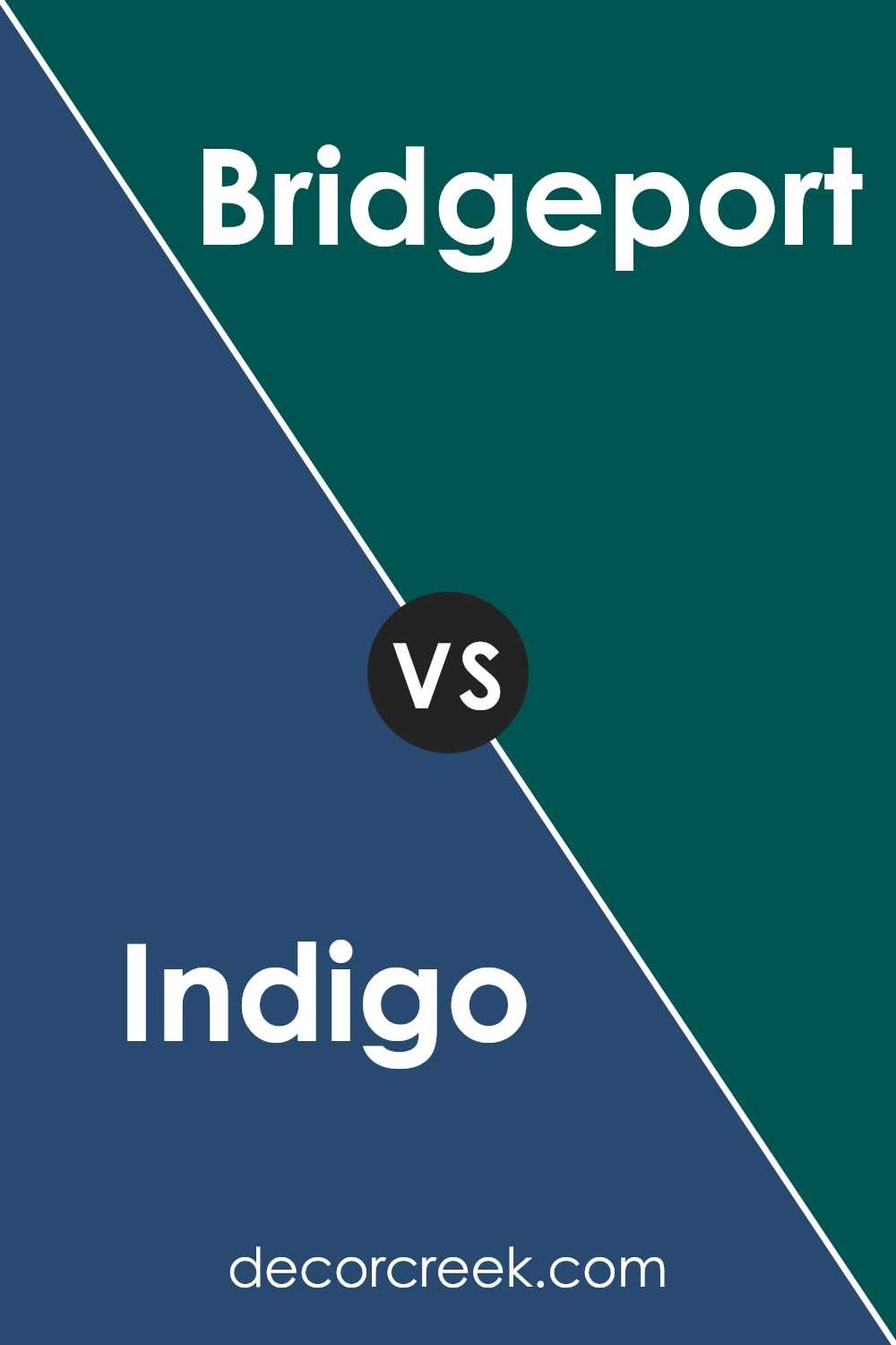
Indigo SW 6531 by Sherwin Williams vs Bridgeport SW 2940 by Sherwin Williams
Indigo SW 6531 by Sherwin Williams is a deep, rich blue with a slightly purplish undertone. It’s a bold and striking color that can add depth and drama to a room. This color can create a cozy and intimate atmosphere, making it ideal for spaces like bedrooms or living rooms where you want a soothing yet intense environment.
On the other hand, Bridgeport SW 2940 by Sherwin Williams is quite different. It is a lighter, more muted shade of blue. With a softer appearance, Bridgeport is versatile and can make a room feel airy and open. It’s a great choice for spaces where you want a more relaxed and calm setting, such as a bathroom or kitchen.
Both colors are beautiful choices from Sherwin Williams, but they cater to different preferences. Indigo is more intense and dramatic, while Bridgeport offers a gentler, more calming vibe.
You can see recommended paint color below:
- SW 2940 Bridgeport
Indigo SW 6531 by Sherwin Williams vs Dress Blues SW 9176 by Sherwin Williams
Indigo SW 6531 and Dress Blues SW 9176 are two rich colors from Sherwin Williams, but they each offer distinct vibes. Indigo SW 6531 is a deep blue with a hint of purple, giving it a striking but slightly warm appearance. It’s a bold choice for spaces where you want a bit of drama without being overwhelming.
On the other hand, Dress Blues SW 9176 is a navy blue that feels steady and classic. It leans more towards a traditional blue, making it perfect for creating a calm and timeless environment.
While Indigo might be viewed as a bit adventurous with its subtle purple undertones, Dress Blues stays true to a classic navy, offering reliable versatility. Both colors are excellent choices for adding depth, but the slight purple in Indigo can make it feel more modern, whereas Dress Blues brings a familiar coziness to a room.
You can see recommended paint color below:
- SW 9176 Dress Blues

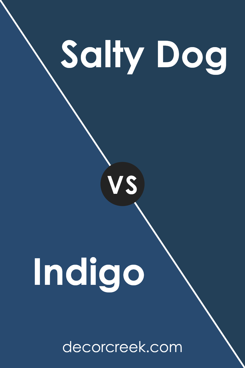
Indigo SW 6531 by Sherwin Williams vs Salty Dog SW 9177 by Sherwin Williams
Indigo SW 6531 and Salty Dog SW 9177 are two distinct colors from Sherwin Williams that offer unique vibes for any space. Indigo SW 6531 is a deep, rich blue with a hint of purple that gives it a moody and mysterious feel.
It’s perfect for adding depth and drama to a room. In contrast, Salty Dog SW 9177 is a bold navy blue that is more straightforward and classic. It has a strong, nautical vibe, making it great for creating a crisp, clean look.
While Indigo has a more subdued, mystical quality, Salty Dog exudes confidence and strength. Indigo works well in spaces where you want to create a cozy, intimate atmosphere, whereas Salty Dog is ideal for making a strong statement, like in a feature wall or entryway. Both colors are dynamic and versatile, offering different ways to enhance your home’s aesthetic.
You can see recommended paint color below:
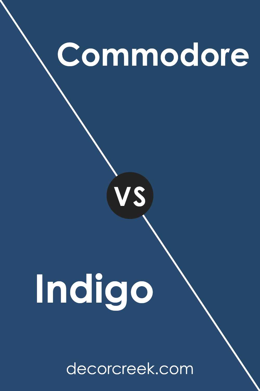
Indigo SW 6531 by Sherwin Williams vs Commodore SW 6524 by Sherwin Williams
Indigo SW 6531 by Sherwin Williams is a deep, bold blue with a hint of purple, giving it a rich and classic look. It’s perfect for making a statement in a room, adding a sense of depth and intensity. On the other hand, Commodore SW 6524 is also a deep blue but leans more towards a true navy. It’s slightly lighter and has a more straightforward blue tone compared to Indigo.
While both colors bring a sense of richness, Indigo feels a bit warmer due to its purple undertone, whereas Commodore provides a cooler and more traditional blue appearance.
Indigo might be used to add a touch of drama or to create an intimate space, while Commodore offers a more timeless and versatile option, easily fitting into various decor styles. Both are strong colors that can anchor a room, but they offer slightly different moods with their subtle variations.
You can see recommended paint color below:
- SW 6524 Commodore
After learning about SW 6531 Indigo from Sherwin Williams, I find it to be a really cool and interesting shade of blue. It’s not like any regular blue, but has a bit of purple mixed in, making it unique and fun. Imagine the color of jeans, the night sky, or blueberries – that’s what Indigo reminds me of.
This color can make a room feel warm and inviting or cool and relaxed, depending on how you use it. It’s like magic! I think it would work well in a bedroom, where it can be calming, or even in a living room for a cozy vibe.
Kids and adults alike might like it because it’s so rich and deep. Using it with white or light-colored furniture can make the indigo stand out even more, like a piece of art.
I also like how it goes well with both modern and old-fashioned styles, making it pretty flexible to use. Whether you want to paint a wall, a piece of furniture, or just add some small details here and there, SW 6531 Indigo by Sherwin Williams seems really handy.
In the end, Indigo is a fantastic color for adding a bit of flair and personality to any room. It’s simple yet striking and can make everyday spaces a bit more special!

Ever wished paint sampling was as easy as sticking a sticker? Guess what? Now it is! Discover Samplize's unique Peel & Stick samples.
Get paint samples

