If you’re considering a fresh look for your walls that combines modern vibes with timeless elegance, SW 7565 Oyster Bar by Sherwin Williams may just be the perfect choice. As I researched potential colors for a living room makeover, I was drawn to Oyster Bar for its unique balance between warm and cool tones.
This delicate, sophisticated shade offers a subtle hint of gray, elevating the space without overwhelming it. Using this color can rejuvenate any room, offering a soft backdrop that complements both contemporary and traditional decor.
Whether you plan to update your bedroom, bathroom, or living room, Oyster Bar brings a gentle warmth that enhances other design elements in the room. It pairs beautifully with a wide range of colors—from bold, dark hues to soft pastels—making it an incredibly versatile choice for your next decorating project.
Let’s see how this chic and understated color can transform your home’s ambiance while keeping things simple and elegant.

What Color Is Oyster Bar SW 7565 by Sherwin Williams?
Oyster Bar is a nuanced beige shade that sways between gray and taupe, making it a versatile choice for various interior styles. This color manages to offer a cozy backdrop while maintaining a clean, contemporary feel, which makes it ideal for styles like modern farmhouse, Scandinavian, minimalism, and even traditional settings. Its muted warmth ensures that spaces feel welcoming but not overly cozy, which is perfect for achieving a balanced decor.
Materials that pair well with Oyster Bar include natural wood, which can draw out the warmth of the beige tones, and white trim or accents, which can contrast crisply with its deeper taupe elements. Textures like linen, wool, and cotton also go naturally with this color, as they emphasize comfort and softness.
For a more modern touch, matte black or brushed nickel finishes can create a striking contrast, perfect for light fixtures, hardware, and accessories.
Oyster Bar works beautifully in spaces that get a lot of natural light, highlighting its complex undertones throughout the day.
It’s a great choice for living rooms, bedrooms, and even kitchens, where its soothing presence can create a relaxed atmosphere. Whether used as a main color scheme or as an accent wall, Oyster Bar is adaptable and easy to blend with various decorative elements.
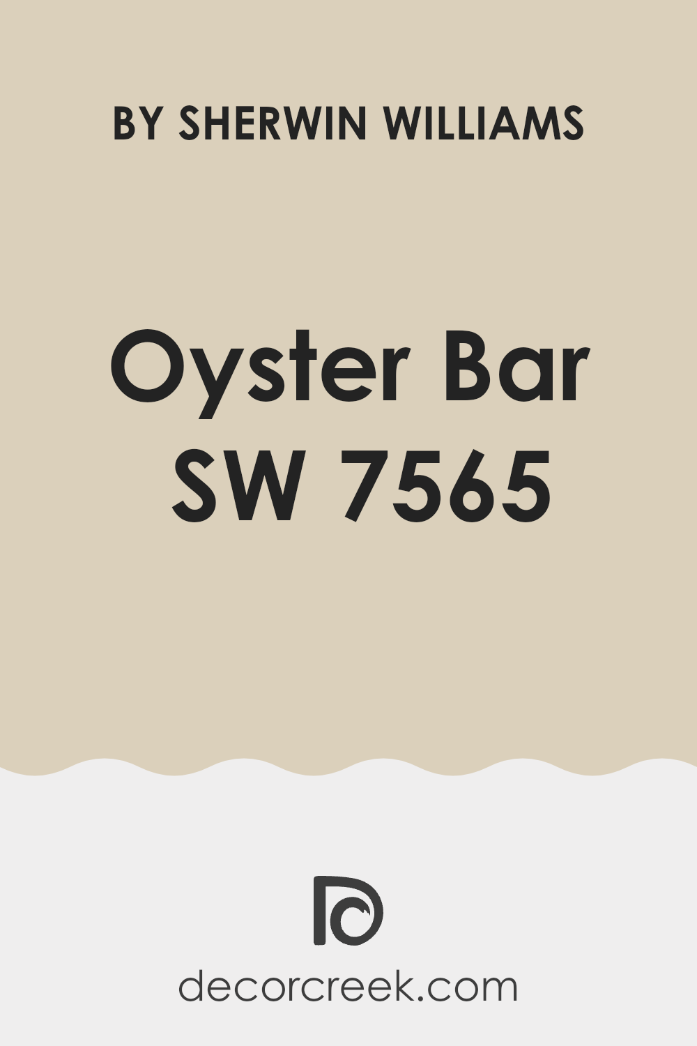
Is Oyster Bar SW 7565 by Sherwin Williams Warm or Cool color?
Oyster Bar SW 7565 by Sherwin Williams is a neutral paint color that can blend well with a variety of decorating schemes in homes. This color, with its warm gray tones, offers a subtle backdrop that can make spaces feel cozy and inviting.
Its softness allows other elements in the room, like furniture and artwork, to stand out, making it an excellent choice for living rooms, kitchens, and bedrooms. The versatility of Oyster Bar is a key benefit—it can be paired with both bold and muted colors, depending on the desired effect.
Whether homeowners want a calm, neutral environment or a dynamic, contrasting look, Oyster Bar provides a steady foundation that can support various styles and preferences. Additionally, in rooms with less natural light, it can help keep the space looking bright and open, proving its usability in a wide range of home settings.
This adaptability makes it a popular choice for those aiming to create a welcoming and balanced home atmosphere.
Undertones of Oyster Bar SW 7565 by Sherwin Williams
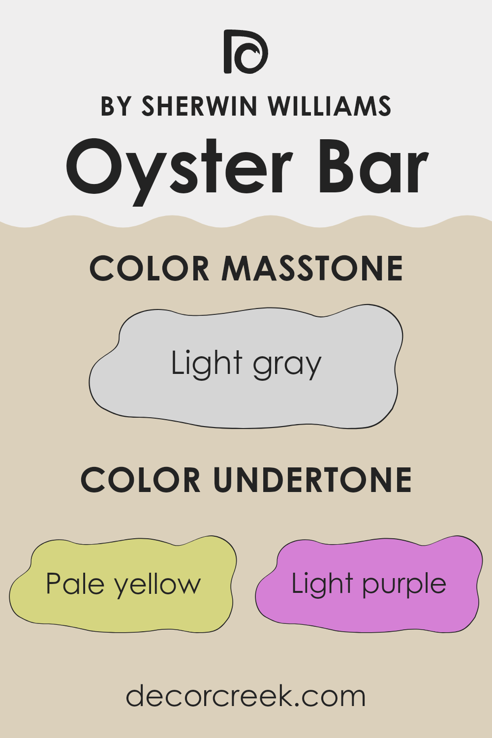
Oyster Bar, a versatile paint color, contains subtle undertones that enrich its overall appearance. Undertones, the underlying hints of color in paint, can significantly alter its perceived shade depending on lighting and surrounding colors. For instance, Oyster Bar includes undertones like pale yellow, which can make spaces feel warmer, especially in natural light. Light purple adds a soft and subtle depth, enhancing neutrality in shadowed areas.
Light blue undertones contribute a cool freshness, balancing the warmth of yellow. This makes Oyster Bar suitable for rooms with varying amounts of sunlight, maintaining a steady, neutral look throughout the day. Pale pink gives a cozy touch that softens walls and pairs beautifully with soft furnishings.
Mint and lilac undertones bring liveliness and lightness, creating an airy feel; this is especially appealing in smaller or more confined spaces, making them appear larger.
Grey undertones are crucial to grounding the color, ensuring it doesn’t lean too vibrantly and remains neutral and flexible to various decor styles. When used on interior walls, Oyster Bar provides a calm, balanced backdrop that adapts well with many accents and contributes to a harmonious environment.
Thus, the undertones of this color work together to provide a balanced, adaptable hue that can enhance the aesthetic of any room.
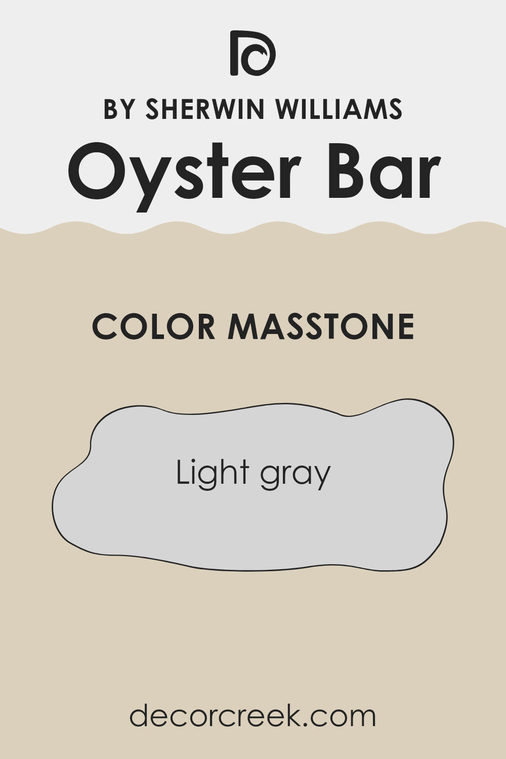
What is the Masstone of the Oyster Bar SW 7565 by Sherwin Williams?
Oyster BarSW 7565 by Sherwin Williams, marked by its masstone of light gray (#D5D5D5), offers a clean and fresh appearance. This shade of gray is really soft, making it versatile for use in many areas of a home.
It’s light enough to make smaller spaces feel larger and brighter, which is perfect for rooms that may not get a lot of natural sunlight. Yet, it’s also solid enough to serve as a gentle backdrop in busier areas like living rooms or kitchens, where it can help to set a calm tone without demanding too much attention.
The neutrality of this light gray means it pairs well with a wide range of colors, from bright and bold hues to more muted tones, which makes it an all-around champion for decorating. Whether you’re looking to create a minimalist look or support some vibrant decor pieces, this color can handle it all.
Plus, it’s practical for hiding minor wall imperfections and maintaining a clean look over time.
How Does Lighting Affect Oyster Bar SW 7565 by Sherwin Williams?
Lighting plays a crucial role in how we perceive colors. The type of light and its intensity can make a color look completely different. This is because light affects the way color is reflected and absorbed, which in turn influences our visual perception of that color.
For example, the color Oyster Bar by Sherwin Williams can appear differently under various lighting conditions. In natural light, this color tends to look softer and more neutral, making it a versatile choice for many spaces. It can bring a warm and inviting feel to a room, especially when used on walls where the natural light hits directly.
In artificial light, such as LED or fluorescent lights, Oyster Bar might shift slightly depending on the type of bulb used. LED lights, which often have a cooler tone, could make the color appear a bit more grayish, whereas warmer bulbs like incandescent might make it look cozier and more beige.
As for different room orientations:
– North-faced rooms: These rooms get less direct sunlight, which can make colors appear cooler and somewhat muted. Oyster Bar in such a room might look more subdued and less warm.
– South-faced rooms: These rooms benefit from ample sunlight most of the day, which can make Oyster Bar look warmer and more vibrant. It could enhance the space by adding a subtle warmth to it.
– East-faced rooms: Here, the morning light can make Oyster Bar appear brighter and fresher in the morning but could go back to a more neutral tone as the day progresses.
– West-faced rooms: With evening light, this color might appear warmer and richer. The soft sunset hues enhance the warmth of Oyster Bar, making the space cozy for evenings.
Choosing the right lighting for a color like Oyster Bar is important because it can significantly impact the ambiance of a room. Whether natural or artificial, light sources help determine the mood and feel of the space where this color is used.
What is the LRV of Oyster Bar SW 7565 by Sherwin Williams?
LRV stands for Light Reflectance Value, which is a measure used to indicate the amount of light a paint color reflects or absorbs when applied to a surface. It is represented by a scale where lower values mean a color absorbs more light, making it appear darker, and higher values indicate a color reflects more light, making it appear lighter.
This measurement is crucial when choosing paint colors because it helps you understand how bright or dark a room will feel once the color is applied on its walls. Colors with higher LRVs are particularly useful in spaces that don’t receive a lot of natural light, as they help to brighten up the area.
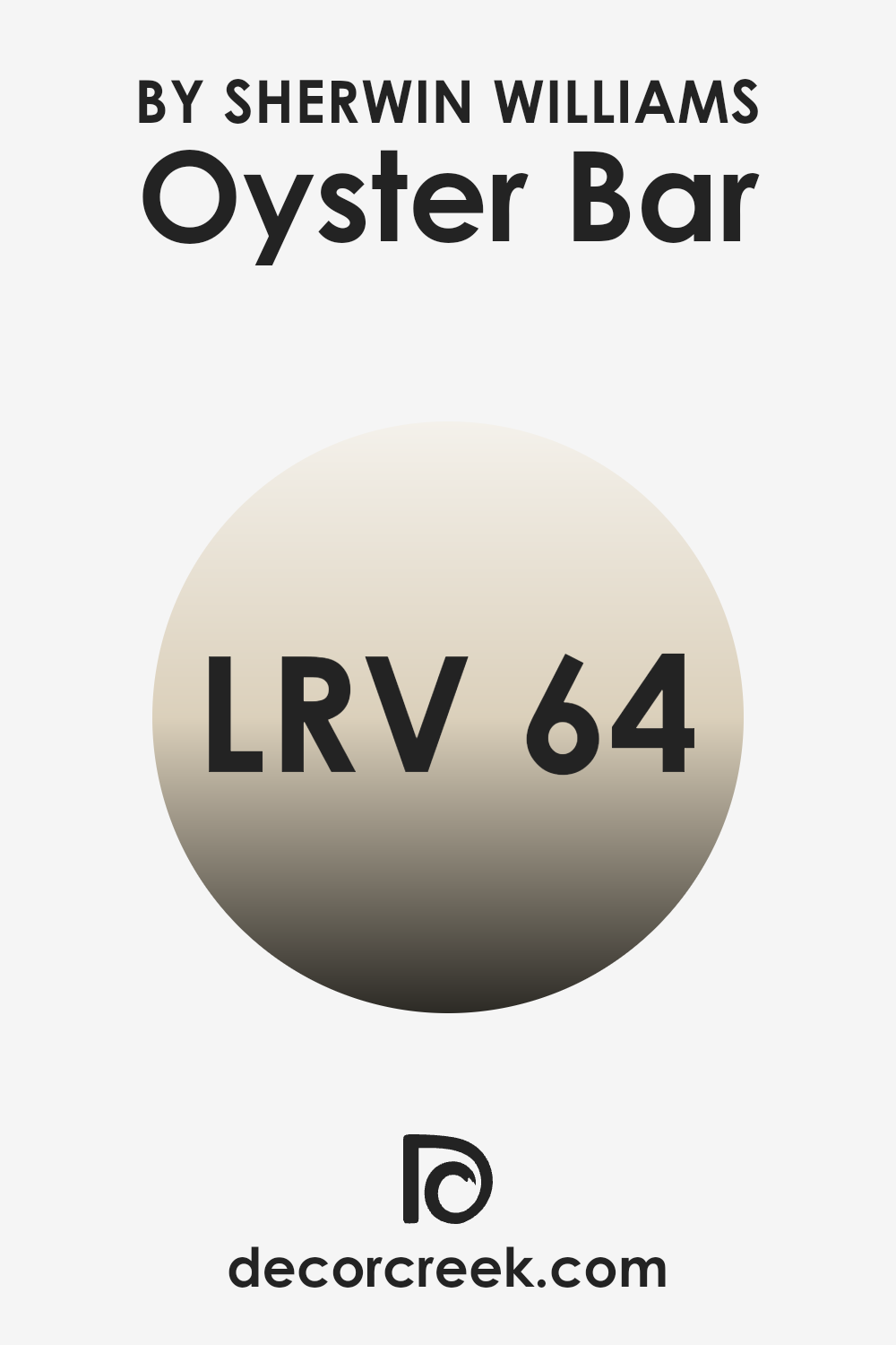
For Oyster Bar, with an LRV of approximately 64, the color is on the lighter side, meaning it reflects a good amount of light. This makes it a great choice for darker rooms, as it can help make the space feel larger and more open.
Additionally, the light-reflecting properties of this color ensure that it maintains a consistent appearance under different lighting conditions, reducing the risk of the color looking drastically different from day to night.
Therefore, using this color in your decorating scheme can add a bright and airy feel, enhancing the overall ambiance without overpowering the space with too much brightness.
Coordinating Colors of Oyster Bar SW 7565 by Sherwin Williams
Coordinating colors are those that complement each other and work well together to create a harmonious look. They are usually selected from the same color family or have similar undertones that make them naturally compatible. For instance, when decorating with a base color like Oyster Bar by Sherwin Williams, you might choose colors that enhance its warm and neutral tone without overwhelming it. A well-picked set of coordinating colors can balance out the ambience of a room, making it feel more complete and pleasant.
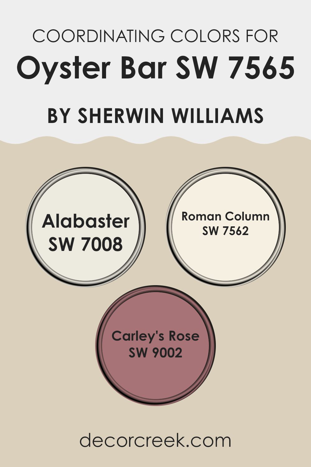
Oyster Bar pairs well with a range of coordinating colors, such as Alabaster, Roman Column, and Carley’s Rose. Alabaster is a soft, creamy white that offers a clean and calm backdrop, making it perfect for trim or ceiling applications. It has the power to brighten spaces while adding a subtle warmth.
Roman Column, another great coordinating color, is a slightly warmer shade with a hint of beige, providing a soft, neutral canvas that complements richer, darker colors or serves beautifully as a main wall color. Lastly, Carley’s Rose is a gentle, dusty pink that adds a touch of gentle color, ideal for creating focal points or adding personality through accent walls or decor items.
Each of these colors supports a cohesive look when paired with Oyster Bar, offering a variety of decorating possibilities that feel natural and appealing.
You can see recommended paint colors below:
- SW 7008 Alabaster (CHECK A SAMPLE)
- SW 7562 Roman Column (CHECK A SAMPLE)
- SW 9002 Carley’s Rose (CHECK A SAMPLE)
What are the Trim colors of Oyster Bar SW 7565 by Sherwin Williams?
Trim colors are specific shades used to accentuate or highlight architectural features and details of a room or building, such as door frames, window frames, skirtings, and moldings. When used effectively, trim colors can enhance the aesthetic appeal of a space and create a cohesive look.
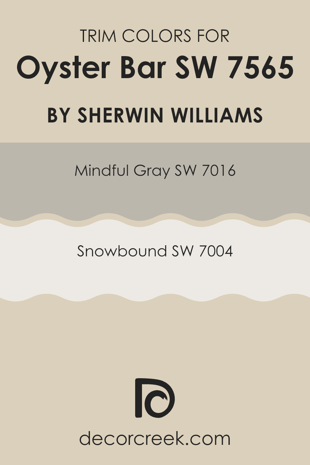
For a color like Oyster Bar by Sherwin Williams, choosing the right trim color is crucial to complement its unique tone. Opting for either Mindful Gray or Snowbound as trim colors provides a pleasing contrast or a subtle enhancement that supports the main color, enhancing the overall ambiance of the space.
Mindful Gray is a warm, gentle gray that balances well with the softness of Oyster Bar, offering a neutral but noticeable border that can make the walls appear more pronounced. On the other hand, Snowbound is a clean, bright white that offers a crisp contrast to the deeper tones of Oyster Bar, making the space feel open and airy. Both colors provide versatility and balance, making them excellent choices for trim, helping to define the space without overpowering the primary wall color.
You can see recommended paint colors below:
Colors Similar to Oyster Bar SW 7565 by Sherwin Williams
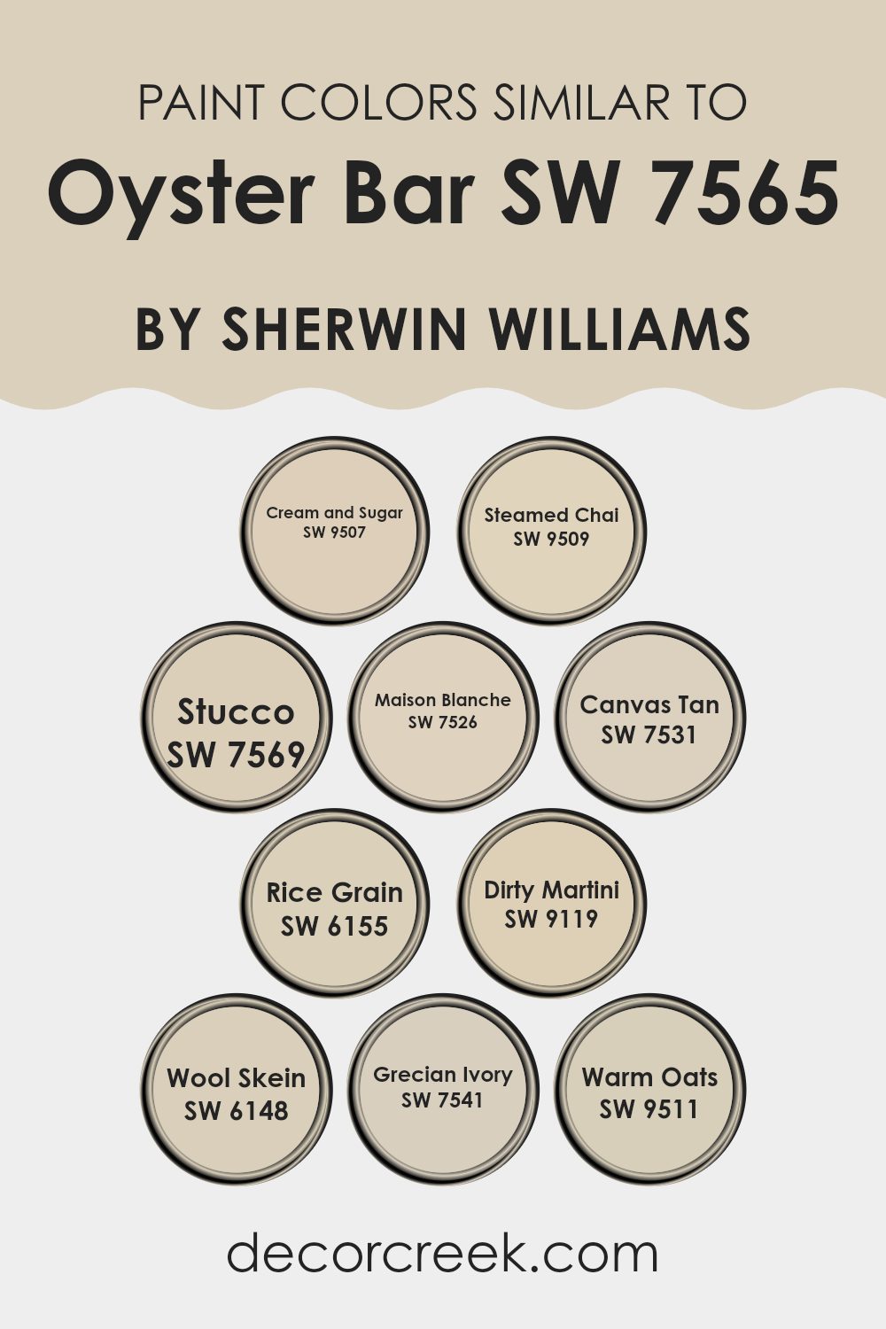
Similar colors are essential in design because they create a harmonious and cohesive look, whether in interior spaces or in various art forms. Colors like Cream and Sugar SW 9507 or Steamed Chai SW 9509, which are gentle and soothing variations of neutrals, offer a seamless visual transition when paired with shades like Oyster Bar.
Stucco SW 7569 and Maison Blanche SW 7526 contribute a slightly earthy tone, complementary yet distinct, enriching the palette subtly without overwhelming the senses. Canvas Tan SW 7531 and Rice Grain SW 6155 lend themselves well to settings that require a touch of warmth to forge an inviting space, which works perfectly alongside similar shades.
Moving on to colors like Dirty Martini SW 9119 and Wool Skein SW 6148, there’s a slightly muted, yet distinctly noticeable, contrast that can enhance the depth and interest in a room. Grecian Ivory SW 7541 provides a soft, almost imperceptible lift to a neutral scheme, ideal for brightening without creating a stark contrast.
Warm Oats SW 9511, on the other hand, brings in a coziness reminiscent of a welcoming, calm environment.
Using these shades in conjunction can beautifully tie together different elements and textures within a room, achieving an overall aesthetic that feels seamless and thoughtfully curated.
You can see recommended paint colors below:
- SW 9507 Cream and Sugar (CHECK A SAMPLE)
- SW 9509 Steamed Chai (CHECK A SAMPLE)
- SW 7569 Stucco (CHECK A SAMPLE)
- SW 7526 Maison Blanche (CHECK A SAMPLE)
- SW 7531 Canvas Tan (CHECK A SAMPLE)
- SW 6155 Rice Grain (CHECK A SAMPLE)
- SW 9119 Dirty Martini (CHECK A SAMPLE)
- SW 6148 Wool Skein (CHECK A SAMPLE)
- SW 7541 Grecian Ivory (CHECK A SAMPLE)
- SW 9511 Warm Oats (CHECK A SAMPLE)
Colors that Go With Oyster Bar SW 7565 by Sherwin Williams
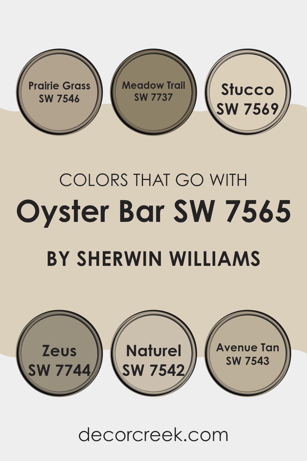
Choosing complementary colors for Oyster Bar SW 7565 by Sherwin Williams is crucial for creating a coherent and visually appealing color scheme in any space. Oyster Bar, a warm neutral, pairs beautifully with certain colors that enhance its natural versatility without overwhelming it. For example, colors like Prairie Grass and Meadow Trail add subtle hints of nature, bringing a soft and organic feel to the room.
Prairie Grass is a gentle green that suggests the freshness of early spring, while Meadow Trail is a deeper, richer shade that conjures up images of a forest path. These greens are especially effective in spaces that aim for a calm and earthy ambiance.
Stucco and Zeus offer a different approach by leaning into the neutrals. Stucco is a light, creamy hue that provides a subtle contrast to Oyster Bar, brightening spaces without stark differences. Zeus, on the other hand, is a strong, dark gray that can create a striking effect when used for accents, grounding the lighter shades in the palette.
Completing this selection, Naturel and Avenue Tan are wonderful for achieving a balanced, warm look. Naturel is a soft, muted beige that blends smoothly with Oyster Bar, and Avenue Tan is a slightly richer tan that works well to provide depth and warmth, ideal for creating inviting interiors. These combinations ensure a cohesive look that enhances the ambiance of any room.
You can see recommended paint colors below:
- SW 7546 Prairie Grass (CHECK A SAMPLE)
- SW 7737 Meadow Trail (CHECK A SAMPLE)
- SW 7569 Stucco (CHECK A SAMPLE)
- SW 7744 Zeus (CHECK A SAMPLE)
- SW 7542 Naturel (CHECK A SAMPLE)
- SW 7543 Avenue Tan (CHECK A SAMPLE)
How to Use Oyster Bar SW 7565 by Sherwin Williams In Your Home?
Oyster Bar SW 7565 by Sherwin Williams is a neutral paint color that offers a graceful balance, making it perfect for any room in your house. Its soft, subtle hue works well with a variety of decorating styles, providing a calming backdrop that complements both bold and gentle colors.
If you’re thinking about refreshing your living room, this color can make it feel warm and welcoming. In the bedroom, Oyster Bar creates a cozy environment that’s ideal for relaxing. It’s also great for kitchens and bathrooms where you want a clean, airy look.
The beauty of this shade lies in its ability to blend seamlessly with other elements in any space, whether you pair it with modern metal finishes or rustic wood textures in furniture and flooring. Using this color can help make your home look beautifully coordinated and feel more inviting.
Oyster Bar SW 7565 by Sherwin Williams vs Warm Oats SW 9511 by Sherwin Williams
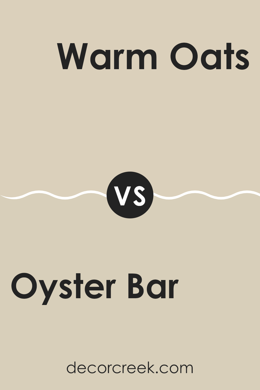
Oyster Bar and Warm Oats are two neutral shades from Sherwin Williams, each offering a unique vibe for room decoration. Oyster Bar is a light gray with a soft touch that gives spaces a clean and airy feel. It’s perfect for those who want a minimalist look without going too stark or cold.
On the other hand, Warm Oats has a warmer tone, leaning towards a beige that envelops the room in a cozy, welcoming atmosphere. This color is ideal for creating a comfy, inviting space in areas like living rooms or bedrooms.
While both shades are subtle and work well with various decor styles, Oyster Bar leans cooler, making it better for modern, sleek aesthetics. Warm Oats, with its hint of warmth, suits a more traditional or rustic style. Choosing between them depends on the mood and warmth you want to bring to your space.
You can see recommended paint color below:
Oyster Bar SW 7565 by Sherwin Williams vs Canvas Tan SW 7531 by Sherwin Williams
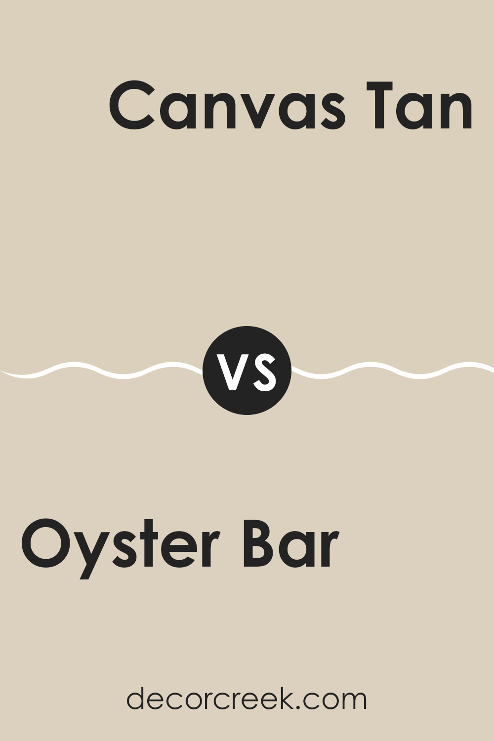
Oyster Bar and Canvas Tan are two neutral paints that bring a warm and inviting feel to any space. Oyster Bar is a light, creamy beige with a subtle hint of gray. It’s perfect for creating a cozy atmosphere, making rooms feel more welcoming without being too bright or overpowering.
Canvas Tan, on the other hand, is a true tan color. It’s slightly darker than Oyster Bar and has more yellow undertones, which adds a warm, sunny vibe to the room.
Both colors are excellent for creating a relaxed environment, but Oyster Bar might be better for those who prefer a space that feels soft and light, while Canvas Tan suits those looking for a bit more warmth and earthiness in their décor. Their subtle differences can affect the mood and appearance of a room, depending on what feelings you want to evoke.
You can see recommended paint color below:
Oyster Bar SW 7565 by Sherwin Williams vs Stucco SW 7569 by Sherwin Williams
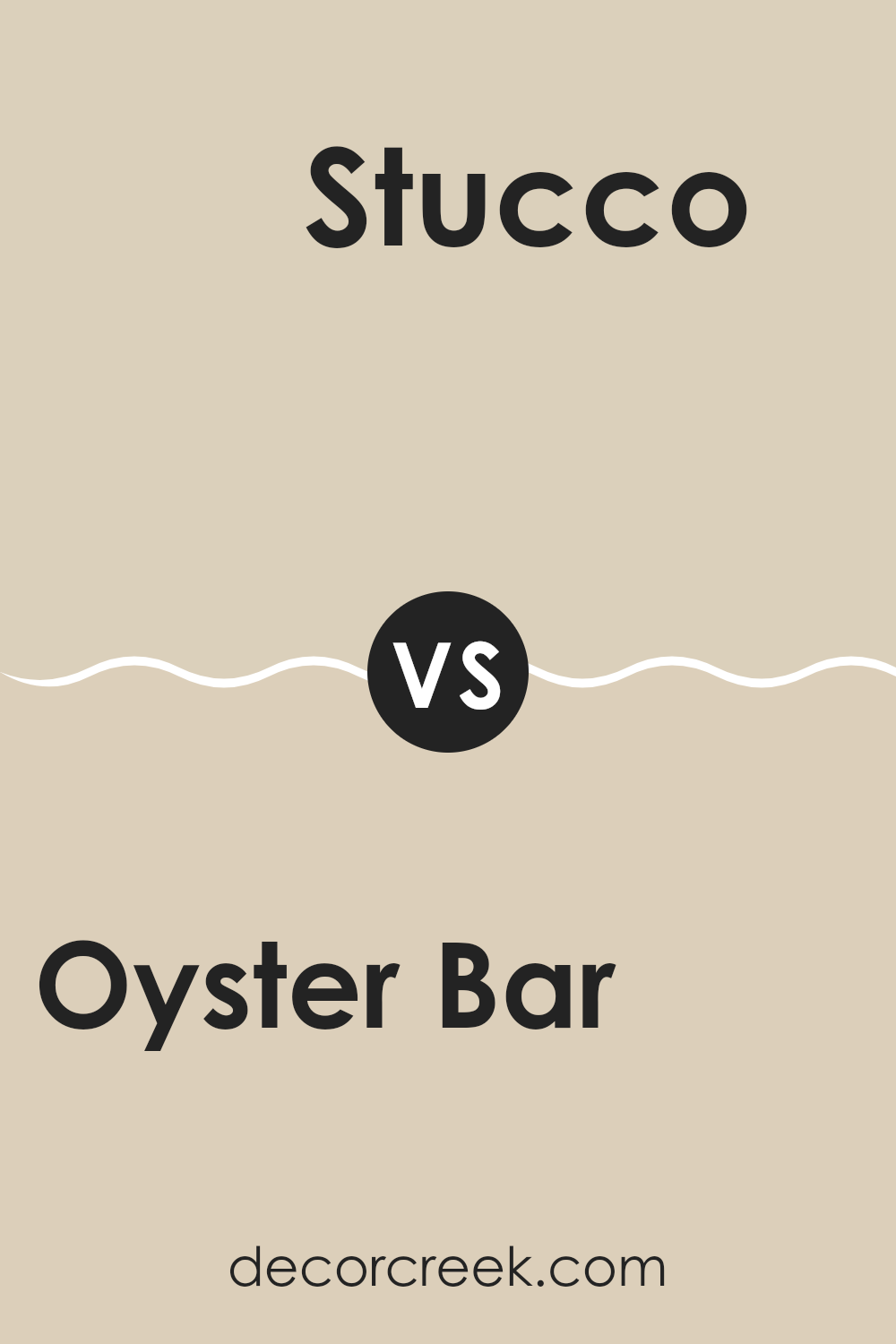
Oyster Bar and Stucco are two neutral paint colors from Sherwin Williams. Oyster Bar is a lighter, softer shade with a hint of beige and gray. It gives a room a subtle warmth and works well in spaces that need a gentle touch of color.
On the other hand, Stucco is a bit darker and leans more towards a true, warm gray. It adds a slightly more pronounced presence to a room and can make spaces feel cozier. Both colors are very versatile and can complement a range of styles and décor choices.
They also pair well together, allowing for a nice contrast that’s not too stark. Oyster Bar is more suited for brightening up a small or dim space, while Stucco can add depth and interest to larger areas.
You can see recommended paint color below:
- SW 7569 Stucco (CHECK A SAMPLE)
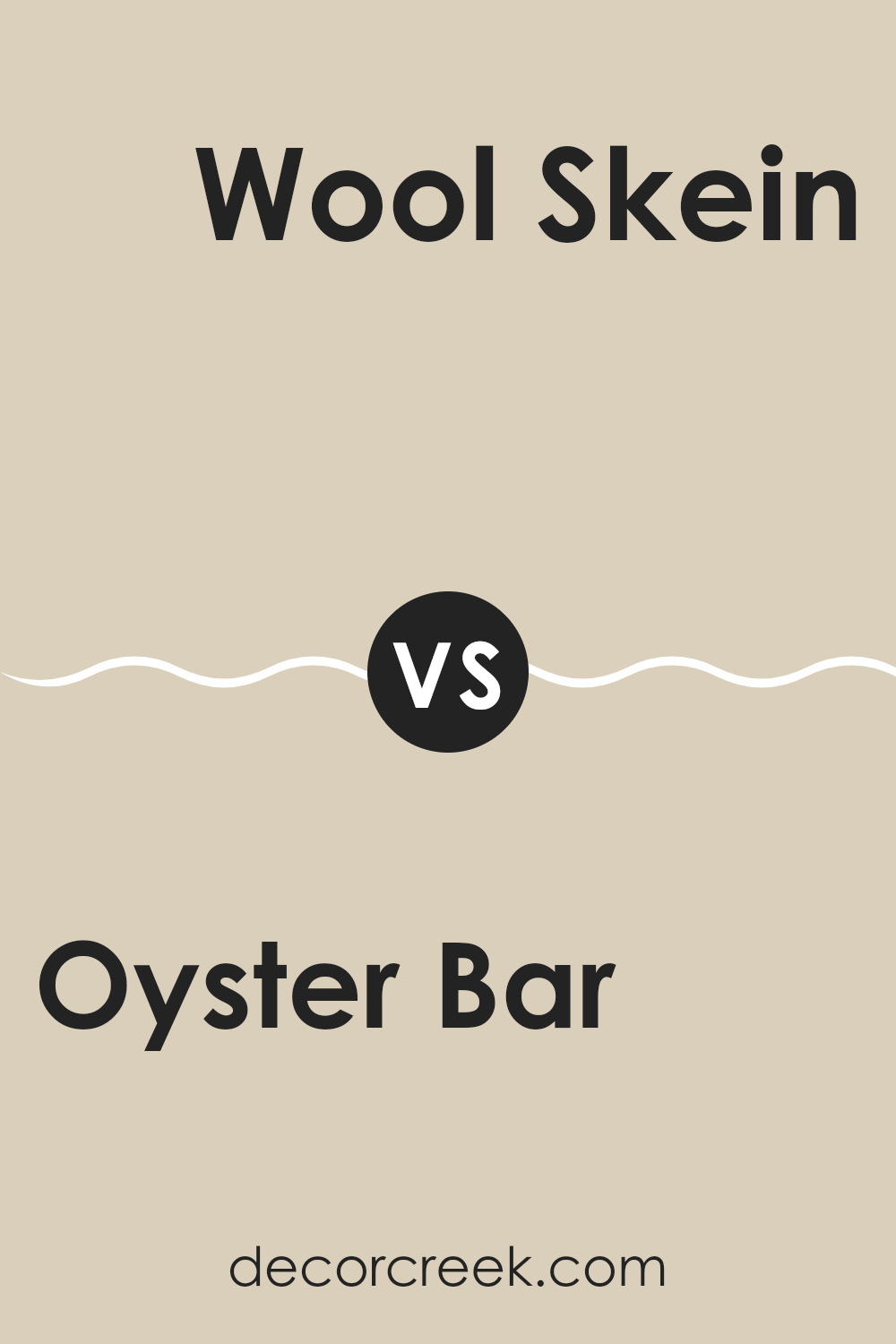
Oyster Bar SW 7565 by Sherwin Williams vs Rice Grain SW 6155 by Sherwin Williams
Oyster Bar and Rice Grain, both by Sherwin Williams, are subtle shades that can create a warm and inviting space. Oyster Bar is a soft, muted beige with a hint of gray, giving it a neutral backdrop that works well in almost any room. It is light enough to make small spaces appear larger, yet has enough depth to add character to the area.
Rice Grain, on the other hand, is slightly darker and warmer compared to Oyster Bar. It has a creamy undertone that brings a cozy feel to spaces. This color fits beautifully in areas where a touch of warmth is desired without overwhelming the room with darker colors.
Both paints are versatile and can blend well with various decors, but Rice Grain offers a hint more warmth, making it ideal for creating a homey, welcoming atmosphere. On the contrary, Oyster Bar is better if you prefer a cleaner, more subdued look.
You can see recommended paint color below:
- SW 6155 Rice Grain (CHECK A SAMPLE)
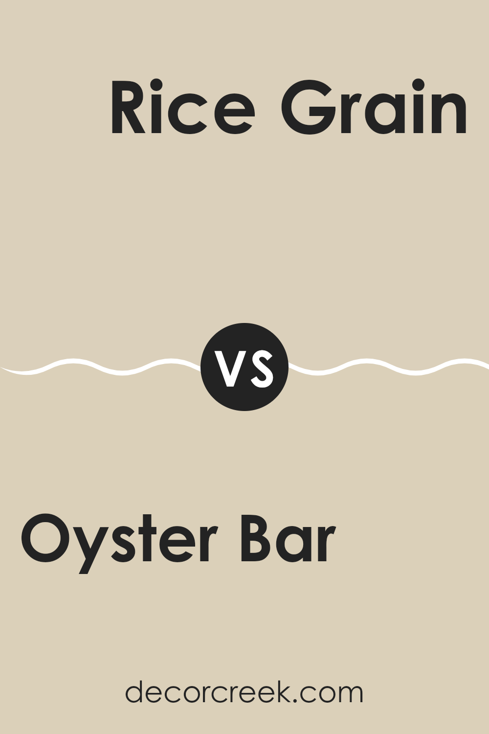
Oyster Bar SW 7565 by Sherwin Williams vs Grecian Ivory SW 7541 by Sherwin Williams
Oyster Bar and Grecian Ivory are two distinct shades from Sherwin Williams. Oyster Bar presents a soft, pale gray with subtle beige undertones, making it an ideal backdrop for both vibrant and muted decor themes.
This color tends to bring a gentle warmth to interiors without overpowering the space, offering a touch of modern simplicity. In contrast, Grecian Ivory leans towards a slightly warmer palette, characterized by its creamy, almost buttery hue. This color is excellent for creating a cozy, welcoming atmosphere in rooms where you want to relax and feel at ease.
Both shades are versatile and able to blend well with various furnishings and styles, but Grecian Ivory offers a warmer ambience, while Oyster Bar keeps things light and airy with a hint of coolness. Depending on the room’s lighting and the desired mood, one might prefer the subtle warmth of Oyster Bar or the more pronounced coziness of Grecian Ivory.
You can see recommended paint color below:
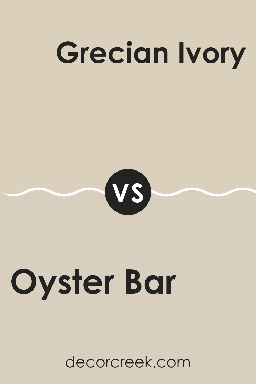
Oyster Bar SW 7565 by Sherwin Williams vs Steamed Chai SW 9509 by Sherwin Williams
Oyster Bar and Steamed Chai are both interior paint colors by Sherwin Williams, but they bring distinct tones to a space. Oyster Bar is a muted, soft beige with a warm undertone, making it a versatile choice for rooms where you seek a cozy and welcoming feel. Its warm base helps in creating a relaxed ambiance, ideal for living rooms and bedrooms where comfort is key.
On the other hand, Steamed Chai has a lighter, more neutral beige tone. This color is closer to an off-white, providing a brighter feel but still maintaining a warm presence. It’s particularly effective in smaller or darker spaces as it reflects more light, making the area appear larger and more open.
Both colors are neutral, so they pair well with various decor styles and other colors. However, the choice between them depends on the amount of warmth and brightness you want to bring into your space. Oyster Bar leans towards a cozier, more enveloping feel, while Steamed Chai creates a lighter, airier atmosphere.
You can see recommended paint color below:
Oyster Bar SW 7565 by Sherwin Williams vs Maison Blanche SW 7526 by Sherwin Williams
Oyster Bar and Maison Blanche are two neutral paint colors from Sherwin Williams. Both share a calm and muted vibe but differ in their undertones and depth.
Oyster Bar is a soft, earthy beige with a hint of gray. It’s a grounded color that’s light enough to make smaller spaces feel larger while still adding a touch of warmth. This color works well in rooms that aim for a cozy, inviting feel.
On the other hand, Maison Blanche is paler, leaning towards an off-white with subtle pink and beige undertones. It’s lighter than Oyster Bar, making it a great choice for creating a bright and airy atmosphere. Maison Blanche pairs beautifully with a wide range of colors and can refresh a space without feeling too stark.
In choosing between the two, consider the mood and size of your room. Oyster Bar’s warmer tones suit intimate, relaxed environments, while Maison Blanche is ideal for making a space feel open and light.
You can see recommended paint color below:

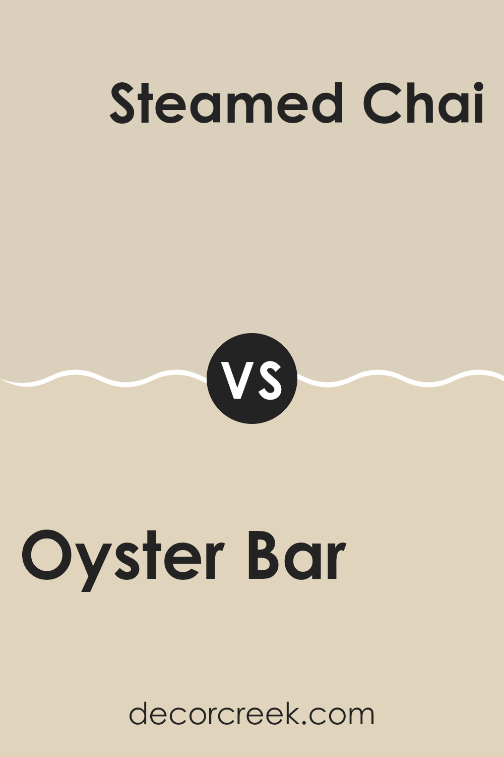
Oyster Bar SW 7565 by Sherwin Williams vs Wool Skein SW 6148 by Sherwin Williams
The main color, Oyster Bar, is a soft, subtle shade that blends neutral beige with a hint of gray. It’s a versatile color that works well in various spaces, creating a calm and welcoming atmosphere without demanding too much attention.
On the other hand, Wool Skein, the second color, is slightly lighter and leans more towards a sandy tone with a warm yellow undertone. This color also provides a comforting and cozy vibe to rooms but adds a touch of warmth that makes it ideal for spaces where you want to feel relaxed and at ease.
Both colors are neutral and easy to pair with other shades, but Oyster Bar offers a cooler, more muted backdrop compared to the warmer and slightly more inviting Wool Skein. These differences make each suited for different tastes and room settings, depending on the desired mood and ambiance.
You can see recommended paint color below:
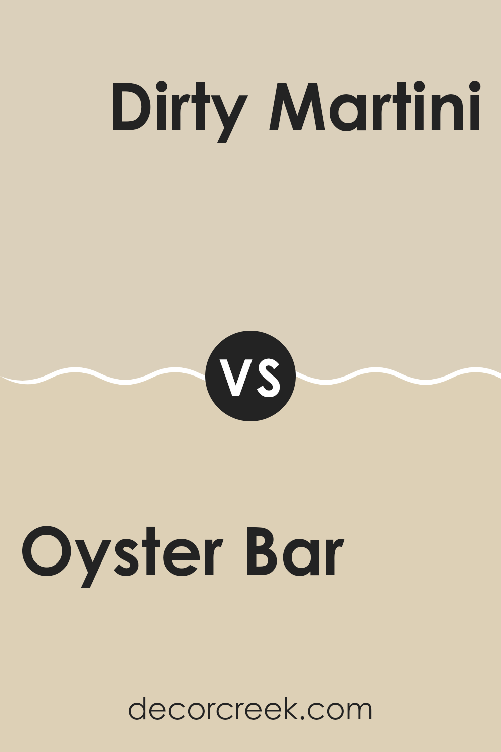
Oyster Bar SW 7565 by Sherwin Williams vs Dirty Martini SW 9119 by Sherwin Williams
Oyster Bar and Dirty Martini are two distinct paint colors from Sherwin Williams. Oyster Bar is a soft, muted beige with a warm undertone. It’s a versatile shade that can make spaces feel cozy and welcoming without being too bold.
On the other hand, Dirty Martini is a deeper, olive green color that adds a bit more character to a room. It’s perfect if you’re looking to make a statement or add a touch of nature-inspired charm. Both colors work well in a variety of decorating styles, but Oyster Bar tends to be easier to match with different decor items because of its neutral base.
Dirty Martini, however, can be the standout feature in a design, especially when paired with wood tones or creamy whites. Choosing between them depends on the atmosphere you want to create: calm and understated with Oyster Bar or more dynamic and earthy with Dirty Martini.
You can see recommended paint color below:
- SW 9119 Dirty Martini (CHECK A SAMPLE)
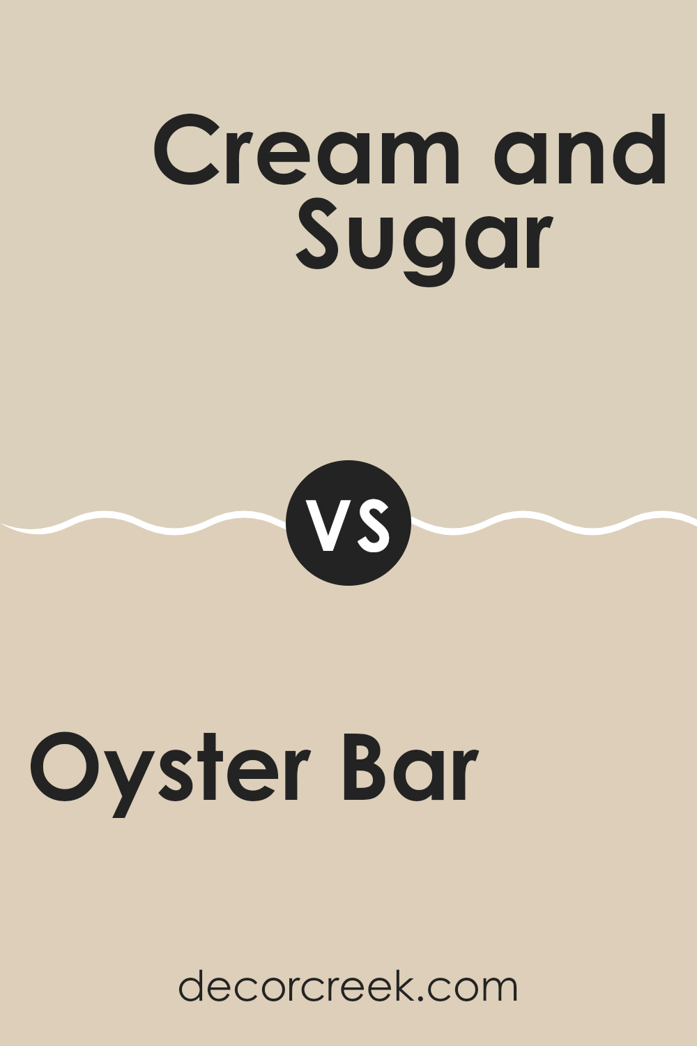
Oyster Bar SW 7565 by Sherwin Williams vs Cream and Sugar SW 9507 by Sherwin Williams
Oyster Bar is a subtle, warm gray with a hint of beige. It leans slightly towards a taupe shade, making it versatile for various spaces. This color provides a neutral backdrop that is less stark than a plain white or a darker gray, giving rooms a cozy but open feel. Its soft hue easily complements wood accents and natural light.
In comparison, Cream and Sugar is a much lighter color, predominantly a pale cream with warm undertones. This color is excellent for brightening up spaces and creating a light, airy atmosphere. Its creamy tone is ideal for those who prefer a softer touch than pure white but still want to maintain a fresh and inviting interior.
Cream and Sugar works well in kitchens and bathrooms, where it can help enhance natural light.
Both colors are neutral, but while Oyster Bar adds depth and warmth, Cream and Sugar offers a lighter, refreshing alternative. Each creates a distinct ambiance, showcasing their uniqueness in enhancing interior spaces.
You can see recommended paint color below:
In wrapping up my thoughts on SW 7565 Oyster Bar by Sherwin Williams, I’ve realized it’s a really great paint color for anyone looking to freshen up their room without making things too bright or too dark. This shade is like a soft gray mixed with a hint of beige, which makes it perfect for creating a calm and welcoming feeling in any room, be it a bedroom or a living room.
I found that Oyster Bar adapts well with different styles and furniture, which means it won’t clash with what you already have in your room. Whether your furniture is dark or light, this color will complement it nicely. Also, if you’re someone who likes to change up your decorations often, Oyster Bar will still work well with any new colors or themes you bring in.
Moreover, because it’s not a very strong color, it can make a room look bigger and more open. It’s especially good in small spaces or rooms without a lot of natural light.
Overall, choosing Oyster Bar can be a smart move if you’re looking for a paint that can keep your room looking fresh and airy, without being too plain or boring.
Ever wished paint sampling was as easy as sticking a sticker? Guess what? Now it is! Discover Samplize's unique Peel & Stick samples.
Get paint samples


