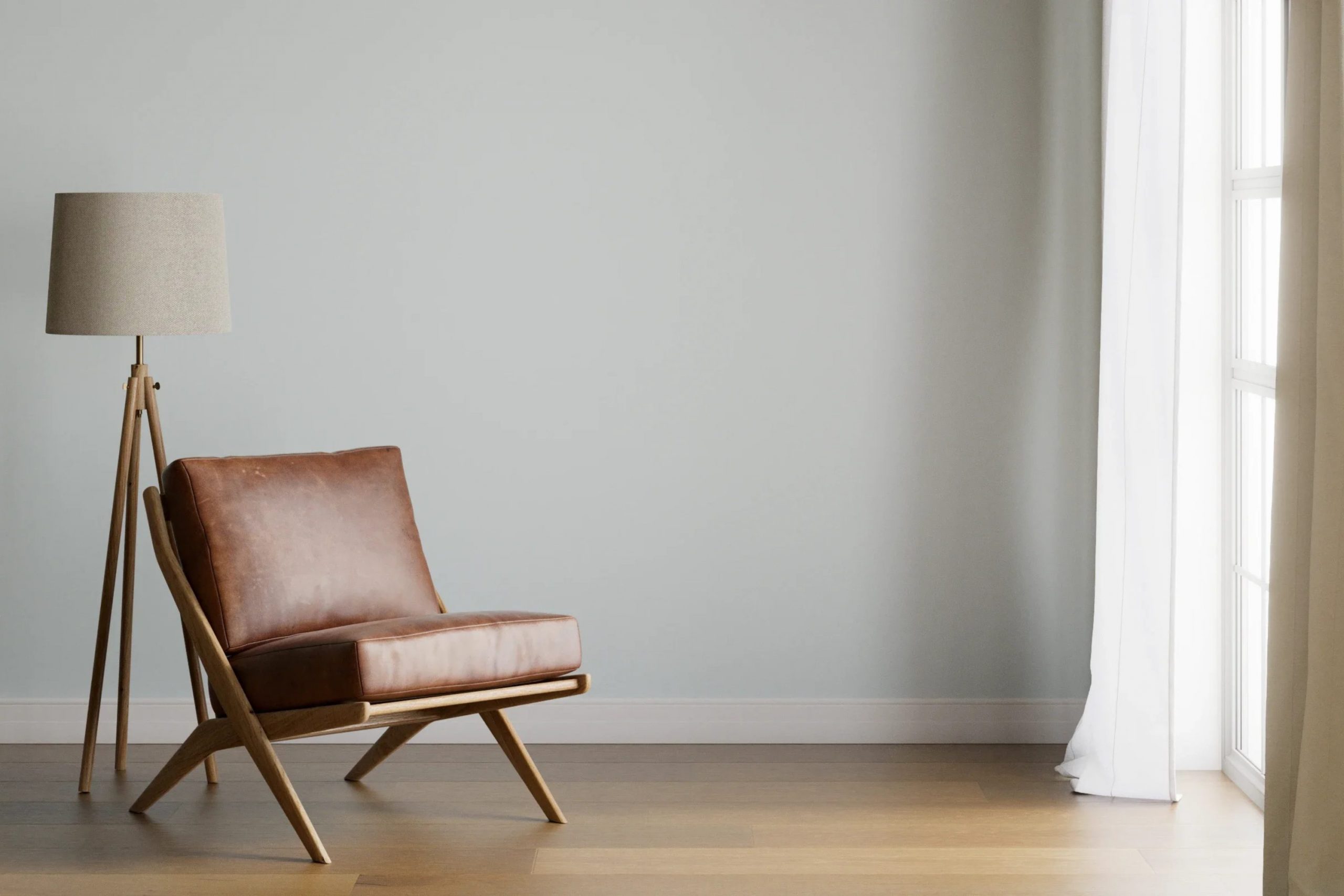
If you’re considering refreshing your room with a new paint color, you might be looking at SW 6224 Mountain Air by Sherwin Williams. I know how picking the right shade can feel a bit challenging with so many options available. Mountain Air is a unique hue that can give your room a fresh and airy feel, but there are a few things you should consider before making a decision.
Firstly, understand the undertones. Mountain Air might appear simply as a light blue or gray at first glance, but it has subtle nuances that can change depending on the lighting and accompanying decor. Observing this shade at different times of the day in your specific room is crucial.
Secondly, consider the room’s function and the atmosphere you want to create. Mountain Air tends to work well in bedrooms and bathrooms, where you might want a peaceful and calming effect. However, its impact could be different in a busy kitchen or a cozy living room.
Lastly, think about compatibility with your existing furnishings and overall home style. This color pairs beautifully with whites and woods, offering a natural and cohesive look. However, it might clash with darker colors or a more vibrant decor theme.
By keeping these points in mind, you can decide if SW 6224 Mountain Air is the right choice for your renovation project.
Is Mountain Air SW 6224 Right for My Home?
When I first saw the color Mountain Air, I instantly felt it has a fresh and calm vibe, perfect for bringing new life into a room. Its subtle blue undertones give a sense of cleanliness that works beautifully in a variety of rooms.
I find that this color pairs exceptionally well with minimalist and Scandinavian interior styles because of its simplicity and lightness. The softness of Mountain Air can also complement coastal themes, making rooms feel airy and beach-inspired.
When thinking about materials, I love combining Mountain Air with natural wood and white accents. The warmth of wooden textures balances the coolness of the color, creating a cozy yet bright environment. Adding in some linen fabrics or knitted throws can also enhance the comfort of a room, making it more inviting.
In terms of where to apply it, I think it shines as a wall color in a living room, bedroom, or bathroom where the goal is to create a relaxing retreat. Its lightness makes it great for rooms that aim to feel more open and less cluttered.
Overall, Mountain Air has an adaptable appeal that works with light, natural materials and soft, cozy textures, helping to make any room feel refreshed and harmoniously styled.
decorcreek.com
What are the right undertones of Mountain Air SW 6224 ?
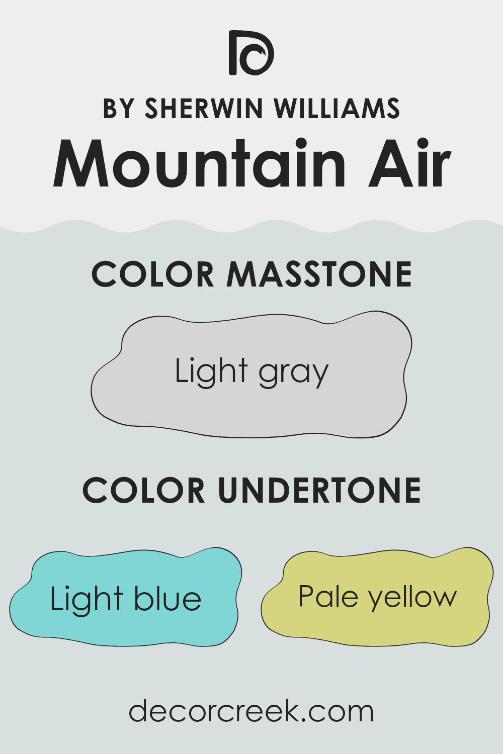
Mountain Air by Sherwin Williams is an adaptable paint color with a complex mix of undertones that can subtly influence the appearance and feel of a room. This particular shade has undertones of light blue, pale yellow, light purple, mint, lilac, pale pink, and gray. Understanding these undertones is key to predicting how the color will look under various lighting conditions and in different rooms.
Undertones are subtle colors that can be seen beneath the surface of the main color, and they play a crucial role in the overall visual impact of a color. Even a predominantly blue paint like Mountain Air can appear softer, warmer, or cooler depending on its undertones.
For instance, light blue and mint give a fresh and airy feel, making a room feel more open and bright. On the other hand, the pale yellow and pale pink undertones add a touch of warmth that can make a room feel more inviting.
When applied to interior walls, the effect of these undertones in Mountain Air can vary. In natural daylight, the light blue and mint undertones may become more pronounced, creating a calm and refreshing atmosphere. In artificial lighting, the warmer undertones like pale yellow and pale pink might become more noticeable, providing a cozy and welcoming vibe.
The addition of light purple and lilac can add a gentle hint of cheerfulness, while the gray undertone helps to ground the color, preventing it from becoming too vibrant and ensuring it maintains a neutral and balanced look. Choosing this color for your walls means the room’s mood can shift subtly throughout the day depending on the lighting, making it a dynamic yet subtle choice for any interior.
decorcreek.com
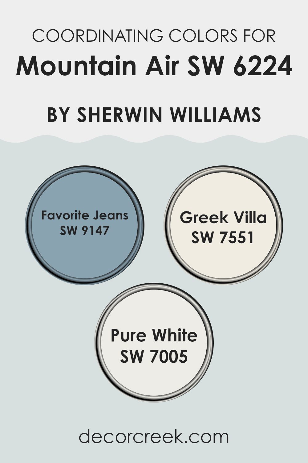
Best Coordinating Colors to use with Mountain Air SW 6224 by Sherwin Williams this year.
Coordinating colors are hues that complement and balance each other in a design scheme, enhancing the overall aesthetic of a room. When colors coordinate well, they create a pleasing harmony and a cohesive look.
For instance, to accompany Sherwin Williams’ Mountain Air, a soft, breezy blue, one could use colors like Favorite Jeans, Greek Villa, and Pure White. Each of these colors supports Mountain Air by accentuating its tones without being too dominant, ensuring that the room feels well put together and visually appealing.
Favorite Jeans is a deeper, more saturated blue that provides a beautiful contrast to Mountain Air, grounding the lighter blue without clashing. This color adds depth and interest to interiors, making it a great choice for accent walls or furniture pieces.
On the other hand, Greek Villa is an off-white with warm undertones, offering a soft backdrop that allows colors like Mountain Air to stand out subtly. Lastly, Pure White is a crisp, clean white that works fantastically for trims and ceilings, providing a sharp, fresh edge that complements the more colorful aspects of the palette, ensuring that the design remains light and airy.
You can see recommended paint colors below:
- SW 9147 Favorite Jeans
- SW 7551 Greek Villa
- SW 7005 Pure White
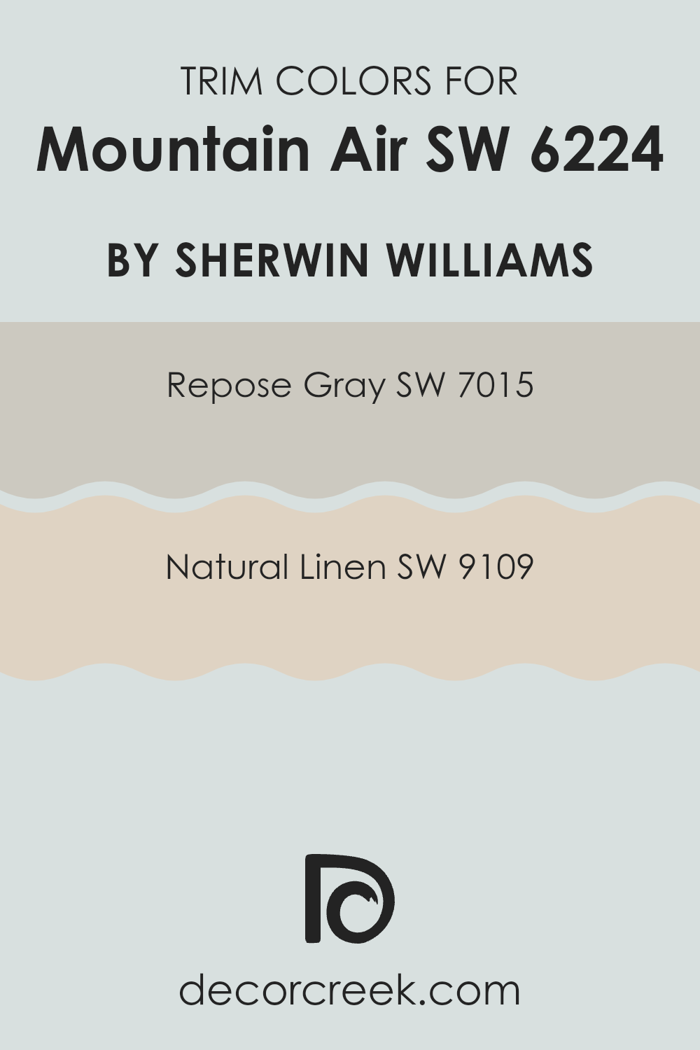
Trendy Trim Colors of Mountain Air SW 6224 by Sherwin Williams to use this year.
Trim colors serve a critical role in enhancing the appearance of a home by defining and accentuating the architectural details and edges. When paired with a base color like Mountain Air by Sherwin Williams, choosing the right trim colors can significantly impact the overall look.
Mountain Air is a vibrant and refreshing hue; hence, selecting complementary trim colors is crucial to achieve a cohesive design. SW 7015 – Repose Gray and SW 9109 – Natural Linen are excellent choices for trim colors, as they both harmoniously balance the playful vibrancy of Mountain Air, grounding it without overshadowing its lively character.
Repose Gray is a subtle warm gray that provides a neutral backdrop, making it an adaptable color for trims, especially in lighting conditions that change throughout the day. It gently contrasts with more vivid wall colors, providing a soft but defined line that enhances architectural features cleanly and crisply.
On the other hand, Natural Linen offers a warmer, beige tone that gives a soft, welcoming feel when used as a trim. This color works well to add a touch of warmth to rooms, complementing cooler tones in the main color and creating a pleasant visual balance that feels both comfortable and stylish.
You can see recommended paint colors below:
- SW 7015 Repose Gray
- SW 9109 Natural Linen
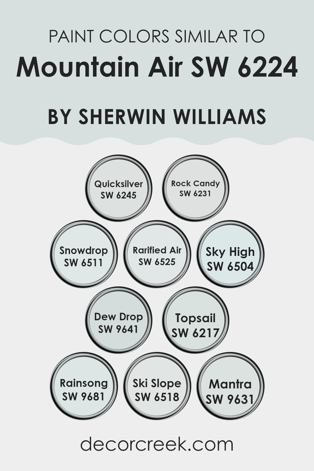
Evergreen Colors Similar to Mountain Air SW 6224 by Sherwin Williams
When enhancing a room, selecting a harmonious palette of similar colors creates a subtle and soothing environment. Similar colors, like those reminiscent of Mountain Air SW 6224 by Sherwin Williams, share common hues, allowing them to blend smoothly within a room, providing a gentle, coherent aesthetic. Such color schemes prevent visual clashes and bring continuity and flow to different design elements, making the room appear more cohesive and well thought out.
Among the colors akin to Mountain Air, Quicksilver SW 6245 presents as a gentle gray with a hint of blue, echoing a soft, cloudy sky. Rock Candy SW 6231 is lighter, with a sweet, almost crystalline freshness to it, like a clear winter morning. Snowdrop SW 6511 offers a bright, clean white that reflects light beautifully, enhancing the sense of openness.
Rarified Air SW 6525 carries a very pale, ethereal blue, almost invisible and airy. Sky High SW 6504 gives off a more pronounced blue, reminiscent of a cheerful, sunny sky. Dew Drop SW 9641 offers a fresh splash, light and invigorating like morning dew. Topsail SW 6217 has a cool, breezy quality, akin to a gentle sea mist.
Rainsong SW 9681 whispers of a soft, muted blue, hinting at overcast maritime climates. Ski Slope SW 6518 is crisp and light, mimicking bright, snowy landscapes. Lastly, Mantra SW 9631 rounds out the palette with a muted, soothing gray that pairs well with both soft and vibrant tones, ensuring an adaptable backdrop for any room. These colors work together to extend a peaceful atmosphere, where each element complements the next without being too intense.
You can see recommended paint colors below:
- SW 6245 Quicksilver
- SW 6231 Rock Candy
- SW 6511 Snowdrop
- SW 6525 Rarified Air
- SW 6504 Sky High
- SW 9641 Dew Drop
- SW 6217 Topsail
- SW 9681 Rainsong
- SW 6518 Ski Slope
- SW 9631 Mantra
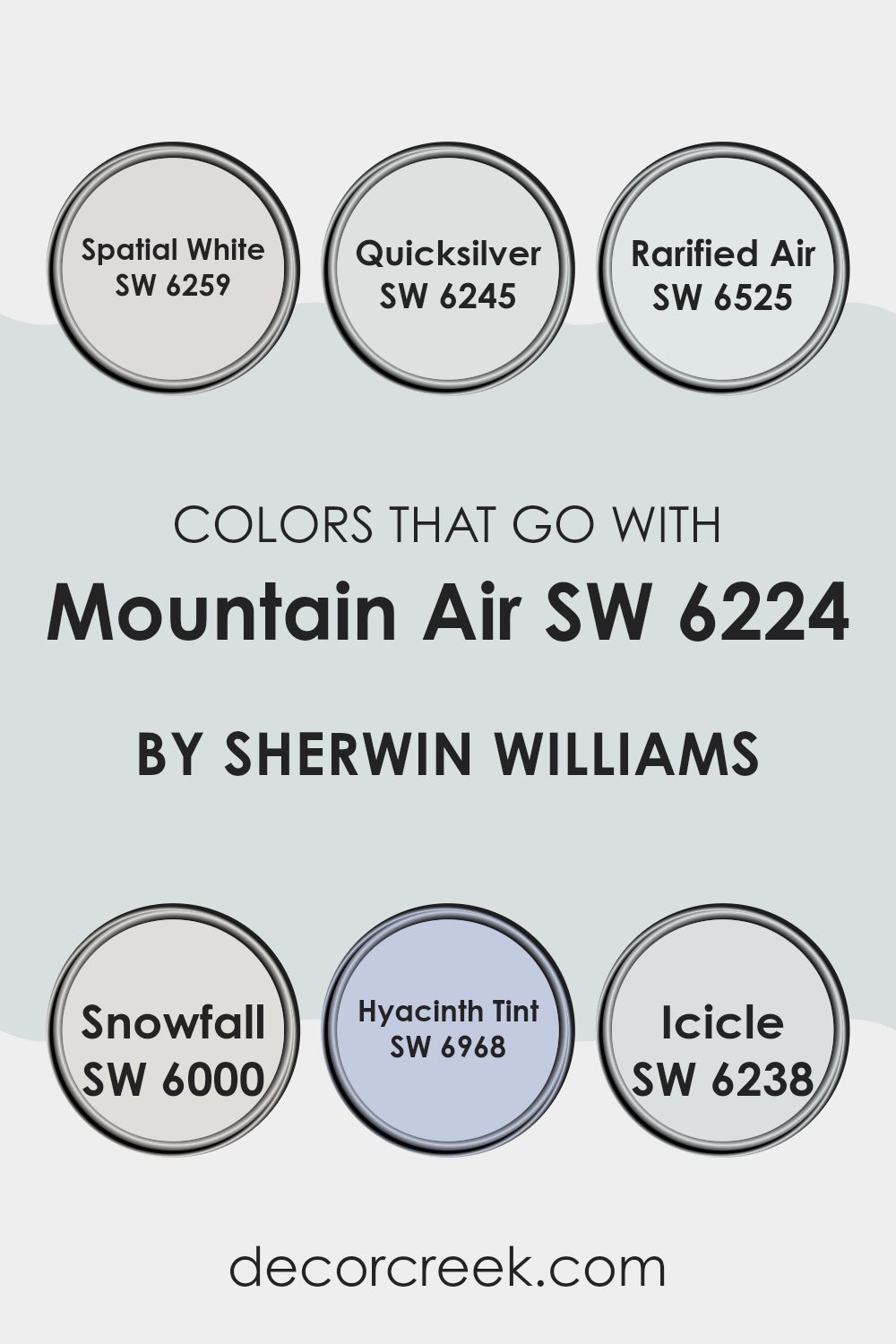
Colors that Go With Mountain Air SW 6224 by Sherwin Williams
Choosing the right colors to complement Mountain Air SW 6224 by Sherwin Williams is essential for creating a harmonious and appealing environment. Colors that coordinate well enhance the overall aesthetic and ensure a seamless flow throughout the room.
For example, Spatial White SW 6259 is a clean, pure white that acts as a perfect backdrop, helping to make Mountain Air’s soothing blue stand out, while also providing a sense of freshness and clarity. On the other hand, Quicksilver SW 6245 exhibits a light gray tone that brings a modern, yet understated balance to the brighter blue shades, making it a great choice for contemporary rooms.
Rarified Air SW 6525, a pale blue that is almost at the threshold of white, adds depth when used alongside Mountain Air without being too intense. Snowfall SW 6000, another white with a soft, subtle nuance, is excellent for crafting a sleek, unified look that complements accessories or furniture in more vivid colors.
For a playful yet refined palette, Hyacinth Tint SW 6968, which features a gentle purple, offers a gentle contrast to enrich any creative room. Lastly, Icicle SW 6238, a cooler, light gray, pulls in a crisp look that ties the room elements together, providing a smooth transition between the more distinct colors of the scheme. Using these complementary colors enables people to craft rooms that are both visually appealing and functionally comfortable.
You can see recommended paint colors below:
- SW 6259 Spatial White
- SW 6245 Quicksilver
- SW 6525 Rarified Air
- SW 6000 Snowfall
- SW 6968 Hyacinth Tint
- SW 6238 Icicle
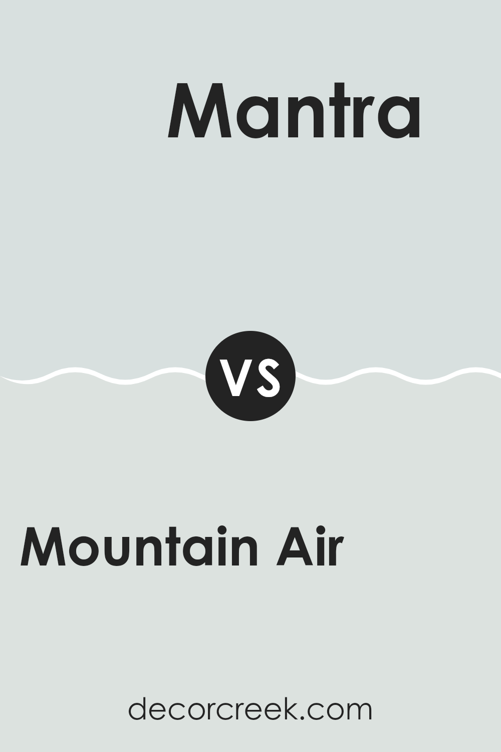
Mountain Air SW 6224 by Sherwin Williams vs Mantra SW 9631 by Sherwin Williams
Mountain Air and Mantra, both by Sherwin Williams, offer distinct vibes for any room. Mountain Air is a cool, breezy blue that brings a light and airy feel. It’s almost like a breath of fresh air, making it perfect for creating a relaxed, calming environment. This shade could work well in a bathroom or bedroom where you want to promote a sense of calm.
On the other hand, Mantra leans into the warmer spectrum with its gray undertone that has hints of silver. This color is more muted compared to Mountain Air and is great for rooms where you want a neutral backdrop that still offers a touch of warmth. It’s adaptable and ideal for living areas or offices where a neutral, yet inviting atmosphere is desired.
Both colors offer a way to refresh your room, but Mountain Air adds a touch of cool freshness, whereas Mantra provides a warm, subdued elegance. Each has its own charm, making them well suited for different areas and moods within a home.
You can see recommended paint color below:
- SW 9631 Mantra
Mountain Air SW 6224 by Sherwin Williams vs Dew Drop SW 9641 by Sherwin Williams
Mountain Air and Dew Drop are both soothing colors from Sherwin Williams, yet they offer distinct vibes that can alter the feel of a room. Mountain Air is a refreshing and gentle blue that has a hint of gray.
It creates a calming and pleasant atmosphere, working well in areas like bedrooms or bathrooms where a peaceful mood is desired. On the other hand, Dew Drop is a subtle green with a soft touch. It brings a natural and light feel to any room, making areas like kitchens or living rooms feel inviting and airy.
Both colors are quite neutral, so they pair well with various decor styles and other hues. However, while Mountain Air adds a cool, airy touch, Dew Drop introduces warmth through its understated green, offering a hint of the outdoors. Choosing between the two depends on the specific atmosphere you want to achieve in your room.
You can see recommended paint color below:
- SW 9641 Dew Drop
Mountain Air SW 6224 by Sherwin Williams vs Snowdrop SW 6511 by Sherwin Williams
Mountain Air is a light, breezy blue with a subtle touch of gray, creating a calm and soothing atmosphere. It mimics the look of a clear sky, making it ideal for rooms where you want a peaceful vibe. This color is adaptable enough to work in bedrooms, bathrooms, or living areas where a touch of calm is desired.
In contrast, Snowdrop is a much lighter shade, almost flirting with being white, but has a hint of blue. It’s so subtle that it can sometimes appear purely white unless closely inspected or placed against a true white. This color is fantastic for making small rooms appear larger or for giving a room a fresh, clean look. Snowdrop works well in many settings, from trim to ceilings, or even as the main color in a minimalist room.
Both colors offer a calm and clean look, but Mountain Air adds more visual interest with its distinct blue hue, while Snowdrop keeps things simple and understated.
You can see recommended paint color below:
- SW 6511 Snowdrop
Mountain Air SW 6224 by Sherwin Williams vs Rarified Air SW 6525 by Sherwin Williams
Mountain Air and Rarified Air are two shades by Sherwin Williams that both offer a unique take on light blues. Mountain Air is a soft, muted blue with a hint of gray, giving it a very gentle and calming feel. It’s an adaptable color that works well in many rooms, particularly in areas where you want a soothing atmosphere, like bedrooms or bathrooms.
On the other hand, Rarified Air is lighter compared to Mountain Air. It leans more toward a very pale, almost airy blue that can make a room feel more open and spacious. This color can help brighten up a small or dim room without being too bold or dominant.
Both colors are similar in that they provide a clean and fresh look, but the main difference lies in their intensity and the mood they set. Mountain Air, being slightly darker, offers a more grounded and cozy vibe, while Rarified Air gives off a feeling of lightness and openness that can really lift a room’s atmosphere.
You can see recommended paint color below:
- SW 6525 Rarified Air
Mountain Air SW 6224 by Sherwin Williams vs Ski Slope SW 6518 by Sherwin Williams
Mountain Air and Ski Slope are both paint colors offered by Sherwin Williams, each bringing a unique vibe to any room. Mountain Air is a subtle shade that resembles a gentle, light blue sky. It’s quite soft and airy, making it perfect for creating a relaxed and calm atmosphere in a room.
On the other hand, Ski Slope has a slightly cooler tone, leaning toward a pale, icy blue. This color mimics the look of a clear, frosty winter day on the slopes and can give a room a fresh and crisp feel.
Both colors, Mountain Air and Ski Slope, work well in rooms that aim for a light and open atmosphere, but the choice between them depends on the specific mood you’re trying to achieve. Mountain Air tends to add a bit more warmth to a room with its subtle vibrancy, whereas Ski Slope offers a cooler touch, potentially making a room feel more spacious and bright. Whether you opt for the warmth of Mountain Air or the crispness of Ski Slope, both colors are excellent for creating a peaceful and inviting environment.
You can see recommended paint color below:
- SW 6518 Ski Slope
Mountain Air SW 6224 by Sherwin Williams vs Sky High SW 6504 by Sherwin Williams
Mountain Air and Sky High, both by Sherwin Williams, are two soothing shades with distinct vibes. Mountain Air is a soft, muted blue with a hint of gray, giving it a cool and calm appearance. It’s perfect for creating a relaxed atmosphere in any room, resembling a gentle breeze or a faint mist in a mountainous area.
On the other hand, Sky High is a brighter and more vibrant blue. It has a clearer and more uplifting quality, much like looking up at a clear daytime sky. This color can bring a more energizing and cheerful feel to rooms, making them feel more open and airy.
Both colors are adaptable for home decor, yet they serve different moods and settings. While Mountain Air could be better for a subdued and peaceful setting, Sky High suits rooms where a fresher, livelier touch is desired. Overall, choosing between them depends on the kind of atmosphere you want to achieve in your room.
You can see recommended paint color below:
Mountain Air SW 6224 by Sherwin Williams vs Quicksilver SW 6245 by Sherwin Williams
When you look at Mountain Air and Quicksilver by Sherwin Williams, you see two cool, subtle colors, but they have different vibes. Mountain Air is a soft, refreshing blue that feels light and airy, making a room feel open and calm without being too bright.
On the other hand, Quicksilver is a light gray color. It has a subtle blue undertone, which gives it a fresh look while keeping that neutral gray appeal, making it very adaptable for combining with other colors.
If you’re deciding between the two for a room, think about the atmosphere you want to create. Mountain Air is great for a gentle, soothing environment, perfect for bedrooms or bathrooms where you want to relax. Quicksilver, with its gray base, works well in rooms where you need a modern, clean look that still feels welcoming, like living rooms or kitchens. Both colors reflect light well, helping smaller rooms appear larger, but the choice depends on whether you prefer something more distinctly blue or a neutral with cool undertones.
You can see recommended paint color below:
- SW 6245 Quicksilver
Mountain Air SW 6224 by Sherwin Williams vs Rainsong SW 9681 by Sherwin Williams
Mountain Air and Rainsong are two distinct shades offered by Sherwin Williams. Mountain Air is a soft, gentle blue that has a light and airy feel to it, bringing a sense of freshness to any room. It’s not too bold, making it easy to incorporate into various decor styles, from modern to traditional. This color is particularly effective in rooms that aim for a clean and open atmosphere, such as kitchens and bathrooms.
On the other hand, Rainsong cuts a deeper, moodier figure. This shade leans toward a richer gray with underlying blue tones, making it a standout choice for creating more dramatic and cozy environments. It’s well suited for dens or bedrooms where a touch of depth can make the room feel more inviting and warm.
When comparing these two, Mountain Air offers a lighter, breezier touch that enhances rooms with a subtle hint of blue, whereas Rainsong provides a stronger presence, establishing a more definite mood with its blend of gray and blue. Each brings its unique vibe, depending on the feel you want to achieve in your room.
You can see recommended paint color below:
- SW 9681 Rainsong
Mountain Air SW 6224 by Sherwin Williams vs Rock Candy SW 6231 by Sherwin Williams
Mountain Air and Rock Candy are two subtle and soft colors from Sherwin Williams that bring a peaceful and light feeling to any room. Starting with Mountain Air, it has a breathable, sky-like tone that can make rooms seem more open and airy. This color is a touch cooler, leaning slightly toward a pale blue, which helps create a clean and fresh atmosphere.
On the other hand, Rock Candy presents itself as a pale gray with very light blue undertones. This color is also peaceful, yet it offers a step toward a neutral palette that blends smoothly into modern decor. Rock Candy is also adaptable and can effectively coordinate with a broader range of colors and furnishings compared to the slightly more distinct blue of Mountain Air.
Both colors are excellent choices for creating a relaxed and inviting environment. Whether aiming for a hint of coolness with Mountain Air or a subtle neutral vibe with Rock Candy, either shade works beautifully for a modern and light-filled room.
You can see recommended paint color below:
- SW 6231 Rock Candy
Mountain Air SW 6224 by Sherwin Williams vs Topsail SW 6217 by Sherwin Williams
Mountain Air and Topsail, both by Sherwin Williams, are subtle shades that have a calming effect yet distinguish themselves in tone and mood. Mountain Air is a light, airy blue with a hint of gray that gives it a clean, refreshing vibe. It’s perfect for a breezy, open feel in a room, making rooms appear larger and more open.
On the other hand, Topsail is a bit closer to a pale, soft green, offering a hint of warmth compared to the cooler tones of Mountain Air. Topsail is ideal for creating a cozy, comforting atmosphere, working especially well in bedrooms and living areas where you want to feel relaxed.
Both colors are light enough to be adaptable in various lighting conditions, complementing a wide range of décor styles. While both can brighten up a room, Mountain Air provides a crisper look, and Topsail leans toward a gentle, soothing atmosphere. This makes them both excellent choices, but your preference might depend on the mood you’re looking to create in your room.
You can see recommended paint color below:
After reading all about SW 6224 Mountain Air by Sherwin Williams, I’ve learned that this paint color is really special. It’s like the soft whispers of the wind when you’re high up in the mountains, feeling peaceful and calm. The color looks like a light, breezy blue with hints of gray, which makes it great for making any room in your house feel fresh and airy.
Mountain Air is not just beautiful but also gentle and clean, making it perfect for bedrooms, bathrooms, or even the living room where everyone likes to hang out. This color works well with lots of other colors, so you can use it for big walls or just for small decorations.
After looking at how it pairs with different themes and furniture, it’s clear that using Mountain Air can make your home look lovely without much effort. Whether you’re updating your room or just adding a little new touch, this color is a smart choice because it’s easy to look at and makes a room feel open and light.
If you or your family are thinking about changing a room in your home, I really think you should consider Mountain Air. It’s a friendly color that makes every room feel like a happy Sunday morning.
decorcreek.com
Ever wished paint sampling was as easy as sticking a sticker? Guess what? Now it is! Discover Samplize's unique Peel & Stick samples.
Get paint samples

