Sky High SW 6504 by Sherwin Williams is like stepping into a calm and serene space filled with possibilities. This soft, airy blue opens up a room, creating an atmosphere that feels both refreshing and peaceful. It’s a color that lifts your spirits, reminiscent of clear skies and gentle breezes.
When I see this hue, it instantly brings a sense of freshness and brightness to my surroundings. It’s perfect for those looking to bring a sense of calm and openness into their homes.
Imagine painting your walls with this inviting shade. It feels like a gentle breath of fresh air, giving a room a sense of spaciousness. The soothing quality of Sky High makes it an ideal choice for any area where you want to relax and recharge.
Whether it’s a living room, bedroom, or even an office, this color effortlessly makes the space feel more expansive and comforting.
Pair it with light, neutral furnishings or contrast it with deeper accent tones to create a balanced and harmonious look. Sky High provides versatility with a touch of elegance, turning any space into a welcoming retreat. It’s more than just paint; it’s an experience that brings a quiet, uplifting charm to your everyday life.

What Color Is Sky High SW 6504 by Sherwin Williams?
Sky High by Sherwin Williams is a gentle and soothing shade of light blue. This color evokes the calmness of a clear sky on a pleasant day. With its soft tone, Sky High works wonderfully in spaces where you want to create a peaceful atmosphere. It’s perfect for bedrooms, living rooms, and nurseries, adding a sense of lightness and openness to these areas.
This light blue fits well in coastal-themed interiors, complementing the relaxed vibe often associated with beach-inspired designs. It’s also a lovely choice for Scandinavian-style spaces, where simplicity and natural light play key roles.
In modern and minimalist interiors, Sky High adds a subtle touch of color without being overwhelming.
Sky High pairs beautifully with a variety of materials and textures. It looks clean and fresh alongside crisp white trim and moldings, enhancing the light, airy feel of a room.
It’s also harmonious with natural woods, such as oak or maple, which add warmth and earthiness. For textures, consider soft linen or cotton fabrics in whites, grays, or light earth tones to maintain a calm environment. Soft wool rugs or woven baskets can add a sense of coziness without overpowering the gentle hue of Sky High.
Is Sky High SW 6504 by Sherwin Williams Warm or Cool color?
Sky High SW 6504 by Sherwin Williams is a soft, light blue color that can bring a sense of calmness and openness to a space. When used in homes, it can make rooms feel larger and airy. This color is especially effective in smaller spaces, as the light blue shade can create the illusion of more space and enhance natural light.
Sky High pairs well with whites and neutral tones, allowing for a clean and fresh appearance. It can work as a great choice for bedrooms, living rooms, or bathrooms, providing a peaceful backdrop that doesn’t overpower other decor elements. The gentle hue can also complement various styles, from modern to traditional.
Incorporating Sky High into the walls or accents of a room adds a touch of softness and harmony, making it a versatile option for homeowners looking to create a welcoming and soothing environment.
Undertones of Sky High SW 6504 by Sherwin Williams
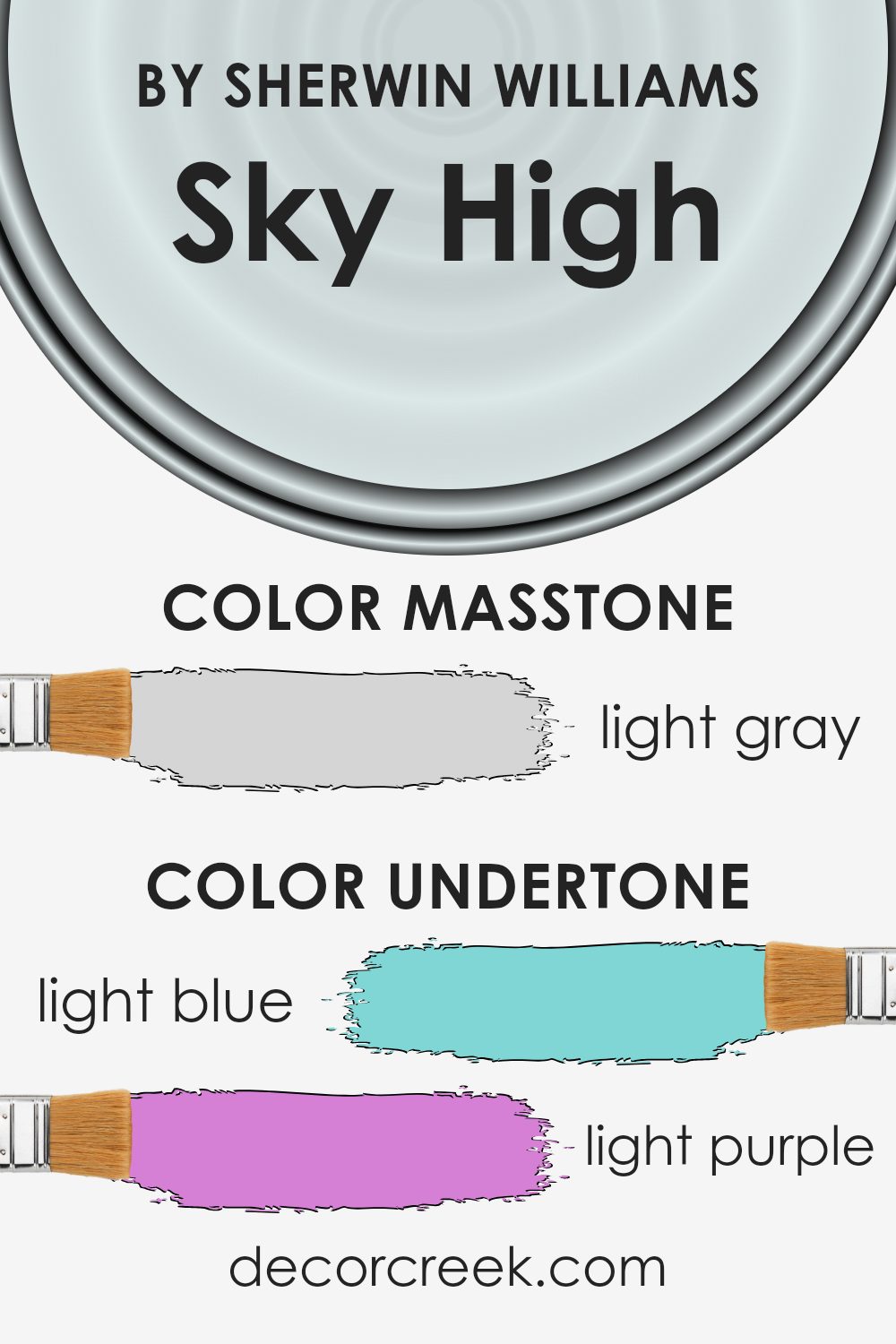
Sky High SW 6504 by Sherwin Williams is a soft, soothing blue that can bring a calm vibe to any room. The undertones in this color are quite interesting, as they bring in touches of light blue, light purple, pale yellow, lilac, mint, pale pink, and grey. These shades subtly mix within the color, giving it a unique depth.
These undertones can significantly affect how we perceive the paint. When you look at a color, the undertones may catch your eye, making the color feel warmer or cooler depending on the lighting and surrounding colors.
For example, in brighter rooms, the pale yellow and light purple undertones can soften the blue, making it appear warmer. In contrast, in shaded spaces, the grey and light blue undertones might come forward, giving the color a cooler feel.
On interior walls, these undertones can adjust the paint’s effect, making it adaptable to various styles.
In different lighting conditions, Sky High can appear as a fresh minty hue or as a calm lilac color. The combination of light and pastel shades ensures that this paint can create a balanced and inviting atmosphere that complements surrounding decor effortlessly.
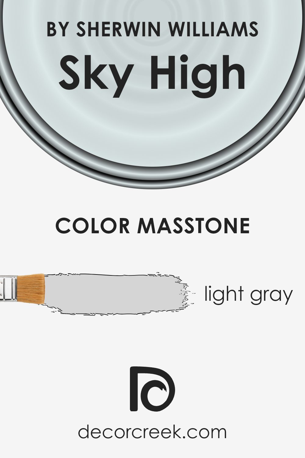
What is the Masstone of the Sky High SW 6504 by Sherwin Williams?
Sky High SW 6504 by Sherwin Williams is a light gray color (#D5D5D5) that works well in many homes. Its soft and neutral tone makes it versatile for different styles and decor. The lightness of this gray helps to make rooms feel airy and open, making spaces appear larger than they are.
This can be particularly useful in smaller rooms or areas with less natural light, as it helps to enhance brightness.
The color complements a wide range of furnishings and accessories, allowing homeowners to change their style without needing to repaint. Light gray serves as a great backdrop for adding accents in bolder colors if desired. Additionally, it pairs well with other neutral tones, creating a calm and balanced environment.
Sky High’s subtle hue works for various rooms, from living rooms to bedrooms, or even kitchens. It’s a practical choice for those looking for a clean, modern look without committing to a stark white.
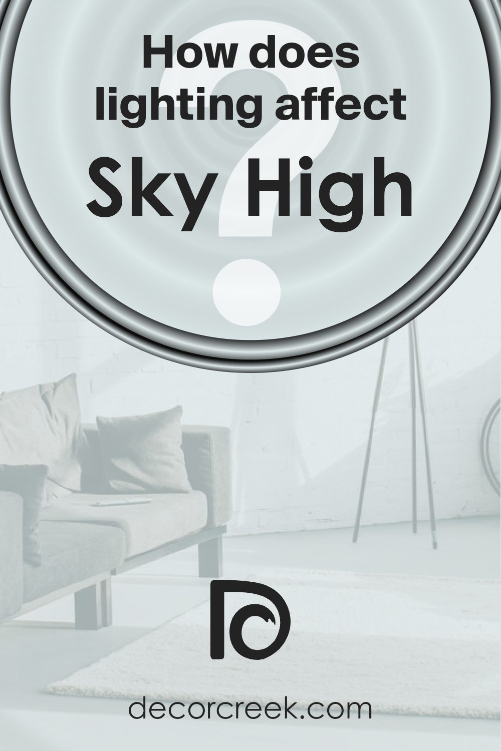
How Does Lighting Affect Sky High SW 6504 by Sherwin Williams?
Lighting plays a huge role in how we perceive colors. Different light sources, like sunlight and artificial lights, have different characteristics that can change how a color appears.
Take Sherwin Williams’ Sky High SW 6504 as an example. It’s a soft, calming blue. In natural light, this color might look very different from how it appears under a lamp or other artificial light sources.
In north-facing rooms, the light tends to be cooler and softer. This can make Sky High appear more muted or cooler, as the natural light doesn’t have the warmth that can make colors pop. So, Sky High might appear more subdued, which can be great if you’re aiming for a calming atmosphere.
South-facing rooms, on the other hand, get warm and bright sunlight throughout the day. Here, Sky High can look vibrant and fresh. The warm light enhances the soft blue tones, making the room feel airy and bright. It’s a good choice if you want an upbeat and lively atmosphere.
East-facing rooms get bright, warm light in the morning and cooler, muted light later in the day. In the morning, Sky High can look lively and cheerful. As the day progresses, it may look a bit more toned down due to the cooler light. This can add a dynamic quality to the room, with different moods at different times of the day.
West-facing rooms catch the warm afternoon light, which can again enhance the warmth of the color. In these settings, Sky High looks inviting and cozy in the late afternoon and evening. The light makes the blue appear slightly warmer and more comforting.
In artificial light, Sky High might look different depending on the bulb. Soft white bulbs (often a warmer light) can make it feel cozy and warm, while daylight bulbs (a cooler, bluish light) can make it look sharper and cleaner.
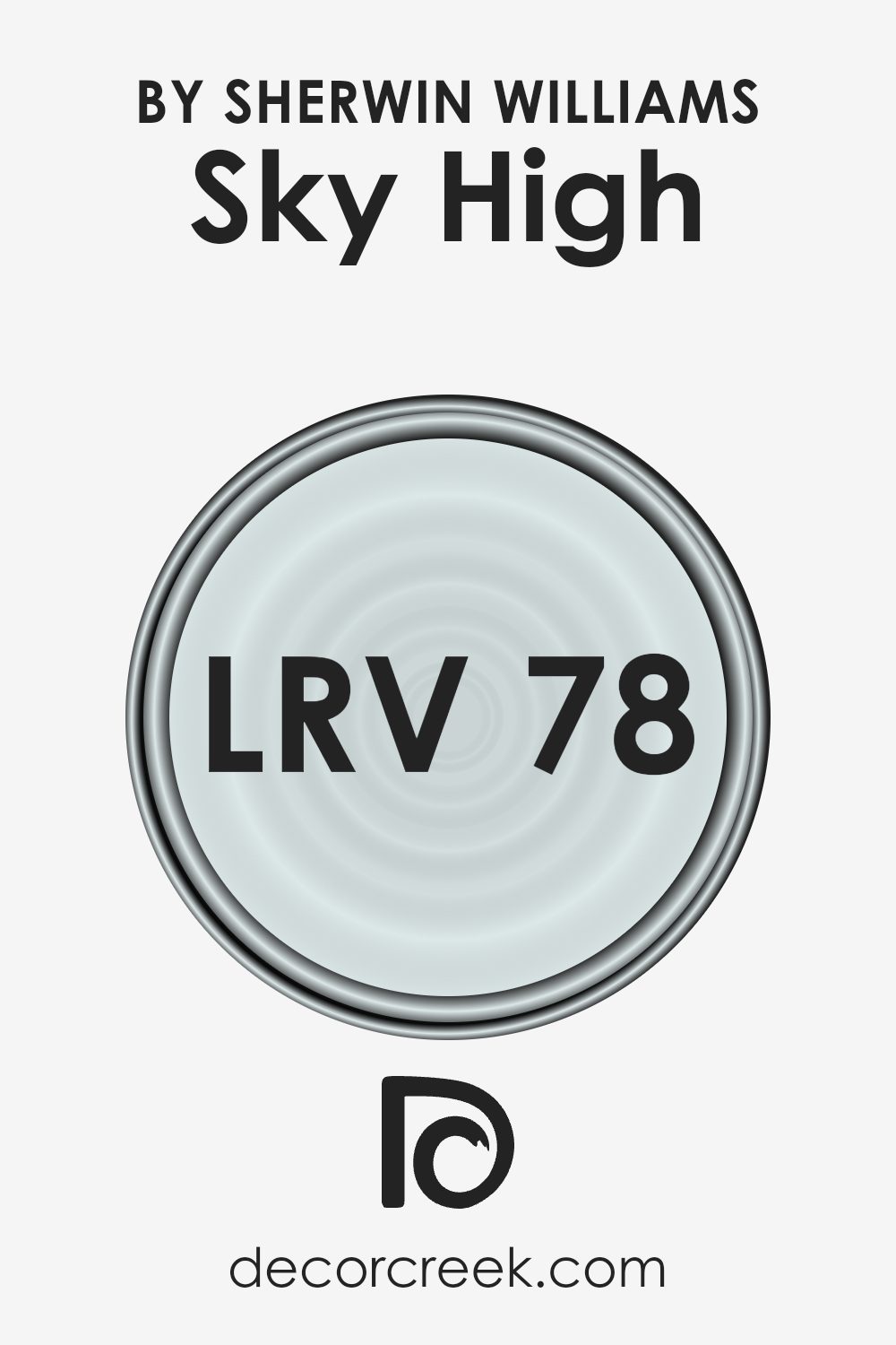
What is the LRV of Sky High SW 6504 by Sherwin Williams?
Light Reflectance Value, or LRV, is a measurement used in the paint industry to determine how much light a color reflects. It is measured as a percentage that ranges from 0 to 100, where 0 means no light is reflected (pure black) and 100 means all light is reflected (pure white).
Understanding LRV is important because it helps you predict how a color will look on your walls, depending on the lighting in your room. Colors with high LRV reflect more light, making rooms feel brighter and more open.
On the other hand, colors with low LRV absorb more light, which can make spaces feel cozier and more intimate.
Sky High has an LRV of 78.332, indicating it is a light color that reflects a lot of light. This high LRV means that when you use this color on your walls, it will make the space feel airy and expansive.
It is an excellent choice for rooms that lack natural light, as it will help brighten the area and make it feel more inviting. Because of its ability to reflect light, it can also make rooms feel larger than they are. If you’re working with a small or dimly lit space, using a color like this can help create a more open and welcoming atmosphere.
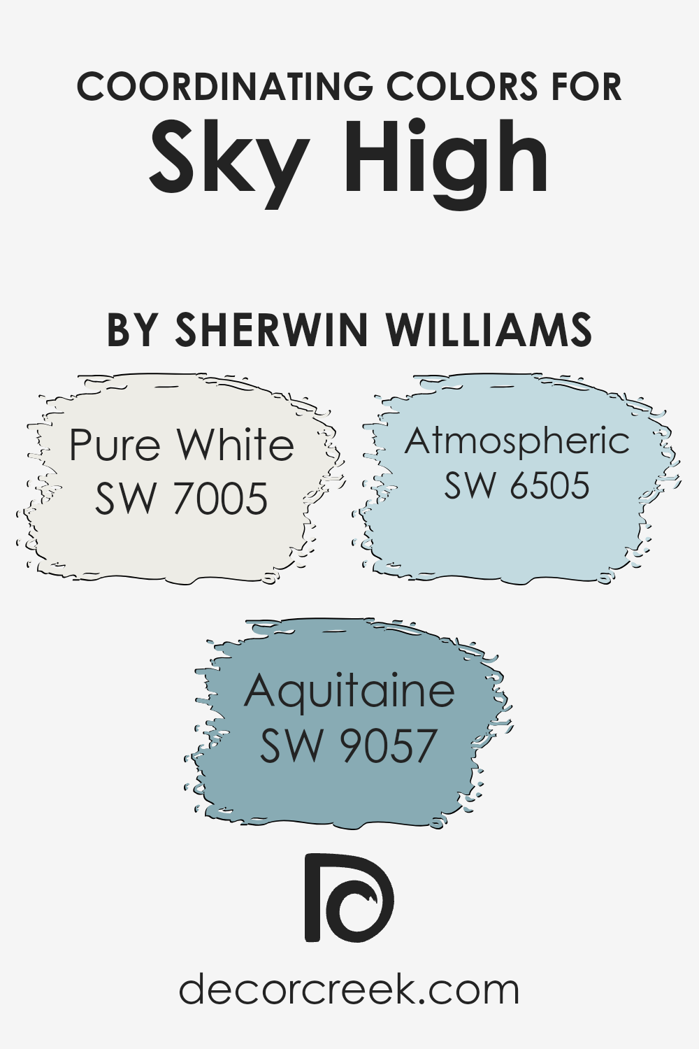
Coordinating Colors of Sky High SW 6504 by Sherwin Williams
Coordinating colors are colors that work well together to create a balanced and pleasing look. When combined, they enhance a room by complementing the main color and bringing out the best features of both the color palette and the space itself.
For the Sherwin Williams color Sky High, coordinators like Pure White, Aquitaine, and Atmospheric can be used to create a harmonious setting. These colors are chosen to support the main color and to make the space feel cohesive.
Pure White is a crisp, clean color that serves as a versatile backdrop, allowing the Sky High shade to stand out. It adds a touch of simplicity and brightness to any space. Aquitaine offers a rich, deep hue that contrasts nicely with Sky High, adding depth and a bit of drama. It brings an element of warmth and sophistication to the color scheme.
Atmospheric, on the other hand, is a subtle, muted shade that can soften and balance the brighter tones, creating a calm and inviting atmosphere.
Together, these colors can be combined in various ways to enhance the aesthetics of a room, keeping it lively yet welcoming.
You can see recommended paint colors below:
- SW 7005 Pure White
- SW 9057 Aquitaine
- SW 6505 Atmospheric
What are the Trim colors of Sky High SW 6504 by Sherwin Williams?
Trim colors are the shades used on the edges or borders of walls, ceilings, and other architectural features to highlight or accentuate the main wall color. They play a crucial role in the overall appearance of a room by providing contrast or complementing the main wall color.
In the case of Sky High by Sherwin Williams, a soft and airy blue, choosing the right trim colors can enhance its refreshing feel and clean look.
SW 8917 Shell White and SW 9541 White Snow are excellent choices for trim with this color. These particular shades provide a crisp outline that helps Sky High stand out, creating an inviting and harmonious environment.
SW 8917 Shell White is a warm, creamy white that brings a touch of coziness to a room.
Its mild warmth pairs well with Sky High, adding a soft contrast without overpowering the room’s light and airy ambiance.
SW 9541 White Snow, on the other hand, is a pure, cool white that enhances the freshness of Sky High. This shade adds a crisp, contemporary feel to the room, ensuring that the blue remains the star of the show while still offering a clean, polished look around the edges.
Together, these trim colors bolster the appeal of Sky High, offering versatile options for different stylistic preferences.
You can see recommended paint colors below:
- SW 8917 Shell White
- SW 9541 White Snow

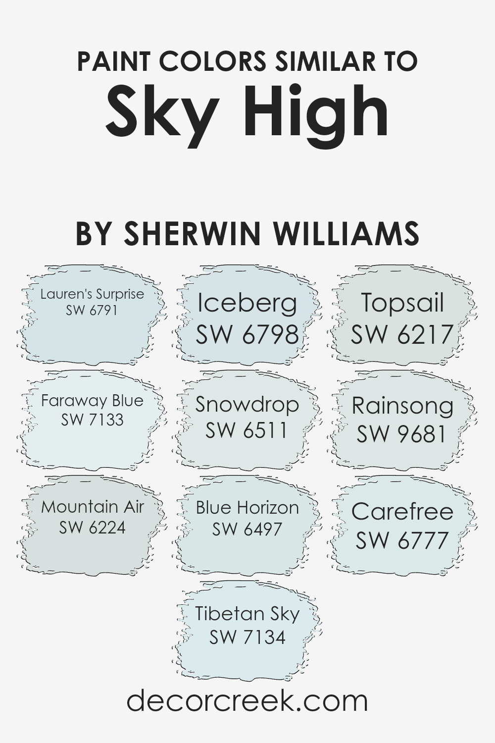
Colors Similar to Sky High SW 6504 by Sherwin Williams
Using similar colors to Sky High by Sherwin-Williams helps create a harmonious and calming environment. These colors, such as Lauren’s Surprise and Faraway Blue, share similar tones with Sky High, making them ideal for spaces where you want continuity and a peaceful ambiance.
Lauren’s Surprise is a gentle blue with a touch of grace, offering a soft yet lively feel. On the other hand, Faraway Blue has a delicate, airy quality that can open up a room and make it feel welcoming.
Mountain Air is another color that complements Sky High, with its cool undertones bringing a refreshing feeling. Tibetan Sky is more muted and calming, while Iceberg offers a frosty touch reminiscent of winter mornings. Snowdrop presents a serene, almost ethereal whiteness that works well in creating a relaxed space.
In contrast, Blue Horizon embodies a sky-at-dawn vibe, bringing a sense of calm. Topsail adds a breezy element with its muted aqua tones.
Rainsong, with its soft blue-gray palette, and Carefree, a playful and lighthearted tint, complete this set of similar colors. Used together, these colors can help to create a room that feels cohesive and soothing, perfect for a restful home.
You can see recommended paint colors below:
- SW 6791 Lauren’s Surprise
- SW 7133 Faraway Blue
- SW 6224 Mountain Air
- SW 7134 Tibetan Sky
- SW 6798 Iceberg
- SW 6511 Snowdrop
- SW 6497 Blue Horizon
- SW 6217 Topsail
- SW 9681 Rainsong
- SW 6777 Carefree
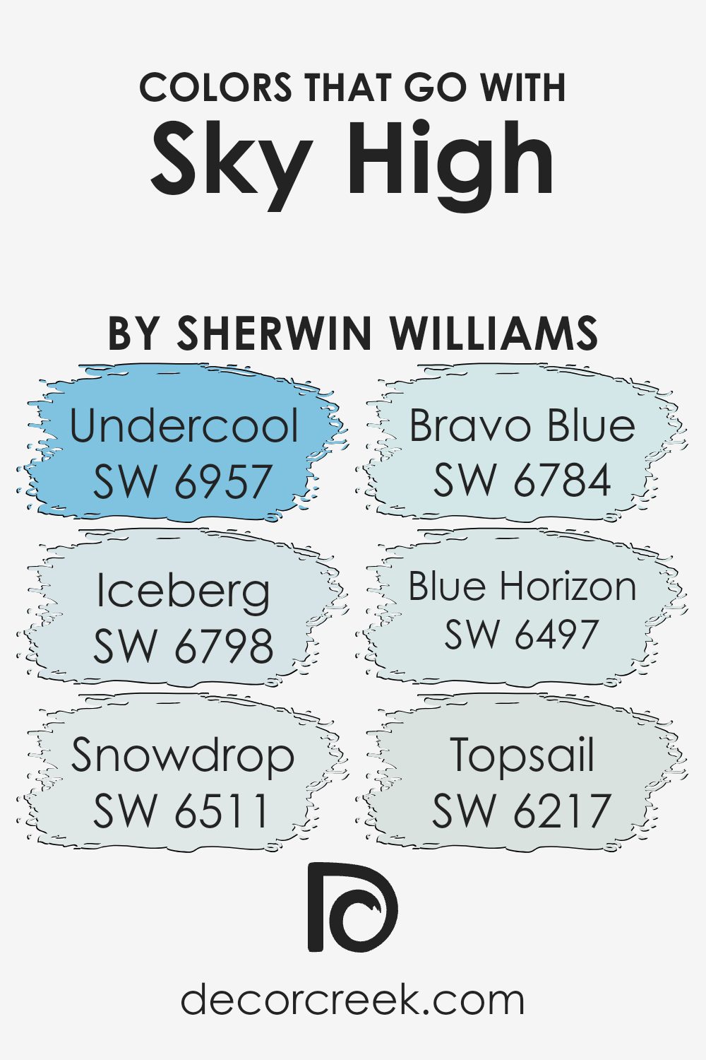
Colors that Go With Sky High SW 6504 by Sherwin Williams
Colors that complement Sky High SW 6504 by Sherwin Williams are important because they can create a cohesive and pleasing environment in any space. SW 6957 – Undercool, for example, is a refreshing aqua that pairs beautifully with Sky High’s light, airy feel, adding a touch of coolness.
SW 6798 – Iceberg, a pale blue, mirrors the faint tones in Sky High, providing a gentle contrast that highlights its softer undertones. SW 6511 – Snowdrop is a delicate off-white that balances and brightens spaces when used alongside Sky High, while SW 6784 – Bravo Blue adds a lively element with its vibrant hue.
These colors work together seamlessly, each enhancing the atmosphere created by Sky High while adding their unique touch. SW 6497 – Blue Horizon is a calm and steady blue, perfect for grounding Sky High’s light character. SW 6217 – Topsail, a subtle blue-green, introduces a touch of warmth, rounding out the palette and enriching the overall room environment without being overpowering.
When used together, these colors harmonize well, allowing for versatile design choices across different rooms and moods, whether you’re looking to add depth, vibrancy, or a calming influence in your space.
You can see recommended paint colors below:
- SW 6957 Undercool
- SW 6798 Iceberg
- SW 6511 Snowdrop
- SW 6784 Bravo Blue
- SW 6497 Blue Horizon
- SW 6217 Topsail
How to Use Sky High SW 6504 by Sherwin Williams In Your Home?
Sky High SW 6504 by Sherwin Williams is a soft and inviting light blue paint. This color can brighten any room while adding a touch of calmness. It’s a great choice for bedrooms, where you want a peaceful atmosphere to start and end your day. Sky High works well in bathrooms too, as it brings a fresh and airy feel.
In a living room, it pairs nicely with neutral furniture and adds a subtle pop of color. You can also use it in a child’s room for a playful yet gentle look. To make a space feel larger and more open, consider using Sky High on the walls with white or light-colored trim.
This color goes well with natural wood tones and complements other pastels for a cohesive look. Whether for a feature wall or an entire room, Sky High brings a sense of openness and comfort to any home space.
Sky High SW 6504 by Sherwin Williams vs Iceberg SW 6798 by Sherwin Williams
Sky High SW 6504 and Iceberg SW 6798 are both light and airy colors by Sherwin Williams, but they differ in tone and feel. Sky High is a soft, calm blue, reminiscent of a bright sky on a clear day. It brings a sense of openness and freshness to a room. Iceberg, while also a shade of blue, leans more towards a cooler, icier hue. It reminds one of an icy landscape or a winter day.
When used in a space, Sky High feels warmer and more inviting than Iceberg. It works well in living areas or bedrooms where a relaxed environment is desired. Iceberg, on the other hand, provides a crisp, clean look, making it suitable for modern kitchens or bathrooms where a sleek appearance is preferred.
Together, these colors can create a harmonious balance, with Sky High adding warmth and Iceberg bringing in a refreshing coolness.
You can see recommended paint color below:
- SW 6798 Iceberg
Sky High SW 6504 by Sherwin Williams vs Lauren’s Surprise SW 6791 by Sherwin Williams
Sky High SW 6504 is a light, airy blue that captures the essence of a clear sky. It’s a color that feels gentle and open, bringing a sense of calm and space to a room. On the other hand, Lauren’s Surprise SW 6791 is a vibrant, bold blue with a hint of teal. It’s energetic and playful, adding a lively touch to any space.
When comparing these two, Sky High is more subdued and perfect for a soothing atmosphere. It works well in bedrooms or living areas where relaxation is key. Lauren’s Surprise, however, is great for creating a fun environment, making it suitable for kids’ rooms, creative spaces, or accent walls.
While Sky High brings a soft background presence, Lauren’s Surprise stands out and draws attention. Both colors offer a fresh feel, but their moods are quite different, one calming and the other exciting.
You can see recommended paint color below:
- SW 6791 Lauren’s Surprise
Sky High SW 6504 by Sherwin Williams vs Topsail SW 6217 by Sherwin Williams
Sky High (SW 6504) and Topsail (SW 6217) are both calming shades of blue by Sherwin Williams, but they differ in their tones and effects. Sky High is a soft, airy blue reminiscent of a clear sky on a bright day. It brings a light, refreshing feeling to a space, making it ideal for creating an uplifting and open atmosphere.
On the other hand, Topsail is a cool, pale blue with subtle gray undertones. This makes it slightly more muted and sophisticated, offering a gentle hint of color without being overwhelming.
Topsail’s cooler shade adds a sense of calm and works well in rooms where a soothing environment is desired, such as bedrooms or bathrooms.
While both colors are ideal for creating a serene environment, Sky High is brighter and more vibrant, whereas Topsail is subdued with a touch of elegance. Both work well with neutral or white accents to maintain a clean and inviting look.
You can see recommended paint color below:

Sky High SW 6504 by Sherwin Williams vs Blue Horizon SW 6497 by Sherwin Williams
Sky High (SW 6504) and Blue Horizon (SW 6497) are both colors from Sherwin Williams that evoke a sense of calmness but in different ways. Sky High is a light, airy blue that resembles the soft color of a clear sky. It brings a sense of openness and freshness to any space. It’s ideal for creating a peaceful, spacious atmosphere, especially in smaller rooms that benefit from lighter hues.
In contrast, Blue Horizon is a slightly darker, muted blue. It feels more grounded and offers a gentle, cozy vibe. This color is great for creating a relaxing environment without being too bright. Its subtle undertones make it versatile for various settings, from bedrooms to living rooms.
While both colors offer a touch of blue tranquility, Sky High is more about openness and light, whereas Blue Horizon provides a comforting, slightly deeper blue that’s perfect for creating a warm, inviting space.
You can see recommended paint color below:
Sky High SW 6504 by Sherwin Williams vs Tibetan Sky SW 7134 by Sherwin Williams
Sky High (SW 6504) by Sherwin Williams is a soft, airy blue that feels light and refreshing. It brings to mind clear skies on a sunny day, making a room feel open and spacious. The color is gentle and works well in spaces where you seek a calm and open atmosphere.
In contrast, Tibetan Sky (SW 7134) is a more muted, grayish blue, offering a subtle and understated look. It’s less bright than Sky High and has a grounding effect. This color can be used to create a cozy and calming environment, providing a sense of balance and stability.
While both colors are blues inspired by the sky, Sky High is more vibrant and light, ideal for creating a sense of space and airiness. Tibetan Sky’s deeper tone offers a soothing, modest feel, perfect for relaxing spaces. Both can be used effectively but convey slightly different moods depending on the desired vibe of the room.
You can see recommended paint color below:
- SW 7134 Tibetan Sky

Sky High SW 6504 by Sherwin Williams vs Snowdrop SW 6511 by Sherwin Williams
Sky High SW 6504 and Snowdrop SW 6511 by Sherwin Williams are two light and airy colors, but they have different feels. Sky High is a soft, pale blue, reminiscent of a clear daytime sky. It brings a sense of openness and calm to a space, making rooms feel larger and breezier. It works well in areas where you want to feel relaxed and refreshed, like living rooms or bedrooms.
Snowdrop, on the other hand, is a very light blue with a hint of cool undertones, almost resembling a crisp early morning sky or a distant icy landscape. It feels clean and fresh, making it an excellent choice for bathrooms or kitchens, where a touch of brightness is desired without overwhelming the senses.
Both colors are soothing, but Sky High leans more toward warmth, while Snowdrop has a cooler, more understated vibe. They pair well with neutrals, creating an inviting and calming environment.
You can see recommended paint color below:
- SW 6511 Snowdrop
Sky High SW 6504 by Sherwin Williams vs Faraway Blue SW 7133 by Sherwin Williams
Sky High (SW 6504) and Faraway Blue (SW 7133) are two soft shades of blue by Sherwin Williams. Sky High is a light, airy blue, similar to the clear sky on a bright day. It feels fresh and open, creating a sense of spaciousness in any room. This color works well in areas where you want to bring in plenty of natural light and create a cheerful atmosphere.
On the other hand, Faraway Blue is slightly deeper and has a bit more gray in its mix, giving it a muted, calm feeling. This makes it suitable for spaces where a cozy and relaxing environment is desired.
While Sky High can brighten up a space, Faraway Blue provides a touch of coziness and elegance, making it perfect for bedrooms or reading nooks. Both colors are versatile and can complement a wide range of interior styles, depending on the mood you want to achieve.
You can see recommended paint color below:
- SW 7133 Faraway Blue
Sky High SW 6504 by Sherwin Williams vs Carefree SW 6777 by Sherwin Williams
Sky High SW 6504 by Sherwin Williams is a soft and light blue with a calming and airy feel, reminiscent of a clear day’s sky. It’s perfect for creating open and spacious environments. This color brings a sense of freshness and lightness to a room.
On the other hand, Carefree SW 6777 is a lively and vibrant aqua blue. It has a cheerful and energetic vibe, making it ideal for spaces where you want to add a burst of energy and fun. This color can brighten up a space and create a lively atmosphere.
While Sky High is more subdued and lends itself to a peaceful setting, Carefree is bold and playful. Sky High might be better for a bedroom or living room where relaxation is key, whereas Carefree could be a great choice for a playroom or a kid’s bedroom, injecting life and positivity into the space.
You can see recommended paint color below:
- SW 6777 Carefree
Sky High SW 6504 by Sherwin Williams vs Mountain Air SW 6224 by Sherwin Williams
Sky High SW 6504 by Sherwin Williams is a light and airy blue that captures the essence of a clear sky on a sunny day. It has a fresh, uplifting feel that can brighten up a room and make spaces feel open and welcoming. On the other hand, Mountain Air SW 6224 is a soft, muted grayish-blue with green undertones. This color evokes a sense of calmness and relaxation, reminiscent of a misty morning in the mountains.
While Sky High is more vibrant and cheerful, adding a lively touch, Mountain Air feels more subdued and neutral. Sky High is ideal for creating a playful, light-filled environment, while Mountain Air is perfect for those who prefer a more understated, peaceful atmosphere.
Both colors work well with whites and natural wood tones, but Sky High pairs beautifully with pastels, whereas Mountain Air harmonizes nicely with deeper earthy tones.
You can see recommended paint color below:
Sky High SW 6504 by Sherwin Williams vs Rainsong SW 9681 by Sherwin Williams
Sky High (SW 6504) and Rainsong (SW 9681) by Sherwin Williams are both beautiful blue shades, each with its own unique vibe. Sky High is a light, airy blue that evokes a sense of openness and freshness. It can make a room feel spacious and bright, like a clear, sunny day. This color works well in spaces where you want to encourage relaxation and a fresh atmosphere.
On the other hand, Rainsong is a deeper, more muted blue. It has a touch of gray, giving it a calming and grounding effect. This makes it a good choice for creating a cozy and comforting environment. Rainsong is versatile and can blend well with a variety of decor styles, providing a subtle yet striking backdrop.
In summary, choose Sky High for a lighter, more energetic space, and opt for Rainsong if you prefer a deeper, more soothing ambiance.
You can see recommended paint color below:
- SW 9681 Rainsong
Conclusion
This color is like a perfect mix of blue that reminds me of a clear sky on a sunny day. It’s simple yet beautiful, and it makes me feel happy just thinking about it.
When using this color for painting, it seems like it can make a room feel brighter and more cheerful. It’s like bringing a bit of the outdoors inside, and that’s really cool. I find it interesting how a color can change the way a room feels. SW 6504 Sky High doesn’t just sit there; it helps lift everything around it.
This color feels friendly and can fit anywhere in a house, whether it’s the living room, bedroom, or even the kitchen. It’s nice to know this color can help make spaces feel fresh and welcoming. It feels like a little bit of nature’s beauty right at home.
I like this idea because it shows how colors have power in how they can make us feel happier and comfortable. In the end, SW 6504 Sky High is more than just a color; it’s a little reminder of the sky’s beauty that we can enjoy every day.

Ever wished paint sampling was as easy as sticking a sticker? Guess what? Now it is! Discover Samplize's unique Peel & Stick samples.
Get paint samples

