This color isn’t just a shade of green; it carries depth and character that bring warmth and sophistication to any space.
As I began working with Narragansett Green, I noticed that it offers a perfect balance between traditional and modern aesthetics.
It is calm and soothing while maintaining a subtle energy that liven up a room. Whether in a cozy living room or an elegant dining area, this color seamlessly connects diverse elements within the home.
Narragansett Green works well with a range of other colors and materials. Pair it with crisp white for contrast, or complement it with warm woods and metallic accents for an elegant touch.
Its versatility makes it a favorite choice for those who appreciate both subtlety and style.
When I apply this color, I see how it instantly uplifts the mood of the space. The hues seem to change slightly with the lighting, creating a dynamic environment that feels both inviting and sophisticated.
Whenever I walk into a room painted in Narragansett Green, I can’t help but feel a sense of calm mixed with inspiration.
What Color Is Narragansett Green HC-157 by Benjamin Moore?
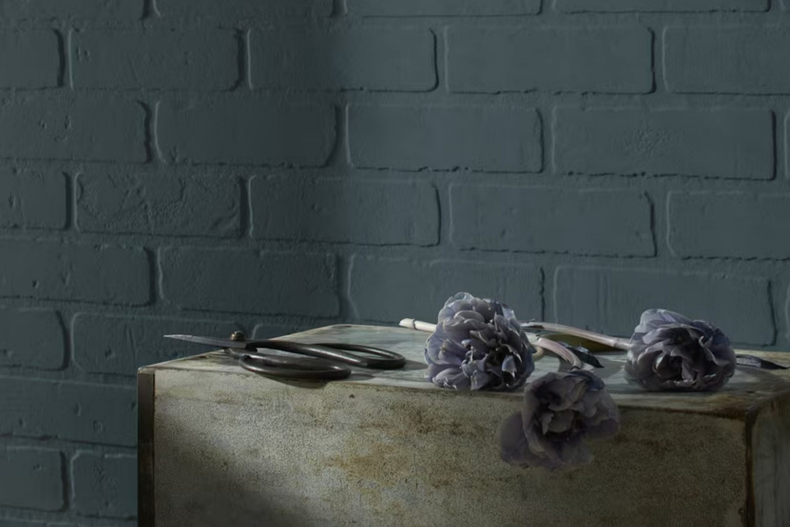
Narragansett Green HC-157 by Benjamin Moore is a rich, deep green hue with blue undertones, creating a color that is both bold and versatile. This shade can range from appearing more green in some lights to having a touch of teal in others. It works beautifully in various interior styles, particularly those that lean towards traditional, coastal, or modern settings.
In traditional interiors, Narragansett Green adds a layer of elegance and refinement, complementing classic wood tones and antique furnishings.
In coastal-styled homes, its calming green-blue quality evokes the ocean, pairing nicely with light-colored wood, natural fibers, and soft whites. In modern spaces, it can be used to create striking contrasts against crisp whites and metallic finishes.
When it comes to materials and textures, this color pairs well with natural elements. Think of rich walnut or oak floors and furniture, as well as textured fabrics like linen or wool. It also complements brass or gold accents, which add warmth and a bit of luxury.
For a more contemporary look, consider pairing it with matte black fixtures or concrete surfaces. Narragansett Green’s versatility makes it a great choice for various applications throughout a home, providing depth and character.
Is Narragansett Green HC-157 by Benjamin Moore Warm or Cool color?
Narragansett Green (HC-157) by Benjamin Moore is a versatile color that brings a touch of nature into the home. With its deep, rich green tones, it creates a cozy and inviting atmosphere. This color can make a room feel warm and grounded, perfect for living rooms or study areas where comfort and focus are desired.
In spaces with plenty of natural light, Narragansett Green can add depth without overwhelming the senses. The green hue complements both traditional and modern furnishings, allowing homeowners to create a cohesive look regardless of their style preferences.
It pairs beautifully with neutral shades like cream or beige, which helps to lighten the space, while darker woods or metallic accents can add a touch of elegance.
Whether used on an accent wall or throughout an entire room, this color adds character and a soothing presence. It’s a popular choice for those looking to bring a bit of the outdoors inside, reflecting growth and renewal.
Undertones of Narragansett Green HC-157 by Benjamin Moore
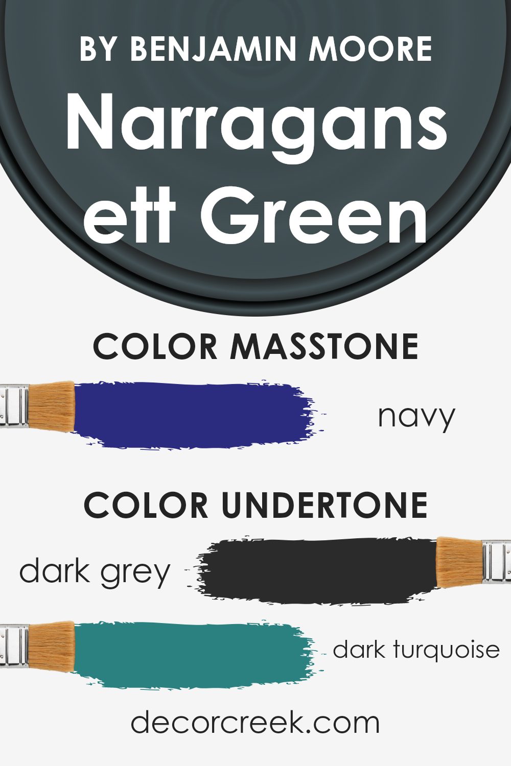
Narragansett Green by Benjamin Moore is a complex color with several undertones that influence how it appears. This color has hints of dark grey, dark turquoise, dark green, purple, brown, olive, grey, dark blue, blue, violet, and lilac. These undertones can change how we perceive the color, depending on the lighting and surrounding colors in a room.
Undertones are the subtle colors that lie beneath the primary color. They can greatly affect a paint color’s appearance, making it look warmer or cooler, brighter or more muted.
In Narragansett Green, the mix of green, blue, and grey creates a color that can feel calm and balanced.
The green and olive undertones give a natural and earthy feel, while the blue and turquoise add coolness and depth. The addition of dark grey and brown intensifies the richness of the color, providing a grounding effect.
When used on interior walls, these undertones mean that Narragansett Green can change throughout the day with the light. With natural light, it may appear more vibrant, while artificial light might bring out the cooler tones.
This versatile color can complement a wide range of furnishings and decor, offering a peaceful yet sophisticated backdrop for any room.
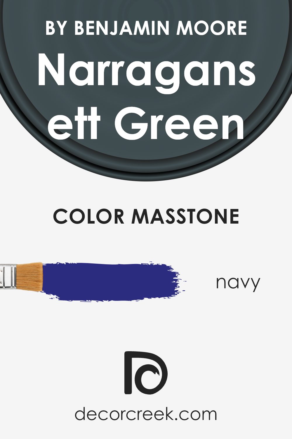
What is the Masstone of the Narragansett Green HC-157 by Benjamin Moore?
Narragansett Green HC-157 by Benjamin Moore is a versatile paint color that can add depth and character to various rooms in a home. Its masstone of navy (#2B2B80) gives it a rich, dark hue that makes spaces feel cozy and grounded.
This dark undertone allows Narragansett Green to act as a neutral in some settings, pairing well with both warm and cool colors. For example, white or light gray accents can create a sharp, modern look, while adding tan or beige elements can lend warmth to the space.
In living rooms or bedrooms, this color can add a calming, grounding effect. It’s an excellent choice for accent walls, creating a focal point without overwhelming the room. In kitchens or bathrooms, it can bring a touch of nature inside, especially when paired with natural wood or stone. This navy-inspired green offers flexibility, making it suitable for both traditional and contemporary interiors.
How Does Lighting Affect Narragansett Green HC-157 by Benjamin Moore?
Lighting plays a significant role in how we perceive colors. The color of an object can change dramatically under different lighting conditions. This is because light can alter the way colors are seen by our eyes, affecting the mood and appearance of a space.
Narragansett Green (HC-157) by Benjamin Moore is a deep, rich shade that can look different depending on the lighting. In natural light, this color appears more vibrant and fresh.
However, in artificial light, particularly if it’s warm, the color can appear slightly muted and take on a cozier feel.
In north-facing rooms, which receive cool, indirect light, Narragansett Green tends to look a bit darker and slightly bluer. The coolness of the light can make the green aspect of the color recede, bringing out more of the undertones. This may give the space a calm and subdued atmosphere.
In south-facing rooms, there is plenty of warm natural light throughout the day. Here, Narragansett Green can appear lighter and more vibrant. The warm light enhances the green tones, making it appear brighter and more lively, which can energize the room and make it feel warm and inviting.
East-facing rooms receive warm, yellowish light in the morning and cooler light in the afternoon. In morning light, the green will seem warmer and more vibrant, while in the afternoon, it might look slightly bluer and toned down. This shift can provide an interesting play of colors throughout the day.
In west-facing rooms, the light is cooler in the morning and warmer in the afternoon. During afternoon and evening hours with direct sunlight, Narragansett Green becomes more pronounced and rich. In the morning, though, the color will look subdued and cooler.
Overall, Narragansett Green’s appearance changes with the direction and type of light, making it a versatile choice for various rooms and lighting situations.
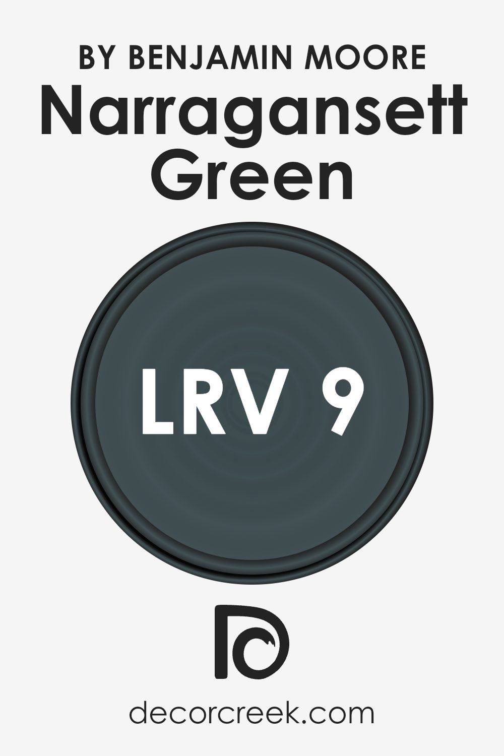
What is the LRV of Narragansett Green HC-157 by Benjamin Moore?
LRV, or Light Reflectance Value, is a measure of how much light a color reflects compared to how much it absorbs. It is measured on a scale from 0 to 100, where 0 means the color absorbs all light (like true black), and 100 means it reflects all light (like pure white).
This value helps in understanding how bright or dark a color will look when applied to a wall. A lower LRV means the color will absorb more light, making the room appear darker, while a higher LRV means the color will reflect more light, making the room feel brighter.
Narragansett Green with an LRV of 9.14 is a very dark color, meaning it will absorb most of the light in a room. This can make a space feel cozy and intimate, but it can also make the space seem smaller and darker, especially if there’s not much natural light available. If used in a spacious room with ample lighting, it can add depth and richness to the walls.
The low LRV value of Narragansett Green suggests that it is best used in areas where you want to create a strong, bold ambiance, perhaps accented with lighter colors or bright furnishings to balance out the darkness.
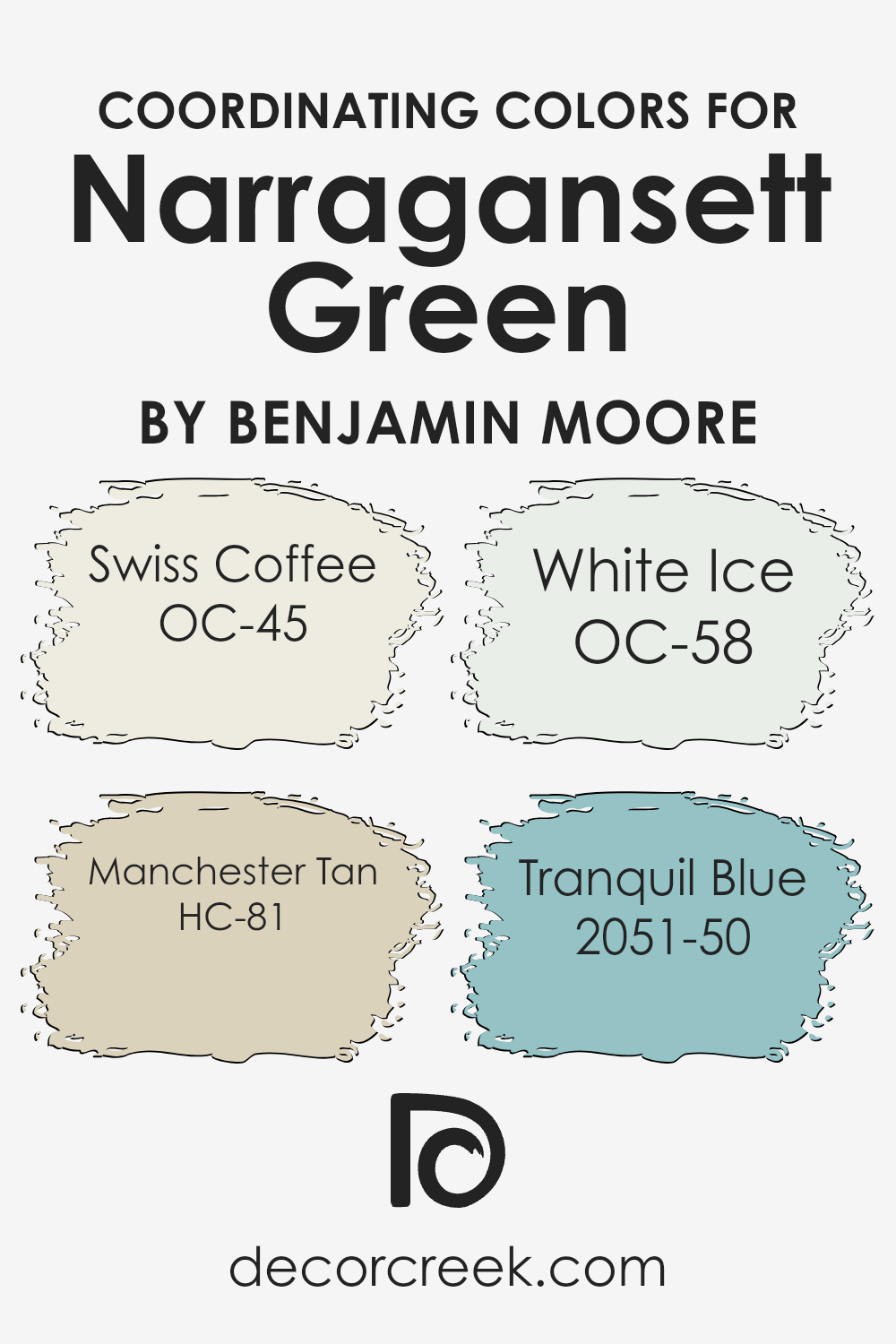
Coordinating Colors of Narragansett Green HC-157 by Benjamin Moore
Coordinating colors are hues that complement and enhance each other when used together in a space. The idea is to select shades that harmonize with a primary color, helping to create a cohesive and visually pleasing environment.
For example, Narragansett Green by Benjamin Moore is a rich and deep green that serves as a stunning focal point. Paired with the right coordinating colors, it can bring balance and depth to any room.
Swiss Coffee is one such coordinating color; it is a soft, warm white that provides a gentle contrast to the boldness of green.
It helps to brighten and open up the space, offering a cozy and inviting atmosphere.
Alongside Swiss Coffee, Manchester Tan introduces an earthy, neutral tone. This warm beige adds a touch of subtle elegance, harmonizing beautifully with green without overpowering it.
White Ice, another coordinating choice, is a crisp and clean white with a hint of coolness, making it perfect for adding fresh accents to a room dominated by deeper colors.
Lastly, Tranquil Blue brings a soft, peaceful blue that can infuse a room with a light and airy feel. It pairs well with green, creating a calming yet vibrant environment. Together, these colors work in harmony to create a balanced and aesthetically appealing space.
You can see recommended paint colors below:
- OC-45 Swiss Coffee
- HC-81 Manchester Tan
- OC-58 White Ice
- 2051-50 Tranquil Blue
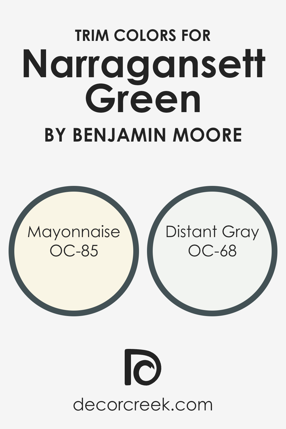
What are the Trim colors of Narragansett Green HC-157 by Benjamin Moore?
Trim colors refer to the shades used to paint the trim, such as baseboards, moldings, and window frames, in a room or on a building. These colors are important because they help to highlight architectural features and create a polished look by providing contrast or harmony with the primary wall color.
In the case of Narragansett Green HC-157 by Benjamin Moore, choosing the right trim color can enhance this deep, moody green. A well-chosen trim color can either make the room feel brighter and more open or create a cozy, intimate atmosphere.
Using OC-85 Mayonnaise or OC-68 Distant Gray as trim colors with Narragansett Green can significantly impact the atmosphere of a space. Mayonnaise, a soft, warm white, offers a gentle, creamy contrast to the richness of the green, which adds warmth and a welcoming vibe to the room.
Distant Gray is a light, cool gray that provides a subtle and clean contrast, ideal for a more contemporary feel that still maintains a soft touch. Both of these options give balance and style to Narragansett Green, showing how trim colors are essential for completing the overall look.
You can see recommended paint colors below:
- OC-85 Mayonnaise
- OC-68 Distant Gray
Colors Similar to Narragansett Green HC-157 by Benjamin Moore
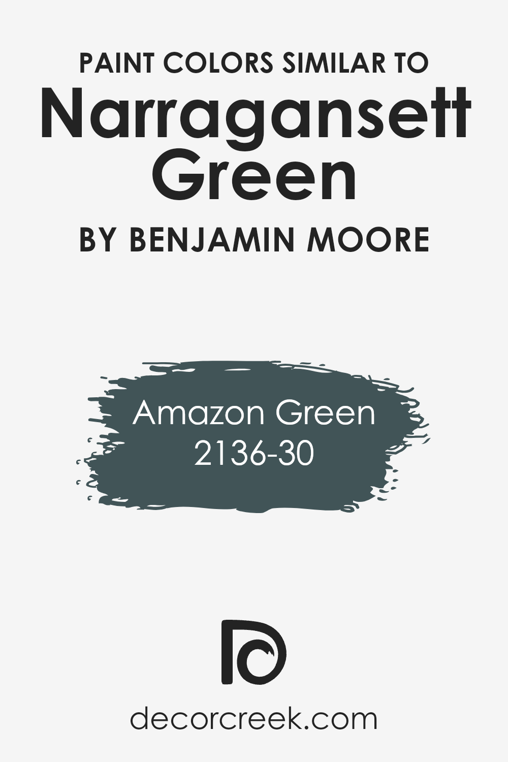
Similar colors play a crucial role in design and decoration because they create a sense of harmony and balance. When you use colors that are close in hue, such as Amazon Green and Narragansett Green, the overall look is more cohesive and pleasing to the eye. Similar colors can subtly enhance the primary color, making the environment feel more unified.
Incorporating these colors lends stability, which is especially important in creating a calming and relaxing atmosphere. The subtle differences between these shades can add interest without going overboard, allowing for a sophisticated yet understated style.
Amazon Green, with its rich forest tones, provides depth and drama. It conjures up the vitality and lushness of dense foliage, bringing elements of nature into the space. In contrast, Narragansett Green is more muted, with a touch of gray that gives it an elegant, subdued look.
This color evokes a tranquil and timeless feel, ideal for a relaxed yet refined setting. Together, these shades create a seamless blend that balances vibrancy with softness.
Using such similar colors can tie together different elements in a room, providing a gentle backdrop that enhances other design features without overpowering them.
You can see recommended paint color below:
- 2136-30 Amazon Green
How to Use Narragansett Green HC-157 by Benjamin Moore In Your Home?
Narragansett Green HC-157 by Benjamin Moore is a deep, rich shade that combines green and blue tones, creating a color that can change with the light. It’s ideal for creating a cozy atmosphere in any room. In a living room, this color can make a bold statement on an accent wall, providing a warm backdrop for art and decor.
In the kitchen, it offers a classic touch when used on cabinets, paired with brass or gold hardware for a chic look. For bedrooms, this color can add depth to the space, complementing light-colored bedding and wooden furniture.
If used in a hallway or entryway, it provides a welcoming feel, making the space look more inviting.
To balance its intensity, pair Narragansett Green with neutral tones like white or beige. This color works well with both contemporary and traditional styles, offering versatility in home design.
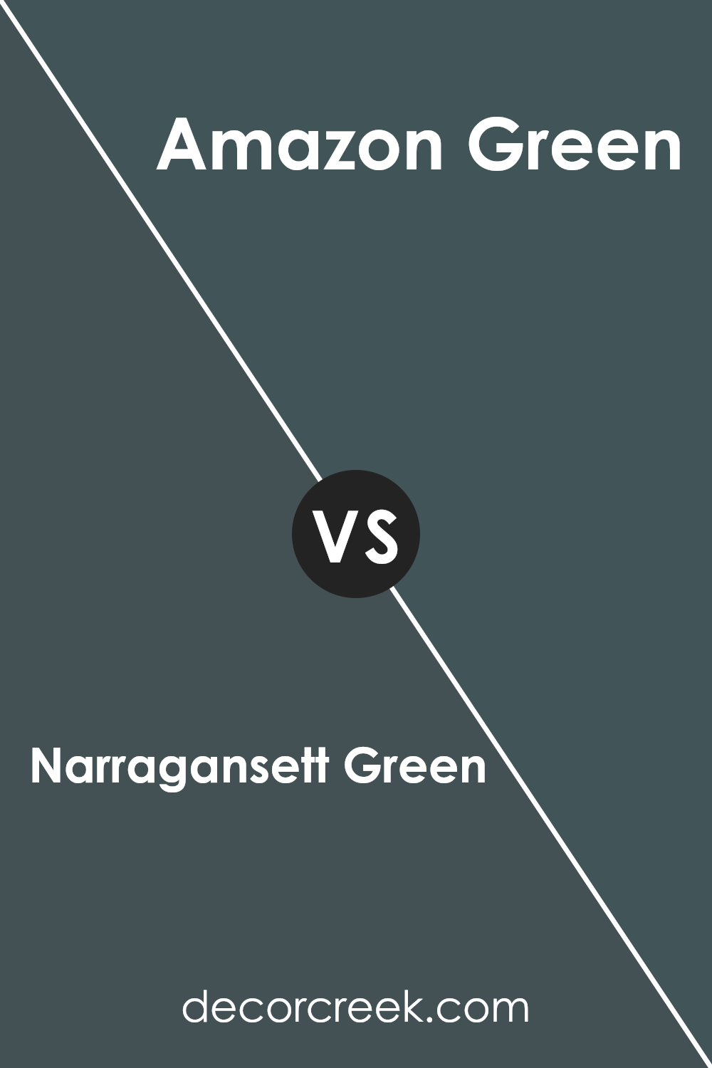
Narragansett Green HC-157 by Benjamin Moore vs Amazon Green 2136-30 by Benjamin Moore
Narragansett Green HC-157 by Benjamin Moore is a deep, muted shade of green with blue undertones, giving it a classic and timeless feel. This color often creates a calm and elegant atmosphere, making it a popular choice for traditional and sophisticated spaces. It pairs well with neutral tones, such as grays and beiges, and can complement wood finishes beautifully.
On the other hand, Amazon Green 2136-30 by Benjamin Moore is a richer, more vibrant green with a hint of warmth. This color brings a lively and energetic vibe to a room, perfect for spaces where you want to add a touch of nature and freshness.
Amazon Green works nicely with other bold colors but also stands out against whites and lighter shades.
Both colors have their unique appeal: Narragansett Green offers understated elegance, while Amazon Green brings a lively, refreshing look. Your choice would depend on the mood and style you want to achieve in your space.
You can see recommended paint color below:
- 2136-30 Amazon Green
Conclusion
Narragansett Green by Benjamin Moore is a special color that I’ve come to really like. It reminds me of a perfect mix between green and gray, almost like a misty morning or soft sea waves. It’s not too bright, so it’s gentle on the eyes, much like calm grass on a cloudy day. I think it’s really good for walls, furniture, or even small items, because it can fit with lots of other colors.
One thing I noticed is how it changes a bit depending on where you see it. In bright light, it looks fresh and clean. When inside, it can seem warmer and more cozy, like being wrapped in a soft blanket.
This makes it a great choice for places where you want to feel comfortable, like a bedroom or a living room.
I also like that this color feels like it tells a quiet story. It doesn’t shout but whispers gently, like a friendly voice. It can go really well with wood, white, or other gentle colors.
Overall, Narragansett Green feels like a nice hug from nature, making any place feel special without taking all the attention. It’s a color that feels just right, like a gentle friend in your home.
Ever wished paint sampling was as easy as sticking a sticker? Guess what? Now it is! Discover Samplize's unique Peel & Stick samples.
Get paint samples

