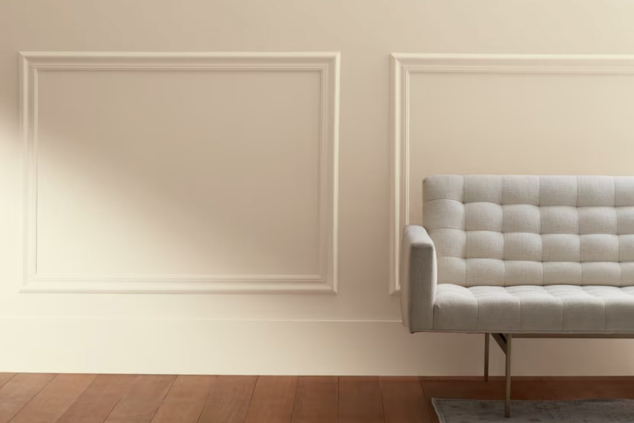
When you first consider updating a room, choosing the right paint color can be a crucial decision. One color you might find particularly appealing is 966 Natural Linen by Benjamin Moore. This shade is a soft, warm neutral that offers a flexible backdrop for any room in your home.
It’s subtle enough not to overwhelm, yet has enough presence to make a room feel inviting and comfortable. Imagine it in your living room, where its gentle hue complements both natural light and your chosen home decor, creating a cozy, cohesive room.
Or picture it in a bedroom, where its peacefulness encourages relaxation and rest. Natural Linen adapts well to various lighting conditions, maintaining its beauty and warmth under both the bright sun of a window-lined dining nook or the softer light of a well-placed lamp in a reading corner.
Its adaptability and enduring charm make it a popular choice for those looking to add a touch of understated elegance to their living environment.
What Color Is Natural Linen 966 by Benjamin Moore?
Natural Linen by Benjamin Moore is a warm, neutral paint color that brings a cozy and inviting feel to any room. It carries subtle undertones of beige and gray, making it a flexible choice for many home interiors. This color stands out for its ability to create a soft backdrop that pairs beautifully with both bolder accents and other neutrals.
In terms of interior styles, Natural Linen works wonderfully in rustic, traditional, and modern farmhouse designs. Its warm hue complements the organic textures found in these rooms, such as distressed wood, soft woolen textiles, and woven rattans. This paint color also suits minimalist rooms, where its subtle warmth helps to soften the starkness typically associated with this style.
Natural Linen harmonizes exceptionally well with materials such as leather, linen, and clay, enhancing textures and adding depth to the room. When it comes to pairing with other colors, it coordinates effectively with rich browns, soft whites, and muted greens, which together create a grounded and welcoming atmosphere.
Whether you’re painting a living room, bedroom, kitchen, or hall, Natural Linen offers an enduring aesthetic that adapts well to a variety of decors and personal tastes, ensuring a stylish and harmonious look.
Is Natural Linen 966 by Benjamin Moore Warm or Cool color?
Natural Linen 966 by Benjamin Moore is a popular paint color that brings a warm, welcoming feel to any room in a home. This shade is a subtle, soft beige that works well in many rooms, whether it’s a cozy living room or a bright kitchen. It has a natural, earthy vibe that pairs beautifully with various decor styles, from rustic to modern.
The flexibility of Natural Linen 966 makes it an excellent choice for those wanting a neutral backdrop that still adds warmth to their room. It goes well with a wide range of colors, allowing for flexibility in decorating. Whether combined with bold hues or other neutral tones, this color supports the overall aesthetics without overpowering the room.
Additionally, this color can help make small rooms appear larger and more open, thanks to its light-reflective qualities, but it still gives enough warmth to keep the room feeling cozy and inviting. This makes it a great option for anyone looking to refresh their home with a color that is both functional and stylish.
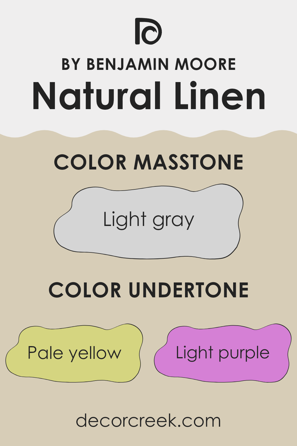
Undertones of Natural Linen 966 by Benjamin Moore
Natural Linen 966 by Benjamin Moore is a flexible paint color with a complex mix of undertones that influence how it looks in different settings. Understanding undertones is important because they can subtly change the color’s appearance under various lighting conditions.
This particular shade has undertones of pale yellow, light purple, light blue, pale pink, mint, lilac, and grey. These undertones can make the wall paint react differently depending on the light source and other colors in the room. For instance, pale yellow can make it feel slightly warmer, whereas the light blue might give a cooler impression in a brightly lit room.
When painted on interior walls, the blend of undertones in Natural Linen allows for a flexible backdrop that adapts well with different decors. The grey and lilac undertones bring a touch of depth that prevents the color from feeling flat. Meanwhile, the hints of mint and pale pink can add a fresh and gentle layer that makes the room feel welcoming.
Because of these undertones, Natural Linen is an excellent choice for rooms that need a neutral yet dynamic hue. It pairs nicely with both dark and light furniture, enhancing the overall mood without overpowering with color. The ability of this paint to slightly shift its appearance makes it practical for rooms used throughout the day, offering subtle shifts that keep the interior interesting.
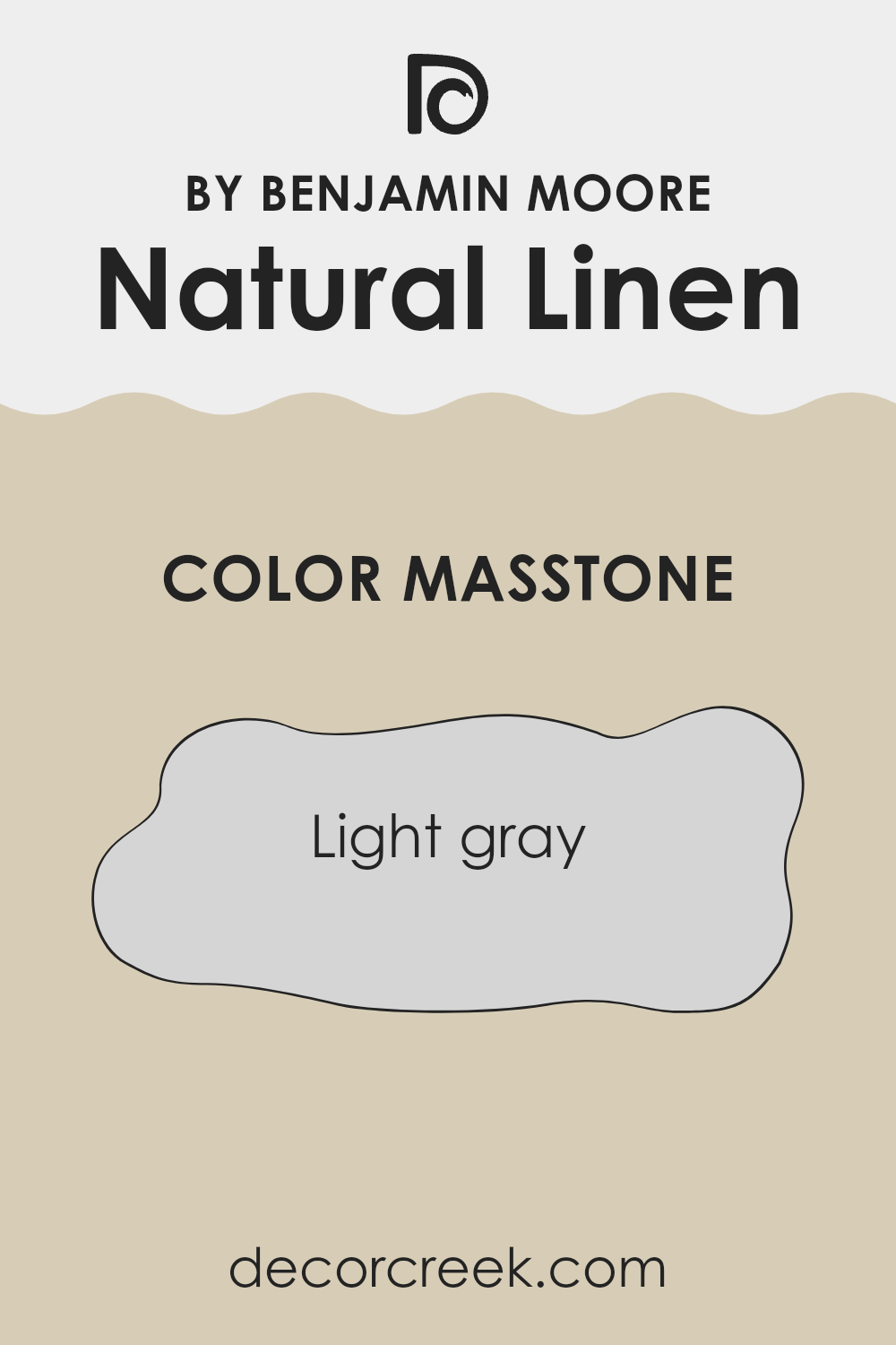
What is the Masstone of the Natural Linen 966 by Benjamin Moore?
Natural Linen 966 by Benjamin Moore has a masstone of light gray, which gives any room a clear, calm vibe. The color is neutral, making it very easy to blend with other shades. Whether it’s bright colors or other subdued tones, it works well.
This flexibility is useful in homes because it lets homeowners switch up their decor without worrying about repainting the walls to match new styles. The light gray tone also helps to reflect light, making rooms appear larger and more open, a great plus for small rooms or areas with limited natural light.
It’s a practical choice for families too, as its subtleness hides minor marks and smudges better than darker shades. Overall, Natural Linen 966 is an effective and adaptable option that can set a calm foundation in a home.
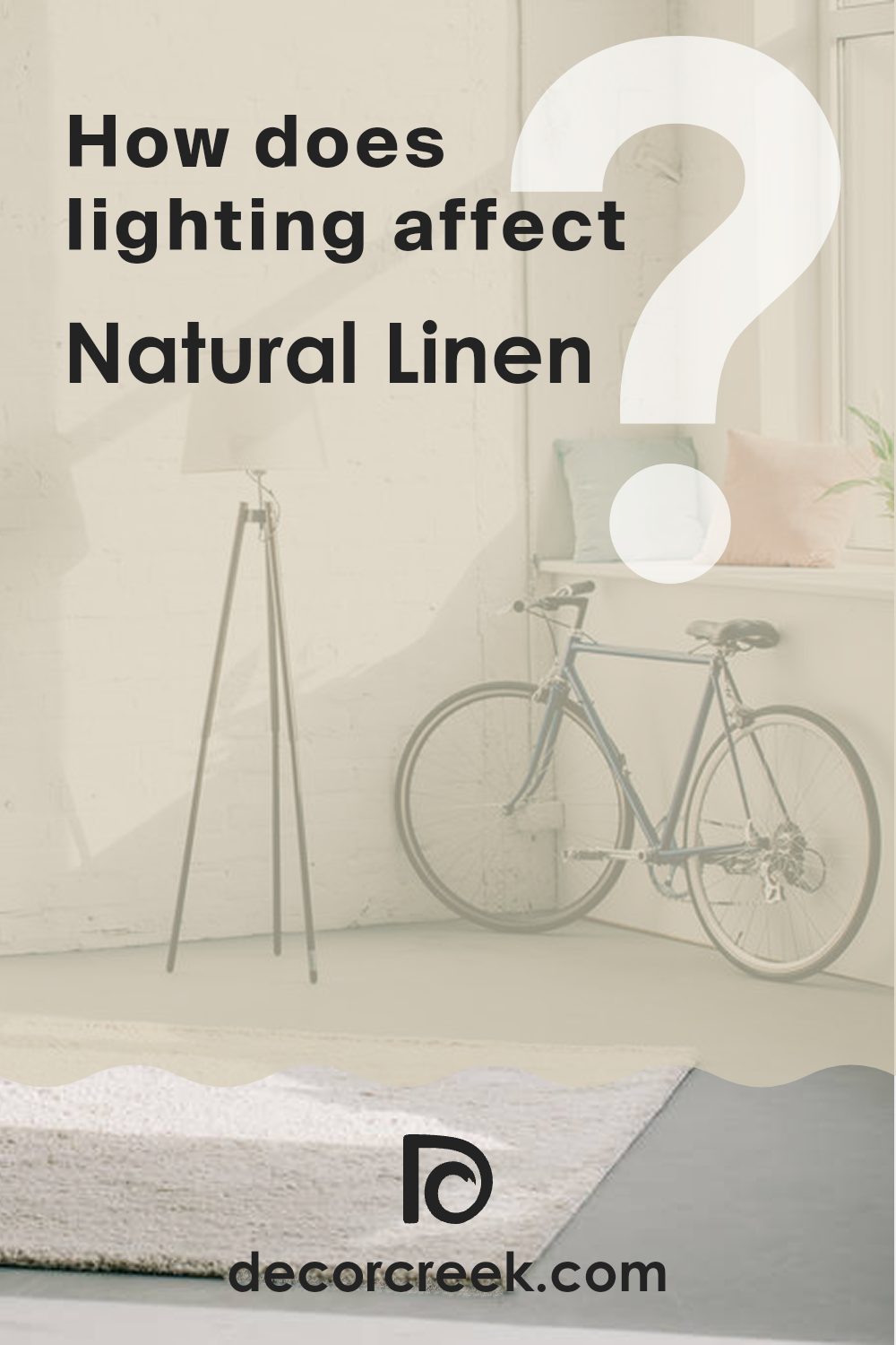
How Does Lighting Affect Natural Linen 966 by Benjamin Moore?
Lighting has a significant impact on how colors appear in different environments. When choosing a color for a room, it’s important to consider the type of light the room receives. For example, Benjamin Moore’s Natural Linen 966 is a neutral color that can change subtly depending on lighting conditions.
In rooms with natural light, the lighting changes throughout the day. Natural Linen 966 looks different in this varying light. In a room facing north, which receives less direct sunlight, the color might appear slightly cooler and more shadowed, giving it a muted, soft look. This can make the room feel calm and relaxed.
In a south-facing room, where sunlight is more abundant and direct, Natural Linen 966 will look warmer and brighter. The ample sunlight brings out the warmer tones in the paint, making the room feel more inviting and cozy.
East-facing rooms benefit from the morning sunlight, which can make the color look very gentle and pleasant in the early hours. As the day progresses and the direct sunlight moves away, the color might lose some of its warmth and appear softer.
West-facing rooms get the evening light, which means Natural Linen 966 will have a warmer glow towards the end of the day. During the morning and early afternoon, when the room is less lit, the color could appear more neutral and less vibrant.
Artificial lighting also affects how colors are seen. With incandescent lights, Natural Linen 966 can look warmer due to the yellowish tint of these lights. Fluorescent lighting might cast a cooler glow on the color, making it appear more austere.
Understanding how Natural Linen 966 interacts with different lighting conditions can help you decide where to use it effectively. Whether it’s a north, south, east, or west-facing room, or under artificial lights, considering these factors ensures you achieve the desired effect in your room.
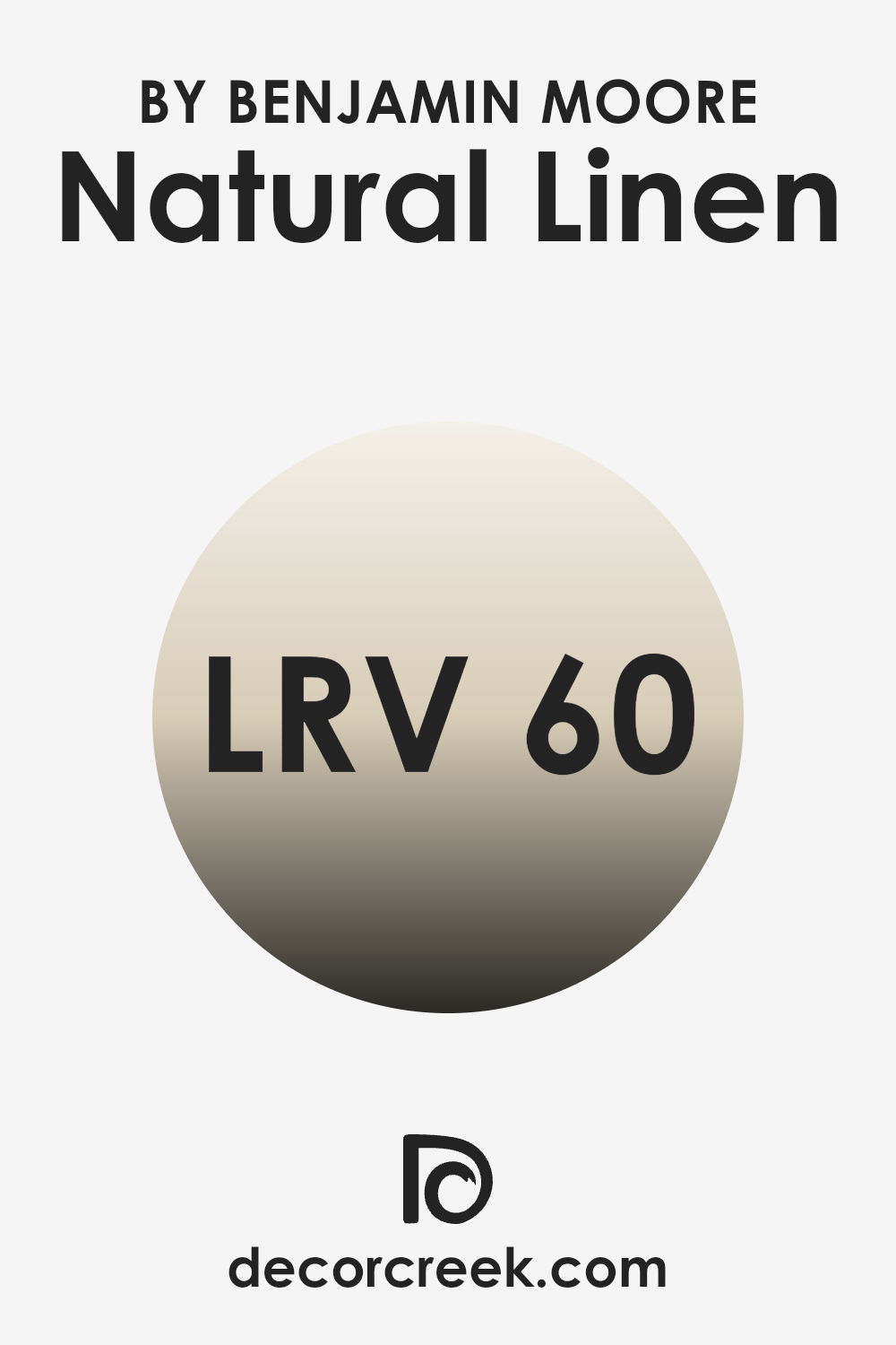
What is the LRV of Natural Linen 966 by Benjamin Moore?
LRV, or Light Reflectance Value, measures the percentage of light a paint color reflects back into a room compared to how much it absorbs. It’s like a gauge to see how light or dark a color will appear once it’s on your wall.
A higher LRV means the color reflects more light back, making the room feel brighter and more open, while a lower LRV means the color absorbs more light, which can make a room feel cozier but smaller. With an LRV of 59.84, Natural Linen by Benjamin Moore is closer to the lighter side, which means it won’t make a room feel cramped or dark.
Instead, it reflects a good amount of light, brightening the room without overpowering it with brightness. This level of reflectiveness makes it a flexible choice for various rooms, helping to create a welcoming atmosphere, particularly in rooms that might not have a lot of natural light.
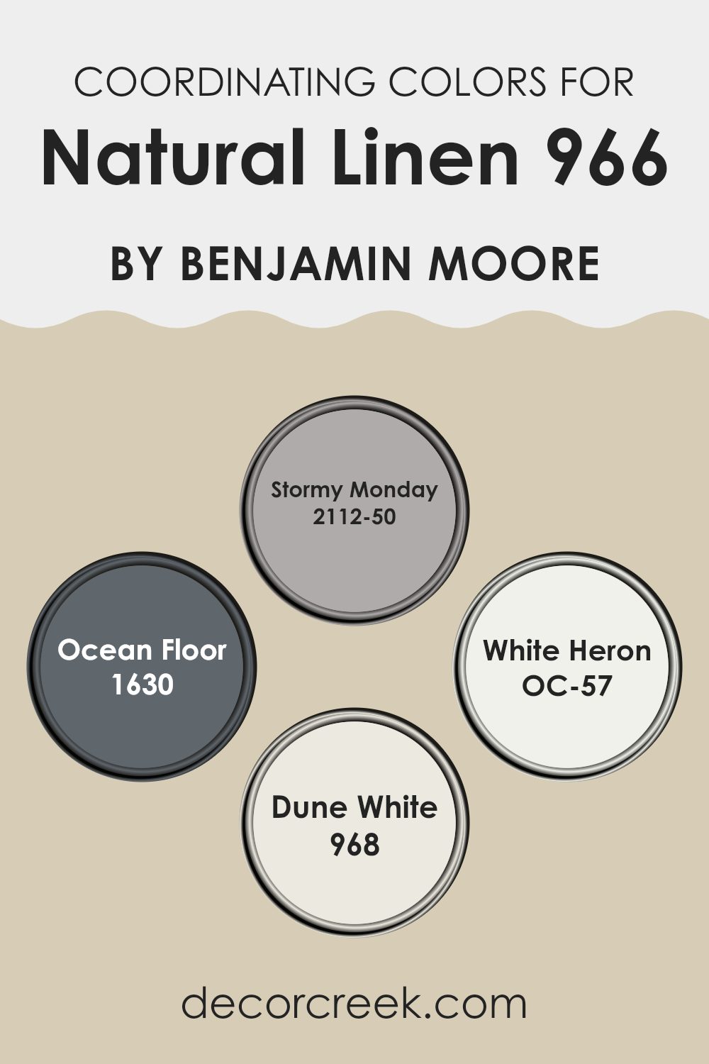
Coordinating Colors of Natural Linen 966 by Benjamin Moore
Coordinating colors are those that complement each other harmoniously when used together in decor, enhancing the ambiance of a room. By choosing colors like Stormy Monday, Ocean Floor, White Heron, and Dune White to coordinate with a base color such as Natural Linen by Benjamin Moore, you create a balanced and visually appealing palette.
These coordinating hues share similar undertones or contrasts that bring out the best features of each color, making the overall look cohesive and pleasing to the eye. Stormy Monday is a muted, soft gray that provides a calm and neutral backdrop, perfect for balancing brighter or darker hues.
It’s an ideal choice for creating a subtle, refined look in rooms. Ocean Floor, by contrast, is a deeper, ocean-inspired blue-gray that adds depth and interest to interiors, offering a feeling of groundedness. White Heron is a bright, crisp white that gives a clean and fresh look, perfect for making rooms appear larger and more open. Meanwhile, Dune White offers a lighter, sandy hue, resembling the soft color of a beach, which adds warmth and a gentle, inviting quality to a room. Together, these colors work seamlessly to create a cohesive and attractive color scheme.
You can see recommended paint colors below:
- 2112-50 Stormy Monday
- 1630 Ocean Floor
- OC-57 White Heron
- 968 Dune White
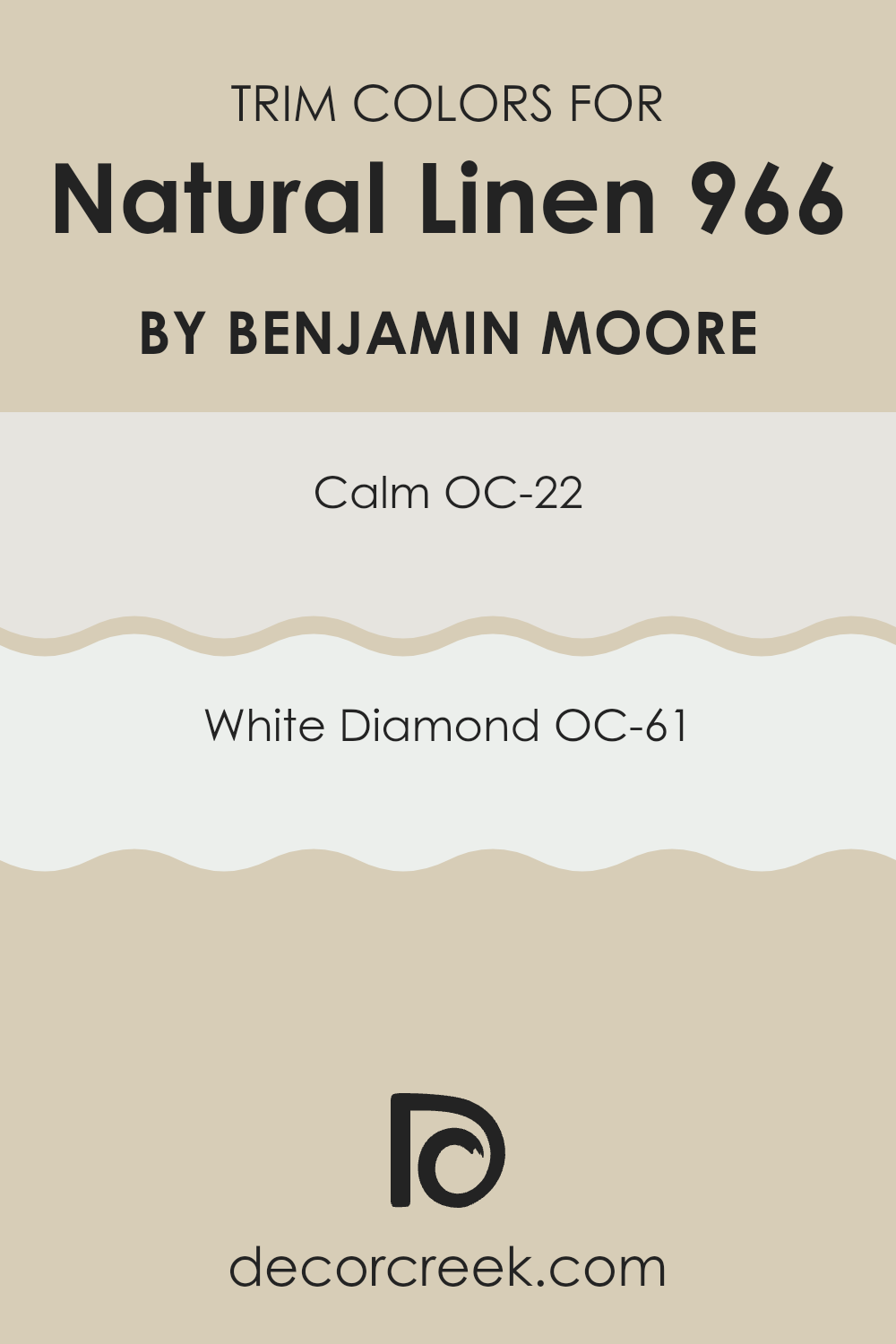
What are the Trim colors of Natural Linen 966 by Benjamin Moore?
Trim colors, often used for door frames, baseboards, and molding, play a pivotal role in defining and accentuating the aesthetic of a room. They are used not only to highlight the architectural features of a room but also to create a subtle contrast that can make wall colors stand out more effectively.
For a flexible and warm wall color like Natural Linen by Benjamin Moore, selecting the right trim colors is crucial in order to frame the room beautifully without overpowering the gentle tone of the main color.
Benjamin Moore’s OC-22 Calm is a gentle off-white with a hint of gray that works beautifully as a trim color, providing a soft contrast that enhances the richness of Natural Linen without being too stark or overpowering. On the other hand, OC-61 White Diamond offers a crisp, clean look that brightens the edges of the room, giving a fresh and airy feel to the room. Both colors are excellent choices for trim, offering a subtle distinction that complements the base color while ensuring the overall look remains cohesive and balanced.
You can see recommended paint colors below:
- OC-22 Calm
- OC-61 White Diamond
Colors Similar to Natural Linen 966 by Benjamin Moore
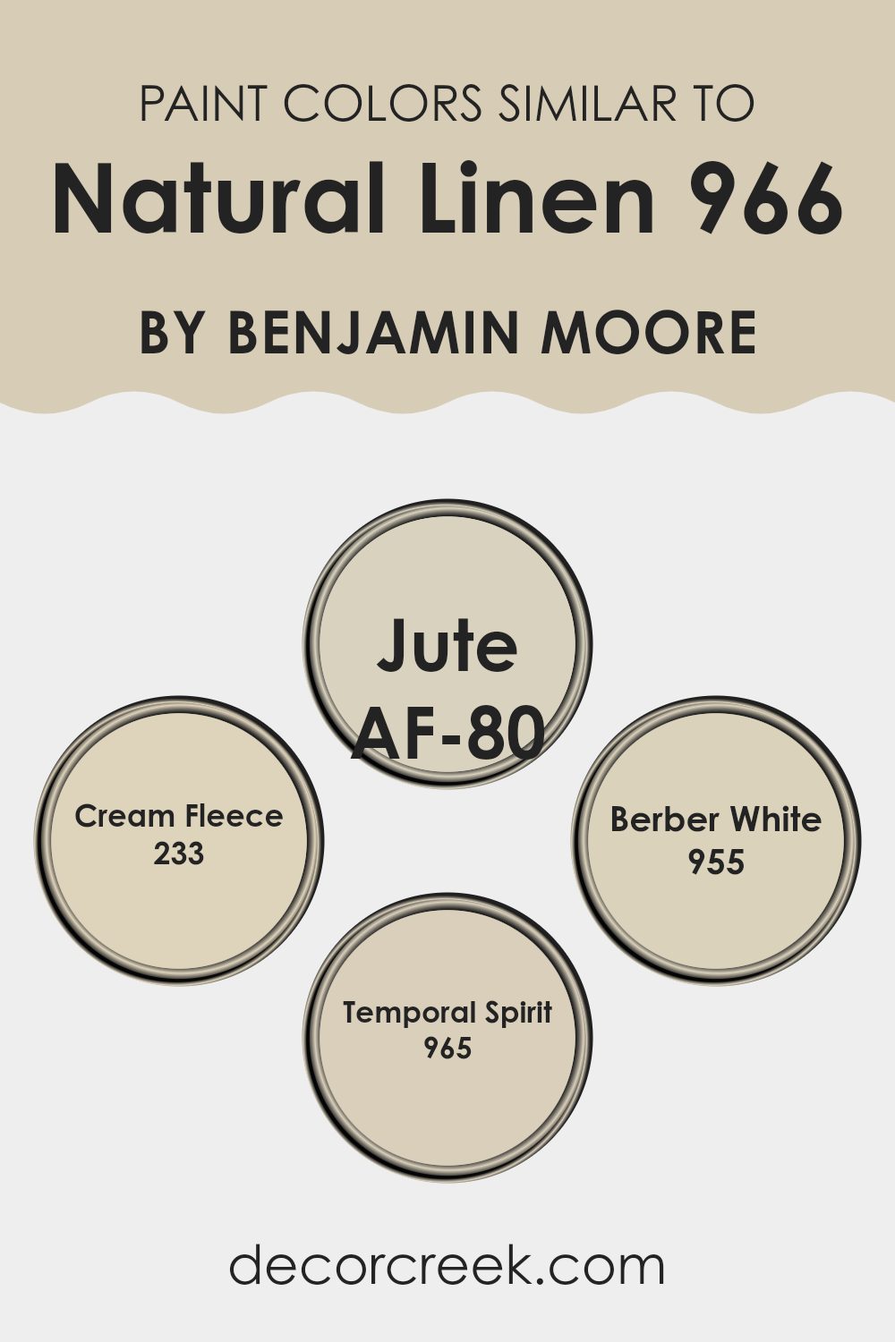
Choosing similar colors is key in creating a harmonious visual appeal. When colors share tonal similarities, they naturally complement each other, leading to a design that feels coherent and seamless. For instance, Natural Linen by Benjamin Moore is a perfect base color to which other similar shades can be added to enhance the style without overpowering the senses. Colors like AF-80 Jute, 233 Cream Fleece, 955 Berber White, and 965 Temporal Spirit, are excellent choices, each contributing to a soft, warm ambiance that can make any room feel inviting.
AF-80 Jute is like a subtle undertone of Natural Linen; it adds depth without deviating from the soft, warm essence. Cream Fleece, on the other hand, offers a slightly richer and creamier feel, providing a delicate contrast that enhances the visual texture of a room.
Berber White is lighter, ideal for brightening rooms and introducing a subtle diversity that aligns with the calm nature of Natural Linen. Lastly, Temporal Spirit enriches the palette with a grayish tint, adding a layer of modern flair that parallels well with the other colors. Altogether, these shades create a cohesive yet diverse palette that can be used to fashion a welcoming and beautifully coordinated room.
You can see recommended paint colors below:
- AF-80 Jute
- 233 Cream Fleece
- 955 Berber White
- 965 Temporal Spirit
Colors that Go With Natural Linen 966 by Benjamin Moore
Choosing the right colors to pair with Natural Linen 966 by Benjamin Moore can greatly enhance the ambiance of any room. When matched thoughtfully, these complementary colors create a coherent and visually appealing palette, ensuring interiors look harmonious and well thought out. Complementary colors enhance each other, making the other colors appear richer, which has an eye-pleasing effect that appeals naturally to human perception. The play of colors can affect moods, perceptions, and the overall aesthetic of the room.
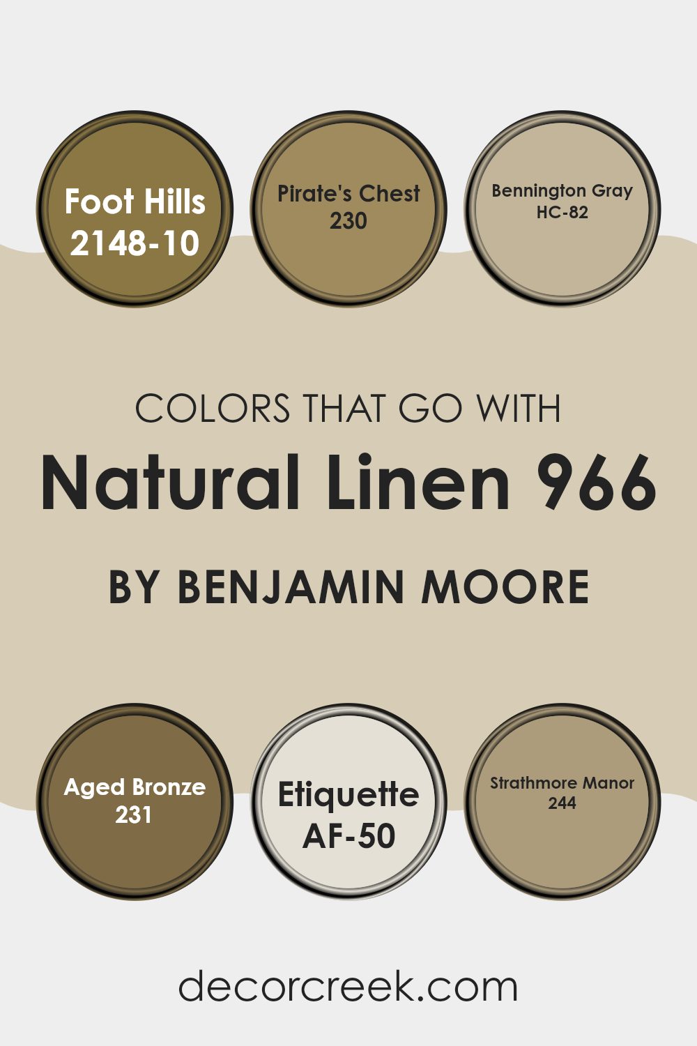
Foot Hills 2148-10 is a deep, warm brown that offers a strong contrast to the softness of Natural Linen, giving a room a grounded and cozy feel. Pirate’s Chest 230, with its golden brown hue, adds a touch of warmth and recalls the colors of autumn, perfect for rooms meant to feel welcoming and relaxed.
Bennington Gray HC-82, a subtle and gentle gray, works as a neutral backdrop that allows Natural Linen to stand out without overpowering the room, perfect for achieving a balanced look. Aged Bronze 231 provides a rich, darker element that mimics the beauty of aged metal, adding depth and a touch of luxury. Etiquette AF-50 is a clean, minimalistic white that refreshes the room, bringing out the brightness of Natural Linen, making the room appear airy and larger.
Lastly, Strathmore Manor 244 is a refined tan shade that pairs nicely with Natural Linen for a soft, seamless transition of calming neutrals, ideal for creating a peaceful setting. Each of these colors can be used to craft rooms that feel complete and tailored to personal tastes, contributing to the overall beauty and function of the home.
You can see recommended paint colors below:
- 2148-10 Foot Hills
- 230 Pirate’s Chest
- HC-82 Bennington Gray
- 231 Aged Bronze
- AF-50 Etiquette
- 244 Strathmore Manor
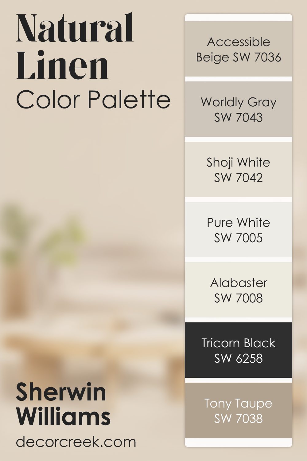
Natural Linen SW 9109 by Sherwin Williams Color Palette
Natural Linen brings an earthy, gentle warmth, and this palette builds on that softness in a comforting way. Accessible Beige and Worldly Gray offer a natural balance that feels steady and grounded. Shoji White and Pure White brighten the palette without taking away its cozy feel.
Tony Taupe adds a rich note that pairs beautifully with the warm undertones.
Tricorn Black provides striking contrast, giving the palette strength and definition. Alabaster rounds everything out with a soft glow.
This palette feels warm, friendly, and easy to enjoy in everyday life. It’s ideal for homes that aim for comfort, natural beauty, and a sense of quiet color harmony
How to Use Natural Linen 966 by Benjamin Moore In Your Home?
Natural Linen 966 by Benjamin Moore is a warm, neutral beige paint color with a hint of gray. It has the ability to create a cozy atmosphere in any room, making it a popular choice for homeowners looking to add a touch of softness and warmth to their room. It’s especially great for living rooms and bedrooms where you want to establish a comfortable and inviting vibe.
Natural Linen 966 pairs well with a wide range of colors, from earthy tones to pastels, making it a flexible option for decorating. It can be used on walls to form a neutral backdrop that allows furniture and artwork to stand out. It’s also a great choice for painting cabinets or trim to add a subtle contrast without overpowering the room.
Applying this color in areas with natural light can open up the room, making rooms appear larger and more airy. It’s a practical choice for refreshing your home and giving it a new look without being too bold or distracting.
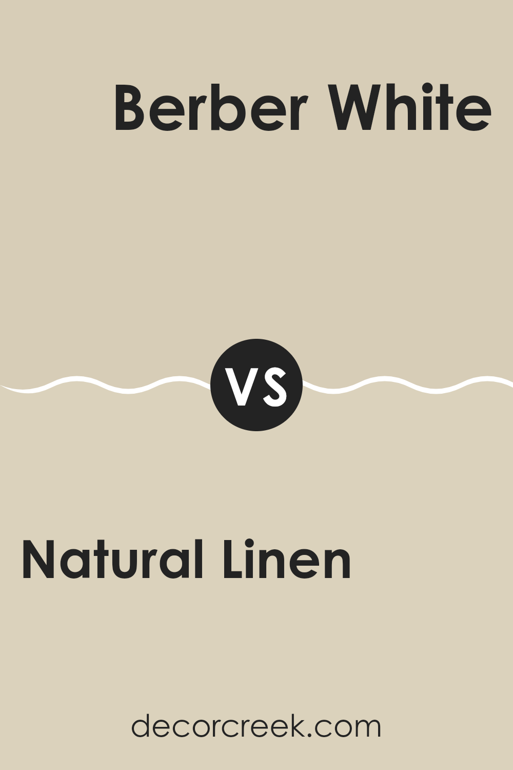
Natural Linen 966 by Benjamin Moore vs Berber White 955 by Benjamin Moore
Natural Linen and Berber White by Benjamin Moore are two paint colors that bring their unique qualities to a room. Natural Linen is a warm, inviting beige that offers a cozy feel to any room. It mirrors the look of natural linen fabric, providing a comforting and gentle atmosphere. This color works well in living areas and bedrooms where you want a soft, welcoming vibe.
On the other hand, Berber White is a soft white with a subtle hint of cream. It is lighter and brighter than Natural Linen, making it ideal for rooms you want to feel more open and airy. It reflects light beautifully, which can help to make small rooms appear bigger and more spacious.
Both colors are flexible and can be used in various styles of decor. While Natural Linen brings warmth and a touch of earthiness, Berber White offers a clean and fresh look, perfect for a modern, minimalistic approach or for enhancing natural light. Depending on your room and needs, each has its advantages.
You can see recommended paint color below:
- 955 Berber White
Natural Linen 966 by Benjamin Moore vs Jute AF-80 by Benjamin Moore
The main color, Natural Linen, offers a soft, warm beige shade that creates a cozy and inviting atmosphere. It’s flexible enough to work well in various rooms, lending a subtle, homey charm to rooms. On the other hand, Jute, the second color, brings a lighter, almost creamy beige tone. It’s a bit fresher and brighter, making it great for rooms where you want to enhance natural light and create a gentle, welcoming environment.
When comparing them, Natural Linen has a richer, deeper beige tone, providing a comforting presence that works well with both bright colors and darker hues. Jute, being lighter, tends to pair nicely with softer color palettes, enhancing an airy feel.
Depending on your room’s purpose and the amount of light it gets, you might choose Natural Linen for its warmth and depth or Jute for its light, refreshing qualities. Both colors support a calm, pleasant mood in any living area.
You can see recommended paint color below:
- AF-80 Jute
Natural Linen 966 by Benjamin Moore vs Temporal Spirit 965 by Benjamin Moore
Both Natural Linen and Temporal Spirit by Benjamin Moore are subtle neutral shades, though they exhibit some distinct differences. Natural Linen is a warm, beige color that brings a cozy and inviting feel to a room.
It has a slightly toasted feel, making it ideal for rooms where you want a welcoming atmosphere. On the other hand, Temporal Spirit is a cooler tone, leaning more towards a soft grey. This color is great for a modern look and fits well in rooms that aim for a clean and contemporary vibe.
The primary difference lies in their warm and cool undertones—Natural Linen offers warmth, while Temporal Spirit provides a muted backdrop that pairs well with bolder colors or minimalist decor. In essence, your choice between the two depends on whether you’re aiming for warmth or a sleek, modern feel in your decoration.
You can see recommended paint color below:
- 965 Temporal Spirit
Natural Linen 966 by Benjamin Moore vs Cream Fleece 233 by Benjamin Moore
Natural Linen and Cream Fleece are two paint colors by Benjamin Moore that share a subtle and warm base, but they have unique characteristics that set them apart. Natural Linen has a soft, neutral beige tone that gives a cozy and inviting feel to any room. It’s a flexible color that works well in rooms that aim for a calm and understated look.
On the other hand, Cream Fleece is lighter and has a creamier appearance. This color is great for making a small room appear brighter and more spacious, as it reflects light better than the deeper beige of Natural Linen. Cream Fleece is perfect for those who prefer a slightly airier ambiance with a touch of warmth.
Both colors are excellent choices for creating a relaxed environment, but the choice between them depends on how light or cozy you want your room to feel. While Natural Linen adds depth to a room, Cream Fleece introduces a lighter, softer touch.
You can see recommended paint color below:
- 233 Cream Fleece
In conclusion, after learning about 966 Natural Linen by Benjamin Moore, I can really see why it’s a popular choice. It’s a calm color that can make rooms feel bigger, warm, and comfy. Whether I wanted to paint my bedroom, living room, or even the kitchen, this color can fit nicely because it’s like the light brown color of sand at the beach. It doesn’t shout for attention, yet it makes everything look neat and put together.
This color can also pair well with many other colors. Whether it’s dark brown, deep green, or even a bright color, they all seem to work well with Natural Linen. This allows a lot of flexibility in decorating a room. Adding in some pops of color through furniture or decorations can make the room look fun and lively.
I think choosing this paint could be a great choice if someone likes a calm and warm environment, without making it look boring. It’s easy to see why Benjamin Moore’s 966 Natural Linen could be a good pick. It’s not just any paint; it sets a lovely, peaceful mood that can make your home feel just right.
Ever wished paint sampling was as easy as sticking a sticker? Guess what? Now it is! Discover Samplize's unique Peel & Stick samples.
Get paint samples

