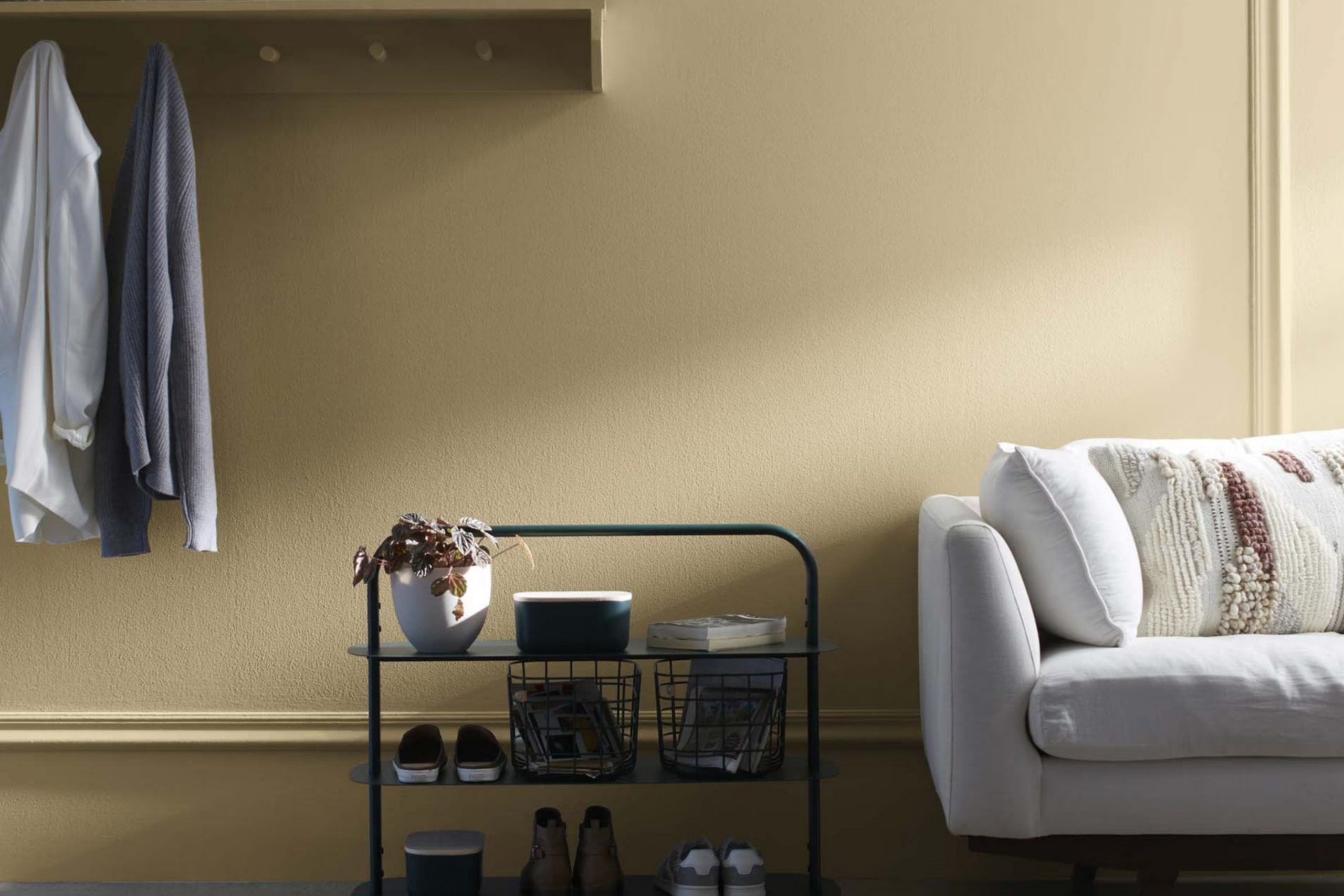
When I first started working with 235 Oak Ridge by Benjamin Moore, I was drawn to its warm, inviting presence. It’s a color that has a way of making any area feel cozy and welcoming. While some colors can feel overpowering, 235 Oak Ridge strikes a perfect balance.
Its earthy undertones create a sense of harmony in a room, making it ideal for living rooms where you want to unwind after a long day. Whether you’re painting a small accent wall or an entire room, this shade provides a soothing backdrop that complements a wide variety of furnishings and decor styles.
In my experience, Oak Ridge works well in both natural and artificial light, offering a consistent, comforting vibe regardless of the time of day. It’s an adaptable shade that pairs beautifully with both modern and traditional elements, allowing you to add your personal touch without clashing with the walls.
The color’s subtlety also means it serves as a great foundation, letting other design elements shine. Choosing 235 Oak Ridge means opting for a color that brings warmth and character to a home, subtly enhancing the environment without shouting for attention.
What Color Is Oak Ridge 235 by Benjamin Moore?
Oak Ridge by Benjamin Moore is a refined shade of brown that combines earthy undertones with a touch of warmth, creating a comforting and inviting atmosphere. This adaptable color is ideal for interior areas where a cozy, welcoming feel is desired. It works beautifully in living rooms, dining areas, and bedrooms, adding a sense of grounded calmness to any room.
Oak Ridge complements a variety of interior styles, including rustic, farmhouse, and traditional settings. Its warm hues enhance natural materials like wood, making it a great choice for rooms with exposed beams, wooden floors, or furniture. Paired with soft, textured fabrics such as chunky knits, linen, or wool, it can add depth and dimension to a room.
The color also matches well with metal accents, such as brass or copper, which can bring a hint of refinement. For contrast, it can be combined with light, creamy whites or soft grays, accentuating its warmth without overpowering the area.
Overall, Oak Ridge by Benjamin Moore offers a perfect blend of style and comfort, providing an adaptable backdrop for both bold and subtle design elements.
Is Oak Ridge 235 by Benjamin Moore Warm or Cool color?
Oak Ridge by Benjamin Moore is a warm, earthy paint color that brings a sense of comfort and coziness to a home. This shade sits comfortably between brown and green, providing a natural and inviting look that suits various styles and rooms.
It works well in living rooms, dining rooms, and bedrooms by creating a welcoming atmosphere. The color’s natural tones make rooms feel grounded and stable, and it pairs wonderfully with neutral decor or nature-inspired accents. Oak Ridge can be used on all four walls for a bold look or as an accent to complement lighter shades.
Its adaptability allows it to work well with both traditional and modern furnishings. This color is ideal for those who want to incorporate more nature into their home without overpowering the room. Thanks to its ability to blend seamlessly with different design elements, Oak Ridge is a reliable choice for any room in the house.
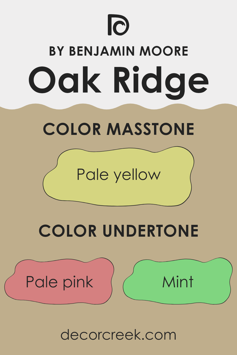
Undertones of Oak Ridge 235 by Benjamin Moore
Oak Ridge by Benjamin Moore is a complex color with a rich set of undertones that makes it adaptable for interior walls. Undertones are the subtle hues that appear beneath the main color. They can change how we perceive the paint depending on lighting and surrounding colors.
Oak Ridge includes undertones of pale pink, mint, grey, light grey, light purple, light blue, lilac, yellow, orange, light green, and olive. These undertones create a dynamic color that can look different in various settings.
For example, in a room with lots of natural light, the mint and light green undertones may become more visible, giving the area a fresh and airy feel. In contrast, under artificial light, the warmer undertones like pale pink and orange might be more pronounced, adding a cozy warmth to the room. The grey undertones provide a grounding effect, making the color appear more neutral and calming, while the touches of light purple and lilac can add a subtle hint of elegance.
The light blue undertones can make the room feel cool and calm, while the yellow and orange undertones can introduce warmth and cheerfulness. Overall, Oak Ridge’s varied undertones allow it to harmonize with different decors, making it suitable for a wide range of interior styles.
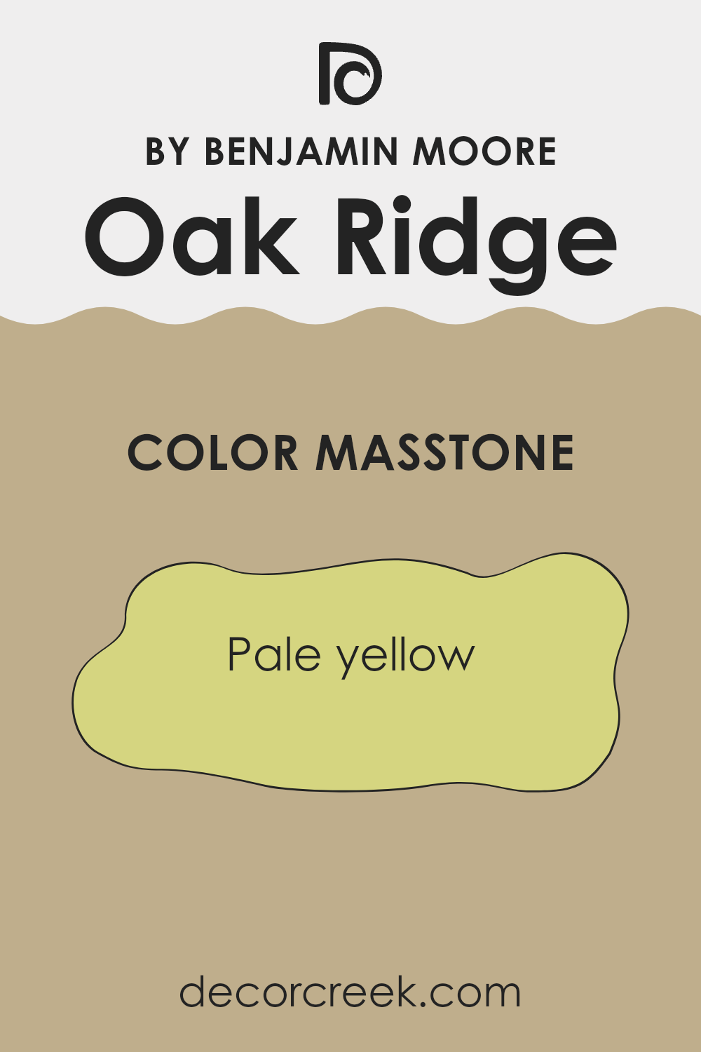
What is the Masstone of the Oak Ridge 235 by Benjamin Moore?
Oak Ridge by Benjamin Moore is a pale yellow with a hex code of #D5D580. This soft, warm color can make an area feel inviting and cheerful. In homes, this shade works well in places like kitchens, living rooms, or bedrooms because it brings a sunny touch without being overpowering.
The lightness of the color helps to make small rooms appear larger and more open. It also combines nicely with neutral tones like whites, creams, and light grays, allowing homeowners to create a balanced and calm atmosphere.
Oak Ridge can complement wooden furniture or floors, enhancing the natural elements of a home. It pairs well with both contemporary and traditional styles, providing adaptability in design. This gentle yellow adds a hint of warmth and friendliness to various areas, making it a popular choice for those looking to add a touch of color while maintaining a soft look.
How Does Lighting Affect Oak Ridge 235 by Benjamin Moore?
Lighting plays a significant role in how we perceive colors. The appearance of a color can change dramatically under different lighting conditions. Oak Ridge 235 by Benjamin Moore is a warm, earthy, olive green that may look different depending on the lighting and the room’s orientation.
In natural light, Oak Ridge’s earthy tones are highlighted, bringing out warmer hues. In rooms with plenty of natural light, it can appear rich and inviting. However, in artificial light, the color might change. Under incandescent lighting, it will often look warmer and more yellow. With LED or fluorescent lights, the shade might not appear as warm, possibly introducing cooler tones.
Rooms that face north typically receive cooler, indirect natural light. In these rooms, Oak Ridge can appear more muted and slightly grayer, as the natural light emphasizes the cooler aspects of the green. It’s still a comfortable color, but not as vibrant as in warmer lights.
South-facing rooms get the most intense sunlight throughout the day, making Oak Ridge appear brighter and more vibrant. The warm undertones are highlighted, making the room feel sunny and cheerful.
East-facing rooms get warm, soft light in the morning and cooler light in the afternoon. In these rooms, Oak Ridge will be brightest in the morning, bringing out its more vibrant tones. As the day progresses, it might take on a more mellow, neutral hue.
In west-facing rooms, Oak Ridge may look duller and cooler in the morning but warm up significantly in the afternoon as the setting sun casts a warmer tone. During the late afternoon and evening, the color can become rich and comforting.
By considering the lighting and room orientation, you can use Oak Ridge 235 to create a desired atmosphere in your room.
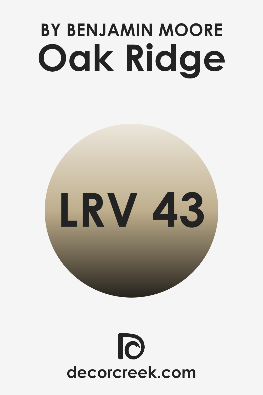
What is the LRV of Oak Ridge 235 by Benjamin Moore?
LRV stands for Light Reflectance Value, which is a measurement that tells you how much light a color reflects. It is measured on a scale from 0 to 100, where 0 is absolute black, reflecting no light, and 100 is pure white, reflecting all light. When it comes to painting a room, knowing the LRV of a color is important because it affects how the color will appear on the walls.
A higher LRV means the color will reflect more light, making the room feel brighter and possibly larger. Conversely, a lower LRV means less light is reflected, which can make a room feel cozier but also potentially darker.
For the color Oak Ridge by Benjamin Moore, which has an LRV of 42.53, it means the color is in the mid-range in terms of light reflection. It does not reflect a large amount of light like lighter colors, nor does it absorb too much like darker shades. As a result, Oak Ridge will bring a balanced feel to a room.
It won’t overpower with brightness, making it a good choice if you want to retain a comfortable and inviting atmosphere while still maintaining some light. This makes it adaptable for various settings, whether you want to create a warm, welcoming living room or a more calm and neutral bedroom.
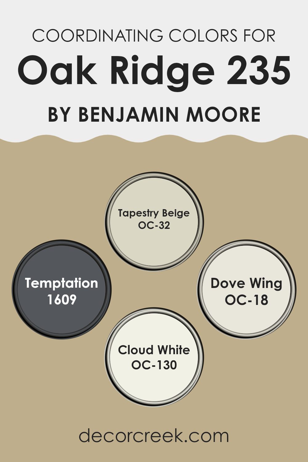
Coordinating Colors of Oak Ridge 235 by Benjamin Moore
Coordinating colors are hues that complement each other and work together to create a harmonious look in an area. When choosing coordinating colors, it’s important to select those that naturally blend well and enhance the main color. For the color Oak Ridge by Benjamin Moore, several colors serve as excellent coordinators.
Tapestry Beige (OC-32) offers a warm, neutral backdrop with subtle undertones that enhance and balance the more vivid tones. Temptation (1609) brings depth with its rich charcoal shade, adding a moody yet elegant touch to your design.
Meanwhile, Dove Wing (OC-18) is a soft and creamy off-white that provides a gentle contrast, perfect for creating a light and airy feeling that pairs well with Oak Ridge. Cloud White (OC-130) is another soft white option — it gives a clean and fresh finish that can brighten an area without overpowering it. These colors are chosen to match well with Oak Ridge, helping to maintain a balanced aesthetic.
By using these coordinating colors together, you can achieve a cohesive look, whether you’re painting a room, choosing textiles, or selecting decor pieces. Each of these shades adds its unique touch and enhances the overall palette.
You can see recommended paint colors below:
- OC-32 Tapestry Beige
- 1609 Temptation
- OC-18 Dove Wing
- OC-130 Cloud White
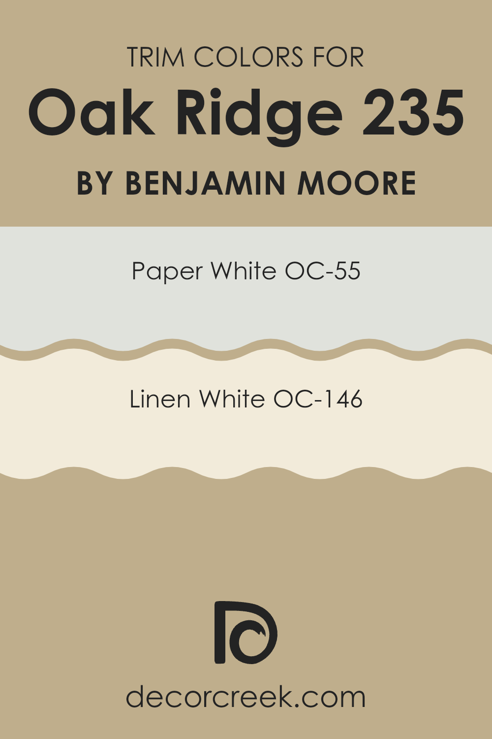
What are the Trim colors of Oak Ridge 235 by Benjamin Moore?
Trim colors refer to the shades used on the borders, moldings, doors, and sometimes ceilings in a room. They play a crucial role in defining an area by providing contrast and enhancing other colors in the interior design. For Oak Ridge, choosing the right trim colors can make all the difference in how the room feels and looks. Using colors like OC-55 Paper White and OC-146 Linen White as trim colors can highlight the architectural details and provide a clean and polished look.
Paper White is a light grayish-white shade that is crisp and fresh. It offers a subtle hint of color while keeping the look bright and clean. Linen White is a warm, off-white color with soft undertones that provide a cozy and inviting atmosphere without overpowering the room.
These trim colors are important because they interact with the main wall colors, enhancing the overall ambiance of the room. For Oak Ridge, which may feature warm or neutral base wall colors, these trim choices add depth and texture without overpowering the other elements in the design. Paper White creates a sleek, modern vibe, making it excellent for an area where you want to keep things contemporary and uncluttered.
Linen White provides warmth, ideal for rooms that need to feel more intimate or classical. Both of these colors work well with various wall colors and can bridge the gap between contrasting shades, ensuring the room’s design feels cohesive and harmonious.
You can see recommended paint colors below:
- OC-55 Paper White
- OC-146 Linen White
Colors Similar to Oak Ridge 235 by Benjamin Moore
Using similar colors in design helps create a balanced and harmonious look. When you select colors that are alike, it allows different elements in an area to connect visually. These colors often share undertones or hues, making transitions between them smooth and pleasing to the eye.
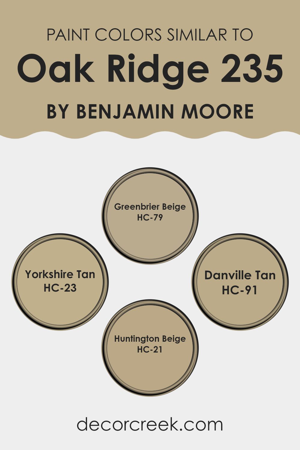
In the case of colors similar to Oak Ridge by Benjamin Moore, shades like Greenbrier Beige, Yorkshire Tan, Danville Tan, and Huntington Beige are great choices. These colors work well together because they all offer warm, earthy tones that complement each other, creating a cozy and inviting atmosphere in any room.
Greenbrier Beige is a warm, neutral shade that brings a comforting and grounded feel to an area. Yorkshire Tan offers a slightly richer tone with hints of golden brown, perfect for adding depth and warmth. Danville Tan carries a subtle, soft brown that makes an area feel welcoming and relaxed, while Huntington Beige is a classic, refined choice that provides a lasting backdrop with its balanced beige tone. Together, these colors can make any room feel more connected and coordinated, enhancing the overall look without overpowering the senses.
You can see recommended paint colors below:
- HC-79 Greenbrier Beige
- HC-23 Yorkshire Tan
- HC-91 Danville Tan
- HC-21 Huntington Beige
Colors that Go With Oak Ridge 235 by Benjamin Moore
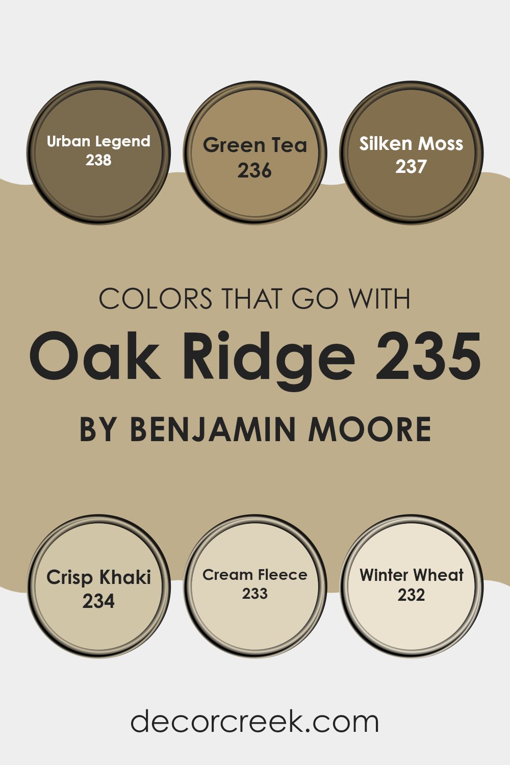
Choosing colors that complement Oak Ridge 235 by Benjamin Moore helps create a balanced and inviting environment. Oak Ridge is an adaptable shade, and pairing it with the right colors enhances its beauty. Urban Legend 238, for instance, is a deep, warm hue that adds depth and richness, creating a strong contrast with the natural tones of Oak Ridge.
Green Tea 236 offers a fresh, earthy vibe; it’s a lively green that feels refreshing and harmonizes beautifully with the nature-inspired palette. Silken Moss 237 sits comfortably alongside Oak Ridge, with its muted, soft green tones providing a calming and balanced touch.
Crisp Khaki 234 is a light neutral color that brightens the room and enhances the warmth of Oak Ridge. Cream Fleece 233 partners nicely as well, with its soft, creamy tone lending a cozy and welcoming atmosphere, perfect for a soothing backdrop.
Finally, Winter Wheat 232 adds a hint of sun-kissed warmth, bringing a subtle, golden glow that makes Oak Ridge shine brighter. Together, these colors weave a seamless look where each hue complements the other, whether used in the same room or connecting rooms, helping create a harmonious flow throughout your home.
You can see recommended paint colors below:
- 238 Urban Legend
- 236 Green Tea
- 237 Silken Moss
- 234 Crisp Khaki
- 233 Cream Fleece
- 232 Winter Wheat
How to Use Oak Ridge 235 by Benjamin Moore In Your Home?
Oak Ridge 235 by Benjamin Moore is an adaptable paint color, perfect for bringing warmth and coziness to any area in your home. This shade is a rich, earthy brown with subtle hints of gray, adding depth and a natural feel to your room. It works well in both modern and traditional settings, making it a great choice for various design styles.
For living rooms, Oak Ridge 235 creates a comforting atmosphere, ideal for relaxing with family or entertaining guests. In the bedroom, it can help create a snug and restful environment conducive to a good night’s sleep.
This color pairs well with neutral tones, warm whites, and even bolder colors like deep blues or forest greens, allowing for a range of decorating options. You can use it as a feature wall to add focus or as a base color throughout a room. Oak Ridge 235 provides a welcoming backdrop that effortlessly complements various furniture and décor.
Oak Ridge 235 by Benjamin Moore vs Yorkshire Tan HC-23 by Benjamin Moore
Oak Ridge 235 is a warm, medium-toned brown that brings to mind the rich textures of a forest floor or well-worn leather. It has a comforting, earthy quality that makes it suitable for cozy areas, providing a sense of warmth and familiarity.
On the other hand, Yorkshire Tan HC-23 is a lighter, softer brown. It gives off a feeling of subtle elegance and can brighten an area while maintaining a grounded vibe. Its lighter shade makes it adaptable, often used to make rooms feel more open and inviting without being overpowering.
When comparing the two, Oak Ridge is deeper and more enveloping, creating a snug, intimate environment. Yorkshire Tan offers a touch more brightness and is perfect for areas where you want to enhance the natural light. Both colors have their unique charms, but your choice will depend on whether you prefer the depth of Oak Ridge or the lightness of Yorkshire Tan.
You can see recommended paint color below:

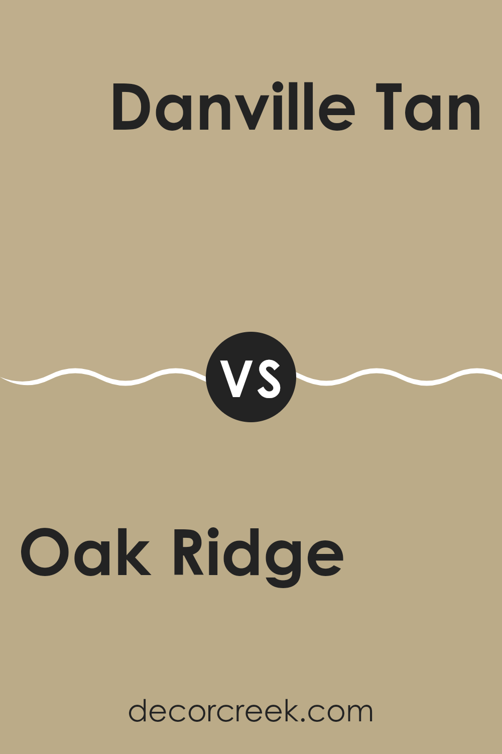
Oak Ridge 235 by Benjamin Moore vs Danville Tan HC-91 by Benjamin Moore
Oak Ridge 235 by Benjamin Moore and Danville Tan HC-91 are both warm, earthy colors that bring a sense of comfort to a room. Oak Ridge is a medium beige with golden undertones, giving it a rich and cozy appearance. It works well in areas where you want a little more depth than a standard beige, without being too bold.
Danville Tan, on the other hand, is lighter and softer. It has a balanced tan tone with hints of gray, making it more neutral and adaptable. Danville Tan is excellent for creating an airy and open feel in a room while maintaining a warm ambiance.
While Oak Ridge adds more warmth and depth, Danville Tan offers a lighter touch, ideal for areas where you want to maintain an open and welcoming atmosphere. Both colors complement each other well, making them suitable for different parts of your home depending on the desired mood and lighting.
You can see recommended paint color below:
- HC-91 Danville Tan
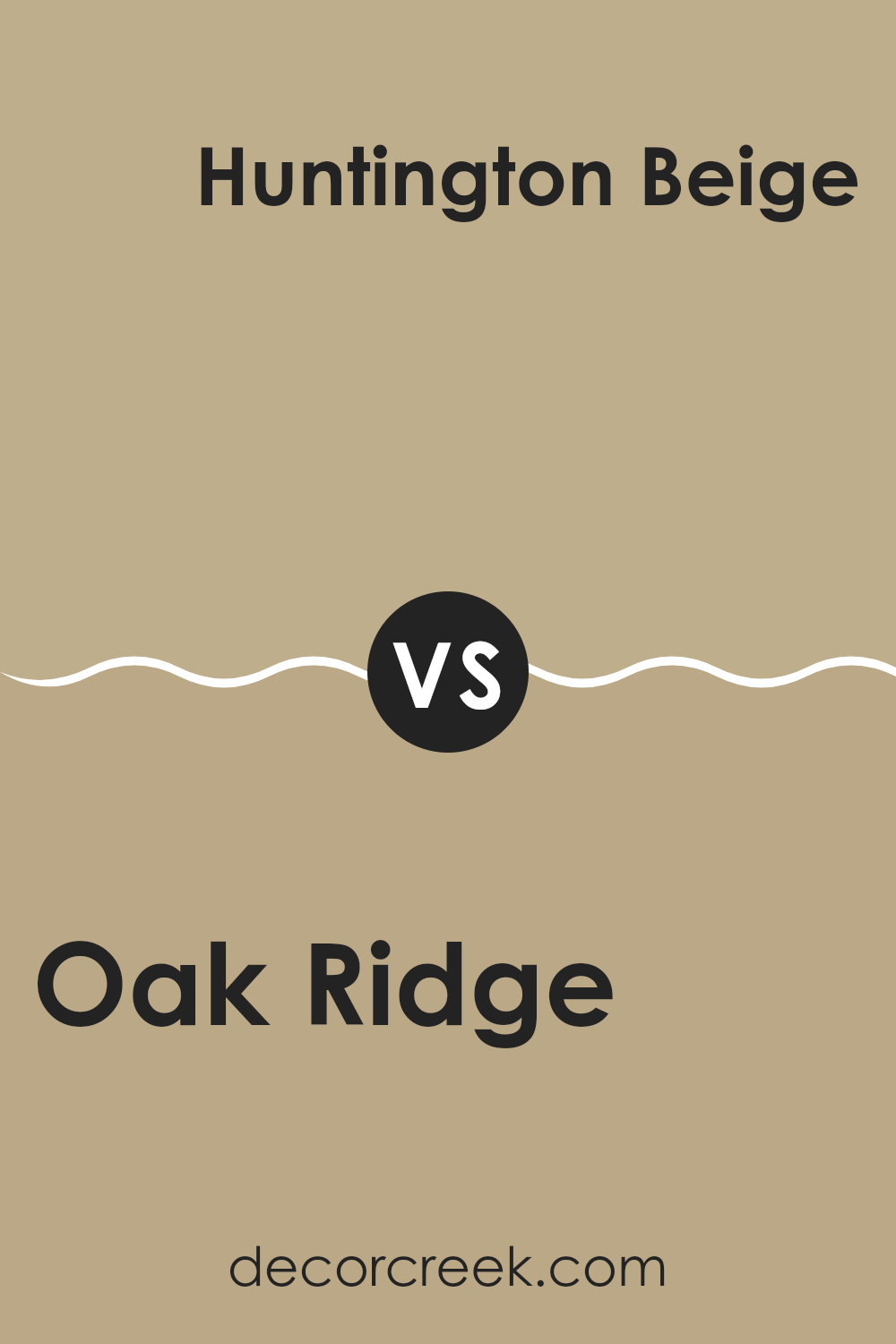
Oak Ridge 235 by Benjamin Moore vs Huntington Beige HC-21 by Benjamin Moore
Oak Ridge 235 is a deep, rich brown that feels warm and comforting. It creates a cozy atmosphere and works well in areas where you want a snug and inviting vibe. This color suits rooms with a lot of natural light, as it balances the bright with its depth.
On the other hand, Huntington Beige HC-21 is a lighter, more neutral color. With its soft beige tone, it can make areas feel larger and airier. It’s an adaptable color that pairs well with a wide range of other colors, making it great for open areas or places where you want a clean, classic look.
While Oak Ridge adds a sense of warmth and intimacy, Huntington Beige offers an open, light feeling. Choosing between the two depends on whether you want a cozy, enclosed area or a bright, roomy one. Both colors have their charm, just in different ways.
You can see recommended paint color below:
- HC-21 Huntington Beige
Oak Ridge 235 by Benjamin Moore vs Greenbrier Beige HC-79 by Benjamin Moore
Oak Ridge and Greenbrier Beige, both by Benjamin Moore, are warm, earthy tones that can bring a sense of comfort to a room. Oak Ridge 235 is a rich, warm brown with undertones of yellow and red, which gives it a cozy, inviting feel.
It can work well in areas where you want to create a snug atmosphere, such as living rooms or libraries. On the other hand, Greenbrier Beige HC-79 leans more towards a muted, light beige color with green undertones. This makes it an adaptable choice that feels slightly cooler and can be paired well with various other colors.
It’s ideal for areas where you want a more neutral backdrop that still has some character. While Oak Ridge adds a bolder statement, Greenbrier Beige offers a softer, more subtle look. Both colors work beautifully in homes but create different moods.
You can see recommended paint color below:
- HC-79 Greenbrier Beige
As I reflect on “235 Oak Ridge” by Benjamin Moore, I find myself truly impressed by how much a little bit of paint and color can change the way we feel about a place. Imagine your favorite room at home; now picture it in a bright new color. It might feel like a whole new place, right? That’s what this story is about.
In the article, Benjamin Moore shows us how colors aren’t just about looking nice—they affect how we feel. For instance, painting a room a light blue might make you feel calm and peaceful, like you’re at the beach. A sunny yellow might remind you of a bright, happy day. By using different colors at 235 Oak Ridge, every spot gets its own special mood.
I learned that picking paint colors is a bit like being a magician: you can create any feeling you want in a room just by brushing on a new color. It’s not just about what looks good—it’s about how the room makes us feel when we step inside.
So, next time you’re thinking about changing your room, remember how colors can make your room feel just right for you. It’s like having a superpower to change a house into a home full of happiness and comfort.
Ever wished paint sampling was as easy as sticking a sticker? Guess what? Now it is! Discover Samplize's unique Peel & Stick samples.
Get paint samples

