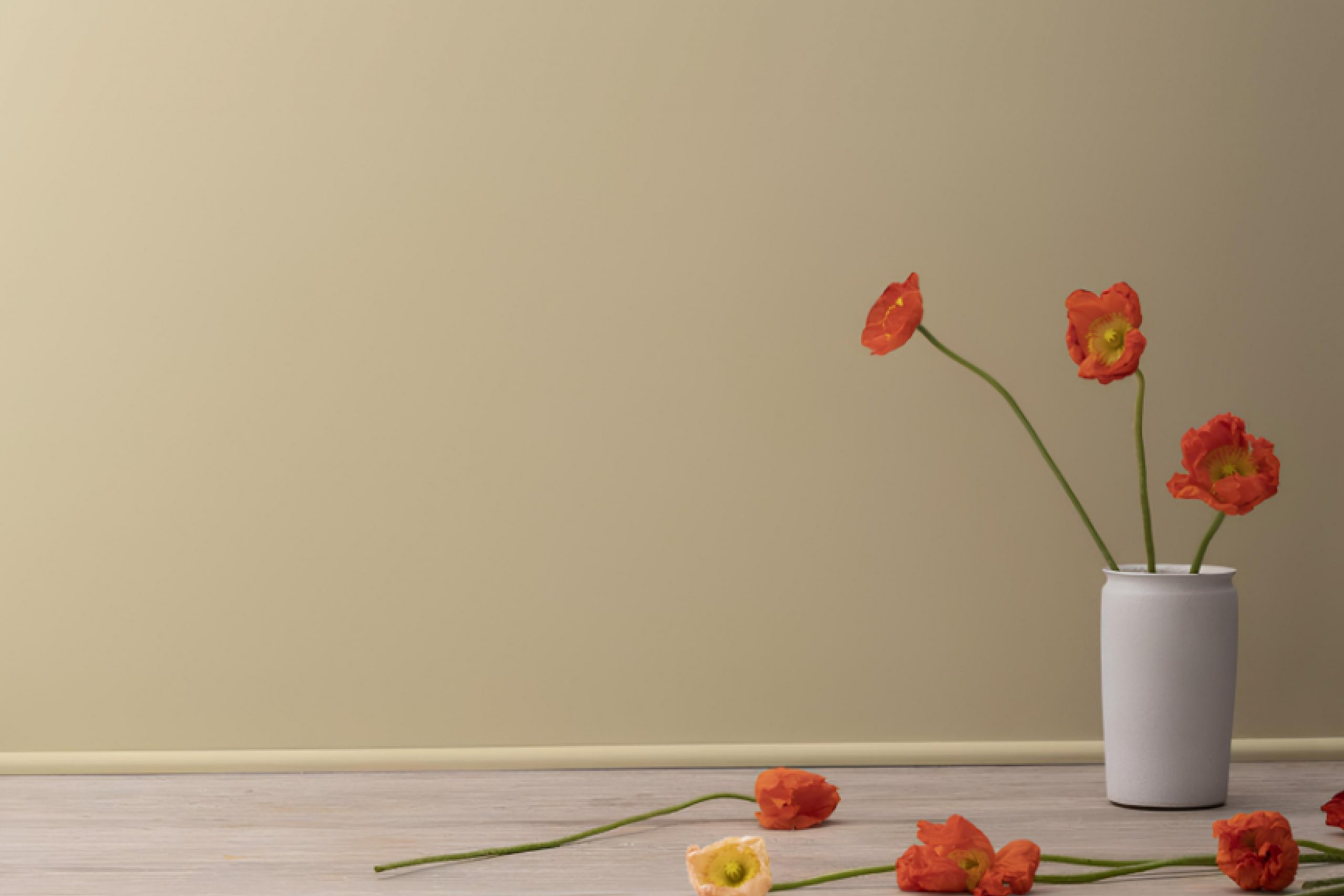
I recently chose HC-23 Yorkshire Tan by Benjamin Moore for a room makeover and was immediately struck by its unique warmth and versatility. Picture a cozy, inviting space where every wall radiates a soft, welcoming glow—that’s the effect Yorkshire Tan has. As someone who appreciates a hue that can adapt to different lights and settings, I found this shade effortlessly blends with various decor styles, from modern to traditional.
Yorkshire Tan is not just another beige; it has a distinct richness that avoids feeling too heavy or dull. Whether you’re aiming to create a soothing backdrop for a busy office or a serene haven for a bedroom, this color adds just enough character without overpowering the space.
It pairs beautifully with rich woods, vibrant greens, and deep blues, making it surprisingly easy to integrate into existing color schemes. If you are thinking about refreshing your space, consider how this warm tan can enhance the overall feel.
It’s subtle yet effective in creating an atmosphere that feels both grounded and airy, a perfect balance for those looking to refresh their living spaces without committing to a bold or trendy palette.
What Color Is Yorkshire Tan HC-23 by Benjamin Moore?
Yorkshire Tan is a warm, inviting hue that adds a touch of coziness to any space. This color falls into a soft, neutral palette, making it incredibly versatile for various decorating styles. It particularly shines in traditional, rustic, and country interiors, where its earthy base helps create a homely, welcoming atmosphere.
One of its best features is its compatibility with natural materials. Yorkshire Tan pairs beautifully with untreated wood, helping to highlight its natural grains and textures. When teamed with leather, this color enhances the rich, luxurious feel of the material. It also works well with woven textures like wicker or rattan, adding depth and interest to the room.
In terms of finishes, Yorkshire Tan looks exquisite alongside matte or brushed metals, such as copper or bronze. These combinations bring a touch of warmth and understated elegance to interiors. Similarly, it coordinates well with stone elements, like a marble fireplace or a granite countertop, providing a subtle, yet grounding contrast.
In summary, Yorkshire Tan is a go-to choice for those looking to create a cozy, grounded environment. Its natural harmony with wood, leather, and rustic textures makes it perfect for spaces designed to feel like a warm embrace.
Is Yorkshire Tan HC-23 by Benjamin Moore Warm or Cool color?
Yorkshire TanHC-23 by Benjamin Moore is a warm, inviting shade of tan with beige undertones that gives a cozy feel to any room. This versatile color pairs well with a wide range of other colors, from soft neutrals to bold shades.
It works particularly well in living rooms and bedrooms where you want to create a comfortable and relaxing atmosphere. Its soothing nature helps to make spaces feel more welcoming and can help to soften the appearance of a room.
Whether you are looking to paint the walls or just use accents, Yorkshire Tan helps to tie design elements together without overwhelming the space. It’s a great base color that can support a variety of décor styles, from rustic to modern. If you’re trying to give your home a warm and grounded feel, Yorkshire Tan is an excellent choice.
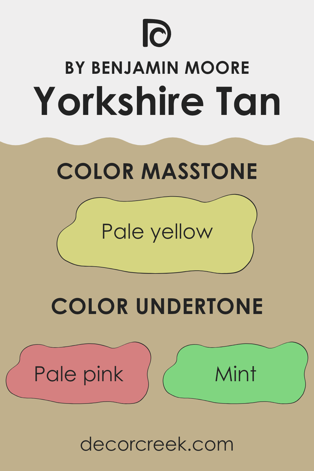
Undertones of Yorkshire Tan HC-23 by Benjamin Moore
Yorkshire Tan is a versatile paint color that includes subtle undertones which significantly influence how it appears in different settings. Undertones are secondary colors that impact the primary hue’s temperature and how it interacts with light and surrounding colors. For Yorkshire Tan, these undertones range from pale pink to olive, creating a rich, complex shade.
In terms of interior design, the effect of undertones can profoundly affect the mood and aesthetic of a room. For example, the pale pink and light purple undertones can add a soft, warm feeling, making the space feel more welcoming. On the other hand, gray and light gray undertones can give a more neutral, balanced look, which is great for areas where you want to maintain a calm and understated atmosphere.
In a room with ample natural light, the mint and light blue undertones might become more pronounced, giving Yorkshire Tan a fresher, crisper look. Conversely, in spaces with less light or at different times of the day, the darker undertones like olive and orange may emerge, providing a cozy, enveloping feel.
This complex interplay of undertones means that Yorkshire Tan can adapt to various styles and preferences, making it a practical choice for different rooms. Whether it’s a bedroom wanting a touch of softness or a living room needing a neutral backdrop with subtle depth, the undertones in Yorkshire Tan help achieve these aesthetic goals while keeping the space interesting and dynamic.
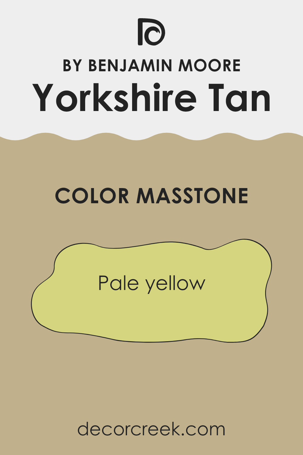
What is the Masstone of the Yorkshire Tan HC-23 by Benjamin Moore?
Yorkshire Tan HC-23 by Benjamin Moore has a masstone of pale yellow, a color that brings a subtle brightness to any room without being overwhelming. This shade has an airy feel that can make smaller spaces seem larger and more open. Its light tone helps to bounce light around a room, which is great for areas that might not get a lot of natural sunlight.
One of the advantages of Yorkshire Tan is its versatility. It pairs well with a wide range of other colors, from soft neutrals like whites and greys to bolder hues such as blues and greens.
This makes it an excellent choice for living rooms or bedrooms where you want a calm but cheerful atmosphere. Additionally, its pale yellow hue adds warmth to spaces, creating a cozy and welcoming environment. This color works well in a variety of home styles, whether you have a modern look or prefer something more traditional.
How Does Lighting Affect Yorkshire Tan HC-23 by Benjamin Moore?
Lighting plays a crucial role in how we perceive colors. The type of light, whether natural or artificial, can dramatically change the appearance of a color. For instance, Yorkshire Tan by Benjamin Moore can look different under various lighting conditions due to its warm, neutral hues.
In artificial light, Yorkshire Tan tends to appear warmer and richer. This is because most indoor lighting, like incandescent bulbs, enhances the yellow and red tones in the paint. As a result, rooms painted in this color will feel cozy and welcoming when lit with lamps or overhead lights in the evening.
Under natural light, the color shifts slightly depending on the time of day and the weather. On a sunny day, Yorkshire Tan will reflect more light and can look lighter and more vibrant. On a cloudy day, it might look more muted and softer. This variability makes it a versatile color choice for spaces that receive a lot of sunlight.
In rooms that face north, which typically receive less direct sunlight, Yorkshire Tan can appear a bit cooler and more shadowed. This can make the room feel calm and relaxed, but it might also require additional lighting to bring out the warmth of the color.
South-facing rooms, on the other hand, get plenty of sunlight throughout the day. Here, Yorkshire Tan will look consistently brighter and more true to its hue, giving the room a cheerful and lively vibe.
In east-facing rooms, the color will change as the day progresses. It can look softly bright in the morning light and become more subtly warm by the afternoon. This makes east-facing rooms great for activities throughout the day.
In west-facing rooms, the afternoon and evening light can intensify the warm tones of Yorkshire Tan, making it feel particularly warm and cozy as the sun sets. This can be ideal for living areas where you wind down at the end of the day.
Understanding these effects can help you decide where to use specific colors based on the mood and atmosphere you want to create in each room.
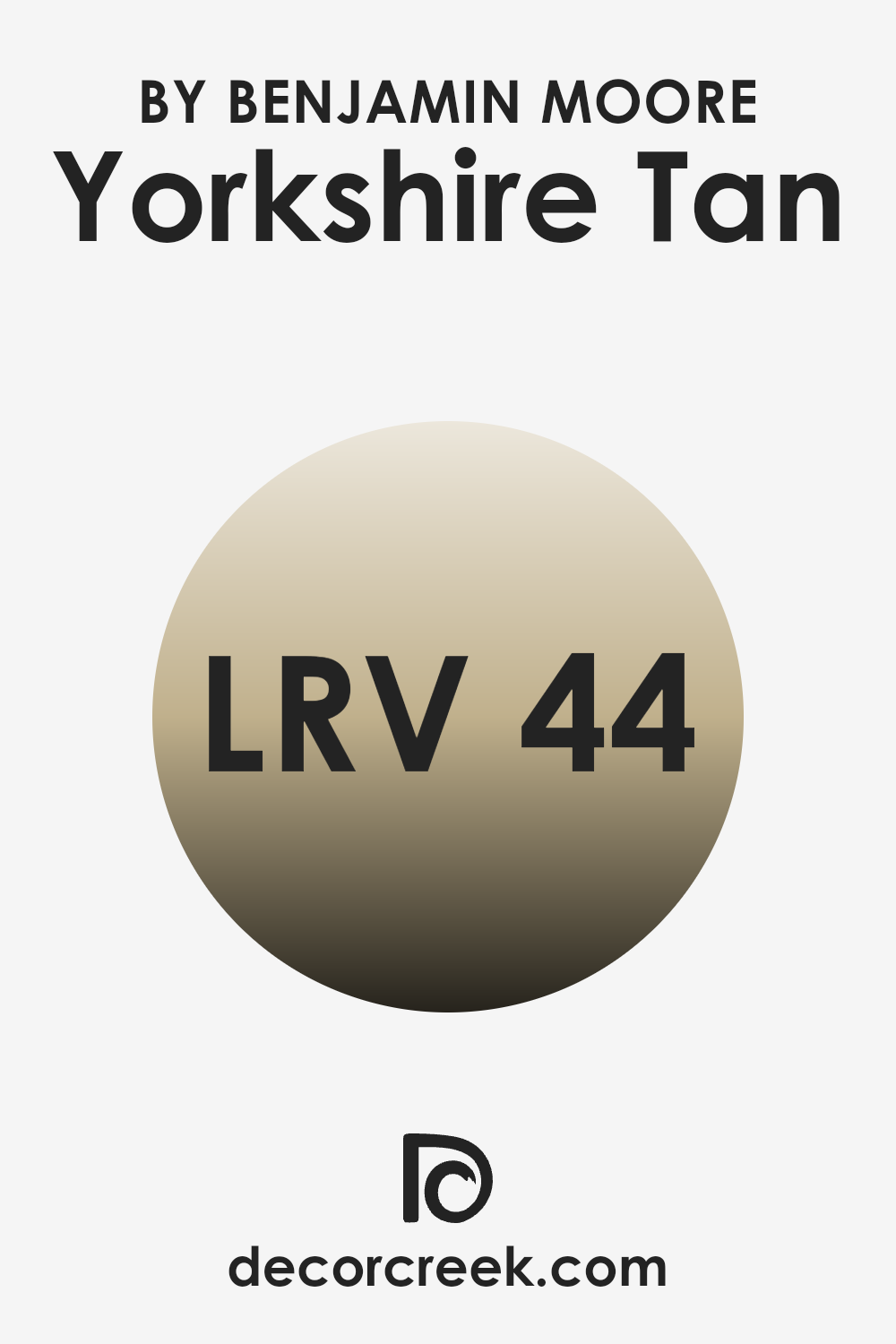
What is the LRV of Yorkshire Tan HC-23 by Benjamin Moore?
LRV stands for Light Reflectance Value, a measure that indicates how much light a paint color reflects or absorbs. This value is expressed on a scale from 0 to 100, where lower numbers mean the color absorbs more light and appears darker, while higher values reflect more light, making the color appear lighter.
This measurement is crucial when choosing paint colors because it helps determine how a color will look in various lighting conditions. A room with plenty of natural light can handle darker shades (lower LRV), while a darker room might benefit from a lighter shade (higher LRV) to make it feel brighter and more open.
The LRV of Yorkshire Tan is 43.93, placing it in the mid-range of light reflectance. This means it’s versatile enough to be used in various lighting conditions without appearing too dark or too bright. In a well-lit room, Yorkshire Tan will have a warm and welcoming presence, enhancing the ambience without dominating it.
In a dimmer space, it still retains enough light to prevent the room from feeling too closed in or dreary. This balance makes Yorkshire Tan a good choice for someone looking to add some warmth to their room without the risk of making it feel smaller or overly shaded.
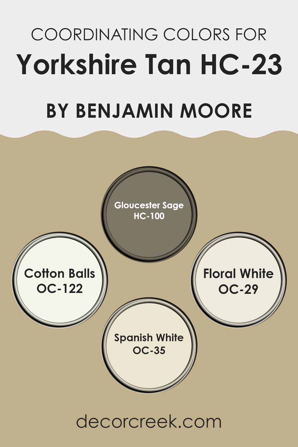
Coordinating Colors of Yorkshire Tan HC-23 by Benjamin Moore
Coordinating colors are a set of hues that complement each other when used together in an interior space, creating a harmonious and balanced look. These colors are chosen based on their ability to support the primary color, in this case, Yorkshire Tan, enhancing its warmth and versatility without overpowering it.
They either share similar undertones or contrast beautifully to bring out the best in each other, making the design feel cohesive. Using coordinating colors ensures that the decor flows smoothly from one room to another or within a single space, adding depth and character.
Gloucester Sage is a muted green that provides a natural feel when paired with Yorkshire Tan, lending a calm, earthy vibe to any room. Cotton Balls offers a clean, crisp whiteness, making it an excellent choice for trim and ceilings to provide a fresh contrast against deeper wall colors. Floral White is a soft off-white with a gentle warmth, perfect for creating a subtle differentiation that feels cozy and inviting.
Spanish White is slightly richer with a hint of beige, rounding out the palette with a creamy texture that complements the depth of Yorkshire Tan, ensuring the space feels welcoming and well-coordinated.
You can see recommended paint colors below:
- HC-100 Gloucester Sage
- OC-122 Cotton Balls
- OC-29 Floral White
- OC-35 Spanish White
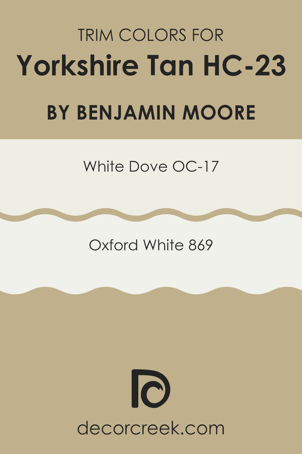
What are the Trim colors of Yorkshire Tan HC-23 by Benjamin Moore?
Trim colors refer to the paint used on the moldings, door frames, window casings, and other architectural features that outline or “trim” various surfaces in a room. Choosing the right trim color is crucial because it highlights these features, creating a neat and finished look that complements the main wall color.
For instance, using trim colors like OC-17 – White Dove or 869 – Oxford White with Yorkshire Tan HC-23 by Benjamin Moore can bring a crisp, clean contrast that enhances the overall aesthetic of the room. These trim colors help define the space crisply and allow the richness of Yorkshire Tan to stand out, adding depth and a visually pleasing hierarchy to the color scheme.
OC-17 – White Dove by Benjamin Moore is a versatile off-white with a soft and creamy appearance. It has a slightly warm undertone, making it an excellent choice for trims as it offers a subtle contrast without being too stark against warmer wall colors like Yorkshire Tan. On the other hand, 869 – Oxford White is brighter and crisper, with a more neutral palette that provides a stronger contrast, making architectural details pop more distinctly. This color is perfect if you want to accentuate the trim details more boldly while still maintaining a harmonious look with the Yorkshire Tan walls.
You can see recommended paint colors below:
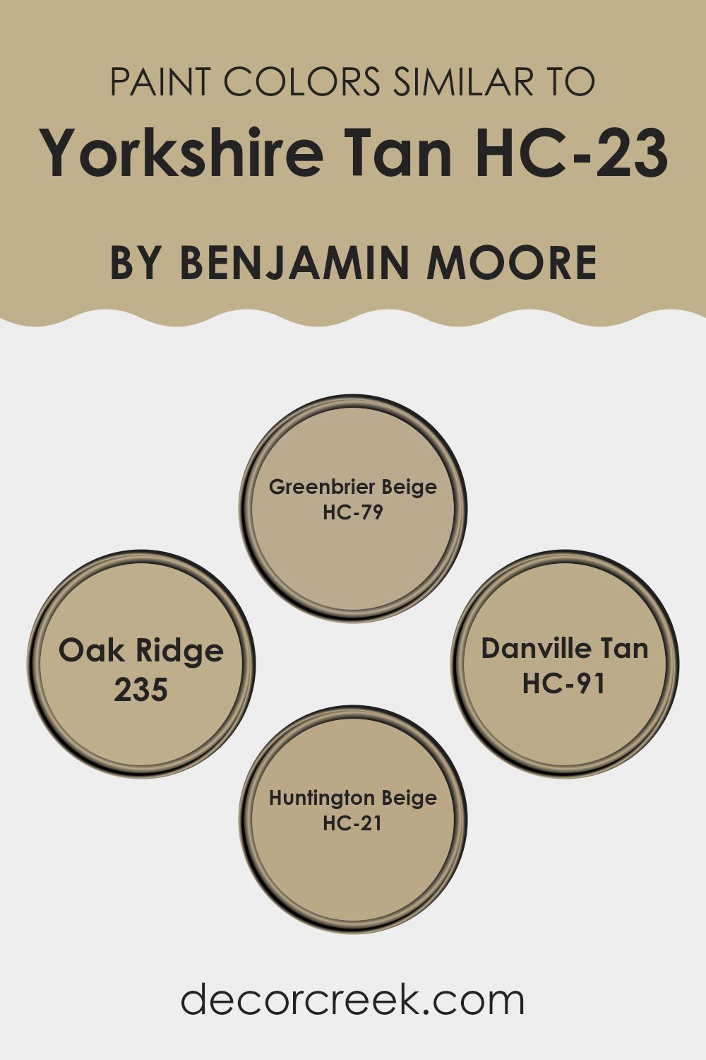
Colors Similar to Yorkshire Tan HC-23 by Benjamin Moore
Choosing similar colors can be a highly effective way of achieving a cohesive and harmonious look in any space. Colors that are similar lie close to each other on the color wheel, leading to a subtle variation in tone which can enhance the depth and complexity of your interior without the stark contrasts that come with complementary colors.
This technique creates a warm and welcoming atmosphere, appealing to the eye through gentle transitions and understated elegance. For example, if you appreciate the warm and soft appearance of Yorkshire Tan, you might find it enriching to consider other colors within its spectrum for a refined yet unified aesthetic.
Greenbrier Beige is a muted beige that exudes a mild, earthy vibe, perfect for spaces where a touch of understatement is desired. Oak Ridge is a bit darker, offering a solid, wood-inspired hue that adds a sense of stability and grounding to a room. Then there’s Danville Tan, which leans towards a warmer tone, infusing spaces with a cozy, inviting amber glow.
Lastly, Huntington Beige brings a slight freshness into the mix, brighter than the other options, yet still maintaining the calm, relaxed feel that works beautifully in both lively living areas and tranquil private spaces. These shades together can help create a layered look that feels both intentional and naturally comfortable.
You can see recommended paint colors below:
- HC-79 Greenbrier Beige
- 235 Oak Ridge
- HC-91 Danville Tan
- HC-21 Huntington Beige
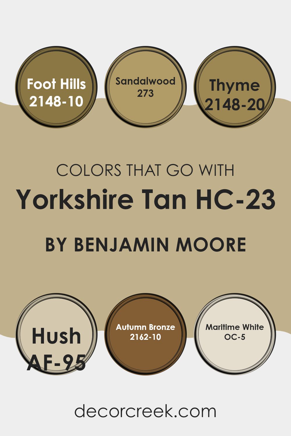
Colors that Go With Yorkshire Tan HC-23 by Benjamin Moore
Choosing colors that complement Yorkshire Tan HC-23 by Benjamin Moore is essential for creating a cohesive and visually appealing space. Yorkshire Tan HC-23 is a versatile color, and selecting harmonious shades like Foot Hills, Sandalwood, Thyme, Hush, Autumn Bronze, and Maritime White amplifies its beauty. When paired with these colors, Yorkshire Tan HC-23 helps achieve a balanced look that is pleasing to the eye.
Foot Hills is a deep, earthy brown that adds a sense of grounding to the space, making it feel warm and inviting. Sandalwood, a softer, neutral beige, offers a subtle contrast that highlights the warmth of Yorkshire Tan without overwhelming it.
Thyme is a rich, herbal green that brings a natural, refreshing element to the design, complementing the earthy tones of Yorkshire Tan. Hush is a soft gray with a hint of beige, providing a gentle backdrop that allows more vibrant colors to stand out. Autumn Bronze is a bold, dark bronze that brings depth and drama to the palette, offering a striking contrast that makes Yorkshire Tan pop.
Lastly, Maritime White is a clean, bright white that adds crispness and light, helping to balance the darker shades and amplify the space’s overall brightness. Together, these colors create a harmonious and inviting atmosphere, enhancing the beauty of Yorkshire Tan HC-23.
You can see recommended paint colors below:
- 2148-10 Foot Hills
- 273 Sandalwood
- 2148-20 Thyme
- AF-95 Hush
- 2162-10 Autumn Bronze
- OC-5 Maritime White
How to Use Yorkshire Tan HC-23 by Benjamin Moore In Your Home?
Yorkshire Tan HC-23 by Benjamin Moore is a warm and neutral shade that brings a cozy feel to any room. This color is flexible, making it a great choice for various spaces in your home. In living rooms or dens, it can create a welcoming atmosphere that makes guests feel right at home. It’s also ideal for bedrooms where a calming backdrop can make winding down at the end of the day easier.
Yorkshire Tan works well with other colors, allowing for a range of decorating styles. You can pair it with bold hues like navy or deep green for a striking contrast, or keep things muted with soft whites and beiges for a more subtle look. This paint color is particularly effective in spaces with natural light, where it can warm up the room without overpowering it.
For a practical application, Yorkshire Tan is a good choice for high-traffic areas such as hallways and entryways, where it can hide everyday marks and scuffs while still looking fresh and tidy.
Yorkshire Tan HC-23 by Benjamin Moore vs Greenbrier Beige HC-79 by Benjamin Moore
Yorkshire Tan and Greenbrier Beige are both colors by Benjamin Moore that provide a warm, inviting feel to any space. Yorkshire Tan is a deeper, golden tan shade that gives a cozy, comforting vibe. It’s perfect for areas where you want a soothing yet rich color tone.
On the other hand, Greenbrier Beige has a lighter, more neutral beige tone. This color is excellent for making spaces feel brighter and more open, offering a subtle and clean look. Both colors are versatile and can work well in various settings like living rooms, bedrooms, or hallways.
Yorkshire Tan works great in spaces with lots of natural light or where you want to add a bit of warmth. Greenbrier Beige is a better choice for smaller, possibly dimmer spaces that you want to appear more spacious.
You can see recommended paint color below:
- HC-79 Greenbrier Beige

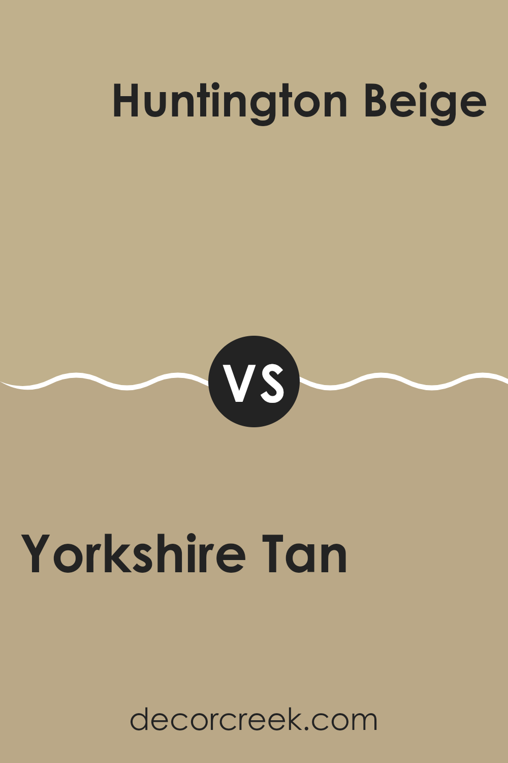
Yorkshire Tan HC-23 by Benjamin Moore vs Huntington Beige HC-21 by Benjamin Moore
The Yorkshire Tan and Huntington Beige are two shades from Benjamin Moore that are both part of the Historic Color collection. Yorkshire Tan has a deeper, warmer feel, almost like a soft caramel. This color can make a room feel cozy and welcoming because of its rich undertones.
On the other hand, Huntington Beige is a lighter, more subdued shade. It has a classic beige look that’s versatile and easy to match with different decors. Although both colors share a calming presence, Huntington Beige brings a lighter, airier feel to a space, compared to the denser, earthier touch of Yorkshire Tan.
These two hues could work beautifully together, providing a balanced contrast that enhances each space’s warmth and appeal. Overall, picking between them depends on whether you want the warmth and depth of Yorkshire Tan or the subtle, soft environment that Huntington Beige creates.
You can see recommended paint color below:
- HC-21 Huntington Beige
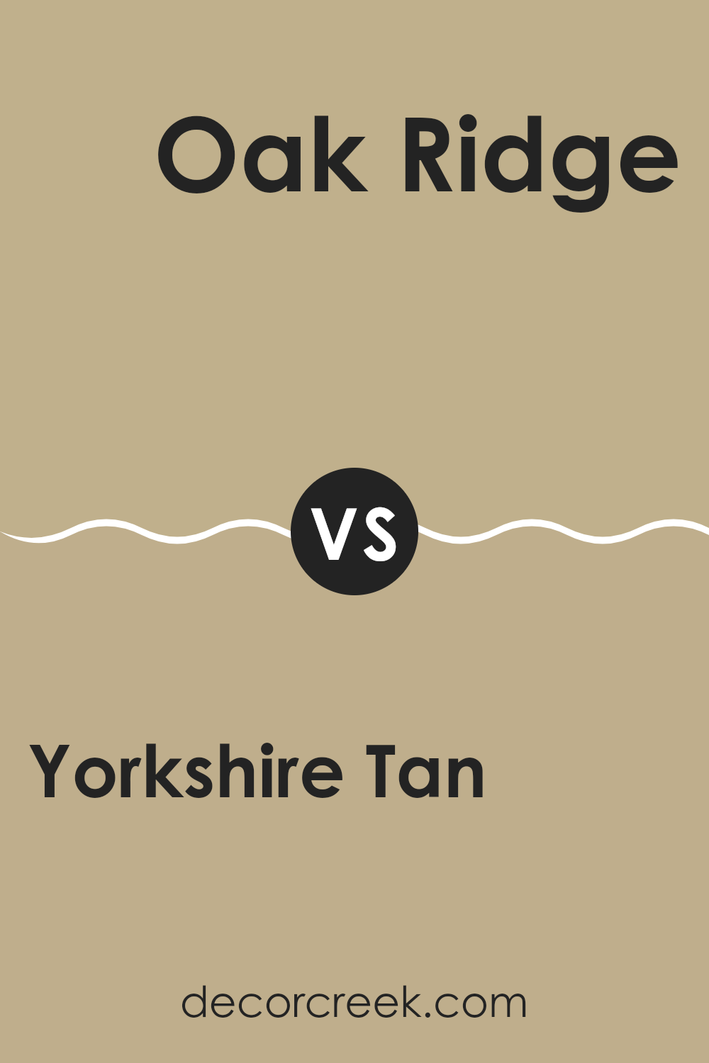
Yorkshire Tan HC-23 by Benjamin Moore vs Oak Ridge 235 by Benjamin Moore
The main color, Yorkshire Tan, is a warm, inviting beige that offers a cozy and welcoming feel to any space. It’s soft enough to act as a neutral backdrop, blending well with various decor styles and other colors. This color tends to create a comfortable and homely environment without drawing too much attention.
On the other hand, Oak Ridge is a deeper shade, leaning more towards a rich, classic brown with an earthy base. It offers a stronger presence in a room and is excellent for accent walls or pairing with lighter tones for a grounding effect. This color works exceptionally well in spaces where a more defined, cozy feel is desired, such as studies or living areas.
Both colors are versatile but serve different purposes in interior design. Yorkshire Tan is more about creating light and space, whereas Oak Ridge focuses on depth and character. Depending on the room’s function and the atmosphere you want to achieve, each color has its strengths.
You can see recommended paint color below:
- 235 Oak Ridge
Yorkshire Tan HC-23 by Benjamin Moore vs Danville Tan HC-91 by Benjamin Moore
Yorkshire Tan and Danville Tan by Benjamin Moore are both warm, neutral colors, but they vary slightly in tone and depth. Yorkshire Tan has a richer, deeper brown undertone, making it a cozy and inviting option for spaces like living rooms or bedrooms.
It’s perfect for creating a grounded, welcoming atmosphere. On the other hand, Danville Tan is lighter and has a more beige hue, which makes it ideal for smaller spaces or rooms that get less natural light, as it can help make the area feel more open and airy.
Both colors work well with a variety of decor styles and can be paired with contrasting colors for a dynamic effect or with harmonious tones for a more subtle look. They are versatile choices for anyone looking to add warmth to their space.
You can see recommended paint color below:
- HC-91 Danville Tan
Conclusion
First off, Yorkshire Tan is very warm and welcoming. It’s like a cozy blanket on a chilly day—it makes any room feel more inviting. Whether you’re painting your living room, bedroom, or even your kitchen, this color adds a nice touch of warmth.
One thing I really appreciate about Yorkshire Tan is how it works well with different styles and furniture. Whether you have an old wooden bookcase or a modern sofa, this color on the walls brings everything together in a nice, harmonious way. It’s not too dark or too light, so it strikes a perfect balance, making it easy to use in many homes.
Additionally, Yorkshire Tan is a good pick because it doesn’t get boring or go out of style. It has a classic feel to it, meaning that even as you change how your room looks over the years, the color will still fit right in. It’s also easy on the eyes, not too bright or harsh, which makes spending time in a room painted this color very pleasant.
All in all, choosing HC-23 Yorkshire Tan by Benjamin Moore is a smart move if you’re looking for a paint color that makes your space warm, welcoming, and harmonious without demanding too much attention. It’s a color that quietly does its job, making any room look and feel nicer.
Ever wished paint sampling was as easy as sticking a sticker? Guess what? Now it is! Discover Samplize's unique Peel & Stick samples.
Get paint samples

