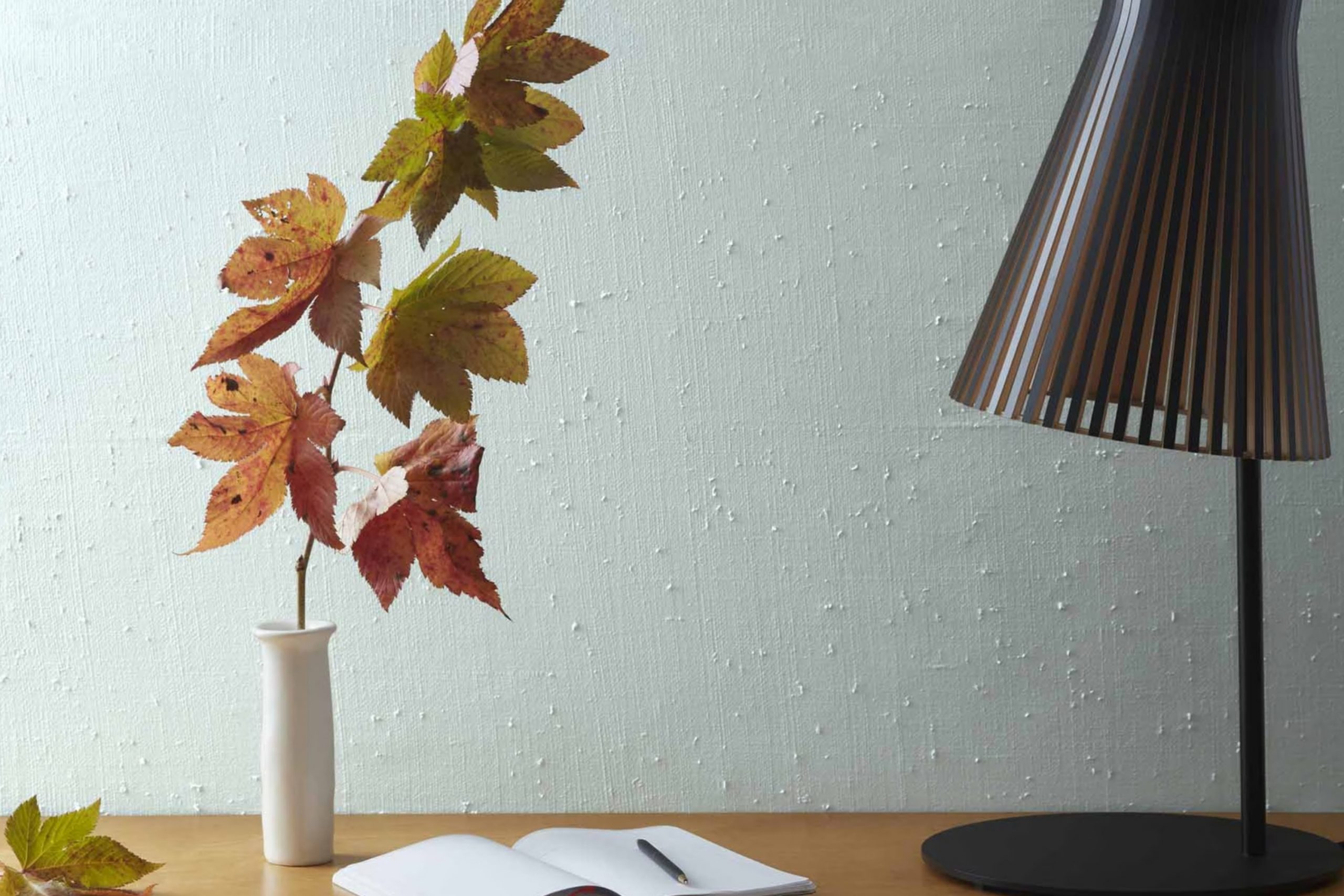
When you pick a paint color for your home, the impact is immediate and lasting. Choosing 2123-50 Ocean Air by Benjamin Moore is like opening your room to a gentle breeze from the sea. This shade isn’t just blue; it carries hints of gray and a touch of warmth that make it adaptable and soothing.
It pairs beautifully with crisp whites and natural woods, evoking a calm and inviting atmosphere. Whether you’re aiming to refresh your bedroom or give your living room a relaxed vibe, Ocean Air has a subtle elegance that enhances your decor without overpowering it. It reflects light in a way that changes subtly with the day, from the bright cheer of morning to the soft glow of an evening.
It’s a color that supports a variety of styling choices, from modern minimalism to cozy coastal.
So, if you’re looking to renew a room while keeping things light and airy, 2123-50 Ocean Air is a choice that you might want to consider. It promises an understated yet profound change in how you feel in your home every day.
What Color Is Ocean Air 2123-50 by Benjamin Moore?
Ocean Air by Benjamin Moore is a soft, light blue that evokes the freshness of a gentle sea breeze. This subtle yet lively color adds a crisp, clean feel to any room while keeping a cozy and approachable atmosphere. Ocean Air is adaptable enough to work wonderfully in various interior styles, particularly in beach-themed, contemporary, and minimalist designs. It brings a touch of lightness that complements the relaxed nature of coastal decor, the sleek lines of modern styles, and the pared-down aesthetic of minimalist rooms.
When it comes to pairing with materials and textures, Ocean Air goes beautifully with natural wood, from pale maple to rich walnut, enhancing the organic feel of the room. It also matches well with linens and cotton for a soft, layered look that feels comfortable and inviting. For a bit of contrast, pair it with metals like brushed nickel or stainless steel, which add a cool, crisp edge to the warmth of this light blue shade.
Ocean Air also integrates smoothly into rooms that get a lot of natural light, reflecting and amplifying the brightness of the interior. It’s a fantastic choice for living rooms, bedrooms, and bathrooms where a calm, airy feel is desired. This color helps create a cheerful room that’s easy to relax in and equally easy to love.
Is Ocean Air 2123-50 by Benjamin Moore Warm or Cool color?
Ocean Air 2123-50 by Benjamin Moore is a soothing shade of blue with a hint of gray, making it adaptable for a variety of home rooms. This soft, airy color has a calming effect, which is perfect for rooms where you want to relax such as bedrooms and bathrooms.
Its lightness brings a fresh and open feel to any room, helping small areas appear larger and brighter. Because it has gray undertones, it pairs well with many other colors, from warm woods in furniture to crisp white trim, adding a balanced and welcoming vibe.
Whether you want a peaceful reading nook or a gentle backdrop for a bustling family kitchen, Ocean Air offers a refreshing palette that’s easy on the eyes. It also works beautifully in well-lit areas or rooms that could use a touch of lightness, enhancing natural light or brightening rooms without it.
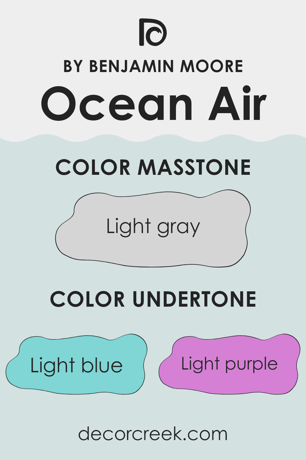
Undertones of Ocean Air 2123-50 by Benjamin Moore
Ocean Air 2123-50 by Benjamin Moore is a light, refreshing color with a variety of subtle undertones that influence how it appears in different settings. Undertones are secondary colors that affect the main hue, shaping how the color is perceived and how it interacts with other elements in a room.
The undertones of Ocean Air include light blue, light purple, pale yellow, lilac, mint, pale pink, and grey. These undertones contribute to the paint’s overall adaptability and its ability to blend with different decor styles and color palettes.
In a well-lit room, the light blue and mint undertones might make the walls seem more vibrant and airy, enhancing the feeling of openness. In contrast, in a room with less natural light, the grey and lilac undertones could become more noticeable, giving the walls a softer, more subdued look. When using Ocean Air on interior walls, the presence of these varied undertones means the color can appear slightly different from one room to another based on lighting and surroundings.
This includes both natural light and the colors of furniture and decorations in the room. For example, next to bright colors, the pale yellow and light purple undertones might stand out, adding a subtle contrast. Near darker shades, the grey undertone might be more pronounced, providing a grounding effect.
Overall, the undertones in Ocean Air make it a flexible color choice for many rooms, allowing it to adapt subtly to different environments and decor styles. This adaptability makes it a popular choice for those looking to refresh their home with a new wall color.
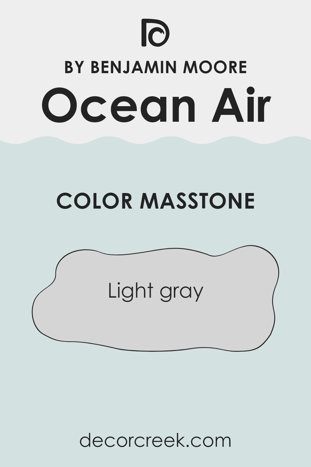
What is the Masstone of the Ocean Air 2123-50 by Benjamin Moore?
Ocean Air 2123-50 by Benjamin Moore has a masstone of light gray, noted by its color code #D5D5D5. This neutral shade makes it highly adaptable for use in various rooms of a home.
It’s particularly effective in areas where you want a gentle and understated background that doesn’t overpower the decor but instead creates a calm and welcoming atmosphere. Light gray works well with both bright colors and other neutrals, allowing for easy pairing with different furniture and accents.
Being light in tone, it can also help make smaller rooms appear larger and more open. This color also adjusts well to different lighting, maintaining its subtle beauty whether under natural sunlight or artificial illumination, making it a reliable choice for consistently stylish looks across all kinds of interiors.
How Does Lighting Affect Ocean Air 2123-50 by Benjamin Moore?
Lighting plays a crucial role in how we perceive colors, affecting their brightness, hue, and overall mood. Different types of light can change the way a color looks in a room. Artificial light varies in intensity and color, and natural light changes depending on the time of day and the direction it comes from.
Taking the color Ocean Air by Benjamin Moore as an example, we can see how different lighting conditions affect its appearance. Under artificial light, such as incandescent bulbs, Ocean Air may appear warmer and slightly more muted compared to how it looks in natural daylight, which tends to bring out the vibrancy and true hue of the color.
LED or fluorescent lights, which can be cooler, might make it appear slightly bluish.
In rooms facing different directions, the color can look quite different:
- North-facing rooms: These rooms often get less direct sunlight, which can make colors appear cooler and slightly darker. Ocean Air might look more subdued and gentle in a north-facing room.
- South-facing rooms: These rooms enjoy abundant light most of the day, making colors look brighter and more vivid. Ocean Air will likely appear fresher and more lively in a south-facing room.
- East-facing rooms: Morning light is warm and bright, so Ocean Air will look cheerful and vibrant in the morning but might lose some of its punch as the day progresses.
- West-facing rooms: Evening light, which tends to be warmer, will make Ocean Air feel cozier and softer in the afternoons and evenings.
Understanding how lighting affects colors helps in choosing the right paint for a room based on its orientation and the type of light it receives, ensuring the color performs beautifully throughout the day.
decorcreek.com
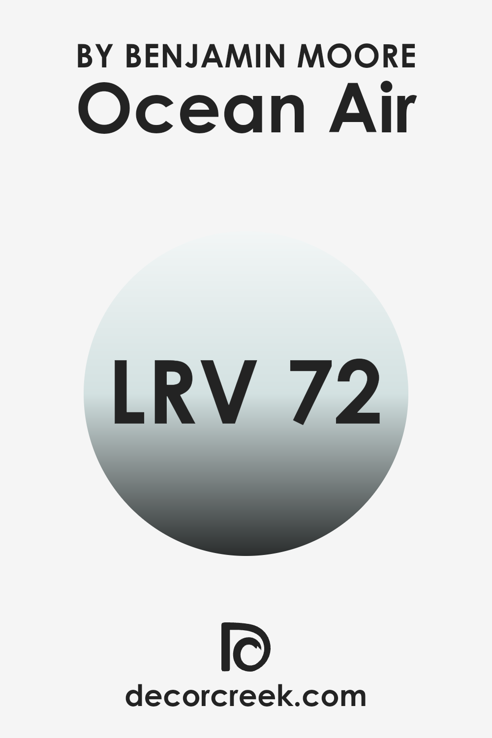
What is the LRV of Ocean Air 2123-50 by Benjamin Moore?
LRV stands for Light Reflectance Value, and it’s a measurement that shows how much light a paint color reflects compared to how much it absorbs. By using a scale generally from zero to one hundred, where a higher number indicates that the color reflects more light back into the room, designers and painters can predict how light or dark a paint will appear once applied to the walls.
This value is particularly important in determining whether a room will look brighter or cozier depending on the choice of color. For the color in mention with an LRV of 71.84, it reflects a substantial amount of light, contributing to a lighter appearance on the walls.
This high reflectivity makes the color a good choice for rooms that need to appear more open and airy. Rooms with less natural light can particularly benefit from this high LRV, as it will help make the room feel brighter. Conversely, in very brightly lit areas, this color might appear much lighter and can be paired with darker shades to bring balance.
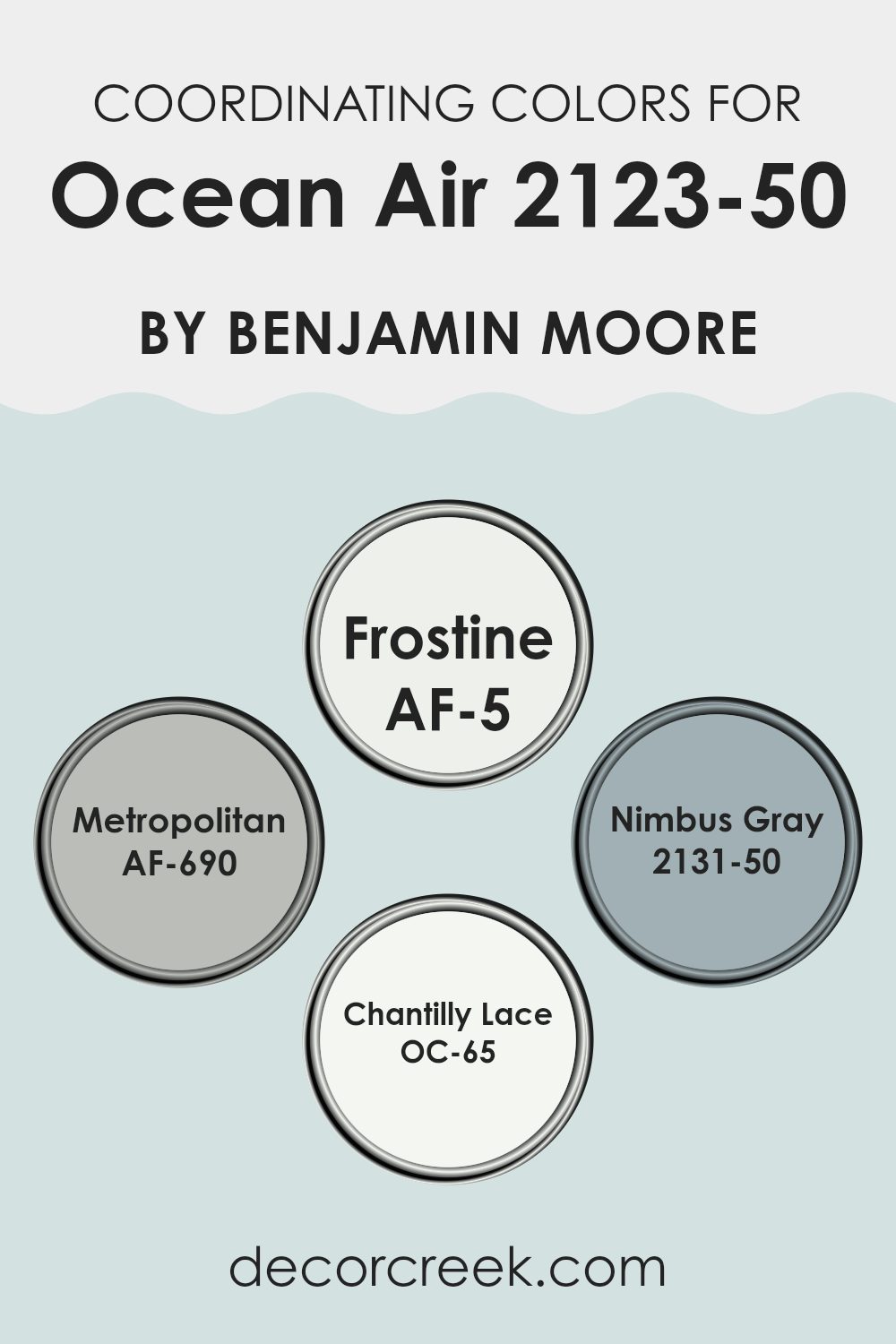
Coordinating Colors of Ocean Air 2123-50 by Benjamin Moore
Coordinating colors are a palette of hues that complement or enhance each other when used together in interior design or fashion. These colors work in harmony to create a cohesive look, bringing balance and a pleasing aesthetic to any room. When used in reference to Ocean Air 2123-50 by Benjamin Moore, the coordinating colors are designed to bring out its unique qualities while maintaining a unified appearance.
Frostine AF-5 is a light, almost ethereal white that offers a crisp, clean backdrop, making it an excellent choice for trim or ceiling colors. It contrasts subtly with stronger colors, thereby making them stand out more. Metropolitan AF-690, a calming gray, provides a neutral base that is adaptable and understated, perfect for a modern look that still feels warm.
Nimbus Gray 2131-50, a deeper shade of gray with a hint of blue, adds depth and interest to rooms, making it great for accent walls or furniture pieces. Chantilly Lace OC-65 is another white tone, known for its purity and brightness, ideal for creating a vibrant and fresh feel in a room. Together, these colors complement Ocean Air by adding either contrast or depth, enhancing the visual appeal of any interior they are used in.
You can see recommended paint colors below:
- AF-5 Frostine
- AF-690 Metropolitan
- 2131-50 Nimbus Gray
- OC-65 Chantilly Lace
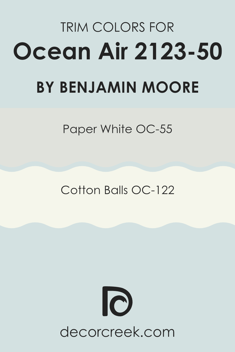
What are the Trim colors of Ocean Air 2123-50 by Benjamin Moore?
In interior design, trim colors are hues used for the trimmings around windows, doors, and baseboards, which create a distinctive outline or frame for the room, enhancing the overall aesthetic of the interior. Trim colors are particularly important when paired with the calming blue shade of Ocean Air by Benjamin Moore, as they can enrich its appeal by providing a crisp, clean look that contrasts yet complements the wall color.
OC-55 – Paper White and OC-122 – Cotton Balls are excellent choices for trim colors in a design scheme centered around Ocean Air. Paper White (OC-55) is a fresh and airy shade of white with a hint of gray, providing a neutral backdrop that makes it adaptable enough to work with various colors including the refreshing Ocean Air.
Cotton Balls (OC-122), on the other hand, is a pure, bright white that offers a stark, clear contrast that can make the blue tones of Ocean Air stand out, giving the room a lively yet cohesive feel. These trim colors are essential in defining the features of a room, framing the walls like a piece of art, and making the color combination crisp and visually appealing.
You can see recommended paint colors below:
- OC-55 Paper White
- OC-122 Cotton Balls
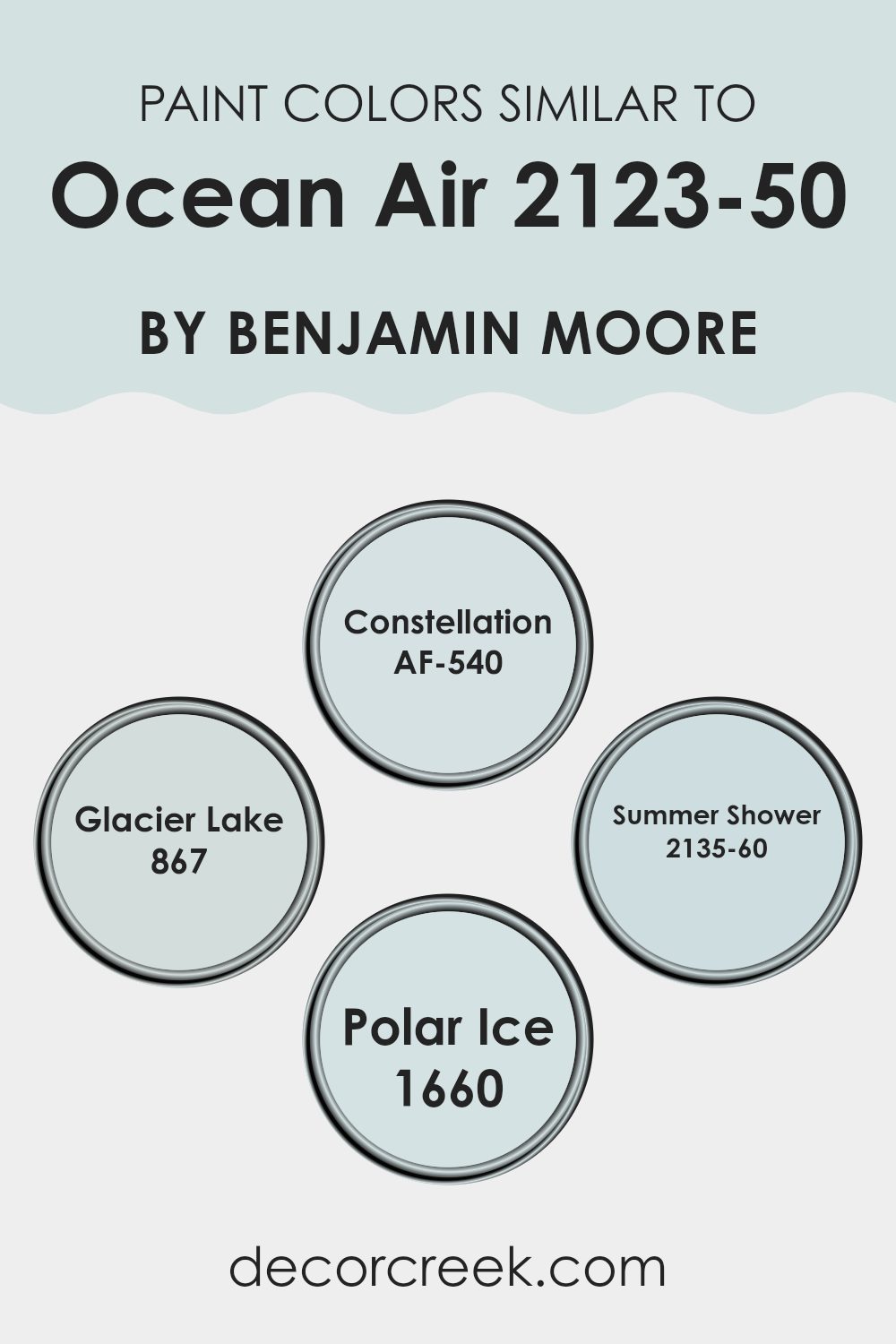
Colors Similar to Ocean Air 2123-50 by Benjamin Moore
Similar colors play an important role in interior design as they provide a cohesive and balanced look while allowing for a variety of accents and décor items. Using shades akin to Ocean Air, such as Constellation, Glacier Lake, Summer Shower, and Polar Ice, helps create a harmonious atmosphere that smoothly ties together different elements of a room.
These colors form a soothing gradient that resonates with the calming essence of a unified color palette. By sticking to colors that are close in tone, one can achieve a seamless visual flow from one area to another, making rooms appear larger and more open. Constellation is a gentle gray that carries a hint of blue, reminiscent of a night sky just after dusk.
This makes it a wonderful backdrop for brighter colors or metallic accents. Glacier Lake, on the other hand, has a more pronounced blue tone, similar to a calm lake under a clear sky, which is excellent for creating a refreshing vibe in any room. Summer Shower offers a lighter, airier blue that mirrors the softness of a clear, early morning sky.
It works beautifully in rooms that aim for a bright and open feel. Finally, Polar Ice provides a barely-there blue that’s almost white, perfect for enhancing natural light and creating a crisp, clean look. By incorporating these related shades, one can easily craft a room that feels unified, comfortable, and inviting.
You can see recommended paint colors below:
- AF-540 Constellation
- 867 Glacier Lake
- 2135-60 Summer Shower
- 1660 Polar Ice
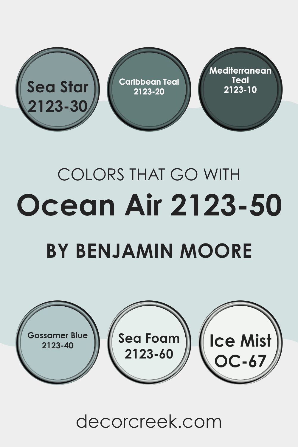
Colors that Go With Ocean Air 2123-50 by Benjamin Moore
Choosing the right colors to complement Ocean Air 2123-50 by Benjamin Moore is crucial in creating a harmonious and appealing aesthetic. This shade of soft blue has a calm and gentle presence that is enriched when paired with well-chosen coordinating colors. Such combinations can effectively set the mood of a room, whether aiming for a lively aquatic theme or a subtle beach-inspired vibe. These complementary colors help to create visual depth and bring balance, providing a smooth transition between the various elements of a decor scheme.
The palette that pairs with Ocean Air includes several hues. Sea Star 2123-30 offers a deeper, more intense blue, calling to mind the depths of the ocean and providing a striking contrast to the lighter Ocean Air. Caribbean Teal 2123-20, just like the name suggests, has a vibrant greenish-blue tone that adds energy and a warm, inviting feel to the room.
Mediterranean Teal 2123-10 is even deeper and more vigorous, making it perfect for accents that demand attention. For a lighter approach, Gossamer Blue 2123-40 offers a more ethereal, airy feel, akin to a soft sky on a clear day, while Sea Foam 2123-60 brings in a hint of green, reminiscent of gentle sea waves. Lastly, Ice Mist OC-67 serves as a near-white, providing a fresh, clean backdrop that allows other colors to stand out vividly. By using these colors thoughtfully, one can design a room that is both balanced and colorful, perfect for reflecting personal style and creating an inviting atmosphere.
You can see recommended paint colors below:
- 2123-30 Sea Star
- 2123-20 Caribbean Teal
- 2123-10 Mediterranean Teal
- 2123-40 Gossamer Blue
- 2123-60 Sea Foam
- OC-67 Ice Mist
How to Use Ocean Air 2123-50 by Benjamin Moore In Your Home?
Ocean Air 2123-50 by Benjamin Moore is a gentle and refreshing blue shade that can add a light and airy feel to any room in your home. This color is perfect for creating a calm atmosphere, making it an excellent choice for bedrooms and bathrooms where you can relax. It’s also bright enough to use in living areas and kitchens, where it adds a touch of calm without making the room feel closed in.
When paired with white trim and accents, Ocean Air really stands out, giving a clean and crisp look. It works well with natural light, enhancing the feeling of openness and roominess. For a more grounded look, combine it with darker furniture or flooring. This contrast can make the room feel well-balanced and cozy.
Ocean Air can also be a great choice for smaller areas like hallways or entryways, where it can make the area seem more inviting and open. Whether you’re redoing a single room or updating your entire home, Ocean Air offers a fresh and pleasant touch.
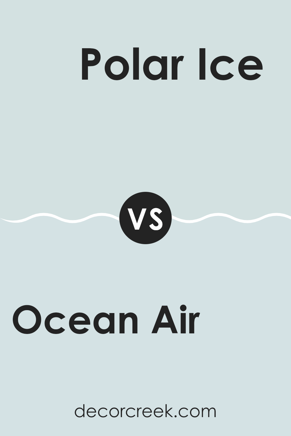
Ocean Air 2123-50 by Benjamin Moore vs Polar Ice 1660 by Benjamin Moore
Ocean Air by Benjamin Moore is a refreshing and light blue color that brings to mind a gentle, breezy day by the sea. It has a soft, calm feel to it, making it perfect for creating a relaxed atmosphere in any room.
In contrast, Polar Ice by Benjamin Moore is also a light color but leans more towards a cooler, icy blue tone. It suggests a clean, crisp feel that can brighten rooms while still maintaining a soothing vibe.
When comparing both, Ocean Air carries a slightly warmer undertone that resembles the open sky on a clear day, whereas Polar Ice reflects the sharp clarity of a frozen landscape. Both colors work beautifully for achieving a fresh look but will influence the mood of a room differently based on their warm and cool undertones.
You can see recommended paint color below:
- 1660 Polar Ice
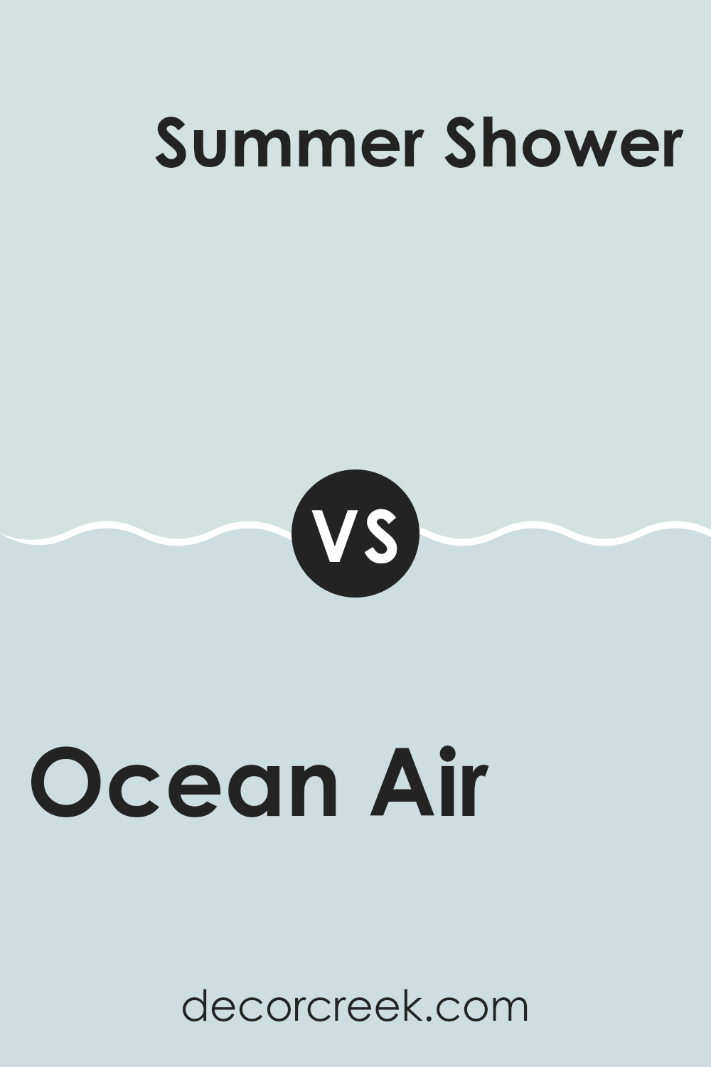
Ocean Air 2123-50 by Benjamin Moore vs Summer Shower 2135-60 by Benjamin Moore
Ocean Air and Summer Shower are two beautiful shades by Benjamin Moore, each offering a unique take on blue hues. Ocean Air is a light, airy blue that has a subtle vibrancy, making it refreshing yet calm. It’s the kind of color that brightens up a room while maintaining a laid-back vibe, much like a gentle breeze by the sea.
On the other hand, Summer Shower is a softer and cooler blue, leaning a bit towards a pale blue. It’s incredibly light and almost has a hint of gray, which makes it fantastic for a clean and minimalistic look. It’s the perfect backdrop for a room where you want to relax and unwind.
Both colors are great choices for creating a peaceful atmosphere in your home. Ocean Air adds a bit of cheer with its brighter tone, while Summer Shower keeps things mellow with its cooler, softer approach. Depending on your room and mood, either shade can enhance your interior with their gentle blue tones.
You can see recommended paint color below:
Ocean Air 2123-50 by Benjamin Moore vs Constellation AF-540 by Benjamin Moore
Ocean Air and Constellation are both colors by Benjamin Moore that offer a fresh, open feel but in subtly different ways. Ocean Air is a lighter, more breezy shade that resembles a clear sky on a sunny day. It’s soft and has a cheerful vibe, making it great for creating a relaxed atmosphere in rooms like living areas or bathrooms.
On the other hand, Constellation is a slightly deeper hue, reminiscent of the early evening sky just as stars begin to appear. It’s a quiet and understated color, providing a calm background that’s perfect for bedrooms or quiet study areas.
Both colors are adaptable and work well in many parts of the home, but while Ocean Air adds a sunny lift to a room, Constellation offers a more muted, grounding effect. Together, they can complement each other beautifully in a home, offering a blend of brightness and calm.
You can see recommended paint color below:
- AF-540 Constellation
Ocean Air 2123-50 by Benjamin Moore vs Glacier Lake 867 by Benjamin Moore
Ocean Air (2123-50) and Glacier Lake (867), both by Benjamin Moore, offer distinctly calming vibes but differ in their visual impact and mood-setting qualities. Ocean Air is a soft, pale blue with a breezy, light feel, reminiscent of a clear sky on a sunny day. It’s perfect for creating a relaxed, airy atmosphere in a room.
On the other hand, Glacier Lake has a deeper, more saturated tone, leaning slightly towards turquoise. This color resembles the rich hues found in deep waters and has a slightly cooler presence, giving rooms a fresh, invigorating feel.
While both colors bring a sense of calmness, Ocean Air is subtler and might be favored for smaller, more confined areas needing an expansion of visual openness without overpowering the senses. Glacier Lake, with its richer hue, works well in rooms that can handle a bit more color intensity, making it ideal for accent walls or larger interiors. Together, they can be used to create a dynamic yet harmoniously refreshing palette.
You can see recommended paint color below:
- 867 Glacier Lake
After reading about the paint color 2123-50 Ocean Air by Benjamin Moore, I feel pretty excited to share what I’ve learned. This color really stands out because it brings a nice, calm feeling, almost like you’re sitting by the sea and looking at the sky.
It works well in lots of rooms, whether in a busy kitchen or a peaceful bedroom. People love how it looks with different furniture, and it doesn’t get boring or seem too strong. Now, I understand why so many folks choose it for their homes.
It’s friendly, not too bright but not too dull, just right for making a room feel cozy. Plus, it’s a shade that you won’t get tired of quickly. So, if someone is thinking about giving their room a new look, Ocean Air might be a perfect pick. It’s like a fresh breath of air in your home, calming and pleasant.
Ever wished paint sampling was as easy as sticking a sticker? Guess what? Now it is! Discover Samplize's unique Peel & Stick samples.
Get paint samples

