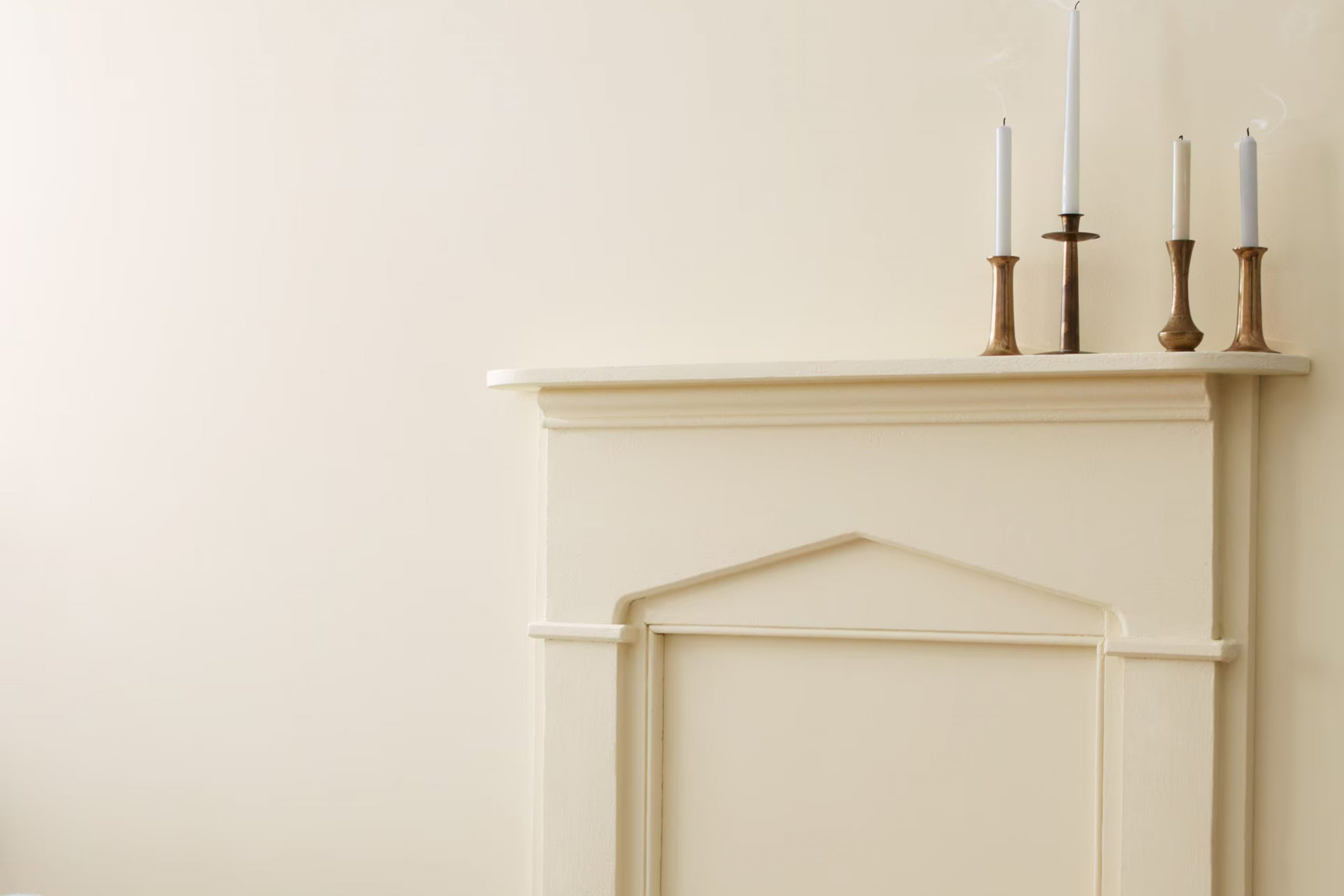
The first time you see 971 Olympic Mountains by Benjamin Moore, it might just take your breath away. It has this rich, creamy texture that spreads smoothly across any wall, instantly warming up the area. It’s not too bright, yet not too dull, creating a perfect balance that fits a calming bedroom or an inviting living room.
In painting a small study in my home, I chose this color, hoping to craft a cozy corner for reading and relaxation. The color did not disappoint, providing a subtle backdrop that seems to enhance concentration and calmness.
It’s also adaptable, blending beautifully with various furnishings and decor styles, from modern minimalist to rustic farmhouse.
If you’re thinking of giving your walls a fresh coat, consider this shade for a soothing, elegant atmosphere. It’s the kind of color that turns a mere room into a sanctuary.
What Color Is Olympic Mountains 971 by Benjamin Moore?
Olympic Mountains by Benjamin Moore is a warm gray shade with soft beige undertones, making it an adaptable color for interior areas. This color has a soothing quality without being too stark or cold, making it ideal for creating a cozy and inviting atmosphere. Its neutrality allows it to blend seamlessly with a variety of decor styles, from modern minimalist to rustic farmhouse.
In terms of interior styles, Olympic Mountains works particularly well in Scandinavian and contemporary themes due to its clean and muted nature. It serves as a gentle backdrop that complements streamlined furniture and natural wood accents commonly found in these settings. This color is also excellent for shabby chic decor, providing a subtle contrast to distressed furniture and vintage pieces.
Pairing well with materials like unfinished wood, soft linen, and brushed metal, Olympic Mountains enhances textures without overpowering them. In an area featuring this color, consider adding wool throws or jute rugs to introduce texture while maintaining a harmonious look. It’s equally effective in areas that utilize a lot of glass and metal, providing a soft counterbalance to their sleek surfaces.
Whether used as a main wall color or as an accent, this color supports a range of material combinations and can help create a cohesive interior environment.
Is Olympic Mountains 971 by Benjamin Moore Warm or Cool color?
Benjamin Moore’s Olympic Mountains 971 is an adaptable paint color that can really enhance the feel of any room in a home. Its warm, creamy beige tone makes it perfect for creating a cozy and welcoming atmosphere. This lighter shade has the ability to open up smaller areas, making them appear brighter and more spacious.
Because of its neutral quality, it pairs well with a wide range of other colors and decor styles, from modern to rustic. This makes it a great choice for common areas like living rooms and kitchens, where you might want a cohesive look that can easily accommodate different types of furnishings and accessories.
Additionally, Olympic Mountains 971 works well in rooms with a lot of natural light as well as those with limited sunlight, maintaining its beauty under various lighting conditions. This paint color is a practical option for anyone looking to refresh their home’s appearance with a fresh, yet subtle, new look.
Undertones of Olympic Mountains 971 by Benjamin Moore
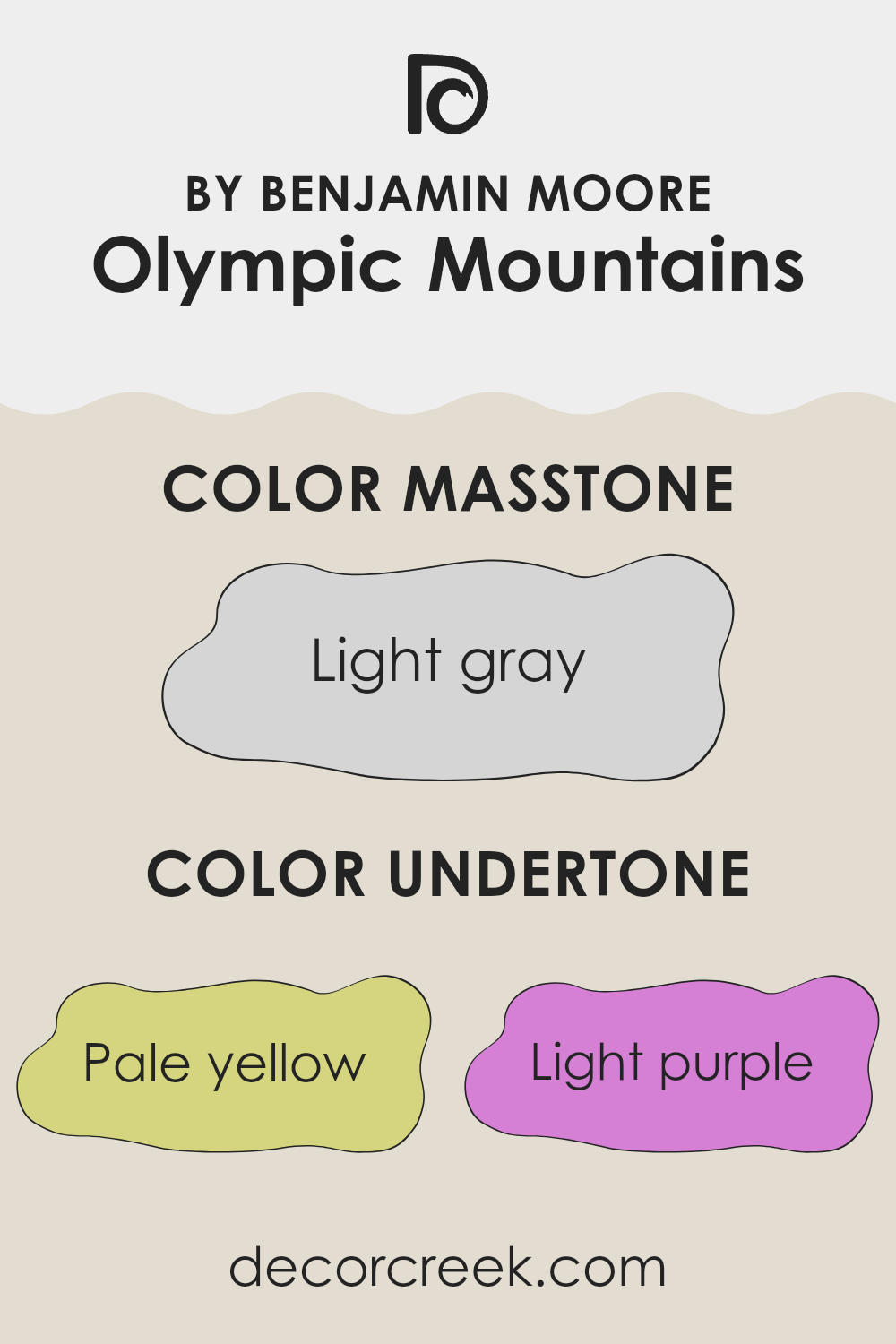
The color Olympic Mountains by Benjamin Moore is a unique shade that incorporates a variety of undertones, which subtly influence the perception of its primary hue. Understanding these undertones—pale yellow, light purple, light blue, pale pink, mint, lilac, and gray—helps to appreciate how the color behaves in different lighting conditions and environments.
Undertones are the faint colors that lurk beneath the surface of the main color, impacting how it is seen. They can cool down or warm up a color, depending on their nature. For instance, pale yellow and mint bring a hint of warmth, making a color feel more inviting, while light blue and gray might give it a cooler, more reserved appearance.
When Olympic Mountains is used on interior walls, these undertones play a crucial role in setting the mood of the room. In natural light, the pale yellow and mint undertones might make the area feel brighter and more open, while the gray and light blue can give it a calm and collected feel. The hint of lilac and pale pink adds a soft, subtle richness, adding layer and depth without it feeling too intense.
The unique combination of these undertones ensures that Olympic Mountains is an adaptable paint color, capable of fitting into many different interior styles and themes. It can enhance the aesthetic of a room, adding personality and mood in a subtle, yet effective way.
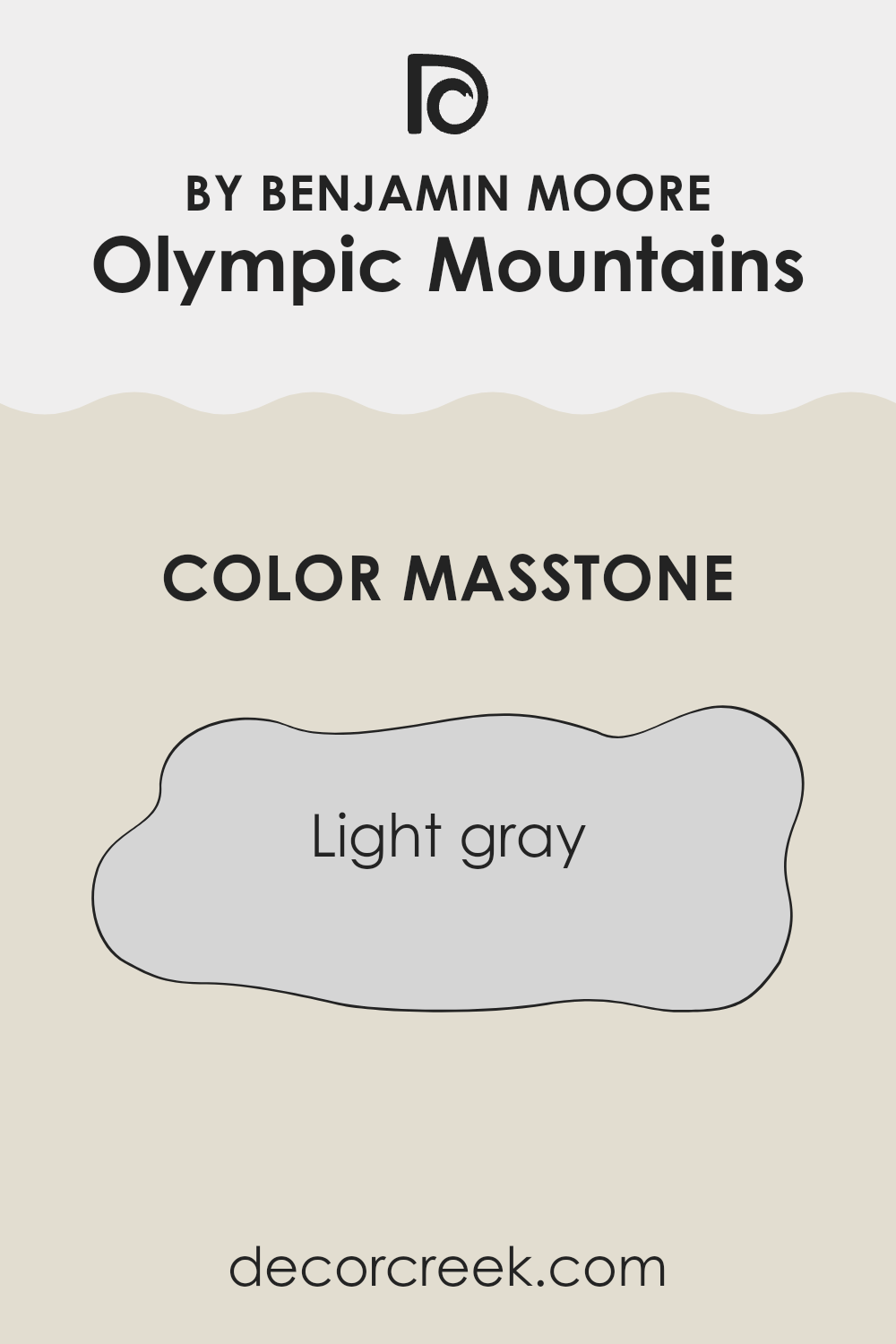
What is the Masstone of the Olympic Mountains 971 by Benjamin Moore?
The Olympic Mountains 971 by Benjamin Moore is a light gray color with a masstone of #D5D5D5. This shade of gray is very adaptable and works well in many different areas of a home. Its lightness helps to make rooms look bigger and brighter, which is great for smaller areas or rooms that don’t get much natural light.
This color is also easy on the eyes, making it a good choice for places where you spend a lot of time, like living rooms or bedrooms. It’s neutral, so it goes well with almost any other color.
This means you can add other colors through furniture or decorations without having to worry about them clashing with the walls. Additionally, light gray is known for hiding small marks or dirt better than lighter colors, which can help keep your home looking clean and well-kept. Overall, Olympic Mountains 971 is a practical and flexible color choice for any home.
How Does Lighting Affect Olympic Mountains 971 by Benjamin Moore?
Lighting plays a crucial role in how colors appear in different environments. This is important to consider when choosing a paint color like Olympic Mountains 971 by Benjamin Moore, an adaptable shade that can look different based on the lighting conditions.
In artificial light, such as from light bulbs, Olympic Mountains 971 tends to show a warmer tone. This is because most indoor lighting has yellow undertones, which can enhance the warmth in the color, making it appear cozier and slightly richer. Under LED or fluorescent lights, which can have cooler tones, the color might look more neutral and subdued.
In natural light, the appearance of this color can vary significantly depending on the time of day and the weather. On a bright sunny day, Olympic Mountains 971 reflects more light, displaying a lighter and more vibrant tone. On cloudy days, it might look more muted and soft, blending beautifully with the overcast sky.
The orientation of a room can also affect how Olympic Mountains 971 is perceived:
- North-facing rooms: These rooms get less direct sunlight, which can make colors appear cooler. Here, Olympic Mountains 971 might look more subdued and slightly grayish, making the room feel calm and collected.
- South-facing rooms: These receive a lot of sunlight, which can make the paint look brighter and more vibrant. In such rooms, Olympic Mountains 971 will feel warmer and more inviting.
- East-facing rooms: Morning light is cooler, so this paint will look softer and more subtle in the morning, becoming warmer as the day progresses.
- West-facing rooms: In the afternoon and evening, when the light is warmer, the color will appear richer and more intense.
Choosing the right lighting and considering room orientation can greatly influence how Olympic Mountains 971 enhances an area, affecting the mood and overall aesthetic.
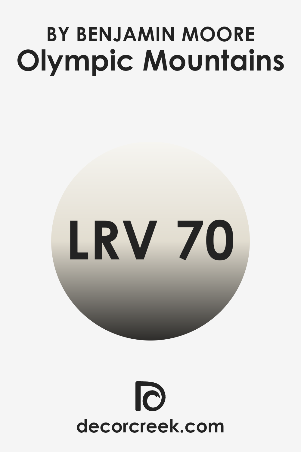
What is the LRV of Olympic Mountains 971 by Benjamin Moore?
LRV stands for Light Reflectance Value, which is a measure used to describe the percentage of light a paint color reflects from or absorbs into a surface. It is calculated on a scale from zero to one hundred, where zero absorbs all light and appears black, while one hundred reflects all light and appears white.
This value helps homeowners and designers determine how light or dark a color will look in an area and how it will influence the ambiance of a room. A higher LRV means the color will appear lighter and can make a small area feel more open and airy. Conversely, a color with a lower LRV will absorb more light and can make an area feel smaller and cozier.
The LRV for Olympic Mountains, which is 70.15, indicates that this color is quite light and will reflect a good amount of light. This makes it an excellent choice for rooms that might be smaller or darker as it will help brighten the area and make it feel larger.
The lightness of this shade means it can also effectively hide imperfections on walls and works well in areas that receive less natural light. Additionally, the high LRV allows this particular color to stay fairly true to its hue without it feeling too intense or fading out, maintaining a pleasant appearance throughout different times of the day.
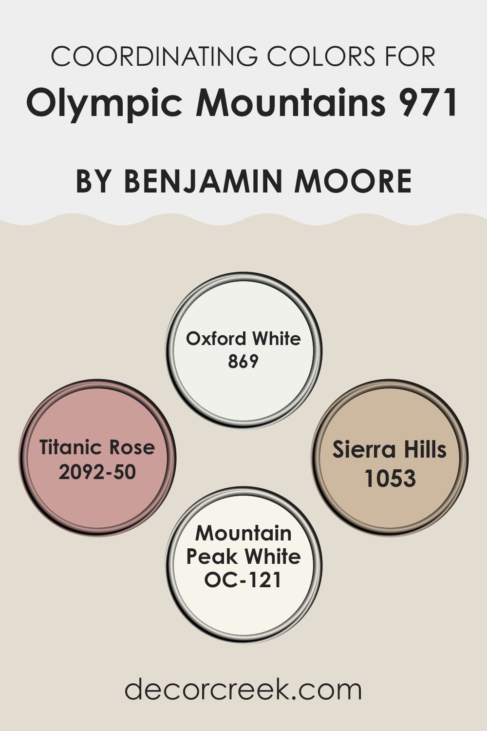
Coordinating Colors of Olympic Mountains 971 by Benjamin Moore
Coordinating colors are shades that complement each other to create a harmonious and appealing look in any given area. When selecting coordinating colors, the aim is to choose hues that balance well without clashing, ensuring that each adds depth and character to the décor. Specifically, coordinating colors for a given base color should enhance its beauty and bring out the subtle undertones in a tasteful and effective manner.
For instance, Oxford White 869 is a clean and pure white that helps balance out more intense colors and adds a fresh look to any room. Likewise, Titanic Rose 2092-50 is a gentle blush pink that introduces a soft, nuanced charm, perfect for creating a warm and inviting atmosphere.
Sierra Hills 1053, another coordinating color, features a subtle beige tone that marries well with a wide range of palettes, lending an earthy, grounding effect. Lastly, Mountain Peak White OC-121 offers a slightly off-white hue that acts as an adaptable backdrop for richer colors, allowing them to stand out without overpowering. Together, these coordinating colors work synergistically to enhance the overall aesthetic and feel of an area.
You can see recommended paint colors below:
- 869 Oxford White
- 2092-50 Titanic Rose
- 1053 Sierra Hills
- OC-121 Mountain Peak White
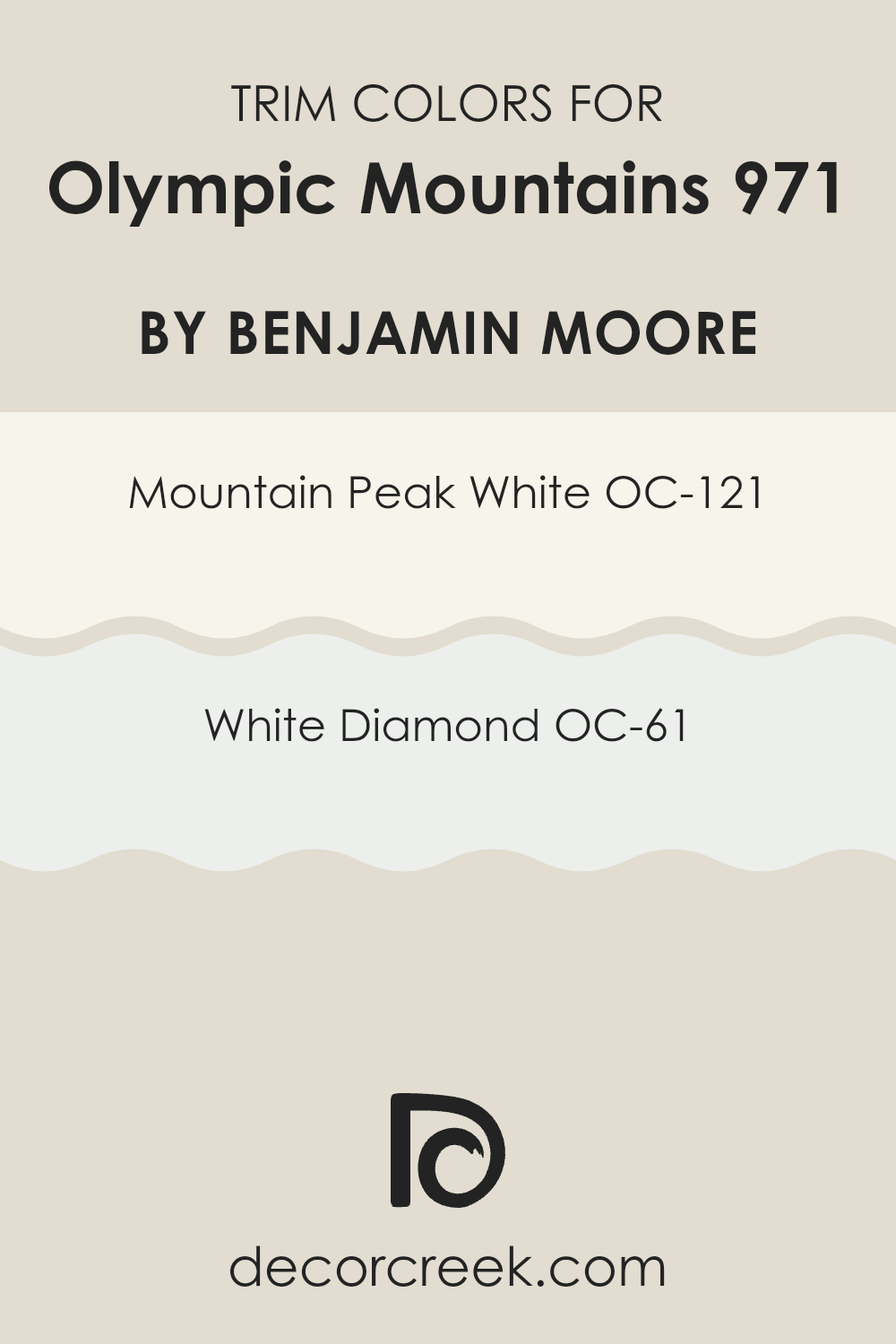
What are the Trim colors of Olympic Mountains 971 by Benjamin Moore?
Trim colors, like those suggested for Olympic Mountains 971 by Benjamin Moore, play a crucial role in enhancing the aesthetic appeal and distinguishing architectural elements of a room or house exterior.
By using contrasting trim colors, such as Mountain Peak White or White Diamond, you can highlight features like door frames, windows, and skirting boards. These trim colors serve not only as a visual boundary that defines different parts of a structure but also help in creating a more finished and cohesive look.
Mountain Peak White, or OC-121, is a creamy white that offers a warm and inviting touch to any area, making it an excellent choice for trim. It pairs beautifully with the rich hue of Olympic Mountains 971 to create a subtle yet noticeable contrast, which can make the main color stand out more. On the other hand, White Diamond, or OC-61, has a slightly brighter and crisper tone. This color is perfect if you desire a sharper contrast that draws the eye to the home’s architectural details and enhances the overall sharpness of the design.
You can see recommended paint colors below:
- OC-121 Mountain Peak White
- OC-61 White Diamond
Colors Similar to Olympic Mountains 971 by Benjamin Moore
Choosing similar colors when painting a room can create a harmonious and pleasing atmosphere. The gentle blend of hues that complement each other naturally enhances an area without causing visual clashes or it feeling too intense.
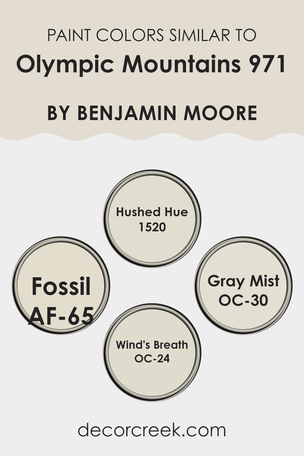
For instance, colors like 1520 – Hushed Hue, AF-65 – Fossil, OC-30 – Gray Mist, and OC-24 – Wind’s Breath all work together seamlessly given their subtle differences and shared undertones. Using these colors together allows each one to shine without competing for attention, setting a calm and cohesive mood in the environment.
Each of these colors brings its own unique feel to a room while still aligning with a central aesthetic theme. 1520 – Hushed Hue offers a soft, creamy complexion that can lighten up any area with a touch of warmth. In contrast, AF-65 – Fossil provides a slightly deeper, earthy beige that grounds the area with a sense of stability and depth.
OC-30 – Gray Mist is a gentle gray that gives a clean, fresh look, perfect for creating a modern feel. Lastly, OC-24 – Wind’s Breath is an off-white with a hint of gray, ideal for brightening areas while keeping a soft, neutral palette. Together, these colors offer an adaptable palette that can enhance any living area with ease and style.
You can see recommended paint colors below:
- 1520 Hushed Hue
- AF-65 Fossil
- OC-30 Gray Mist
- OC-24 Wind’s Breath
Colors that Go With Olympic Mountains 971 by Benjamin Moore
Choosing the right colors to complement the shade Olympic Mountains 971 by Benjamin Moore is crucial in creating a cohesive and appealing look in any area. Olympic Mountains 971 is an adaptable shade that pairs well with a variety of colors, enhancing the aesthetic appeal of interiors.
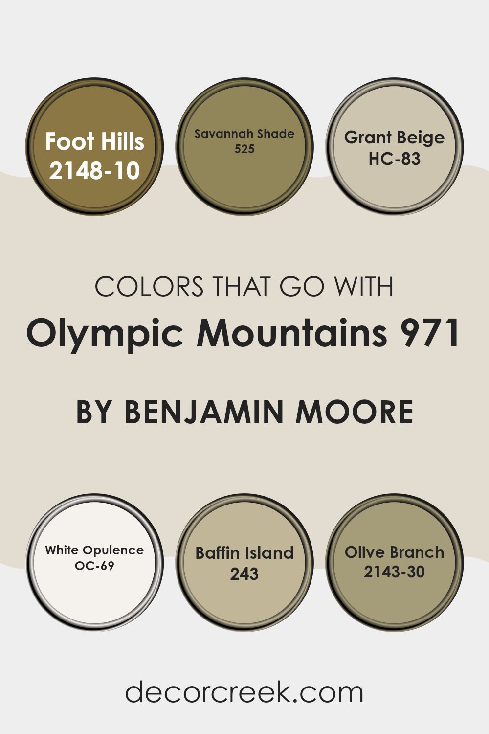
For example, Foot Hills 2148-10 is a deep, earthy tone that contrasts nicely with the lighter Olympic Mountains 971, providing a robust backdrop that adds depth to a room. Savannah Shade 525, on the other hand, offers a lighter, sandy color that harmonizes with Olympic Mountains 971, bringing a warm and welcoming feel to any environment.
Grant Beige HC-83 is another excellent companion to Olympic Mountains 971—it’s a neutral beige that provides a subtle and elegant background, allowing Olympic Mountains to stand out. White Opulence OC-69 is a fresh and clean white, perfect for creating a crisp and airy feel when paired with the soft gray of Olympic Mountains 971.
If looking for a touch of uniqueness, Baffin Island 243 adds a muted, icy blue to the palette, offering a refreshing contrast that still aligns with the calmness of the base color. Lastly, Olive Branch 2143-30 introduces a natural green, injecting vibrancy and life, which complements the earthy undertones of Olympic Mountains 971, making the area feel grounded and connected to nature.
You can see recommended paint colors below:
- 2148-10 Foot Hills
- 525 Savannah Shade
- HC-83 Grant Beige
- OC-69 White Opulence
- 243 Baffin Island
- 2143-30 Olive Branch
How to Use Olympic Mountains 971 by Benjamin Moore In Your Home?
The Olympic Mountains 971 by Benjamin Moore is a lovely shade of paint that brings the subtle tones of nature into your home. It’s inspired by the stunning natural scenery of the Olympic Mountains, providing a soft, welcoming green that works beautifully in many different areas. This adaptable color is perfect for those looking to add a touch of calmness and freshness to their rooms without it feeling too intense.
You can use Olympic Mountains 971 in various ways. For example, it’s great for a bedroom where you might want light and airy vibes to help you relax and get a good night’s sleep. In living rooms, this color pairs well with natural wood furnishings, enhancing a cozy and inviting atmosphere. If you’re feeling creative, it also serves as a unique base for an accent wall, where you can then decorate with art or shelves featuring decorative items.
Furthermore, in bathrooms, Olympic Mountains 971 can create a spa-like setting when combined with white tiles or fixtures. It’s also an excellent choice for a kitchen, where it can complement both modern appliances and more traditional decorations. Whatever room you choose, this color is sure to add a fresh, lively feel.
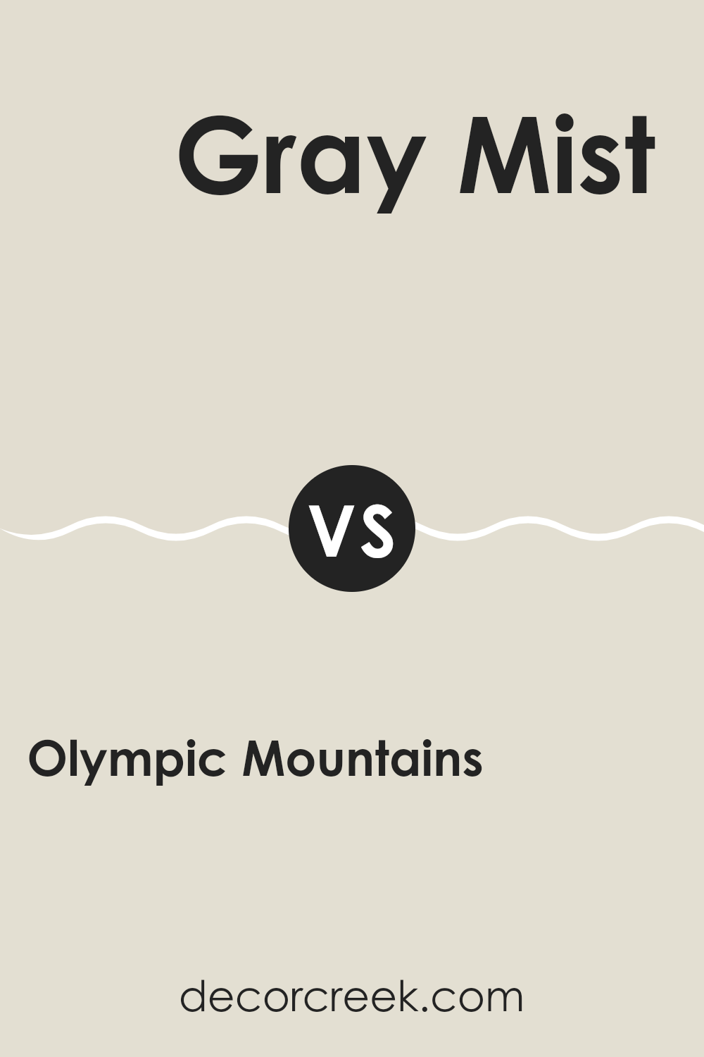
Olympic Mountains 971 by Benjamin Moore vs Gray Mist OC-30 by Benjamin Moore
Olympic Mountains and Gray Mist are both colors by Benjamin Moore that add a calm feel to any room. Olympic Mountains is a shade that resembles the natural color of a mountain covered in a light haze. This color is slightly warmer with beige undertones, making it a cozy choice for living areas.
On the other hand, Gray Mist is a lighter color that leans more towards a classic gray. It’s subtle enough to work as a neutral backdrop in various rooms, from kitchens to bedrooms. This color has a clean and airy feel, providing a fresh look without being too stark or cold.
Both colors are adaptable and can be used in different parts of the home. Olympic Mountains works well in areas where you want a bit of warmth and an inviting ambiance, while Gray Mist is ideal where a lighter, more open feel is desired. Choosing between them depends on the mood and tone you want to set in your area.
You can see recommended paint color below:
- OC-30 Gray Mist
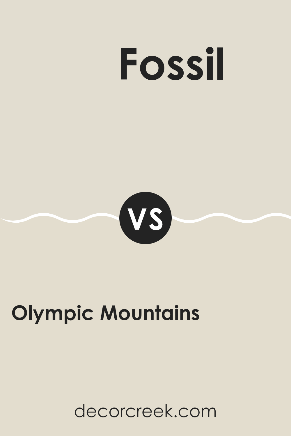
Olympic Mountains 971 by Benjamin Moore vs Fossil AF-65 by Benjamin Moore
Olympic Mountains by Benjamin Moore is a muted, gentle gray with a hint of warmth. It’s an adaptable color that works beautifully in areas that aim for a soft, cozy feel. This subtle hue has the ability to create a calming atmosphere without making the area feel too cold or impersonal.
Fossil by Benjamin Moore, on the other hand, is another soft tone but leans more towards a neutral beige with gray undertones. It’s an excellent choice for those who prefer a slightly warmer palette but still enjoy the understated elegance that gray tones provide. Fossil can enhance the warmth of a room while maintaining a clean and inviting aesthetic.
When comparing the two, Olympic Mountains is cooler with its gray base, whereas Fossil brings a softer, more beige-like presence, adding a touch of warmth. Both colors are quite neutral, making them easy to pair with various decor styles and other colors.
You can see recommended paint color below:
- AF-65 Fossil
Olympic Mountains 971 by Benjamin Moore vs Wind’s Breath OC-24 by Benjamin Moore
Olympic Mountains by Benjamin Moore is a warm beige with a soft, natural feel that creates a cozy atmosphere in any room. It leans towards a slightly earthy tone, which makes it great for areas where you want to promote comfort and ease. It pairs well with natural materials and light woods.
On the other hand, Wind’s Breath by Benjamin Moore is a lighter, off-white color that has a hint of beige. This color is delicate and subtle, giving rooms a brighter appearance without being too stark. It’s perfect for enhancing areas by making them seem more airy and open. Wind’s Breath works well in smaller rooms or areas with less natural light.
Both colors are adaptable and can work in various styles of decor, but Olympic Mountains brings warmth and depth, while Wind’s Breath focuses on creating a light, refreshing area. Whether choosing either, both lend themselves to a relaxed and welcoming vibe.
You can see recommended paint color below:
Olympic Mountains 971 by Benjamin Moore vs Hushed Hue 1520 by Benjamin Moore
Olympic Mountains by Benjamin Moore is a warm, neutral beige that provides a calm and inviting atmosphere to any area. It might remind some people of sandy shores or a classic clay pot, making it adaptable for use in many different rooms, from living areas to bedrooms.
On the other hand, Hushed Hue is a lighter, soft pink that offers a gentle and airy feel. This color is particularly suitable for creating a soothing environment, much like the inside of a seashell or a delicate spring blossom. It’s great for areas where you want to add a touch of lightness and warmth without it feeling too intense.
Both colors share a natural, understated quality but serve different moods and visual impacts. While Olympic Mountains keeps things grounded with its earthy undertones, Hushed Hue lifts the area with its subtle pink hues. Depending on what feel you’re going for—earthy or light—either of these colors could be a good choice.
You can see recommended paint color below:
- 1520 Hushed Hue
Writing my thoughts about the 971 Olympic Mountains paint from Benjamin Moore has been really fun. This paint color reminds me of being outside in nature, right among big, tall mountains and forests. It’s a cool, green color that makes you feel calm just by looking at it.
I’ve noticed that this paint can change how a room feels. If you use this in your room, it might make you think of being outdoors, even when you have to stay inside. It’s great for places like bedrooms or living rooms where you relax a lot.
Also, this color goes well with many other colors. You can mix it with light colors like white or gray, and it still looks good. That means it’s easy to use when you want to give your room a new look without having too much trouble.
Benjamin Moore did a great job with Olympic Mountains. It offers a soothing green that’s not too bright or too dark. I think it’s perfect for anyone who likes their room to have a nature feel or just wants a cool and calm vibe around them.
Overall, trying out this paint showed me that the right shade on your walls can really change how a room makes you feel. And I think that’s pretty awesome!
Ever wished paint sampling was as easy as sticking a sticker? Guess what? Now it is! Discover Samplize's unique Peel & Stick samples.
Get paint samples

