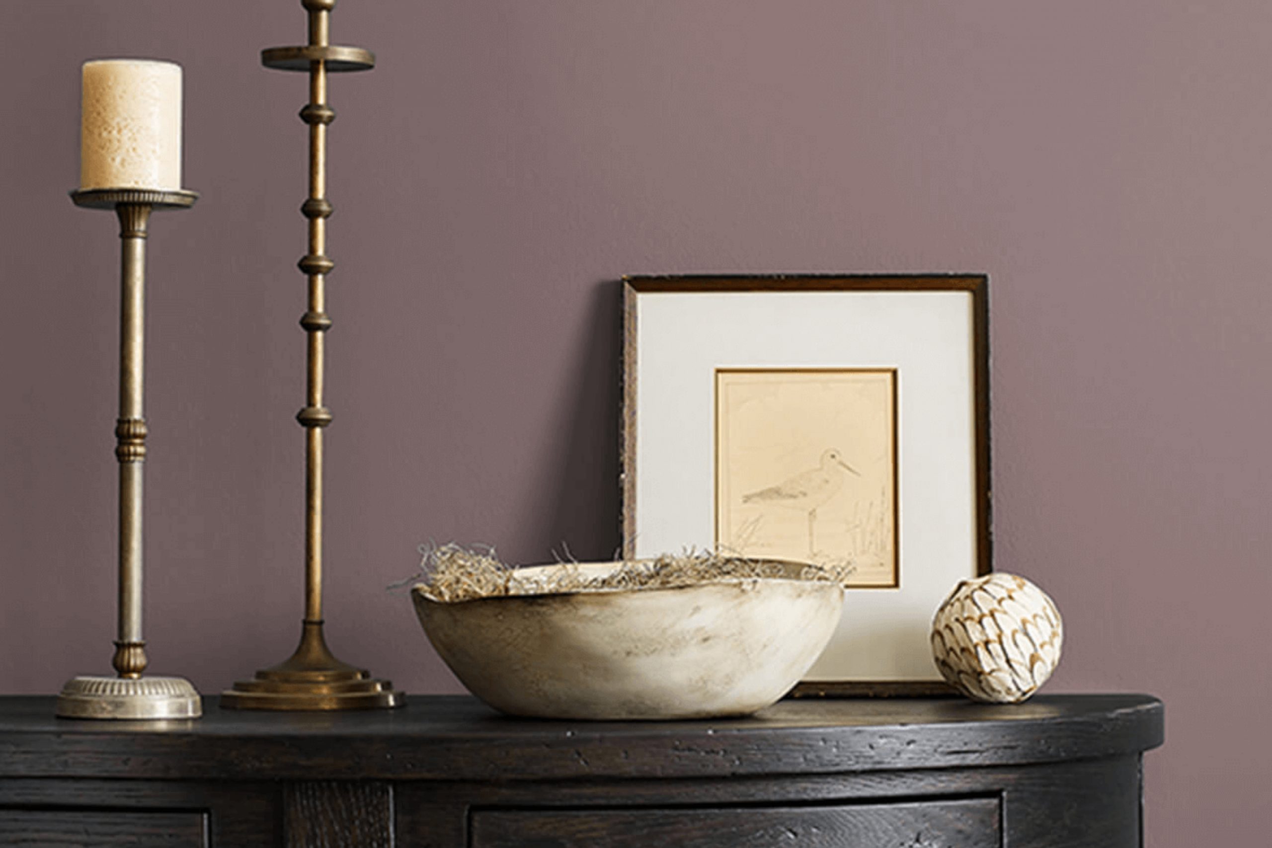
Patchwork Plum (SW 0022) by Sherwin Williams is a shade that immediately draws attention. It’s a deep, rich color with hints of warmth and refinement. When you choose this color for a room, you create an atmosphere that feels both inviting and luxurious. The plum hue has a unique way of adding depth to your surroundings, making it perfect for a cozy living room or an elegant dining area.
You’re likely to appreciate how Patchwork Plum complements various textures and materials. Whether paired with soft fabrics, sleek metals, or natural wood, the color brings a heightened sense of cohesion to the decor scheme. It stands out without overpowering other elements, balancing the room effortlessly.
Unlike more common shades, this color brings a touch of the unexpected. It speaks to a personality that’s bold yet thoughtful. As you spend time in a room with Patchwork Plum on the walls, you may find yourself inspired to think creatively, relax more deeply, or simply enjoy the richness that surrounds you.
It has a way of reshaping a room into something truly memorable, where art and comfort come together seamlessly.
What Color Is Patchwork Plum SW 0022 by Sherwin Williams?
Patchwork Plum by Sherwin Williams is a rich and moody shade of purple with deep undertones of brown and gray. This color offers a cozy and intimate atmosphere, perfect for rooms where warmth and comfort are important. In terms of interior style, Patchwork Plum is particularly well-suited for traditional, eclectic, and bohemian designs. It adds a sense of depth and character and is ideal for creating accent walls or highlighting architectural features.
Pairing Patchwork Plum with materials like dark woods, such as mahogany or walnut, can amplify its warm nature. It also looks beautiful alongside metals like brass or antique gold, adding an elegant touch. Fabrics like velvet or linen in complementary shades such as cream, taupe, or mustard can enhance the room’s texture while maintaining a harmonious look.
For those who prefer a cozy, layered feel, this color works well with textured throws, patterned rugs, or pillows in earthy tones. In lighting, soft, ambient lights can accentuate the depth of the Plum and foster an inviting environment.
Whether used in a living room, library, or bedroom, Patchwork Plum can provide a stylish backdrop that is both dramatic and comforting.
Is Patchwork Plum SW 0022 by Sherwin Williams Warm or Cool color?
Patchwork Plum by Sherwin Williams is a rich, deep shade that brings warmth and depth to any room. This color has a luxurious and comforting feel, making it a great choice for living rooms and bedrooms where coziness is desired. Its deep plum tone can create an elegant atmosphere, adding a sense of richness and refinement to your room.
When used on walls, Patchwork Plum can make a room feel more intimate and inviting. It pairs well with neutral colors like beige or cream, which can balance its intensity and keep the room from feeling too dark. For a bolder look, consider pairing it with gold or brass accents, which play off the warmth of the plum.
Patchwork Plum’s versatility means it works in both traditional and modern settings, bringing a unique character that can be adjusted based on lighting and decor choices, making it a flexible option for various design styles.
Undertones of Patchwork Plum SW 0022 by Sherwin Williams
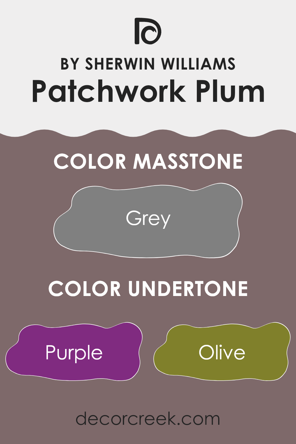
Patchwork Plum by Sherwin Williams is a rich, deep color with a variety of undertones that influence its appearance. These undertones include purple, olive, dark turquoise, brown, and several others. The way we perceive this paint can change based on lighting and surrounding colors, as undertones alter its overall hue and mood.
In a room, Patchwork Plum might show more of its purple and violet undertones, giving it a warm, welcoming feel. This makes it ideal for rooms where you want a cozy atmosphere, like a bedroom or living room. The olive and dark green hints can add a touch of earthiness, grounding the color and making it feel more comfortable and natural.
In areas with cooler light, such as a room with northern exposure, undertones like navy and dark turquoise might come forward. This shift can provide a more subdued and relaxed feel, sometimes making the color appear more refined and calming.
If fuchsia or red undertones become more pronounced, it can create a vibrant atmosphere, perfect for social rooms. On the other hand, pale pink or lilac undertones can soften the color, offering a gentler and more calming look. Ultimately, the paint has a flexible character depending on its environment, making it suitable for various design preferences.
What is the Masstone of the Patchwork Plum SW 0022 by Sherwin Williams?
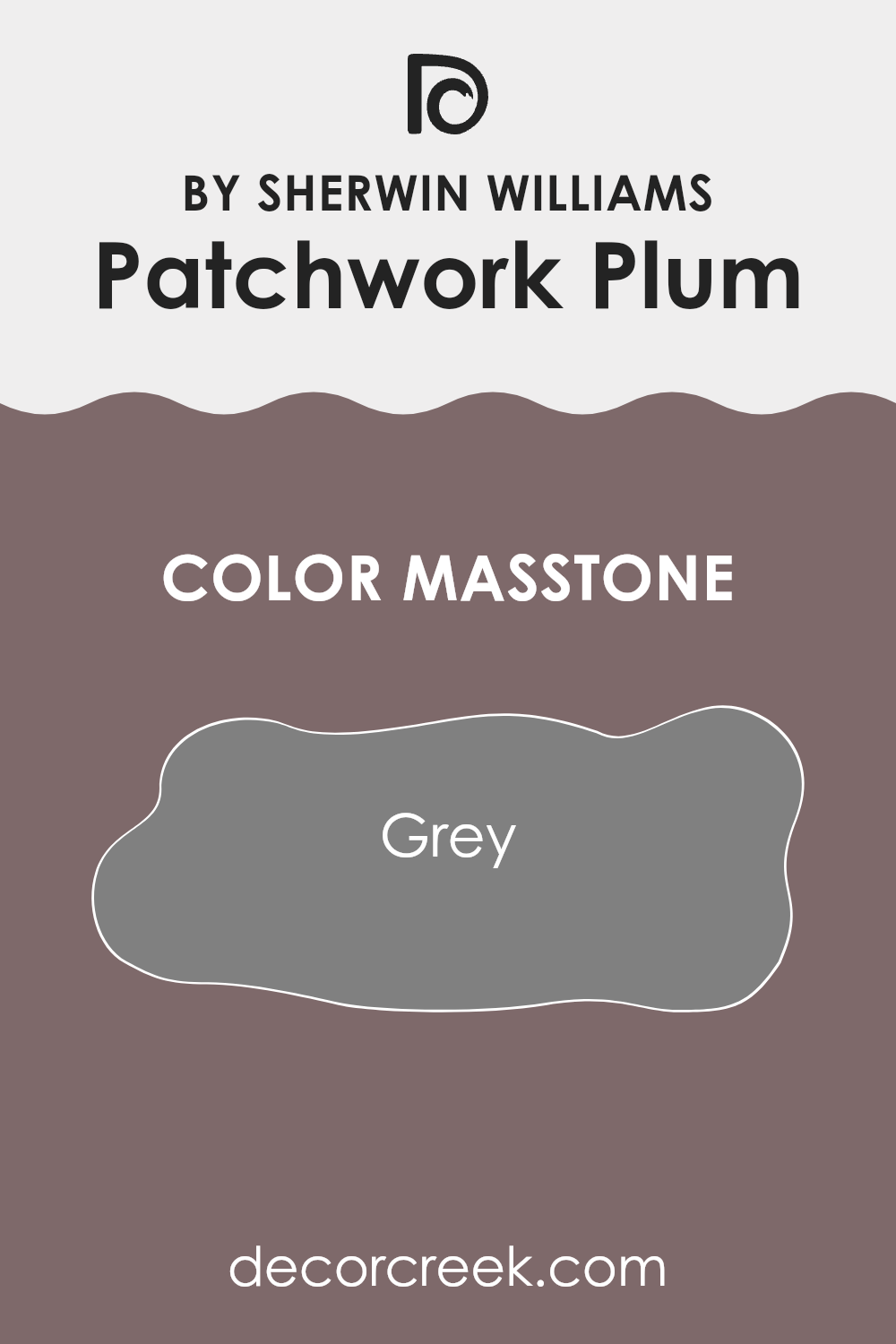
Patchwork Plum SW 0022 by Sherwin Williams has a unique masstone of grey (#808080). This grey gives the color a subtle, muted quality, helping it blend easily with different styles in a home. Unlike bolder or brighter colors, the grey undertone in Patchwork Plum makes it feel more understated and balanced. This can create a welcoming and cozy atmosphere in rooms like living rooms or bedrooms.
In color schemes, the grey masstone introduces a calm feeling. It softens the overall look, making it suitable for both modern and traditional homes. Combining Patchwork Plum with neutral accents, like whites or beiges, enhances its gentle appearance.
On the other hand, pairing it with more vibrant hues can add depth without feeling too intense. Additionally, the grey tone helps the color adjust to various lighting conditions, looking slightly different but still appealing in sunlight or under artificial lights. This flexibility makes it a favorite choice for many homeowners.
How Does Lighting Affect Patchwork Plum SW 0022 by Sherwin Williams?
Lighting plays a big role in how paint colors appear in a room. The color Patchwork Plum (SW 0022) by Sherwin Williams, a deep plum shade, can look different depending on the type of light it is exposed to.
In natural light, which changes throughout the day, this color can show very differently. In a north-facing room, which usually has cooler and more diffused light, Patchwork Plum might look a bit muted or even slightly blueish. The absence of direct sunlight keeps the color subdued, so the deep plum won’t appear as rich.
In a south-facing room, you get a lot of warm and direct sunlight, especially during the middle of the day. This type of lighting can bring out the warmer and more vibrant aspects of the patchwork plum color. It might look more intense and true to what you’d expect from a deep plum, adding richness to the room.
East-facing rooms get bright, clear light in the morning but become cooler and more muted as the day goes on. In the morning, Patchwork Plum can seem brighter and more vivid. By the afternoon, the plum may take on a more subdued appearance.
West-facing rooms receive the warmest light in the late afternoon and evening. Early in the day, the plum color might seem a bit muted or even shadowy. However, by late afternoon and evening, the warm light can make the color glow, enhancing its depth and warmth.
Under artificial light, such as LED or incandescent bulbs, the color can change again. Incandescent bulbs, which give off a warm yellowish light, can make Patchwork Plum appear warmer and more inviting. LED lights vary more; a cool LED will keep the color closer to its natural state, while a warm LED might mimic incandescent lighting.
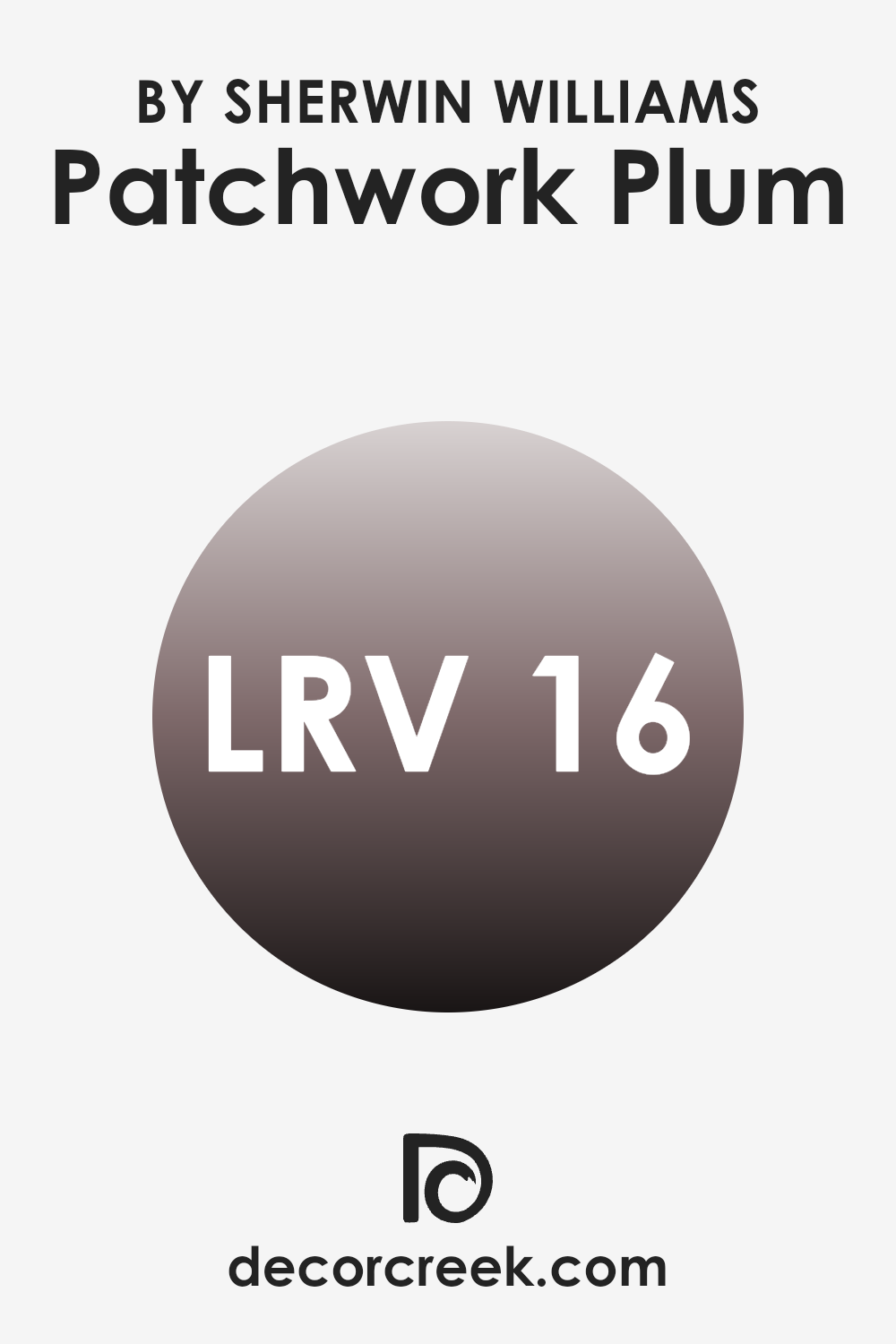
What is the LRV of Patchwork Plum SW 0022 by Sherwin Williams?
LRV, or Light Reflectance Value, is a measurement that tells us how much light a color reflects when it’s applied to a wall. The scale ranges from 0, which is absolute black and reflects no light, to 100, which is pure white and reflects all light. When you see an LRV like 15.623, it means that the color reflects only a small amount of light. Colors with lower LRV values tend to absorb more light, making them appear richer and possibly darker in a room.
The LRV is important because it helps people understand how light or dark a color will look once it’s painted on a wall. It can also influence how a room feels—colors with a low LRV can make a room feel cozier but might also make it feel smaller or less bright.
For a color with an LRV of 15.623, like Patchwork Plum from Sherwin Williams, you can expect it to give a room a warm and intimate atmosphere. Because it doesn’t reflect much light, it will appear deeper and more saturated, contributing to a cozy feeling in the room.
This color is likely to be more impactful in rooms that receive ample natural or artificial light, as it provides a good contrast with lighter finishes or furnishings. However, in darker rooms, it may make the room feel smaller and more enclosed. Choosing a color with a low LRV like this can be a bold choice, great for those who want to create a dramatic effect or a sense of warmth.
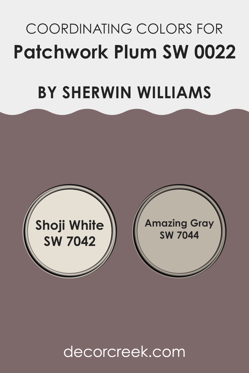
Coordinating Colors of Patchwork Plum SW 0022 by Sherwin Williams
Coordinating colors are shades that work well together to create a harmonious look in a room. They complement each other, enhancing the overall aesthetic by balancing contrast and unity. When choosing coordinating colors for a rich tone like Patchwork Plum by Sherwin Williams, it’s important to select hues that will enhance its depth and warmth without overpowering it.
For example, Shoji White (SW 7042) is a soft, warm white that provides a gentle contrast to the deep tones of Patchwork Plum. Its subtle warmth adds a touch of lightness, creating an inviting and balanced atmosphere without feeling stark or cold.
On the other hand, Amazing Gray (SW 7044) is a flexible neutral with warm undertones that can ground the entire color palette. It complements the richness of the plum while adding depth without clashing. This shade brings a cozy feeling to a room, making it ideal for living areas or bedrooms where comfort is key.
By pairing Patchwork Plum with Shoji White and Amazing Gray, you can create a pleasant and cohesive look that feels both welcoming and refined. This combination showcases how a well-chosen palette can turn any room into a harmonious and inviting room.
You can see recommended paint colors below:
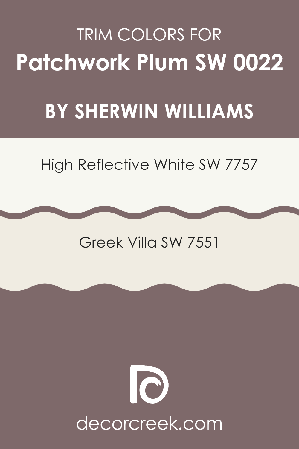
What are the Trim colors of Patchwork Plum SW 0022 by Sherwin Williams?
Trim colors refer to the hues used on a building’s fascia, doors, windows, and moldings to create contrast or harmony with the main wall color. Trim colors play a crucial role in framing the central color and enhancing its appearance. When used with Patchwork Plum by Sherwin Williams, trim colors are particularly important.
They can highlight the rich, deep tones of the plum and create a balanced, inviting look for a room. This combination not only accentuates the wall color but also brings out the architectural details of a room or building, making them stand out.
In choosing trim colors for Patchwork Plum, using SW 7757 – High Reflective White and SW 7551 – Greek Villa can be especially effective. High Reflective White is an ultra-bright white with a clean, crisp finish, perfect for providing a sharp contrast against the dark, warm hue of the plum, which can make the color pop even more.
Greek Villa, on the other hand, is a softer, warmer white that adds a subtle touch of elegance and warmth, complementing the rich tones of Patchwork Plum without creating too stark of a contrast. These colors used as trim will frame the main color beautifully, ensuring a cohesive and visually appealing appearance.
You can see recommended paint colors below:
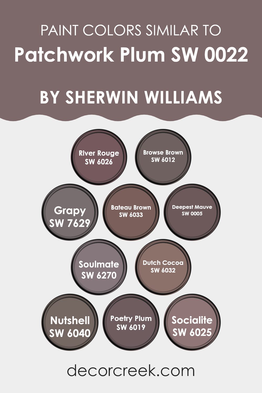
Colors Similar to Patchwork Plum SW 0022 by Sherwin Williams
Similar colors are important because they create a harmonious and cohesive look in a room. When you use shades that are close to each other on the color wheel, it results in a subtle and unified appearance, which is pleasing to the eye. The similar colors to Patchwork Plum by Sherwin Williams achieve this effect beautifully.
SW 6026 – River Rouge adds a warm undertone with a hint of red, while SW 6012 – Browse Brown brings in a muted, earthy vibe that complements plum shades seamlessly. SW 7629 – Grapy and SW 6033 – Bateau Brown introduce purple and brown tones that enrich the overall palette, adding depth without straying too far from the base color.
Continuing this theme, SW 0005 – Deepest Mauve offers a balance of purple and pink, creating a rich, comforting atmosphere. SW 6270 – Soulmate leans more towards a deeper purple, perfect for adding a cozy, inviting feel. SW 6032 – Dutch Cocoa provides a soft, creamy brown that pairs nicely with these colors to ground the setup.
SW 6040 – Nutshell has a more robust, nutty hue, adding warmth to the color mix. SW 6019 – Poetry Plum then gives a slightly lighter and more playful touch, and SW 6025 – Socialite includes a subtle hint of brightness, lifting the environment without overpowering it. These colors together build a wonderfully cohesive and inviting room.
You can see recommended paint colors below:
- SW 6026 River Rouge
- SW 6012 Browse Brown
- SW 7629 Grapy
- SW 6033 Bateau Brown
- SW 0005 Deepest Mauve
- SW 6270 Soulmate
- SW 6032 Dutch Cocoa
- SW 6040 Nutshell
- SW 6019 Poetry Plum
- SW 6025 Socialite
How to Use Patchwork Plum SW 0022 by Sherwin Williams In Your Home?
Patchwork Plum SW 0022 by Sherwin Williams is a rich, deep purple color that can add warmth and elegance to any room. When used in a living room, it creates a cozy and inviting atmosphere, perfect for relaxing or entertaining guests.
This shade can be a statement wall, paired with neutral colors like beige or cream, to balance the intensity. In a bedroom, it brings a sense of comfort and coziness, ideal for restful nights. For those who love a bold look, Patchwork Plum can be used in a dining room to give it a touch of drama and sophistication.
Accents like gold or brass can enhance its richness. In smaller areas like a powder room, this color can make the room feel luxurious and intimate. Additionally, using it on cabinets or doors adds character without making the area feel too heavy. Remember to pair it with good lighting to highlight its beautiful hue.
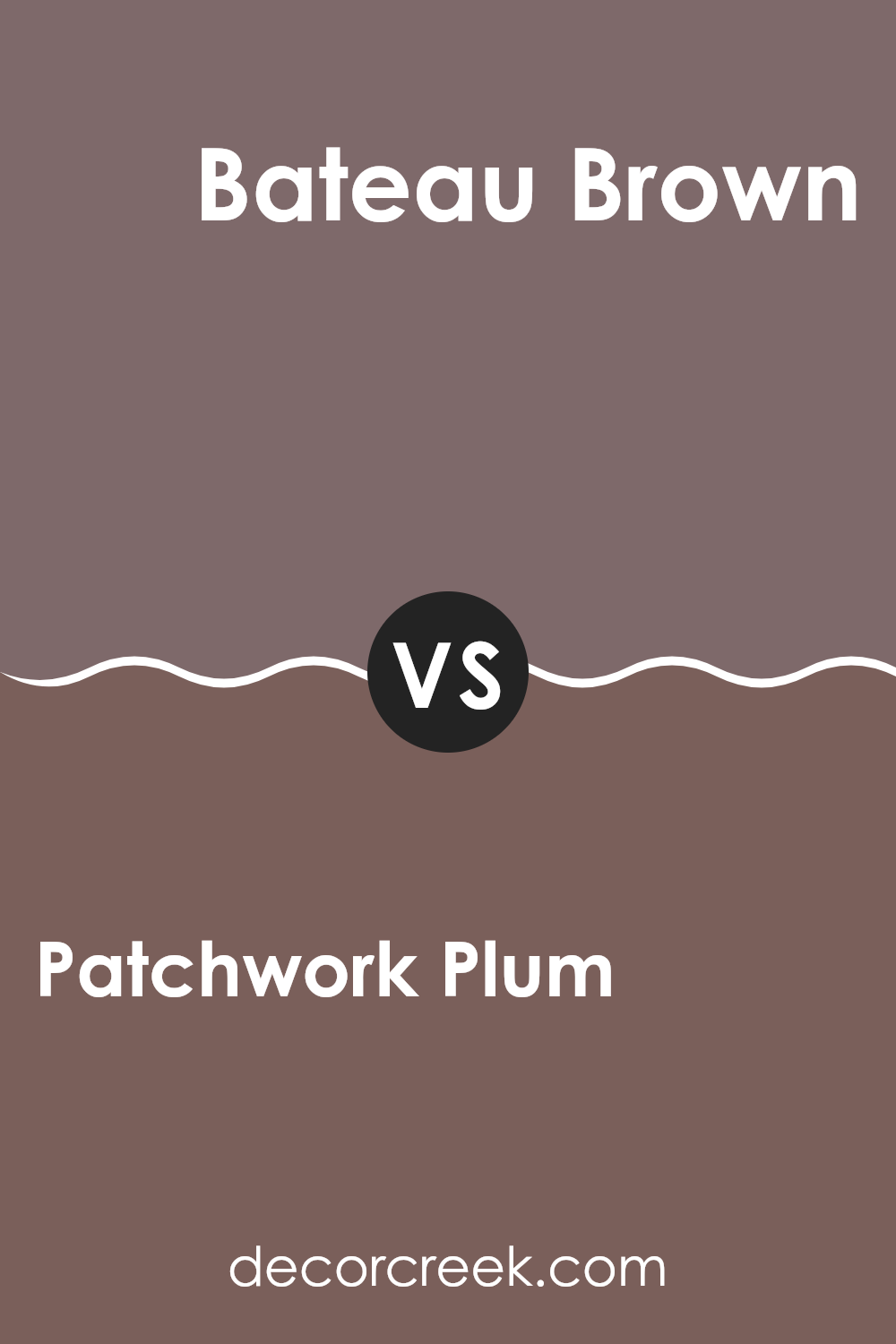
Patchwork Plum SW 0022 by Sherwin Williams vs Bateau Brown SW 6033 by Sherwin Williams
Patchwork Plum SW 0022 and Bateau Brown SW 6033, both by Sherwin Williams, are rich, warm colors that offer distinct styles. Patchwork Plum is a deep, muted purple with hints of red and brown. It brings a cozy and welcoming feel to any room, creating a warm atmosphere that feels inviting.
On the other hand, Bateau Brown is a dark, earthy brown with a touch of warmth. This color feels grounded and stable, providing a neutral backdrop that pairs well with many colors.
While Patchwork Plum adds a touch of drama and is ideal for creating a cozy nook or accent wall, Bateau Brown is more understated and adaptable, suitable for larger rooms or as a complement to other earthy tones. Both colors have their unique appeal, with Patchwork Plum being more vibrant and Bateau Brown exuding a quiet strength.
You can see recommended paint color below:
- SW 6033 Bateau Brown
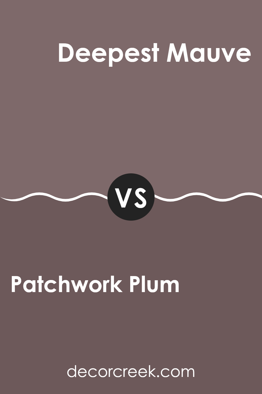
Patchwork Plum SW 0022 by Sherwin Williams vs Deepest Mauve SW 0005 by Sherwin Williams
Patchwork Plum SW 0022 by Sherwin Williams is a warm, muted purple with a hint of brown, giving it a vintage and cozy look. This shade can add a touch of old-world charm to any area. It feels rich and deep, making it a great choice for creating a snug atmosphere in rooms like living rooms or libraries.
On the other hand, Deepest Mauve SW 0005 is a darker and more intense shade of purple. It leans more towards a burgundy tone, which gives it a bold character compared to the softer Patchwork Plum. Deepest Mauve can add a dramatic accent to any room, making rooms feel more intimate and luxurious.
In summary, Patchwork Plum is more subtle and soothing with its warm undertones, while Deepest Mauve is more intense and striking. Both colors have their unique appeal, and their use will largely depend on the mood you want to set in the room.
You can see recommended paint color below:
- SW 0005 Deepest Mauve
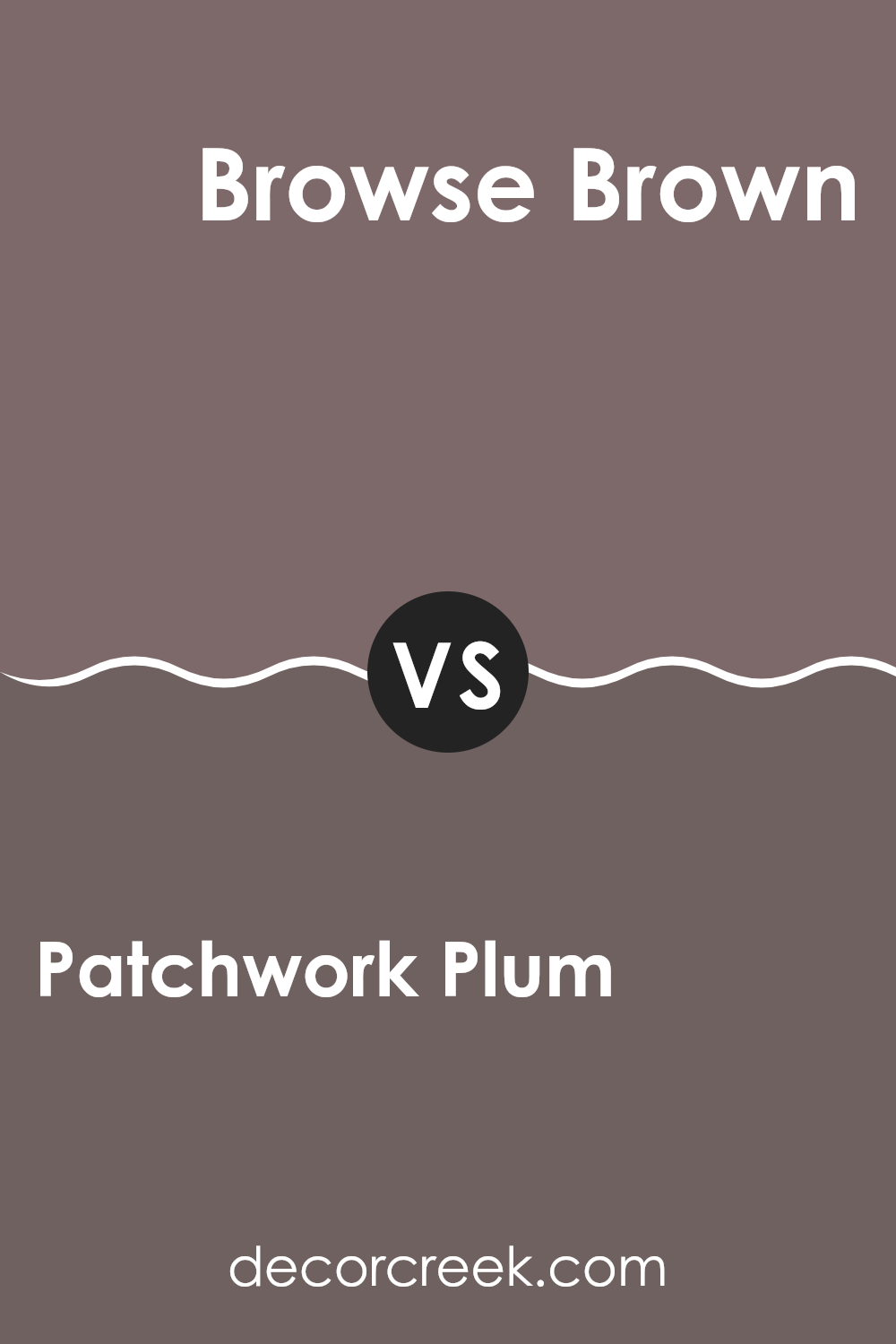
Patchwork Plum SW 0022 by Sherwin Williams vs Browse Brown SW 6012 by Sherwin Williams
Patchwork Plum SW 0022 and Browse Brown SW 6012 by Sherwin Williams offer two distinct yet complementary shades for interior design. Patchwork Plum is a rich, deep purple with hints of red, creating a warm and cozy atmosphere. It’s a bold choice that can add a touch of elegance and character to a room.
On the other hand, Browse Brown presents a soft, earthy brown with subtle undertones that evoke a sense of comfort and reliability. It’s a flexible color that can act as a neutral backdrop or add depth when paired with other shades.
When used together, Patchwork Plum can serve as an accent against the more muted Browse Brown, creating a balanced and inviting environment. The plum adds vibrancy and interest, while the brown grounds and harmonizes the overall look. Both colors work well in various settings, from traditional to contemporary, enhancing the mood and style of a room.
You can see recommended paint color below:
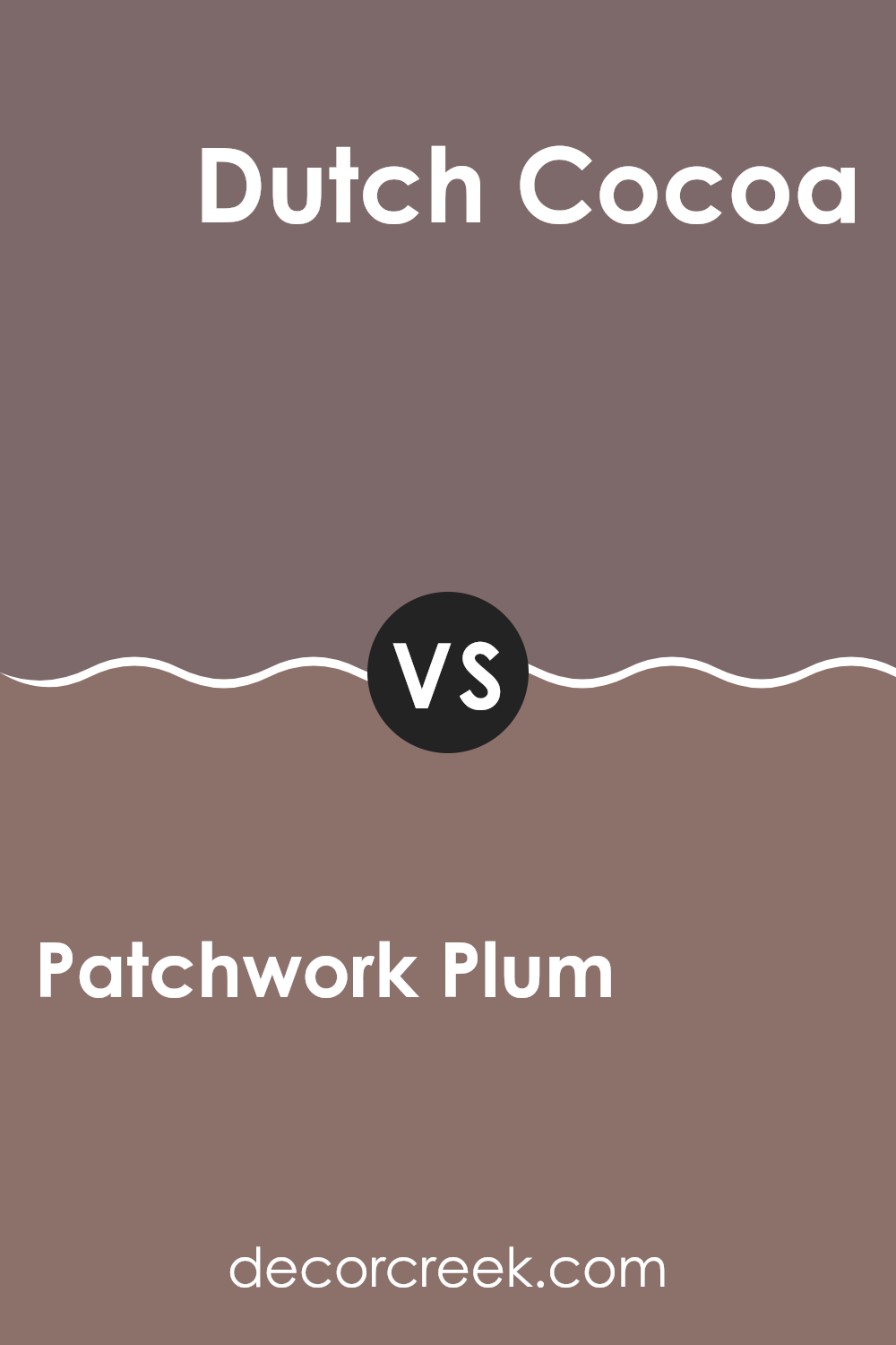
Patchwork Plum SW 0022 by Sherwin Williams vs Dutch Cocoa SW 6032 by Sherwin Williams
Patchwork Plum SW 0022 is a deep, rich purple with a warm undertone. It exudes a sense of coziness and boldness, making it ideal for adding drama to a room. It’s perfect for an accent wall or a cozy nook. On the other hand, Dutch Cocoa SW 6032 is a warm, medium brown that feels comforting and grounded.
It’s a flexible color suitable for living rooms or bedrooms, creating a welcoming atmosphere. While both colors provide warmth, Patchwork Plum offers a more striking and luxurious feel due to its deeper tone. In contrast, Dutch Cocoa has a more grounded and subtle presence.
Together, they can complement each other well—Patchwork Plum adding depth and Dutch Cocoa providing balance. Both colors can be used to create a cozy and inviting room, but Patchwork Plum is bolder, whereas Dutch Cocoa is softer and more grounded.
You can see recommended paint color below:
- SW 6032 Dutch Cocoa
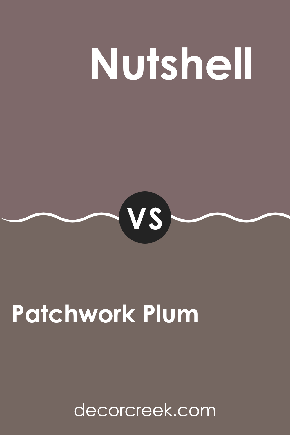
Patchwork Plum SW 0022 by Sherwin Williams vs Nutshell SW 6040 by Sherwin Williams
Patchwork Plum SW 0022 is a rich and deep purple hue with a hint of warmth, giving it a cozy and inviting feel. It’s perfect for creating a bold statement in a room, adding a touch of luxury and depth to any room.
In contrast, Nutshell SW 6040 is an earthy brown with reddish undertones, which offers a warm and natural vibe. While Patchwork Plum can make a room feel elegant and dramatic, Nutshell provides a grounded and comfortable atmosphere.
The combination of these two colors can result in a balanced look, with the purple adding depth and character, and the brown introducing warmth and earthiness. Patchwork Plum might be suited for accents or feature walls, while Nutshell works well as a base color or for larger areas. Together, they strike a perfect balance between boldness and warmth, enhancing the overall feel of a room.
You can see recommended paint color below:
- SW 6040 Nutshell
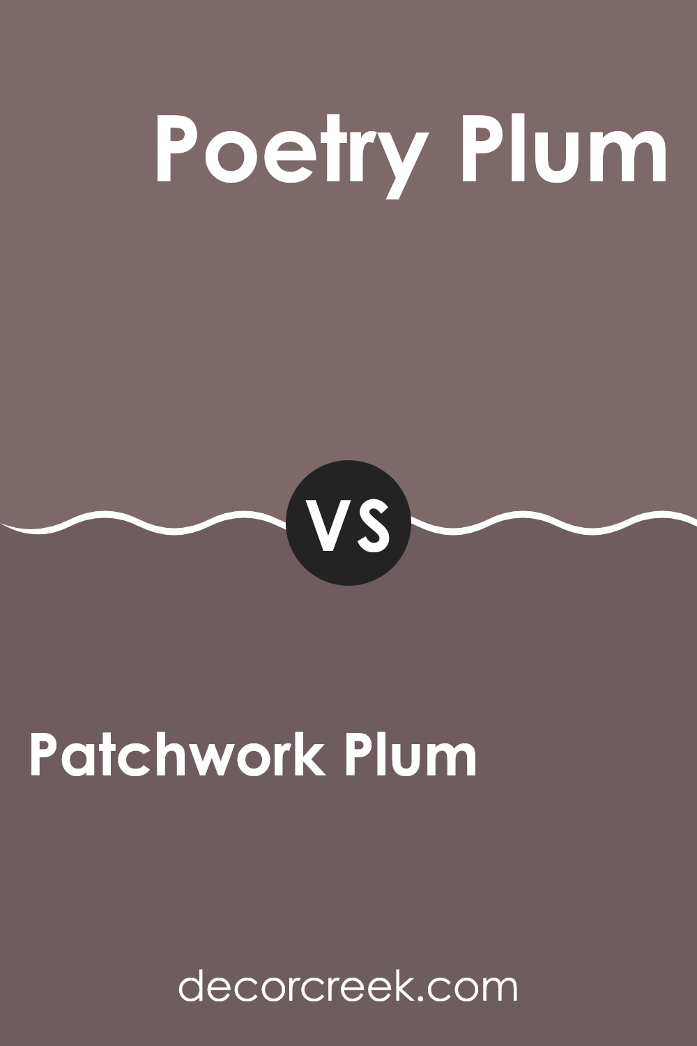
Patchwork Plum SW 0022 by Sherwin Williams vs Poetry Plum SW 6019 by Sherwin Williams
Patchwork Plum (SW 0022) and Poetry Plum (SW 6019) are both beautiful shades of plum by Sherwin Williams, but they have distinct characteristics. Patchwork Plum is a deep, rich purple that has a classic feel.
It’s quite bold and can add a dramatic touch to any room, making it feel cozy and warm. On the other hand, Poetry Plum is slightly lighter and softer, bringing a more gentle and soothing atmosphere. It has a hint of brightness and can invoke a sense of comfort without being overpowering.
While Patchwork Plum might work well in areas where you want to add a touch of elegance and snugness, Poetry Plum is ideal for settings where a softer mood is desired, like a bedroom or a sitting area. Both colors are adaptable, but the choice depends on whether you prefer the intensity of Patchwork Plum or the lightness of Poetry Plum.
You can see recommended paint color below:
- SW 6019 Poetry Plum
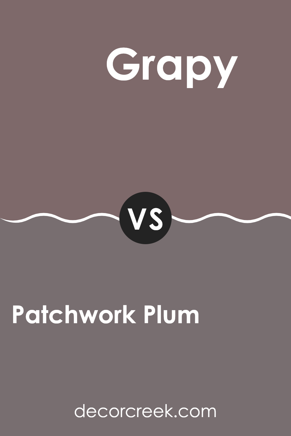
Patchwork Plum SW 0022 by Sherwin Williams vs Grapy SW 7629 by Sherwin Williams
Patchwork Plum and Grapy are two distinct colors offered by Sherwin Williams. Patchwork Plum is a rich, deep shade of purple with red undertones. It gives a warm and inviting feeling, perfect for a cozy living room or a stylish accent wall. It’s bold yet comforting, making it a nice choice for areas where you want to create an intimate atmosphere.
On the other hand, Grapy is a lighter purple with cooler, blue undertones. It feels fresher and more playful compared to Patchwork Plum. Grapy can brighten up a room and add a touch of whimsy, making it suitable for a fun bedroom or a lively dining area.
While both are shades of purple, Patchwork Plum is more intense and dramatic, whereas Grapy feels airy and cheerful. Choosing between them depends on the mood you want to create: warm and cozy or light and energetic.
You can see recommended paint color below:
Patchwork Plum SW 0022 by Sherwin Williams vs River Rouge SW 6026 by Sherwin Williams
Patchwork Plum (SW 0022) and River Rouge (SW 6026) are both lovely colors from Sherwin Williams, but they have different vibes. Patchwork Plum is a deep, rich plum color with a bit of a purple touch. It feels cozy and inviting, making it great for adding warmth to a room. It’s a color that can stand out on its own while making a room feel more intimate.
On the other hand, River Rouge is a warm, muted red with a hint of brown. It has an earthy feel, which gives rooms a grounded, comfortable look. This color has a subtle softness, so it pairs well with natural tones and materials.
While Patchwork Plum has a more luxurious and dramatic look due to its depth, River Rouge offers a more natural, welcoming feel. Both colors can add great character to a room, but their effect on the room’s mood can be quite different.
You can see recommended paint color below:
- SW 6026 River Rouge
Patchwork Plum SW 0022 by Sherwin Williams vs Socialite SW 6025 by Sherwin Williams
Patchwork Plum SW 0022 and Socialite SW 6025, both by Sherwin Williams, offer distinct yet complementary vibes. Patchwork Plum is a rich, deep purple with brown undertones. It’s warm and comforting, perfect for adding coziness to a room. This color has a classic feel, making it suitable for traditional and refined areas.
On the other hand, Socialite is a lighter, dusty mauve with gray undertones. It has a more modern and soft appearance, bringing a gentle and airy touch to interiors. Socialite feels fresh and subtle, ideal for creating a relaxed atmosphere, especially in living rooms or bedrooms.
While Patchwork Plum might work well as an accent or feature wall, adding depth and drama, Socialite can be used more broadly across larger areas to maintain an open and light feel. Pairing them can create a balanced look, with Patchwork Plum providing a bold contrast to Socialite’s gentle warmth.
You can see recommended paint color below:
- SW 6025 Socialite
Patchwork Plum SW 0022 by Sherwin Williams vs Soulmate SW 6270 by Sherwin Williams
Patchwork Plum (SW 0022) and Soulmate (SW 6270) by Sherwin Williams are both rich, deep colors, but they have distinct differences. Patchwork Plum is a warm, earthy shade with a mix of brown and purple tones. It feels cozy and grounding, making it suitable for creating a warm atmosphere in a room.
On the other hand, Soulmate is a cooler, more vibrant purple. It leans towards a true violet, offering a lively and energetic vibe. While Patchwork Plum has a more muted, understated presence, Soulmate stands out as more vivid and bold.
Both colors can bring a sense of depth and character to a room. Patchwork Plum works well for intimate, comforting settings, while Soulmate can add a dynamic touch to an area. Choosing between them depends on whether you prefer the warmth and comfort of Patchwork Plum or the lively, cool energy of Soulmate.
You can see recommended paint color below:
After talking about Patchwork Plum by Sherwin Williams, I think I’ve learned a lot about this paint color. Patchwork Plum is a deep, rich purple that reminds me of a cozy blanket on a chilly day. It’s not too bright or too dark, just the right shade that can make any room feel warm and inviting.
When I think about using Patchwork Plum in a room, I imagine how it might make the room feel special. It’s a color that can make a bedroom feel snug or a living room feel friendly and welcoming. It’s like when you wear your favorite sweater — it just feels right.
I also think it’s neat how Patchwork Plum can match well with other colors. You could have it next to a soft gray or a creamy white, and it would look very nice. It can work with lots of different looks, whether you like a modern style or something more classic.
Overall, Patchwork Plum is a beautiful color that brings comfort and warmth into a room. It’s a bit like inviting a friendly hug onto your walls. I really enjoyed learning about this color, and I might even want to use it someday if I get to paint a room. It seems like a wonderful choice to make any place feel more like home.
Ever wished paint sampling was as easy as sticking a sticker? Guess what? Now it is! Discover Samplize's unique Peel & Stick samples.
Get paint samples

